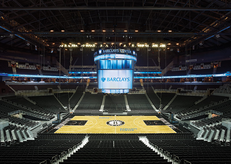
Barclays Center

Introduction
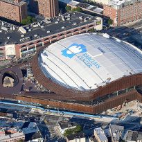
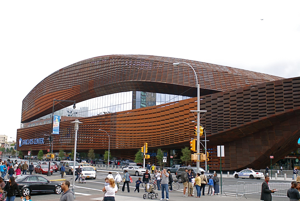
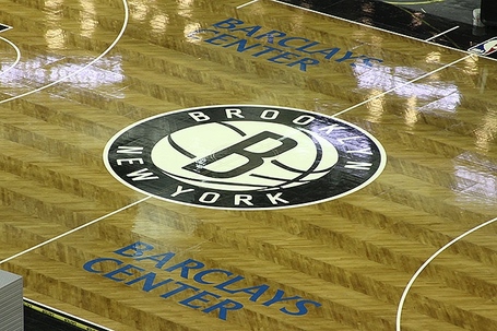
Barclays Center is a showcase for the world’s most exciting entertainment and sports events as well as a work of engineering built into Aecom Ellerbe Becket. Promoted by Forest City Enterprises and Onexim Sports & Entertainment Brooklyn and designed by Architecture Studio AECOMM and SHoP Architects, is the home of the NBA basketball “Brooklyn Nets”.
Surrounded by long controversies is the first piece and representative element of the new Atlantic Yards development of Forest City Ratner Companies, which will be built over the next two decades. The project will occupy 22 acres of land in which 11 subway lines and a commuter train will be located. The development has been delayed by opposition from the community and recession, raise a complex mixed-use office and residential area. Meanwhile Brooklyn has an important piece of architecture to a level not seen long in place.
Situation
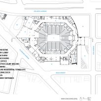
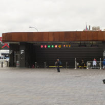
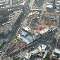
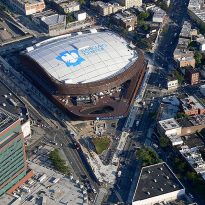
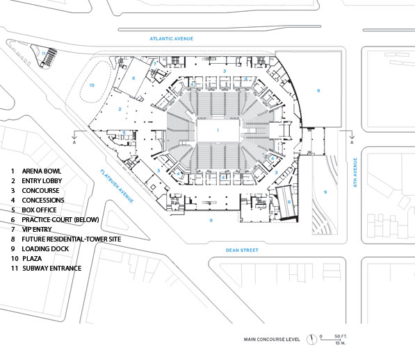
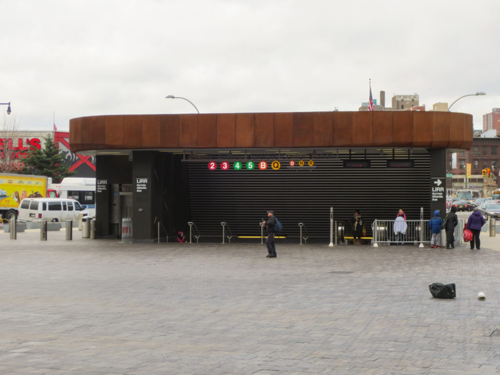
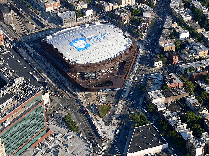
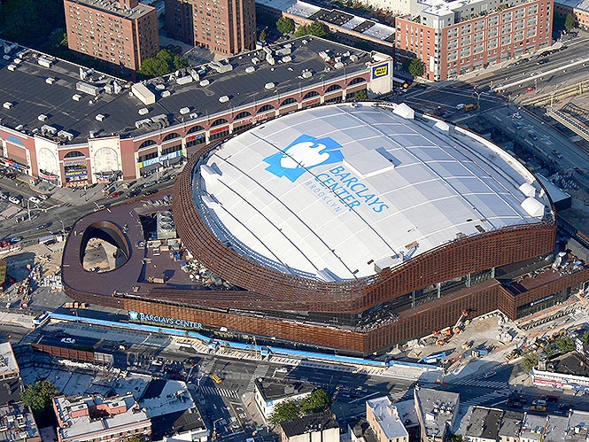
The sports center is located in the heart of Brooklyn, 620 Atlantic Av., New York, United States, a few subway stops from Manhattan and above the new Barclays Center subway station. Put Stone was reaching across 11 subway lines, 11 bus lines and the Long Island Rail Road.
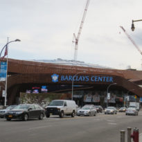
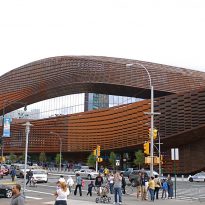
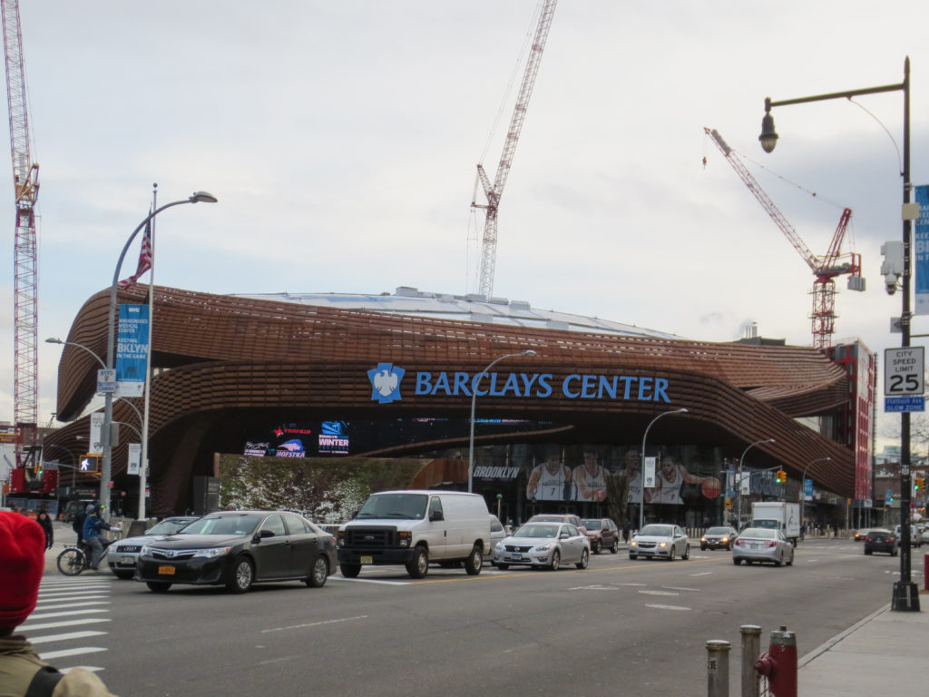
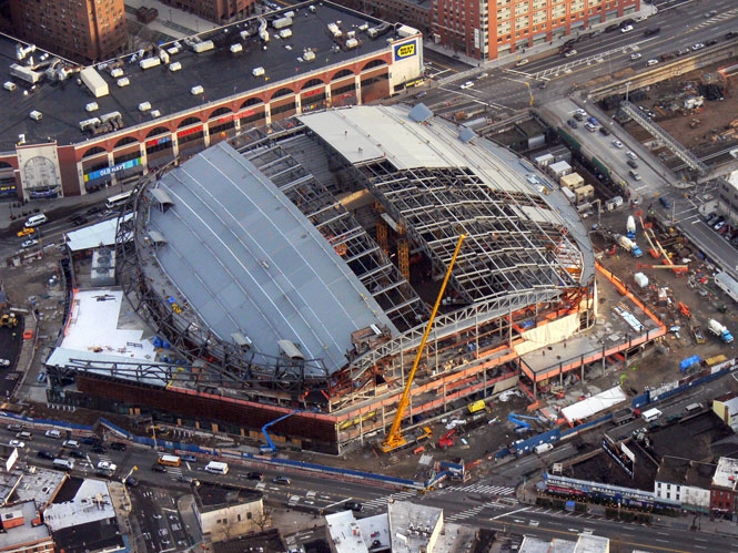
Located in the noisy wedge land created between the Atlantic and Flatbush Avenues, the curved shapes of the building are surrounded by the loud roar of traffic, but despite denials urban conditions, the area is accompanied by vibrant neighborhoods with high density, which help fill the spaces created by the new public sphere of sand.
Concept
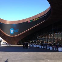
The design of the Barclays Center achieves a surprising balance between iconic shape and performative commitment to maintaining an identity that delights visitors, neighbors, fans and spectators. Integrated in one of the busiest intersections in the urban area of Metro New York, the Centre will maintain a healthy and interactive dialogue with the surrounding streets and neighborhood.
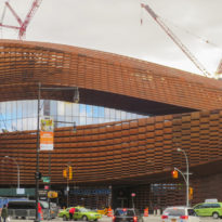
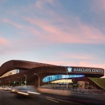
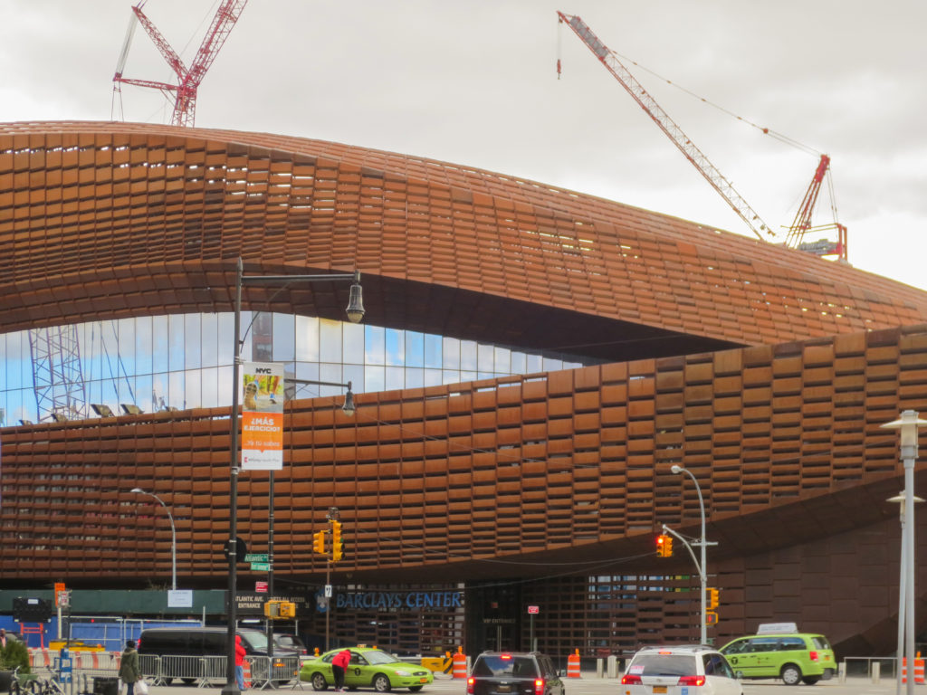
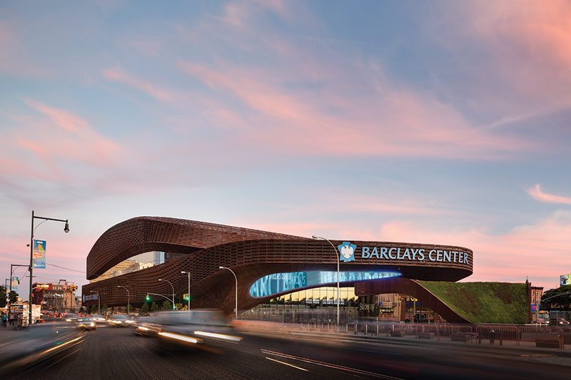
Some critics linked the dark and thick skin of the building with the characteristic “brownstones” that give identity to the architecture of Brooklyn. Others describe it as a whimsical pseudo Industrial ruins, stunning and aggressive makings, despite its curvatures, or as a semi dormant monster, waiting to wake up and roar like the fans gathered inside.
The architects developed the following design concepts when creating the project:
- A large volume to the lobby.
- A powerful opening frame the connection point between the multipurpose space and entrance to the subway.
- Allocate space for restaurant service.
- Create a footbridge dramatic cut through the volume of the hall.
- Having more intimately, that existing so far in other courts, seating for spectators.
- Dedicate multilevel clubs.
- Connecting the butt of practices abroad, entrance hall and other facilities.
- Placing an innovative semi-tractor-trailer and a turntable elevator system.
- Incorporate the best team in the league locker.
- Locate a store that offers objects Nets successful team.
Description and materials
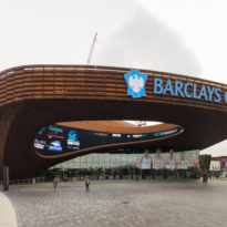
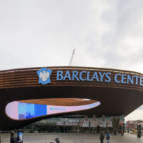
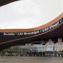
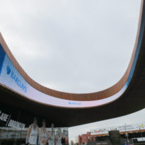
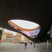
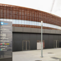
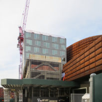
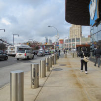
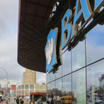
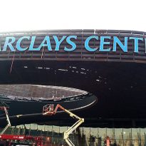
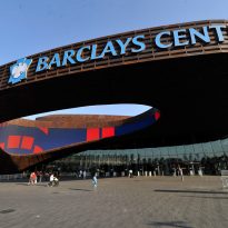
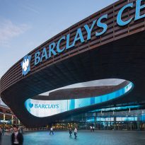
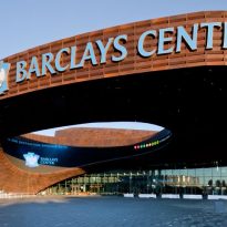
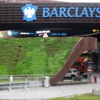
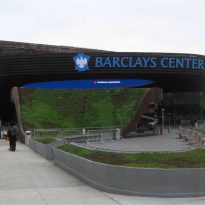
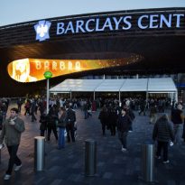
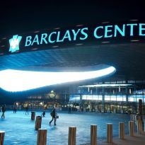
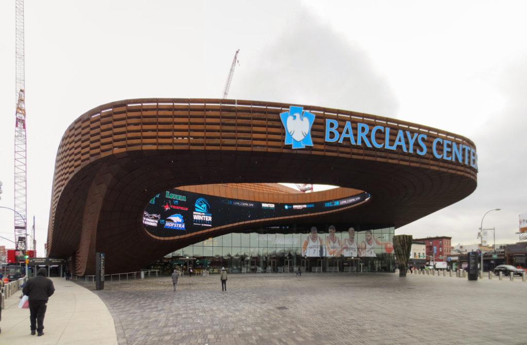
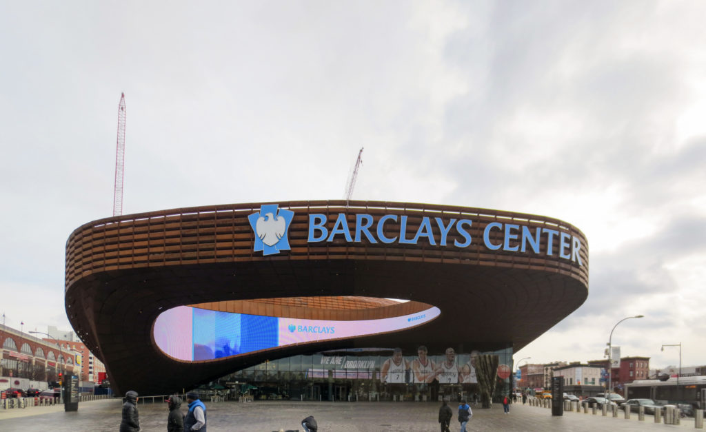
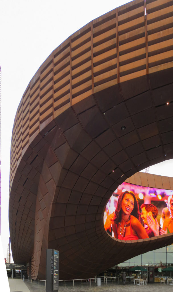
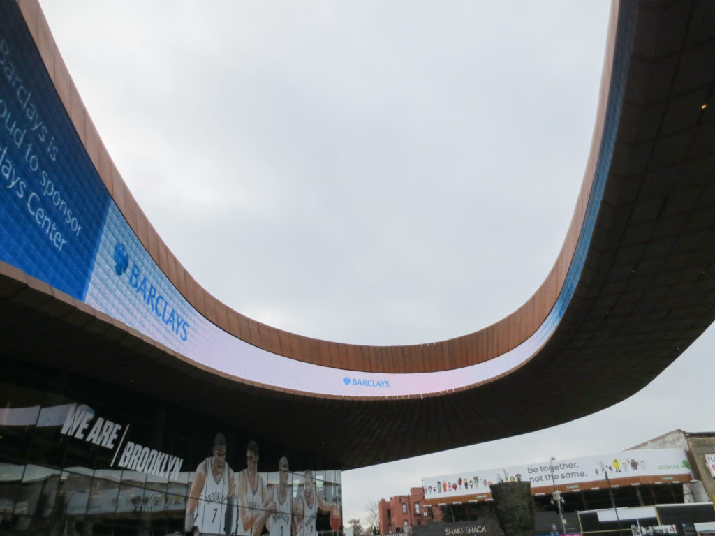
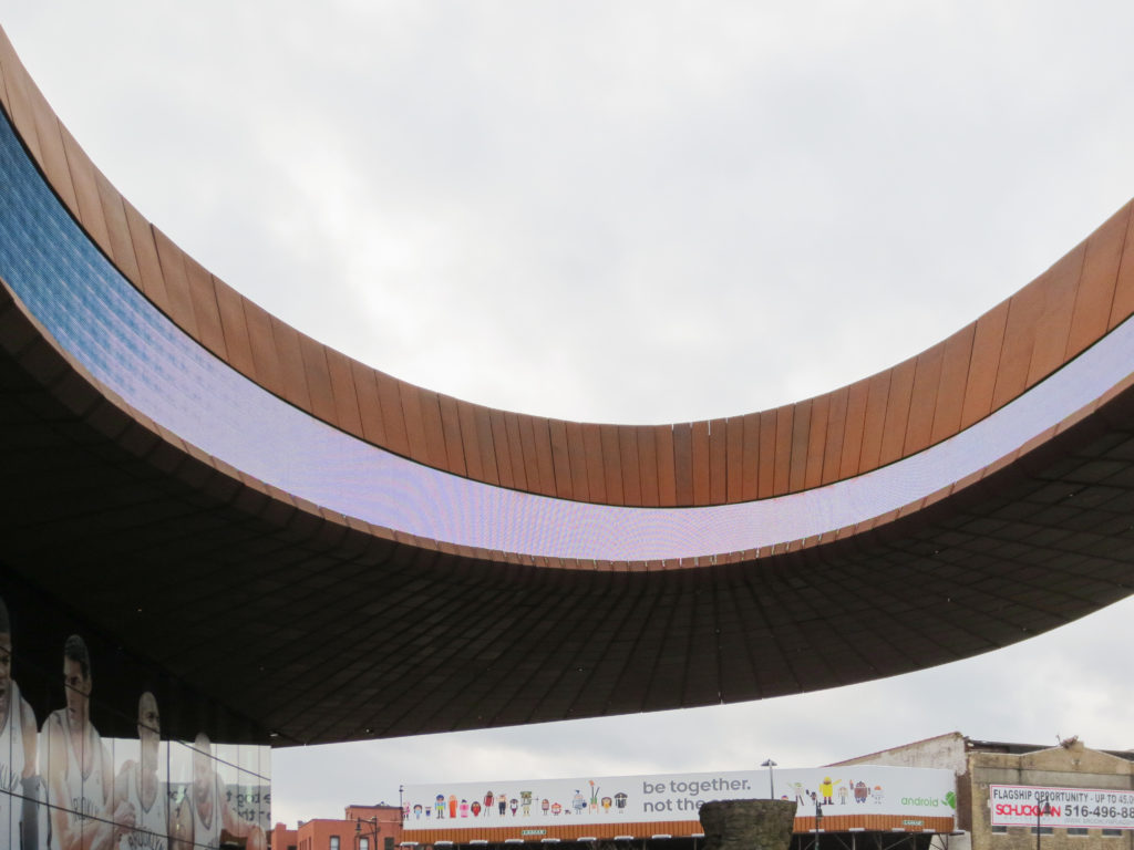
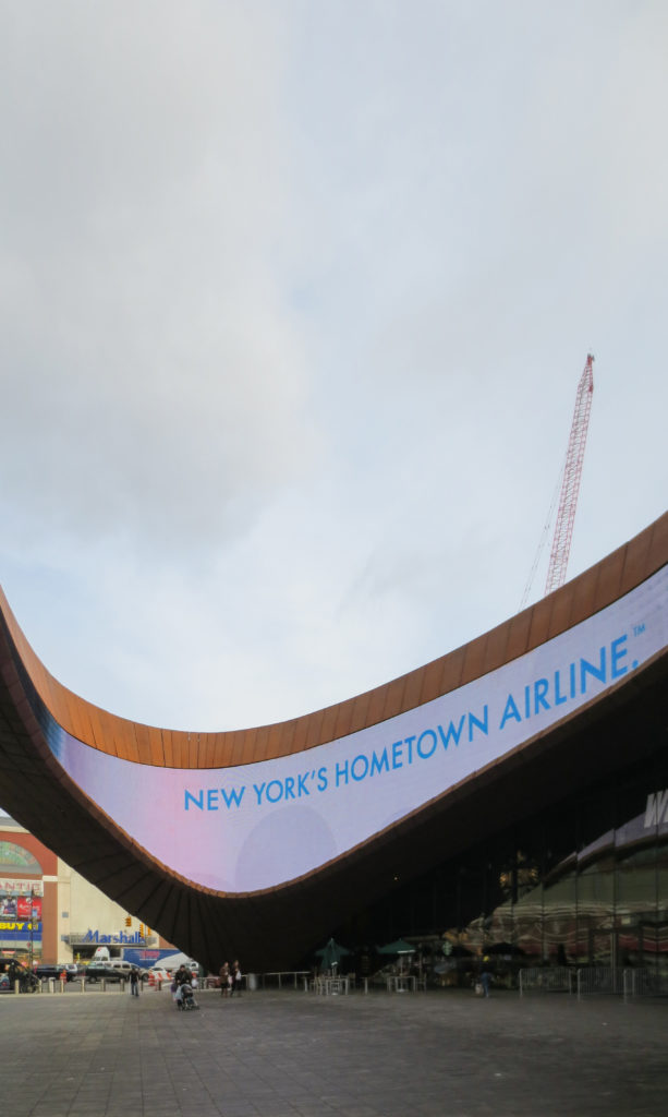
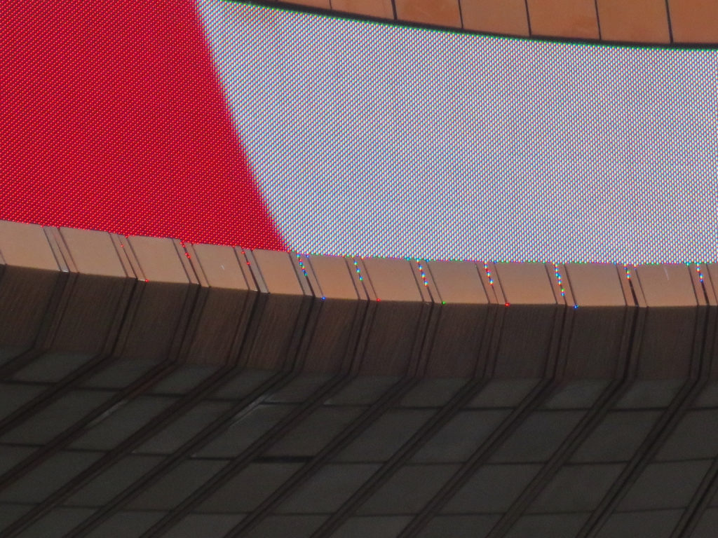
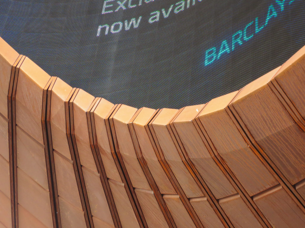
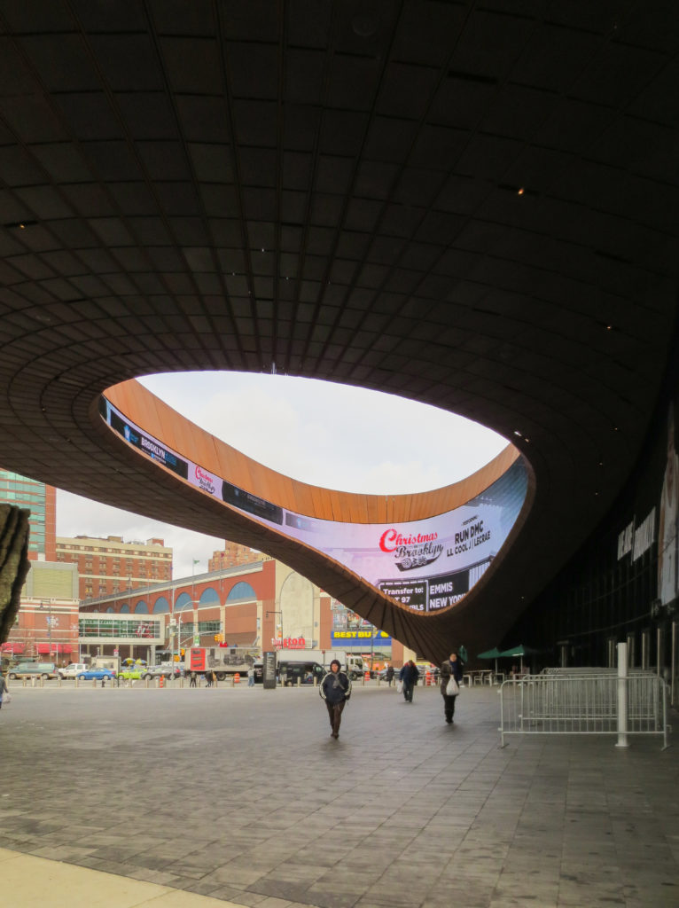
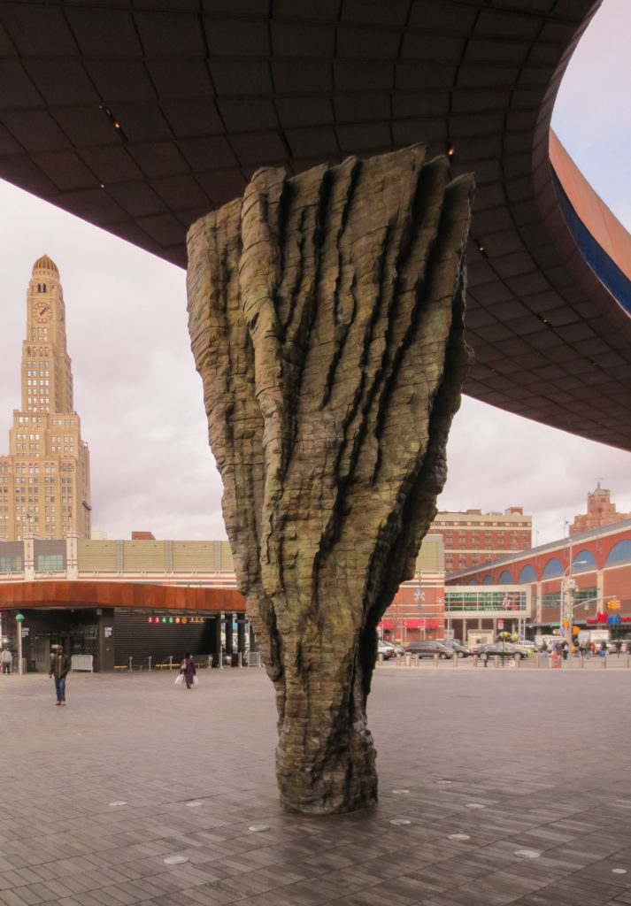
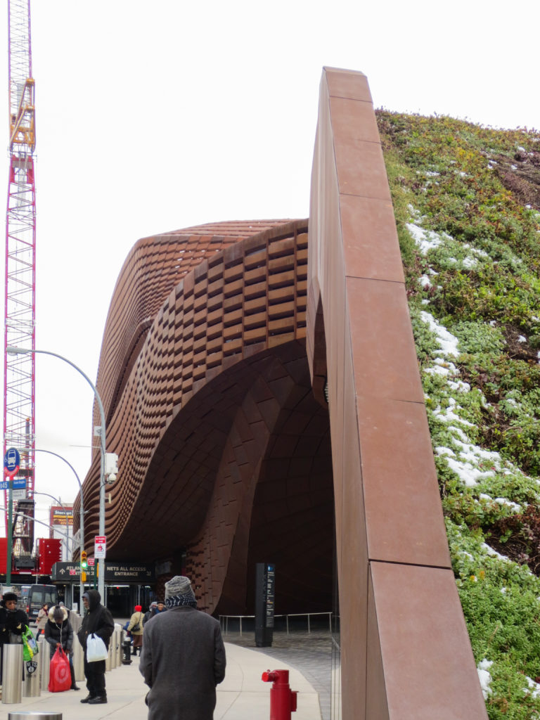
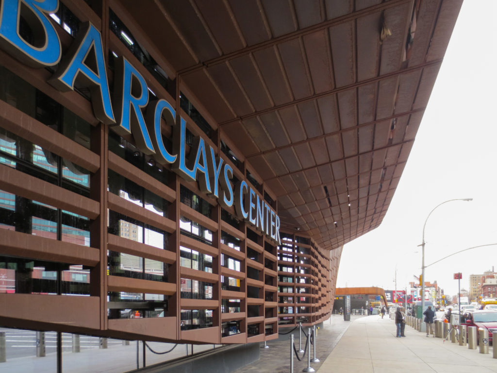
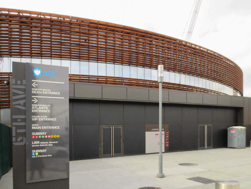
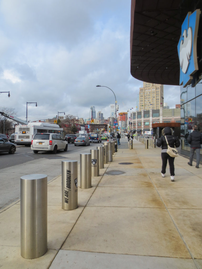
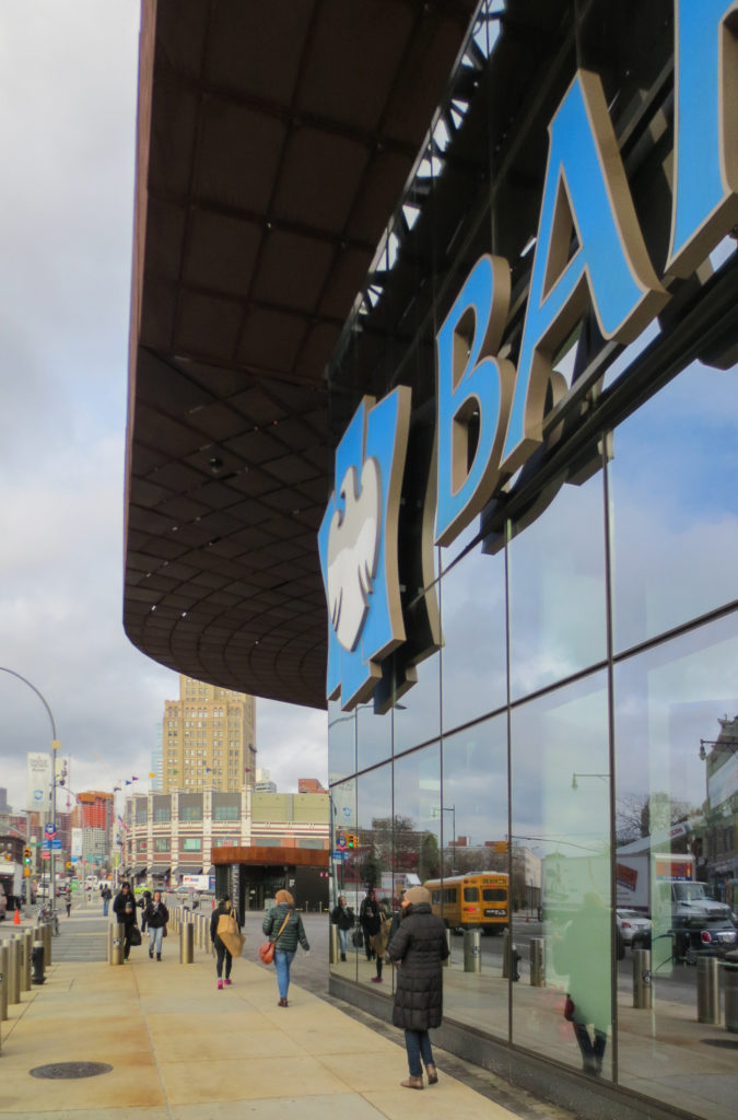
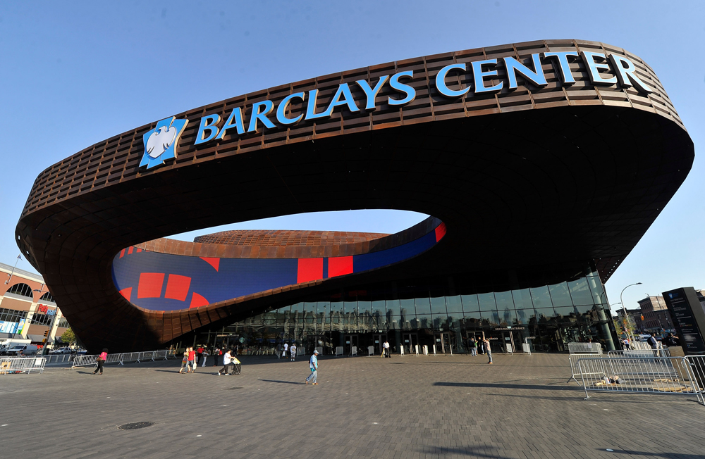
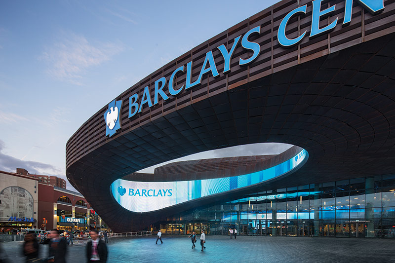
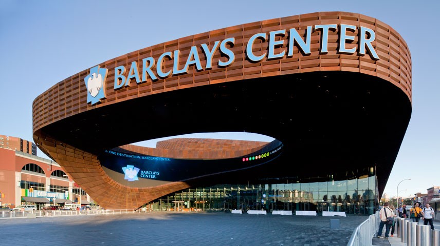
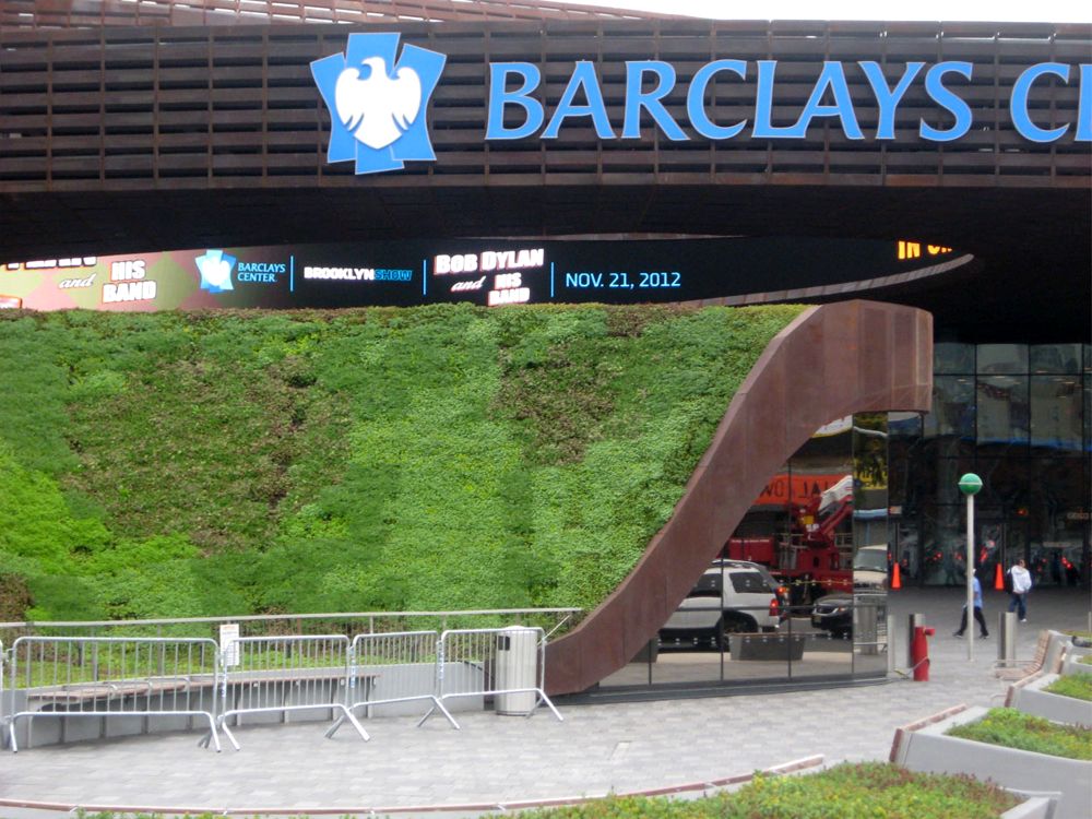
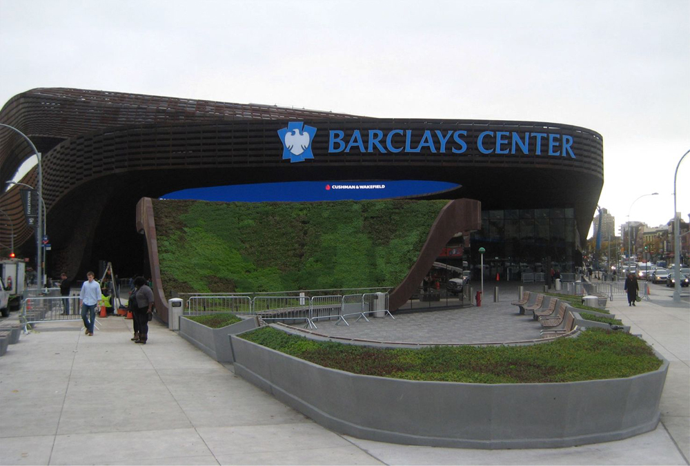
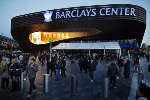
Access to the Barclay Center is done through a large oculus, more than 500m2, surrounded by a spectacular canopy of steel. Oculus inside the ring a digital media programming brightly announces animations. This space-plaza traffic and animation marks a bold new presence in Brooklyn. The generous square in front of the building, a space between public and private, helps define a large area, surrounded by sidewalks that line the street with trees and steel bollards making the public feel safe and secluded from traffic.
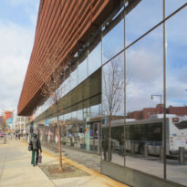
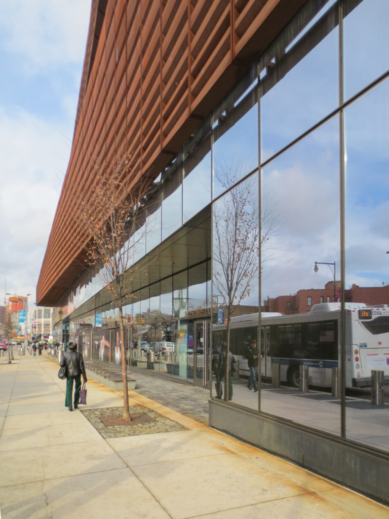
Generally stadiums and arenas do not share their function with street life, in this case the architects of the Barclays Center have filled much of the walls of the ground floor windows and windows, allowing passers-by can see, from the square the marker and the fans watching the game, but not the court. A submerged court practice is also visible from the square.
Green roof
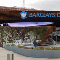
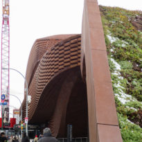
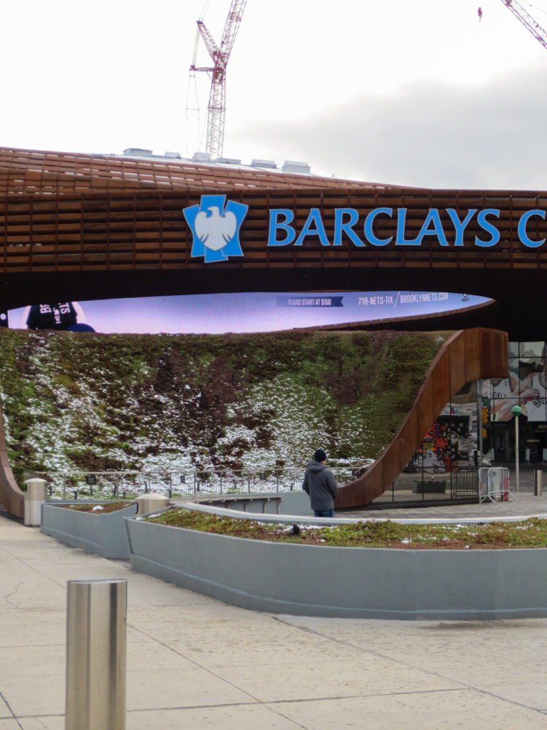
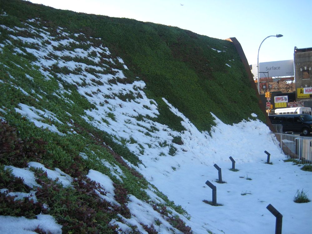
The architects turned to modern technologies for converting the entrance to the underground transit area into a living space, green, innovative and visually appealing to both residents and visitors center. The project Sedum vegetation InstaGreen ® Tile installed with GardNet Hydrotech technology, adapting to the spectacular roof slope shaped entrance tunnel. The slope of the project varies from 0 to 51st in the steepest section. Input roof addition, two half rings planters were placed around the inlet were added.
Steel panels
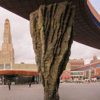
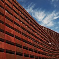
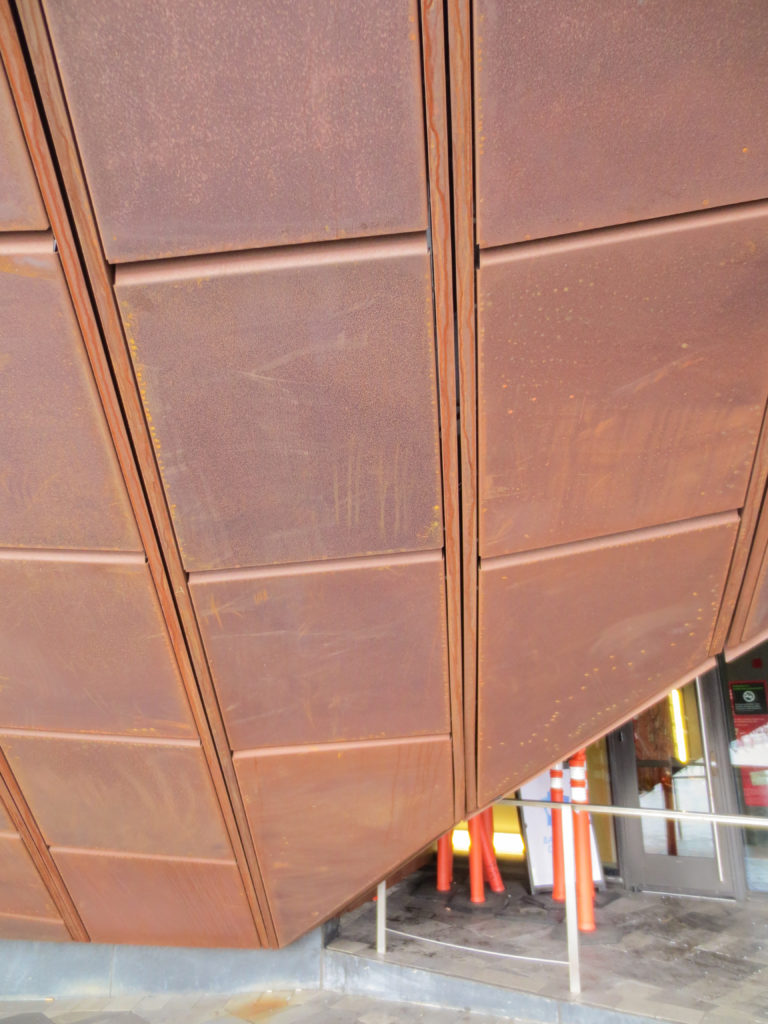
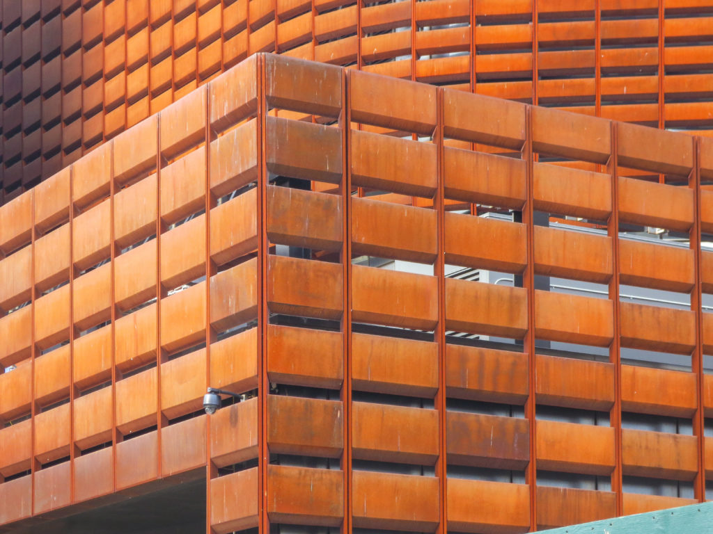
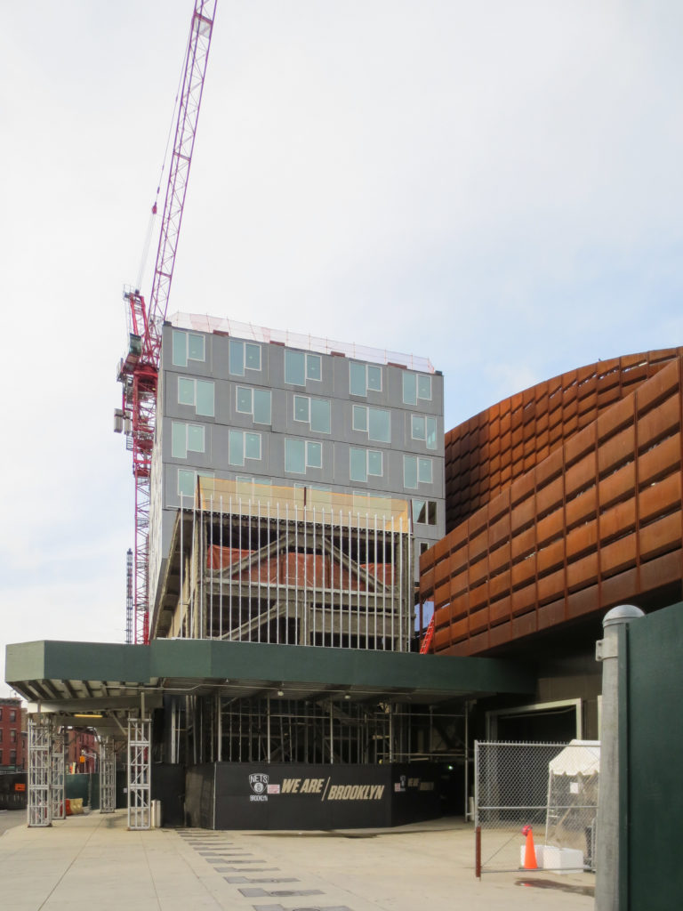
According to Gregg Pasquarelli, a partner at SHoP, the rich and powerful steel panels used in the facade and colorful eligible necessary to evoke “the dust and glamor” of Brooklyn. The contrast between the fluidity of forms, which clearly reflect the contemporary digital design, and the patina of the plates, created artificially balanced combination of high technology and appropriate weight to Brooklyn, a place that has always had a strong sense of self same.
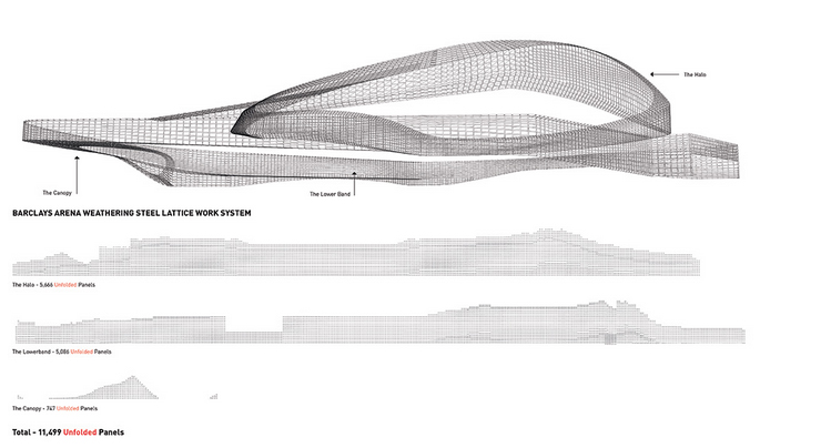
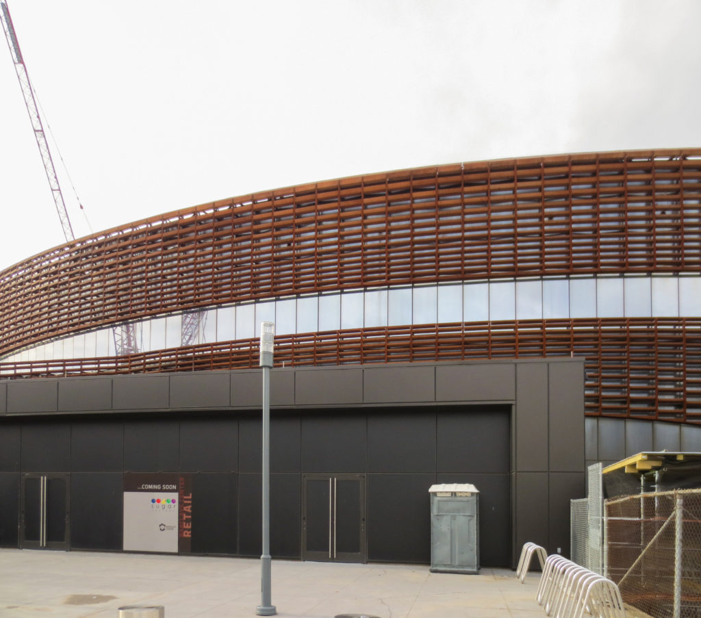
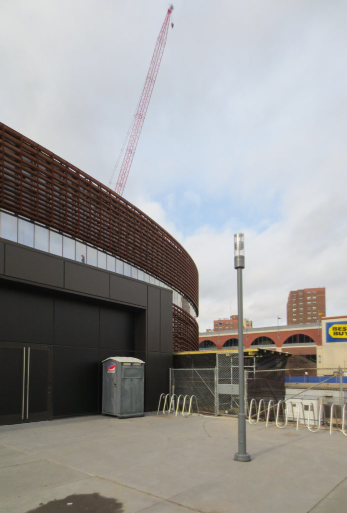
SHoP Architects designed the skin of the Barclays Center, to soften as much as possible, the impact of professional basketball court with 62.709m2 over the residential Brooklyn. “… We have tried to mitigate the size of the building, with horizontal bands that could be read in different scales,” said Gregg Pasquarelli. “There are larger at the top side which responds to the urban scale, and a lower band that is in the neighborhood scale, up to about the height of the brownstone neighborhood, four or five stories…. ”
Digital Technology
AECOM and SHoP collaborated on the development of the concepts of dynamic video integration, placing it in the “oculus” building and unifying the interior lines of lights to create a false interior ceiling in the hallways.
Interiors
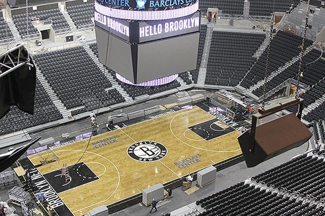
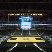
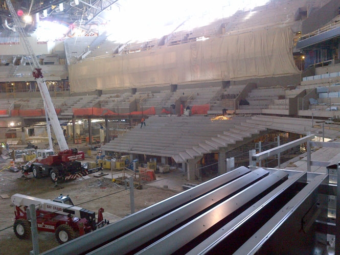
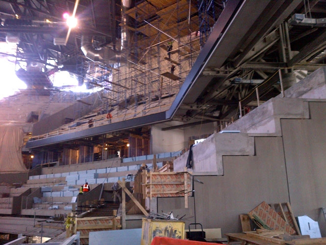
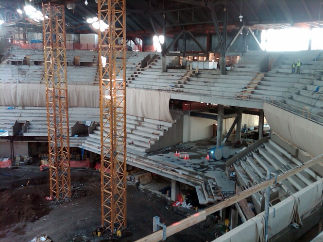
Its central volume is huge and airy, surrounded by stands and various services at different levels and around the court.
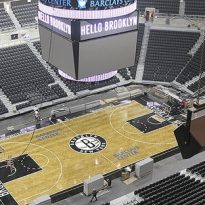
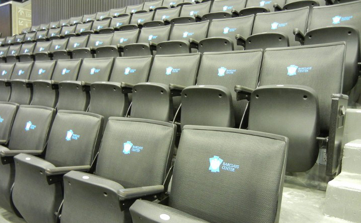
The center has one of the most intimate seating configurations ever designed for a modern multipurpose “arena”. No parallel rows of seats provide good vision to 17.732 sports fans, a number that can be expanded to 19,000 if the audience comes to musical performances.
Capacity:
- Basketball: 17.732
- Ice Hockey: 14,500
- Concerts: 19,000
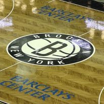
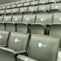
Also features 101 luxury suites, four bars and restaurants, including the famous Ja-Z’s 40/40 CLUB & Restaurant. The coffee chain Starbucks, present in front of the arena seats placed tier type, made of floorboards belonging to atigüas basketball
Despite its large capacity and in contrast to the outward appearance, the interior is relatively conventional.
The steps are very steep to allow the entire audience to be close to their idols. The boxes for commentators and reporters around the stands at an average height, separated from them only by a low wall. The absence of tinted glasses and modest sizes make the enclosures not result ostentatious.
Its interior is almost completely painted black, with gray floors, lights attached to a bow in the area of the track and a mural on the wall of entry to the VIP area, which recalls the facade.
The building has no special parking, although the large number of public transport that allows easy arrival at the site was taken into account.
Structure
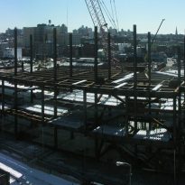
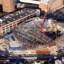
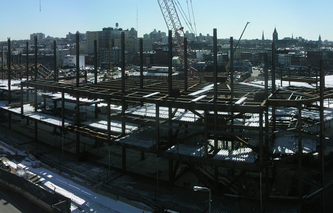
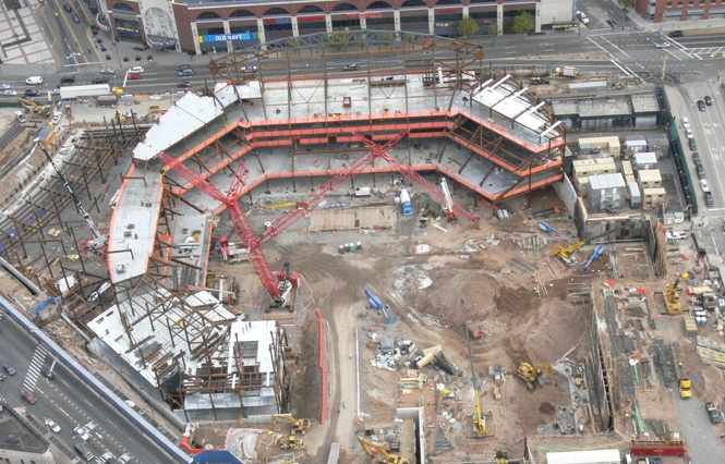
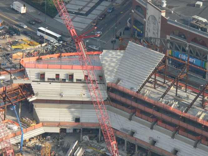
The powerful structure of this building is a work of engineering, developed by Ellerbe Becket of Aecom, like many of the other ingredients.
Facade
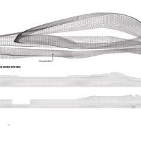
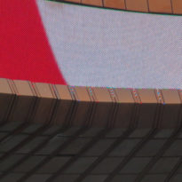
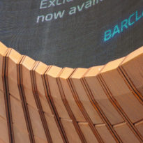
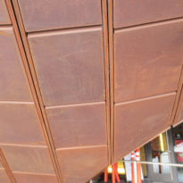
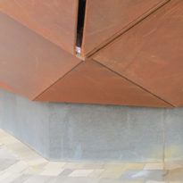
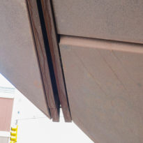
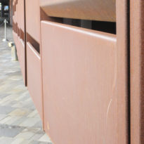
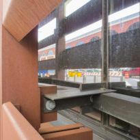
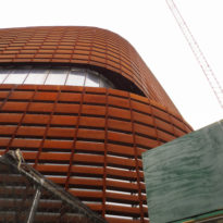
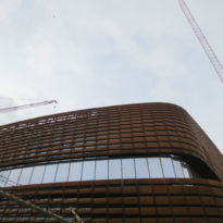
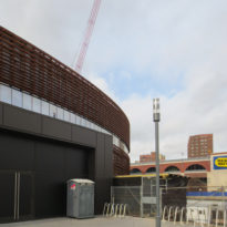
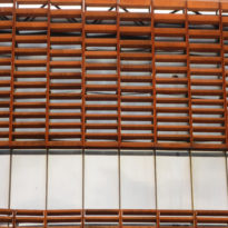
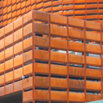
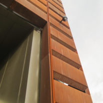
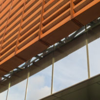
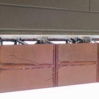
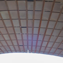
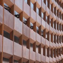
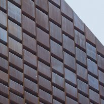
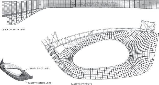
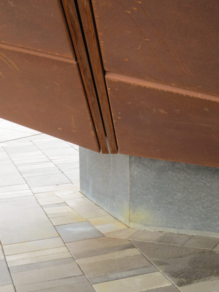
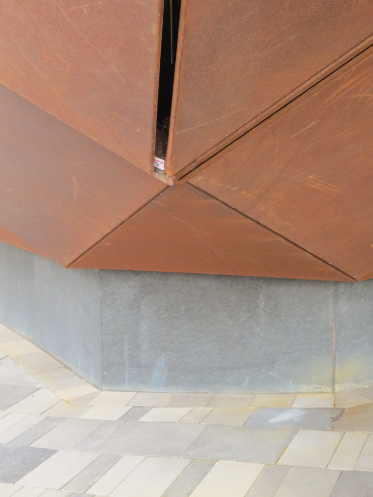
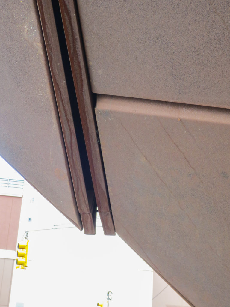
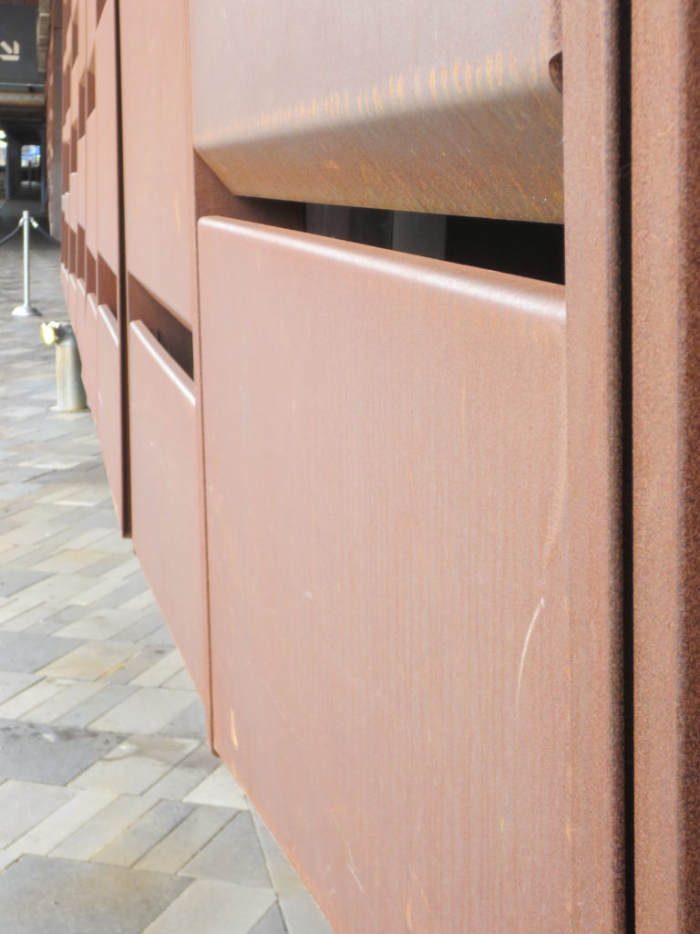
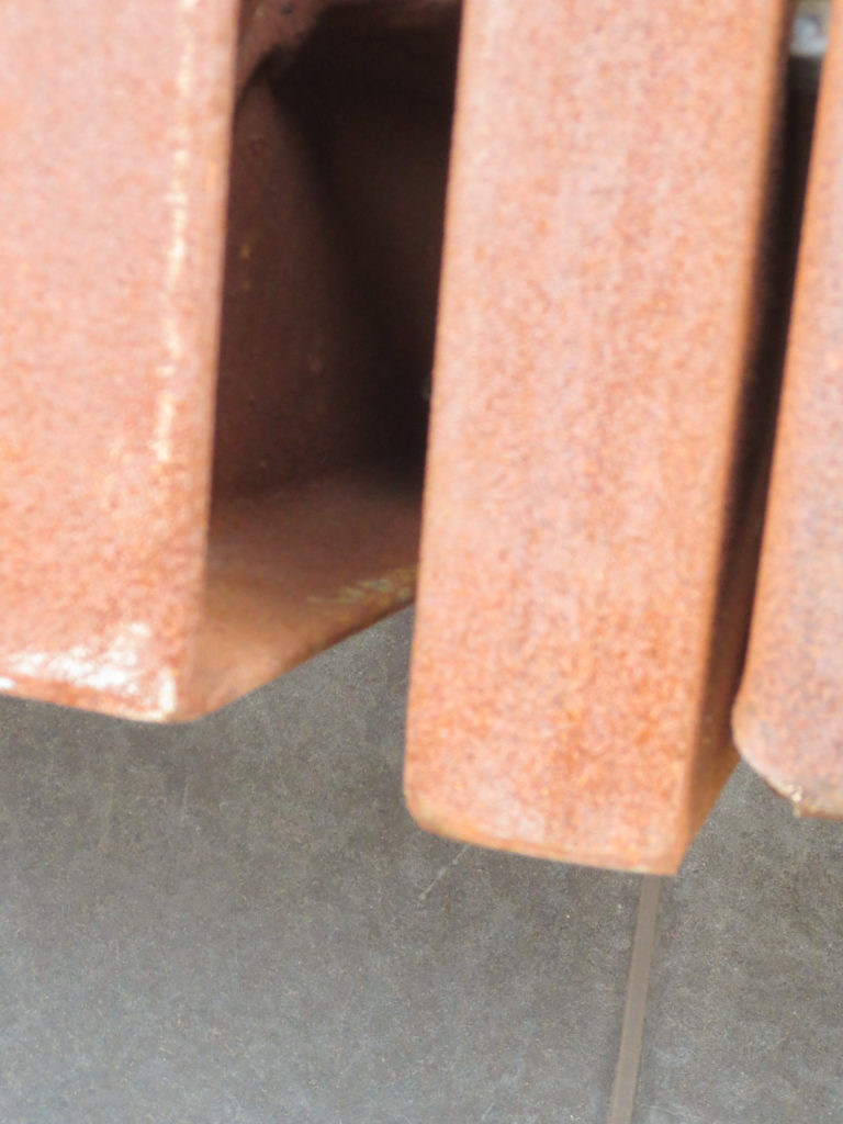
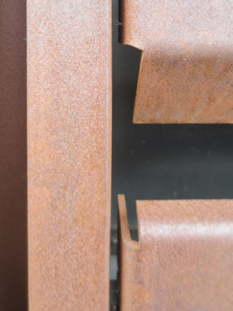
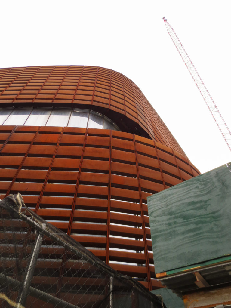
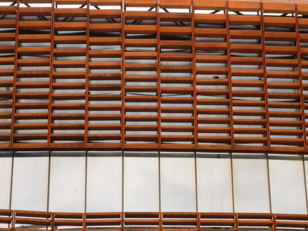
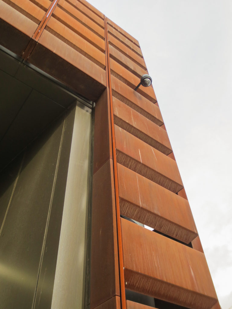
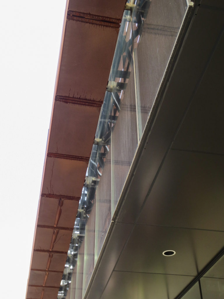
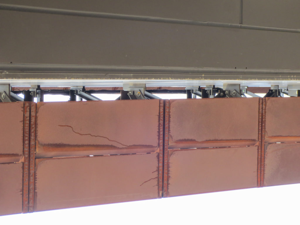
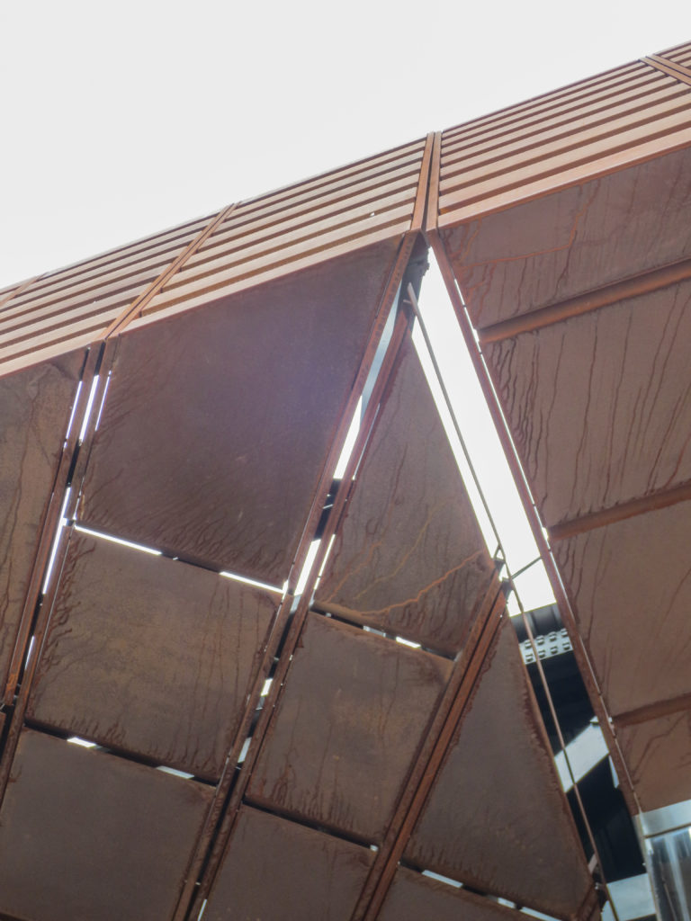
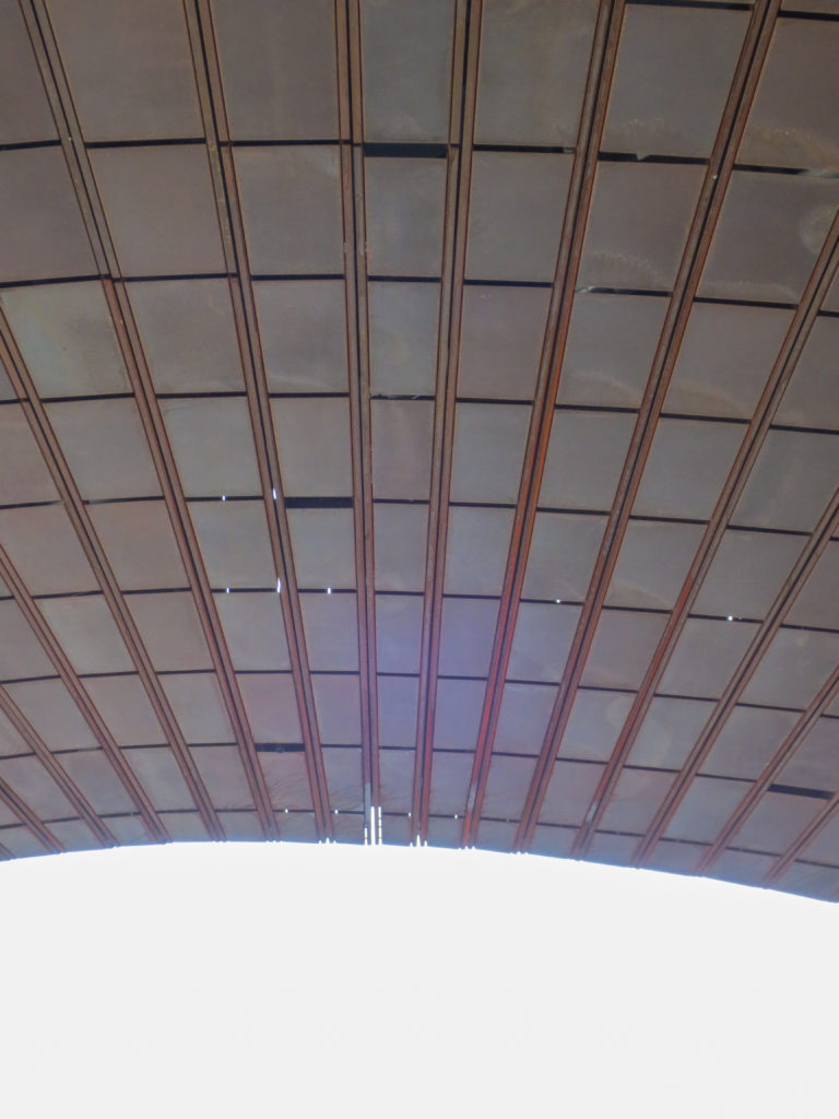
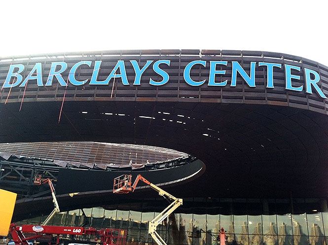
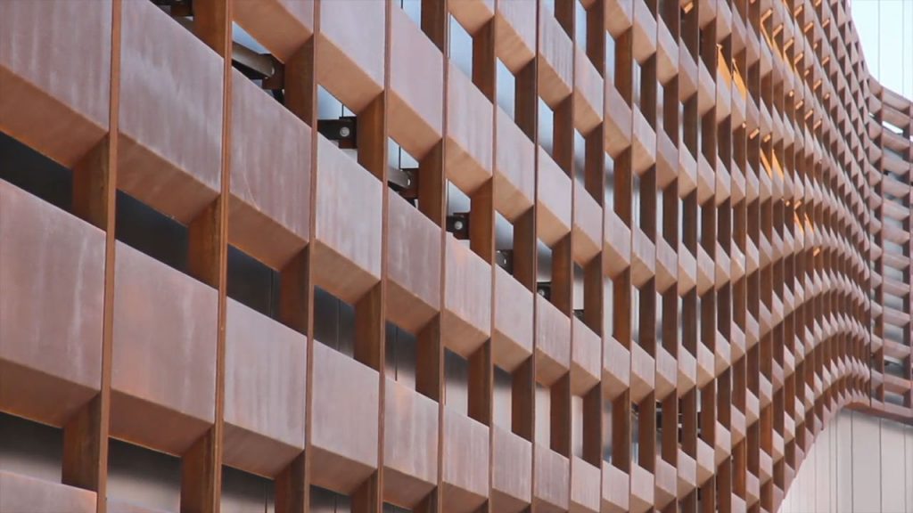
The coating of the facade was in charge of SHoP Architecture, which used the coating by Corten steel mesh formed by 12,000 different pieces designed by computer. These pieces are slightly undulating organic shapes, coated with a rust patina that evokes the construction Brownstone Brooklyn feature, and prevents it forward then destructively bands.
Cover
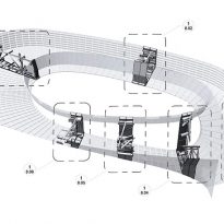
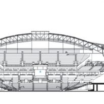
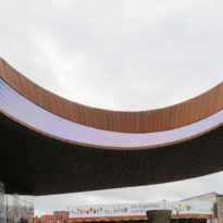
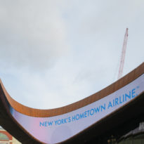
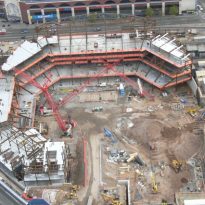
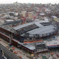
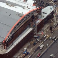
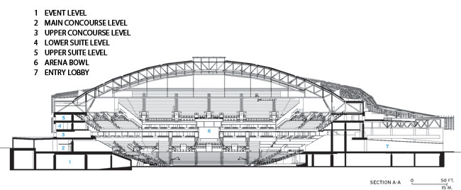
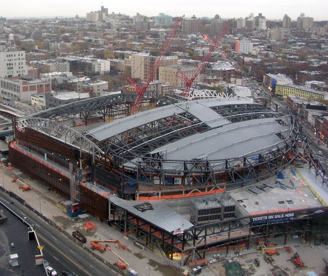
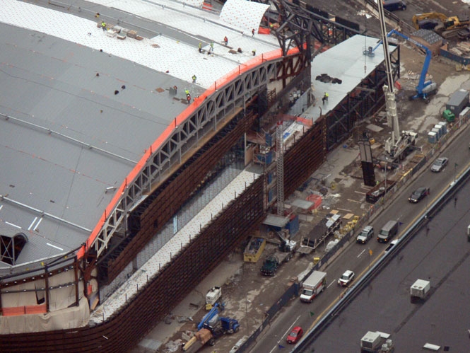
The distinctive arched roof is supported by a pair of arches trussed 106m long, which support truss reinforcement longitudinal direction relative to the sand. The lateral system construction and diaphragms were designed to withstand the forces pushing the roof bows, which were minimized by using a tie tension.
Digital Design

BIM
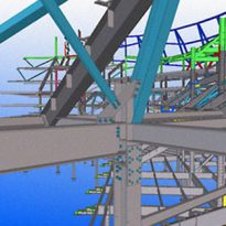
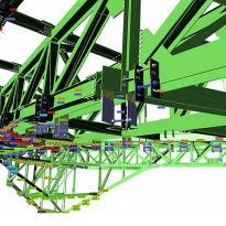
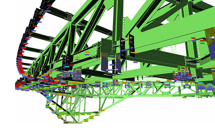
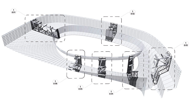
The BIM processor enabled engineers to quickly make steel frames for cantilevered deck.
This steel shell represents a triumph of computer programs, BIM, developing customized and complex geometries.
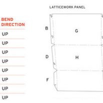
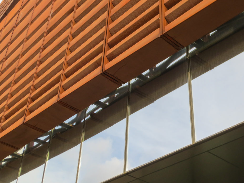
In addition to the corrugations, the spacing of the lattice panels is also varied, giving architects other control lever to adjust the gradient between permeability and coating strength. The panels themselves, of which there are 12,000, each with a single measure, have curves 45 which create a “shadowbox” effect, giving a sense of depth facade.
CATIA
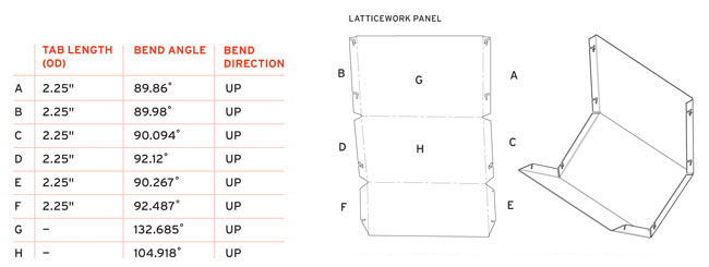
Architects established the surface geometry of the first facade with Rhinoceros and then how CATIA developed. The resulting manufacturing model included details such as thickness, weight, bending radii and length for each piece of the 12,000 panels, no two are alike.
SHoP architects, formed the CATIA program to facilitate the construction of the outside of the building, creating 3-D digital models that facilitated the manufacture and adjustment of the steel parts with its grainy feel and appearance of having been worked manually.
The panels and vertical channels that sustain required a three and a half months of wear and weathering before reaching the site. Made in four batches were subjected between 12 and 16 cycles of wetting and drying per day, up to a limit of 1,000 cycles, achieving at least a year so that Nature would have taken 6 to significantly reduce any setback for continuous exposure outdoors.
“We’ve thought about a lot of materials,” Pasquarelli said. “There was something about the harshness of the industrial raw material, combined with sensual morphology construction and vision, together with the digital quality of the patterns that seemed appropriate metaphor for Brooklyn”.
Glass Curtain Wall
The lattice overlaps a system insulating glass curtain wall, Viracon 13/16-inch VRE1-59 glass laminates comprising aluminum panels and a combination of panels Alucobond 4mm metal compounds with a double layer Kynar custom aluminum sheets 20cm thick.
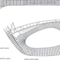
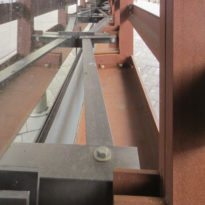
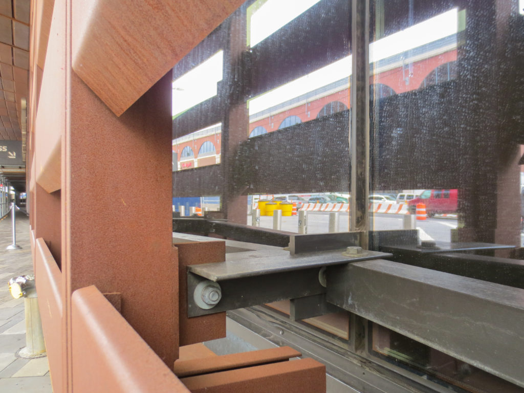
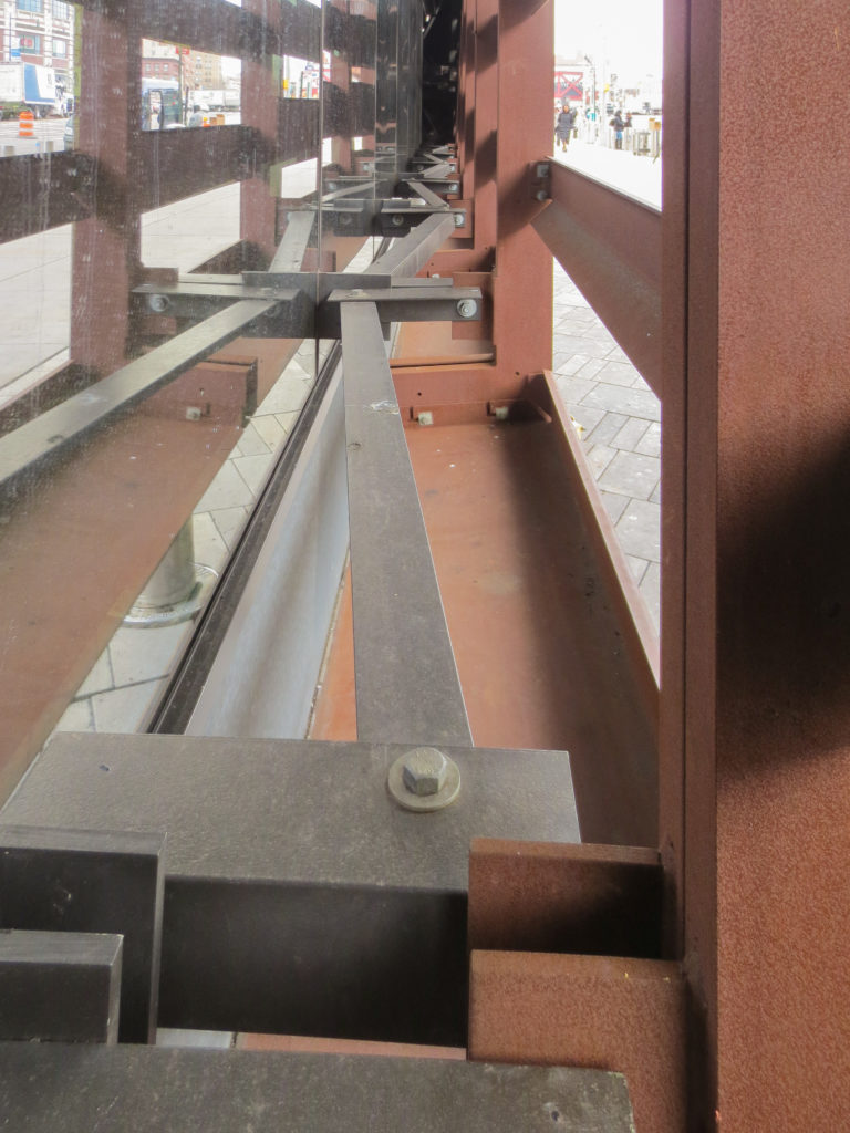
The blinds and curtain wall units were manufactured in unitary mega panels, with dimensions ranging between 12 -15m high x 3 wide. In most places the lattice departs 1.83m glass wall, staying connected to it by a painted steel frame.
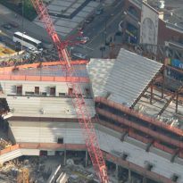
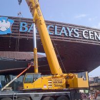
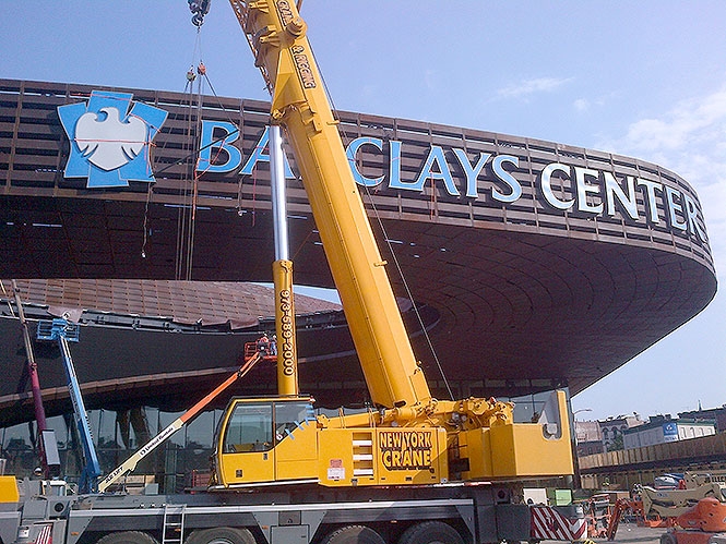
The mega panels were placed by crawler cranes placed and then fixed to the structure with steel supports.
Video
