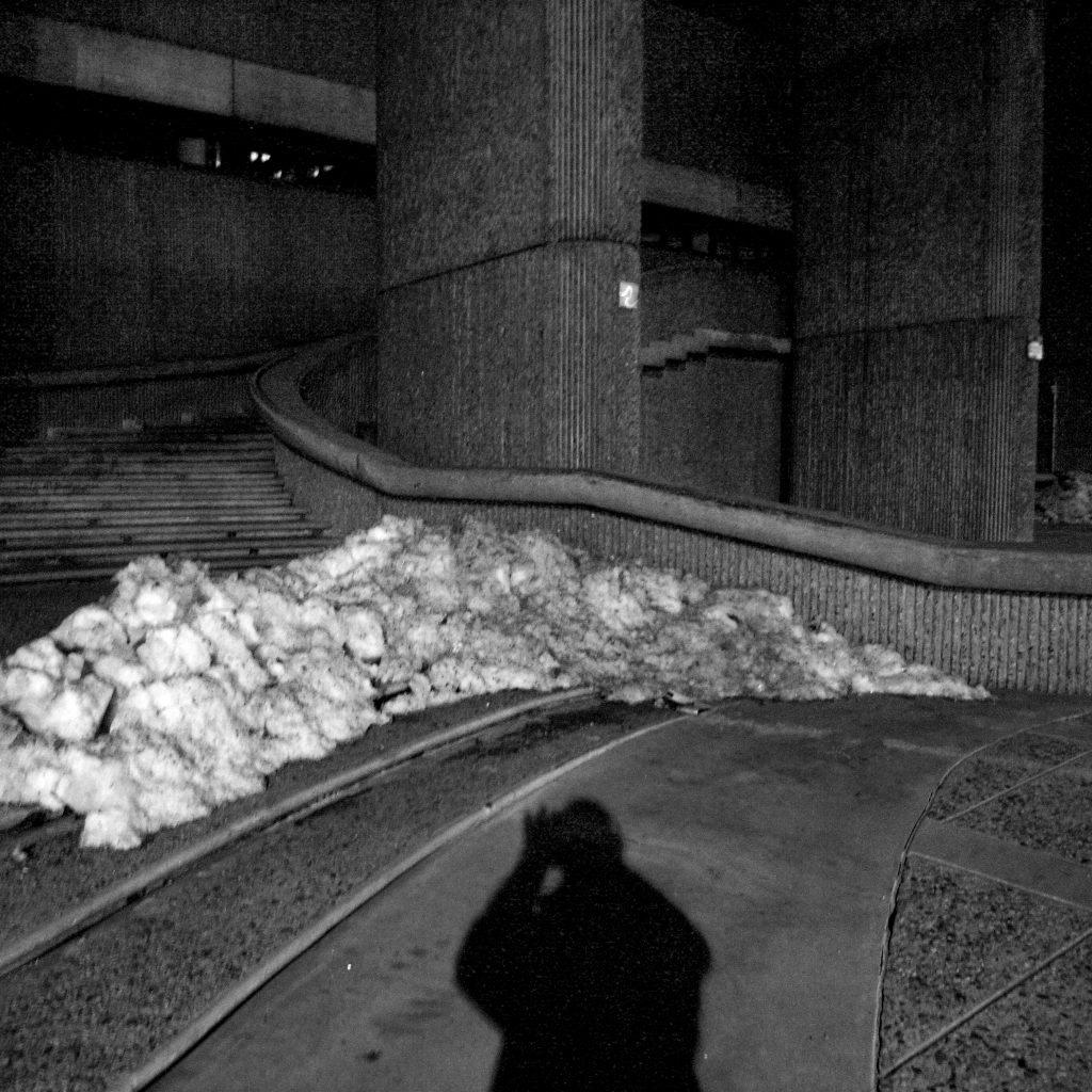
Boston Government Service Center

Introduction
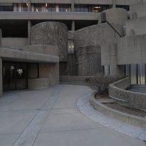
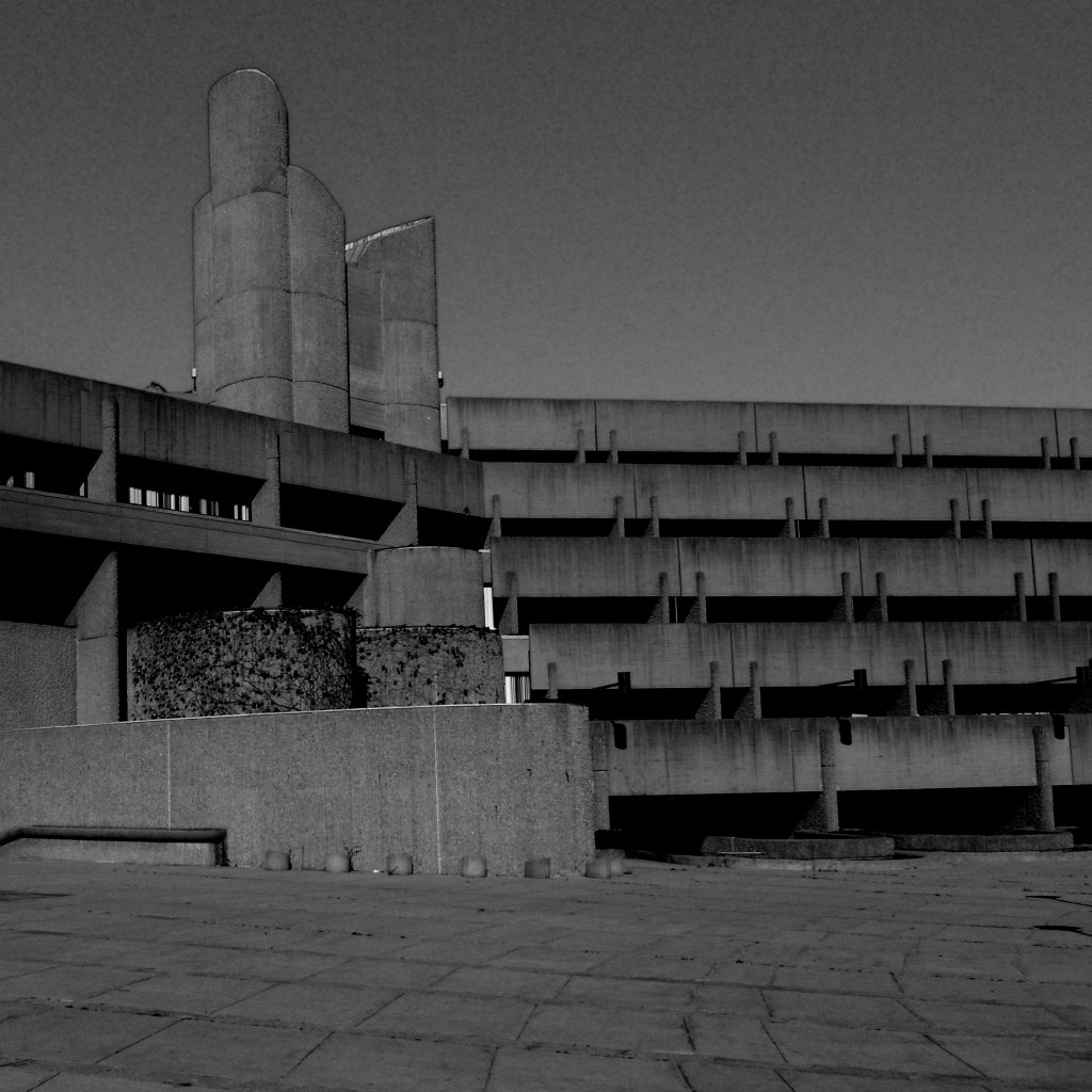
The Government Service Center is a city itself similar to the Barbican in London. It proposes squares and patios on a car park protected by the “body” of the building that allows more or less porous access. The brutalism of this concrete building led him to be named as the “ugliest building in Boston”, competing with the City Hall, its most famous and controversial building.
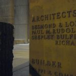
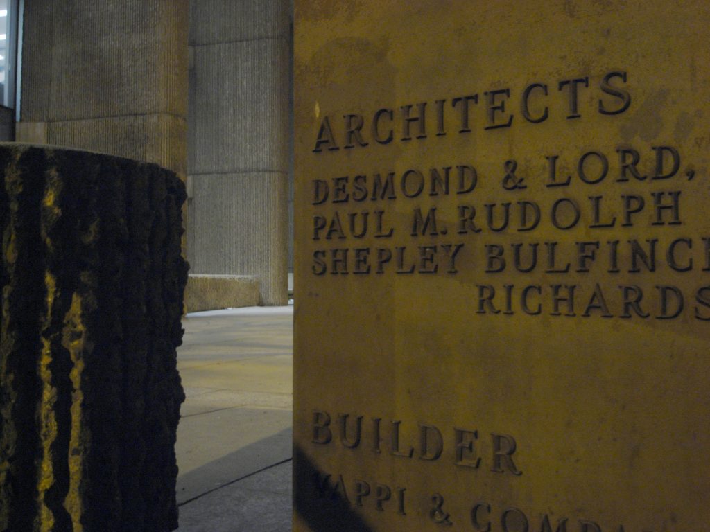
Rudolph was the coordinating architect of the project, assisted by M. A. Dyer, Desmond & Lord and Shepley, Bulfinch, Richardson & Abbott. The project was never completely completed and the citizens contemplate it as another of the great civic steps in false, a problematic development that exemplifies the most alienating qualities of urbanism of the sixties.
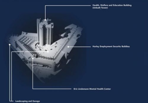
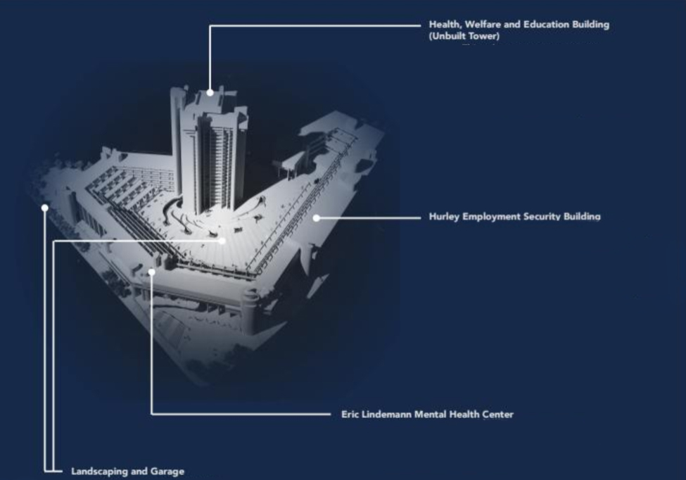
M.A.Dyer together with Desmond & Lord were the designers of the proposed Health, Welfare and Education building that was approved but never built.
Desmond & Lord were together with Rudoph the co-designers of the Eric Lindemann Mental Health Center.
The firm Shepley, Bulfinch, Richardson & Abbott worked together with Paul Rudolph in the creation of the Hurley building.
History
In the early 1960s, when Boston tried to rebuild the city center, it turned to leading architects, such as Paul Rudolph, the influential president of the Yale architecture department, New Haven, Connecticut, seen as a leader in of postwar architecture for questioning what had become the orthodoxy of modernism. Rudolph believed that the ubiquitous glass-walled office buildings of the time made American cities monotonous and boring. The solution, for Rudolph and many contemporaries, was concrete. The solidity offered by this material reminded of traditional masonry buildings and therefore could give urban centers a monumental character appropriate for a strong and self-confident nation. This type of monumentality became known as brutalism, a term that Rudolph never used.
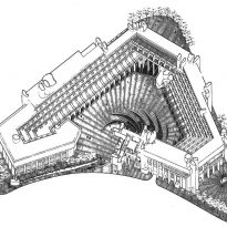
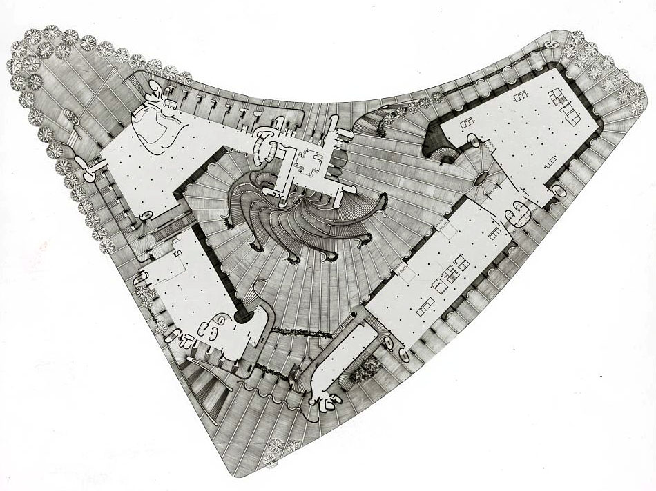
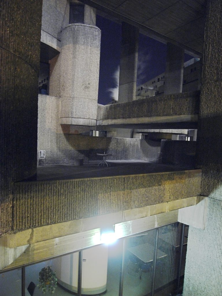
Originally chosen to design only a part of a complex of three buildings, Rudolph took control of the project in 1962 by quickly sketching before the other architects a plan to join the volumes through linked structures. Together, they enclose a fan-shaped patio, the focal point would be a 23-story tower, the “magnet” that would give the address, but it never came to be built. To increase the dramatic sense, Rudolph terraced the spaces surrounding the courtyard, so that they resembled the staggered seats of a theater, suggesting an amphitheater where civic encounters would take place.
Part of the Project had been completed in 1971, but times had begun to change, by the end of the 1960s, the Vietnam War, political assassinations and economic recession had altered the Nation’s environment and economic cuts canceled the construction leaving a large hole where the administrative tower and the Nautilus stairs should have been, which remained a sad presence in the city center for decades.
Interventions
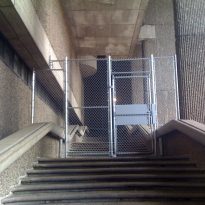
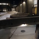
Over the years the Government Service Center became a shadow of what Rudolph imagined. The complex was conceived as a place of celebration and movement, but ill-treatment has made it a rough place, fenced with wire fences on the catwalks that are currently considered too low for pedestrian safety.
IIn 1999, the W. Brooke Palace of Justice, a project by Kallmann McKinnell & Wood, was built in an empty space. At approximately the same time, the patio area was landscaped and stairs, an elevator and a wheelchair access ramp were added. While the additions match the style of the original building, they can be distinguished closely by the different style of striated concrete used, which lacks the rough exposed aggregate.
Although many of the stairs, terraces and protected places are closed to the public at night, these are used by the city’s homeless population to sleep and protect themselves from the weather.
The outer plaza on the north side, which in Rudolph’s original drawings is full of benches, trees and people, is now a parking lot with a wire fence around it.
Location
The building occupies most of a large superblock created when the former West End of Boston, United States, was destroyed in the name of urban renewal. The area was crossed by narrow streets and in the center between Staniford, Merrimac and New Chardon streets this controversial structure rises.
The complex is relatively low if compared to the surrounding context. The highest part is around 27.43m, while the range of surrounding buildings is between 46-122 meters.
Concept
Rudolph‘s ambitions were high: the mental health center of more than 20,900m2 is one of the three buildings originally designed to compose the Government Service Center. As the coordinating architect imagined a square anchored in a 23-story tower. However, due to the funding cuts imposed during the last stages of the project, the tower was never built, leaving Boston with the Rudolph-designed mental health center and the Charles F. Hurley joint building.
The design of the complex was inspired by the idea of an amphitheater that allowed citizens to experience civic dramas. Rudolph interpreted the grand and monumental structure as an appropriate space for the goals of the great society.
It was no coincidence the great contrast between the new building and the one that houses the City Hall. Rudolph designed the complex not as another bureaucratic bunker, but as a public space that could offer a clear and human counterpoint to the philosophy that shaped the City Hall Plaza. For many reasons it never flourished or worked as expected.
In this project the architect used the same technique as in one of his best known works, the Yale Building of Art and Architecture. Determined to shake the status quo of boring glass office towers, Rudolph saw concrete creations as a way of injecting personality into American cities, although he never used the term “brutalism” to define his approach.
Spaces
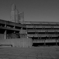
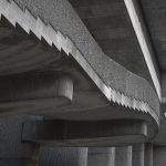
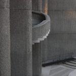
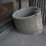
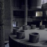
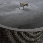
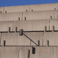
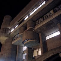
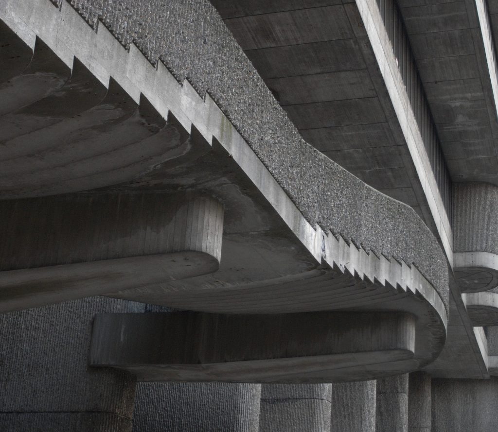
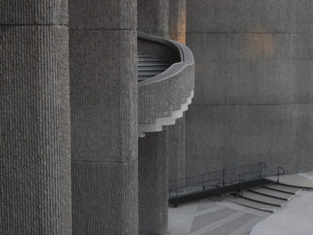
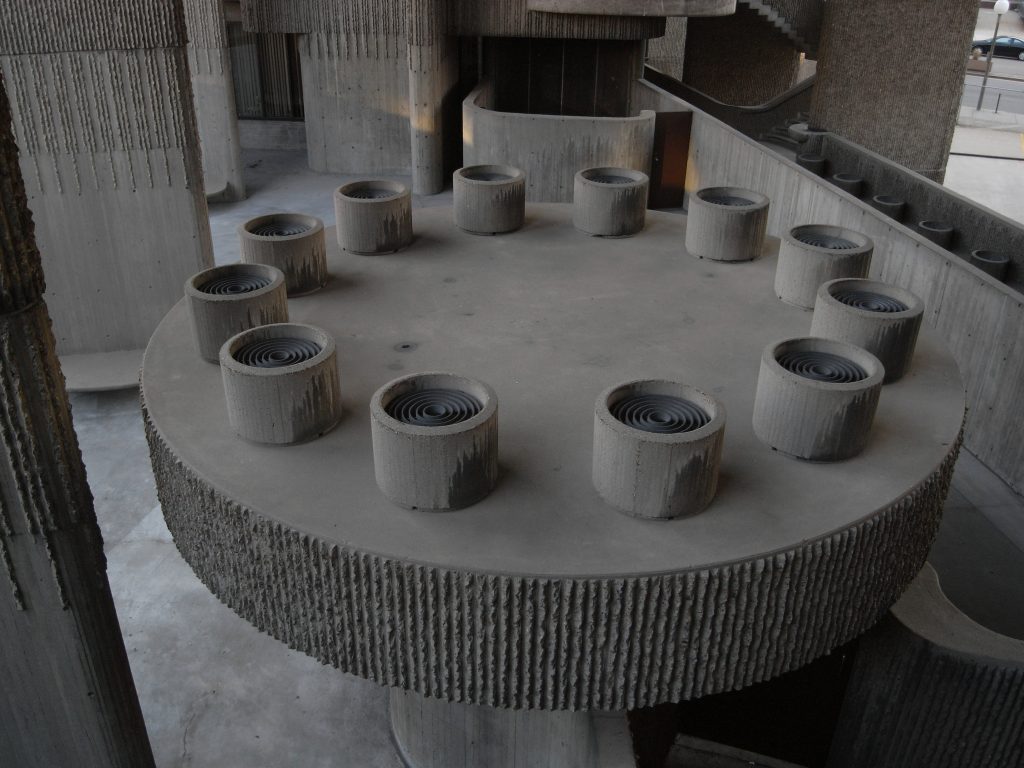
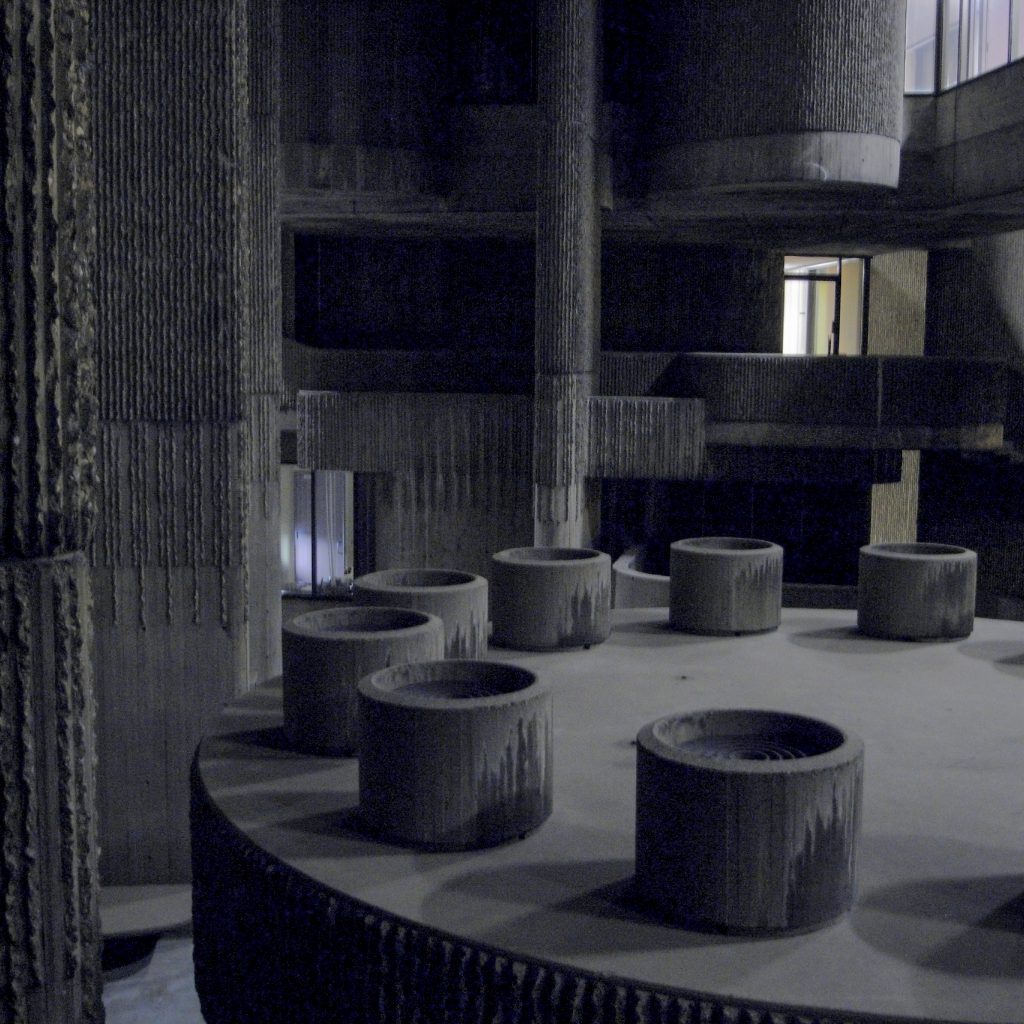
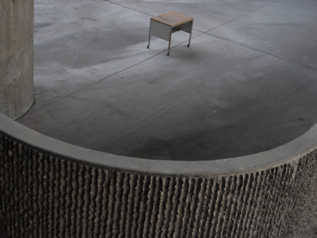
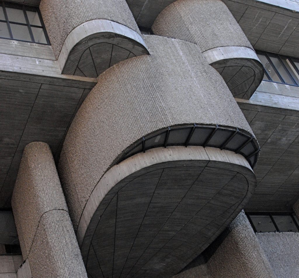
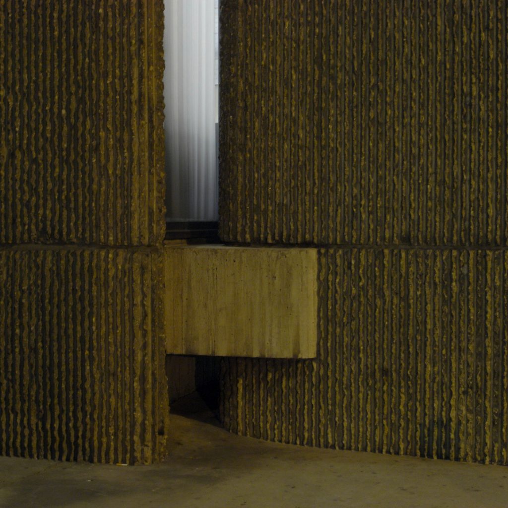
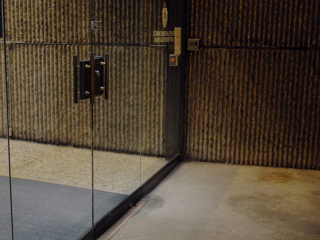
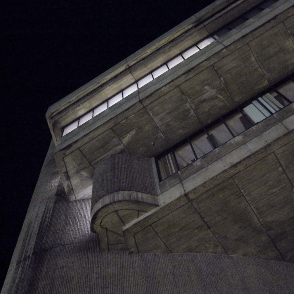
Even without the tower that was to serve as an anchor, the complex is a surprising presence, with its greatness enhanced by dramatic projections and dark shadows cast by its shapes. The building seems to rise from the ground on large cylinders while a curved staircase floats on one side offering a portal to the center. Perhaps the most distinctive feature is its undulating walls, which the workers finished by hand, first by molding the concrete into wooden molds with ribs and then using hammers to cut the aggregate. With a balance of form and function, the texture masks large discolored outer stripes, the result of its exposure to the weather.
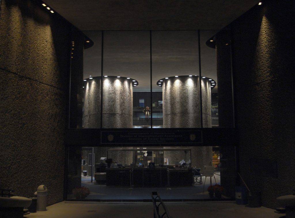
The unfinished complex was formed by two connected bodies, the Charles F. Hurley Building and the Erich Lindemann Mental Health Center. The Hurley section houses the Unemployment Assistance Division and other state government offices. The structure includes a two-level parking partially hidden under the patio.
Mental Health Building
The Erich Lindemann Mental Health Center is a large mass of concrete that is part of a complex of incomplete buildings. Designed by Paul Rudolph in 1962 and completed in 1971, the brutalist creation is a decidedly imposing presence only a few blocks away from the City Hall, a presence that would have been overshadowed by a much larger brutalist tower, if everything had gone according to the architect’s plan .
Putting into practice his conviction that non-orthogonal geometry was beneficial and even therapeutic, Rudolph designed the oval-shaped rooms and curved corridors lined with corrugated concrete. Curved benches and wooden shelves were also placed in the common spaces, including one of them set up a stage and a dressing room so that amateur works could be carried out as a way to stimulate and unite people. Such facilities, like the rest of the complex, contrasted powerfully with the concise functionalism that is usually considered adequate for public facilities.
Hurley Building
The Hurley section houses the Unemployment Assistance Division and other state government offices.
Courtyard
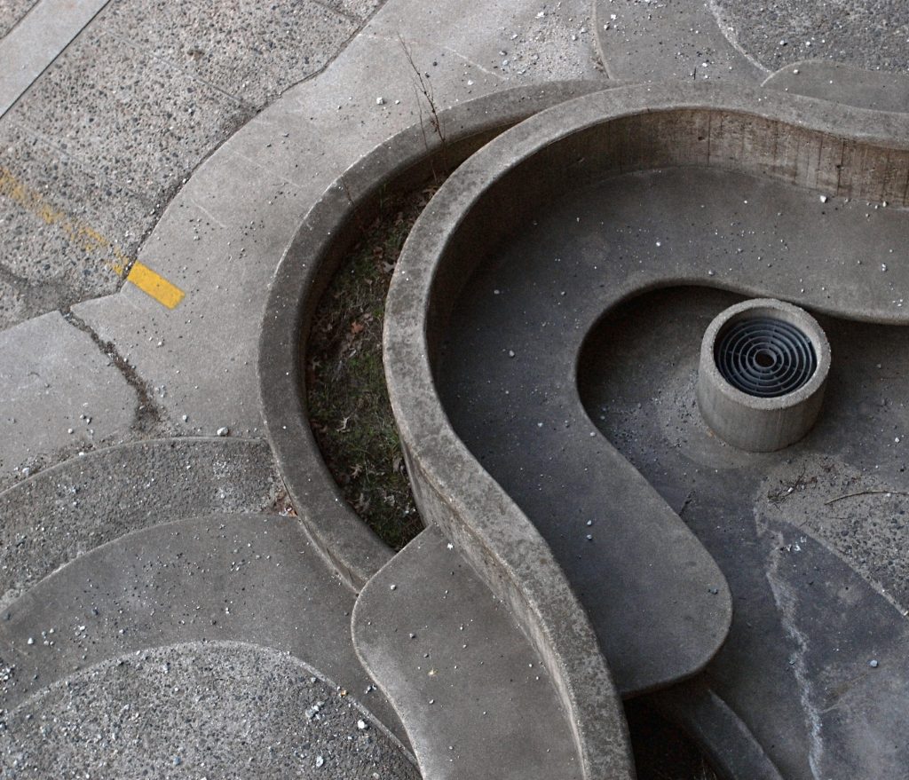
Each element of the courtyard was intended to create a contrast with the Town Hall Square. This was flat while the surface of Rudolph’s inner courtyard was subtly inclined to attract users to a set of curved shell-shaped stairs at the base of the tower, the Nautilus staircase. This would be a meeting place, an unforgettable reference point compared to the City Hall Plaza relatively without distinctive features. Rudolph’s courtyard included incised lines to lead visitors through its varied spaces. In this way he hoped to stimulate different emotional reactions, comparable to the sense of sublime refuge that people feel when they encounter the immense square and St. Peter’s Basilica in Rome.
Structure and Materials
In his design for the Government Service Center, the architect mixes the straight lines he used in Yale with extravagant curved shapes like those that appear in the Endo Pharmaceutical Laboratories on Long Island. In this case, most of the curved surfaces are concentrated in the Lindemann Building.
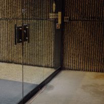
The building bears the undisputed signature of Rudolph in the use of concrete, both on external and internal surfaces. The architect turned to hammered concrete, also known as “corduroy concrete” that he had already used in the Yale Building of Art and Architecture.
Many of the built sectors do not comply with the current standards for construction, such as the emergency exit or the monumental stairs whose integrated railings, also of concrete, do not have the statutory height. The same goes for the tube railings placed in the stair cores in the Hurley building and with the width of the steps.
Hurley Building
The type plant of the Hurley Building is open with perimeter offices and cubicles in the center. The dividing walls are removable modular with built-in electrical and telephone connections.
In addition to the concrete cores and exterior walls, Hurley’s interior resembles a regular office building configuration of the time, with little natural light input due to the deep floor plates.
Lindemann building
The Lindemann Building follows a different typology due to its use as a health facility. The interior walls combine finished concrete with other plaster coated on a metal wire mesh 12.7cm wide.
The clinical and patient rooms extend along the interior of the floor plate, a design that often causes some disorientation.
