Amon Carter Museum of American Art
Introduction
Although Amon G. Carter, a Fort Worth publisher and philanthropist, and Philip Johnson, a renowned New York architect, never met, their visions merged to create a museum now celebrated for its exceptional collection of American art. Carter did not live to see his dream of establishing a grand public museum to showcase his extensive American art collection and passed away in 1955, 6 years before the museum was inaugurated in 1961.
While the building has expanded and adapted over time, it remains primarily a place for individuals to experience American art.
In 1958, architect Philip Johnson was commissioned to design a building that would house Carter’s art collections and simultaneously serve as a tribute to the museum’s founder. The magnificent view from the site was one reason Johnson found the project particularly inspiring. The result was a meticulously detailed, beautifully illuminated building, perched atop one of the few hills in this flat terrain. While its sophisticated construction and the materials used seemed somewhat incongruous with its location and the objects it was to exhibit, it demonstrated that the West was no longer as wild as some “non-Texans” might believe. This polished, vaguely “European” museum feels right at home.
In any case, no museum can be designed to hold only the original collection of its donors, and given the rising enthusiasm for modern art throughout Texas, the Amon Carter Museum might house vastly different works in a decade or two.
Location
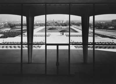
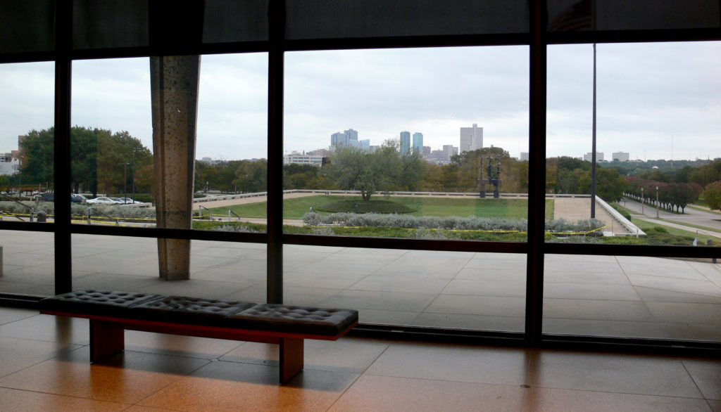
The museum stands on a gentle slope at 3501 Camp Bowie Blvd, overlooking downtown Fort Worth, Texas, USA. The location was personally chosen by Amon Carter in 1951, and Johnson situated the building as high up on the hill as possible to maximize the panoramic view to the east.
The museum has become part of the city’s “museum district”, alongside Louis Kahn’s Kimbell Art Museum and Tadao Ando’s Modern Art Museum of Fort Worth.
Concept

Inspired by the Renaissance-style loggia, an open, covered gallery facing an open plaza, Johnson‘s design confronts an expansive grass-covered plaza encircled by a walkway. In this project, Johnson reaffirms his architecturally simple, adornment-free international style, blending classical structure with modern materials.
Spaces
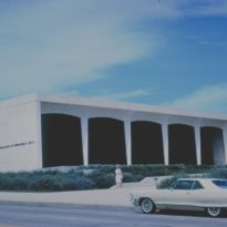
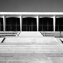
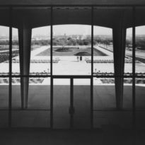
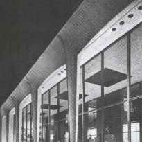
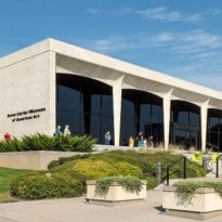
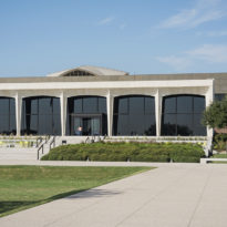
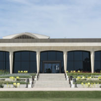
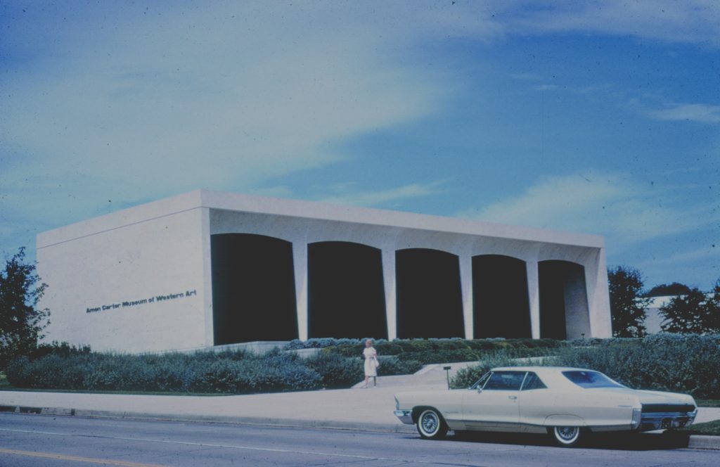
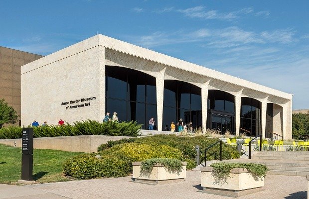
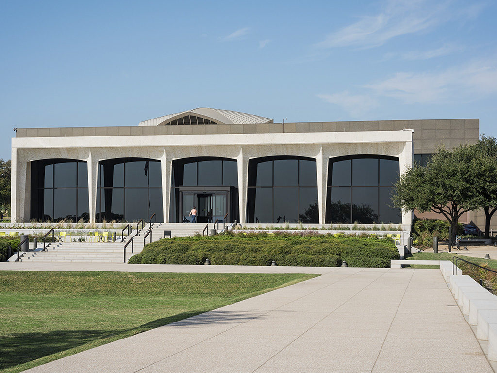
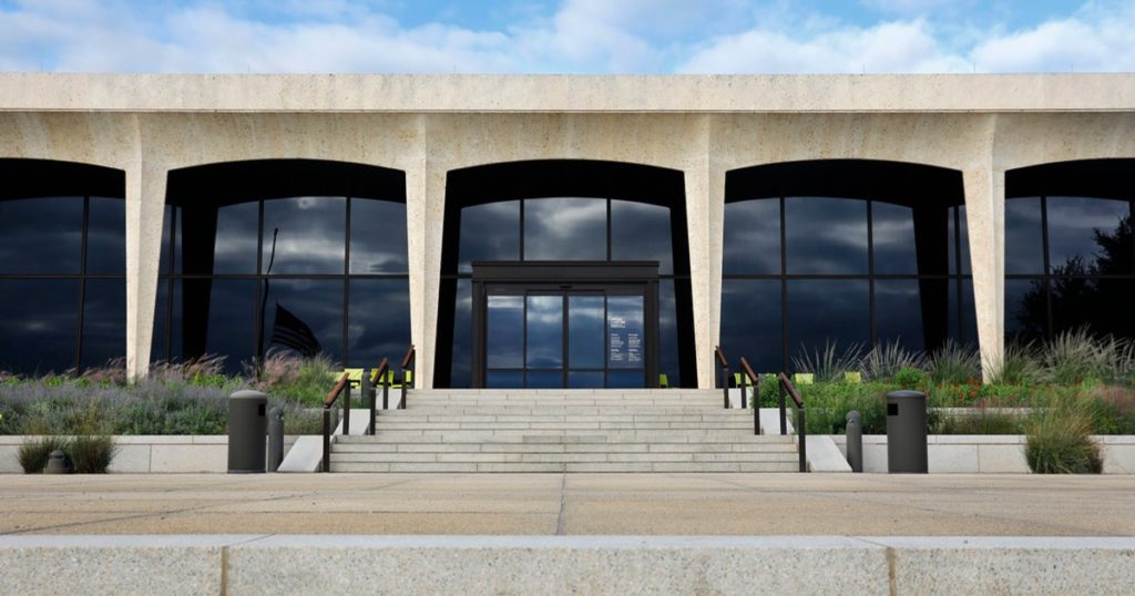
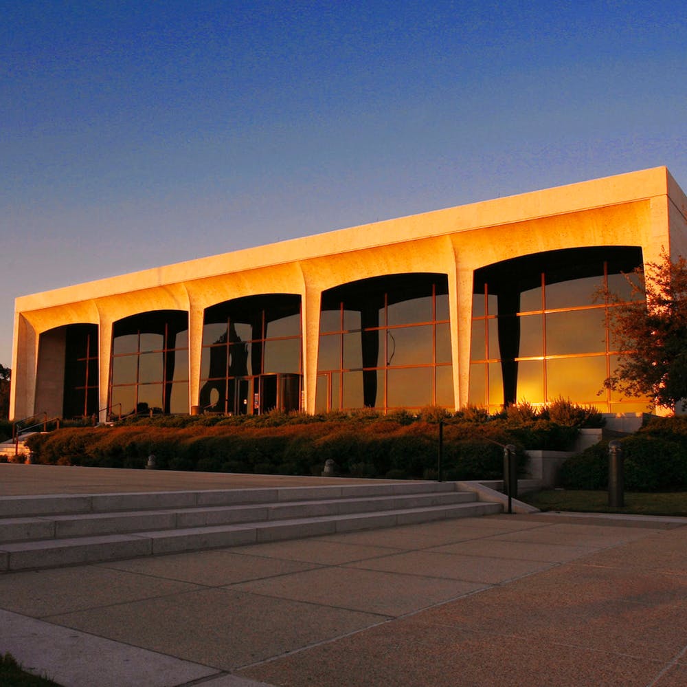
The main facade features a two-story glass curtain wall with bronze mullions, shielded by a portico of five arches looking eastward, towards the city. Johnson believed this curtain wall separated “art from the city, the cool from the warm, the peaceful from the active, the calm from the windy.”
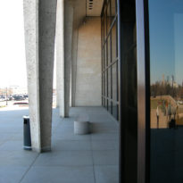
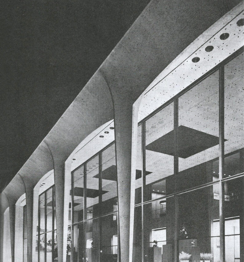
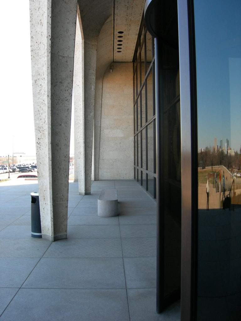
The grand portico or loggia, reminiscent of many classical and Renaissance Italian structures, is supported by conical limestone pillars, concave on four sides, ending in small cross-shaped bases. Initially, these conical columns were controversial and described as “ballet classicism.”
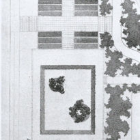
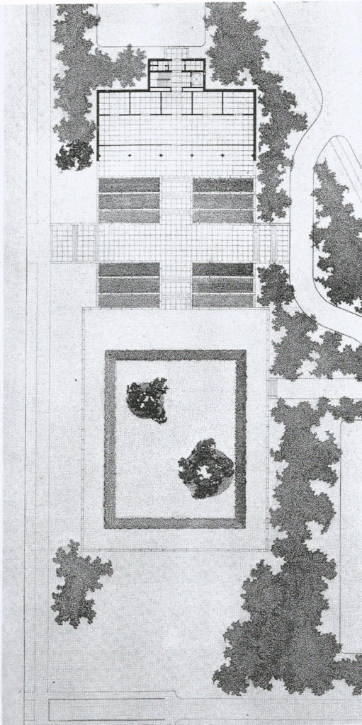
Taking advantage of available outdoor space, Johnson designed a processional entrance with granite steps in a series of landings and platforms. These steps and terraces point toward the city, with a broad sunken, grass-covered plaza as the centerpiece. This plaza, 141×318 feet, aligns the museum with the city’s axis, much like the three bronze sculptures by Henry Moore acquired by the museum in 1962 and displayed on a single Johnson-designed base.
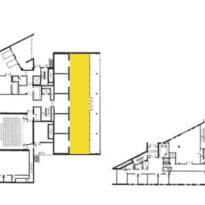
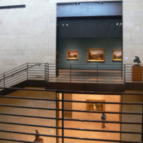
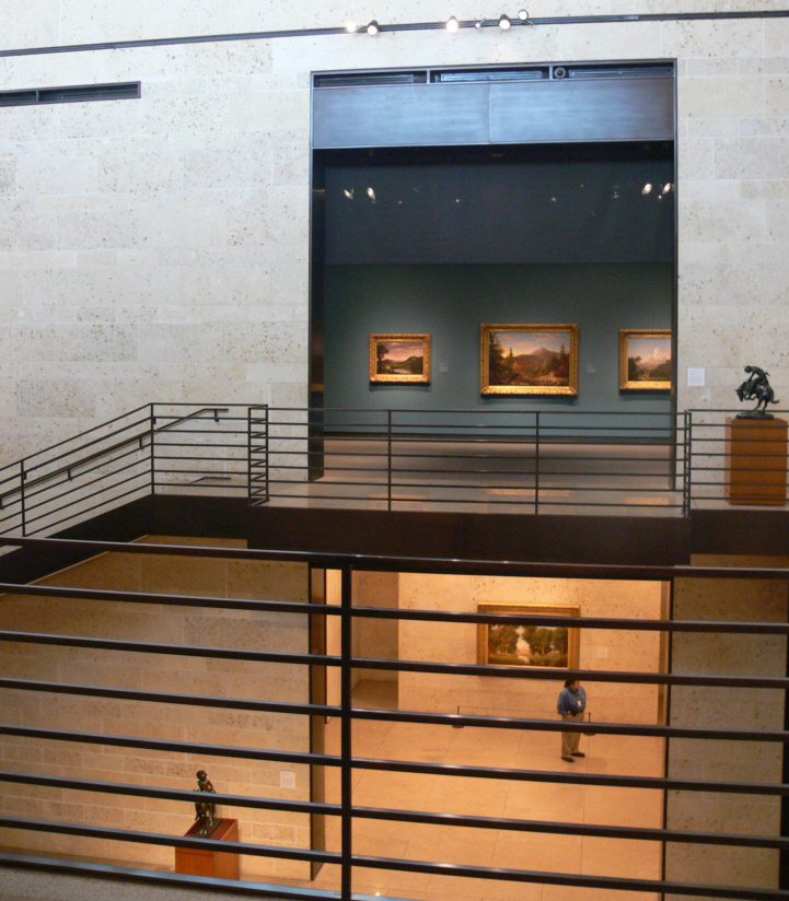
The main entrance leads directly to a two-story lobby, 24 feet wide and 121 feet long, adorned with Texas stone embedded with shells, dark extruded bronze, brown teak, and pink and gray granite floors. Beyond this lobby, Johnson designed five intimate galleries of equal size overlooking the central space. On the mezzanine, he placed five similar rooms for a library and offices that over time function as galleries for rotating exhibitions, each with a balcony overlooking the main space.
Extensions
1964
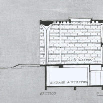
Although the museum was initially conceived as a small commemorative space, rapid collection growth demanded additional space, and so in 1964, Joseph R. Pelich, who was Johnson‘s associate architect in the original project, designed a 14,250 square-foot extension in the basement for offices, a bookstore, research library, and a vault for art storage. Pelich consulted with Johnson to ensure coherence with the original design.
1977
In 1977, Philip Johnson, along with his partner John Burgee, designed a new expansion for the museum. This 36,600-square-foot addition included more office space, a new two-story storage vault, an expanded library, and a 105-seat auditorium.
1999
The collection kept growing to the point where all previous expansions were utilized to full capacity and were still insufficient to accommodate all the art the museum had in hand. And so in 1999 the museum shut down temporarily in order to execute a reorganization and further expansions, once again following Johnson‘s design.
The museum, which Johnson himself referred to as “the building of my career,” underwent work for two years, providing three times more space. The 1961 design was restored, removing the subsequent two extensions. With a total area of 50,000 square feet, 28,000 of which are exhibition areas, the museum reopened on October 21, 2001.
Current Building
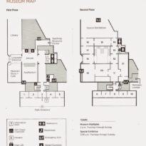
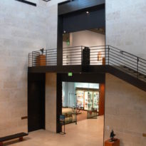
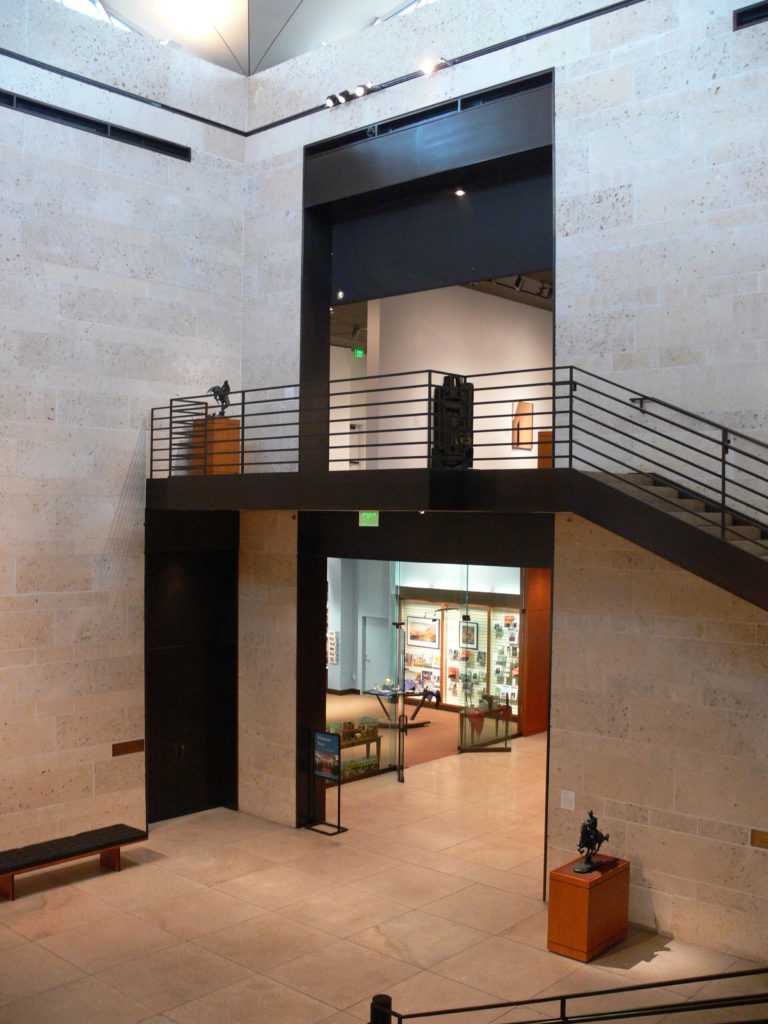
The 2001 expansion follows the footprint of previous additions. To visually set it apart from the original building, it was clad in dark Arabian granite. The expansion’s most striking feature is a central atrium, rising almost 56 feet from the floor, topped by a curved roof with side windows, known as the Lantern. The atrium’s interior walls are adorned with the signature shell-studded stone, and a double staircase ascends from the atrium to a gallery complex on the second floor. This space showcases selections from the museum’s permanent collection and special exhibitions.
The 2001 extension by Philip Johnson includes a 160-seat auditorium, climate-controlled vaults for photo storage, a photography and paper conservation lab, a research library, a museum bookstore, and a storage facility.
Materials
Johnson‘s design is simple and elegant, combining the warmth of bronze with the creamy, intricately patterned surface of native Texas stone embedded with seashells, treated in the style of Italian travertine. Brown teak wood and pink and gray granite were also used.
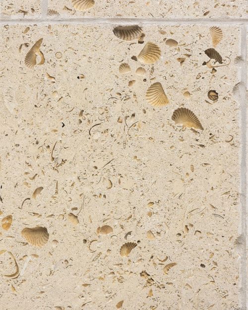
The facade’s arches and the supporting conical columns are covered in native Texas stone, as are the remaining exterior walls. In the most recent extension, to distinguish it from the original building, exterior walls were clad in dark granite.
Columns
The Amon Carter Museum, in all its sophisticated details, exudes restraint and good taste. Yet, it’s not “pure” in the conventional sense: the portico appears to be concrete-made, but the conical columns were carved in sections, wrapped around a central tubular column. Johnson defended this approach, referencing ancient Greek temple architecture, where many details were initially wood-made and then painted to mimic marble. These shell-like concave shapes were hand-carved, making it appear far more elegant than the typical flat or convex stone cladding.
Lighting
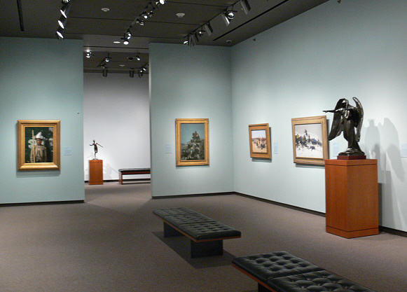
One of the most outstanding features of the museum is its masterful use of lighting. light is more intense on the sculpture groups, but what’s truly impressive is the discreet placement of the light sources. Unless a visitor deliberately stands beneath one of the large ceiling fixtures to look up, the sources remain virtually invisible.
The museum employs large, 2-foot-deep aluminum boxes in the ceiling, which serve the dual purpose of providing both natural and artificial lighting. They’re designed to mitigate the glare from daylight, each accompanied by a skylight that provides natural illumination during the day. Within these boxes, a series of 36 high-intensity sealed fixtures are nested inside carefully designed, shielded cones, which are painted black on the inside. This meticulous design ensures that all reflections are negated, thus hiding the direct light source from any observer’s angle.
Beyond these technicalities, the result is an interior that places the art in the spotlight—quite literally. The overall design ensures that while the artworks are brilliantly illuminated, and the mechanisms behind the magic remain concealed, granting undistracted prominence to the museum’s exhibits.
