Neue Nationalgalerie

Introduction
The Neue Nationalgalerie (New National Gallery) is the latest work of renowned architect Mies van der Rohe, who died shortly before his inauguration, and first performed in Berlin, his hometown.
In the early sixties, Germany created a large area dedicated to cultural facilities close to the Berlin Wall, called Kulturforum. This includes Matthiaskirche (1845), the building of the Berlin Philharmonic, five small museums and the State Library. The first building, completed in 1963, was the Philharmonic Scharoun. The second, the future site of the New National Gallery (Neue Nationalgalerie), was commissioned Mies van der Rohe who was at the time, projecting Schäfer Museum in Schweinfurt. This museum, but it was never built, is part of a series that begins with the project for building Bacardi offices in Santiago de Cuba (1957) and characterized by the use of large platforms, a square, orthogonal grids, fences behind the structure, and supports cross. In more general terms, we find a more distant background in the proposed museum for a small town (1942), which acts as the matrix of the concerns of Mies proyectuales in its American stage, visible in the House 50 x 50, at Crown Hall or in the above projects.
This work was a new way of thinking and understand a museum, away from the closed building composed of many theme rooms, to create a large open space, glass, open and versatile.
Here are clearly legible patents and the principles and how to work the architect, where the concept of “less is more” becomes absolutely meaningless. Next to German Pavilion Barcelona is considered one of the main examples of structural abstraction of the International Style. It is one of the most symbolic of the search and refined elegance of the conceptual simplicity and constructive.
Mies was adamant in its pursuit of perfection. When the space between the infinitely flexible glass facades was inappropriate to display art, the architect of the complex without reply was: “It is so huge that a corridor of course means great hardship for the exhibition of art. I am fully aware of that. But it has such potential that I can not just take into account these difficulties. ”
Mies also rejected a request from the National Gallery of extending the underground area of the building because the expansion – for being invisible underground – would have compromised cubic perfect proportions of the building.
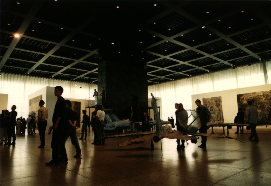
This is one of the three main sites displaying the collections of the National Gallery. The others are the Old National Gallery (Alte Nationalgalerie) which displays collections of the nineteenth century, and the Hamburger Bahnhof, for contemporary art. The Neue Nationalgalerie is mainly dedicated to the art of the twentieth century, with particular emphasis on works from the Bauhaus, expressionism, cubism and surrealism. It contains works by Klee, Munch, Kandinsky and Pablo Picasso, among other important artists in its permanent exhibition. It also serves as a room for temporary exhibitions.
The Neue Nationalgalerie is often compared to the Altes Museum in Berlin, designed by Schinkel, one of the most renowned architects of the nineteenth century. As in the work of Mies, the Altes Museum (in the language of classical architecture) is not their role but is based on its geometry. The austerity in the composition of Mies is usually seen as an interpretation of the classic system of columns and beams, with little reference to the role of the building, except for adding transparency in their facades.
The building offers a stark contrast with other buildings in the Kulturforum, designed at the same time by Hans Scharoun, the Philharmonic, and Kammermusiksaal Staatsbibliothek, more related to the expressions used by Mies International Style.
The gallery is visited by over 100,000 people annually.
Situation
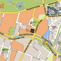
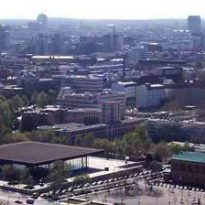
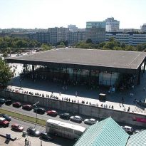
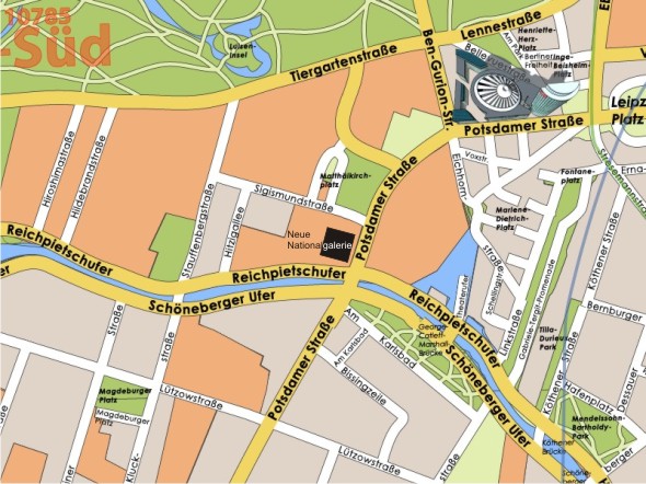
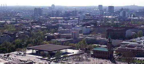
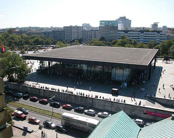
It is located in a central position and very accessible in Berlin as part of the area called Kulturforum, south of the Tiergarten and west of Potsdamer Platz, next to the Philharmonic.
Among the streets around the ground, there is a significant gap.
Concept
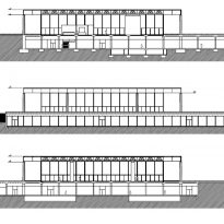
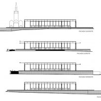
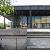
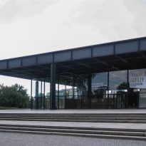
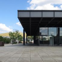
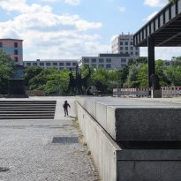
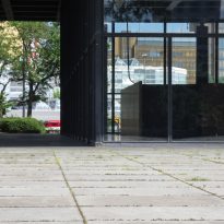
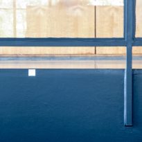
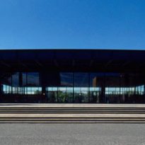
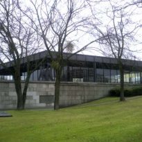
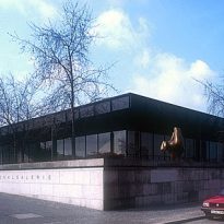
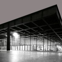
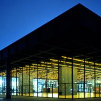
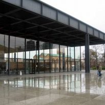
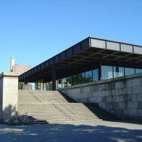
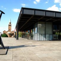
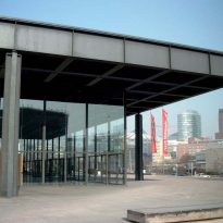
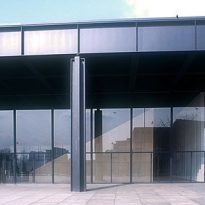
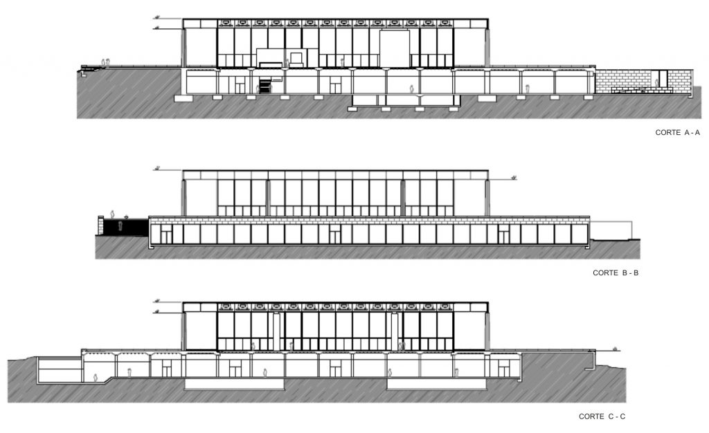
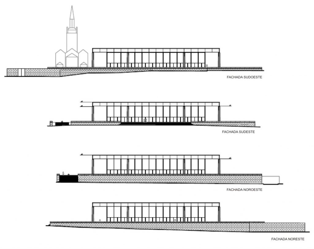
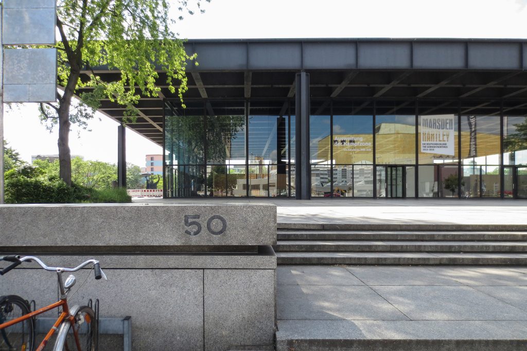
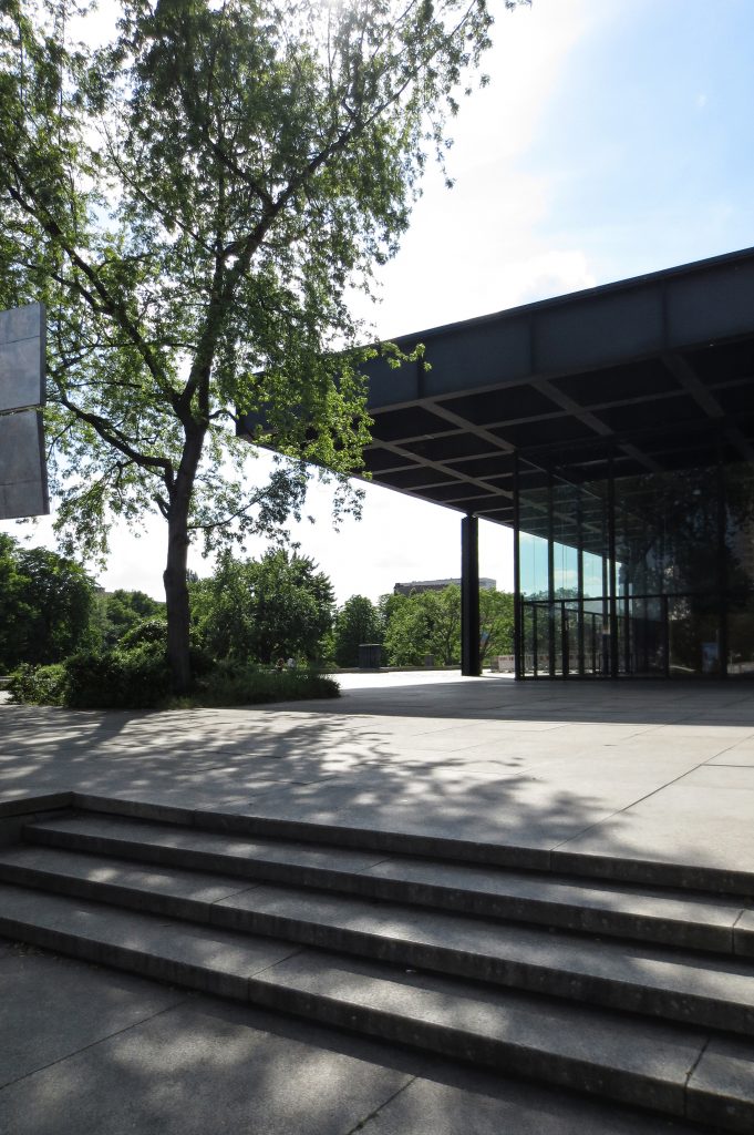
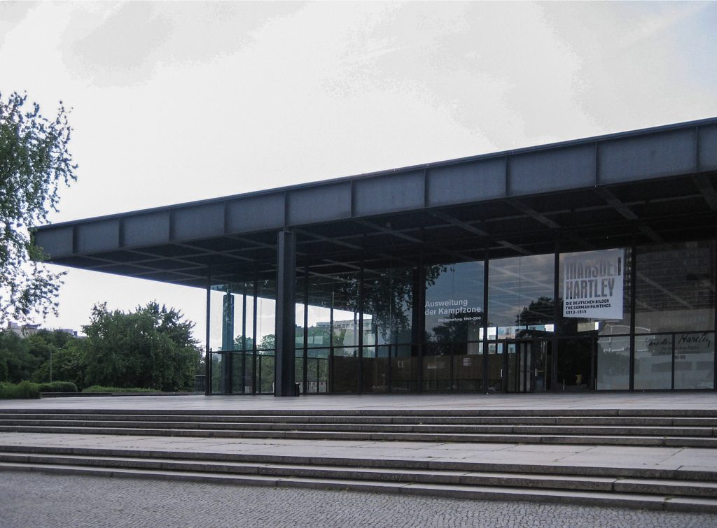
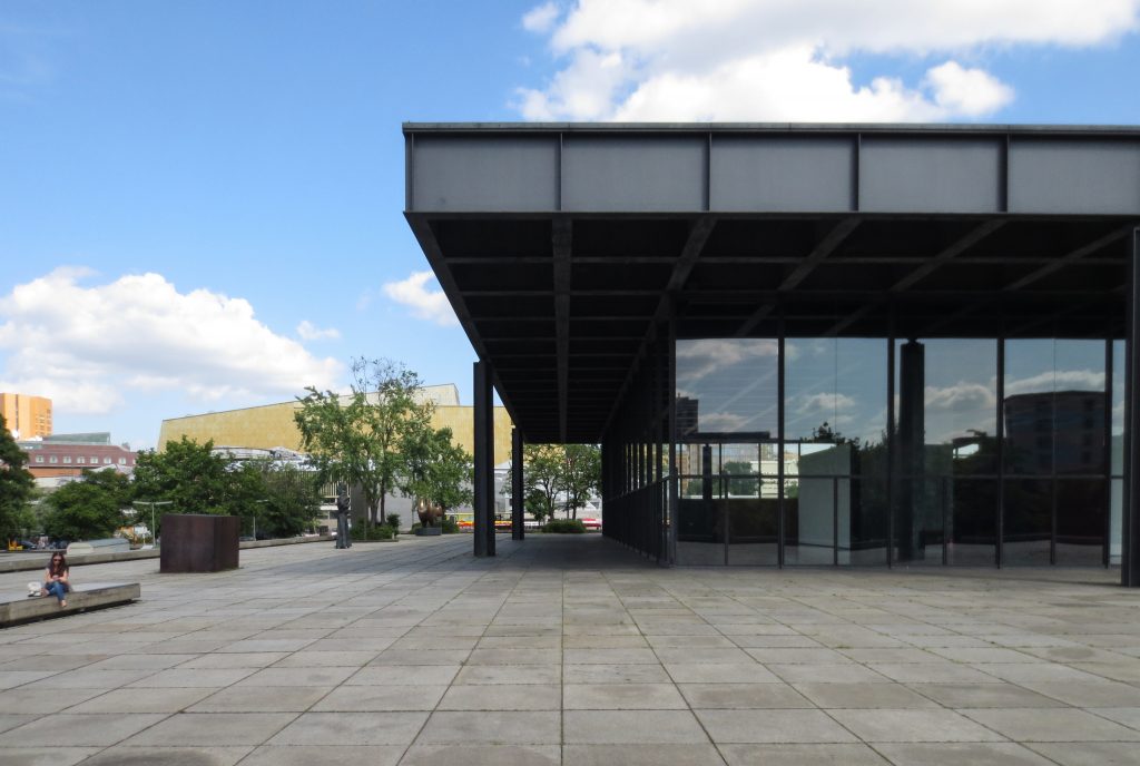
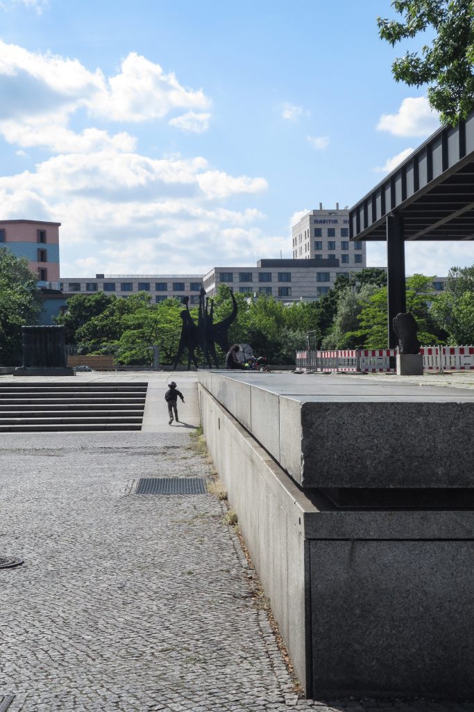
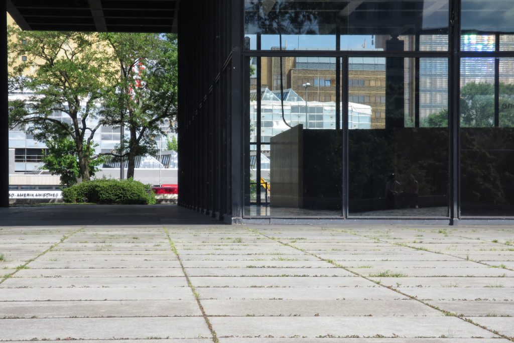
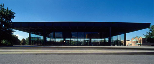
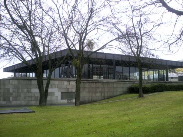
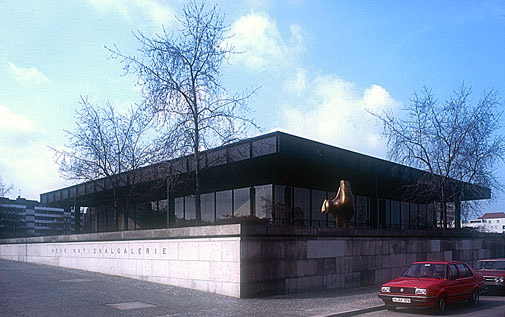
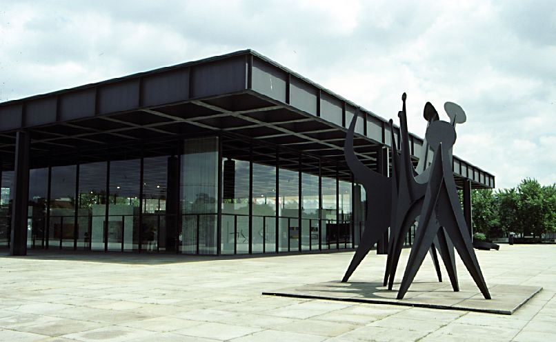
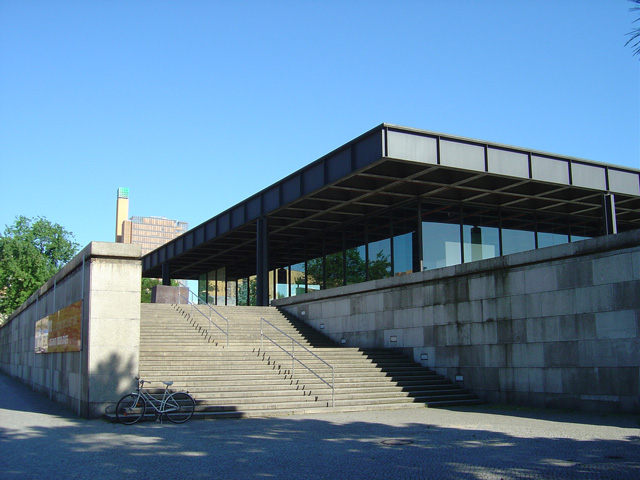
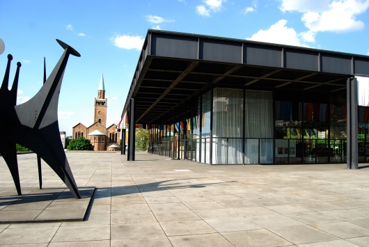
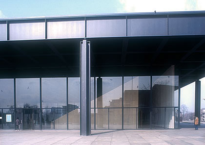
The building is read as a steel and glass that rises on a stone plinth, generated by the difference in levels of the street.
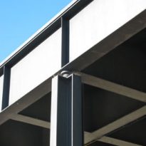
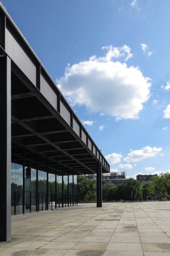
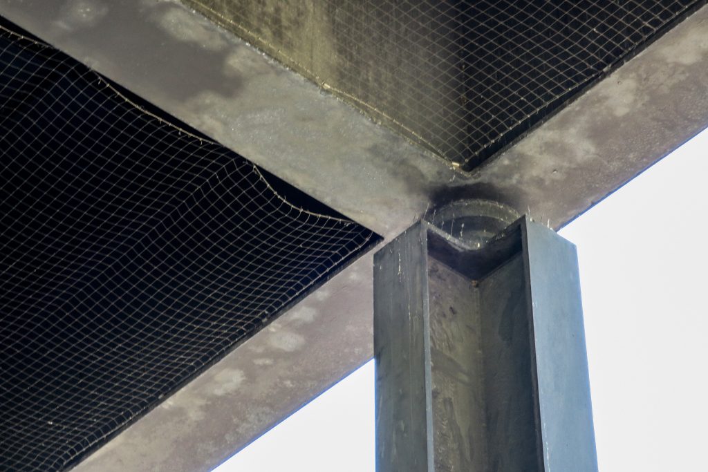
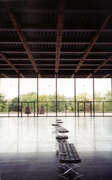
It is a steel structure, severely geometric, which governs the form throughout the building as a computer, since its overall scale, the smallest detail: the deck – support – enclosure. Although this is not presented as a building block, but it is quite flexible.
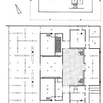
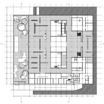
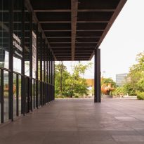
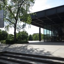
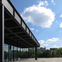
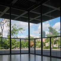
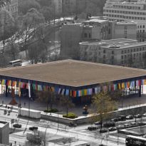
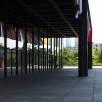
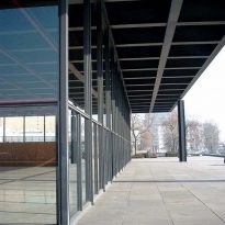
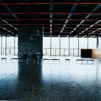
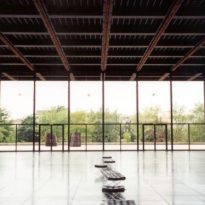
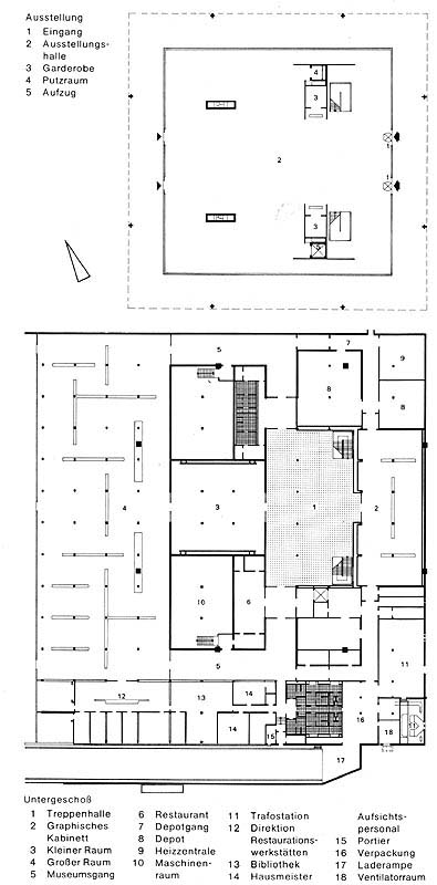
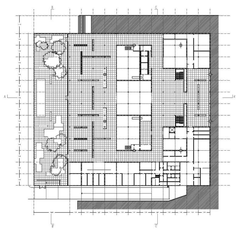
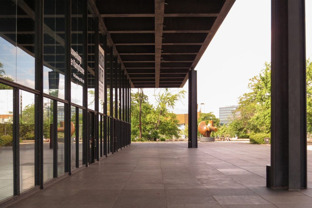
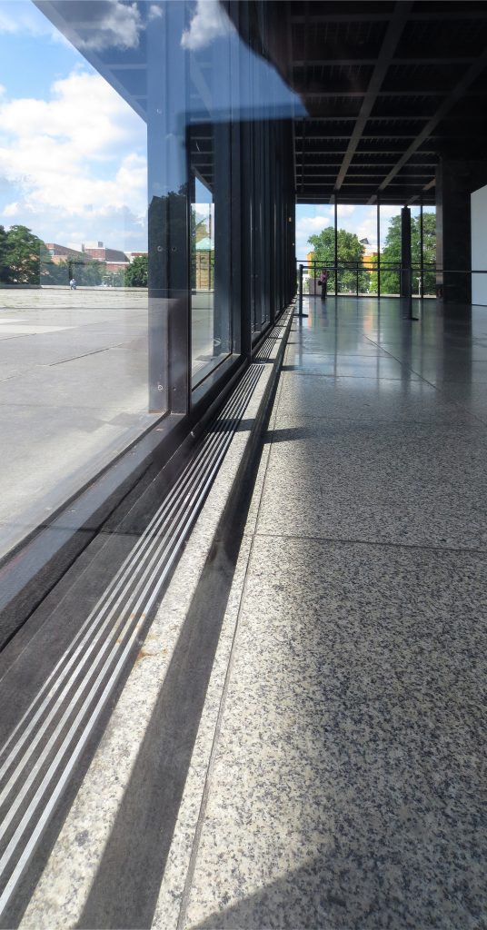
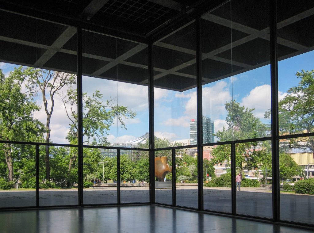
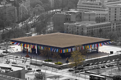
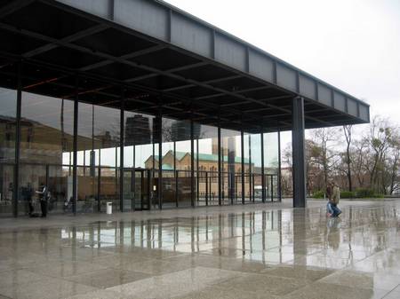
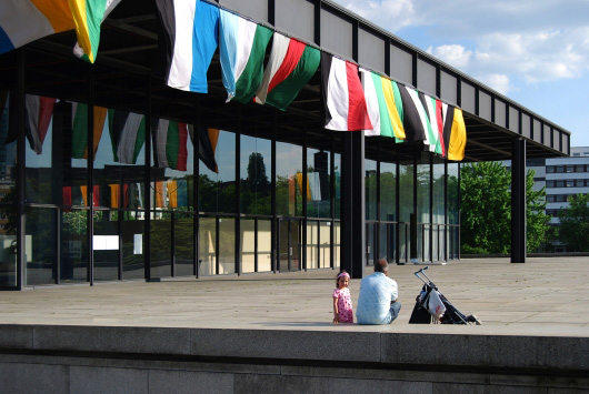
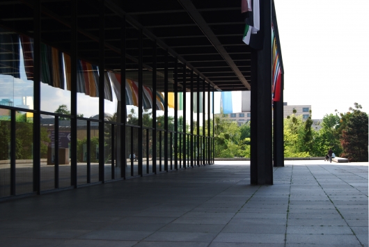
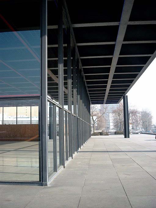
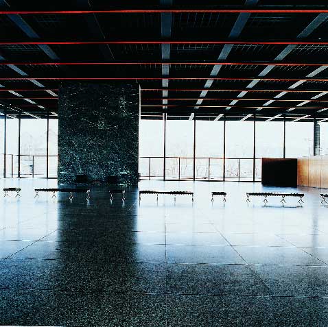
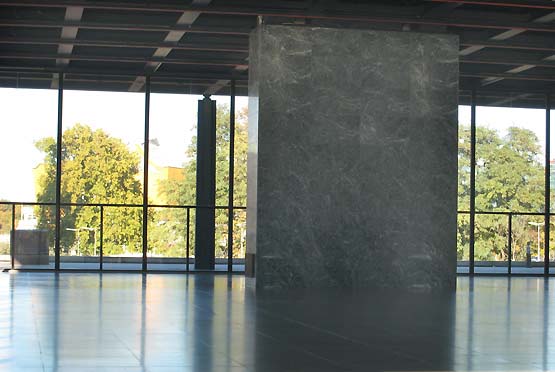
Is distributed on two floors of exhibition: an underground facility that is the socket, and a floor which is the flag transparent, totally free, which is supported by eight columns and leaves open the four corners, so the building becomes much lightness. Here is a clear separation between the structure and envelope defining element of the space, because the enclosure is removed from the cover boundary and the line of columns, creating a gallery around the flag. Visually, it’s almost a piece of esplanade covered.
These features make it very different from a closed to generate a large open space, glass, open and versatile.
Spaces
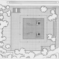
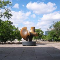
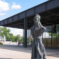
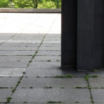
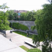
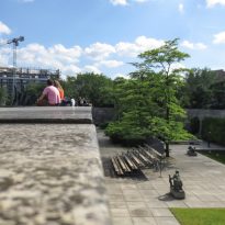
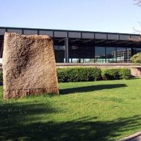
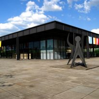
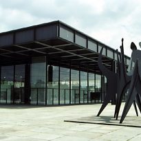
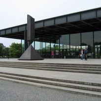
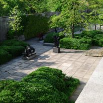
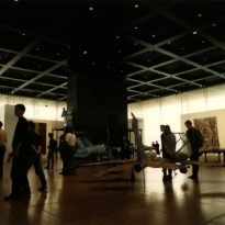
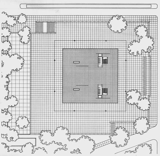
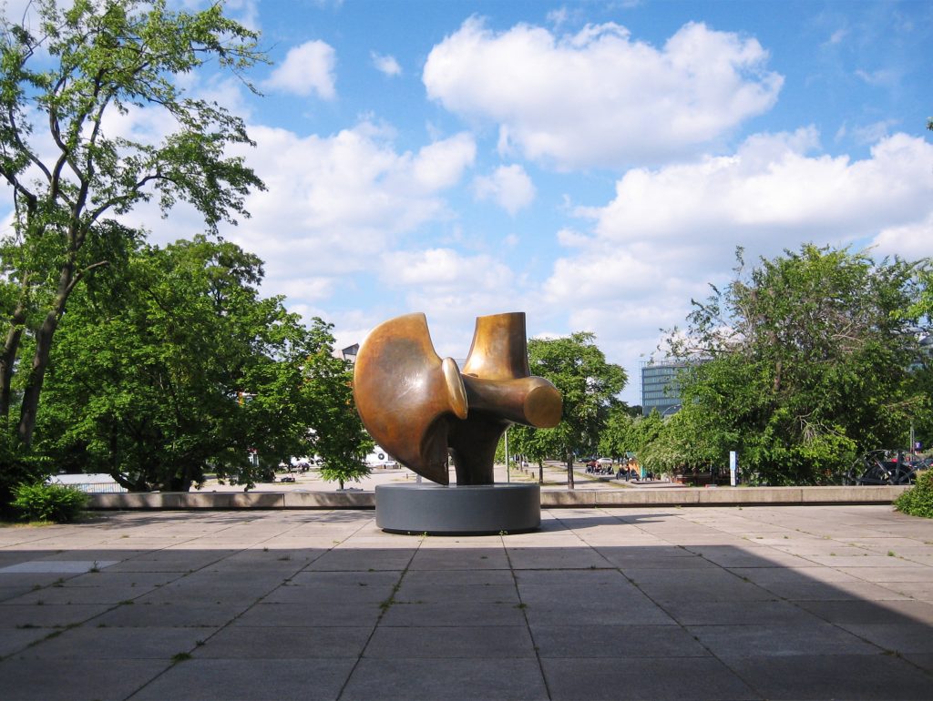
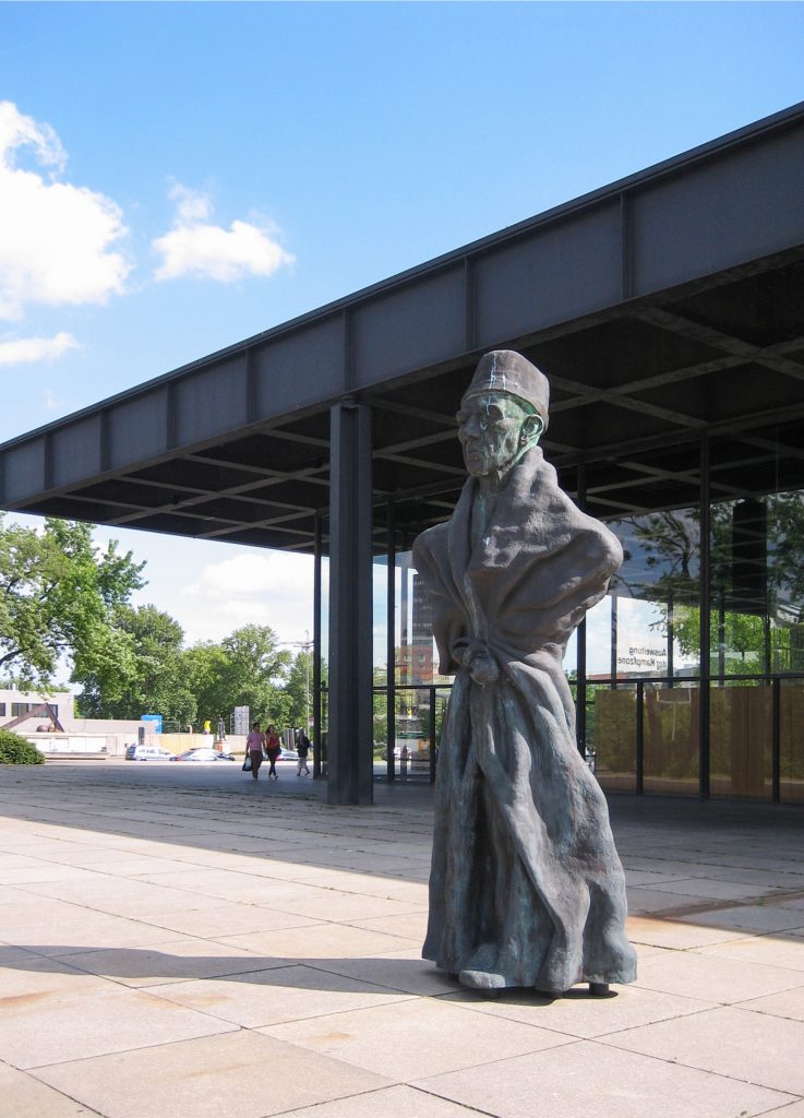
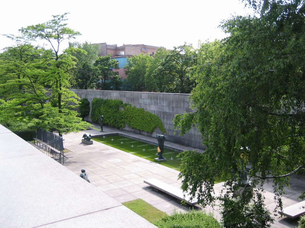
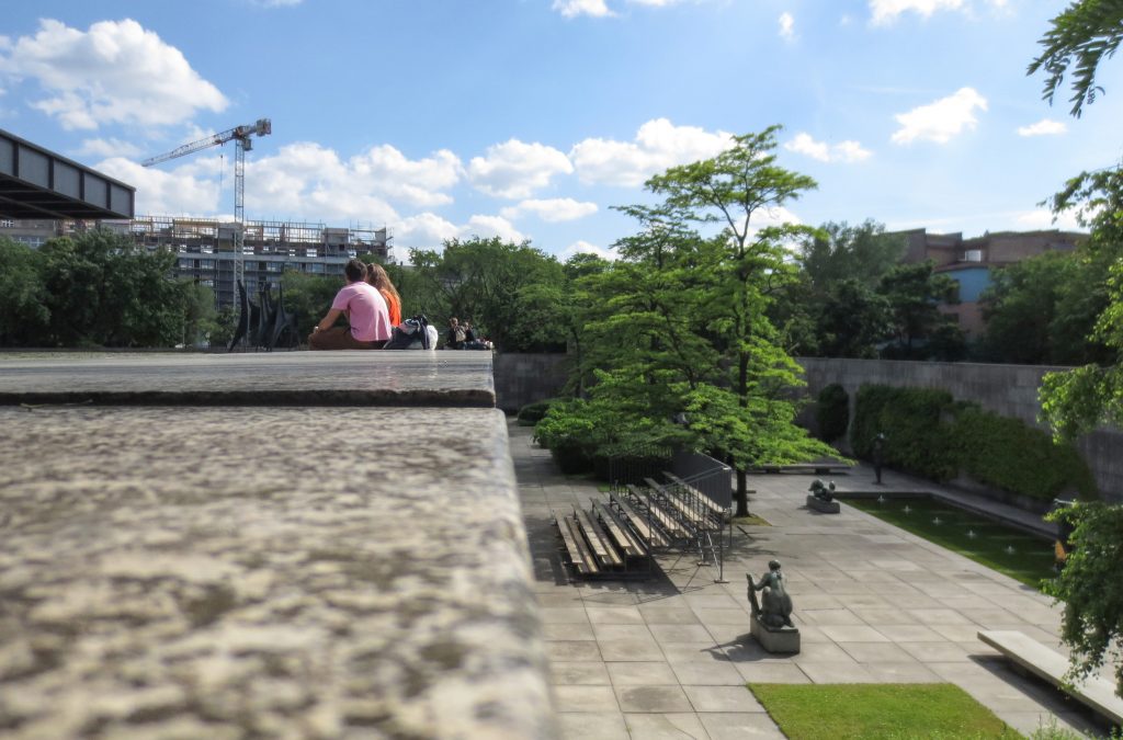
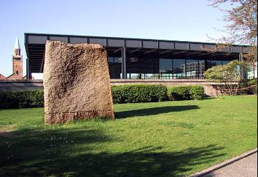
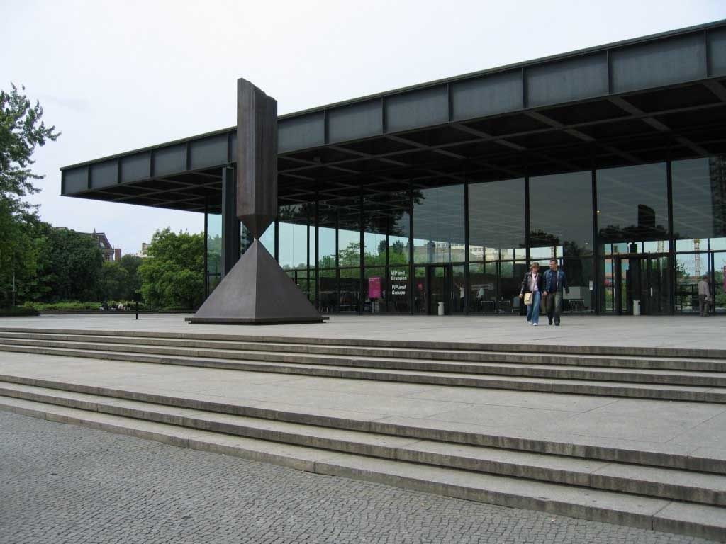
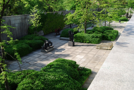
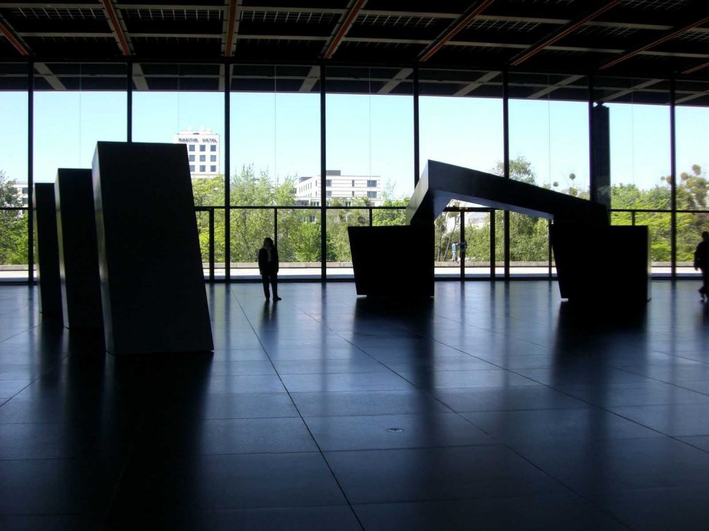
The building is located in a vast esplanade of different levels, which are worked with great skill and sobriety, where a small operation to break the monotony. Large sculptures are presented here Calder and Henry Moore.
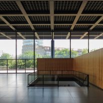
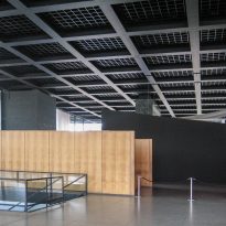
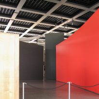
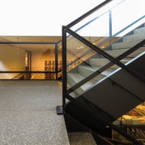
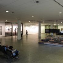
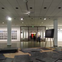
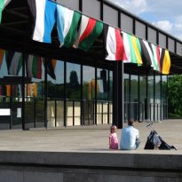
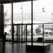
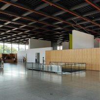
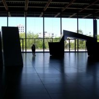
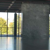
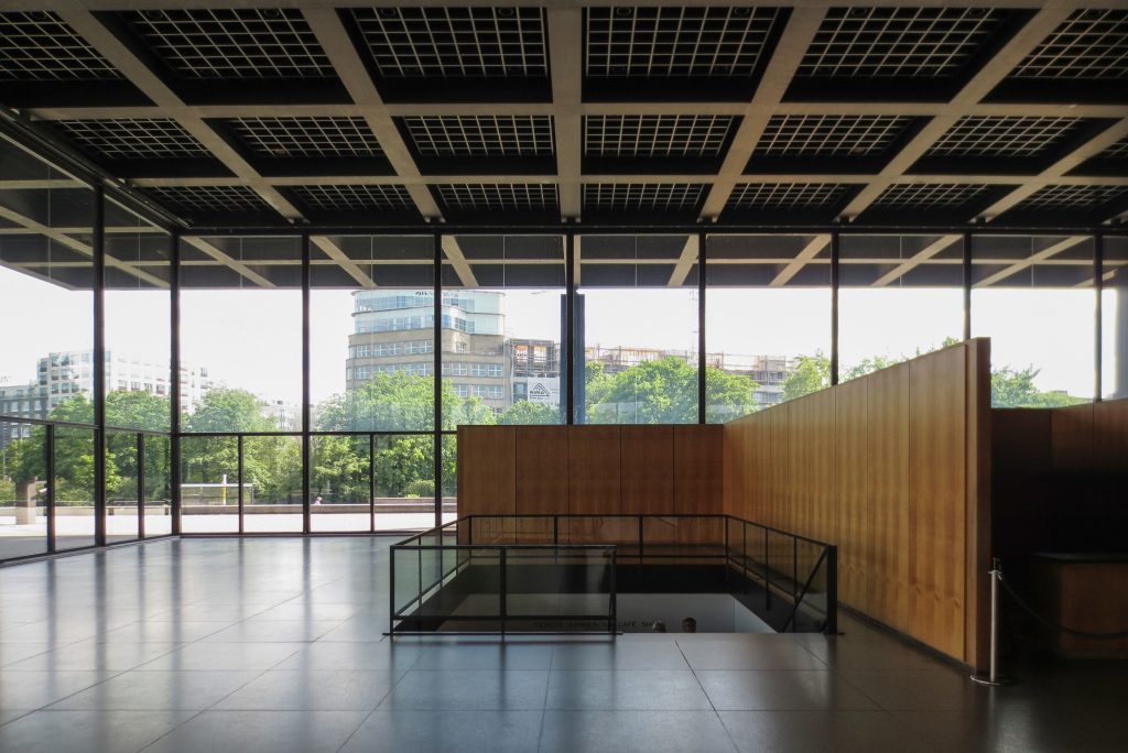
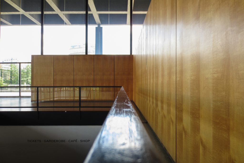
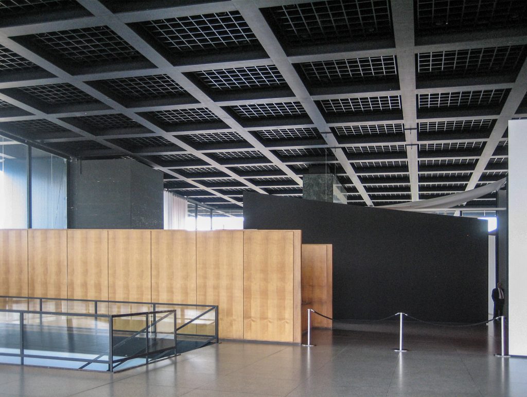
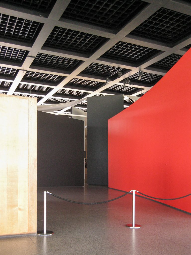
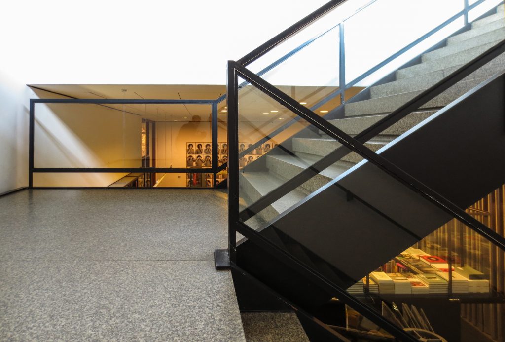
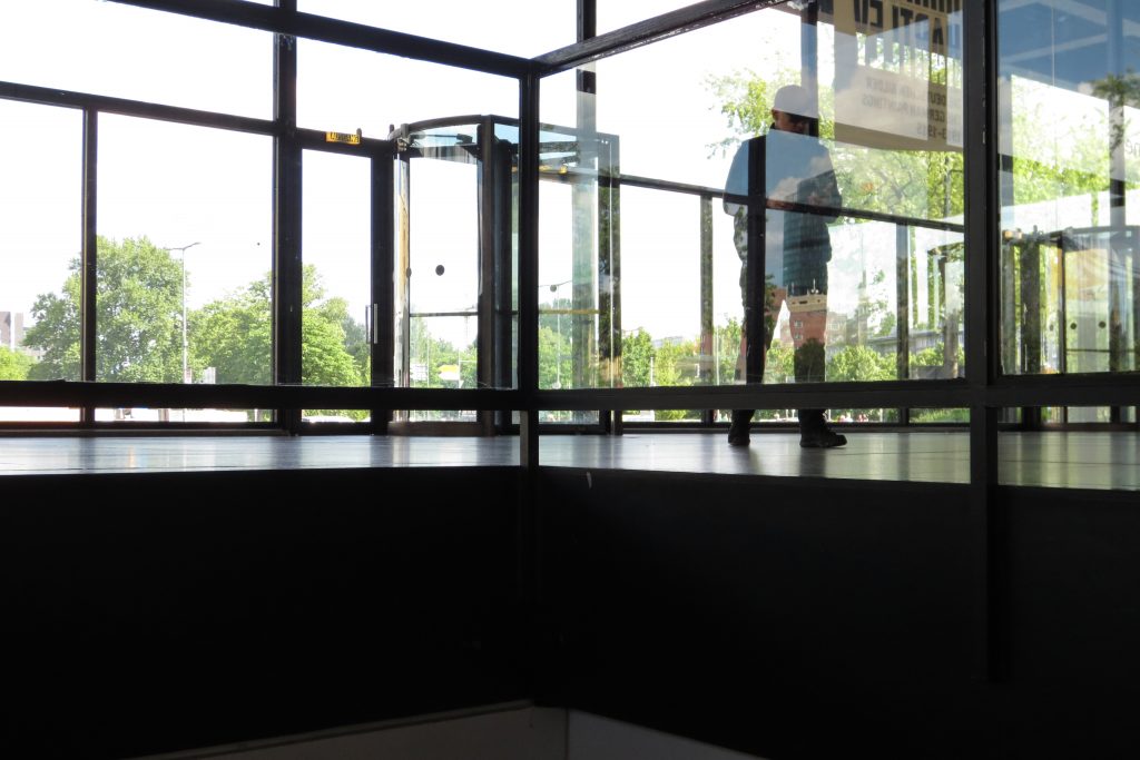
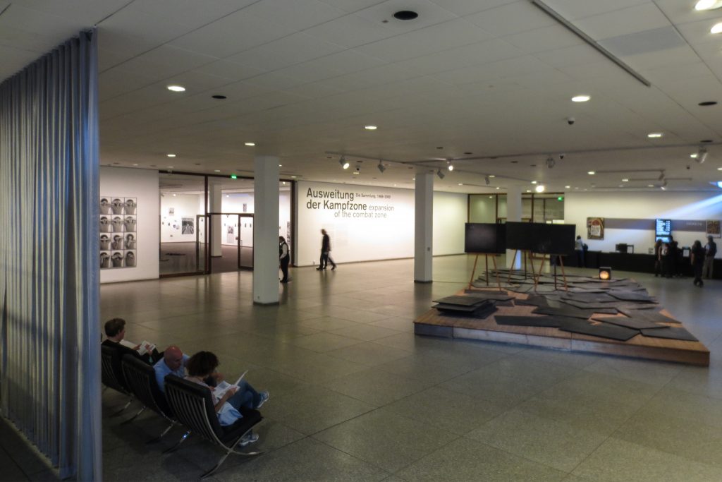
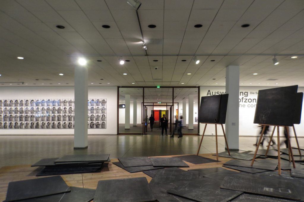
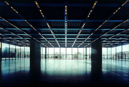
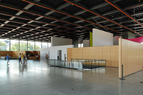
The flag is raised on the esplanade that is a base or platform. Is at the street level and is completely free, only interrupted by two groups of vertical and communication services, and closed by a glass skin. However, under normal conditions, contains elements of walls that vary with the different exhibits and limiting the visual continuity. Access to the building is for this level, which serves as atrium, which also presents temporary exhibitions.
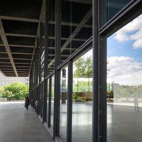
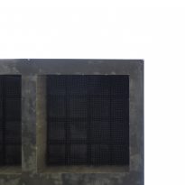
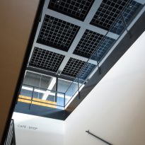
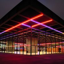
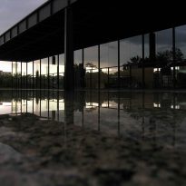
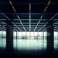
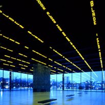
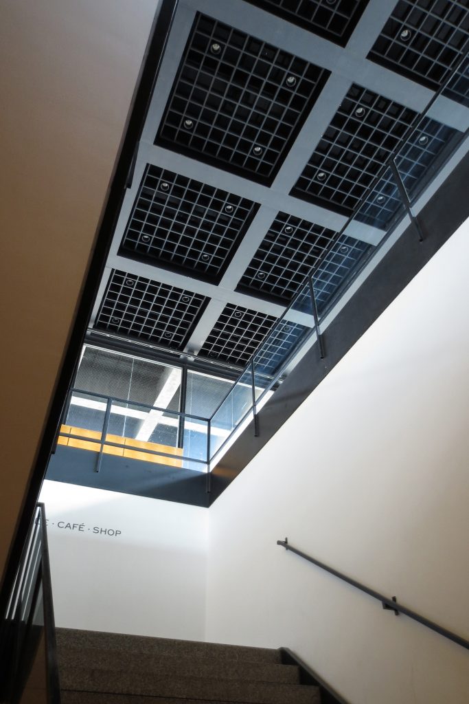
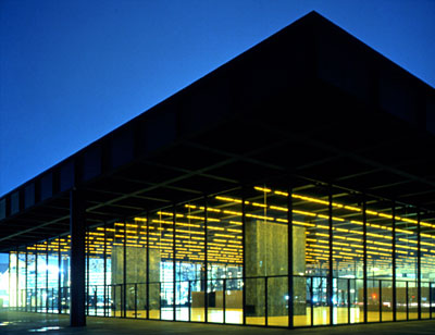
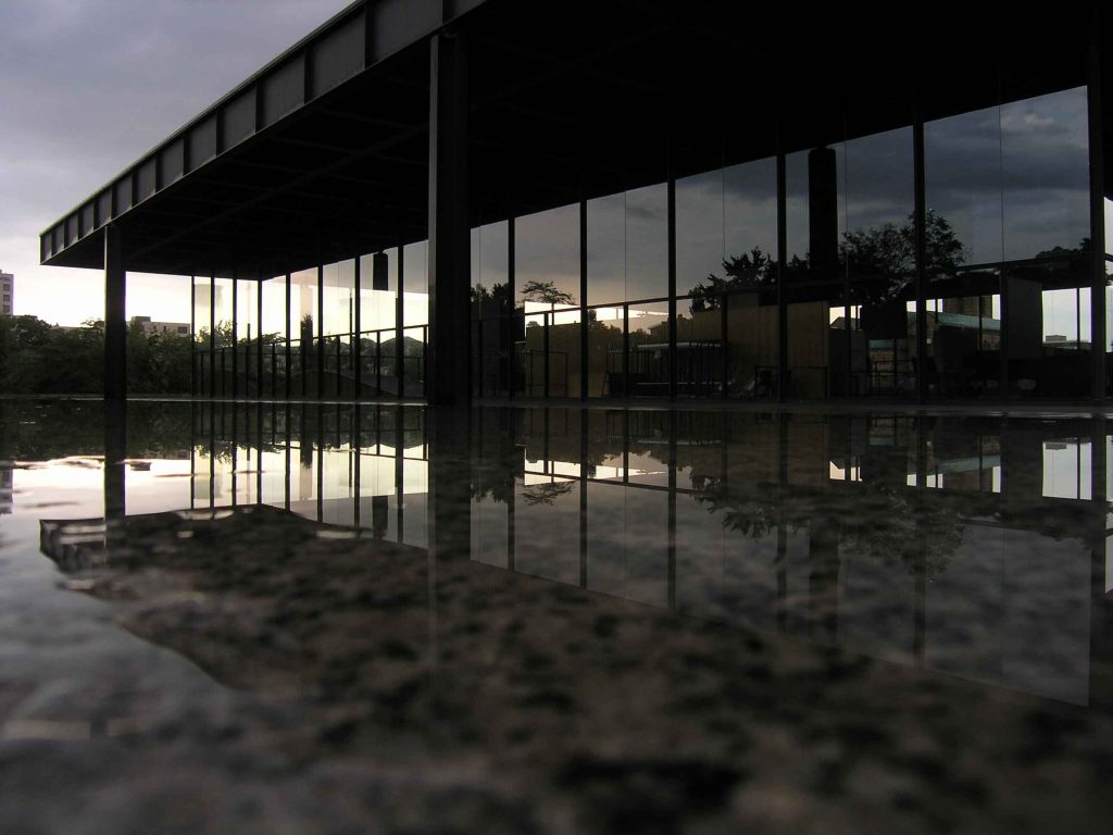
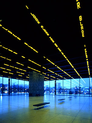
The lighting takes big role in these spaces. Natural light enters the glass walls and is reflected in the glossy black polished floor. The roof, built with a network of dark metal beams, is decorated with long rows of LCD screens that transmit continuously abstract patterns. The unusual lighting in the room prepares the visitor for a new look at the art houses. At the same time, the simplicity and thoroughness geometric rectangular transmit a sense of tranquility and serenity, achieving a balance.
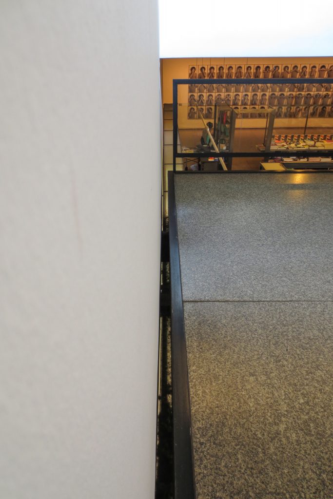
The main exhibition halls where the permanent collection, are at a lower level than the street, buried in the platform. In the rear, the rooms are closed with a skin of glass in front of a sculpture garden.
Structure
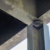
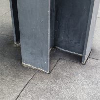
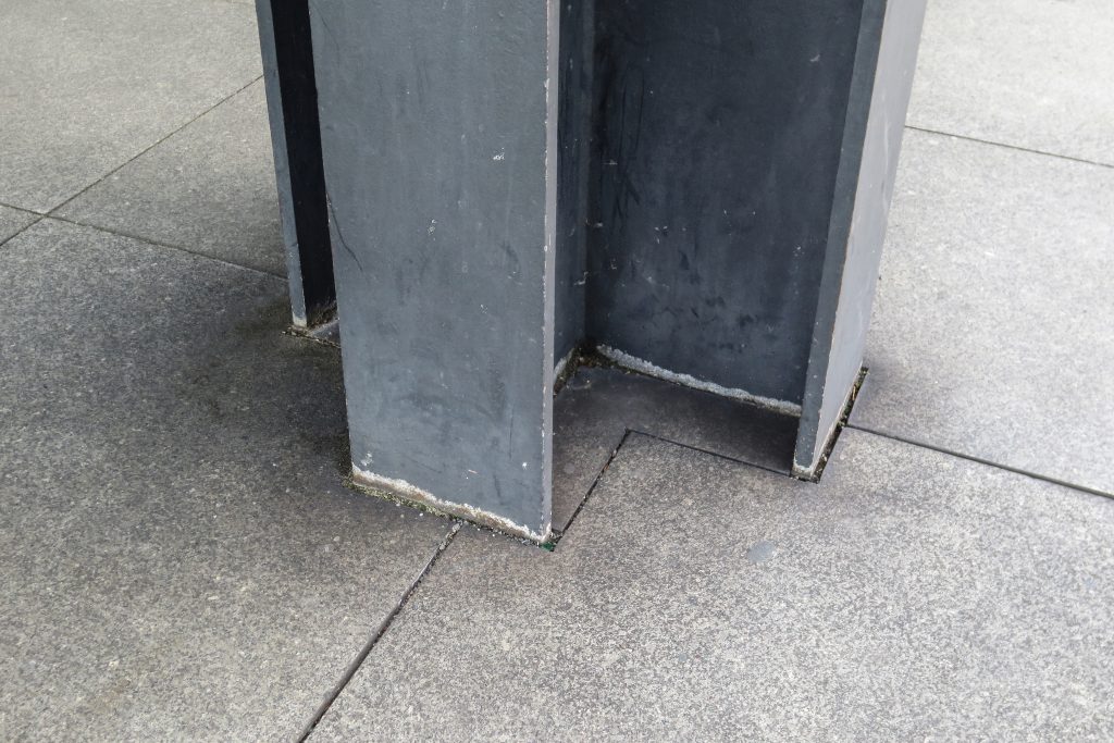
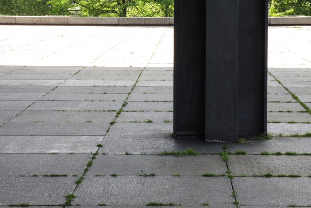
This is a great cover 64.8 square meters in length, supported by cross-8 support in its perimeter, 2 on each side, with the corners cantilever. The roof is made up of a web of steel beams.
Materials
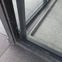
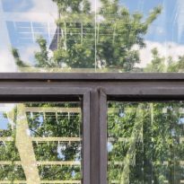
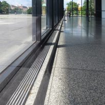
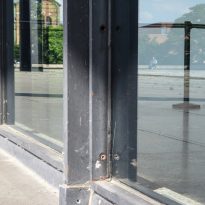
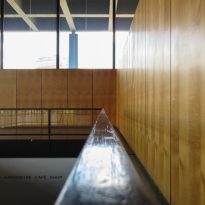
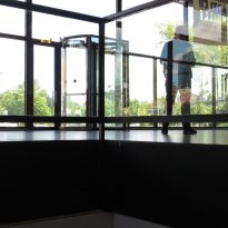
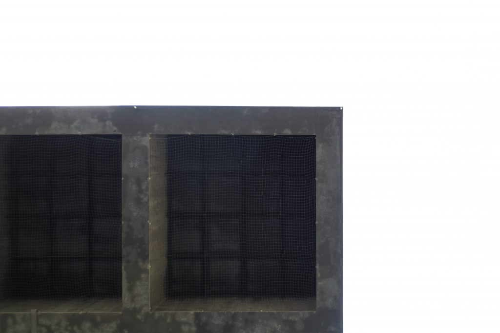
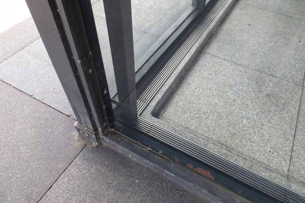
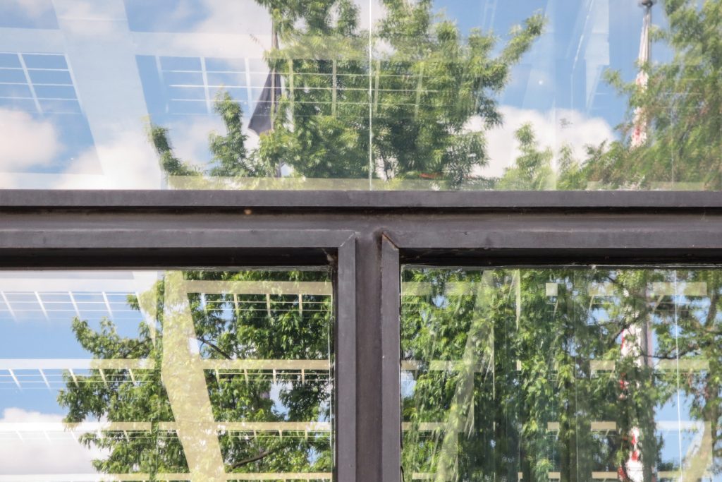
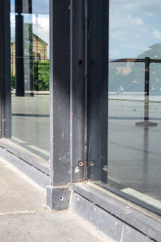
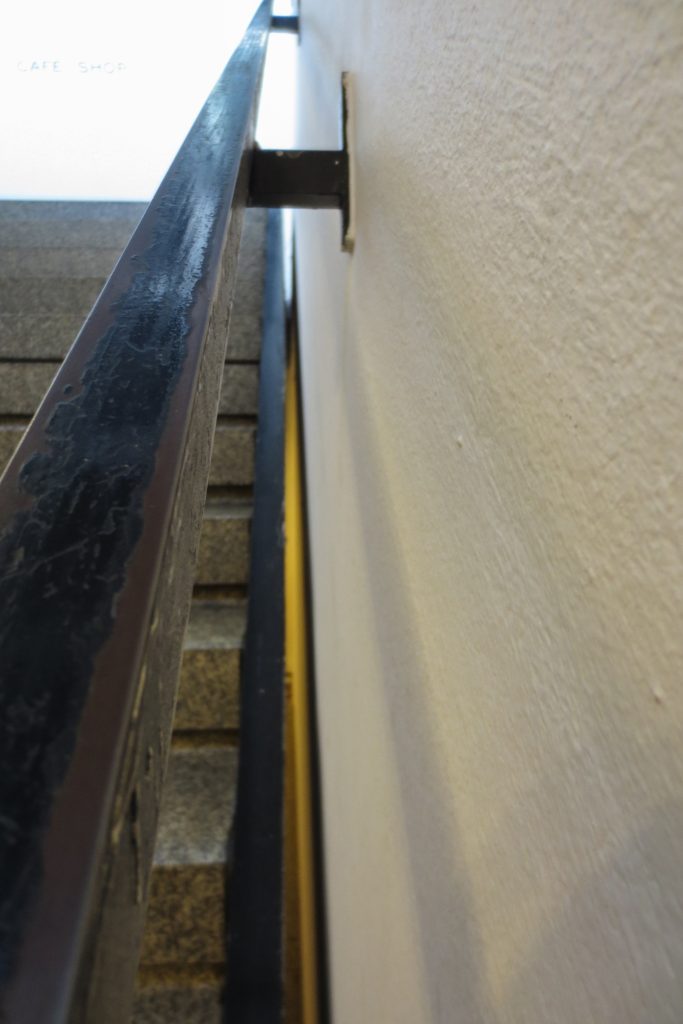
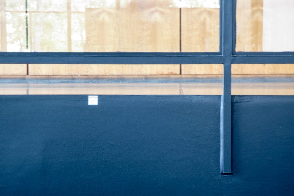
The material is a key issue. Steel and glass out on site. The entire structure is steel, worked with absolute nobility, so that the elements are no longer just something constructive to be somewhat higher. The enclosure is made of glass with stainless steel pillars.
Video
