


Martin Luther King Jr. Memorial Library
Introduction
The only public library designed by architect Ludwig Mies van der Rohe is the one built in memory of Martin Luther King Jr. in Washington, DC. In the 37,161m2 building, transparency and light are metaphors of freedom and knowledge, the basic principles of the teachings that Dr. King defended.
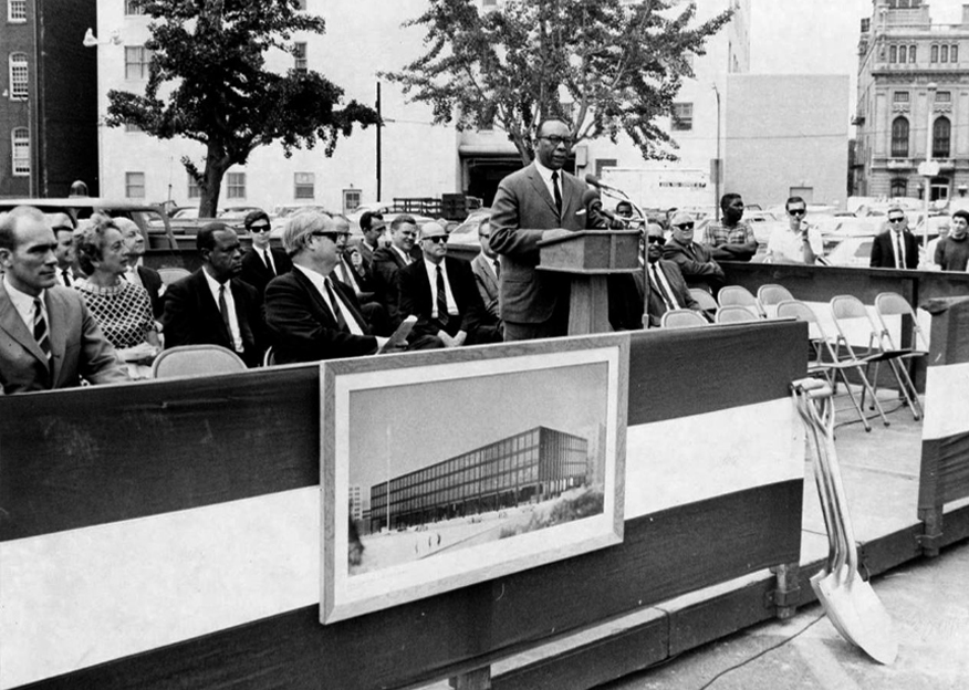
When Mies was chosen to design the building, architect Louis Justement described the decision as a “big mistake,” arguing that a local architect should be the designer of the Washington Central Library. However, when Mies presented his idea in February 1966, the director of the California Public Library, Harry Peterson, said: “This is the most functional, most beautiful and most dramatic library building in the United States, if not the world”.
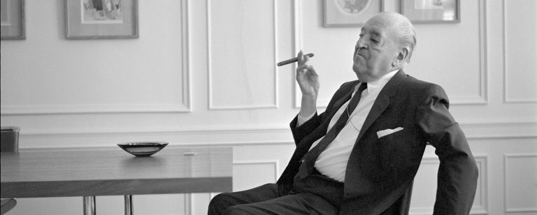
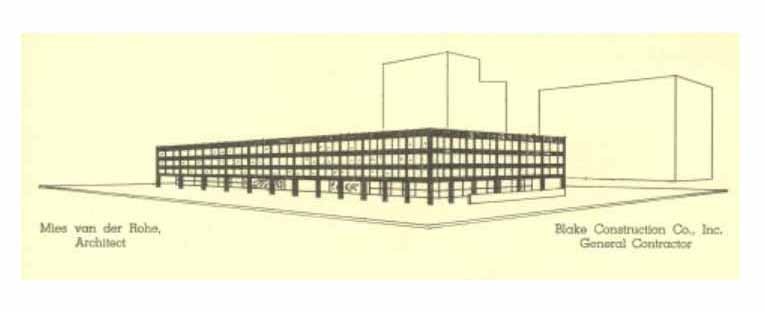
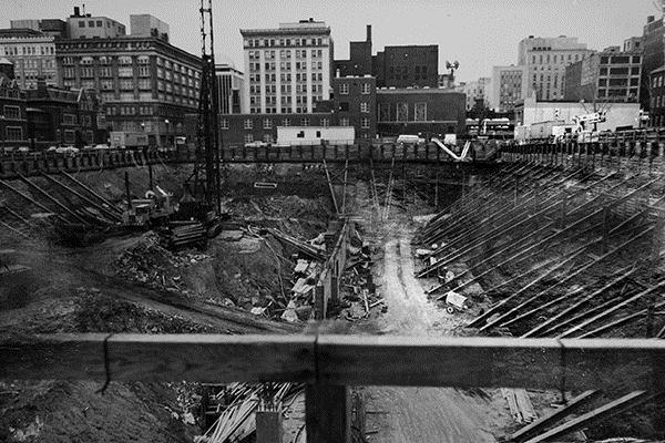
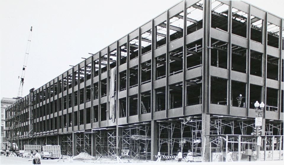
The library was the architect’s last building, it began in 1969 and was completed three years after his death in 1972. Architect John (Jack) Bowman, who worked for Mies, served as project manager and supervised much of the construction and related decisions.
Renewal
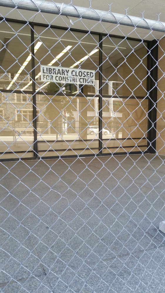
In February 2014, Mecanoo Architecten in association with Martinez + Johnson Architecture PC (M + J) was selected to design the renovation of the Library.
Due to the few means for its maintenance the building has deteriorated, roof failures, broken pipes and elevators out of service among other deficiencies. For its proper commissioning, a budget that ranged from $ 225-250 million was calculated. The works began in 2017 and are estimated to last 3 years.
Some of Mecanoo and Martínez + Johnson’s plans include removing many of the brick walls on the main floor and adding large glass stairs from the entrance hall to the upper floors. Other plans included the construction of a bookstore, an “informal” auditorium and a restaurant, called “Mies Restaurant”.
The biggest planned addition is a fifth floor that houses a space for non-profit partners and the large outdoor terrace. At the end of the renovations, it is possible that the only lasting influence of Mies is the skeleton of the building and the restaurant of the same name, but as Mies put it so aptly, “the architecture is impersonal.”
Location
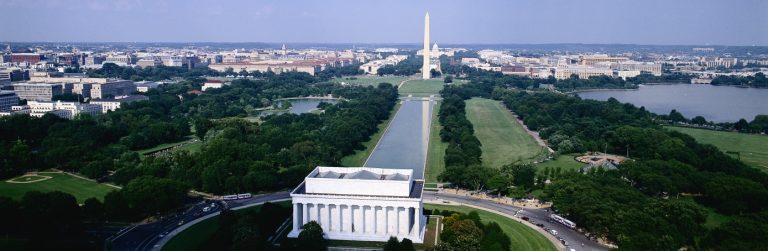
The MLK Library was built to serve as the central library in Washington, DC at 901 G St. corner with 9th, the heart of the business district of the capital city of the United States.
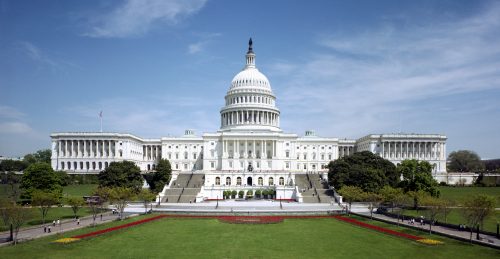
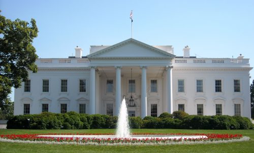
The building is located within the central area of Washington DC, embedded between emblematic structures such as The White House and the Capitol buildings. Also diagonally to the National Portrait Gallery-Smithsonian American Art Museum, a building of the Greek Renaissance of 1836 that appears on the National Register of Historic Buildings.
Concept
The Public Library of the District of Columbia was created by a law of Congress in 1896 as an official entity to provide books and other forms and information services to homes, offices and all residents of the district.
As a social expression, the new Martin Luther King Jr. Memorial Library was deeply innovative for its time. The building was the first modernist structure commissioned by the Art Commission of the District of Columbia and represented a point of social inflection for a civic definition linked to the architectural tradition Washington, DC. It was a conscious effort to make an updated, innovative and technologically advanced structure in the civic enterprise and the fabric of the city.
Design
Holistic approach
Mies used a holistic approach to his designs which incorporated the basic principles of his aesthetic concept. Their design decisions were treated as interconnected aspects of the building’s comprehensive program.
Rectilinear and symmetrical design
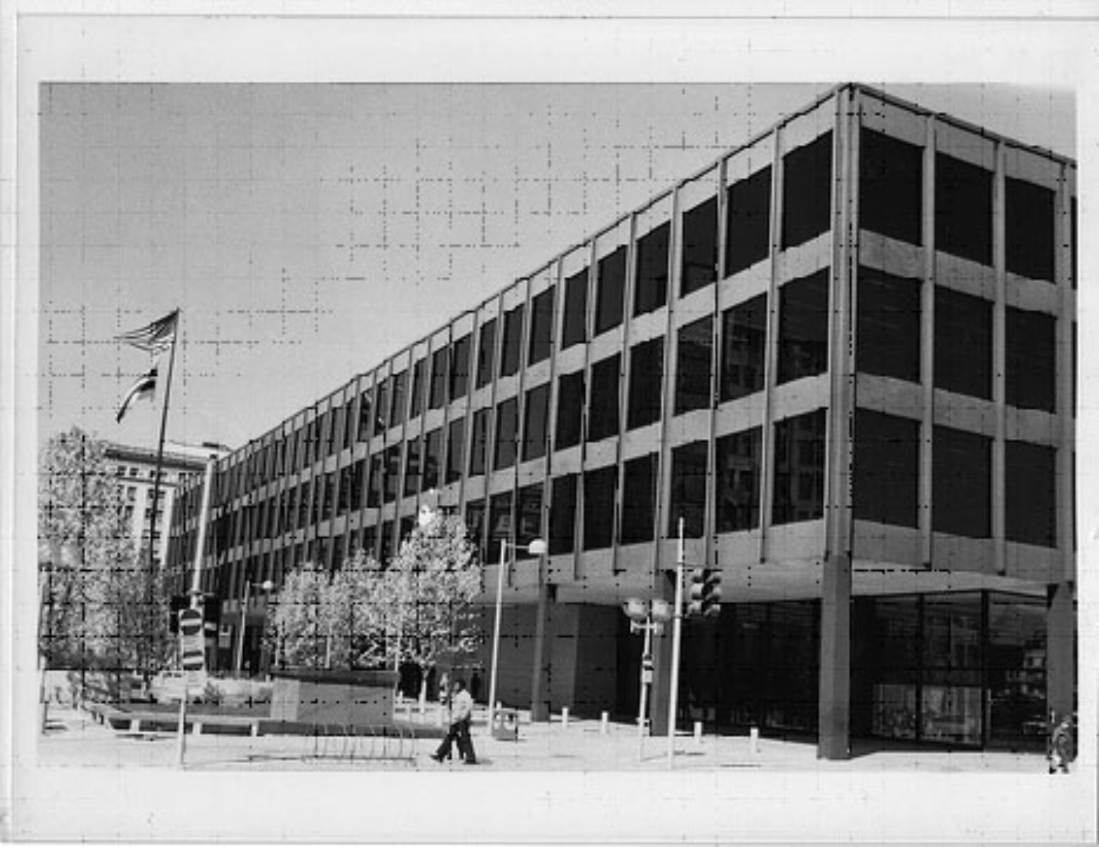
Mies’ architecture is defined by a strict sense of rectilinear and perfect right angles, clearly articulating the structure of the building. From the steel skeleton, the glass panels and the granite pavers, both inside and outside the building exhibits a rectilinear and symmetrical physiognomy.
Horizontality
Mies used rational geometry in his architecture to frame his compositions. The keys to its geometry in MLK are the horizontal proportions of the building. This horizontality is best seen in the three-dimensional shape of the building as a whole, where its shape is in clear contrast to the vertical proportions of the surrounding buildings.
Sense of transparency
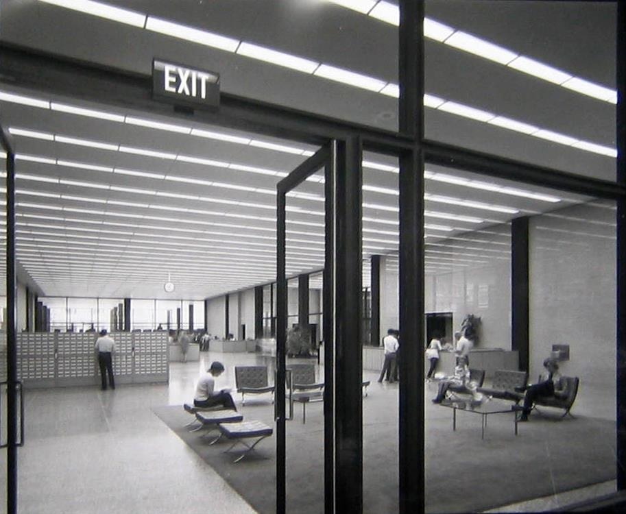
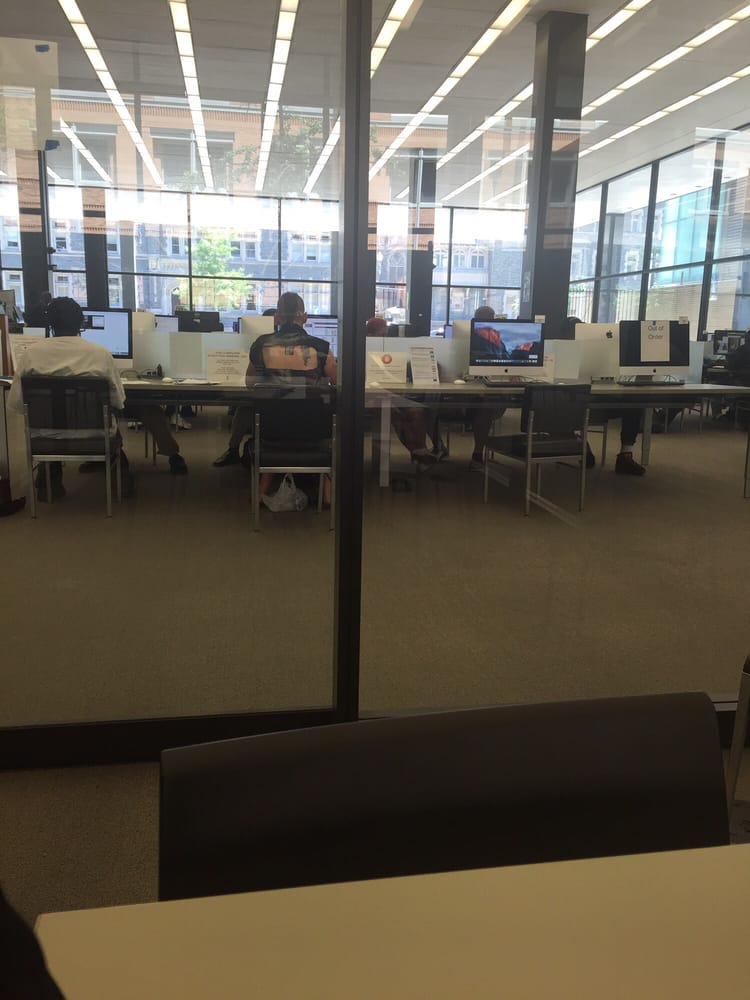
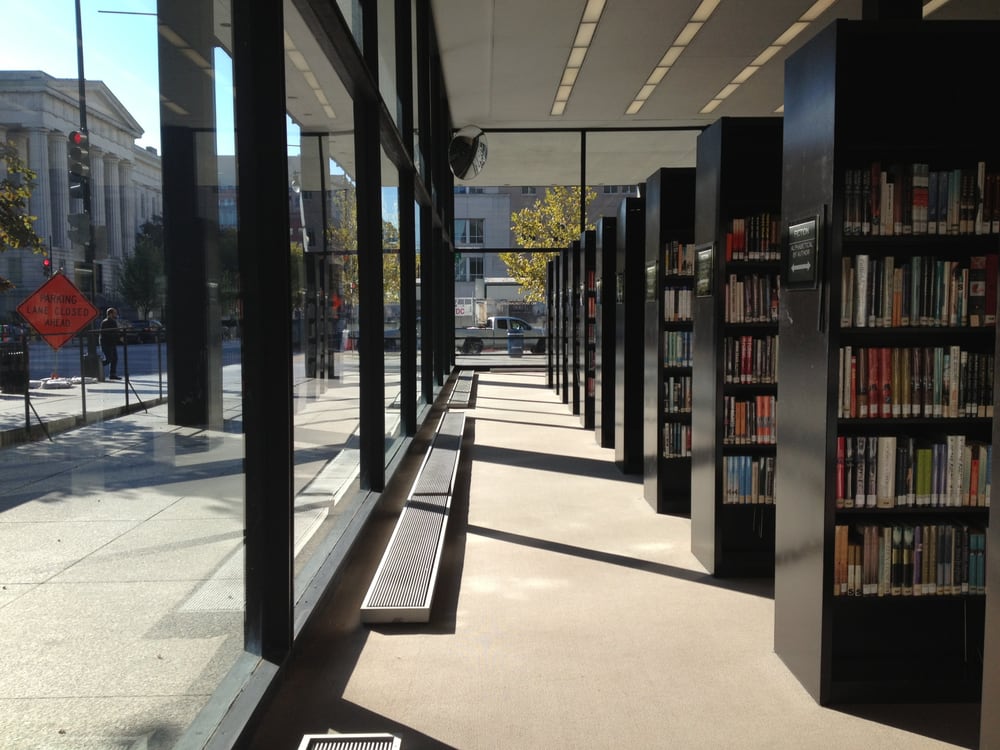
In the library building the architect used transparency so that, from the street, on the ground floor, you could appreciate the activities that took place inside. The windows offer a different sense of transparency on the upper floors, during the day they obscure the activity of the library while allowing users and staff views of the street and surrounding buildings.
Large surfaces and diaphanous plants
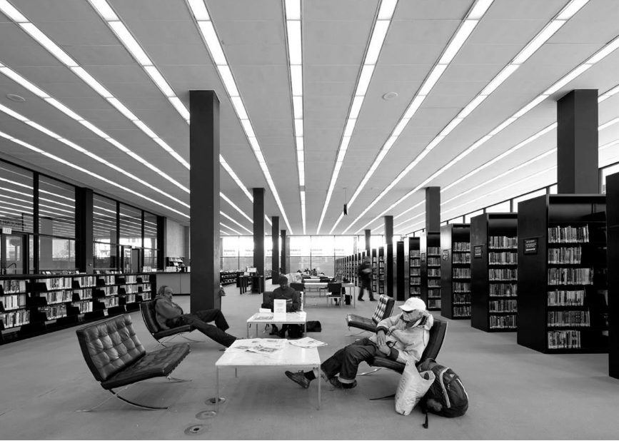
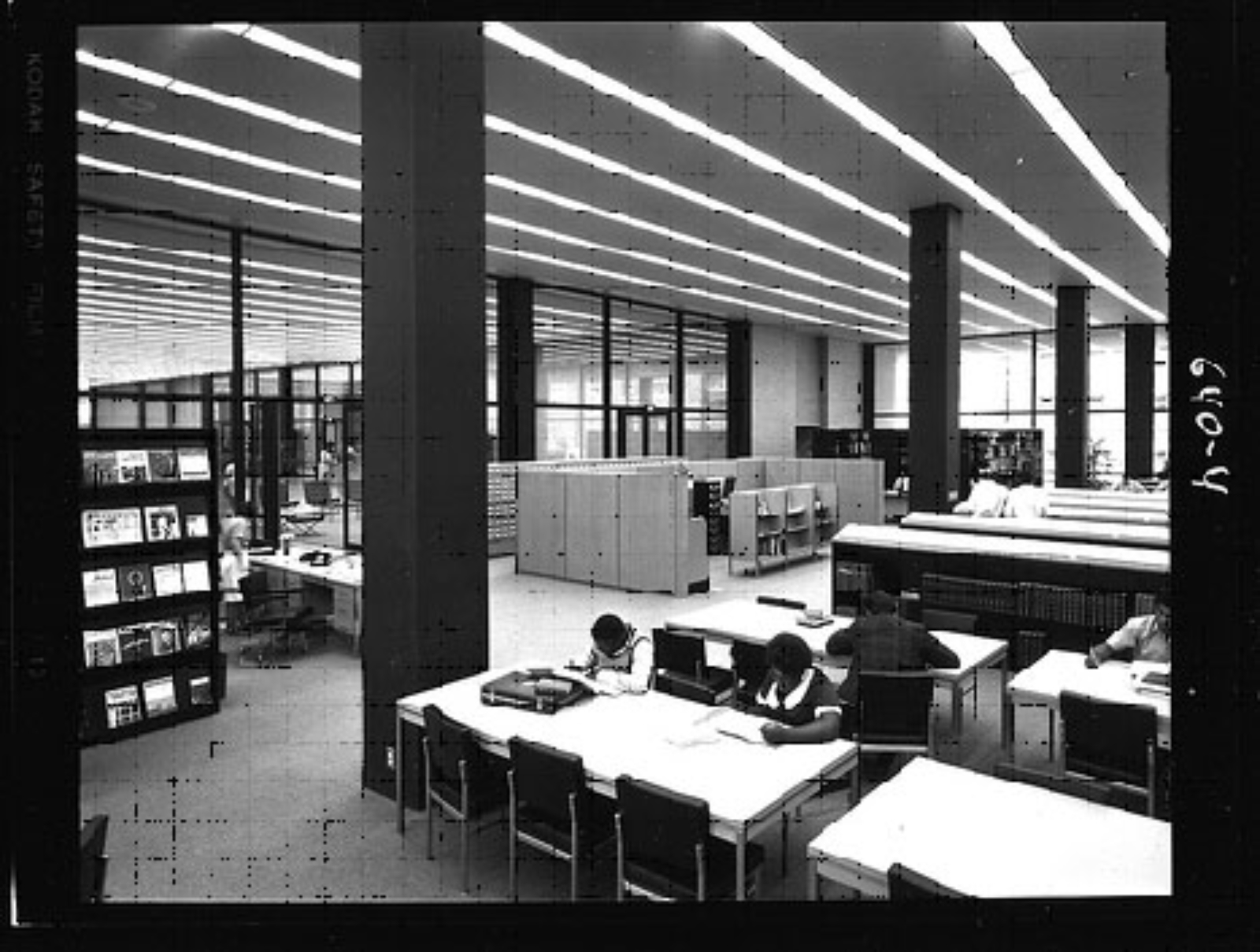
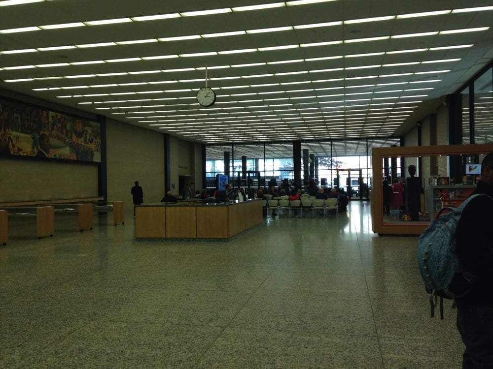
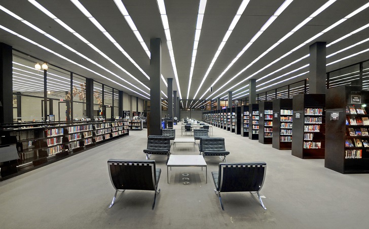
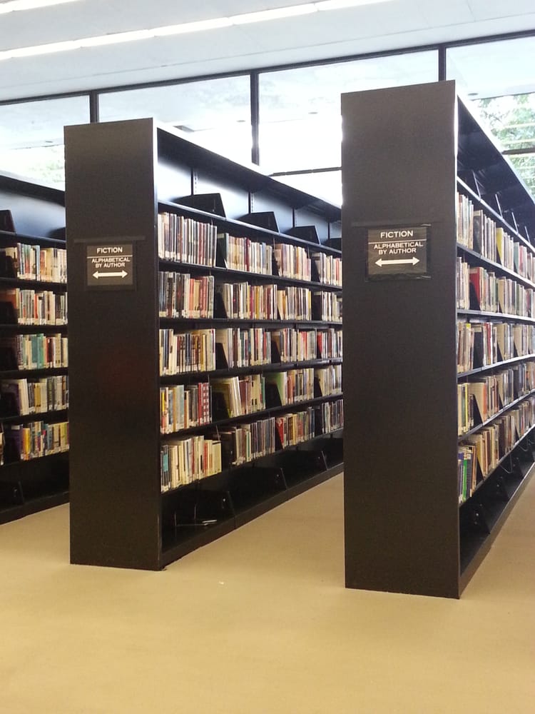
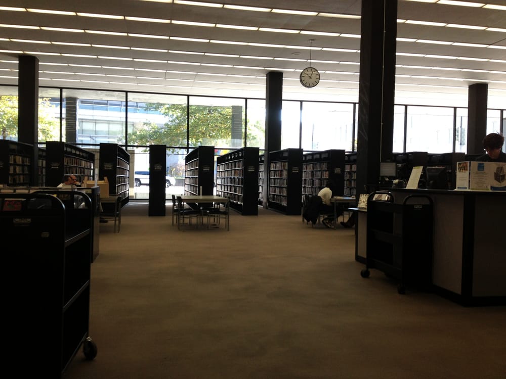
Mies often used large open volumes to define space and create the architectural form. The large open space on the first floor of the MLK Library contributes to the sense of transparency between interior and exterior, being the largest and tallest of the public spaces of the building.
He used rational geometry in his architecture to frame his compositions. The keys to its geometry in MLK are the horizontal proportions of the building.
Building
The Fine Arts Commission, which oversaw the competition for the design of the library, required a flexible interior plan and with possibilities for expansion when deemed necessary. Another requirement fell on vertical communication in the form of elevators and forklifts. Previously the Commission had never approved a modernist design for Washington DC.
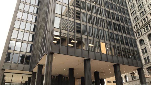
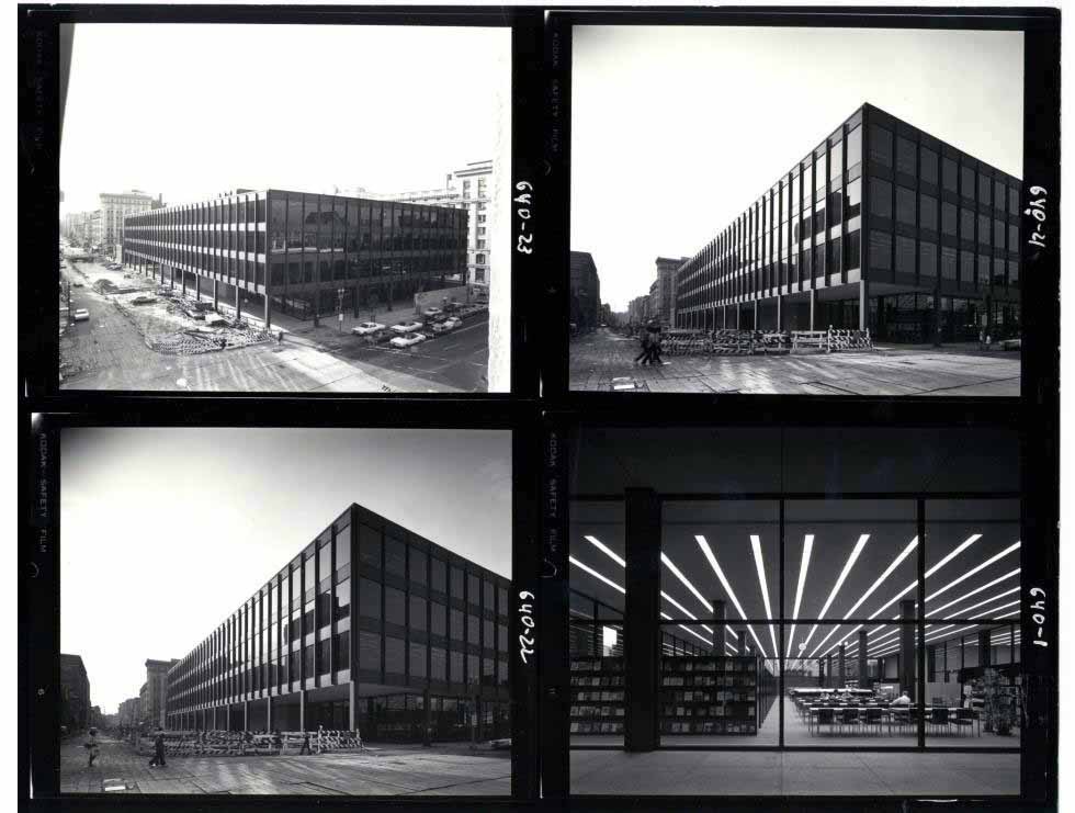
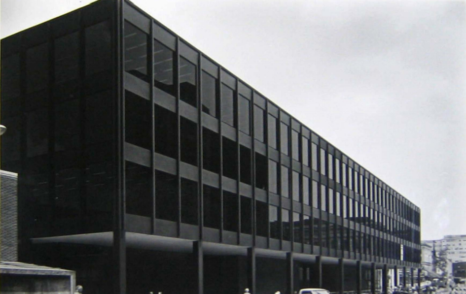
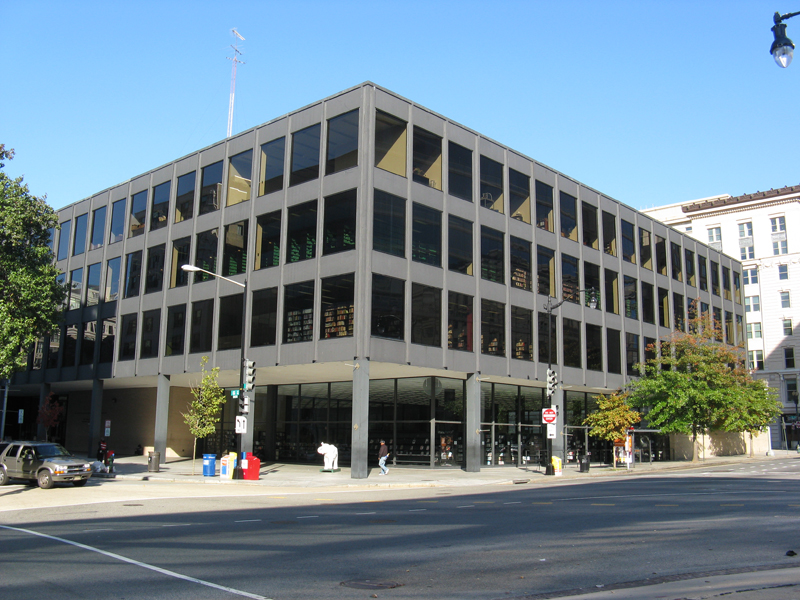
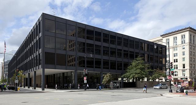
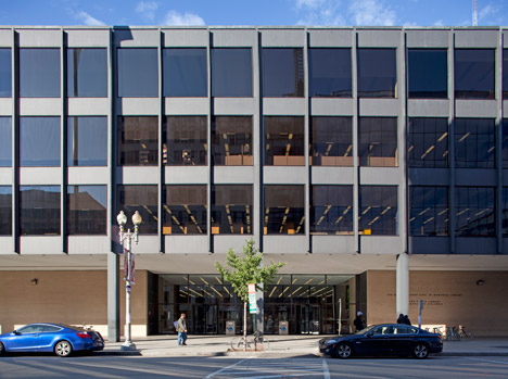
Built primarily with matte steel and tan tinted glass, the building exemplifies the mature sense of Mies van der Rohe‘s “Skin and Bones” architecture. The large tinted windows provide the main conceptual statement of the exterior of the building, create a shaded view of the books inside and, at the same time, demonstrate the transparency of a public institution.
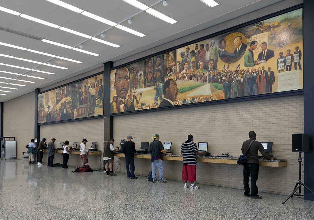
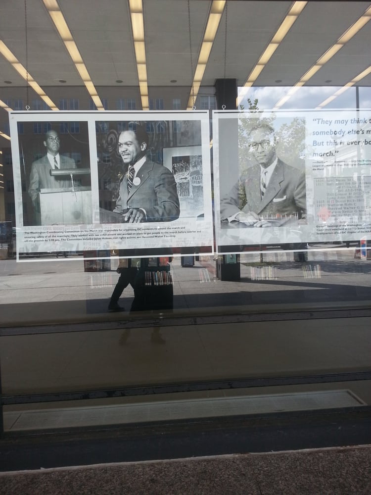
The library is a building of glass and steel, with some masonry walls and concrete slabs, which rises four floors and manifests both the international style and the design principles that Mies used throughout his work. Among the samples of the international style stand out the exposed steel skeleton, new technology in the use of the glass curtain wall, rectilinear vertical shapes, large surfaces and a recessed loggia around the perimeter. Named in honor of the American civil rights leader, the building’s lobby includes a large mural by Martin Luther King, Jr., the work of artist Don Miller.
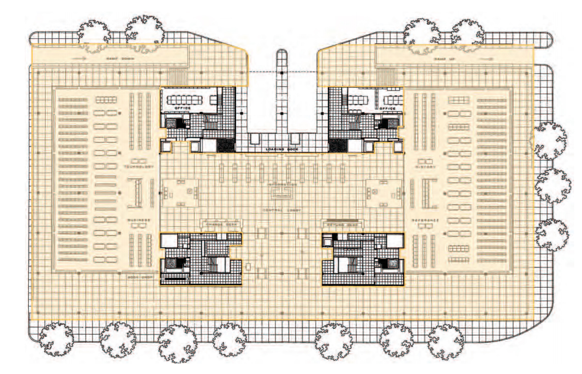
Spaces
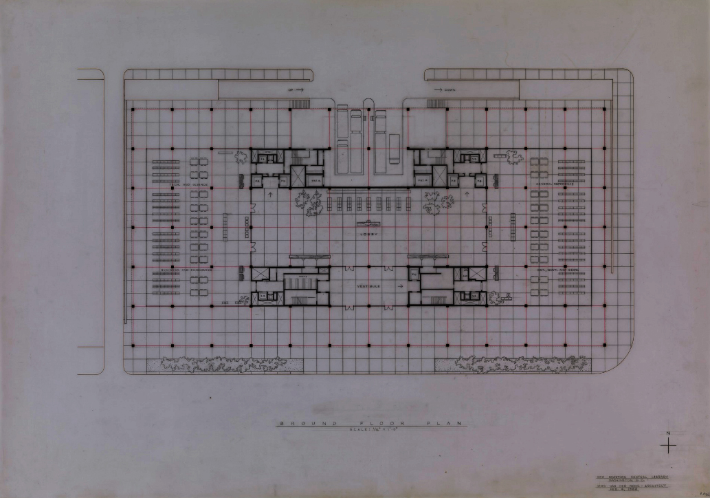
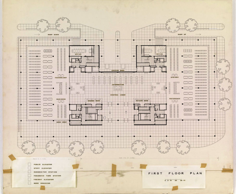
The Library is a rectangular building with approximately 37,161.22m2, four floors above ground and three below. The lowest level is dedicated to parking. Built in the Washington DC metropolitan environment, the building was designed to meet the needs of users of libraries, community groups and librarians. As such, the structure focuses on vertical integration between all levels, which guarantees ease of flow and communication.
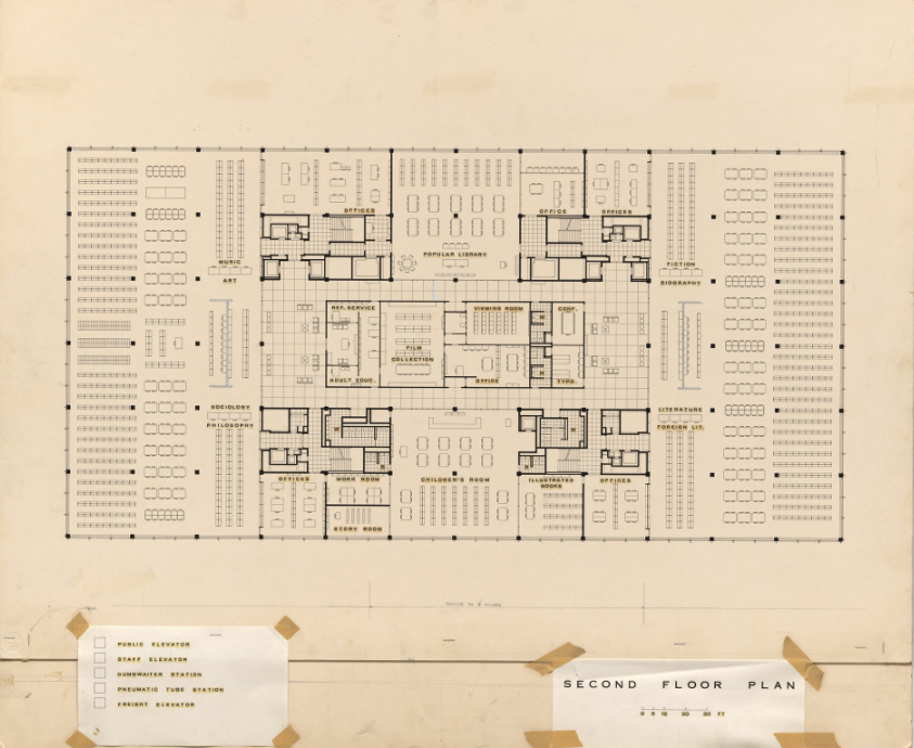
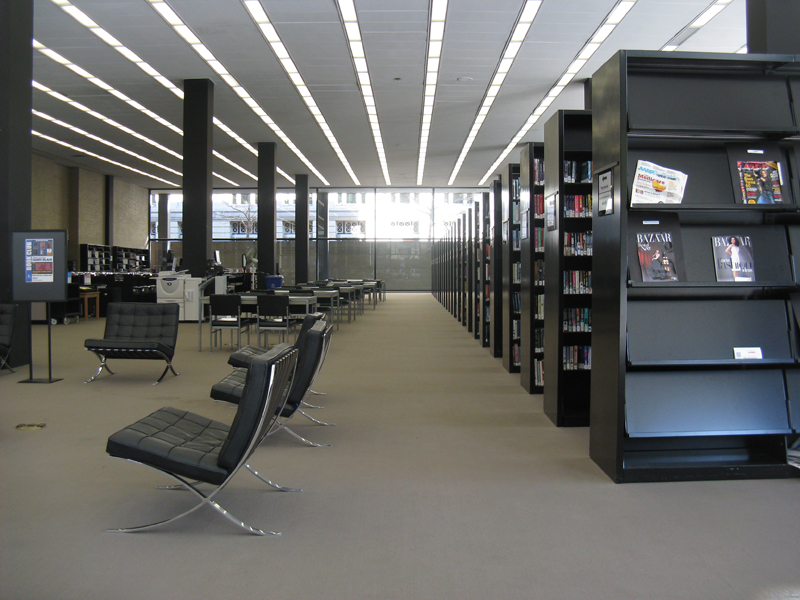
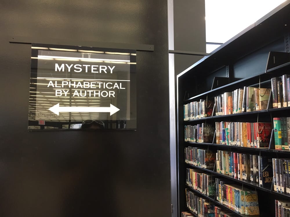
With an open central space surrounded on all sides by stacks of books, offices and meeting rooms, the library was equipped with the most modern technological comforts at the time of its creation, including book conveyor belts and pneumatic tubes to accelerate the Transportation from floor to floor.
The garage, with a simple geometry, was designed as an integral part of the building and opens to an interior lobby that gives access to stairs and elevators that lead to the main lobby.
The building has few fixed walls and a very open floor plan, illustrating Mies’s conception that public space would have to evolve over time to remain relevant.
In 2007 the building entered the Inventory of Historic Sites of C.C., becoming part of the protected buildings. Any proposed changes, both outside and inside should be reviewed by District authorities.
Extension and renovation
Mecanoo, together with its local partner Martinez + Johnson Architecture, will transform the main entrance and the two adjacent cores into focal points, creating new spaces and allowing more natural light to enter the building. Mecanoo’s proposal does not compromise the understanding of the milestone, but rather establishes an elegant composition with a different scale and density, creating a relationship with the building and the urban context.
With the renovation the perimeter walls of brick are eliminated being replaced by large clear glass walls that connect the interior of the library with the outside, allowing to see from the street all the activities that are developed in it and the gain of a large entrance of natural daylight Inside, new spaces are added for various activities for the benefit of the community and the terrace becomes a large garden with wide views of the surrounding urban context.
Structure
Composed of a steel frame, a curtain wall and a columnar grid, the building incorporates all functions in a remarkably bilateral manner. The structural materials used are successful and the building framework is technically commendable. Some perimeter and dividing walls were raised with clear bricks.
Without major structural changes over time, the building remains a testament to its time and the architect’s intention. Equipped with cutting-edge technological services, a simple rectangular shape and large interior spaces broken by neat columns, the building expressed the cold rationality of disciplined studies.
The steel and concrete substructure is independent of the steel and glass superstructure that forms the curtain wall.
Reinforced concrete joists covered with steel plates run horizontally from side to side of the structure to divide the plants, while concrete columns form the structural plants.
The horizontality of the perimeter beams is compensated with steel flange beams, without any adornment, fixed vertically to serve as mullions. The only non-structural ornamentation of the building are narrow beams with flanges welded to the steel plates to cover the columns. These components run from the base of the second floor to just the base of the roof line, creating an articulated rhythm on the flat surface of the curtain wall.
The structural form of the building establishes a rhythm and balance that is referred to throughout the entire volume, extending not only to its architectural development but also to its interior design
Modular design
A characteristic that defines the character of Mies‘ work is his confidence in rational geometry. Through a grid system, it establishes a base, a base module that governs the entire design. Mies explains in this way the application of the module:
“… The structure of the building is a steel frame and the crack is a multiple of the module, 9.14 x 9.14m. The mullions of the windows subdivide the bay into three equal parts of 3.05m each … “.
The module is also used for lighting distribution and furniture placement. The granite pavers placed on the exterior and interior of the ground floor each measure a little less than 1.52×1.52m.
The building exhibits experimentation and innovation in typology, with a large number of functions that flow through a simple rectangular grid. However, the materials and systems related to the internal functioning of the building have proved less advantageous over time and represent some of the difficulties in preserving and maintaining the buildings of the modernist period.
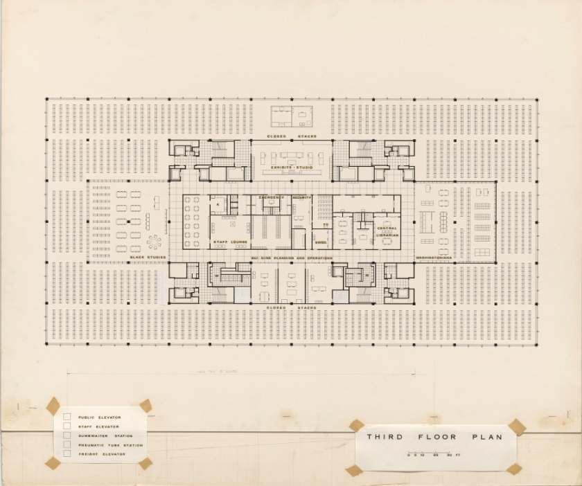
As part of the design and function of the building, Mies created four service cores, one in each quadrant of the building, in order to provide efficient service to the large created areas. These include fixed vertical elements such as stairs or elevators, pneumatic tubes, electric elevators and mechanical shafts.
Materials
All of Mies‘ work is marked by the use of avant-garde materials and methods. This underlines the meaning that “modern” had for the architect, not only from the stylistic point of view but as an application and industrial technological use. The facilities of motorized conveyors, pneumatic tubes, automated weight system or a closed security circuit with screens are only a sample of their belief in the power and importance of modern advances.
A defining feature of the design is the intentional and specific choice of materials selected for the MLK with tones, textures and reflectivity that are incorporated into every aspect of the building design.
Selected materials provide continuity and definition. These characteristics are reinforced with the application of a soft palette of neutral colors such as warm gray, pink, beige and black, used in all materials, be it structure, floors, walls or furniture.
The steel plates that cover the steel and concrete skeleton, both outside and inside, were originally coated with a paint known as “Detroit Black Graphite”
The ground floor, retracted to create a lodge, is delineated mainly by large clear glass panels that go from floor to ceiling, with steel frames. Originally the crystals that were placed were 0.95cm thick between 2.2cm steel bars. The crystals on the upper floors, with the same thickness as those on the ground floor, are tinted in dark bronze.
Continuing with the transparencies also inside, glass partitions were used to separate and connect reading rooms, classrooms and corridors.
The original floors of the Martin Luther King Jr Library, both Rockville granite pavers, wool carpet, vinyl tiles or ceramic tiles, provide the basis for the color palette of the entire building. The cobblestones of the ground floor of polished granite are in light gray tones with spots in darker gray and black. Outside the cobblestones have a more rustic finish and are placed all around the building, in the garage, on the ramps and in some exterior plinths. Granite is also used in interior furniture as a desk surface.
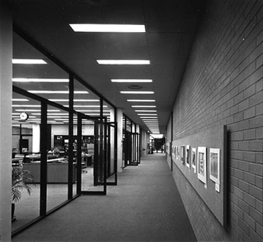
Beige brick with small iron stains is used for both exterior and interior surfaces. Outside to build the retaining wall on three sides of the building, the framing of the main entrance, the rear walls, the loading dock and the entrance and exit of the garage. Inside, the same brick is used especially in the central hall, reading rooms, hallways and auditorium.
Illumination
The lighting scheme inside the library uses both natural and artificial light. The latter reinforces the general design principle by making use of the standard module, placed in the center of the rooms and spaced 1,52m, emphasizing the rectilinear. The rows of light boxes are placed perpendicular to the stacks of books in the first and second floor reading rooms.
The lighting schemes on all floors, which share a common floor plan, have the same orientation, the length of each light is oriented north-south, creating a strong visual sense of horizontality. The fluorescents measure approximately 1.22m long and are protected with translucent plastic covers.
In reading rooms and service spaces, lighting fixtures are not set in a continuous row, but maintain the same general alignment.