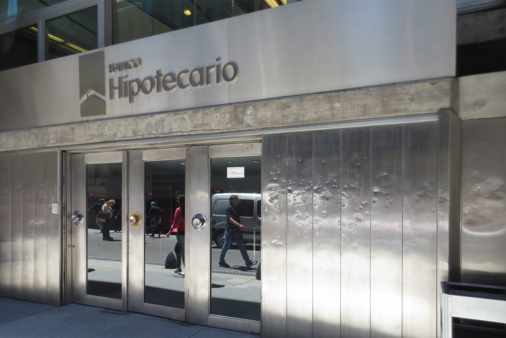
London Bank in Buenos Aires
Introduction
In 1959 a contest was held for the project at the invitation of the Headquarters of the Bank of London and South America. The land was located on a street corner in downtown Buenos Aires, where the financial activity was booming.
The winning design was submitted by the team Clorindo Testa, associated with S. E. P. R. A society, composed of architects: Elia Sanchez, Peralta Ramos and Agostini.
This project, for its urban architectural approach, is one of the most original, bold and far-reaching of the international architecture of the 60s.
Situation
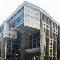
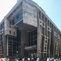
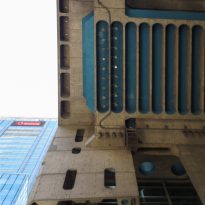
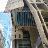
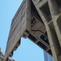
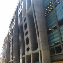
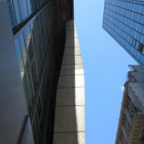
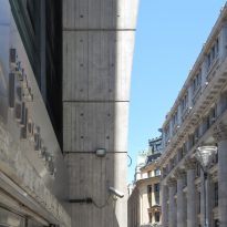
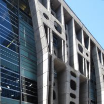
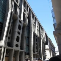
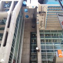
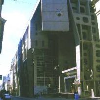
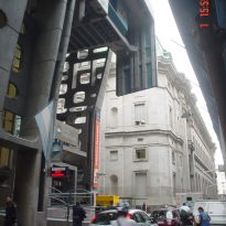
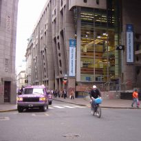
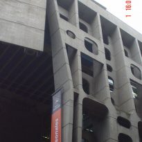
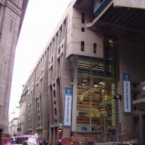
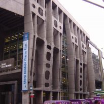
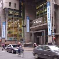
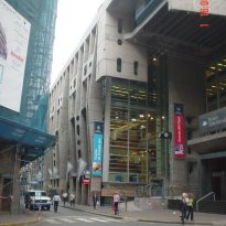
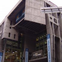
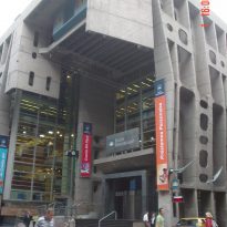
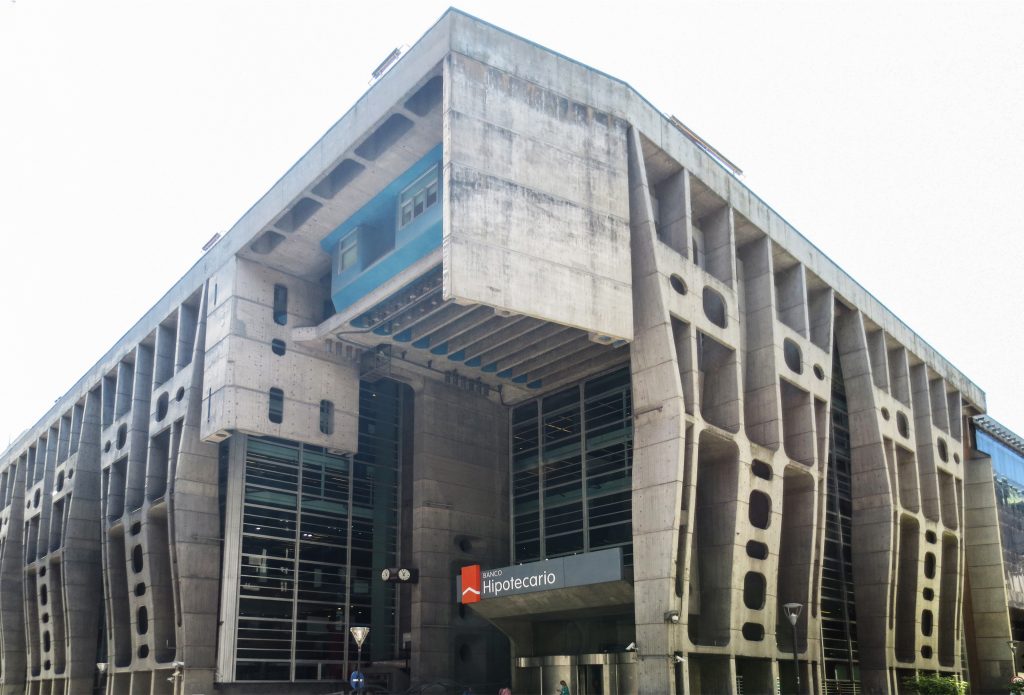
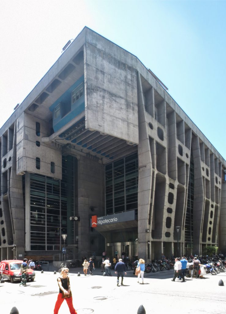
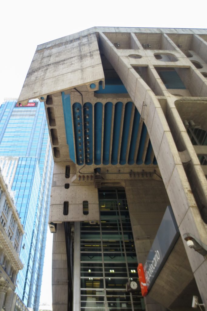
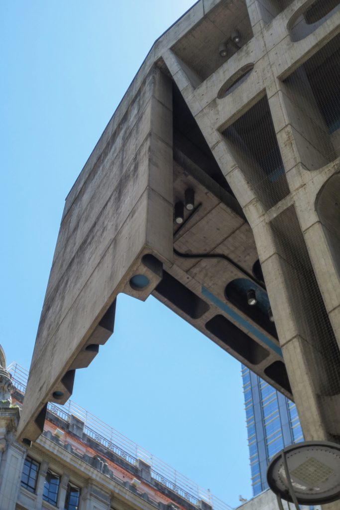
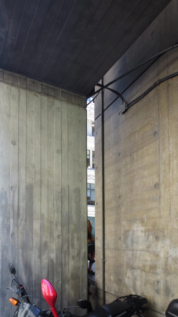
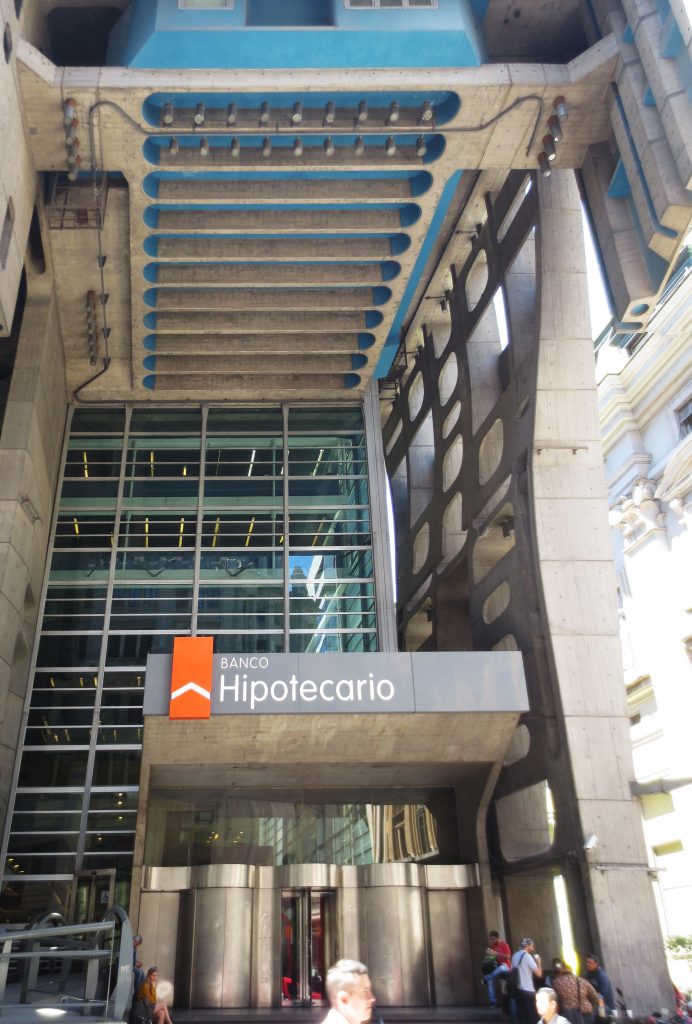
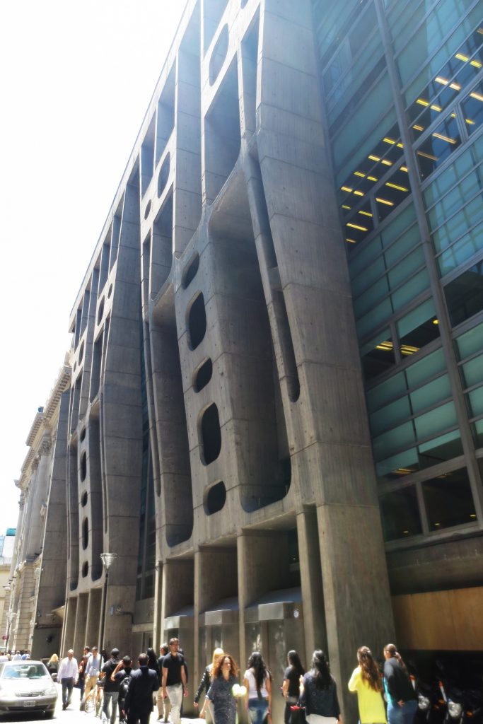
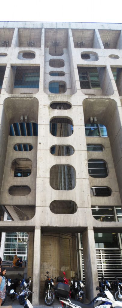
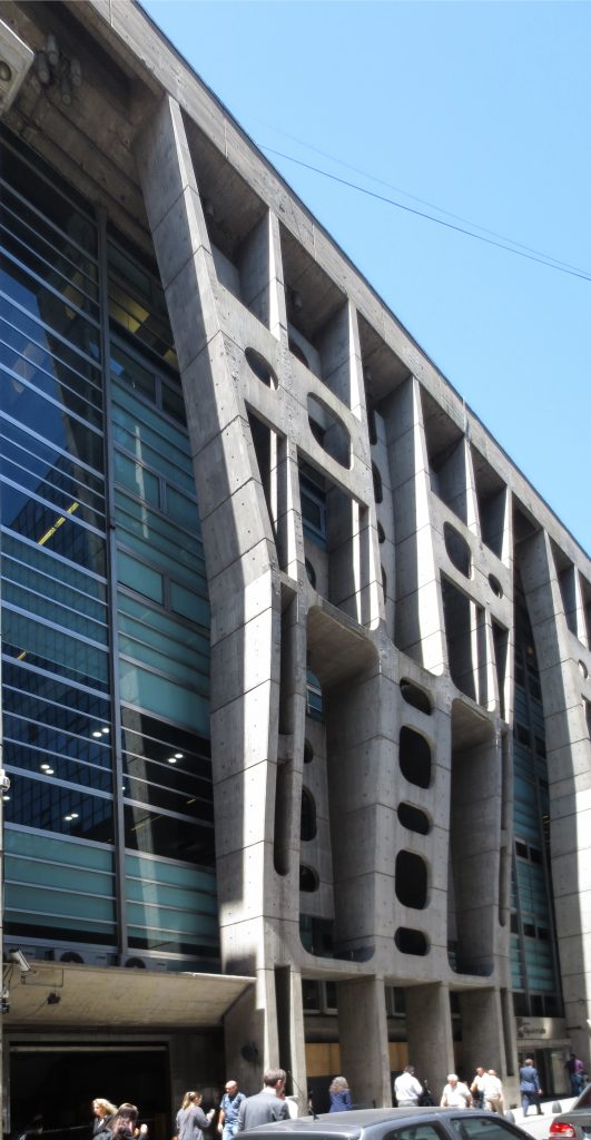
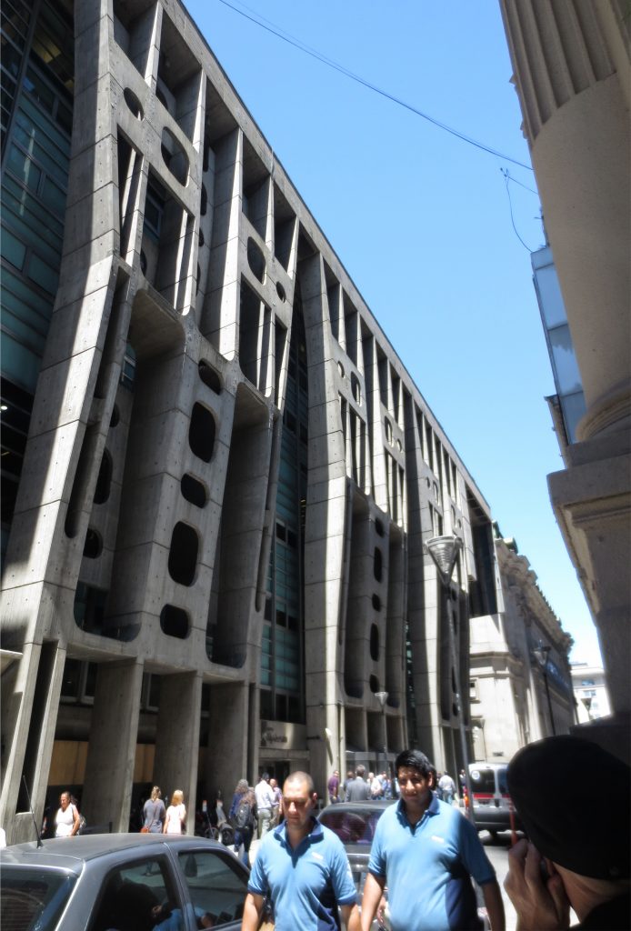
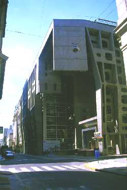
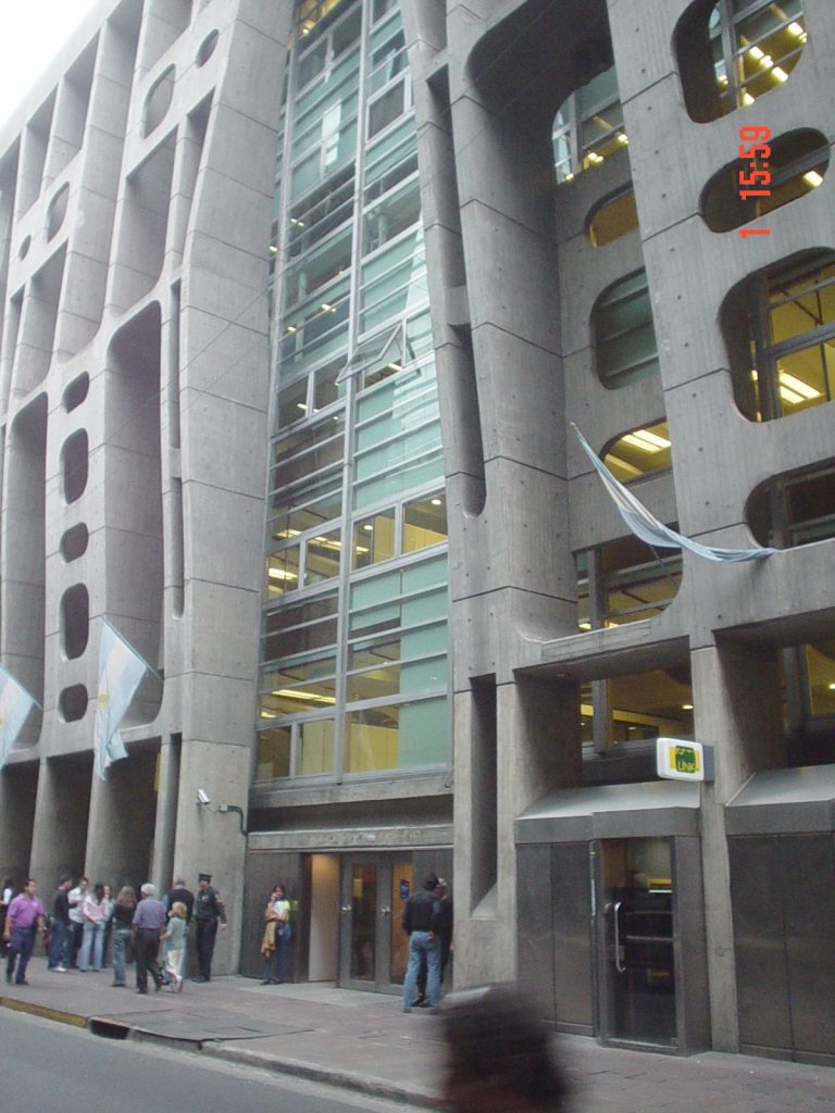
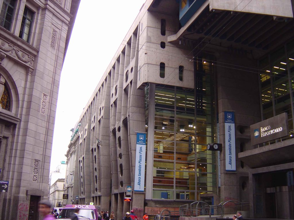
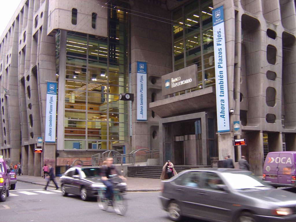
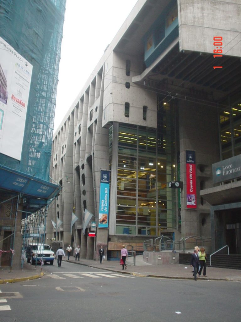
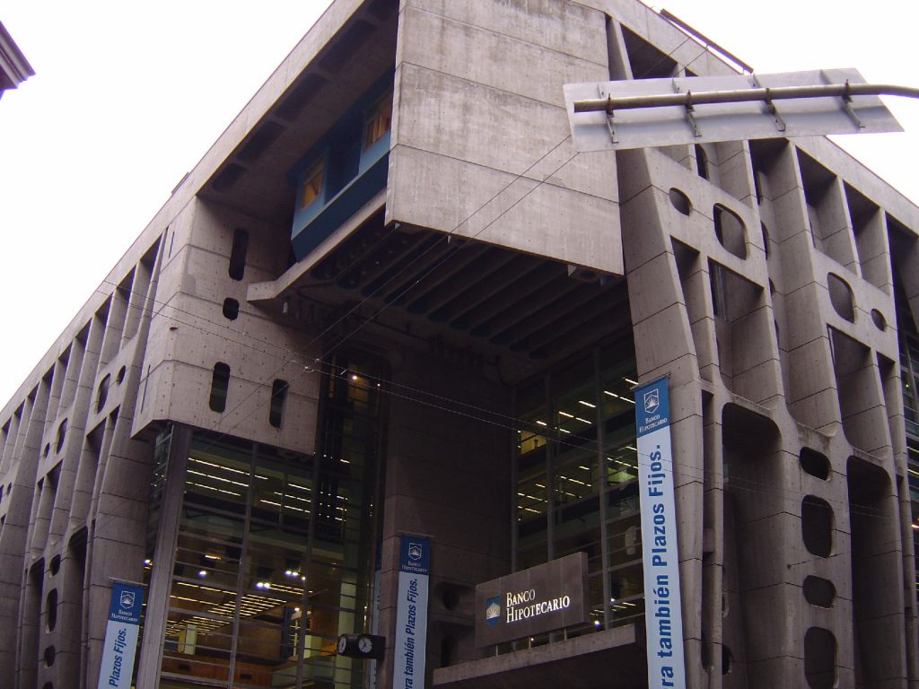
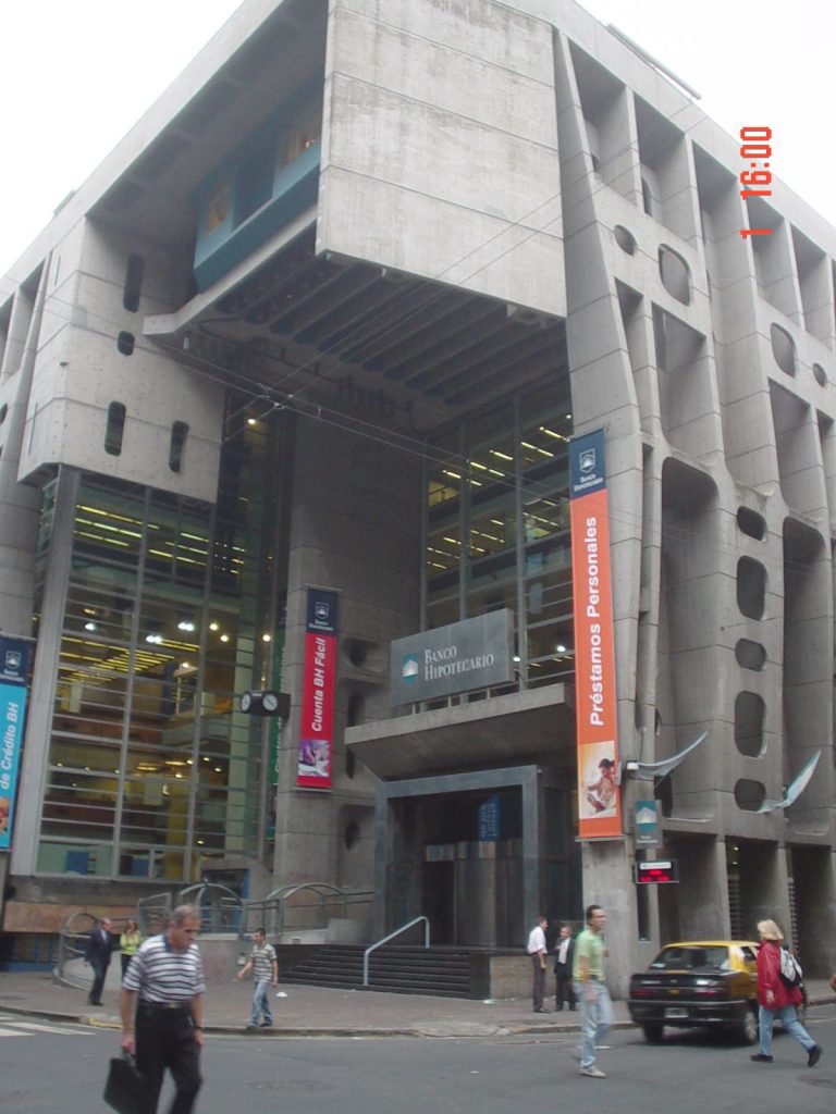
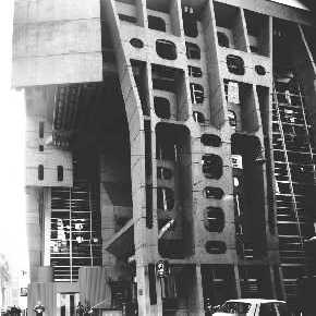
On a corner of downtown Buenos Aires emerges a huge rectangular structure of reinforced concrete. It is strange and unusual in contrast to traditional bank buildings that surround it.
Concept
The innovative mechanisms at work are several. First, the approach of integrating the building to the cityscape as a space of continuity and not closed marked a break with the traditional positions of architecture.
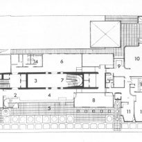
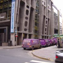
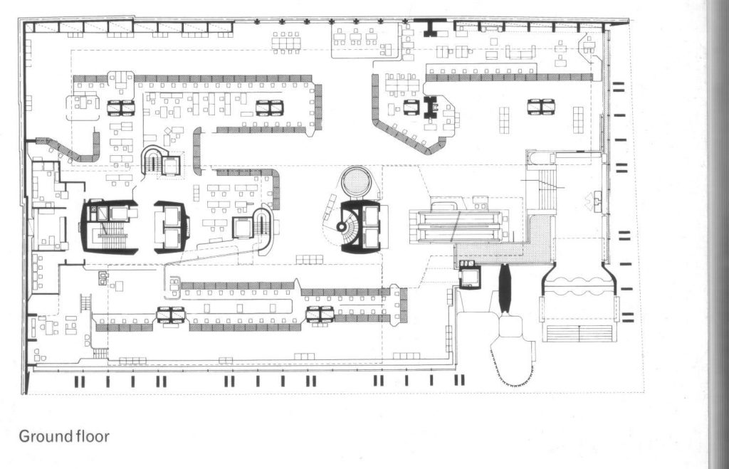
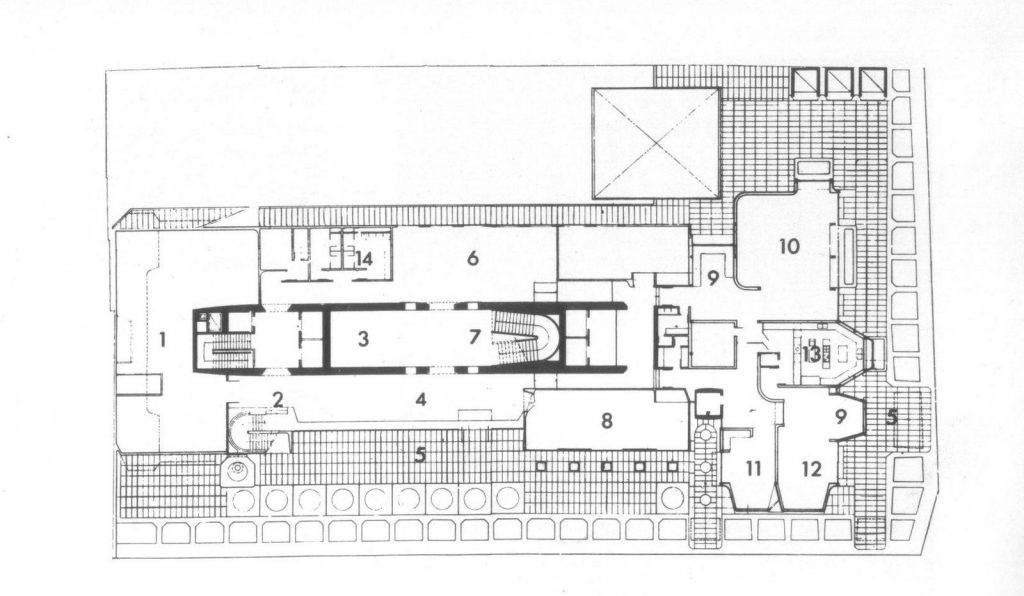
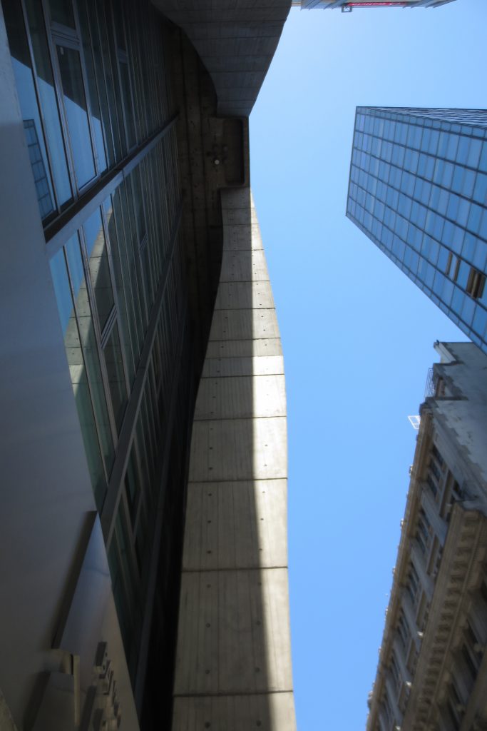
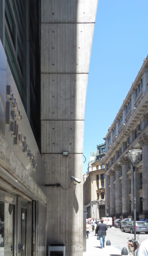
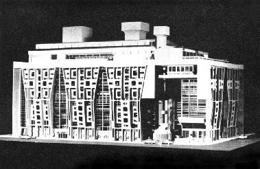
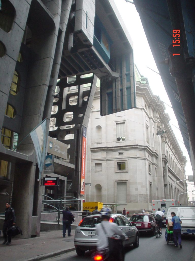
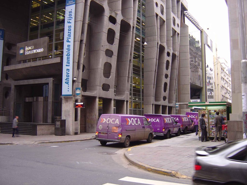
The bank is located between two very narrow streets: Reconquista and Bartolomé Miter, each about 10 meters wide. The project was thought to be taking advantage of this angle bounded by neighboring buildings. The main idea was that the city penetrated within the bank; there was no division between internal and external space, thus extending the narrowness of the streets. According to its designers, the Bank of London should not function as a conventional building, but rather as a covered plaza.
The Brutality in Argentina
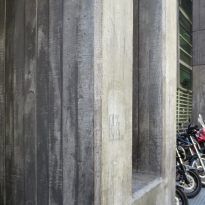
The so-called “brutality” was an architectural trend of European origin that had an important development in Argentina in the years between 1950 and 1960. It was marked by conducting a critical reading of the conventions and cliches, emphasizing the search for a poetic dimension to the architecture through the use of light, wide open spaces and a particular application of the materials. The building was intended to show traces of brutality in the build process as a new ornamental concept, showing the constructive language of reinforced concrete, brick, glass and iron.
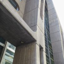
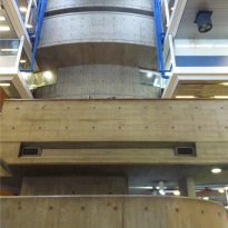
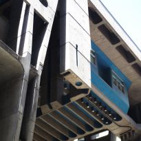
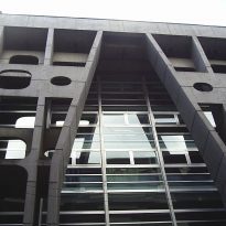
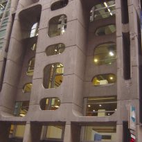
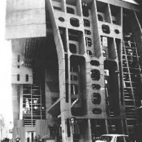
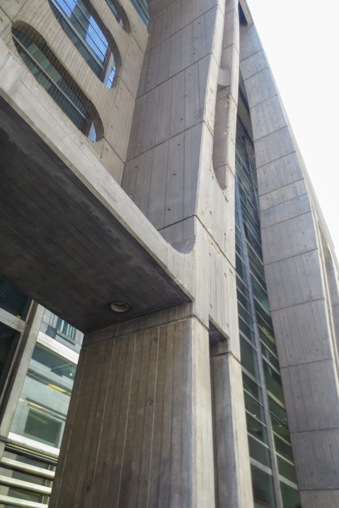
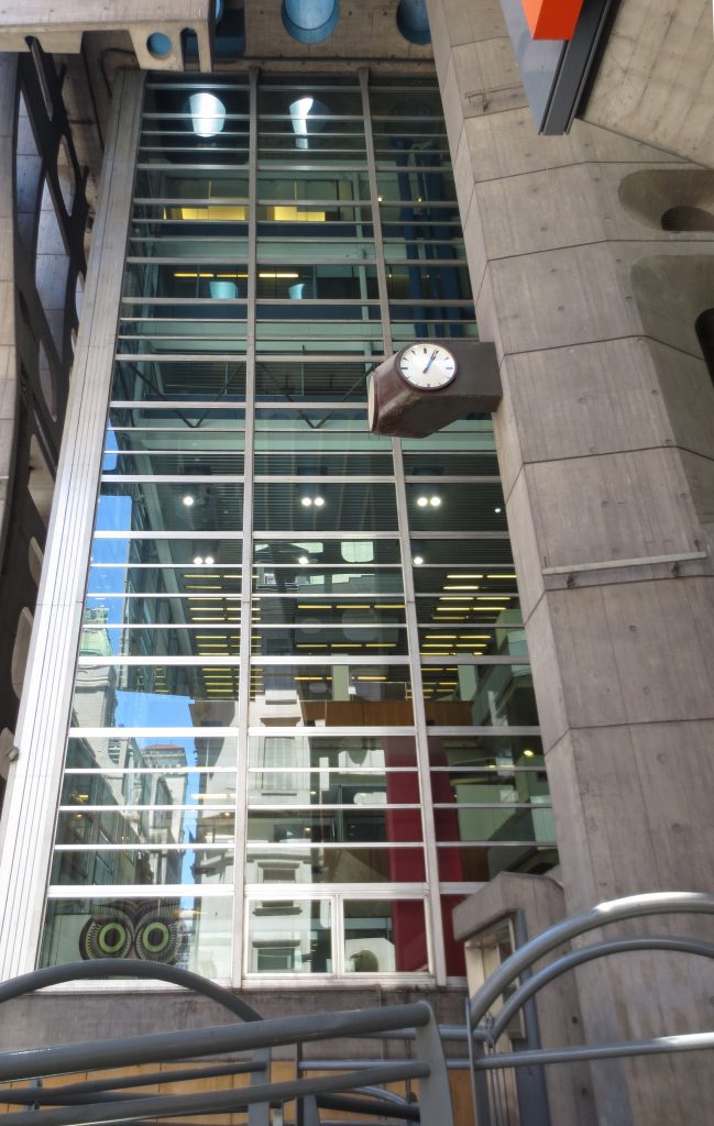
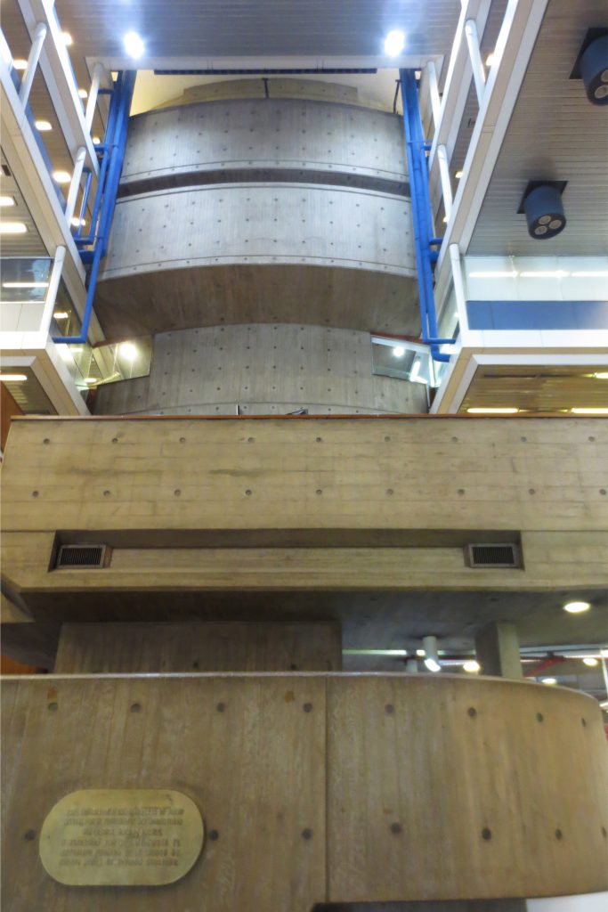
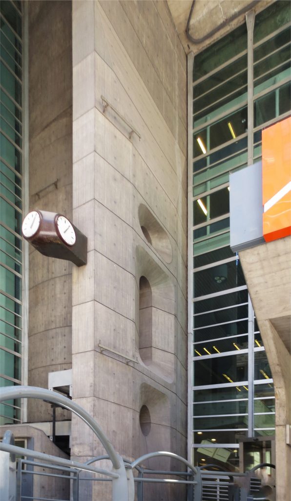
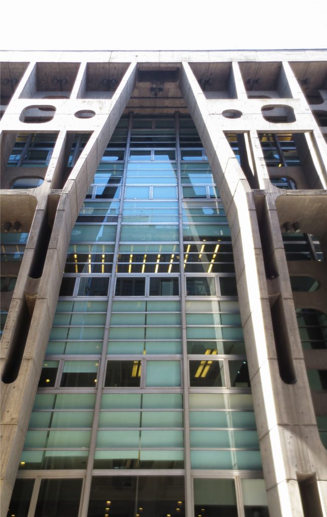
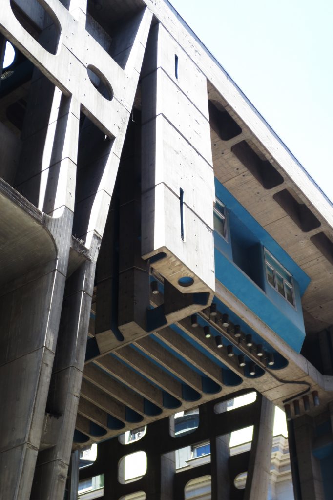
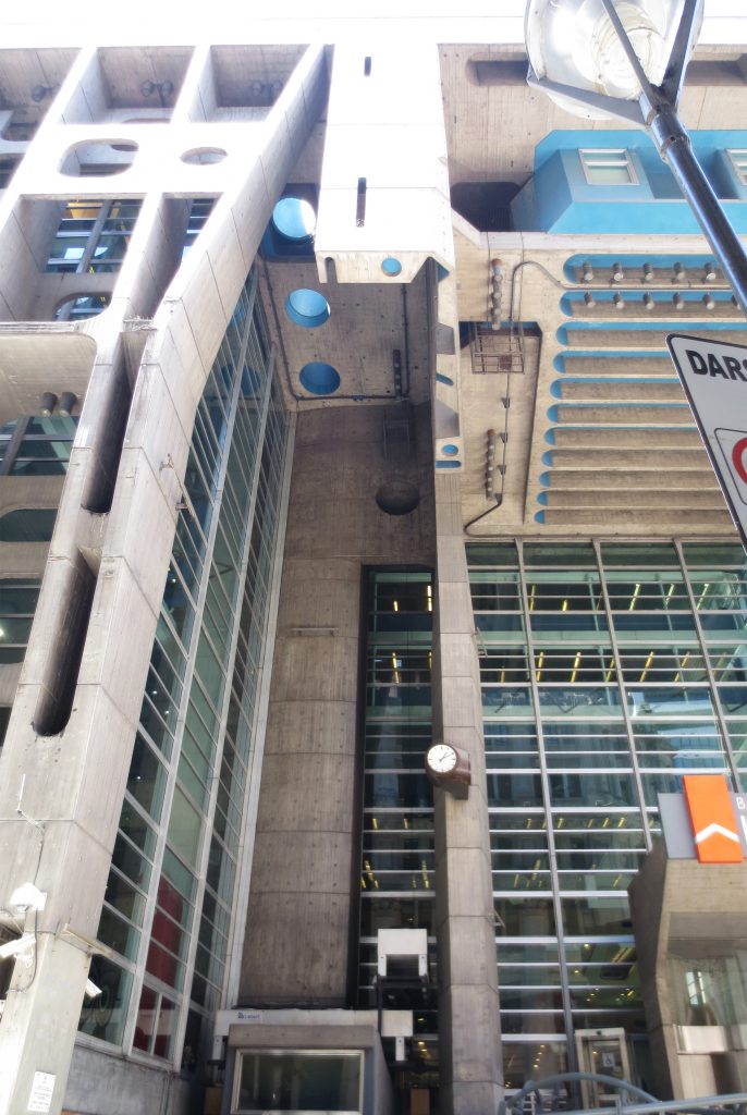
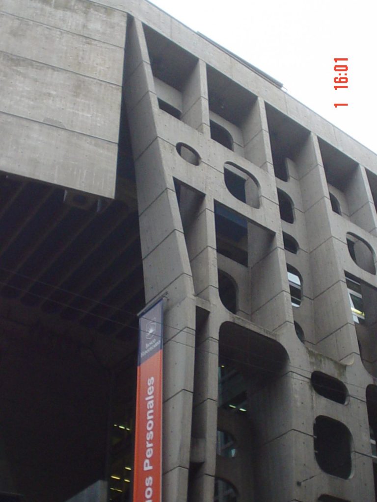
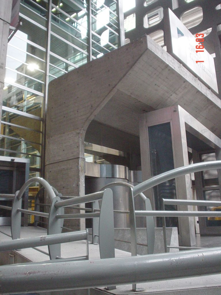
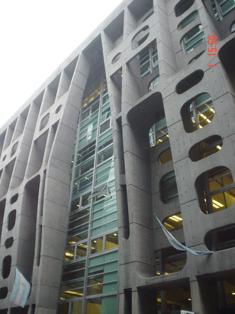
The central column of the work had a fundamental expressive role, and was stripped of any formal representation. This effect was achieved by releasing the floors, hanging or mezzanine, emphasizing the edge beams to create horizontal lines to dominate large austere areas. It also gave the columns a sculptural treatment, porches and staircases, making up two and three stories.
In Argentina, “the brutality” recognizes three different sources. First, the legacy of the Franco-Swiss architect Le Corbusier, as evidenced in works such as the Swiss Pavilion of the City University of Paris (1930) and the Housing Unit of Marseille (1945). The new English “brutality” was conceived around the ideas of Allison and Peter Smithson, the critic Reyner Banham, the photographer Nigel Henderson and visual artist Eduardo Paolozzi. His works were the Ecole, emblematic of Hunstanton (1949-1954) and the Economist Building in London (1967), a building that combines offices, homes and a bank. Finally, and to a lesser degree, another record of brutality in Argentina is the American formalism, with works by Eero Saarinen.
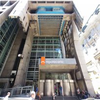
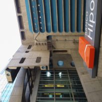
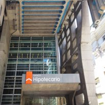
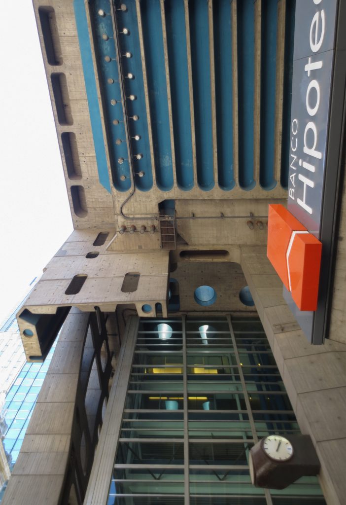
The “brutality” had a great influence within the institutional spaces and won through a contest. The use of perspective brutality in government buildings was stated as a legitimate design option, which later was adopted in buildings destined to become colleges, universities, hospitals and bank headquarters. His brilliance was in the beginning of the’60s and his most important are the Bank of London (now Banco Hipotecario) and the building of the National Library of Buenos Aires, both of Clorindo Testa.
Spaces
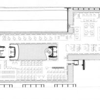
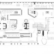
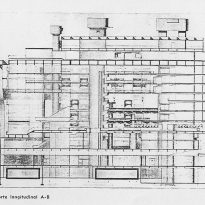
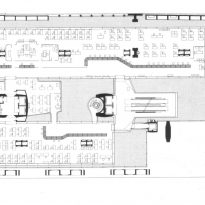
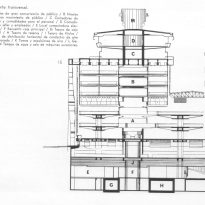
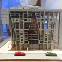
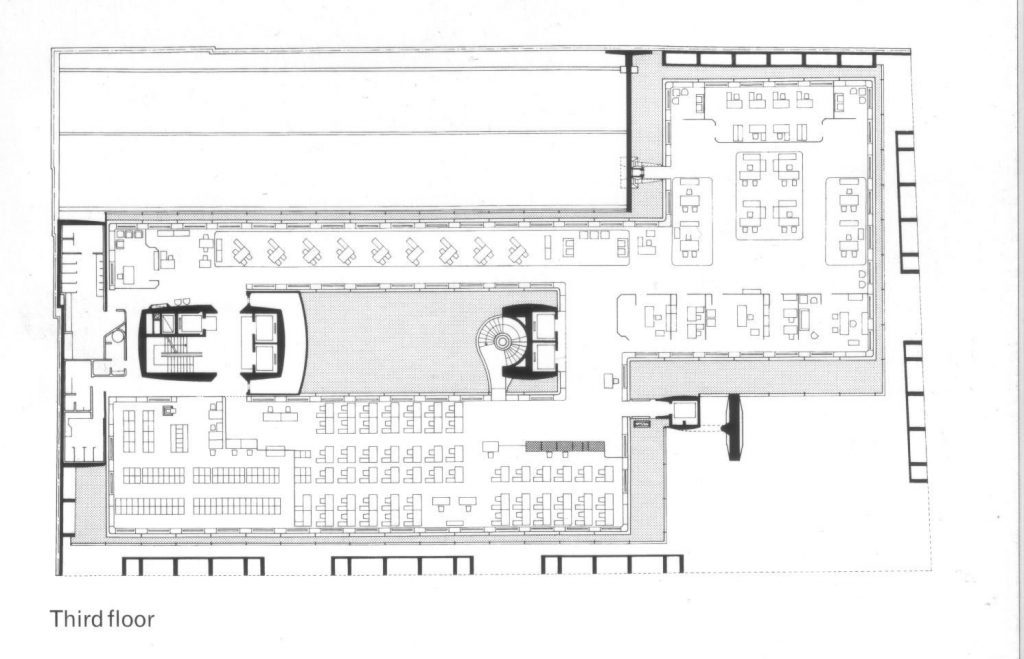
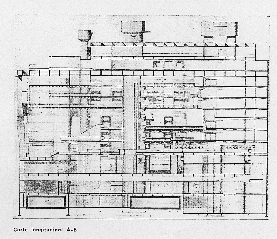
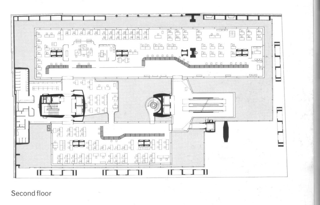
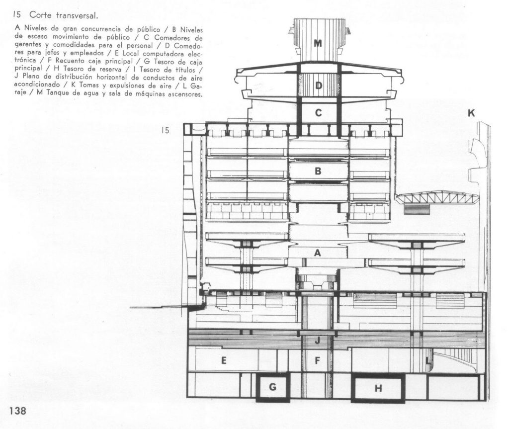
The building of the Bank of London has three floors below grade and 6 above.
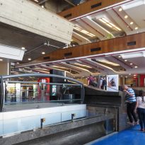
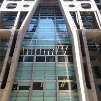
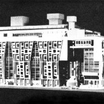
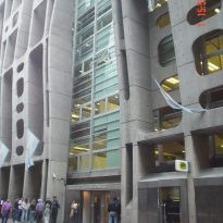
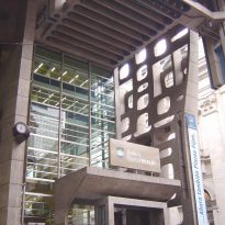
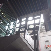
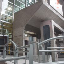
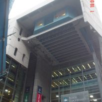
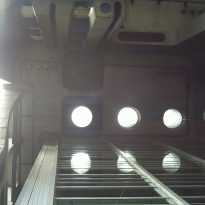
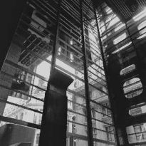
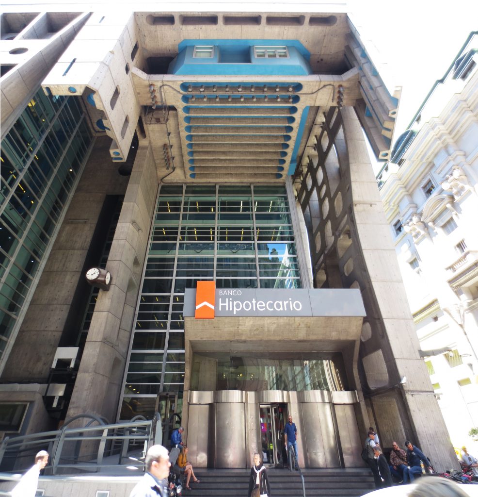
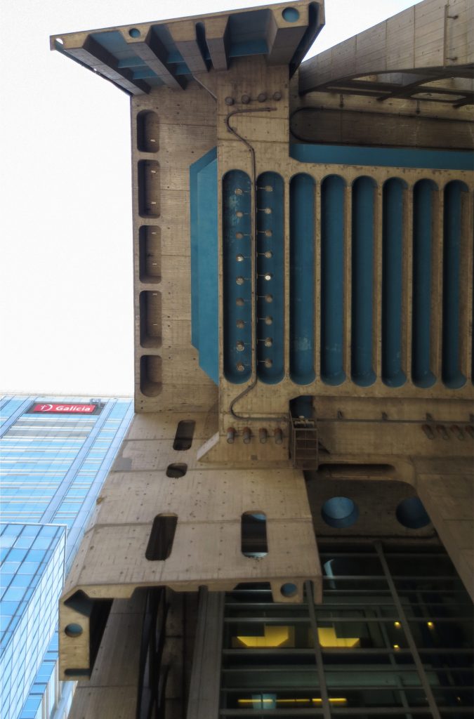
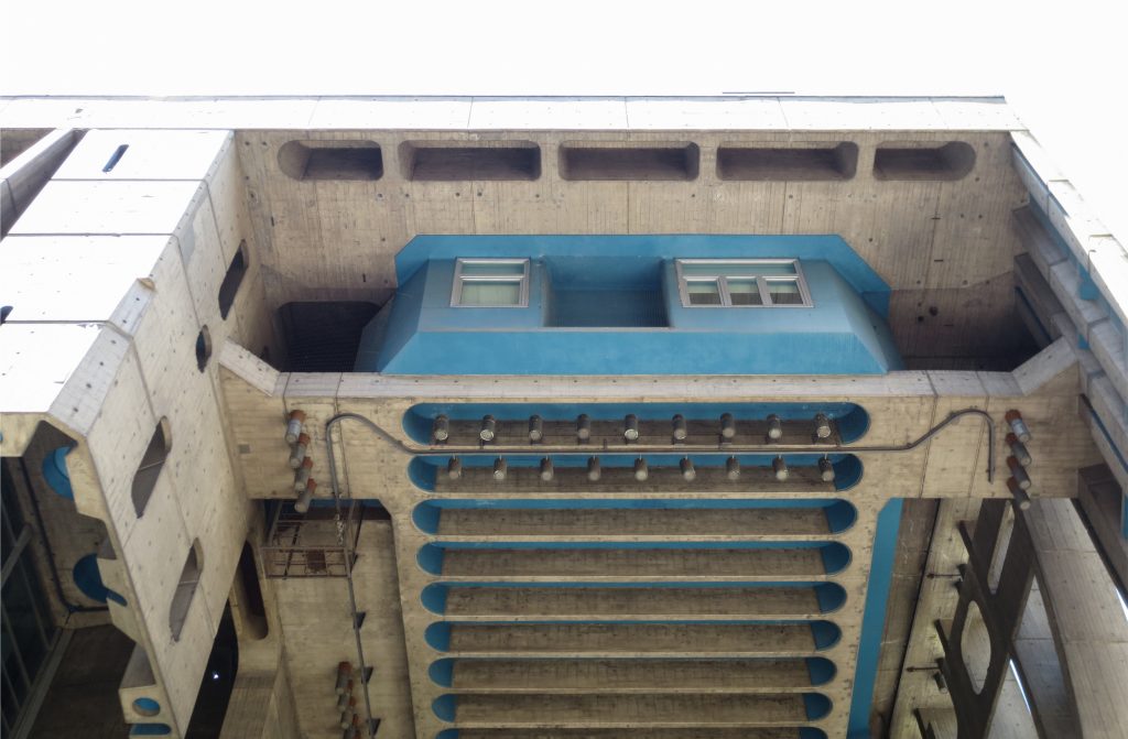
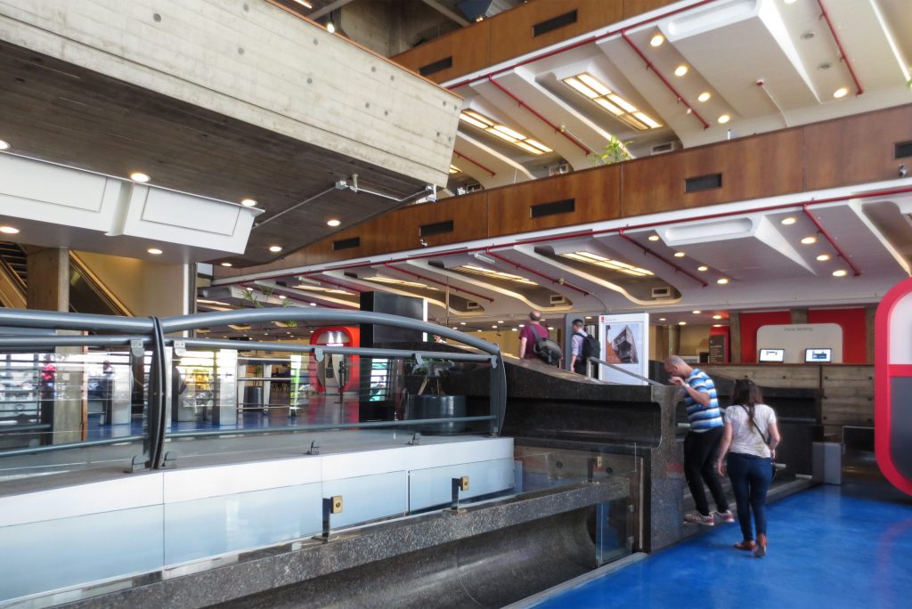
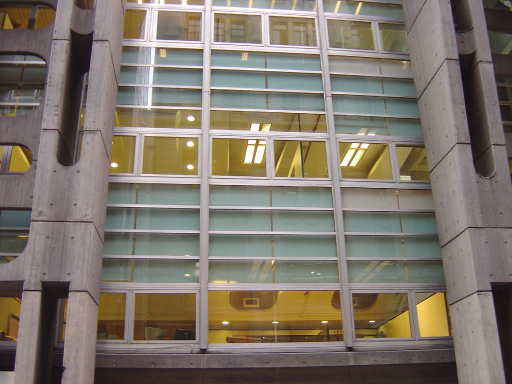
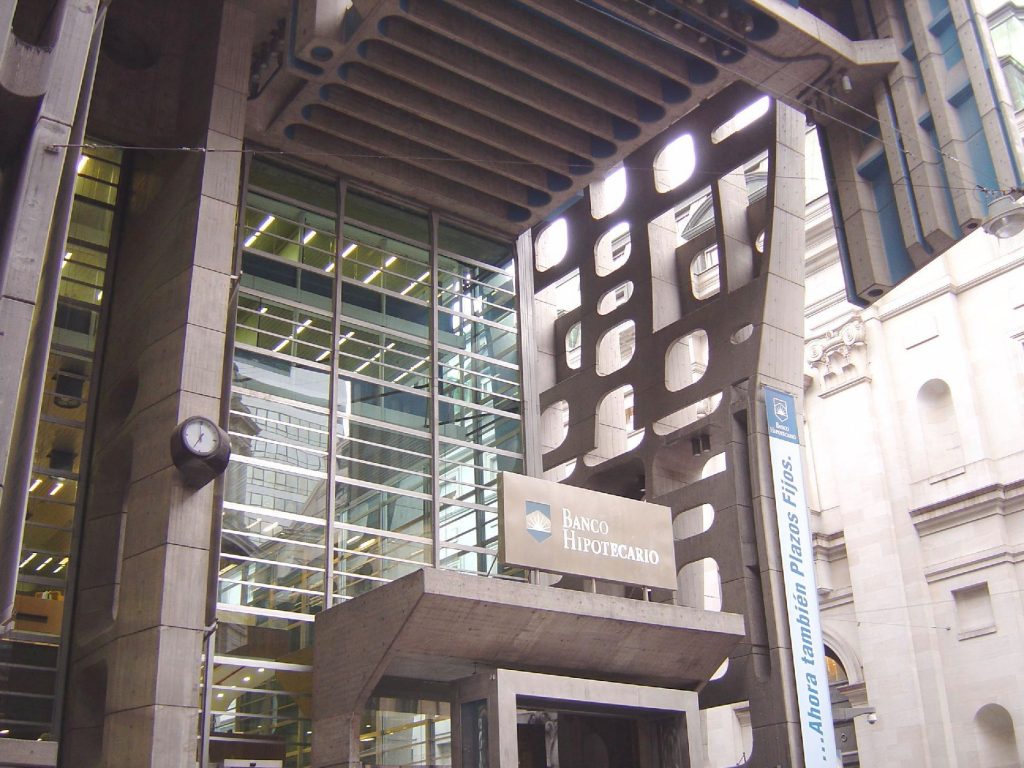
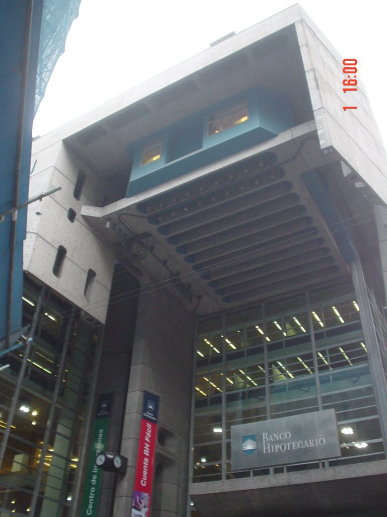
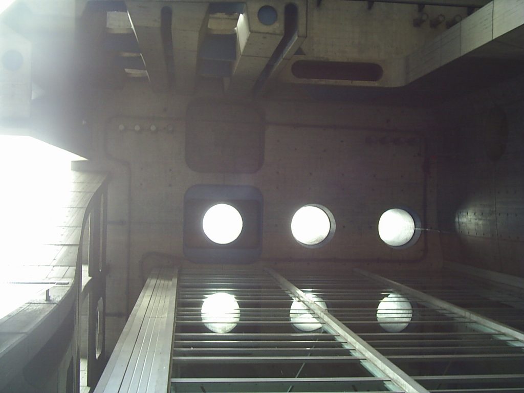
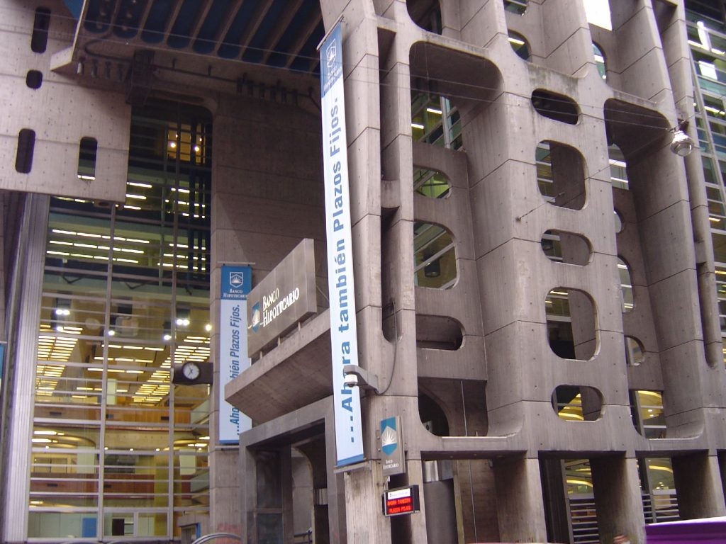
The main entrance on the corner, which makes up the space of transition is emphasized by another display of suspended concrete, which limits the visual space and from the inside. Inside the bank, six levels fragment the single area of central hall, a key element of the traditional banking institutions. These levels are suspended from the ceiling by major steel tie rods, which allows freedom of the work space.
Structure
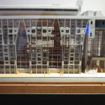
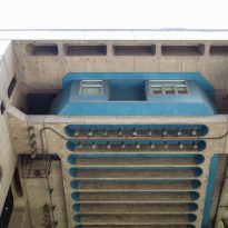
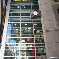
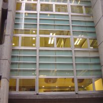
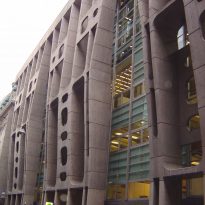
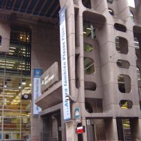
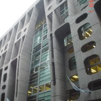
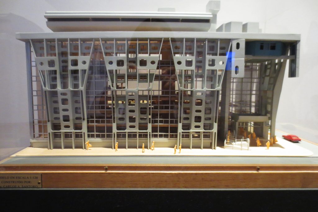
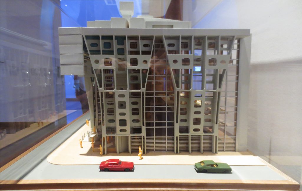
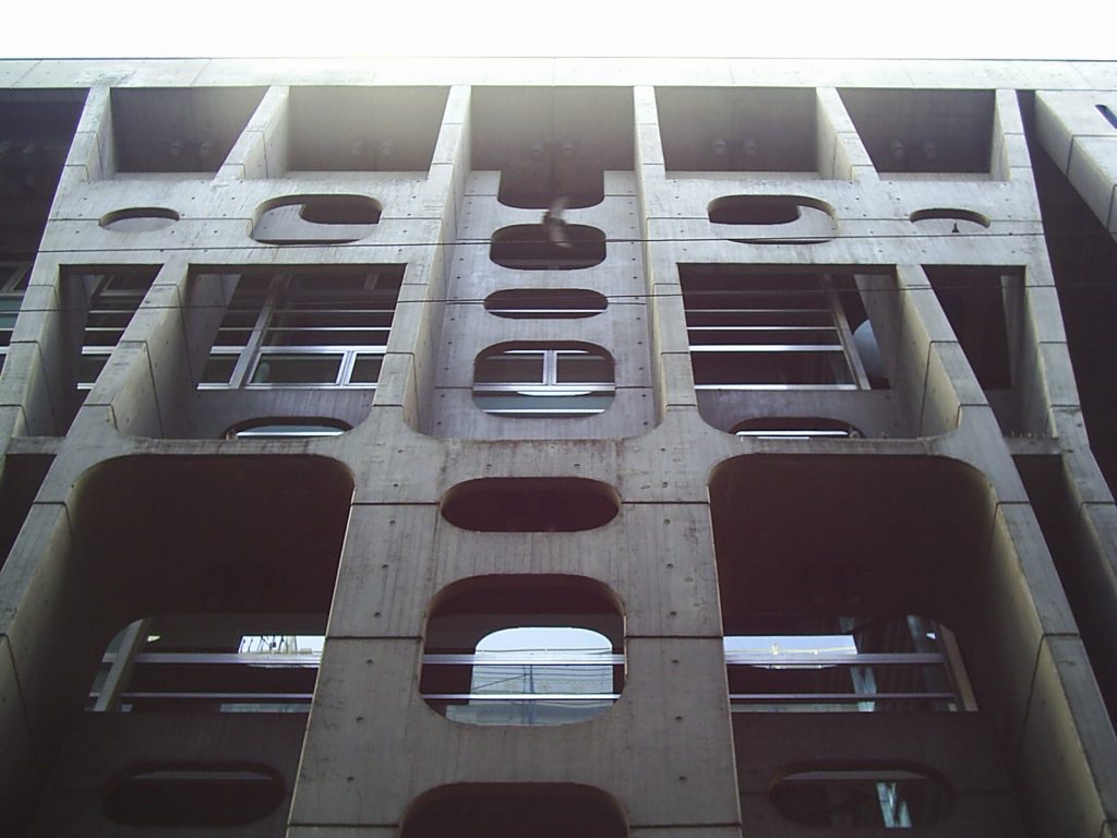
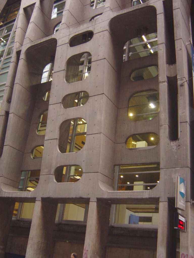
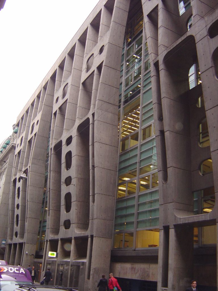
The entire structure operates in a single volume. This scheme is understood and defined by three key elements: the block of the roof and two median walls. The volume is completed through the system used in its two facades, a column perimeter. The roof is supported in part by the colonnade, which also fulfills the role of protective screen against the interior reflections of the sun.
Materials
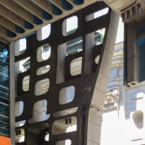
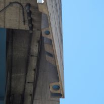
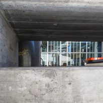
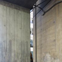
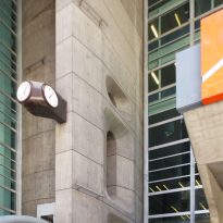
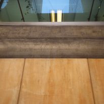
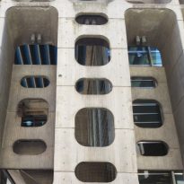
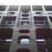
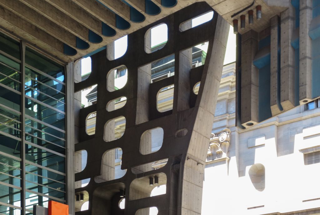
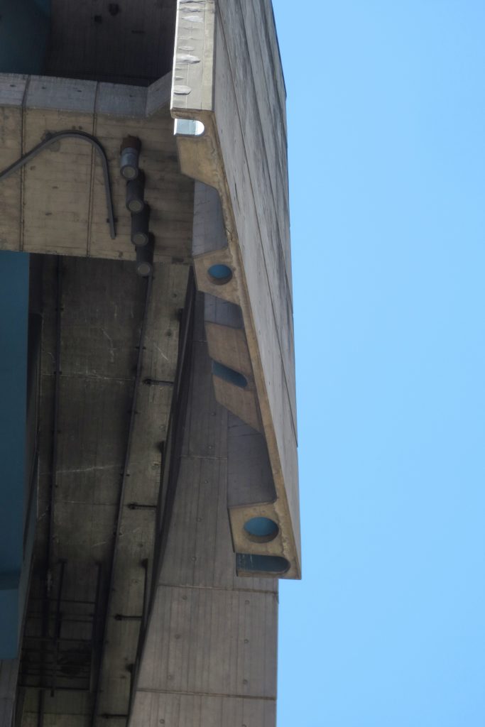
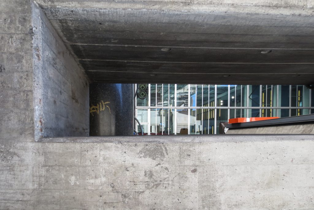
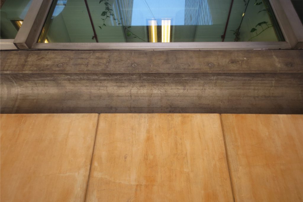
The special treatment of reinforced concrete, modeled as a sculpture, with its shuttering treated in curves, jagged and drilled along geometric patterns, reinforces the innovative nature of the work. The sculptural and functional use of reinforced concrete is a hallmark of Clorindo Testa.
