Library and Learning Centre University of Economics Vienna

Introduction
The building of the architect Zaha Hadid for the new Library and Learning Center of the Vienna University of Economics, (Library and Learning Center – LLC), located on the new Campus of the city, is more like a luxurious ocean liner than a traditional building.
The general design of the new Campus is the result of an urban design competition held in 2008, resulting in BUSarchitektur responsible for carrying out the Campus master plan and another 5 architects chosen to design the buildings, including the architect’s studio.
Opened in early October 2013, the structure houses around 24,000 students and 1,800 employees.
Situation
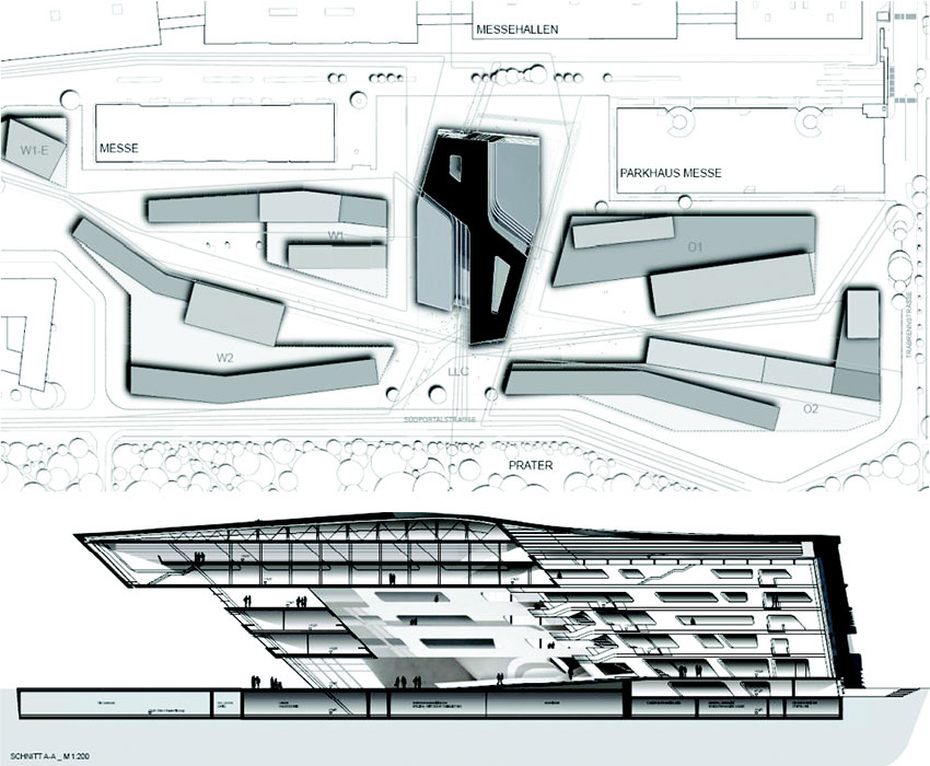
Located in the center of the new University Campus in Vienna, capital of Austria, it is the largest, tallest and most striking piece of architecture in the entire Campus area.
The site, in the Leopoldstadt area is located right next to the famous fairground, Prater, and on the former grounds of the 1873 world exhibition.
Concept
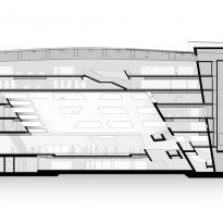
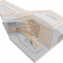
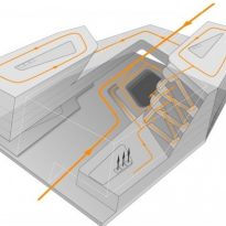
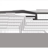
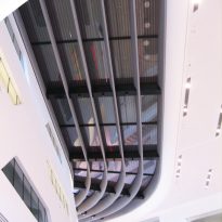
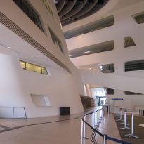
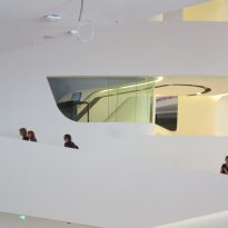
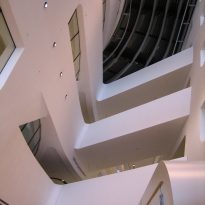
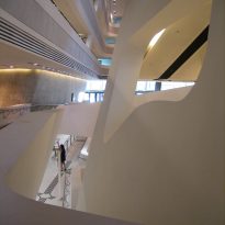
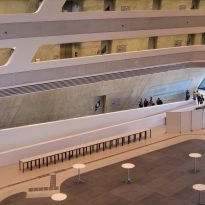
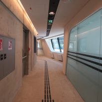
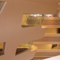
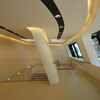
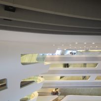
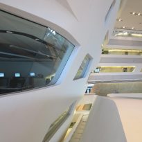
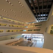
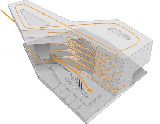
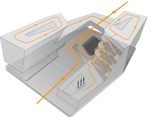
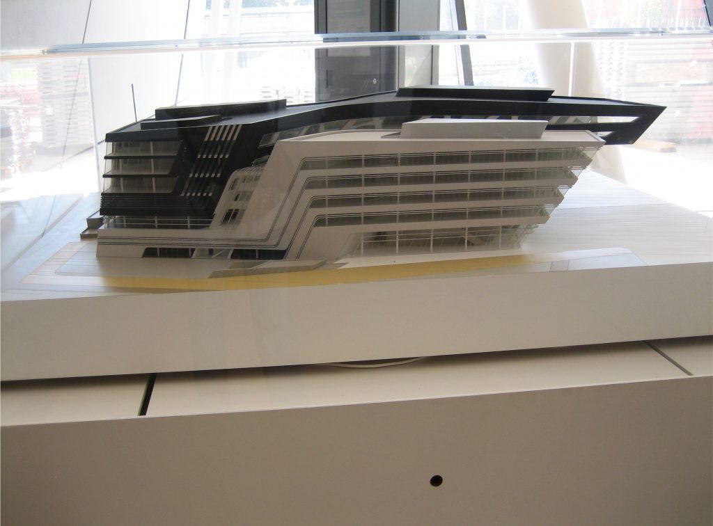
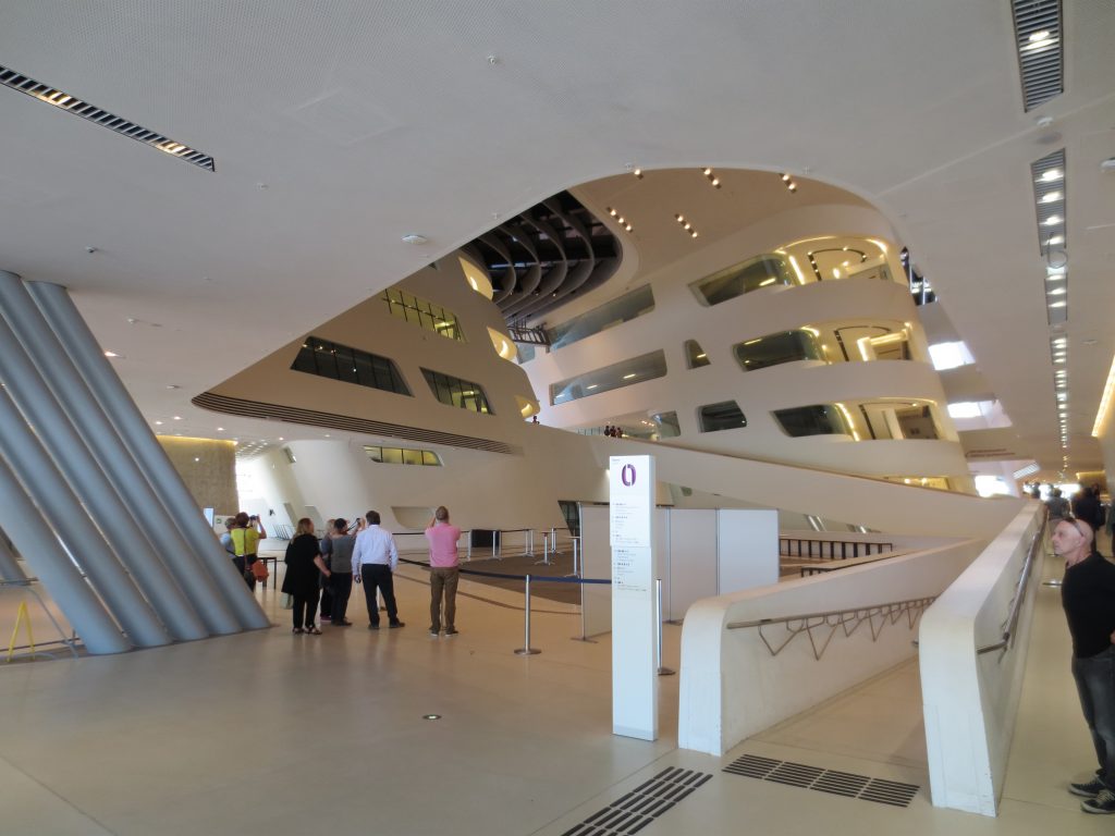
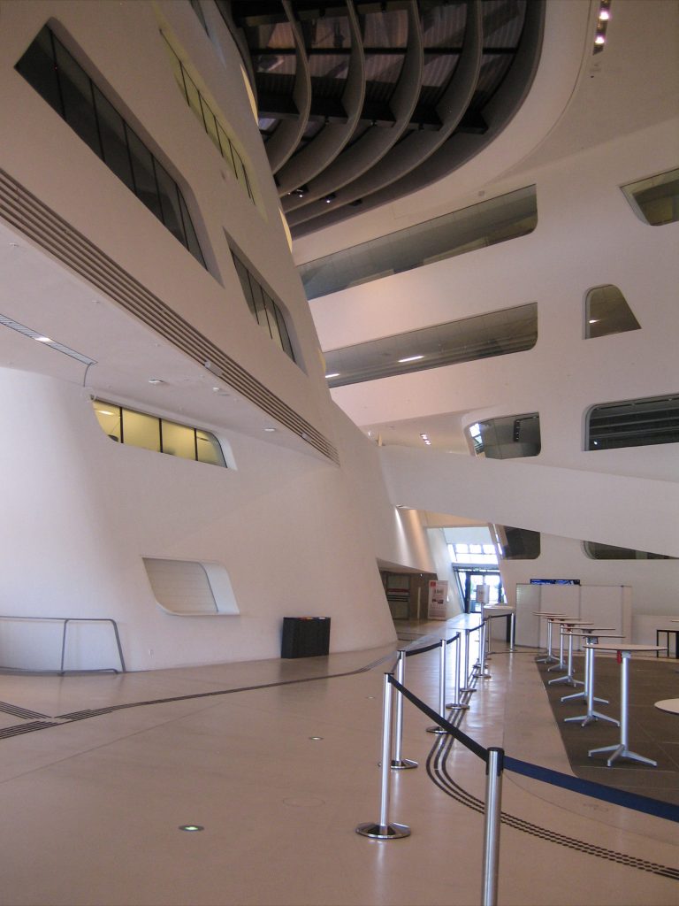
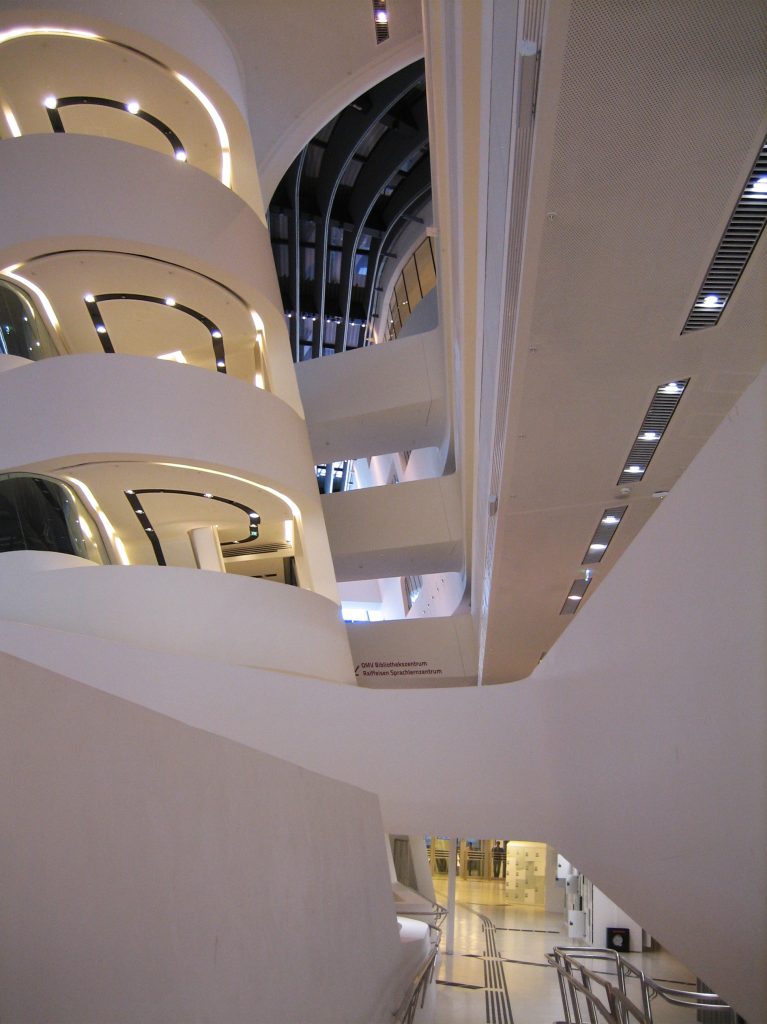
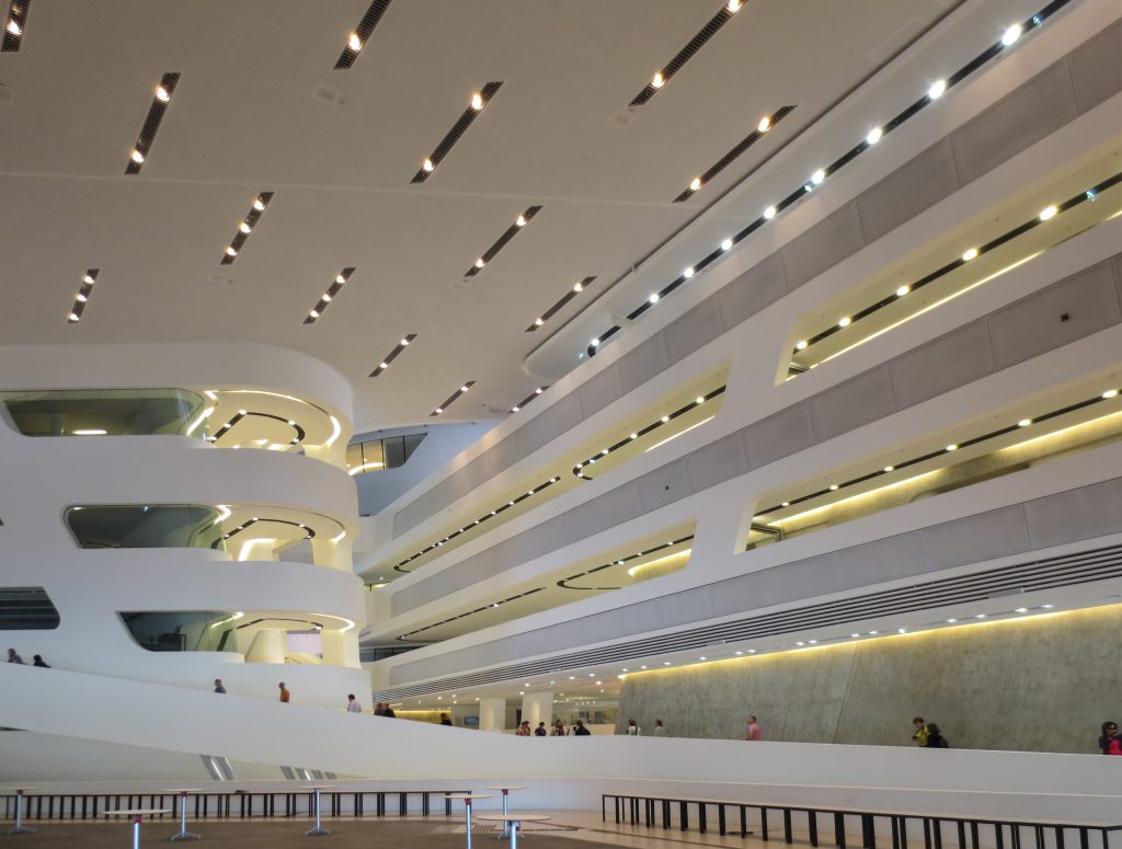
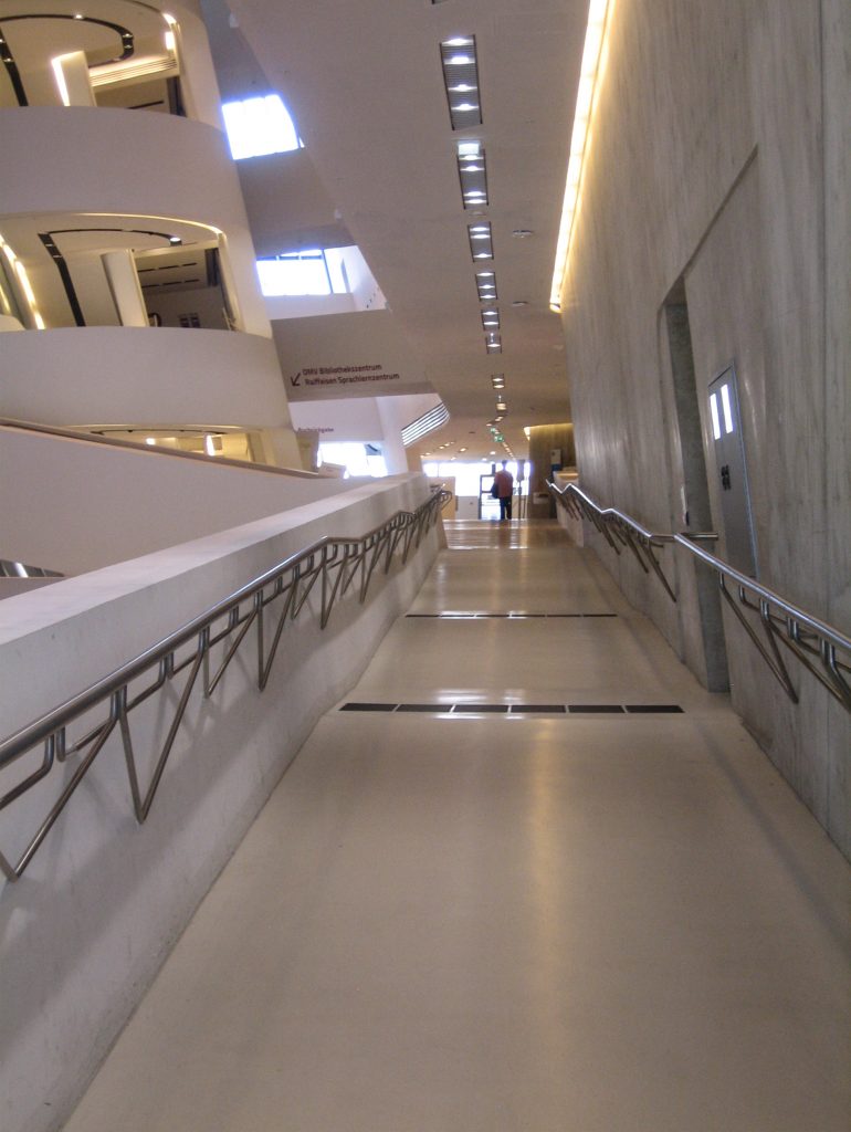
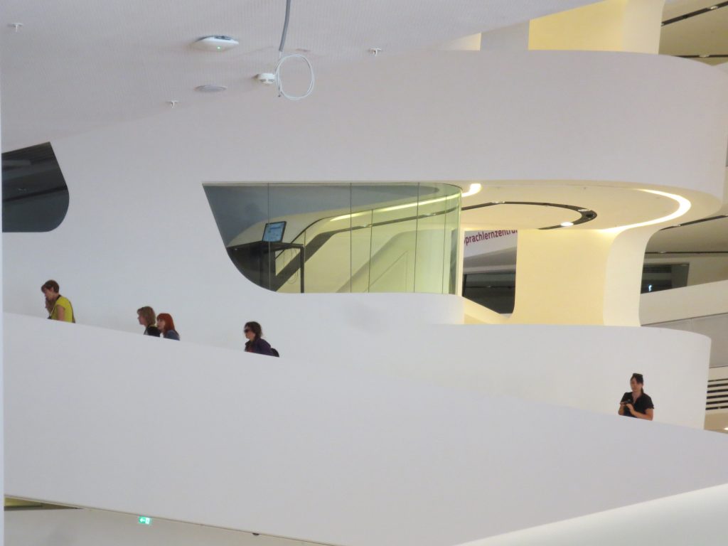
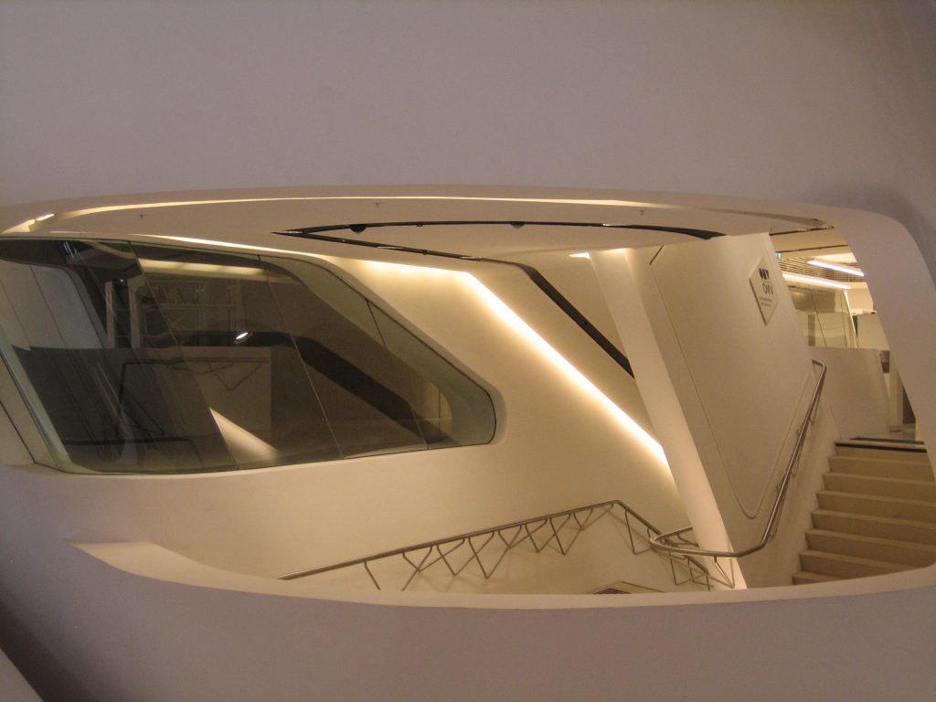
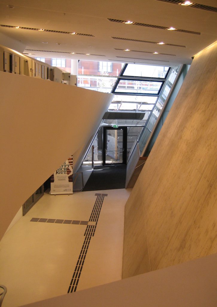
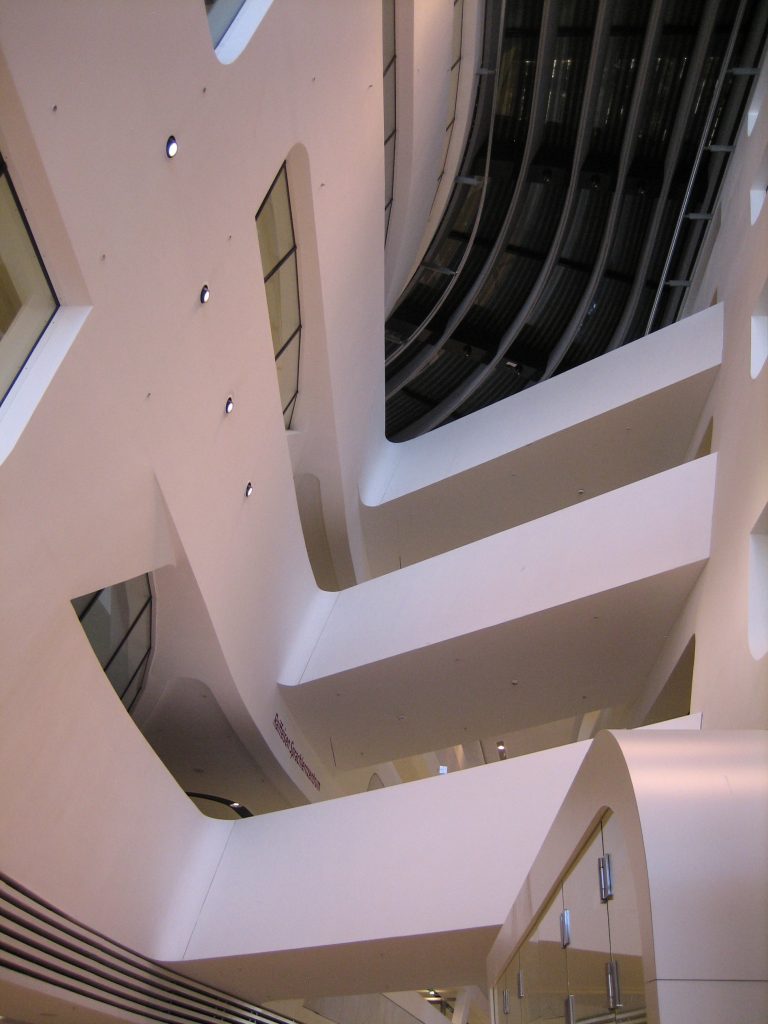
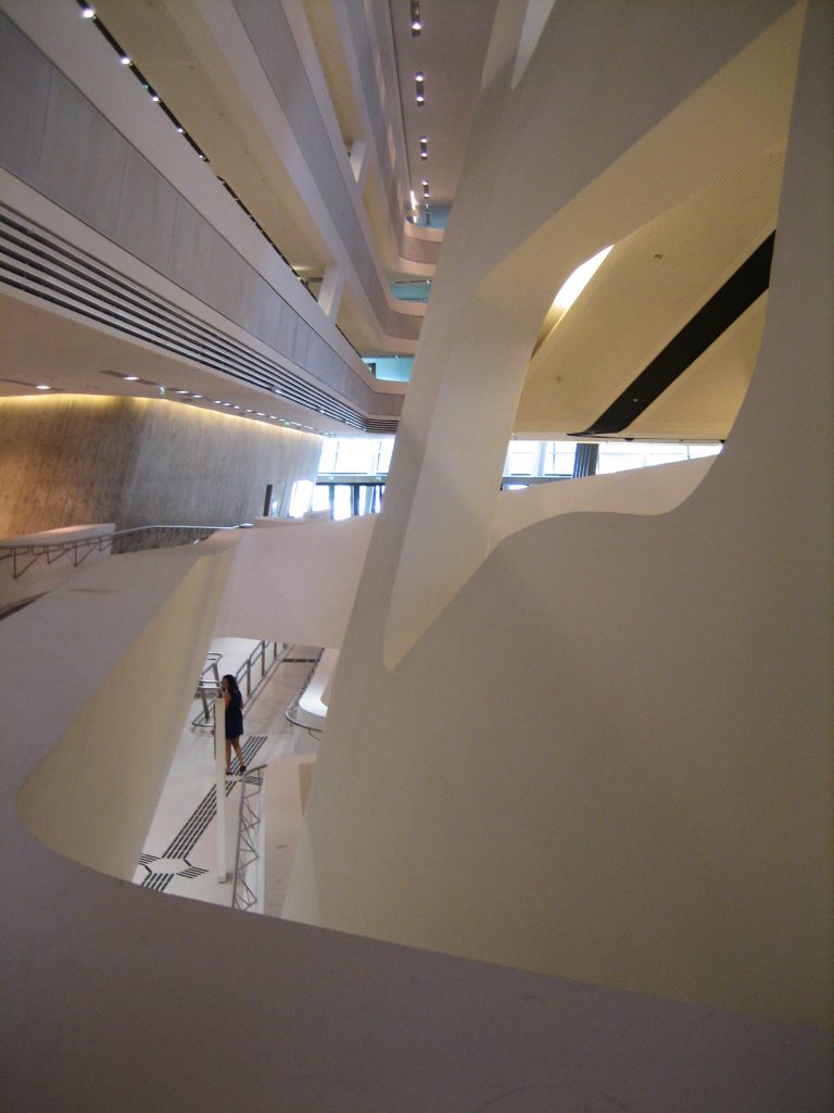
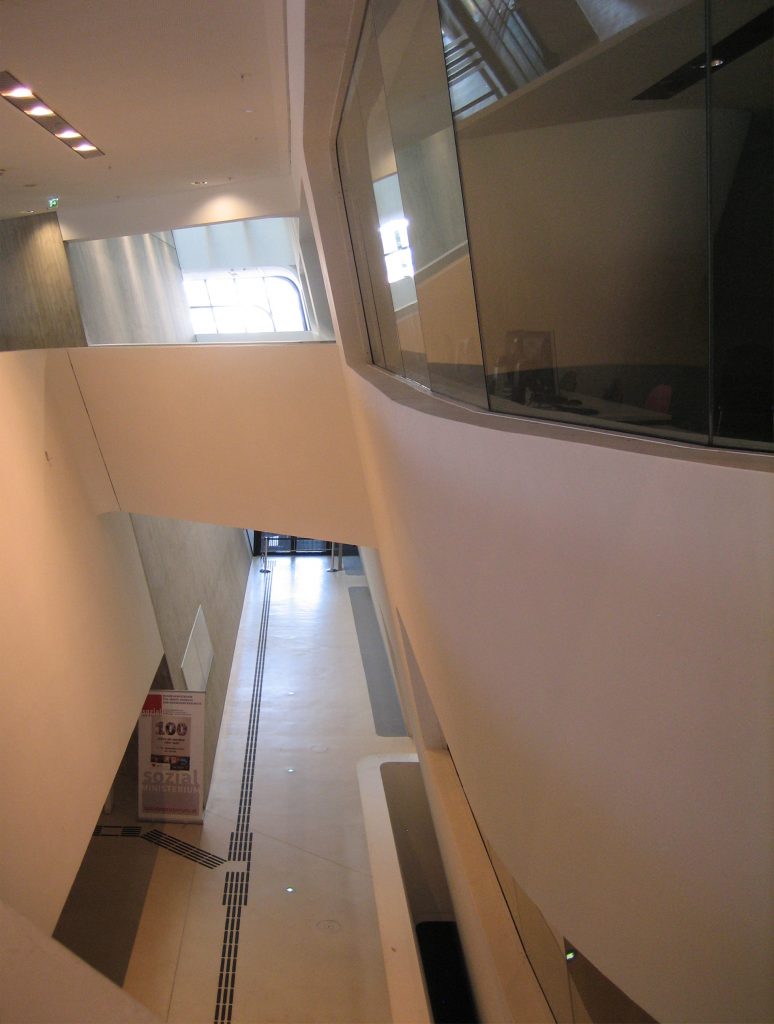
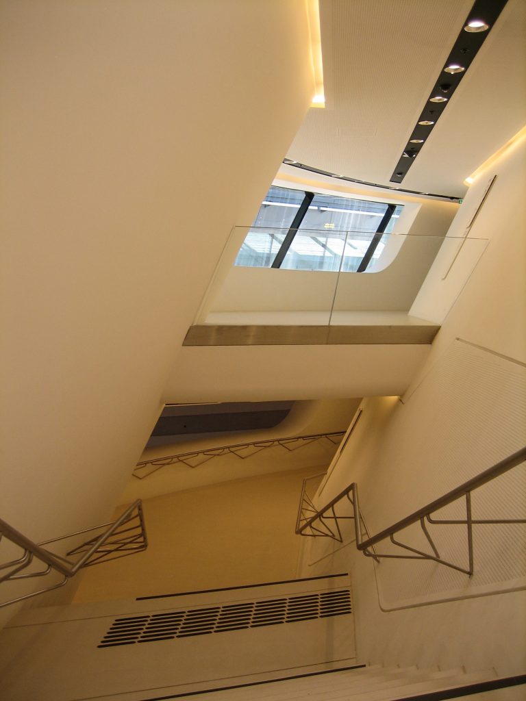
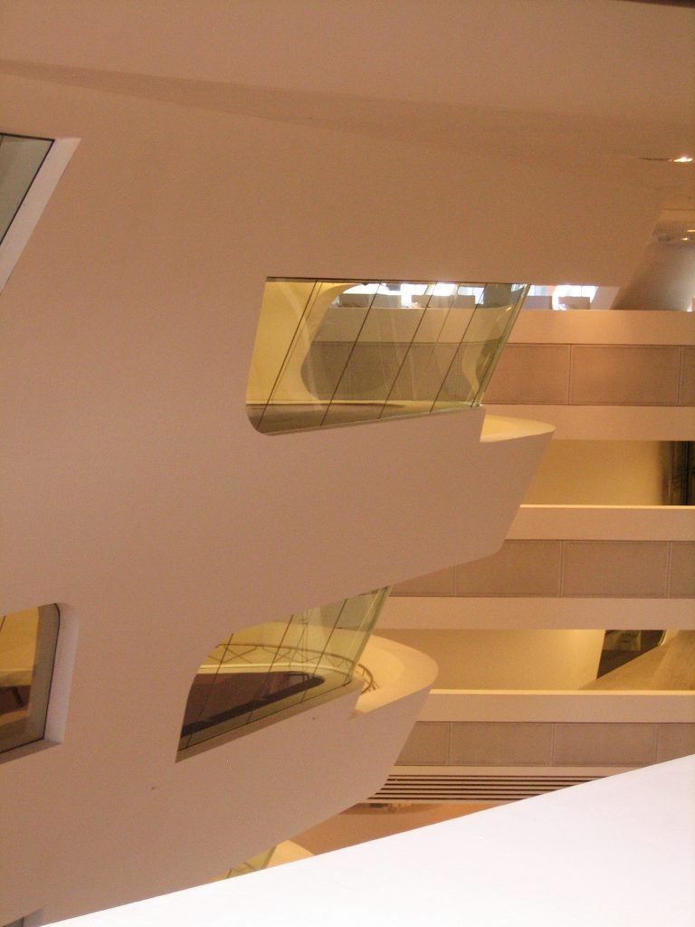
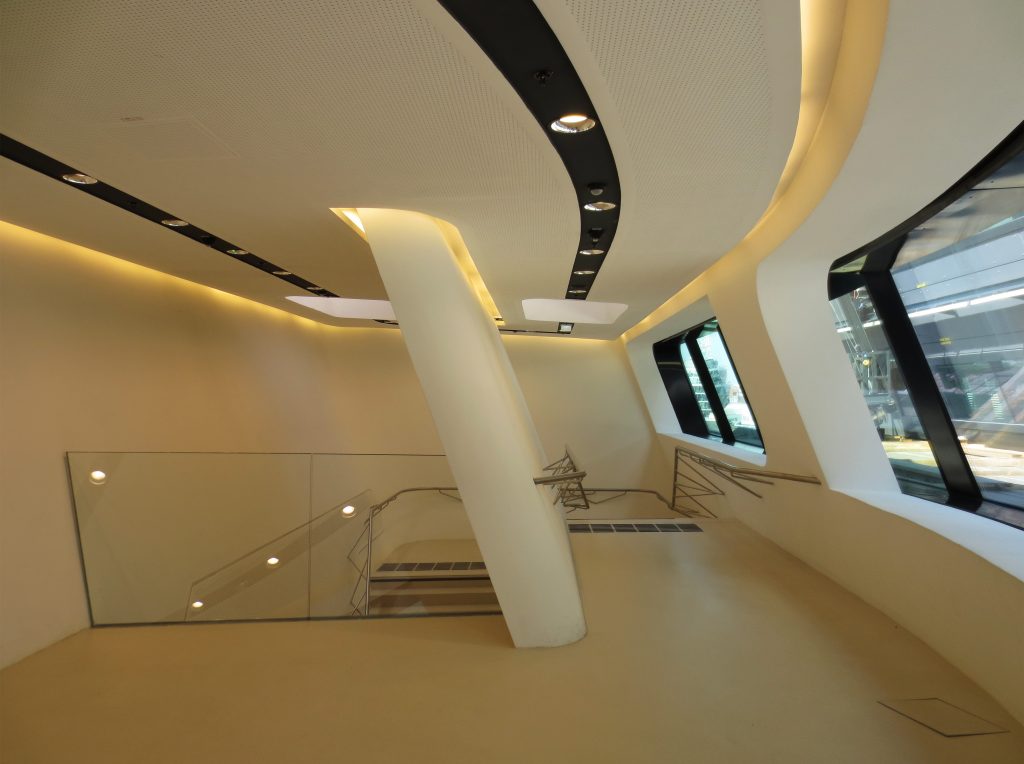
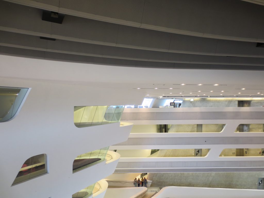
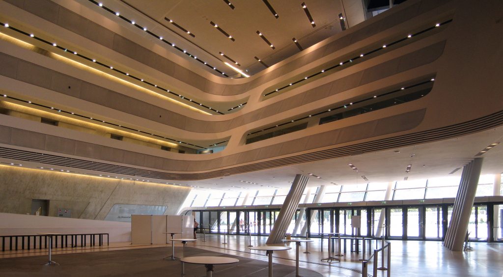
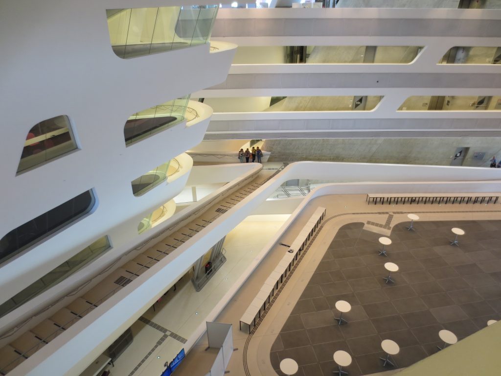
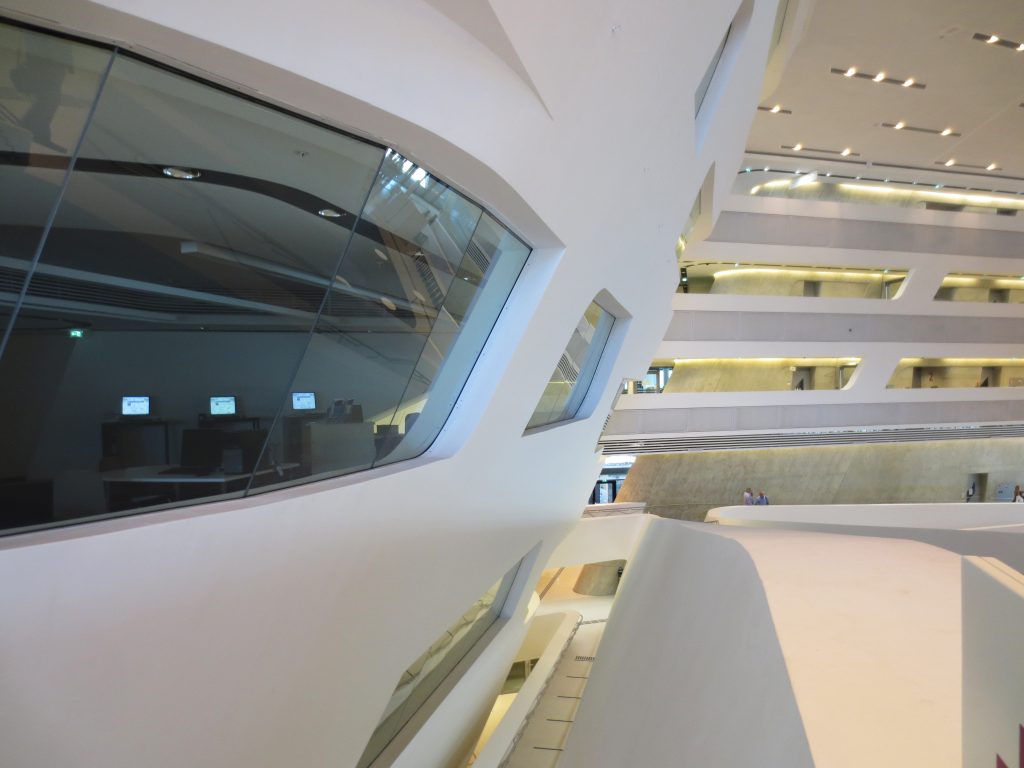
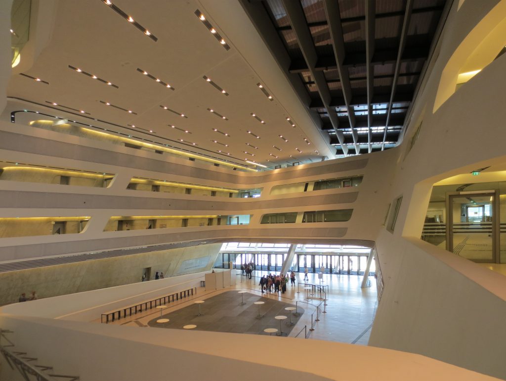
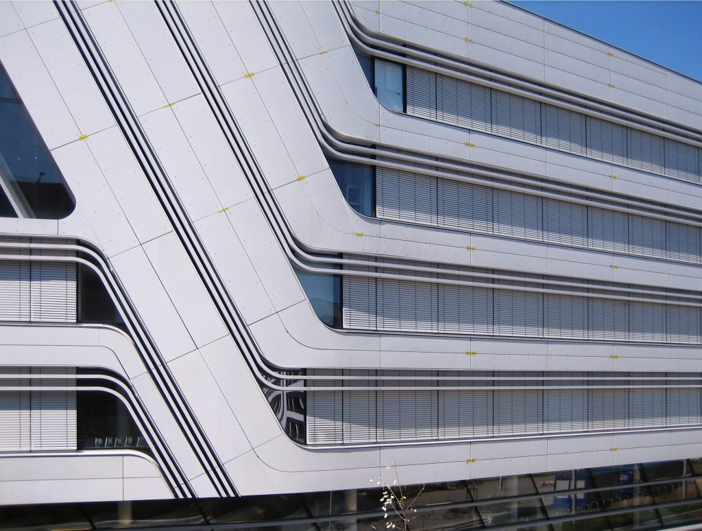
The new Library and Learning Center rises as a polygonal block from the heart of the new University Campus whose development, according to the architects, influenced its architectural design. Straight lines outside the building separate as they move inward, becoming curvilinear and fluid to generate what the architects describe as “a free-form inner canyon” whose shapes move almost like the layers of a rock formation giving place to a large central space that serves as a social and meeting point, as well as the generation of corridors and bridges that guarantee smooth transitions between different levels.
Spaces
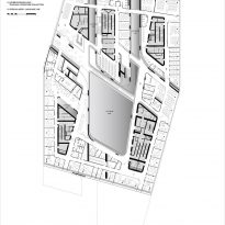
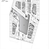
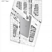
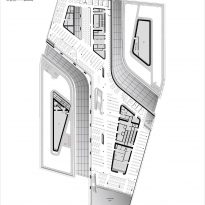
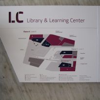
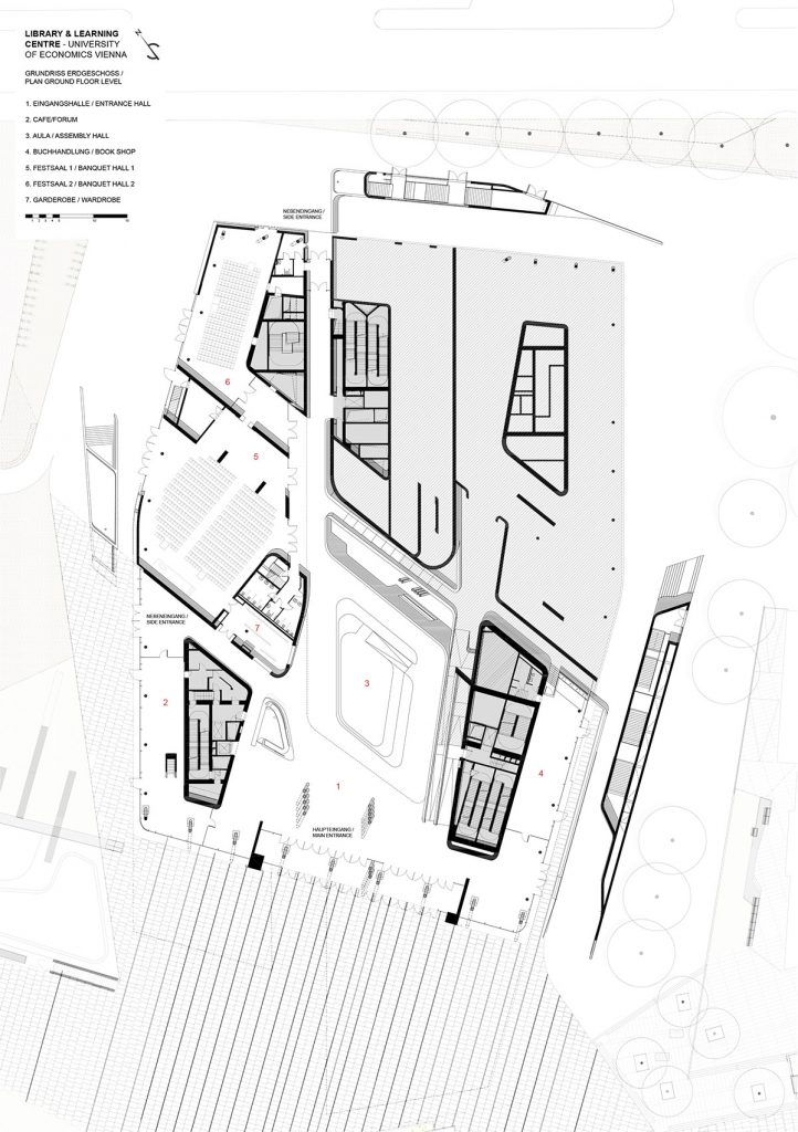
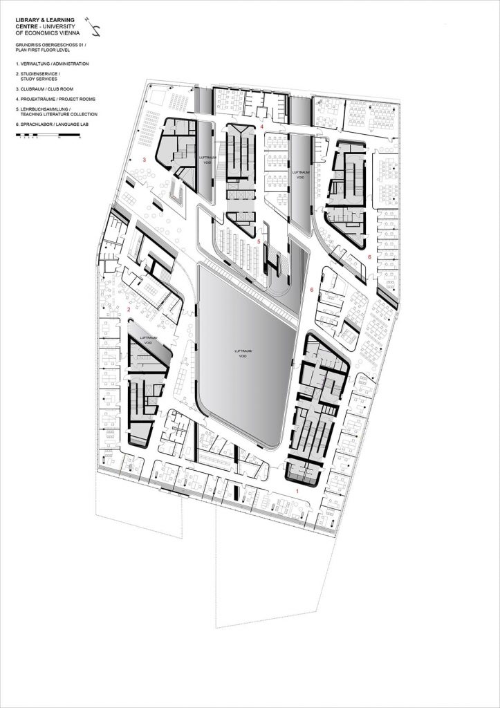
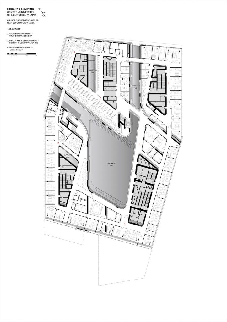
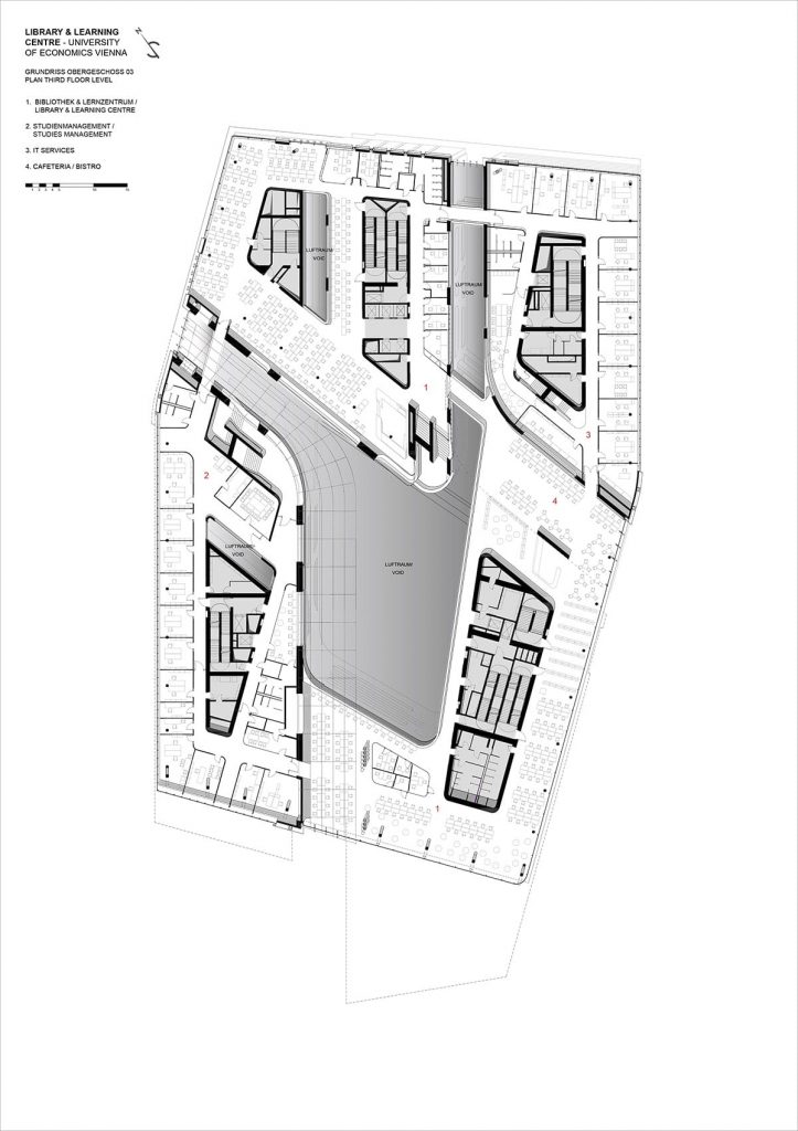
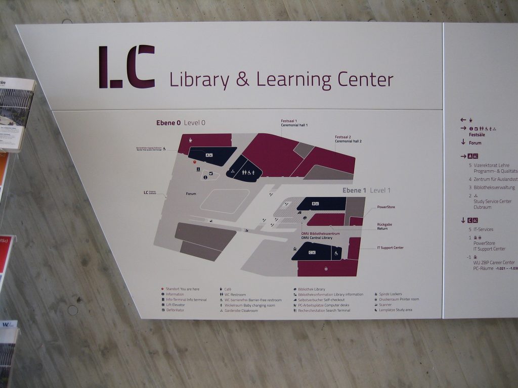
The objective of the functional plan is to clearly define the different areas of the building. The plane translates into a three-dimensional object that delineates the space around the central atrium, corridors and canyons. The main block of the building houses the Service Area, the Learning Center and the Library of Economics, with the Student Services and Library Administration located in the smallest block.
Description
The building was constructed as an urban building with slopes, whose outer edges are cut abruptly and the interiors seem to join smoothly.
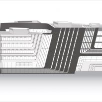
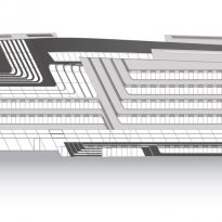
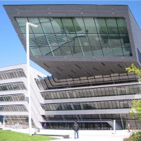
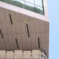
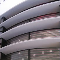
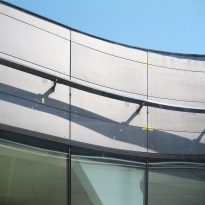
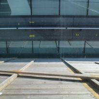
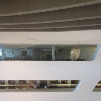
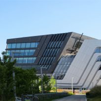
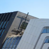
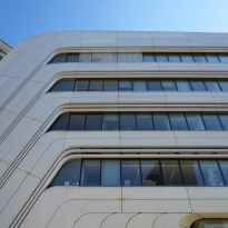
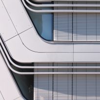
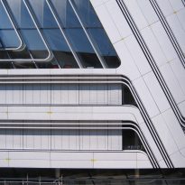
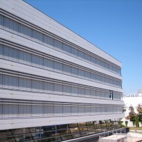
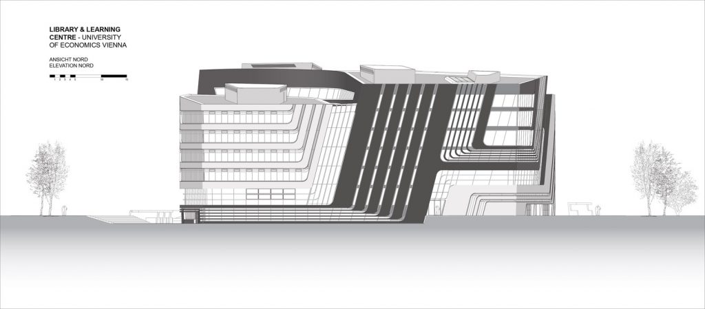
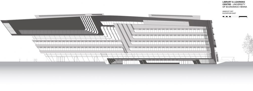
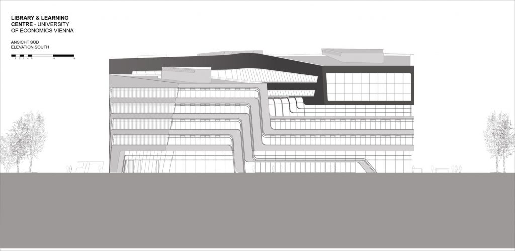
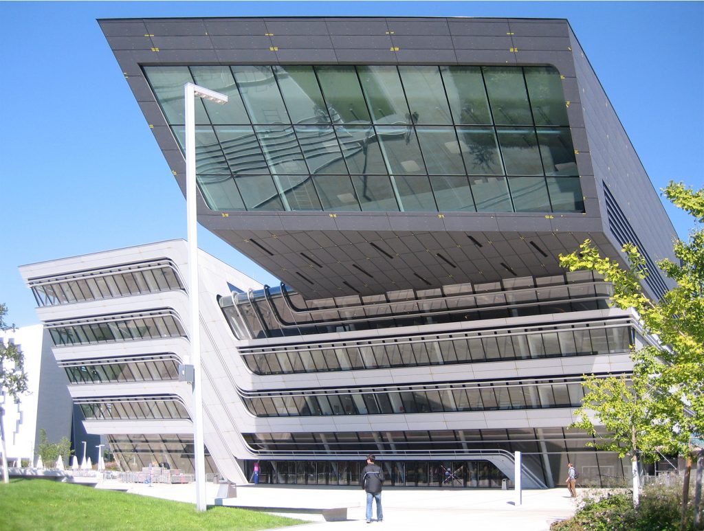
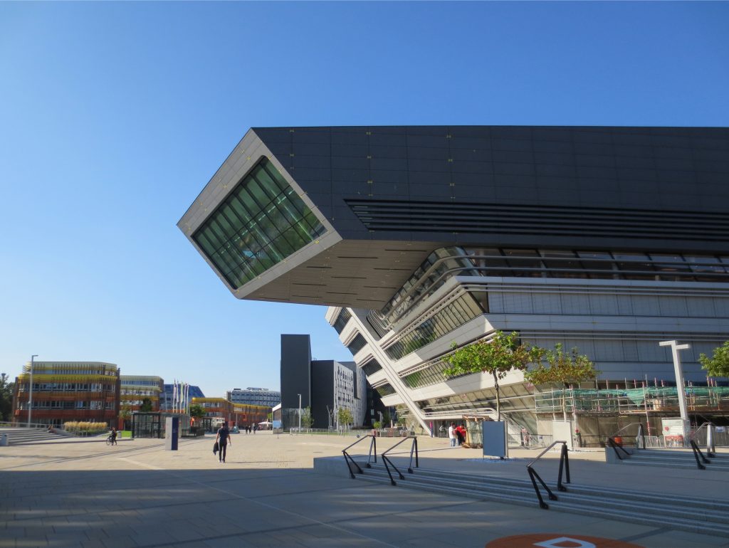
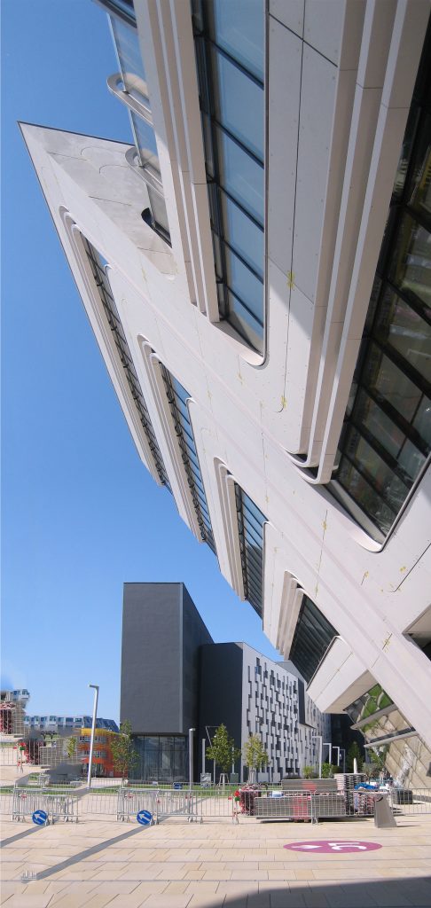
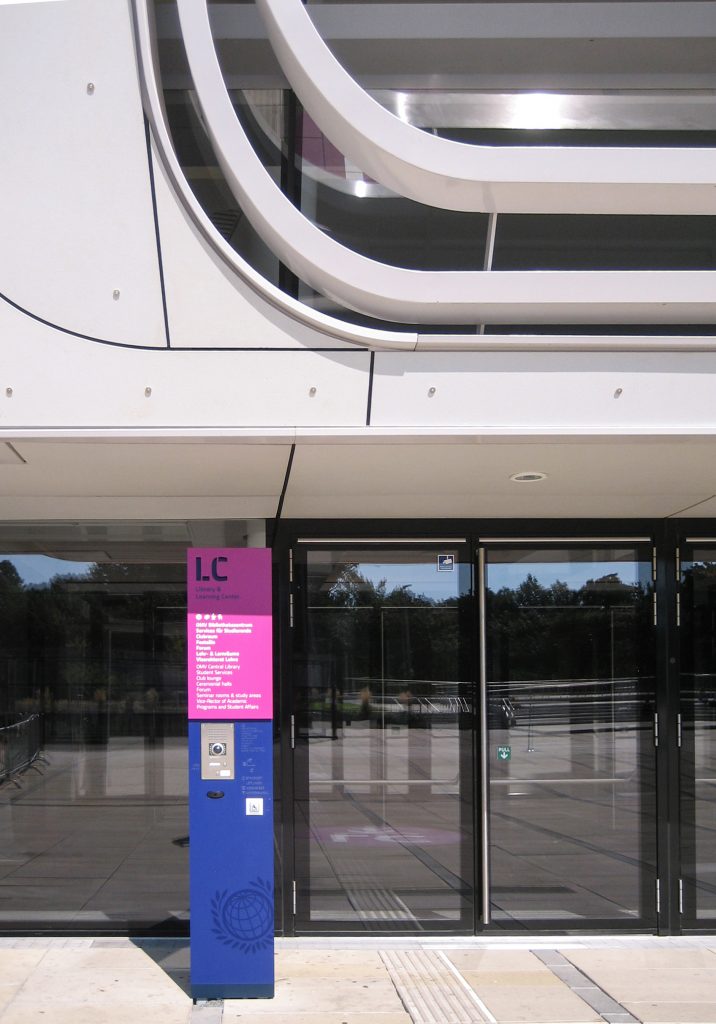
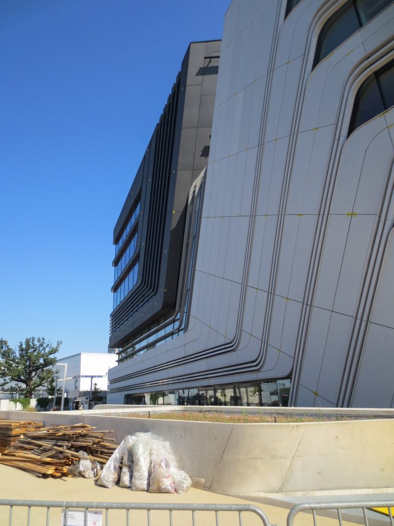
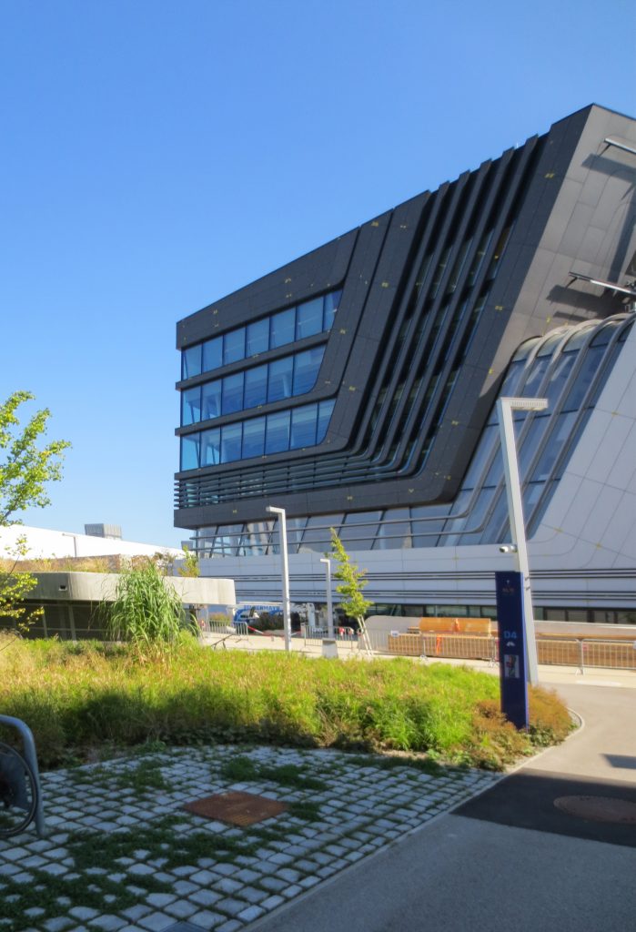
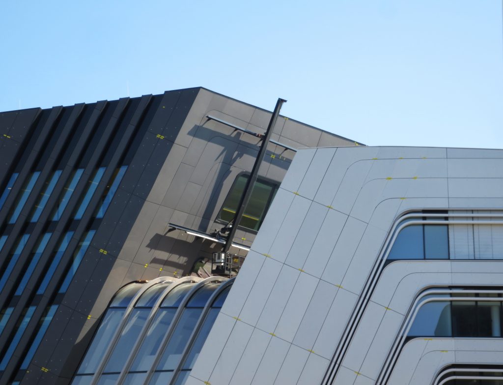
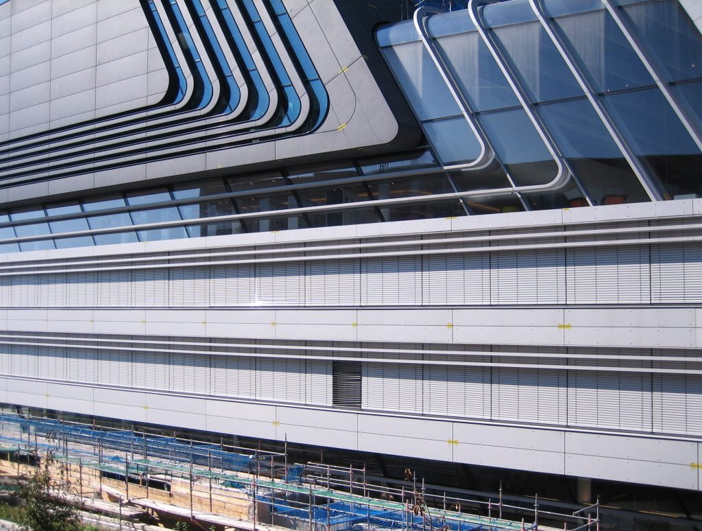
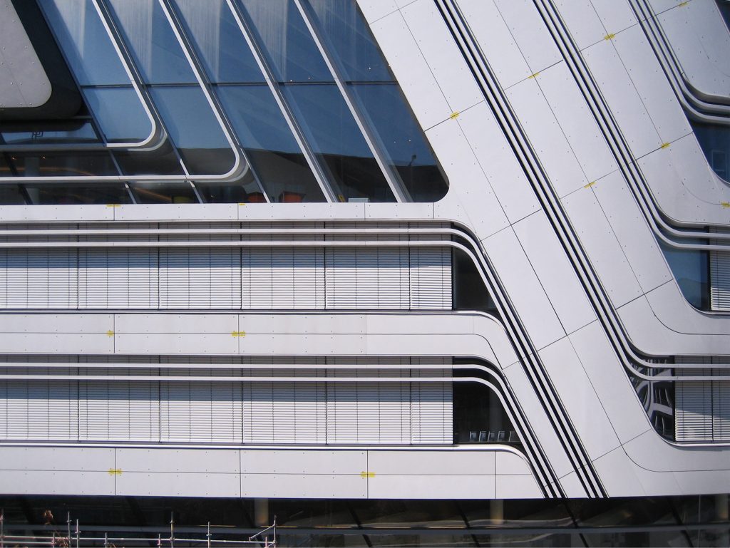
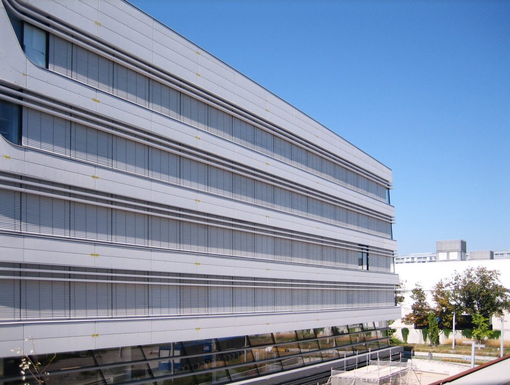
The external appearance of the building, with some facades tilted up to 35º, is marked by two angular elements of contrasting colors, separated by a glass joint that makes the programmatic separation within its interior readable from the outside.
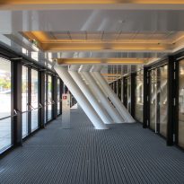
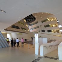
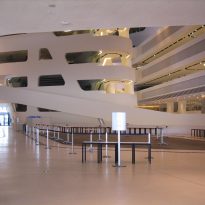
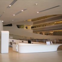
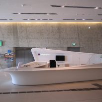
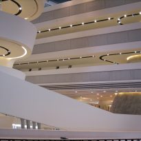
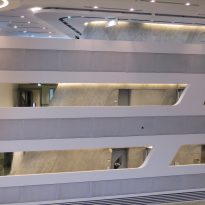
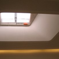
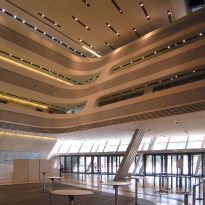
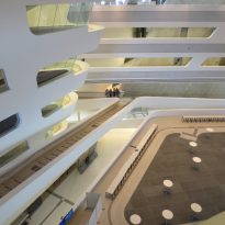
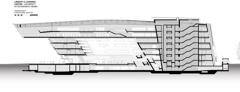
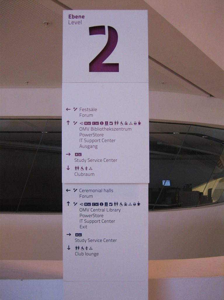
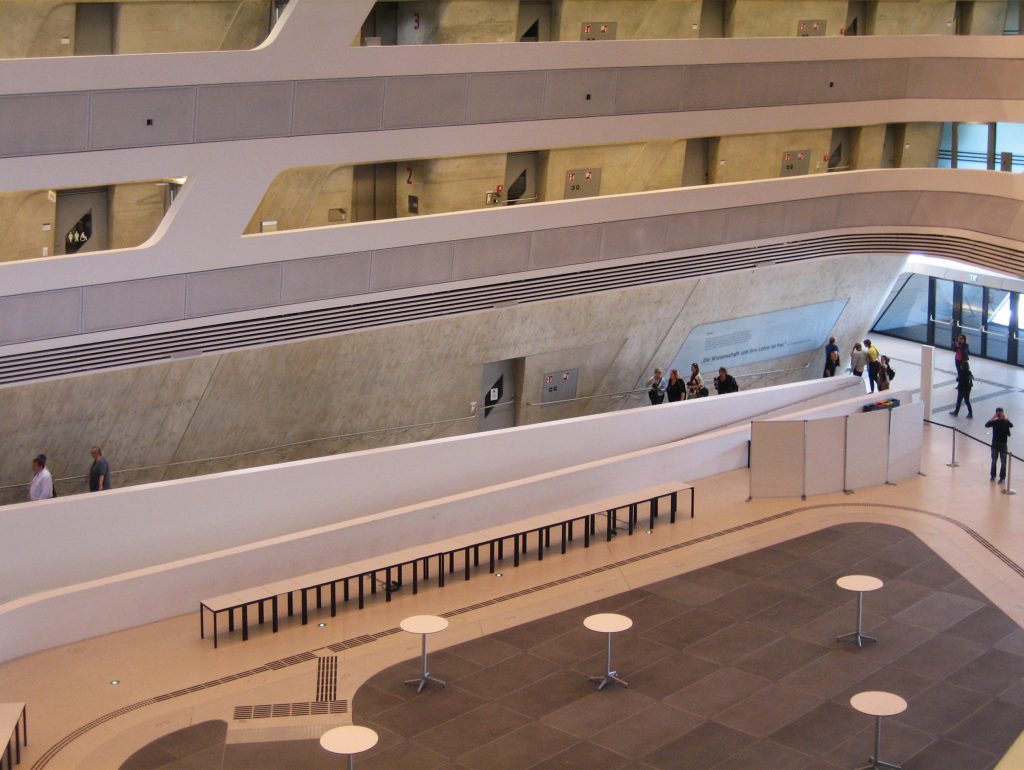
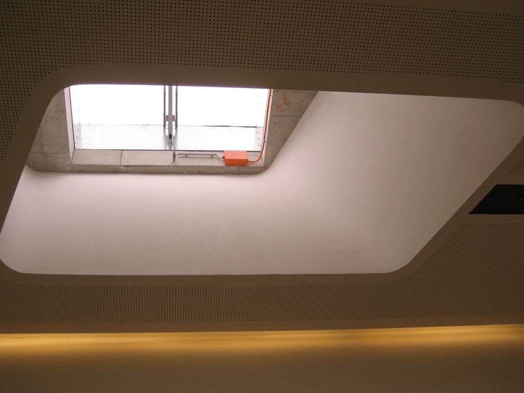
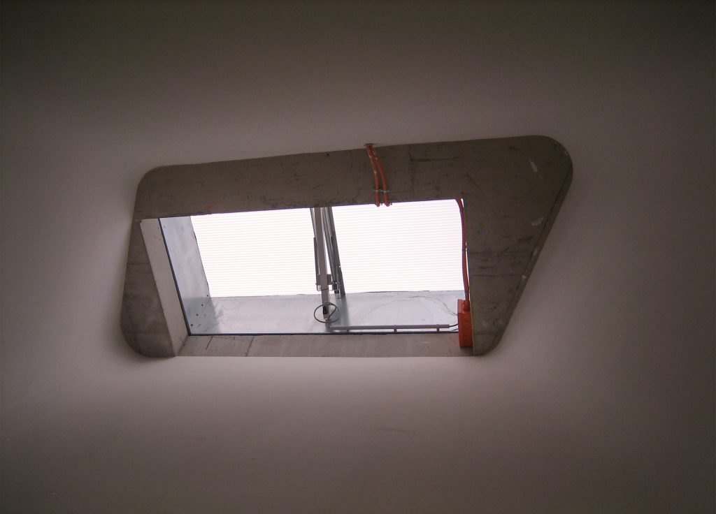
The LLC program includes a bookstore, cafeteria, copy shop, social room, classrooms and auditorium, however, its two main components are the Library with study areas and the administrative office area. These two volumes are separated by the “canyons” that cut the building and in whose center it is created, crossing it, the great atrium, illuminated by natural light that filters through the upper skylights, and that acts as a public square of the center and from school in general.
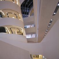
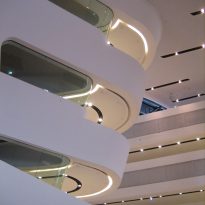
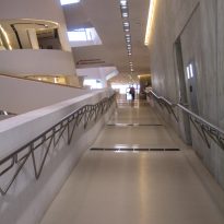
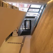
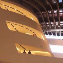
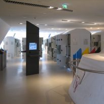
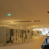
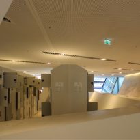
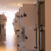
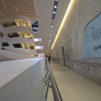
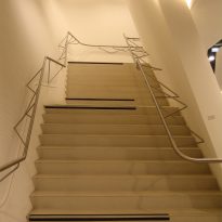
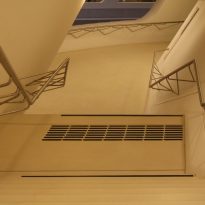
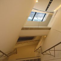
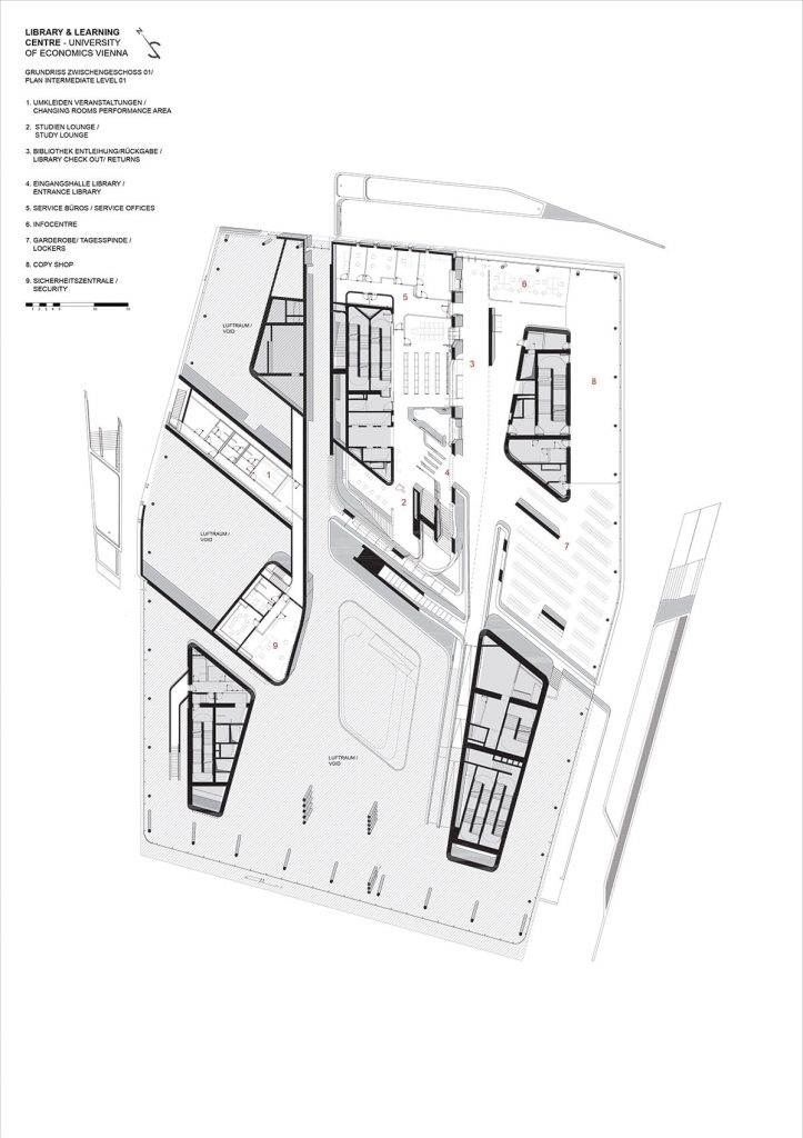
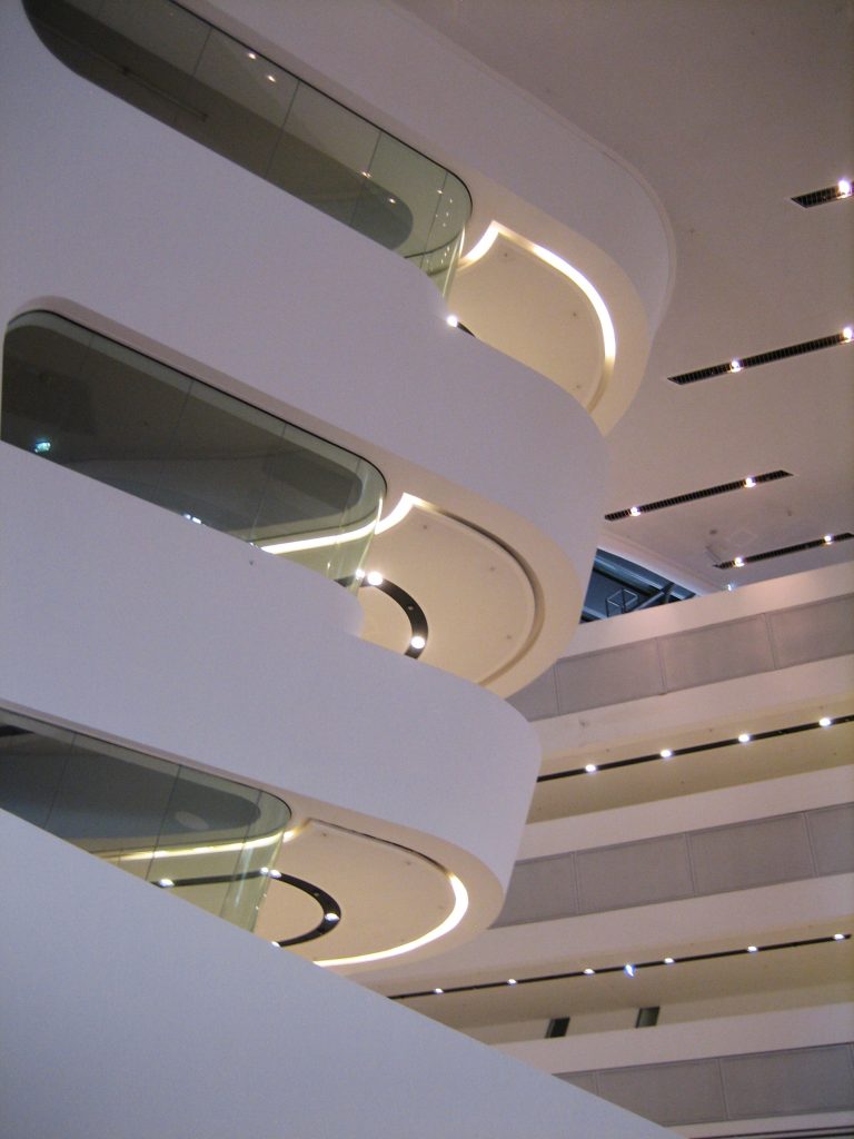
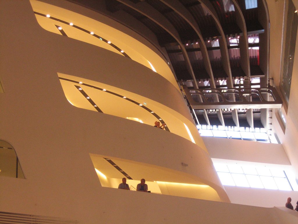
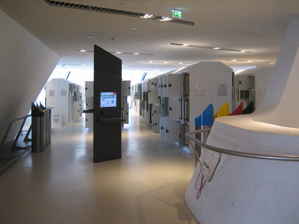
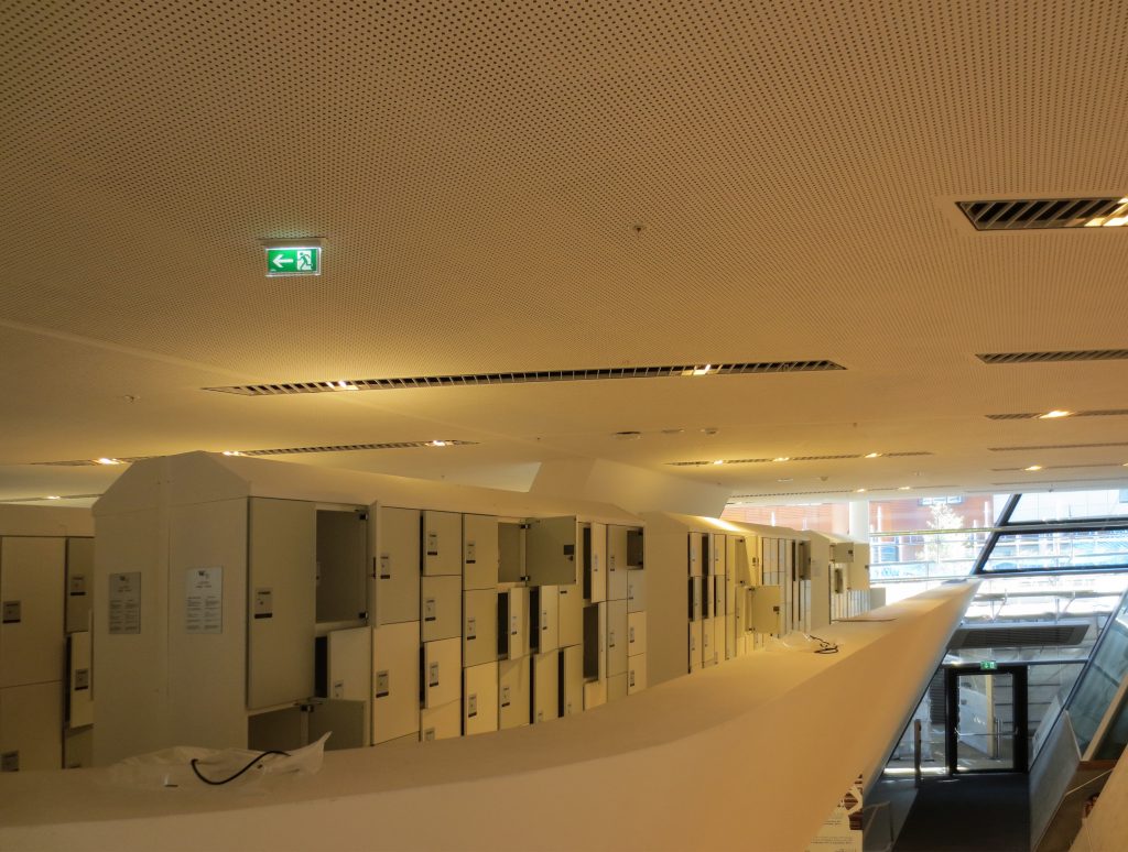
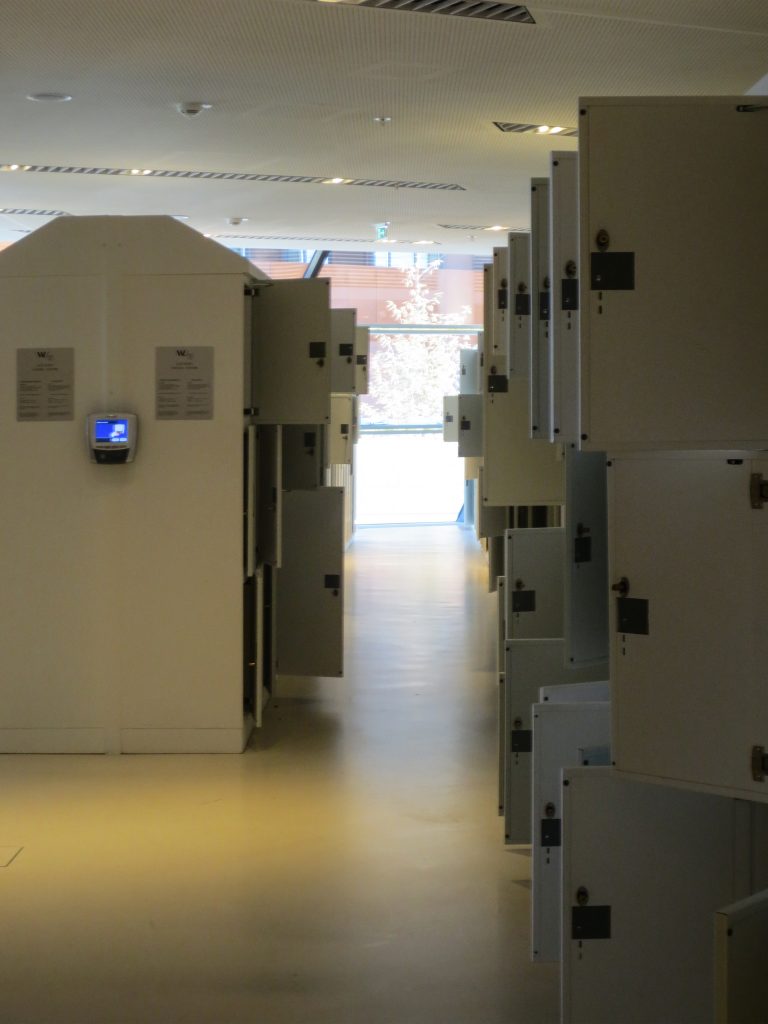
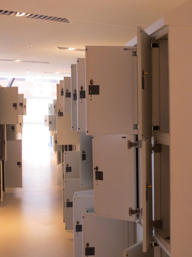
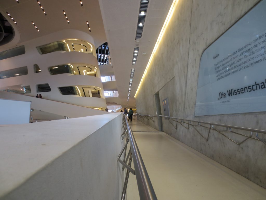
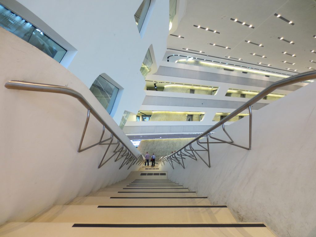
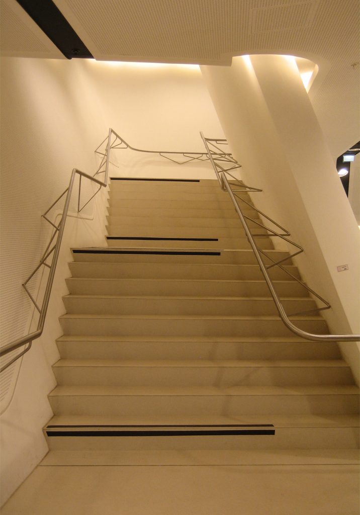
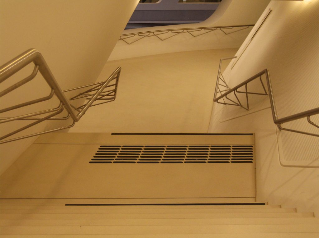
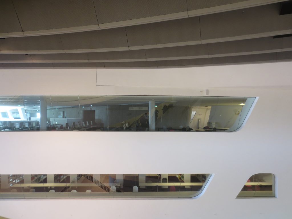
The two volumes with their different levels are entangled with each other and join through ramps and bridges overlooking the great hall, somewhat reminiscent of a large ocean liner, terraces, platforms and galleries are created. Ramps and spiral stairs lead from the entrance to the Library, while the security lockers are located on the mezzanine floor.
The Monitor
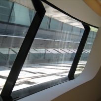
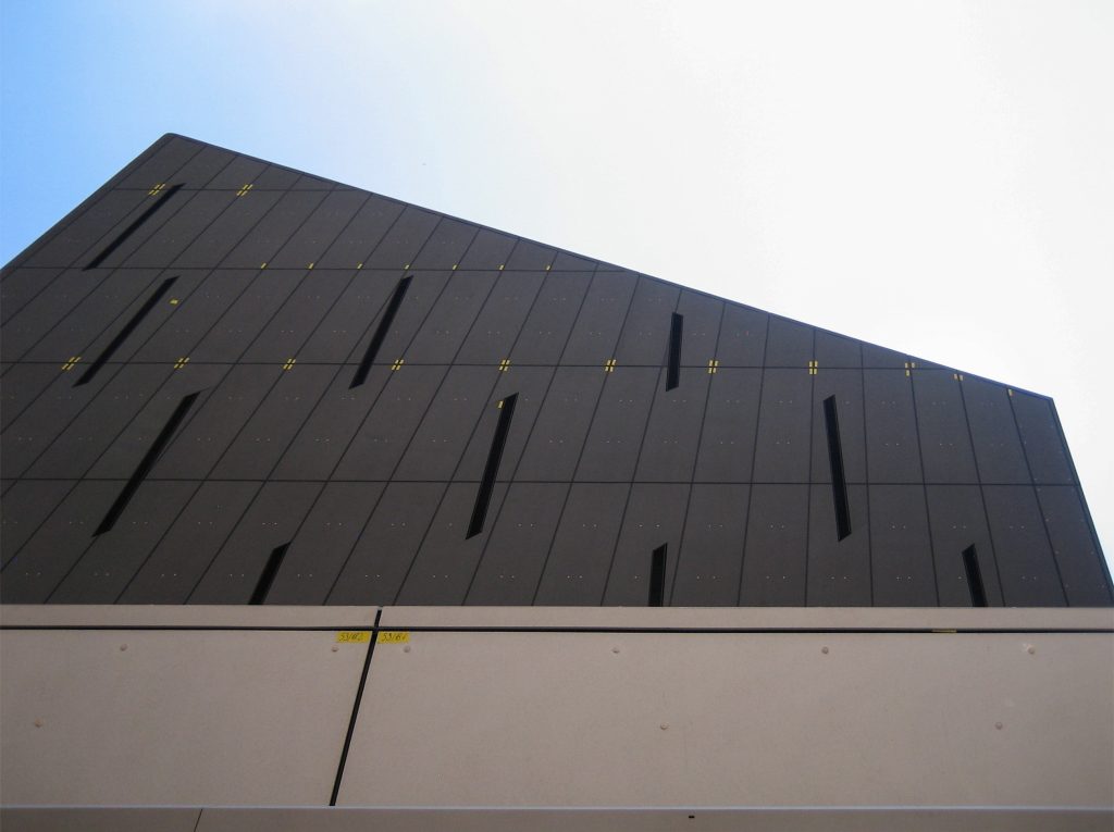
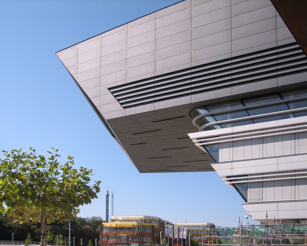
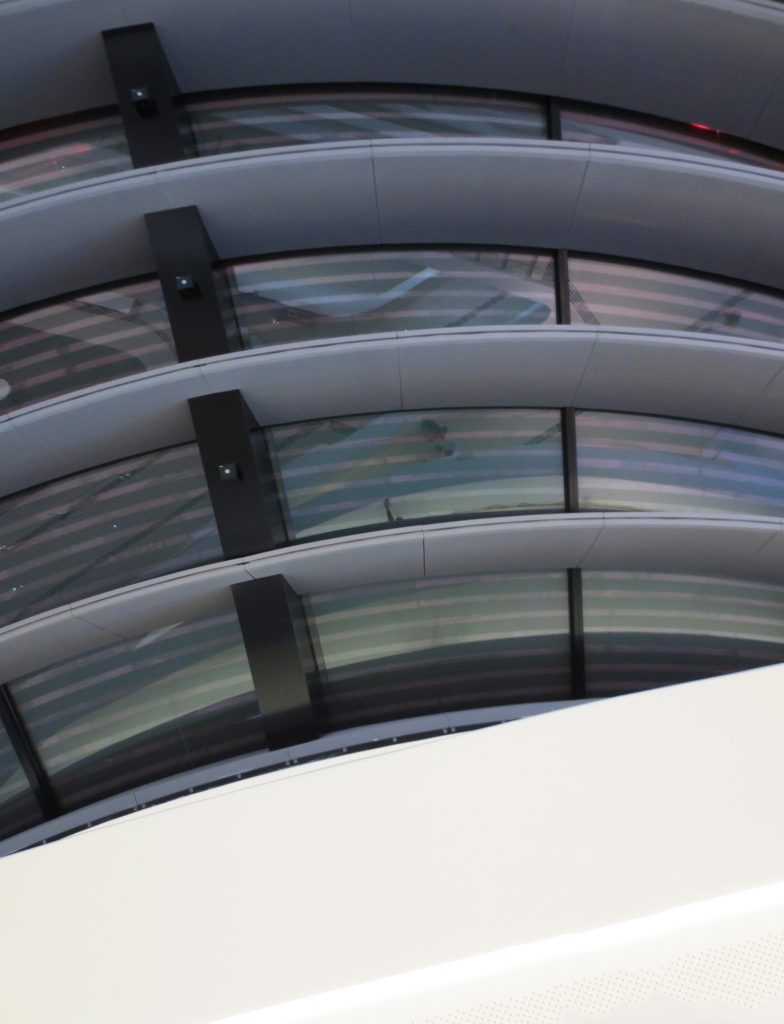
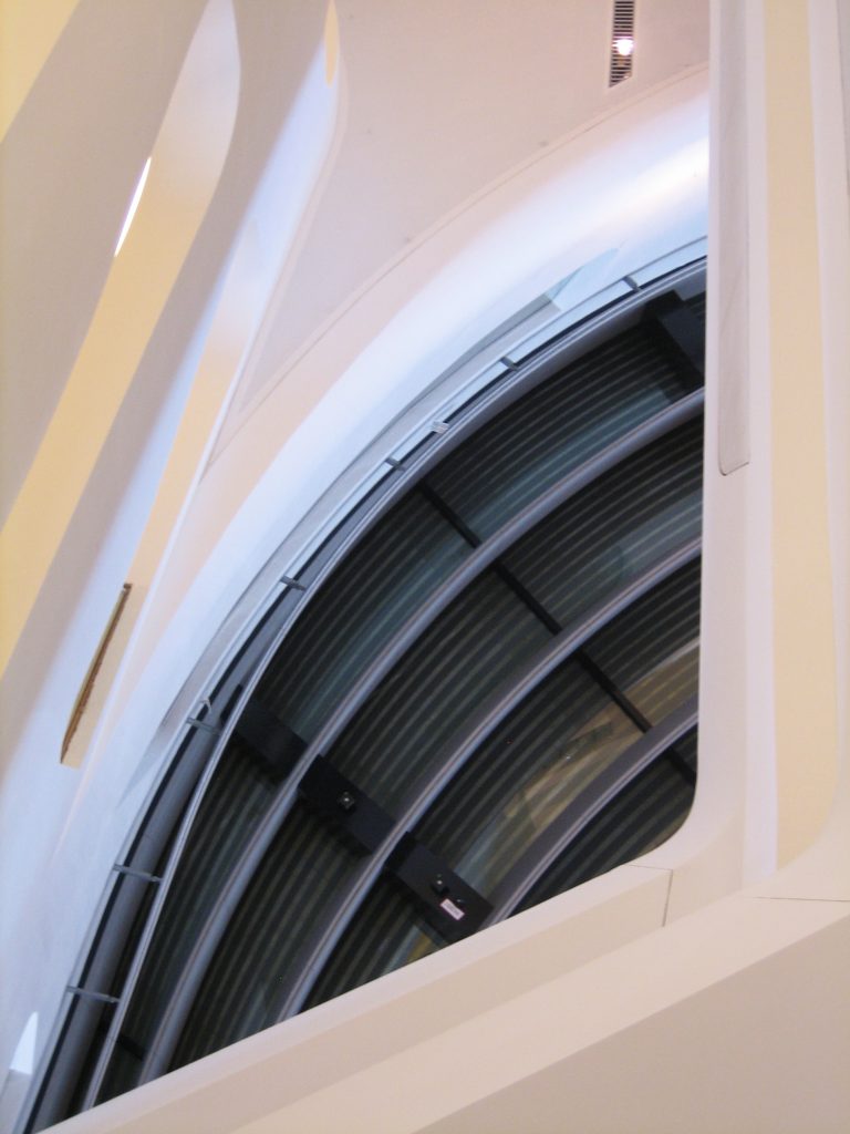
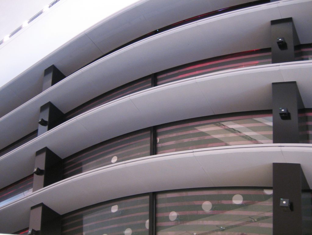
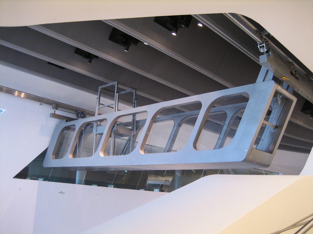
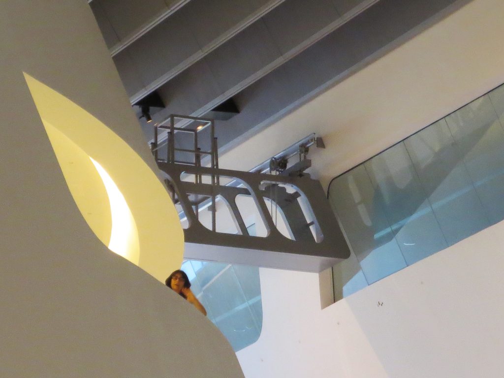
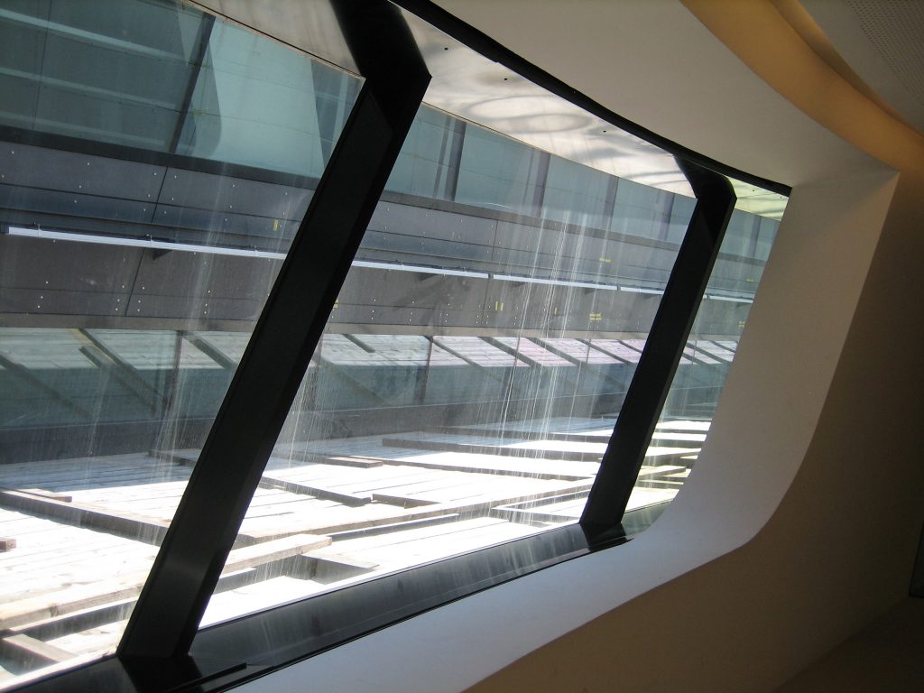
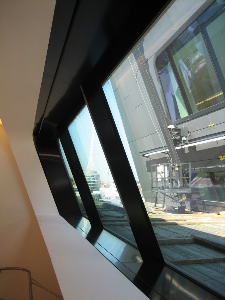
At 28mts above ground level and with a 16m flight above the main entrance is the large dark and cantilevered volume that houses the main function of the center, the Library. Known as “the monitor” on the two upper floors and through the large window overlooking the Prater Park, it houses the reading room and student work areas.
The rest of the facilities of the LLC are located in the other volume that is also divided, becoming two separate tapes that are wrapped around each other to enclose the central glazed meeting space.
Structure
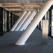
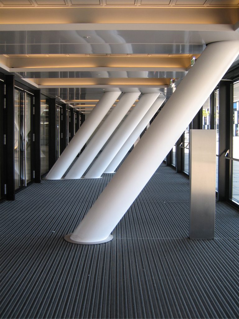
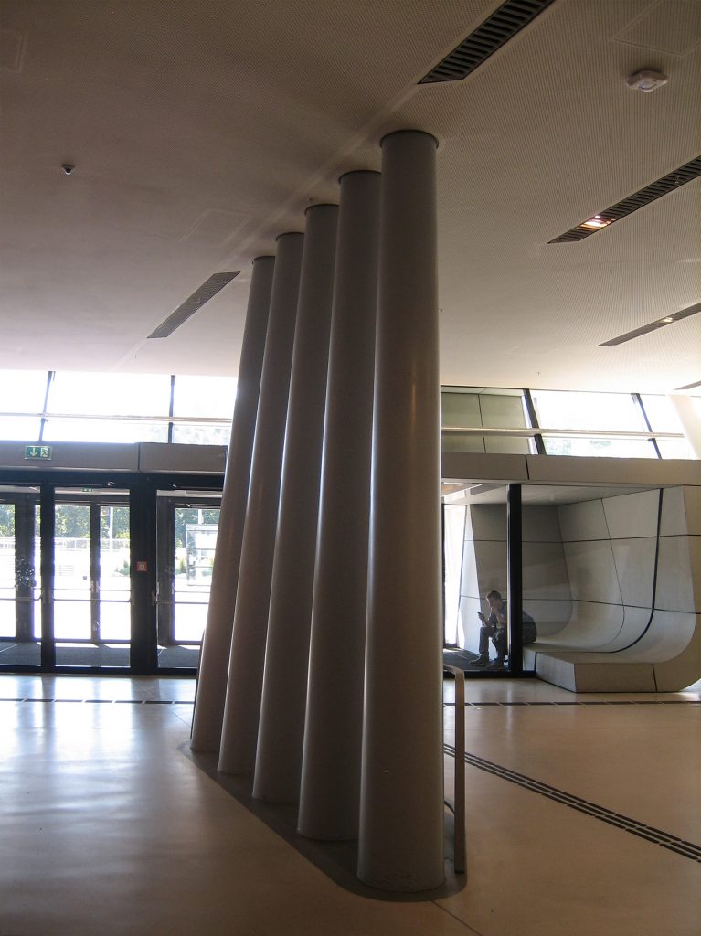
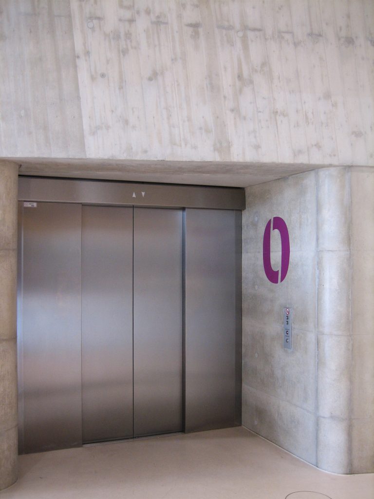
The LLC has five cores, each with a different complex geometry. The corners are also at different angles and, therefore, are corners with different radii. To develop its structure it was necessary to use standard formwork and special formwork, or a combination of both, to meet the requirements of complex construction parts. In rounded corners have been used for structural reasons, when necessary, steel formwork. Mammut 350 wall formwork panels and special MEVA Circo circular column formwork designs are used for inclined and rounded corners.
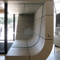
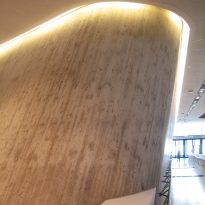
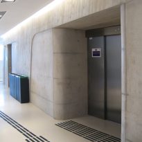
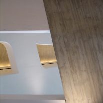
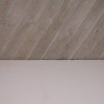
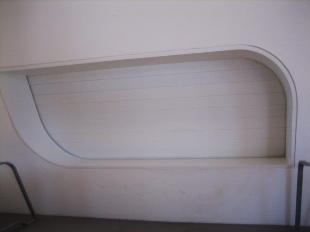
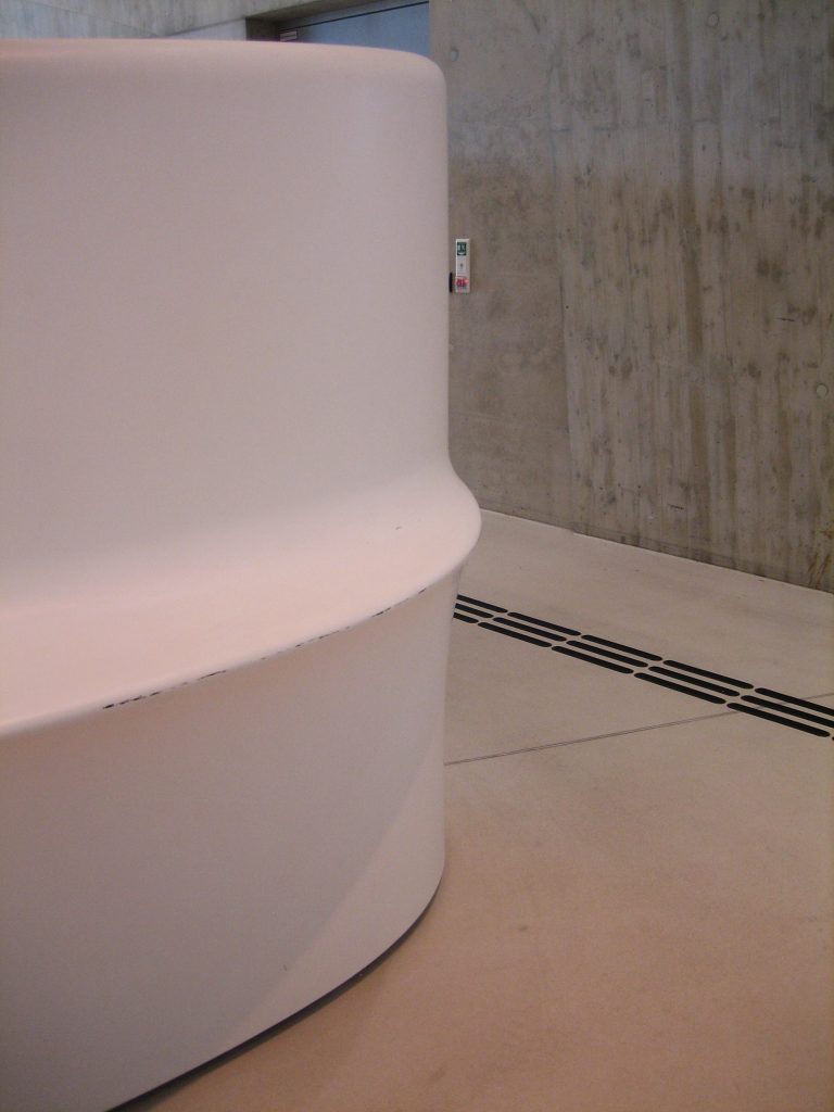
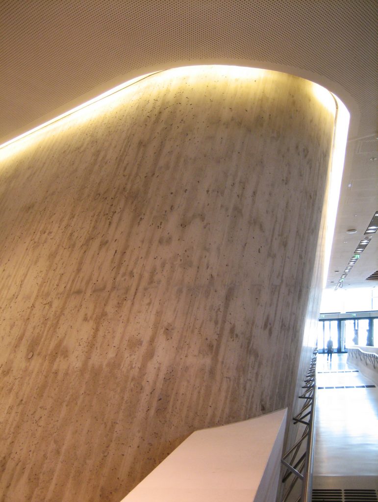
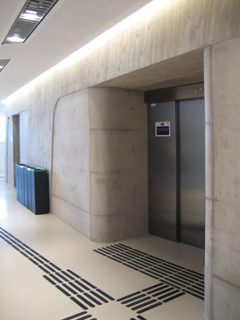
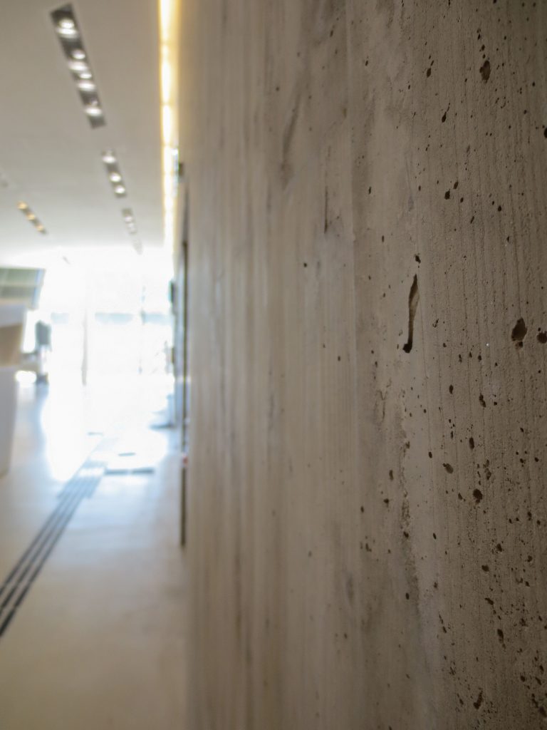
The sloping walls of the core are poured with an architectural concrete surface and a table pattern is applied. The pattern is made with wooden boards, usually 8cm, attached to Mammut 350 panels. Because the front walls are inclined with different angles, the side walls have four different angles and are wider at the top than in the bottom one The core walls have “inlays”, areas with a smooth, concrete architectural surface, optically suspended.
Another feature is the canyon walls between the cores. Mostly composed of beams and parapets, the canyon walls are also inclined and curved with different radii. They are made with Mammut 350 panels and then plastered. The rounded parts of the canyon walls were made with special wood formwork.
Materials
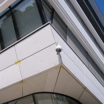
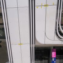
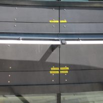
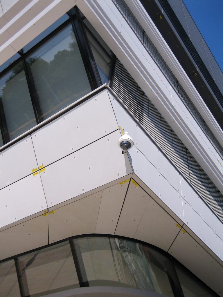
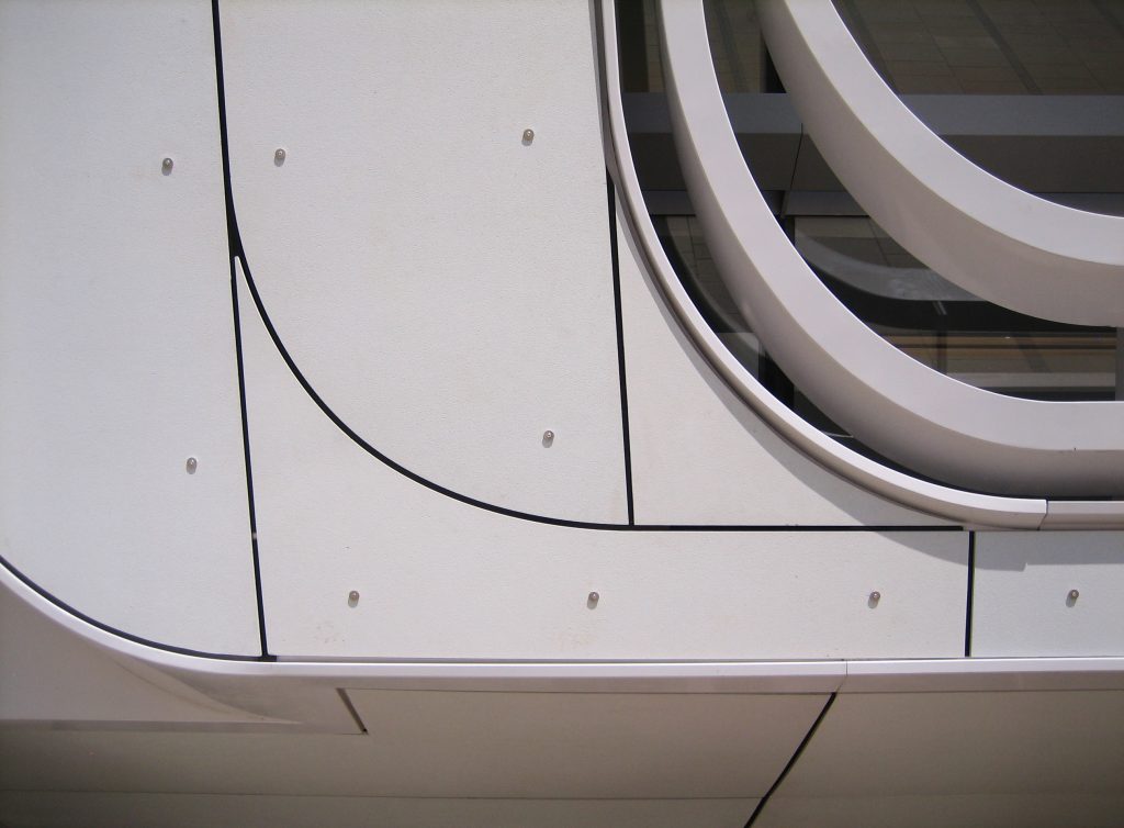
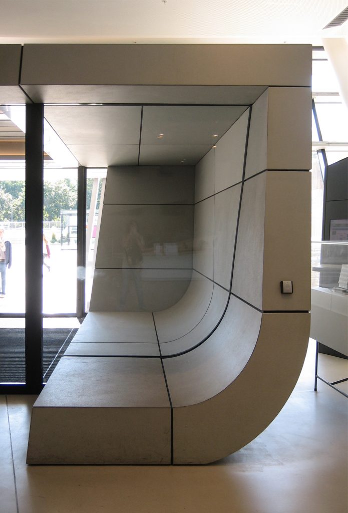
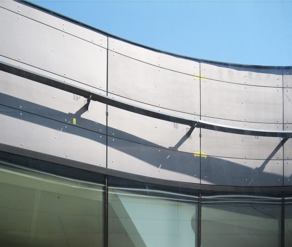
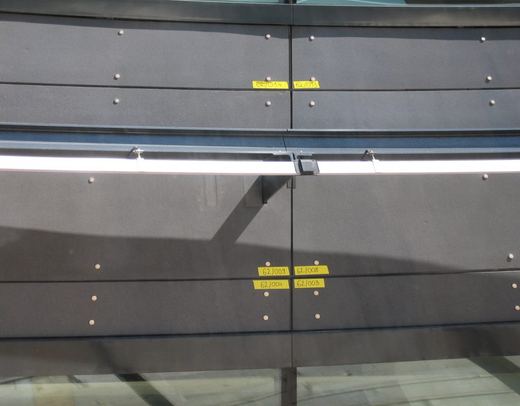
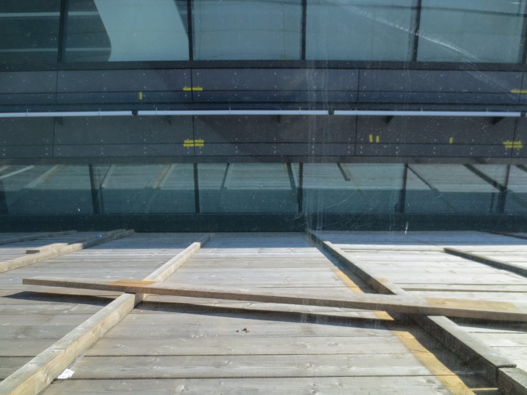
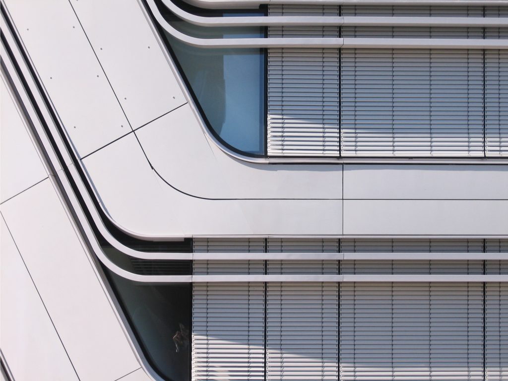
To achieve the sinuous forms of the building it was necessary to take into account the materiality. Both the facade and the interior of the volume that houses the library are made of reinforced concrete reinforced with fiberglass panels, of local origin, in dark color for the study area of the Library, in contrast to the rest of the building finished with white fiberglass panels. These panels work both aesthetically and structurally, being a high-performance material that allowed low-cost and high-quality constructions and cutting-edge facade systems, also ensuring long-term durability.
Illumination
Lighting is influenced by architecture, two separate structures intertwined within a space. These two buildings hold the library together with the administrative offices and are connected by glazed “canyons” that connect the spaces allowing them to work together.
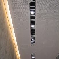
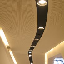
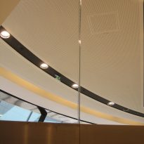
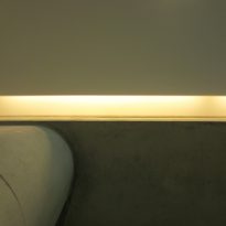
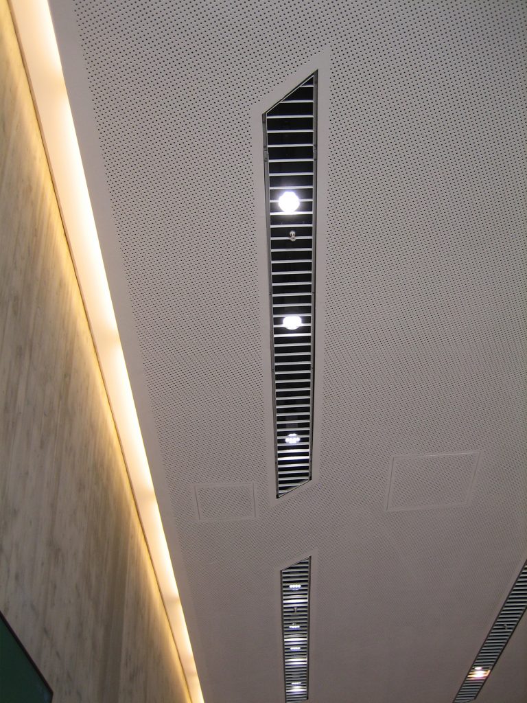
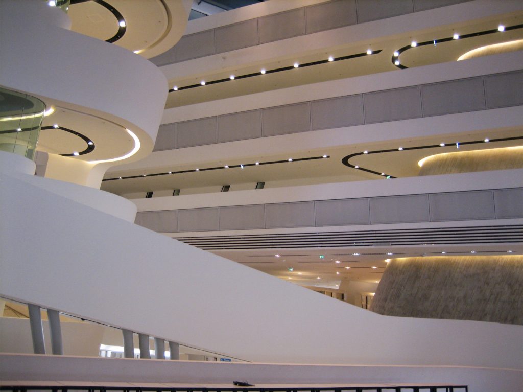
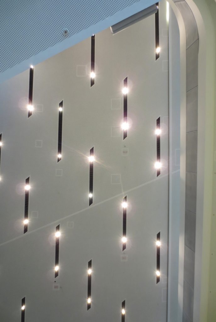
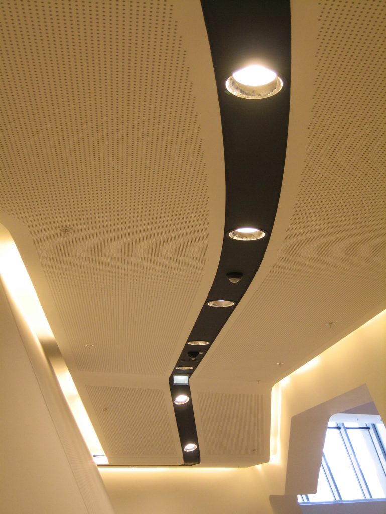
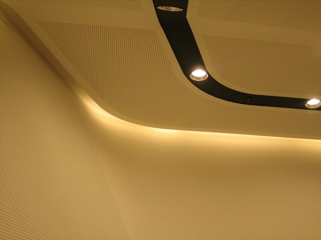
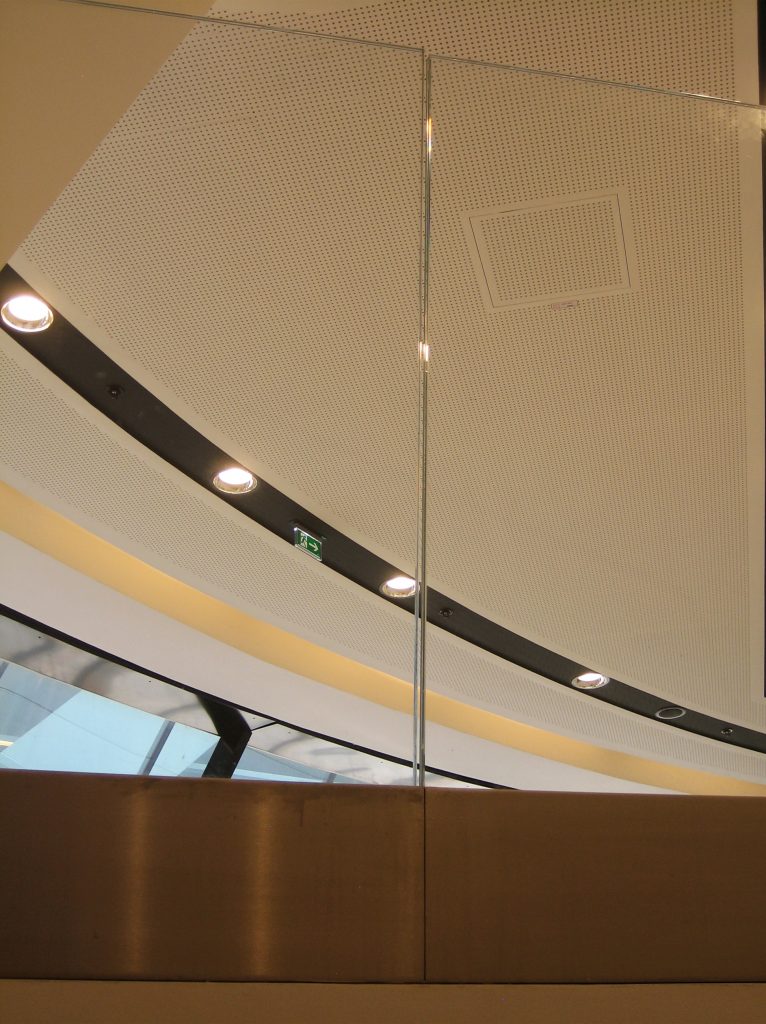
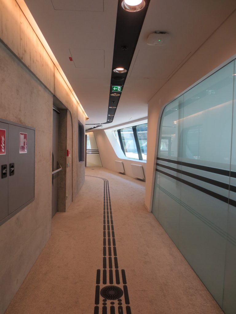
The lighting reinforces the interwoven nature of the building by using curved and linear luminaires and illuminates the walls of the structural elements of the core in a hidden way. On the facades a series of continuous lights follow the structure and the ceiling. In the latter they extend along the atriums and downward along the walls, curving in two geometric planes.
In the building three lighting principles were applied, one for each function: transit areas such as atriums receive daylight during part of the day and the scheme of electrical lighting is accentuated on the walls and ceilings, with a cold white light .
The library receives direct and indirect lighting from suspended parallel lines that follow the perimeter of the building, the shelves, study areas and separation areas are illuminated, with a warm white light. The office space is illuminated through a more silent and introspective direct lighting system.
The external lighting of the building is created by the brightness of the internal lighting, reinforcing the areas and circulation and entrances.
Following the international certification standards, the building complies with the following guidelines:
- recover 75% heat
- the building has a natural light control system
- optimized systems regulate heating, cooling and ventilation
- 50% of the demand for heat and cooling is covered by geothermal energy
- the building has computer rooms with programs that recover waste heat.
Video

