Bank of America Tower

Introduction
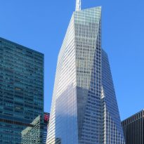
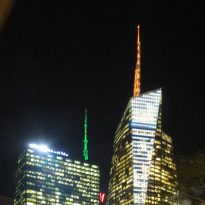
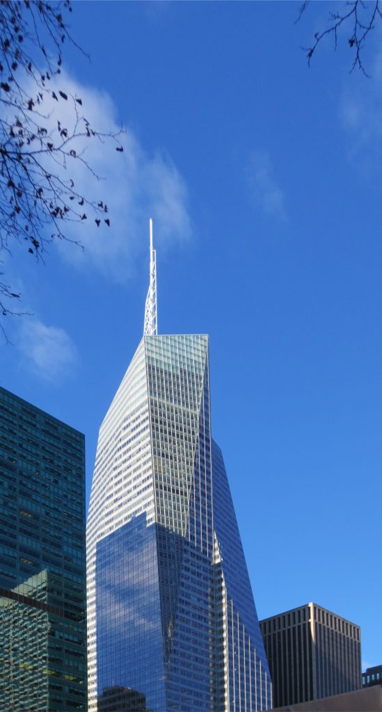
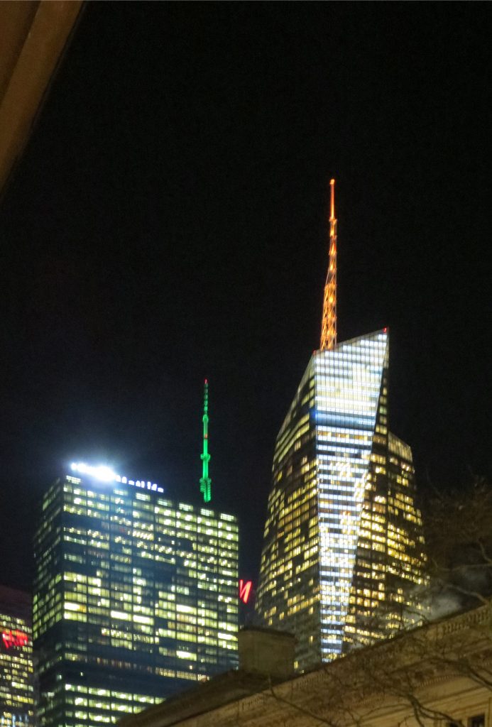
The Bank of America building, also known as One Bryant Park, was designed by Cook + Fox Architects as one of the most efficient and ecological in the world. At a cost of 1 billion dollars, the 55-story tower above street level is crowned by an architectural spire of 77.72m and opened in 2009.
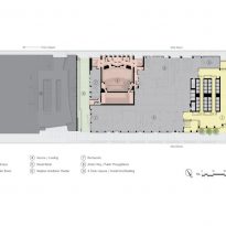
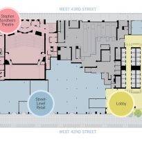
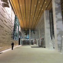
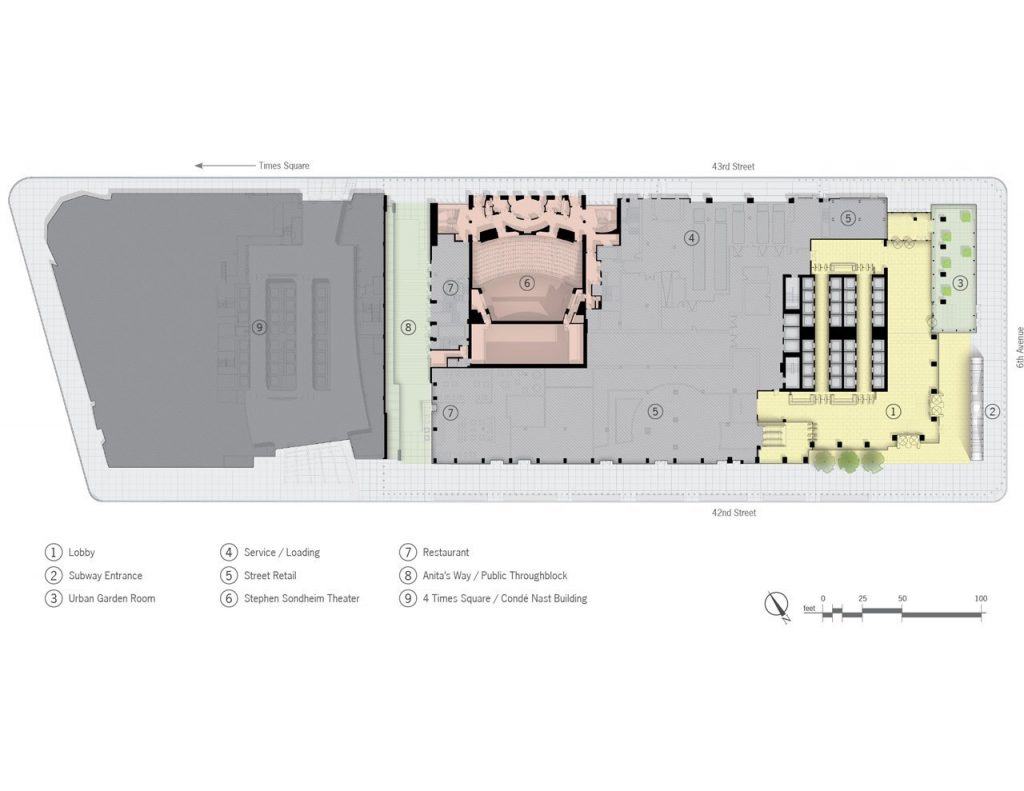
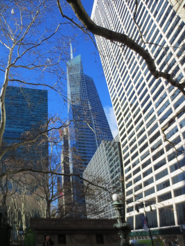
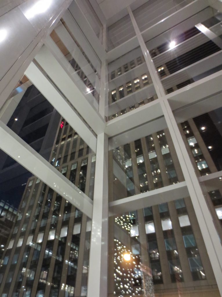
Strategically located in the northwest corner of Bryant Park, this Bank of America headquarters combines important public services and the conduct of secure banking operations within a “green” building. Public spaces include the reconstruction of the iconic Henry Miller Theater, renowned as the Stephen Sondheim Theater, a half-block pedestrian walkway and a “winter garden” at street level with operable glazed screens. Located within the dramatic crystalline forms that cover the podium and the tower, the commercial offices of the Bank of the Americas, amenities functions and administrative areas are located.
One Bryant Park represents a change in thinking about modern building design, achieving on a large scale many of the most transformative ideas of the green building movement for water and energy conservation, material efficiency and indoor environment quality . It has fundamentally transformed the market for large-scale commercial developments. In the city defined by the modern skyscraper, the tower also makes a very visible statement about regeneration, urban administration and global citizenship for the 21st century. This is the first high-rise office tower built in the world that obtains a LEED Platinum rating.
Location
Located on 42nd Street between Avenue of Americas and 6th Avenue, opposite Bryant Park, in New York, United States, the Bank of America rises to a height of 365.8 m. At the time of its inauguration, in 2009, it was the fourth tallest building in the city, after the One World Trade Center, 432 Park Avenue and the Empire State Building. In 2010 he won the “Best Tall Building Americas” award from the Council on Tall Buildings and Urban Habitat.
Concept
The Bank of America Tower in One Bryant Park was designed to set a new standard in high-performance buildings, both for employees of the offices that occupy the tower and for a city and country that is waking up at the beginning of the 21st century to the modern imperative of sustainability, based on the concepts of biophilia (love of life) or the innate need of human beings to connect with the natural environment. The vision, at the occupant level, was to create a modern workplace of the highest quality, emphasizing daylight, fresh air and an intrinsic connection with the outdoors. On an urban scale, the tower is directed to its near surroundings, as well as to the context of downtown Manhattan, adding a new and expressive silhouette on an already iconic horizon.
Its designers found part of the inspiration in the famous New York Crystal Palace, an exhibition building built for the New York Universal Exhibition in 1853 in Bryan Park and the first with a light metal structural frame built in America, along with the cultural influences of The classic skyscrapers of the city.
Spaces
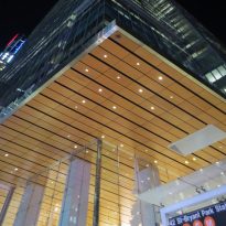
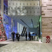
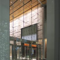
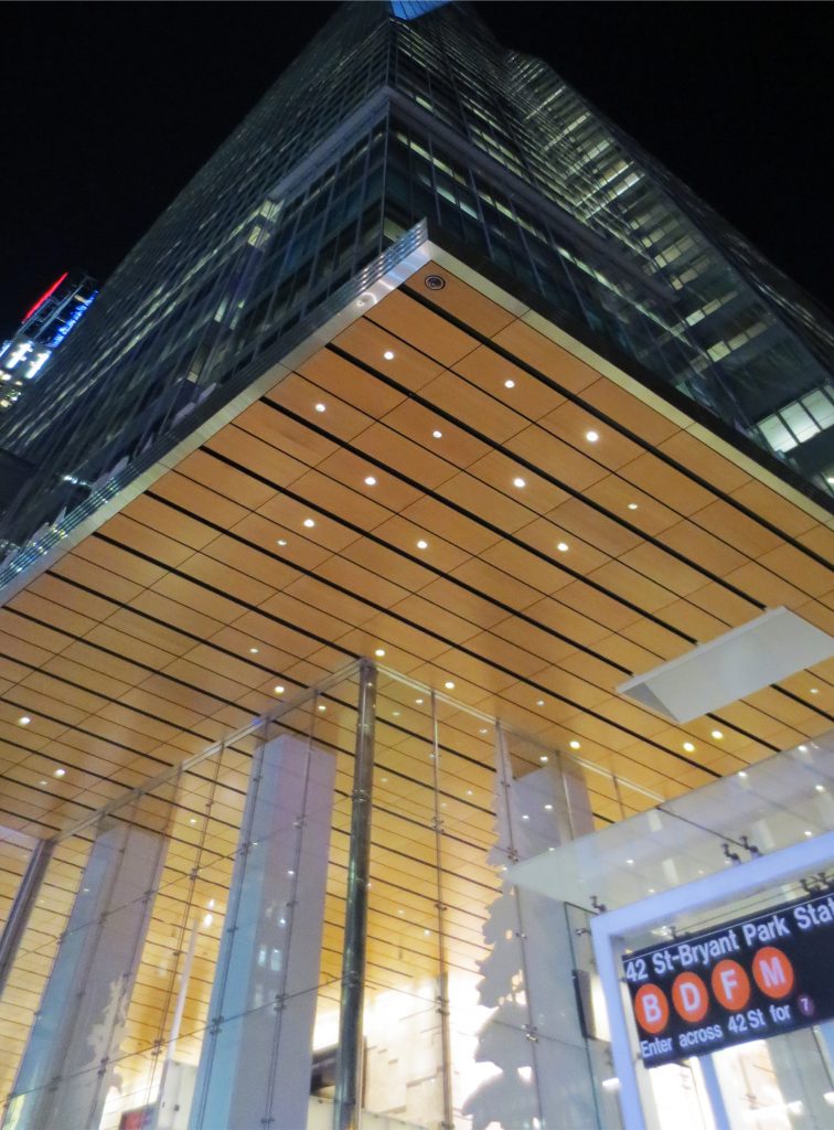
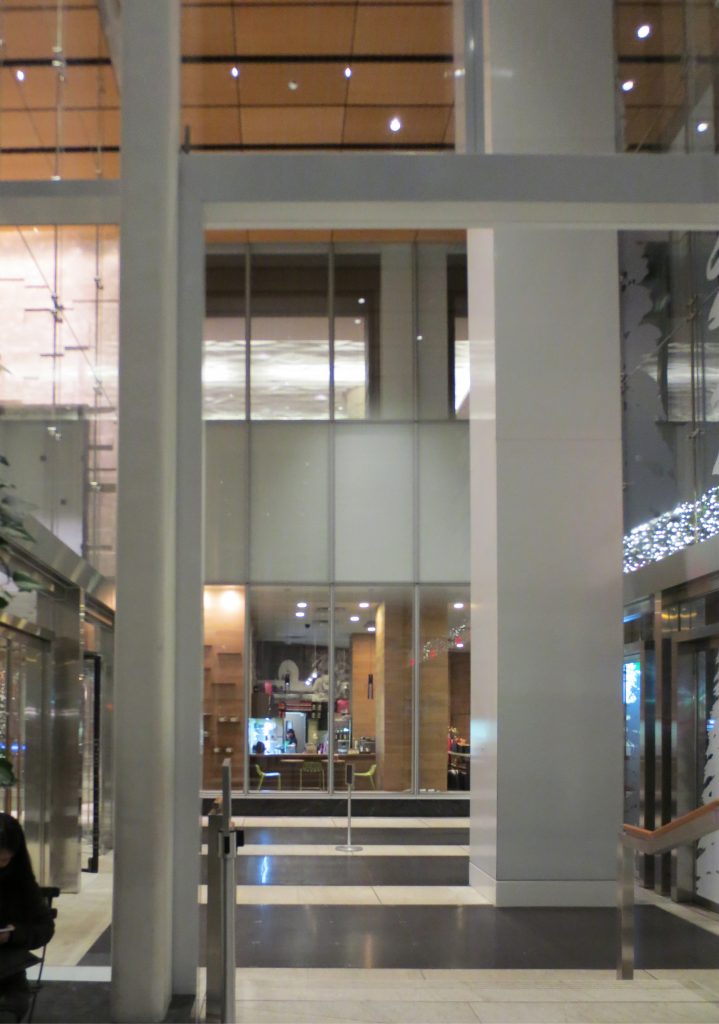
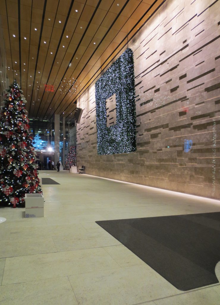
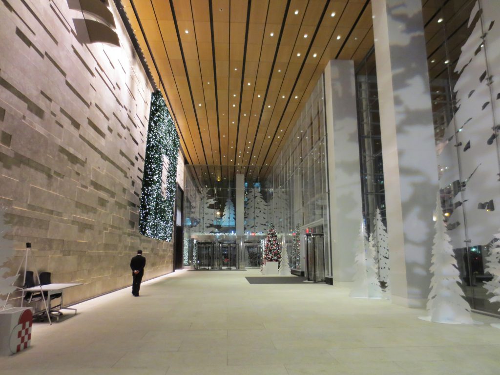
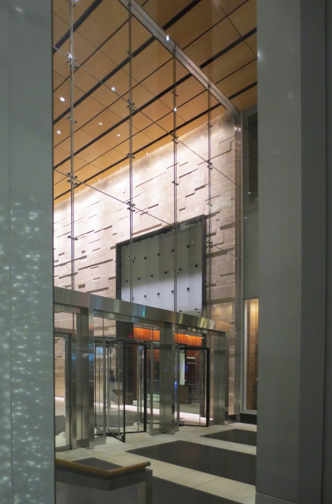
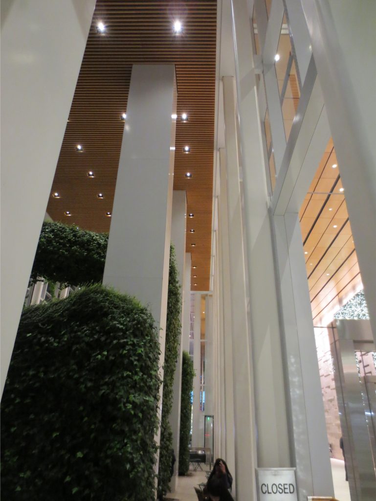
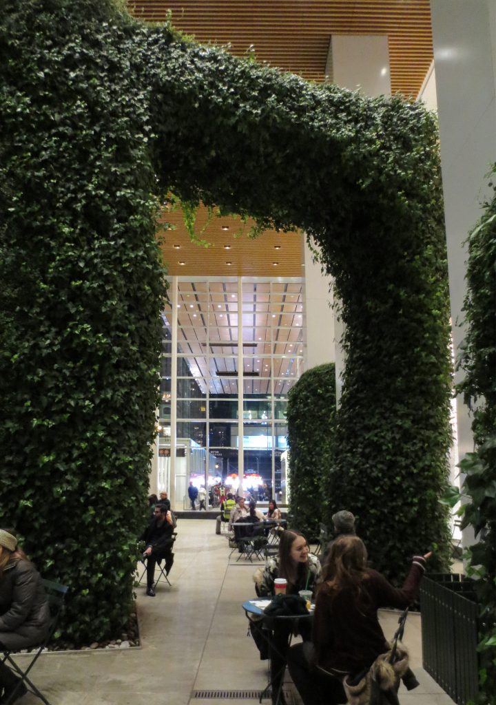
In response to its dense urban context, the building challenges the limits of public and private space with a transparent corner entrance that gives access to the lobby, a diaphanous and neutral space that creates a connection with the public space of Bryant Park, whose restorative spaces Greens extend inside the building through its roofs and a room that encloses an Urban Garden with public access.
Public spaces
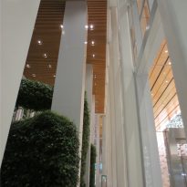
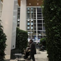
With approximately three times the public circulation space required by New York regulations, for a high-rise office building, the Bank of America Tower contributes and rearranges the pedestrian and transit circulation of the surrounding area. Public services include wide sidewalks, public street furniture and a room with an urban garden located at 43rd Street and Sixth Avenue, which serves as an attractive extension of the nearby park.
The design also incorporates a new glazed underground entrance with wide stairs and an elevator on 42nd Street with the southeast corner of Sixth Avenue. An underground pedestrian walkway on the north side of 42nd Street will connect subway lines B, D, and F to the Times Square station and a new subway entrance midway on 42 will connect to a walkway under the level, plus a special passageway through the “Broadway Wall of Fame” style buildings with interactive information kiosks.
Tower
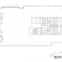
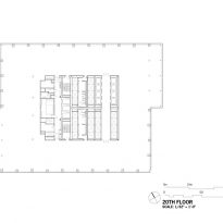
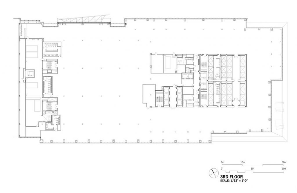
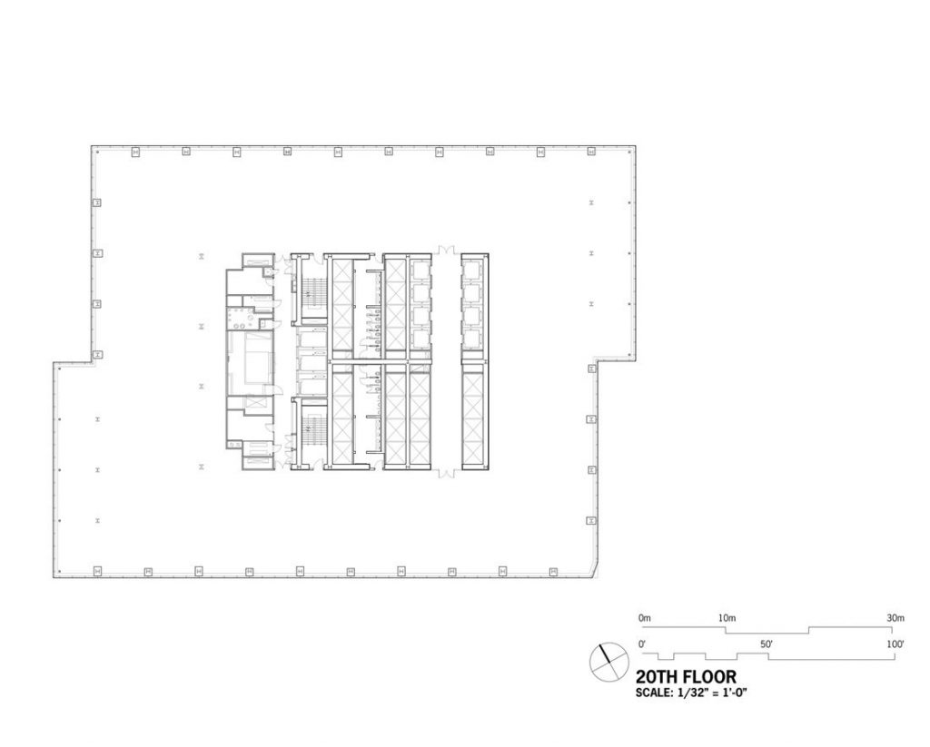
As the skyscraper rises from the uniform grid of the street, the concentration of the tower changes, increasing the verticality of its proportions, as well as the surface exposed to daylight. The building has an area of 195.096m2 dedicated to offices in a modern design.
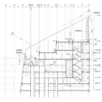
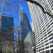
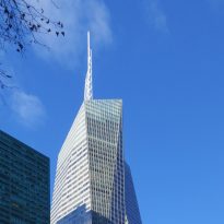
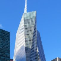
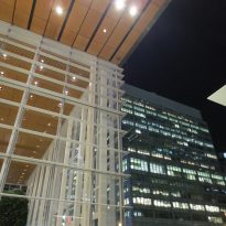
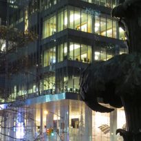
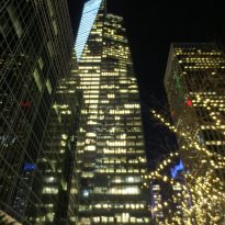
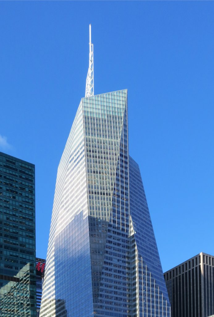
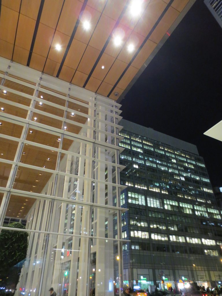
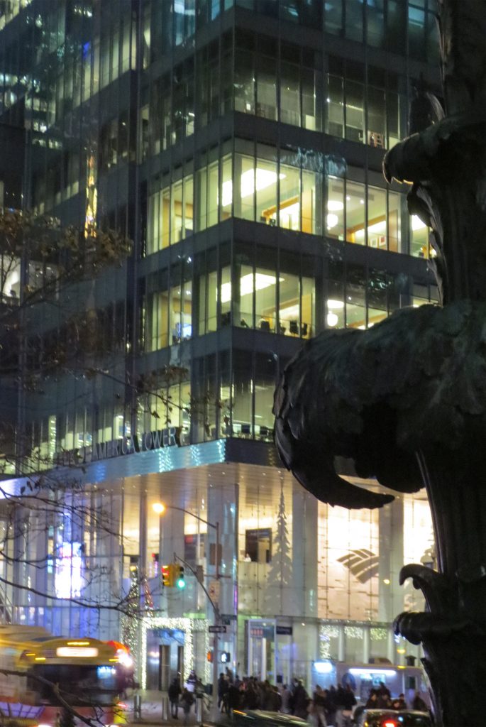
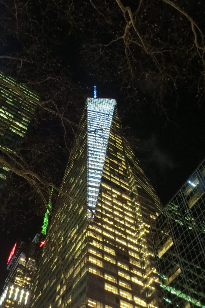
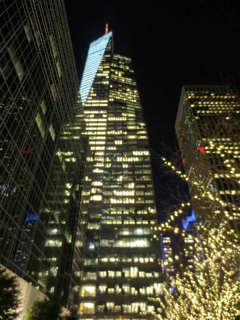
Beginning approximately on Floor 18 and extending to the top of the curtain wall, the four corners of the building begin to lean inward, toward the core, at shallow angles of approximately seven degrees (on average). Each corner begins its slope on a different floor and each inclined surface is skewed at a different angle, around 20 degrees, making the volume appear lighter and more dynamic. This feature also improves natural lighting and air quality in the street space below, as well as the extent of visual axes from the inside, which would normally be restricted by the typical New York block grid. The varied sloping surfaces and curtain walls with an extremely clear coloration give the building the appearance of a very large quartz crystal.
The resulting angular facets open oblique views around and through the Midtown skyscraper forest. In its southeast exposure, a deep double wall orients the building at full height towards Bryant Park. The faceted glass design of the tower features unique sculptural surfaces with sharp folds and precise vertical lines that are animated by the movement of the sun and the moon. From the base of the building, which accommodates the complex pedestrian and surrounding traffic circulation, to the total concentration that continues to the tip of the spire, the design responds to the built environment of downtown Manhattan.
Regarding its design, Richard Cook comments: “… The transparent faceted surfaces of the building function as a permeable membrane to change the qualities of perception and light. Incarnated within this transparent glass skin there is something organic of nature, something that echoes not only the kinetic movement and energy of the streets below, but also the dynamic and crystalline structure of the forms found in the natural world … ”
Structure
Raised on a 8.094m2 site, the project attracts attention not only for its dynamic design, but also for the economic method used in its construction: an unusual collection of inclined steel columns.
Although the curtain wall tilts in two directions as each corner of the building tilts toward the top, the columns lean in only one direction: orthogonally to the core. This system offered significant cost savings. All equal outer columns are placed 6.10m from the center, beginning to lean towards different elevations, which means that few floors of the structure are exactly the same. In addition, where lateral loads accumulate due to compensation columns, the floor structure needs to transfer the resulting loads to the core. Building with this system required more ingenuity.
Due to the height and magnitude of the building the engineers contemplated the possibility of using reinforced concrete in the structure, but because this system would need more time and budget and taking into account the greater ease of the steel to develop such a large infrastructure the equipment of Design leaned for a composite structure, steel frame and concrete cutting walls in the vertical transport core to withstand lateral loads.
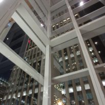
The columns are mostly wide flange sections of ASTM A992 – Grade 50, with other A572 Grade 50 rolled steel elements, larger to withstand higher loads at the base of the tower. At street level, the heavily framed base allows light and air to enter the Urban Garden room.
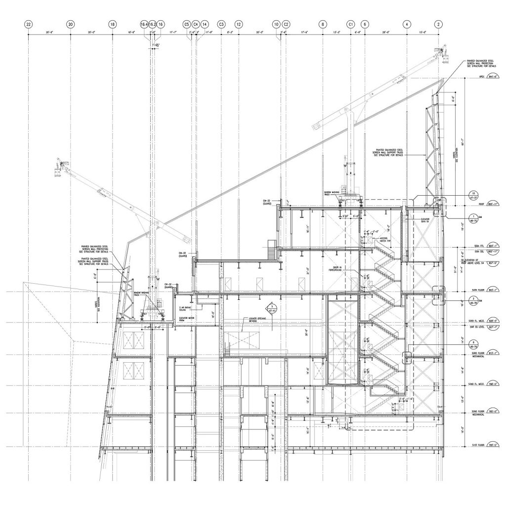
The structural system changes the modes at the ceiling level, where the walls of the screen are cantilevered with a structure constructed from 10×8 HSS and HSS sections of 8×8 steel ASTM A500 Grade B.
This structure was kept as thin as possible around the perimeter of the building to maximize the roof area where the mechanical equipment was placed. It also gives access to the Ajuga of 77.72m high.
Needle
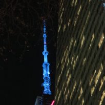
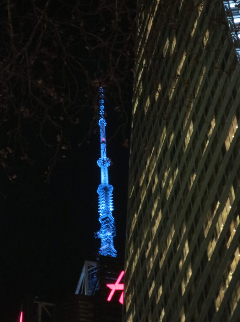
The needle built mainly with welded large diameter steel tubes, narrows from 1.77m in diameter at the base to 0.66m at the tip.
Floors
The floors, which consist of a 0.08cm composite metal platform, are generally framed in W18x35 steel sections, with an area of 12.95m each. Where the additional loads of the column displacements require them, horizontal beams are added to the structure to transfer the lateral forces to the core. The heights from floor to floor are 4.42m to accommodate the building’s mechanical infrastructure.
Materials
The tower uses environmentally friendly building materials, 87% is constructed with recycled material, even concrete is prepared with 45% recycled content, in this case, blast furnace slag. The building is wrapped with floor-to-ceiling windows that optimize natural lighting. The tower has its own rainwater collection system in addition to the wastewater recycling mechanism.
The skyscraper of glass, steel and aluminum is partly inspired by the particular site of its immediate location and its wider urban context. For its construction, 25,000tn of structural steel manufactured by eight companies and a careful design of columns were necessary.
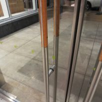
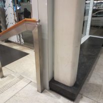
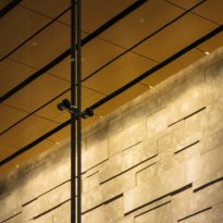
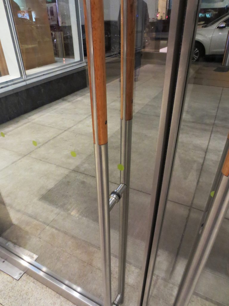
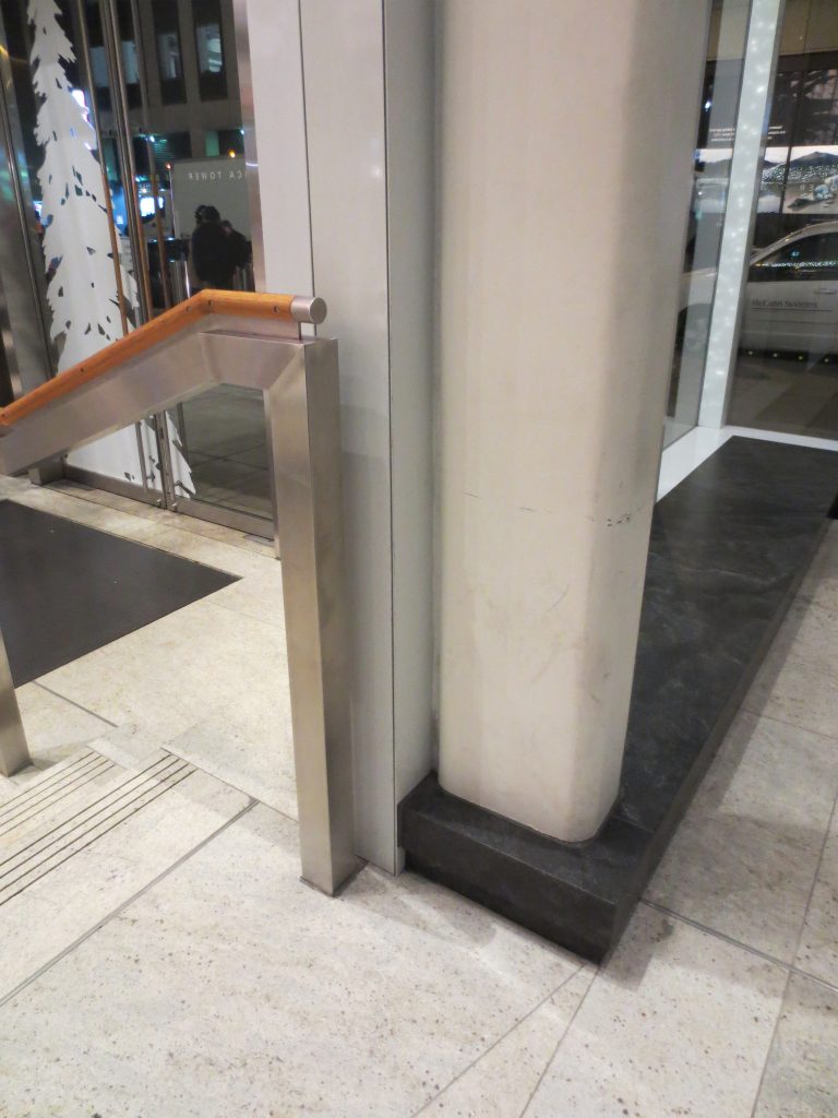
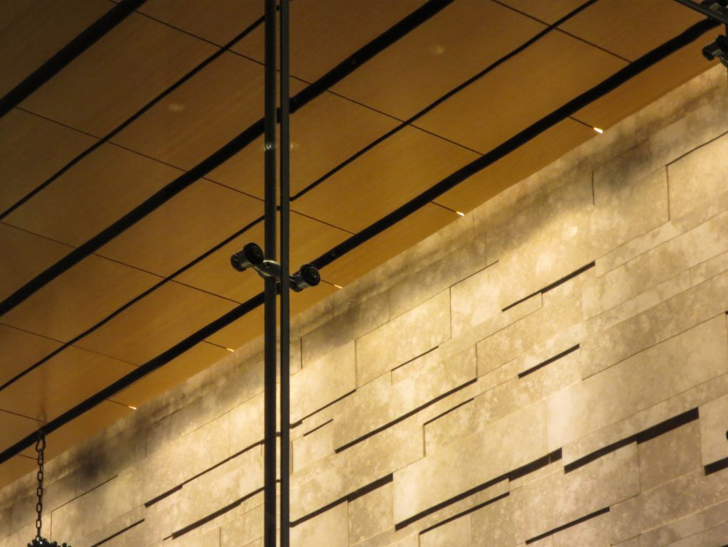
The solid and natural materials of the Public Urban Garden anchor the tower to the ground with small tactile details such as the door handles made of white oak, the fossils embedded in the Jerusalem stone or the leather panels, all of them make the huge tower mass be intelligible to the touch and look of humans.
In addition to the 52 elevators the building has 3 escalators.
The low density glass curtain wall that covers the tower from the floor to the ceiling minimizes the increase of solar heat through the low emissivity glass and special ceramic pieces reflect the heat while providing particular views.
Water saving measures, including gray water recycling, rainwater collection systems and waterless urinals, save millions of liters of drinking water and reduce the building’s water consumption by almost 50%. With an under-floor air system and 95% filtration, fresh air sent to offices can be controlled individually and is cleaner when it is expelled from the building. Recognizing its impact on the heart of a dense metropolis, thermal ice storage tanks in the building’s warehouse produce ice at night, which reduces the building’s maximum demand on the city’s tax-overloaded power grid. In addition, a 4.6 megawatt cogeneration plant on site provides a clean and efficient source of energy for almost 70% of the building’s annual energy needs.
Video
