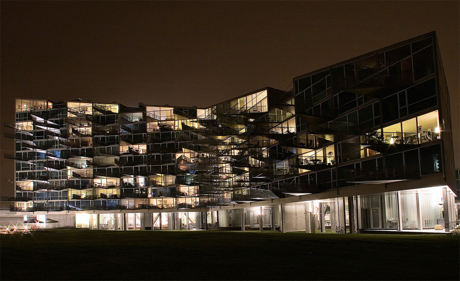
VM House

Introduction
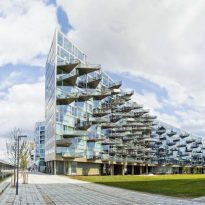
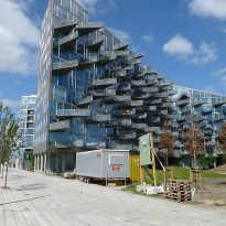
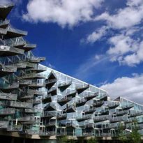
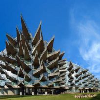
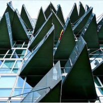
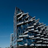
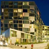
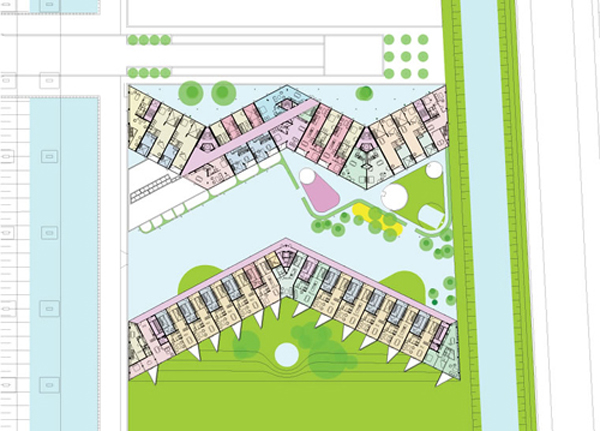
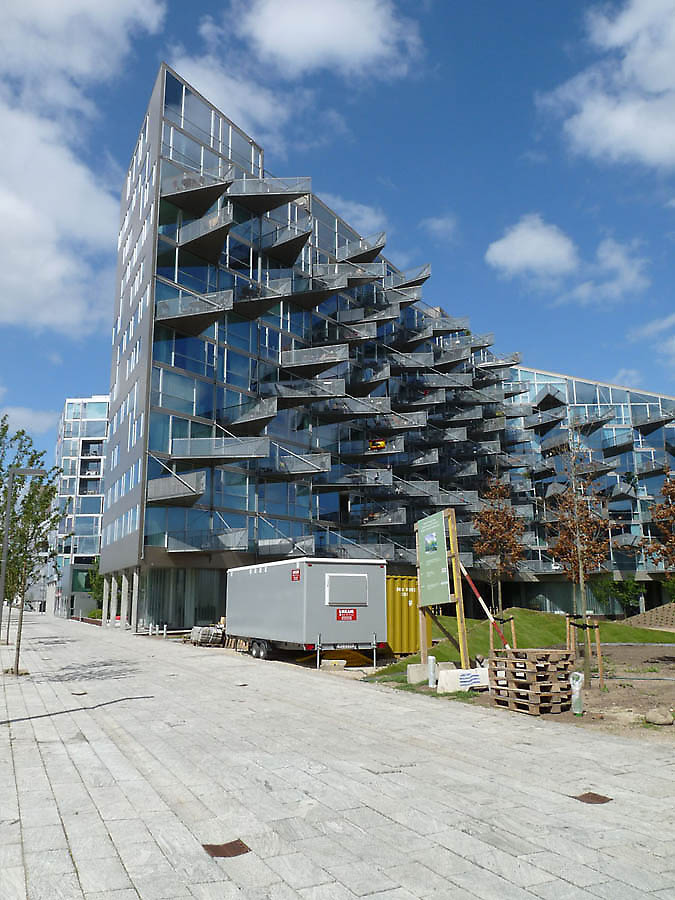
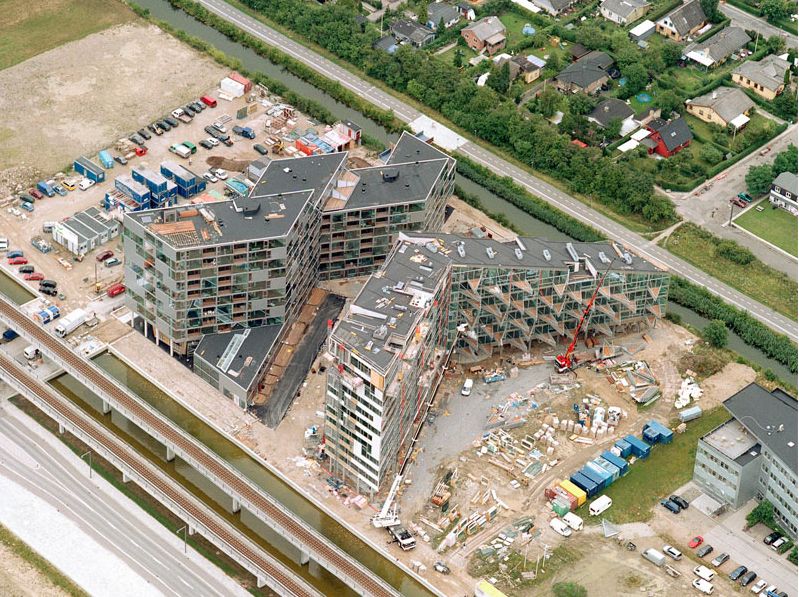
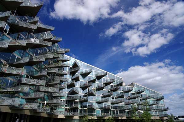
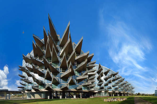
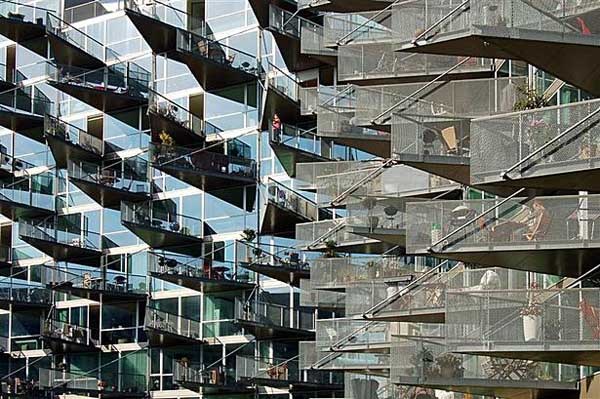
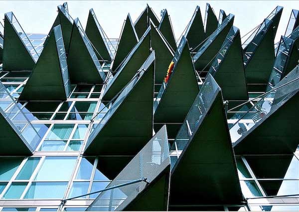
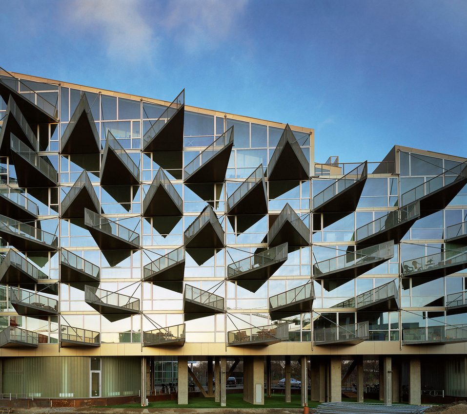
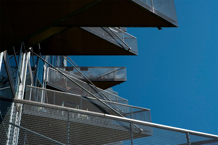
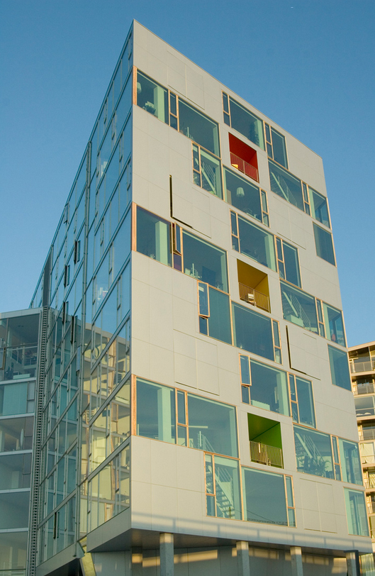
The residential complex known as VM House consists of two apartment blocks, one with a “V” and the other “M”. With its bold triangular balconies protruding from the facade of the building as if it were a hedgehog quills, this study design architects BIG + JDS = PLOT not indifferent to the observer, causing a shock.
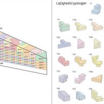
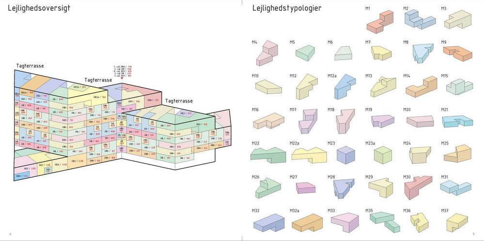
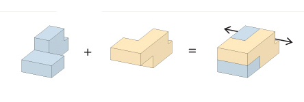
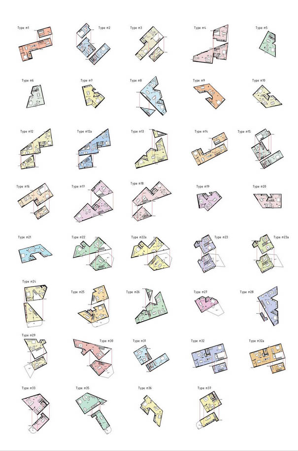
One of the most important aspects of this housing plan focuses on the development of different types of apartments, ranging from one-story homes with up to three others.
“We live in a world where individualism has a greater resonance than before. Diversity is well accepted, even desired. People living in a housing project must also have access to individuality “(Julien De Smedt, JDS)
Description
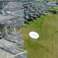
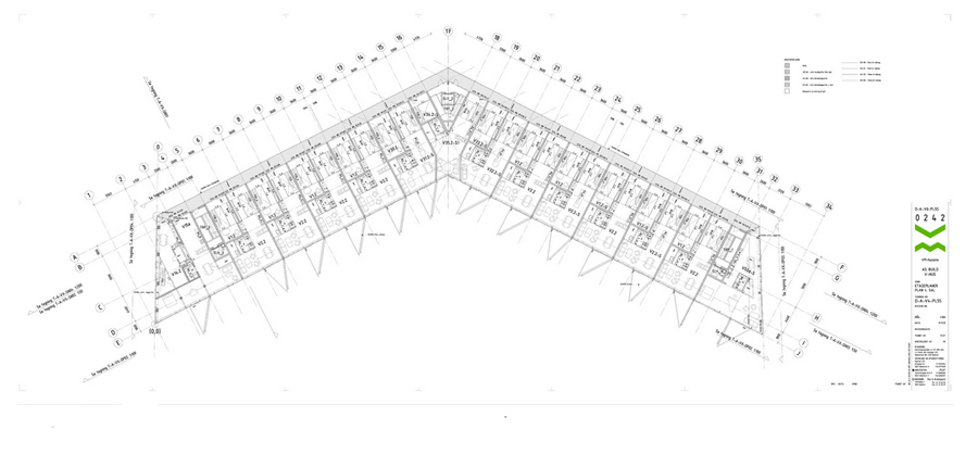
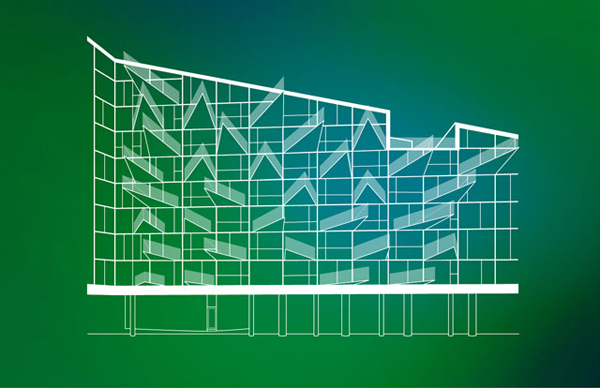
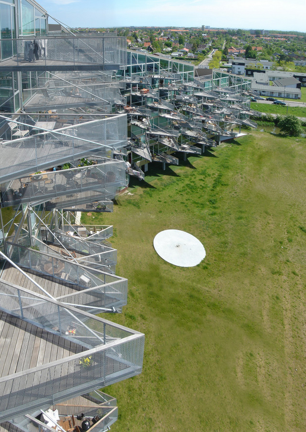
The perimeter of the blocks is clearly defined by its four corners, but inside is open along its sides. Volumes have optimum ventilation, light and views in all homes. The balconies stand like rows of shark teeth on the south side.
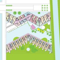
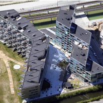
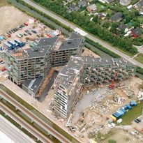
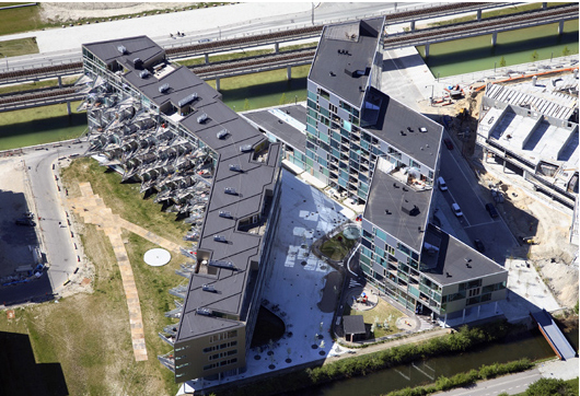
The two buildings placed you come face to face with each other seem to embrace their forms, the arms of the M want to hug the V.
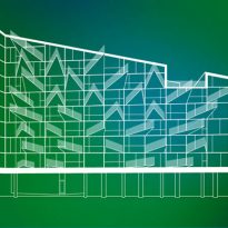
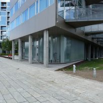
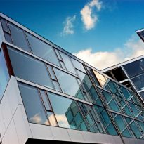
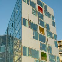
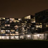
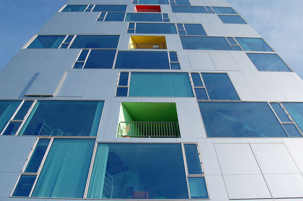
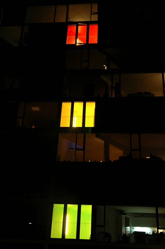
The glass curtain wall that covers the entire front of the building, its interior makes visible from the outside, as if it were a doll house, while it is visually stunning.
- Balconies
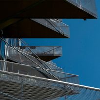
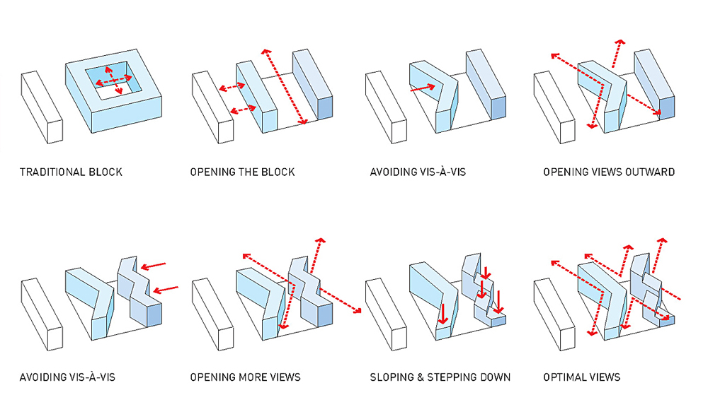
However triangular balconies and projections arranged on the facades of the buildings were not designed simply for visual effects, but were created to allow passage of sunlight abundantly in every home, while allowing ventilation and vision on other balconies.
Location
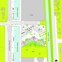
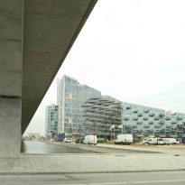
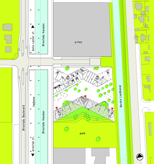
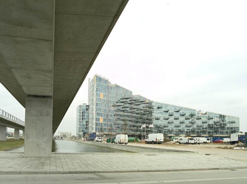
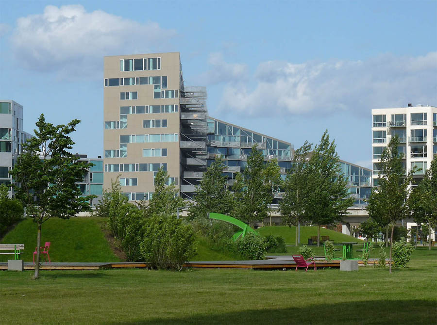
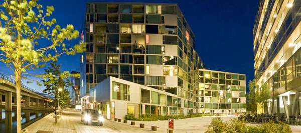
The VM Houses, whose forms seen from above correspond to the letters they are named, are the first residential project built in the new Ørestad neighborhood of Copenhaguen, Denmark. This neighborhood is connected to the city center with a new subway line which is accessed via a steel bridge that crosses the canal.
Concept
The forms of “V” and “M” of the buildings reflect a new concept in apartment blocks and rational reasons based on functional rather than aesthetic interests. With its development architects Bjarke Ingels and Julien De Smedt reinterpret the concept of Unité d’Habitation Le Corbusier and improved, with short center aisles at both ends receiving sunlight.
Form
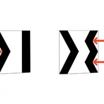
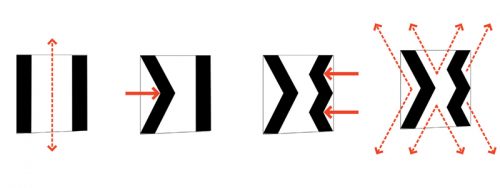
VM took shape based on an initial representation of a simple square, as the terrain where it was to build, bordered by two canals, with a box at the end of each building and a common area in the center. To direct all departments to leverage both the landscape and the night as the sun coming through the yard, architects angularon the first building, M, guaranteeing a different way for the second.
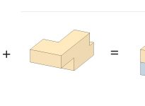
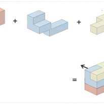
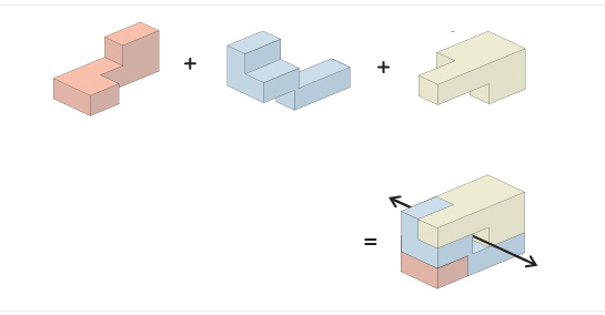
“Buildings are like a game of Tetris in three dimensions, formed by the people dwelling units” (Julien De Smedt, PLOT)
Spaces
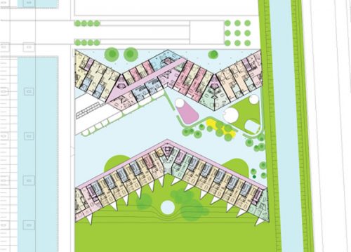
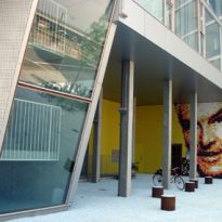
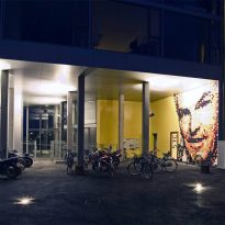
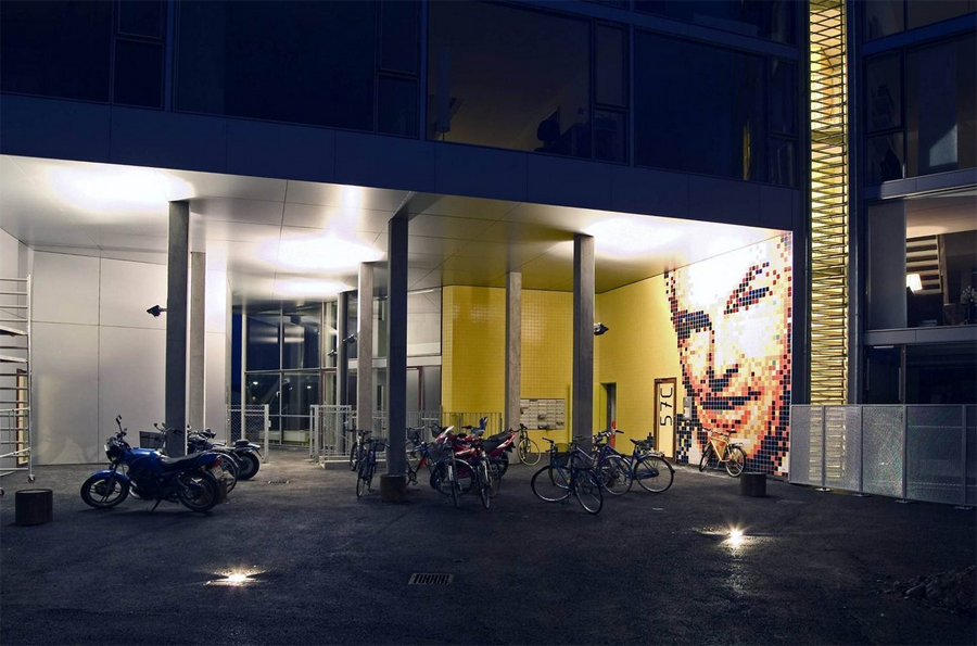
The ground floor, supported on piles, with a geometry that starts from a square divided into two blocks, offers public spaces for storing bikes or bicycles and others that have been closed for use at home for different services. The built volumes are open-air, natural light and views over the triangular balconies that characterize the facade facing south.
“Doubling the forms, says Ingels, opens up to the two channels, which ensures that the apartments, instead of looking at one another, are all oriented toward the landscape.” It also ensures that between light in the courtyard, both morning and evening. Movement breaks which would be a dense straightness within a given species of crystalline light refraction and circulation.
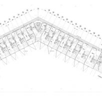
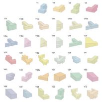
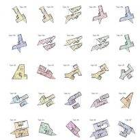
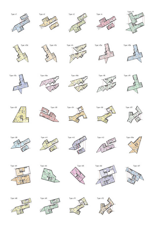
Plants do not respond to typical serial repetitions rectangular floors. For example, the plant has a plant V14 and linear serrated toothed V15 is L-shaped, the V37, located right at the bend of the V, is like the head of an adjusting spanner nuts down around the ladder.
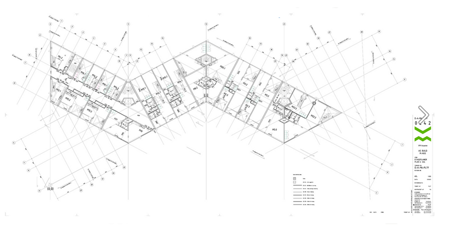
In block M appear even more rare forms, such boomeranags or geometric shapes that were never learn in school.
Block M

This block is oriented north. The logic of the diagonal slab from its center, the house used in V, are divided into smaller portions for the M house The 95 units that form the M House are divided into 36 types of departments. The individual terraces are all on the south side of the complex.
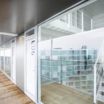
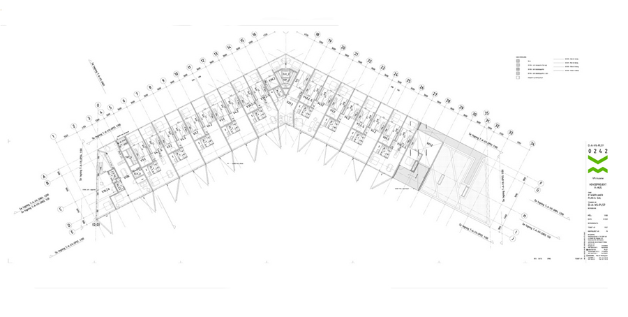
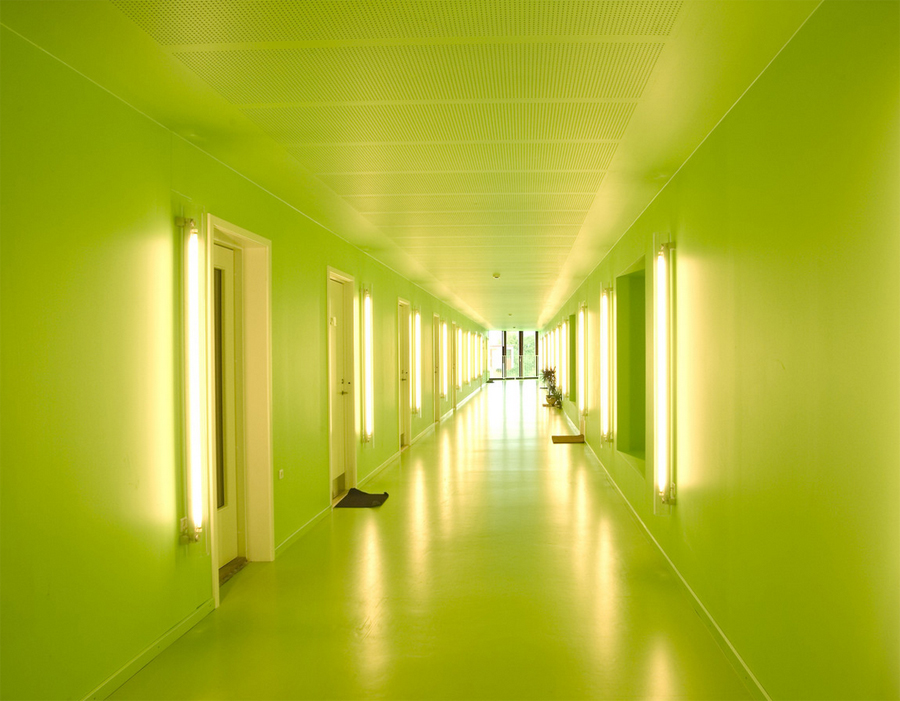
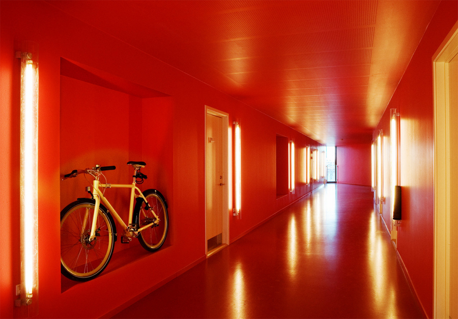
Access to the departments is done from a central corridor running through the volume of the building, opening to daylight at each end. These corridors create connections with the elevators and stairs, working as a community space where neighbors can meet and children play spontaneously. Down the stairs you can have access to the communal terrace.
The apartments are characterized by the interaction of complementary rooms, with double-height studios near the kitchens and living rooms with large open rooms that can be decomposed into smaller and penthouses naturally lit space.
Instead of the usual departments of large buildings are designed as units loft spaces, each different, both in width and height, letting residents design their homes individually.
The 12,500 m2 building was completed in 2004.
Block V
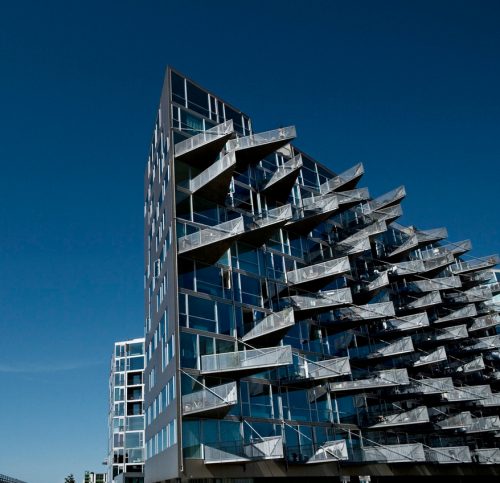
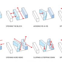
The V block, facing south, is pushed from the center to generate and ensure diagonal views to the open fields that exist in their environment. The vis a vis the neighbor is eliminated by pushing the slab in its center, ensuring diagonal views to the vast open country around. All apartments have double height space to the north and a panoramic view of the south side.
Access to the apartments is through a gateway that connects outer one of the three stairs or elevators, one positioned at each end and in the breakdown of the V.
As the first residential development in the area, it was important to create a welcoming atmosphere. To provide the public space around the buildings, the “V” stands on columns 5 meters high court allowing the opening of the park area on the south side, while the facades are articulated with niches and angles, creating a series of informal meeting spaces.
The 114 units available to the V House consist of 40 different departments. The building completed in 2005 has a floor area of 12,500 m2.
Materials
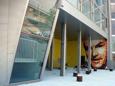
The buildings were constructed with simple materials yet exquisite, large glass facades framed with luxurious wood, aluminum, steel and concrete.
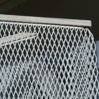
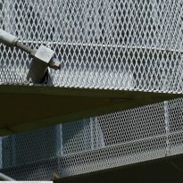
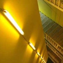
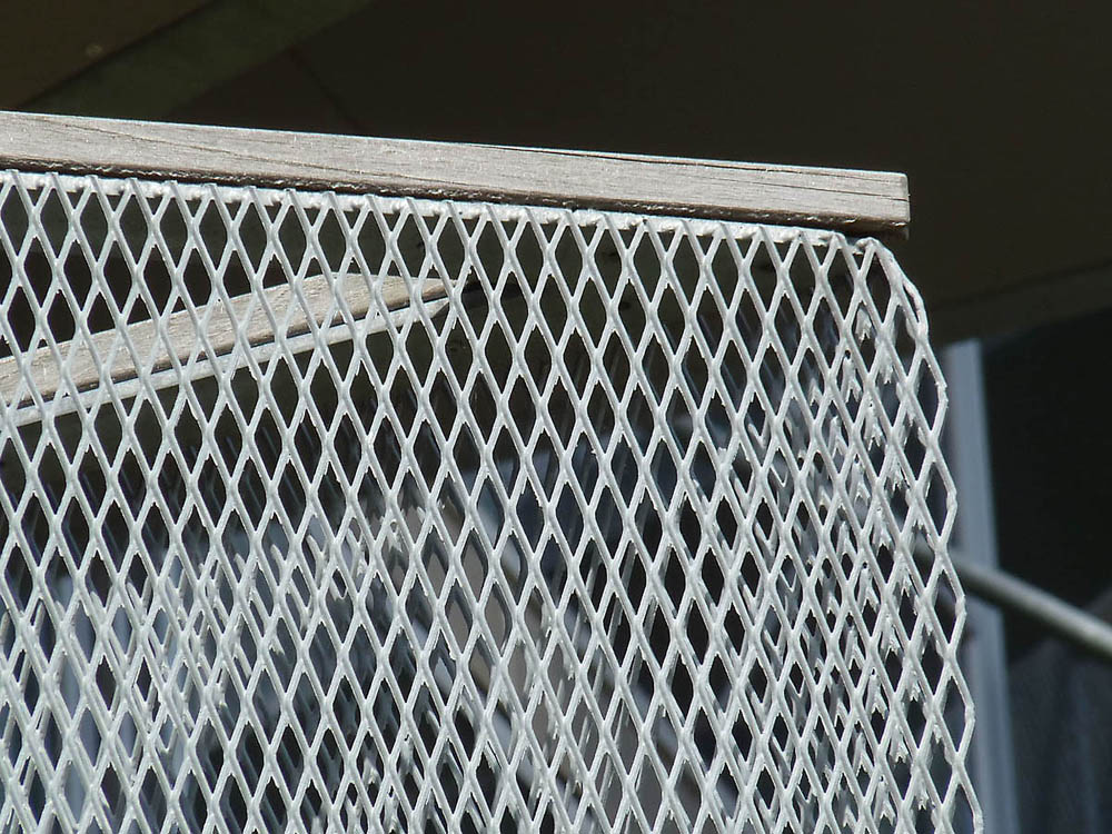
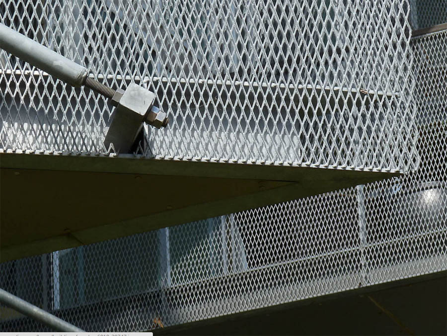
The soils of the departments are solid oak floors and balconies have been used hard dark wood and steel lattice protections. The walls and ceilings in some places show a completion in white concrete and all interior stairs and railings are painted white steel.
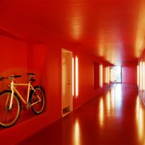
All exterior walls of the apartments are made of glass. The walls of the interior corridors, giving access to the houses were painted with bright colors like pistachio green, red or orange and one side of the door stood a fluorescent vertically.
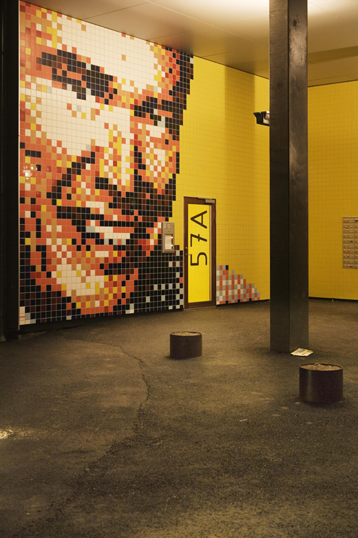
The exterior of the house is clad in panels M floating anodized aluminum. A large mural made of standard tiles and donated by one of the promoters, Per Hopfner, decorates the entrance on the ground floor.
Video
