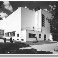
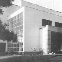
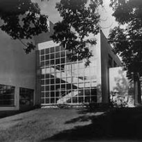
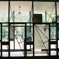
Viipuri Library

Introduction
Like other works constructed from Aalto, this project was the result of a competition for the construction of the Viipuri Library (formerly belonging to Finland and current city Russian Vyborg) won in 1927, but did not begin to build until 1933 in this long period, from the contest until the completion of the final draft in 1933, one can see through the evolution of their schemes a shift in thinking that will architect of functionalism to a fully organic architecture. The library was opened in October 1935.
It was widely acclaimed by critics, including Giorgio Labò stated that “while Frank Lloyd Wright developed the open floor plan, Aalto began the free section, creating a spatial continuity of the first order”.
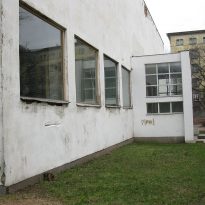
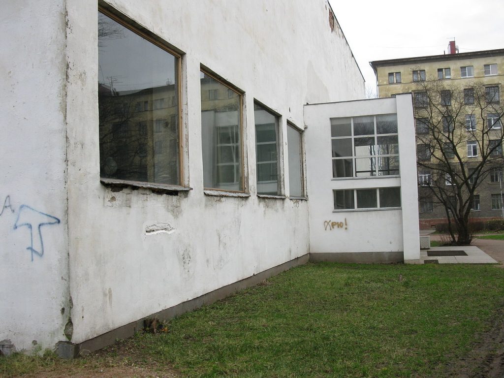
The building was partly bombed in World War II and abandoned for over ten years, causing extensive damage. In the 90’s a rebuilding process that would drag on for years and was made possible by donations received, this reconstruction is pursued to accurately reproduce the original draft of 1935 During 2011-2013, the Government of the Russian Federation began financed works that still missing to complete the restoration.
Location
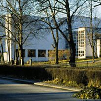
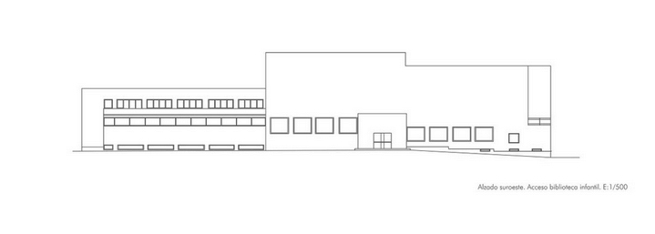
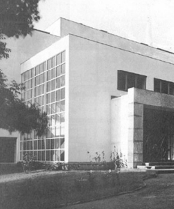
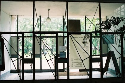
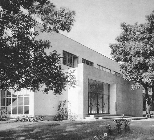
Located in the central park of the city of Vyborg (Viipuri), Russia, and close to the local church, the library has three differential inputs among which the principal is by the north and directly from the main street parallel to the park, middle east where access to offices and service areas to the south and another where, through the park for children adjacent to the building is independently access the children’s library is made.
In 1933 Finnish Viipuri was a town with 90,000 inhabitants situated in the southeast of the country. After World War II it was held by the Russians, to be renamed Vyborg. The library only worked continuously for the 15 months preceding the great contest and once finished, although it was not destroyed, he witnessed the hardships of Soviet Russia and its been abandoned for many years was complete.
Concept
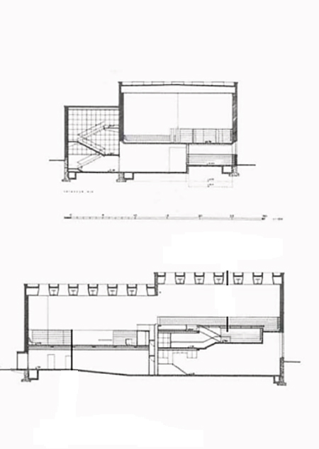
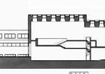
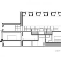
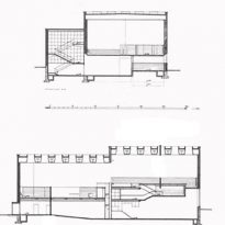
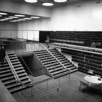
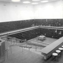
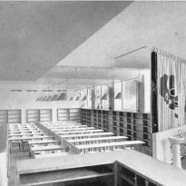
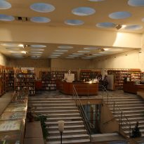
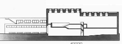
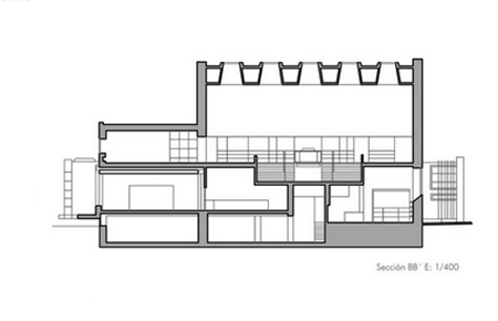
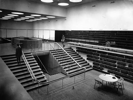
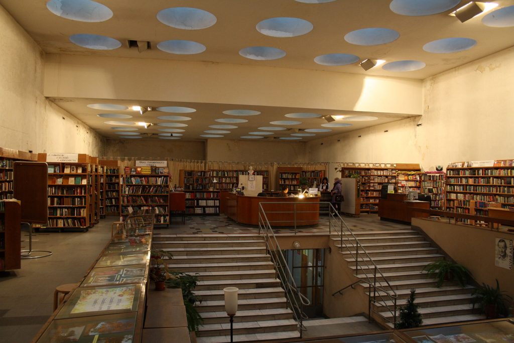
Viipuri Library section is particularly interesting. From ground level, a set of stairs ascends switchbacks leading to a two-level space receives daylight through a skylight and is home to the stacks, one of the areas of reading and control desk.
With the Viipuri Library, Aalto created some type of library buildings, with the free section, creating lighting and special features undulating surfaces, apply later in other multiple Library projects like Seinäjoke (1963-1965), Otaniemi (1965-1969), Reykjavik (1965-1968), the Library of Mount Angel Benedictine in USA (1967-1970) or Center Cultural Wolfsburg (1962)
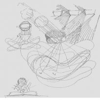
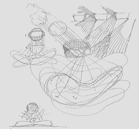
Aalto himself defines his work as the result of his inspiration in the mountain and cliffs bathed in sunlight at different times of day landscapes. “… When I designed the city library in Viipuri, for long periods of time I chased the solution with the help of primitive drawings of some kind of fantastic mountain scenery with cliffs lit by soles in different positions, from which came gradually, the concept for the library building. The architectural core of the library is reading areas and at different levels and loan plateaus, while central control area and forms the highest point above the different levels. Children’s drawings have only a direct connection with the architectural design, but joined together in section and plan, create a kind of unity between the horizontal and vertical structures… “(Alvar Aalto)
Spaces
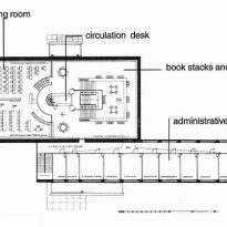
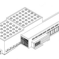
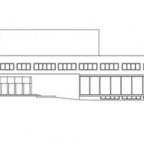
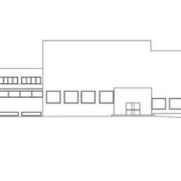
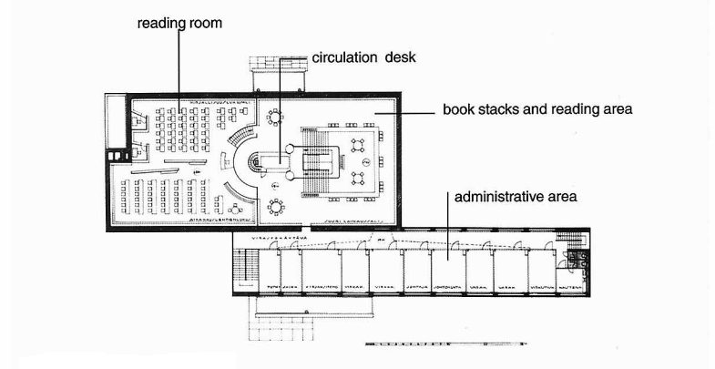
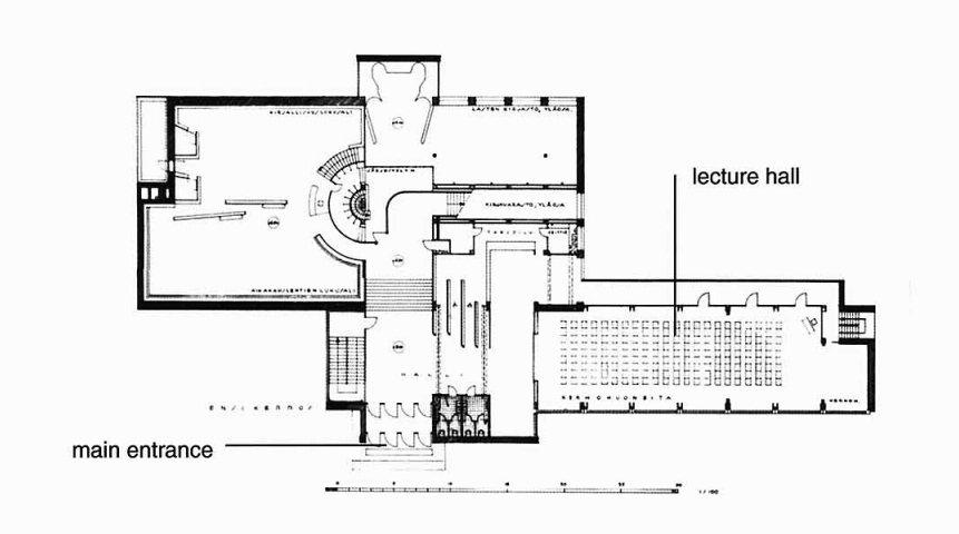
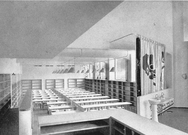
The building is composed of two rectangular volumes, the intersection creates a common area of circulation. This clear separation of the volumes corresponding to a functional differentiation program. The main block is designed for the act of reading, and Aalto dedicated special attention to the isolation and lighting of spaces through a successful manipulation of light and the use of thicker outer wall, while the other lower block, located at north, contains administrative services.

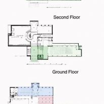
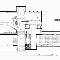
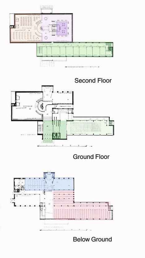
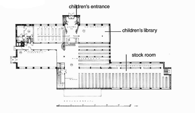
Although most references show three main floors and the ceiling plane, after a more detailed analysis plans and sections, six different elevation levels. On the ground floor is a large entrance hall, a cloakroom, and on the right is the conference room. The separate Children’s Library entrance is on a slightly lower plane in the south side of the plant. The room deposit is located about 2.5 meters below the children’s library. If the entry path follows is a series of stairs leading to 2 different levels with deposits of books and reading rooms. At the same level are administrative offices. The circulation desk is on the highest point overlooking the area of reading and borrowing books.
Rooms
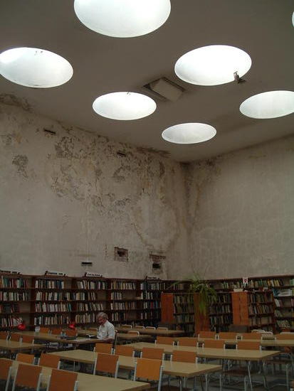
The main reading rooms and lending libraries, artfully superimposed, create a new section and continuous space. To the left of the main hall flanked by two glass staircase leads to the administrative wing.
Deposits and children’s library
Below the entrance floor with an interior access were library deposits, and with direct access from the park, the children’s library. The deposits were composed of 25 modules comb shelves that leaving a center aisle, again repeated on the other side.
The children’s library has access from the playground in the park, at the opposite end to the main entrance.
Reading room
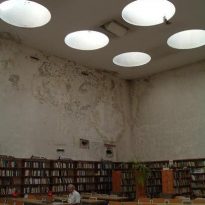
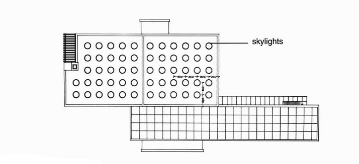
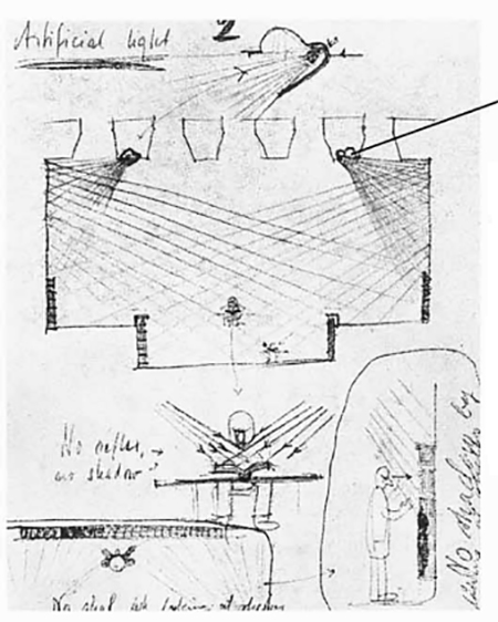
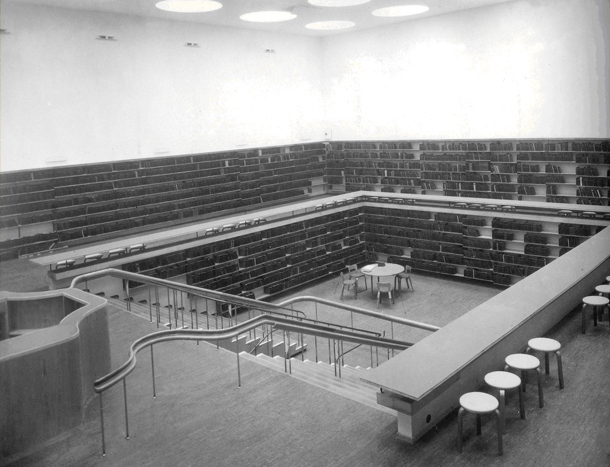
The skylights illuminate the deck arranged in such continuous rooms, resulting in a uniform light diffusion avoids creating shadows the reader uncomfortable, while minimizing the use of artificial lighting, which in turn was conceived and designed to obtain a similar to that achieved with natural light effect. The lighting in this room, together with its division of spaces are the key features that have made this space for lovers of architecture in place of worship.
Spatial distribution
The reading room is divided into two levels, both completely surrounded by bookshelves. The lower level, reading, communicating with the higher one by a central staircase that faces the loans desk and control, from which you can see all the lower room.
Lighting
Natural Light
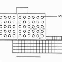
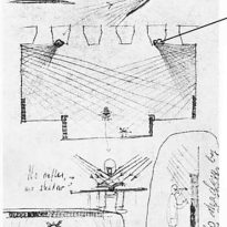
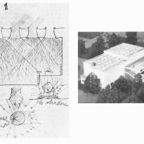
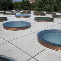
Lighting is one of the primary considerations in a library, in this case the architect designed a perforated by 57 round skylights, with a diameter of 1.83m cover. The round shape was the most satisfying to the condition of internal stress for horizontal glass surfaces and in cold climates the ever present danger of cracking should be avoided at all costs.
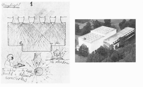
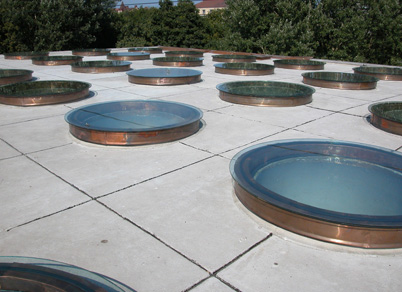
No direct sunlight enters, it is reflected in thousands of lines of reflection result of the conical shape, like a funnel, of the skylight. Thus without the use of a glass diffuser diffuse, shadowless light, ideal for the reader who can take your book to anywhere in the room without being bothered by glare or esombrecimiento was obtained.
Artificial light
In artificial light followed the same principles in natural lighting. Light is designed to fall onto the book diagonally and in all directions in order to avoid shadows. The accessories were placed between the openings of the skylights.
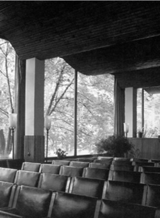
One might question the fact that these main rooms not seize the opportunity to look outside, interacting with the fabulous park, but Aalto designed these spaces as a microcosm, like a religious space is involved.
- Conference auditorium
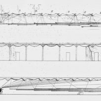
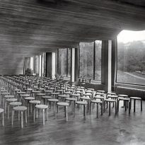
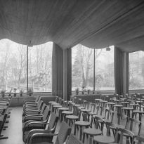
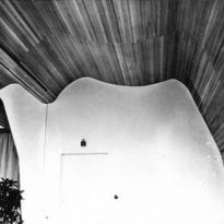
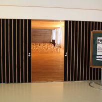
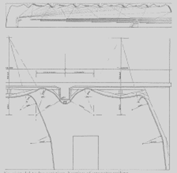
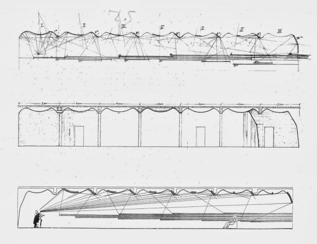
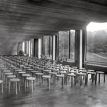
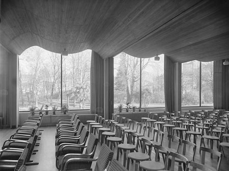
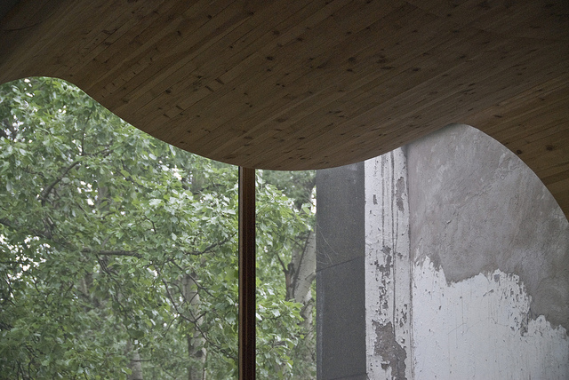
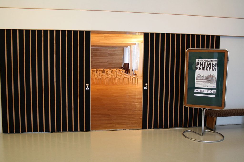
Are particularly characteristic ripples ceiling conference room, made of strips of wood and designed to propagate more efficiently sound to every corner of the room. The knowledge and expertise of an architect with wood through his designs for furniture allowed him to develop here the leap in the use of this material in the architecture itself, with its characteristic stacking stools and chairs with backs. Unfortunately this wavy wooden ceiling was eliminated by the Russians.
Structure
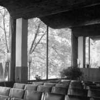
The structure is made of pillars and reinforced concrete slabs builtin situ, following the standards set by the German Committee for Reinforced Concrete, 1925 (Deutscher Ausschus Für Eisenbeton), being at that time the most renowned. There are also metal pillar structure seen in the conference room.
The use of brick is reserved for interior partitions and walls, then coated.
Materials
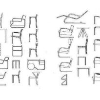
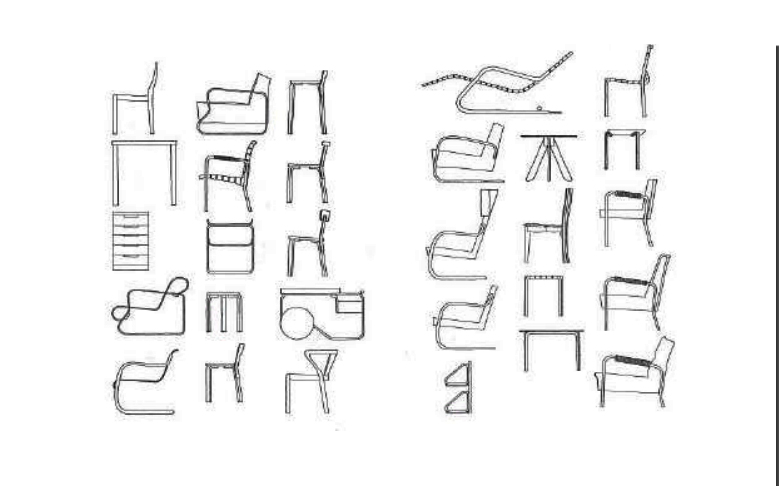
Continuing her particular path Aalto also designed in this library small elements to the user, such as handrails, chairs, curtains and other interior elements. The building was completely white outside and inside the various elements retained their natural color, with the exception of some metal elements were painted black, white or gray.
Acoustic

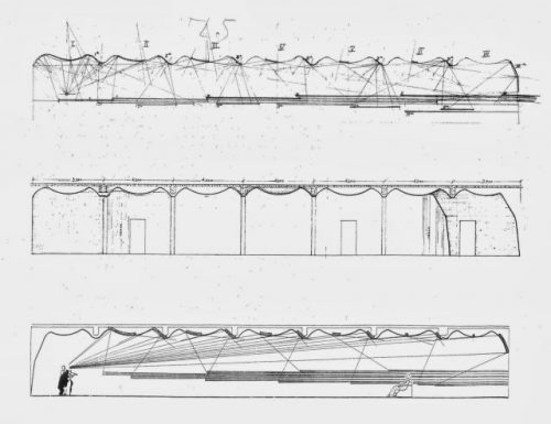
In the conference room the architect solved the acoustics of the space with the design of ripples in the roof made with wood slats Karelian pine, from the Finnish region of Karelia, which help the best sound propagation. The walls had a textile lining, the floor was wood and furniture in the conference room were designed especially for the occasion, with characteristic Aalto stacking stools and seats with backs, made of curved wood.
“… Alvar Aalto is, as Le Corbusier, one of the few architects in our time, has tried something new to attack the problem of the vault in a peculiar way for your period. In the intimate hall Viipuri Library irrational roof curves glide through space as serpentine lines in a painting by Miro. Of course, the architect can demonstrate, in meticulous acoustic diagrams, the shape of the wave that gave the roof allows the sound to the human ear more perfectly. Here, therefore, scientific reasoning and artistic imagination have merged with the architecture, free from the rigidity that today is a constant threat… “(Sigfried Giedion, architectural historian)
Ventilation
The architect and historian Sergei Kravchenko, charged with restoring the building after the ravages of life in Russia after World War II, resulted in the same, tells us about some of the construction details:
“The piping hot grill to heat the water room was located inside the plaster soffit thereof, between the zenith skylights and floodlights, so that the operation of the room itself was a beautiful metaphor of the sun providing us with light and heat. The thick side walls of the central space without fenestration harboring the ventilation system of the room, consisting of diffusers on top expelling clean air along the soffit, where it was heated by the heater and down by lamination to the level of the shelves, where the mouths of return is located. Aalto avoided promote clean air from the bottom and exhaust at the top to avoid creating convection currents that had dragged him dust and consequently affected the books. ”
“The walls of the building containing a system of forced air ventilation, confirming Aalto’s relationship with the technical issues, relationship that was already present in its previous building Paimio. This example of “wall breathing” – an idea proposed by Le Corbusier on your block Centrosyus Moscow, but that was not held in that building – reveals aspects of aaltiana architecture that have received less attention than his interest acoustics”.
