The Paris Metro

Introduction

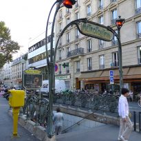
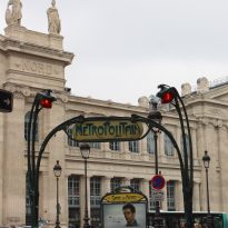
Meter Paris contains 303 stations and 387 corridors and lobbies. Although there have been renewed many times, its original design is Art Nouveau. This image is tried to retain in the restoration of 1999, while the new line 14 has wanted to give an air full of the century.
As all entrances to subway stations, it also fulfills its main task: to be visible from the street and show transmission lines to which it gives access through its information panel.
The design of the first entries subway Paris stems from a contest organized by the Compagnie du chemin de fer métropolitain of Paris, the Metropolitan Train Company of Paris (CMP), in 1899, just before the opening and the entry into operation of this service. Although the winner was the architect Henri Duray, President of the CMP, Adrien Bénard, he preferred the design of municipal architect Jean-Camille Formigé. Later he suggested the architect Héctor Guimard (1867-1942), which showed an Art Nouveau in its proposal that attract Parisians to use this new mode of transportation. With this choice was reached an agreement with the municipal authorities. This project Guimard unveiled to the public Art Nouveau style with which hitherto only the wealthy was familiar.
After designs Héctor Guimard CMP hired architect Cassien-Bernard. This neoclassical proposals made in stone, totally different from the expressive entries Guimard. At the end of the Belle Époque the subway entrances were commissioned several architects who again used the iron railings but of original entries in more austere. Today much of the inputs of the line running from north to south of Paris, line 12, are still in Art Nouveau style, while the inputs constructed from the twenties onwards were designed with a increasingly minimalist style.
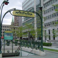
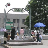
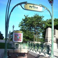
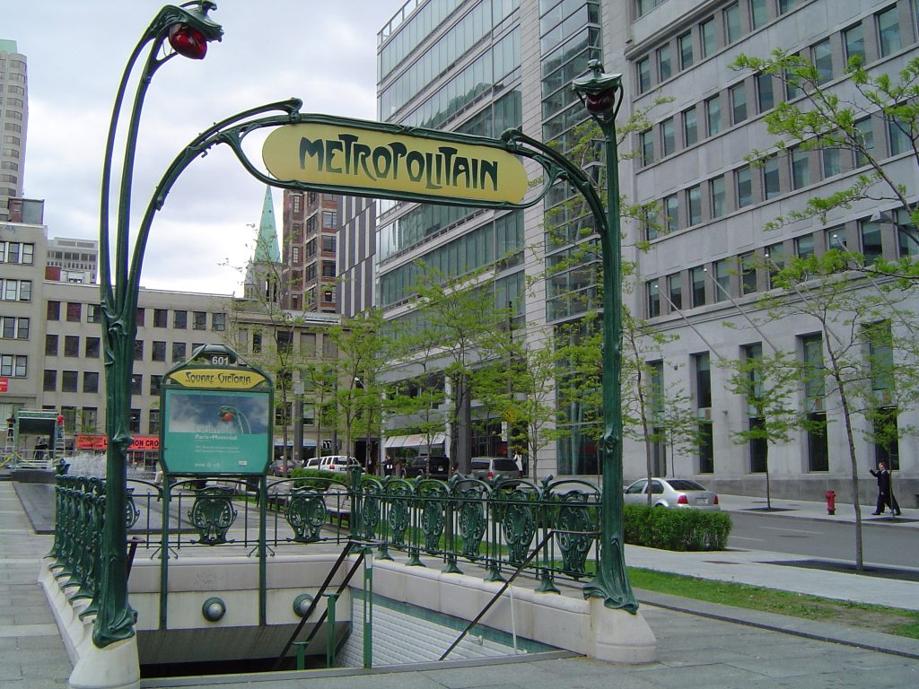
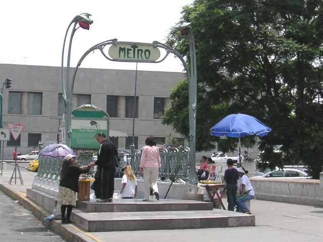
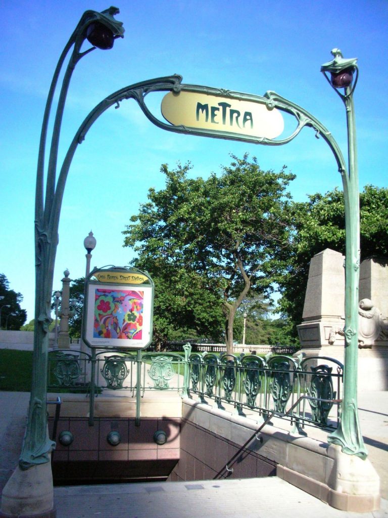
Replicas of the original design Paris were exported to cities as Lisboa, Mexico City and Moscow. Still, out of Paris today there is only one place in the world where this creation of Héctor Guimard can be admired. It is Montreal. The RATP transport authority Paris donated this entrance to the city in 1967 to commemorate their collaboration in designing the metro. It is situated in Station Square Victoria. Because the proposal Guimard was based on a modular design, the door could rebuild Montreal-based parts entrances to subway Paris previously demolished. However, some details like the poster, subway map and areas of the lamps are reproductions made during the restoration carried out between 2001 and 2003. The white tiled yes they are the same type as those used in the mouth the subway Paris. The fact that the design of Guimard have come so far is due to visit the mayor of Montreal, Jean Drapeau, a Paris at the time of their city subway was being designed. Drapeau saw demolished the entrance to the station Etoile, today named Charles de Gaulle-Étoile, so he suggested that it be moved to their city.
Over time the original proposal Guimard has become a symbol of the city of light, being played in many objects designed for tourists.
Situation
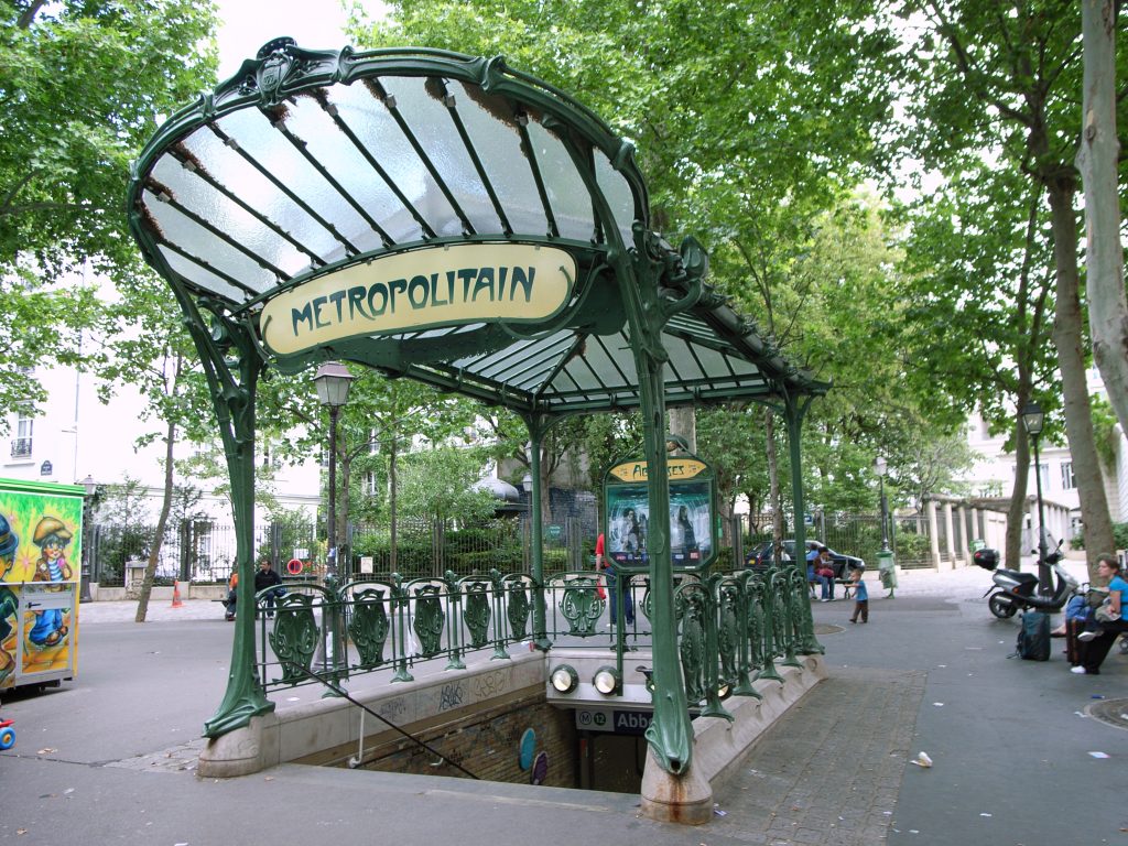
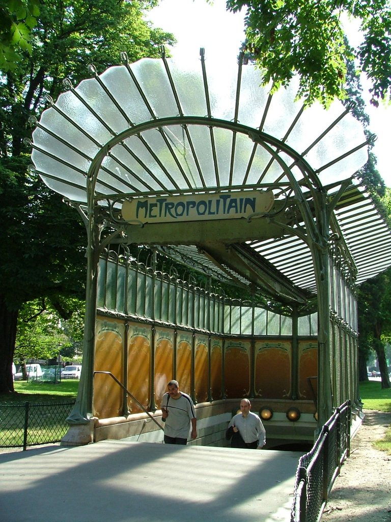
This project is distributed along the metro line 12 Paris. Today several of the entrances to the stations, including Porte Dauphine and Abbesses are preserved.
Concept
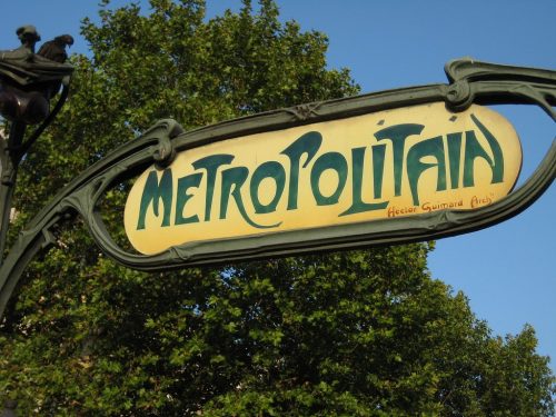
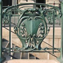
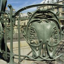
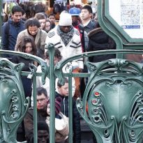
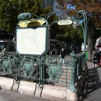
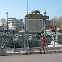
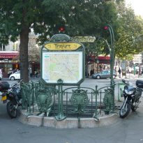
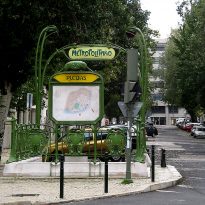
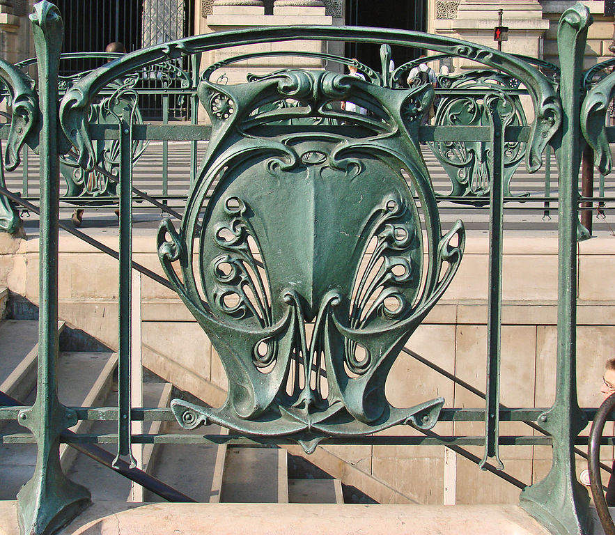
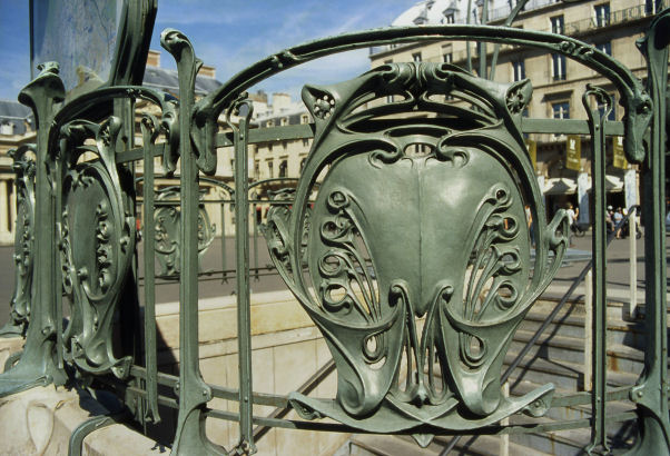
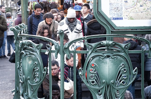
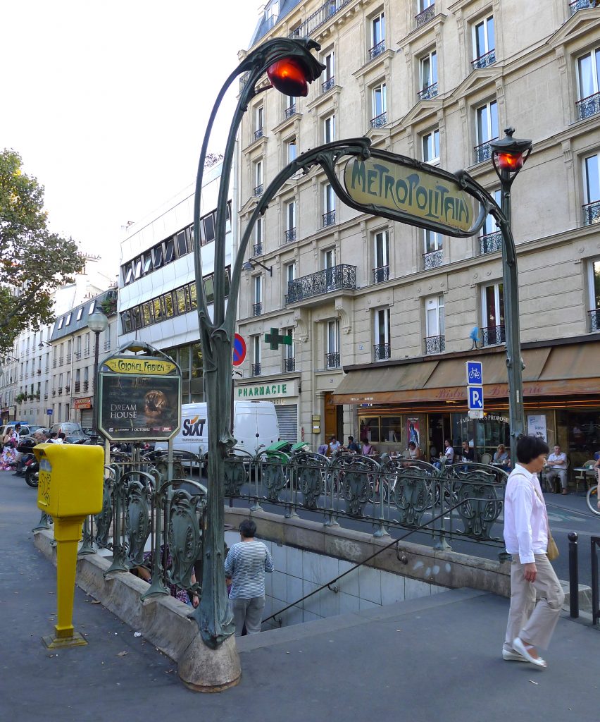
This project has a street furniture, unconventional clearly modernist style at the time of its creation but was well received by most of the Parisian public. As a good example of Art Nouveau this work leverages the capabilities of new industrial materials to create beautiful shapes inspired by the natural world, showing a special attention to detail.
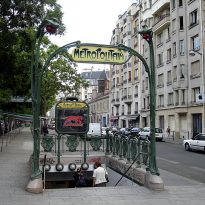
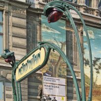
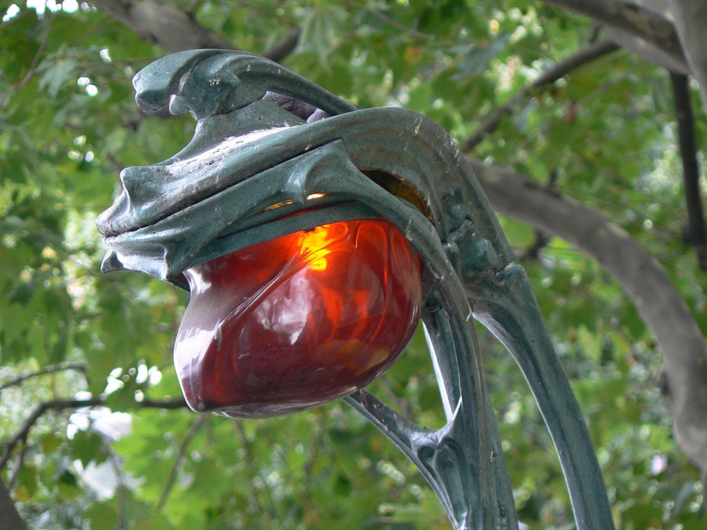
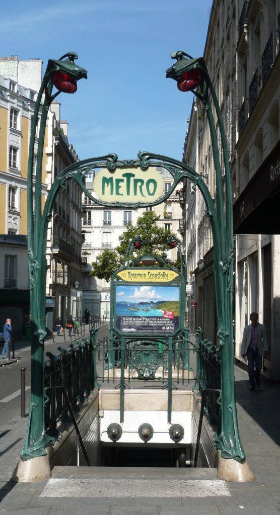
As happened in the project House Coilliot, the metro entrance Héctor Guimard does double duty. On the one hand frames subway access while simultaneously serving propaganda or claim of this new method of transport. To do this Guimard it made use of floral shapes to define the input and illuminate lamps arranged symmetrically shaped flowers. The project can be seen as an example of Art Nouveau in the architecture, design and advertising come together in a single object or shape.
In order to beautify the city, to publicize the modernist style and take advantage of advances in technology, Héctor Guimard proposal designed in a modular way.
Although this proposal was like the vast majority of people, there were some who did not like. As proof of this we have written P. Augustine Cotard, “The provocation pornographique M. Guimard et Bénard,” published in the newspaper ‘La Croix’ ‘in Paris, the March 17, 1902 (translation Castilian by Marisa Garcia):
“Just two years after Mr. Hector Guimard dared to cover the mouth of the Muette station subway with a huge range of glass we could call -espantajo because the synonyms of this extra is limited to frivolity, debauchery and moral license, the Company Paris Metropolitan deigns again to resort to alleged talents of this man. […]
The no-style Mr Guimard, attributing its adherents defend utilitarian value is […] an ugly and brutal copy in the most ordinary materials, irregularities of nature. This laxity forms reveals the criminal intellectual panache of its author.
Mr. Guimard playing obscenely so not worth playing, instead of using the talents entrusted to him by the Creator to loarlo in pursuit of absolute perfection. […] In the Monceau station, as in other parts of Paris, the walkers are insulted by Mr Guimard pornographic filth.
Mr. Guimard crying in all Paris that he wants nothing to “hide the ugliness beneath”, and also says that after Eiffel, art can have a utilitarian value. The monstrous structure Mr. Eiffel in the Champ de Mars, although it is a wart that disfigures everything Paris has at least, in spite of its materials, a perfect repetition of motifs, a rigor, a righteousness of Mr. Guimard knows no avail.
Mr. Guimard act wantonly, we are aware, and has no other purpose than to make our fellow citizens share their perversions. Plant convolutions of his previous “creation” in the Muette shock us, obviously, by the lusts of their forms, own ideas to arouse lust in the weakest citizens. […]
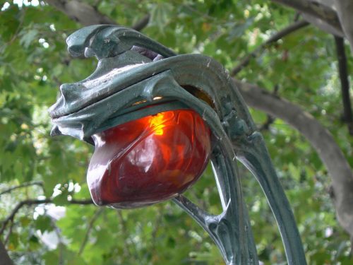
The ways in which decorated the entrance to the station Monceau appear as shameful developments carnal nature. As for the two branches framing the top of the ladder and wrap as a receptacle of two forms of polished glass, oblong, spherical, translucent and blood, can only be used metaphor that Mr Guimard for some years -and we fought without falta- of the most odious and unbearable public representation of the female sex.
The recent statements by Mr Guimard cited by Combat can not be more clear about it: “The men moved Metro in the capital and moving fluids in the human body, and I wanted, with this entry, indicating a seed, a change of state in man, become an inner particle “. These anatomical purposes are eloquent, and we can only hope that the author will receive the punishment he deserves for his deeds. ” – P. Augustine Cotard
Spaces

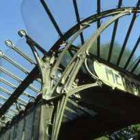
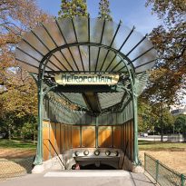
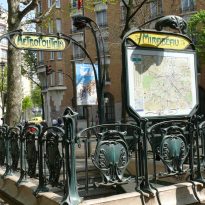
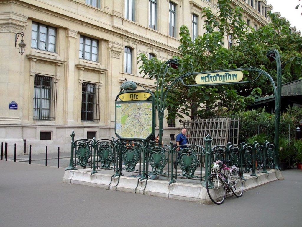
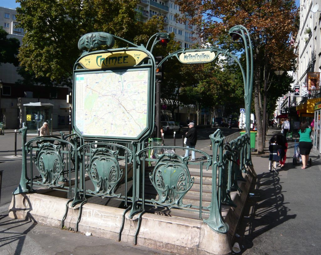
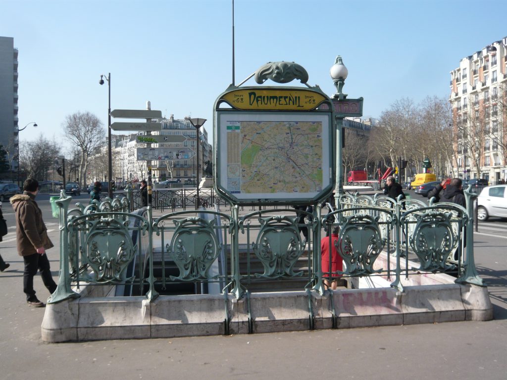
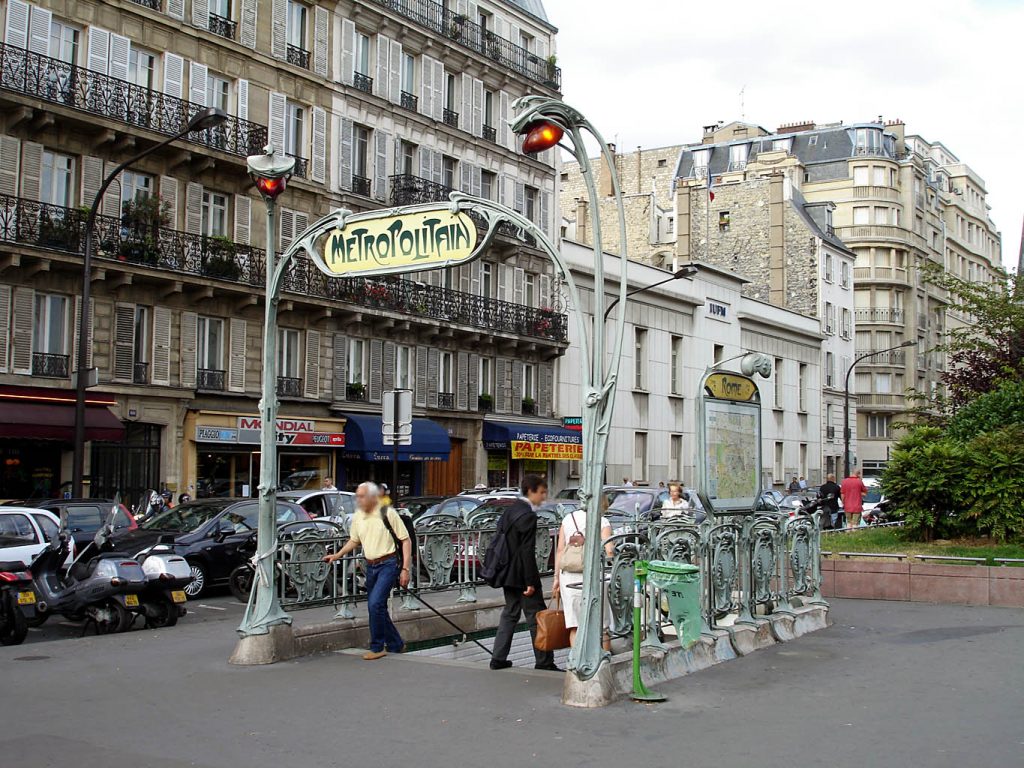
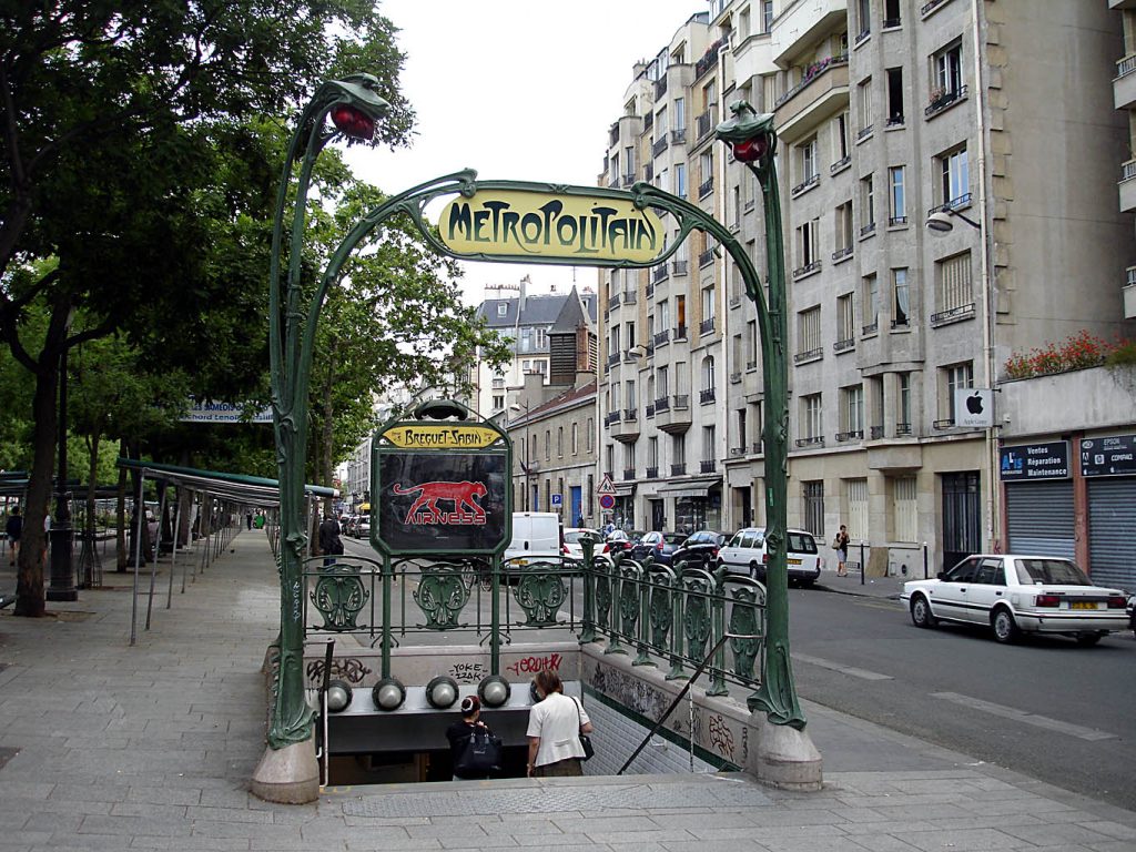
Guimard designed two options for subway entrances, some with a glass roof and other without it. The architect was very inspired by the forms of nature and, as it did in other works, he reflected on this project. From its design were built between 1900 and 1912, 141 subway entrances, of which 86 are kept still.
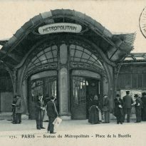
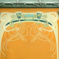
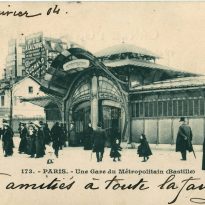
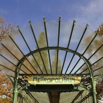
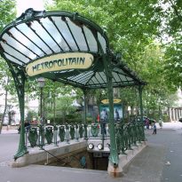
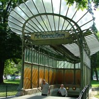
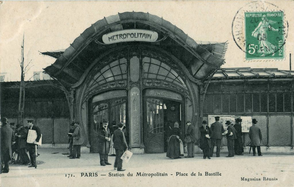
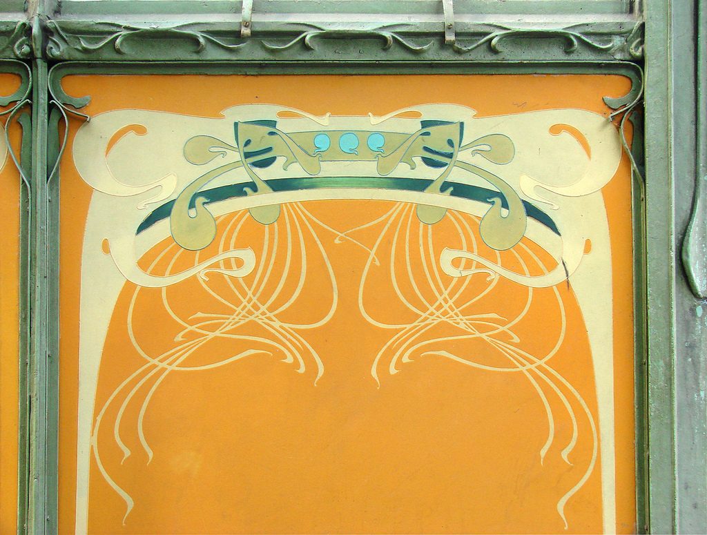
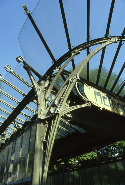
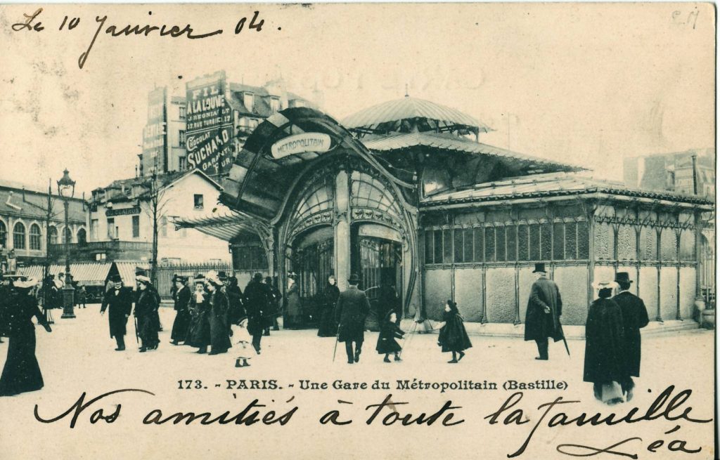
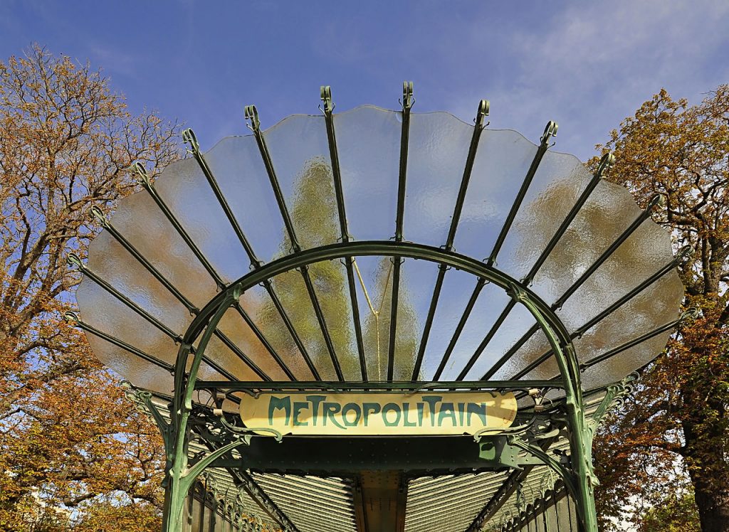
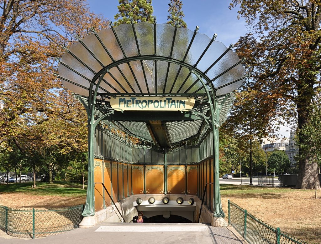
The input type with glass cover, called édicules, shows a design in the form of open fan. Some stations also included an opaque panel decorated with floral motifs and vines. Examples of these entries were underground at the Gare de Lyon, today disappeared, and stop Hôtel de Ville, located today at Abbesses.
The most beautiful entries were built in Étoile stops and Bastille, at the ends of the opening line of the subway Paris, line 1. Both were destroyed in the sixties. Today you can only see three entries metro including édicule. Two of them are originals, the Porte Dauphine and the Abbesses, 1974 transferred from Hôtel de Ville. The third is a replica made in 2000 at Châtelet.
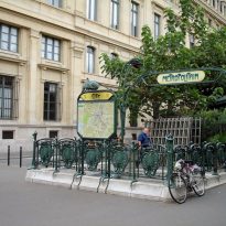
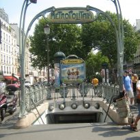
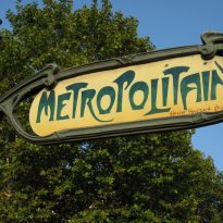
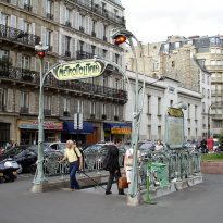
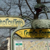
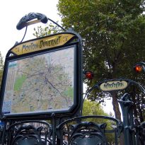
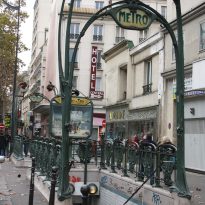
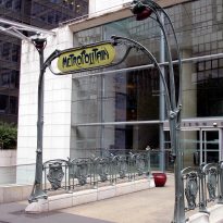
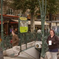
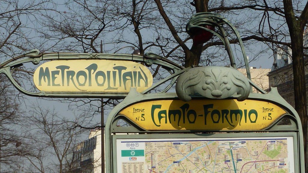
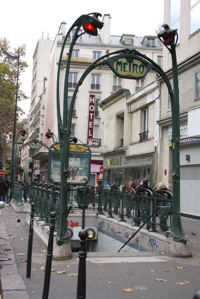
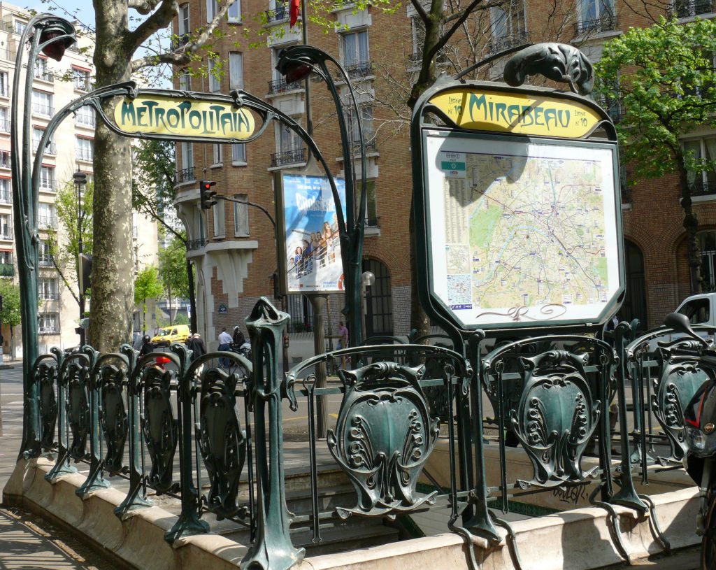
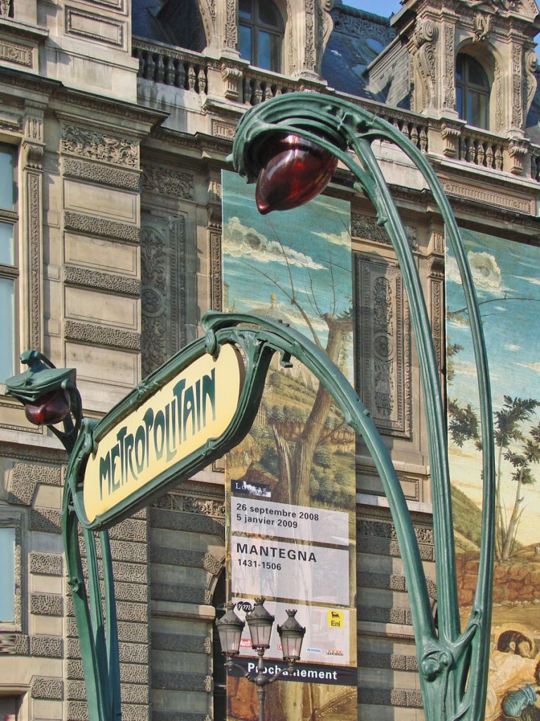
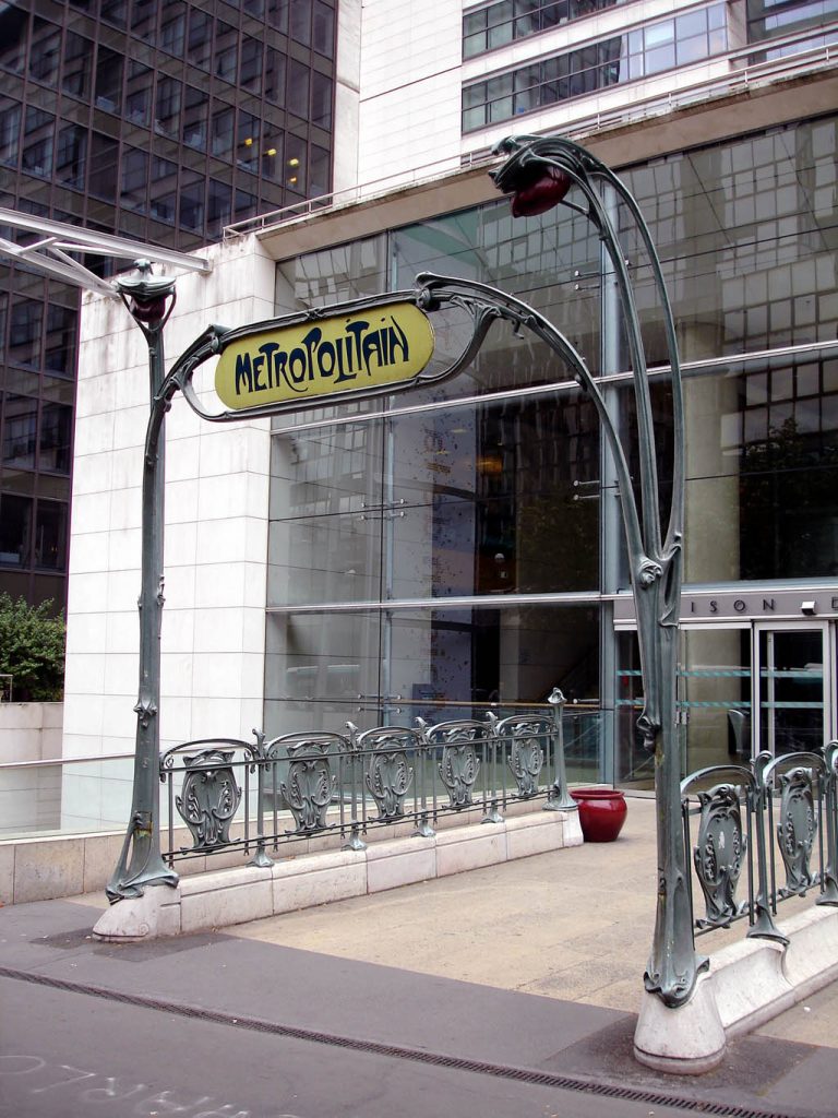
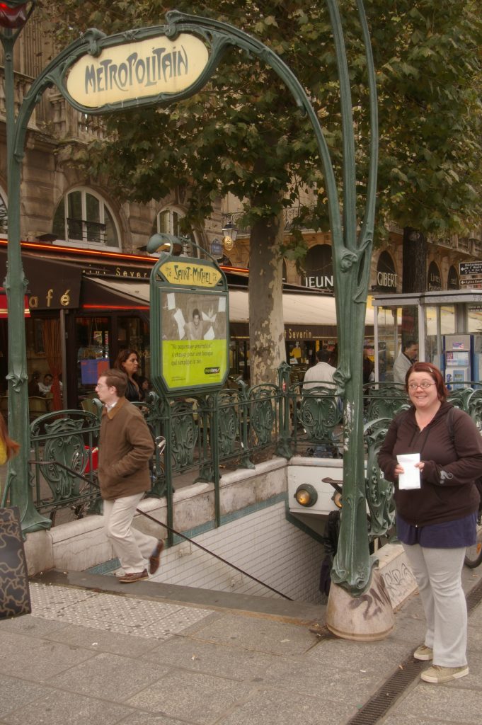
The simplest model of entry without glass cover includes a sign that reads “Métropolitain” between two lamps with organic shapes, as if it were flower stems where orange teardrop-shaped lamp is wrapped a sheet, like the lilies of the valley and other flowers.
Structure and Materials
Since the project arises from initially on an urban scale, it is composed of several modules, thus facilitating assembly and replication in different seasons of the city. Therefore, the main materials used are wrought iron and glass. The structure has a size of approximately five by four meters and a height of about 90 centimeters. The part containing the sign and the lamps have a height of five meters.
Video
