Tassel House
Introduction
Between 1892 and 1894, a European movement was born in Brussels which would rejuvenate the applied arts, and later be called Art Nouveau, Nieve Kunst, Style Liberty, Jugendstil or Modernism.
Tassel House is considered the first architectural work of this movement. It would revolutionise not only the artistic aspect but also the technical. It is one of the classic monuments in the history of architecture. It is the product of a time and of a country, characterised by the economic progress of the bourgeoisie, strong artisanal traditions and increased industrialisation.
The work proposes a total revision of the spatial organisation and a continual dialogue between the flexibility of iron and the durability of stone. For the first time in a house, the potential of iron as a constructive and decorative material are explored. The style and the ornamental elements are not added to the new cast iron construction, but are part of it, and are seen throughout the space. The use of iron as the structural and expressive medium was inspired by the works of engineer, Gustave Eiffel, which culminated with the Eiffel Tower in 1889, and in the theories and illustrations of Viollet-le-Duc in his 1872 book, Entretiens sur l’Architecture.
Although the house is of the traditional typology of Brussels, it establishes not only a new vocabulary but a new syntax. It breaks away entirely from the classic layout of the rooms, which are generally found one after the other, accessed by the main corridor, leaving the central areas in darkness.
It was built by architect, Victor Horta, at the age of 31, and was one of his first works. The house is also known as Maison or Hotel Tabelgssel.
It was commissioned by Emile Tassel, a professor of descriptive geometry at the University of Brussels and collaborator with the firm, Solvay (for whom Horta would later construct the Hotel Solvay between 1895 and 1900).
Once completed, the architect worked for a number of years on its furniture. He also made a number of minor changes (e.g. to the decoration and heating system).
In 1956, the house was divided into smaller homes; a transformation made contrary to the original design.
In 1976, the architect, Jean Delhaye, bought the property with the intention of returning it to its original splendour. He began the restoration in 1982.
In 2000, it was declared a UNESCO World Heritage site, along with three other constructions of the architect.
Location
It is located in the city of Brussels, on the Rue Janson, previously known as the Rue Turin.
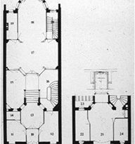
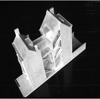
The house sits on a plot 7.79m wide and 29m deep, and occupies the entire width and 20.8m of the depth. Being between two other buildings, it receives light at its shortest sides.
Concept
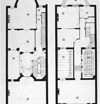
The key conventions in the planning of the work were: a renovation of the floorplan, elimination of the corridor and of the rooms in one line, emphasis of the curved line and use of iron for the architectural structure.
Removal of the corridor and of the line of rooms results in flowing spaces.
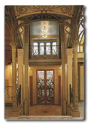
Iron is used for structural elements, as well as decorative ones.
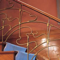
‘Whiplash lines’, also known as ‘Horta lines’, can be seen throughout the property.
Spaces
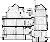
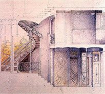
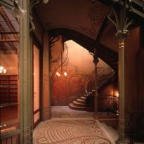
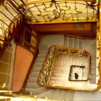
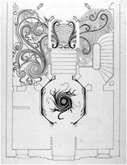
The entrance is found in the centre of the façade. The space is distributed in two zones. The first, reached by the main staircase, which connects the hallway with two main, large spaces, with views over the street. The second, towards the garden, is accessed by another staircase. The two zones of the house surround a central courtyard which illuminates the public areas of the space.
A breakdown of the levels is created. The second area of the building, located toward the back, is above the entrance hall, giving the internal space a contrasting dynamic to the narrowness of the plot.
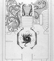
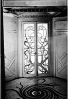
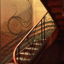
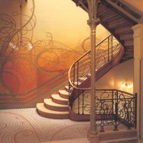
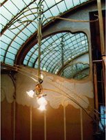
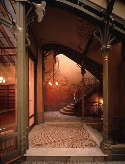
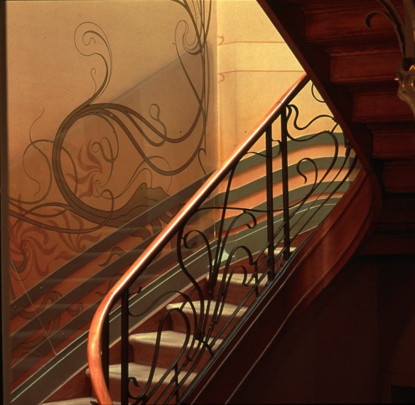
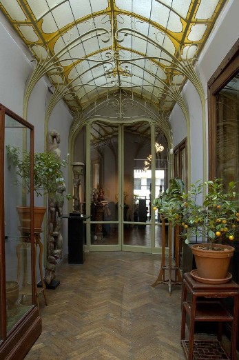
The house offers an inexhaustible array of bidimensional forms, inspired by the study of plants and flowers. Floors, walls and ceilings are covered in ‘whiplash lines’: snaking, intertwining, rippling and climbing up the frames of the windows, around the legs of the furniture and returning on themselves. Their presence, at times excessive, fulfils all requirements of the construction.
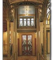
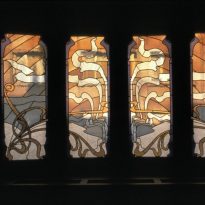
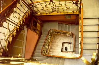
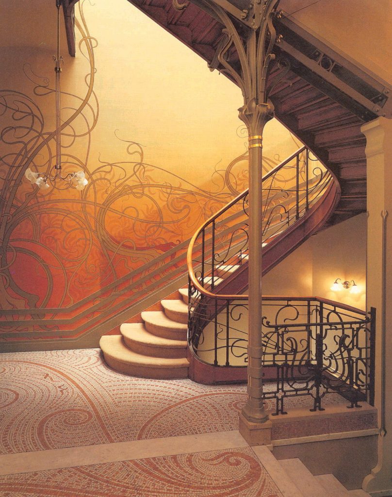
In the interior, the new figurative movement is visibly manifest. A unifying sense links the structural elements to the visual. The principal staircase is a clear example, with its metal frame on show. From it, curved iron mouldings split off to form railings and decorative motifs. The sinuous development of these elements determines a very particular definition of the space. Analogous forms of these elements appear traced on the surfaces, from the design of the stained-glass windows to the mosaics of the floor tiles. In this way, the concave-convex articulation favoured by Art Nouveau is present in the body of the staircase, as well as in the empty spaces, such as the lines of its structure and the meandering mosaic of the floor. At the foot of the staircase, a slim column of iron rises as if it were the stem of a flower. From its “spire” grow bands in the shape of plants, which extend through the space. The imagery is repeated in the corbels and the visible iron supports, and in the objects which climb the stairs, forming the railing. These ornamental details extend across the ceiling and walls, and also the mosaic of the floor, like rings of water which expand from a central point. The design is not repeated like a stamp on paper, but as though every shape is individual.
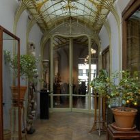
The winter garden on the ground floor is supported by an exposed iron structure.
Façade
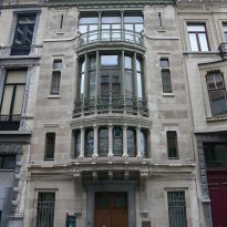
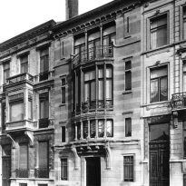
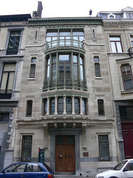
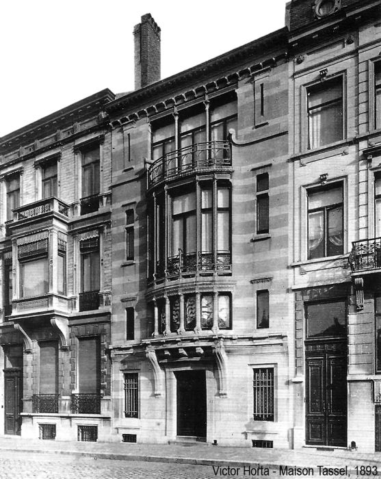
The main elevation mimics the neighbouring façades by repeating their dominant element: the bow window. However, this element differs from them in its curvilinear integration with the side panels.
The elevation of the first floor is formed by a series of windows, separated by small stone columns. On the second floor, high balconies are carved out, slightly set back and protected with an iron railing. On the third floor, the bow window becomes a terrace; a continuation of the three apertures but now as part of the wall.
The dominant element used is the traditional stone brick. However, there are many up-to-date elements present in the façade, such as the undulating surfaces, the visible metal beams and the unusual design of the balustrade.
The façade shows the fluidity of the interior space and translates it to a flexible movement: protrusions and recesses, taut glass membranes, stone and iron are combined in a rhythmic game. It is not only the rhythm of the lines which produces this idea of totality; the importance of colour is likewise fundamental: the browns of the woods, the glow of the bronze, the inlays, locks and latches, the tones of caramel and peach.
Structure
The structure is a metal framework, totally visible in the interior, while in the façade it’s only seen through the central windows.
In this work, the potential of iron as a structural and ornamental material are proven.
