


Sperone Westwater Gallery
Introduction
The Sperone gallery was founded in 1975 by Italian art dealer Gian Enzo Sperone, Angela Westwater and German art dealer Konrad Fischer. Back then it was called the Sperone Westwater Fischer Gallery until it was renamed to the actual Sperone Westwater Gallery in 1982.
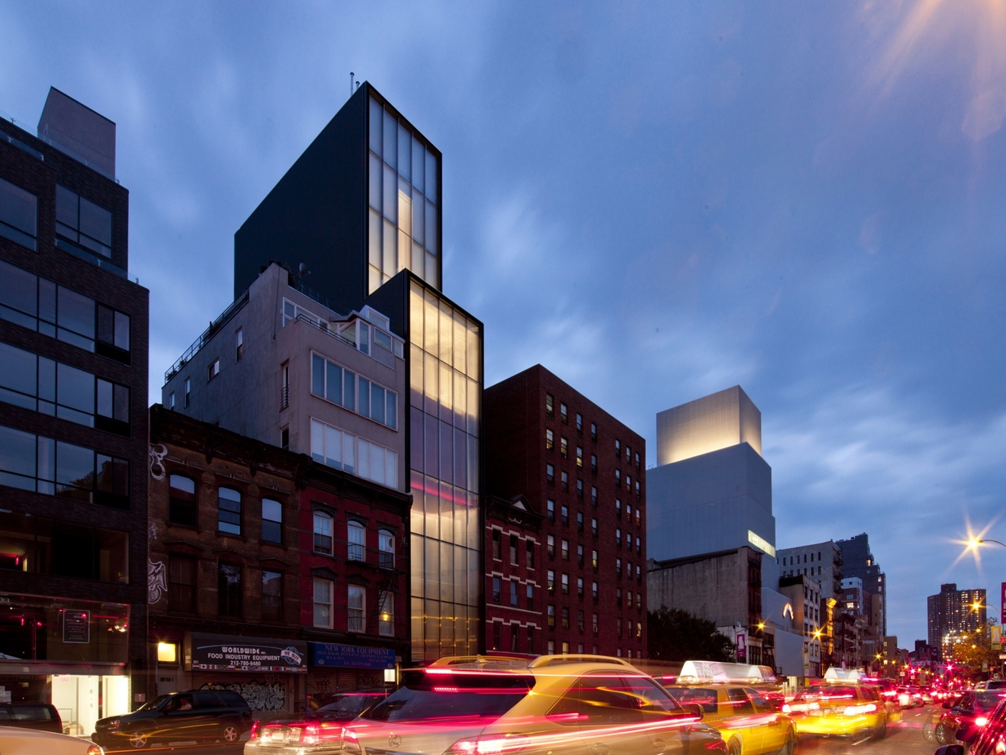
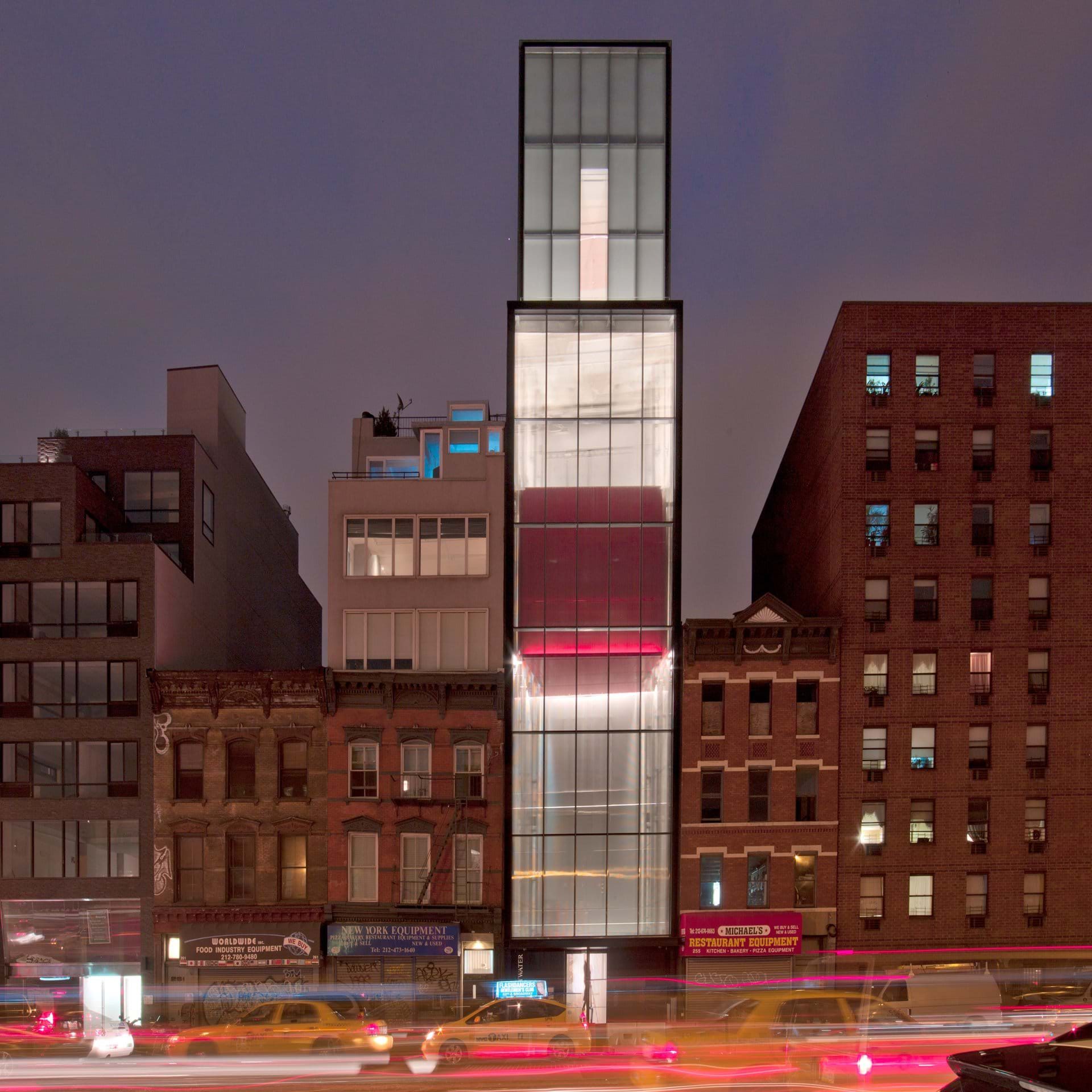
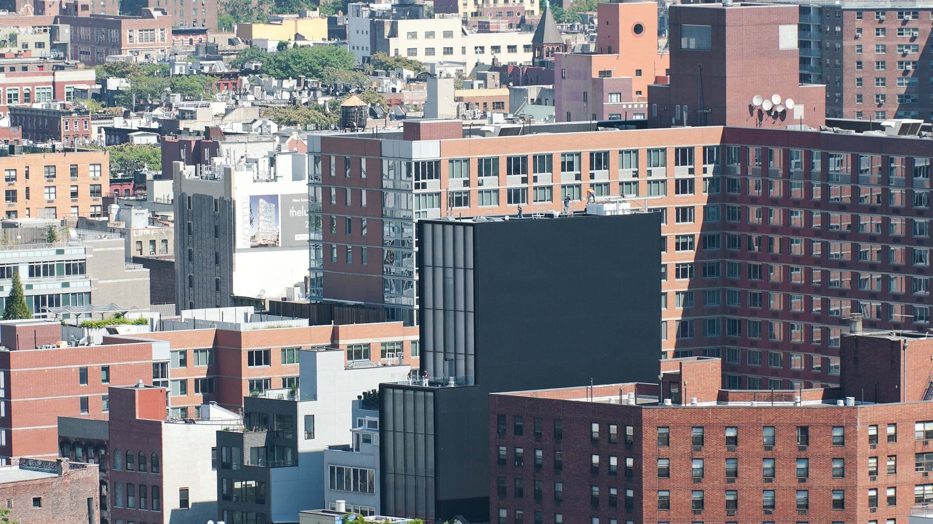
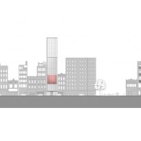
Over the years the gallery has had several homes, including its initial location at 142 Greene Street in SoHo to 121 Greene Street or 415 West 13 Street, until it landed on the Bowery on 2010 in this Foster designed building that was set to become a city icon from day one.
The promoters sure hoped for the effect that a Norman Foster design could have, and their expectations were surely met when the building receive the RIBA International Award, the New York Municipal Art Society’s MASterworks Award for Best New Building and the AIA New York Architecture Merit Award, all during the first year after the constructions was finished.
Location
The Sperone Westwater Gallery is located in the Bowery neighborhood in Manhattan, just south from the East Village. The Bowery, once known for its kitchen equipment’s shops, is today a vigorous district that is trying to reinvent itself as an artistic hub within the competitive city of New York.
The renovation of this area of Manhattan started in the 90’s, but truly consolidated in 2006 when the first luxury apartment complexes opened their doors in the area, followed by they iconic New Museum of Contemporary Art designed by Japanese firm SANAA.
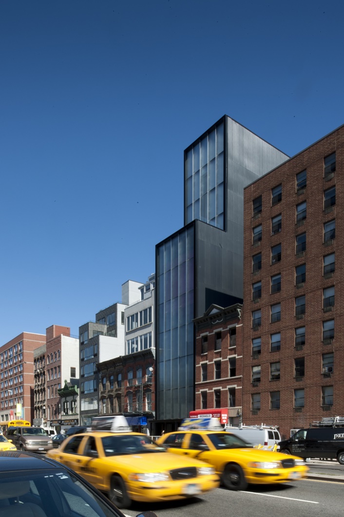
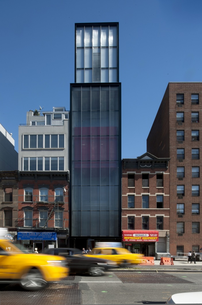
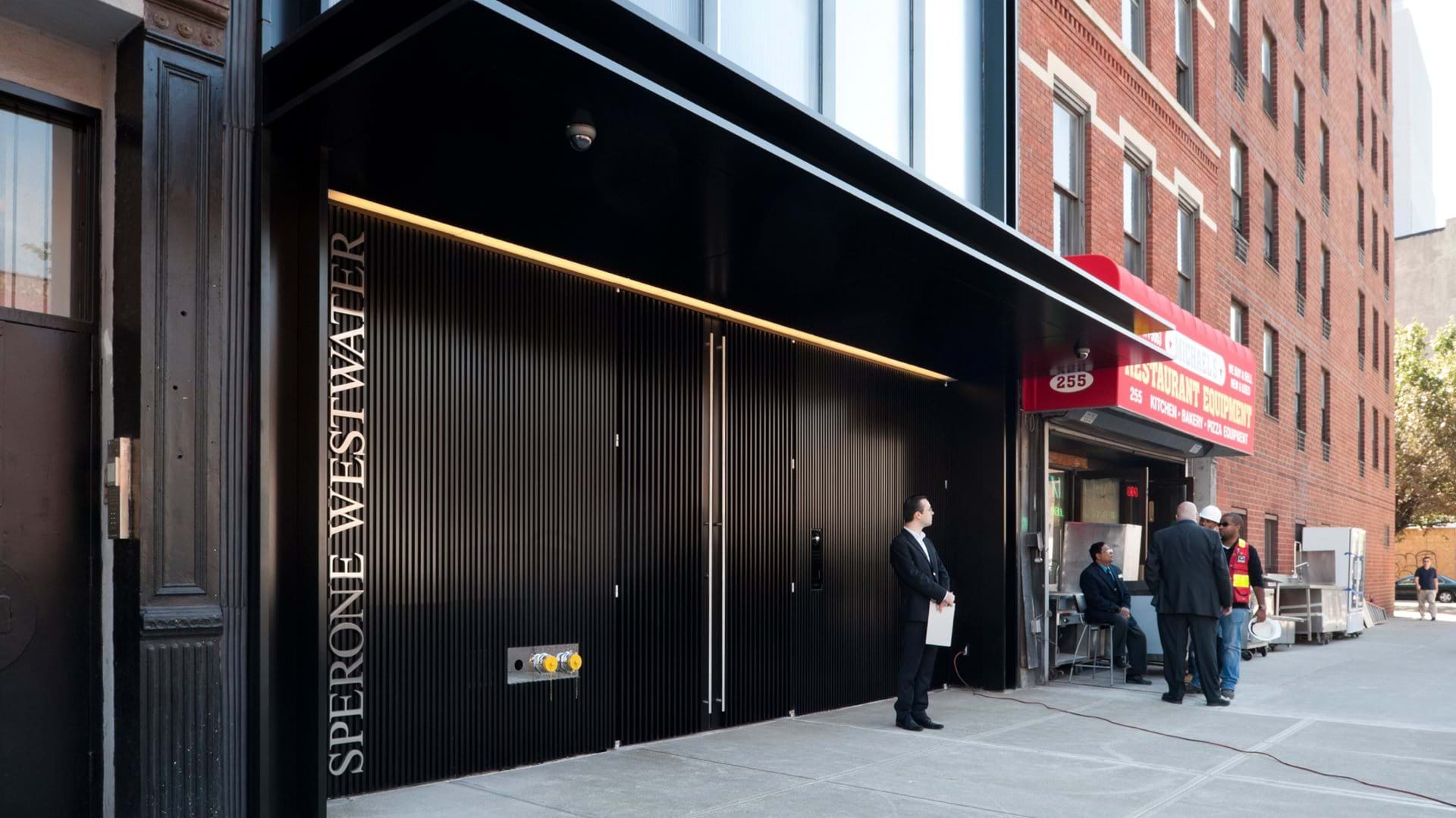
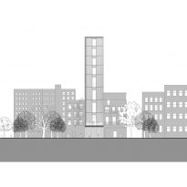
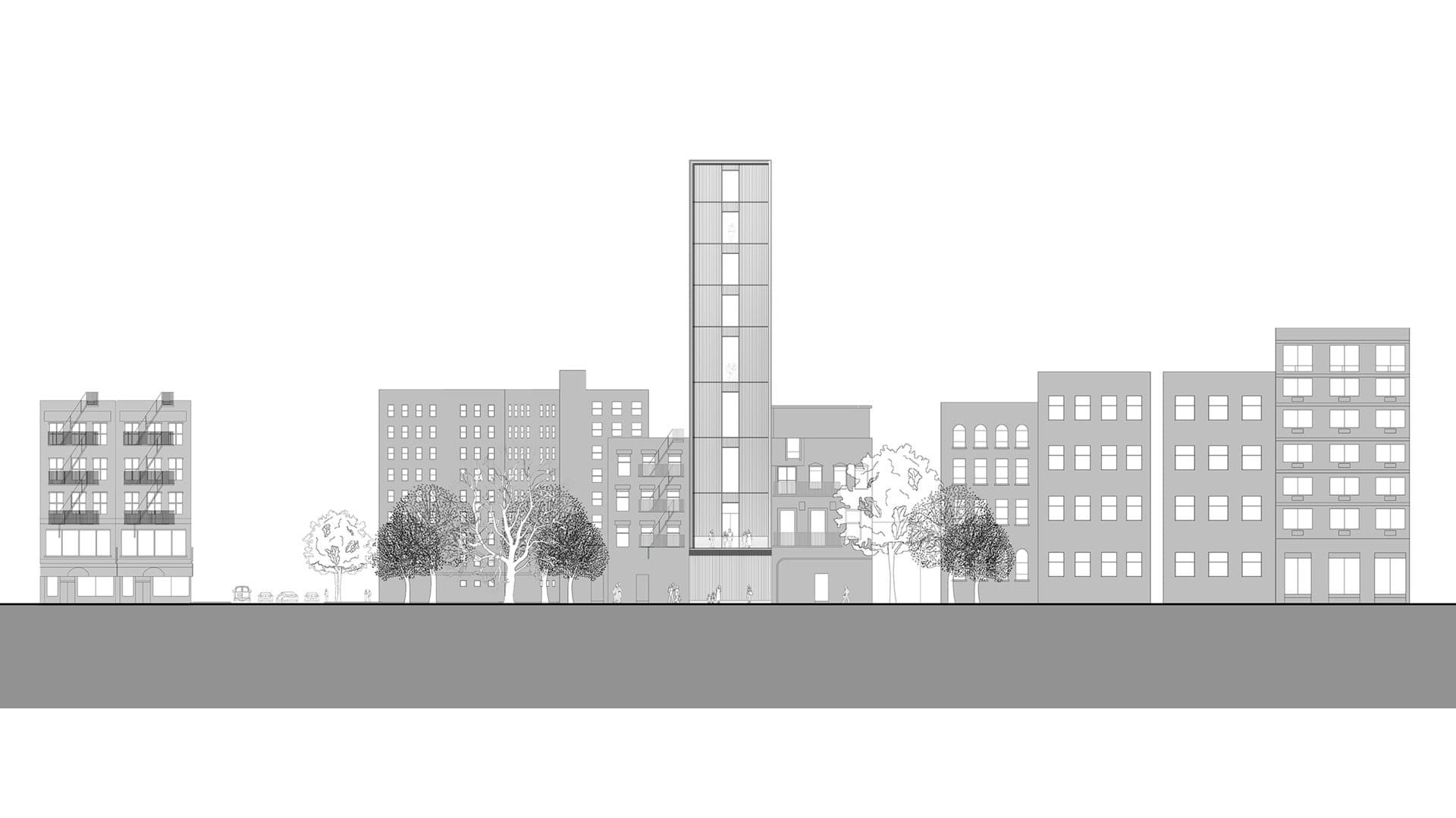
The exact address for the Sperone Westwater Gallery is 257 Bowery, New York, NY 10002, USA. A barely 25 feet wide site that is certainly a restriction when trying to make an architectural statement in a city were huge buildings are everywhere.
The 25×100 feet site has its main entrance on the west side, two slightly shorter buildings on either side and a private garden on the east side which is the back of the building.
Concept
Concept
The concept behind the building is actually quite practical. Three main points needed to be addressed:
- Bring in the appropriate amount of light for an art gallery.
- Acoustically isolate the interiors spaces from the busy streets of New York
- Last but not least, make an architectural statement that will attract visitors by itself.
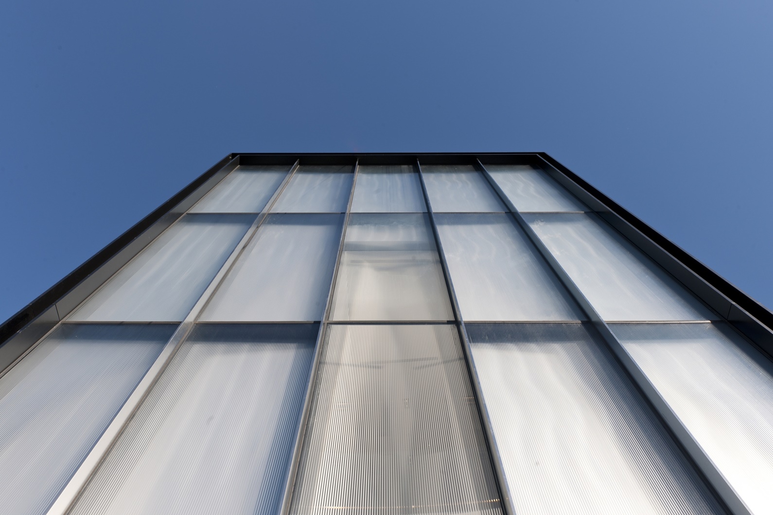
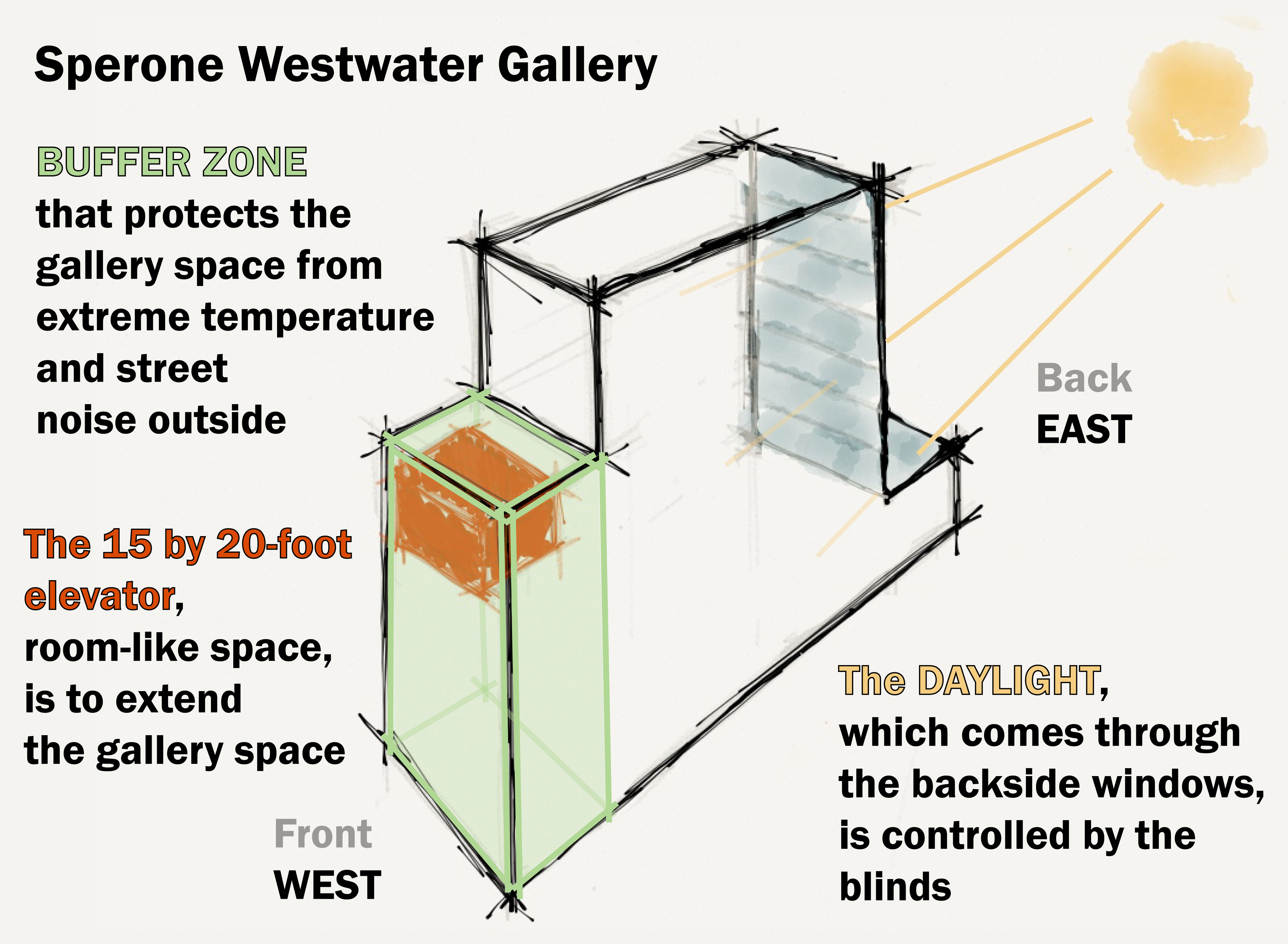
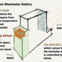
The first of these goals was achieved by using a combination of milled laminated glass and corrugated metal sheets on the West and East façade to control and tamish the natural light that comes into the exhibition spaces.
The second was taken care of by creating a large empty space in front of the building on the West side facing the heavily circulated Bowery street. This space buffers the exterior noises and isolates the exhibition spaces from traffic and ambient city noise.
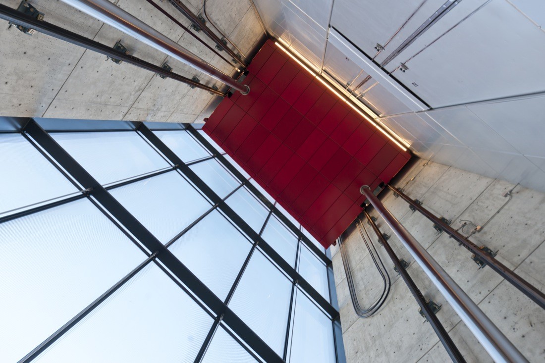
The latest was achieved by both the exquisite black and white design of the building itself and its unique 12×20 foot (3,65 x 6m) moving exhibition room that acts as a giant elevator occupying that middle space created on the West facade to buffer street noise. Making this giant elevator bright red was just the right touch of color that the otherwise minimalistic and monochromatic building needed to make everyone who walks by stop and comment about it, wondering what there might be inside and stepping out of their ways to find out.
Creating a landmark doesn’t mean a building can neglect its context, and so the building’s external shape directly relates to the scale of its neighbors, having a setback at the sixth floor that helps bring its vertical scale down closer to the block’s average.
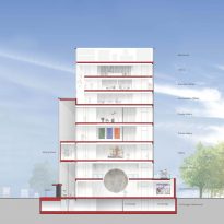
Spaces
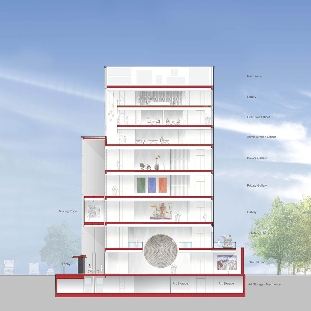
E-W Section
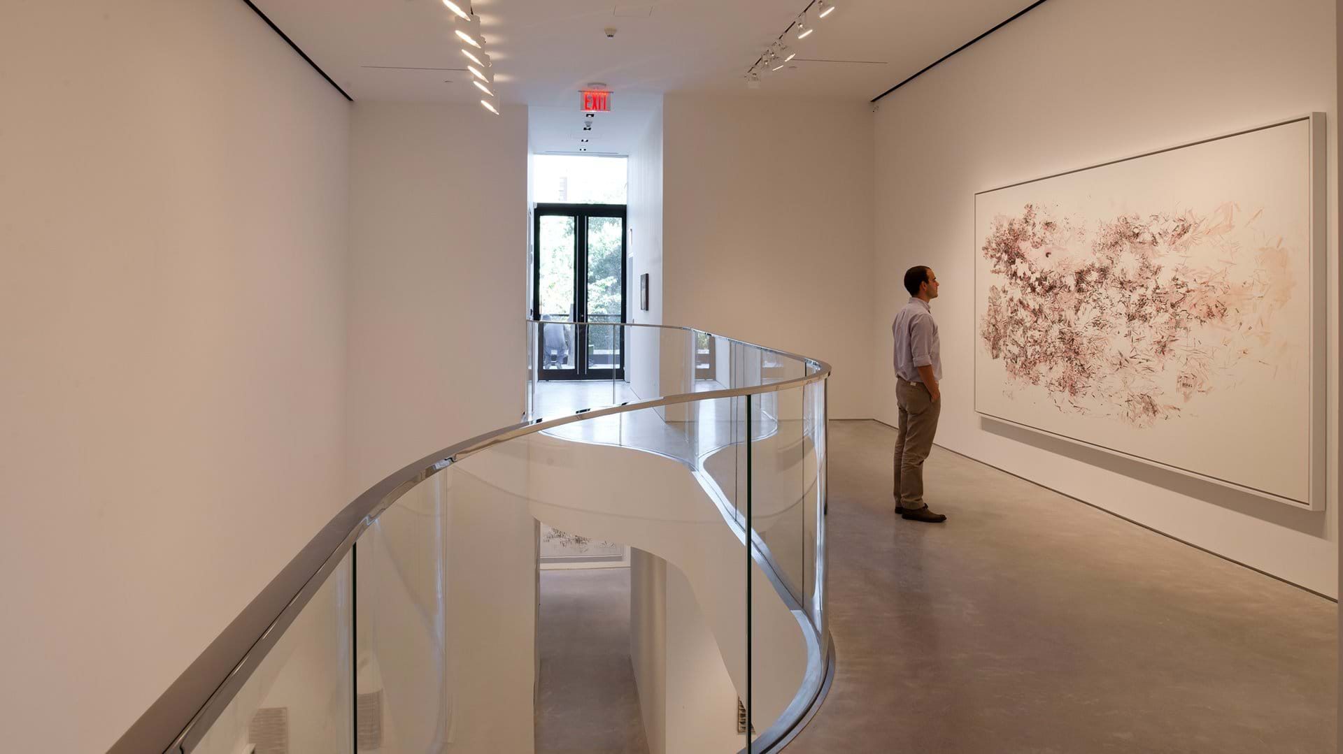
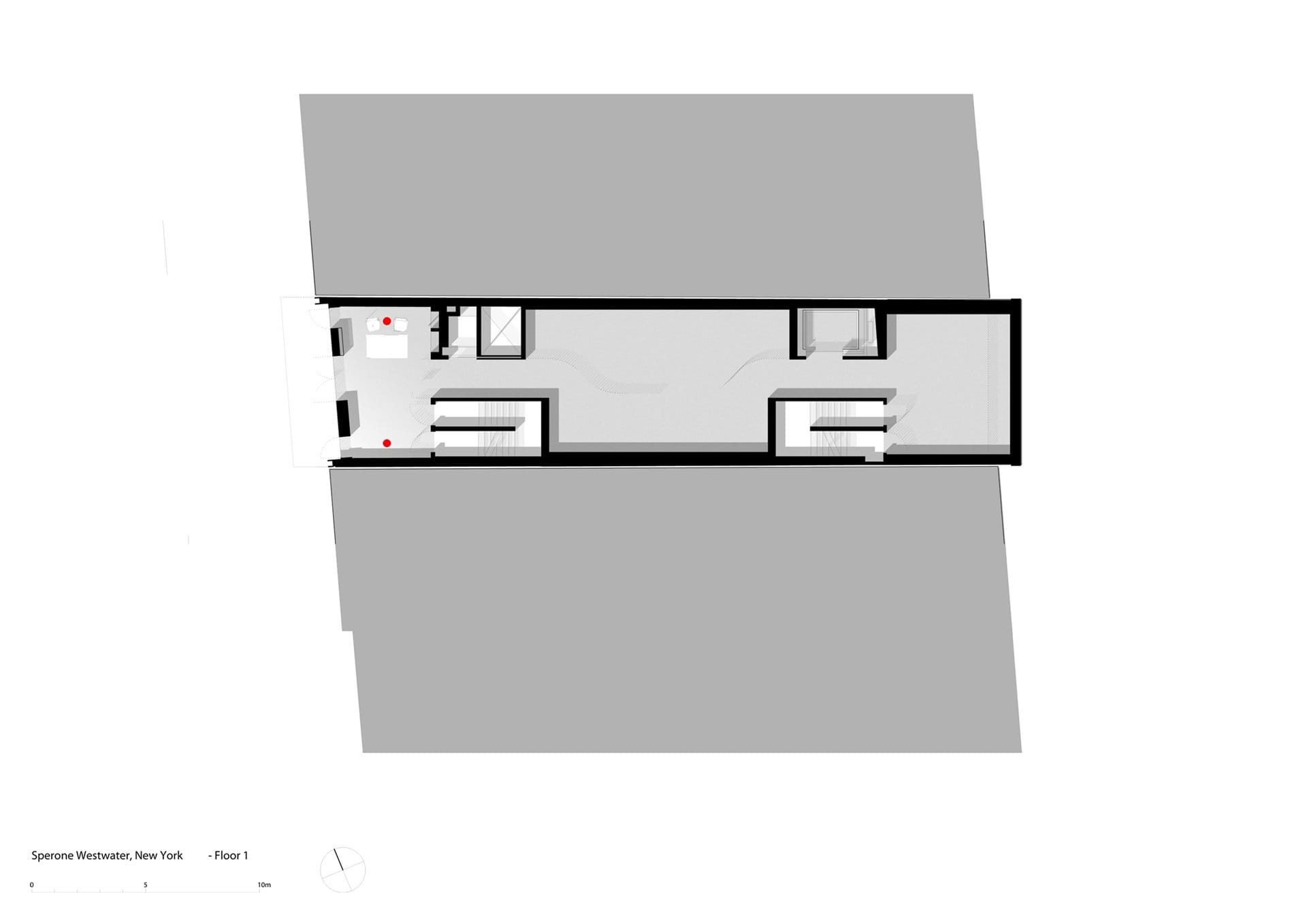
Spaces are clearly distributed by floors, with no single floor hosting more than one activity, except for maybe the ground floor which has both the lobby and exhibition space.
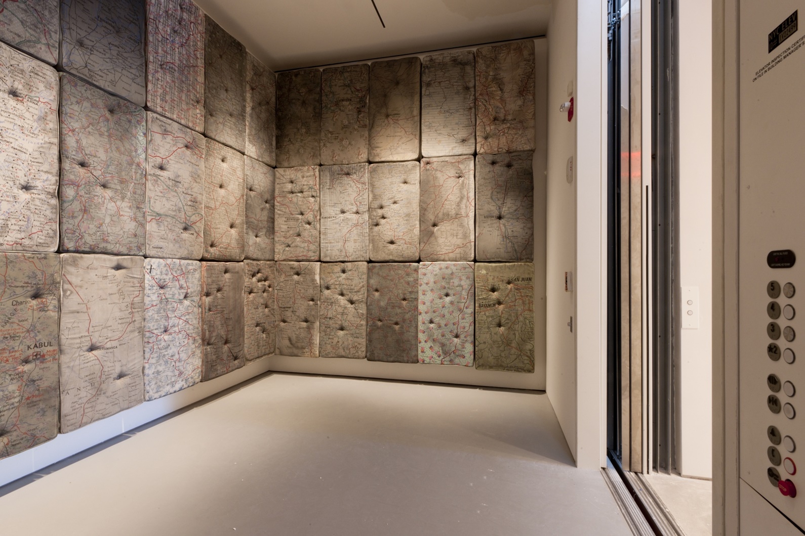
Most spaces are white, with in interrupted continuous concrete floors and minimalistic details, except for the vertical circulation areas. Bot the space that the moving room occupies as well as the regular staircase have a more industrial feel to them, with exposed concrete walls and visible metal construction details.
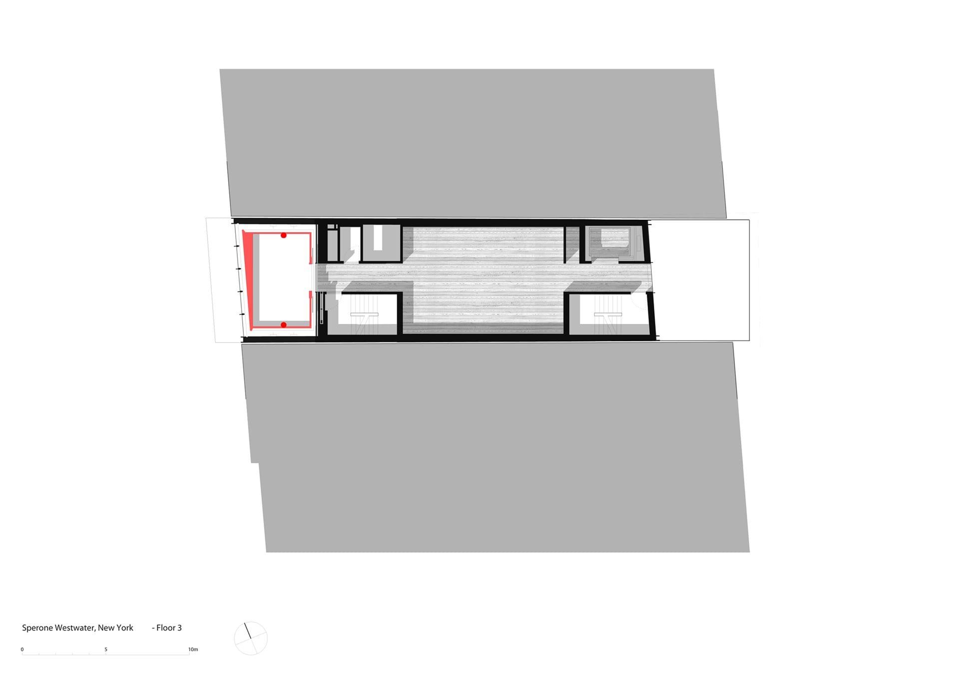
The moving room
The centerpiece of the building is the 12×20 foot (3,65 x 6m) moving exhibition space. Basically a giant elevator that has the ability to stop anywhere between the second and fifth floor, giving the gallery the flexibility to add more space to any of those floors at any given point.
The lobby
The lobby sits on the first floor right below the moving room Technically it sits at the bottom of the elevator case, a space one could argue nobody would want to habitat or feel safe doing so but that in this case is one of the centerpieces of the whole design.
Looking up from the lobby you see the bottom of the moving room, which means the lobby actually changes significantly in height depending on the floor were the moving room is stopped at.
On both the North and South walls of the lobby two giant metallic pistons give the visitor a very clear idea of how the mechanics of the moving room actually work.
Exhibition spaces
Floors one to five make up for the exhibition spaces. Floors one and two are connected by a center double height space that also liberates the north wall any interruptions making it ideal for the display of larger art pieces.
The first floor also is also prolonged towards the East side at the end of the building giving this floor some additional exhibition space and also creating the floor for the second-floor terrace, also know as the sculpture terrace, which overlooks a private garden.
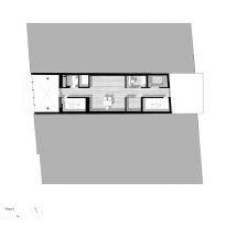
From there up the third, fourth and fifth floor are all independent and equal, with the characteristic that any one of them can be extended by the moving room if needed.
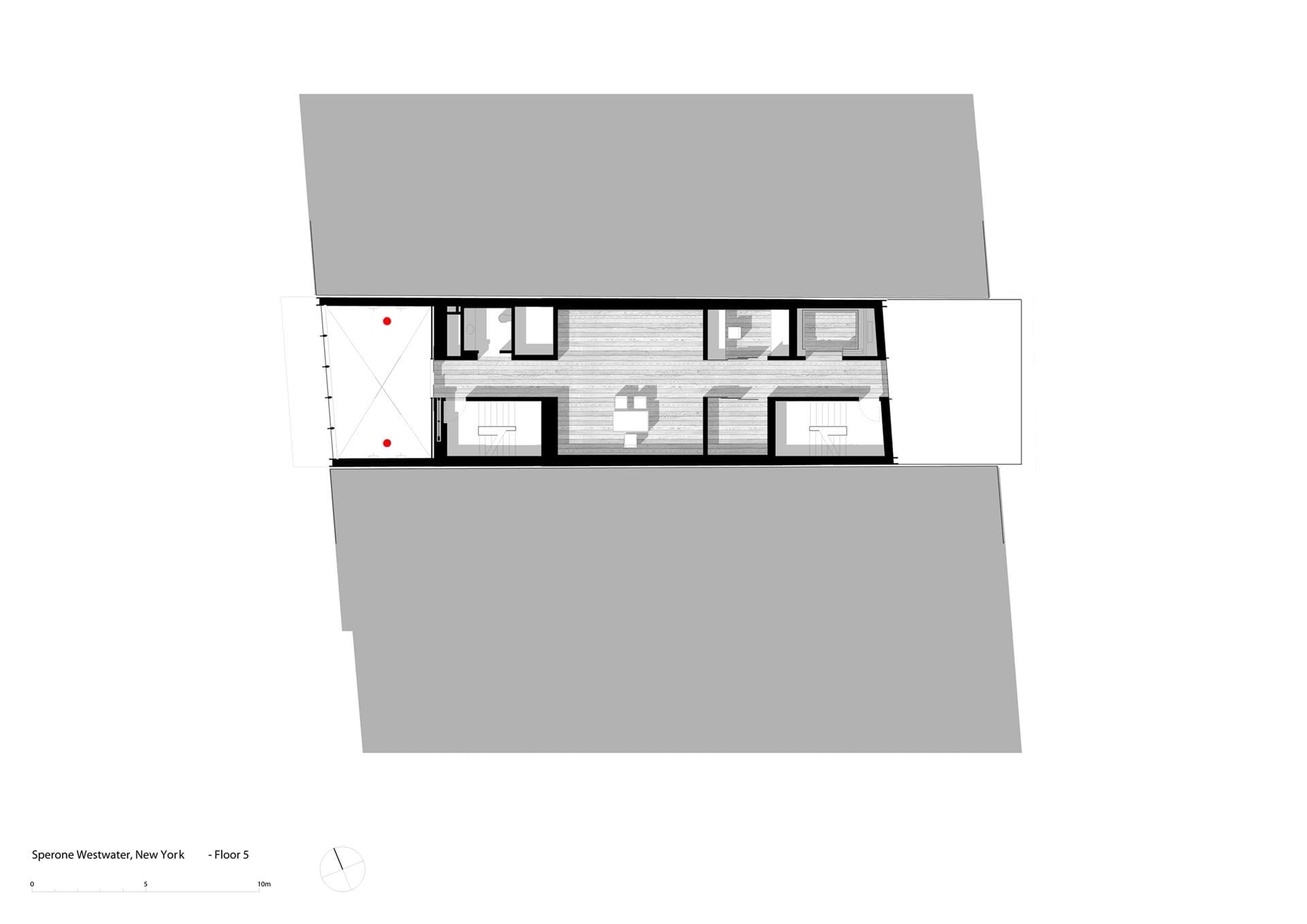
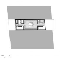
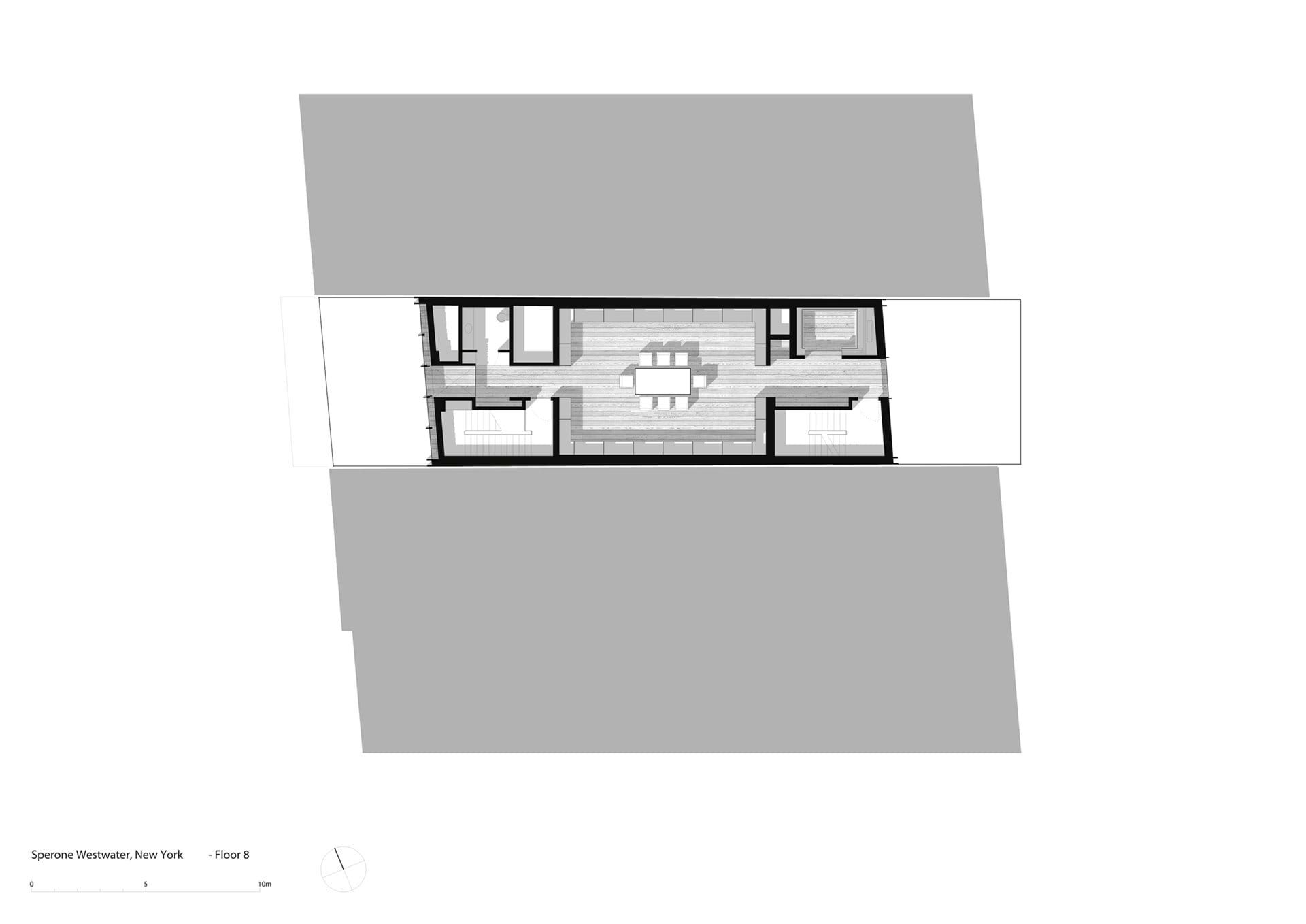
Offices & Library
The three top floors are were the gallery offices are located. The giant elevator case doesn’t reach this height, here floors seven and eight retract from the main façade allowing for natural light to enter the space in a more direct way and also creating a sort of spatially communicated and unique office space.
The last floor is where the library is, a space that is also doubled as a space to host events and presentations.
Other spaces
The gallery also has a basement which is used to store art mainly and a rooftop which serves as the mechanical floor for climatization machines and other mechanisms. Even though the mechanical floor is open to the sky it does have facades on all sides giving the building unity in its outside appearance and hiding all the mechanical elements from the view of pedestrians.
Structure and materials
From the outside the West facade of the gallery looks like a wall of semi translucent glass all surrounded by a black metal frame that contrasts and clearly draws the edges of the building.
In reality the building is a reinforced concrete structure that seats on concrete foundations. Many modern buildings choose steel as their main structural element to be able to do more work off-site and speed up the construction process. In this case however a reinforced concrete structure was chosen as it allowed the architects to gain 3 inches in the width of the internal spaces which was vital considering the size of the site.
The East façade is actually a wall of milled laminated glass sitting on a system of rigid frames, whereas the rest of the facades are a continuous layer of corrugated black metal panels only interrupted by some centered vertical clear glass windows on the East facade.
Videos
Photos
Drawings
-

- 1st Floor
-
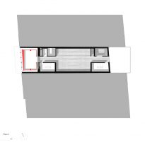
- 3rd Floor
-
- 5th Floor
-
- 8th Floor
-
- Weste Elevation

-
- East Elevation
-
- E-W Section
-
- Concept

-
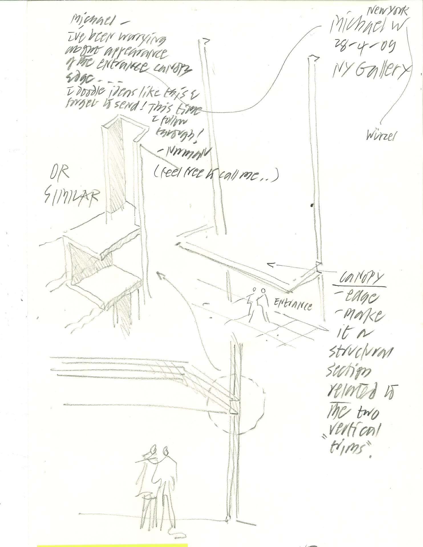
- Detail sketches