Quai Branly Museum

Introduction
In 1996 Jacques Chirac, president of France, sees the need to open in Paris a Museum of Arts and Civilizations to gather information on primitive art until then distributed between the Museum of Man and the National Museum of Arts of Africa and Oceania. In 1998 is chosen among several possibilities the site that will house the new museum and in January 1999 calling internationally contest drafts, I resulting selected later that year joint proposal Architectures Jean Nouvel – OTH – Ingerop.
Competition Program
The competition program aims to develop an innovative approach, both scientific and organizational devices, such as what is offered to the public, while building an integrated with the environment and the time museum.
Functional design program objectives:
- A place that can house the collections from the existing Museum of Man and the MNAAO, together with new acquisitions.
- A resource center, research and teaching.
- A place to other artistic expressions
Considerations own urban project:
At this point it was necessary to take into account the urban context, strictly respecting the mandatory regulatory constraints regarding the site devoted to green spaces. The proposed program could be summarized as “a project both ambitious in their objectives and modest about the built volume, which should get particularly its integration into the urban fabric”.
Situation
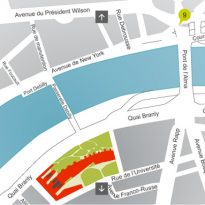
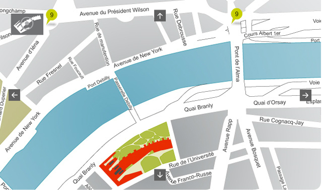
The Mueso Quai Branly, located at 37 quai Branly, 75007 Paris, occupies the space that until the late eighties occupied some buildings built after World War II and originally worked in the Ministry of Finance. When the Ministry moves to Bercy, then President Mitterrand Frnaçois proposes to create in that place a Centre for International Conferences, for which competition is called the late 80. Although picked out one of the projects presented, never realized by presupuestaarios problems
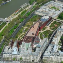
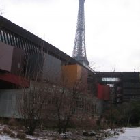
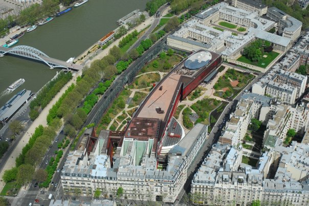
The space on the quai Branly, the consisted of the Seine and close to the Eiffel Tower is a privileged place in the French capital in the urban rules are very strict about maximum heights to build and create green spaces. The area, with an already rooted cultural, is opposite the Palais de Tokyo, the renovated Museum of Man, the City of Architecture and Heritage and the Museum of Modern Art of the City of Paris, on the other bank of the river.
Concept
Letter of intent submitted by Jean Nouvel in the International Architecture Competition (1999)
- Presence-absence or selective dematerialisation
“It is a museum built around a collection where everything is done to provoke the emergence of emotion caused from the first object;. Where everything was done, at once, to protect it from light and to capture lightning indispensable sun vibration, for installation of spiritualities.
It is a place marked by the symbols of the forest, the river, and the obsessions of death and oblivion.
This is the place where asylum censored jobs or despised, recently conceived in Australia or America have.
It is a loaded and inhabited place in which dialogue ancestral spirits of men who discovered the human condition, invented gods and beliefs.
It is a unique and strange place. Poetic and disturbing.
The construction was made possible only by rejecting the expression of our current and western contingencies.
Outside structures, fluids, “woodwork” facade, emergency stairs, railings, ceilings, projectors, baseboards, windows, posters… If your function by circumstances to remain, they disappear from our sight and our consciousness, are cleared before the sacred objects to allow communion. Easy to say but harder to do…
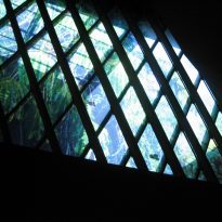
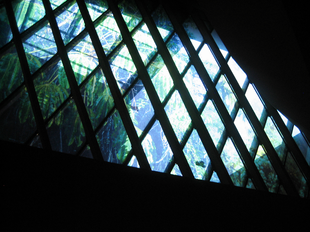
The architecture that emerges from this is an unexpected character. Is it an archaic object? Is the expression of regression? No, on the contrary, to reach this result was resorted to more advanced techniques: the windows are large, very large, very clear, often printed with vast photographs, pillars, randomized into position and height like trees or totems… But, not matter the means… Only the outcome: the art sometimes seems to disappear, we feel that the museum is a simple shelter faceless, in the woods.
When meets dematerialization expression becomes selective signs. Here the illusion cradles the artwork. It remains to invent the poetics of the situation: it is a mild lag, the Parisian garden becomes a sacred wood and the museum dissolves in its depths. “(Jean Nouvel)
Description
As clarifies the architect on your project, it is “a building perched on piles, all is curved, fluid, transparent, mysterious and above all, warm”
Despite the difficult insertion of the new museum alongside the River Seine and in the presence of the Eiffel Tower, view from any angle of the place as the demanding requirements proposed for the project, Jean Nouvel achieves intelligent and exquisitely.
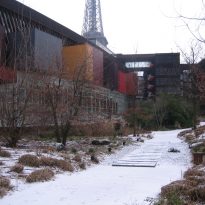
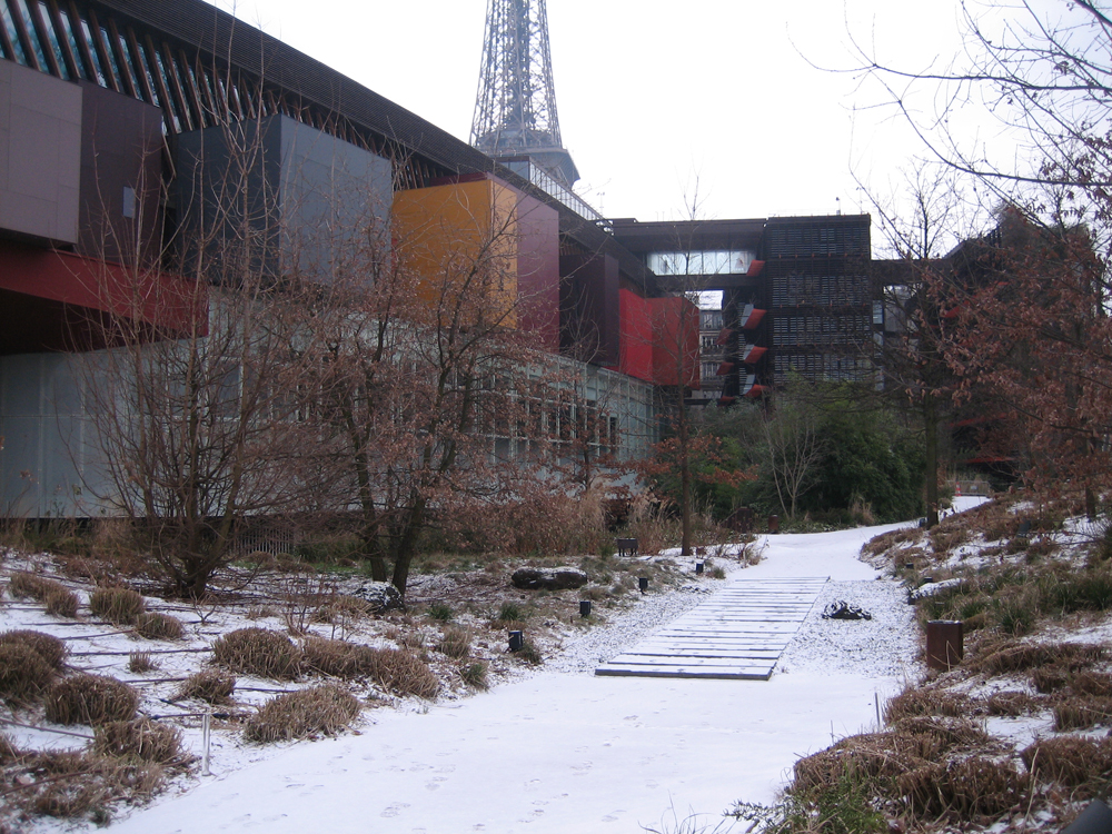
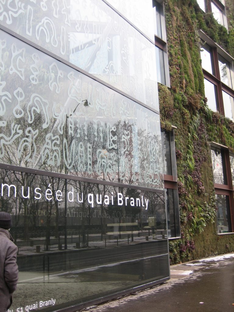
First, the glass wall separating the Museum parallel to the river road, gets a privacy impact “visible” attractive. Second, and satisfy the requirements of the program, trying to reduce the thermal load, at least in part of the whole on the north facade, with a front garden that attracts the traveler, adding an aesthetic and environmental contribution that gives a touch cool to an area of traditional buildings.
Finally, add a space that is not normally open to the public for observation, collection “hold” the museum, usually hidden and here discovered the eye of the visitor as it moves through the access ramp is appreciated through a central circular space and glass unexposed parts are stored.
The enclosure with transparent glass building and opening the heart of the apple, leaving a high percentage of free and landscaped, is a radical urban gesture that even lets you see the buildings of the next street.
Spaces
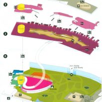
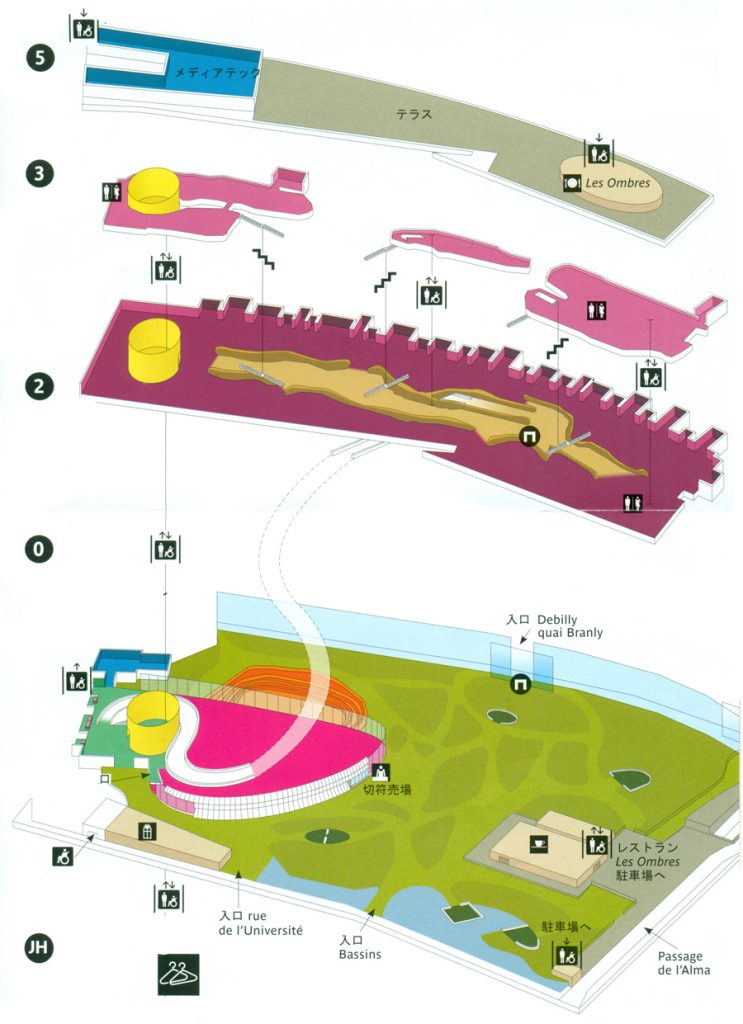
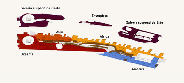
The whole Branly Museum comprises four buildings: the museum itself, with five levels that house the collections, the Branly for administrative services, Auvent, 1,300 square meters for the media library and reading rooms and the University that includes workshops and classrooms, glass and stone, with roofs covered fresh contemporary Aboriginal painters of Australia. Galleries, suspended gardens and spaces for temporary exhibitions complement an ultramodern design. The building explicitly differentiates the different uses of the built volumes and separates the administration and the Museum with different languages and simple materials.
Grounds
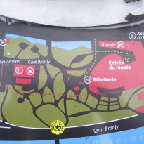
Its 18,000 m2 garden populated by thousands of plant species was designed by landscape architect Gilles Clément and deployed on both sides of the building. They are small hills, waterfalls, ponds, paths, and nearly 200 trees
The Branly
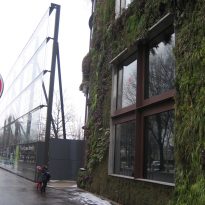
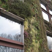
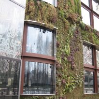
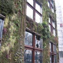
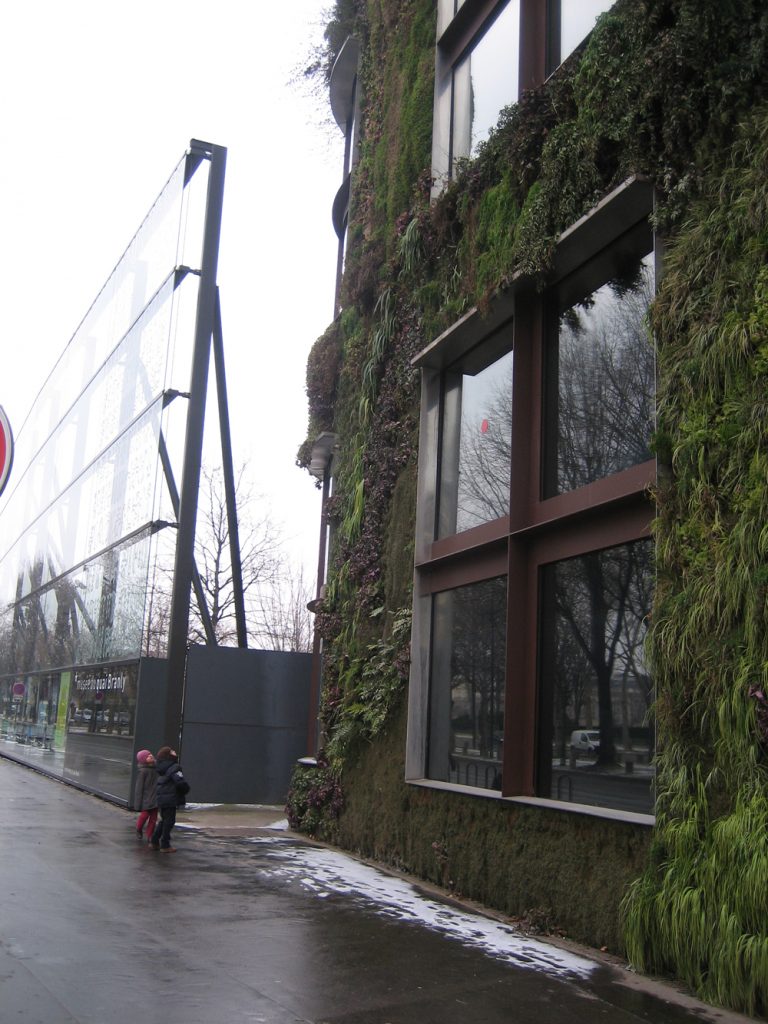
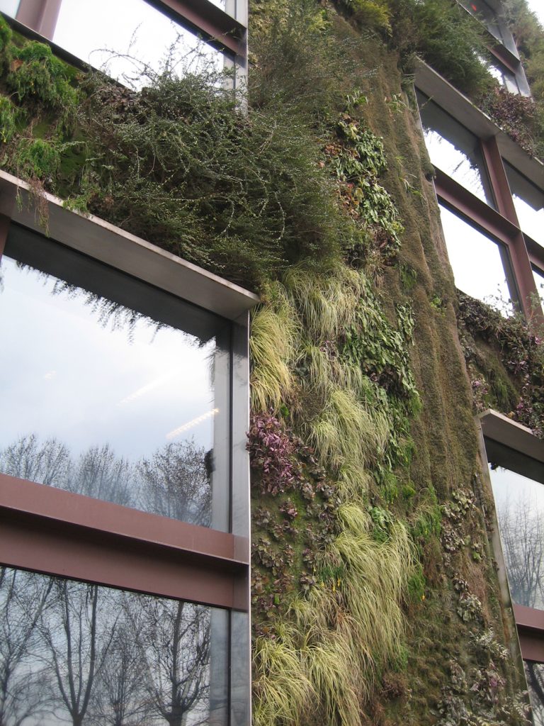
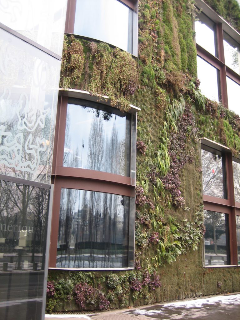
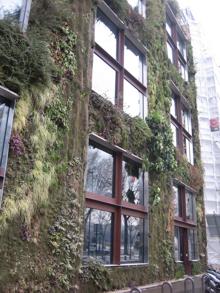
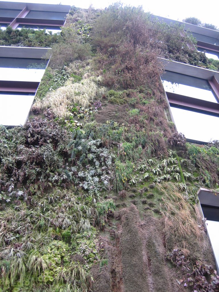
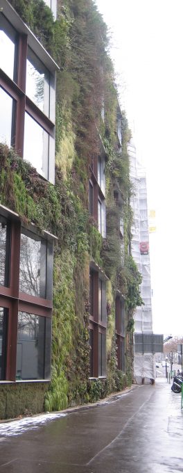
The administrative building is covered with plants and assembled with stone buildings hausmanianas rest of the block. Its facade facing the Seine.
Exhibition halls

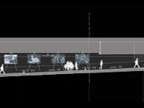
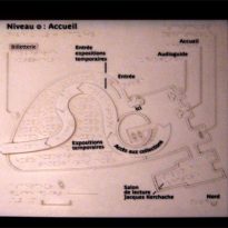
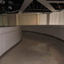
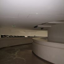
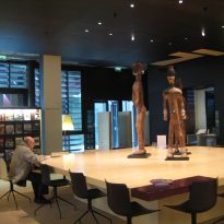
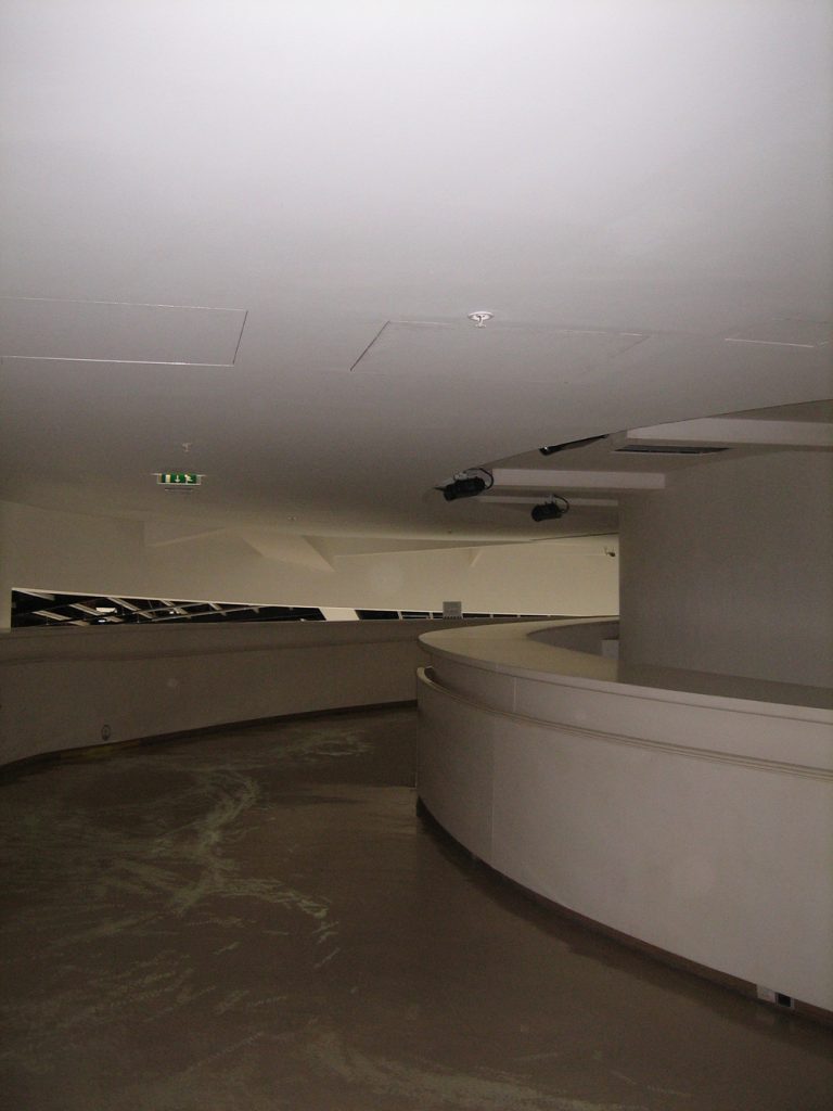
A long, curved ramp leads the visitor to the exhibition halls. His architectural composition requires a tour to appreciate its treasures, displayed in showcases, recesses and modules.
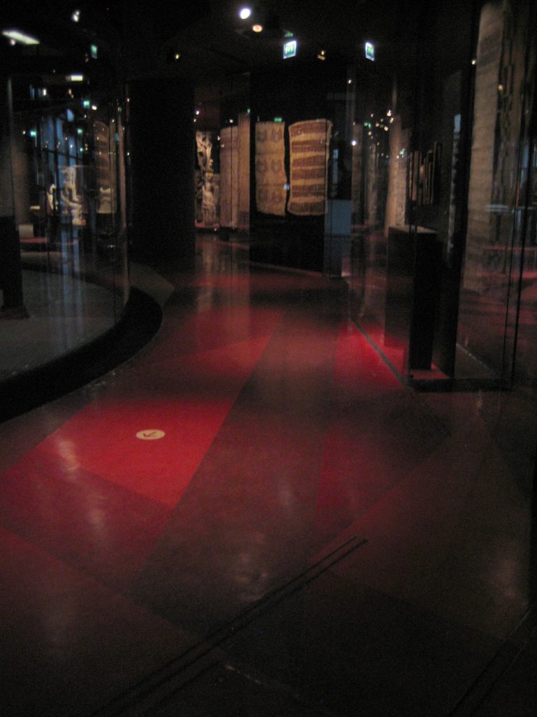
Certain areas of the museum are not divided, the absence of walls makes our visit and our vision are completely different. The light, the darkness that comes from outside, is also a part of the exhibition. The large central area, high-rise features exhibition areas located above the large space and hanging accessed by stairs.
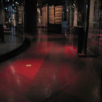
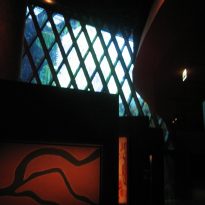
Light is crucial because, unlike other museums where it is clean and clear, in the Musée du Quai Branly, the light is colorful, warm or cold, dark, dark, mythical. The recreation of the environment through the lights and the arrangement of the rooms is a part of the exhibition, the recreation of works that come from human cultures where worldview is different.
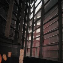
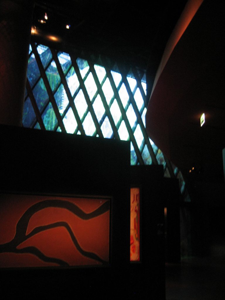
The long, narrow gallery runs between two facades daylight vibrates differently. On the side of the Seine, the reasons dim forest, giving priority to the light coming from the north, a film contained within the thickness of the glass, the reflected outwards.
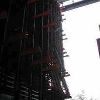
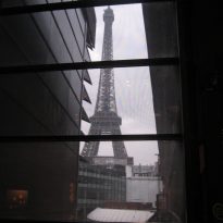
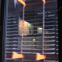
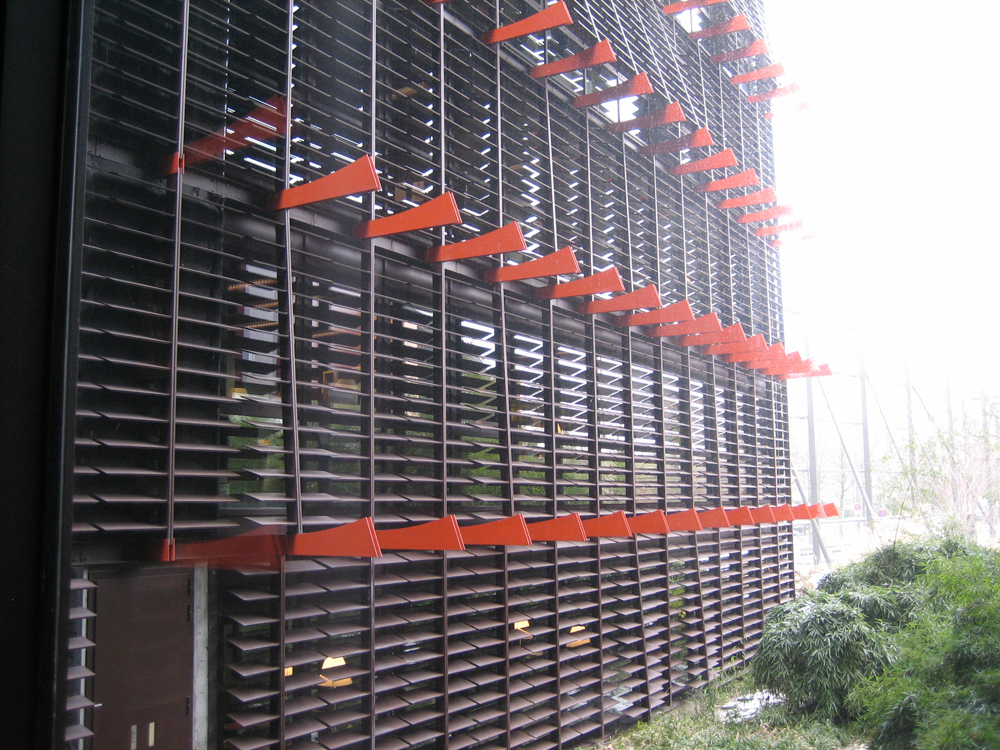
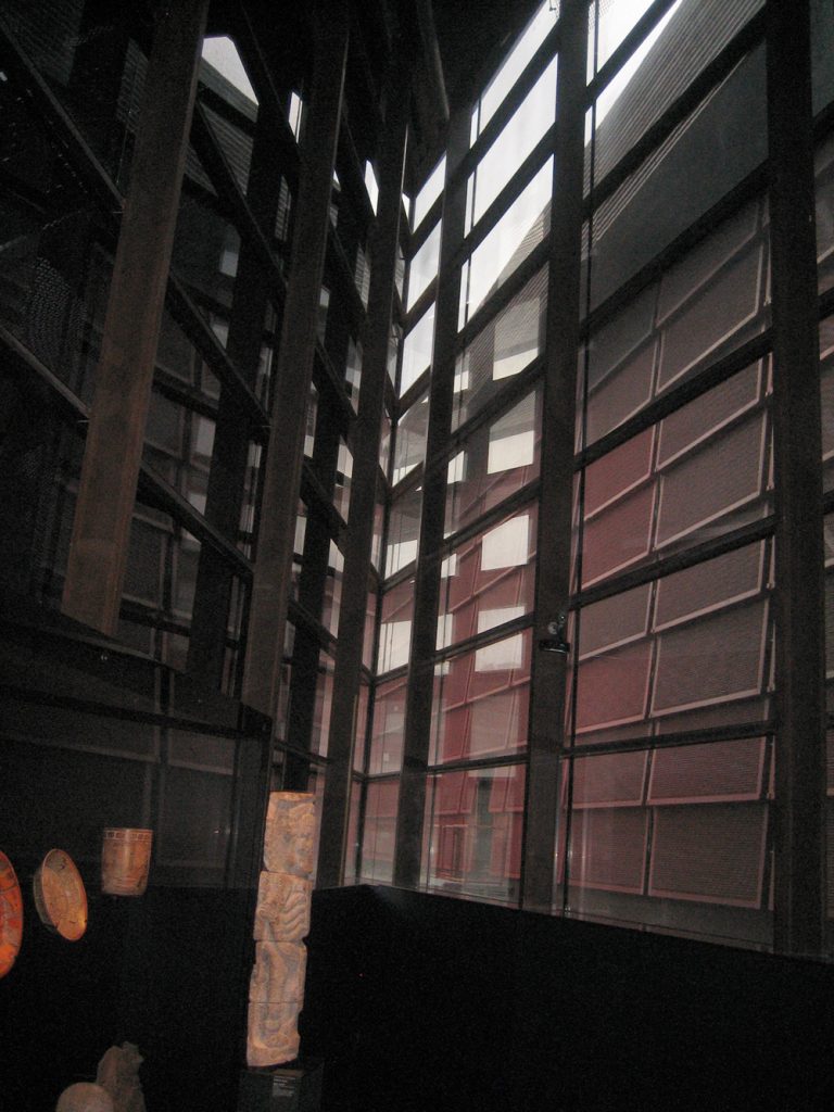
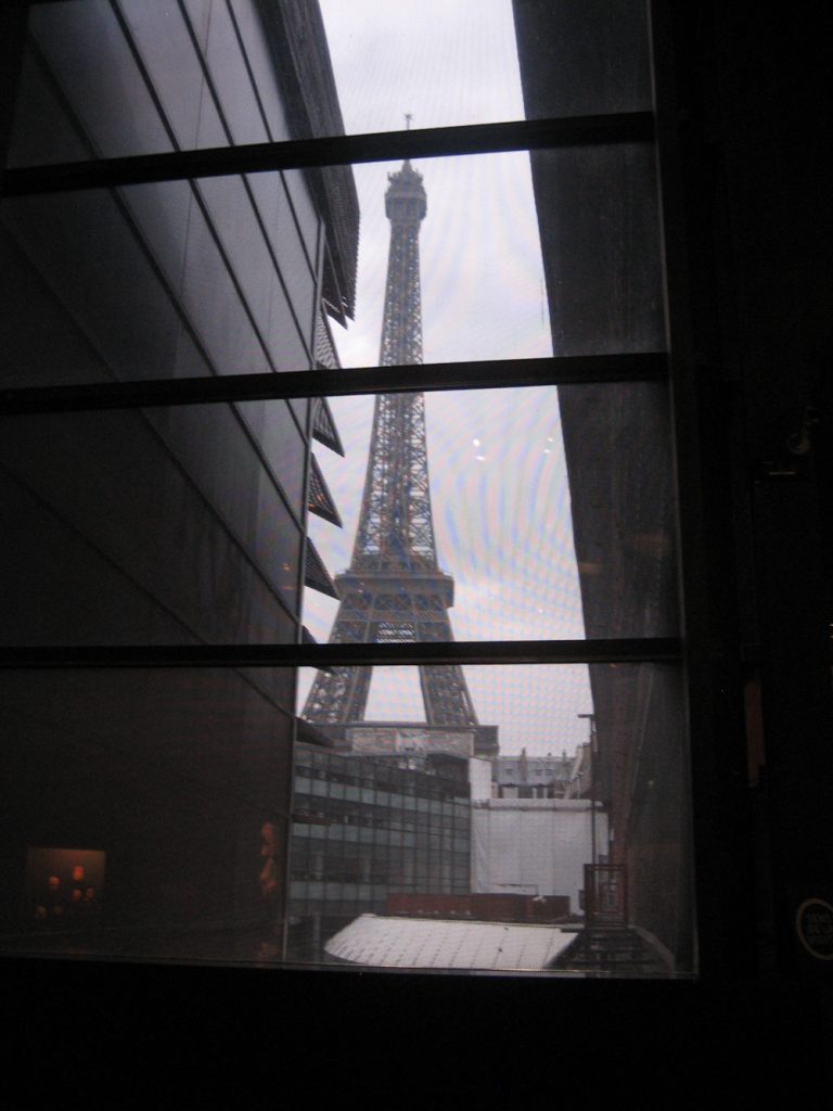
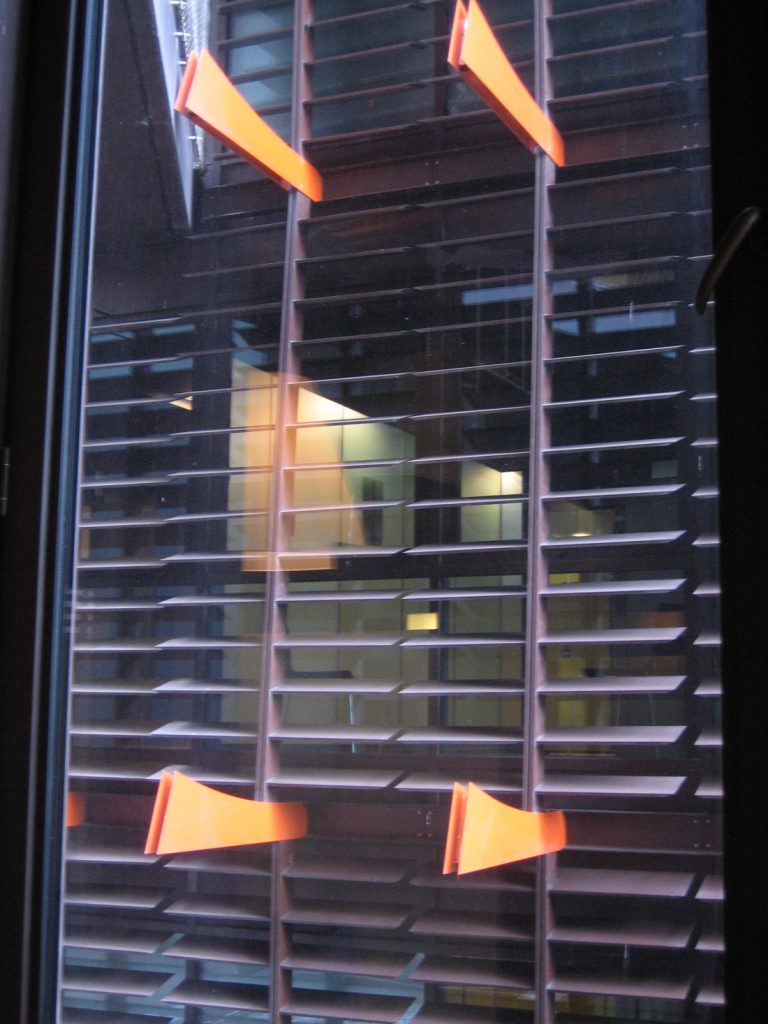
On the south side, the street of the University, the very filter glass behind panels that open and close like the slats of a blind. A geometric frame opening allows the Eiffel Tower to reintegrate the visitor’s cityscape.
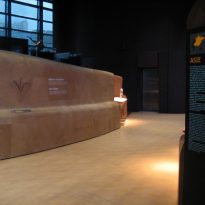
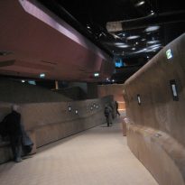
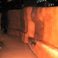
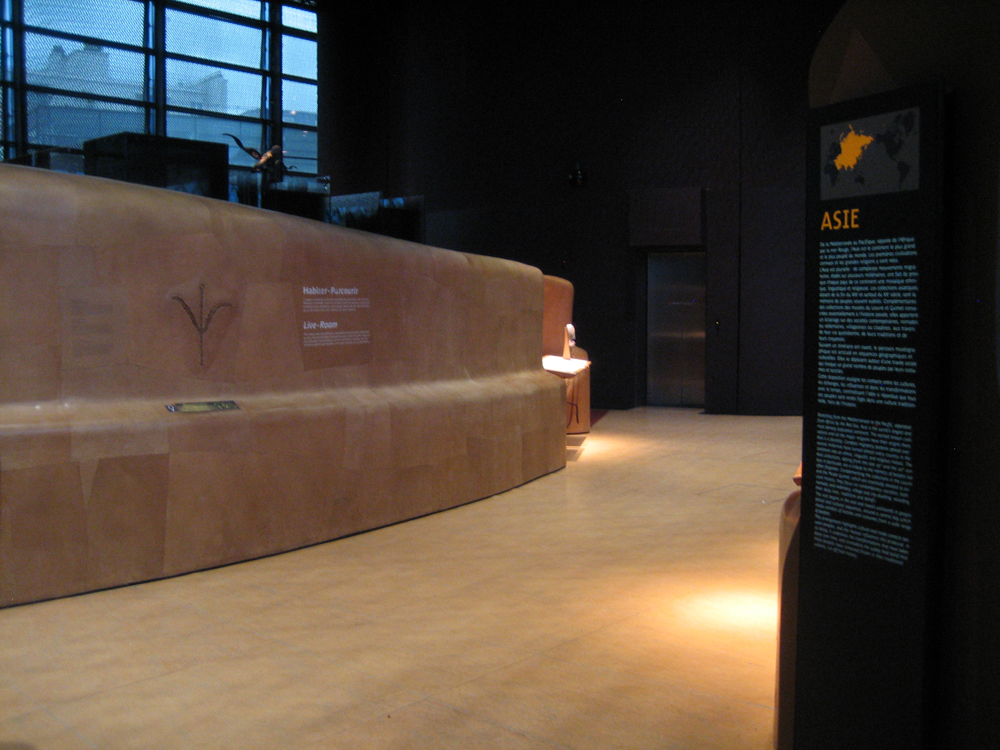
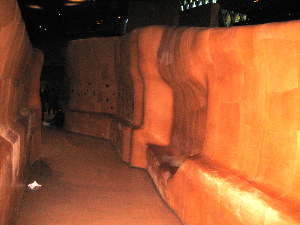
All the way from the gallery, along its length, is traversed by a winding undulating furniture at the height of the visitor body that limit the various spaces and directed towards them.
- The Atrium
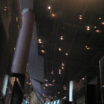
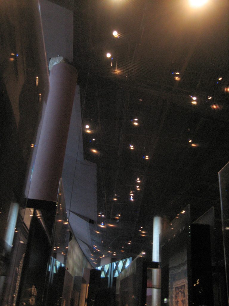
The atrium, full height is crossed by an ellipsoidal and glazed cylinder, allowing all levels seen in the collection of musical instruments museum. This tower of musical instruments, as well as the great mast Seligmann, brought here from the square after being restored Museum of Man, serves vertical scale as it extends from the ground floor of the gallery.
- Boxes
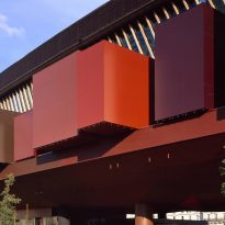
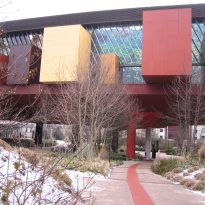
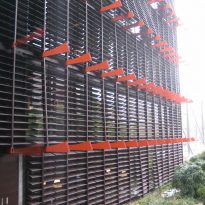
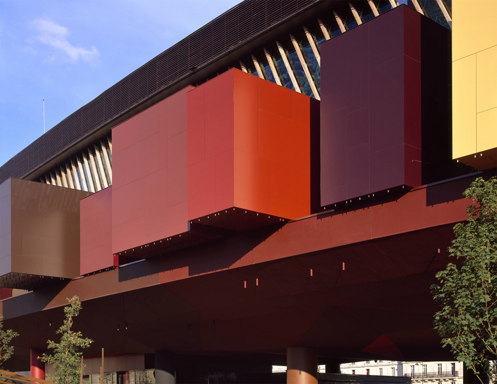
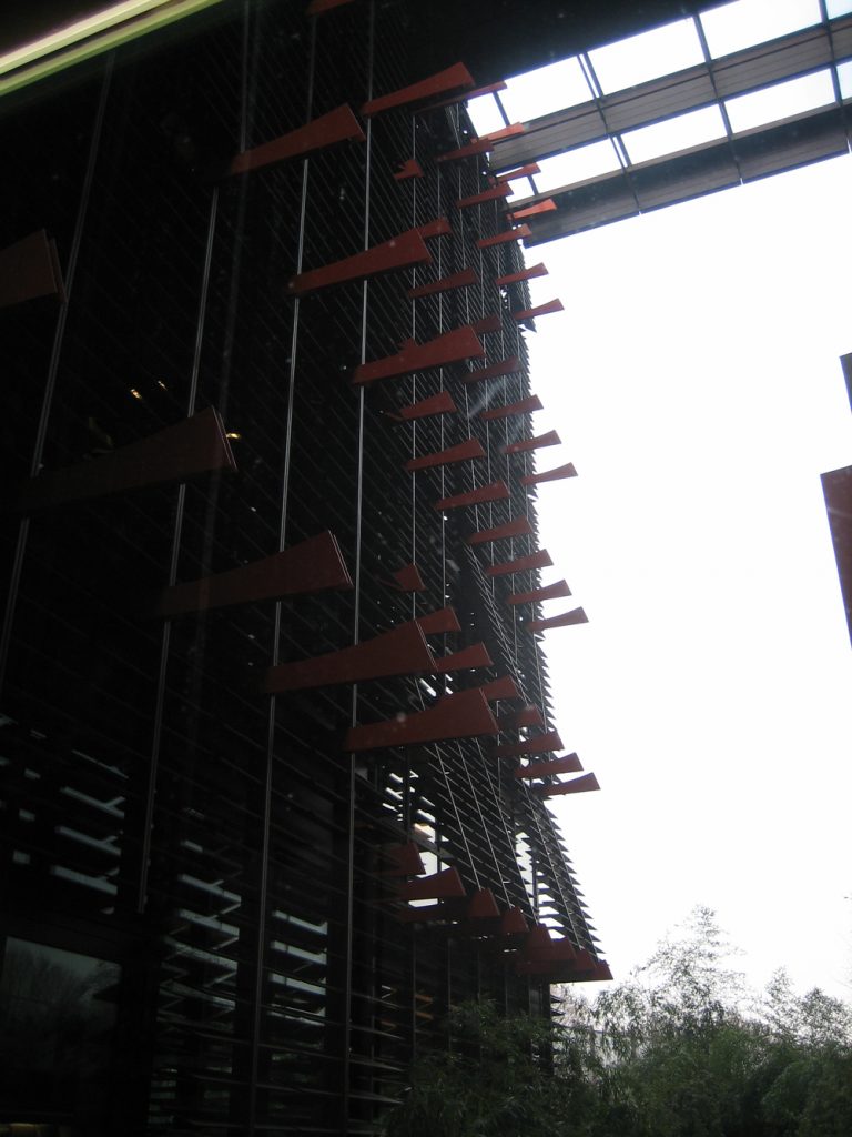
The more than 20 boxes of different sizes that serve as exhibition spaces are located on the north side of the building. Are hollowed as a cave to present the viewer distant worlds, surrounded as entire gallery by a particular environment. Modules are colors that stand outside the front of the Quai Branly and are best understood from the inside.
- Mezzanine
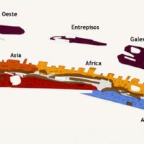
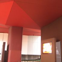
Three suspended mezzanines emerging above the central platform dominate the gallery. These mezzanines shaped faceted islands and whose undersides give the appearance of having been sculpted into space, have different functions, the two sides are for temporary exhibitions and the center offers a multimedia space for samples that require it.
Bookseller & Cafe
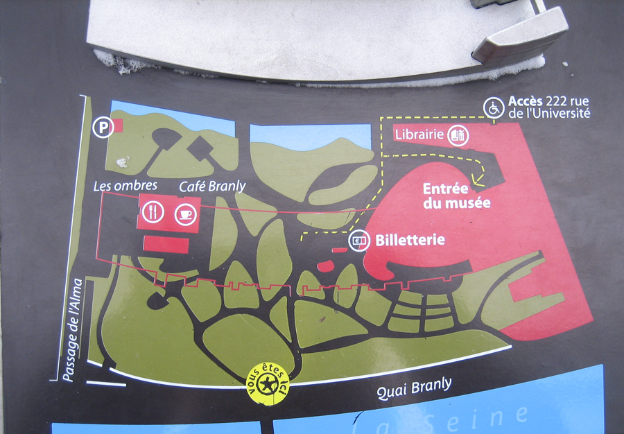
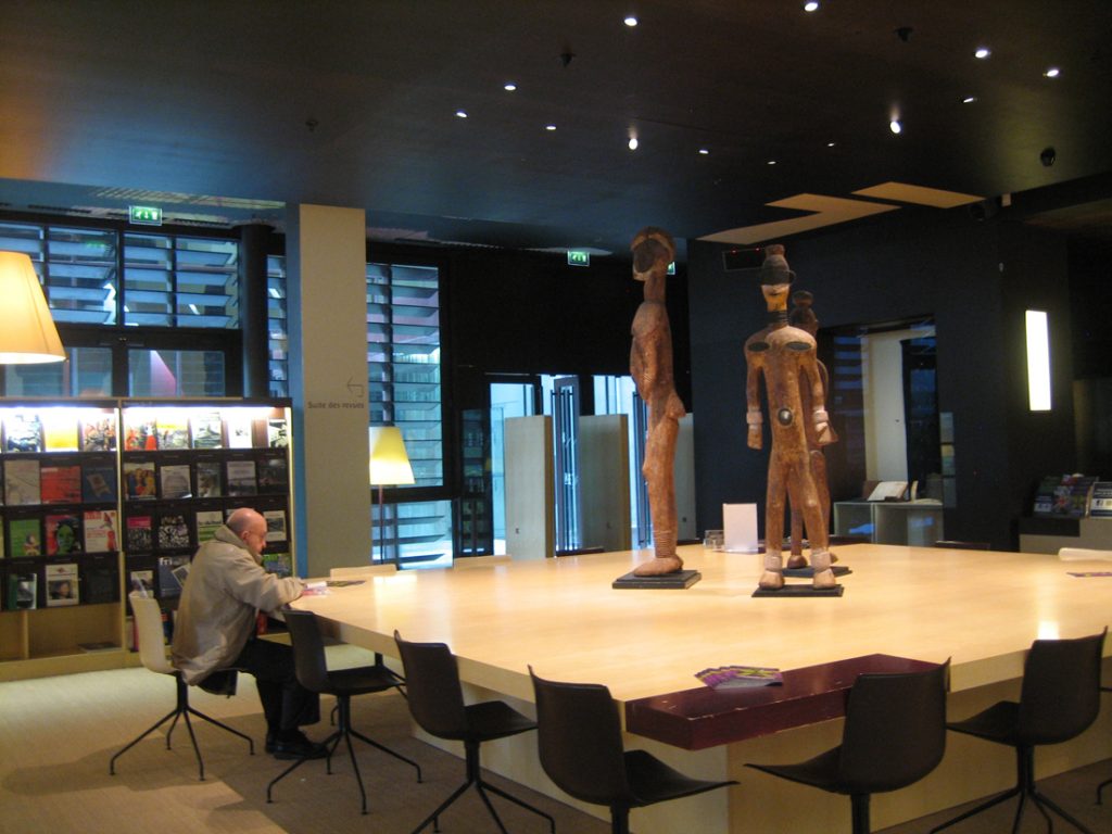
The library of the museum and cafe, provide a service to the neighborhood, which used permanently.
Structure
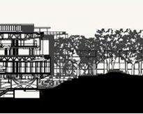
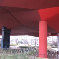
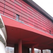
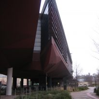
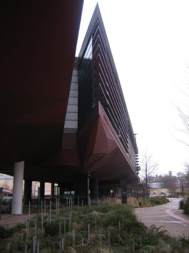
The structure, part of which is supported on stilts, no more than 21 meters high. These 26 piles supporting a metal cover 220 meters long wedge on which 30 multicolored “boxes” that emerge from the exterior facade and give it volume and harmony are based. These buckets inside are used as exhibition spaces.
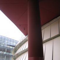
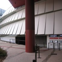
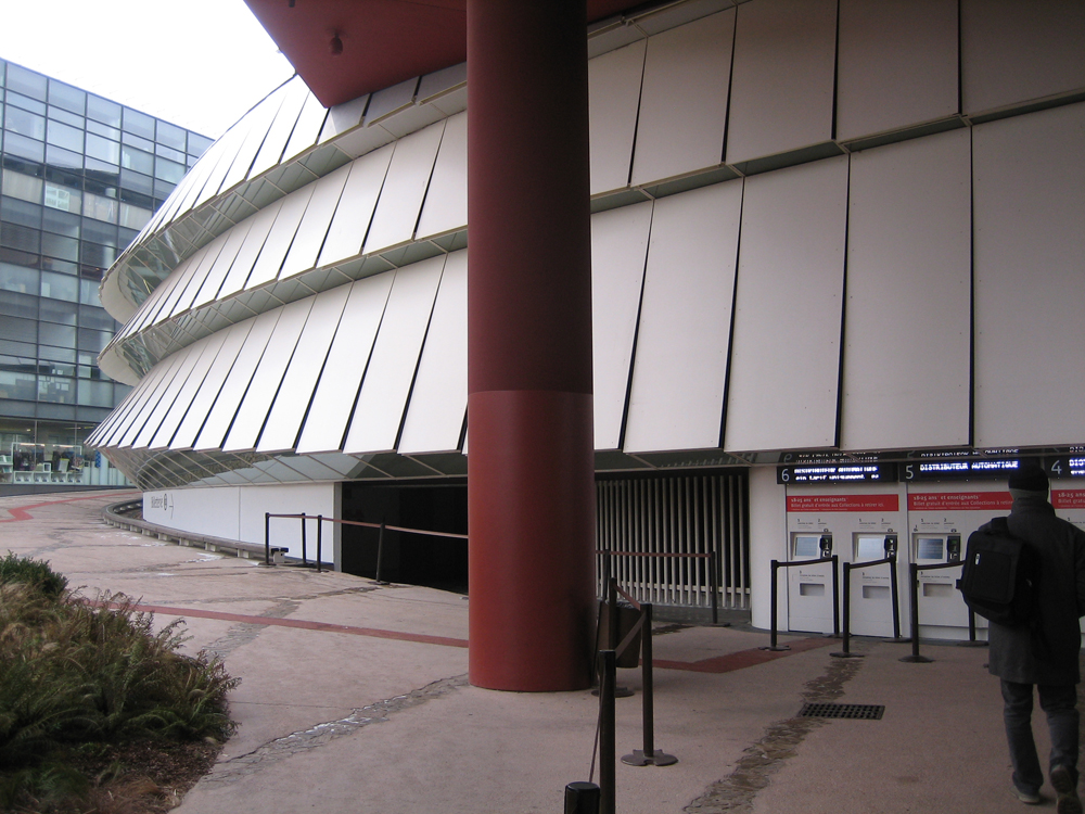
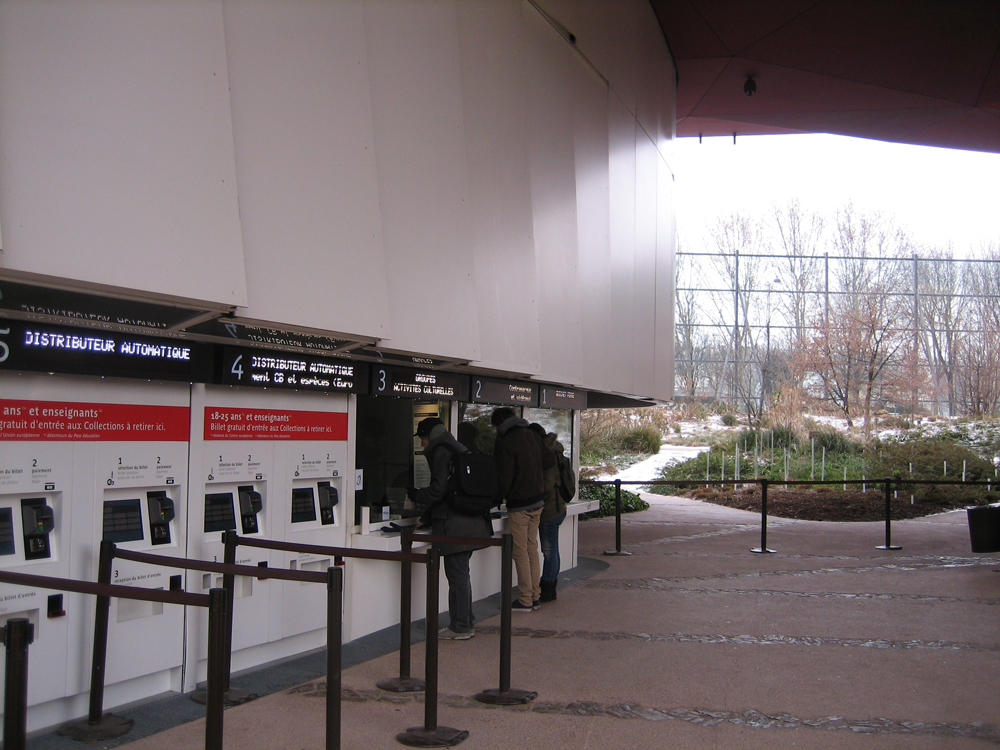
The main building forms a bridge between its two sections, with five indoor levels. The south side of the wedge is visible with an angled junction of two blocks that are part of the main gallery. Below this bridge created with the piles, and under a structure of oblique planes that complete the base of the wedge, the pedestrian is directed towards the main entrance, on the side of the cylindrical building that is the core of the whole and that is coated white plates lifted allowing the entry of light.
Materials
Jean Nouvel has chosen materials such as wood and vegetation, thinking perhaps play landscapes of civilizations present in the museum. During the tour from the entrance and on to the main room, the visitor is prepared to appreciate what is going to see, because it is taken suddenly from the city and immersed in perhaps forgotten or unknown, very colorful environments that invite discovering objects, surrounded by a dim light, which seems to immerse visitors in the depths of very different cultures.

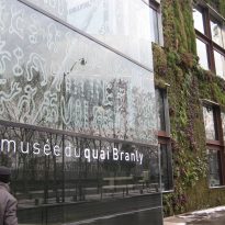
On the side facing the Seine and following the curve traced by the river a palisade of glass 12 meters high and 200 long rises.
- Plant wall
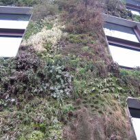
The plant wall, 800 m2, features high-tech elements. It forms with complex metal forming networks “honeycombs” in which the substrates to which the plants chosen for their color, texture, density and foliage are tied are introduced, create a composition designed previously. A permanent drip enriched with nutrients and dosed feed them and allow maintaining a rigorous and controlled green mantle that can be replaced in whole or in part at any time.
- Showcases
The windows are composed of two parallel glass sheets supported by thin white frames that make the frame. Its contours are blurred by serigraphs with the intention of blending the cabinet itself, privileging the gallery space, wanting to give the impression that objects float in space thereof, without barriers.
- Furniture
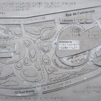
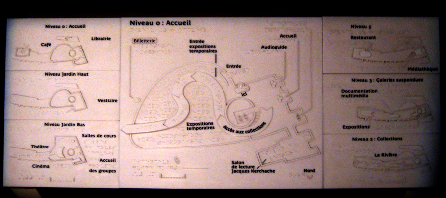
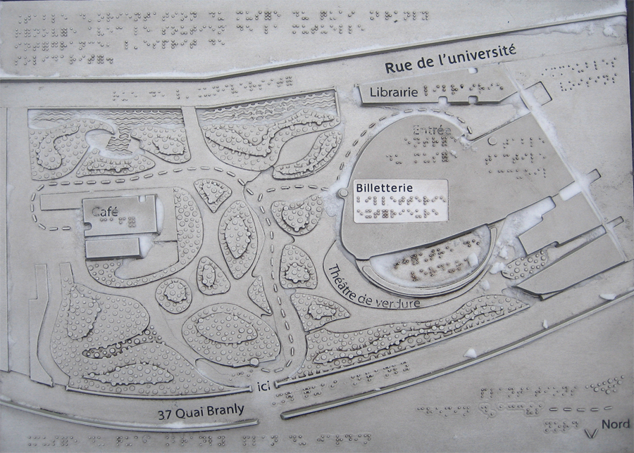
The undulating furniture that defines the different worlds within the gallery, is recessed to shape the seats or house models and screens. The structure is clad in leather and features braille for the blind as well as all information booths.
Video
