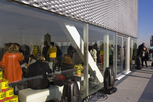
New Museum of Contemporary Art in New York

Introduction
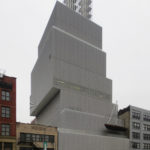
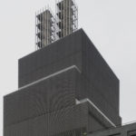
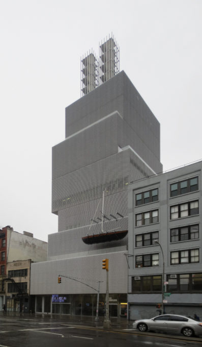
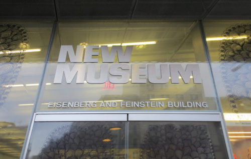
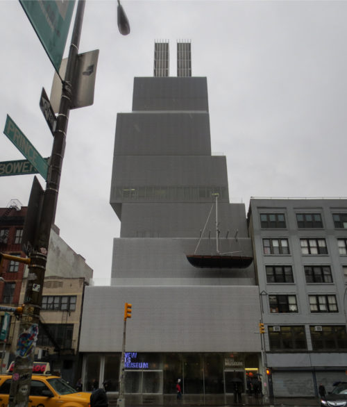
The New Museum of Contemporary Art New York reopens in an original building of rectangular cubes designed by Japanese architects Kazuyo Sejima and Ryue Nishizawa, the study SANAA in lower Manhattan.
The museum, which is the only New York exhibit devoted exclusively to contemporary art, was founded in West Village in 1977 by Marcia Tucker the police station with a mission to promote the new art and new ideas.
Three decades later, reopened its doors in the area, in the district of Bowery, in order to remain a place of continuous experimentation, which is question what is art and what is the role of museums in the XXI century.
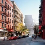
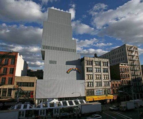
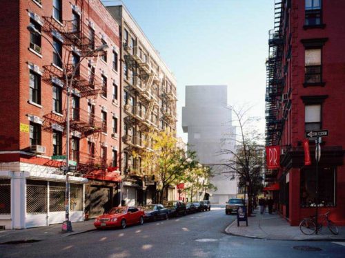
As a superposition of shoeboxes, the new museum joins a sector of the city of New York that seems to flourish again. The Bowery was recently somewhat isolated from the growth and modernization, but the opening of the new museum has focused attention.
Location
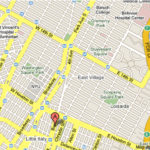
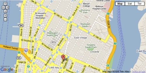
The New Museum reopens at 235 Bowery between Stanton and Rivington, Lower Manhattan, New York, United States.
Long neglected, the Bowery neighborhood has undergone a recent refurbishment but remains harsh. The museum staff decided to move the artwork from a temporary space in SOHO to the site of an old parking in this neighborhood since the arrival of the museum can help revive the economy in the area. In addition, the new museum now has twice as much space as before.
Concept
Arquitecta Sejima relates that his study has wanted to achieve establish a relationship between the building, the museum, the Bowery and New York City.
The idea is to become both a space to house art today, which also serves as an incubator for new ideas for artists that are projected into the future.
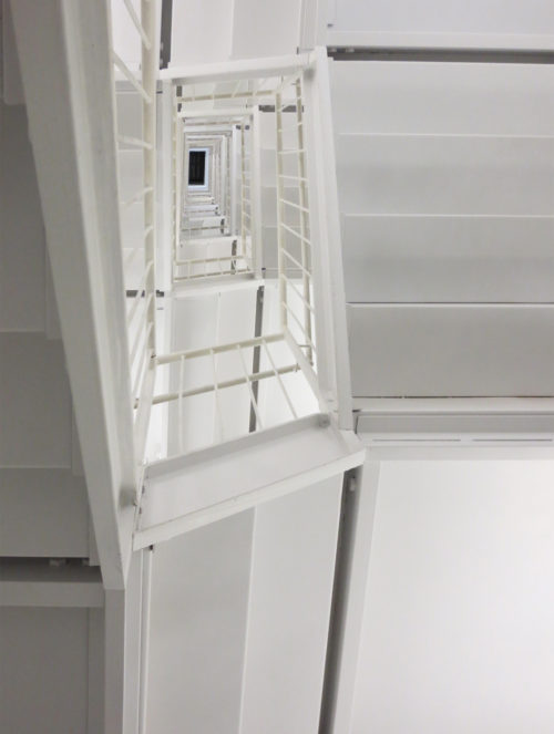
SANAA designed the interior to be flashy but discreet, so that the architecture does not overwhelm but complete art. In addition, the architects chose to expose the bowels of the building to fit with the business of daily work at Bowery.
Design
The design decision serves in part as a response to the adjusted development of the area.
The site measures 21.64 meters wide by 34.33 long and placement of the boxes to the north, east, south and west of the central axis of the building, SANAA could fill more space without extending the perimeter structure. The shift also allows entry of sunlight at each level. delicate and adjustable panels prevent sunlight damaging the works or create flashes. These inputs light create a different atmosphere from the other monolithic, dark and airless environments many museums.
Description
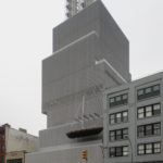
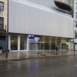
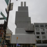
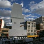
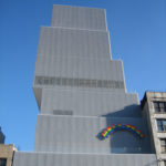
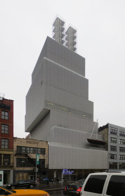
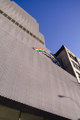
The building of the New Museum is “elegant and urban”, with 54 meters high, of great simplicity of form, seeks to integrate into the neighborhood trying to reflect the commercial nature of the Bowery, according to Sejima and Nishizawa architects.
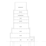
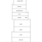
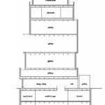
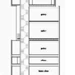
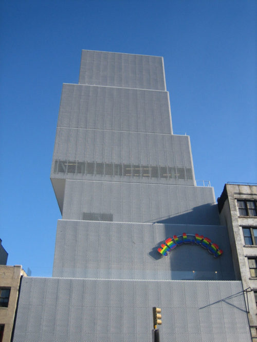
When building this seven-story building, made up of seven disjointed rectangular cubes, architects have wanted to play with the daylight, so that the structure, which appears monolithic from the outside becomes the inside dynamically.
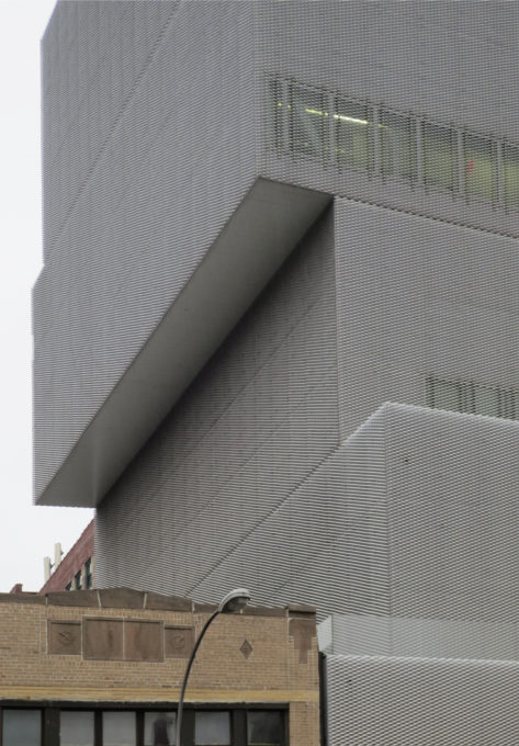
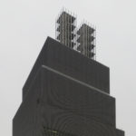
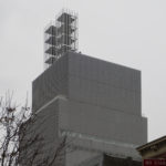
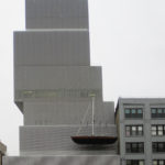
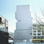
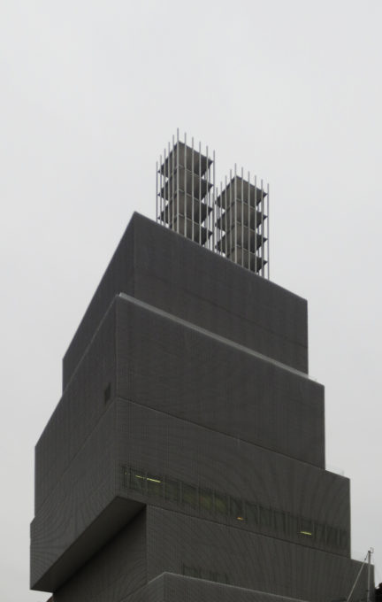
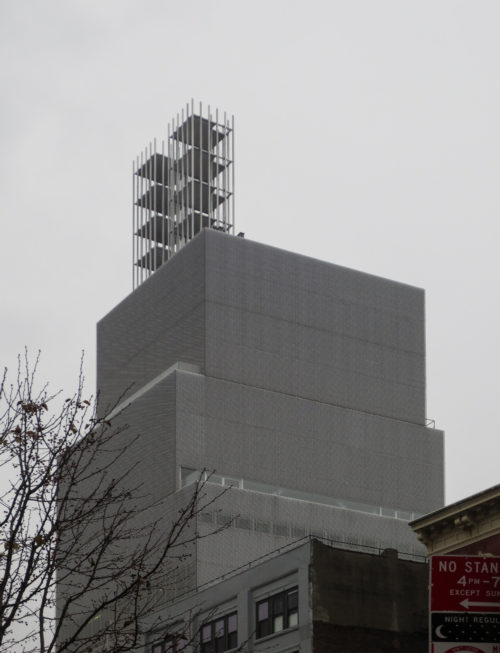
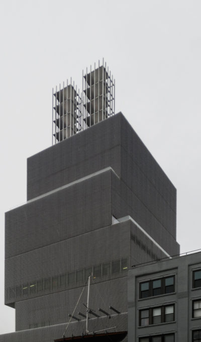
The building resembles a pile seven boxes on each other, unsteadily balanced. The design decision serves as a response to the adjusted development of the area, since this way the building designed by SANAA could occupy more space without extending the perimeter structure.
Architects Kazuyo Sejima and Ryue Nishizawa, have designed the seven levels of this building as a displaced arrangement of boxes, each moved off center from the ground level immediately. The boxes do not move back into a consistent basis, such as building Empire State, but that makes it more as an irregular sculpture.
Windows
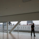
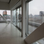
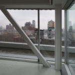
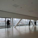
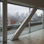
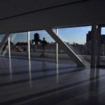
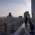
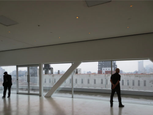
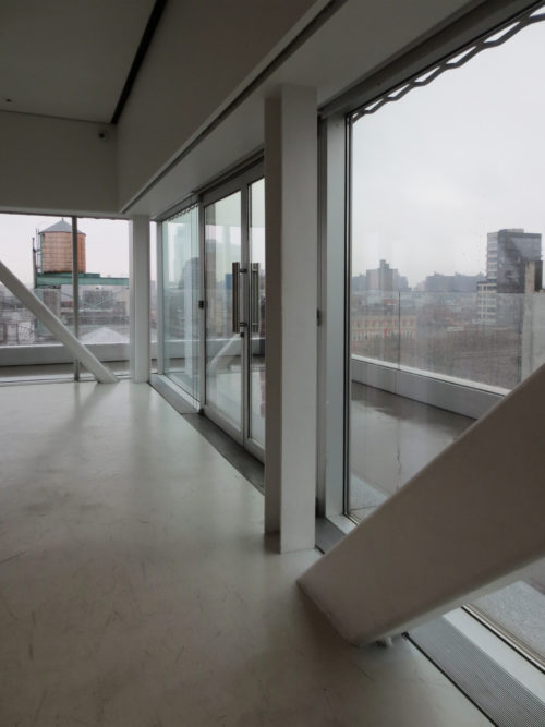
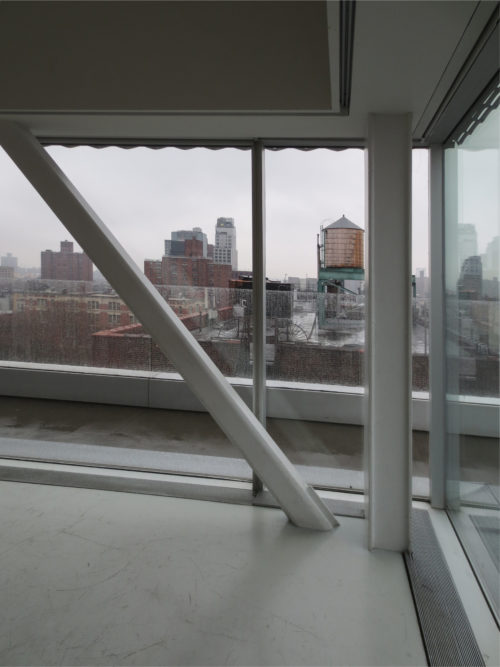
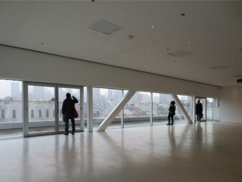
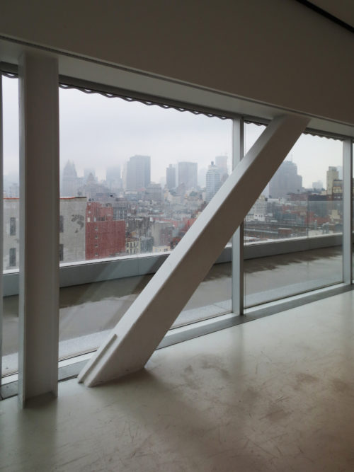
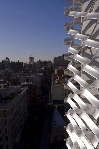
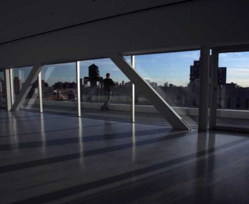
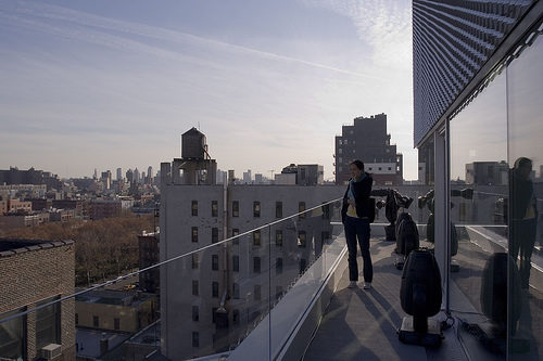
It has floor to ceiling windows on the east and south, as well as covered terraces that surround these two sides, and also offer panoramic views of the city.
The windows of the fifth floor emit a powerful band of light, particularly at night, taking the view architecture. Even if it were this band, the eye could gravitate to this building, which stands out from its surroundings, particularly because buildings small and medium sized around you.
Spaces
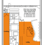
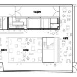
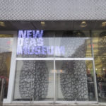
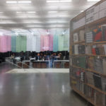
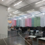
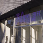
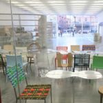
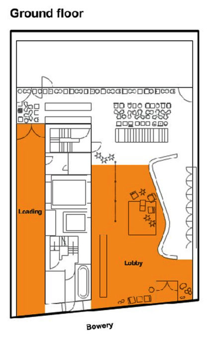
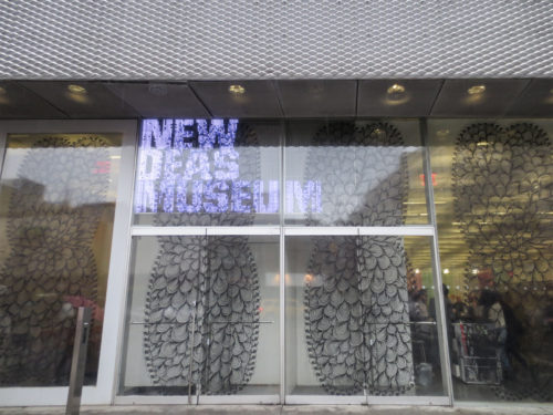
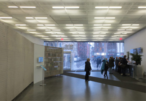
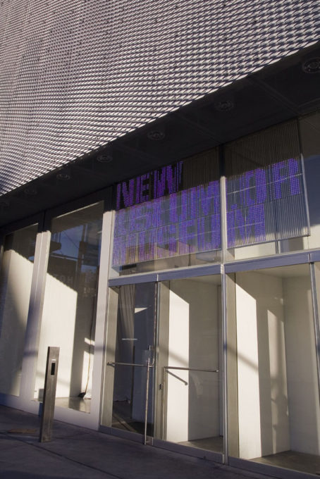
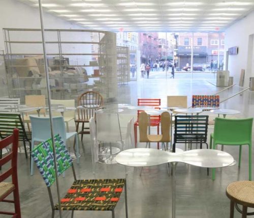
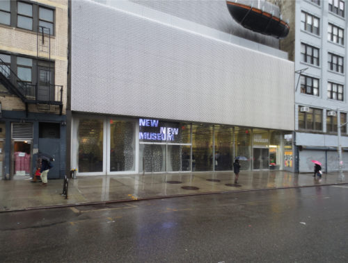
Visitors entering the museum by a lobby at street level, 5 meters high, fully glazed. This membrane glass allows all the functions of the Museum lobby, creating a virtual transitional space between the street and the galleries.
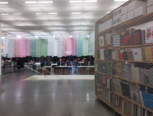
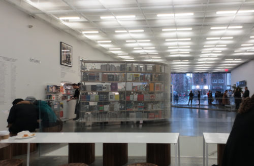
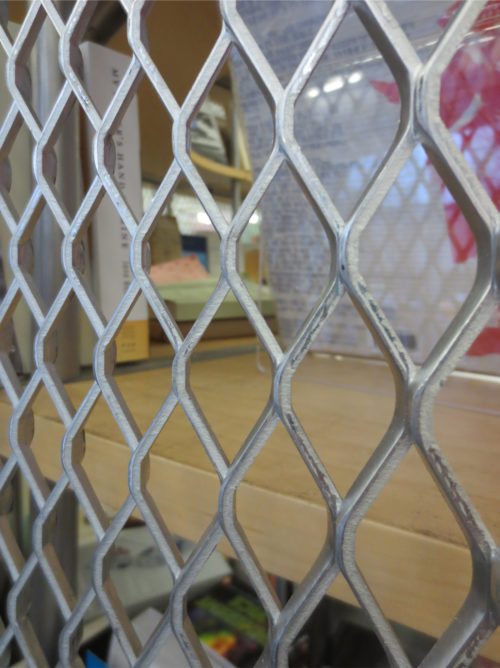
The glass partially encloses an interior staircase leading from the lobby to the basement level. A serpentine metal screen separates the museum store lobby.
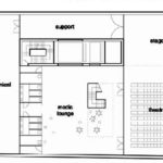
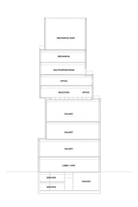
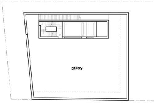
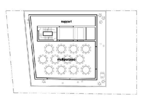
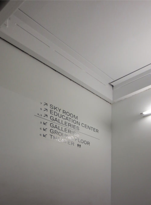
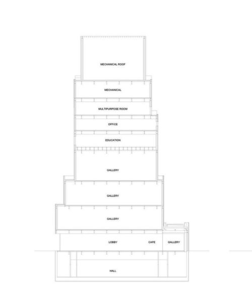
The museum contains 4 public galleries, a total of 1096 m2, a theater of 182 seats, a shop, a cafe, a classroom and an educational center. The building also contains a space for different events on the top floor (186 sqm).
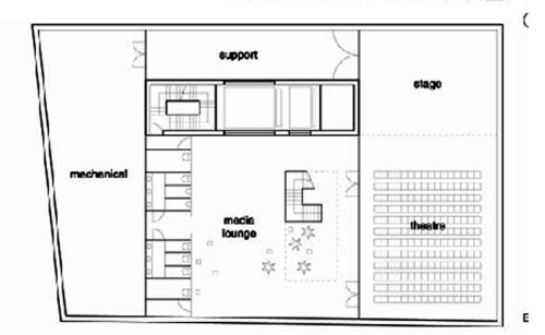
Through stairs or elevators, it descends to the theater located in the basement.
- Lobby

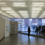
I wanted to express the idea of opening with a completely open lobby visually while maintaining a degree of elegance and beauty within the rough and rugged environment, which is expressed in the building to expose the ducts and structure.
From this lobby visitors can choose several ways to access the rest of the museum. Going up from the lobby, either by stairs or elevator, you reach the galleries located from second to fourth level, all open plan.
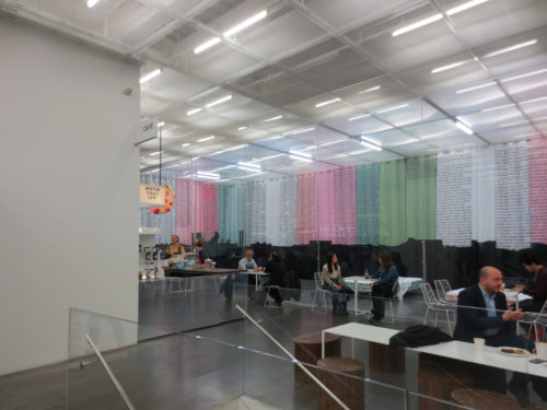
At this level are public restrooms and wineries and coffee shop that is one level above in the lobby.
This plant includes public access and associated loading and unloading doors, in view of passersby. From this hall visitors can access the rest of the museum via stairs or elevators.
In the reception level, the work of the museum are particularly apparent. From the outside, you can see the full level through a crystal plane almost 4.50 meters high rises and extends across the width of the place. This glass wall even provides views of the cargo area.
Galleries
- Second, third and fourth floor
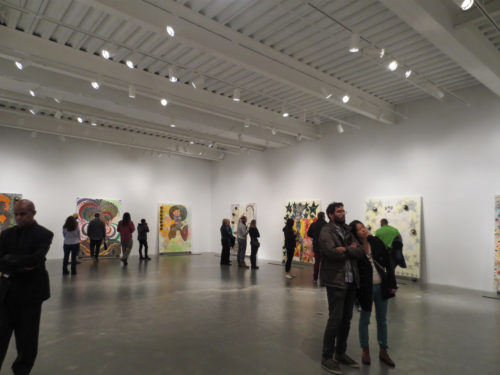
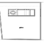
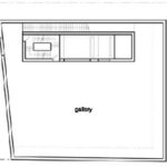
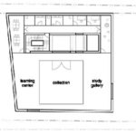
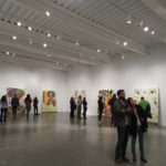
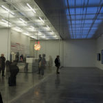
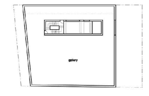
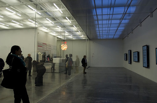
On the three main levels of galleries (the second, third and fourth), free columns spaces create fluidity and are dedicated entirely to exhibition spaces.
Varied ceiling heights in each gallery give greater visual interest. The footprints of the galleries ranging from intimate to large, but thanks to the different heights, all the galleries occupy the same volume.
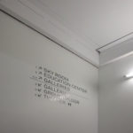
On the second floor are galleries Eugenio Lopez. In the third the foundation Maja Hoffman / Luma and in the fourth the gallery Dakis Joannou and Lietta.
- Fifth floor
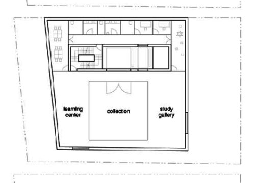
The fifth floor houses the Centre for Education and Paulina Constantino Karpidas, consisting of classrooms, audiovisual rooms and leaves a space for artistic resource center.
- Sixth floor
The sixth floor has administrative offices, cafeteria and kitchen for employees and meeting rooms.

- Seventh floor
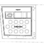
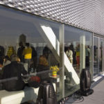
The seventh floor is designed to accommodate the Toby Devan Lewis Sky Room, a multipurpose space intended for special events and art programs, from which you can see the city from above through a terrace which continuously runs along the perimeter of the building.
Basement
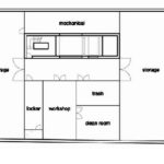
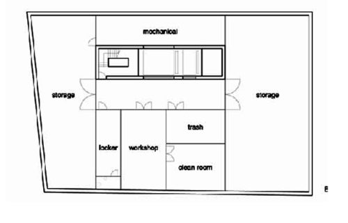
Of the 8 boxes that rise 54 meters above the sidewalk, 7 form the floors that the public can use, and 8, it is a small room for electrical maintenance.
The basement contains not only a theater and restaurants, but also an event hall, which functions as a gallery for special projects.
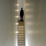
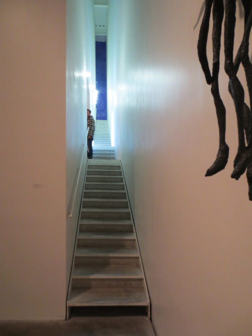
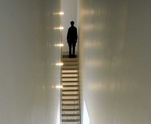
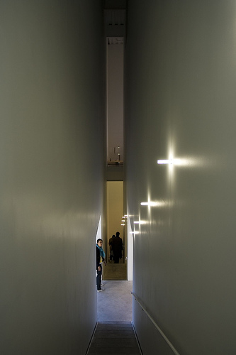
The most unusual museum space measures 1.52 m by 2.44 m, with a height of 10.66 meters. This “well” contains a staircase between floors 3 and 4.
Structure
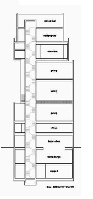
To create a building that meets the regulations imposed and does not look like a monolithic, dark and without aeration drawer, SANAA assigned key elements of the program to each of the seven savings banks that make up the building, then grouped vertically in a pattern circulations and needs of uses. This created a vertical internal structural heart, which links all floors and articulates each other. Then displacements and setbacks occurred between each box to create open spaces that connect to each other, all open plan.
Sejima and Nishizawa have wanted to play with the daylight, so that the structure that appears monolithic from the outside, becomes dynamic inside.
Materials
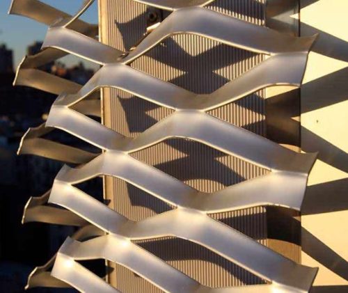
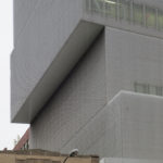
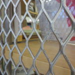
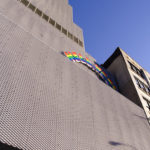
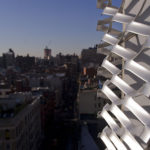
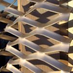
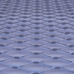
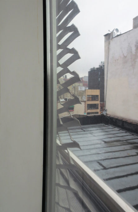
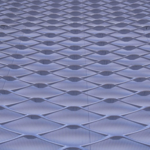
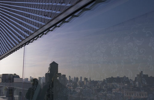
The facade is covered with a mesh-shaped aluminum honeycomb designed by architects to highlight the volumes of boxes and at the same time put on the building. These silver anodized aluminum panels and tear in areas open windows or skylights, allowing its opening to the environment and the accentuation of the volumes of the “boxes”. Visitors can see out of the building through this network shaped aluminum honeycomb, which had never been used to coat the facade of a large building.
The windows are just behind this mesh, which makes the set has a unique appearance, which changes with daylight.
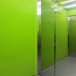
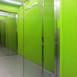
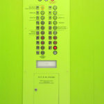
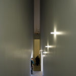
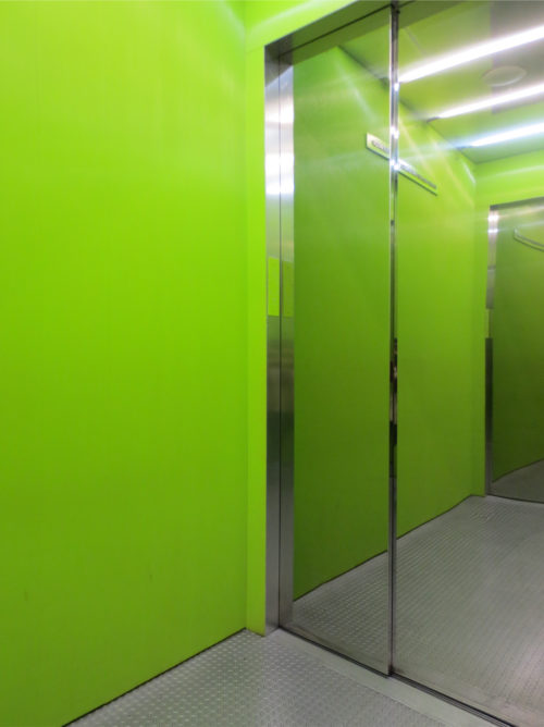
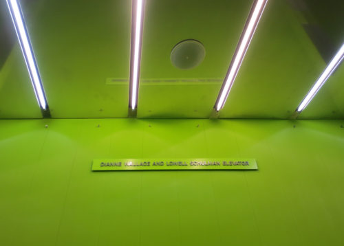
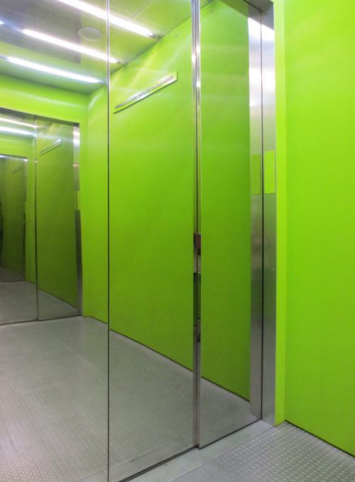
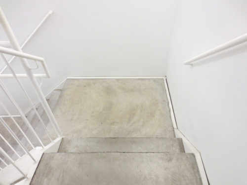
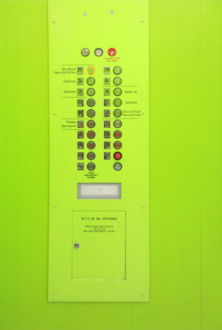
The striking exterior differs markedly from neutral interior. With the exception of an interior elevator and bright electric green cherry mosaics in rooms low level, the museum presents polished gray concrete floors and white walls, as well as structural members exposed diagonal.
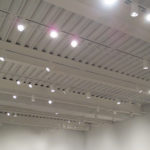
A floating screen softens long roof visible features, filtering light from a fluorescent tube trellis
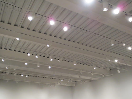
Ducts, sprinklers, and fire-proof material, are also visible.
In the galleries you have been to look at the structural steel of the building.
Video
