McCormick Tribune Campus Center

Introduction
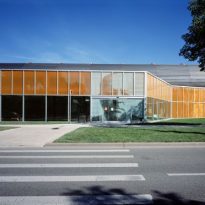
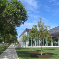
In the historic Campus of Illinois Institute of Technology, designed by Mies van der Rohe in 1940, the team of OMA designs a new educational space, the McCormick Tribune Campus Center.
Rem Koolhaas was the winner of an international architectural competition organized in 1997 as part of the set of actions planned to modernize the center. Among the finalists were Peter Eisenman, Helmut Jahn, Zaha Hadid and Kazuyo Sejima.
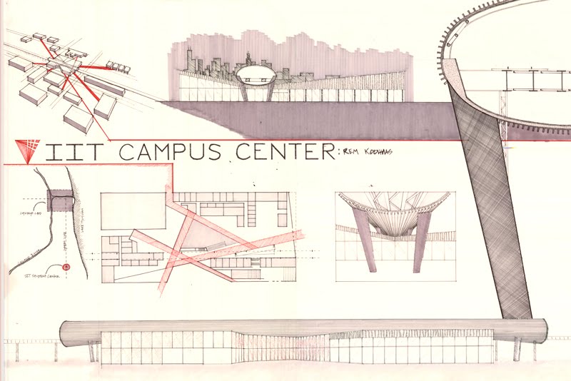
The contest was asked to create a multifunctional center that solve communication within the campus, creating recreational spaces for students and considering their relationship with the elevated train. Koolhaas and his team studied the flow of students during a time and the result became project.
Perhaps at all the people related to architecture know the image of the project, as it was used by Autocad 2008 at the front of version of that year.
Location
The McCormick Tribune Campus Center, located in the heart of the Technological Institute of Illinois (IIT), south of Chicago city, USA, is a project that was conceived with the idea to meet specific needs for students on campus. In addition, the project should be a space that redevelop the site with the least possible space built.
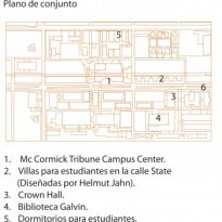
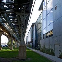
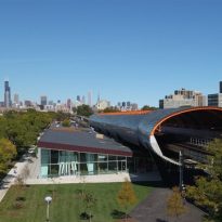
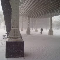
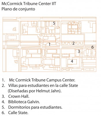
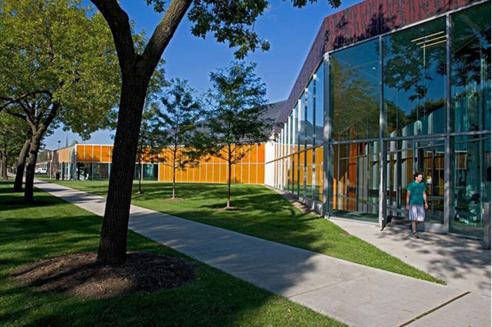
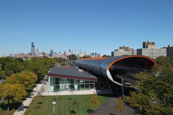
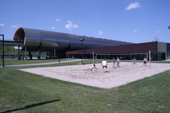
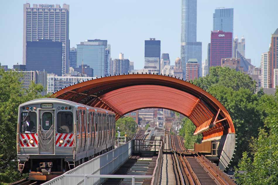
The Campus Center is placed against the Commons Building of Mies and inserted under the viaduct of the Green Line elevated metro area that divides the campus into two parts, along State Street, residence halls and conference rooms.
Previously the site used was an open area, crossed by access roads between the student dormitories and the main classroom buildings downtown.
Concept

The McCormick Tribune Campus Center seeks to revitalize inherent urbanism masterplan designed by Mies van der Rohe in 1940 for the Illinois Institute of Technology, neglected a long time ago.
Project
Rem Koolhaas’s team found in the dilemma of creating a building able to redevelop and absorb as many students as possible with the least amount of incorporated substance, adapting and molding itself to master Mies Van der Rohe, former Head of Department plan, which ruled in his unique style “less is more”.
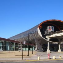
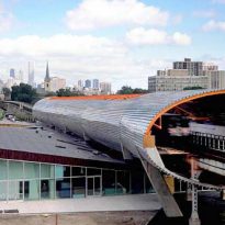
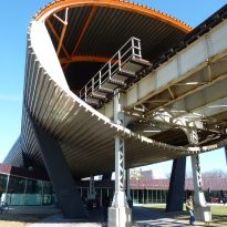
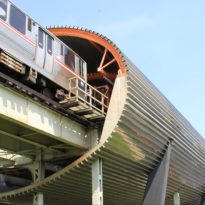
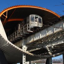
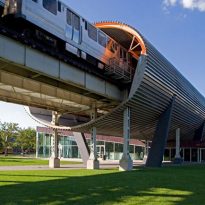
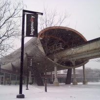
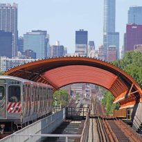
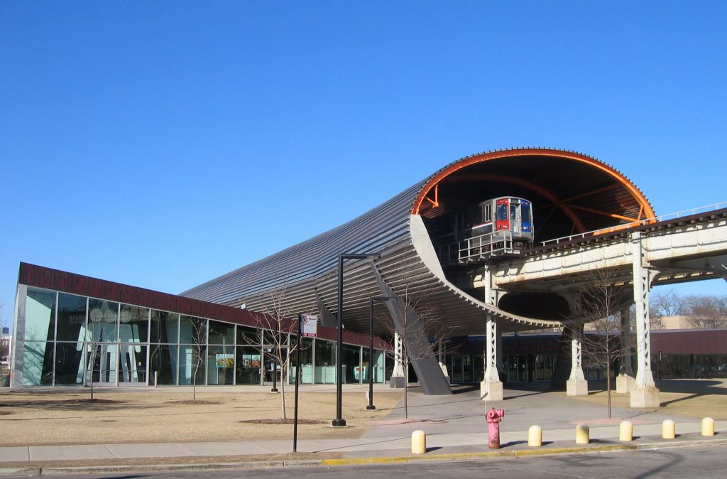
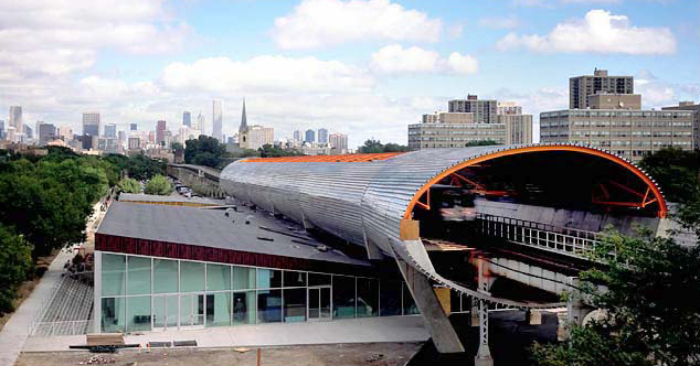
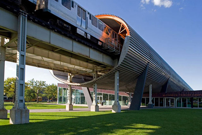
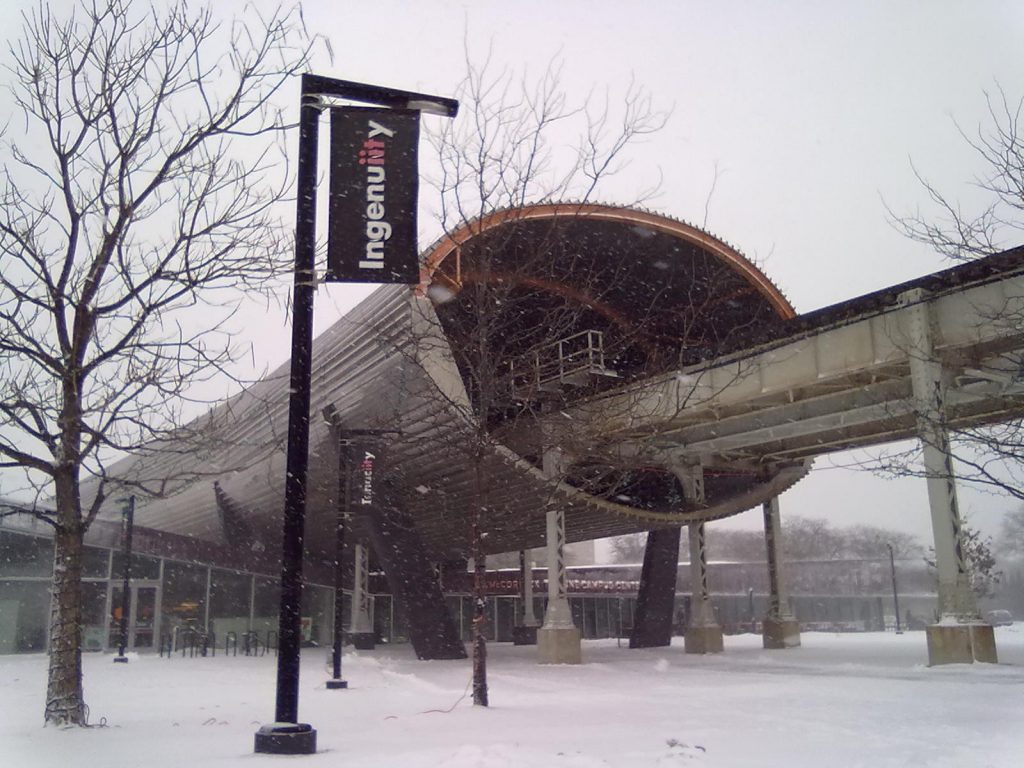
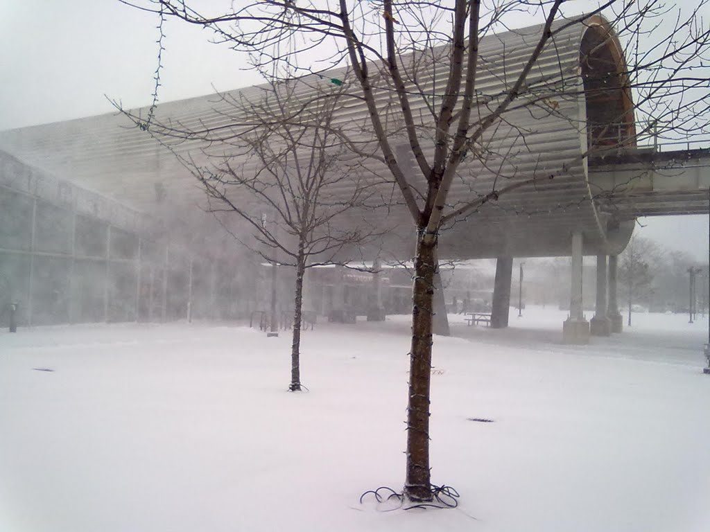
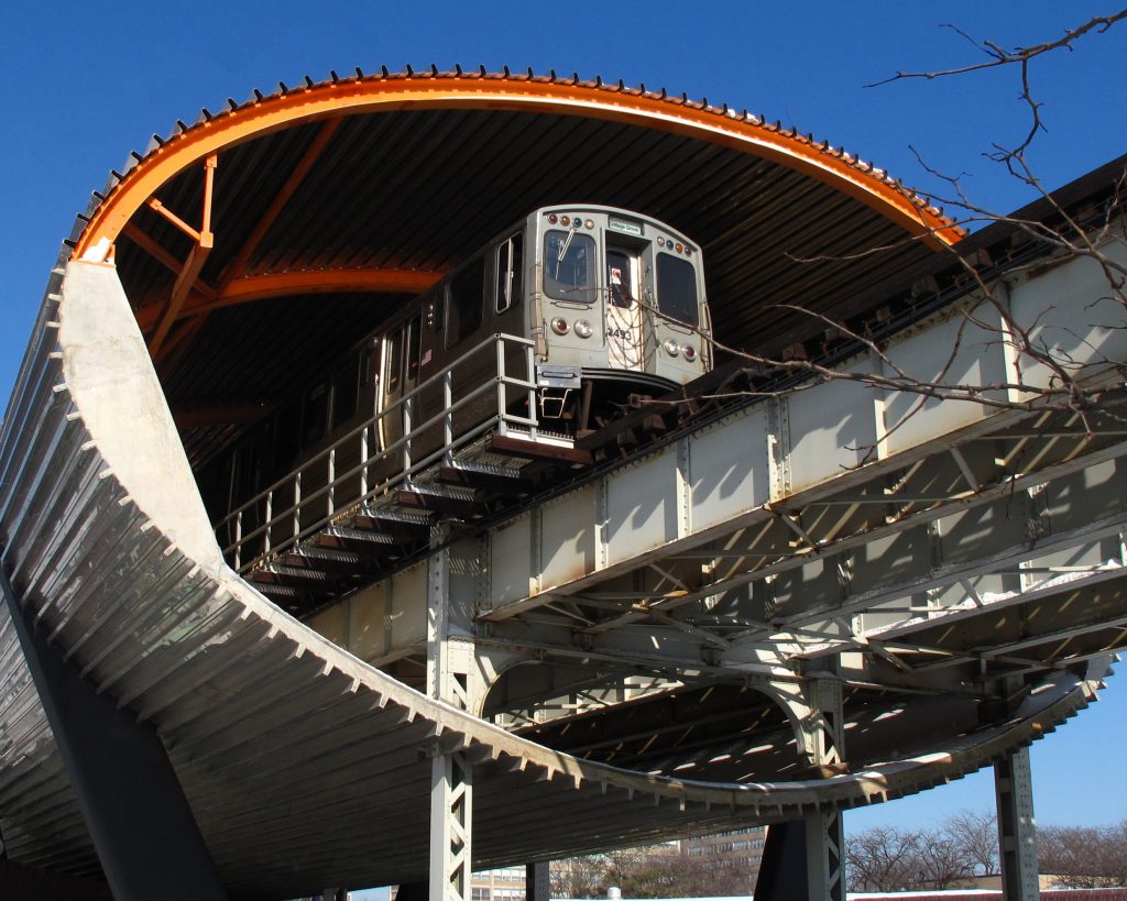
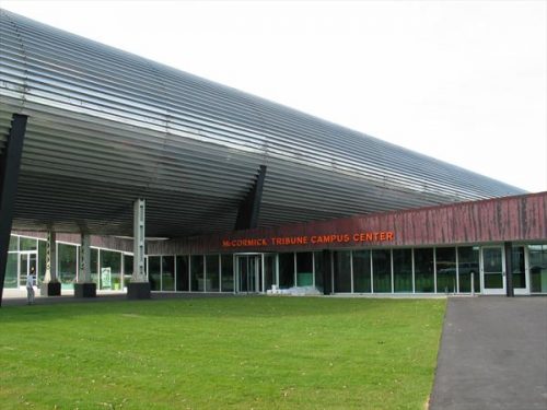
To create a new point of density for the Campus, the building is located in the heart of IIT, a large rectangle between State and Wabash Streets, lanes 32 and 33, directly below the ” L”, the artery that connects the campus with Chicago other. By enclosing the tracks above the Campus Center on a stainless steel cylinder cushioning, a deafening place that was previously missed by his intolerable noise, it becomes not only tolerable but a magnetic point. Tire tracks, named spontaneously among students as “the Tube”, has become a crucial part of the image of the Campus Center and the Institute of Technology.
Spaces
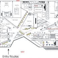
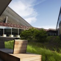
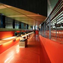
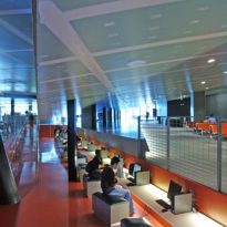
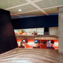
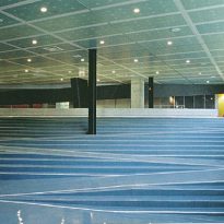
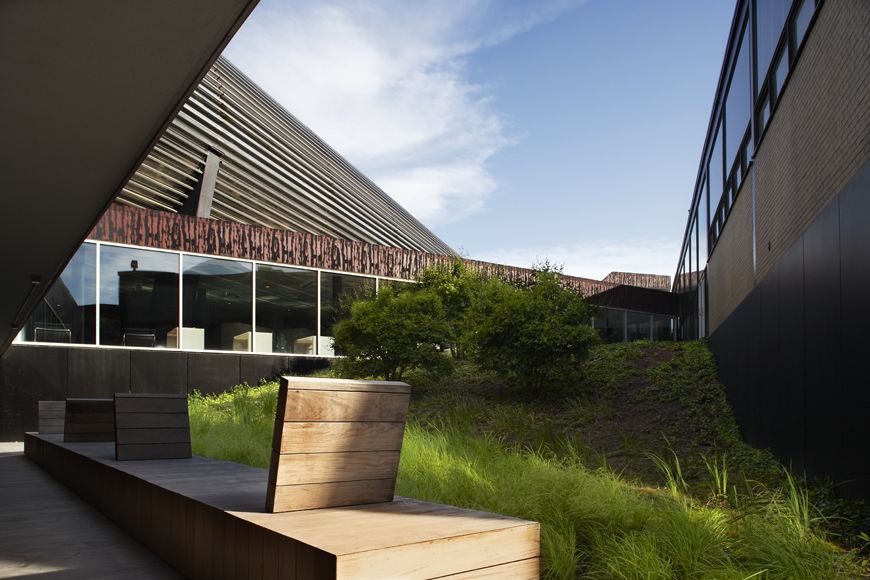
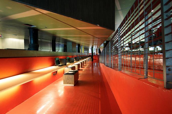
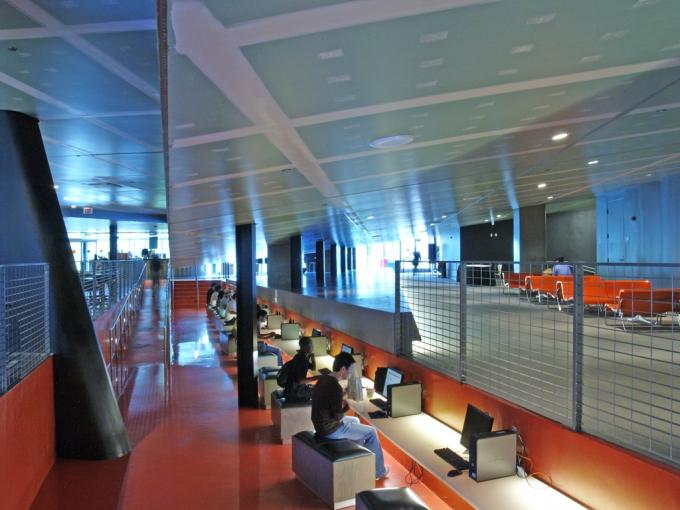
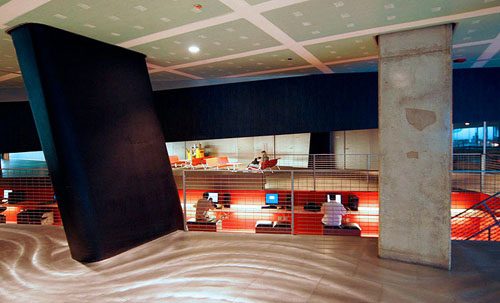
The building becomes a miniature city, and the paths that cross in its boulevards, out of which Koolhaas inserted public spaces. These include ramp seats where students can hang out and socialize, a sunken courtyard with two levels and a dining room dominated by steps and stairs. Also an area of ”broadband” with access to computers.
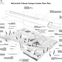
The new building is on a single comprehensive plan, providing a focal point between the two halves previously divided the campus. The steel casing pipe, which absorbs noise meter is located directly on the building. Inside the dense program includes a bookstore, food court, coffee shop, computer center and meeting spaces.
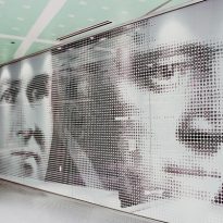
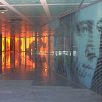
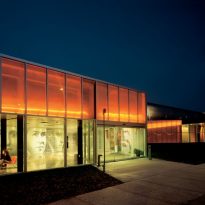
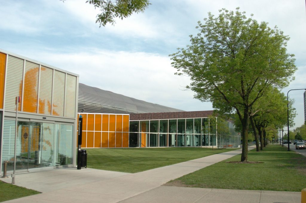
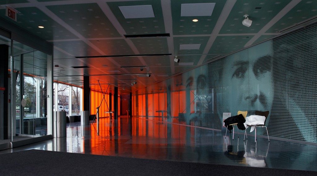
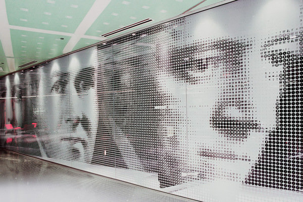
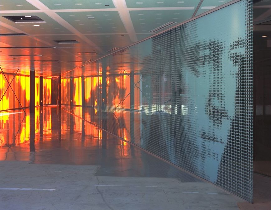
Throughout the building there is a bit of history. At the main entrance to the west, there is a mural with Mies´s face in 7.6 meters in height, welcoming building users, but also seeking their own creation through State Street.
Welcome Centre
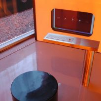
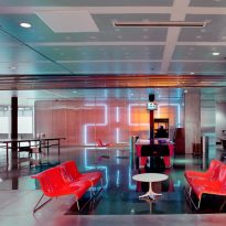
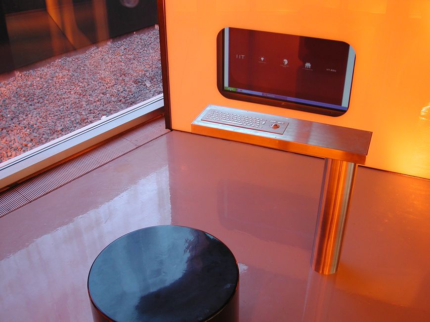
The Welcome Center, part of the Institute of Technology McCormick Tribune Campus Center, serves as the entry point for visitors from all over the IIT Campus. The design space with a glass screen for holographic projections, integrated plasma screens and digital projections on the ground, guide visitors while narrating the history and present of IIT with the screening of short films.
Interactive controls are lifted from the ground, while the projection equipment and lighting sink on the roof of a practical and “hands ” within the museum design.
Commons Building
The Campus Center does not incorporate the Commons Building, but approaches him, touching only at certain points. The building of Mies is displayed as a relic for observation. Koolhaas surrounding the Commons Building transforming the oldest structure in a piece that can be admired from the Mies bridge near the entrance to the Campus Center.
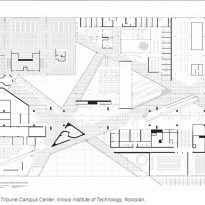
Two main lines create an axis that starts in the Commons Building and diagonally crossing the Campus Center on your way to the legendary Crown Hall, towards the end of the Exelon Tube and side of Campus Center on the 33th Street also seem to flex. One side of the head Educatorium also seems to be directed towards this part. This functional and poetic axis gives the volume of the building referred to an imperceptible twist the confessed love Mies Koolhaas, once again transforming the buildings actors, featuring allegorical representations Vriesendorp and Koolhaas.
McCormick Tribune Campus Center
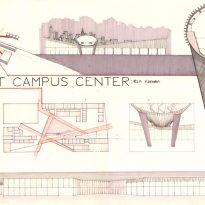
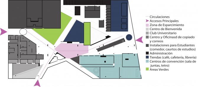
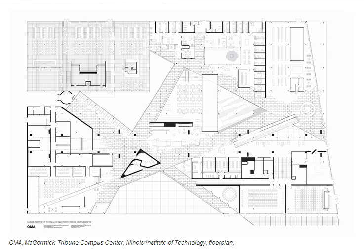
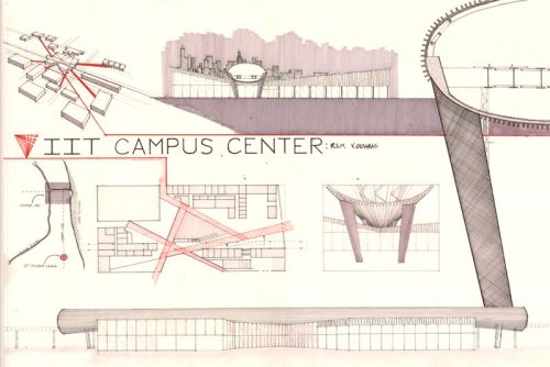
In the final draft, orthogonal divisions of different thicknesses and materials border edges to create rooms, offices, meeting rooms or auditoriums, grouped organisms, again orthogonal patterns, while the network of major routes diagonal creates a split surface circulation areas, rest and recreation.
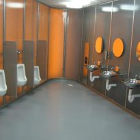
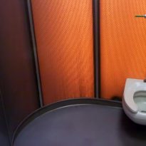
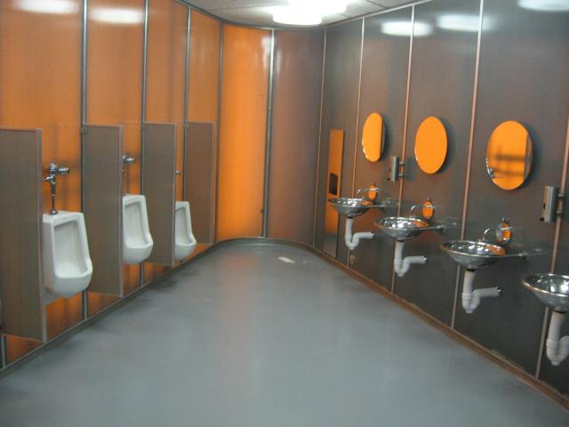
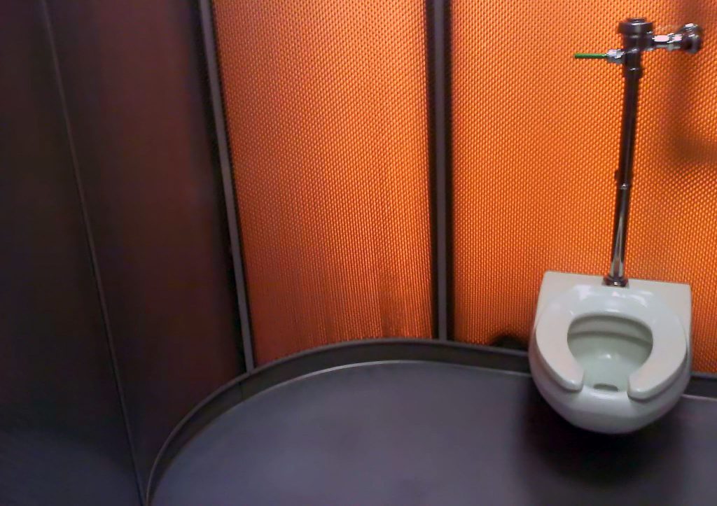
Volumes are also generated by the diagonal lines meet, as the extruded volume with a triangular plan of the rest rooms. The criterion for the organization of the functions is summarized in the plan by OMA with the iconic image of a “flat carpet Pompeiian program”.
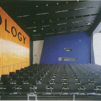
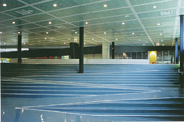
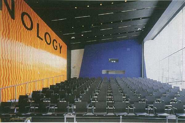
Inside the Campus Center, the transverse axis is spatially exploited, something like a cubist painting. Instead of organizing the interior along straight lines, Koolhaas has organized the spaces in a diagonal grid. Spaces including an auditorium, ballroom, private offices and meeting rooms. At the top, however, the interior is very open and develops in changing levels. The result is a universal Miesian space densely populated with a universe of contrasting images.
Construction
Building
The building was constructed between 2000 and 2003 with a total investment of 48.2 million, 34.6 million for the building and 13.6 to train supporting structure enclosed in the draft. The total area covers 10,690 m2.
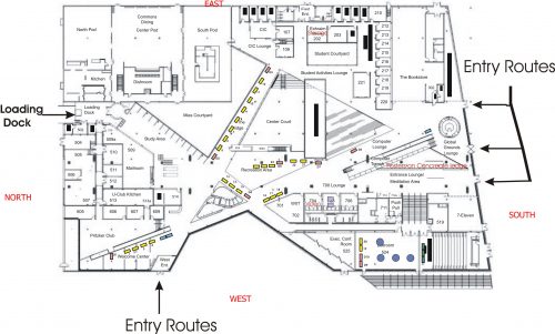
Instead of stacking the activities in a multi-storey building, it was decided to organize each program element of the Campus Center in a single plane that fosters dense urban condition. To achieve this, in 1997 OMA conducted a study to map the “desire lines” of pedestrian traffic that students perform around campus.
Koolhaas uses these paths to chart the building, retaining the shortcuts. These diagonals crossing paths remain within their own Campus Center, linking a multitude of activities through a network of internal streets, plazas, and urban neighborhoods islands forming active 24 hours shopping, entertainment, academics, recreation, together with other urban elements in microcosm.
The roads are north-south diagonal to the orthogonal orientation of the building, which is the plane of the Mies campus. The result is more or less circular wedges forming the space program and Koolhaas describes as “districts”, each dedicated to a general function.
Roof
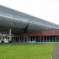
The unifying element of the new building is the roof, a sloping concrete slab that protects against noise from the “L”, covering heterogeneous programs carried out below.
When the roof falls below the “L”, the bottom of the tube goes into the concrete as a reminder of what is above.
The roof has a long projection covering the adjacent Commons Hall, the original student center created by Mies in 1953 and whose original perimeter and wooden partitions have been preserved and now works as a food court.
Lew Collen, former president of the IIT, said about the project : “… The Campus Center meets our vision of creating a nucleus for this college….. Our outstanding students deserve this unique space of its kind and at the same time, solidifies IIT leadership in architectural innovation: from the birth of revolutionary modernism of Mies van der Rohe to Rem Koolhaas audacious concept that inspires the next generation of architects and designers… ”
Structure
For best performance of the structure it was decided to divide it in two different ways:
Structure building
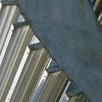
The structure follows the concepts of Mies, responding to his style, with slender vertical elements made of steel, so important in the German Pavilion in Barcelona. For deck slabs Koolhaas used light but have a slope, horizontal building grant for its large proportions. This gable roof, echo the teeth shape on the upper tunnel is supported.
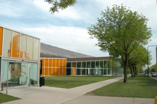
The exterior of the building makes little reference to the cascade of images, spaces and perspectives that lie within. Walking through the center of the building the leaning towers shaped “V” disappearing through the ceiling appear, these structural elements are indicative of the space occupied by the new building is built just below the elevated train line.
If not for the pipe that penetrates the roof and angled style of the cover, the inside of a maze McCormick Center would be almost no guidance but the train above Koolhaas has helped treat the building as a cross-axial composition.
The twin pillars “T” support frame are the same as were used in the Commons Building, newly painted black, but organized without following the geometric order of Mies, introducing diagonal rows that match the shapes of the routes.
- Roof
The roof of the building, made with a metal frame, is divided into three different levels of thickness which differs according to the joint design of the section, but also for reasons of symbolic expression. A continuous inclined plane under the Exelon Tube emerges to State Street to reach the great height of the Conference Center, while on the opposite side of the space is compressed to form a lobby and form a large inaccessible sector.
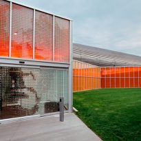
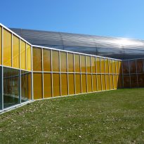
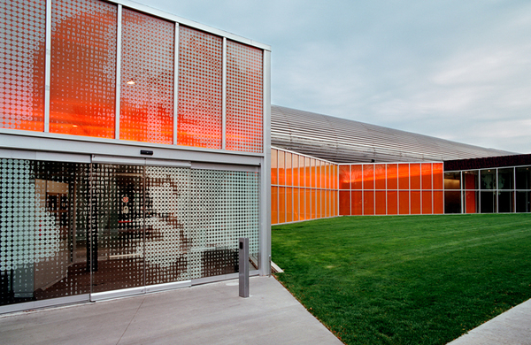
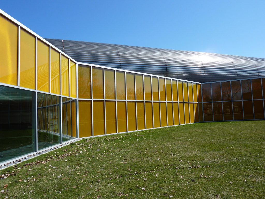
Another shot of the cover with a variable section consists of a horizontal and a sloping roof to the Exelon Tube in the space along Wabash Street, where rooms are inserted cover. These two earrings covered with different inclinations the Exelon, creating the effect that the building has been forcibly inserted under the overpass and tried to escape, arching with the elasticity of a cat. At the end of the cover facing Wabash Street, rectangular panels with square pattern grids together to allow in light while hiding the windows of the rooms.
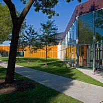
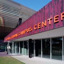
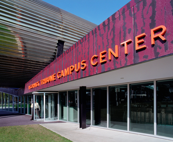
The other ends of the roof and the wall adjoining the Commons Building are coated with synthetic rectangular sheets with a wrinkled surface, painted red with black opaque vertical stripes obtained by using templates.
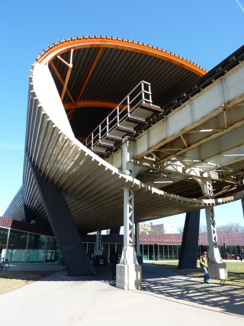
Tunnel Structure
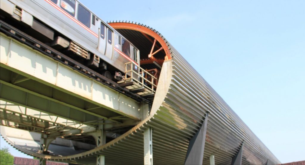
The second structure, completely independent of the building, is the holding tunnel that surrounds the train tracks, and should minimize vibration and noise caused by the passing train.
The tunnel is made of armed steel rings with each other, the bottom lined with concrete and made of a galvanized plated laminate. Structure mixed with cancelería referred Mies style seen in the facades.
- Acoustic Tube
For Koolhaas, slide the Campus Center under the railway viaduct, wrapped in a shell of sound insulation, Exelon Tube, means giving life to one of the emblematic “between spaces” and “Land Vagos” as discussed between 1950 and 1960. The architect defines it as “no man’s land ” on both sides of the elevated subway. The train passes through the oval tube stainless steel rebar, which has become one of the most prominent feature of the center. Designed to cushion the noise of the elevated trains that cross the campus, the tube 160 meters long, provides a spatial and conceptual core for architectural composition.
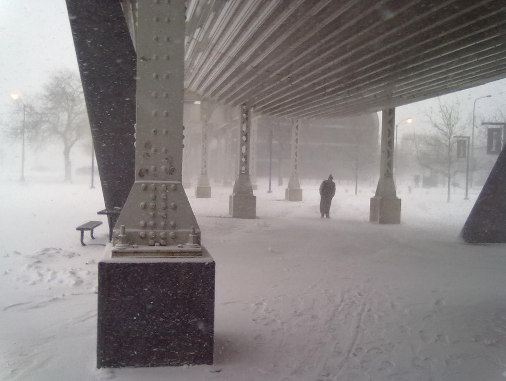
The lattice of metal pillars of the viaduct on the Green Line is encased in exposed concrete, becoming massive square pillars, while seven nails shaped concrete “V”, five of which push up from inside the building perforating the concrete cover, in addition to support from Exelon Tube.
The pylons supporting the tracks, the tube and the building is structurally independent, reducing the impact of the vibrations of the train as direct vibration on the tracks can not enter the tube or in the building.
Materials
In the structure of the building has been used reinforced concrete and steel, in the tunnel V -shaped and ” T” beams, reinforced concrete and oval stainless steel rebar tube. Koollhaas used concrete slabs for the roof of the building that are thicker to help deaden sound and vibration in some areas.
The train noise is reported decreases of 120 decibels under the path to approximately 70-80 decibels at 70 close to the building and inside the tunnel. The effect of sound deadening inside the tube has been well received by the occupants of nearby dorms and classroom buildings.

- Exelon Tube
This element is an area of 162m long, with a bright, as used by Mies oval section steel sheet embossed. In the lower half of the sheet metal becomes a lost mold for concrete protective membrane and laminated galvanized silver.
- Holographic images
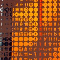
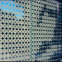
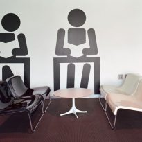
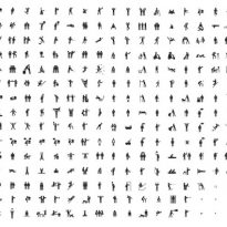
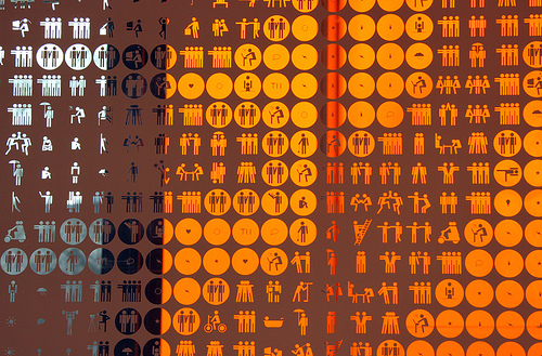
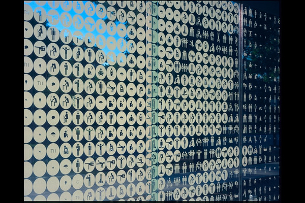
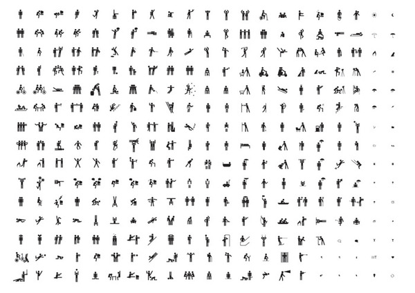
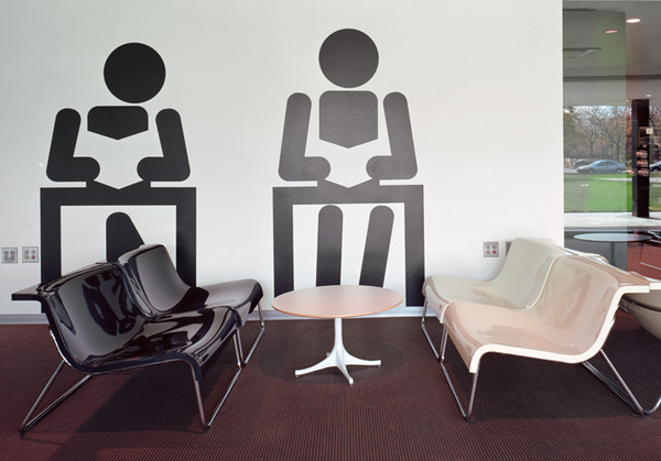
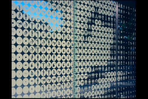
The 2x4m pixelated images that appear on the glass wall of the Welcome Center, among which is also one of Mies, are a creation of a graphic design studio in New York, who worked with OMA in creating some decorative elements such as large digital clock near the entrance and embedded in the soil maps. Each pixel in the image is an icon of a custom set of icons used throughout the building at different scales.
Other architectural elements reminiscent school history are painted black “I- beam” used throughout the interior columns, another nod to Mies.
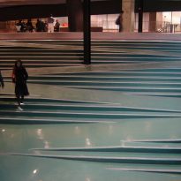
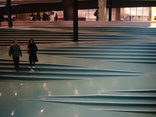
Inside of building large screens showing forests, lenticular surfaces gleaming Op Art, Petra Blaisse stamped fabrics. A grand staircase, painted green, masterfully incorporating a ramp for wheelchairs. Generously planted courtyards, bathed in natural light, this is new winks to previous Mies with Wallace K. Harrison devices that allow us to see that architecture is in 3D.
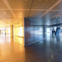
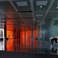
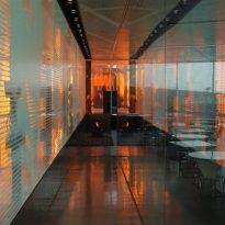
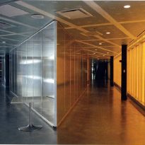
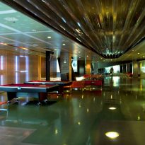
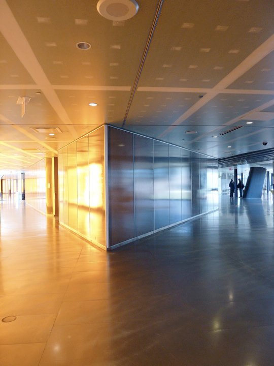
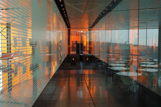
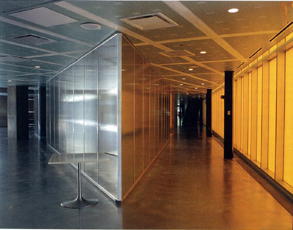
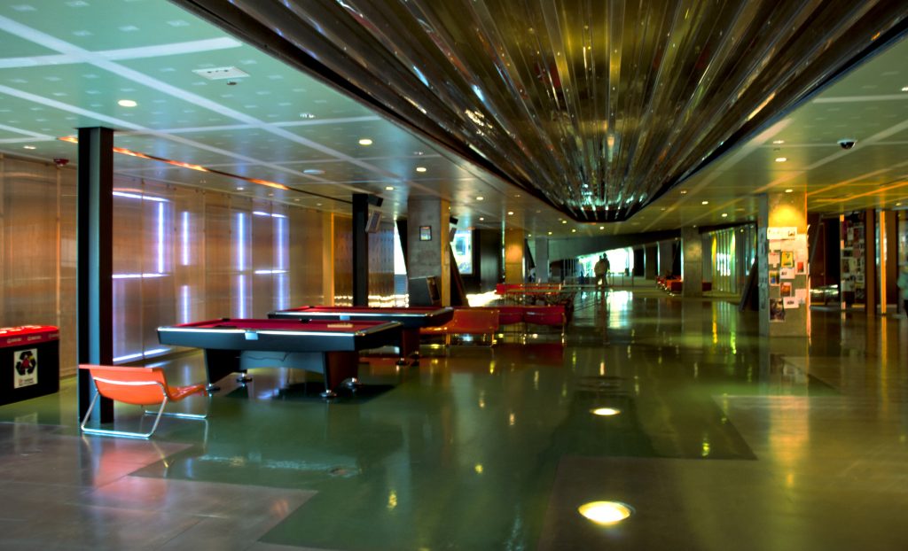
The interior corridors are lined with polished finishes, glass and laminates that sometimes allow the passage of light through a color spectrum, creating different environments within the building.
The words ” McCormick Tribune Campus Center” on the wall of outer glass cylinders are formed with small orange, inserted on the racks like a children’s game.
- Floors and ceilings
The paving and flooring materials create mosaics and lined sectored rustic concrete porch or flat panels and colored aluminum or steel frets, rubber, carpet or wood. Often these panels are joined along angular lines, reflecting the overall design plan, sometimes their surfaces are smooth with a shiny plasticized coloring oblique transformed into dazzling lights, typical of Junkspace screens.
On the roof of the main areas of assembly and movement are panels “sheetrock” uncovered, even in stucco joints, leaving visible solution “not finished”, which is also used in other works of OMA.
