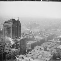
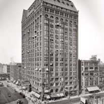
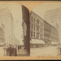
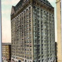
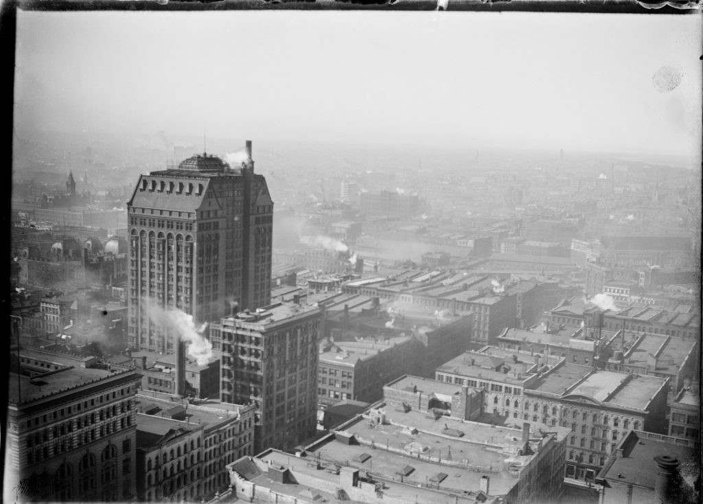
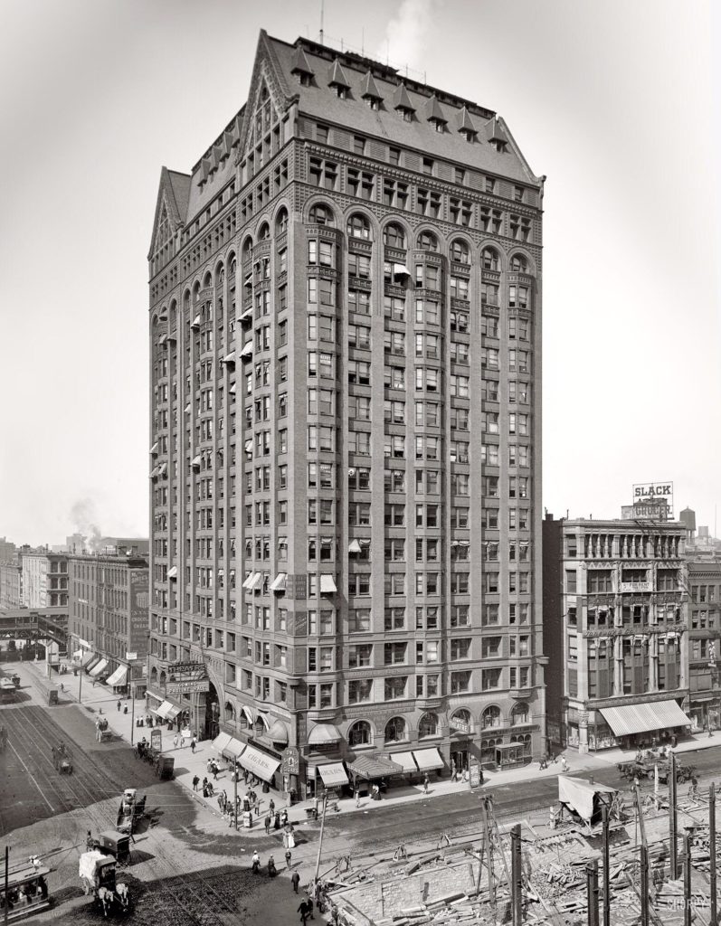
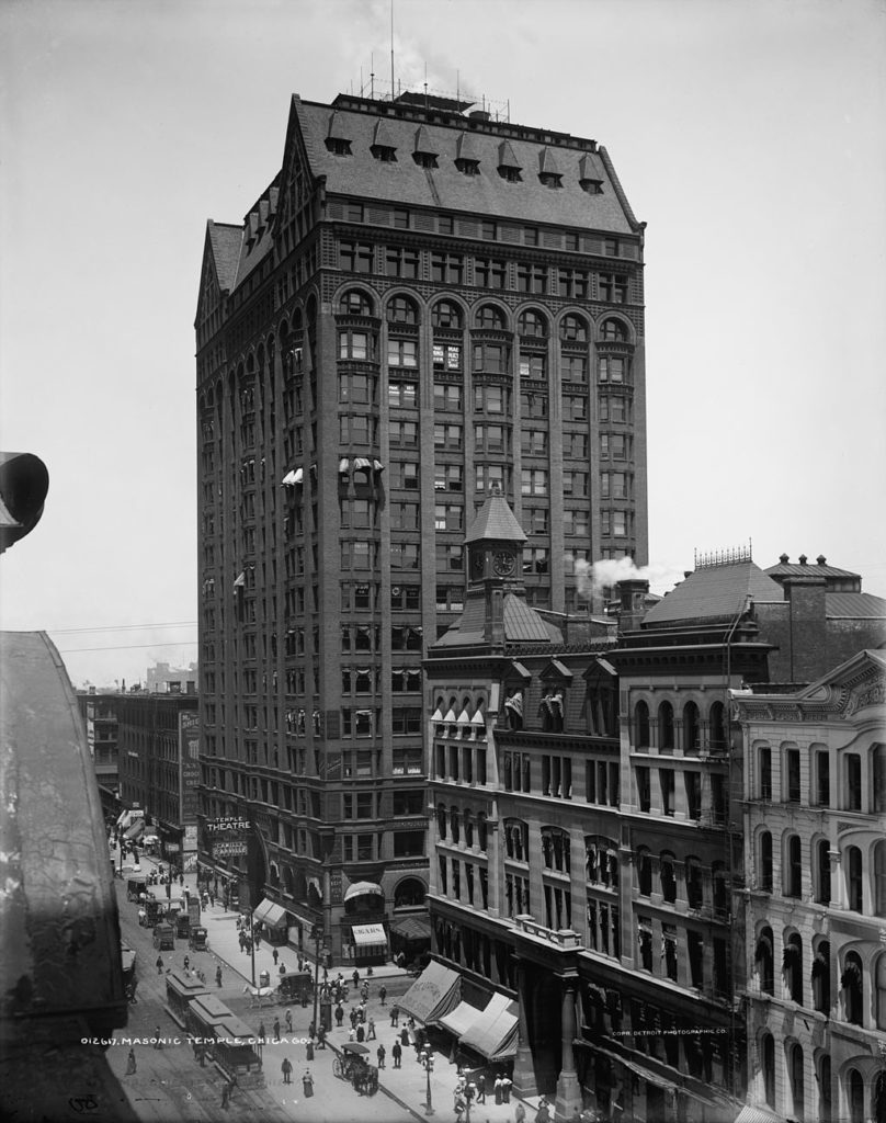
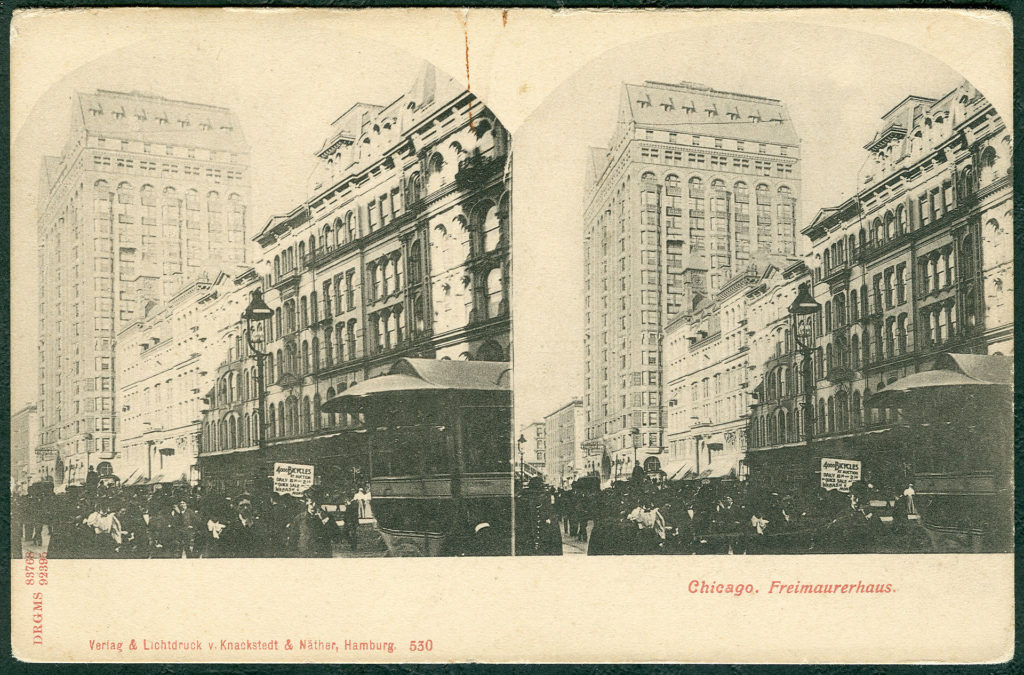
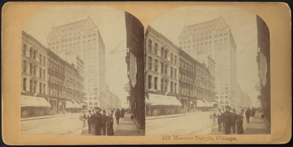
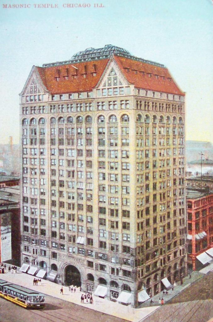
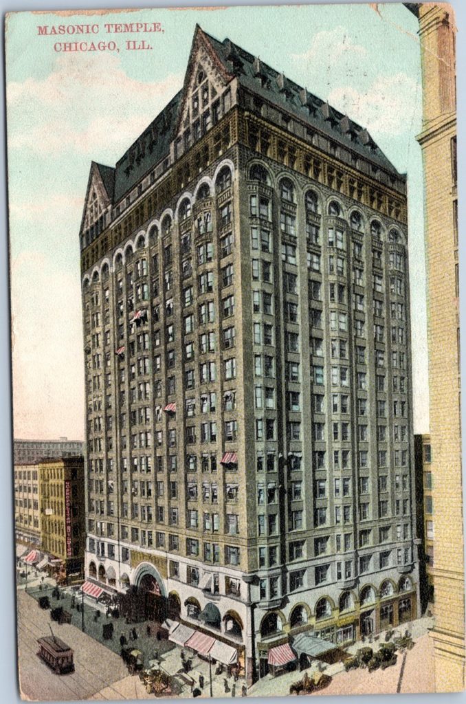
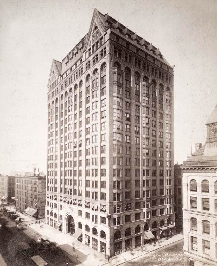
Masonic Temple Chicago
Introduction
The Chicago Masonic Lodge had outgrown the rooms it had rented since 1884, and appreciated the publicity that could be gained for the organization if Chicago was the victor in the contest for the 1892 Fair. In anticipation of Chicago’s victory, the lodge bought the property in January 1890 and announced that it was planning to build a 12-story building that would contain the headquarters of the Illinois and Chicago orders, as well as an 850-room European-style Hotel. It was not at all odd that reports had mentioned both the planned Temple and the almost completed Auditorium in the same article, for the Masons’ planned building grew in height to 15 stories in February 1890, and then to 18 stories in July, when Inland Architect noted the real objective of the building committee: “The extreme height of the building up to the finial on the gables as shown in the design will be 288,’ 48 higher than the top of the Auditorium tower,” which had just been completed as the city’s tallest building during the previous month. Once again, challengers who were planning a taller building had waited until construction of their competition was completed so that it would be next to impossible to add extra height to compete with the planned taller height of their tower. The final design would comprise 20 stories to a final height of 302’ 1”.
Although it had been the original plan to incorporate a hotel in the project, anticipating the demand the Fair would generate for new hotel rooms, at some point the hotel was replaced by a much more daring idea: a vertical shopping arcade. The covered shopping street protected one from the weather, from the traffic on the street with its inherent smell of horses and manure, and from the hustle, bustle, and crime of crowded urban sidewalks. This idea seemed to make sense that such a building in Chicago could succeed, especially given the city’s long, cold winters. After all, it was to be located on the city’s major shopping street, State Street.
Location
Chicago: the northeast corner of State and Randolph Streets.
Concept
The first ten floors of the building would be designed as what today is termed a vertical shopping mall. While large department stores had been designed as a stack of floors around an interior atrium during the past thirty years, this was going to be a completely different concept. Instead of one store with its various floors built around an atrium in which the customer had already entered, a great number of stores would be arranged around the vertical space. The challenge was to first get the customer to enter the building, and then once in, entice her to travel to the tenth floor to arrive at a particular store to shop. Would this be as, more, or less desirable than walking along State Street? The owners showed their concern not only over this issue, but also over the fear of heights of potential customers by not numbering the floors in the shopping zone (so as “to do away with the idea of altitude”), but naming them instead after distinguished Masons, that “allowed Mrs. Browne to be shot up to Smith Street, instead of starting with the idea of going up to the nineteenth floor.”
Burnham’s plan concept lined the three street fronts with single-loaded commercial space around a central atrium that occupied the leftover space in the center of the site. The site wasn’t deep enough to complete the doughnut plan and still have an atrium wide enough to balance its interior height of 300,’ so he placed an arc of 14 elevators at the rear of the plan to complete the atrium.
Materials
The extreme height of the atrium meant that the architects would have to employ every trick in the book to coerce sufficient daylight to penetrate into the lower floors, so they resorted to placing a window wall behind the elevator tracks. They also lined the storefronts between the balcony and the shops with large plate glass windows. This not only provided clear views into the shops to entice customers to come in, but also allowed daylight from the exterior windows to bounce into the atrium. The last detail they employed to maximize the use of daylight was using highly polished materials on all of the surfaces: alabaster-encased columns, marble-sheathed ceilings, mosaic tile floors, and mirrors in the upper levels of the atrium, to help reflect daylight into the atrium.
Spaces
A shopper would enter the building under the colossal 30’-6” high by 29’ wide granite arch, through a double-doored vestibule to minimize the stack effect, and into a relatively low lobby. This space provided the spatial transition or compression that set the stage for the shock of entering into the tallest space in the U.S., the 20-story, 300’ high atrium. In the morning on a bright day, the sun would have flooded the atrium, passing through the east wall of windows behind the elevators, accentuating the incessant movement of all 14 cabs and their shadows. A first-time visitor most likely could have missed the stairways to the second floor as these spilled out, onto the ground floor immediately adjacent to the edge of the opening at the second floor, as they walked awestruck into the atrium. The lateral stairways ended at the Third Floor where the stairs were then joined at the centerline of the atrium for the remaining body of the building. If the shoppers were hungry, instead of ascending to one of the upper floors, a 2000-seat restaurant, the largest in the city, was available in the basement.
Floors 11-16
Floors 11-16 were designed for rental offices that required a shallower depth from the exterior windows than the shops on the floors below. The corridors were correspondingly pulled in from their location at the perimeter of the balcony along the atrium to an interior location that divided the office space into a double-loaded corridor scheme. This pushed the “exterior” window wall of the inner ring of offices to the outer edge of the floor at the atrium, for which Root designed a modern, straightforward, unornamented elevation sheathed with a veined, white carrara marble with a rectilinear grid design.
Floors 17-18
The rooms for the Masons and their secret rituals were located on floors 17-18, high above the sidewalks and completely out of sight from the non-member. The building’s floor plan had been so designed and structured to provide large, 50’ by 111’ column-free halls with capacities of 1300 people for balls and banquets on the North and the South sides of each of these floors, that were linked by a smaller hall on the West or State Street front. The seventeenth story was spanned by 3’ deep lattice girders that not only had sufficient depth to support the large live loads of Masonic events performed on the eighteenth floor, but also to act as tierods for the A-framed trusses that spanned the eighteenth story. These not only gave the rooms on this floor a 20.5’ high ceiling which allowed for the insertion of balconies in the vaulted ceiling, but also supported the smaller nineteenth floor. This floor housed the men’s toilet rooms and barbershops.
Floors 19-20
As a response to not only the success of the Auditorium’s new observation deck, the project’s leaders decided to make the twentieth story a combined wintergarden and observation deck. An enclosed greenhouse would not only continue to draw paying customers year-round, but also better encourage those who were of weaker heart to experience the open-air elevator cab ride with the hope that they would come back to visit the ten floors of shopping without any reservation. There were four express elevators that whisked visitors up to the nineteenth floor, from which they would then climb up two flights of Root’s open ironwork stairway at the edge of the vast chasm that was sheathed with mirrors at this level and into the artificial Garden of Eden in the sky.
The Conservatory was completely enclosed with a sloped glass roof that ran up from the building’s edge, where there were radiators to provide heat for the winter, to the vast skylight that covered the atrium. Sliding panels of glass lined the perimeter walls of the Conservatory that could be opened on a summer day. Burnham & Root placed the skylight’s iron structure outside of glass making the glass from the inside seemingly to float effortlessly above the atrium. From the observation deck, a visitor had a 360° unobstructed vista of Lake Michigan sparkling in the east, and the infinite plains disappearing to the horizon on the north, west, and south. Truly, as one city guidebook sold during the Fair claimed, “everything that can be found in the modern city may be found and obtained in the Masonic Temple. The business interests are so varied that a man or woman might live within its walls for an entire year without ever going or sending outside for any necessities and very few luxuries of life.” It was, indeed, as Scientific American reported, “A city under one roof.”
Structure
Structurally, twenty stories was simply too tall for bearing walls in Chicago, as the Auditorium’s tower was proving, so the Masonic Temple was to be completely steel framed, with no supplementary rigidity provided by any bearing walls.
Lateral stability was gained with the same system first tried in the Chicago Hotel: two lines of continuous diagonal bracing that were located on either side of the elevator bank, which also supplied the columns for the long, clearspan Masonic spaces in the upper floors. The diagonal bracing extended for two floors, typically intersecting the intermediate floor at a column connection.
Very concerned about the overall stiffness of the frame, engineer E.C. Shankland employed two-story iron columns that were arranged in an alternating pattern so that half of the columns in each floor were always continuous at that point. (This practice continued to be used in many skyscrapers up through and including the World Trade Center twin towers) .The entry arch posed a significant structural problem in that there were two columns that carried the load of the seventeen floors above the arch that had to be transferred to the sides of the arch so that the opening would be column-free. Shankland placed a 25 ton, 7’ deep by 43’ long box girder immediately above the arch to carry the column loads over to the adjacent columns. The Chicago Tribune realized that the city’s builders had invented a new “type of the American school of Architecture, the masonry is only to protect the real supports of the building, steel beams.” For an iron framed building, however, Root had still detailed a vast amount of masonry, undoubtedly to be somewhat symbolic of the owners of the building.
