Kio Towers

Introduction
The tradition of the Gates Urban in the Spanish capital becomes of the era in which Madrid was a walled city. La Puerta del Sol, Puerta de Guadalajara or the Puerta de la Vega made in the twelfth century were such example. Subsequently, the urban development the city, the doors became commemorative items, such as the allegorical Puerta de San Vicente (1726), or the beautiful Puerta de Alcala (1764) in the Parque del Retiro.
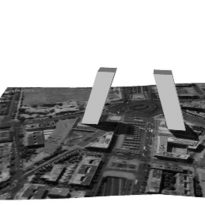
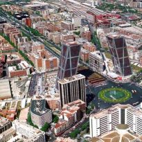
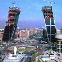
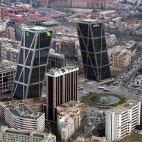
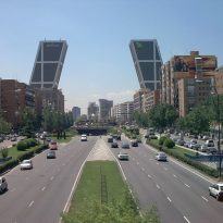
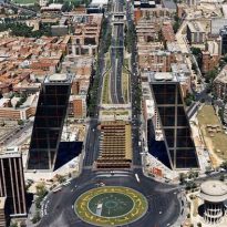
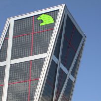
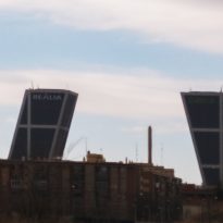
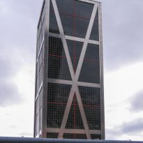
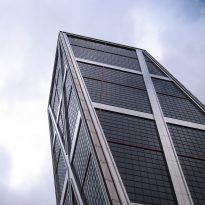
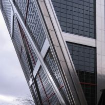
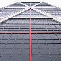
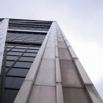
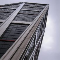
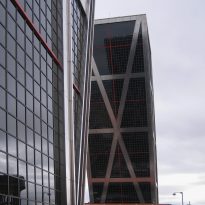
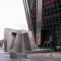
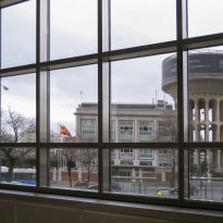
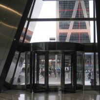
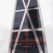
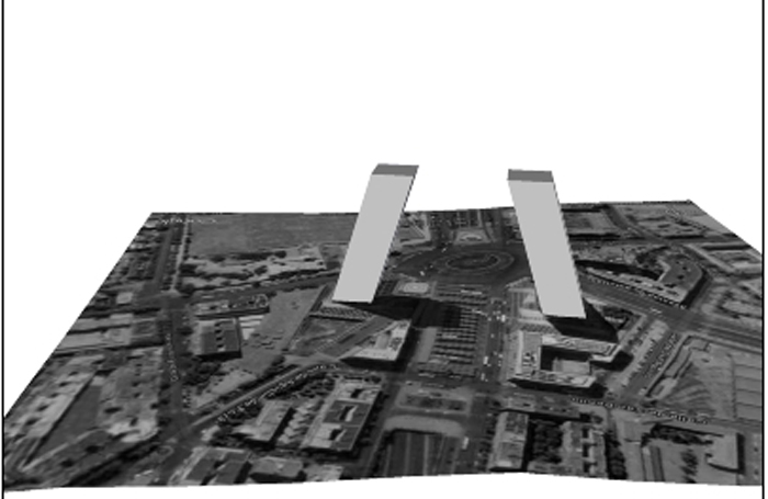
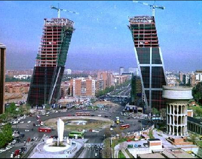
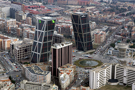
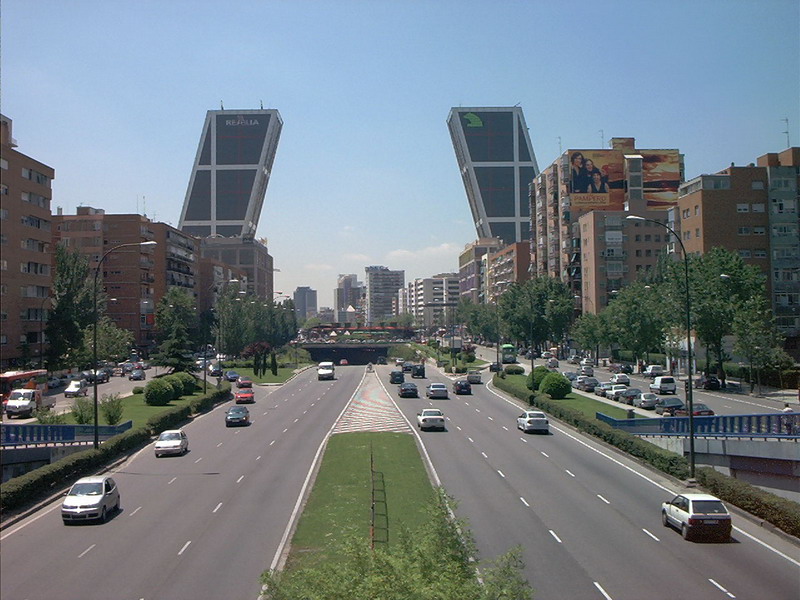
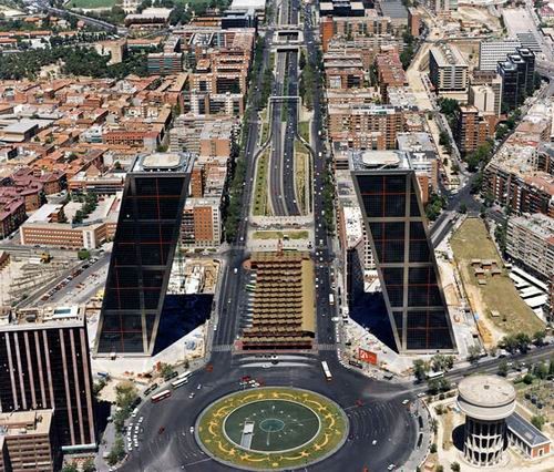
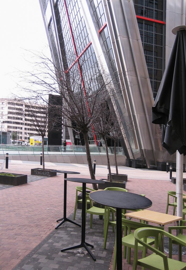
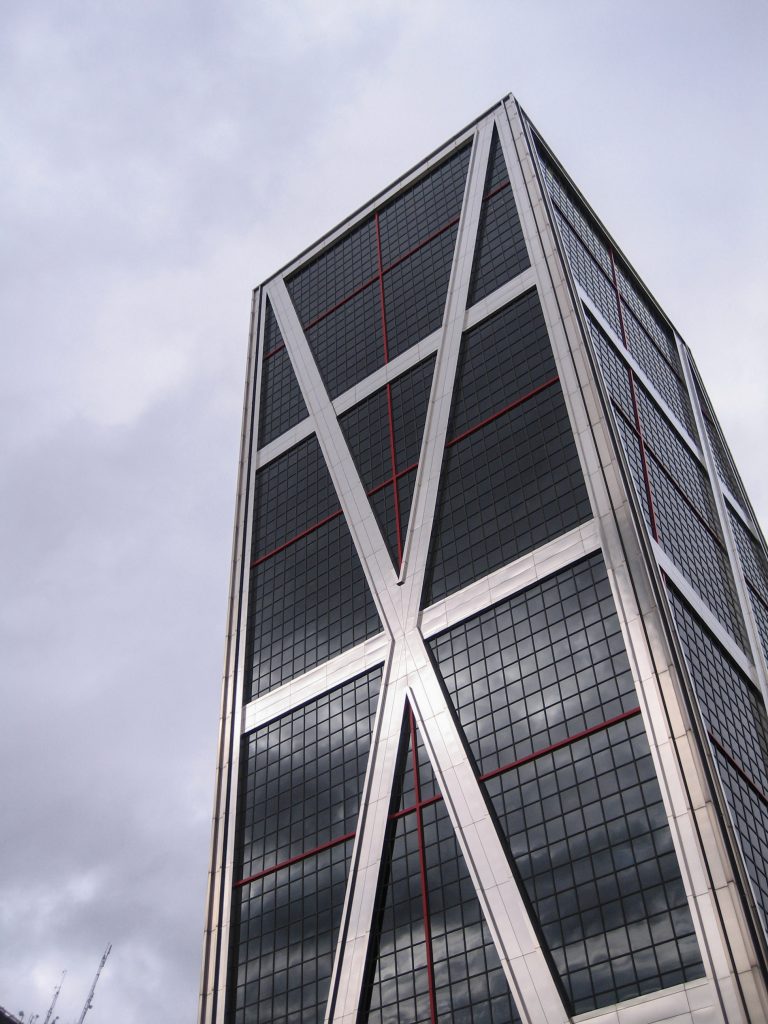
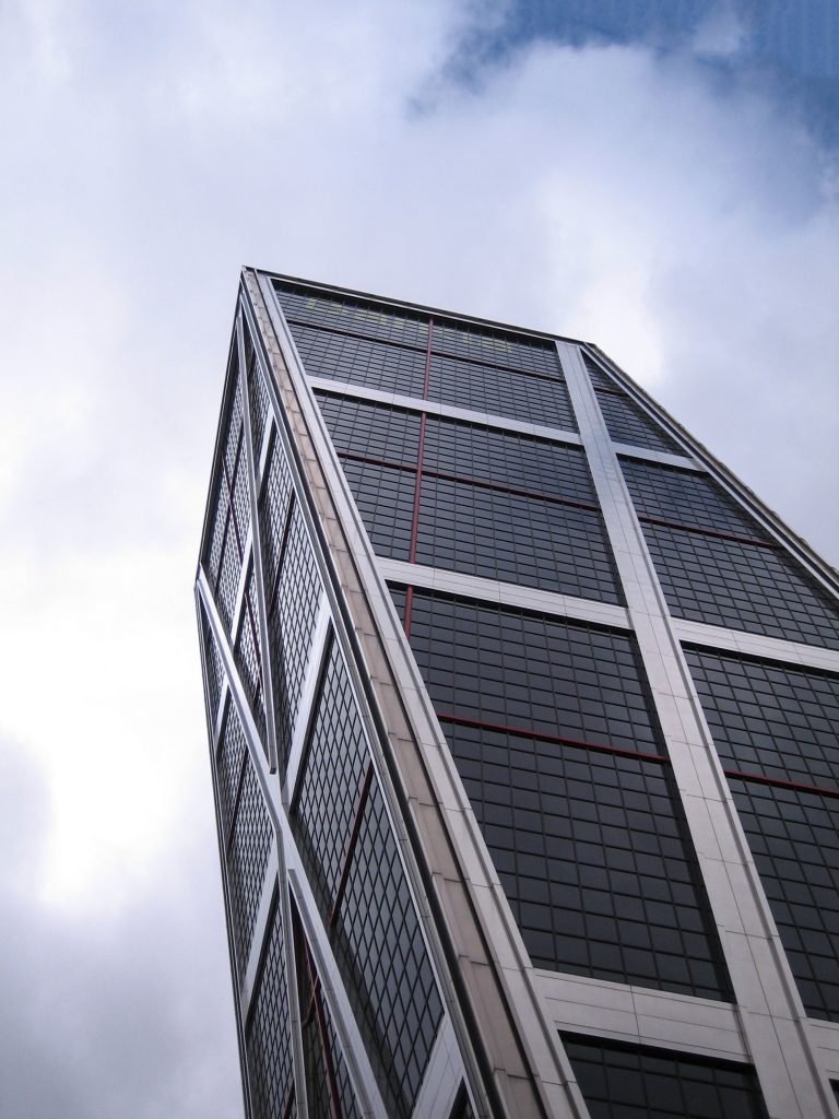
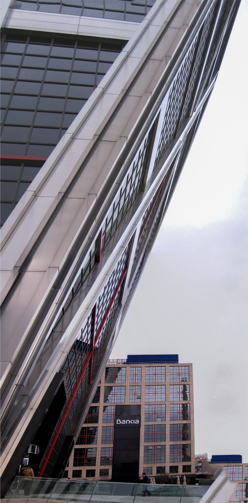
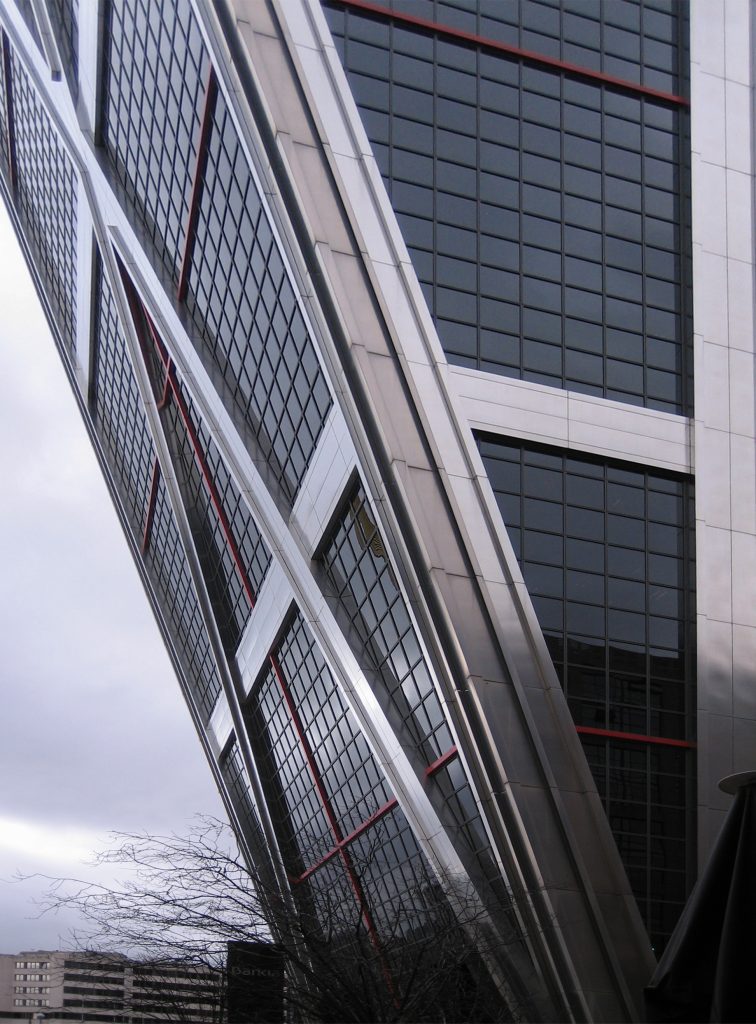
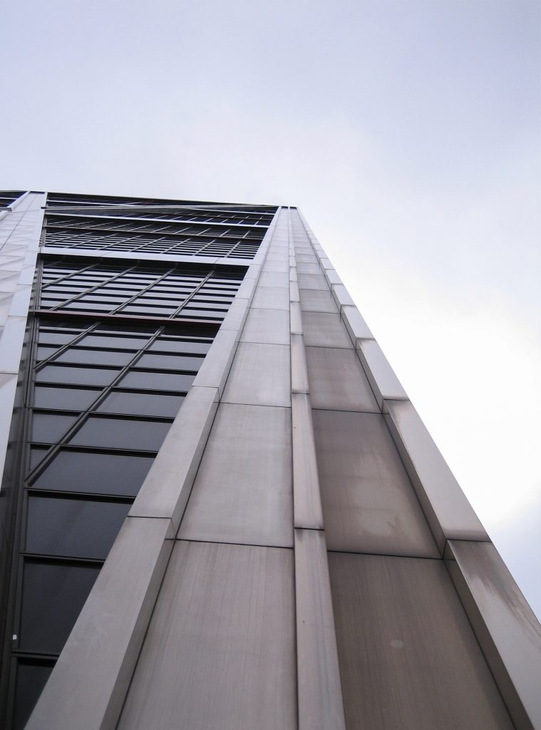
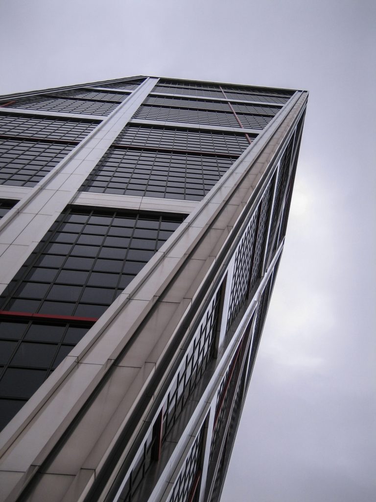
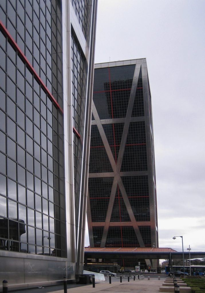
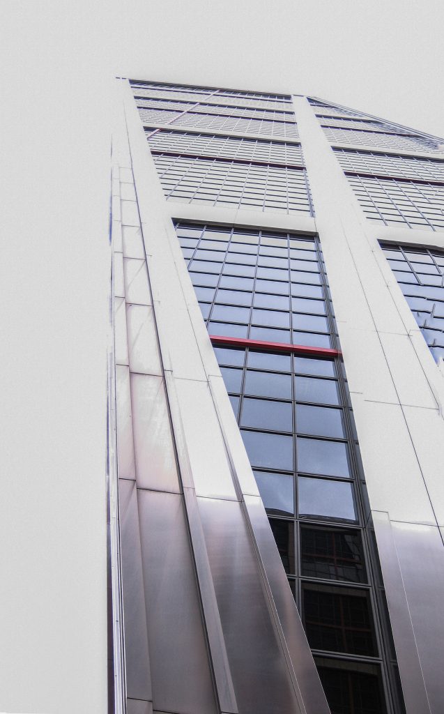
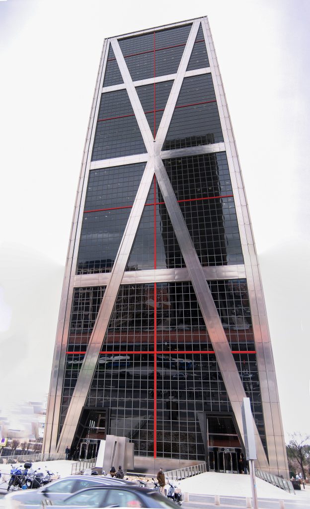
In contemporary times, faithful to this tradition, Madrid included in its townscape the Gateway of Europe, formerly Kio Towers, a spectacular framework comprises two towers tilted 15 degrees from the vertical, located opposite the Plaza Castilla and north Paseo de la Castellana.
And while the other tower as the Tower of Pisa, gained fame for his unintentional tilt, the KIO Towers (also known as because they were commissioned by the Kuwait Investment Office) were the first skyscraper inclined (deliberately) in the world. Subsequently, the towers were acquired by a Caja Madrid and the other by Realia.
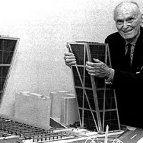
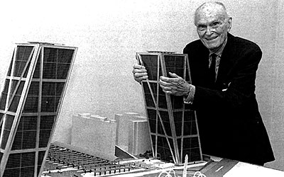
The task fell into the hands of the nonagenarian Philip Johnson, the patriarch American who in 1979 received the first Pritzker Prize in history, the Nobel of architecture, a disciple of Mies van der Rohe.
Back to modernism in the 90, Johnson, along with his partner John Burgee, decided again to leave the tradition of skyscrapers and vertical bet this time by two inclined buildings. To do so was based on a chart of Russian Alexander Rodchenko, which had an inclination of 15 degrees.
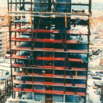
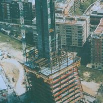
Its construction went through a series of financial difficulties that caused a break in the works for several years, so that its construction lasted from 1989 until 1996.
His real name is Puerta de Europa towers, the moniker coming from the KIO behalf of the Kuwait Investment Office promoter.
Location
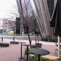
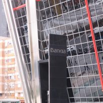
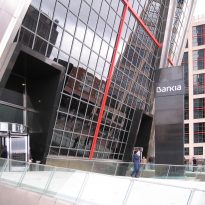
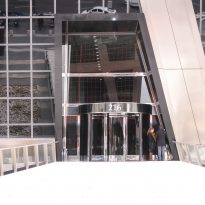
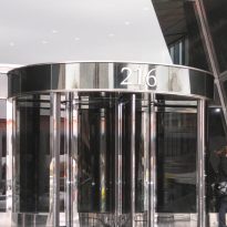
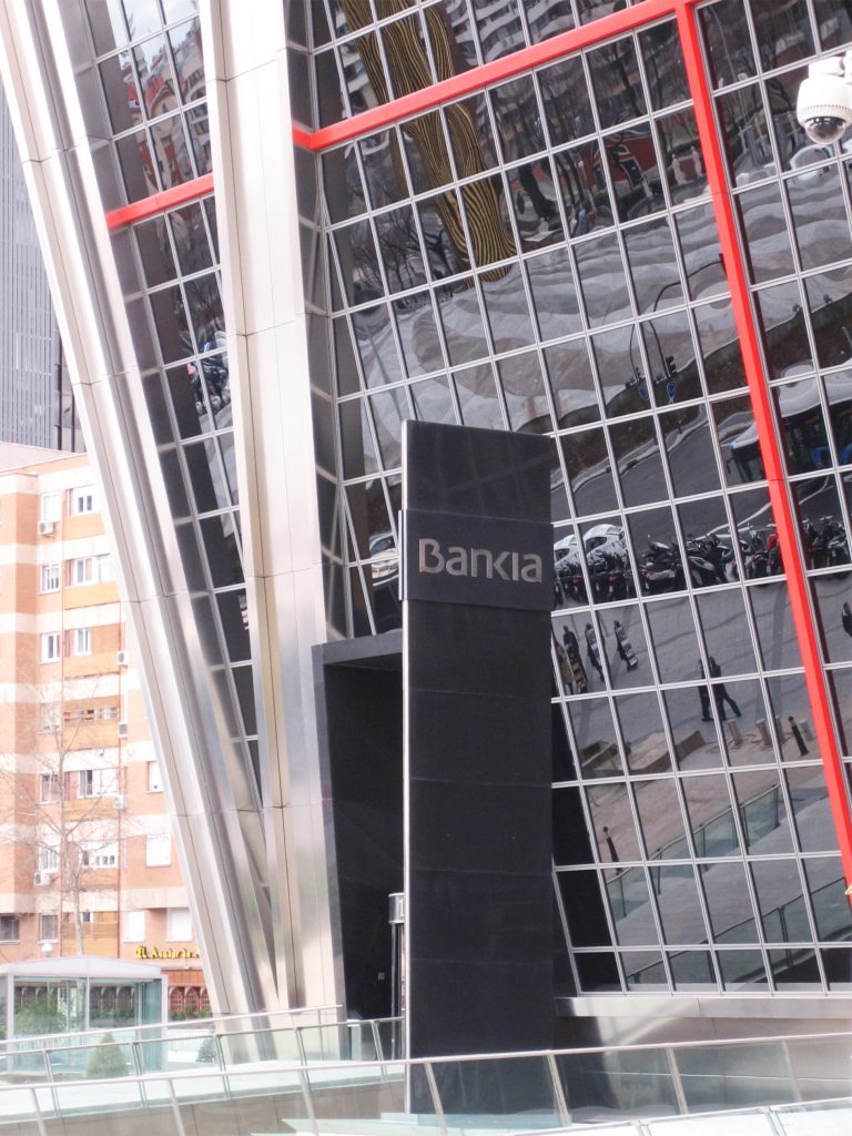
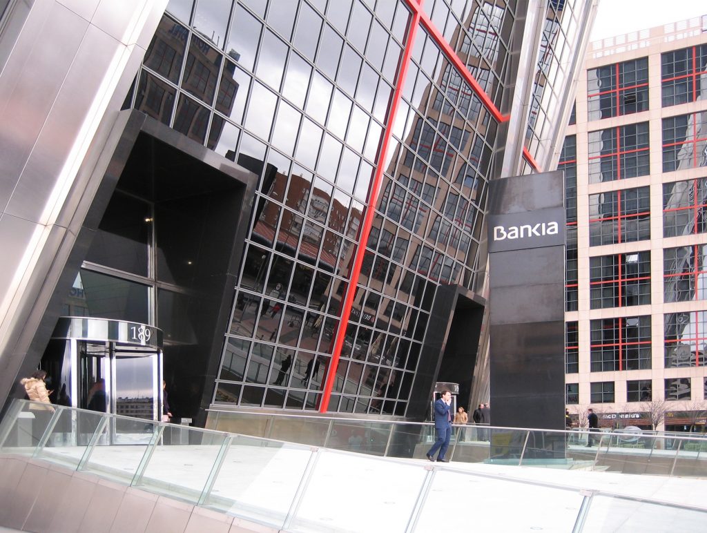
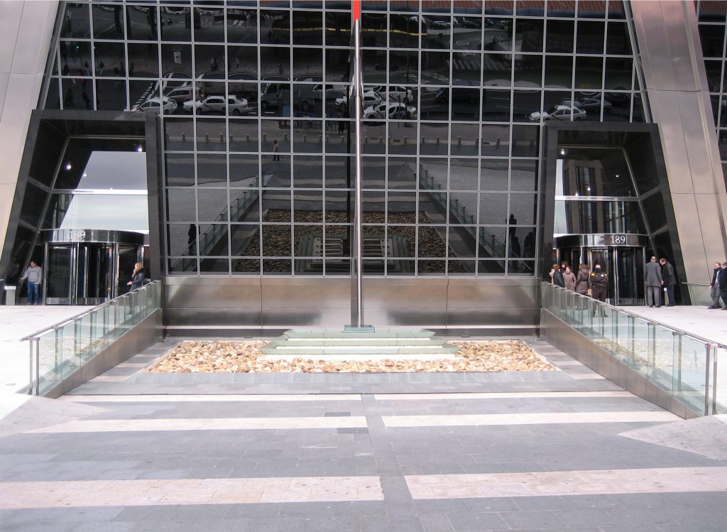
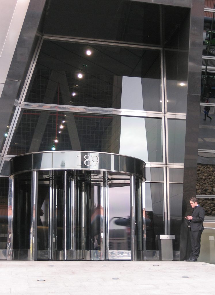
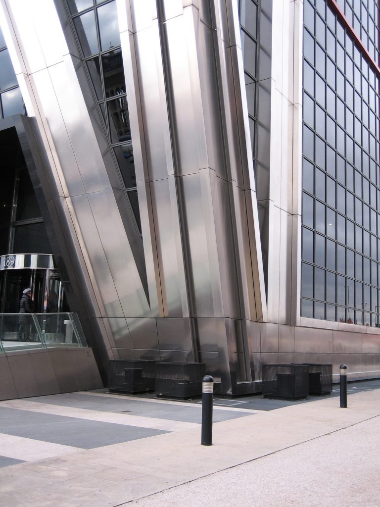
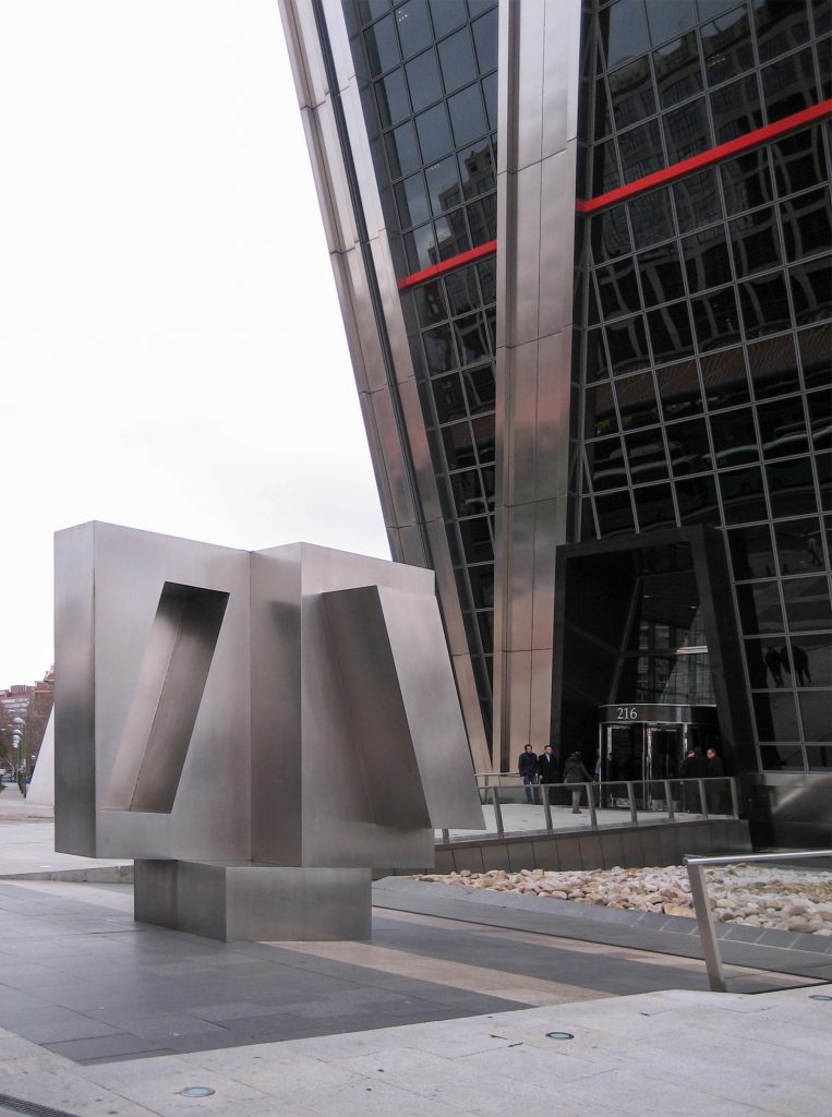
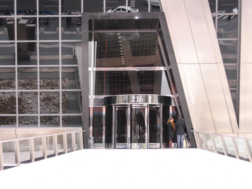
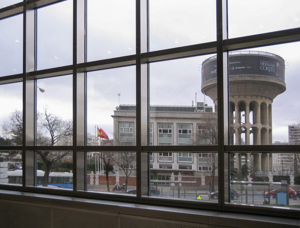
Located in the Plaza de Castilla, is the entrance to Madrid from the north. In the beginning was the direction Plaza de Castilla s / n, 28046 Madrid, Spain, but with its acquisition by companies and banks that hold it defined. Tower I occupied by Bankia has its address at Paseo de la Castellana 189 and Tower II occupied since its inauguration by the real estate group Realia in Paseo de la Castellana 216. La Castellana is one of the main streets of the Spanish capital, the towers rise almost at its end, in the Chamartin district, forming the heart of the district of Castilla.
- Nearest station: Plaza de Castilla
- Neighborhood: Chamartín and Plaza Castilla
Concept
They were designed with the idea of breaking with the concept of linear design. The postmodern design is classic Philip Johnson.
Johnson during his visit to the towers in 1996, said: “… We must end the right angle if we do not want to die of boredom…”, “… The architects we can concentrate now on a mission to make the shapes of the buildings that improve man… “the skyscraper is over, we can forget it. The architects we can concentrate now on a mission to make the shapes of the buildings that improve man “.
Johnson was based on a drawing by russian artist Alexander Rodchenko
Spaces
- Total Area 87,808 sqm
- Plants techniques 2300 m²
- Plants offices 54,000 sq ft, in which their workers have a view toward the empty
- Basements 33,808 m
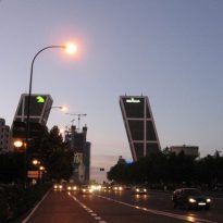
The tower on the left to exit from Madrid is known as Puerta de Europa I while the other is known as Puerta de Europa II. To avoid confusion its first features a helipad painted in blue and red in the second.
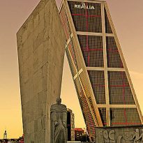
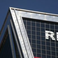
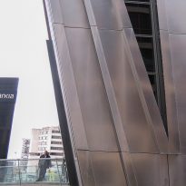
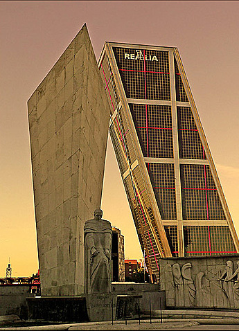
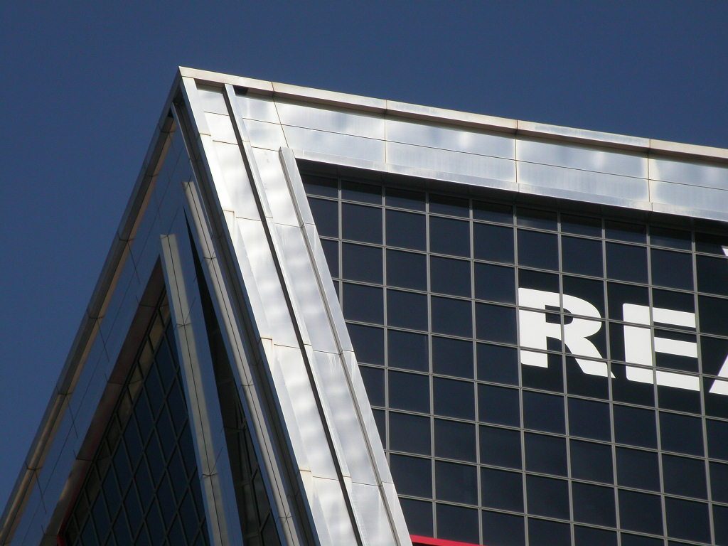
The tower on the left is the logo of Caja Madrid, while the tower on the right, has the logo of Realia, a real estate company. The logo of Realia has been added later.
Structure
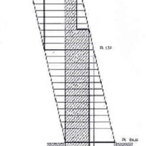
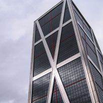
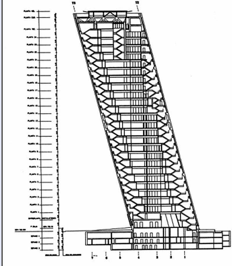
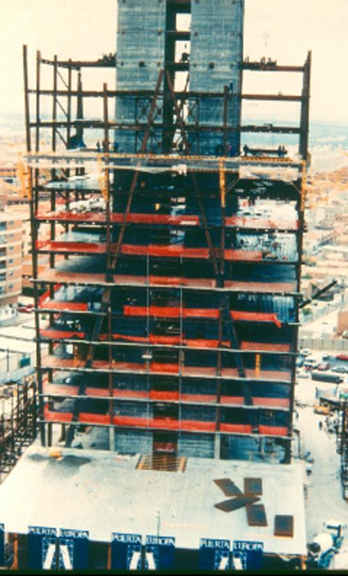
The structural solution to the dramatic tilt is achieved through structural steel, coupled with a rigid core, a prismatic reinforced concrete box that houses the stairs and elevators.
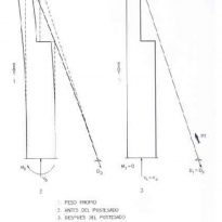
To counteract the thrust of the floors tilted to the side, a system of cables linking the upper part of the building with an underground counterweight located on the opposite side (the checks are written specifically for 60 x 10 x 10 m).
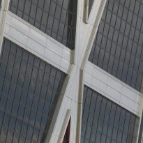
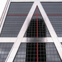
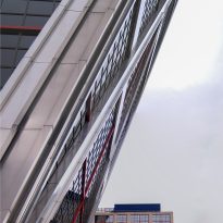
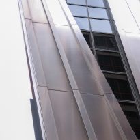
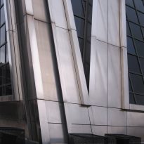
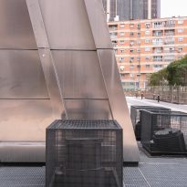
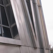
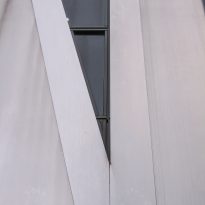
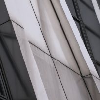
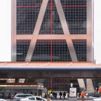
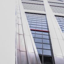
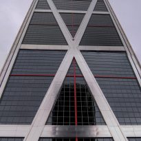
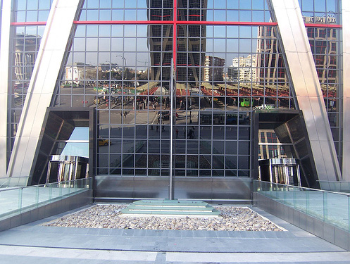
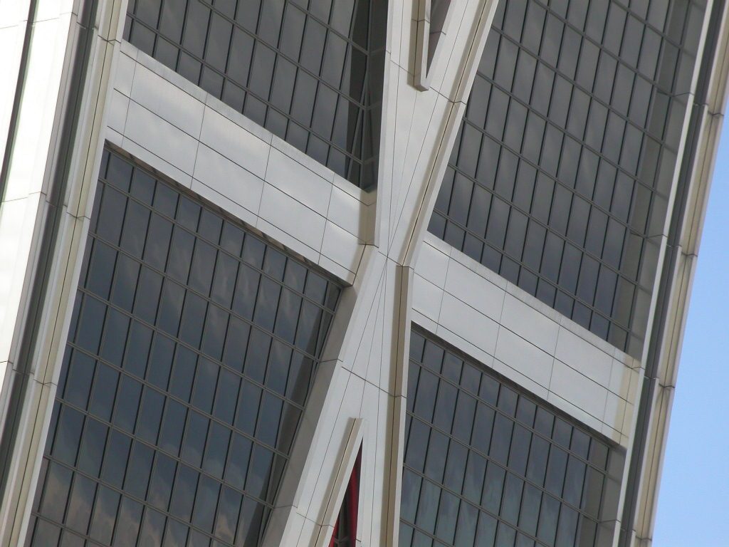
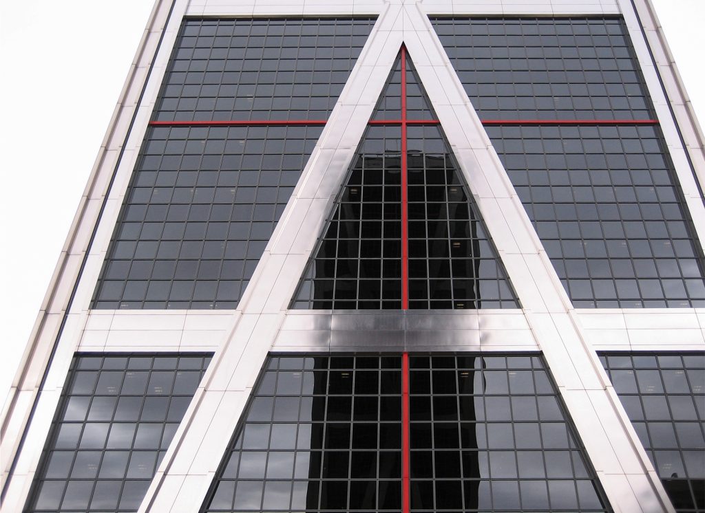
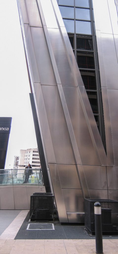
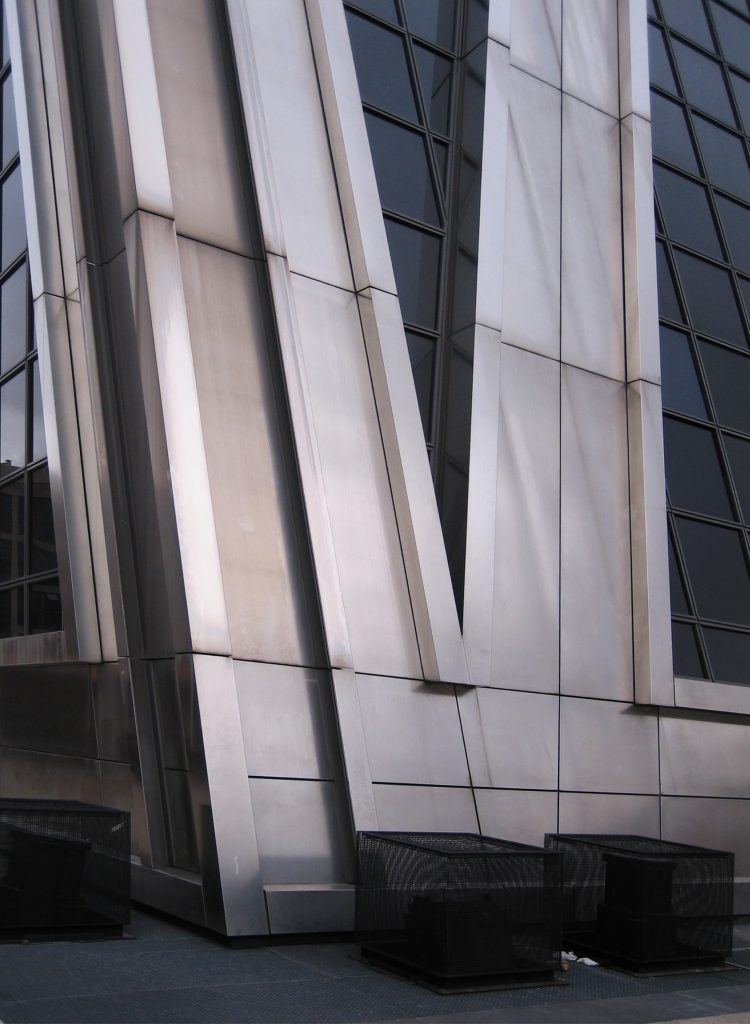
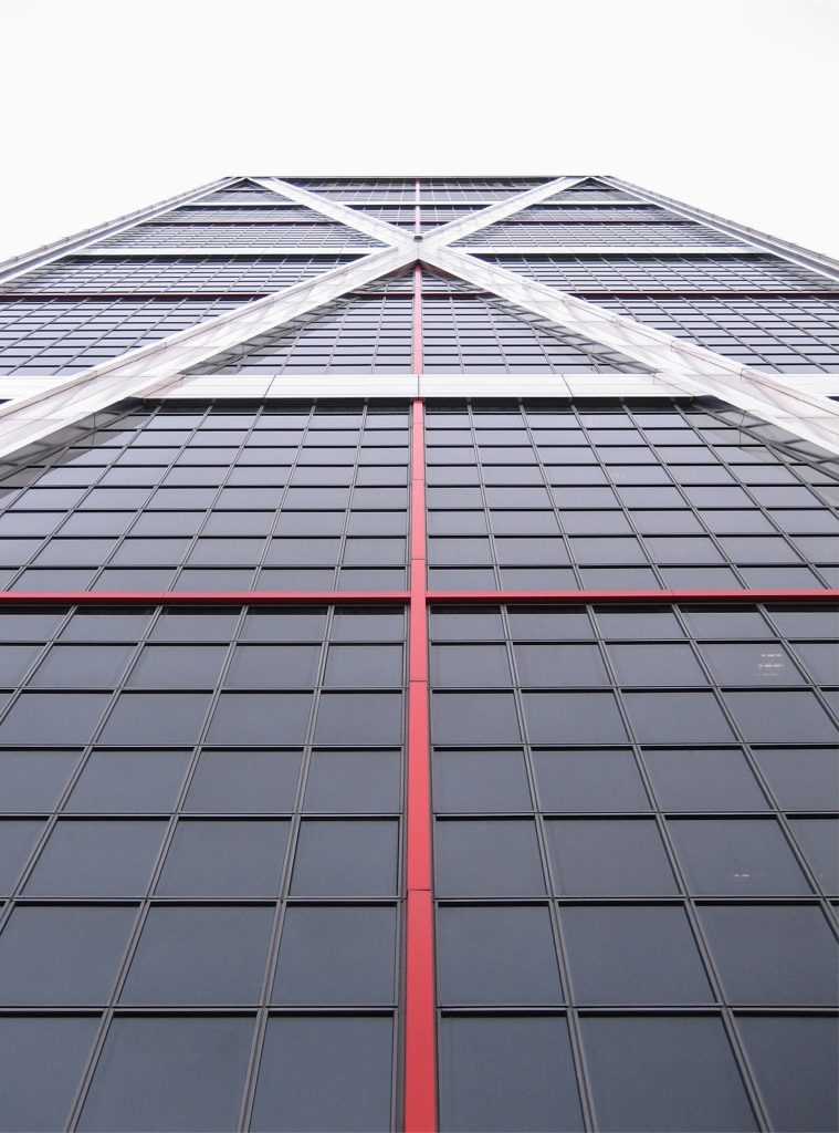
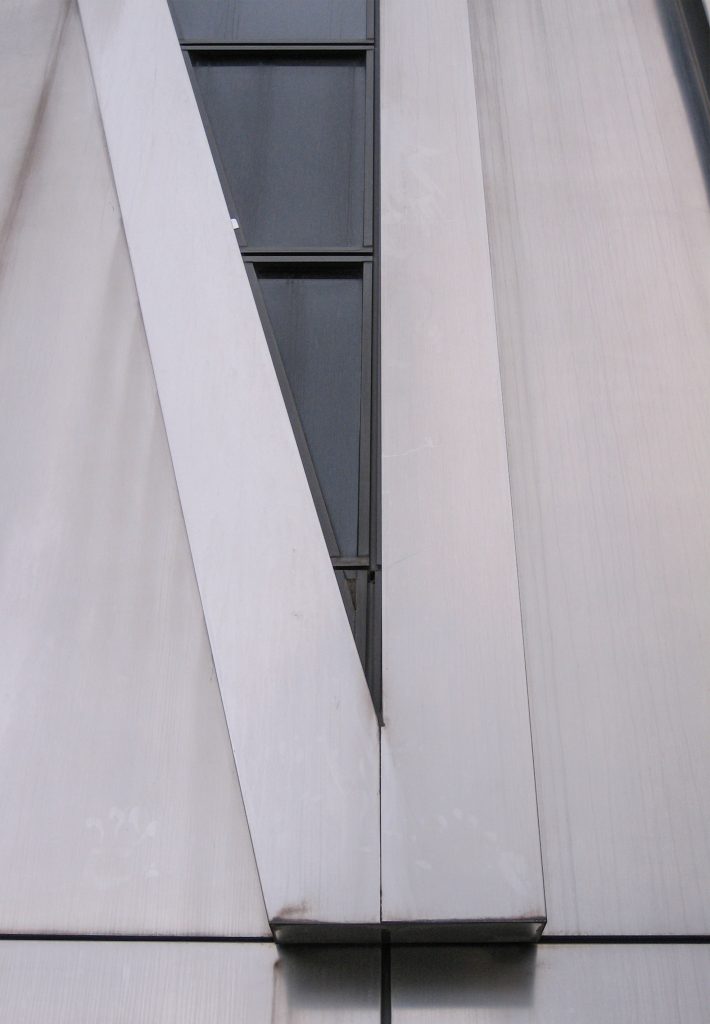
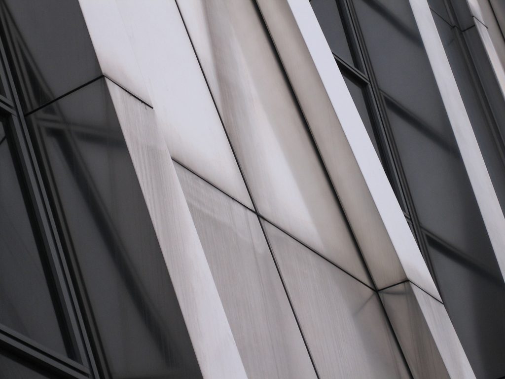
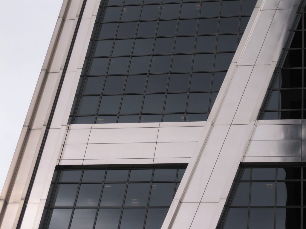
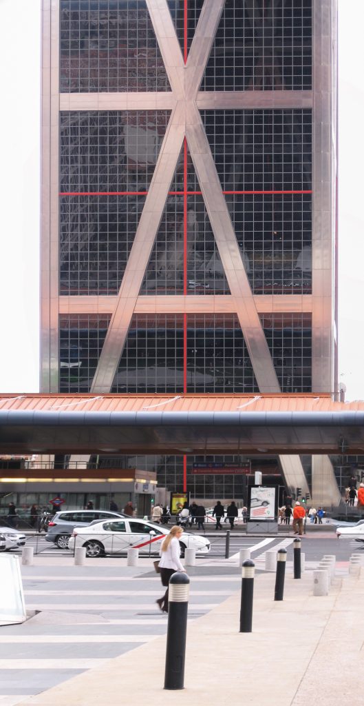
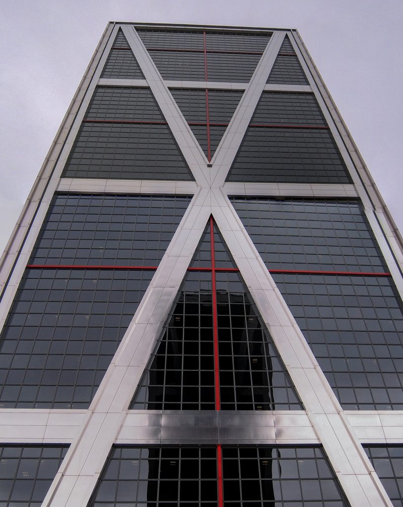
At the same time we opted for triangular elements that give rigidity to the structure and prevent deformities; hence the giant blades on the facades side and the two triangles which are divided into the main facade.
The structural design corresponds to the signature Leslie F. Robertson Associates, which also calculated the Twin Towers of New York (design of Minoru Yamasaki), the Torre’s Bank of China in Hong Kong and the Miho Museum in Japan, both works of IMPei.
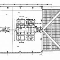
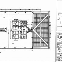
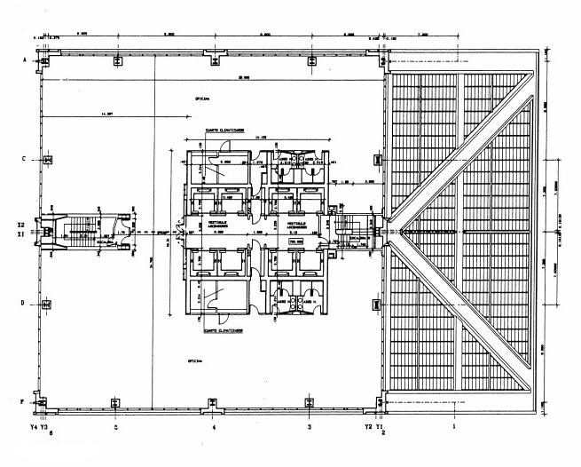
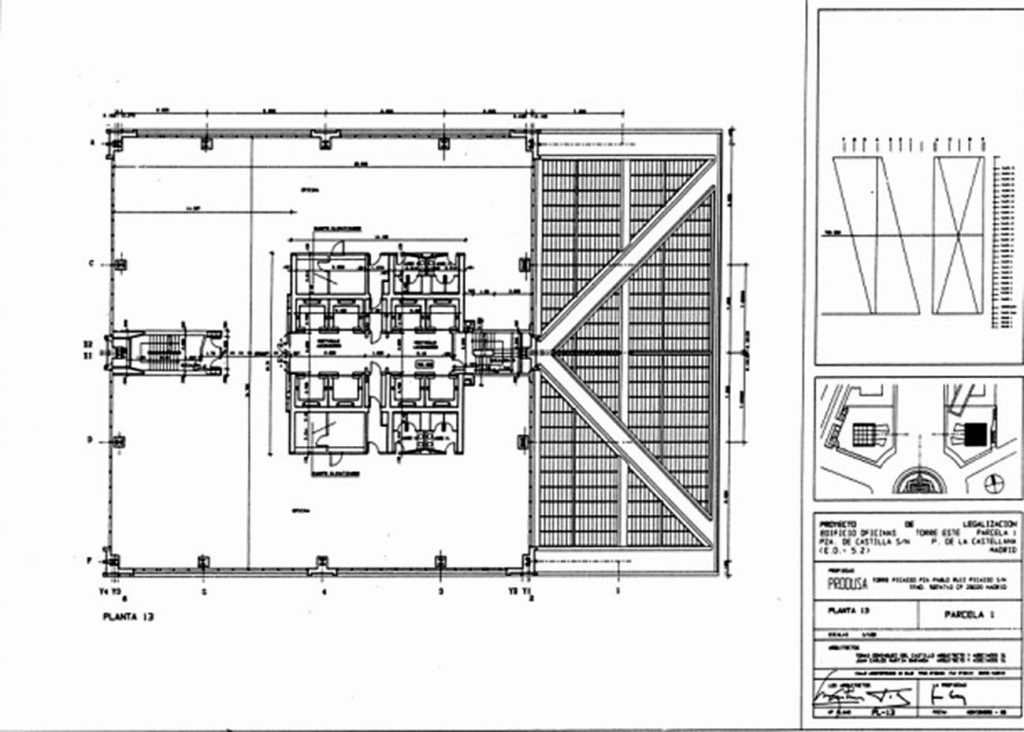
The office towers reaching 115 m in height each (one of the towers is 1 cm higher than the other) and fly about 30 m vertically from the base. They have 27 floors whose area is 1170 m2 each. Because the elevators did not go up vertically and diagonally, each floor has a different development.
Still, given that the vertical apex of the base coincides with the upper corner, had to be divided elevators in two parts: one climbs to the floor 13 and from there you change to another elevator to the floor 27.
The secret of its construction is based on the fact that most of its weight rests on a central axis of concrete and steel structure each, while the “inclined” to each of the towers is much lighter.
Metal Structure
Steel Type A-42 and A-52 Total Weight 8900 MT. Unions screws 200,000 pc
Steel armor: 4,200 tons
Steel postesado 140 tm
Concrete Structure
Foundation: Displays (H-175) 17,500 m³ piles (H-200) 13,950 m³ Encepados, beams and floors of basements (H-250) 16,800 m³ perimeter walls and slabs tower (H-275) 2,975 m³
Rigid nuclei (H-350) 8,400 plant Forged m³ (HL-200 Arlit) 6,780 m³
Facades
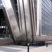
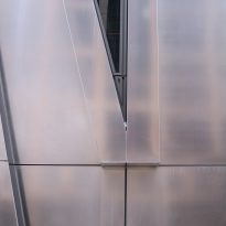
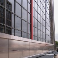
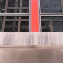
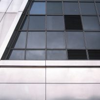
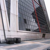
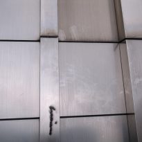
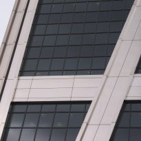
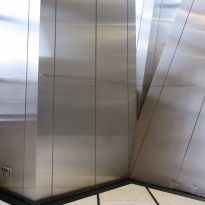
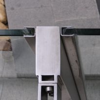
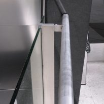
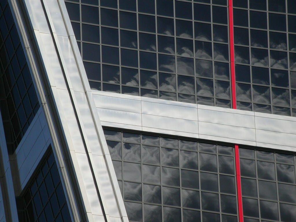
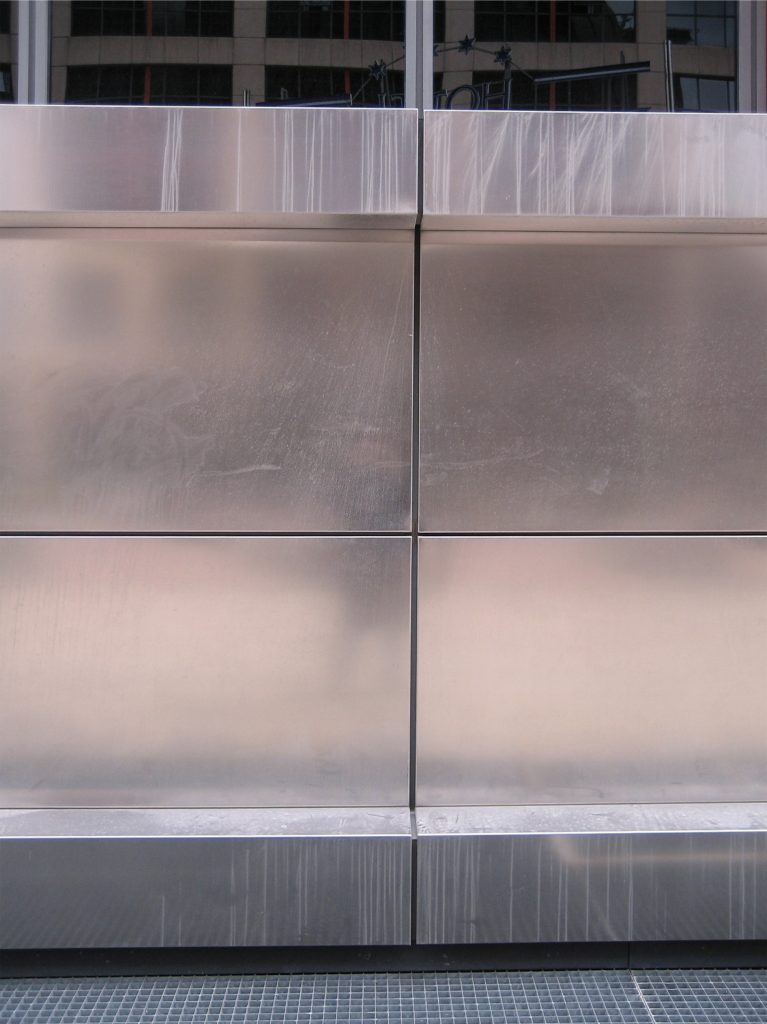
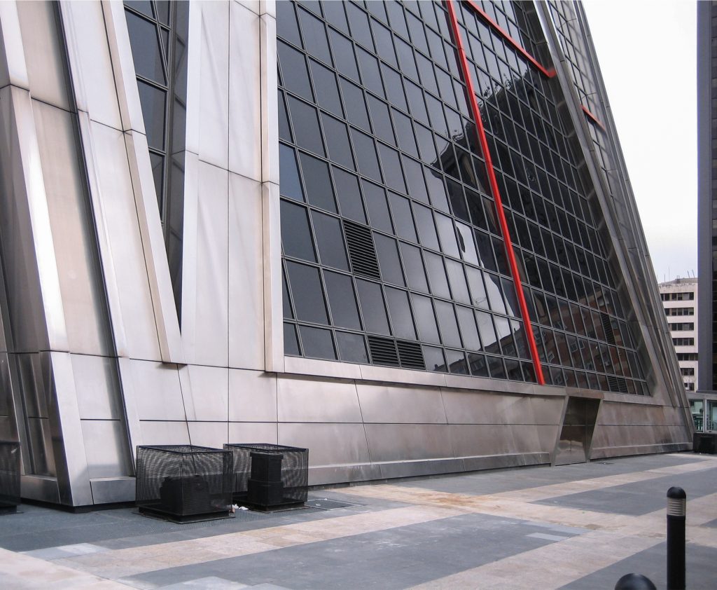
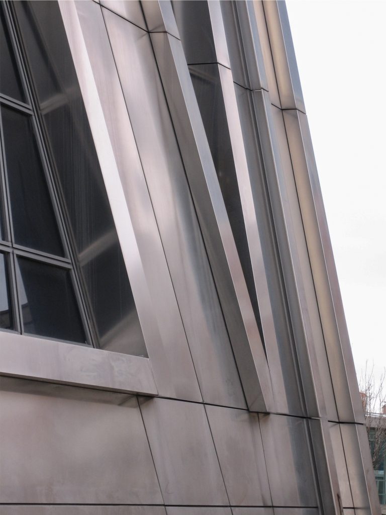
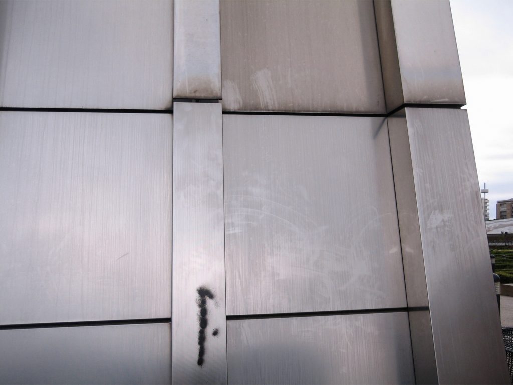
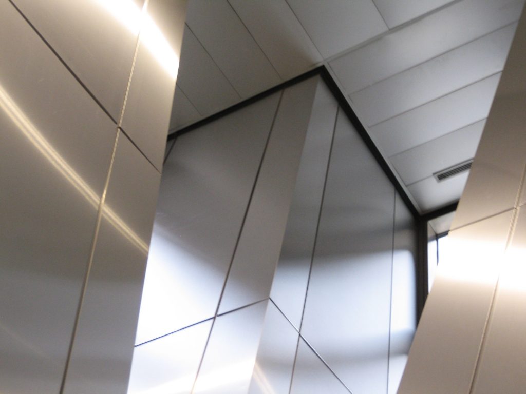
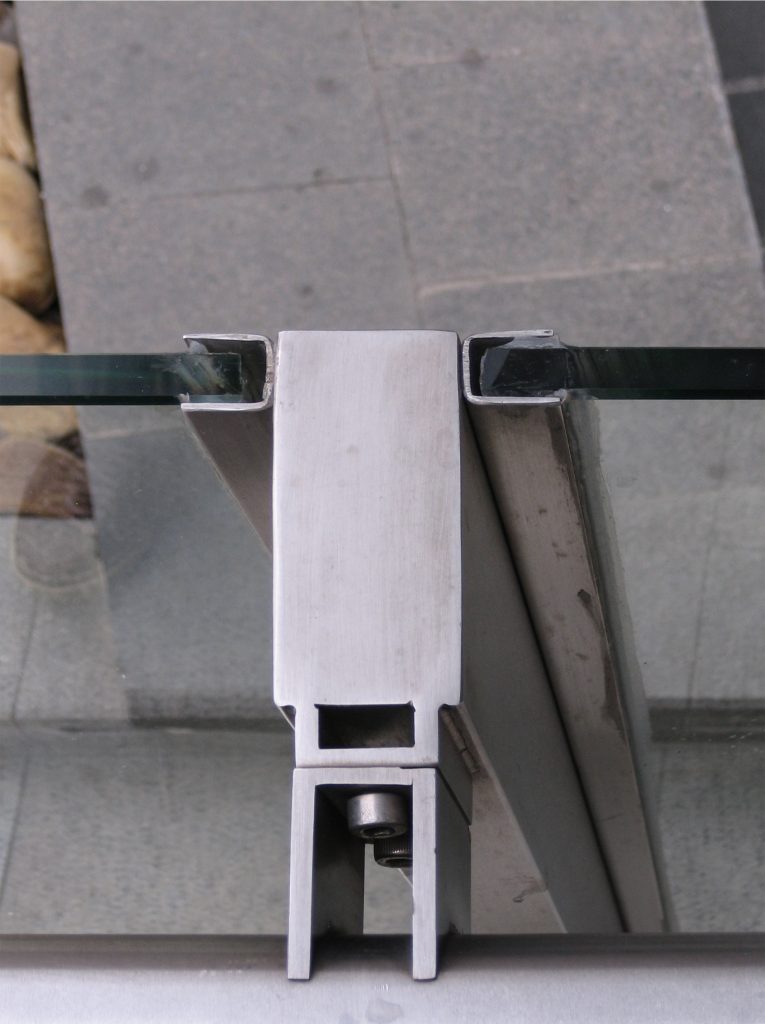
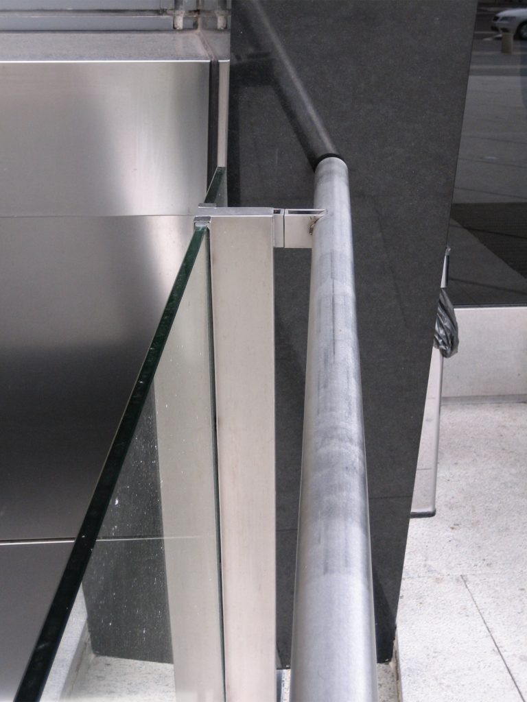
32,864 m² curtain wall. Glass 22,324 sq meters. Stainless steel 10,540 m²
Materials
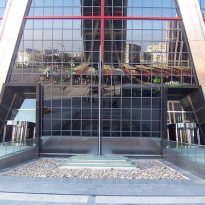
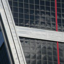
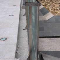
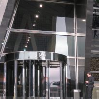
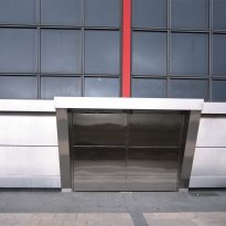
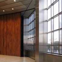
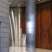
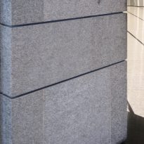
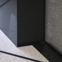
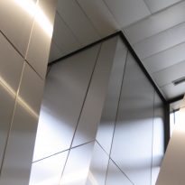
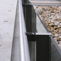
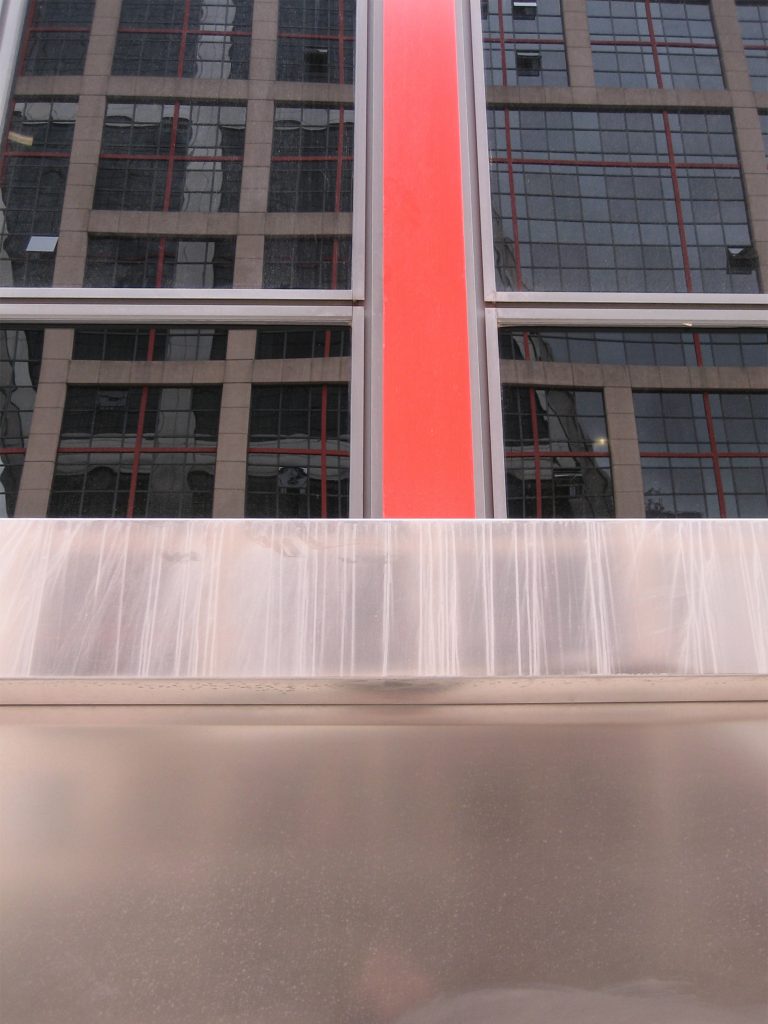
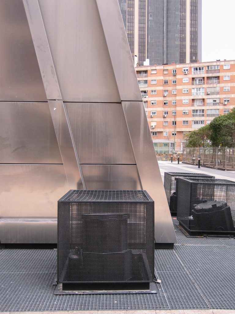
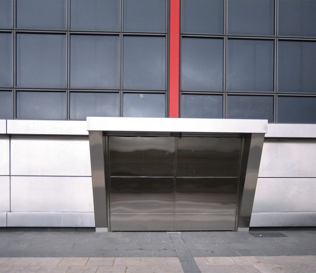
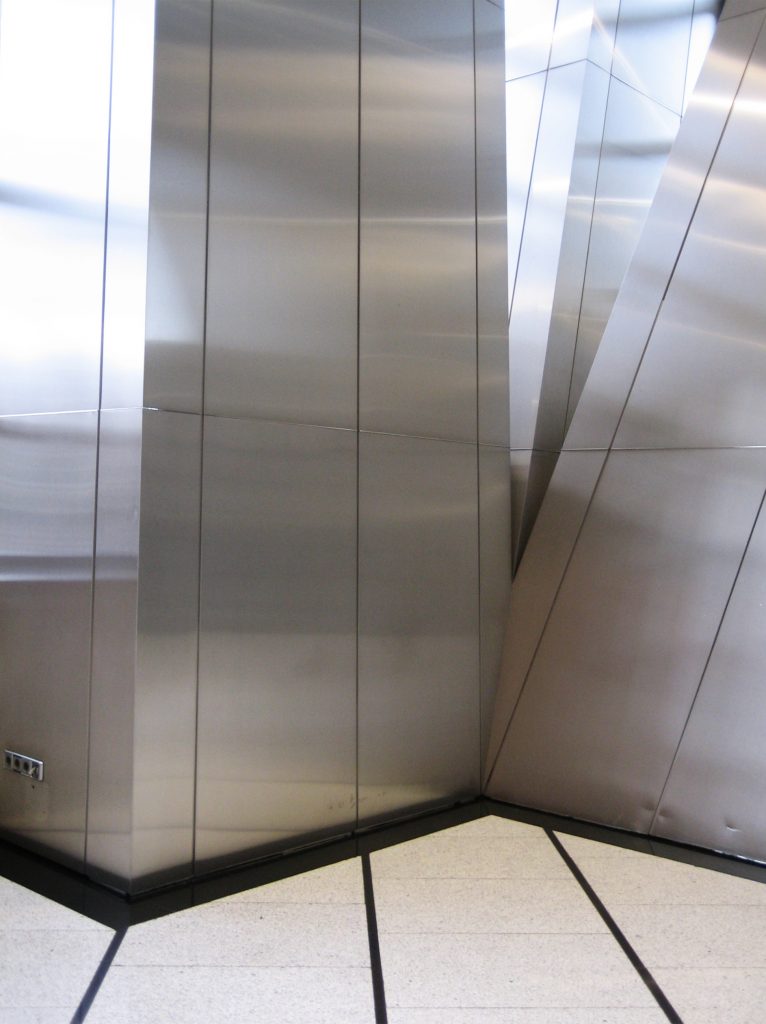
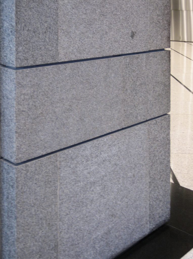
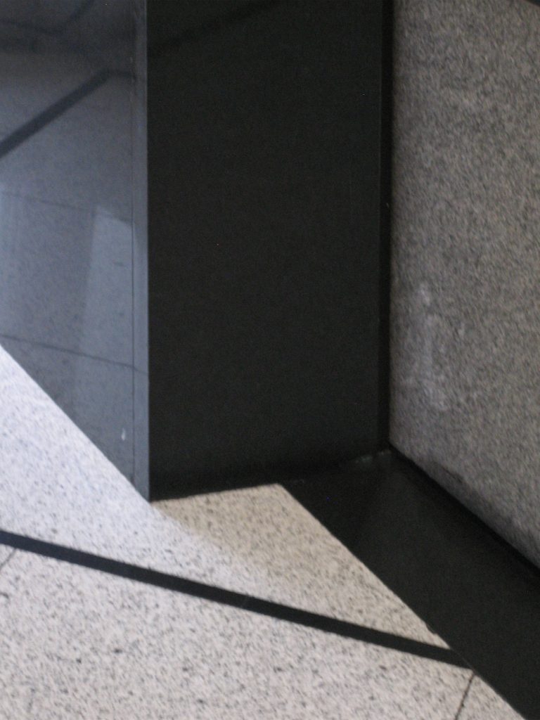
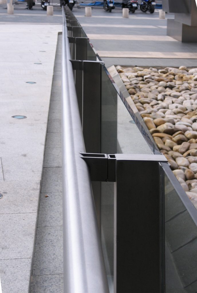
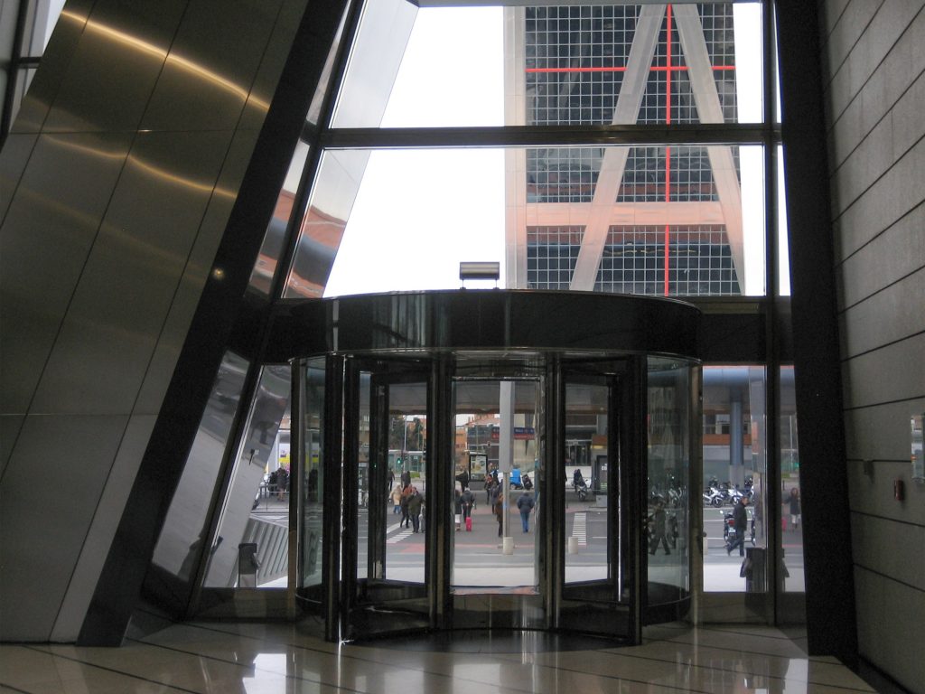
The KIO Towers are two buildigns of glass, granite and metal, symmetrically placed with respect to the axis Castellana. The structural steel parts diagonal, vertical and horizontal around a vertical reinforced core and can be viewed from the outside, as part of its appeal. The shiny metal is placed above a dark glass skin with a checkered print rojo.Cada tower has a helipad on top, one red and one blue.
