Johnson House / Riebe House
Introduction
Although Arts Architecture magazine significantly promoted Pierre Koenig’s architecture, he received few commissions from northern California. Cyrus and Elisabeth Johnson were one of the exceptions. The couple saw Koenig‘s work in the magazine and decided to commission him to design a house in the area.
Location
The Carmel Valley is located in a warm rural area, about 16 km from Carmel and the Pacific Ocean. The climate was not much different from that of southern California, USA, but the predominant architectural style of the area was by far the Spanish style.
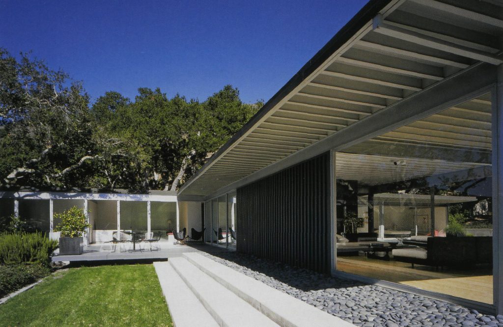
The plot the Johnsons had purchased in La Ranchería was oriented to the south, populated with oaks, and sloping from the street, offering views of distant rolling hills. To some extent, it was a plot comparable to the Case Study House No. 22, and Koenig approached the project similarly.
Concept
In the project’s notes, Koenig quoted the Johnsons saying that this house would be “a timeless design, a home that will still be here for our grandchildren.”
In his concluding remarks, he wrote: “The Johnsons believe their steel house will require minimal maintenance, as the materials used will neither crack nor deteriorate, nor are affected by fungi or insects are used.”
Spaces
Instead of building a swimming pool as in the CSH 22, Koenig leveled and reinforced the plot with a single-story concrete structure facing the landscape, which, once covered with trench fill, became the basement.
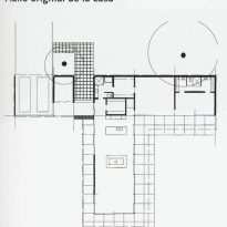
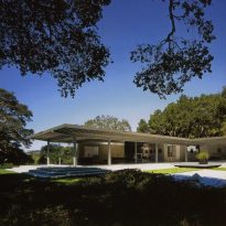
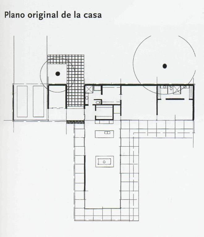
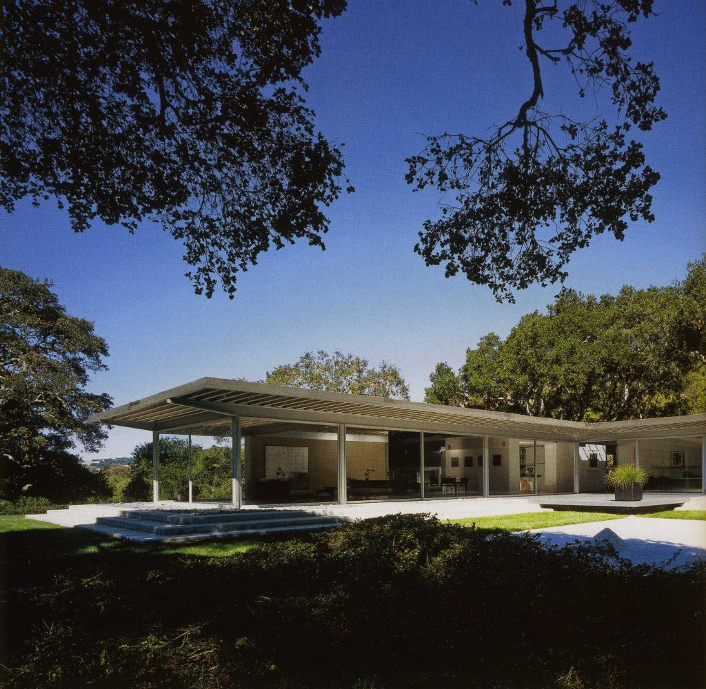
Above, at street level, he organized the garage, entrance, and bedrooms along the north side, and the kitchen and living room in a glazed and cantilevered wing facing south. Thus, the L-shaped layout of the common spaces mirrors that of the Case Study House No. 22. The only difference is the relocation of the entrance and garage to the other end of the bedroom wing, which kind of turns the L structure into a T-shaped layout.
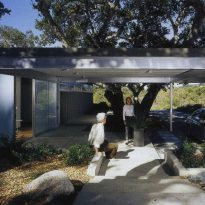
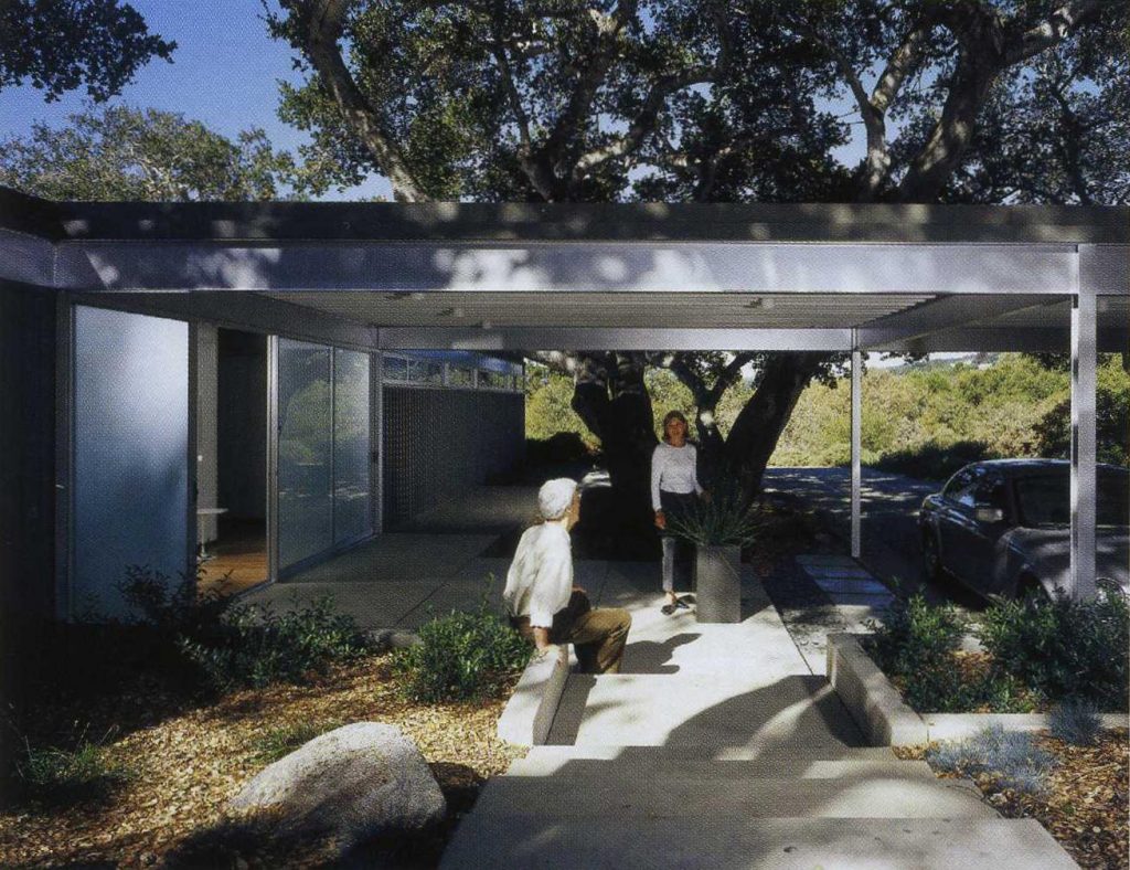
In the Case Study House, the garage was the property’s entrance in itself, and the access to the house happened via bridges along the pool. In the Johnson house, on the other hand, a small workshop separates the bedroom wing from the garage, creating a sheltered entrance with a framed view on the west side of the living room wing. The entrance hall is located at the connecting point between the living room and the bedrooms. While in the Case Study House one entered the house from the interior corner of the L layout, in the Johnson house, one enters from the outside.
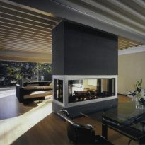
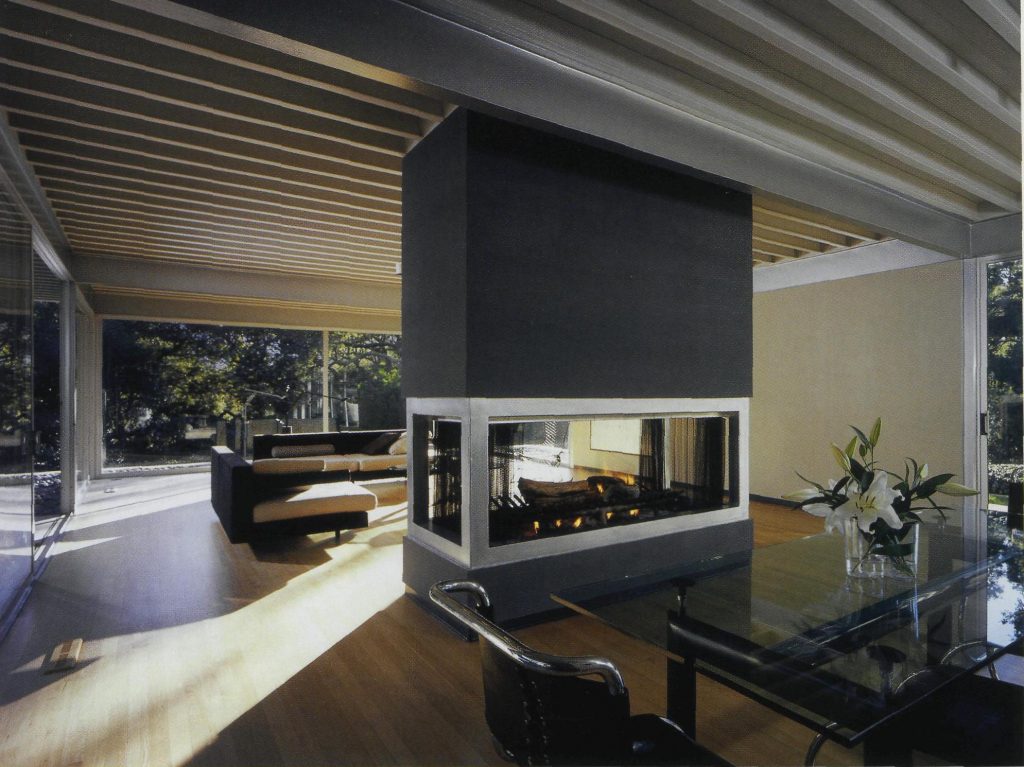
Still, in both cases, the stand-alone kitchen’s position directs the visitor to the living room and the central fireplace.
1995 Refurbishment
In 1995, Koenig returned to Carmel Valley to restore and expand the house for Fred and Cynthia Riebe. By then, the house didn’t stand out as much as it once did, since other modern homes had been built nearby.
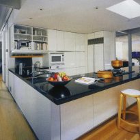
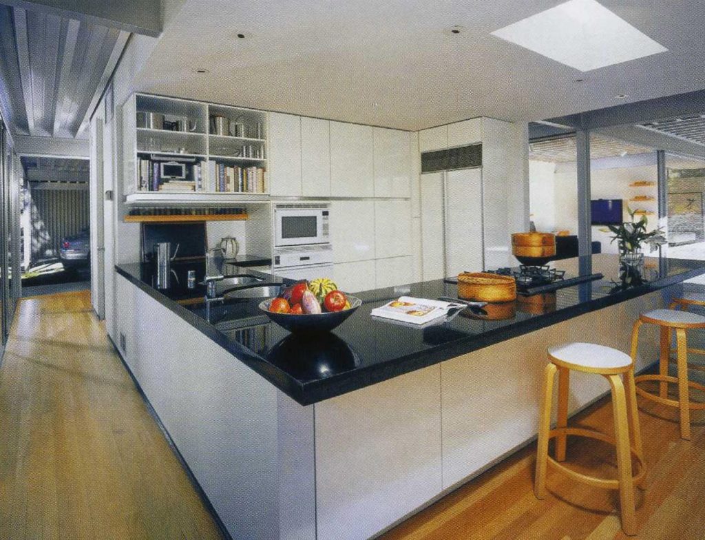
The restoration modernized the kitchen, which was extended toward the bedroom wing to accommodate a breakfast bar. The countertops and tall cabinets blocking the kitchen’s view were redesigned into a pantry wall occupying the lower part of the metal panels. A new drop ceiling with recessed lights was added to define the space and give a more enclosed feel.
More drastic was the rearrangement and extension of the bedroom wing.
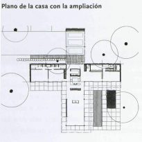
- First, the garage and workshop were replaced by two guest rooms under the existing roof.
- Then a new garage was built, set at a right angle to the previous one and aligned with the living room wing. This turned the T-shaped layout into a cruciform layout.
- The entrance was located at the northern end of the bedroom wing, creating a new access point where the master bedroom and dressing room used to be. These were relocated next to a new master bedroom at the eastern end of the bedroom wing, with a study between them and the kitchen. Thus, the building transformed into a dwelling more suitable for housing an entire family.
Structure and Materials
As with the Case Study House No. 22, Koenig adopted a 6-meter square grid with steel flange beams that span the entire length of the living room wing and project into space.
In the Case Study House the end of the beams was cut at a right angle, here on the other hand they are spindle-shaped beams that more aptly reflect the weight of the cantilever and give the elevation a cleaner feel.
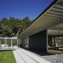
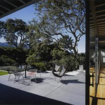
The roof is made of 150mm T-section metal panels, wider than in the Case Study House, and extends in a 2.10-meter overhang around the entire house. As Koenig writes in the project’s notes, the cantilevered roof, besides protecting the interior from sunlight, increases “the feeling of living in close contact with the outside”. Here too Koenig used 2.40×3 meter sliding glass doors to enclose the living room wing and the south-facing facade of the bedrooms, but at Johnson’s request, he also created a solid 6-meter wall on the west side of the living room to protect the furniture and the piano. Inside, the living room finish is natural teak.
Outside, the house is clad in vertical metal panels painted a light beige, matching the faded oak wood of the interior floor. As is typical in Koenig‘s buildings in this period, the ceilings are exposed metal panels, painted white.
In this house, as in the Case Study House No. 22, choosing a 6-meter square grid doesn’t fully exploit the steel’s structural potential, although the beams jutting out under the cantilever at the southern end suggest a linear form. However, this was a necessary choice as the bidirectional nature of the T and L-shaped grid doesn’t allow for one dominant direction. In the Oberman house, built around the same time, as will be seen, the linear nature of the layout allowed Koenig to organize the structure unidirectionally and then bracing it with structural metal panels.
