James R. Thompson Center
Introduction
Seeking to reverse decades of decline in Chicago’s financial district, the city laid out a renovation plan during the 1970s and 1980s.
Taking advantage of that opportunity, the State of Illinois combined 50 state offices in a new building that together with three other major government buildings, located one street away from each other, aimed to become a “people-friendly center,” a welcoming and easily accessible place not only to do business with the State of Illinois but also to walk, shop or dine.
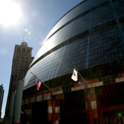
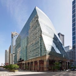
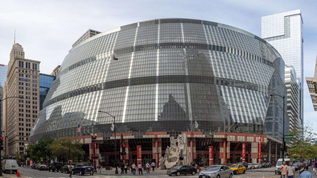
Its unique, postmodern design, compared on numerous occasions to a spaceship, has long been the subject of both praise and criticism, and its high maintenance and operations cost, estimated at $17 million a year, has been a drain on state resources. The building, designed by Helmut Jahn in 1985, has been threatened with demolition since the early years, when state officials argued that it was too costly to maintain and proposed selling it. Saving the building gained momentum as a preservationist cause in 2017, when the state government formally put it on the market. In 2019, the National Trust for Historic Preservation listed the building as one of the most endangered in the country.
In 2019, when the state finally authorized its sale, Illinois Governor J.B. Pritzker said, “The Thompson Center has outlived its useful life in its current state.” Now, it finally has a new owner: Google, which bought the building for $105 million and plans to use it as a second headquarters in Chicago.
For those concerned about its preservation, it is a good sign that a company like Google has bought the building. Technology is one of the few industries that actually invests in architecture, at least in the form of corporate overreach through billion-dollar campuses designed by famous architects like the Google Charleston East Campus-Bay View (2022) by Bjarke Ingels in collaboration with Heatherwick Studio, or the building that in 2018 Frank Gehry designed for Facebook at the Menlo Park Campus.
In recent years, companies like Apple and Google have turned to the adaptive reuse of historic structures, which involves costly restorations.
Google, which is headquartered in Mountain View, California, has had a presence in Chicago since 2000. It currently employs about 2,000 employees in the area of the city known as Fulton Market.
Location
The Thompson Center, located at 100 W Randolph St, Chicago, IL 60601, USA, is connected to the city’s Pedway system, a network of walkways and tunnels linking many buildings and transit stations in the loop. It is the only building in the city where six L train lines converge, easily connecting it to the south, west and north sides of Chicago.
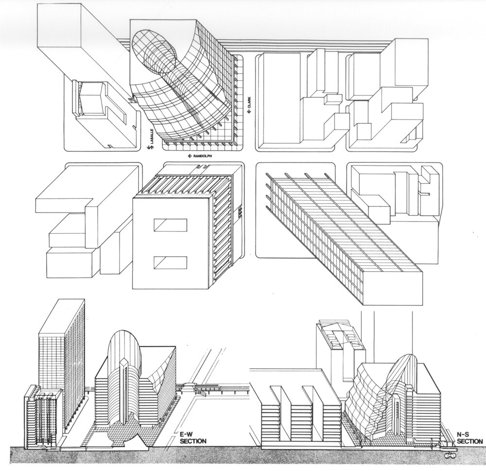
The building is located inside the city’s Loop, on a lot bounded by Lake Street to the north, Randolph Street to the south, Clark Street to the east and LaSalle Street to the west.
Concept
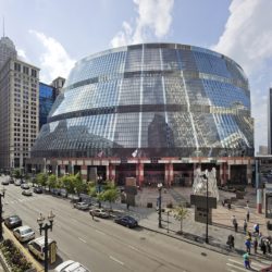
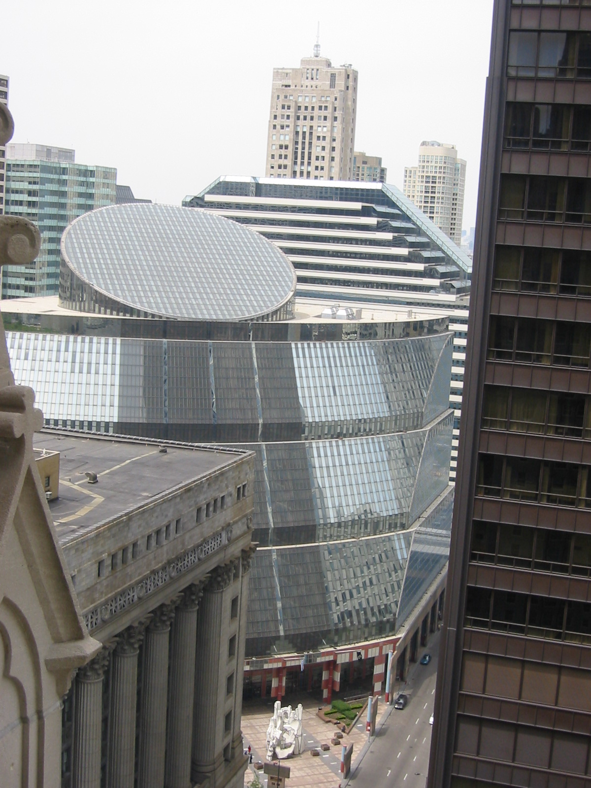
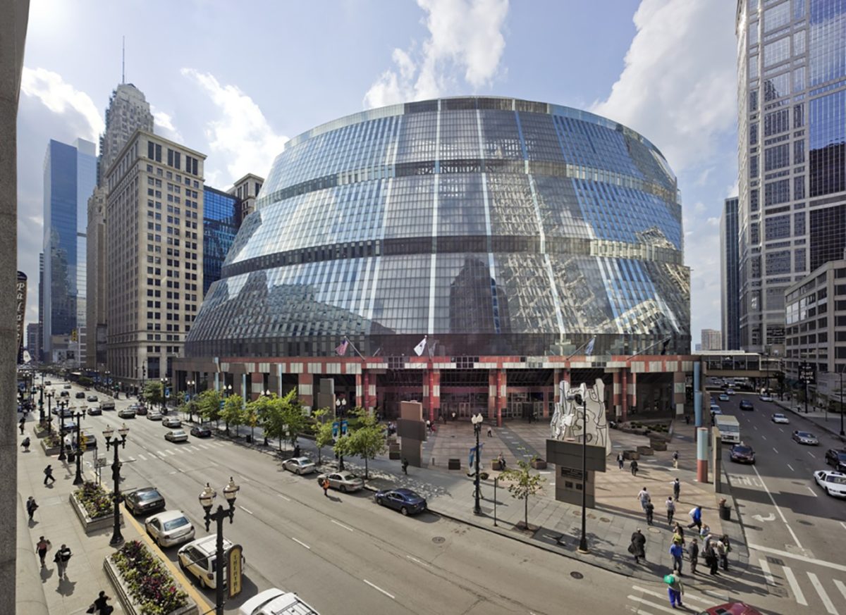
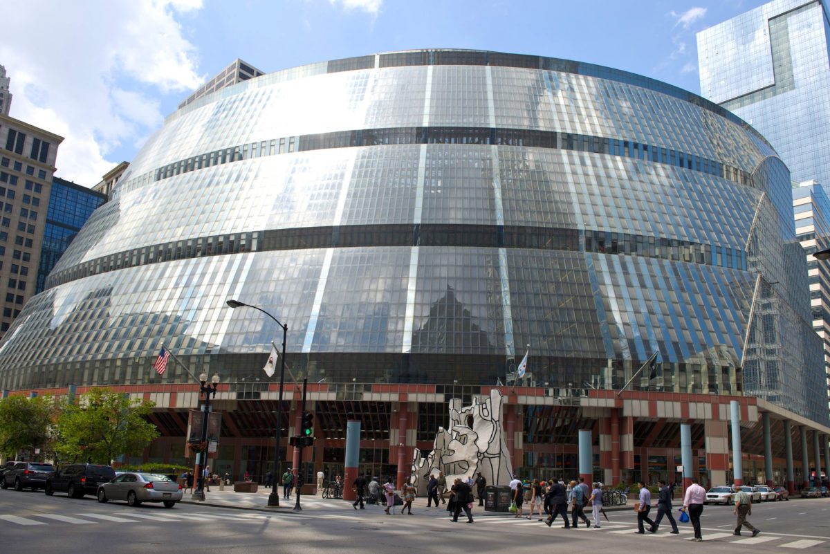
The state government center designed by Helmut Jahn is a clear example of postmodern architecture, with colorful details and a shape that references the dome of the state Capitol. In addition to making a bold first impression, its design is intended to communicate a message: the building’s openness and transparency are meant to symbolize the state’s commitment to serving the people.
With this building, the architect proposes a new type of civic space open to the public. The “open office” concept in the floor plans and the use of glass symbolically expresses the idea of an accessible and transparent government. Despite its high-tech aesthetic, the human is at the heart of the Thompson Center’s design.
“…It is intended to provide a humane and stimulating environment, thus restoring the social role of architecture… ” (Murphy J., 1985).
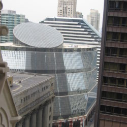
Although from the outside many observers have pointed out that the Thompson Center looks like a stadium or a spaceship, upon entering the building they can only be amazed at the sight of a building that brings vitality and excitement to a government building that brilliantly demonstrates the transparency called for by Governor James Thompson when the building was proposed.
Design
In 1978, after his re-election, Governor James R. Thompson commissioned architect Helmut Jahn to build a landmark building in the heart of Chicago to represent the state of Illinois. The building would be constructed on a lot adjacent to City Hall, the County Building, and the Chicago Civic Center.
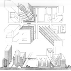
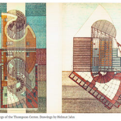
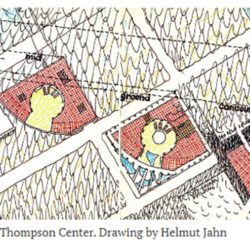
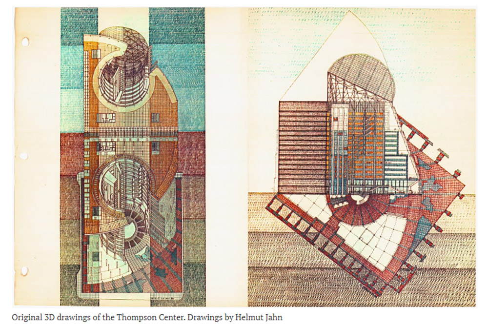
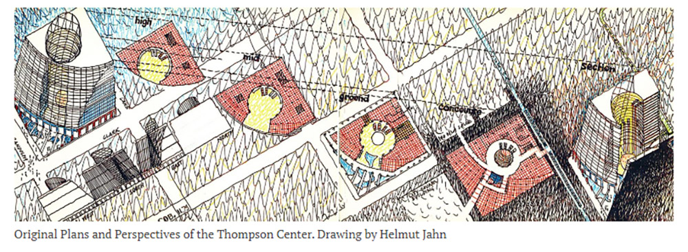
Jahn designed eight schemes for the site and evaluated each based on the percentage of the site the building would occupy, its function, technical difficulty, aesthetic quality, initial construction cost, and ongoing operations. The first scheme was a high-rise tower oriented east-west on the site; the second, a high-rise tower oriented north-south; the third scheme was an L-shaped building of medium height; the fourth scheme was a medium-rise building in the form of a cut block; the fifth was what Jahn referred to as a broken box of medium height, with an open central courtyard; the sixth scheme, a low-rise doughnut, would similarly have an open central atrium; in the seventh scheme, the building stepped back and had an enclosed central atrium. The eighth scheme was the final choice of the governor and is the design that was constructed.
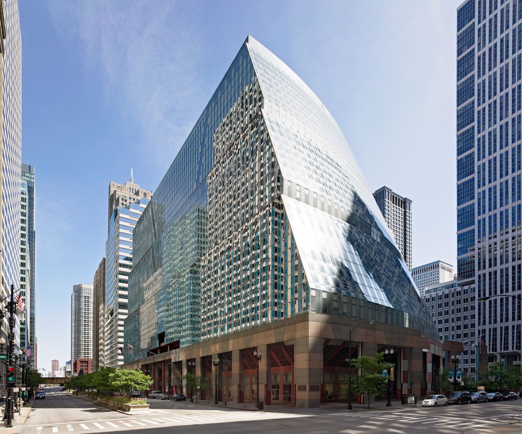
The building inverts the modernist concept of a tower and plaza by drawing the city into the building, moving the public space inward, and flattening the tower into a cylindrical form reminiscent of state capitol domes. The architect’s final rebuke to modernist conventions is inside. The corner of the clear glass entrance blatantly gestures toward the modernist Civic Center, the City Hall, and the classically designed County Building, located on the southeast corner and south sides of the site.
Spaces
With this building, the architect reinterprets the grandeur of government buildings. Its size complements the city/county hall building across the street, rather than dwarfing it as a skyscraper would. Jahn brings the interior open space into a large atrium, a focal point similar to a capitol’s rotunda.
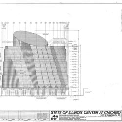
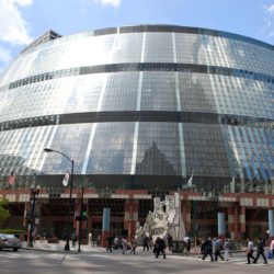
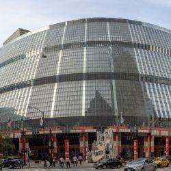
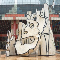
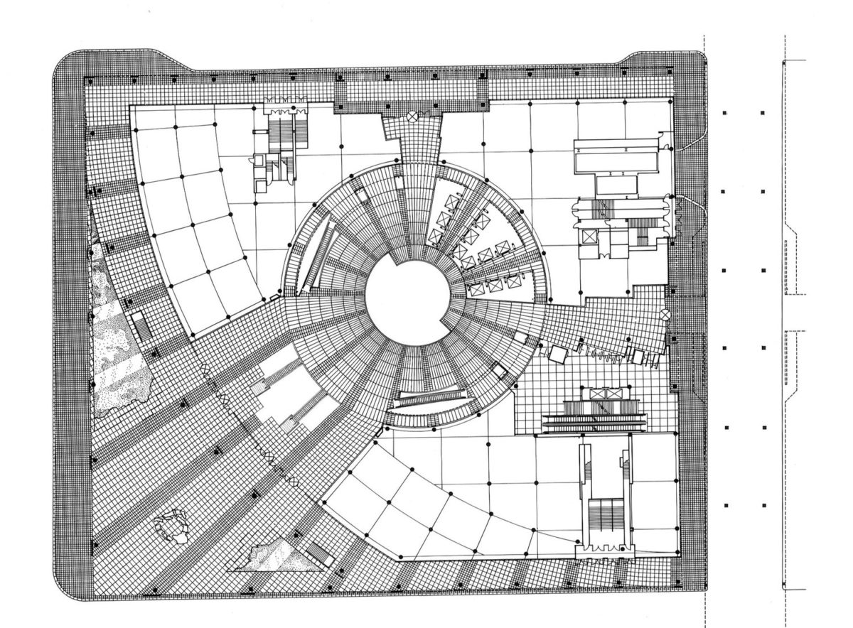
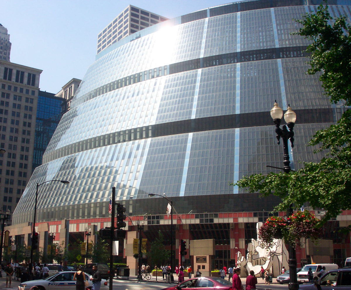
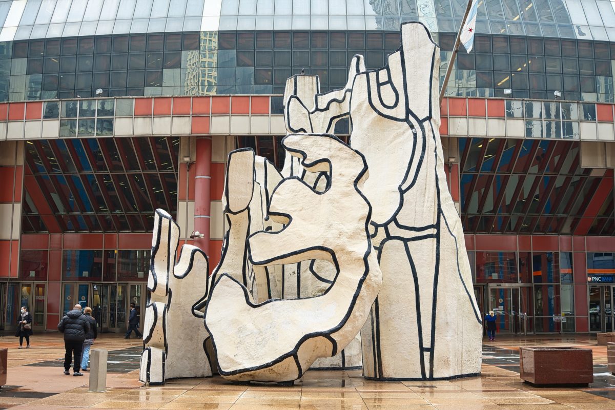
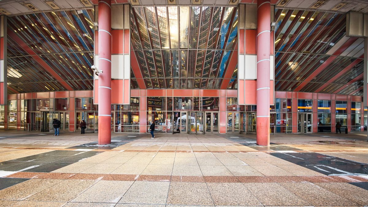
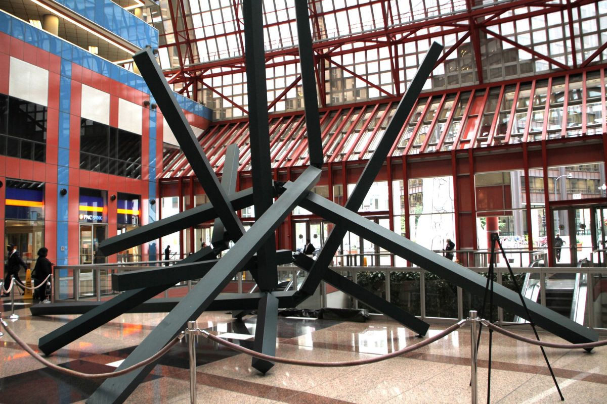
The north and west elevations follow the street, while a stepped, curved, glass-curtained facade breaks the rigidity of the city grid at the southeast corner, opening up an open-air plaza and defining the main entrance to the building’s central space, the atrium. Independent columns articulate the transition from the exterior to the interior through a covered colonnade. Jean Dubuffet’s sculpture Monument With Standing Beast was placed in front of the Thompson Center.
Atrium
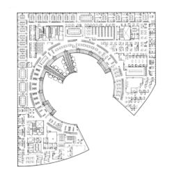
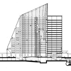
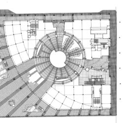
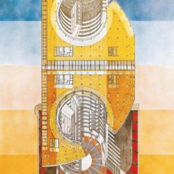
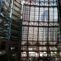
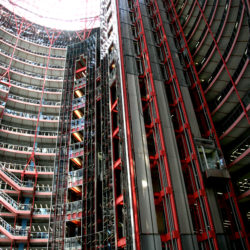
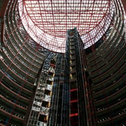
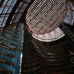
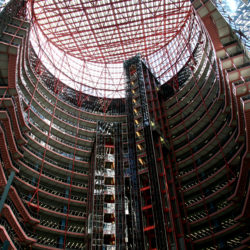
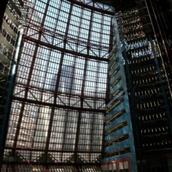
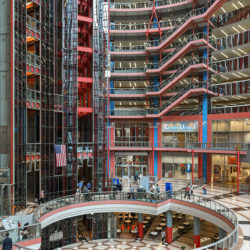
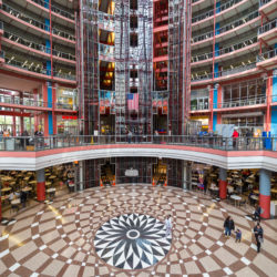
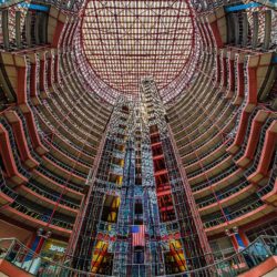
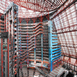
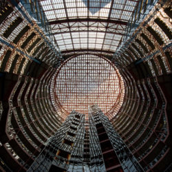
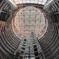
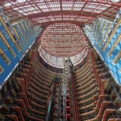
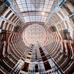
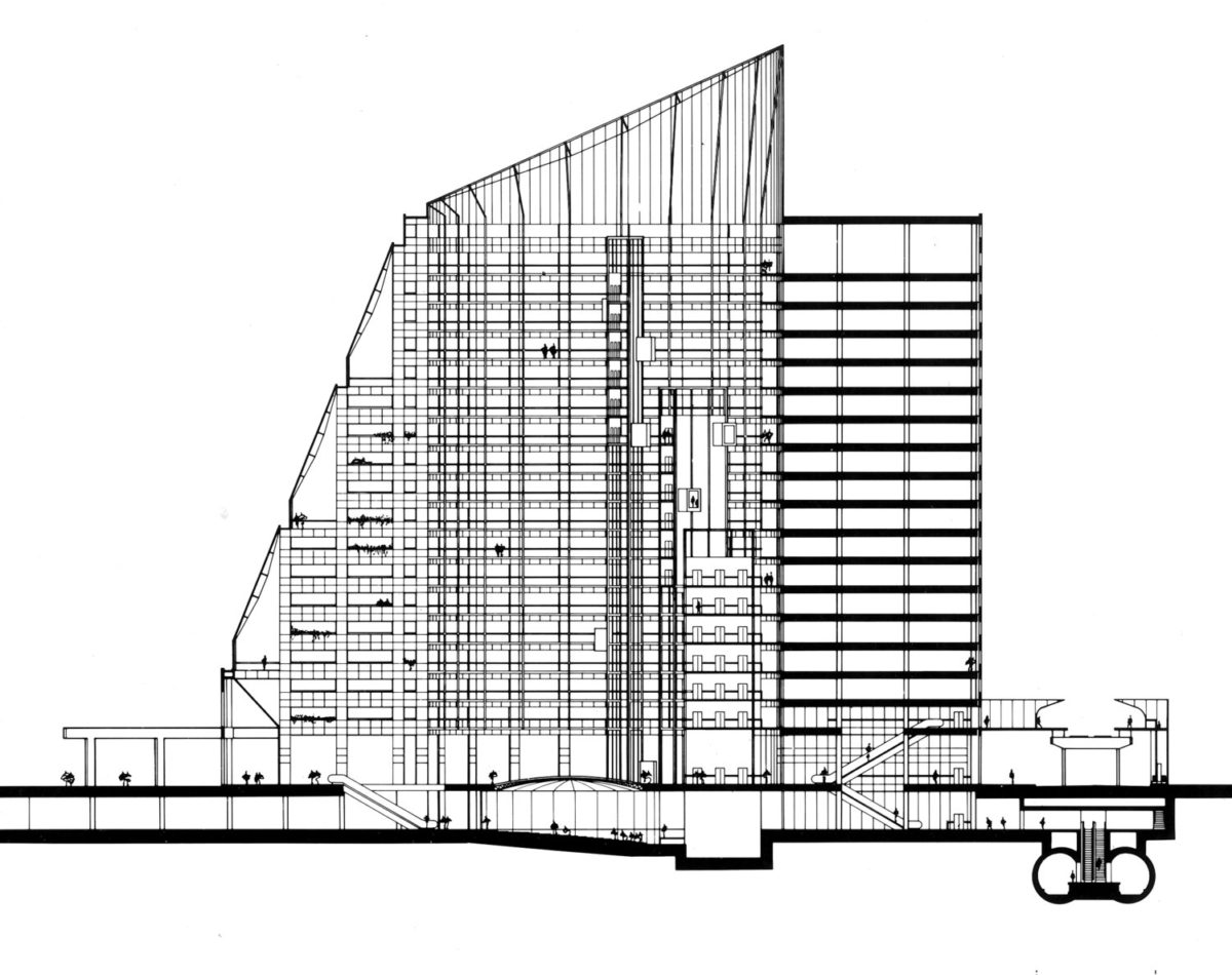
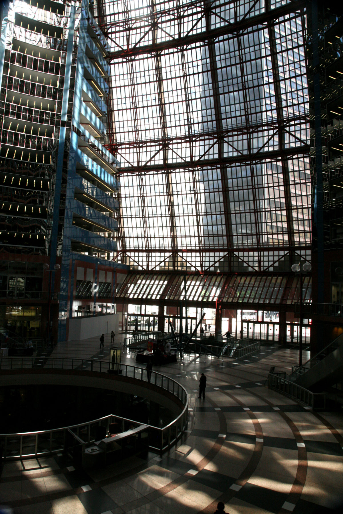
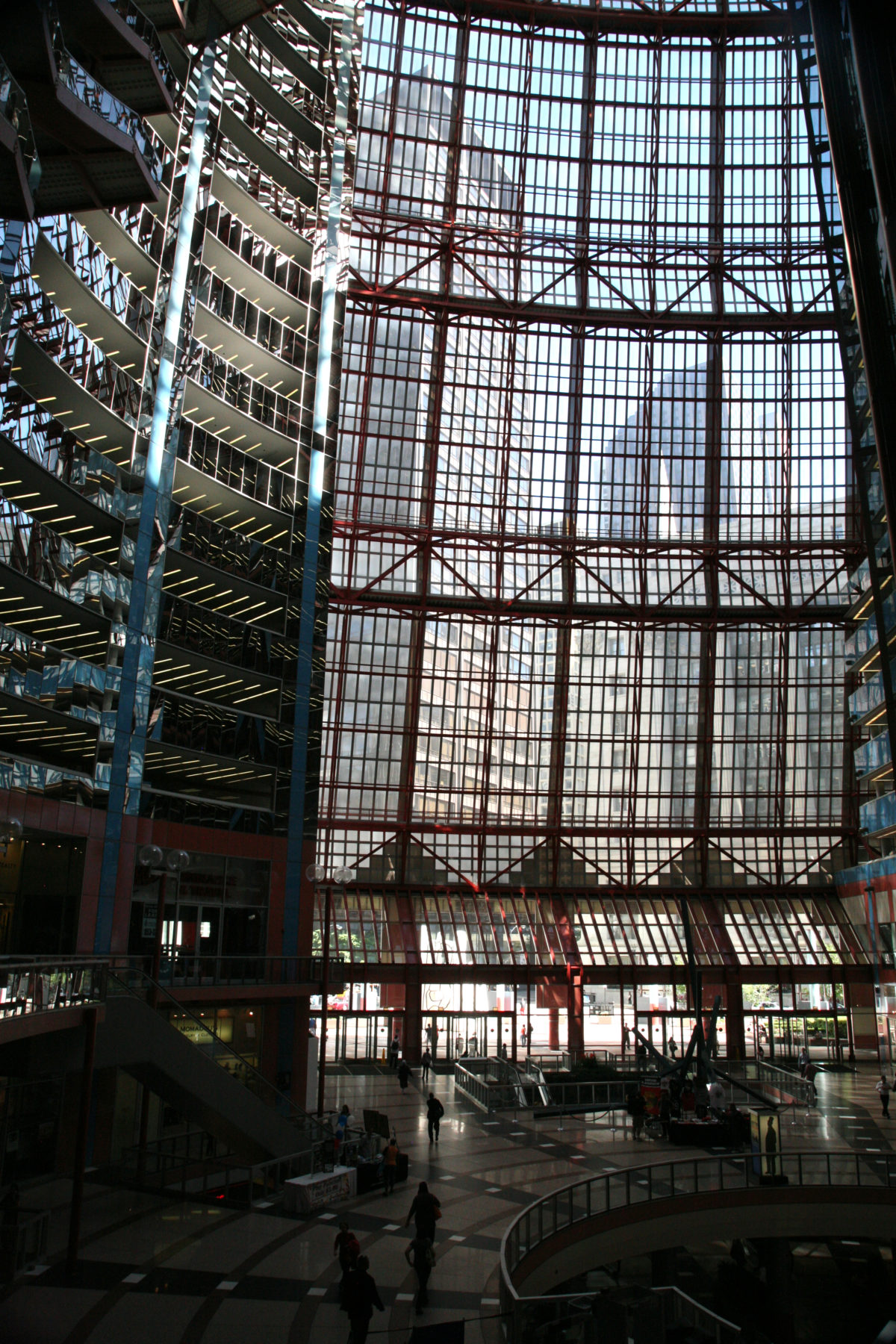
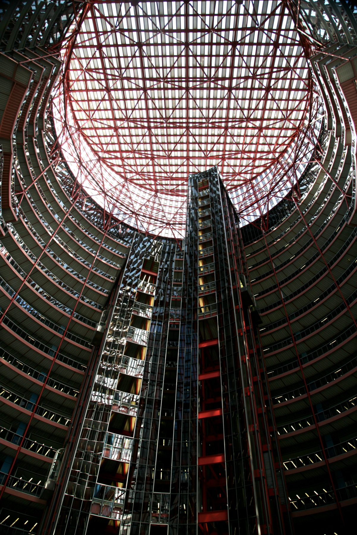
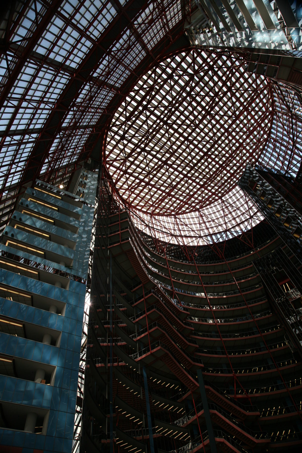
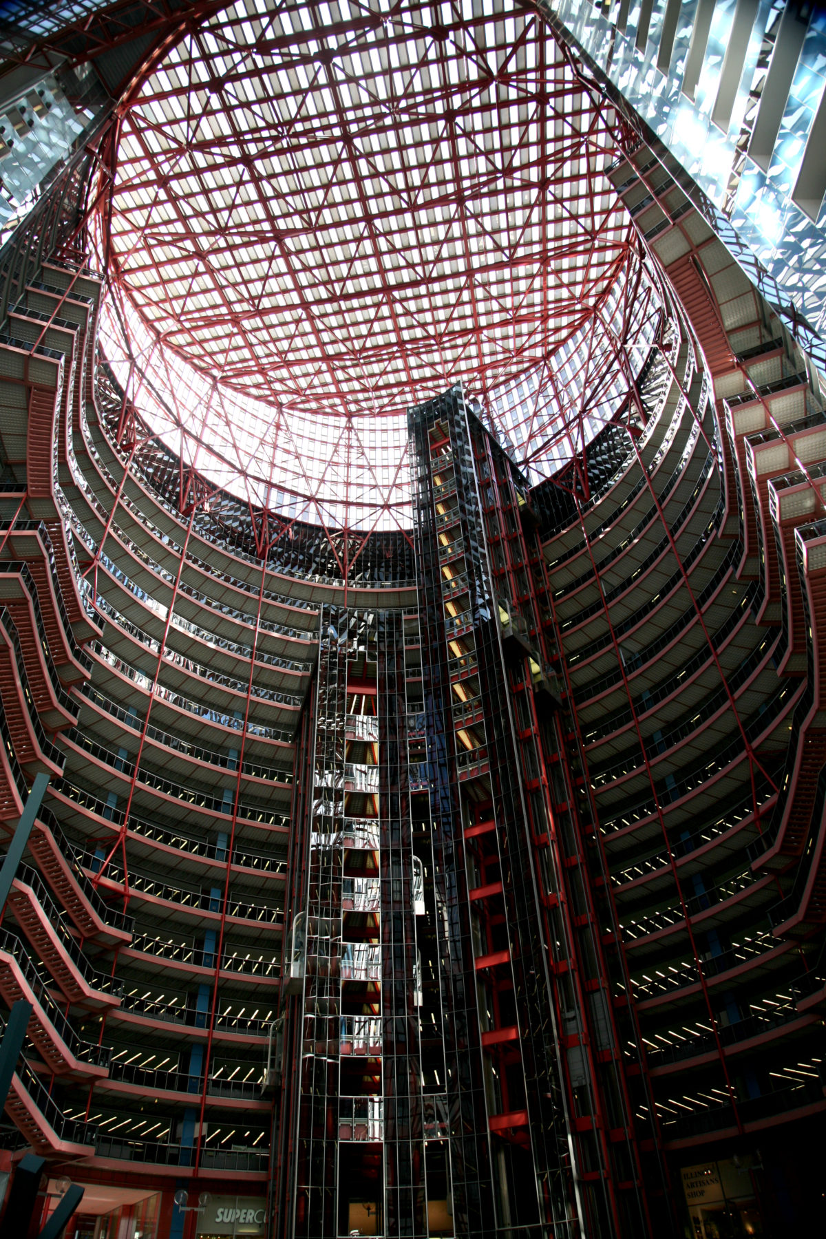
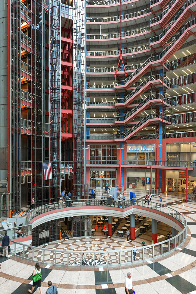
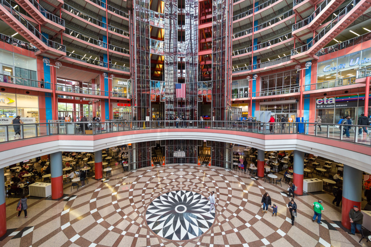
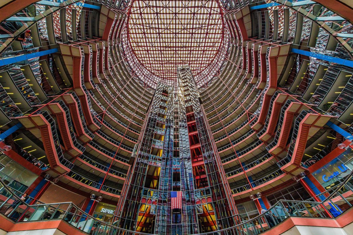
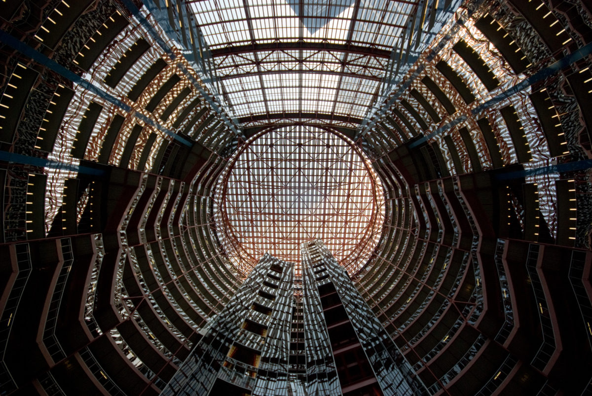
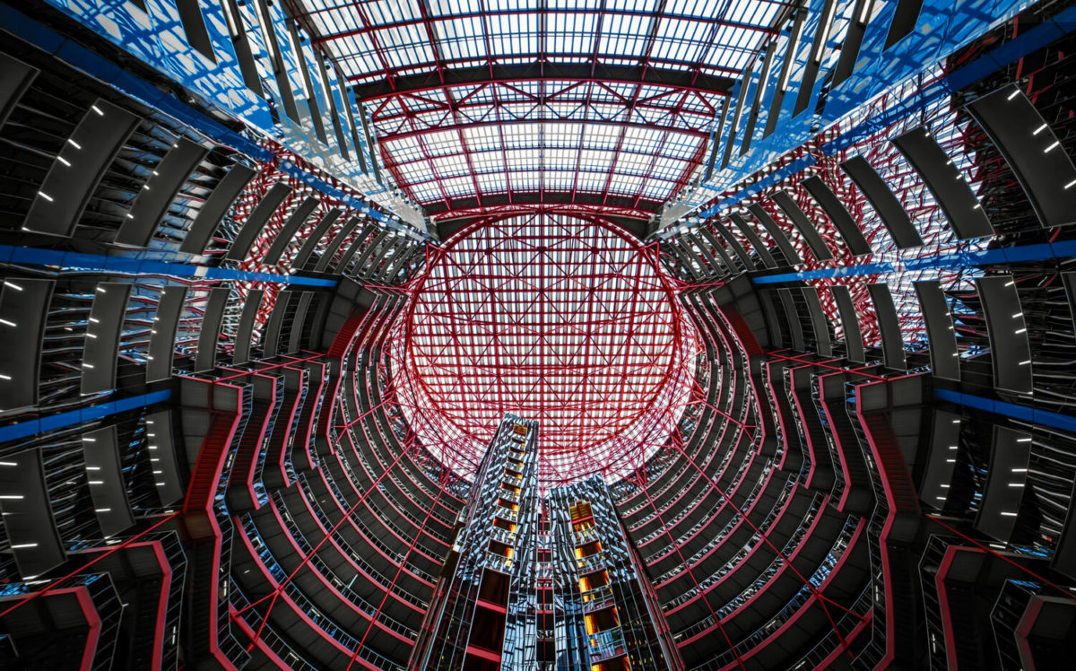
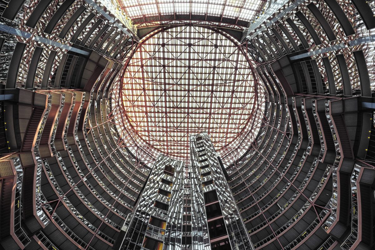
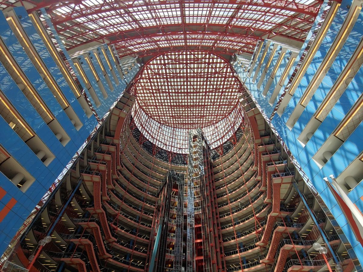
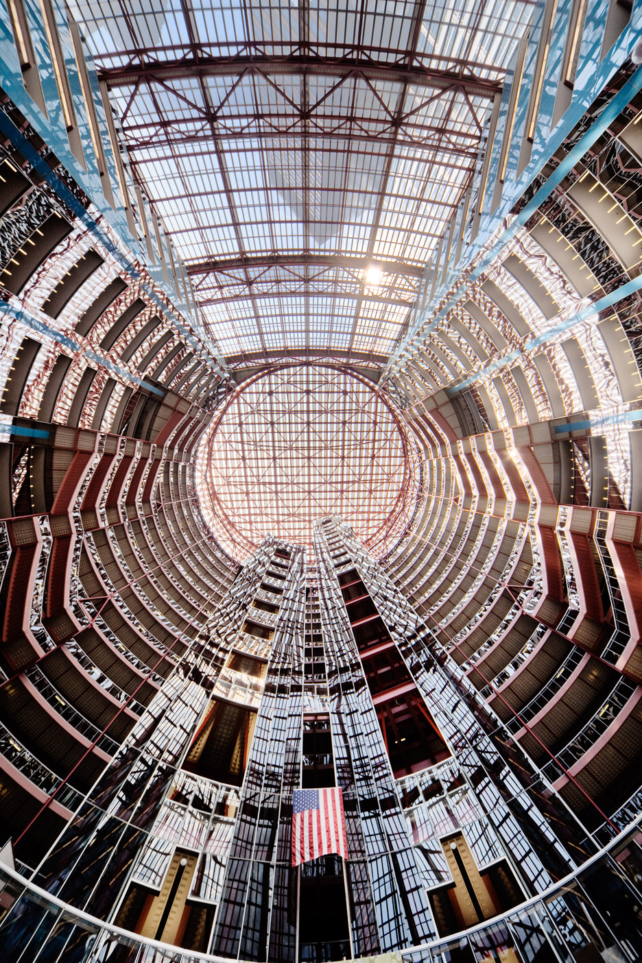
The postmodernist details continue inside with a huge public space of 48.77 m in diameter that rises 14 levels. The circular space illuminated by a large sloping skylight is bordered by office balconies, escalators and glass elevators that open onto the rotunda, projecting a sense of openness. Its majesty and brightness are reminiscent of the Sony Center that the architect designed in Berlin in 2000, although in this project the circular atrium space is a contemporary interpretation of the Rotunda, a classical architectural form historically used for civic and public buildings.
A circular cutout in the floor, 21.95m in diameter, opens onto the underground floors, where a large food court, a Department of Motor Vehicles office and corridors leading to nearby buildings are located.
Higher levels
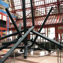
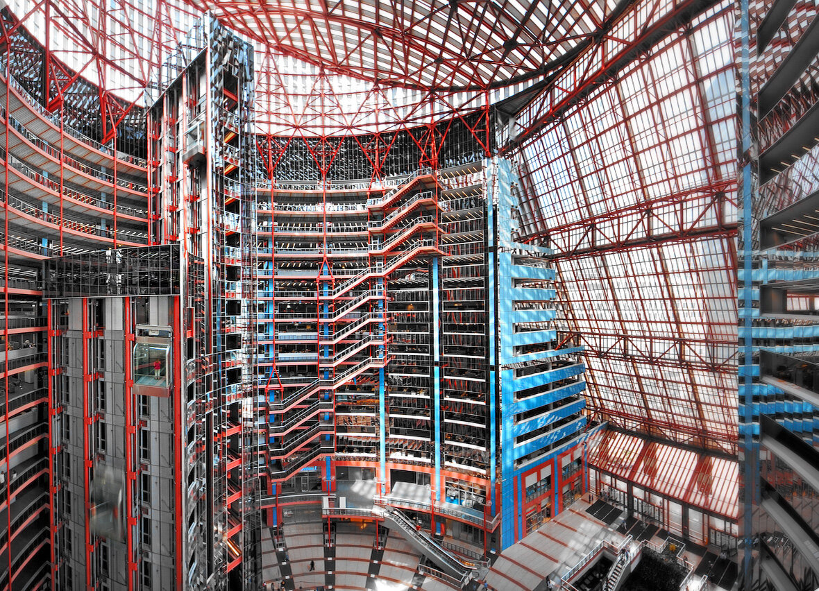
The upper levels occupied by state offices are what the building is really all about. Here, an elegant chandelier structure envelops the void and becomes the matrix from which everything hangs. Layers of office floor trays surround the atrium and celebrate the mechanics of rising and falling.
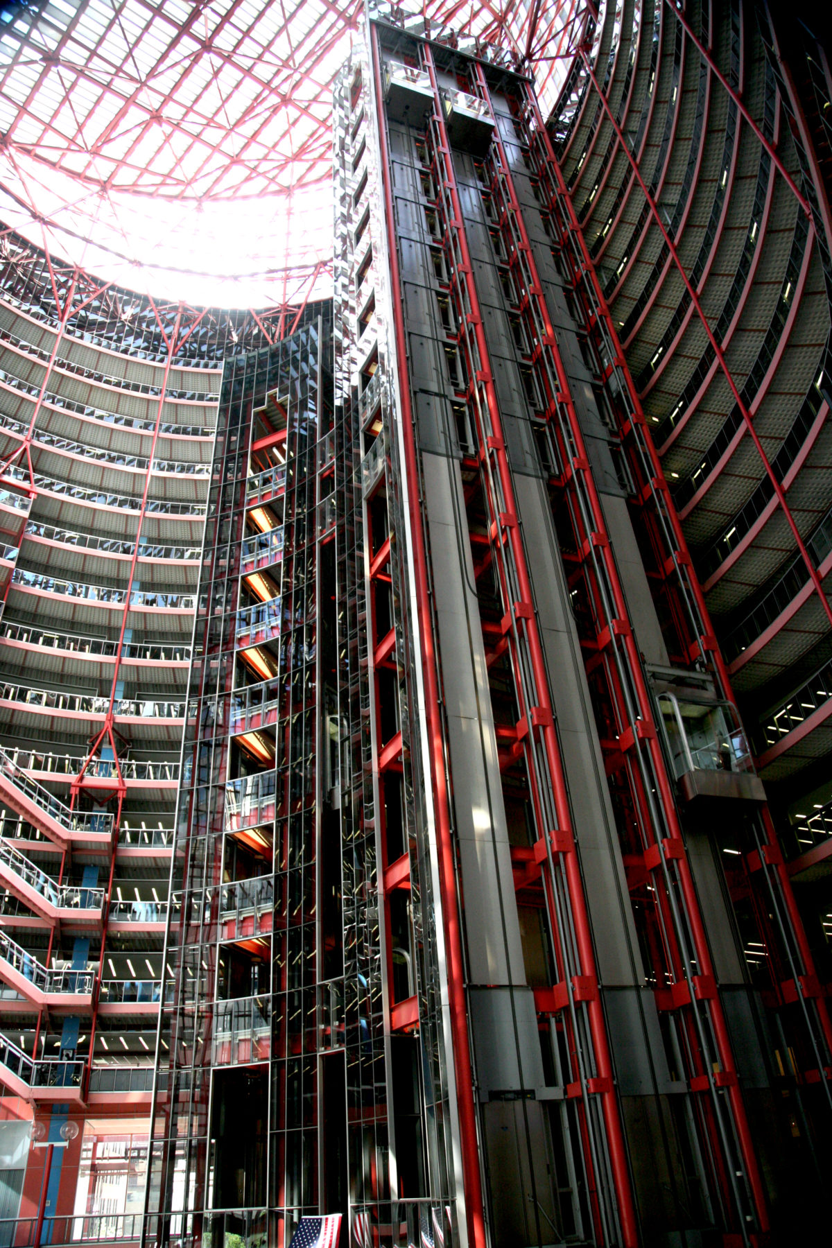
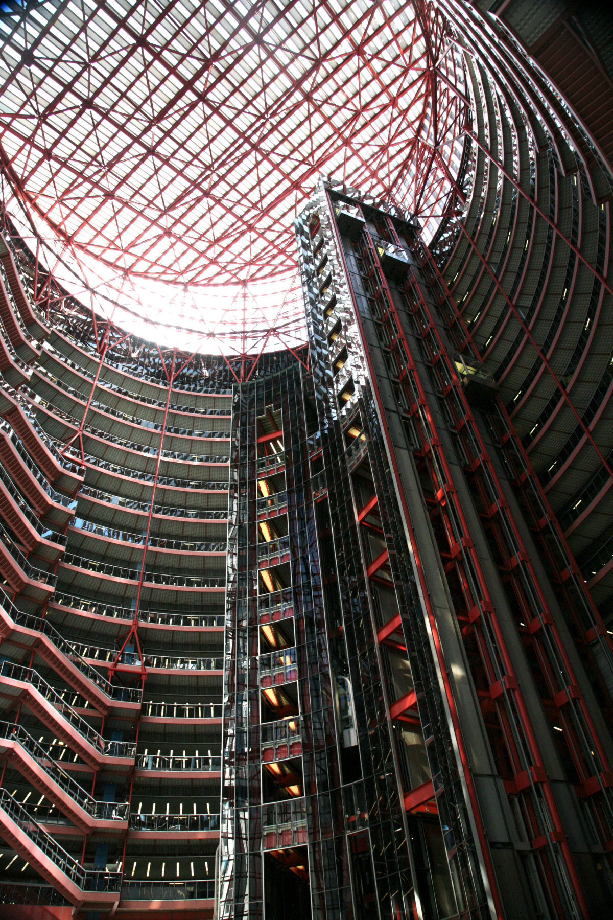
The seemingly free-standing elevator banks and articulated suspended staircases lend an air of kinetic sculpture, an impression compounded almost to unlimited degrees by the reflective kaleidoscopic spandrel rings.
Elevators
Among the transparent architectural features is a network of high-speed elevators and their mechanical equipment that give the building a machine-like character. Externally exposed metal columns, cables and counterweights erase the typical shafts and corridors that hide hidden machinery in most buildings. In particular, the elevator machine room, a space often enclosed between the upper floor and the roof, is completely enclosed in tinted glass as part of the atrium decoration.
Panoramic glass cabins glide effortlessly through the atrium providing a kinetic rhythm and vitality to the space as passengers come and go. Travelers, tourists, shoppers and citizens throng the center, touring the building through the interlocking system of vertical transportation that is not celebrated in other styles of architecture. Escalators and metal stairs weave the floors together, while towering elevator shafts anchor the roof to the subway gallery.
Structure and materials
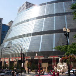
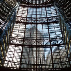
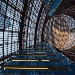
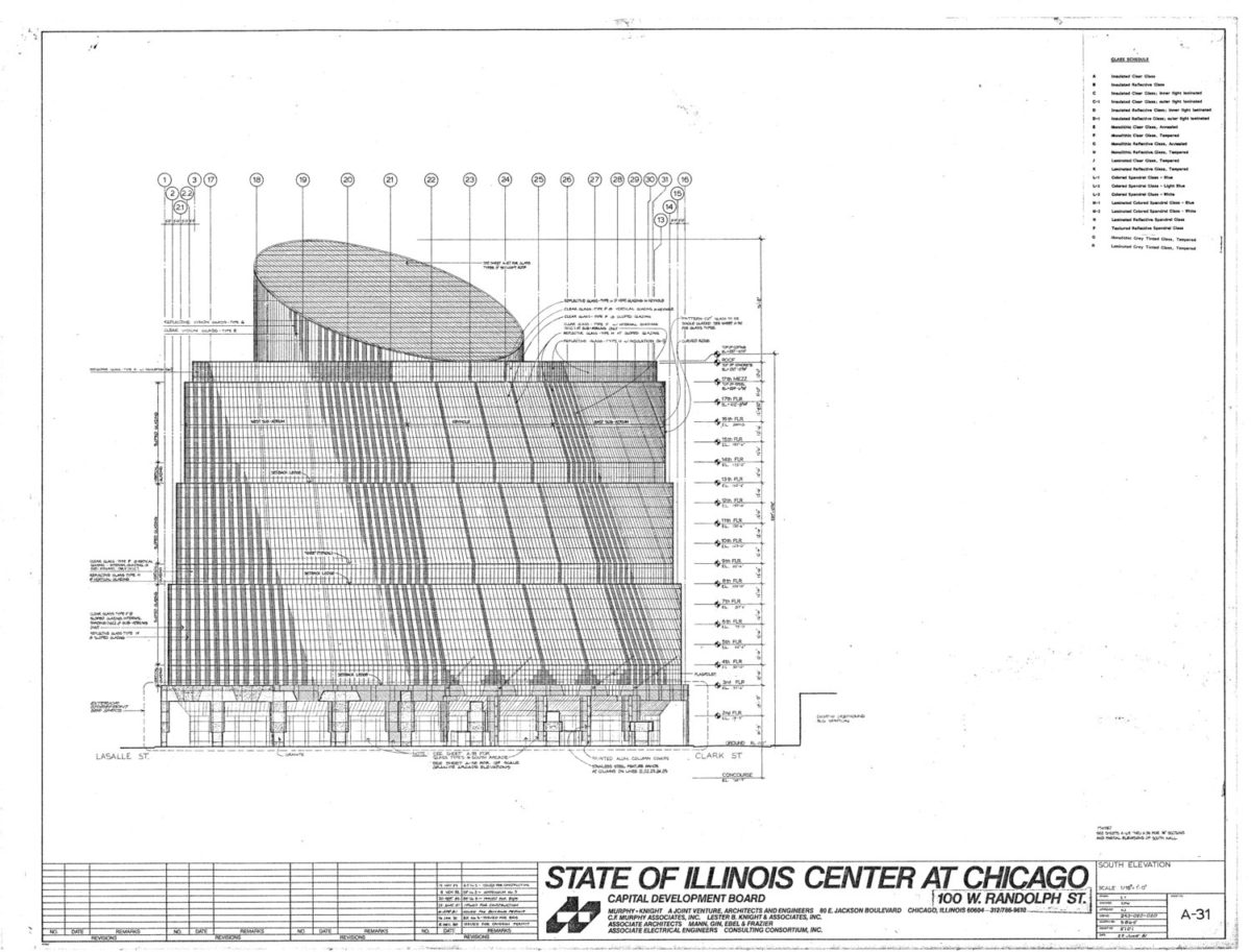
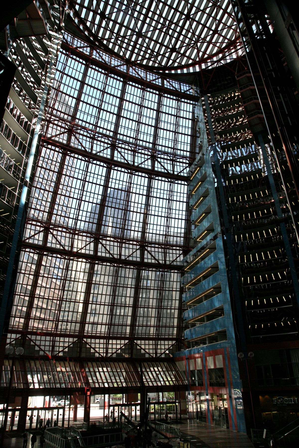
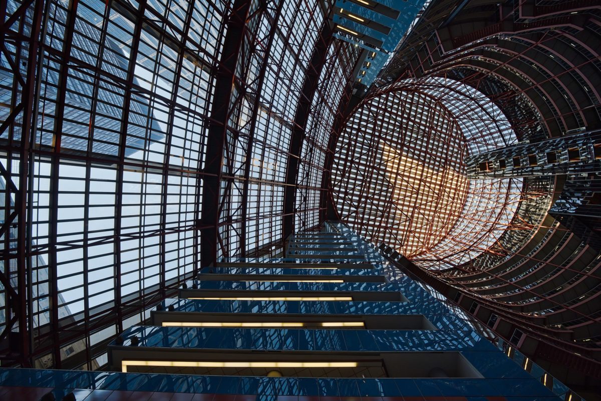
The building combines postmodernist aesthetics with structural engineering, resulting in one of the best examples of high-tech architecture and inside-out building design in the United States. Its design features a diagonal glass cylinder that is completely framed in structural steel.
Cooling system
The Thompson Center looks a bit like a huge greenhouse, so keeping it cool is a challenge. An innovative thermal storage system helps achieve thermal comfort. The chillers create ice slush overnight, when electricity prices are low, and store the slush in underground tanks. The slush is used to air condition the building during the day and then refreeze at night.
Facades
The building’s facades are almost entirely made of glass. A total of 24,600 pieces of framed glass with a metal structure feature a combination of transparent and reflective panels.
Originally, the design called for curved, insulated, double-pane glass panels, but these were found to be prohibitively expensive. Flat insulated glass was suggested, but Jahn ruled it out. Eventually curved, uninsulated, single-core glass panels were used, triggering the need for a more costly and insufficient air conditioning system on hot days, with internal temperatures reaching 32.5º.
A spectacular inlaid marble rosette can be seen in the lobby. The combination of glass-paneled walls and ceilings and marble-inlaid floors infuse the 111,483.648m2 of stunning postmodernism into a charming era of architecture.
Elevators
The original elevators transported workers and visitors through the colorful interiors, mainly in salmon and blue. However, the total exposure of their mechanical system was noisy, especially for workers who spent hours in the offices, so it was necessary to create an acoustic shield, even though it masked some of the mechanical components.
Video
Drawings
-

- Gov. James R. Thompson unveils a working model of the new 17-story State of Illinois Building. Feb. 19, 1980. (James Mayo/Chicago Tribune/TNS)
Photos
vicent desjardins
Otras fotos
