Geisel Library

Introduction
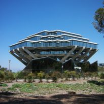
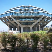
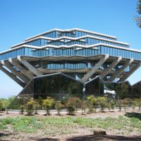
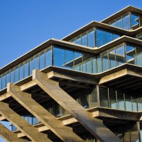
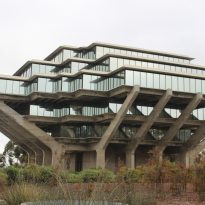
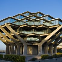
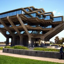
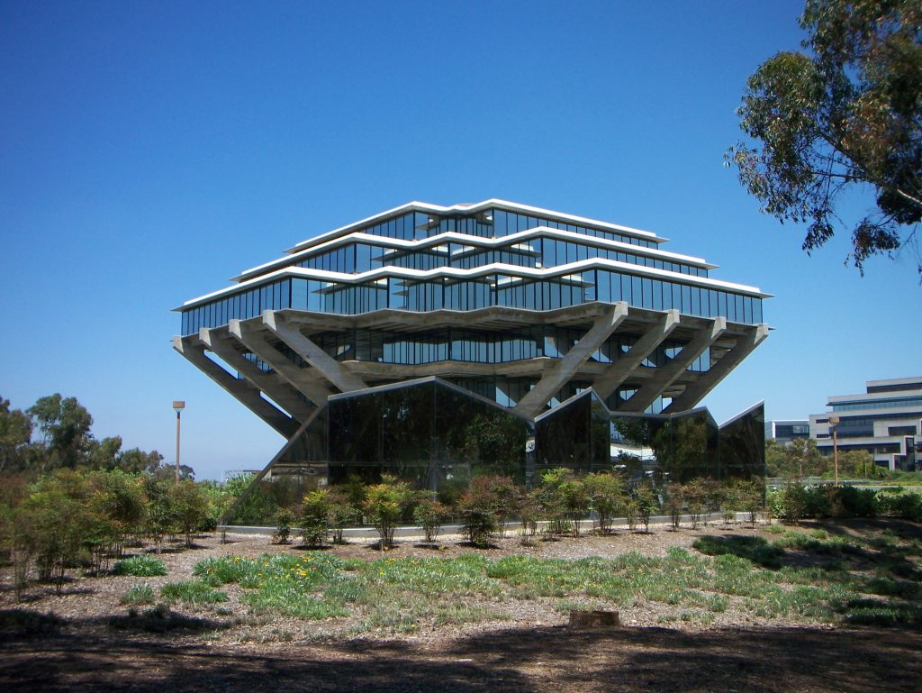
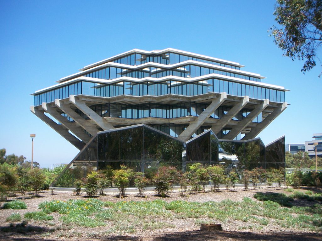
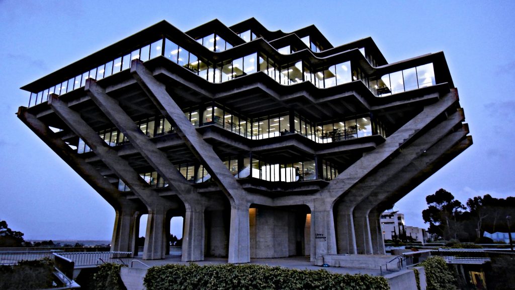
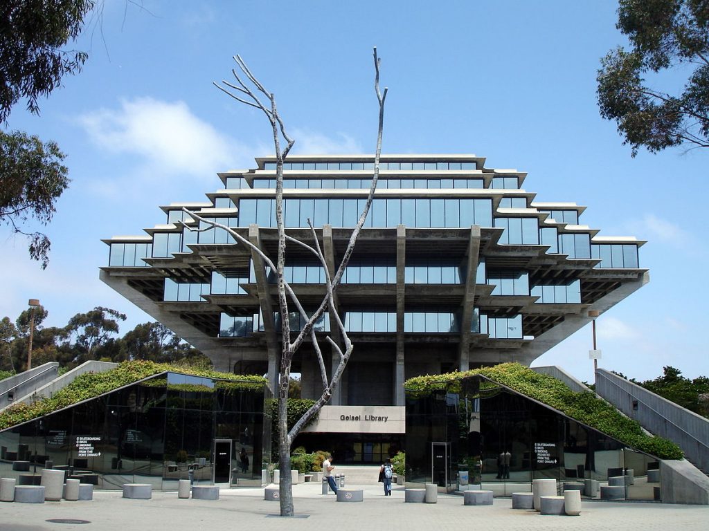
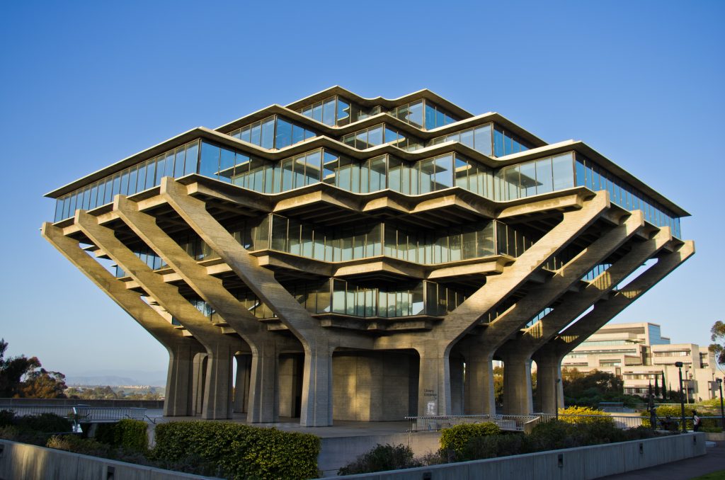
The Geisel Library was designed in 1970 by architect William Leonard Pereira, famous for its futuristic designs, associated with the space age, including the Trans-American Pyramid in San Francisco. The student library building, which houses four of the university’s nine libraries, rises 6 levels above the ground in an inverted pyramid. In 1995 he received the name of Audrey and Theodor Seuss Geisel, the latter better known as Dr. Seuss, in recognition of his generous support for libraries, a gift of $ 20 million and the contents of his archives, in addition to his commitment to increase literacy levels
In addition to its impressive architecture, the Geisel Library offers users the most advanced technological tools to facilitate research and learning, including high-speed Wi-Fi, a self-service system and extensive digital information and online resources.
Dr. Seuss
Theodor Seuss Geisel was an American author, political cartoonist, poet, animator, book editor and artist, known for creating more than 60 children’s books under the pseudonym of Dr. Seuss. His work includes several of the most popular children’s books of all time, such as The Cat in the Hat, Green Eggs and Ham or Horton Hatches the Egg among others.
Reform
In 1992 the building was functionally updated and the tower, as it is called, was restored to a similar plane to the one originally designed by Pereira that allows more reading spaces. A new heating, ventilation and air conditioning system was installed, the elevators were renovated and a third public elevator was added. The shelves containing the books were reinforced for possible seismic episodes.
Although the addition of the Library, designed by Gunnar Birkerts, was deliberately designed to be subordinated to the strong and geometric shape of the existing library, part of the austerity of the original building has been diminished by the addition of vaulted ceilings, painted walls and carpets on levels 1 and 2.
In July 2015, the Geisel Library Revitalization Initiative was launched as an important effort to transform and revitalize the most used interior public spaces on floors 1, 2 and 8.
Location
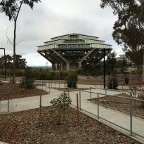
The Geisel Library is located in the center of the UC San Diego campus, in La Jolla, United States, directly north of the Price Center, a study center. In this location, the building is visible to motorists traveling south from the Sorrento Valley area on Interstate 5.
Concept
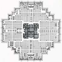
The architect thought the library spherically, so that the building was as close as possible to the users’ study points, 91m or 2 minutes away from each point. Completed in 1970, its modernist design was originally conceived as a spherical building with a hidden structure inside, a steel and glass building. But the diagonal structural elements moved prominently outward.
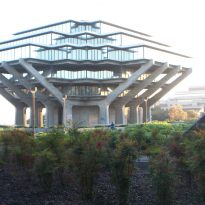
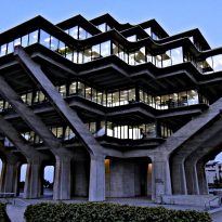
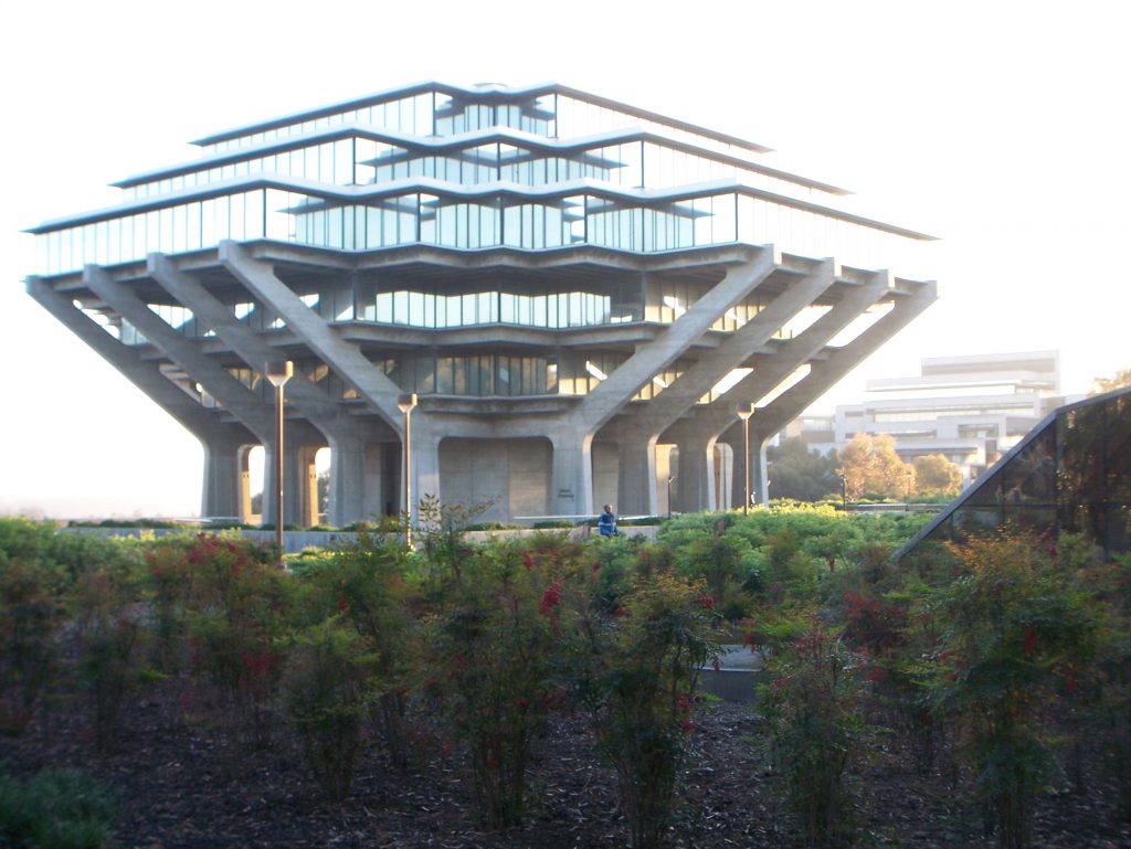
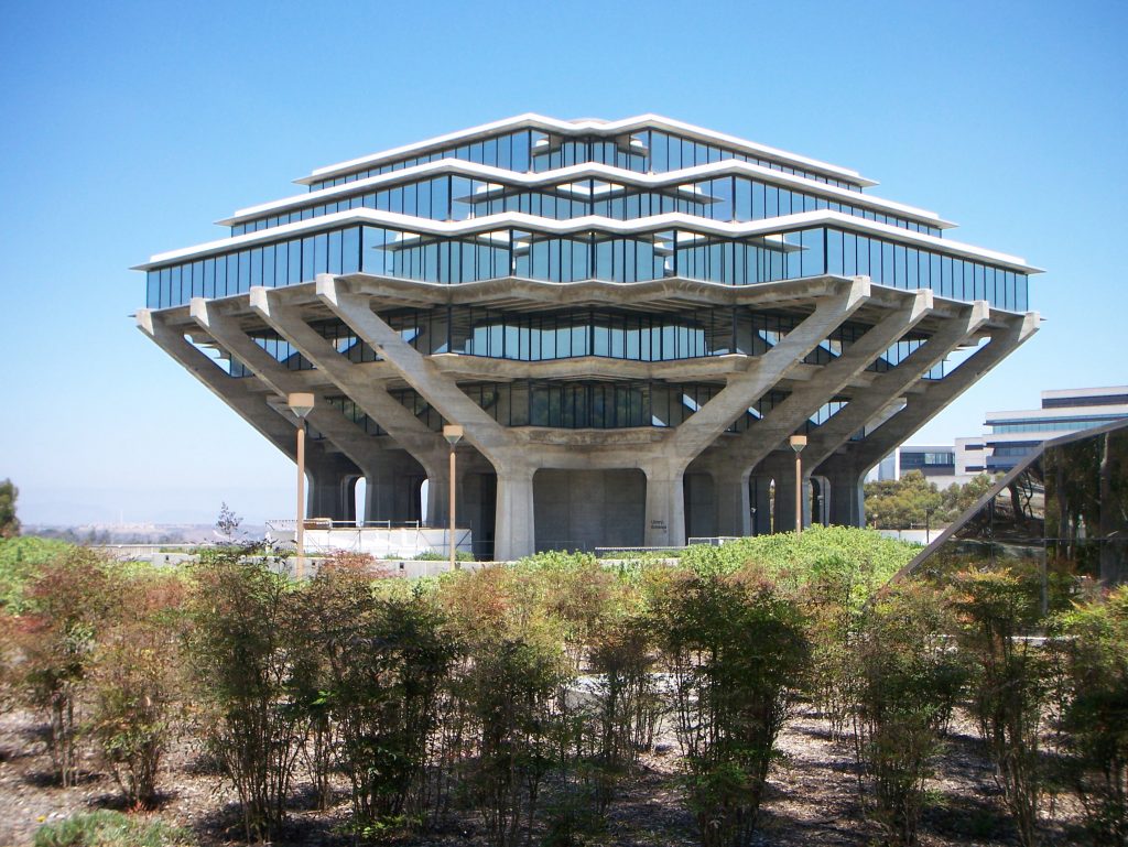
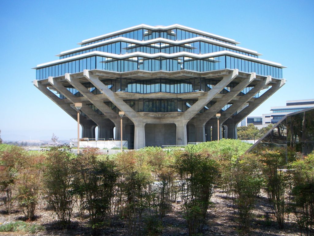
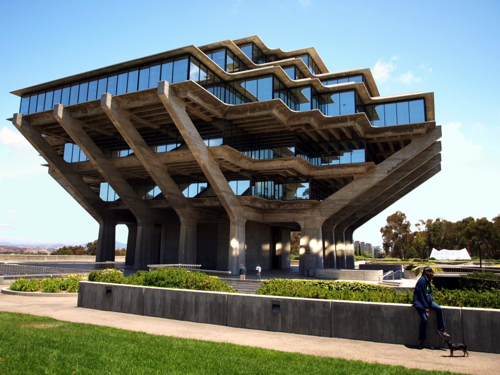
The arches of the building, in combination with the design of the individual floors, are intended to look like hands holding a stack of books. The concept of changing space influenced many other works, including the Seattle Central Library.
Spaces
Although its canyon entrance, in the center of the University Campus, has not changed over the years, its interior has been renovated to become a determining factor with a simple design. The architect intended future additions under the sloping sides that advanced toward the canyon entrance.
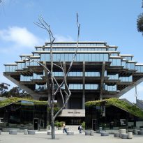
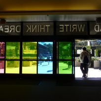
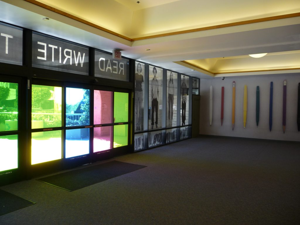
The library entrance is marked by a art work t by John Baldessari, READ – WRITE – THINK – DREAM, printed on colored glass. The Geisel Library also features a life-size bronze statue of the Cat with Hat, the most famous character of Dr. Seuss.
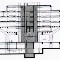
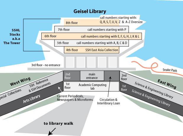
The library building has 8 floors, two of them underground. In its two underground levels are some of the sections of the library such as study spaces and computer labs. The first underground level is considered the main level, although the experiential center of the building is immediately above the level of the forum located in the narrowest part of the building.
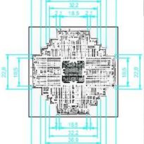
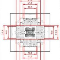
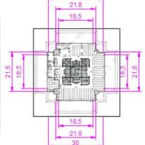
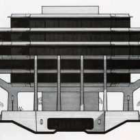
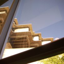
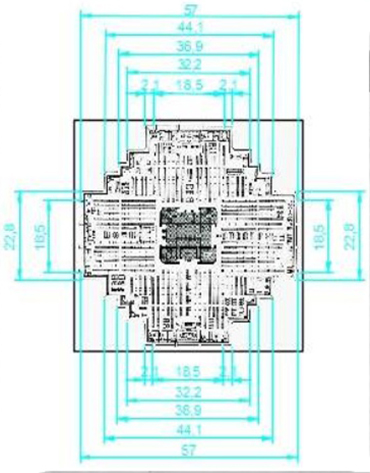
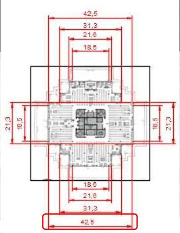
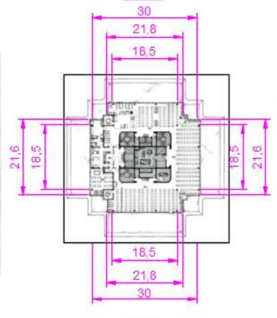
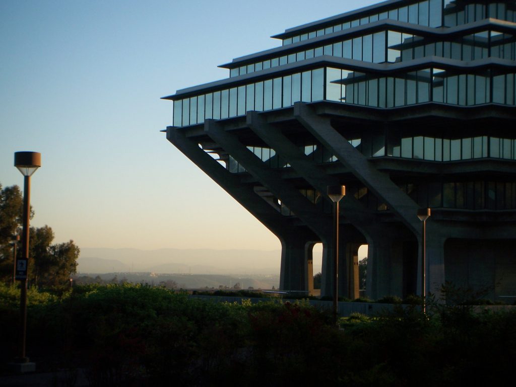
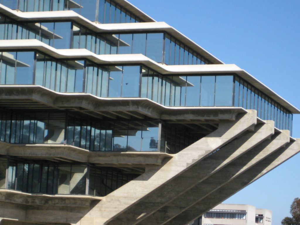
The overhangs of the 6 upper floors, which house collections, individual study spaces recovered with the restoration of 1995 and group study rooms, cast a shadow over the outer plaza. These 6 floors are of different sizes, the 6th being the largest, with 64m wide.
Third floor
A feature of the library is that the lower levels, the underground levels, are numbered 1 and 2, and the upper floors numbered 4 through 8. This has resulted in several fantastic explanations of why the floor 3 is apparently sealed and is not accessible from elevators or stairs.
One of the most popular stories is that the design of the building did not take into account the eventual weight of the books in the library, so the third floor has necessarily been left empty. This is a common urban legend, associated at different times with many other university libraries.
Actually, the third floor is an open concrete exterior forum with two levels and an emergency exit used by students from floors 4-8 to exit without having to go down to the lower floors. Its first platform, a public meeting area, was originally intended for exhibitions of sculptures, acoustic music, open-air debates or poetry reading. The second level is numbered as floor “3.5” and contains the public service connections and wiring rooms for the upper floors.
Structure
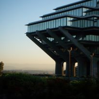
The tower designed by Pereira is a good example of brutalist architecture that rises 6 floors above level with a height of 33.53 m and another 2 underground floors. The widest point of the building is in the sixth and is 64m and the narrowest in the forum at ground level.
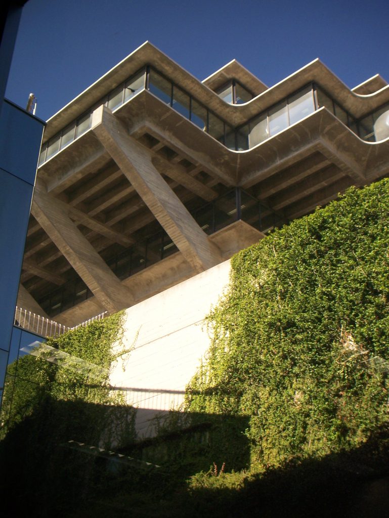
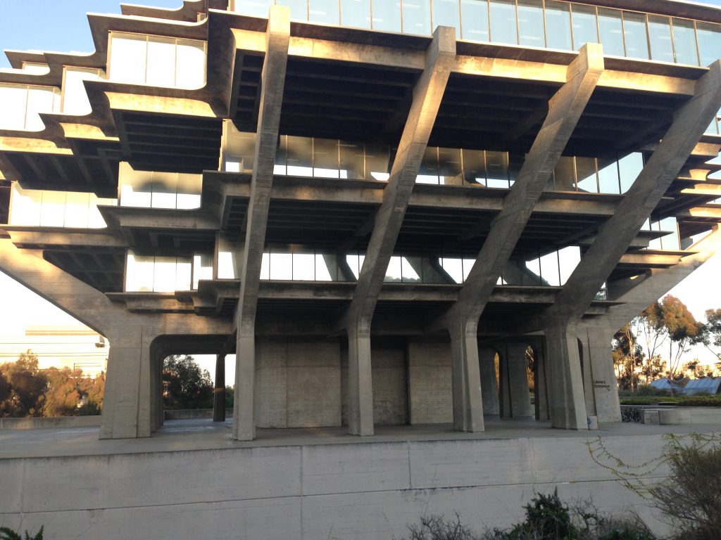
The original plans required a completely steel and glass structure, but the university opted for reinforced concrete when steel prices soared in the 1970s, also to lower construction costs and save on future maintenance. The use of concrete allowed for a more sculptural design.
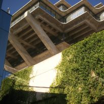
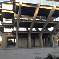
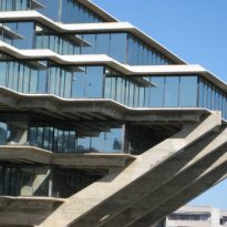
The first two floors rise like a pedestal that supports the stepped levels above it. Hidden on the second floor four large steel frames support the third floor of the structure. From this level 16 huge columns of prestressed concrete inclined at angles of 45º outwards support the overhangs of the upper floors. These springs extend beyond the width of the sixth floor and join the jagged edges of the enclosed spaces with a continuous diagonal movement that joins the floor plates at their bottom edge. To prevent them from bending outwards under the tension transmitted to them by the floors, each of the springs is connected to its opposite by means of three-quarter-inch steel bars that counteract gravitational forces.
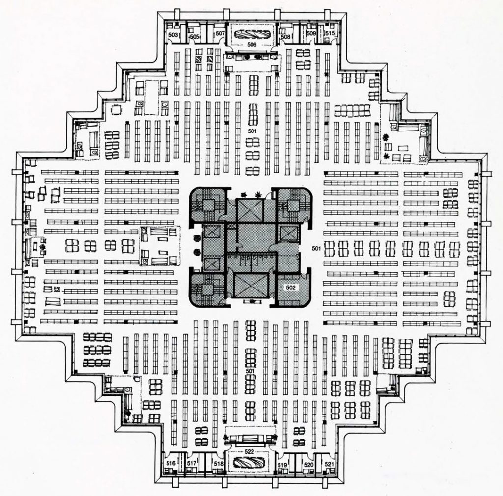
Up to the third level the floors are made of concrete loaves with composite beams, from here slabs and beams are combined. A solid reinforced concrete core runs throughout the building housing stairs, elevators and mechanical shafts.
Materials
In the construction of the building that houses the library, mainly reinforced concrete, 12,998m3, and glass have been used.
The peripheral beams that support the upper structure and the tension of the cantilevers are made of post-tensioned concrete with 300 bars of high tensile strength steel. These beams are anchored in shoes that contain 1,147m3 of concrete on each of the four sides of the building.
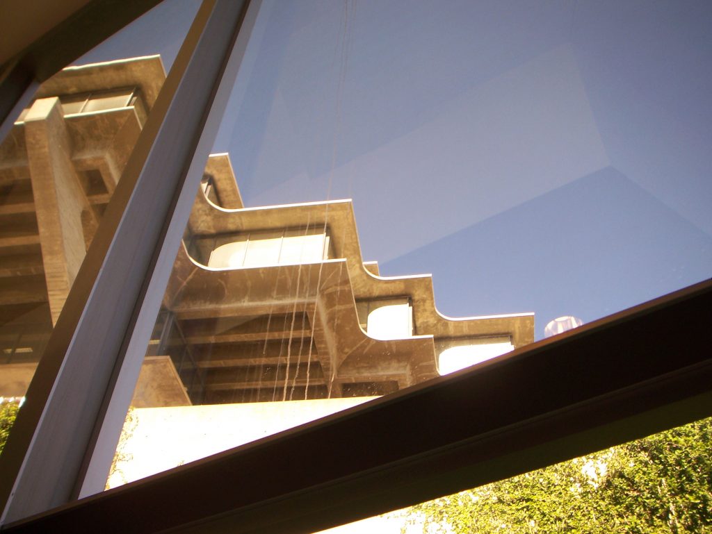
The general finish is concrete seen in a horizontal pattern with large glass plates coated in anodized aluminum that provide light to the interior reading and stacking spaces. In total, 3,530m2 of glass have been used, the color of which oscillates, depending on the daylight, between opaque grays, bright blues and fire yellows.
Video
