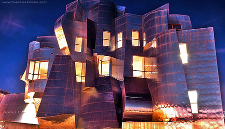
Frederick R. Weisman Art Museum

Introduction
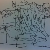
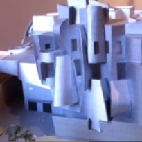
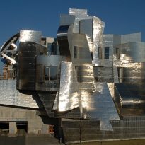
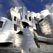
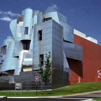
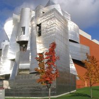
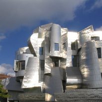
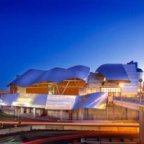
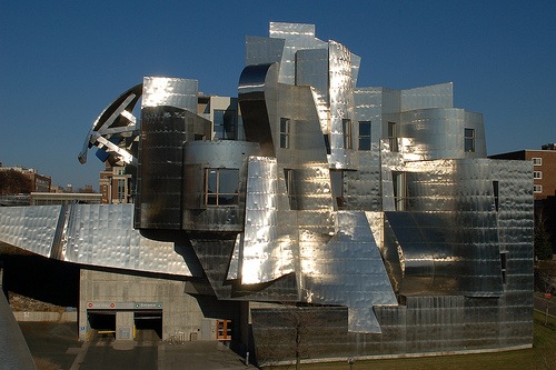
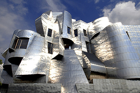
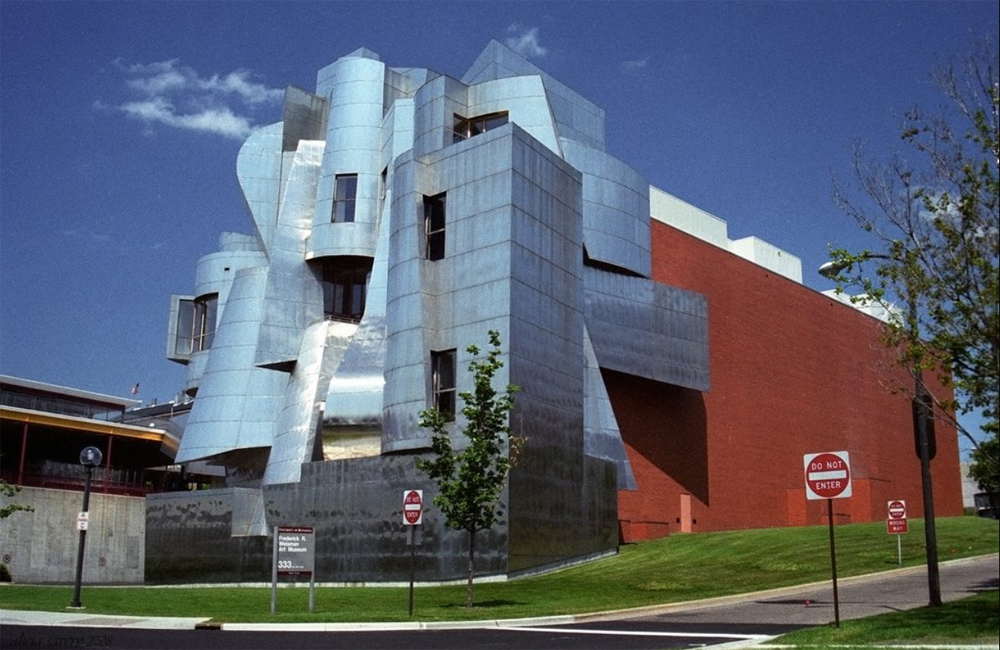
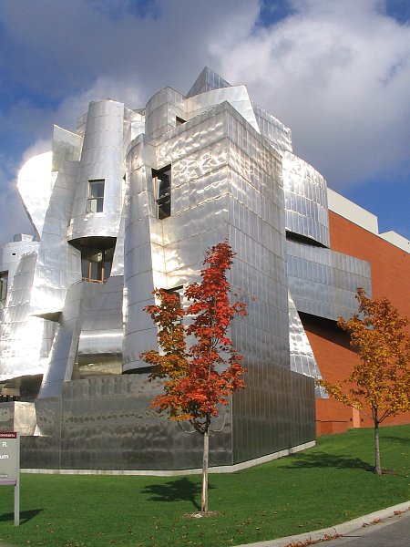
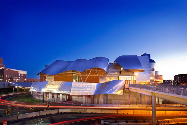
The design of the Museum of Frederick R. Weisman Art, also called simply Weisman Art Museum, highlighted by the use of curved metal structures as features in the works of Frank Gehry. The blinding effect generated by this facade when the sun reflects, has caused much criticism among the inhabitants of the surrounding grounds that may dazzle to circulate in cars, still under the expressionistic style, architect gets his work stand out and prove interesting for visitors.
The design of Frank O. Gehry, Pritzker Prize (Nobel of architecture) in 1989, received the “Progressive Architecture Design Award in 1991.
Situation
The Weisman Art Museum is located on the campus of the University of Minnesota, more precisely at 333 East River Road, Minneapolis, the largest city in the state, United States.
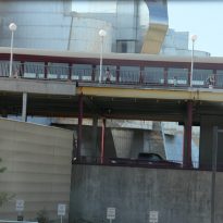
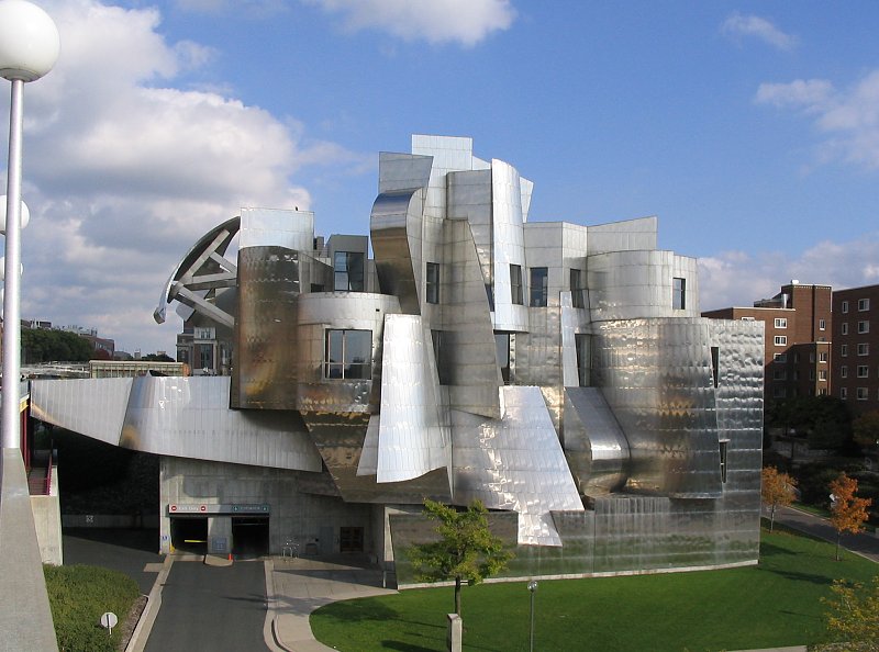
The building erected on the banks of the Mississippi River has access from the Av. Washington and also from the Campus, via a suspended walkway that connects them.
Concept

It was Gehry’s ability to cope with the culture and needs of the Art Museum of the University which made him perfect for the design of the new Frederick R. Weisman Museum candidate. Lyndel King, director of the Weisman Art Museum, said Gehry was chosen as architect, after a long selection process because “showed that truly understands the mission and dream of the museum.” Focusing on the traditions of the University and the needs of students, Gehry created a museum that is both accessible, functional and interesting, while immediately identifiable as belonging to the art world.
Spaces
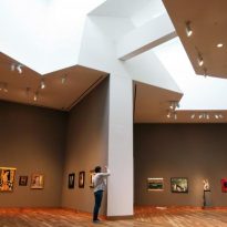
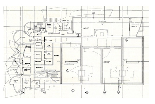
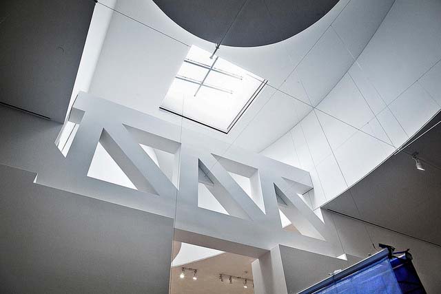
The interior spaces of the museum are large and airy, allowing exposing major works. The building that serves several purposes consists of four floors above ground and is distributed in two distinct areas:

- West Zone
In Gehry’s design is area been intended to services, bringing together both the stairways and elevators, and bathrooms, shop, cafe and the museum offices.
- Eastside
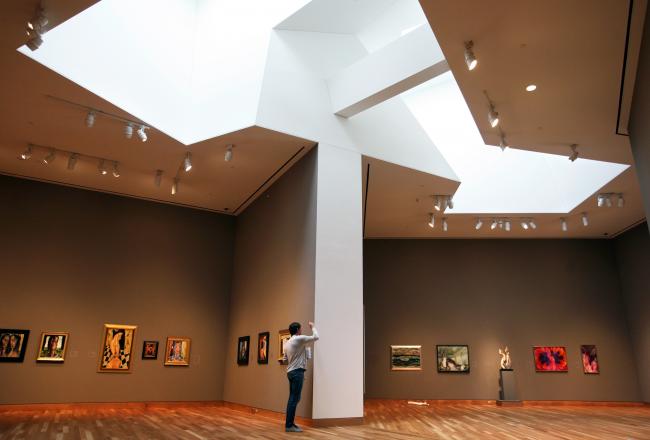
The east side is dedicated exclusively to permanent exhibition galleries, allowing students the university campus to enjoy the masterpieces of the museum at any time during the years of his stay at the City University of Minnesota. The location of the artwork has been especially careful to be on line and harmony with the building.
Spaces available for events
• Gallery Dolly Fiterman
With its stunning river and clerestory lighting, this gallery is used to
events up to 150 people for dinner and 350 for receptions.
• William G. Shepherd Hall
This room, flat, has 120 seats, is used for conferences.
• Seminar Room Weisman Family
This conference accepts 25 people sitting around a seminar table.
Facade

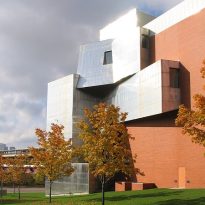
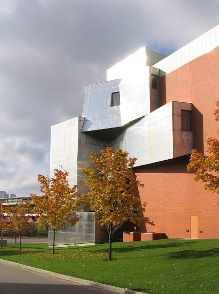
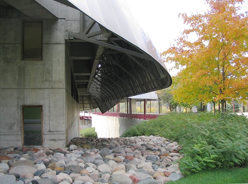
The building has two faces, depending on which side you look. From the other side of campus, has a brick facade that blends with the existing brick and sandstone buildings.
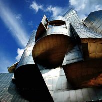
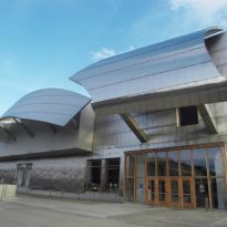
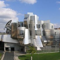
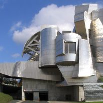
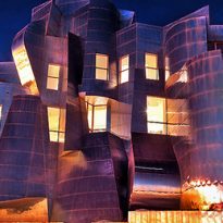
On the west facade stands out for its irregular coating stainless steel parts, creating an area of curves and angles. It Gehry used the abstract metaphor of a “waterfall with fish” recurring figure in some of his works, being a good example, Goldfish, at the Olympic Port of Barcelona.
Expansion 2009-2011
In 2009, the Weisman Art Museum hires again to Gehry to expand its surface, improving the original design opened in 1993.
Five new galleries, with 8,100 m2, allowing the museum to double the capacity of the exhibition at any time. They have also included spaces for study and expanded the pedestrian walkway with new sunscreens. The fifth gallery, the Target Studio for Creative Collaboration, houses experimental collaborations between artists, students, teachers and the community.
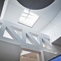
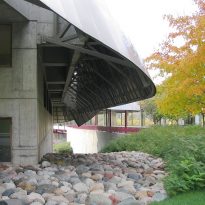
This expansion modules Gehry used combined concrete and structural steel stood at the southeast part of the building, getting natural light to penetrate inside zenith.
Materials
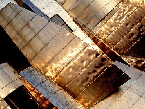
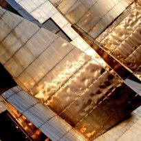
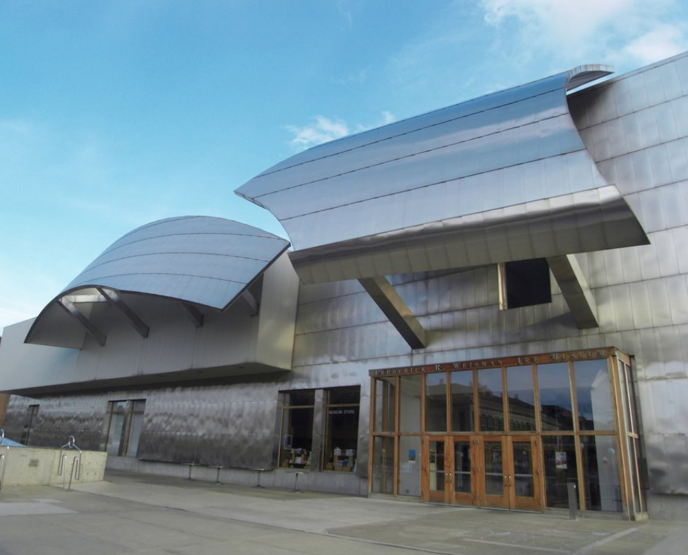
In the case of the museum’s outer skin is brushed stainless steel, manufactured and installed by the A.Zahner Company, a frequent contributor to the works of Gehry.
The walls of the exhibition halls are white, a color that contrasts with the treated natural wood flooring, which gives a touch of warmth to the galleries.
CATIA
As for the design of Guggenheim Museum Bilbao, at the Museum of Art Weismann to sophisticated and innovative CATIA software, using aerospace technology that gets scanned by a long and painstaking process each vertex of the model of each building designed by Gehry was used. Through this complex process, it is possible to bring to reality the preparation of all real parts that make up the structure and skin of each building.
