Berlin State Library

Introduction
The National Library of Staatsbibliothek Berlin, designed by architect Hans Scharoun and Edgar Wisniewski, is probably the most famous modern library, next to the Phillips Exeter Academy Library, Louis Kahn.
It is part of a complex of cultural buildings in Berlin called Kulturforum. Presents a language familiar to the Berlin Philharmonic, also Schauroun work, as opposed to international style exhibited by the Neue Nationalgalerie of Mies van der Rohe. The three buildings comprising the Kulturforum.
It is one of the organs of the Prussian Cultural Heritage Foundation. It was created in 1967 to house some of the books from the Staatsbibliothek who had moved to Berlin during the war to prevent the bombing, and by chance ended up in one of the Western occupation zones after the war. The other part, about half of all books, ended up in the Soviet zone and was relocated in the original building of the Avenue Unter den Linden, east of the city. This means that the library collection is fragmented into two physical locations called Headquarters 1 (the old building) and Seat 2 (Scharoun’s work), a mile away in a straight line, but at the time was divided by the Wall.
Since the unification of Germany, the two sites were joined to form a new Staatsbibliothek zu Berlin – Preussischer Kulturbesitz. It is called “a library in two houses.”
2 of the Headquarters Library is located at the eastern end of the Kulturforum at the border that divided Berlin. Before the fall of the wall, the building was part of this limit. The eastern facade is closed because it functioned as a barrier to training.
Along with other buildings in the Kulturforum, symbolized the German commitment to the freedom of the western part of town. Today the library is at the heart of Berlin.
Location
Two Locations of the Library were built in the Mitte district.
Headquarters 2 forms the eastern border of the Kulturforum in the line where the Berlin Wall.
It is located south of the Tiergarten and west of Potsdamer Platz in the center of town.
It was built next to the Landwehr canal and is a neighbor of Ibero-American Institute (IAI).
Concept
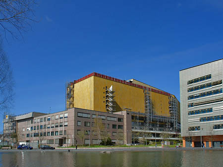
The State Library should function as a lock to separate Kulturforum located in West Berlin, the band’s death and the wall. For this reason, the outer envelope shows a total silence of the interior.
It is a building of enormous scope, complex volumes of over 300 meters in length. Only from a distance you can see the monumental scale of the whole.
The mass expands enclosure built on the floor without caring its limits, seems only to domestic laws before entering unknown. Only highlights the coronation with a volume coated copper plates. If you look closely, the building disappears and becomes a topography that blends with the surrounding environment.
Spaces
The route to enter the building is quite naturally, an instinctively. The access is quite corner, moved to the left of the axial axis of the front. This shift is creating a concavity on the floor coincides with one of the edges of the coronation. The access shaft is reinforced by two concepts: a singular vertex in the upper area and a hole in the part that comes with the ground.
The last meters occur outside invading the concavity created. It is an open-air space that serves to return the building friendly and help you feel comfortable in it.
On the lintel of the door, you can see the size of the entire building, or when viewed from afar. A small canopy protects access and, briefly, all the monumental scale disappears just when it crosses the threshold of the door.
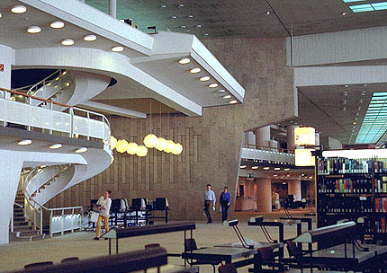
From the entrance, once flanked the door, a huge foyer opens suddenly to the eye and suggest different paths. Head, is a staircase wide and comfortable, while on either side, there are two singular.
On the right side, the space seems to have no end, is illuminated from behind as the light from the windows of the facade that served as a guide to access from outside. This makes them aware of the location of the space.
The lobby on the left is smaller and apprehensive, and is illuminated by a window in the corner with stained glass that focuses the attention first. They are located cloakrooms, lockers, a store counter, toilets and other services required in the access right.
This space is rotated ninety degrees from the initial direction of the route that pointed to the staircase. From there you can see the impressive size of the entire lobby, which extends on the other side. The initial width of this space is, from this point in depth, and the front has a wide perspective depth, but the closure is sufficiently enlightened as to shorten the distance that separates them.
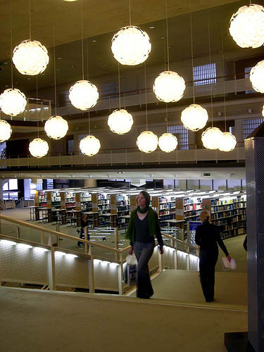
The lobby has a total area greater than 5,000 square meters, but two elements are combined to mitigate the perception of space. One is the useful height of the enclosure of six meters, the other is the adoption of a structure of great lights, a pillar for every 150 square feet of roof. Both items will be attuned to the dramatic steps that make up the space, bringing its effect.
Illuminate an enclosure of this size is not a simple matter, especially given that one of the two long walls that surround the area is facing a blind. In the central hall on the right is a rectangular enclosure, anchored to the pavement, which acts as a flashlight and a spreading soft light coming from all around the top floor, which, in turn, has lighting. The rectangle corresponds to a lamp or a piece of furniture cleverly placed on the initial gap, it is airtight and accessible from the lobby where boots, represents a portion of the floor has fallen and can carry light from below, see a small sample of what is the essence of the building.
The arrangement of this piece on the hall broke the visual axis transverse oblique that other lost in the Escorza, generates a movement in their environment and subdivided the original space.
To switch to the other end should go for the darker area on the far side of the facade, there is more limited, as a passage area. Exceeded the central obstacle is detected again the initial amplitude and the light of the accompanying tour facade. A sharp light from the back wall. Once on the opposite end, an inner courtyard of the low altitude visual returns and indicate to the outside visitors, the existence of a set of units of the building that extends longitudinally and is in the area for the Center for Latin American Studies, functional area to put as an annex to the building.
Before you go back a portion of the lobby and expands slightly separated from the rest. This is the foyer of the hall.
The return to the starting point is around, inside the front access. The area is oriented east and the warm light of morning escampa freely throughout the area. The space is occupied by the files of the general library and group of chairs that are several rest areas, its location coincides with the most warmly lit.
Back to home is the staircase that takes any role. The ascent is straight, wide, no change of course, open side unobstructed round. Before reaching the roof of the hall, stops by the presence of a mezzanine hidden behind the blind wall that delimits the original lobby.
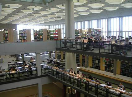
The platform of the mezzanine is quite smaller in size than the previous one, but its height is considerably higher, with about ten meters high. The sense of height is dominant over its entire area, being powered by an elongated enclosure. Peripheral two galleries, one over the other, make two lines of the cornice on perimeter walls that invite look up.
The light which comes from the longitudinal and long ornament that corresponds to the rear façade of the building is strong, coming from the west. However double balconies of the cross section acts as brisoleil, avoiding any direct radiation from the sun. The clarity of the new site far exceeds that of the previous hall. There are two effects that qualify for this space in relation to the first volume of air, in height, and amount of light per square meter, both are higher.
The floor of the hall widens slightly in the area of encounter with the ladder, creating here a wider area and, although it is partially occupied by the bar, the glass that separates them makes your site is displayed to join in a previous single space.
It arrives here turning right within the meaning of the stairs, to walk along the long hallway that leads to the other end. The visitor can distinguish which is under the golden crown volume work. On this roof plane is located, the deposit of general books.
Having reached the end of the hall is another staircase discovered, symmetrically prepared to allow the previous left before resuming the journey to continue to rise.
The floor is elevated from the ground to over 6 meters, with an area greater than 10,000 square meters. The site is about 165 meters long and its width is variable, with an average of 60 meters breadth. With the new staircase leads to the 2 / 3 of the plant.
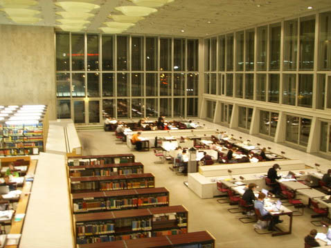
Is here the general reading room, which occupies the lobby area more appropriate to the area of Latin American Studies. The space is almost equivalent to the projection of the entire building. The ceiling of the room is 9 meters tall. The light is absolute and uniform, and comes from the dihedral formed by the roof and facade of the east, that of access. This marks an initial order to the site, the area facing the opposite is the blind, where dock ladders, more or less as it happened with the lobby on the ground floor but the other way around but now everything is bigger and sharper. About this ornament shows two overlapping pathways, as if they were boxes of an audience.
The vast esplanade consists of three levels: central, which is the largest, and two sides that surround it. In the middle is the rectangular hole that descends to the floor to access, one carrying light to the ground floor. The vacuum of the excess is protected by a canopy height of two isolated plants. These platforms, which are equivalent to individual buildings within the mantle of the deck, extending the side wing generating other contiguous areas zoned useful partners to the huge reading room.
In the opposite wing, left, right at the finish of the second staircase, the other side space deals with a single mezzanine. The three sites, although independent, they form a unit under the dazzling daylight.
From the attic of one of the wings, you see the vision of space as a whole.
A four meters above the floor is found the wall, blind in the lower lobby and along the mezzanine. For the interior strip that have occupied and offer new routes peripherals.
Turning to the opposite end of the floor under the canopy that presides over the great central space there is a staircase leading to the auxiliary two mezzanines, each intermediate landing is carefully placed on a railing all around the space. The second mezzanine is a new point of view, more privileged than their predecessors. From there a gateway communicates with the home side facing the boxes. At the junction starts a new service staircase that leads up to the roof of the building. His step is restricted to in-house staff and access to the deposit of general books. The Boards of lectures and reading up in the form of terrace deposits into windowless, covered with oxidized aluminum plates in gold. This corresponds to the blind facade of the building location in relation to the Wall.
At the starting, the service staircase connects the balcony that are longitudinally on the blind side wall thickness and give this ornament has been adjacent to the lobby of the mezzanine.
Video
Imágenes del film “Wings of Desire” en el interior de la Staatsbibliothek


