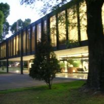
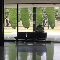
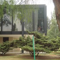
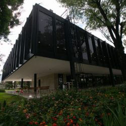
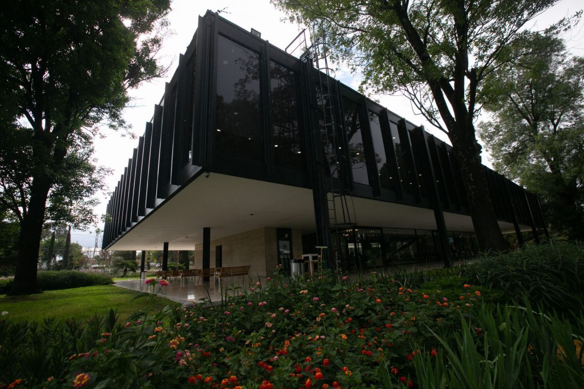
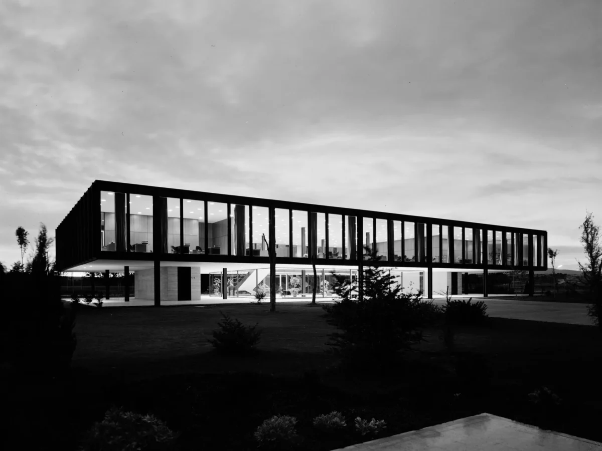
Bacardi offices in Mexico City

Introduction
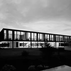
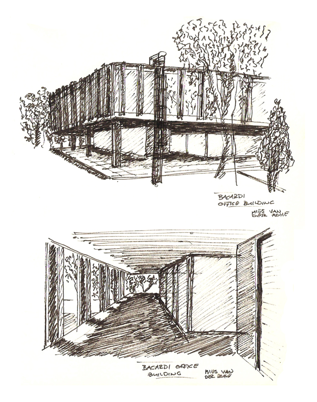
Between 1957 and 1961 Mies van der Rohe designed the offices for the Bacardi plant in Mexico. It was the second work that the architect designed for the company as little time ago, the owner of the liqueurs, Mr José M. Bosch, impressed by the Crown Hall that Mies had designed for the IIT in Chicago, he instructs the headquarters office in Cuba.
The book reflects all the Bacardí for architectural expression in the work of Mies van der Rohe, is the most perfect purity of his forms and spaces. Here are clearly represent its principles and its way of working with the concept “less is more” is always present. In this case uses the principle of “open plan” an area where the game of perfect proportions.
The offices are part of a harmonious architectural ensemble is completed with the area of aging and bottling, designed by the architect Félix Candela. Here we generated combinations of six hyperbolic paraboloids cross hatch shows clearly where each of 30 meters wide.
The work was proposed by the UNESCO as World Heritage Cultural category on November 20, 2001.
Location
Tultitlán is located on Mariano Escobedo, a city in the State of Mexico which is part of the Metropolitan Zone of Mexico City, located north of it.
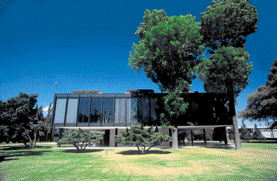
The set was built parallel to the main highway that connects Mexico City with the city of Queretaro, separated by a large garden.
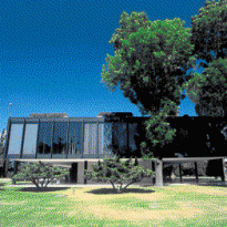
The book rests on a carpet of grass surrounded by curtains of green trees.
Concept
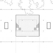
This is an open plan structure rigorously geometric module in the main square as the computer.
Is used here with the principle of centrality within the hollow volume formed a large double height. The ground floor is transparent and is organized through a gallery around the perimeter core glazing.
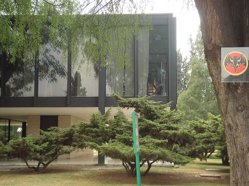
In this case the structure is located outside the glass enclosure.
Spaces
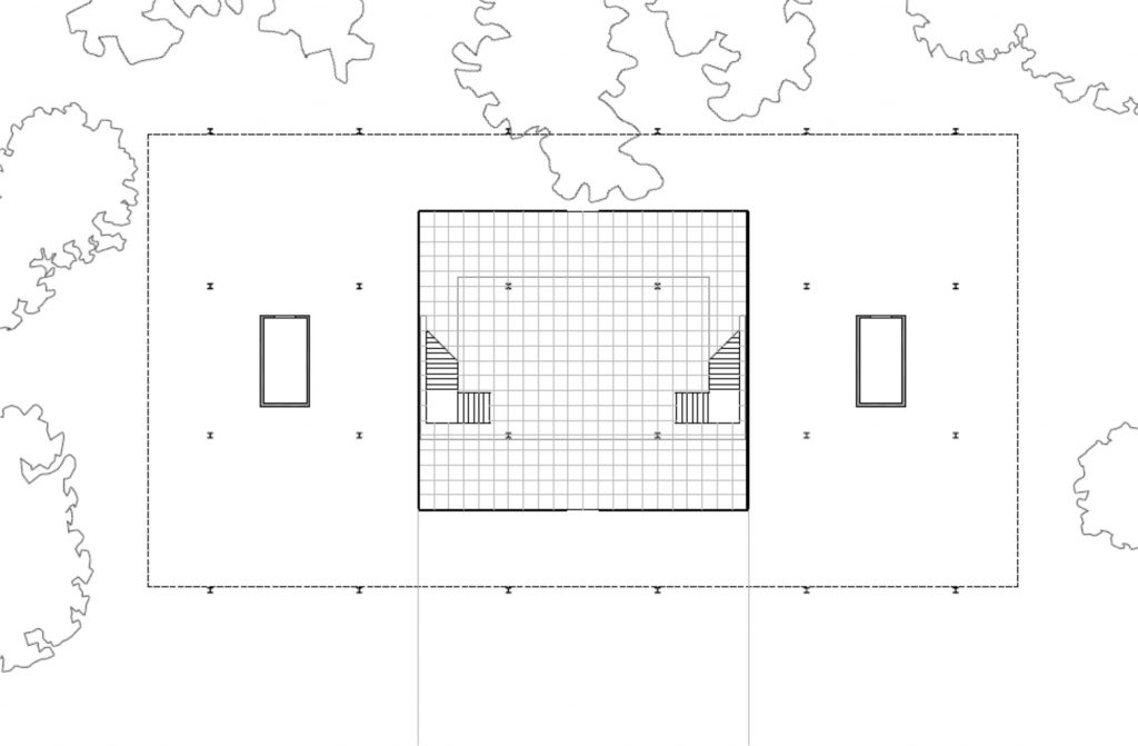
The rectangular building is 52 meters long and 27 meters wide, with 8 meters in height located on two floors.
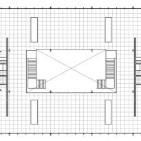
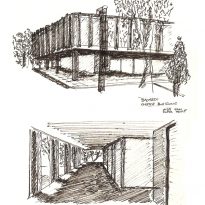
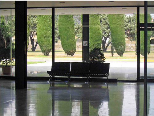
The ground floor is a large open hall with two symmetrical staircases leading to the first floor, bordering the central space of the double-height hall. Around the glass part of the hall is a gallery Half perimeter. The hall gravitates on its vertical axis, but only receives light through the sides. The space is visually spreads outwards.
On first floor, a gallery surrounding the hole of double height. Here are located the administrative offices and meeting rooms, separated by mobile panels.
Structure
You could say that the building is pure structure. All decisions made during the project respond simultaneously to a question of aesthetic proportion and good structure and clear solution.
There are two structures, one main and a secondary, but the second actually perform any function of load transfer.
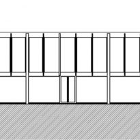
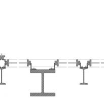
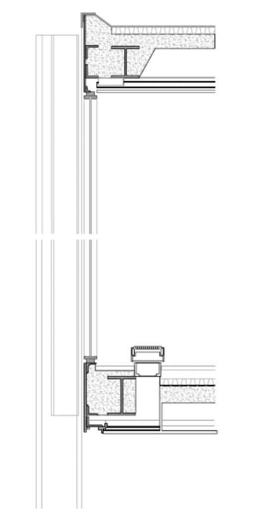
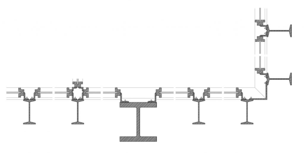
For the main structure was a square plot of modulation, with support every 9 meters. Although to keep up on the walls and the secondary structure does not overlap when they reach the perimeter esquena porches are expanded slightly. The columns are structural profiles of double-T steel.
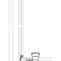
For modular façades Mies used its hallmark, a substructure of profiles in the same geometry double T but less singing, that each module divided into five panels under vertical proportions.
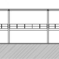
The supports in the two longer sides of the plant, passes tangent to the line of closure, while in the transverse direction are two overhangs of 3.50 meters on each side are offset by two identical overhangs that occur in the interior to the dual space.
The pillars inside pass tangential to the edges twice, repeating the same solution of the facade.
Materials
The architect used the language that characterizes his work, with basic materials: glass, steel and travertine.
The metal is painted black. Large glass fronts used on steel uprights. The interior spaces are divided by wooden panels.
