Bacardi Office Building in Santiago de Cuba
Introduction
In 1957, Mies van der Rohe designed the new headquarters offices for the Bacardi Rum Company in Santiago de Cuba at the request of the company’s president who had been impressed by a previous encounter with the architect in Chicago. However, because of the 1959 revolution, this design never got ot be built and the company continued to operate from the 1930 Art Deco tower, designed by architects Esteban Rodríguez Castells, Rafael Fernandez and Jose Menendez Ruenes.
The project showed many similarities with other works from Mies. The project for the Museum of Schweinfurt Schäffer and Neue Nationalgalerie in Berlin, both designed later, are also characterized by the use of large platforms, square, orthogonal grids, fences behind the cruciform structure and supports, just like Mies had planned for the Bacardi Offices. Here Mies clearly represents his ideas and his way of working with the concept “less is more”. Mies used the same principle of “open plan” and “fluid space” used in other buildings such as the German Pavilion of Barcelona. The quest for a visual connection between the interior and exterior spaces is also pursued in this project.
Location
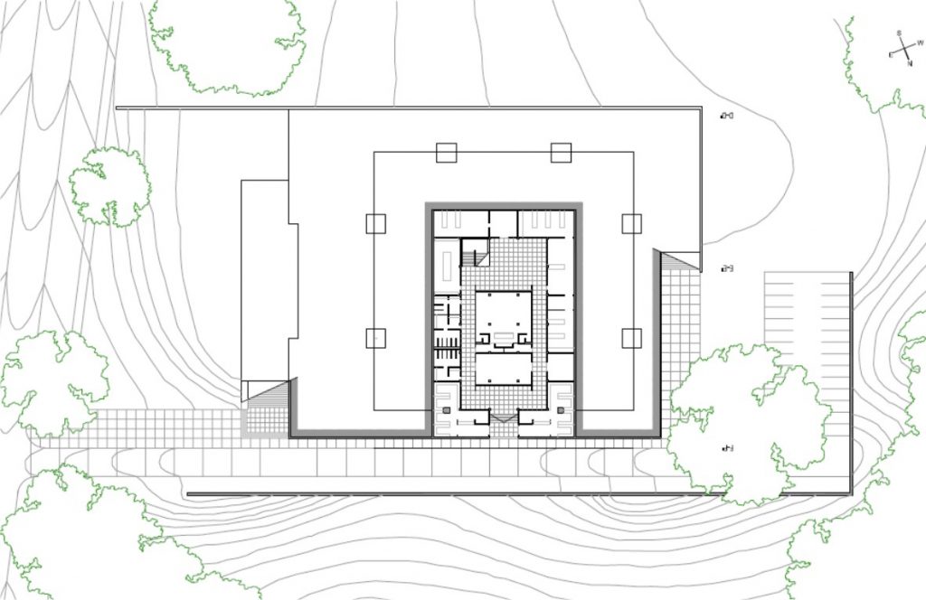
The possible location of the project was in the Second Street and Central Road or Avenida de los Libertadores, on a corner plot between two streets of vehicular traffic. Between the two streets the ground is significantly uneven, which the architect included in the design by making the earth a part of a wall.
The area generally has low density of green space due to surrounding buildings, except for the medians.
Concept
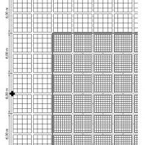
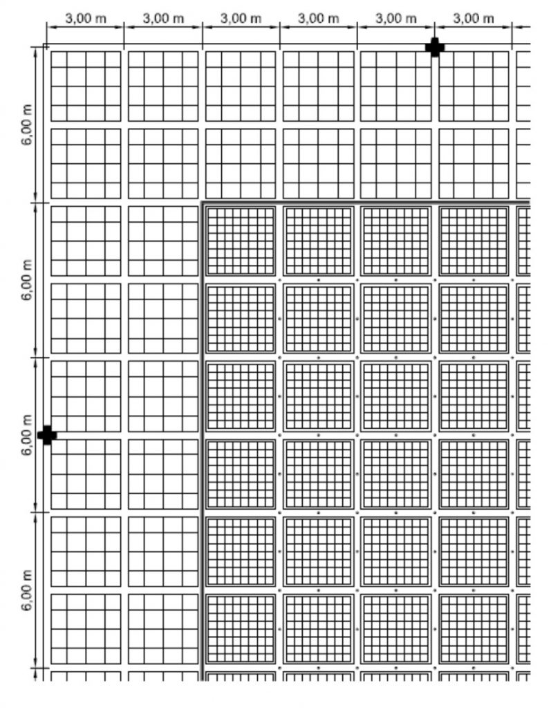
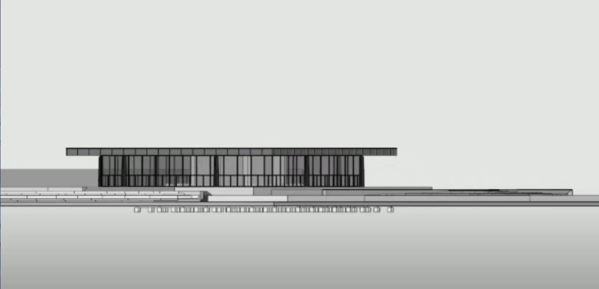
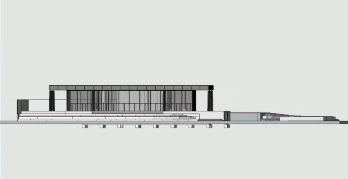
A clear and well-defined geometric grid is the base of this concrete structured design. However, as rigid as the base grid might be, the building does not become a monolithic cube, in fact it becomes a very flexible, permeable and versatile space.
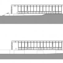
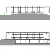
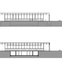
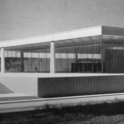
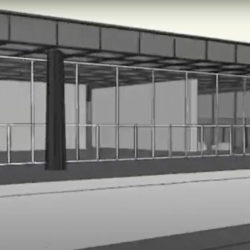
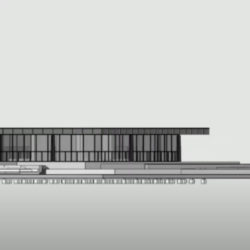
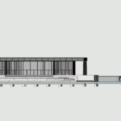
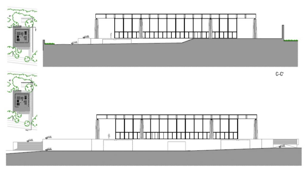
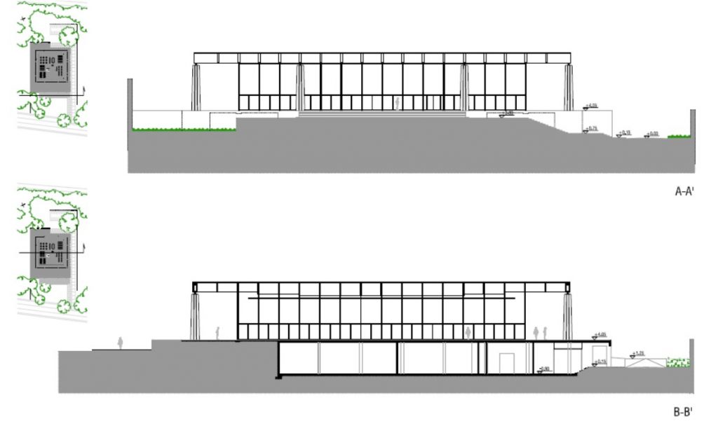
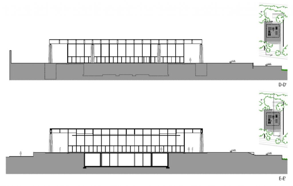
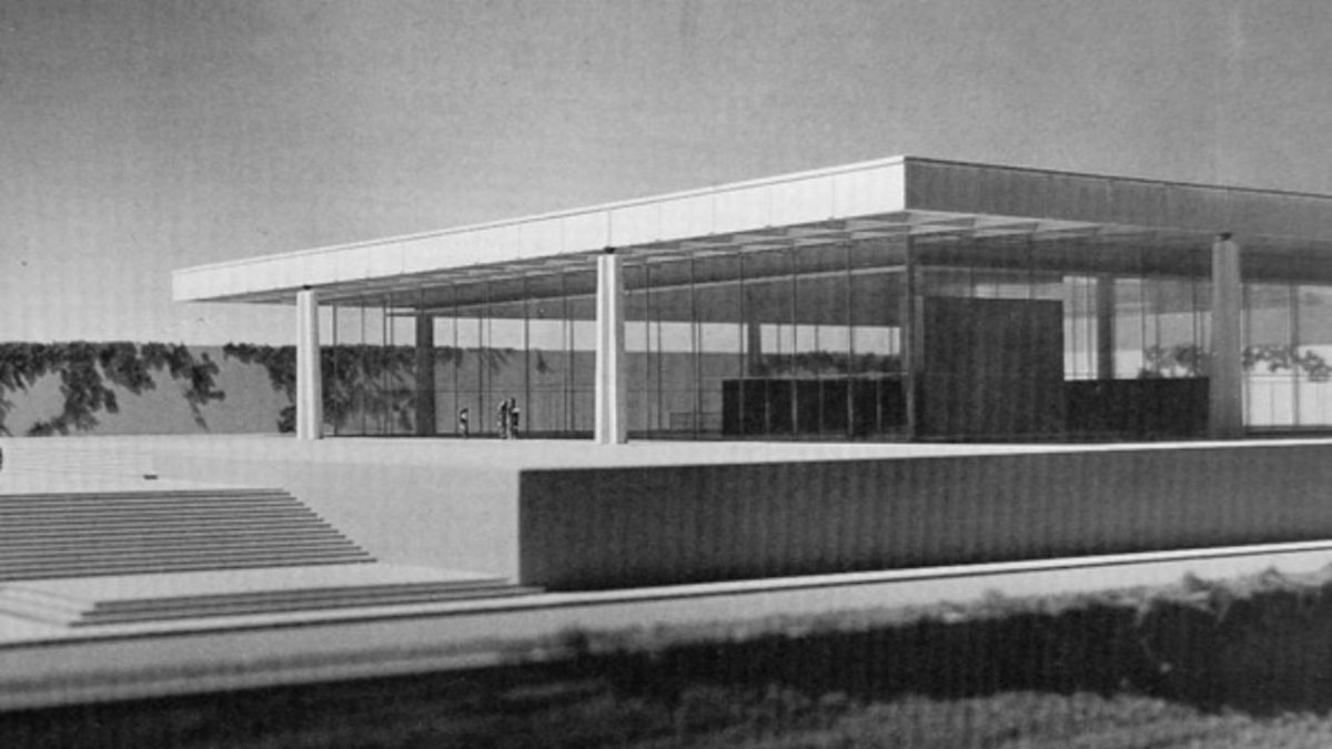
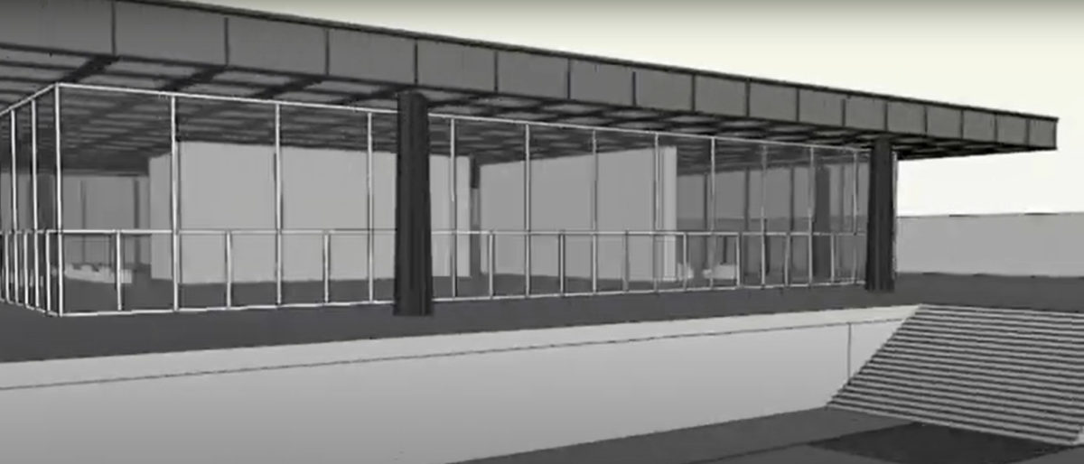
The building is divided in two floors. The lower floor acts as a platform where the second floor can develop freely, with the roof being supported by only eight columns. These columns are placed two on each side of the squared floorplan, leaving the corners free of any structural support, which makes the massive building appear much lighter that it would otherwise. The glass façade is placed away from the roof limit, creating an outdoor gallery.
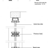
The division between the structure and the enclosing elements is clear and almost exaggerated. New construction techniques now allowed architects to separate these two elements, and in this design Mies pushed this opportunity to the extreme, as if trying to set an example of what could be achieved now that thick walls and small windows were not a necessity.
Spaces
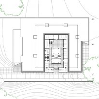
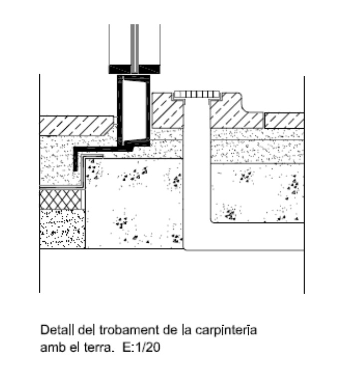
Because of the sloping plot were the building was designed, Mies decided to place the building on a platform that woudl level up the ground for his design. The access happens through a staircase enhanced by two side walls, one of which is bordered by a road to the rear parking lot and the other in the southwest side by the neighboring property. The walls create a courtyard in which some kind of sculpture would have been placed.
The interior is divided into two floors. The lower platform is partially buried, in response to the slope of the terrain. Because of it’s semi-buried position Mies used this floor to place secondary spaces, such as storage or the cafeteria. It can be accessed both through the internal staircase that connects it to the upper floor and from the outside with a separate secondary entrance.
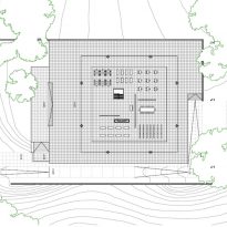
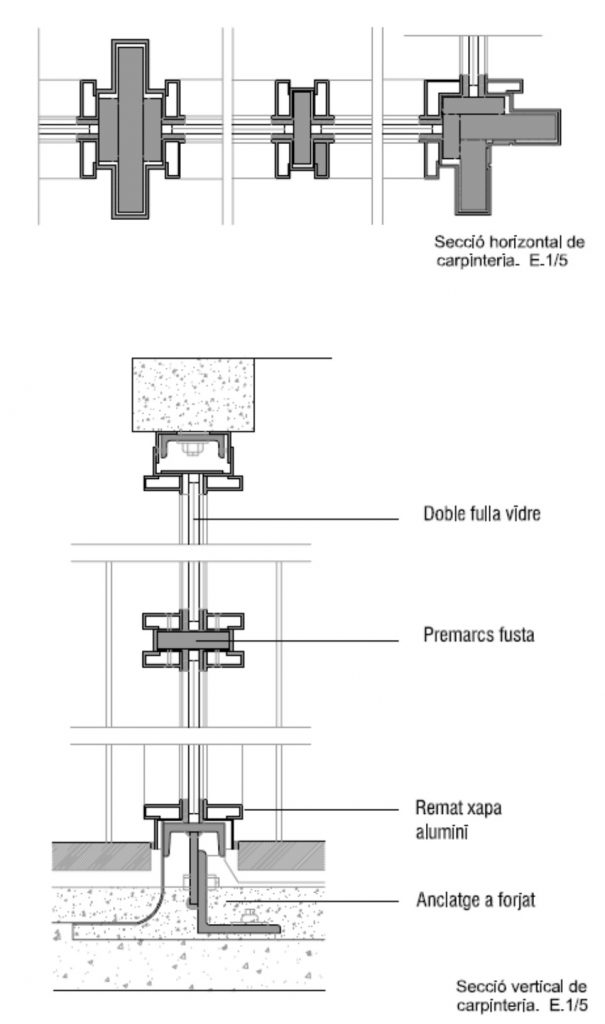
The upper floor plan is completely free and open. The enclosure is made of glass on its four sides, placed 6 meters inwards from the edges of the roof, creating a large gallery space that runs along the outside. On this floor Mies placed the offices, which could be completely rearranged as needed. The staircases leading to the lower level is actually the only fixed element found on this floor that could not be moved, other than the glass facades of course. Mies also created two self-standing walls that would serve as partitions. These walls were 2 meters tall and made out of wood. The staircase and these carefully thought partition walls helped divide the sapce into three main areas: The access ladder that served as the lobby, a second space that would serve as a meeting room and a third space that would work as a large, open work space.
Structure
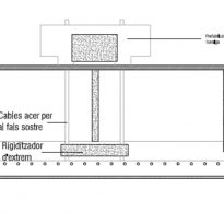
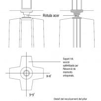
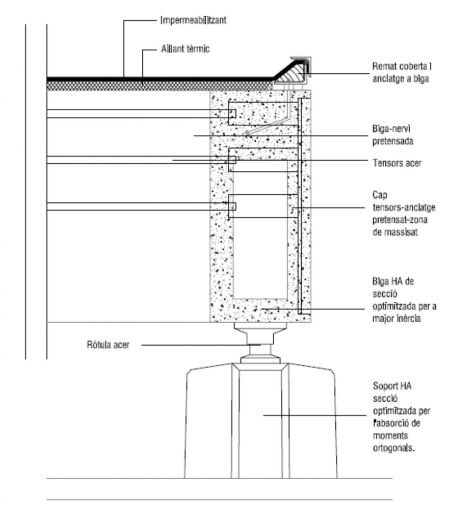
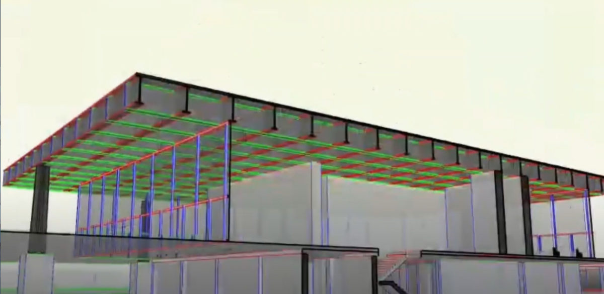
The structure is made out of reinforced concrete, consisting of a 54 square meter deck supported by eight seven-meter-tall cruciform columns.
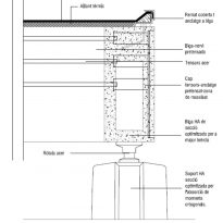
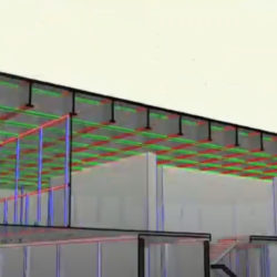
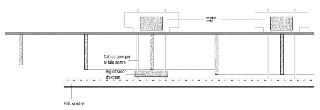
The roof is a large grid formed by post-tensioned beams that, responding to the structural forces diagram, have their largest section in the middle and smaller sections at the ends, with a minimum section of 1.5 meters.
The columns are located two on each side of the squared-shaped floorplan, at the edge of the roof, leaving the corners free of any structural support. They are 15 meters inward, creating four large overhangs. The eight supports are cross-sections of concrete, tied to the deck by steel joints.
Materials
The structure is made of reinforced concrete, the enclosure of glass and the interior panels out of timber. Floors would have probably been made out of marble, if we take other buidlings by Mies as a reference.
