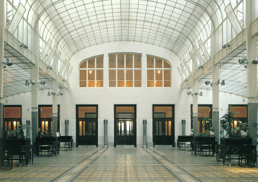
Austrian Postal Savings Bank

Introduction
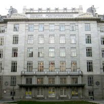
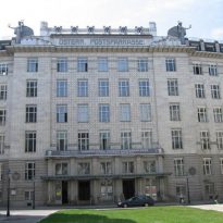
The Post Office Savings Bank in Vienna, was started when the architect was 62 and ended with 71, sums up the work of his life and together with the Church of San Leopoldo in Steinhof is considered the most important work Wagner and one of the architectural symbols of Vienna. Together with Berlin and Chicago Vienna is among the places where the “functional architecture” was founded and the building fully meets what is meant by modern architecture.
Of the 37 projects submitted to the competition, the winner of Wagner was beginning to take place in 1904, with some modifications with respect to the original project, and part of the roof was completed, the first building in 1906.
Project
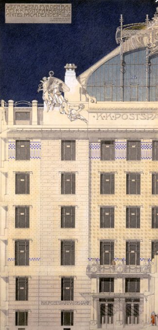
The tender for the construction of the Post Office Savings Bank Imperial-Royal was an open and anonymous process carried out in February 1903 three meetings were necessary for the jury to decide the winner, winning the draft submitted by Wagner on the other 36.
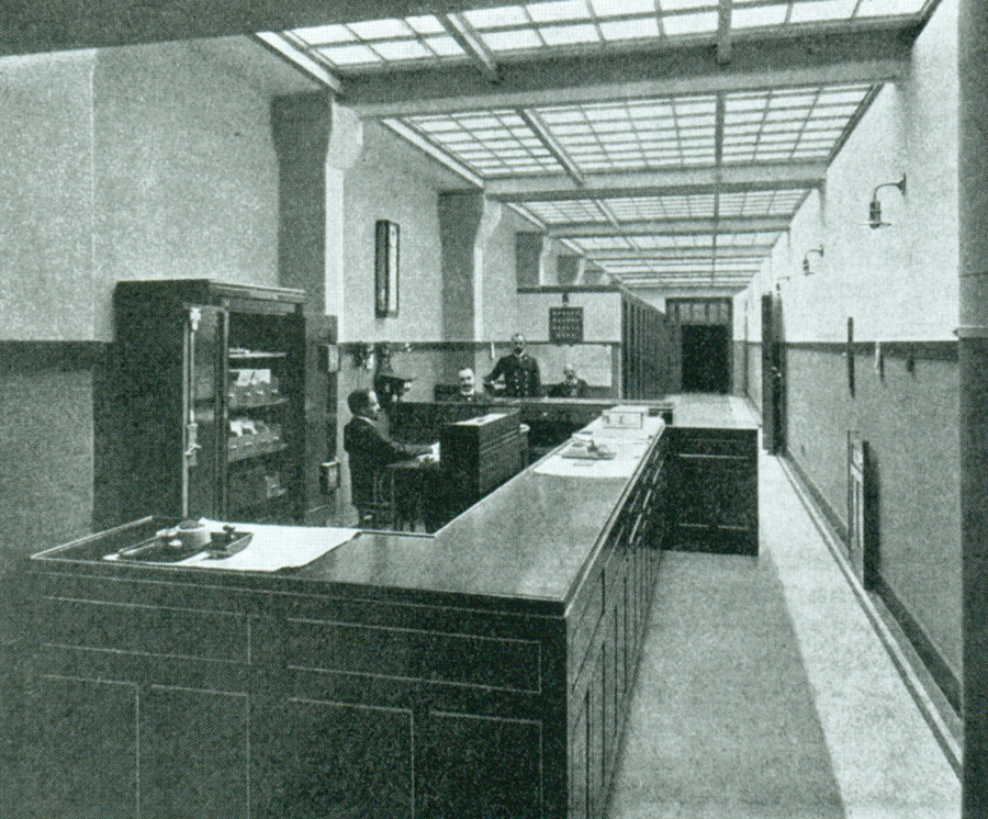
Contrary to the tender specifications, Wagner took the corridors to be used by the Savings in your transactions, this is one of the reasons used by some of the architects of the jury as argument to reject the project, but was finally recognized as a functional improvement not previously considered by the representatives of the Postal Savings Bank. The competition is mainly notable for three reasons: 1 The jury took three consecutive days to evaluate projects, 2. jurors individually examined projects between meetings and 3 The priority given to functions and construction criteria style assessments clear that modernity was gaining ground set.
The draft Otto Wagner was definitely more suggestions carefully crafted all presented to the jury, was the only participant able to combine the vision of a new Postal Savings Bank with a new architecture, being an extremely rare event in the history of architecture a visionary project that match a client architecture and also visionaries, with the same content and objectives.
Modifications
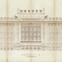
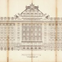
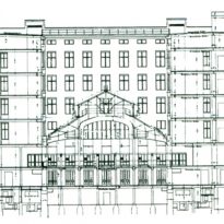
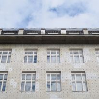
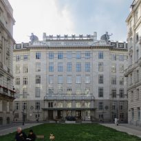
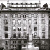
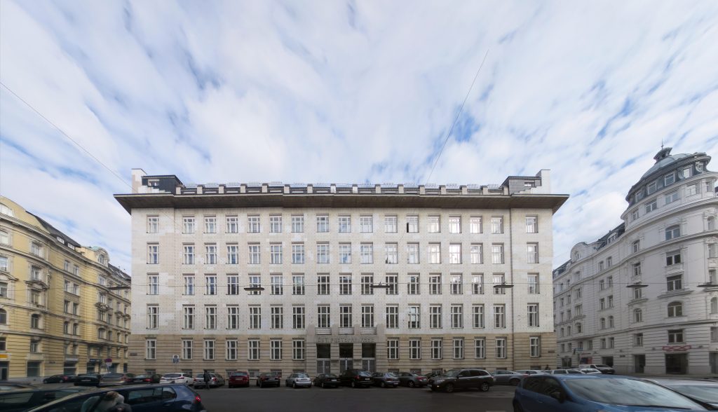
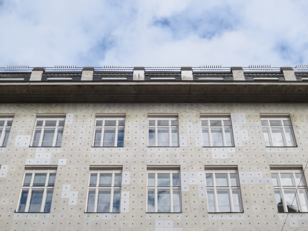
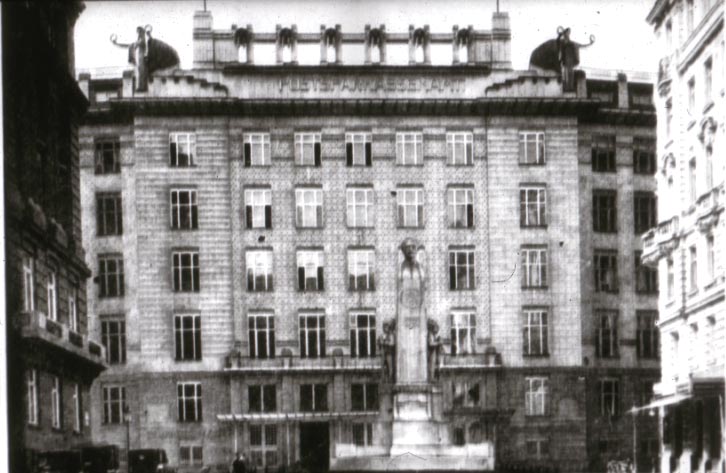
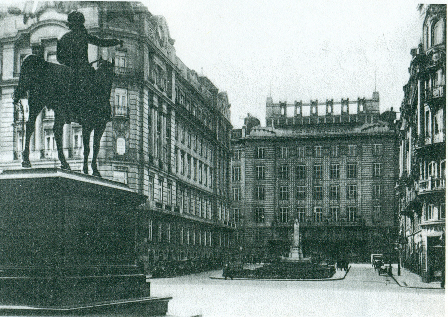
During the following year to win the contest Wagner revised its original plans, with particular attention to the central part of the building facing the small square Georg Coch Platz. The high arch structure of metal and glass on top was replaced by horizontal attics, wall and topped with balustrade. These modifications enabled him to achieve greater harmony between the horizontal line of the building and the horizontal rhythm of the windows, showing a great sense of integrity for the whole
Location
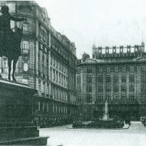
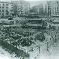
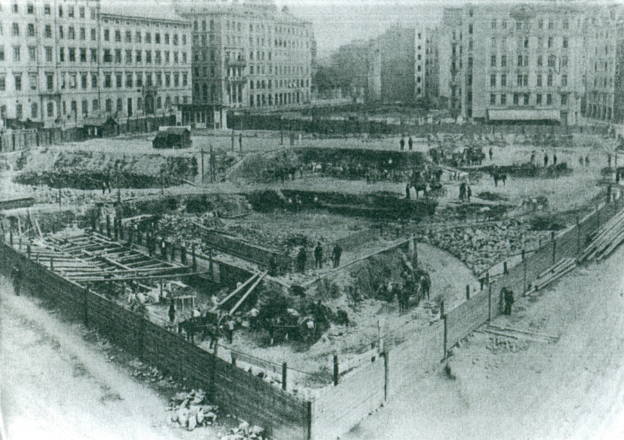
In order to transfer the former headquarters of the Postal Bank, which since 1833 was located in the former monastery of the Dominican Order in 1903 he was called to contest a specific program for the new location in the Stubenviertel in George Coch Platz 2 1018 Vienna. Otto Wagner won first prize and started with the project but the style differs greatly respected environmental criteria such as volume, color and rhythm of openings.
In 1902-03, about the same time that the competition for the Postal Box, Otto Wagner participated in another competition for a “general regulation plan” to Vienna. Their suggestions were the basis for urban development around the Savings site being considered by the architect as the ideal for the Office of the Imperial and Royal Mail subsequently used for the Savings Bank.
Concept
The building received rave reviews in the architectural environment of the time and was considered a pioneer achievement of Austria, and indeed of European architecture.
Flor plan
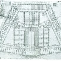
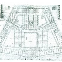
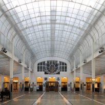
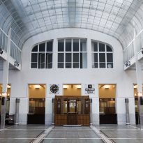
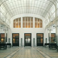
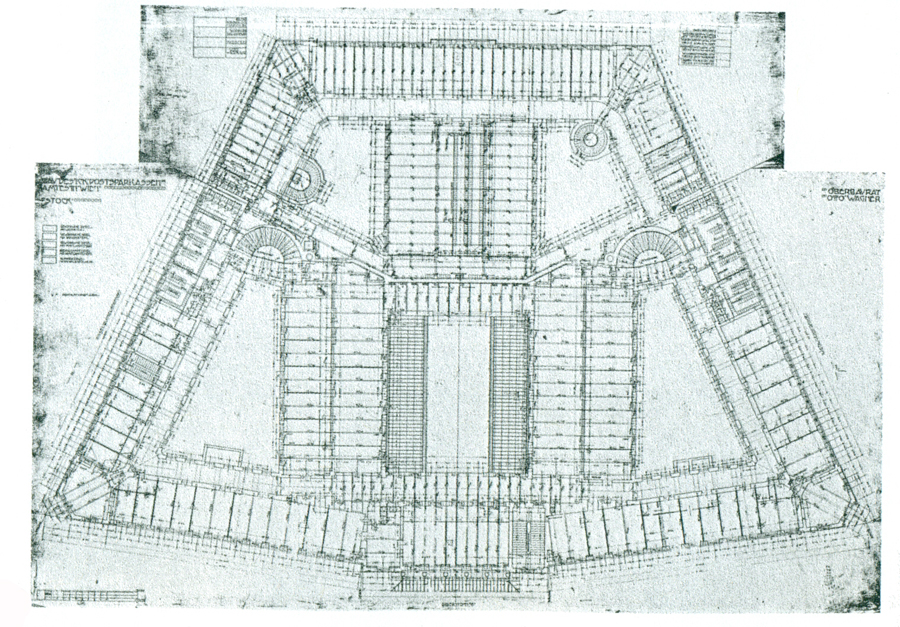
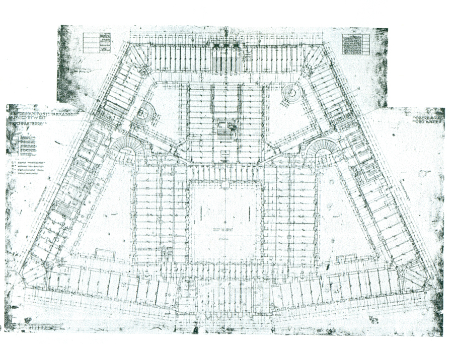
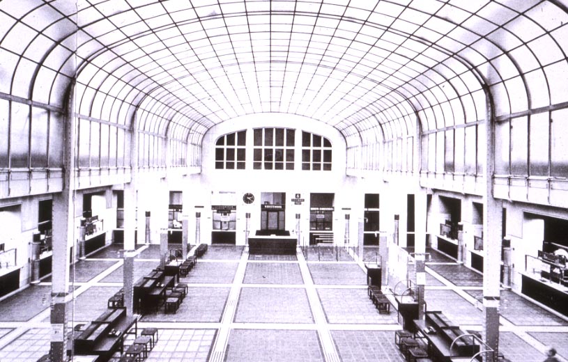
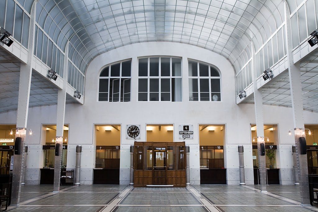
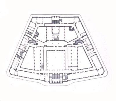
The architect designed a basilica with three naves, the central higher that the two sides, with the intention of giving his creation, for a profane place, a rational basis to establish an art form as the inevitable result of a functional form. The central module becomes urban architectural ornament and decoration. The whole building is built around the central hall where the functional requirement is very clear and perfect to fulfill his duties, is the main idea of the project.
This concept was achieved mainly inside as it is a true representation of a building and completely practical offices related to its purpose, it appears to us as a “huge envelope full of money”
Spaces
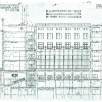
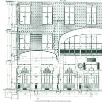
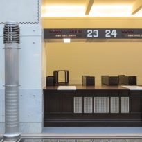
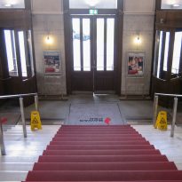
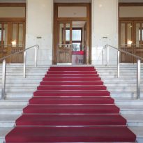
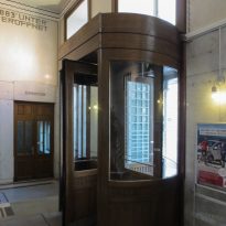
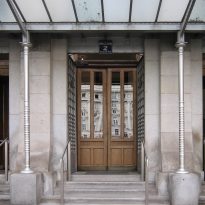
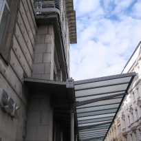
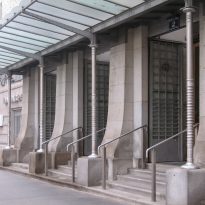
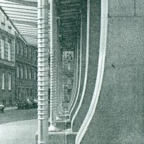
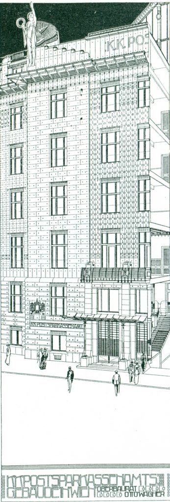
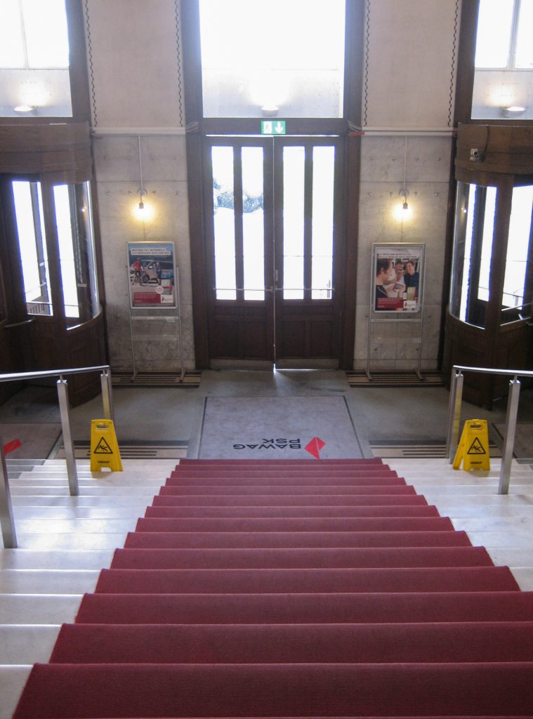
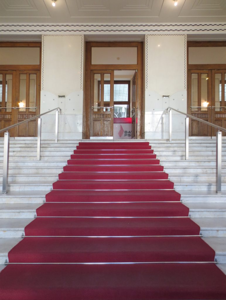
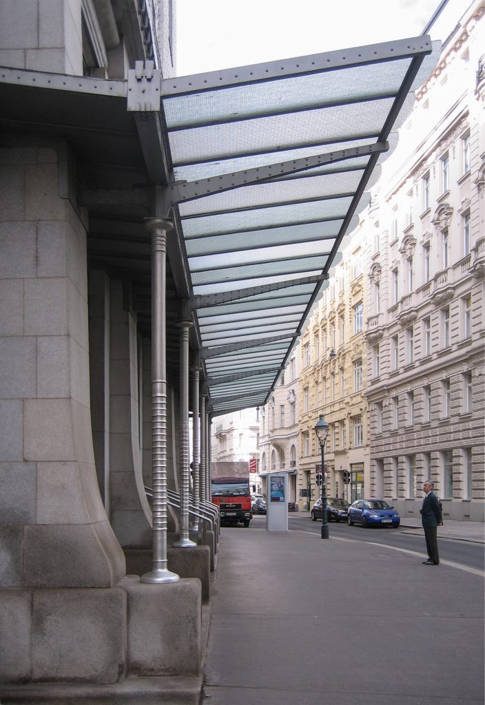
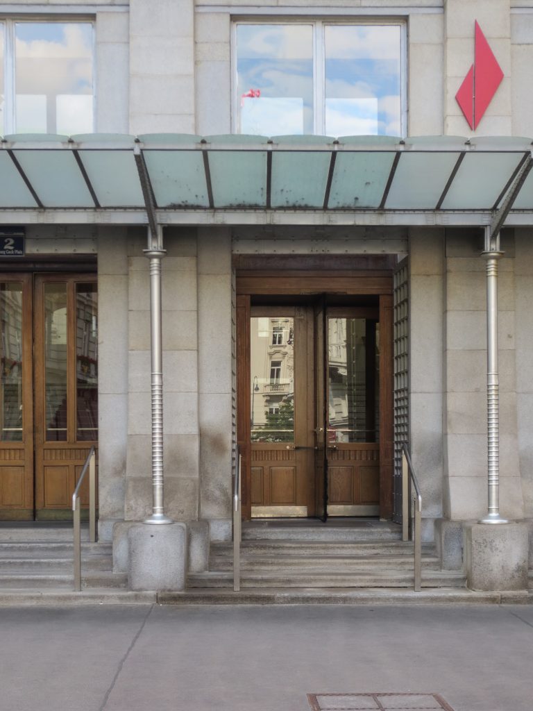
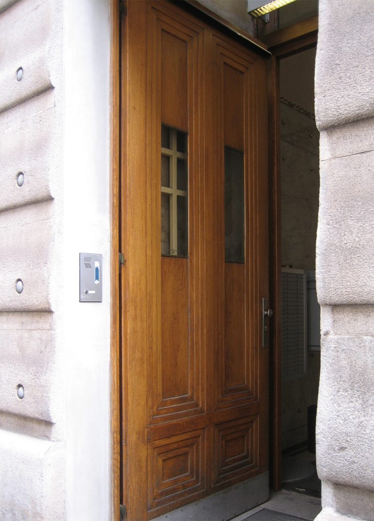
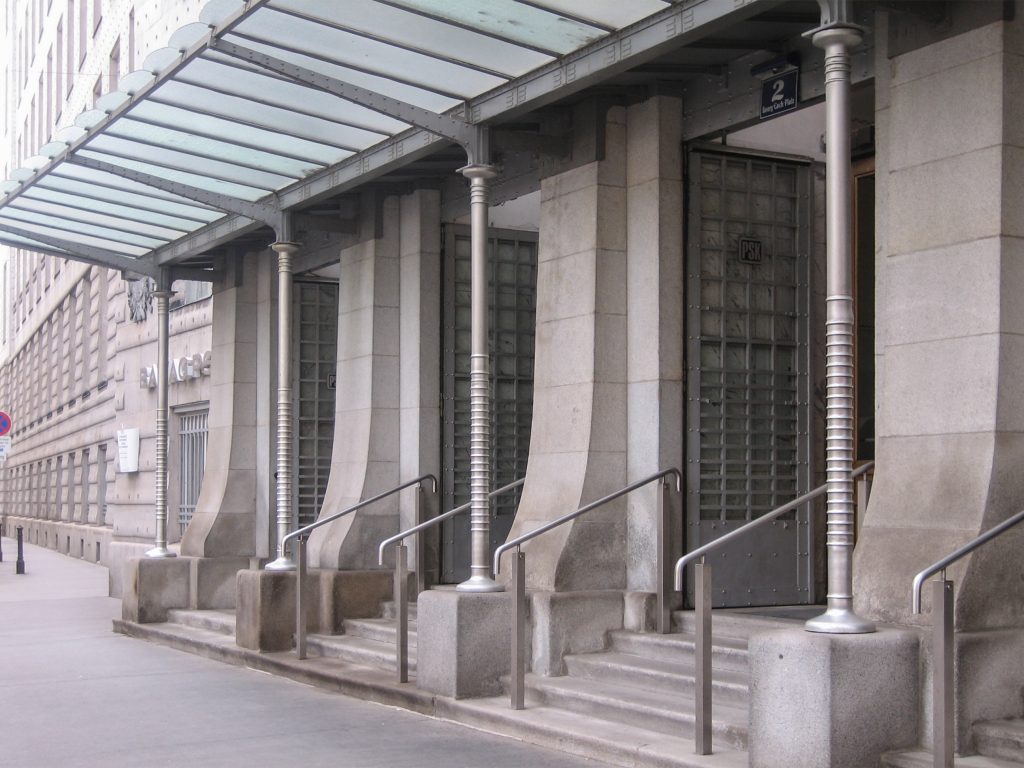
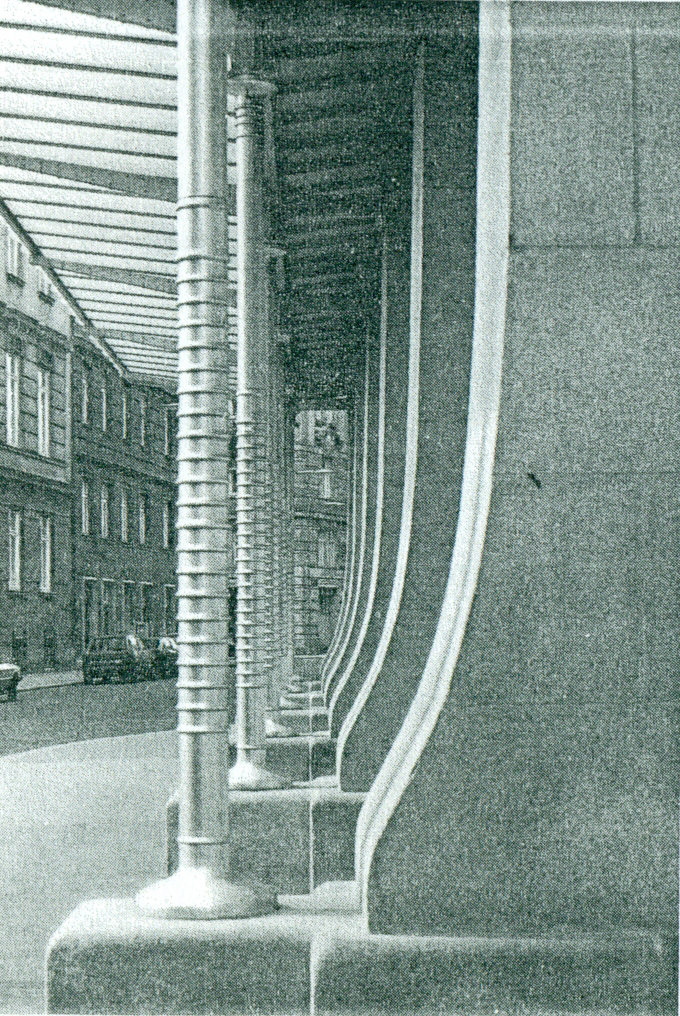
The main entrance to the building is via a wide staircase covered by a single carport metal and glass supported by slender columns, which give access to the atrium leading to the central area of the bank. Below this large patio lit basements, one of which develops its work mail is placed.
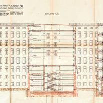
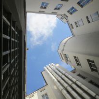
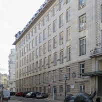
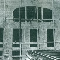
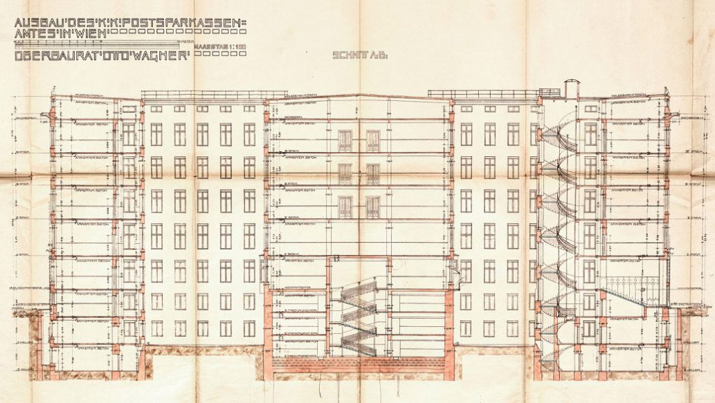
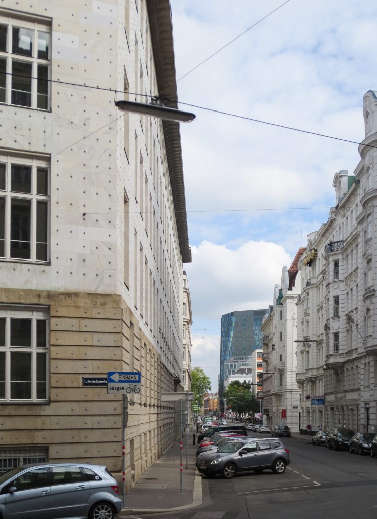
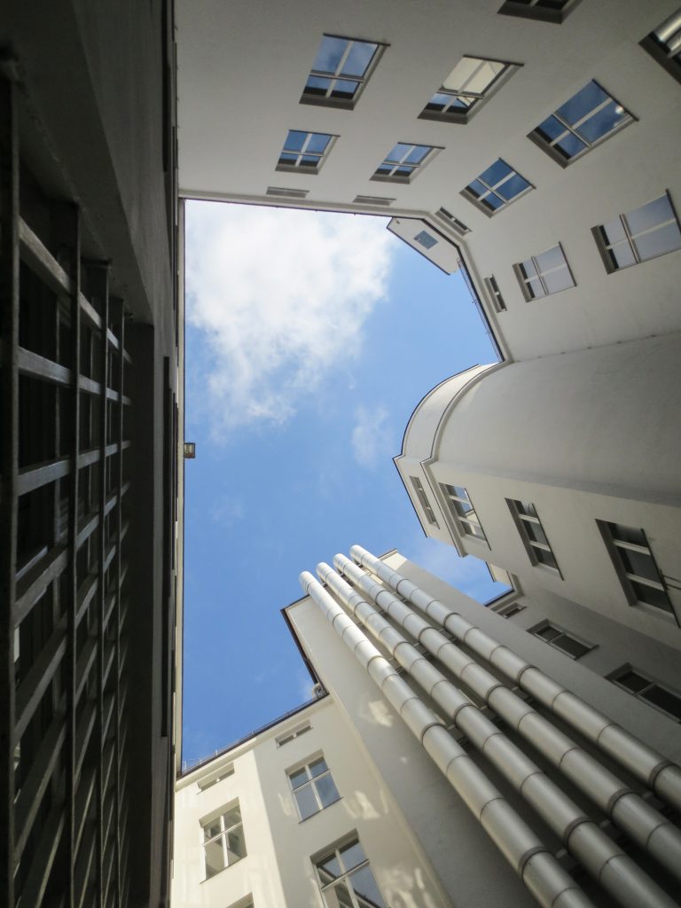
The building has 8 levels organized symmetrically around 5 yards of light that illuminate the interior. In order that the Savings Bank went into operation as soon as possible, the work was divided into two parts, the first building on the east side, was built between 1903 -1906 and the second in the western part, the part rear of the building that faces Dominikanerbastei, was completed between 1910 1912, being attached to the first.
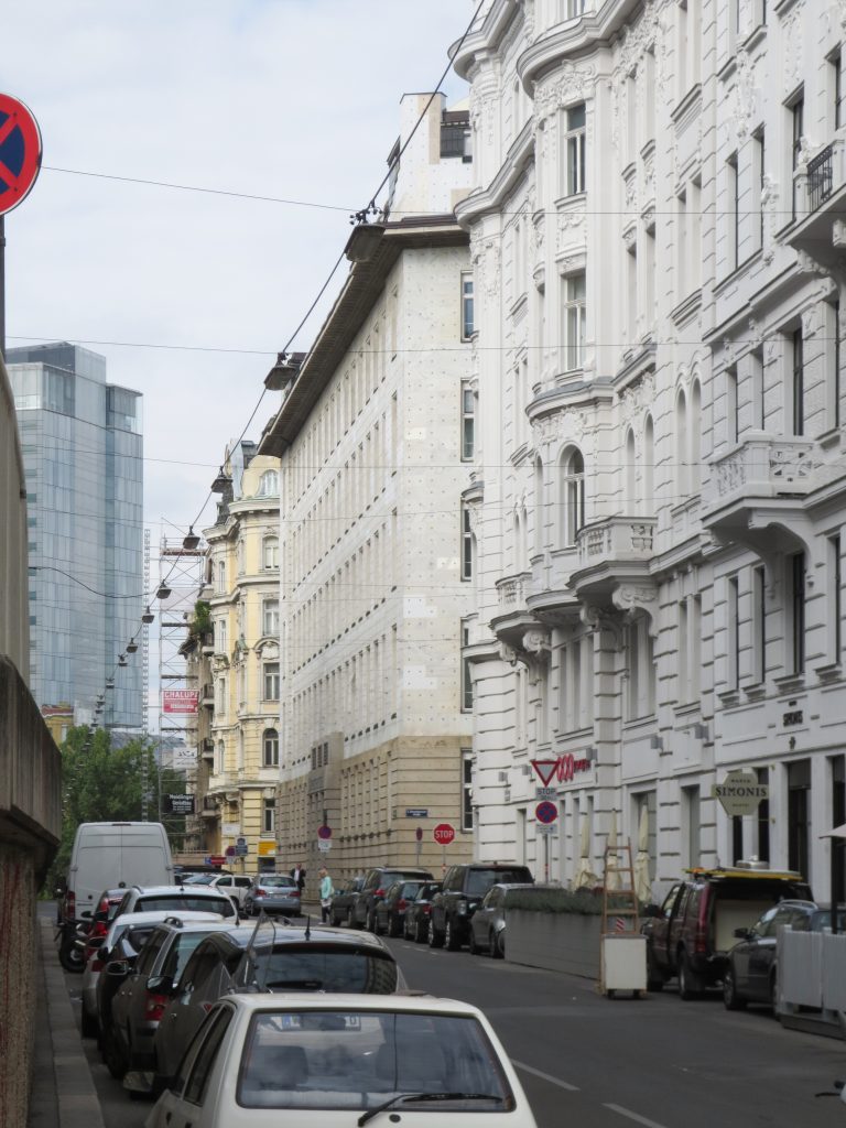
Although his style differs markedly from other surrounding buildings, the architect had the respectful approach to keep some characteristics of the environment, such as volume, color and rhythm of openings.
Interior
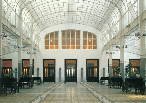
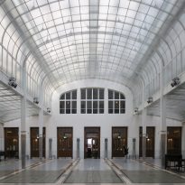
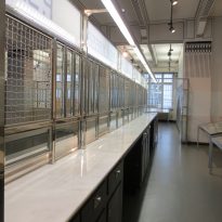
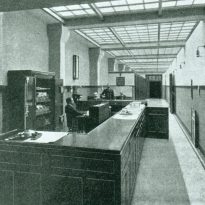
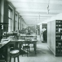
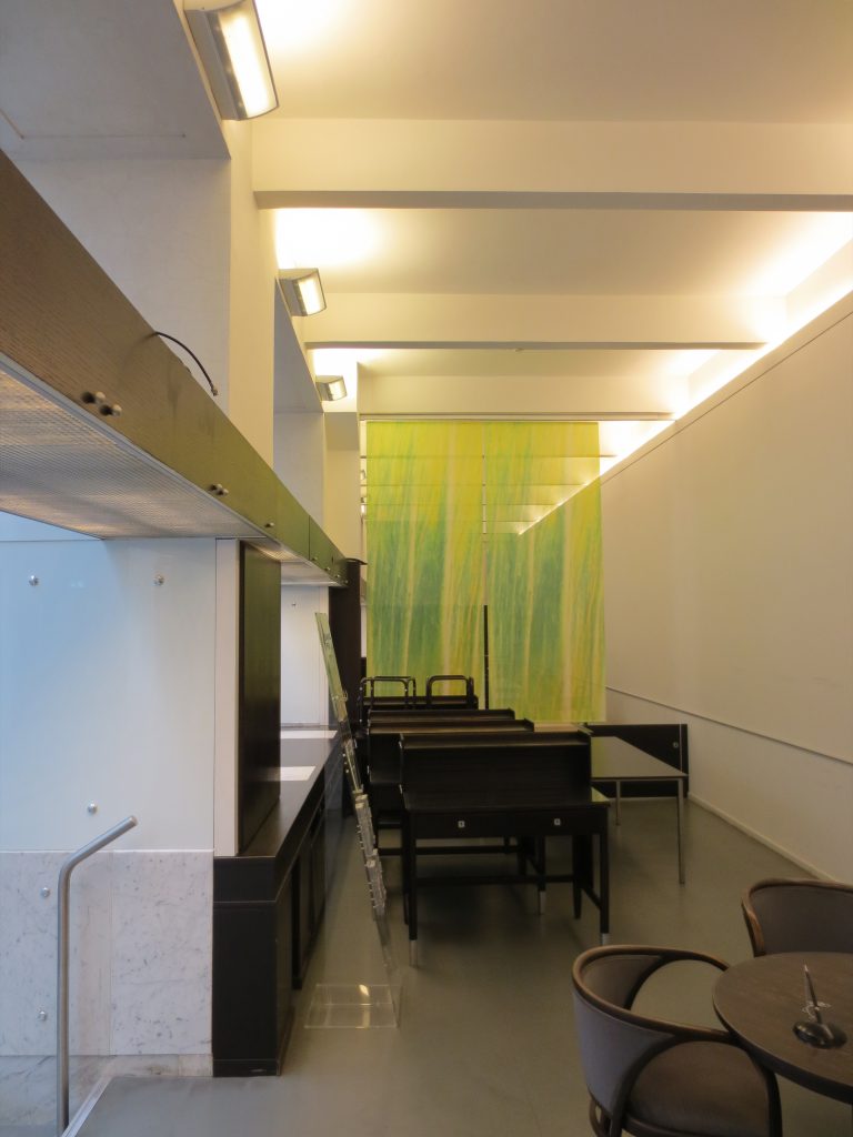
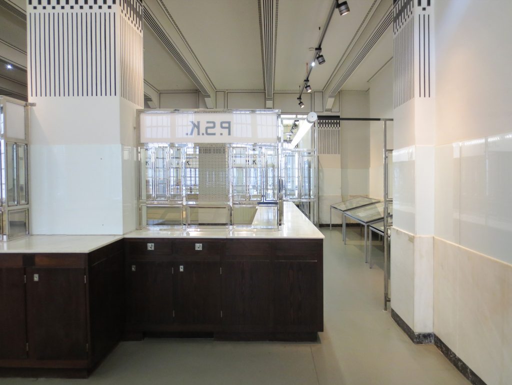
This trapezoidal shaped building, harmoniously developed around the central hall, the flexible use of space, lack of ornamentation and the seamless integration of two materials, glass and iron, clearly reflect the transition from conventional forms of historicism the new architectural trend Secession, modern architecture, Art Deco or Jugendstil, without any reminiscence of historic styles, no hint of palace architecture nor free rebirth, only “useful style”
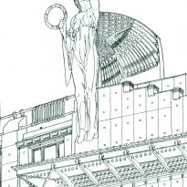
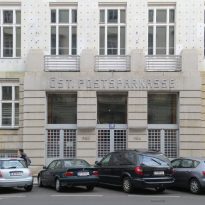
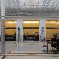
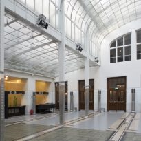
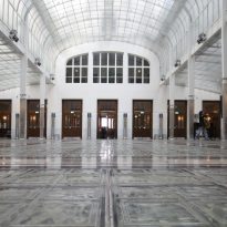
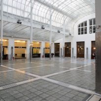
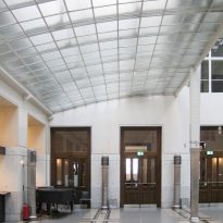
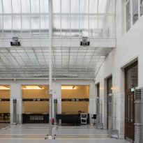
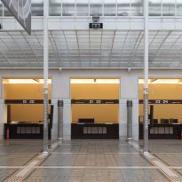
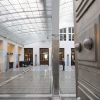
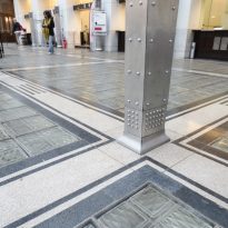
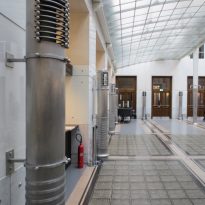
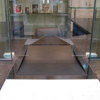
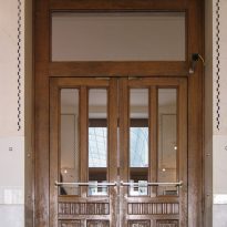
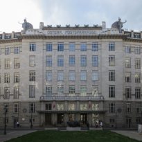
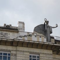
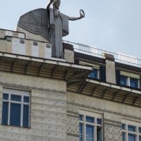
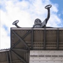
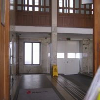
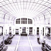
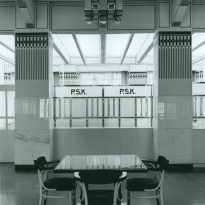
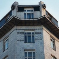
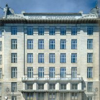
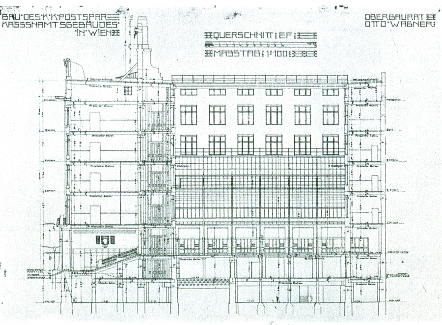
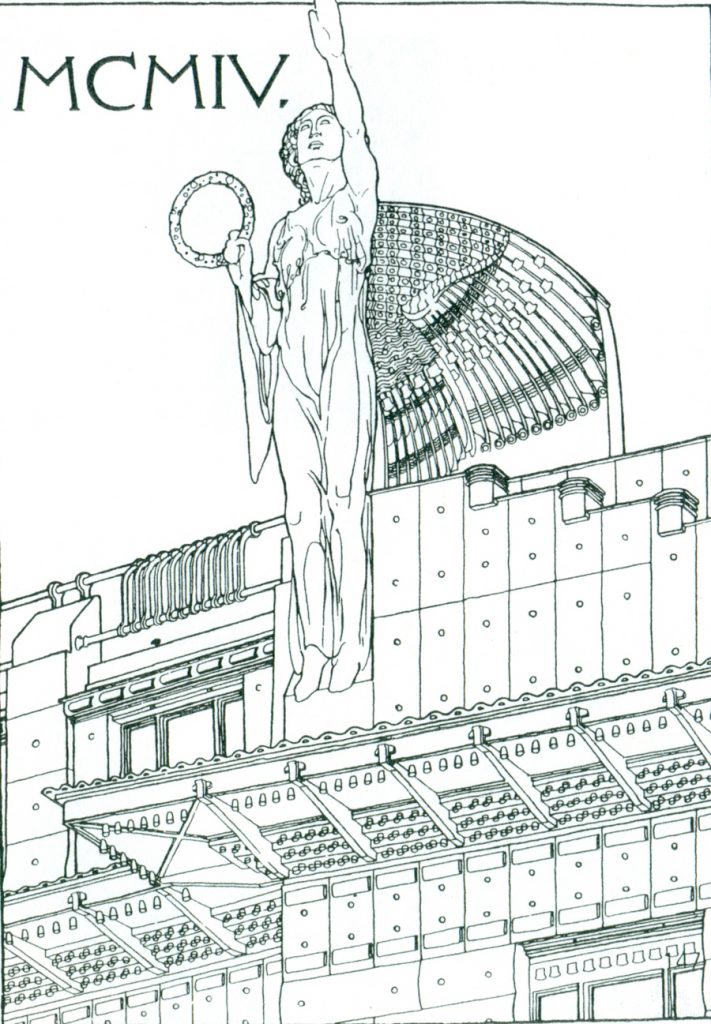
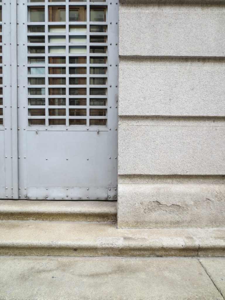
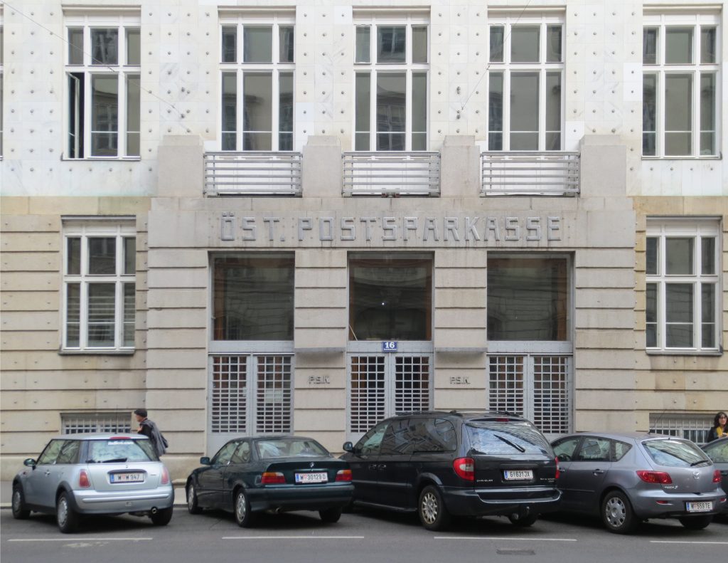
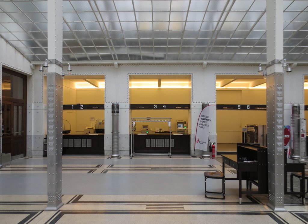
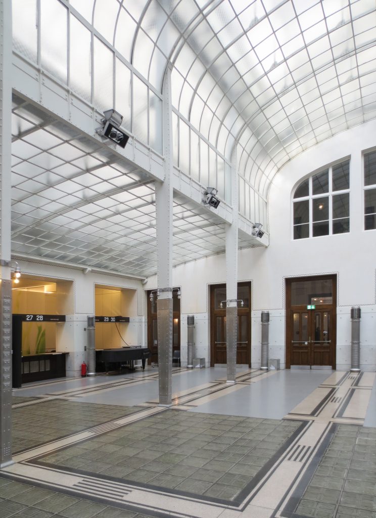
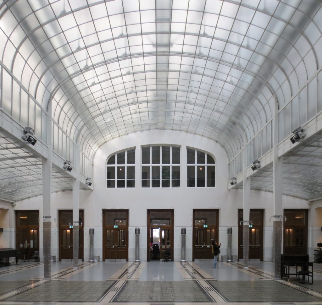
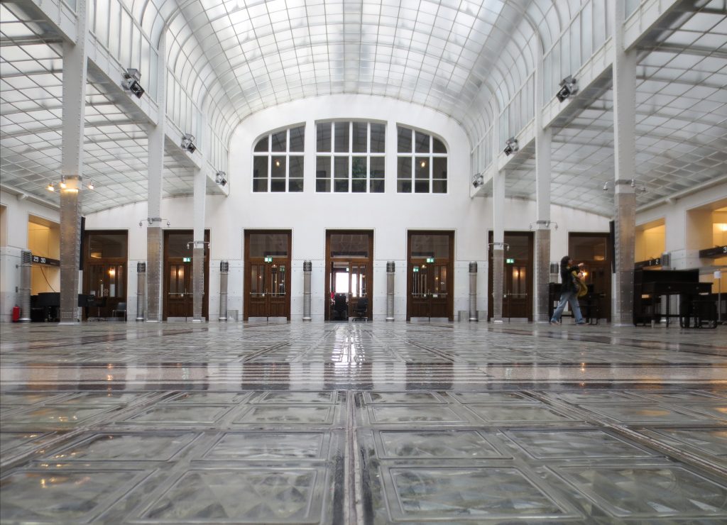
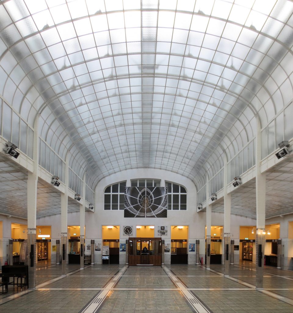
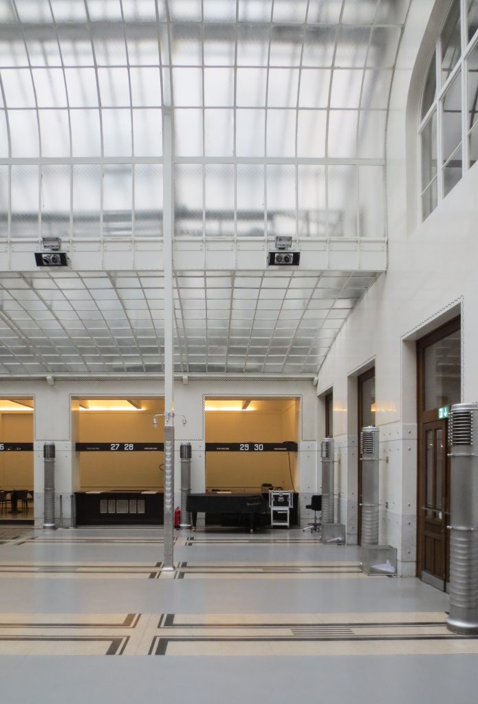
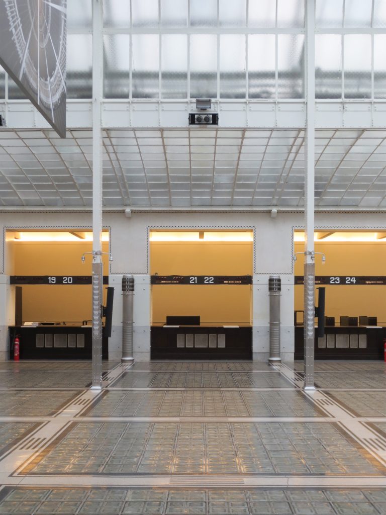
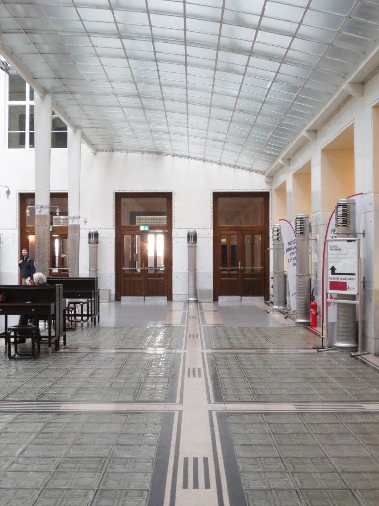
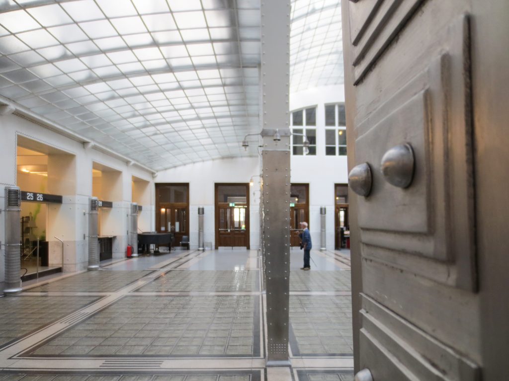
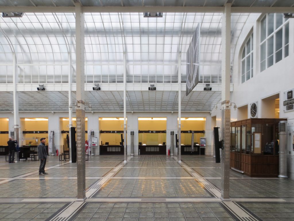
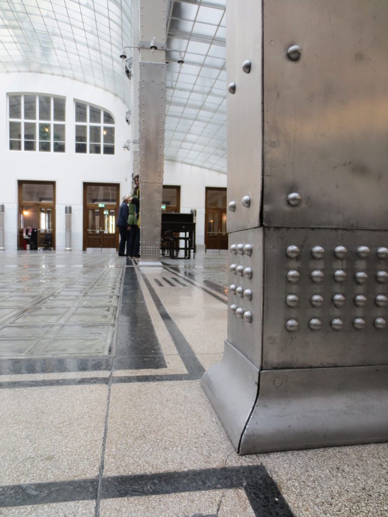
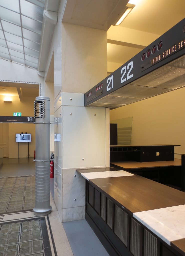
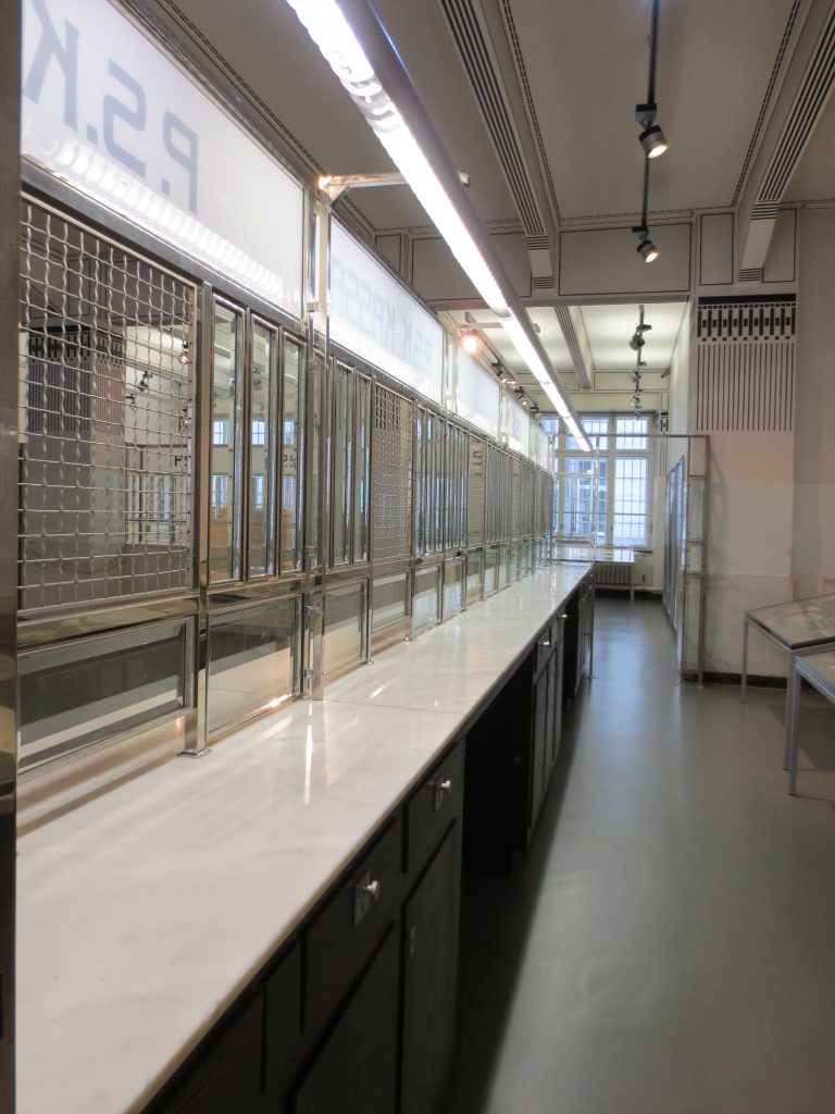
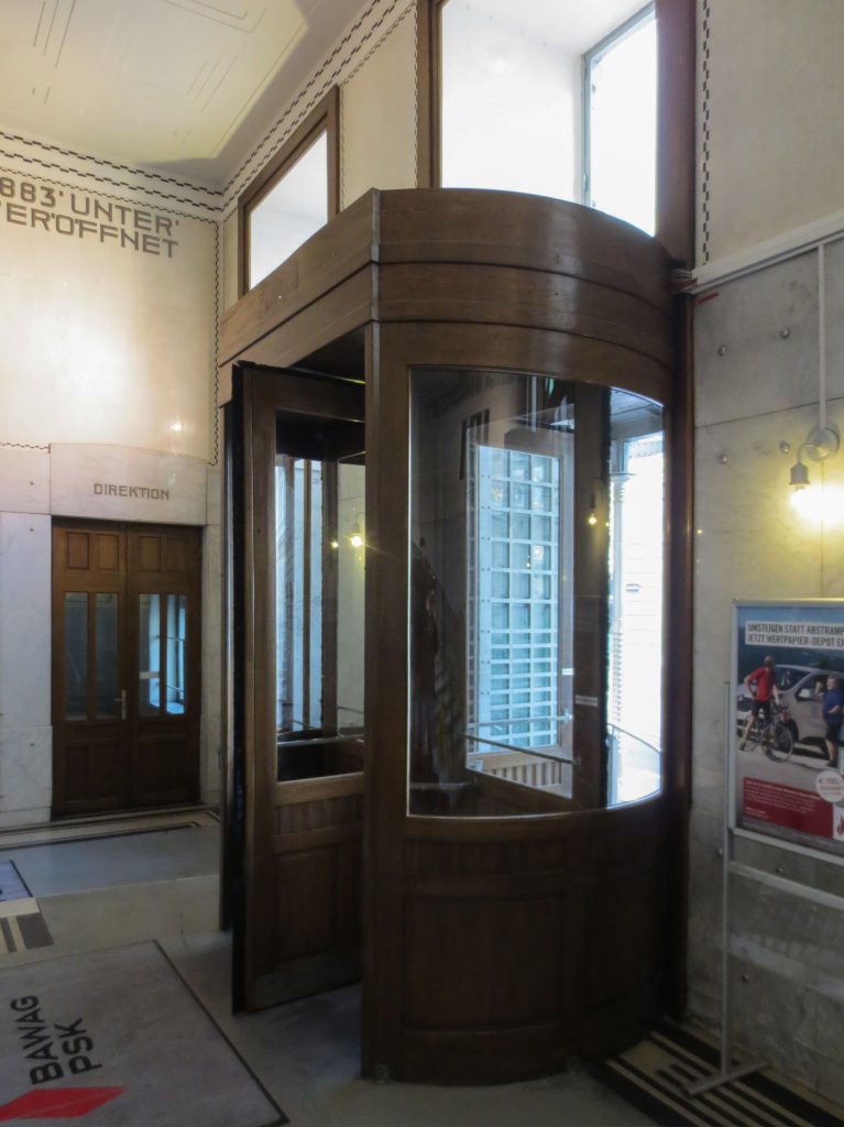
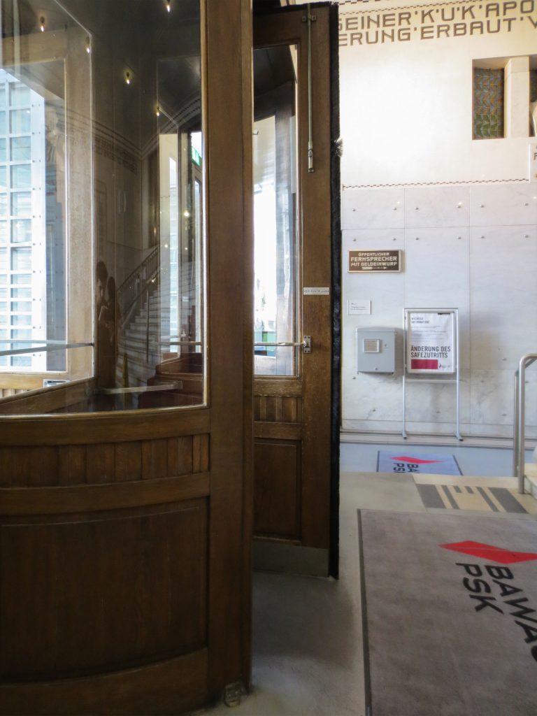
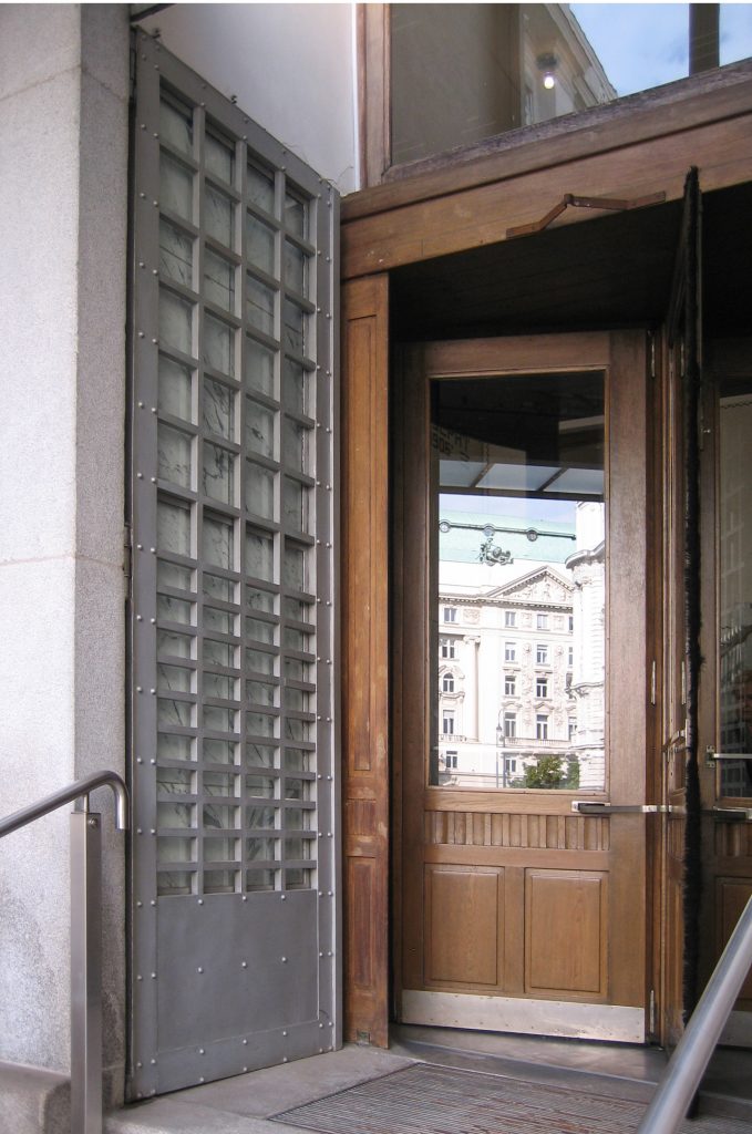
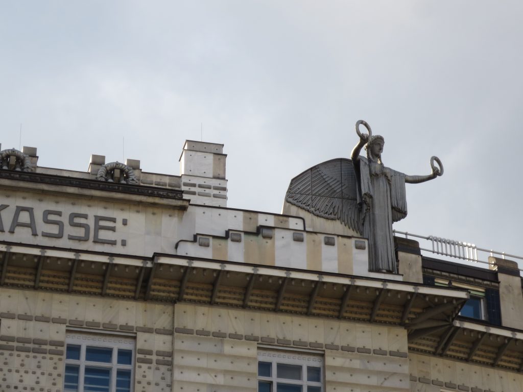
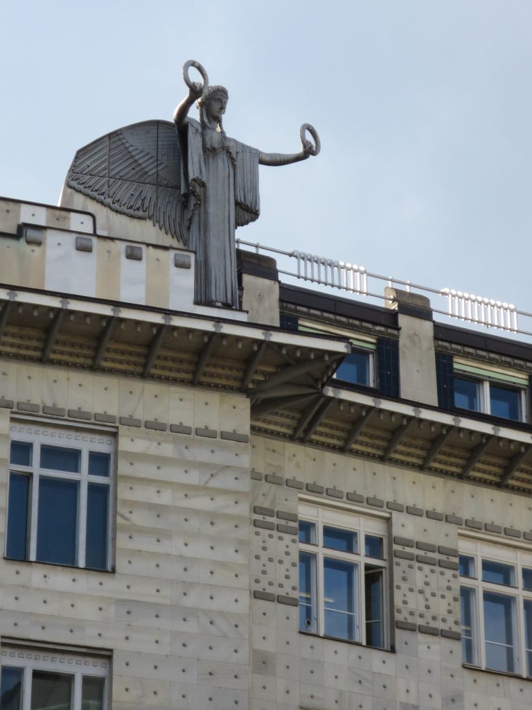
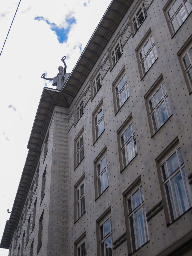
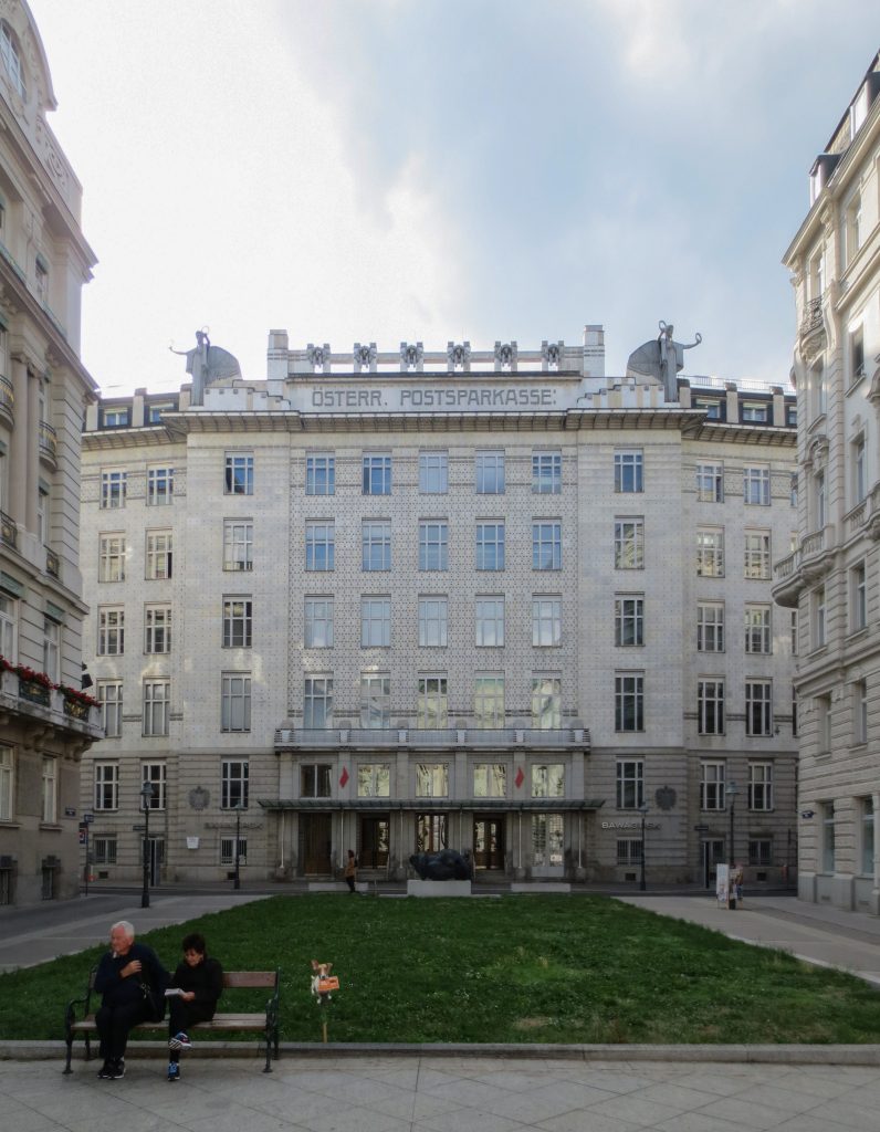
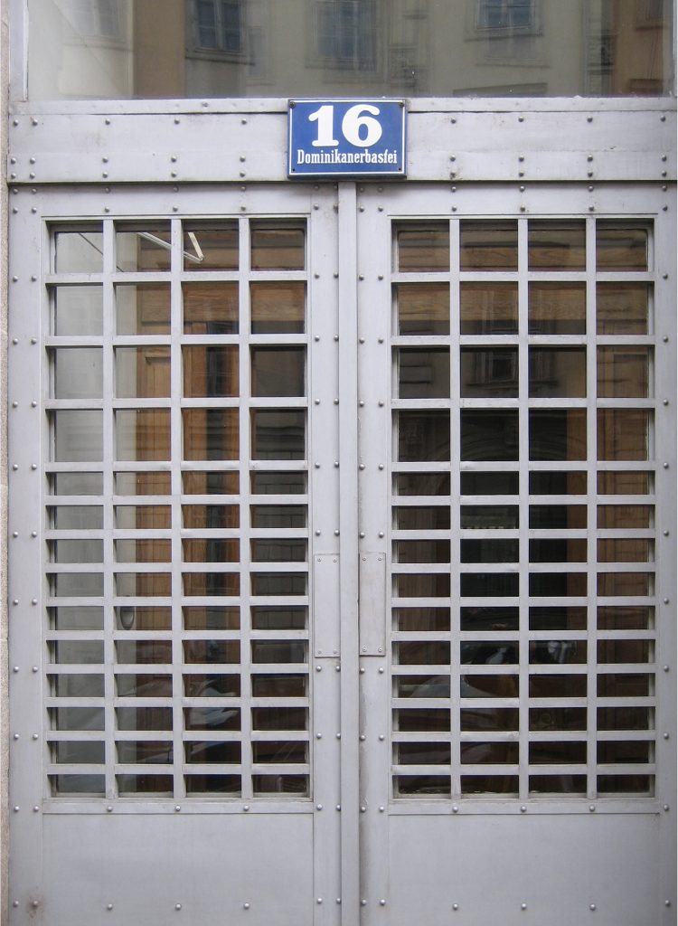
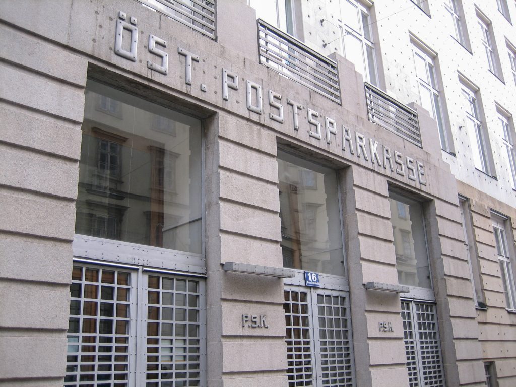
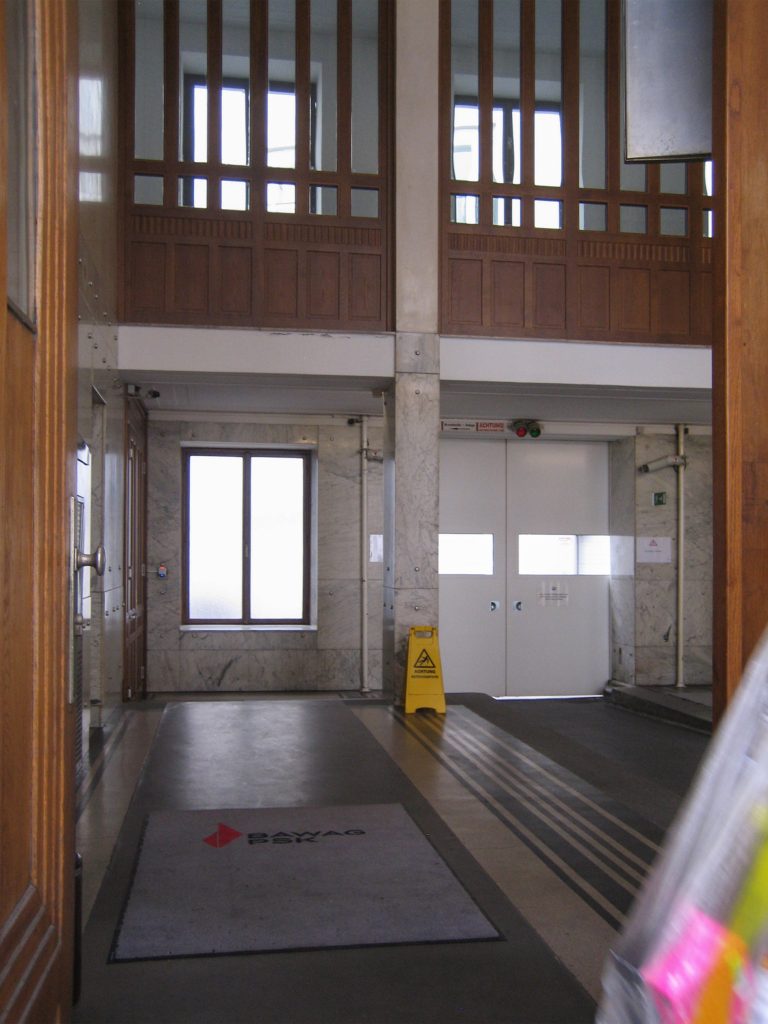
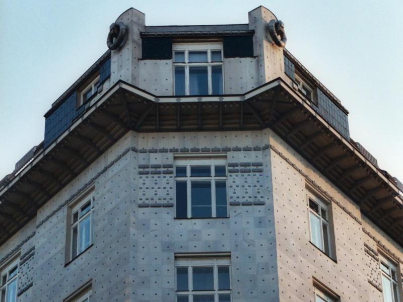
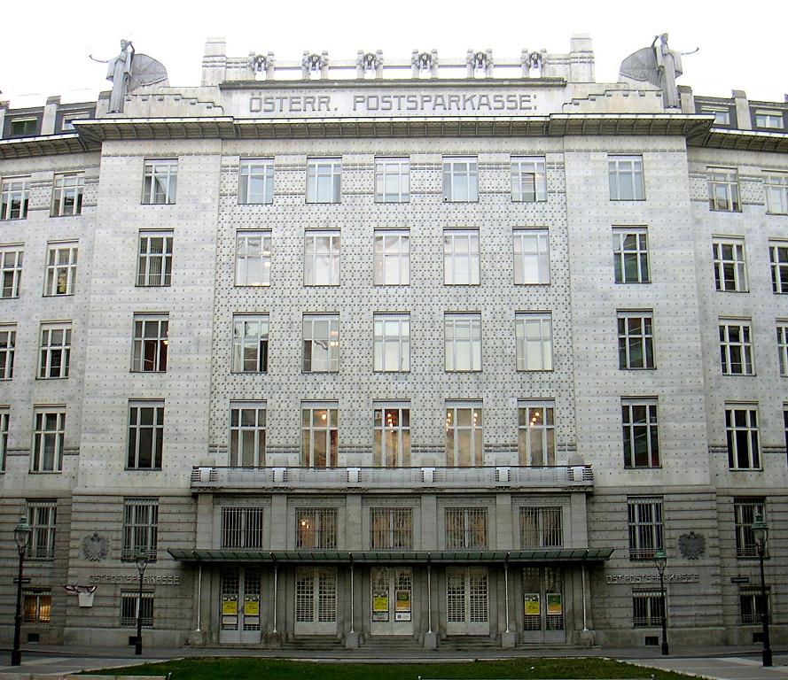
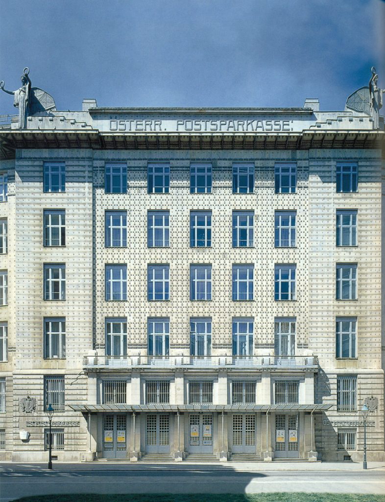
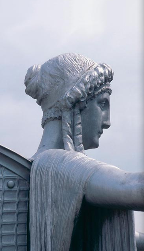
Once up the broad stairs and through gridded facade, whose sides and cornice the two statues of a winged woman than 4.5 meters are located, you can access the stunning atrium that leads to the main hall the bank, a large open space with 550 square meters, glazed both on the pergola roof and the bottom with a novel and striking glass floor also.
Ceiling
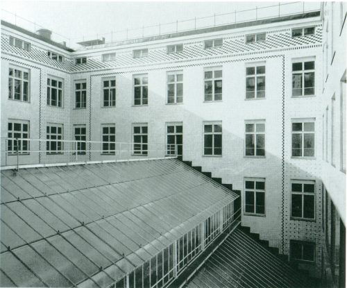
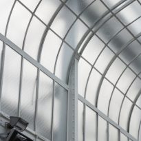
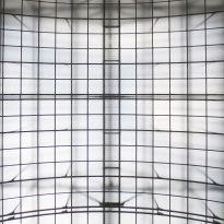
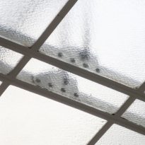
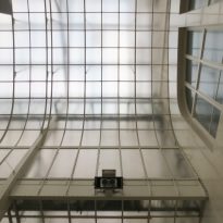
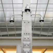
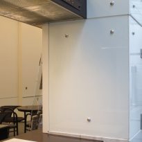
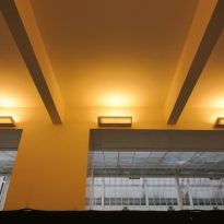
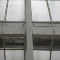
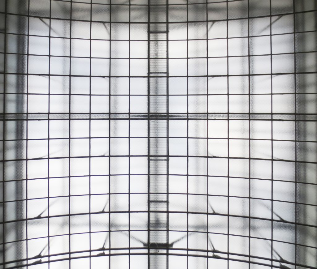
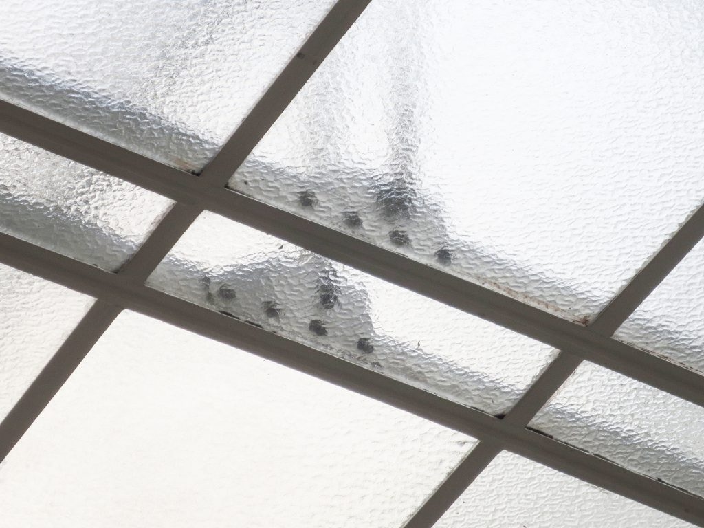
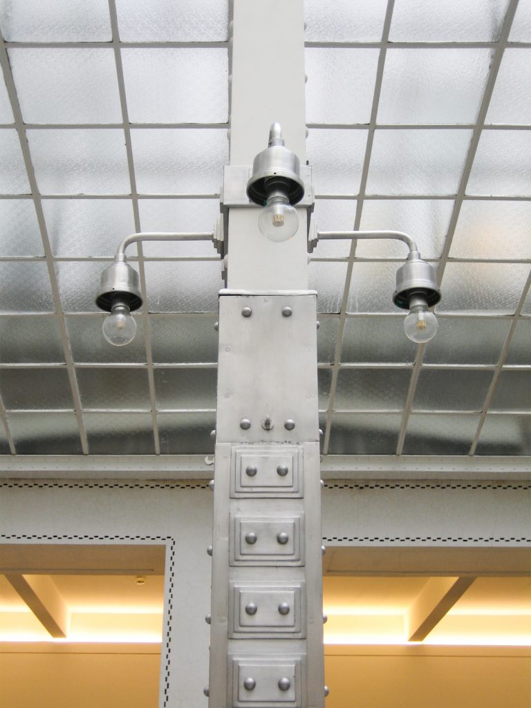
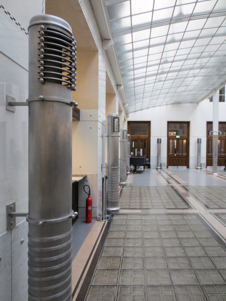
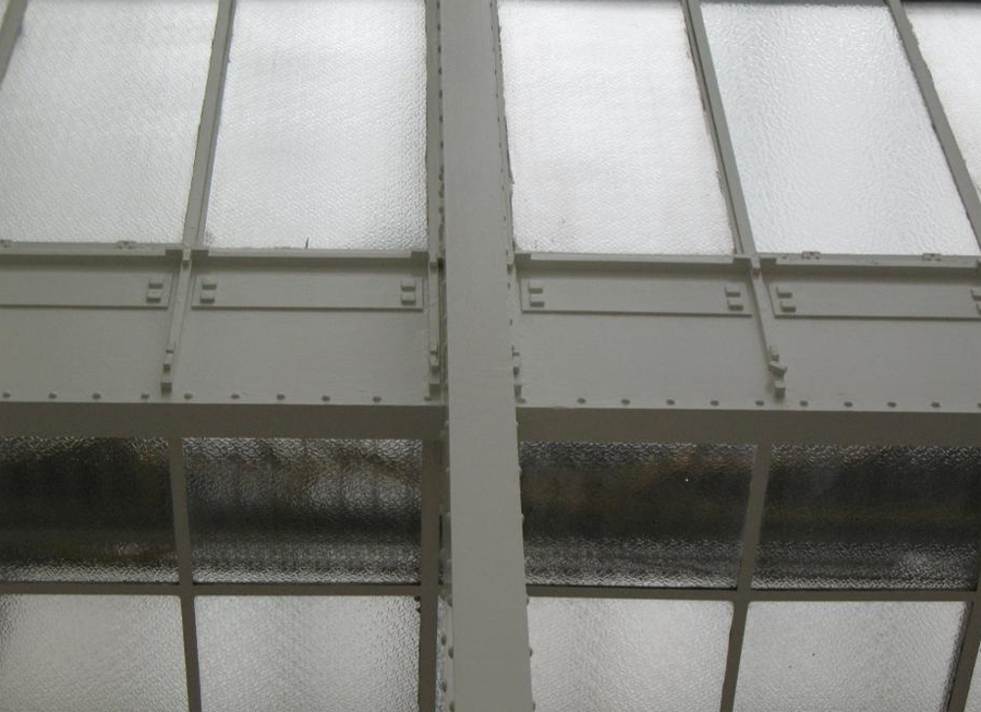
It is a suspended ceiling supported by glass plates and metal wiring looms. The frame forming the pergola covering the central space was made of iron, forming squares that were covered with crystals, allowing light into the room.
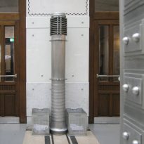
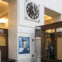
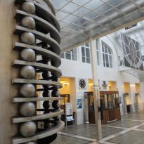
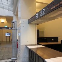
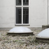
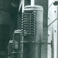
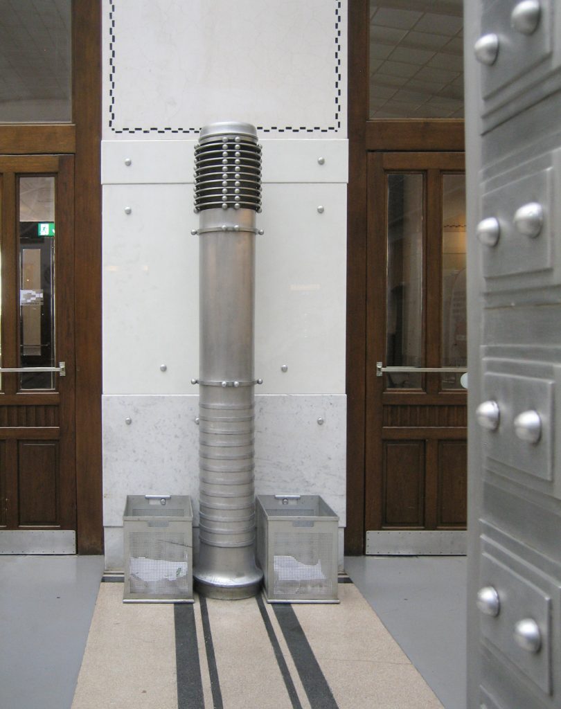
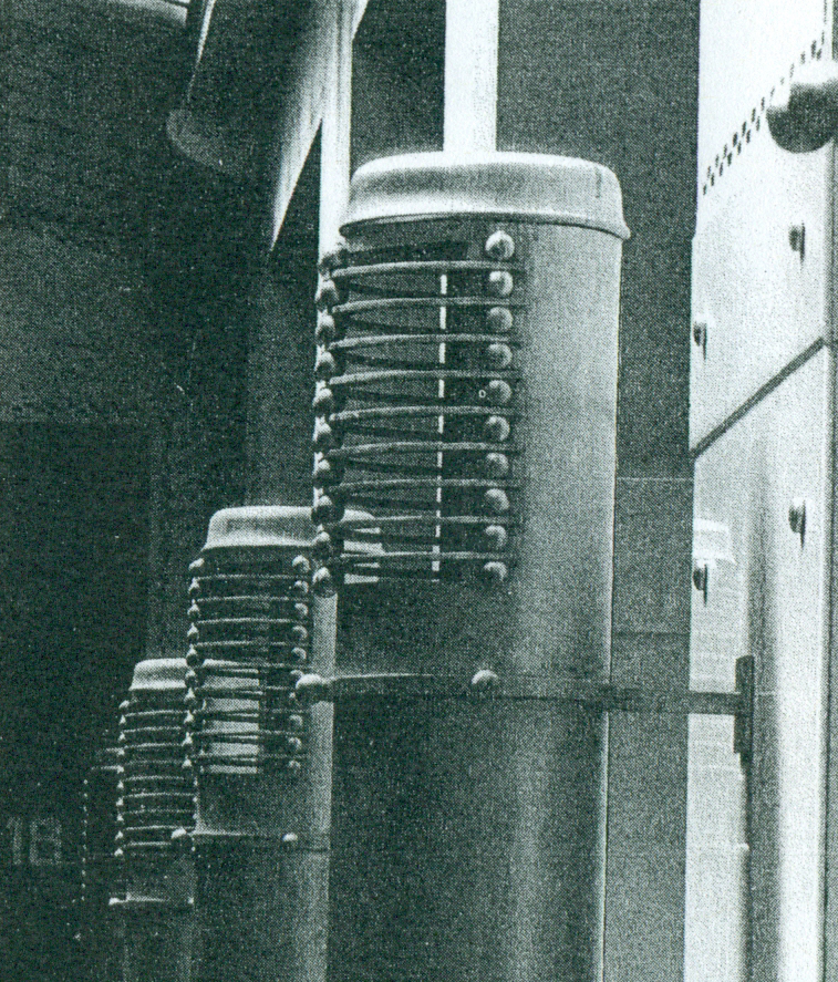
On this frame one second gable roof, also made of glass, which protects the dome of the main hall displays. Snow this roof the removed tubes rising from the heating radiators.
Floor
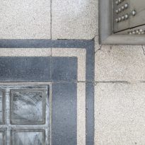
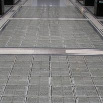
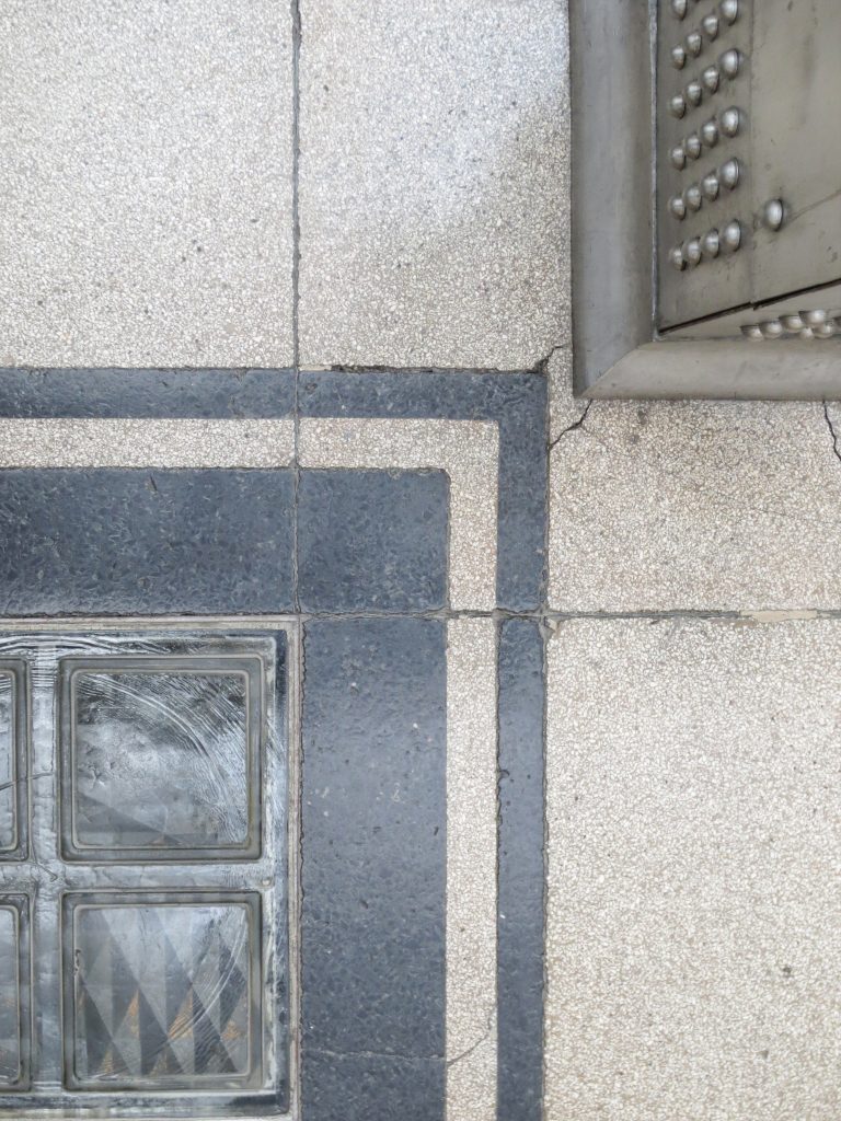
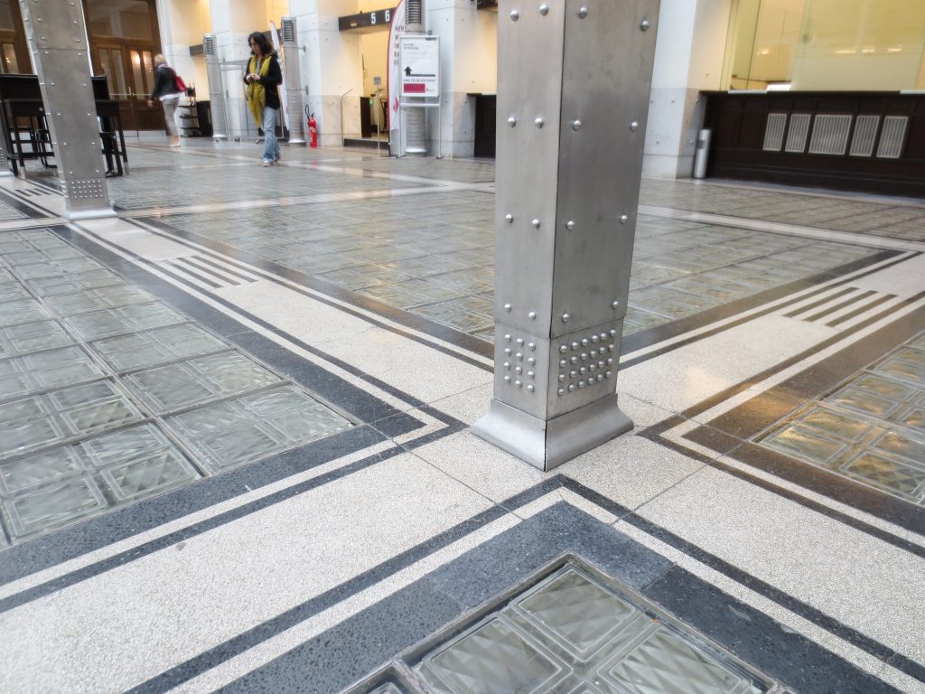
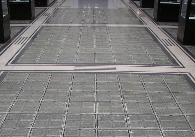
The new floor was covered in pieces of dough translucent glass that allow the passage of light to the post office located below, and like all the materials chosen by the architect for the spaces of customer service belong to modern materials functional, hygienic and easy to maintain.
Exterior
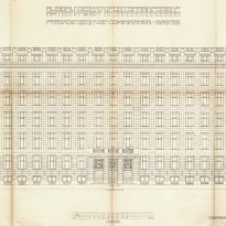
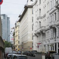
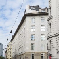
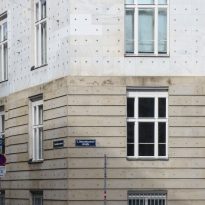
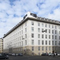
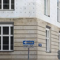
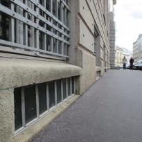
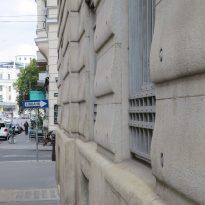
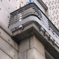
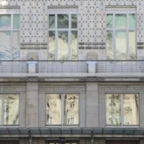
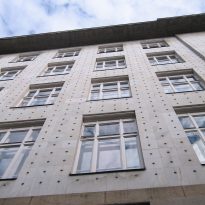
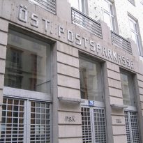
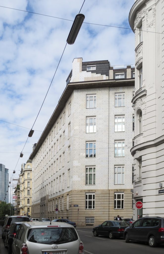
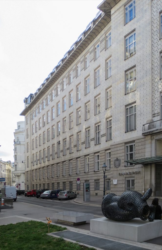
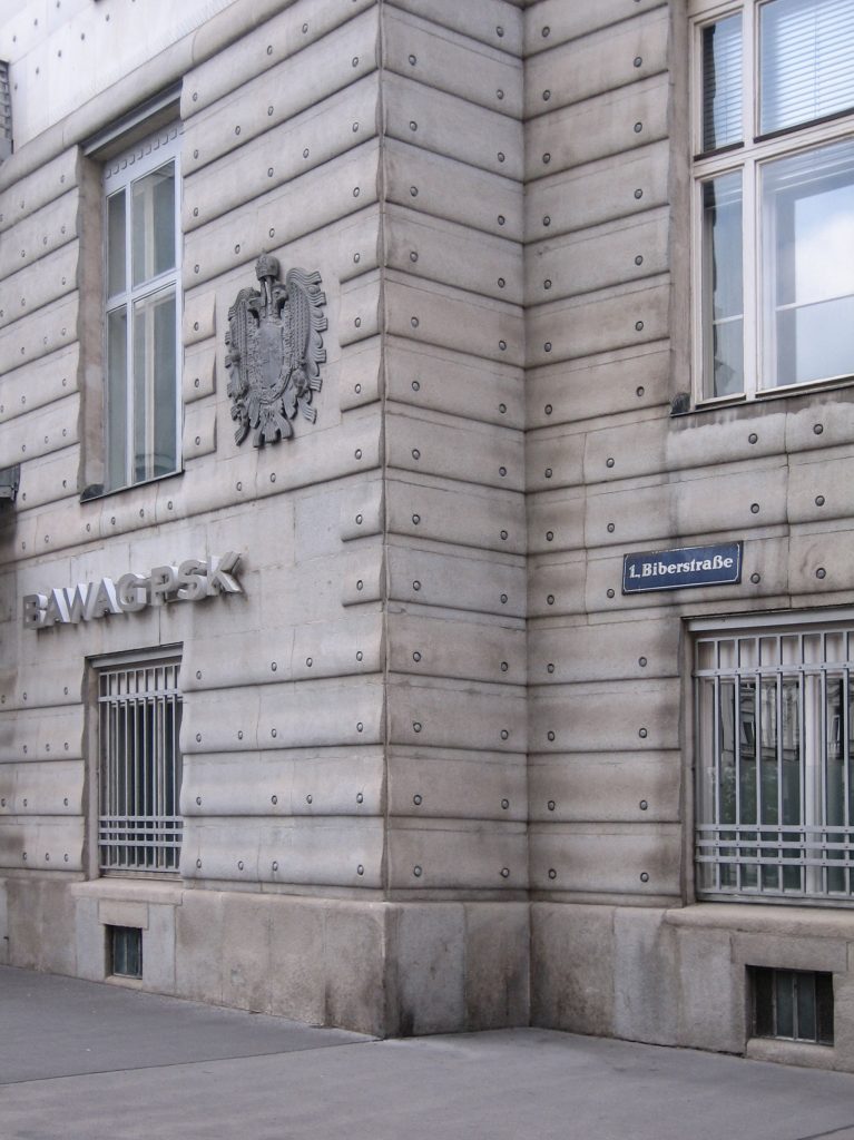
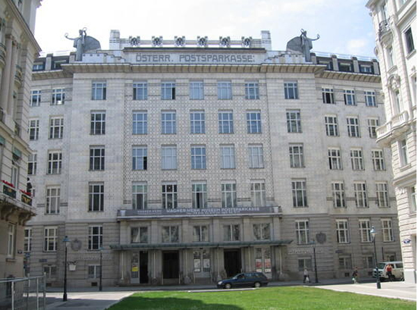
The exterior is unlike anything that Wagner had designed so far, getting fit and blend with the surrounding buildings. The massive body of the building has a horizontal cut at the points where they cross the street corners.
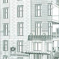
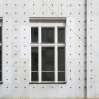
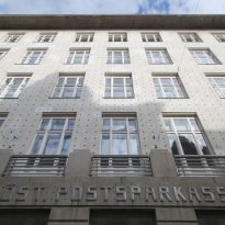
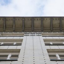
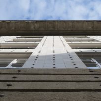
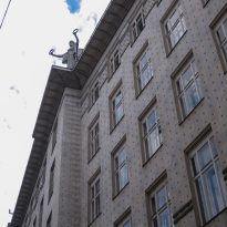
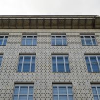
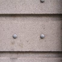
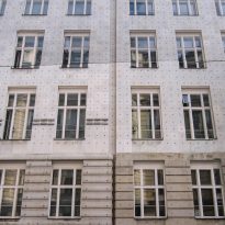
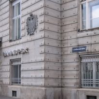
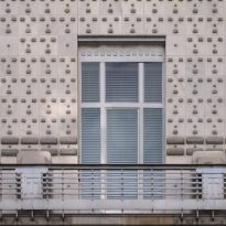
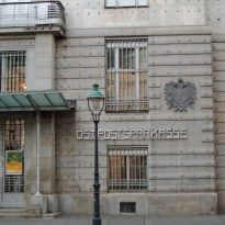
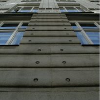
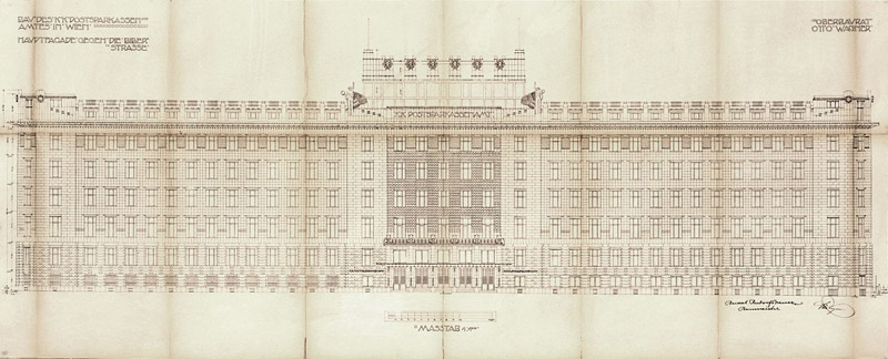
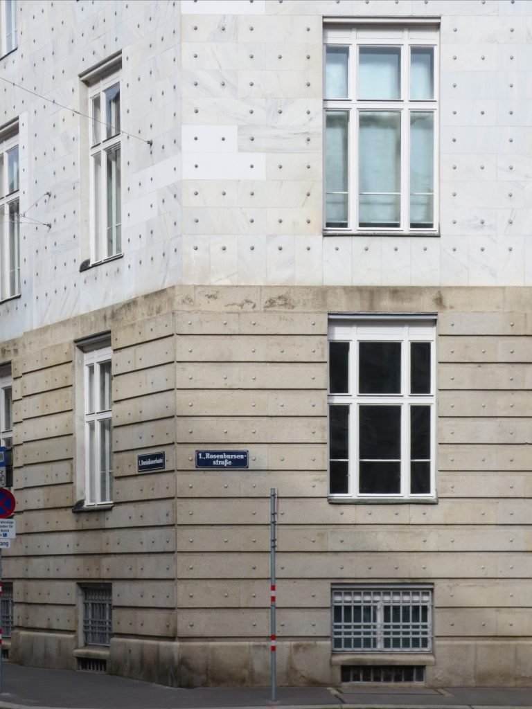
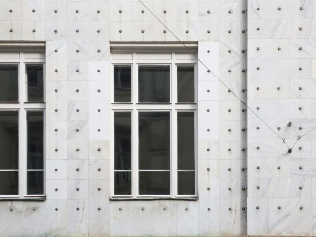
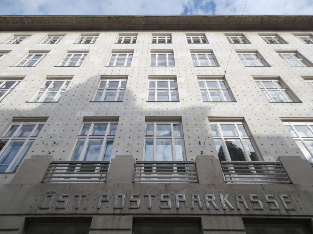
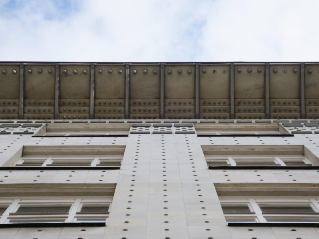
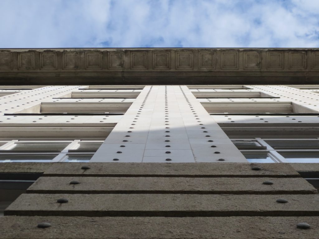
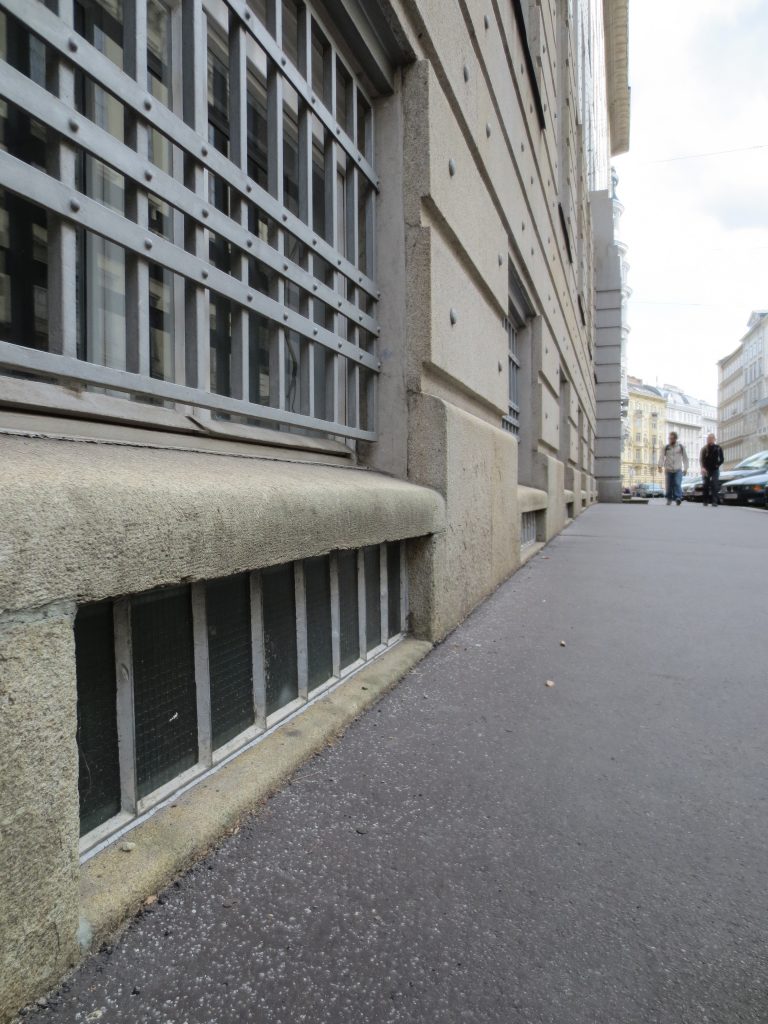
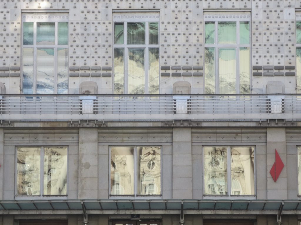
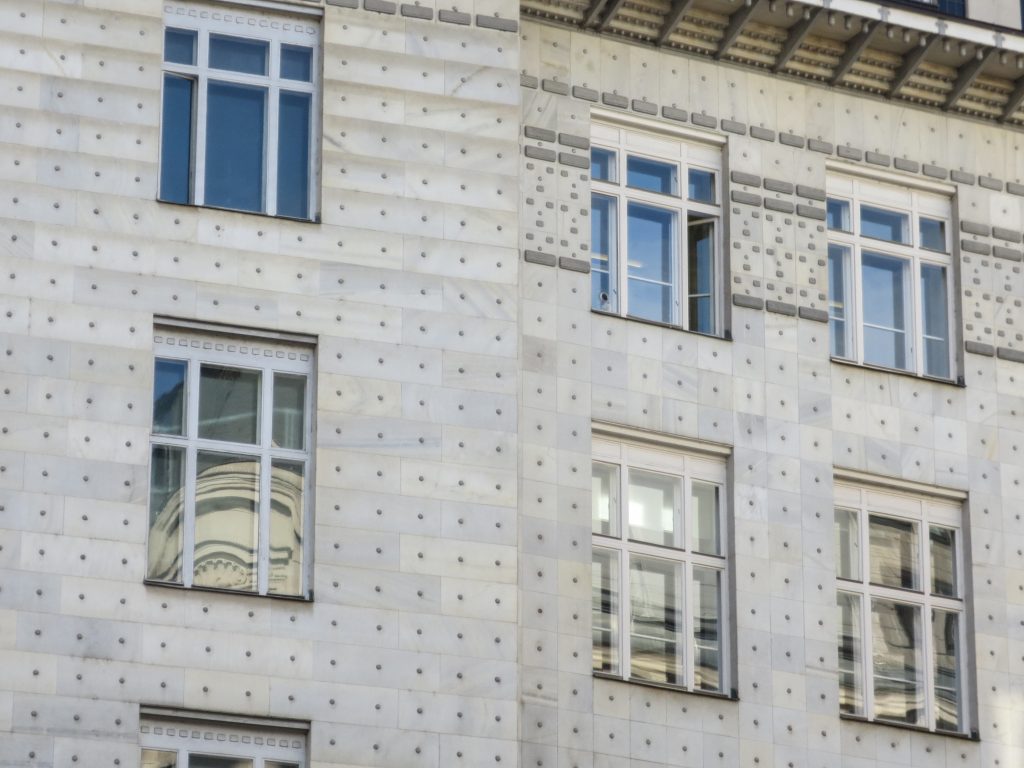
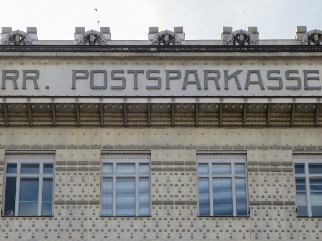
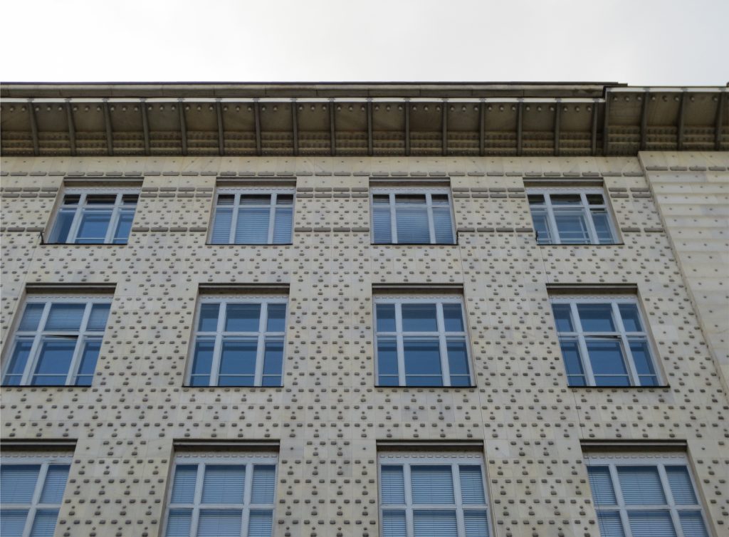
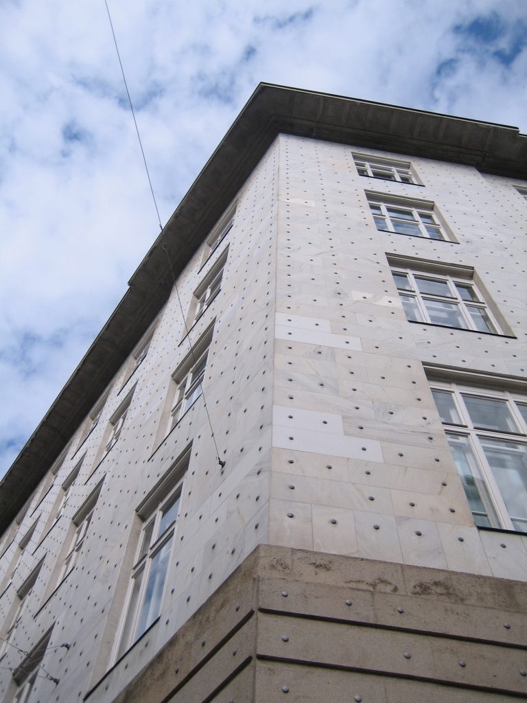
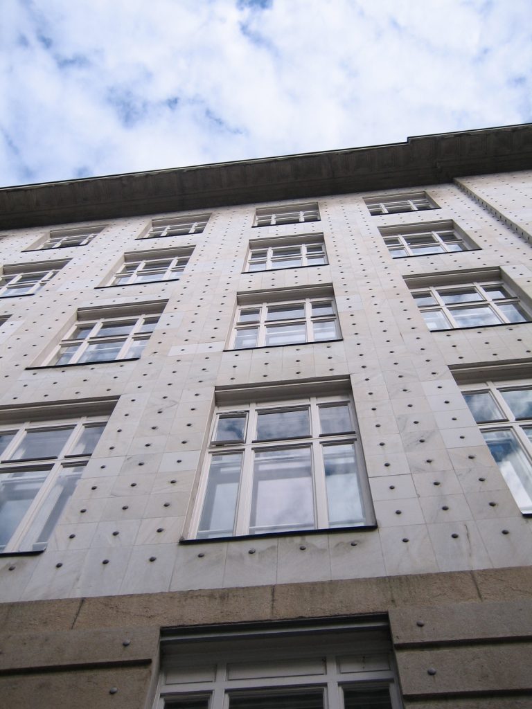
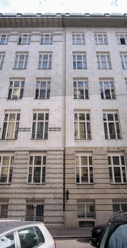
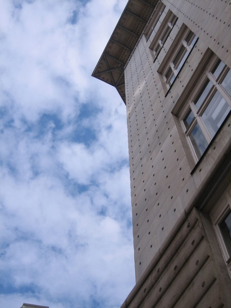
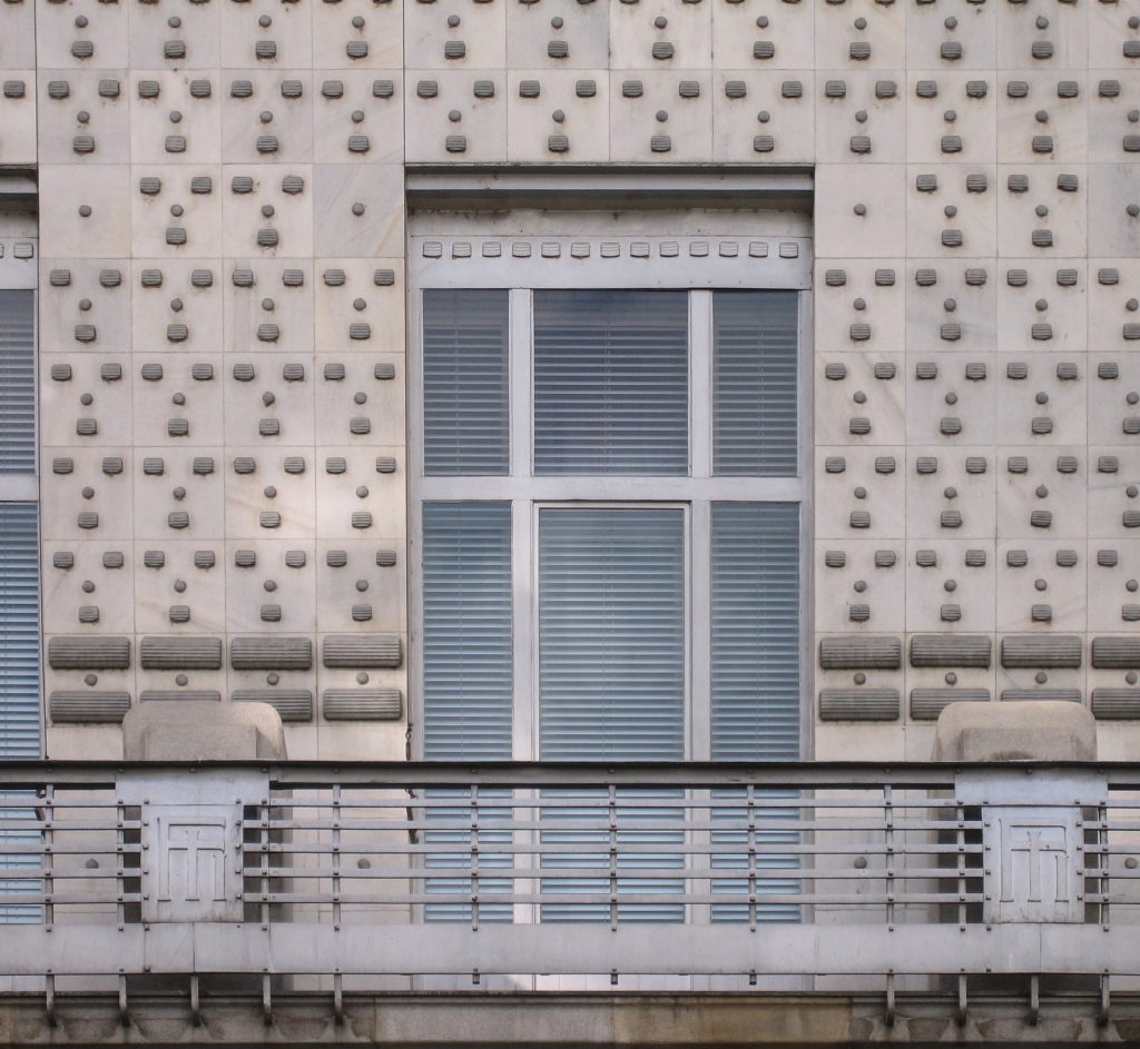
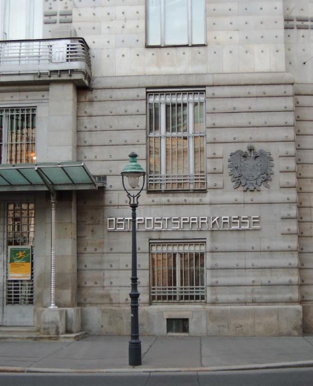
The facade gives the building grid a particular aspect that has received numerous and varied comments. Architecture critic said about J.Lux made ”… the building resembles a huge safe, covered entirely by nailheads. However it is not devoid of a certain monumentality and character whatsoever, for the interior and spread outward objective directly and clearly the idea of building….. ”
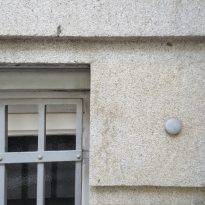
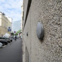
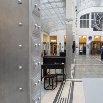
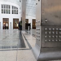
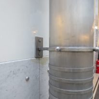
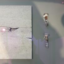
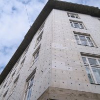
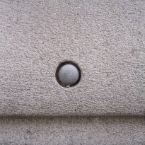
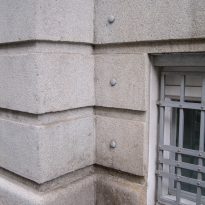
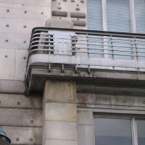
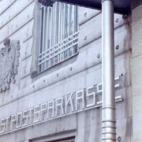
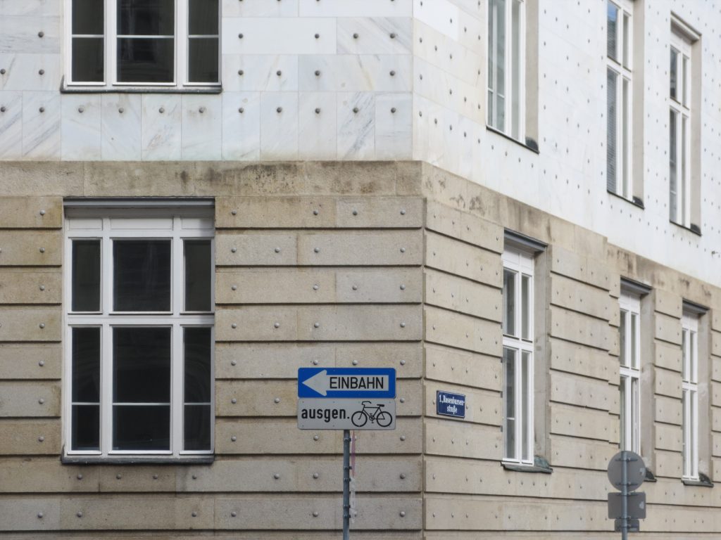
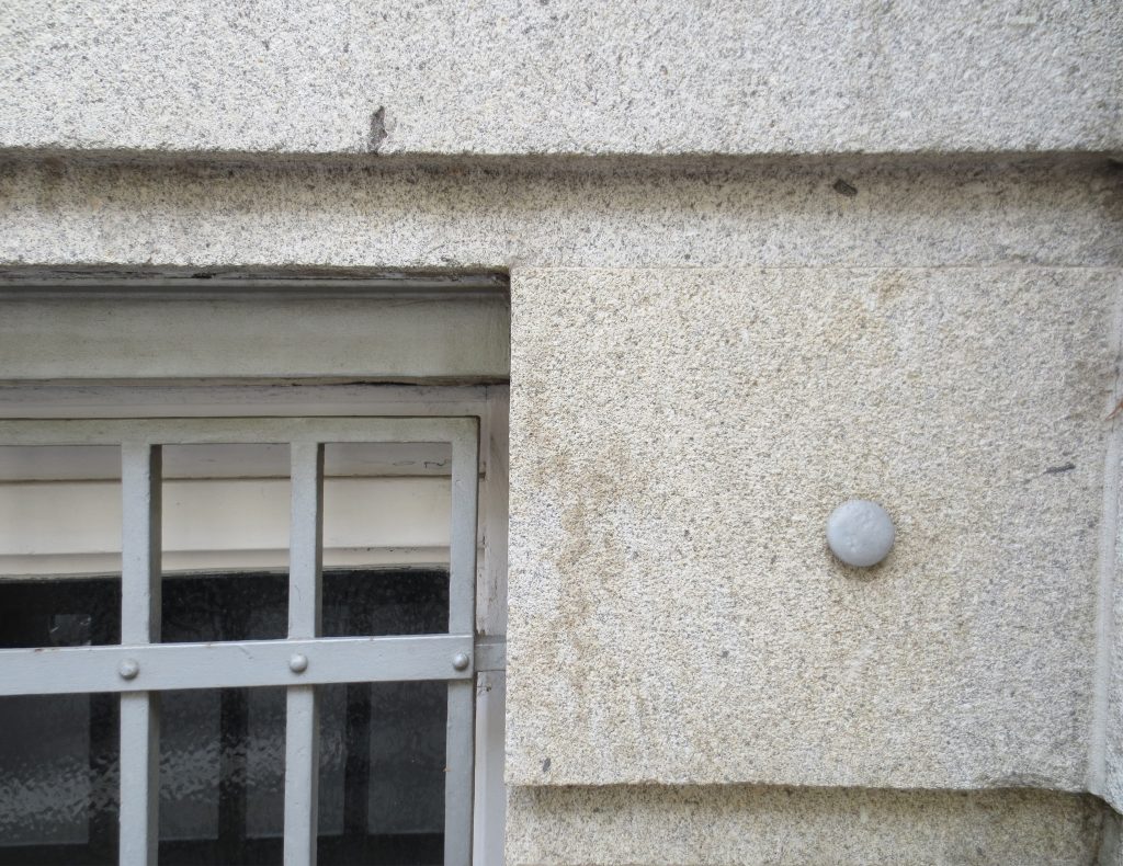
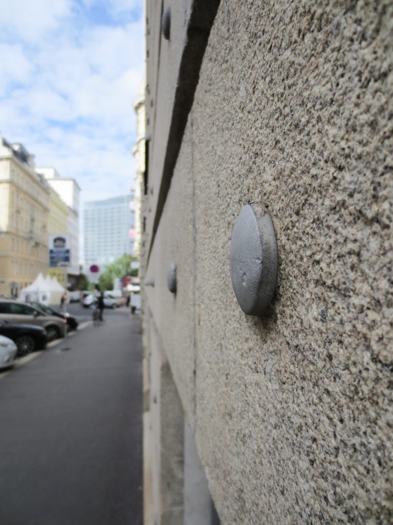
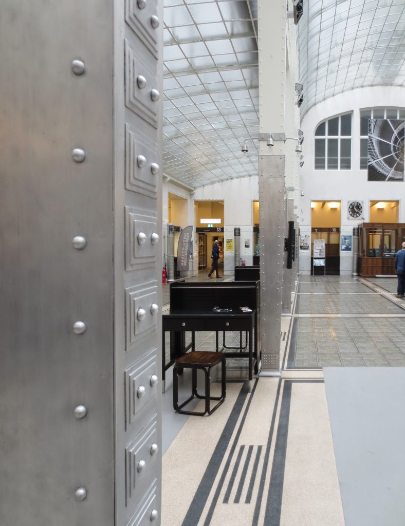
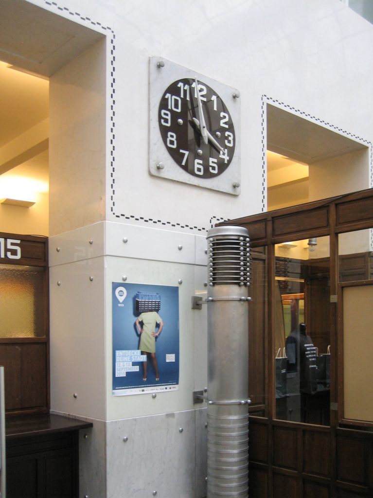
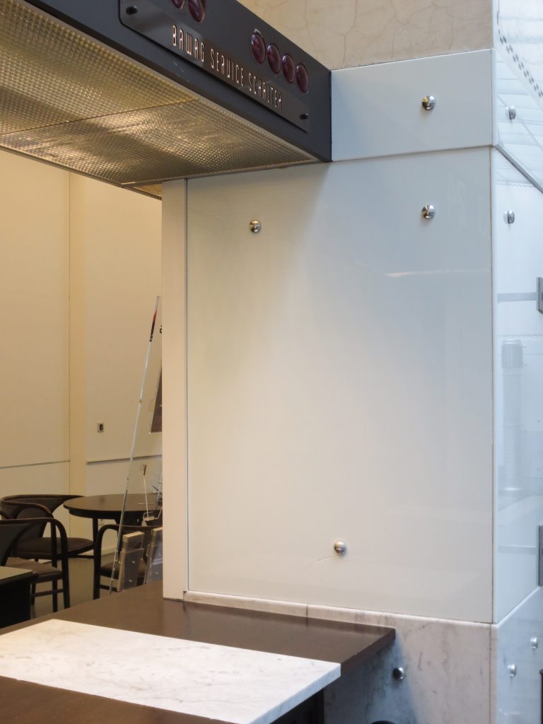
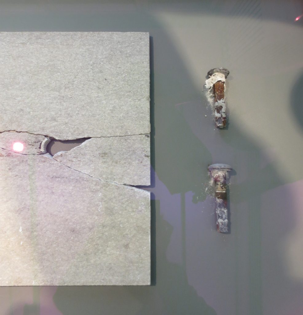
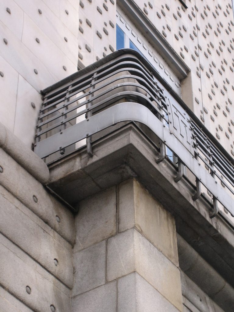
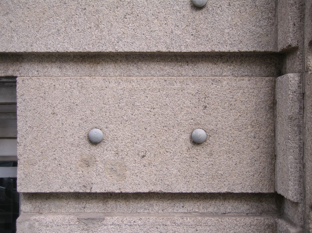
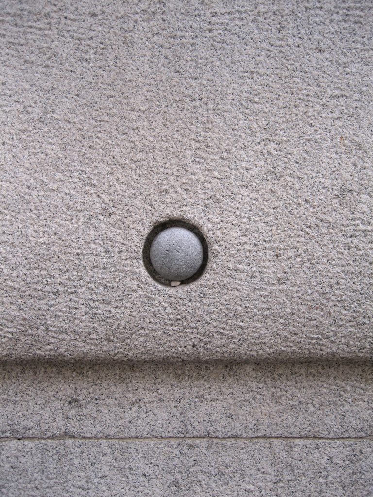
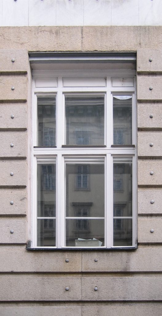
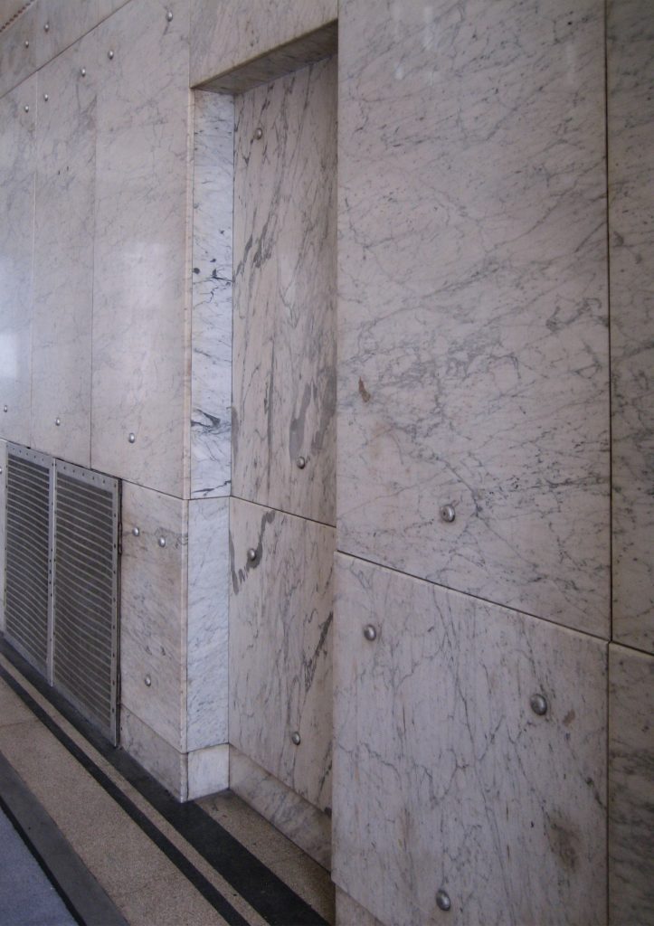
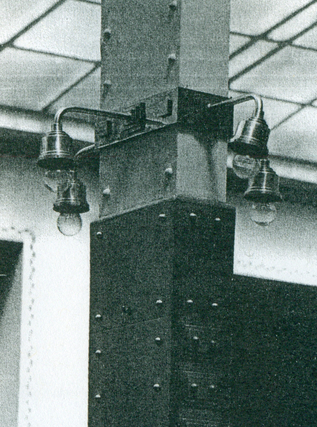
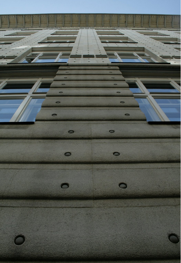
Wagner creates a language through materials, a succession of infinitely repeated elements that in turn create a benchmark for expedited citizen, as if their time and did tick step. This fact is verifiable both outside, the facade, and inside, the roof and sides of the core module. In the front bolts that supposedly bind the stone slabs to brick walls evoke industrial architecture, although it is a decorative detail and the plates were attached with mortar
Structure
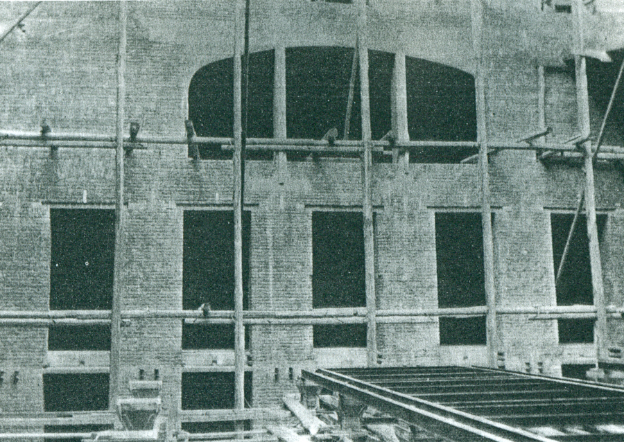
The structure of Postbank is innovative, it is presented as a metal structure covered with marble slabs and sconces aluminum reinforced concrete slabs. The walls were built of brick and then coated.
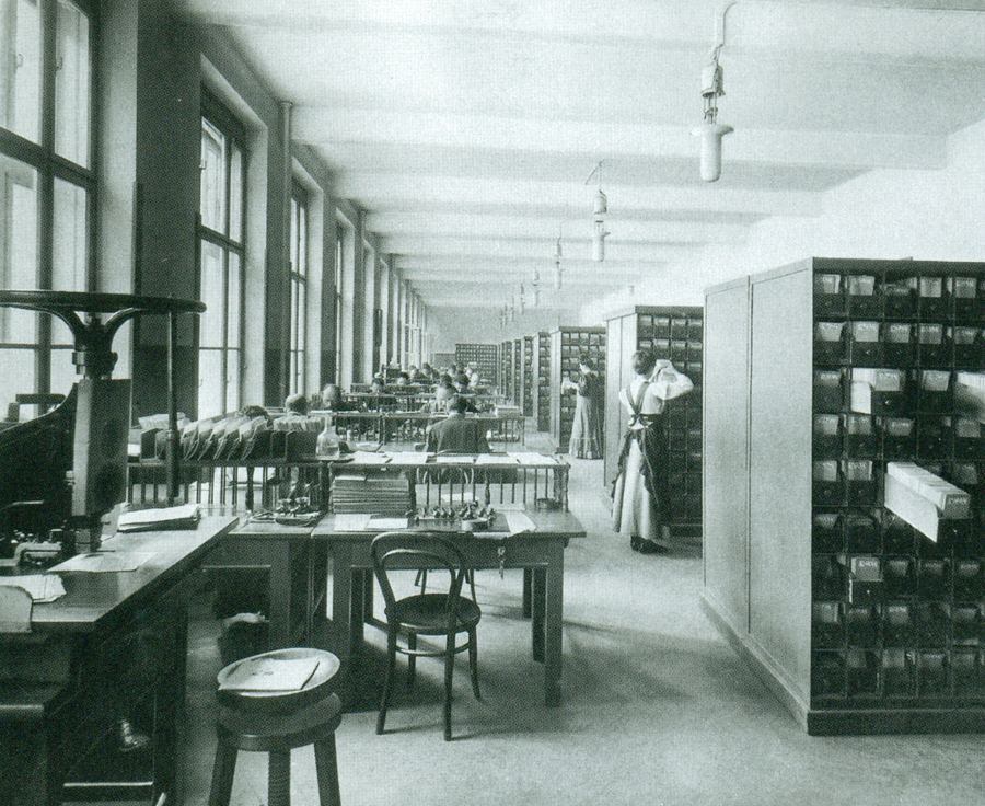
Inside large bearing walls were not included, allowing complete flexibility for the various functions of the bank, illuminated by generous windows.
Materials
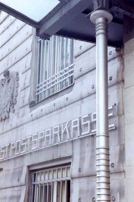
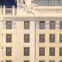
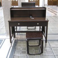
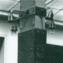
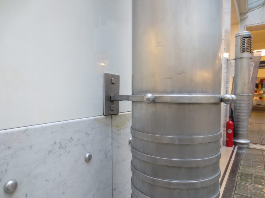
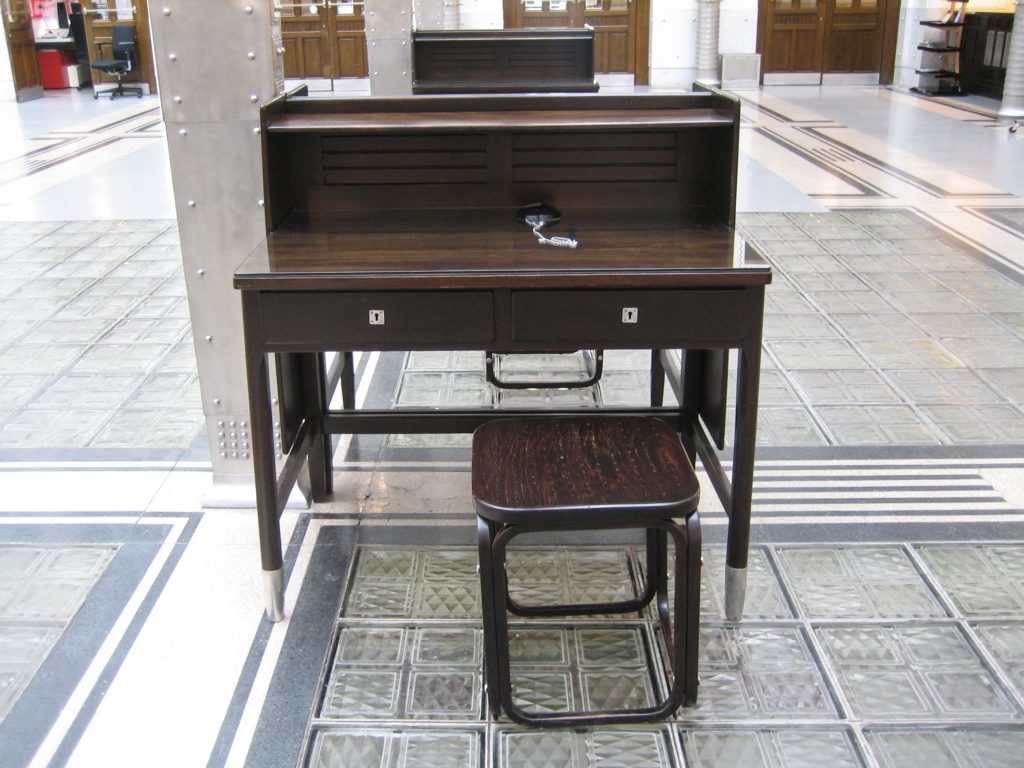
The two winged women located on the cornice of the facade, Schimkowitz works were made from aluminum and make up one of the many expressionist touches the building. Aluminum was used throughout the building as a decorative element, the heads of the bolts, brackets colgadizo the acroteria or wreaths. The bank is also furniture design Otto Wagner
Aluminum
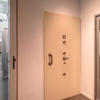
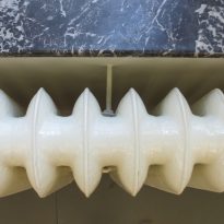
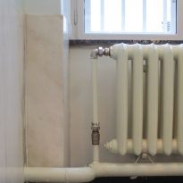
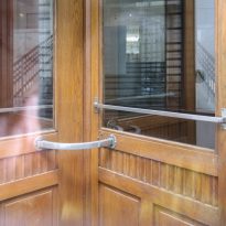
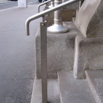
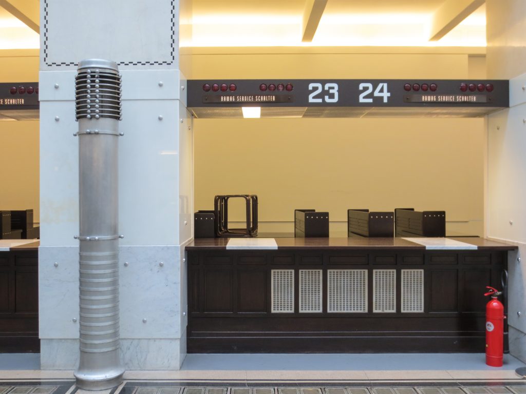
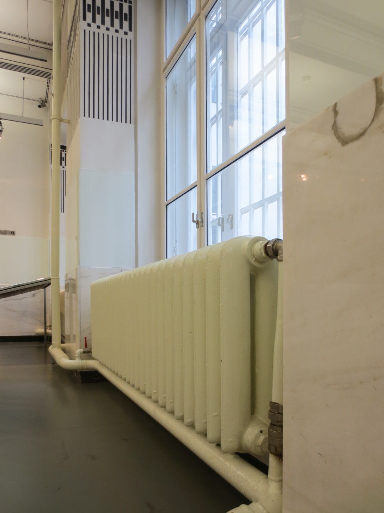
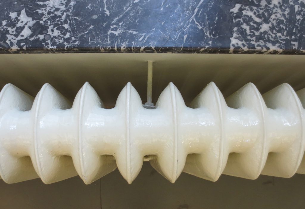
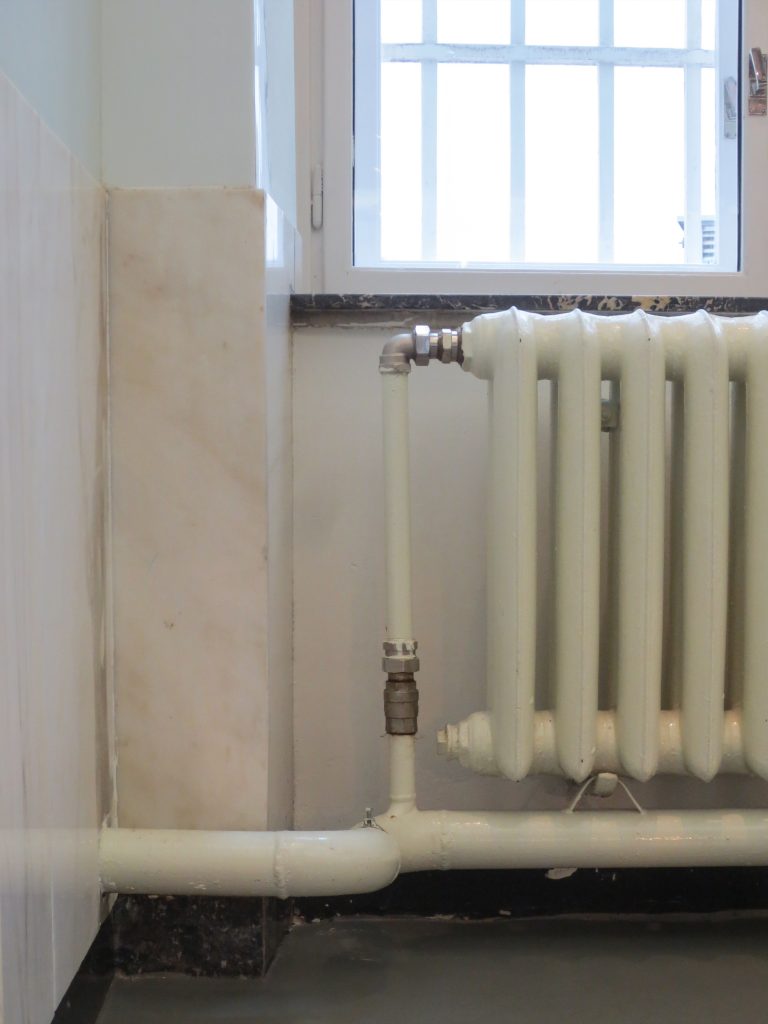
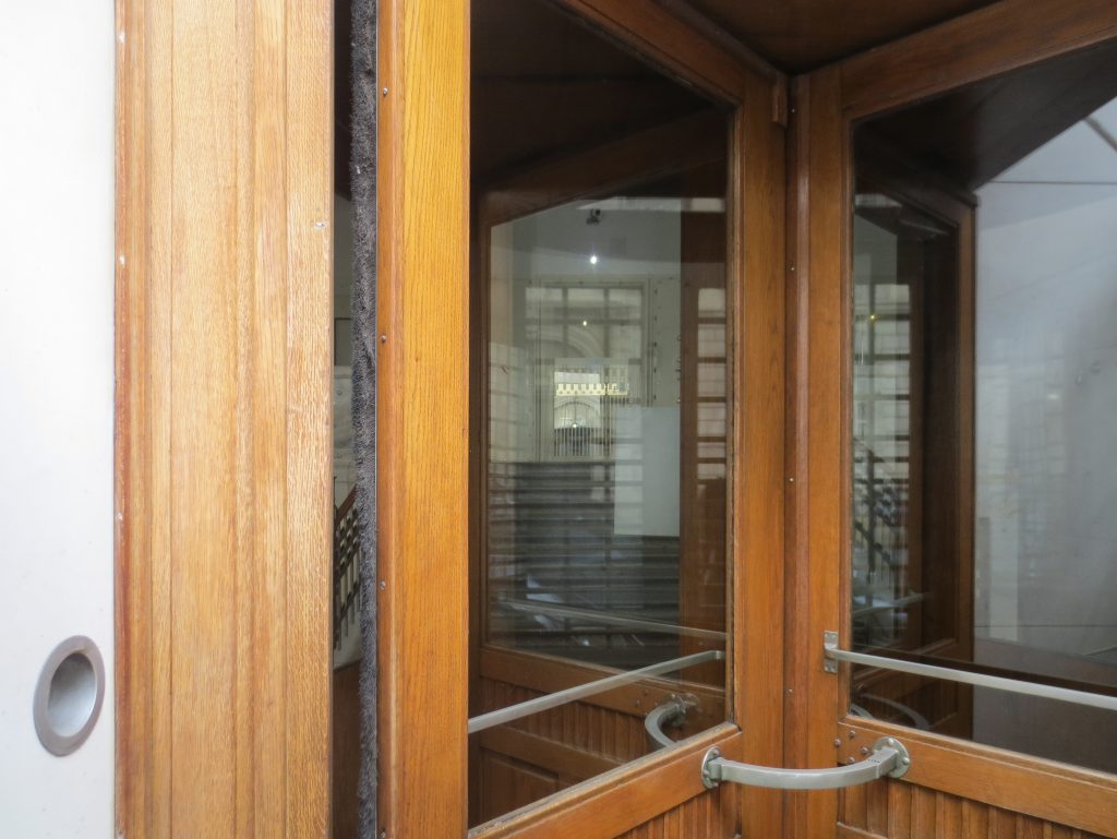
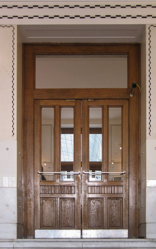
Fundamental to the use of aluminum in the 800 handles, fittings, lighting fixtures, heating grilles, radiators hot air and wall pilasters in the living windows, reason was the fact that this material did not need cleaning any.
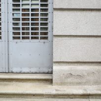
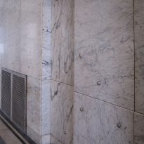
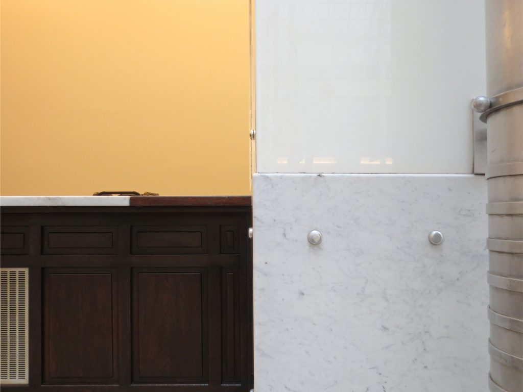
The facade made of brick, was coated with white marble slabs Sterzinger and granite, set by coated aluminum, total 17,000, the same technique used in the Church Steinhof bolts and the building of the dam Kaiserbad. The marble slabs resting on a granite base rounded whose parts are all in the same direction and with a little relief, to thereby enhance the effect of horizontality and vivacity and confer plasticity to the building. The metal canopy and iron points to the main entrance is supported by cast iron columns coated aluminum.
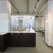
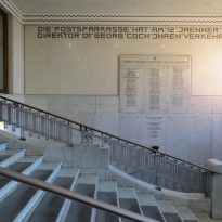
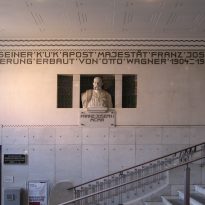
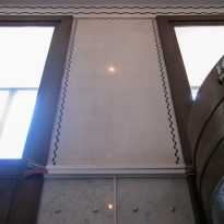
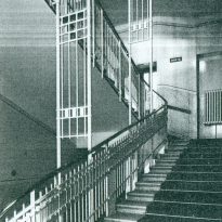
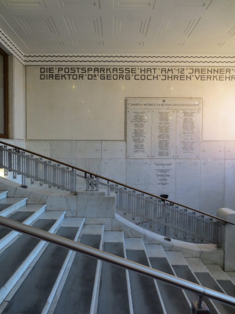
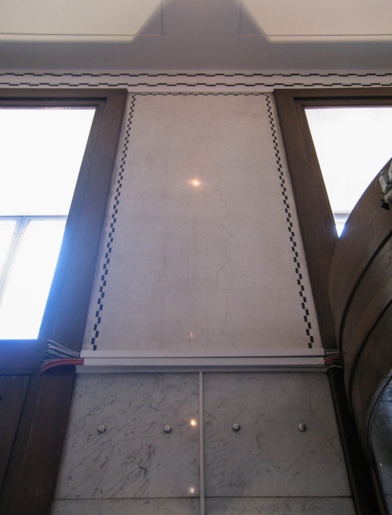
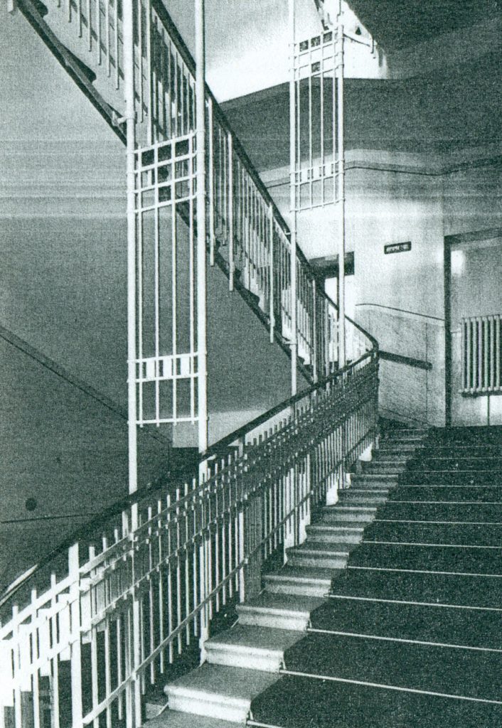
The interior walls of both local as stairs or walkways are also lined with marble. The stairs are made of concrete and steel with marble steps of 3 cm.
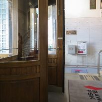
The soils of the central hall were made of translucent blocks made from molten glass and framed with granite tiles decorated with black lines, the rest of the spaces Wagner combined the marble linoleum.
Video
