MahaNakhon
Introduction
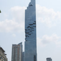
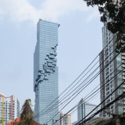
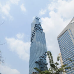
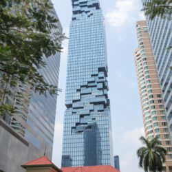
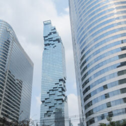
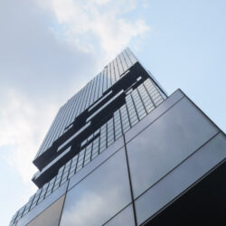
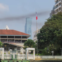
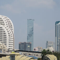
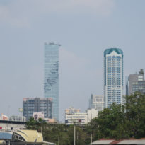
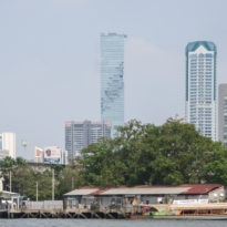
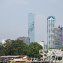
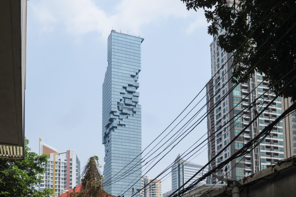
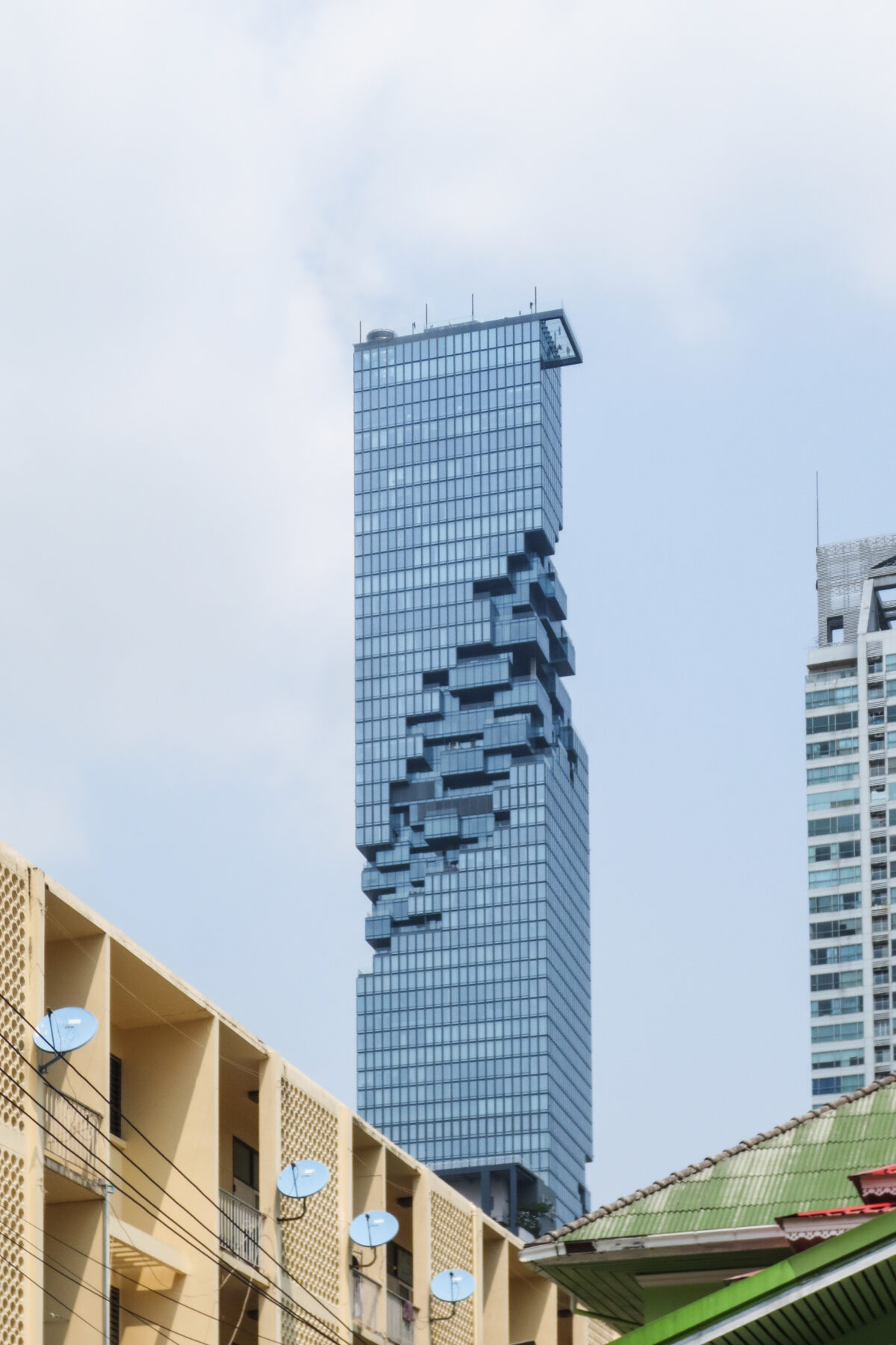
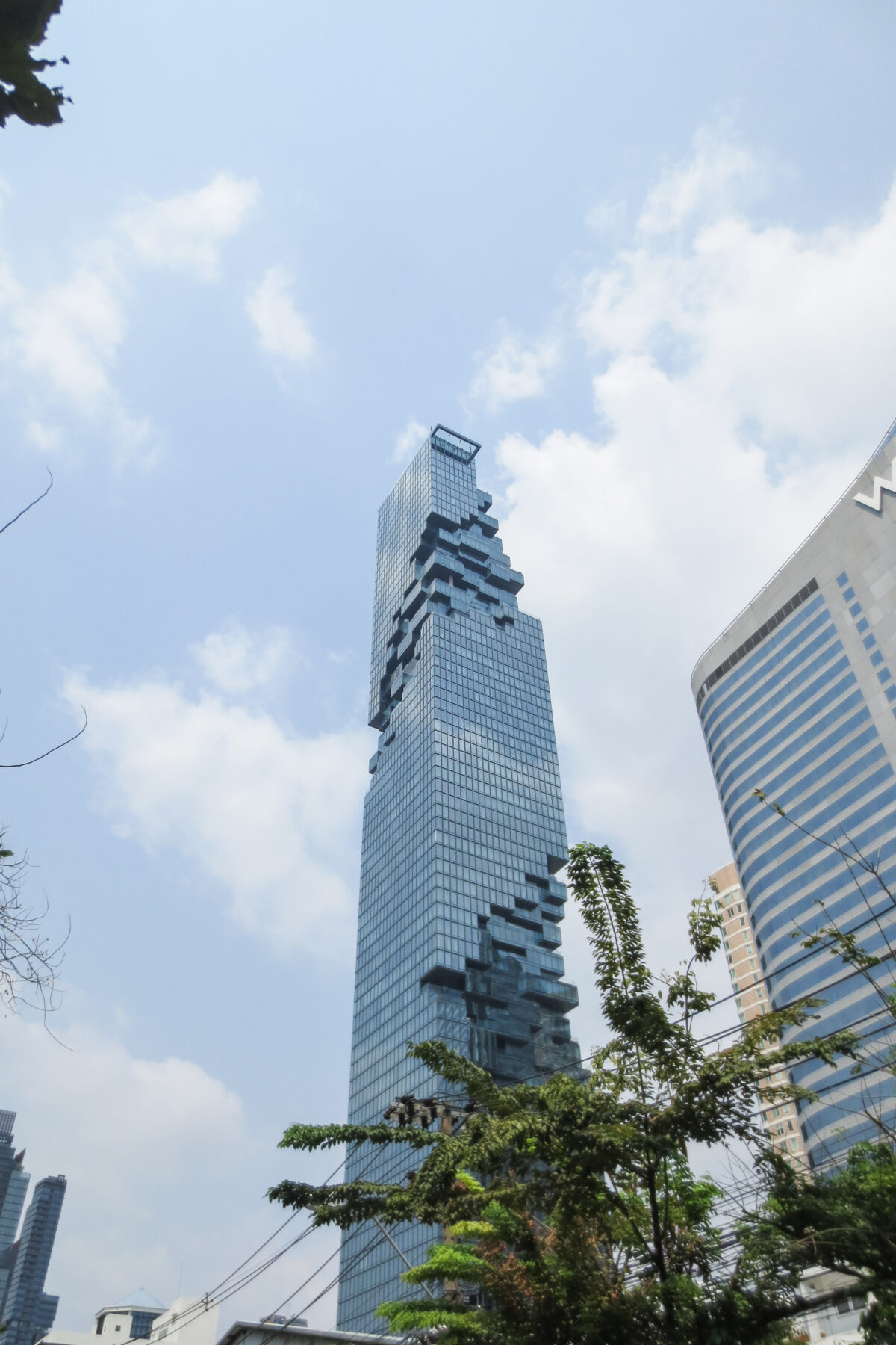
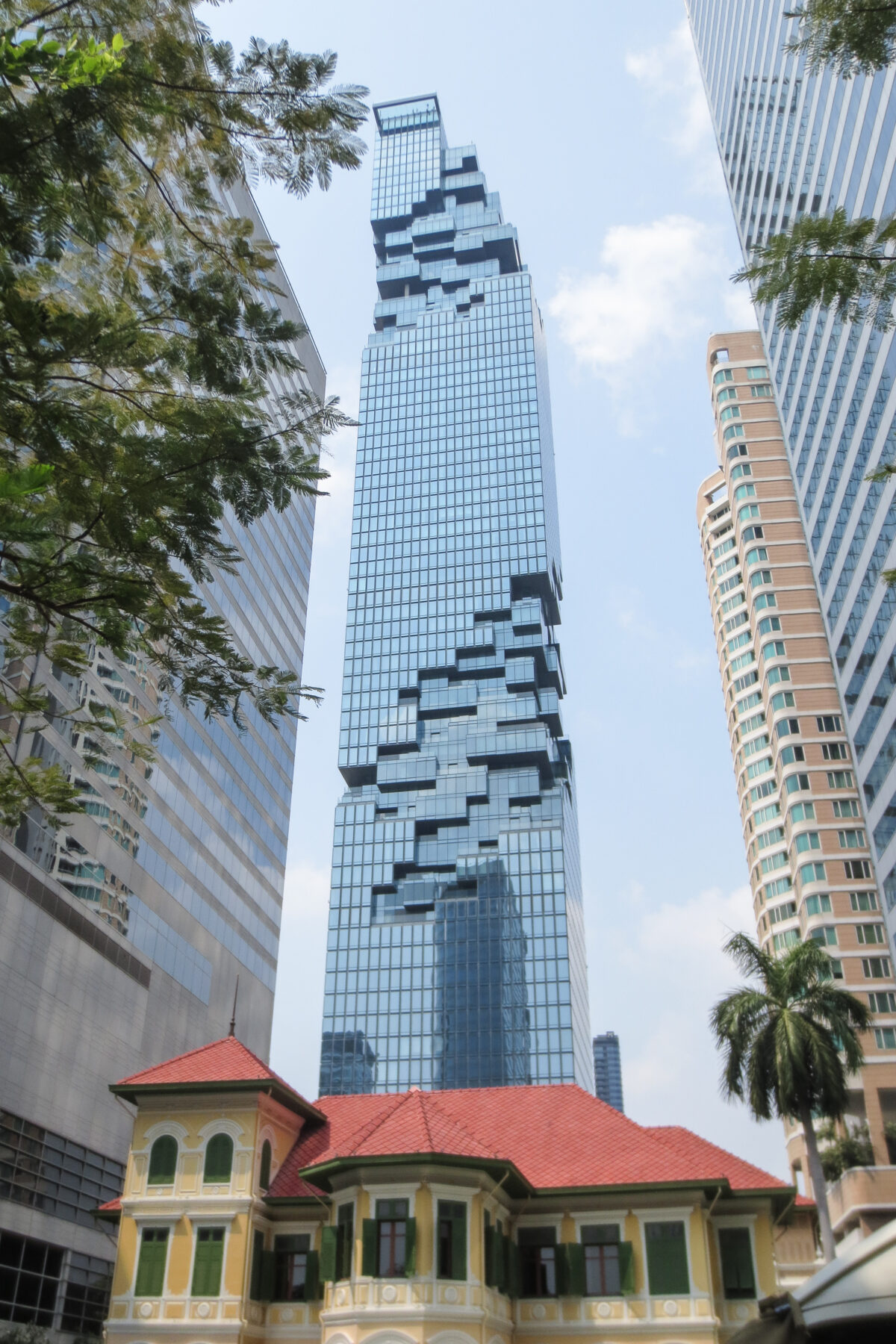
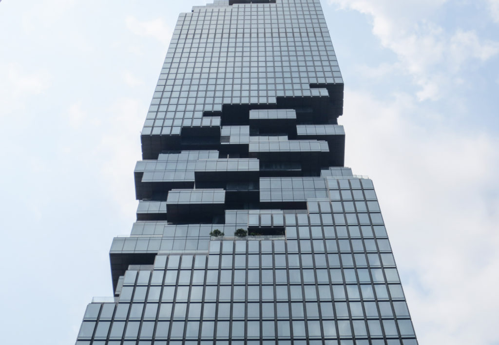
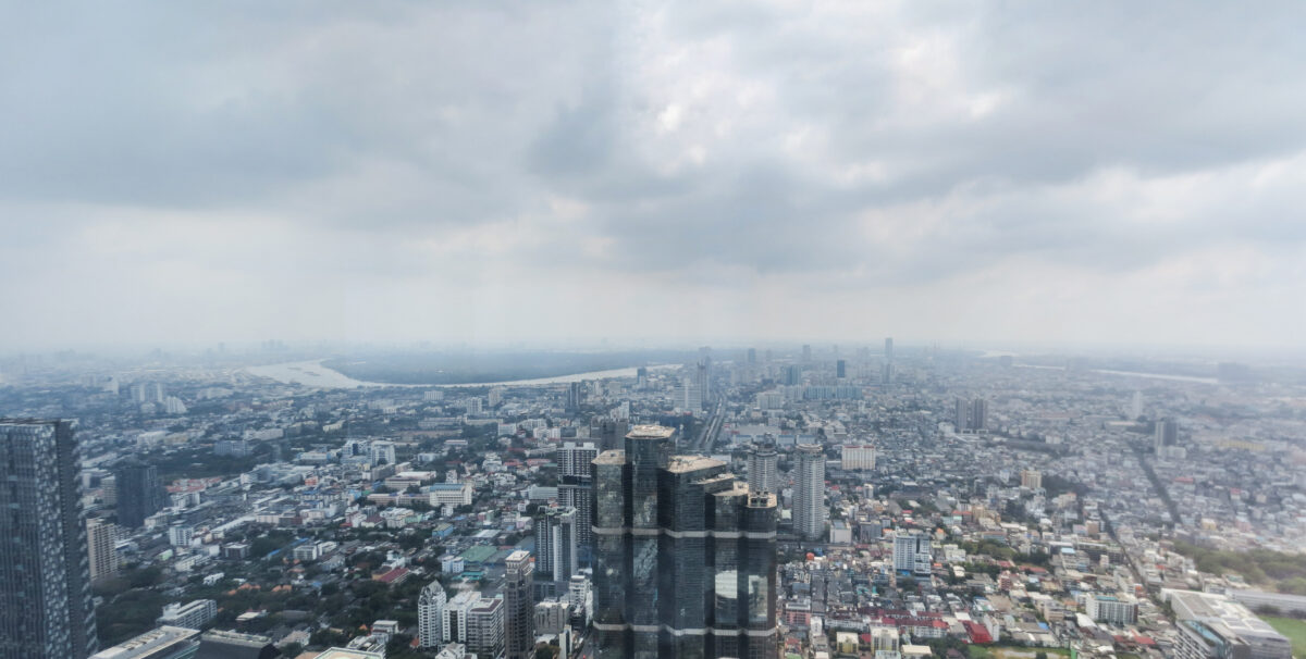
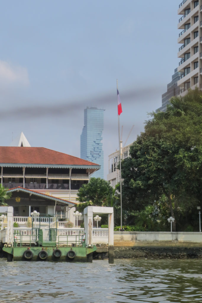
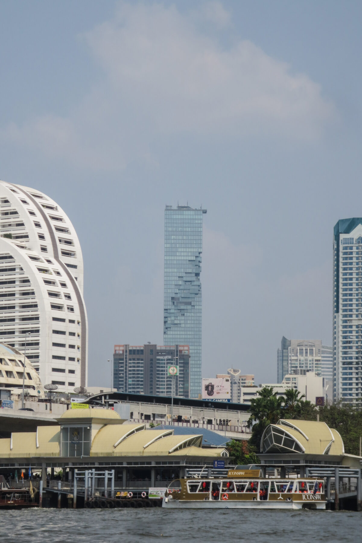
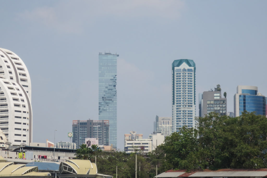
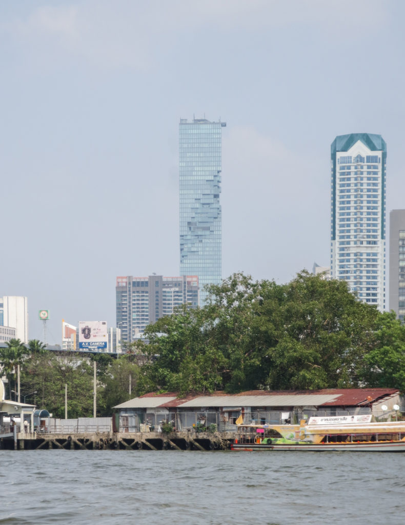
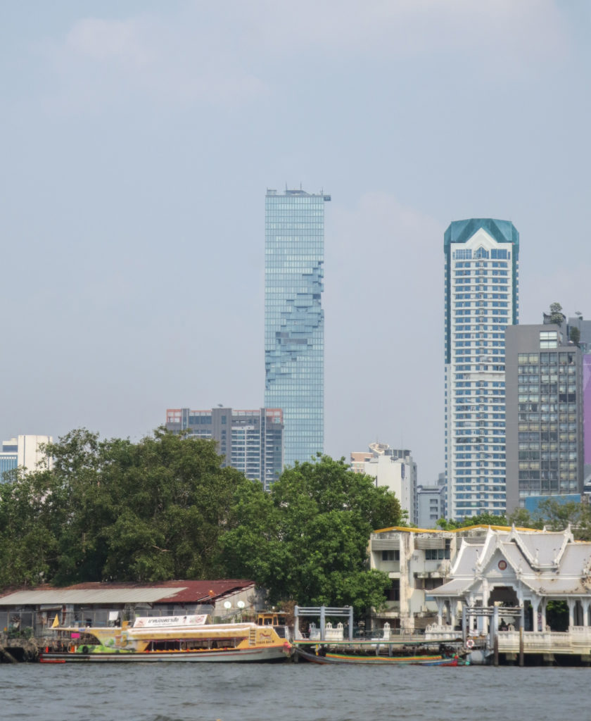
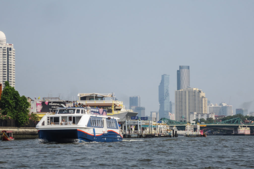
The King Power MahaNakhon tower is a 77 storey high-rise located in the Central Business District (CBD) of Bangkok.
As Thailand’s becomes a larger economic force in Asia more and more international companies are looking to the capital city, Bangkok, to establish offices and create new business. These companies come to the city not only with their business but also with their own workforce, specially executives and people in senior positions. This growing and sophisticated group come with certain expectations which the city is now rushing to meet, and that includes a new level of quality architectural design. The MahaNakhon tower meets the highest and most sophisticated standards when it comes to design and construction, something unseen to the city of Bangkok until 2016 when the MahaNakhon tower was completed.
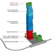
The MahaNakhon tower, which literally means “Great Metropolis” in Thai language, is also known as King Power MahaNakhon due to the name of the shopping center that occupies the firsts floors. It’s a mixed use complex including luxury residences, a hotel, a shopping center, a public plaza and a rooftop sky bar and observatory, all directly connected to the city’s Skytrain rapid transit system. Overall the development accounts for more than 150,000 square meters of prime real estate which was by far the most expensive in Bangkok when they started becoming available for tenants.
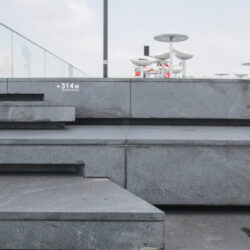
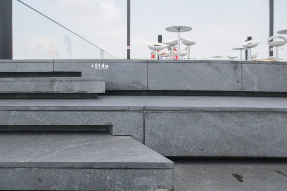
De complex, designed by german architect Ole Scheeren while being head of OMA for the Asian continent is, without a doubt, the most ambitious project of architecture and urbanism that Bangkok had ever seen and also became the tallest building in the city at the time of its completion in 2016. In an almost childish play by a competing development the MahaNakhon tower lost the title of tallest building in Bangkok in 2018, when the Magnolias Waterfront Residences Tower 1 was completed with 315m, just one more than the MahaNakhon.
Awards for a project of this magnitude didn’t take long to arrive. Even before being completed the tower had already been named “Best Luxury Condo Development 2014 (Bangkok) at the Thaliand Property Awards, “Best Thailand Development 2014” and “Best Luxury Condominium in Southeast Asia 2014” at the SE Asia Property Award and “Best Mixed Use”, “Best Residential” and “Best Residential Highrise” at the 2015 Asia-Pacific Property Awards.
Location
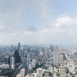
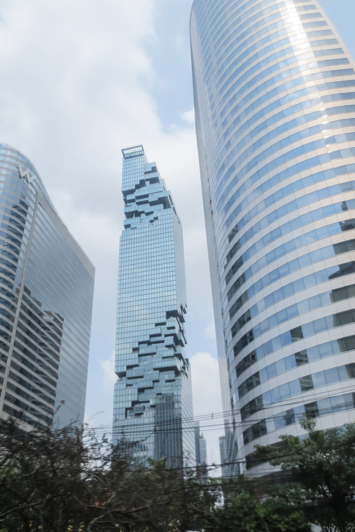
The tower is located in the heart of Bangkok’s CBD (Central Business District), a fast developing neighborhood which is home for some of the newest and most modern developments in the city, including high end hotels such as the W hotel and many Grade A office space buildings.
The tower stands between Silom and Sathorn roads and is directly connected to the Chngononsi SkyTrain Station (BTS) and the Bangkok BRT station on Narathiwat Ratchanakharin road.
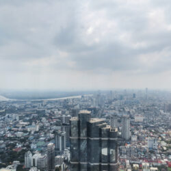
This prime city neighborhood is strategically located between the river, to the west, and Lumpini Park to the east, and has attracted not only many high-end hotels and office towers but also many embassies, with Sathorn road being popularly known as “Embassy Row”.
CBD also has very easy access to the shopping areas of Siam / Ratchaprasong which is only three kilometers away by road or BTS.
Concept
The concept behind the MahaNakhon’s tower starts at the urban level.
High-rises in Bangkok have a number of restrictions which they need to comply with in order to get building permission from the city council. Mainly:
- The total gross floor area (GFA) is calculated by a factor of 10:1 relative to the ground area.
- There is a 60 degree setback angle from the street that needs to be respected in order to prevent over-shading.
- Parking is mandated by the Bangkok Metropolitan Authority at a set ration to the number of residences, but on top of that it is standard market practice in the area to provide parking on a 1:1 correlation with the number of bedrooms.
On top of these city regulated restrictions there was a desire to keep all the retail components as close to the main road and Skytrain station as possible, while the residences and hotel should be as far from it as possible in order to avoid street noise and provide privacy.
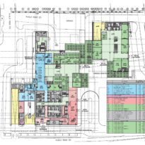
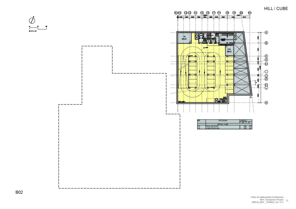
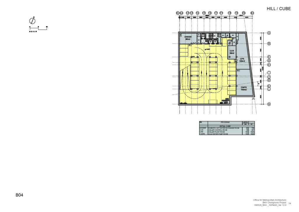
Considering all this it was clear that a single building in the traditional shape of basement+column would not allow the project to grow as high as it wanted to be. This lead to the first decision of dividing the program into two separate buildings, both of which would have to comply with the above terms independently. Some part of the retails space together with the transportation hub were put into a smaller building closer to the street while the rest were set back considerably leaving an open space in between them which would become the public square.
“Pixelation”
As much as that decision was the first to start shaping the project and gave it a unique urban signature, the most distinctive trait of the tower came later. In order to become the highest building in Bangkok and comply with the GFA regulation the Architectes came up with a concept that not only solved this issue but also provided a lot of additional benefits.
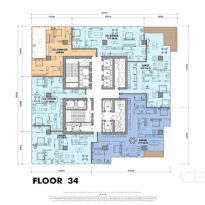
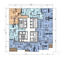
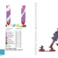
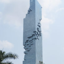
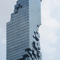
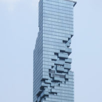
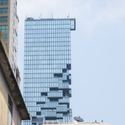
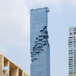
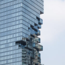
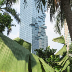
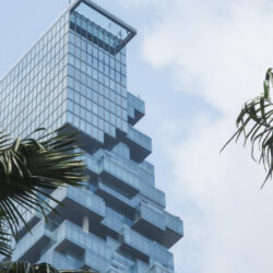
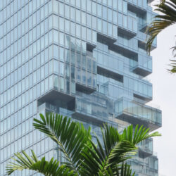
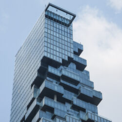
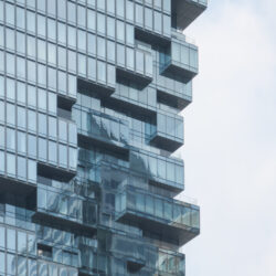
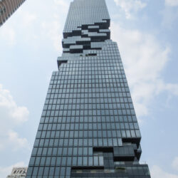
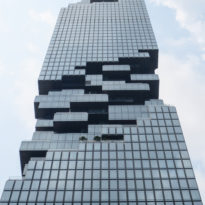
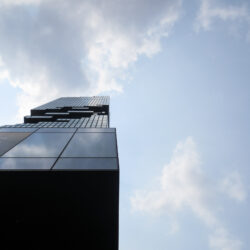
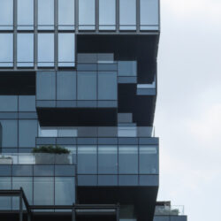
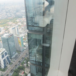
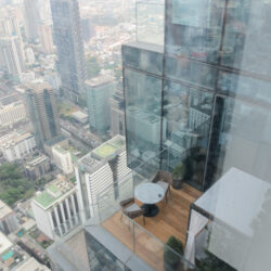
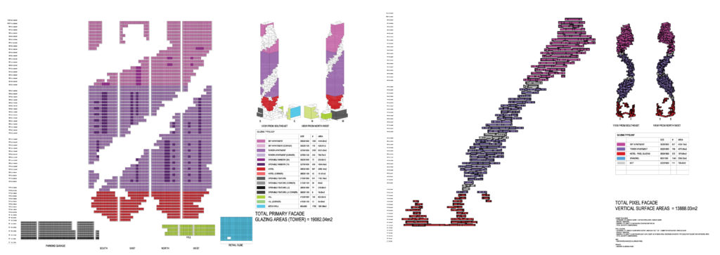
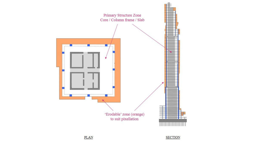
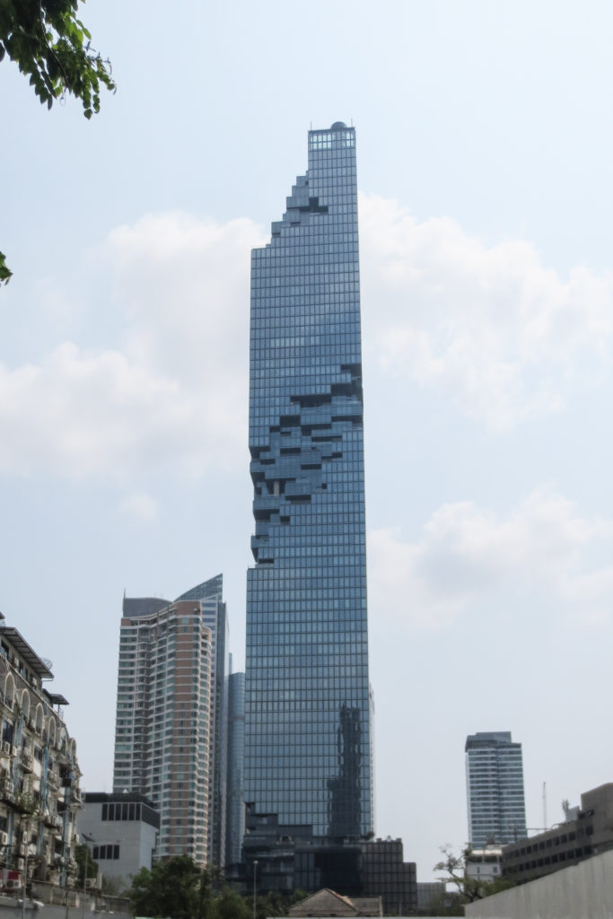
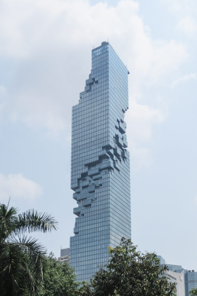
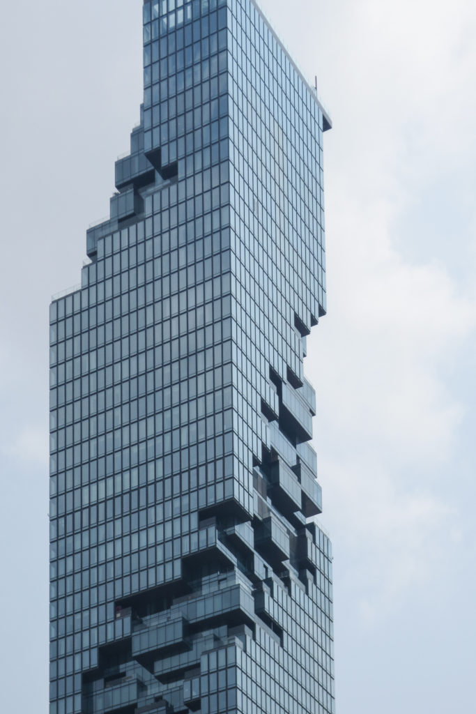
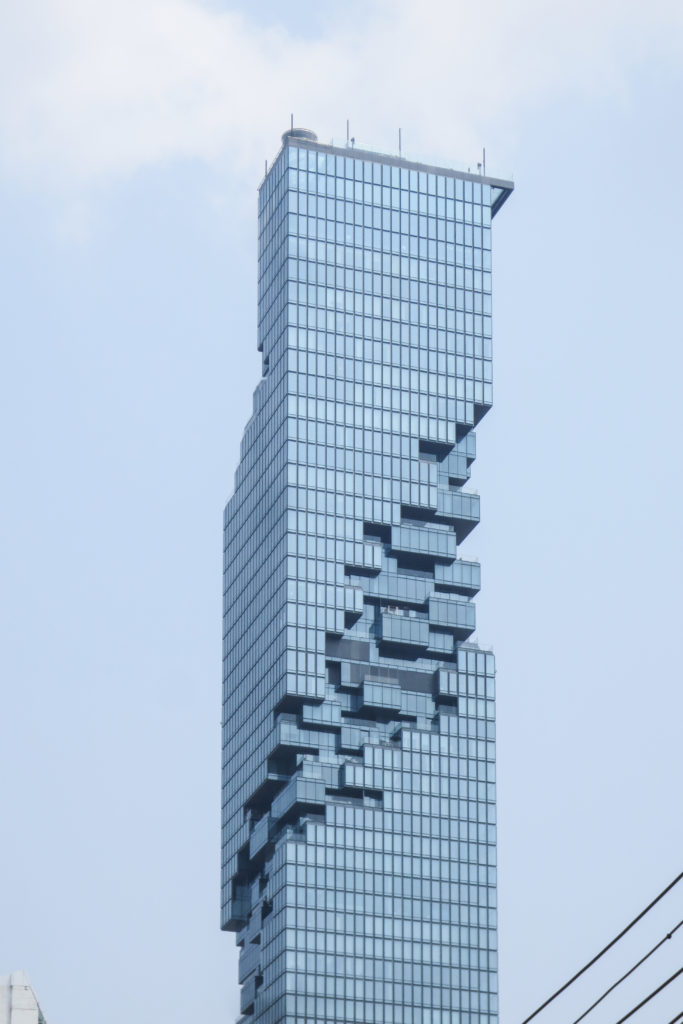
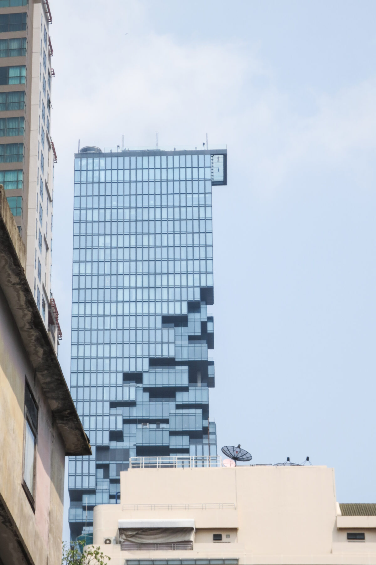
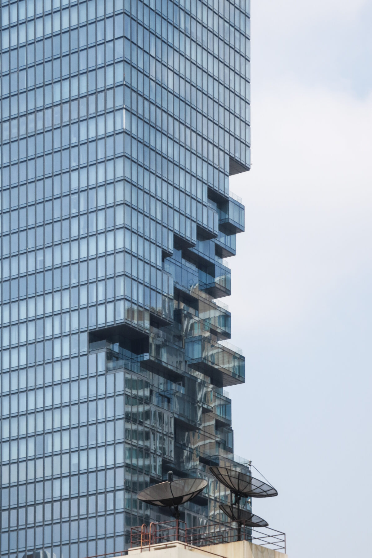
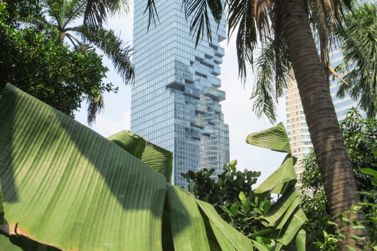
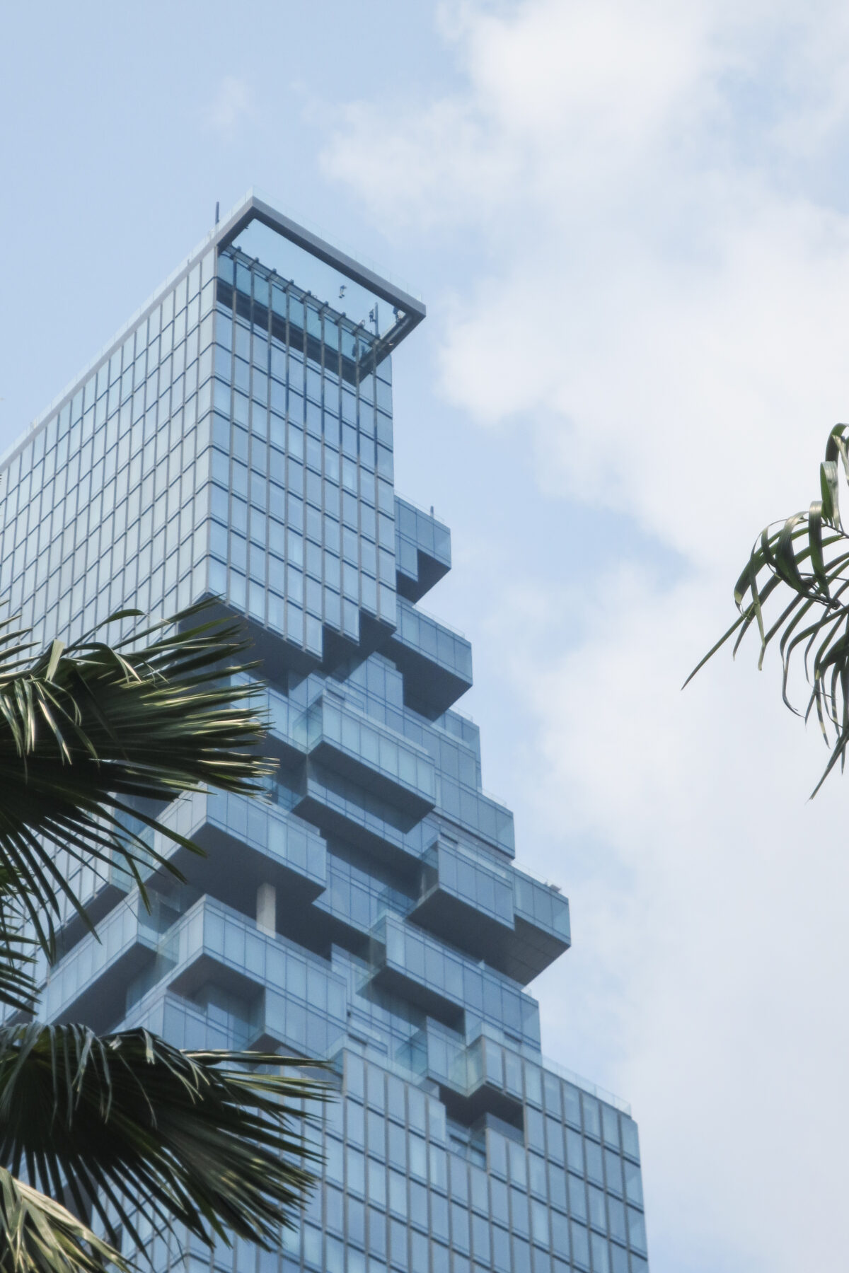
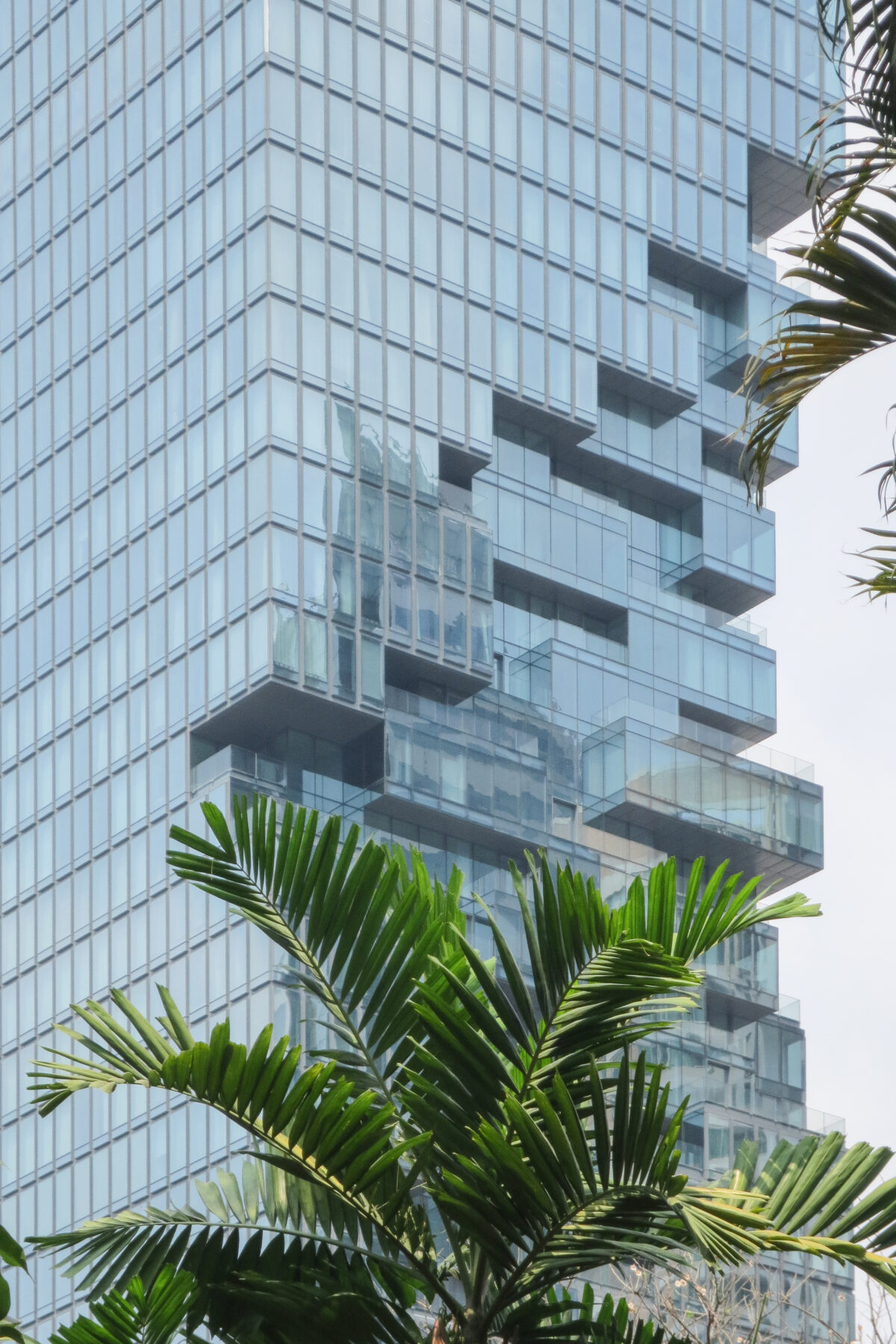
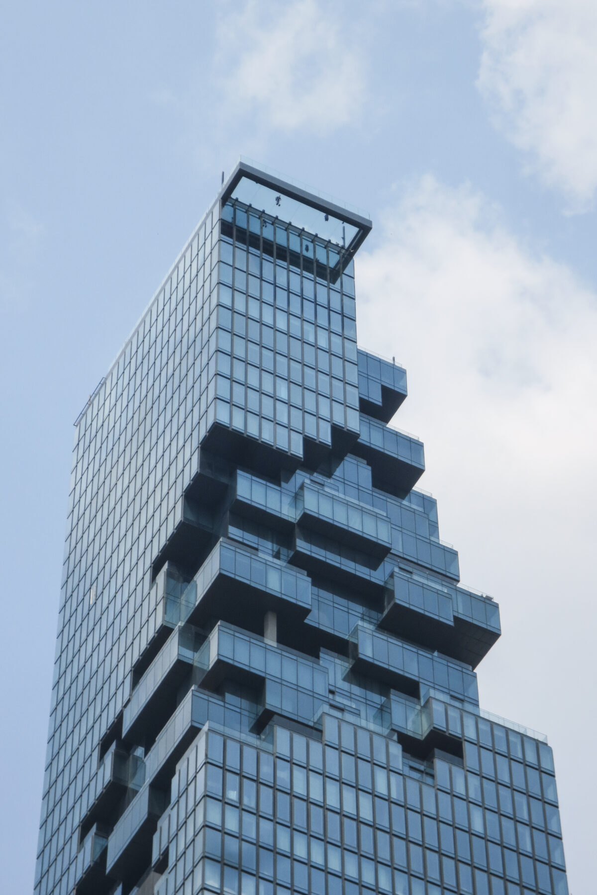
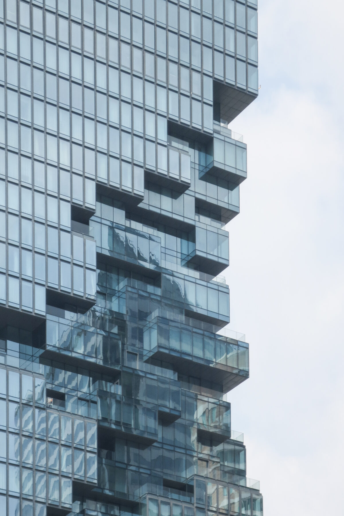
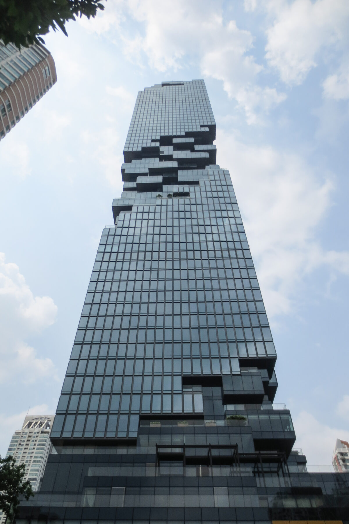
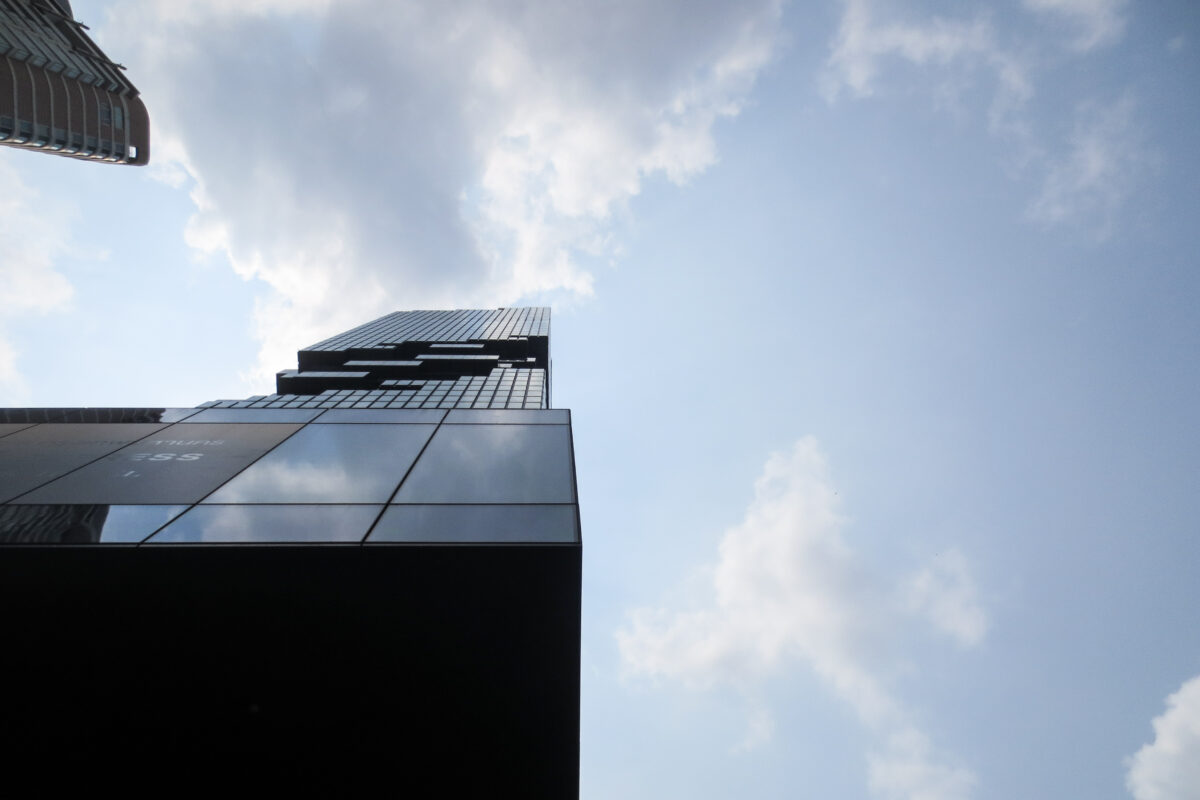
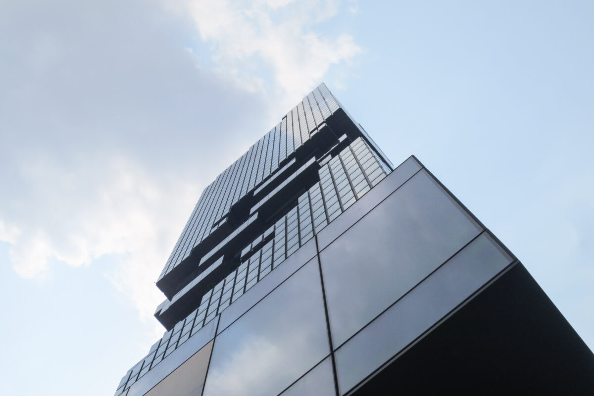
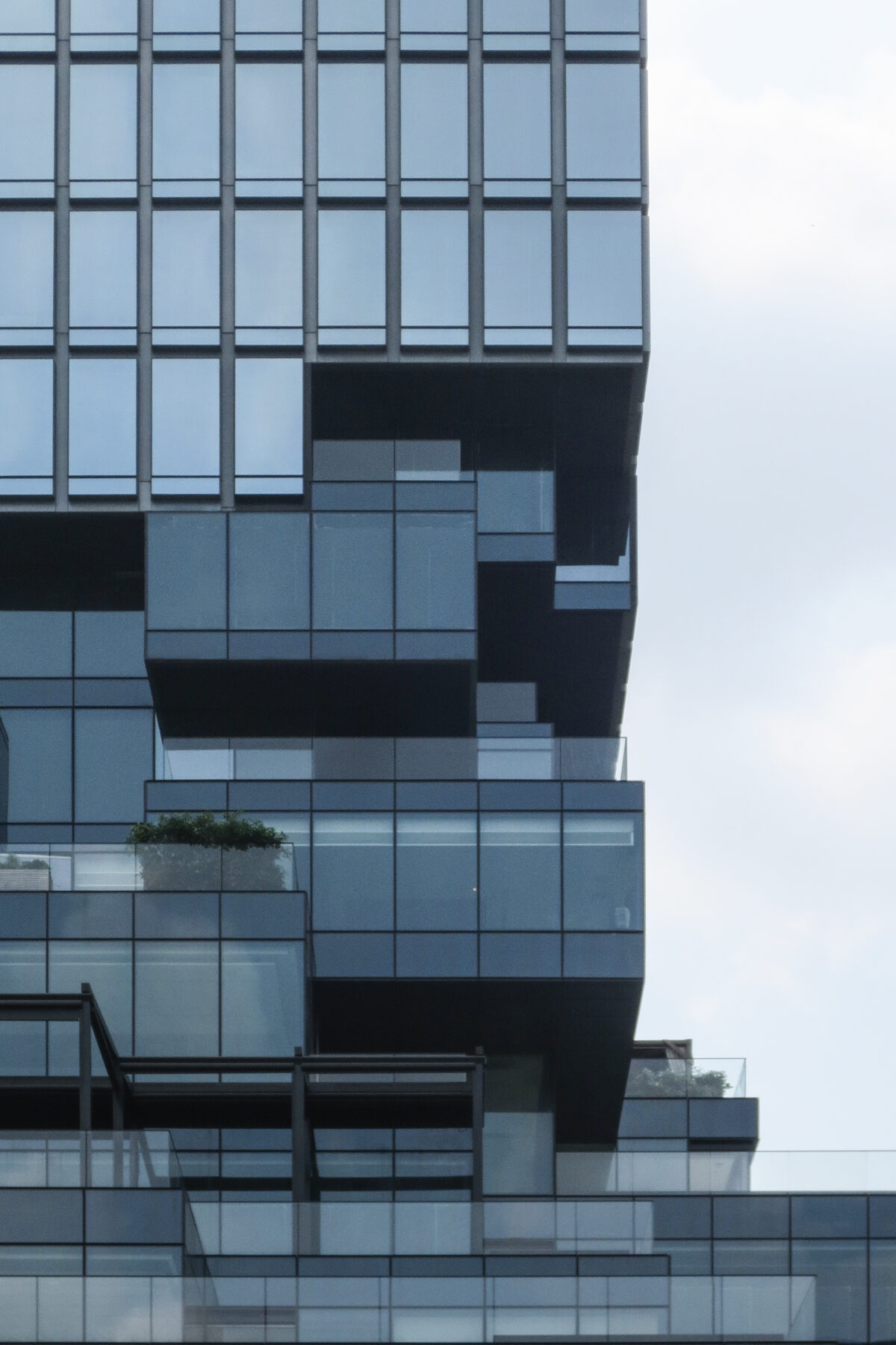
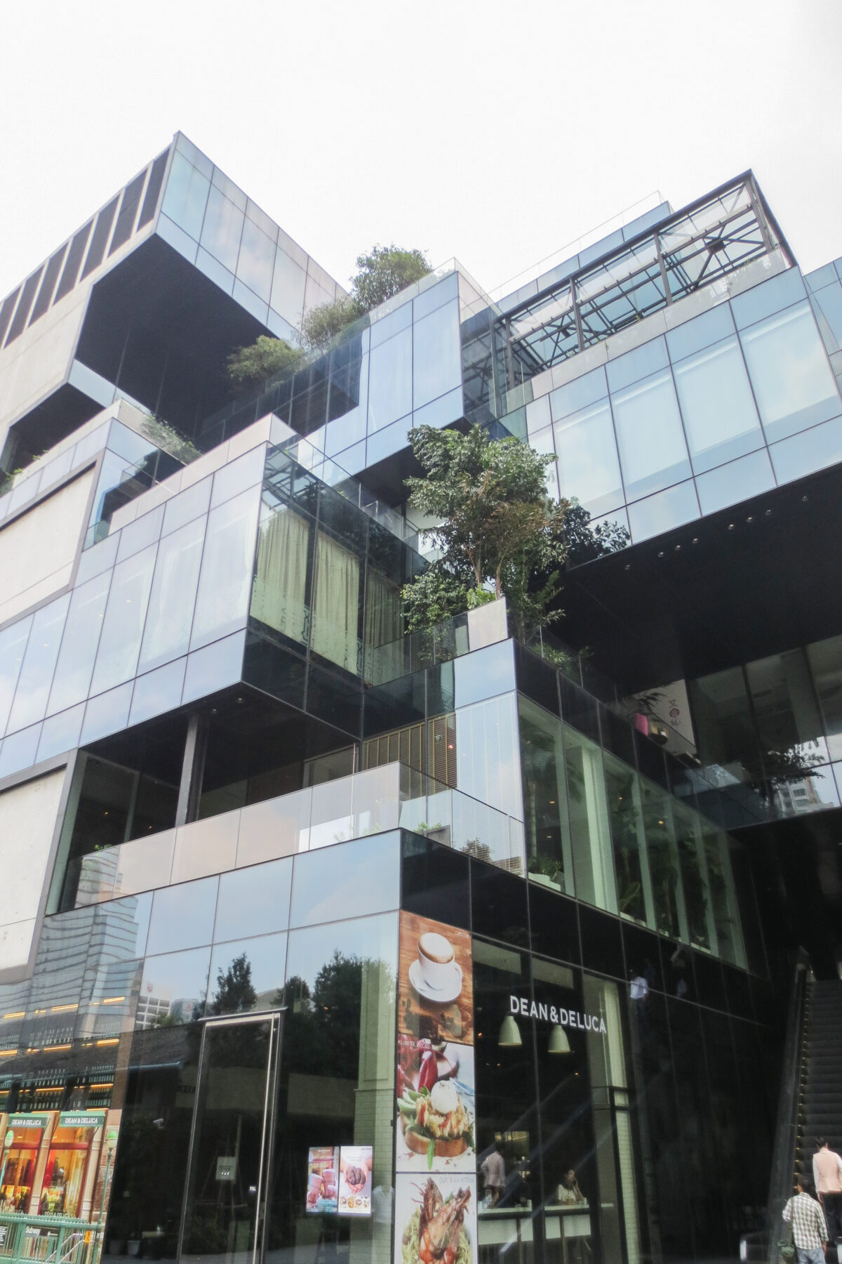
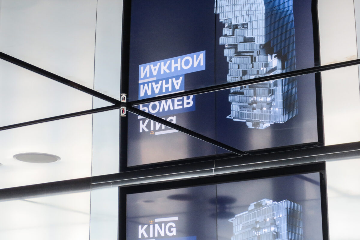
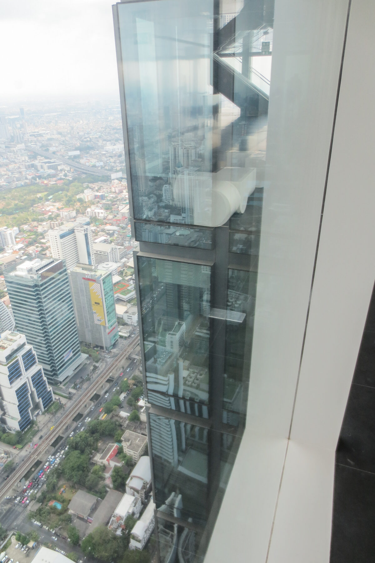
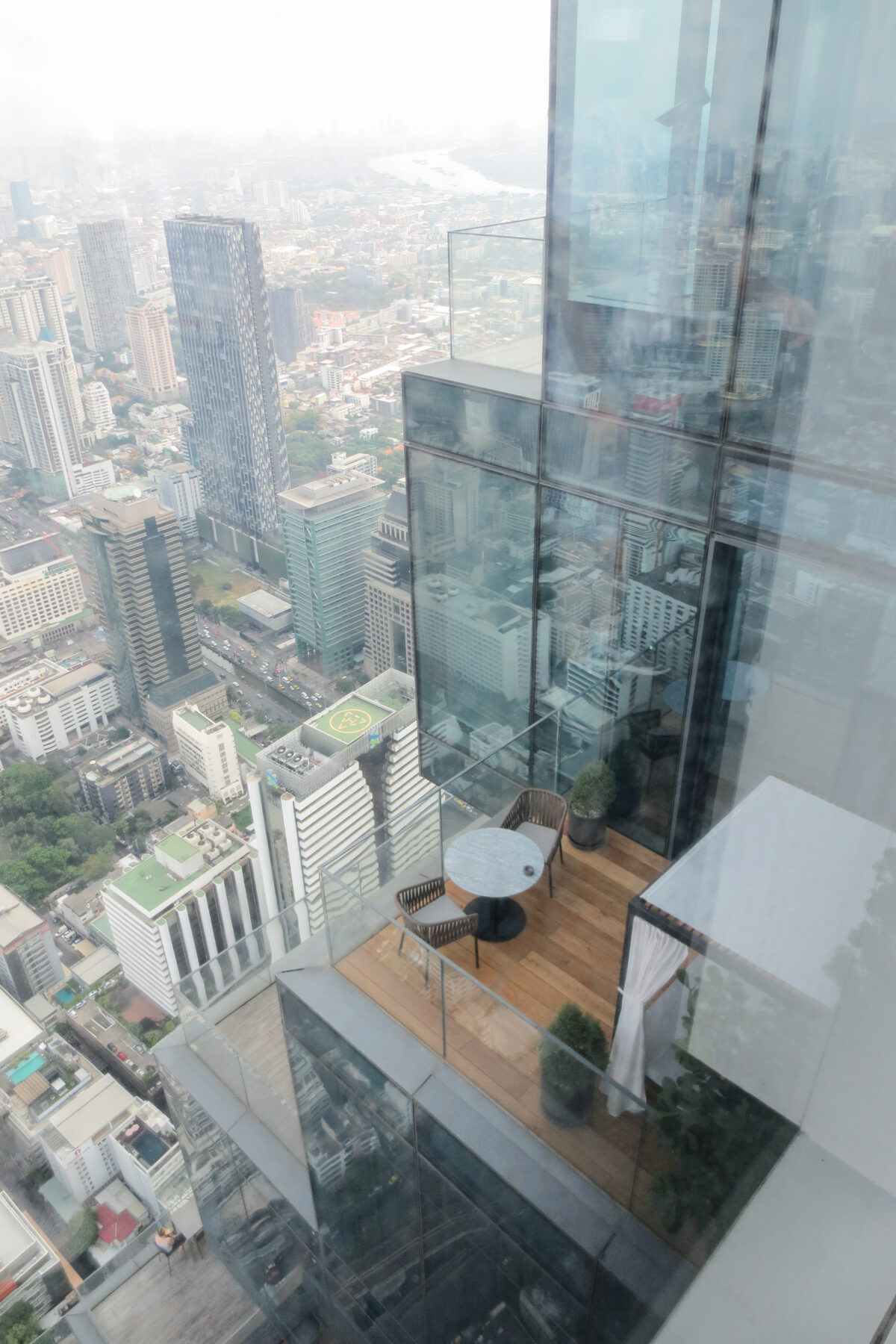
The design team decided to move away from the traditional extruded volume and decided instead to create a spiral of indentations along the tower. These indentations varied in depth, creating a complex series of terraces, balconies and “floating” rooms that ended up shaping the tower to the point where it’s now commonly known as the “pixel” tower since this combination of staked surfaces, terraces and protrusions create the impression of a digital pixelation.
This “pixels” solve the GFA problem, but most importantly they foment the relationship between the interior and the exterior, creating a permeable membrane between the interior and the exterior that allow the residences and hotel to “connect” with the vibrant life of the emerging global capital that is Bangkok.
In words of the design team themselves:
“The building is an exploration of bringing the inside and the outside closer together and to create living spaces that float high above the city,” said Scheeren.
“You can step out onto the terraces and transition to the open air, as people in the tropics live in a fluid condition between interior and exterior spaces. We are literally carving those possibilities into the tower and make these qualities accessible at staggering heights.”
Spaces
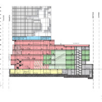
The total area of the complex adds up to 150,000 m2 divided as follows:
- Main tower:
- Tower Residences 67,000 m2
- Residential Amenities 4,400 m2
- Hotel 16,600 m2
- Hotel Amenities 11,600 m2
- Retail 5,900 m2
- Sky Bar 3,500 m2
- MEP 5,200 m2
- Parking 10,400 m2
- CUBE building:
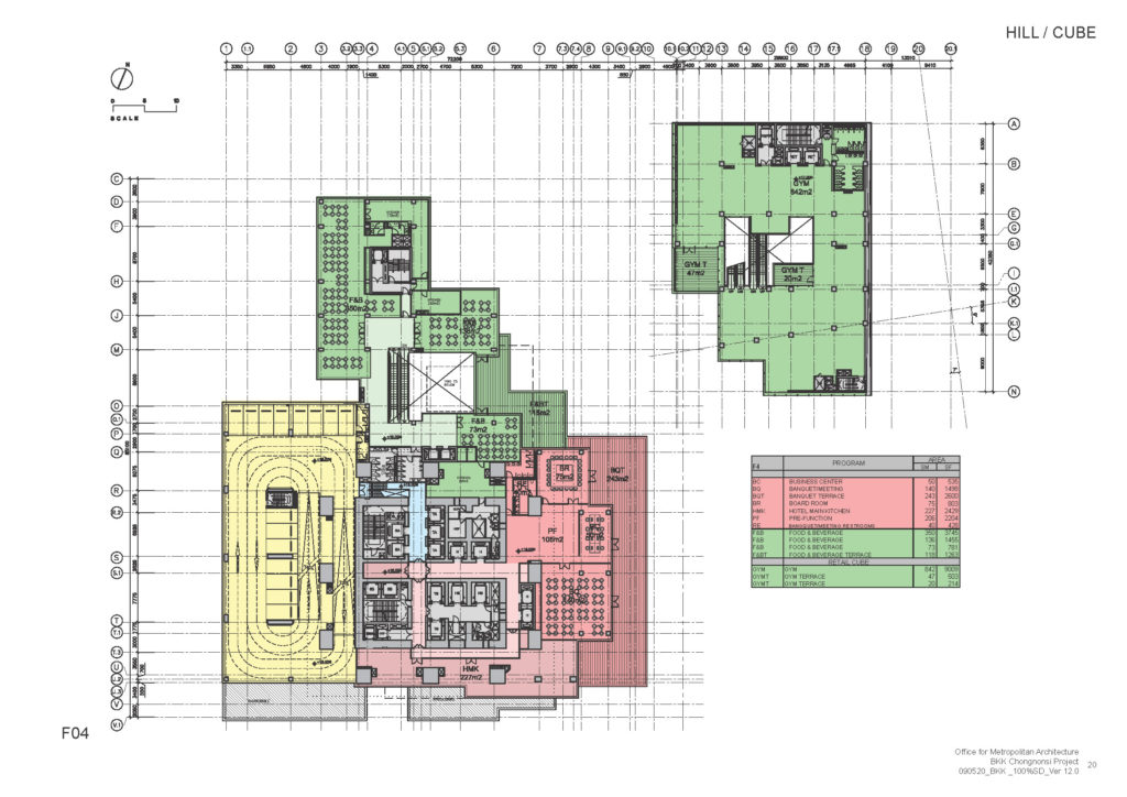
- Retail 9,000 m2
- MEP 1,000 m2
- Parking 5,400 m2
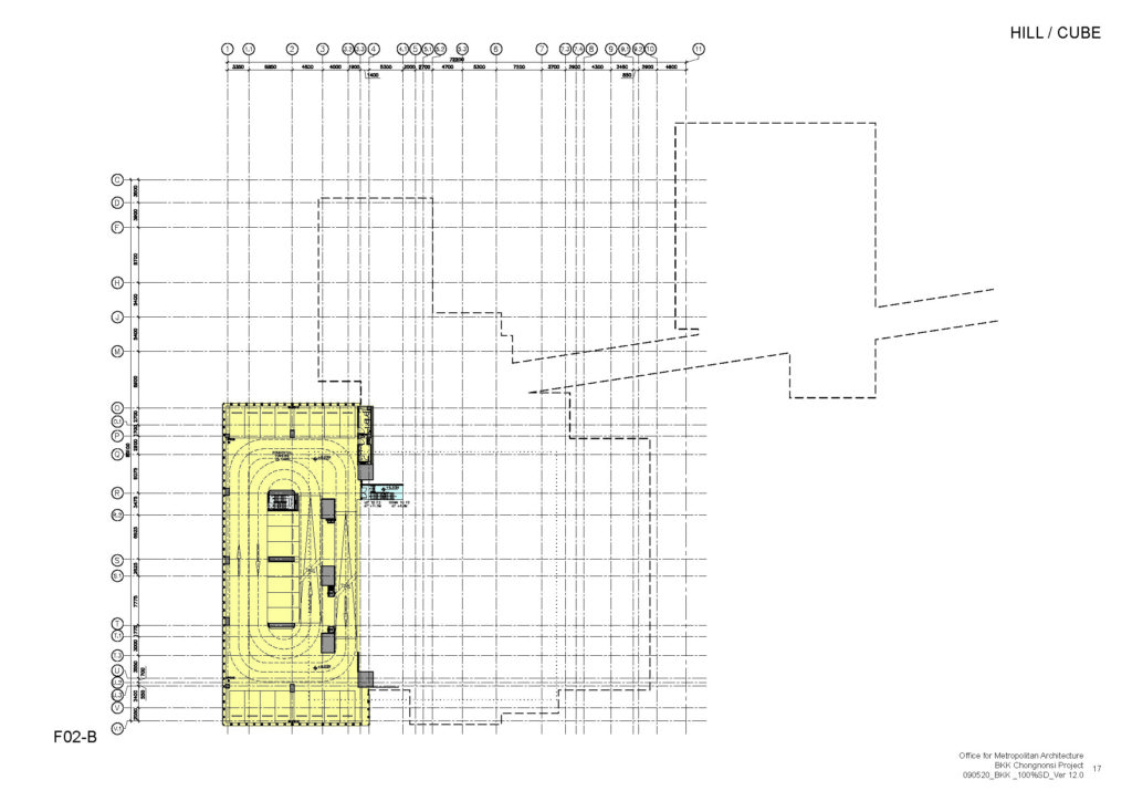
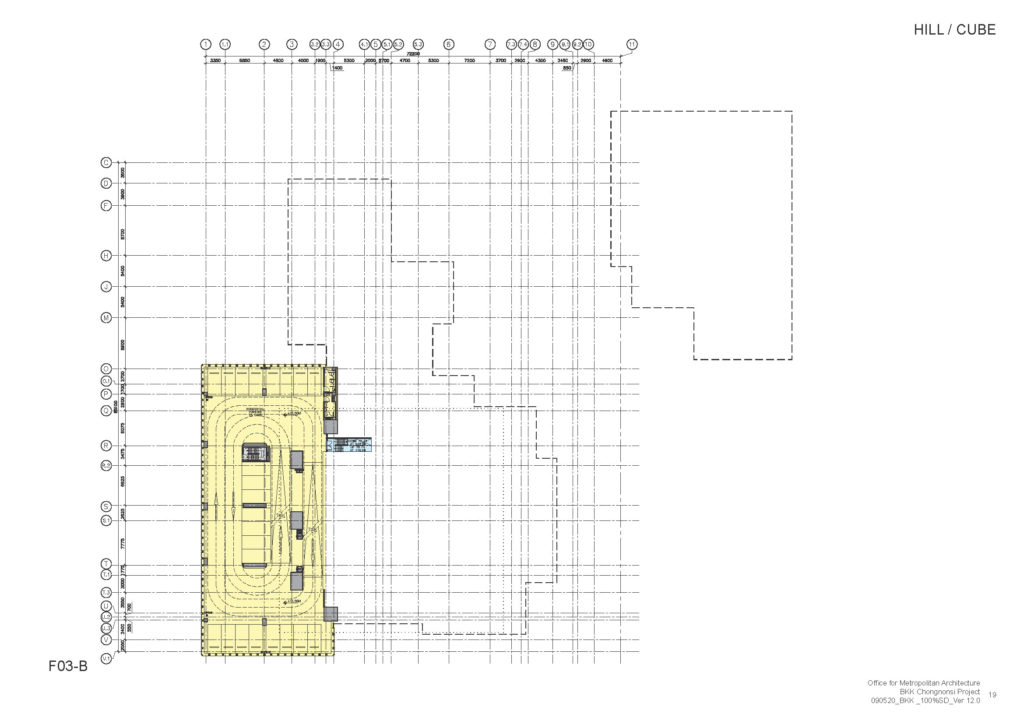
- Offsite Parking 8,300 m2
Parking
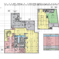
Parking space is divided into separate zones to serve the different users.
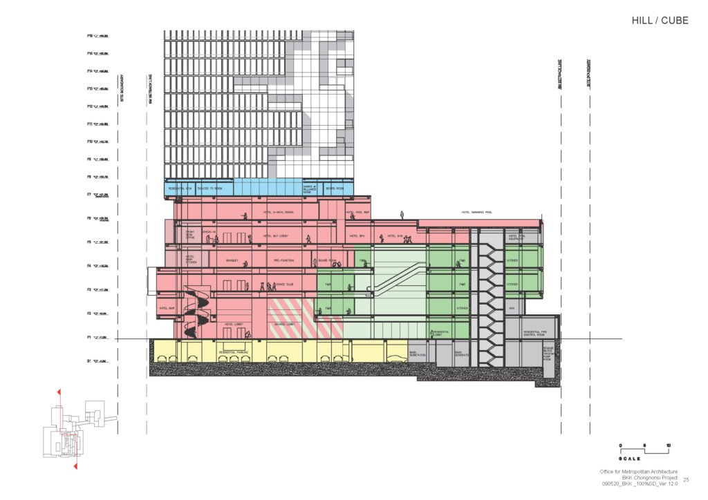
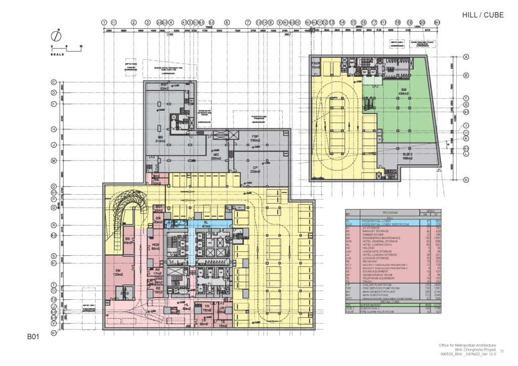
Clients visiting the complex to buy at the retail space will park below the CUBE building where a valet service is also available.
Hotel clients have parking space available at the base of the main tower.
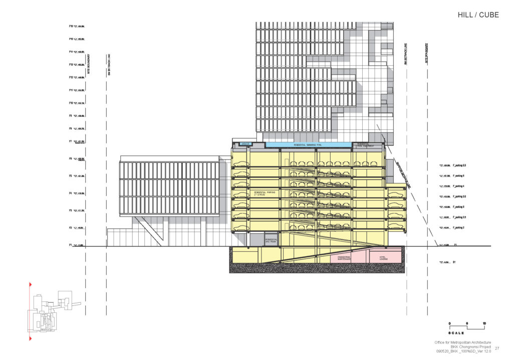
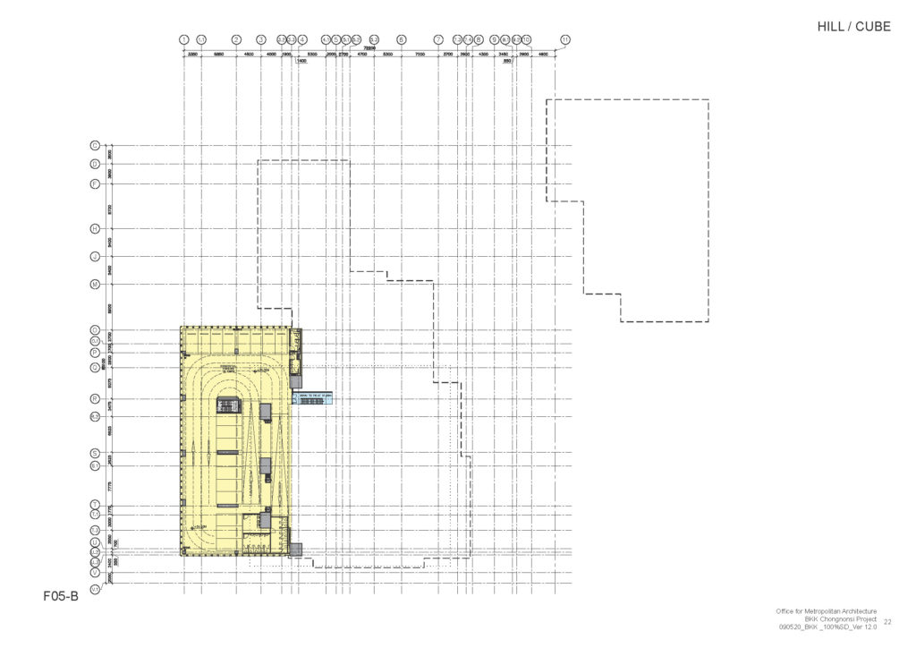
Finally, residents of the MahaNakhon tower have their own parking space in the basement floors below the main tower with a valet and doorman services accessing an offsite parking lot with a mechanical parking system that maximizes the total number of on-site parking spaces to close to 900. This mechanical parking is adjacent to the main building on the west side of the tower and is 6 floors high.
MahaNakhon Plaza
The MahaNakhon Square, at the front of the tower, is probably the most notorious urban gesture of the project in a city where luxury developments tend to become “fortresses” with no relation to the urban grid or the city life in general.
The Square is designed as a dynamic public plaza, a spot for planned and spontaneous cultural events, a landscaped retreat for the city’s inhabitants, and a rare venue for cultural and social interaction.
The CUBE
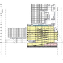
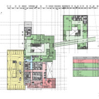
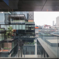
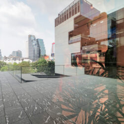
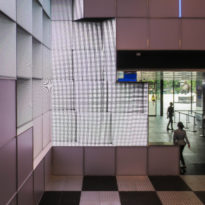
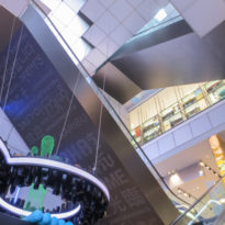
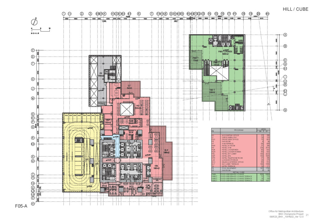
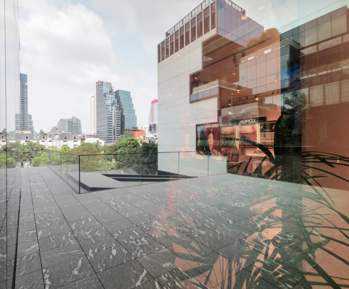
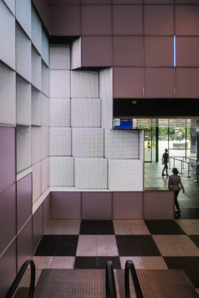
The CUBE is an adjacent freestanding seven-storey building – the “Cube” with corresponding terraces creates an expansive outdoor atrium – forming a valley and network of social, dining, and leisure spaces that serve the residences and the public.
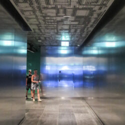
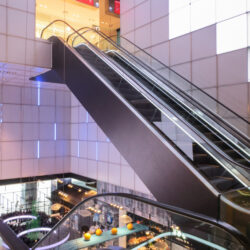
It’s also the connecting node between the MahaNakhon complex and the Skytrain transportation system.
Retail space
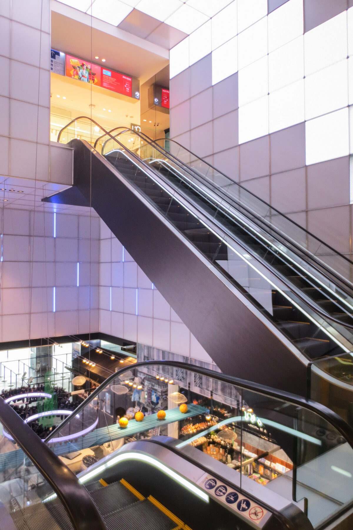
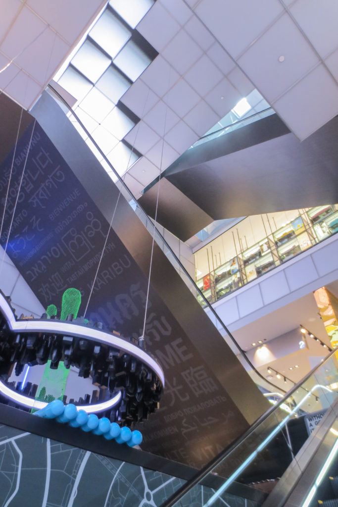
The retail space is divided into two separate parts. Generally speaking restaurants stay in the CUBE building while shops are located in the first floors of the main tower. Shops sell mainly luxury brands and are operated by King Power, Thailand’s leading travel retail group which has the proprietary concession of Thailand’s duty-free business.
The brand which was founded in 1989 also gives name to the whole complex which is officially called King Power MahaNakhon.
Residences
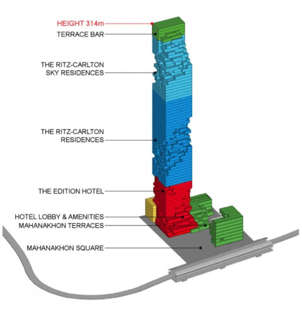
The residences have been branded by the luxury hotel brand Ritz-Carlton with a total of 207 units between floors 23rd to 73rd.
Standard residences are located between floors 23rd to 54th, followed by larger “Sky residences” from floors 56th to 73rd. Units range from 125 to 850 square meters, however some owners have combined several units to achiee residences of up to 1500m2.
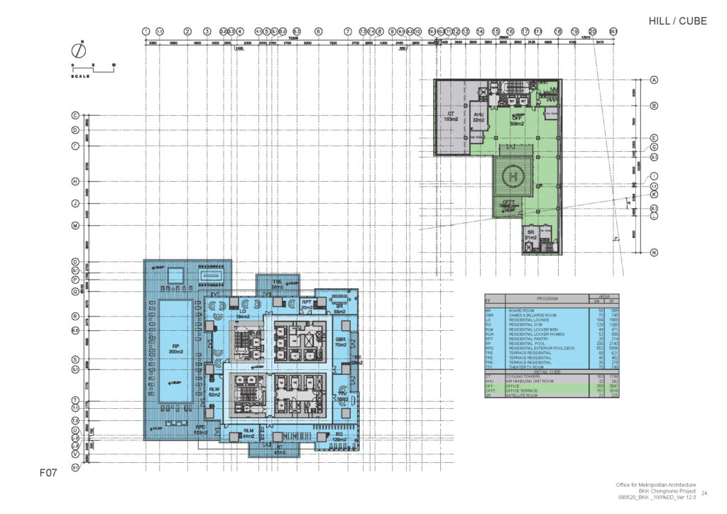
On the 7th floor there is a full floor dedicated to facilities which is accessible to residents only and includes:
- Outdoor Swimming Pool and Gardens
- Sundeck and Cabana Area
- Fitness Center
- Yoga and Pilates Room
- Screening Room
- Game Room
The Ritz-Carlton Club Lounge is located on the 54th floor and offers residents the following amenities:
- Residential Club Lounge and Bar
- Meeting Area
- Library
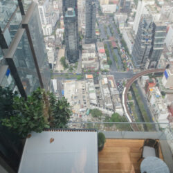
Residences located in the pixelated side of the tower all have generous outdoor spaces which are uncommon to high-rises, but common in tropical climates such as Bangkok’s. The “pixes” have been carefully designed to provide unobstructed panoramas of the city and the Chaophraya River.
On the other hand residences located on the non-pixelated side of the tower enjoy a different kind of interior-exterior relationship with double-height living spaces equipped with full height folding balcony windows that can be opened transforming usually interior living areas into outdoor spaces.
Hotel
The hotel occupies floors 9th to 18th and is positioned as a high-end boutique hotel.
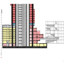
The hotel has a separate elevator core as to ensure that residents don’t mix with guests while at the same time guests don’t have to mix with shoppers. It also has a dedicated amenities floor separated from the residence’s amenities.
Observatory and Sky Bar
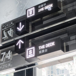
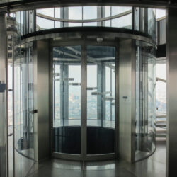
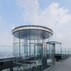
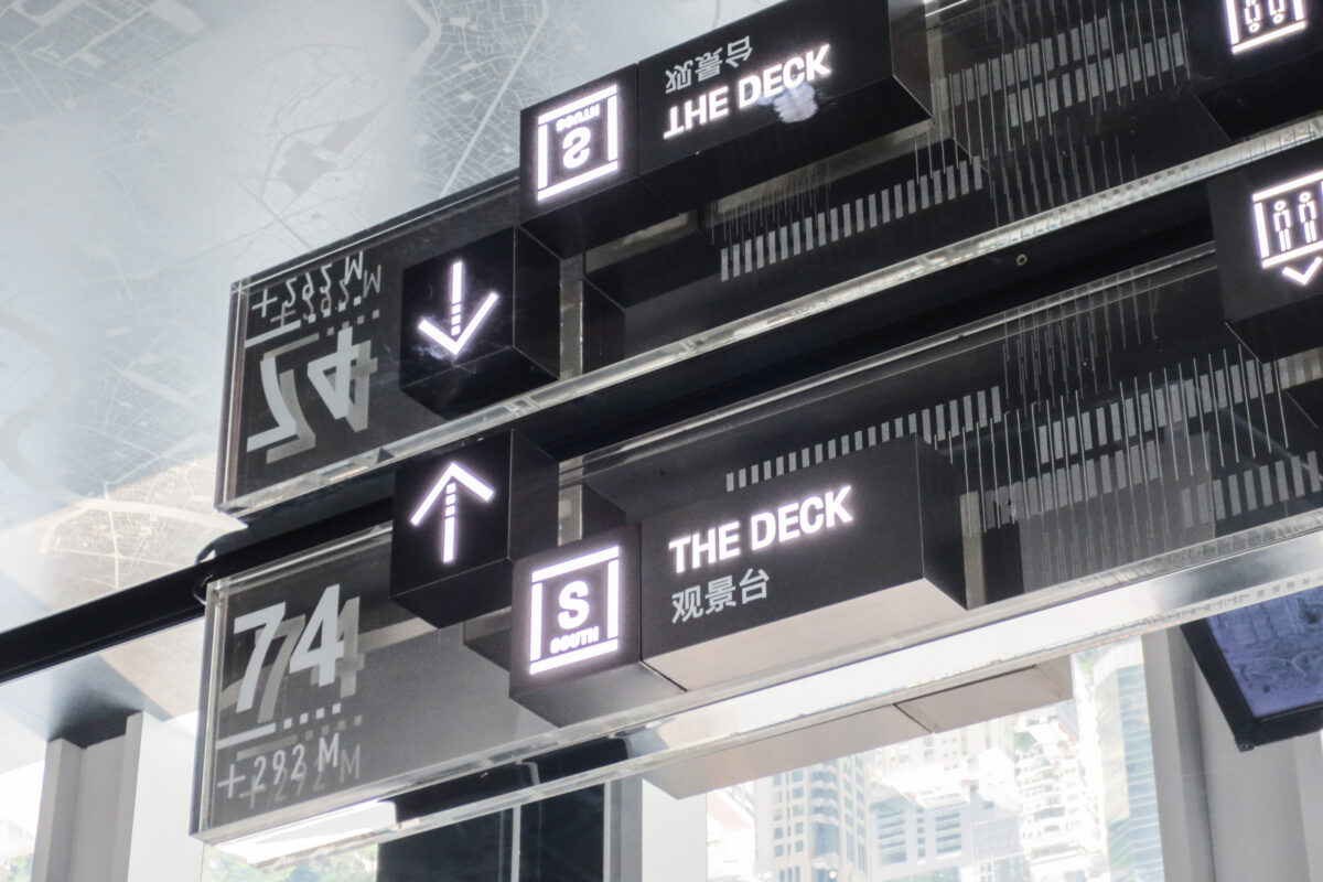
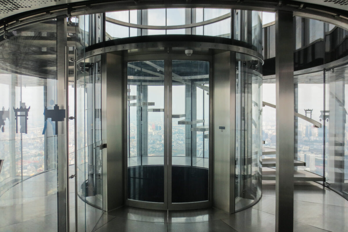
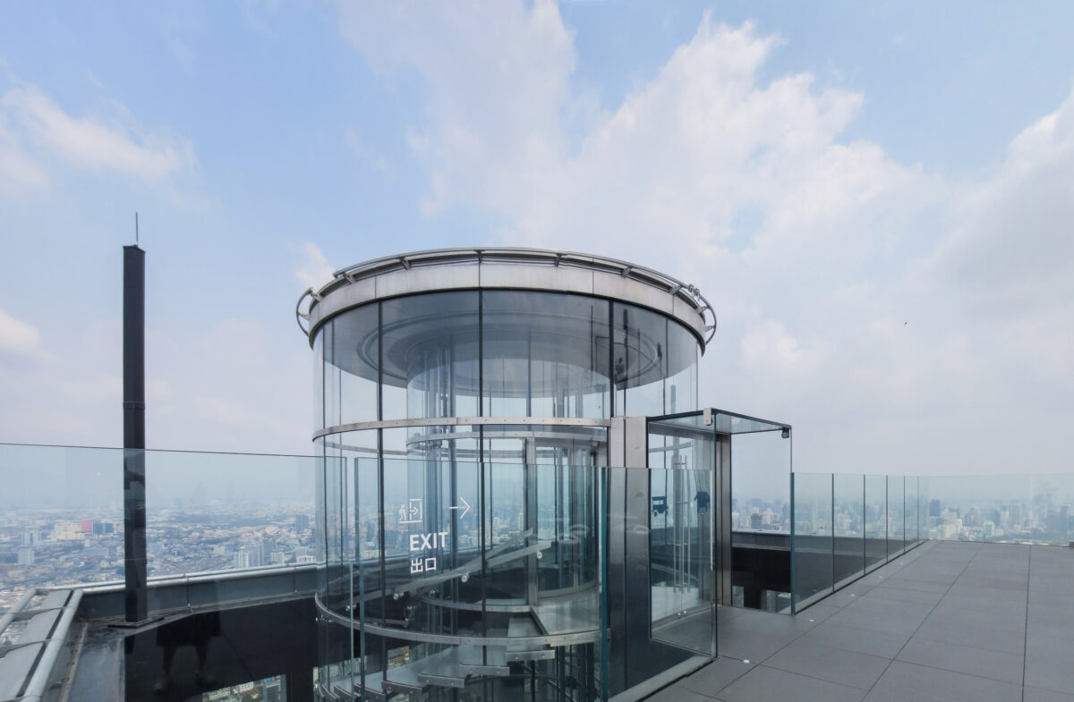
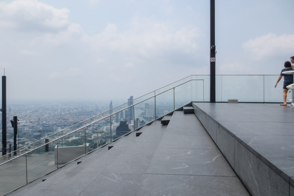
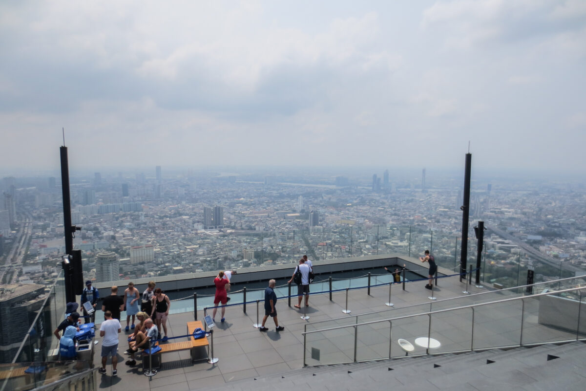
The observatory and the Sky Bar occupy floors 74th to 77th.
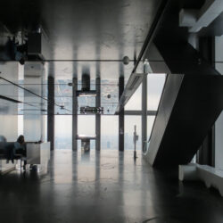
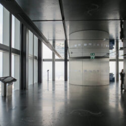
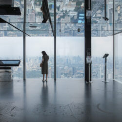
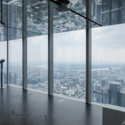
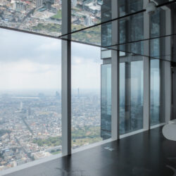
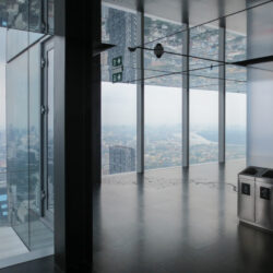
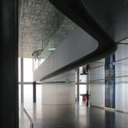
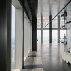
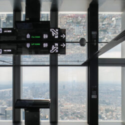
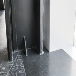
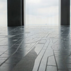
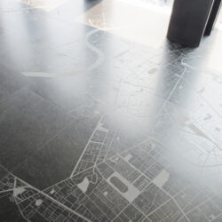
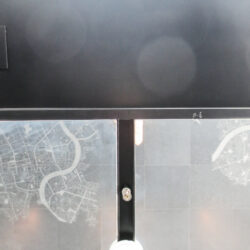
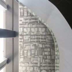
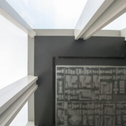
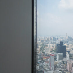
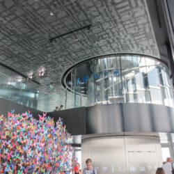
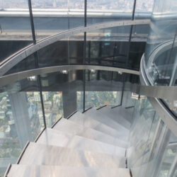
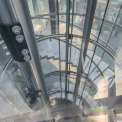
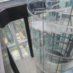
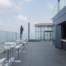
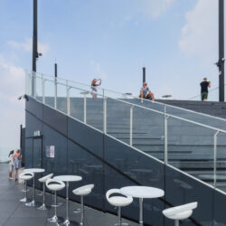
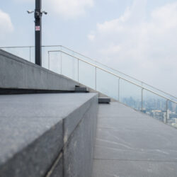
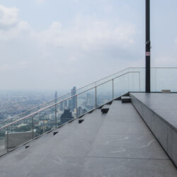
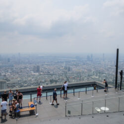
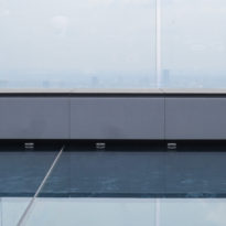
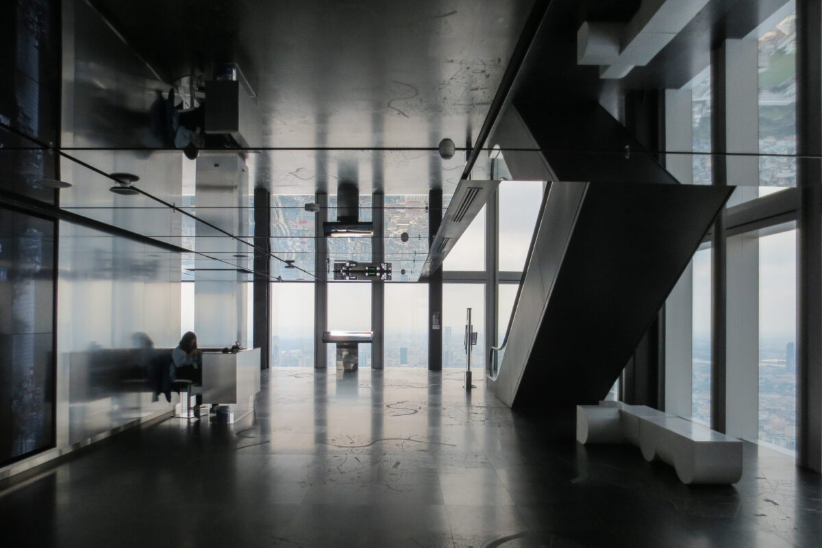
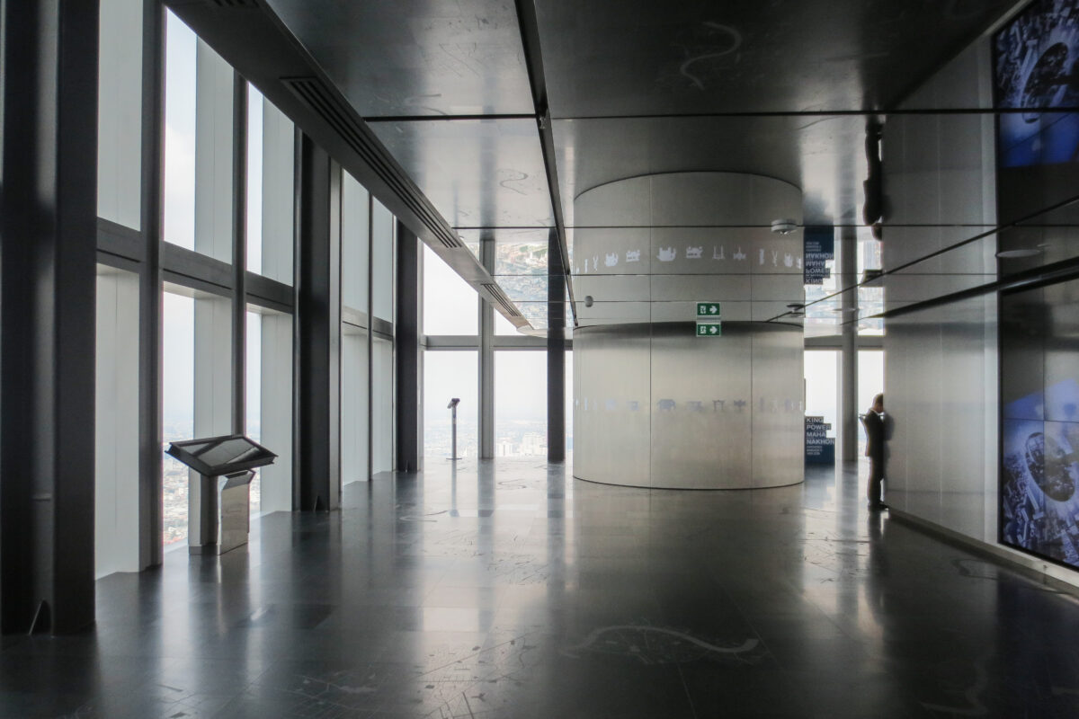
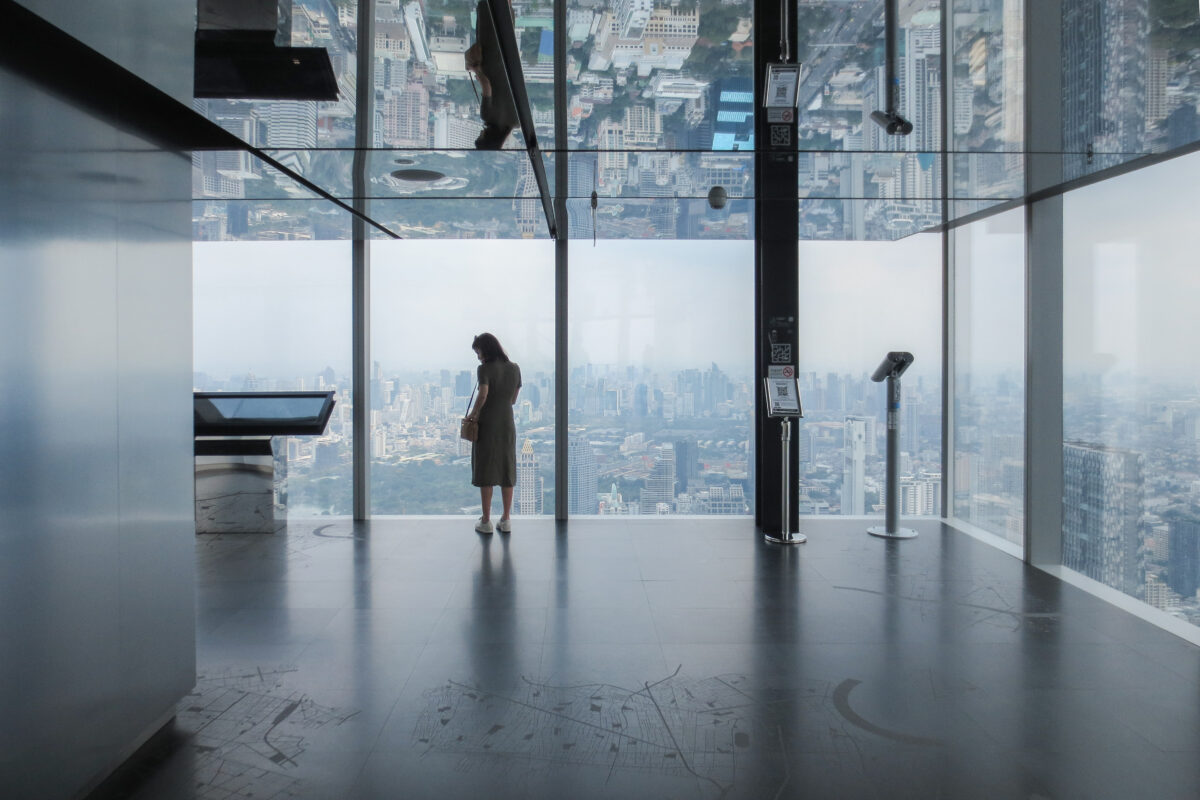
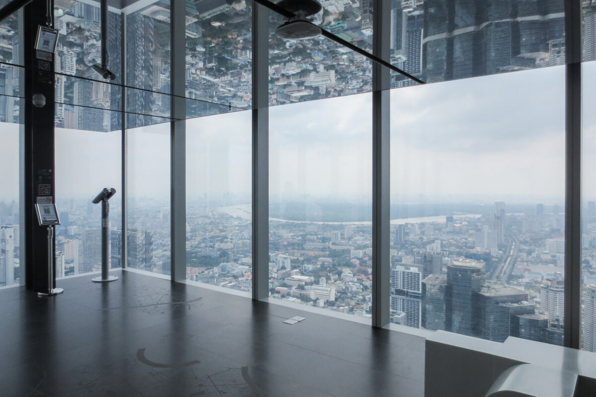
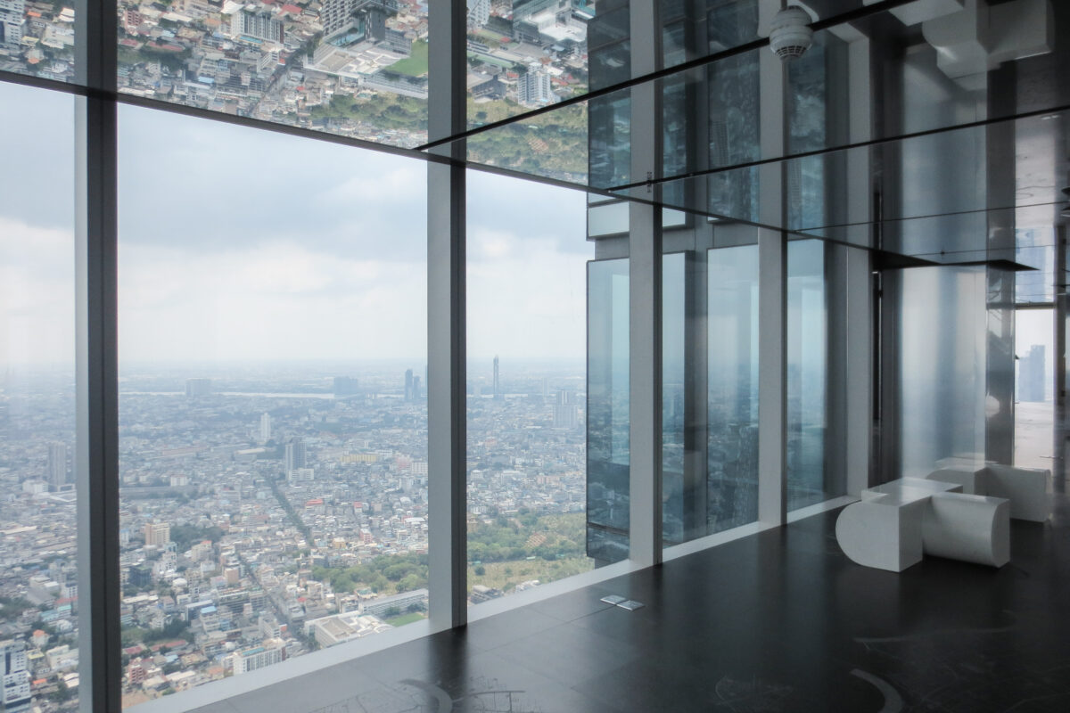
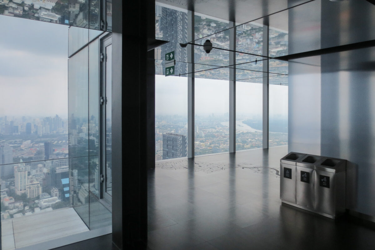
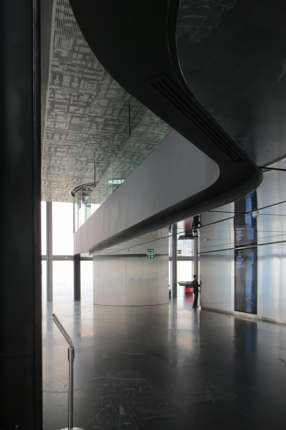
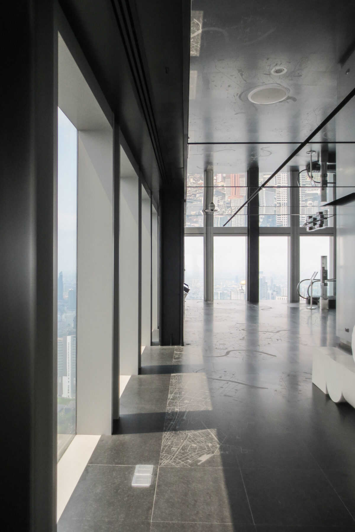
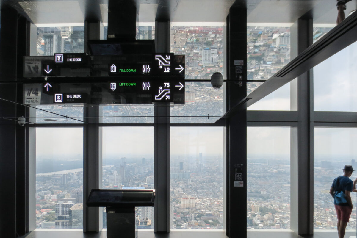
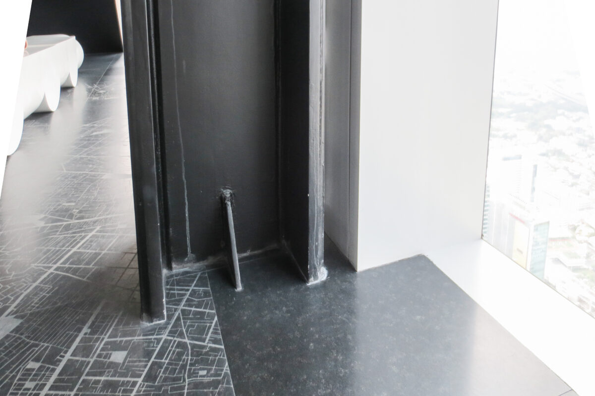
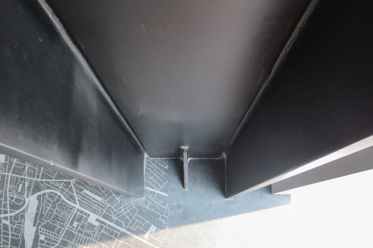
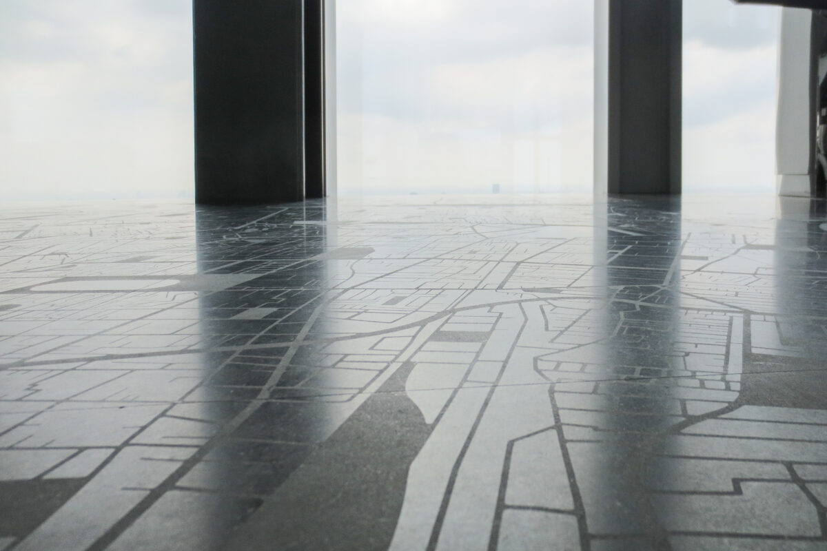
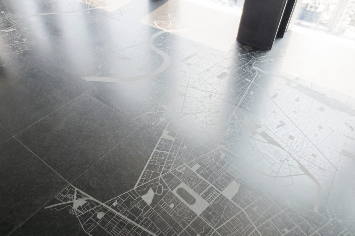
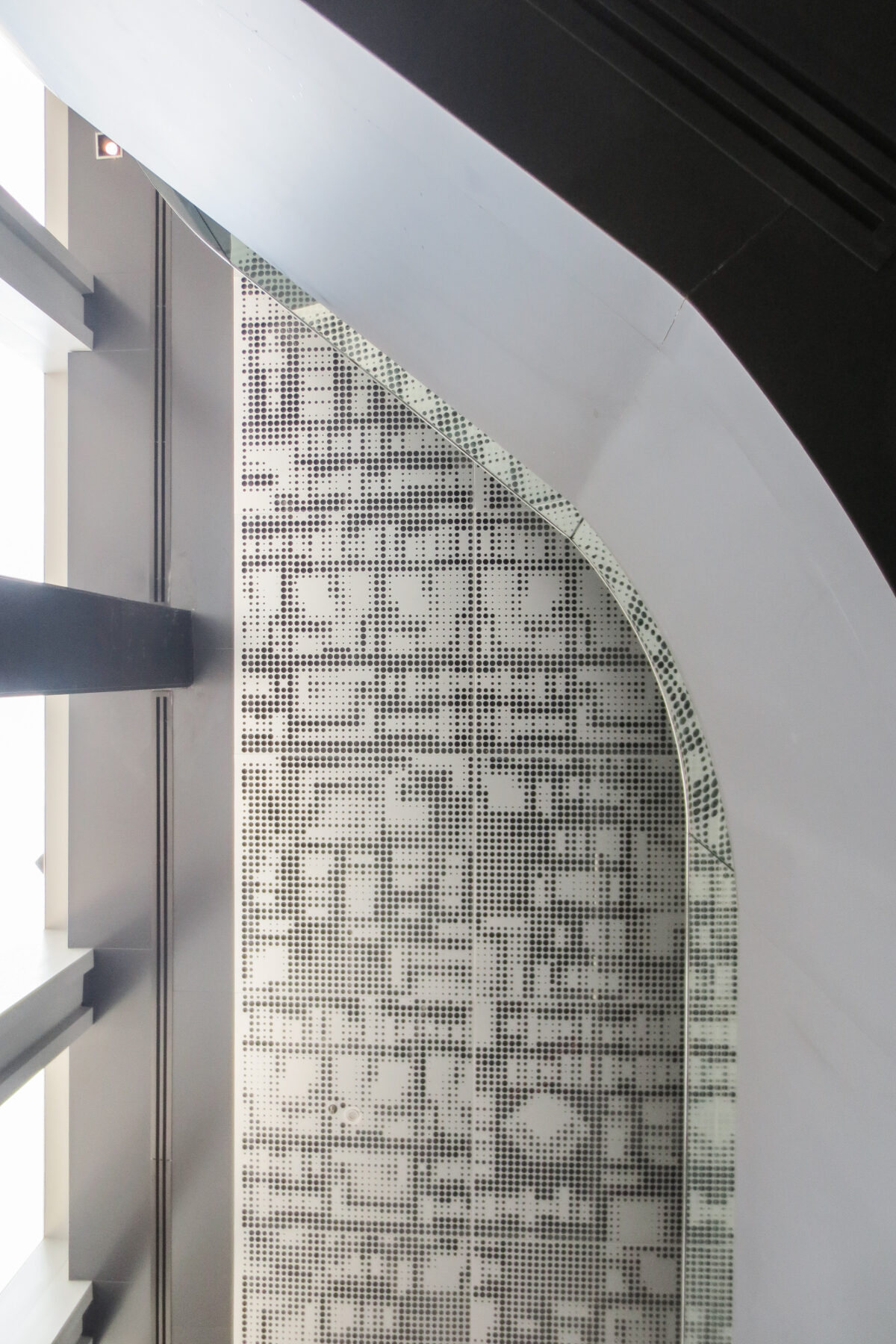
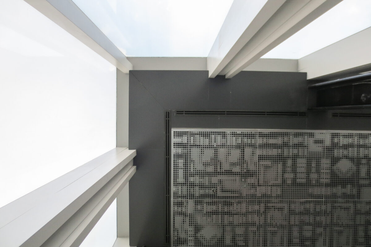
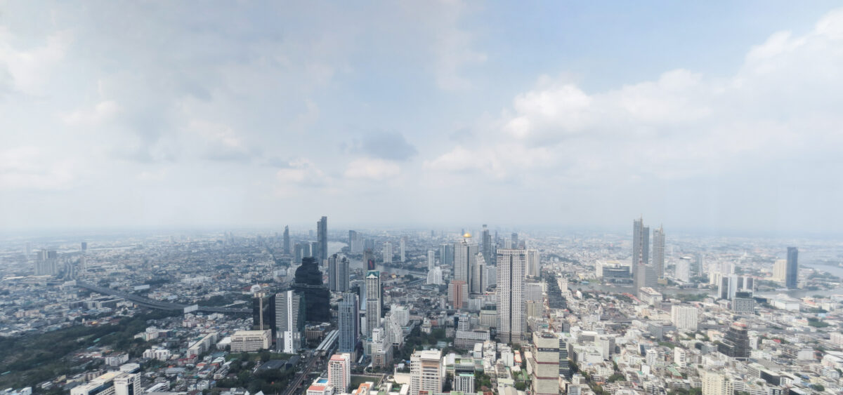
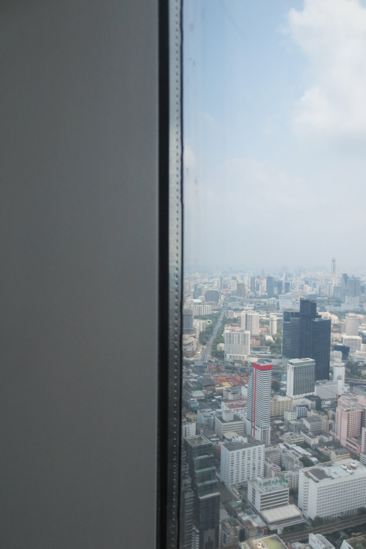
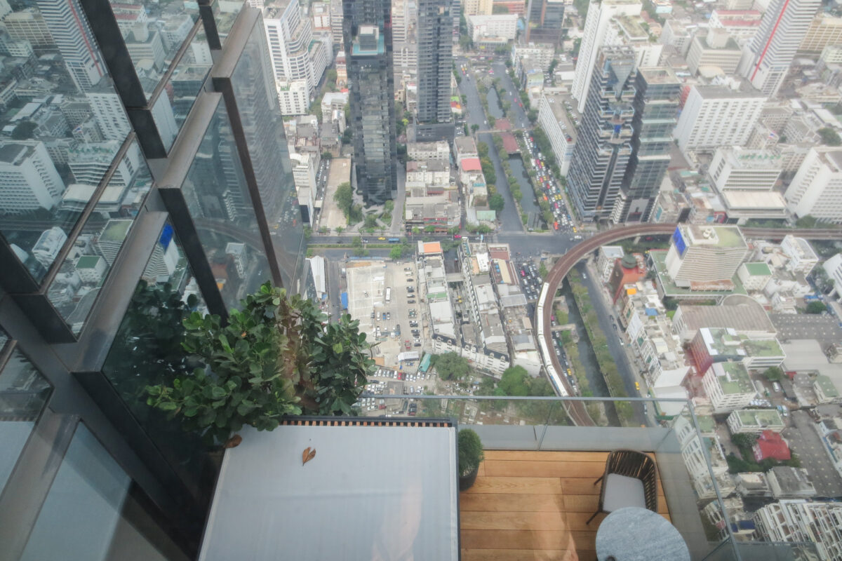
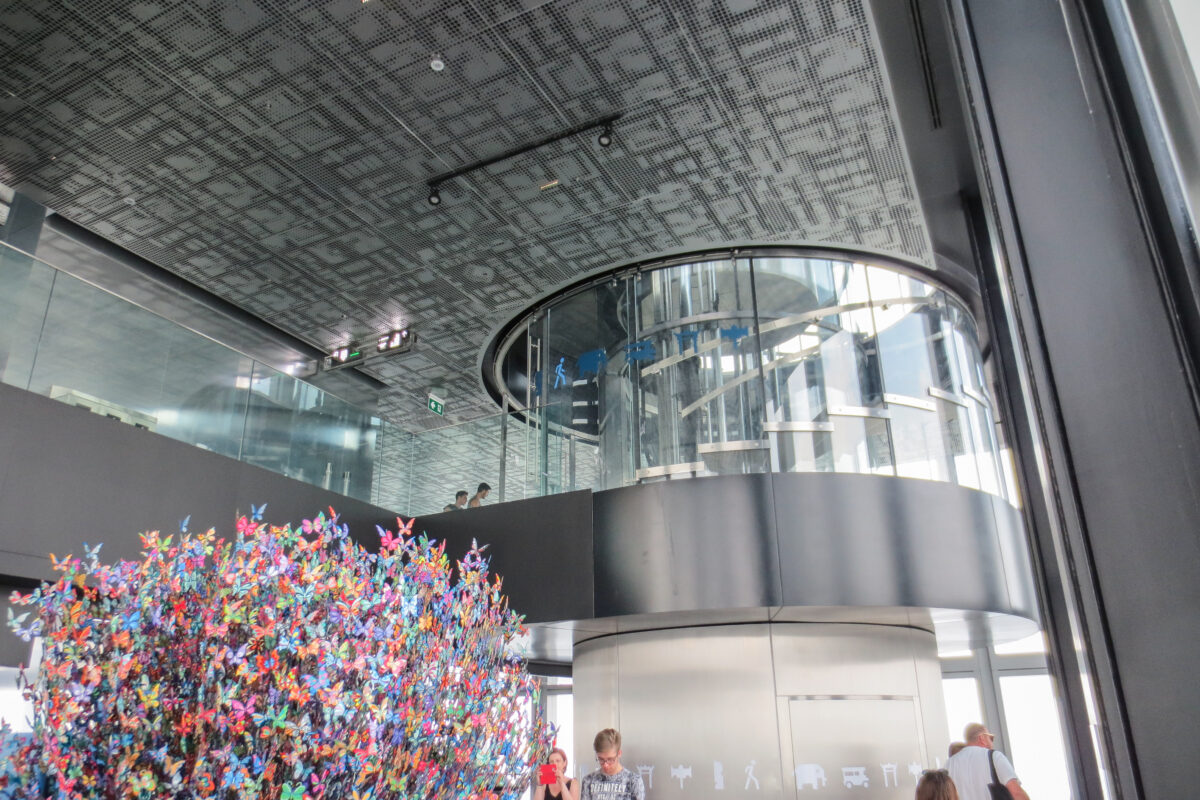
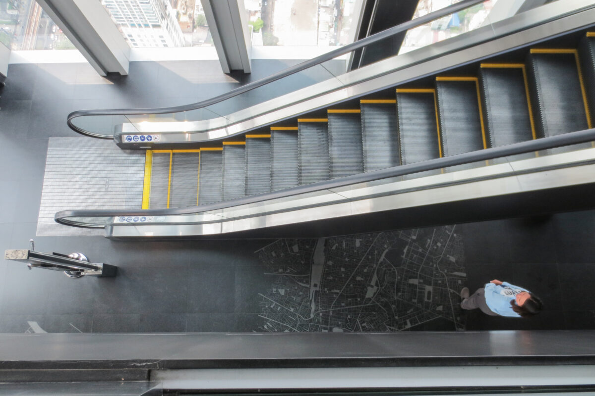
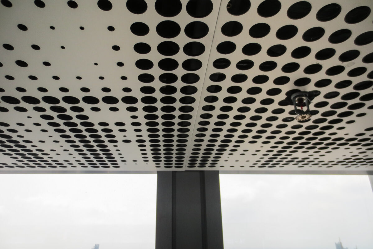
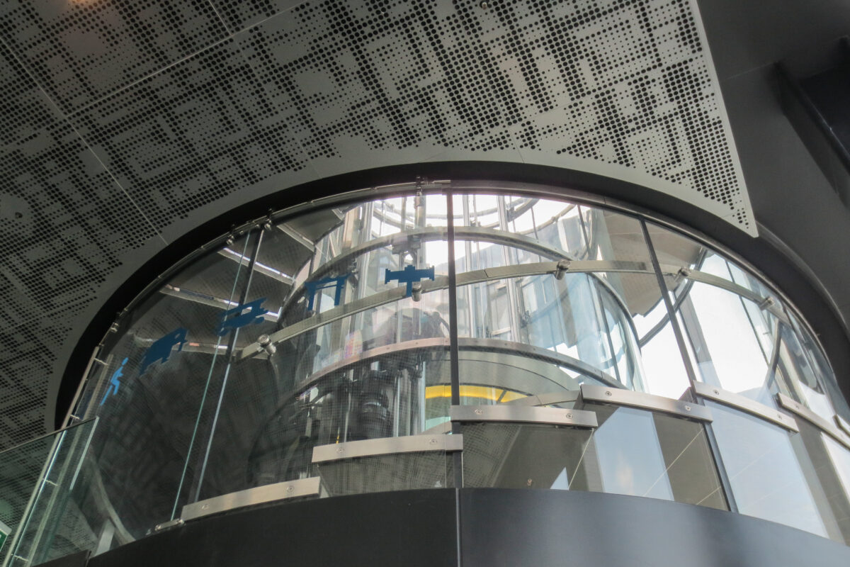
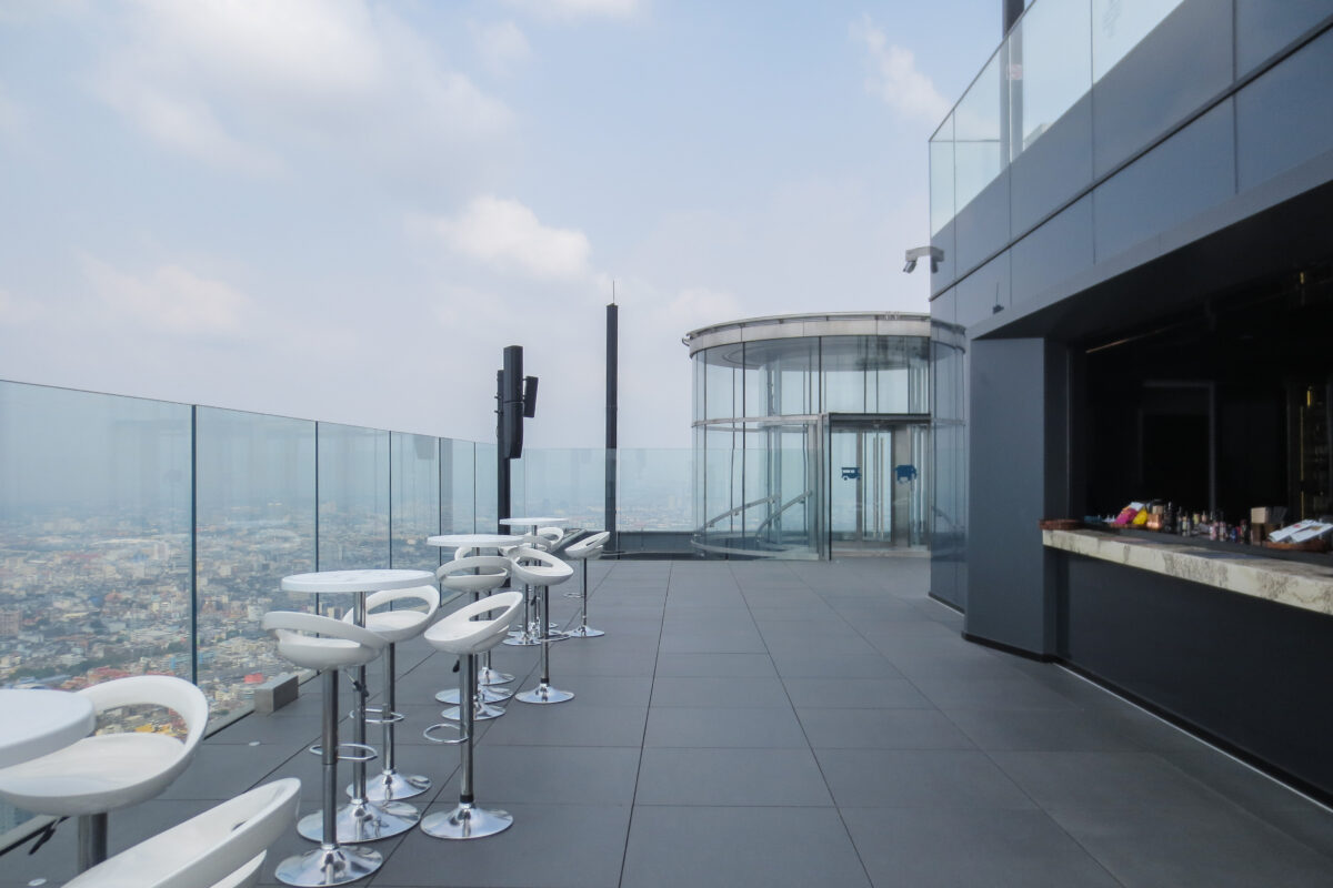
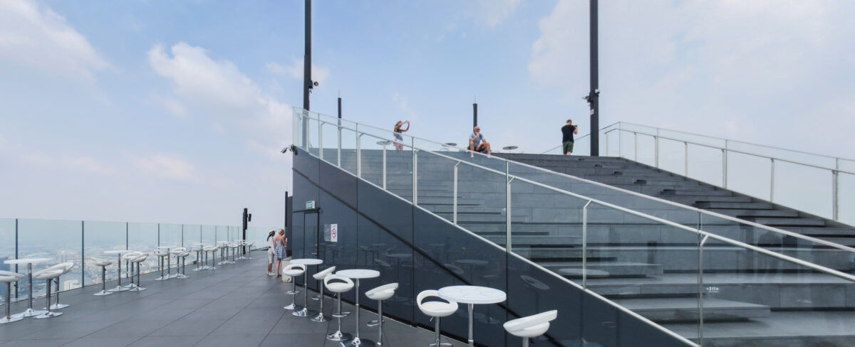
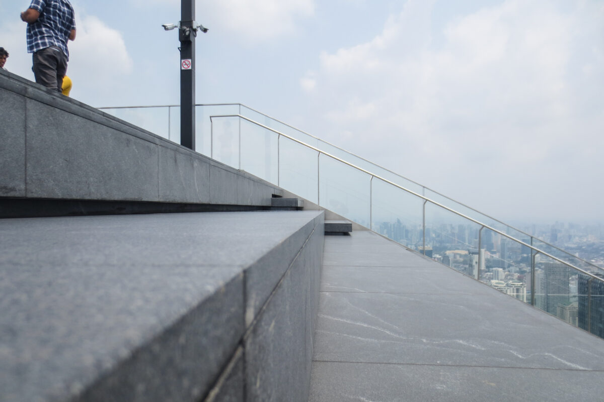
The first two floors offer a unique 360 degrees view over the city of Bagkok while educating the viewer on the city’s heritage and history through inscriptions and city maps engraved on the floor, while the tow top floors are outdoor spaces occupied by the Sky Bar and Skytray and are meant for leisure and amusement of visitors.
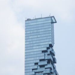
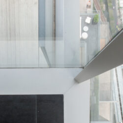
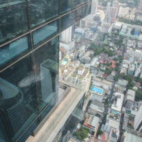
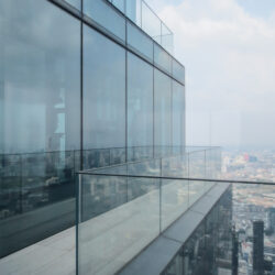
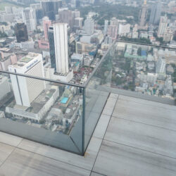
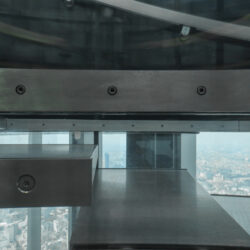
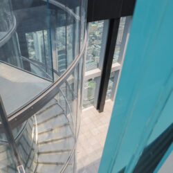
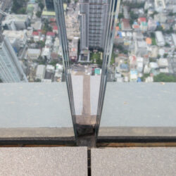
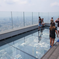
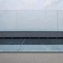
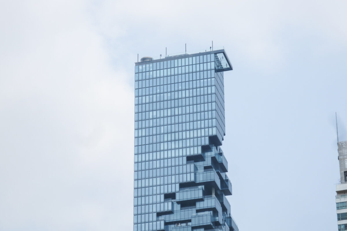
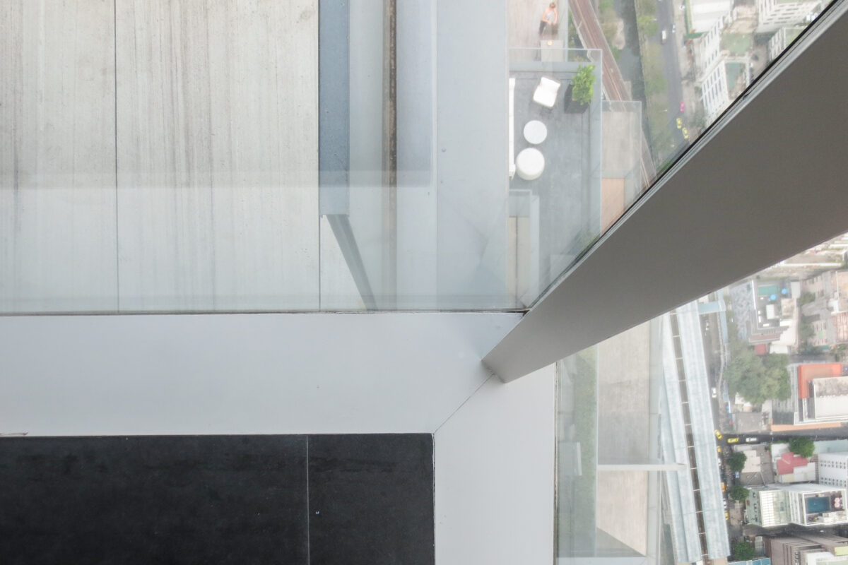
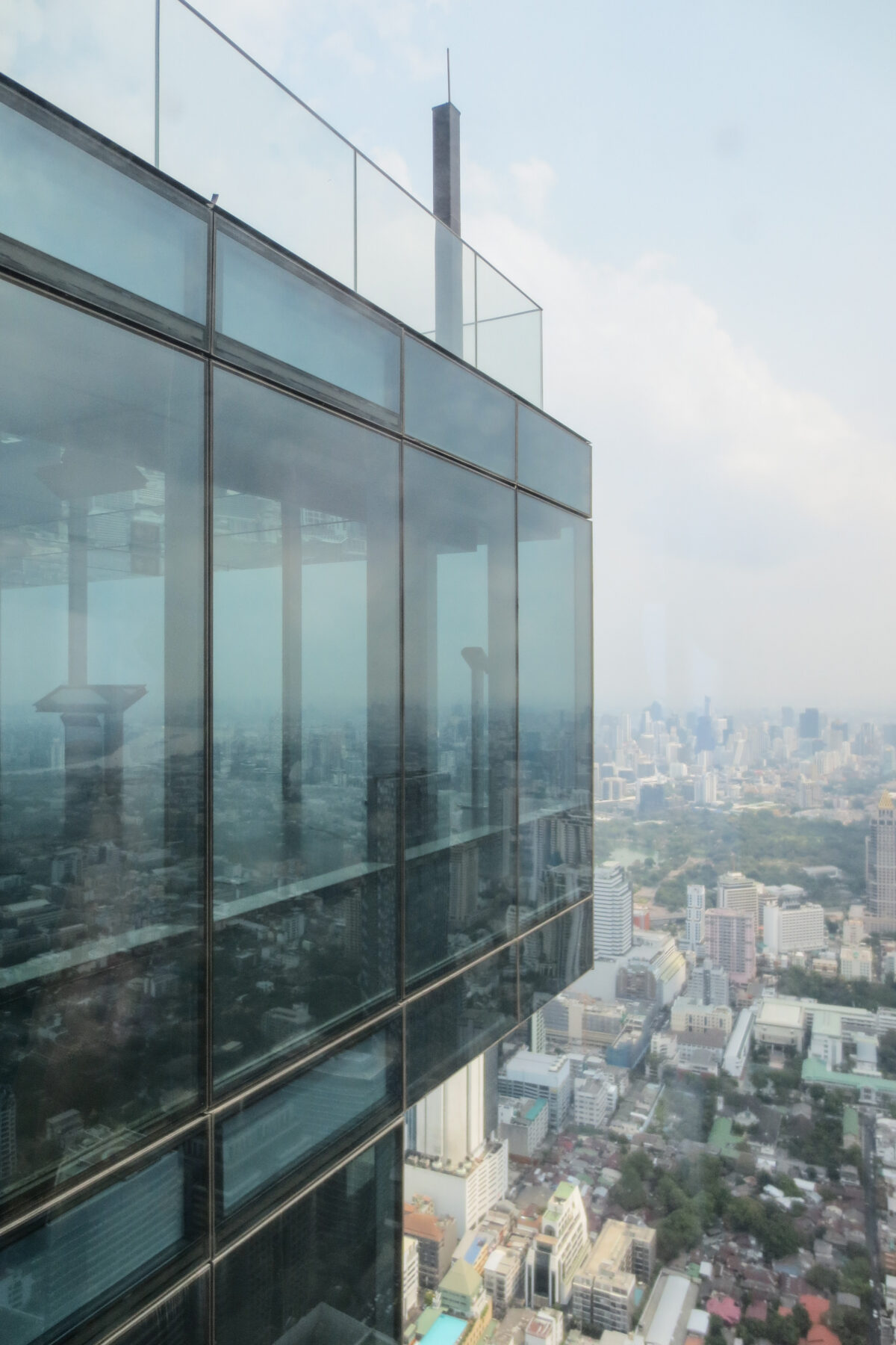
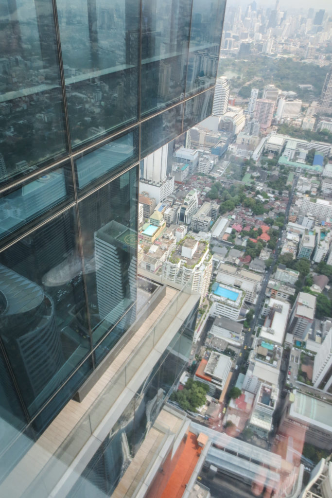
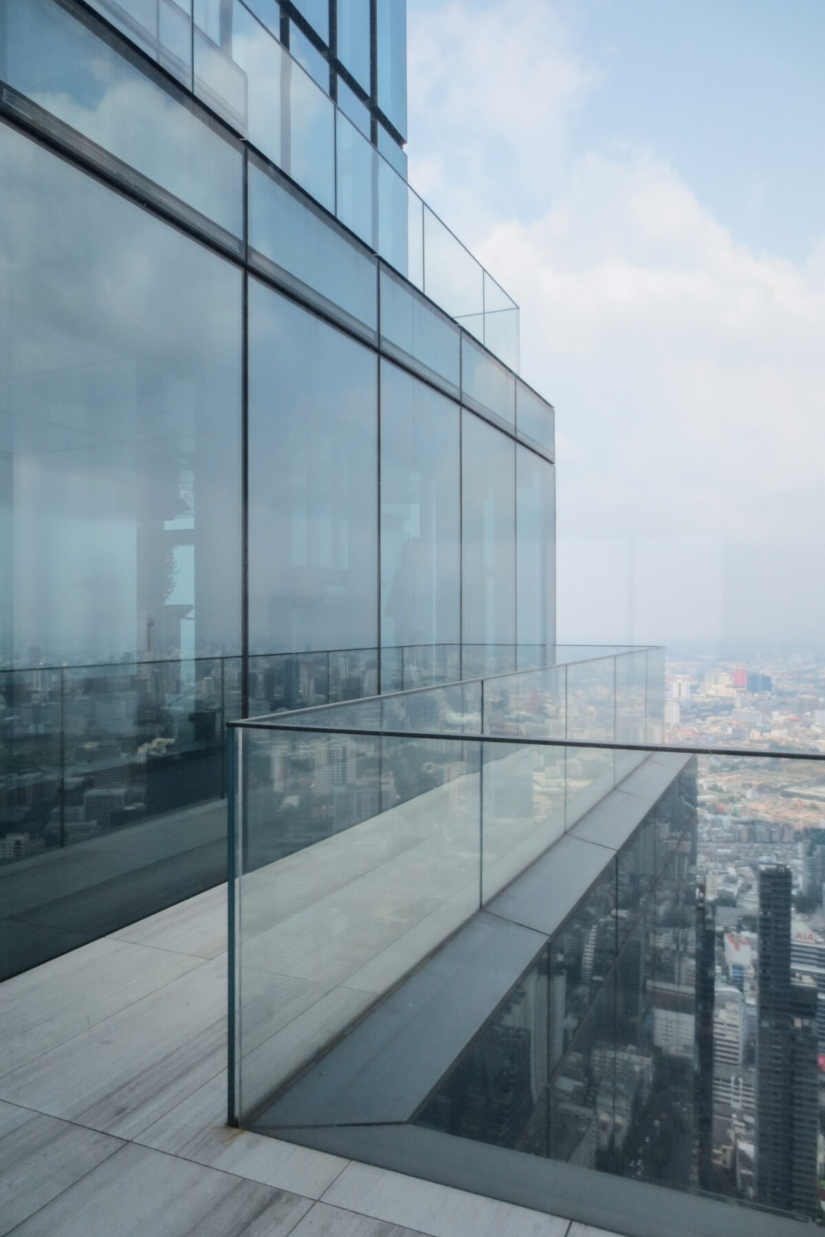
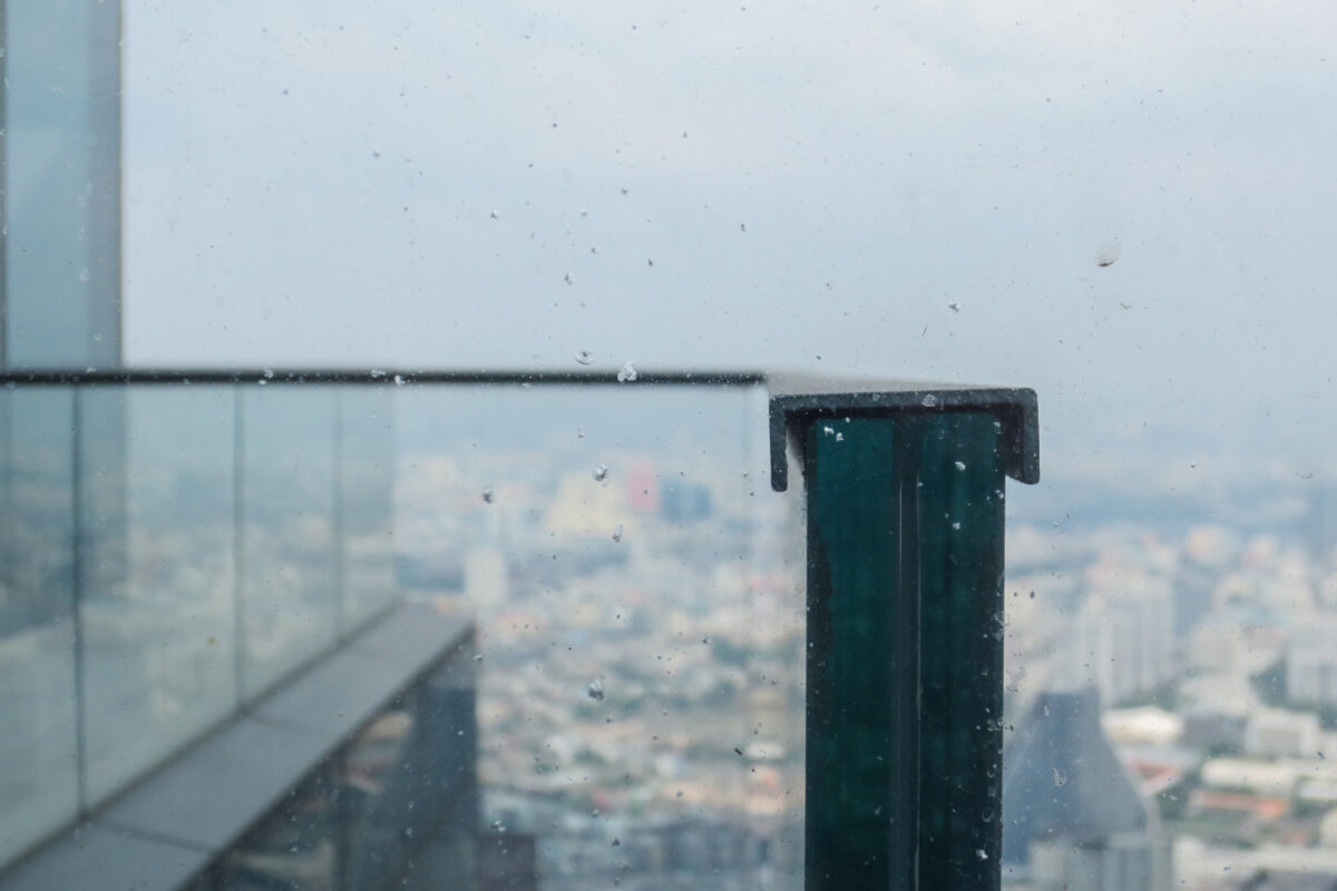
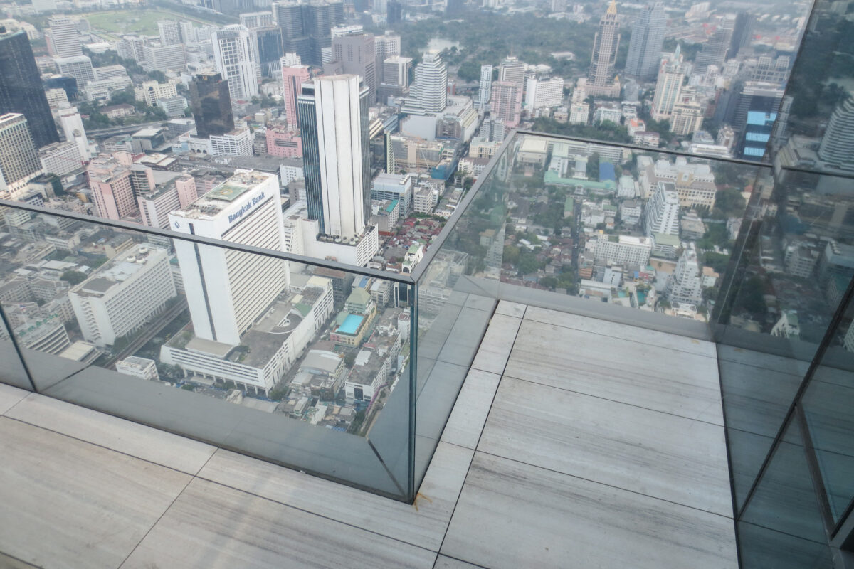
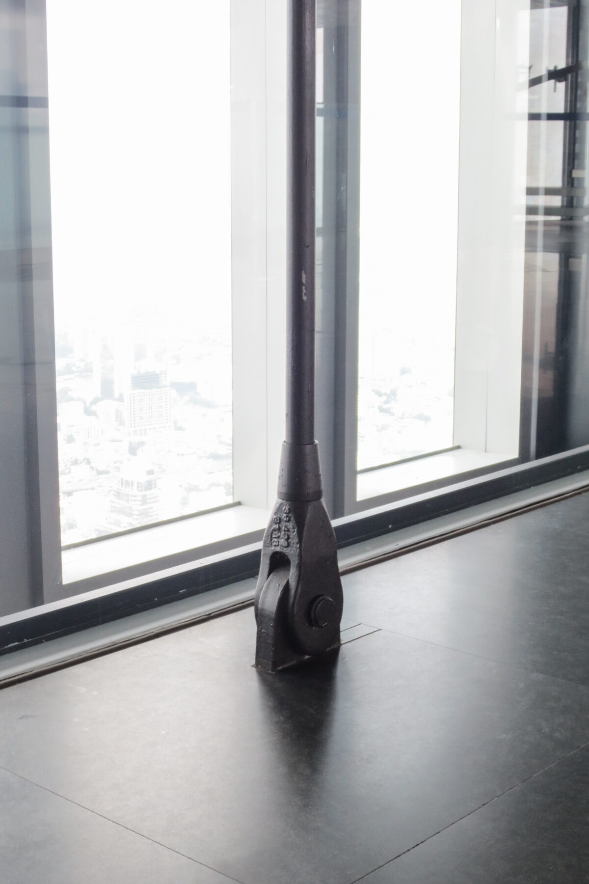
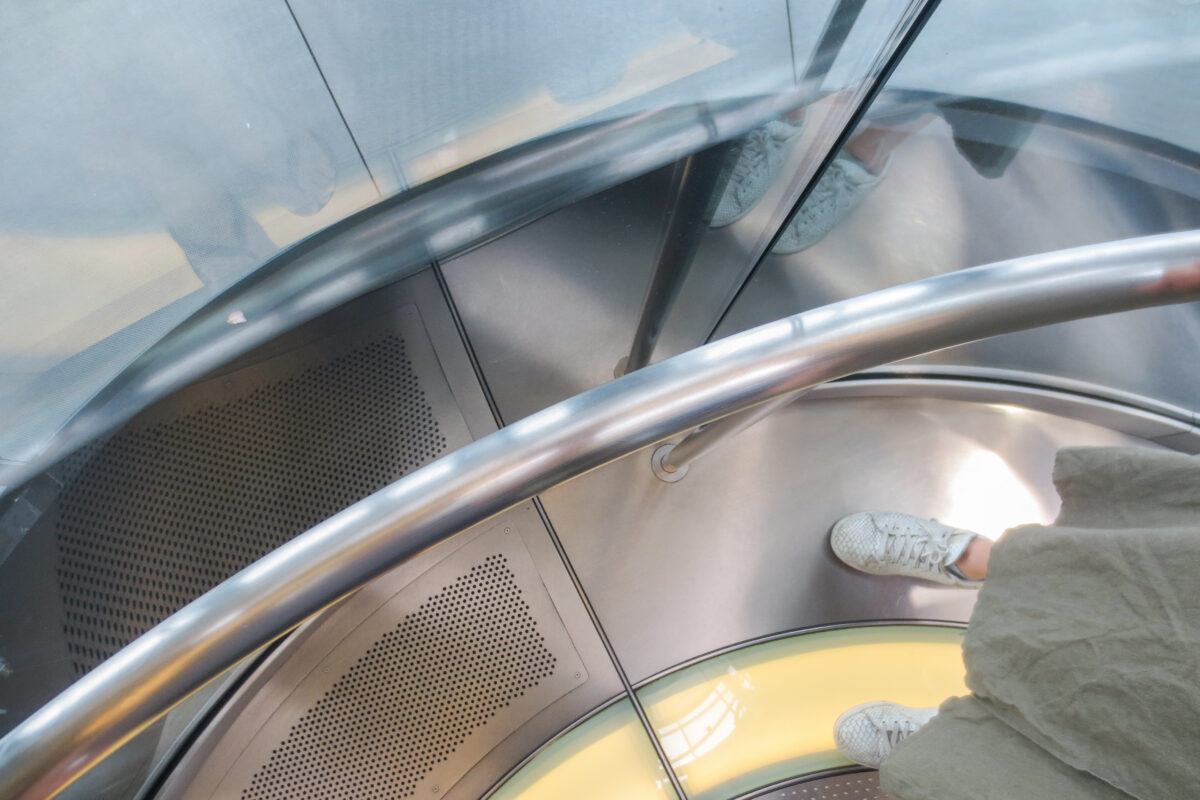
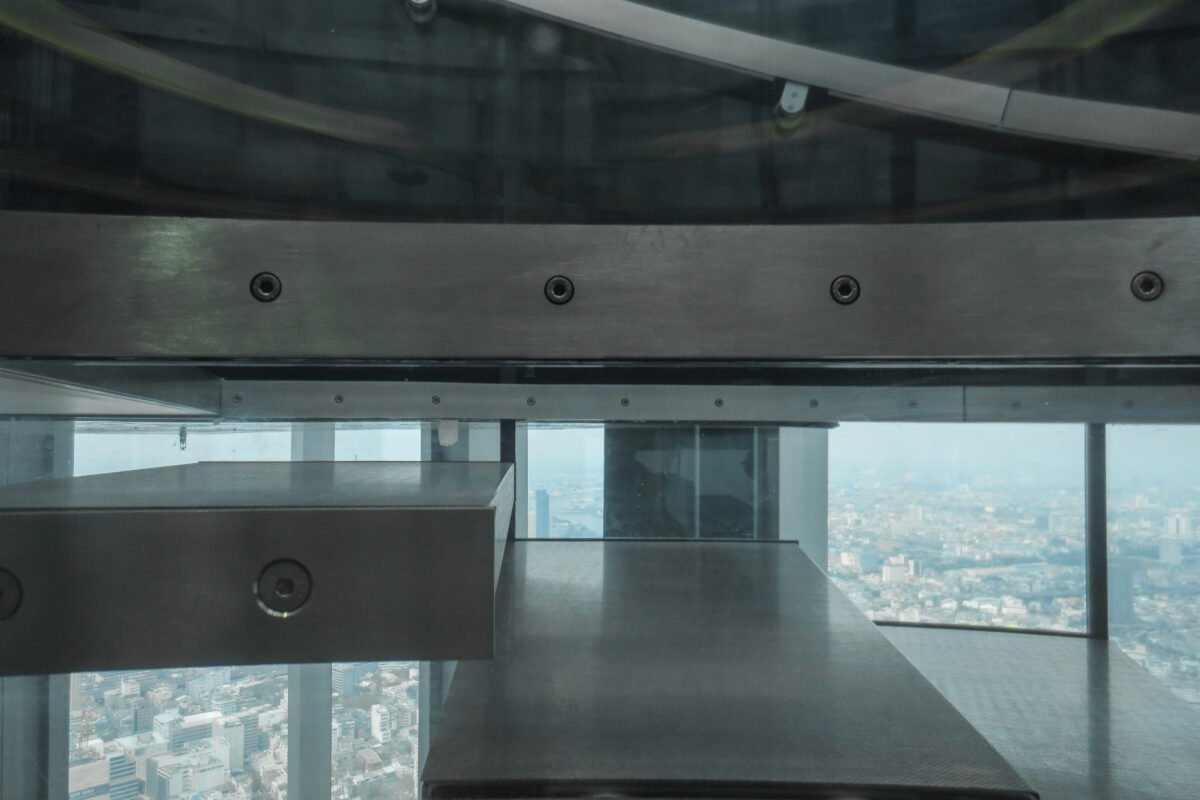
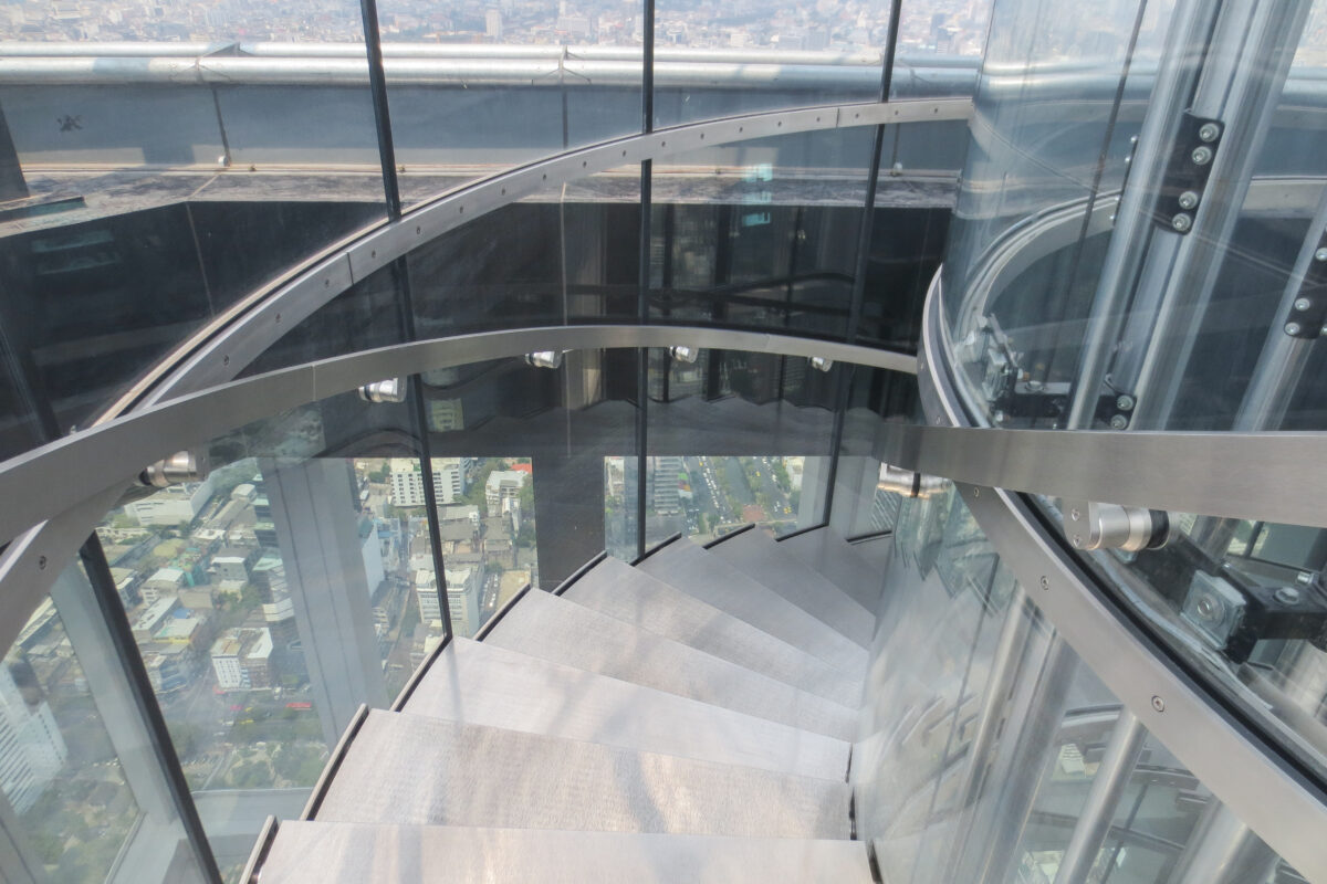
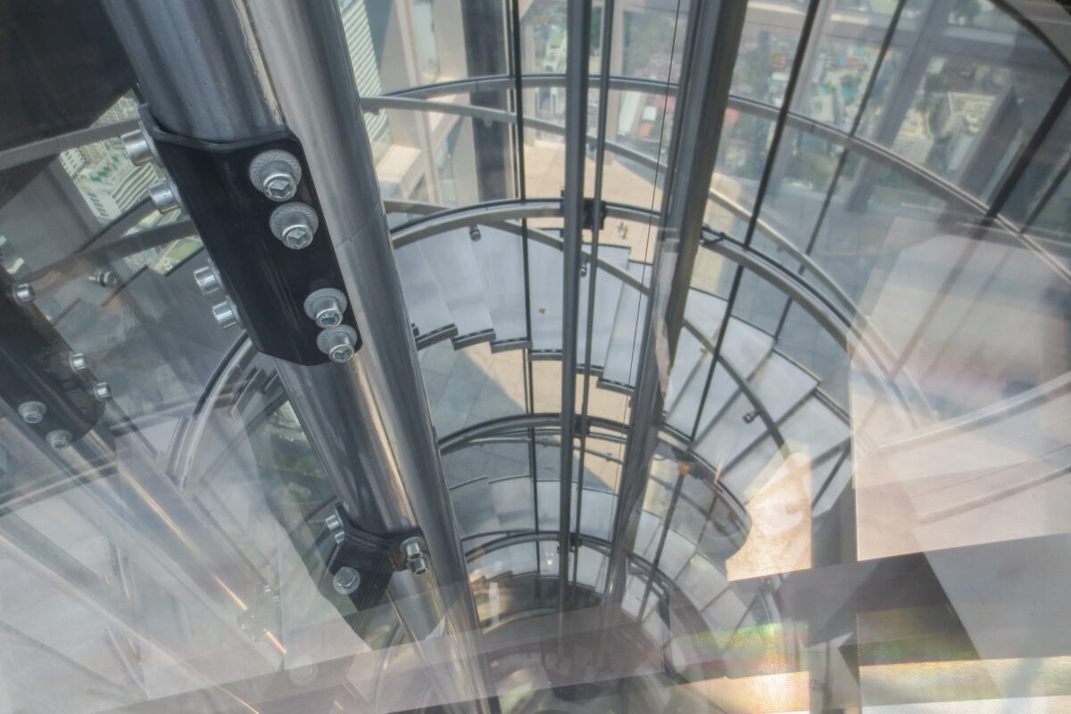
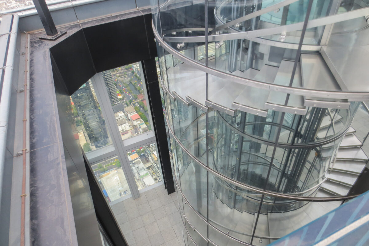
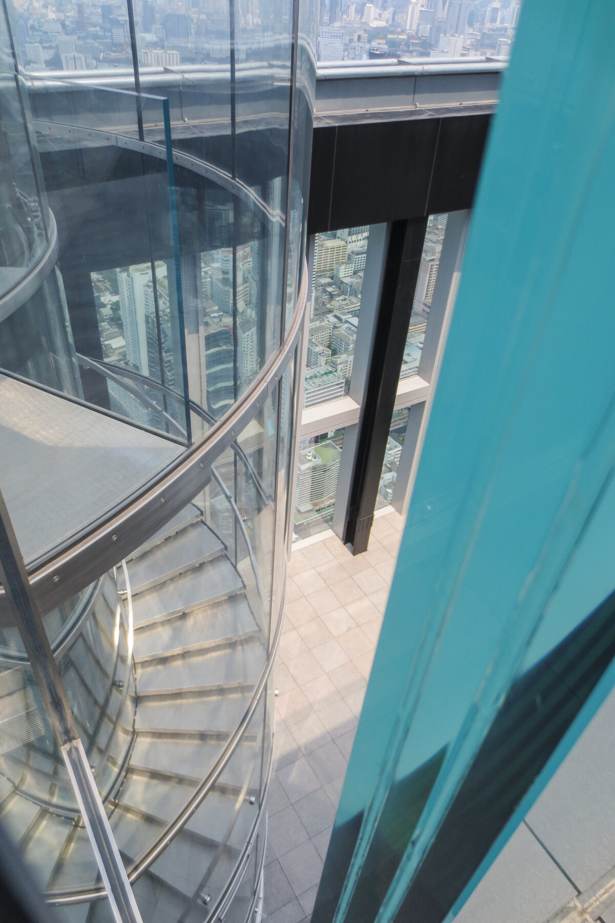
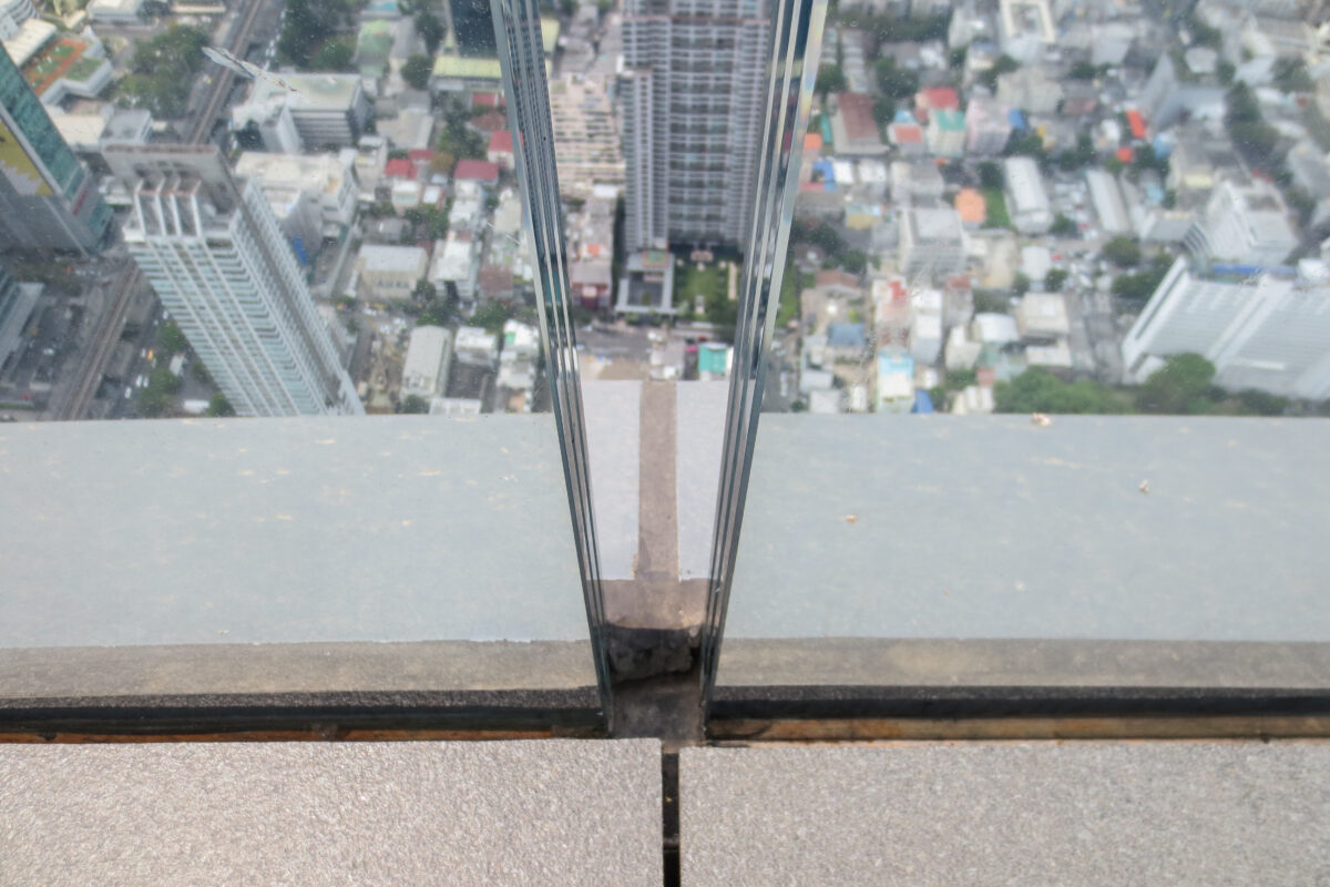
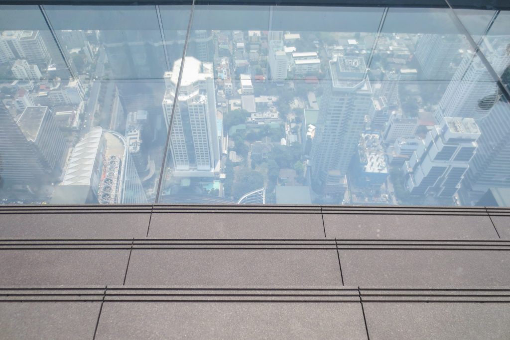
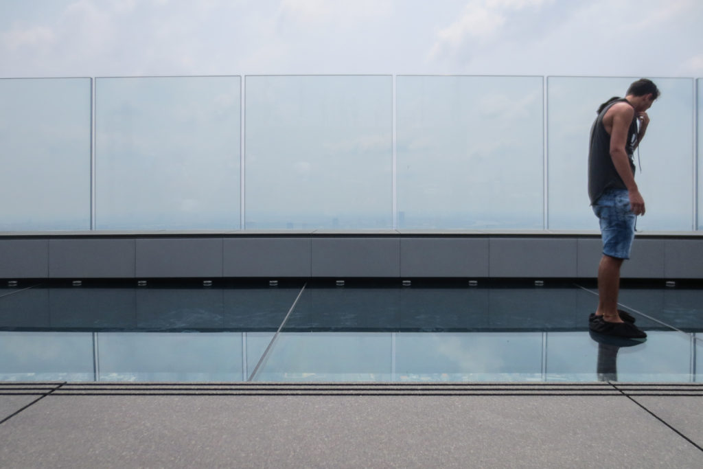
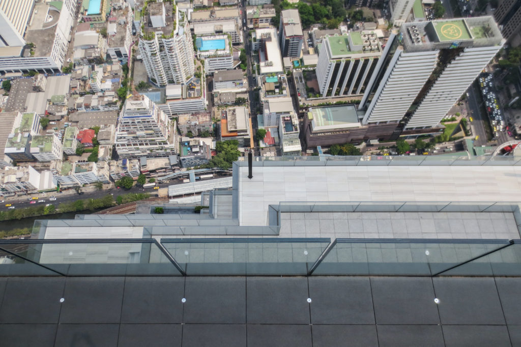
The 76th floor includes a glass deck that is cantilevered out from the building to give visitors views directly down to the ground more than 300 meters below. This attraction is known as the Skytray, a walkable glass platform of 4,5×17,5 meters that is not only sure to attract thousands of visitors every year but also ensure that these visitors post breathtaking photos of them walking on the glass platform on their social media, helping promote and spread the word about the MahaNakhon which will bring more business to the observation deck and retail business in the building.
Structure
Foundation and core
The structure of the MahaNakhon tower was a challenge from the very beginning since Bangkok has very soft soils which are far from ideal to support a mega-structure such as this one.
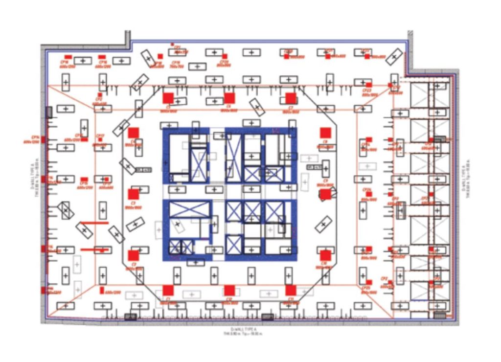
In order to compensate for the soft soils an 8.75 meters thick mat foundation of pure concrete was created as a solid base from which to build on top. That mat is also connected to the ground by 129 1.2x3m individual piles drilled to a depth of 65 meters underground. This, together with extensive wind tunnel testing’s with winds blowing with different strengths in up to 36 directions allowed the engineers to reach CTBUH seismic recommendations.
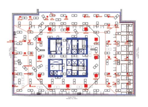
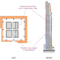
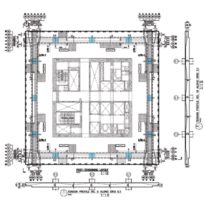
Above the massive foundation mat a concrete core surrounded by 12 concrete mega-columns rise all the way to the very last floor.
Cantilevers
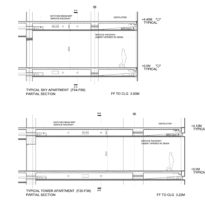
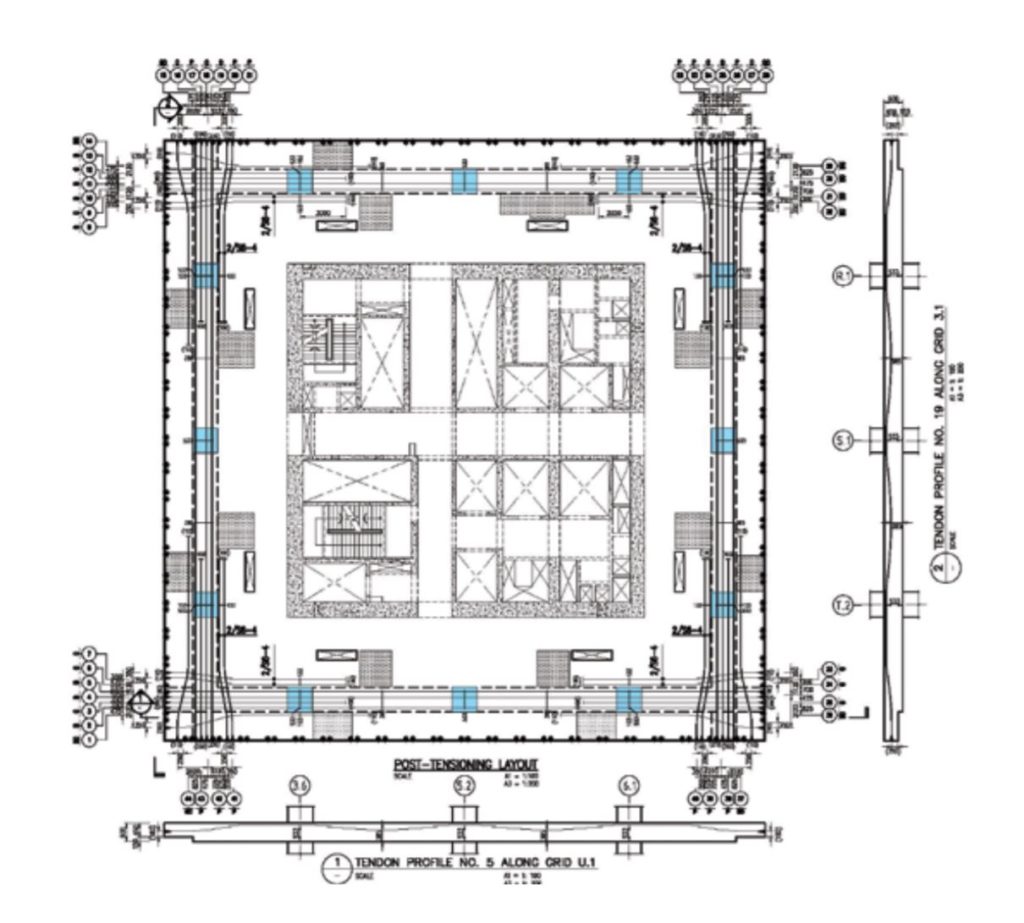
Since the carving, pixelated spiral that surrounds the tower goes in up to 5m from the façade line no structural elements could be placed at the façade level, otherwise these would be interrupted by the spiral or would be visible across the spiral completely destroying the design vision. As a result of this circumstance 30% of the total slab area is cantilever, with typical spans of 8m in residential floors that sometimes went up to 10m.
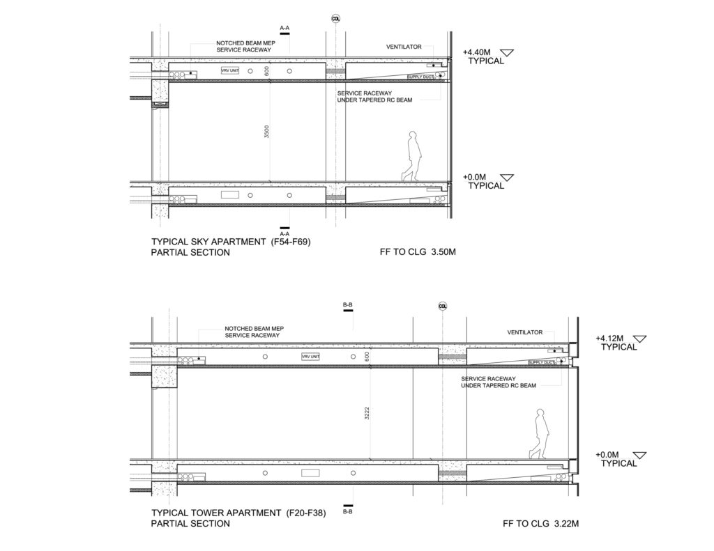
The key to the success of this structural design were post-tensioned beams that create a sort of perimeter for each floor and help compensate the deflection of each slab. These beams were designed to be relatively wide with respect to their thickness so that they would take up as little vertical space as possible allowing each floor to be higher.
Observation deck
A slightly different structure was adopted for the first two floors of the observation deck on floors 74th and 75th. Here steel columns have been placed on the edge of the slabs near the façade line. These steel columns are double high as the 75th floor doesn’t actually reach the façade and is instead hanged by steel tensors from the floor above.
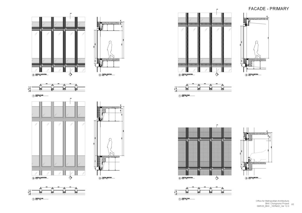
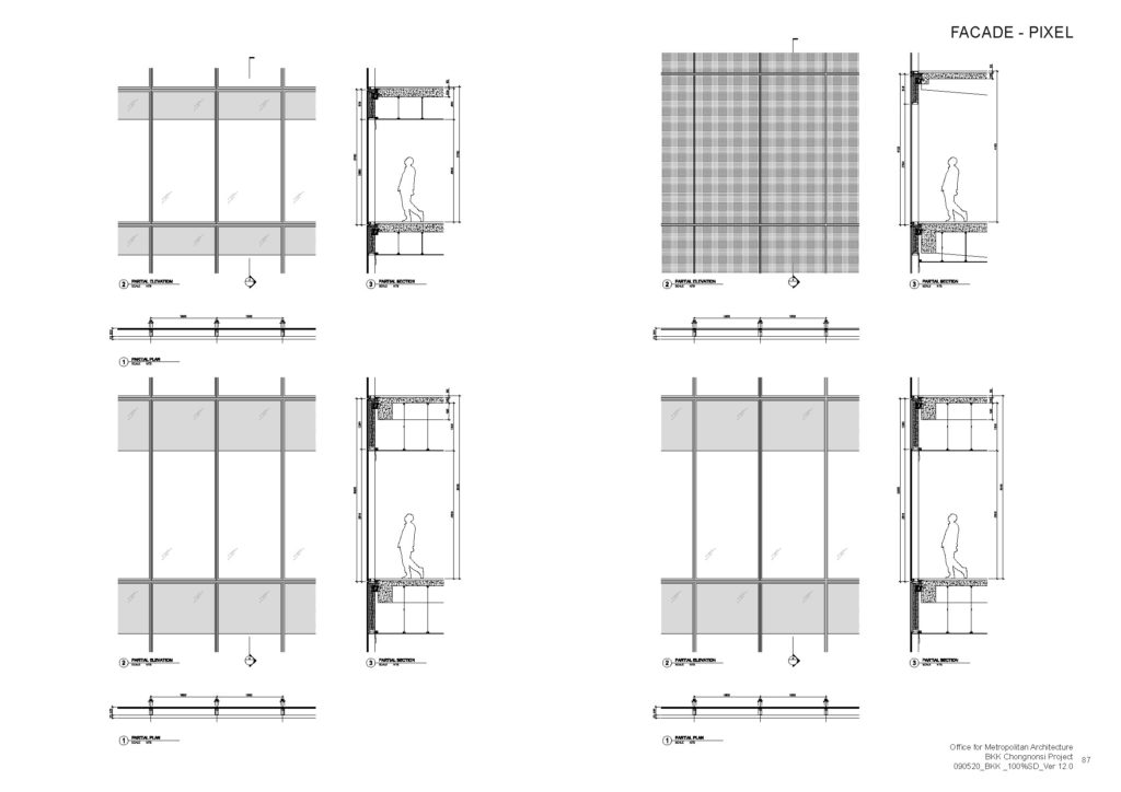
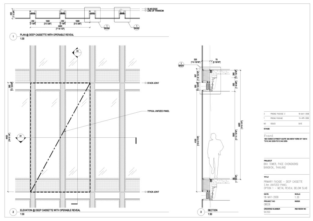
Curtain Wall
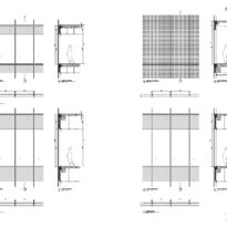
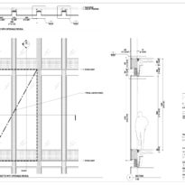
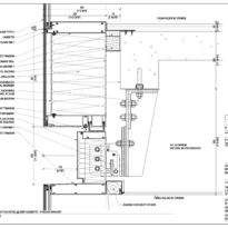
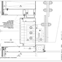
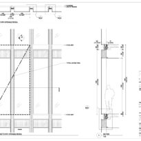
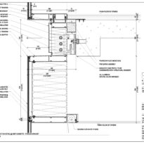
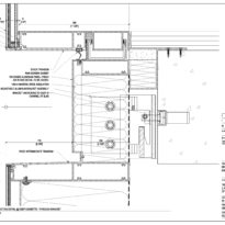
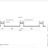
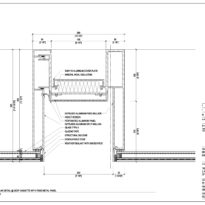
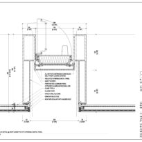
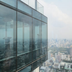
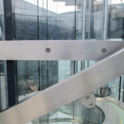
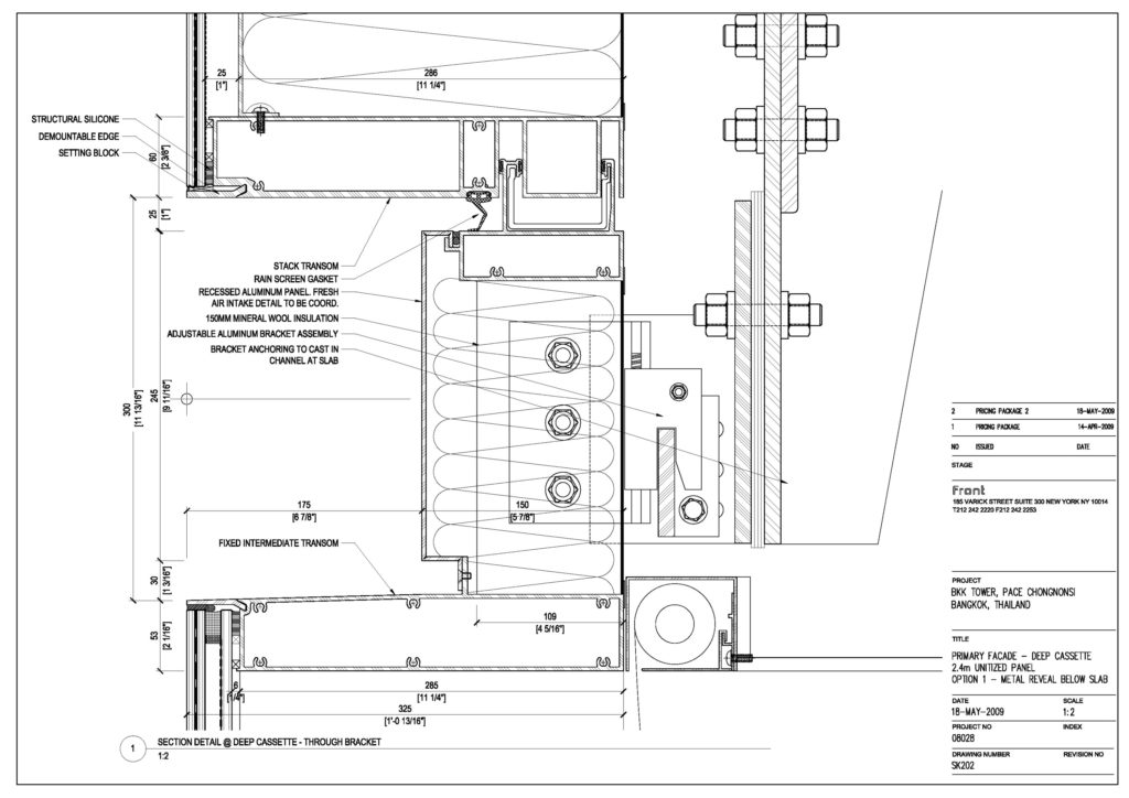
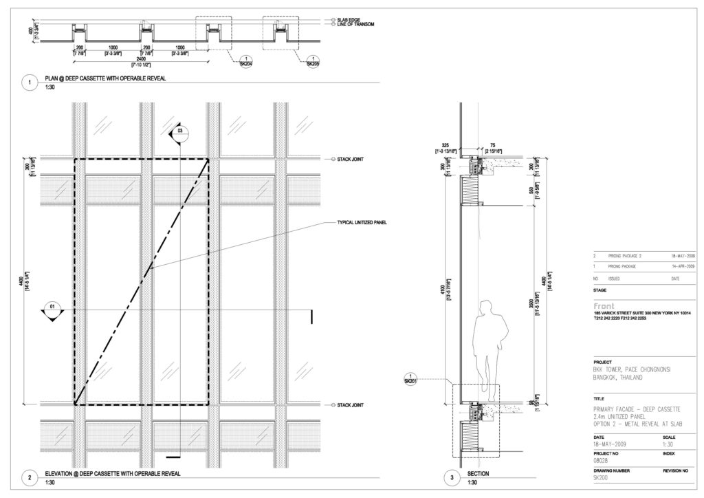
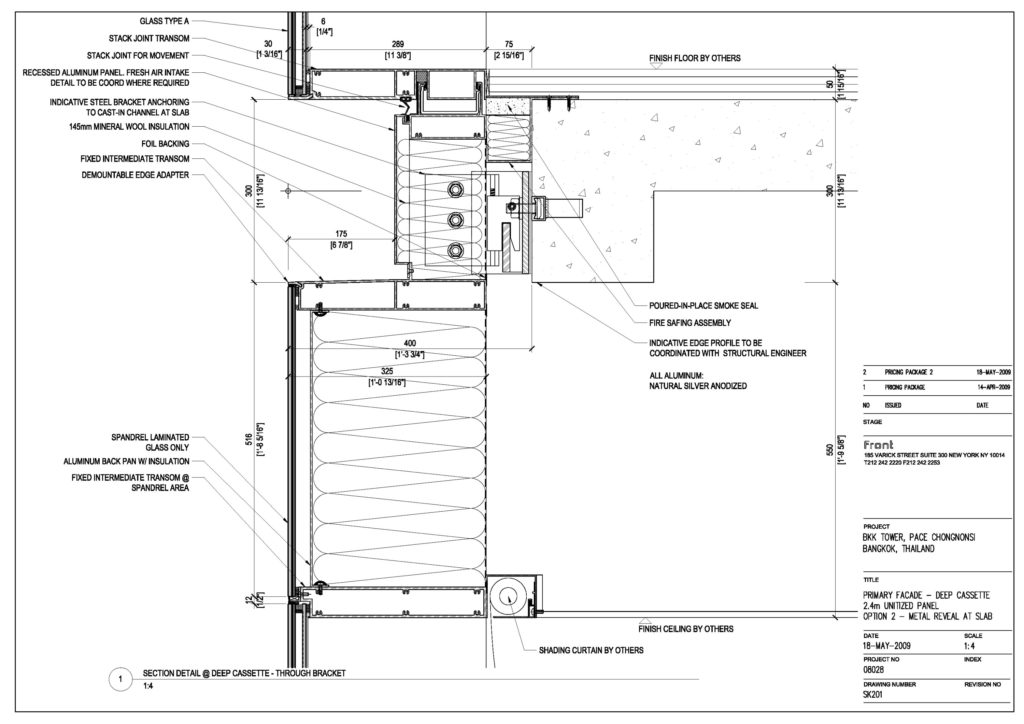
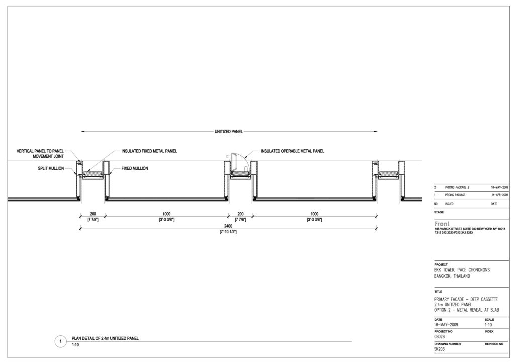
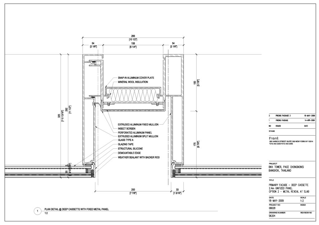
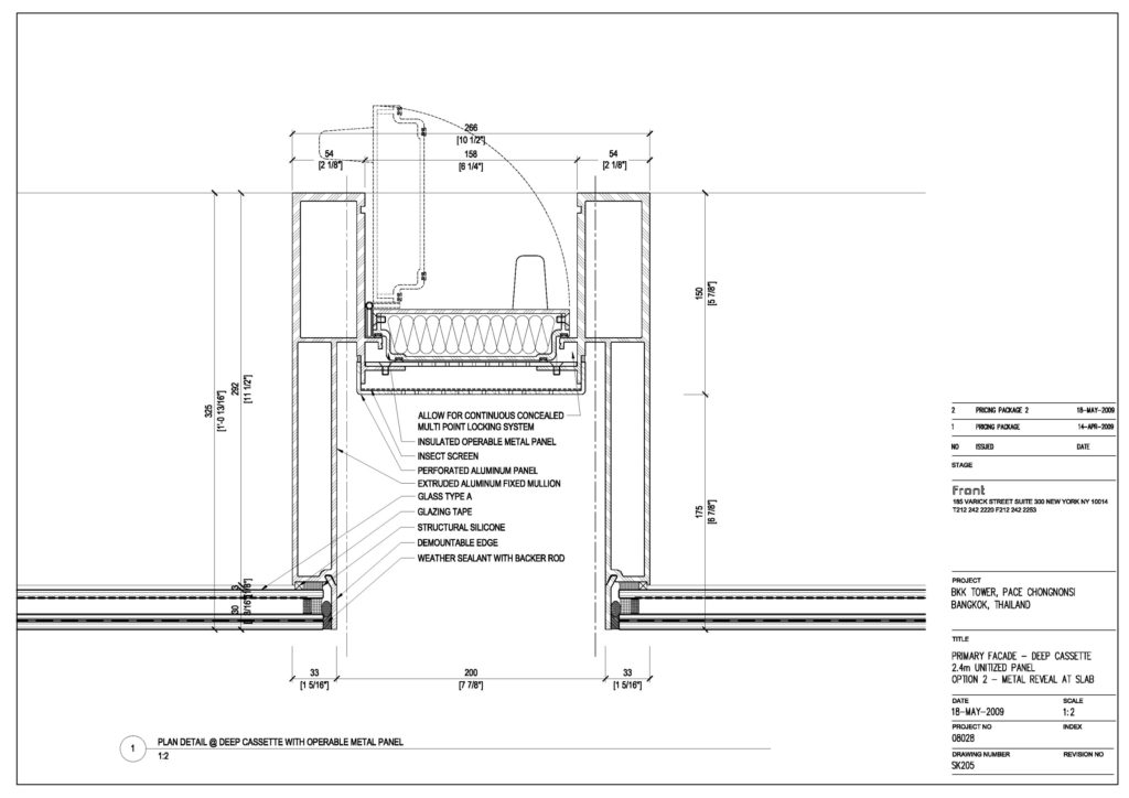
The curtain wall was designed to hang from the edge of each floor slab with special horizontal joints between panels called “slack joins”. These joints allowed for a 25mm vertical deviation between panels. From those 6mm were reserved for temperature related expansion/contraction of the glass, which meant every floor slab had to be finished with a precision of just 19mm or otherwise two glass panels would clash and damage each other.
Even if each floor slab was perfectly executed that meant any deflection, whether short-term or long-term, larger than 19mm would cause the panels to clash. This, together with the fact that almost each floor slab was different due to the pixilation of the design, made the success of the façade solution a huge challenge.
However, on-site tests were performed during construction which shower that the deflection of floor slabs due to its own weight was 9,7mm before post-tensioning and 8,4mm after. This low deflection is due to a high concrete elastic modulus and a low creep coefficient.

