Yokohama Maritime Terminal

Introduction
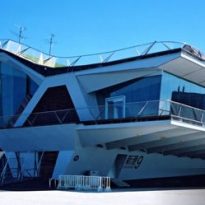
The International Passenger Terminal in Yokohama is the largest marine terminal in Japan. The creator of this work is to study English FOA, composed by Alejandro Zaera Polo and Farshid Moussavi.
In 1994, the architects won the tender for the terminal almost unintentionally. Previously, the ideas of this young marriage had seduced the directors of the Architectural Association in London, where he gave lessons. The authorities offered them to publish their most innovative project and the couple decided to design the passenger terminal to test their ideas and then publish the project.
The work of Zaera Polo and Moussavi was imposed on other 660 projects submitted, including those of large architecture as Dominique Perrault and Richard Rogers. Among the jury found people like Arata Isozaki and Toyo Ito.
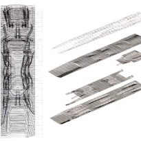
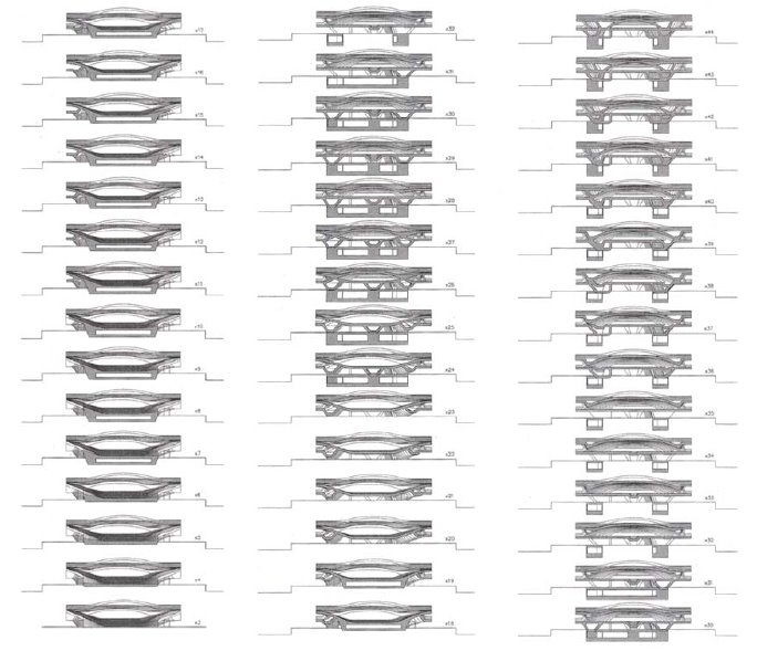
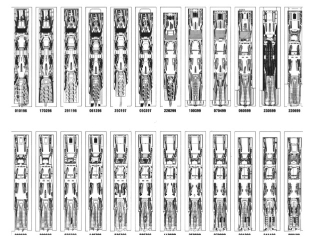
To develop the project, the architects used three-dimensional virtual models.
Situation
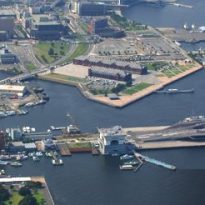
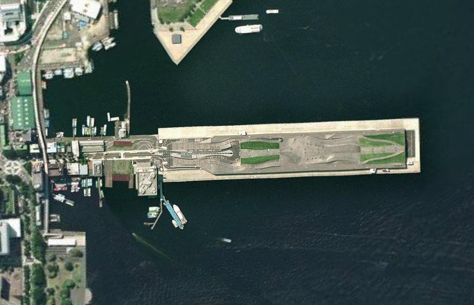
The terminal is located in the Japanese city of Yokohama, near the city park of Yamashita. Is located at the boundary between land and sea, on the edge of the bay, eliminating the boundary between them.
Concept
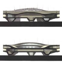
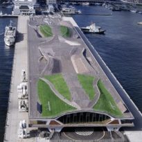
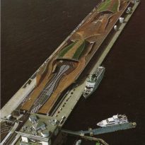
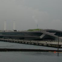
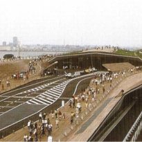
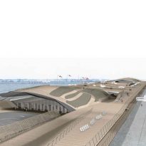
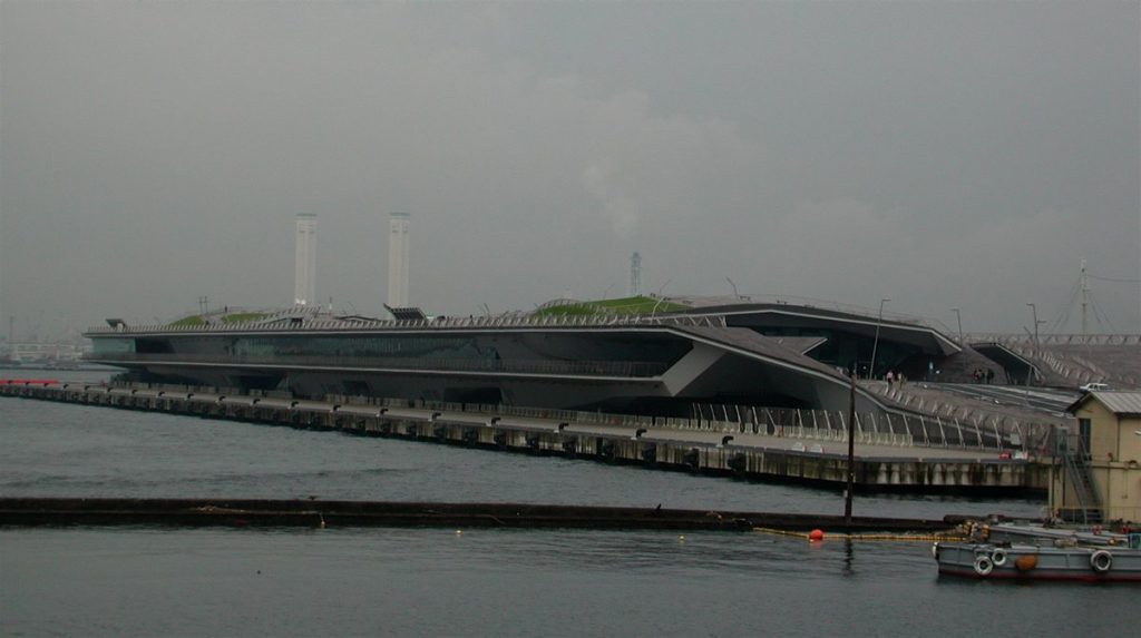
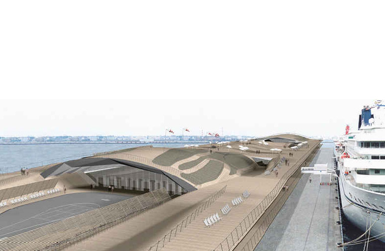
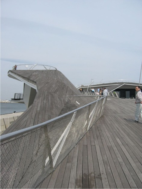
The Terminal does not have the image of a traditional building. It is a spring which undulated gets into the sea.
The first approaches to the project showed the terminal as an extension of the neighboring city park Yamashita. Then the goal became more ambitious: to become an interface between the ocean and open the denser conglomerate formed by the cities of Tokyo and Yokohama combined, which helps to connect with platforms. The solution was to be flattened a building and wave to be confused in the ground floor, the roof, exterior and interior.
This is an urban proposal. It is not just a building but is a fundamental part of the city’s urban space.
The function of the square / terminal is not merely to organize the flow, but also set up a field intensity of urban expansion through multiple paths and directions.
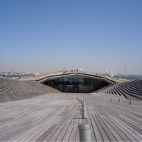
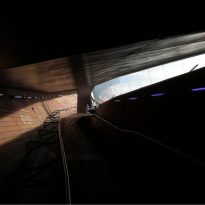
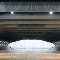
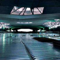
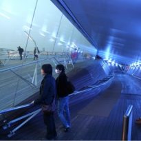
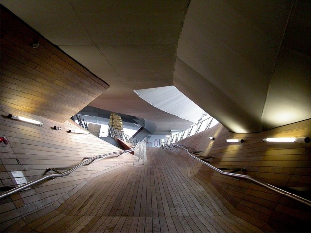
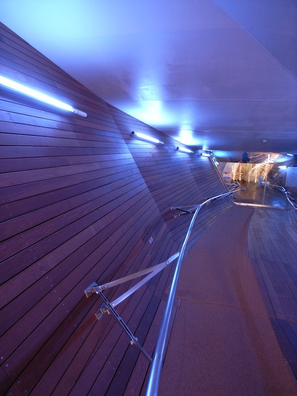
The Terminal looks like a whale. From the inside, the feeling is being inside a prehistoric animal, where you can see your skeleton.
Spaces
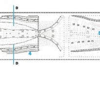
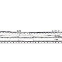
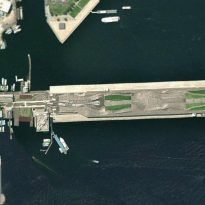
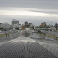
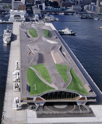
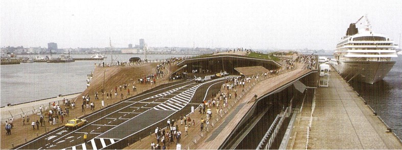
The pier-building is 70 meters wide and goes 430 meters into the sea. The total height is approximately 15 meters.
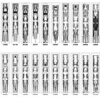
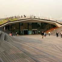
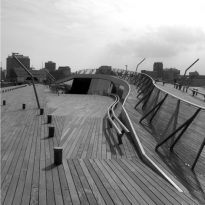
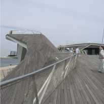
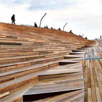
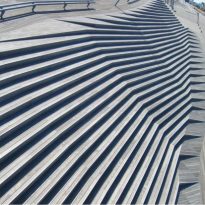
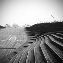
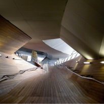
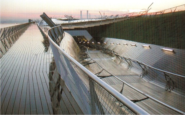
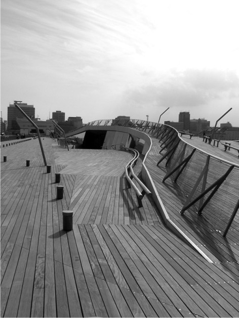
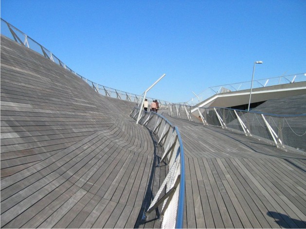
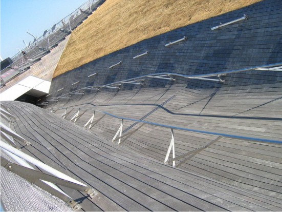
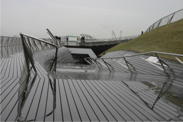
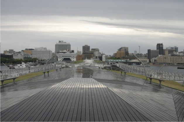
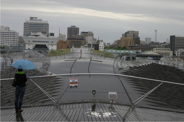
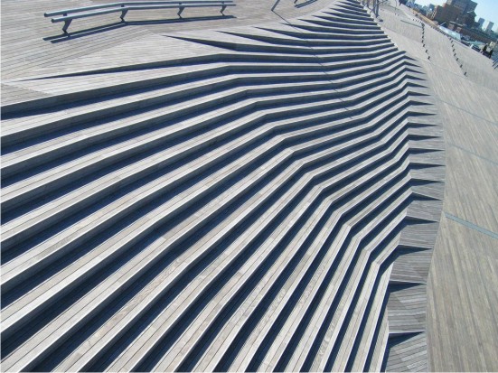
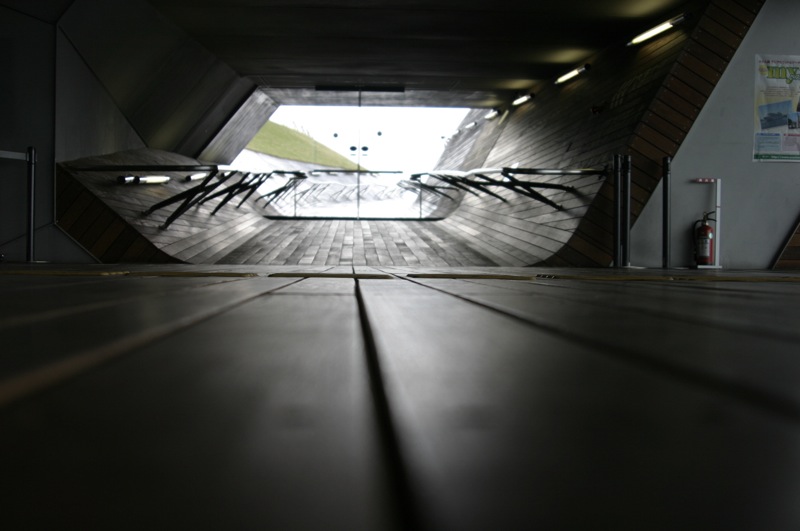
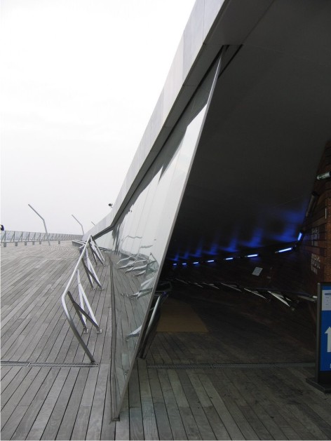
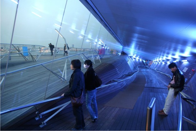
It is a building with no recognizable facade, where the walls are mixed with soil, the columns by their absence soil and becomes homeless, as soon as the interior becomes exterior. The architects of the building were proposed to make a continuity of urban land, and for that, given the form of a soft Lomada that gradually grows in height as it enters the sea. Thus, the undulations in the topography constitute the building, the limits are diluted and the roof folds taking different forms. The ground surface is bent upon itself, forming folds that produce and contain the roads running through the building. The individual moves at different levels.
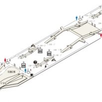
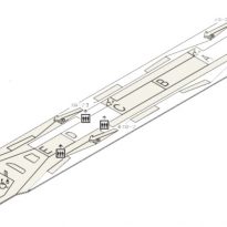
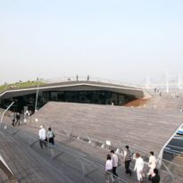
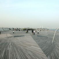
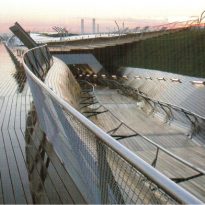
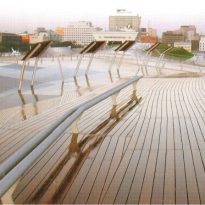
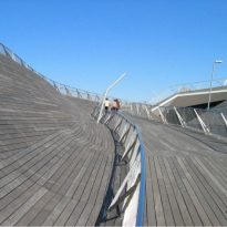
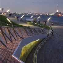
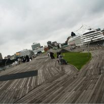
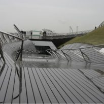
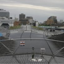
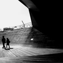
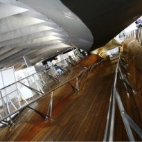
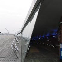
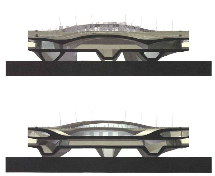
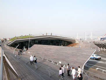
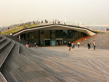
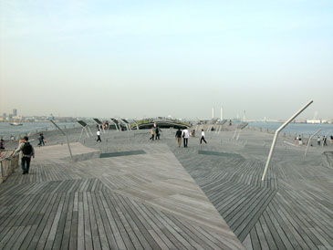
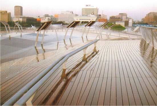
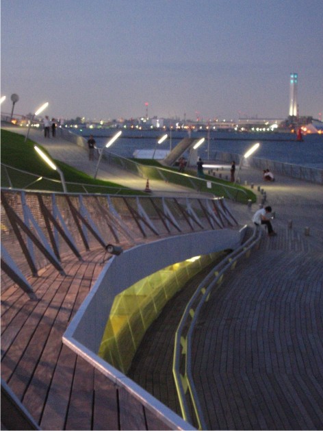
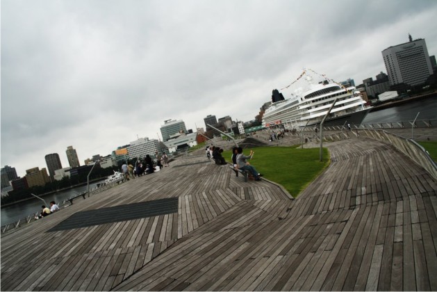
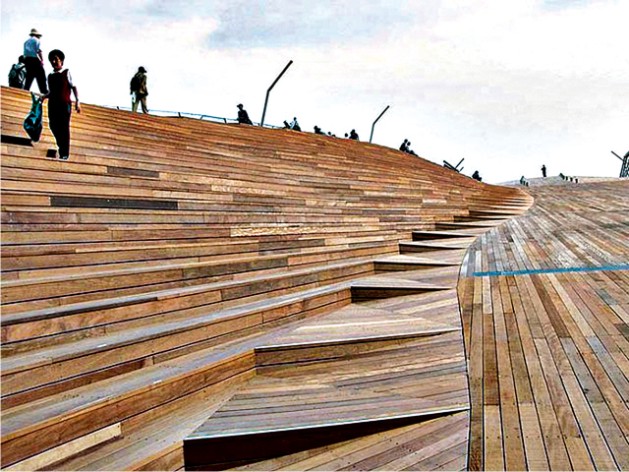
The upper level of the terminal is a wooden terrace that serves to stroll and enjoy the scene consists of maritime vessels moored with passengers climbing or descending. The main activity of the building is below the terrace, where operating rooms arrivals and departures, the areas of meetings and waiting, restaurants and shops. At a lower level parking and hides the engine room.
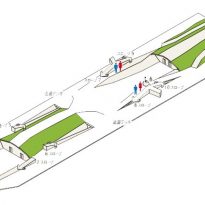
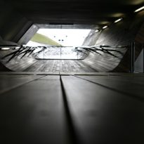
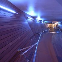
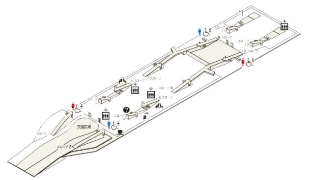
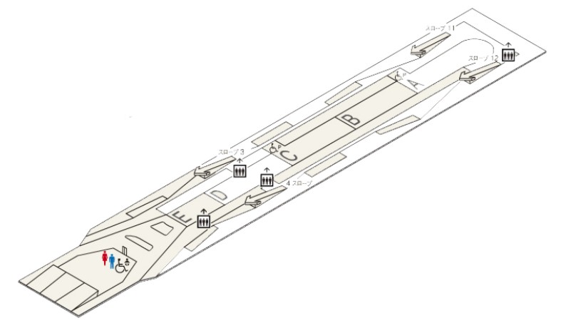
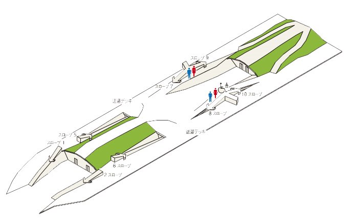
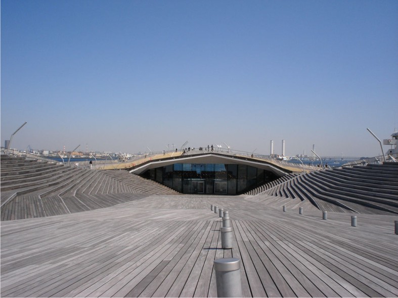
The level of the soil not only fulfills its role of supporting surface, but that happens to shape space. In this way, several times the floor or wall becomes rises to form inclines and stairs linking the interior and exterior. A total of 10 ramps connecting the three levels.
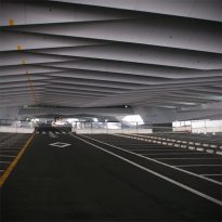
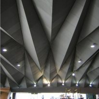
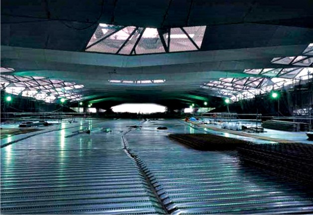
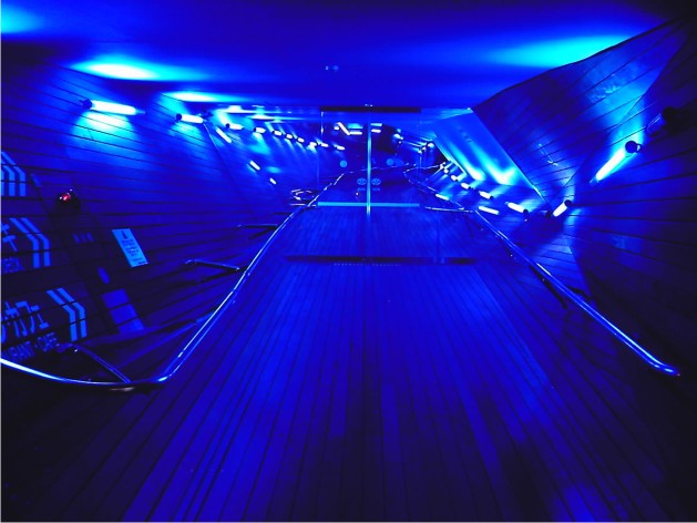
For the public entering the terminal is a rare experience: it’s like being inside a huge prehistoric creature. The roof of the main hall looks like a heavy skeleton contrast, because of its low height, with the vast width and length of the environment. The most specific function in separate boxes from the ceiling, as if they were the internal organs of a gigantic animal.
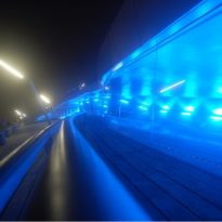
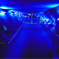
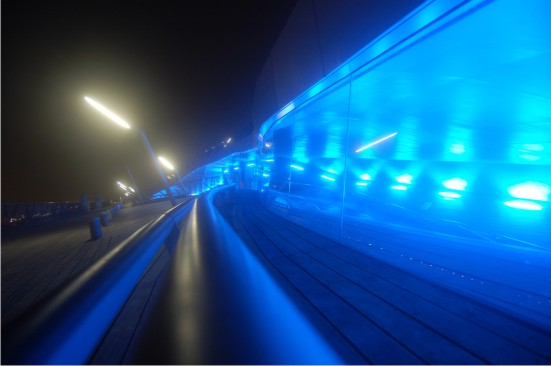
The space is extremely dynamic, flowing in all directions. The details of design also helped to give impetus to the building (the timber of soil, handrails and the constant view of the sea).
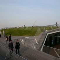
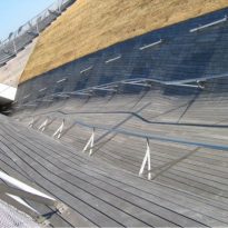
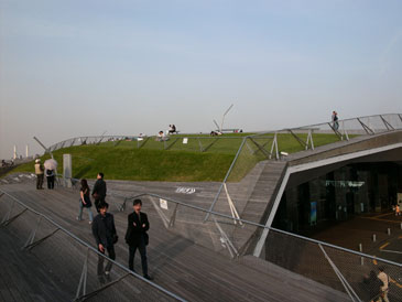
With the intention of extending the neighboring city park near the waterfront, the designers planted grass on the roof of the terminal.
Materials
We used materials similar to those of a boat, with structure of folded sheet steel and covered with wood that matches the topography.
Structure
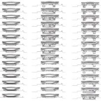
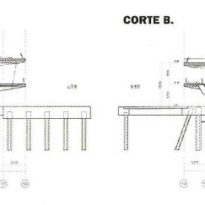
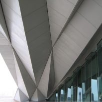
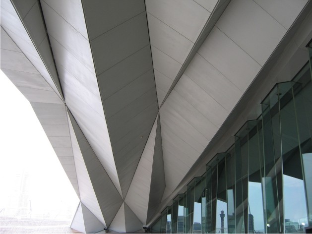
This is a structure of large lights. As the system dispenses with the structural columns, which is the roof folds and takes different forms for bridging the gap between support.
The structure is made up of long pieces of steel placed too close together and, as the atmosphere is relatively low, the optical effect produced is unusual. Unlike Yokohama, in most of the structures for large buildings with lights height is also great. Here the beams are very close to the observer. However, space is dynamic.
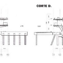
Cantilever beams of over 14 meters in height that contain all levels of the building, saving the distance between the dock and a series of piles already in place.
The surface of the soil also folds in on itself, forming pleats that provide structural strength. The jacket constructive and the central column are merged into a single thing.una sola cosa.
Video
