Yacht Club in Belo Horizonte

Introduction
In 1940 the mayor of Belo Horizonte, Juscelino Kubitschek makes it an important commission to Oscar Niemeyer. The general plan was the creation of an ex nuovo city on the outskirts of Belo Horizonte for the recreation of the middle class was in full physical expansion and population. Oscar Niemeyer important work by the modern landscape architect Burle Marx (1909 to 1994).
For the implementation of this city garden was raised a set of buildings that are located around a large artificial lake. The plan, the territorial level, should work as a whole, but each building must operate autonomously and independently. At the same time, the whole project should interact with nature and above all establish a close relationship with the artificial river.
The center of the project was a casino, who was accompanied on the landscape by a restaurant, a ballroom, a church, a hotel (not built) and the Yacht club. Finally the project was also home to the mayor.
These buildings are paradigmatic examples of modern architecture in their use. So far, European modern architects had focused on human needs and functional, says Papadaki:
“Modern architecture hitherto cared about health, man’s rational behavior and their physiological needs” fresh air, sunlight and contact with nature, and had remained away from the life of leisure “.
In any case the introduction of non-functional elements in the urbanization of Pampulha, marked a turning point in modern architecture. This project introduces a new architecture Niemeyer seeking since the late ’30s, moving away from the rationalism of his early works. With this complex, the architect made clear the possibilities of formal invention through new construction techniques. In exploring the potential of reinforced concrete and playing with references to Mies van der Rohe and especially Le Corbusier, Niemeyer created bold forms that challenged the structures and surprised the world years later.
Pampulha planning is not only innovative in its new role as entertainment, but also a plan that seeks to integrate more organic nature, at a formal level. Keep in mind that it is one of the first times that is modern architecture and tropical conditions in an environment as most virgin and sublime. Given these conditions, Niemeyer projected a totally innovative ways, as opposed to modernity and cold ‘machine’ Union. In Pampulha, begins a formal search for its architecture, much less rigid and straight to bump into more organic shapes and curves. Many times, Niemeyer played with a natural repertoire, which combines taut curves with straight lines, diagonals and of course the fractal forms of nature.
Decades later in Europe, the architects had been away from the purism and rationalism to generate expressive forms different from its predecessors. In this and many other things is influenced by Oscar Niemeyer.
Location
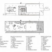
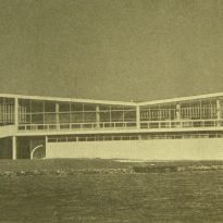
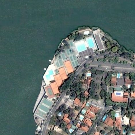
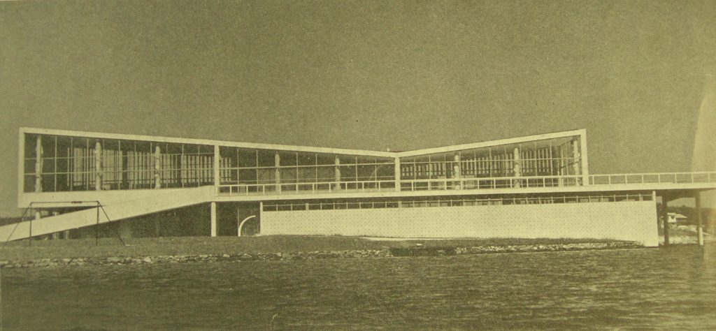
The building is an elongated volume that sits perpendicular to the great lake of Pampulha. The short side is 17 meters and has north-south orientation, and the long side is 60 meters and is oriented to the east and west.
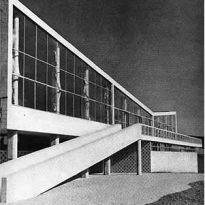
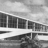
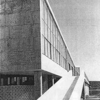
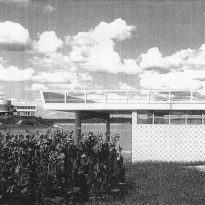
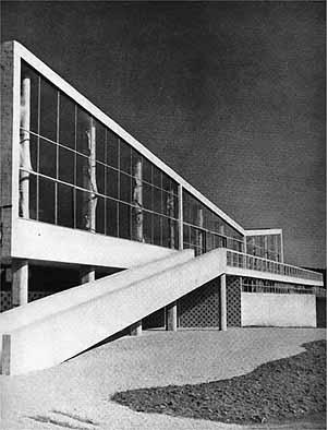
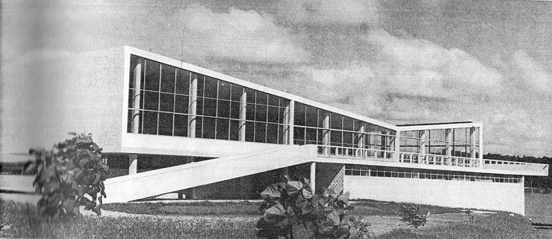
The main access comes tangent to the south wall, through an elegant concrete ramp that allows contemplation of the nature, imposing building and the lake. The south facade has an absolute rigor. It is totally blind, in an attempt to protect themselves from adverse climatic factors and the importance of framing the lake side and sunbathe.
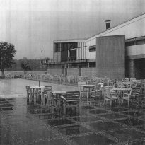
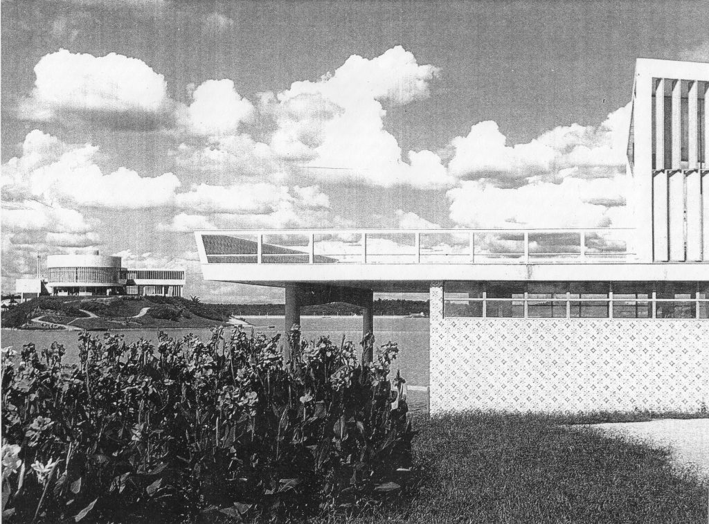
The opposite short side is oriented to North and given its location in the southern hemisphere receives the best solar orientation. The building sits on the lake to allow the connection in ground floor and a generous terrace on the first floor. This area is a perfect sunning and panoramic views of the bay and the architectural ensemble created by the architect.
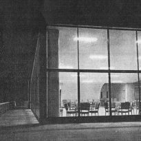
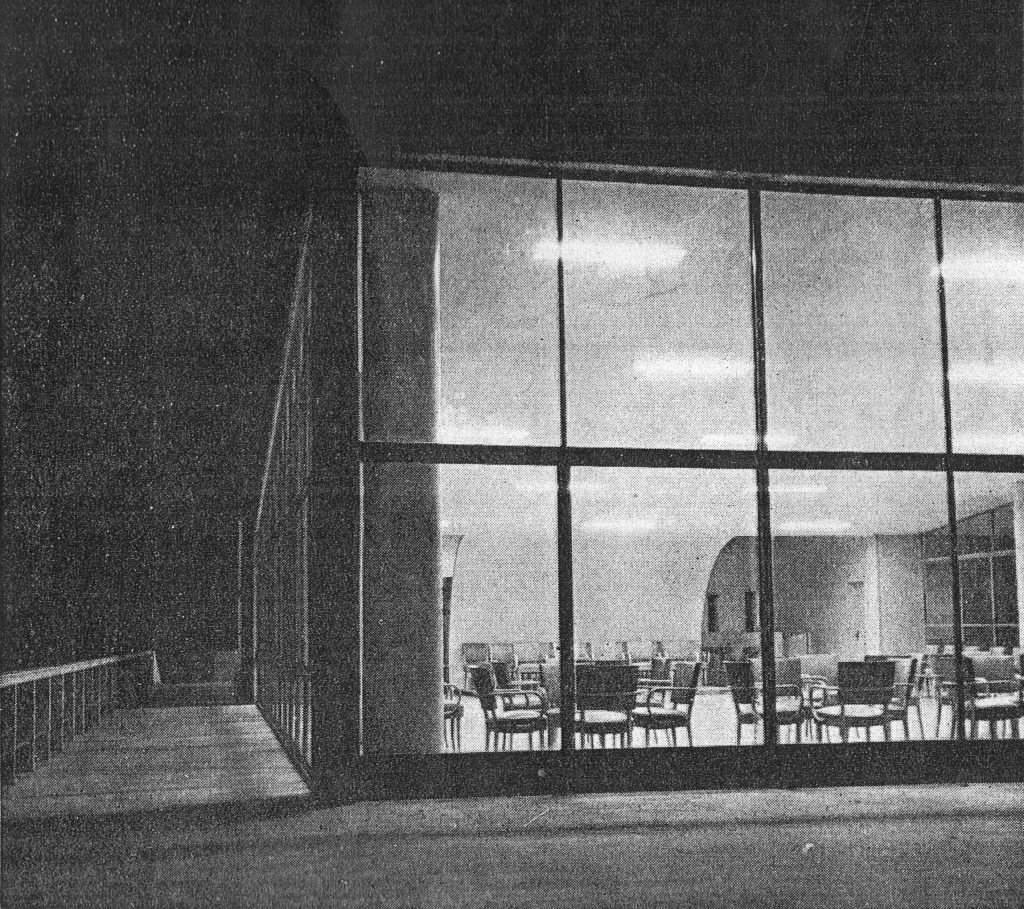
Niemeyer clearly differentiates the two long sides. The east side is fully open to views and the weak morning sun through a glass facade. However, the west wing, due to the sun sifts direct interior-exterior relationship, hiding somewhat pools and other areas of service that own enjoyment. The lower connection to the outside is done with various mechanisms that will deepen further.
Concept
The Yacht club building is an elongated prism of little height, which is understood as a horizontal building, trying to melt into the horizon of Pampulha and dive into the water like a boat more. The language used is distinctly modern Niemeyer, using the latest techniques and materials such as glass, concrete and Brise-soleil. However, the architect elegantly combines these innovations with a deeply rooted tradition in Brazil. Niemeyer investigated in a style that looks at how traditional elements could remain in its revolutionary architecture, without falling into old ways and procedures, as the same Niemeyer:
“Back to the past, insisting that architecture out of time for an architect would be evidence of a regrettable timidity”
Niemeyer These investigations were also influenced by the great modern master Le Corbusier and what this was doing in his last visits in America. Both roads took more vernacular, an intention to make a timeless architecture.
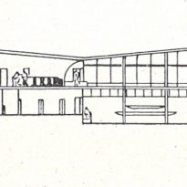
In a quick scan the cover in a “V” of the Yacht Club can be seen as formal and even capricious. Although clearly departs from the flat roof of the modern movement, Niemeyer uses a deeper sense that the form itself. The slope corresponds to a domestic distribution, not only to give a maximum height where it is needed but also to break up the monotony of a long, low building.
For differentiation purposes, the left is the great hall and part of the right is the restaurant, screened and bonded both by an acoustic shell to start the restaurant and a continuation of the sloping roof, in an intention to unite the vertical plane with the “horizontal” ceiling.
In another approach, the cover also acts as “quilling” the views and in a psychological sense defined in a way the opening of space, and intention for the relationship with the outside.
Another peculiar thing is the total independence of the upper and lower. We can see clearly that virtually any wall is continuous at the two plants, always generates a setback, a shadow in one of the two plants.
Influenced by 5 points from Le Corbusier, Niemeyer and enter the open plan pilotis as structure, concept and formal interpretation.
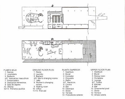
The ground floor is an open space and open that integrates 2 volumes of reception and changing rooms, quite residual. The walls are independent of the structure and form estereotómicos volumes with holes where the steps are generated, views, ie connections between east and west.
Instead upstairs has a glass facade more conventional modulated. Partly tectonic enclosures on the upper floor have formal games between glass, brise-soleils walls and terraces, as related Hitchcock:
“The highlight soleils much Brise-dimensional interest of large facades, replacing the effect of flat planes characteristic of the 20s’.
As for the vertical communications, as the ramp and the spiral of service, leaves in front view and used as a compositional element as well as functional.
Spaces
The interior space is mostly transparent in the restaurant area and great room. The plant is free, only few partitions that act as thresholds informal rather than divisions.
These walls are striking and have some artistic interest. In the hall the visitor encounters a landscape mural of modern Brazilian Burle Marx. In the back to be, another mural takes center stage. This is a mural that depicts scenes Portinari sports and leisure, in a clear language of Cubism. The small band shell stage works and separator between the environment of reception and the restaurant overlooks a terrace and lake.
This gives a bandshell dual circulation thanks to its central location, and reinforces the project at all scales, both internally and in the siting.
The centrifugal dispersion corresponds to a circuit ground crisscrossed by diagonal perimeter and established through the centrality of the stairs and the bandshell (…), and just as through the installation of doors on the edges of the glazed facade.
In the west lies an area of service and cuisine of the restaurant. This sector is highly segmented and closed off significantly, unlike the clear and transparent nave.
On the west side, between the Brise-soleils and glazed enclosure generates an intermediate that can be visited, where you can enjoy the shade and the breeze passing through the sunscreen.
Items
Brise Soleil
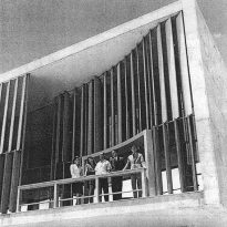
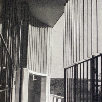
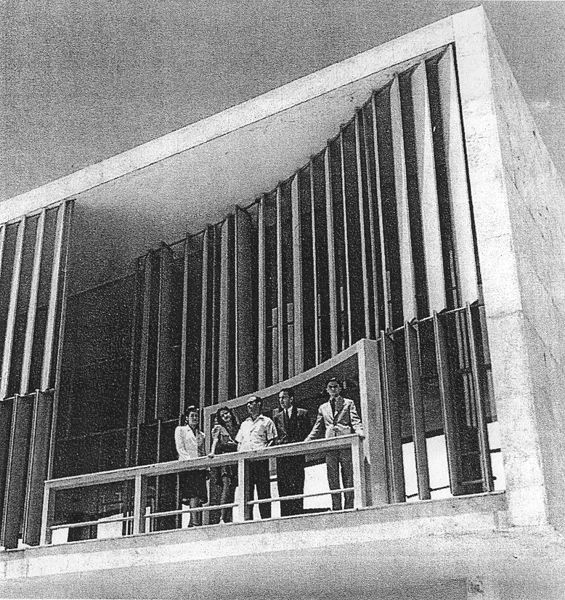
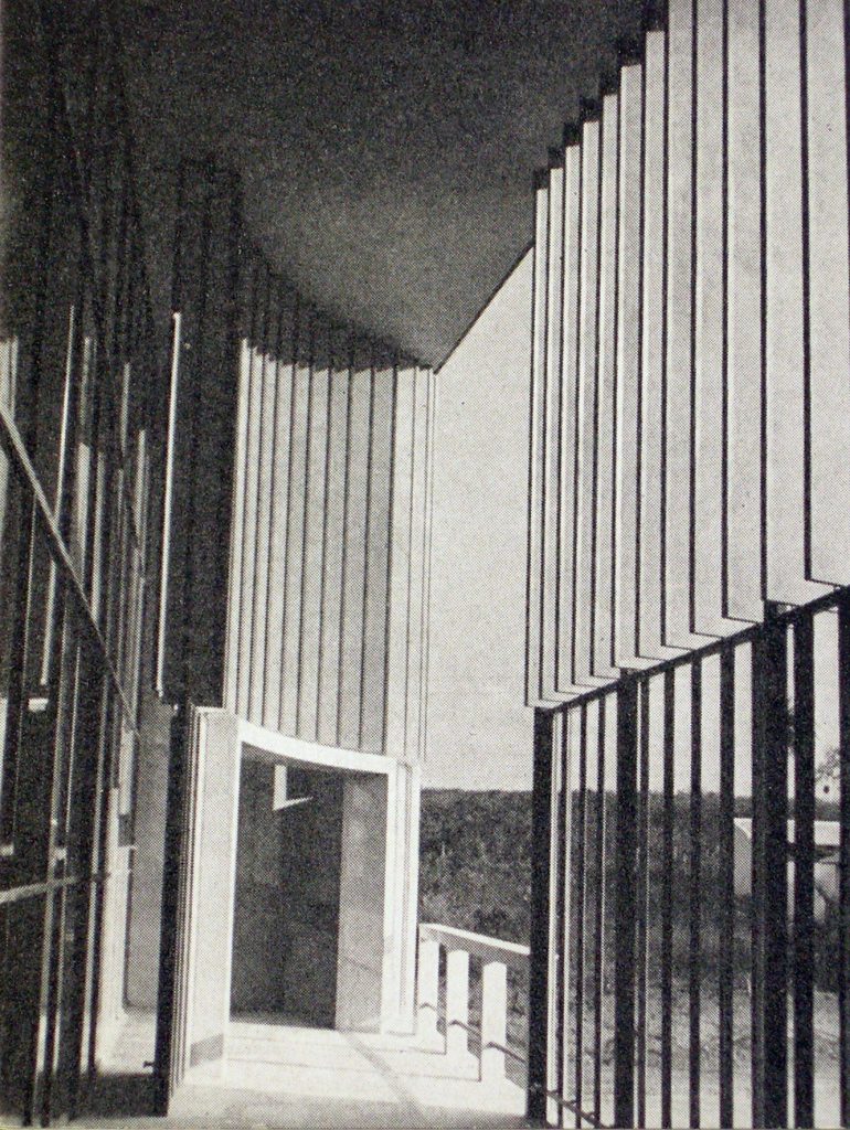
The west facade is protected by Brise-soleil, designed in two bands one above the other and on several levels, showing the versatility that allows architectural element.
The brise-soleil of the building deserves a separate chapter, not only will their integration and aesthetics but also because this element was introduced with such force in Brazilian architecture.
The sunscreen was revalued by Le Corbusier, popularizing the French name “Brise-soleil” and then incorporated into the Brazilian modern architecture as quebra-sol. At the time the architects estimated rigorously the problems of sunning, light and heat without neglecting the aesthetic value. We investigated the Brise-soleils fixed, mobile, vertical and horizontal. Models varied according to solar orientation, materials, whether of concrete, aluminum, etc.. or design.
As is known, Niemeyer and Lucio Costa did some historical revisionism in which he discussed what they wanted to retain elements of Brazilian vernacular architecture and what not. At the time lived the latest solutions introduced by Le Corbusier and to modulate the space while giving much greater plasticity of the facades, with the most vernacular wood blinds. Lucio Costa, Niemeyer’s mentor in Brazil made a lot of research techniques in formal and Brise-soleil.
At the Yacht Club were used soleils Brise-oriented vertical aluminum. They are lightweight and ocher colored for a warm reflection of light inside and a greater plasticity in the front.
On the west side closest to the south, the sunscreen is located on the edge of the change wrought in the plane of the glass is about 2 meters setback about generating a semi-outdoor gallery that protects against excessive sunlight and allows the passage of people. Niemeyer made a hole in the Brise-soleil modern way of an old window, to allow views from certain angles without screens.
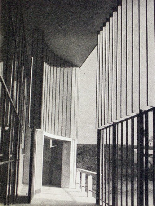
On the other side, then the great hall is another sunscreen, but with far more aesthetic intentions and volumetric. A shade house in the same proportion as above, introduces a curve on this side of Brise-soleil. Like the others is generated with a hole through the steps, allowing you to integrate the architectural space and the use of people. It is also a way of diluting the barrier between inside and outside, making the forum a “threshold size.
Ramp
Access is via a slow ramp outside the user depositing on the second floor. Niemeyer The idea is to access the interior as they walk and enjoy the virgin territory.
The ramp, as in all buildings Niemeyer leisure has no value by itself but its easy ascent allows the game to discover different views along the climb. Here again we see the influence of Le Corbusier for his use of the ramps and promenade in architecture.
Spiral staircase
A spiral staircase uses it twice. One is more of service and the other is quick access to the boats and the lake. The plastic character of the curves of the stairs harmonize with some of the furniture and floor is noted independence of the structure. It is well known that Le Corbusier was also playing with the aesthetic possibilities and volumetric spiral staircase.
Structure
It responds to the modulated grid of modern architecture, although a little distance some changes.
The structure is made with pillars and reinforced concrete slabs placed on a rectangular grid. With a 5m distance between pillars in the longitudinal direction of the building and a risky in light of 11.5m transversely Niemeyer credits of structural skills and ability to fuse them into a plastic universe and compositional so typical of Brazilian architect. Examples are the pillars that have a substantial section of 40cm x 60cm forming a particular form of an ellipse. On the south side of the ground floor, efforts are supported by the structure mentioned a new grid that sits in the middle with lights on 3.6m and 5m in longitudinal cross. The section of these pillars are circular and substantially smaller than the main pillars.
The forged and coated particles are both made in reinforced concrete and timely support to the structure above.
Materials
Like all his work, the materials are the union of the most modern materials and some indigenous material and traditional.
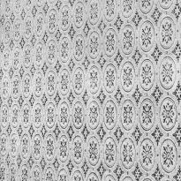
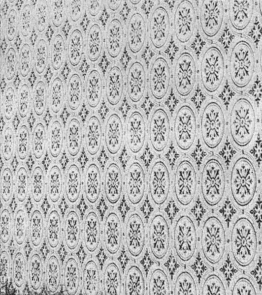
The main material is concrete, but is painted white. It also uses the lining of natural stone tiles on the south wall and tiles refer to the Brazilian tradition and give a glossy finish to the floor.
Niemeyer course uses the glass. Used in large panels or sliding windows within a wall.
The Brise-soleils using adjustable aluminum.
Many elements of the Yacht club are painted blue. The ramp, the rail and the pilotis. Blue is often used in traditional buildings on the shutters and the shutters on the frames, on the basement and also the boom.
If color applications Yacht club are almost literal tradition of the traditional terms in the language of modern architecture, however the color of the brise-soleils East is a true interpretation, almost a recreation.
