White Towers
Introduction
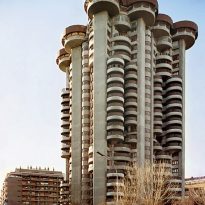
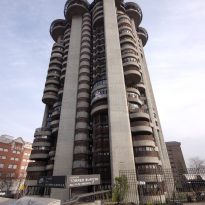
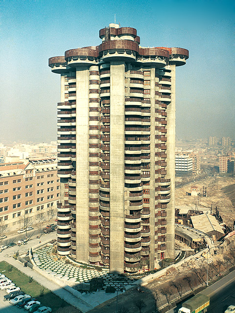
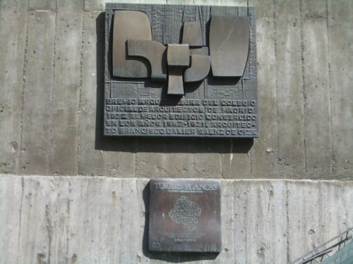
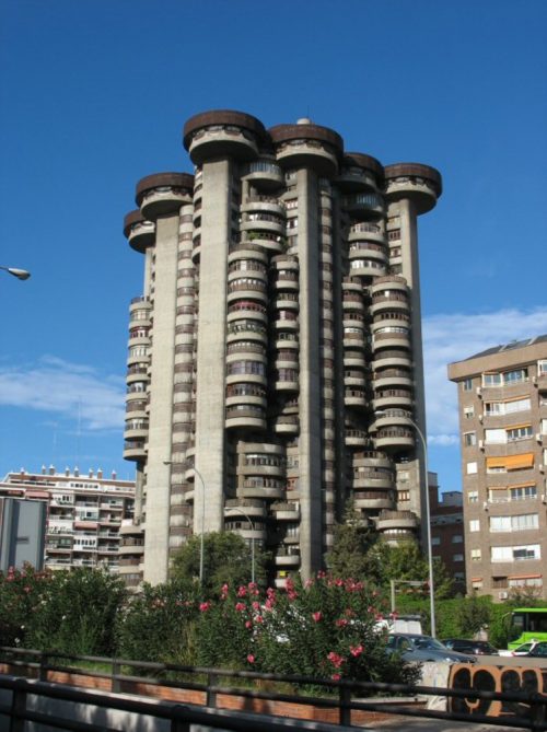
This apartment building, built between 1964 and 1969, is considered the best example of Spanish organicismo of the time, and for many, is one of the greatest achievements of this style can be found in the world.
It is a masterpiece of Francisco Javier Saenz de Oíza, designed in collaboration with John Daniel and Rafael Moneo Fullaondo, then a member of the team’s architect. The achievement is a living example of collaboration between Saenz de Oíza and construction Huarte (now merged OHL), also drafted in another landmark building in the city of Madrid, BBVA Tower on Paseo de la Castellana, opened in 1981. Both were enormously influential achievements in the architecture of the city during these two decades and have the admiration and recognition by the international community of architects.
Torres Blancas was once an experiment, a proposal favored by the construction company, whose role in the culture of the 60 was critical in supporting the forefront. John Huarte, who since his company made some of the finest buildings in the 60s and 70s, and sponsored publications which were known contemporary culture in a culture of Spain by the Franco esclerotizada and development. Huarte family, through its construction, undertook this residential tower against convention and stands as a model in the residential architecture in height.
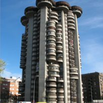
The White Tower building, and called for lifting the original two towers covered with white marble dust mixed into the concrete, was the first building in height and is considered an architect of the most successful of its author, who suggested it a synthesis of rationalism and organized, capable of changing the architectural debate of the late’60s.
Situation
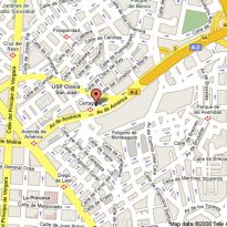
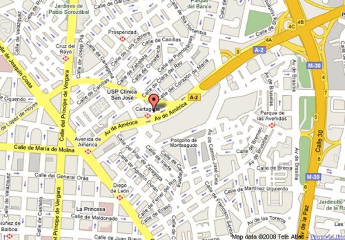
Located at the entrance to Madrid via the N-II, the building is in the Heart of Mary Street, corner of 2 Avenue of the Americas, number 37. This is a shortcut to the Spanish capital
Concept
Oiza wanted to make an apartment building unique, very high, which grew organically, like a tree or tree as a whole, by vertical ladders, lifts and facilities, as if they were veins or timber vessels linking the homes to the ground.
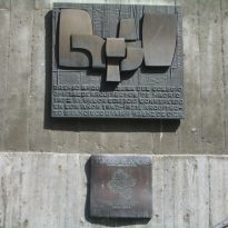
The only concrete tower which resulted in the original idea, it displays an organic: a set of vertical-looking tree on the lookout to open terraces and gardens cores, like Le Corbusier. The book won the European Excellence Award in 1974.
Similarities
There’s a lot of Le Corbusier in Oiza Saenz of the same intellectual energy, and similar confidence, a humanism that seeks to improve life through a new architecture.
Le Corbusier Oiza rescued from the rationalist idea of building houses with gardens in height (buildings, villa) and took on Frank Lloyd Wright of the proposed organic tower Price, making a personal interpretation of the two trends, seemingly opposite, in a work he turned to the world, getting a unanimous recognition among the works of organized.
Description
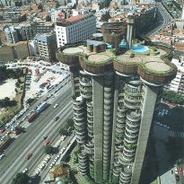
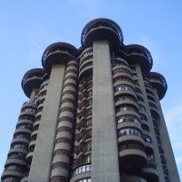
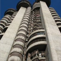
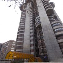
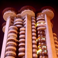
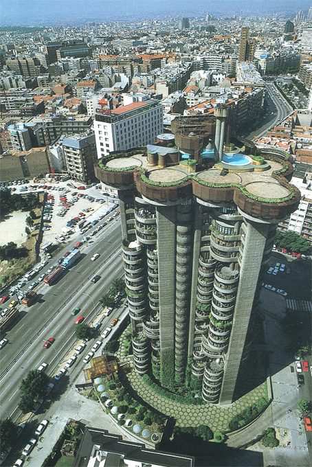
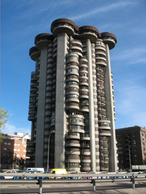
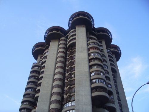
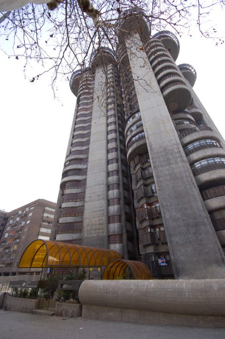
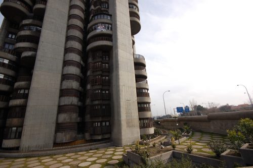
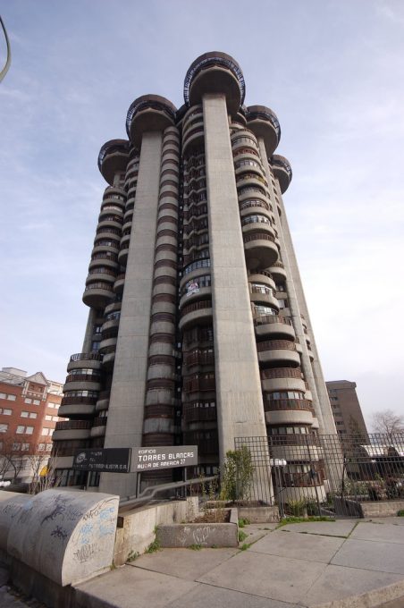
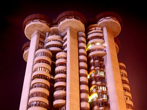
The concrete building is expanded in the top as the top of a tree, opening multiple platforms circulars, so that any response to the external work to establish a new dialogue between architecture and landscape garden.
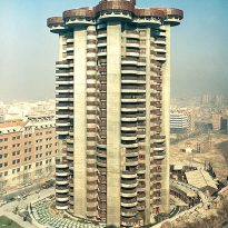
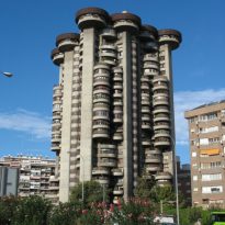
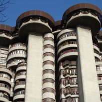
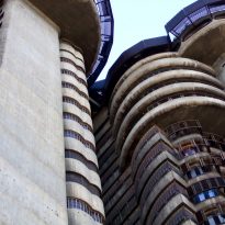
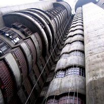
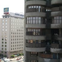
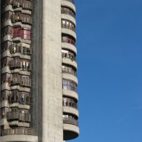
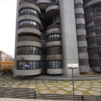
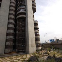
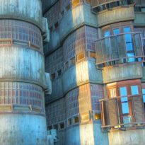
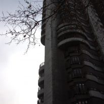
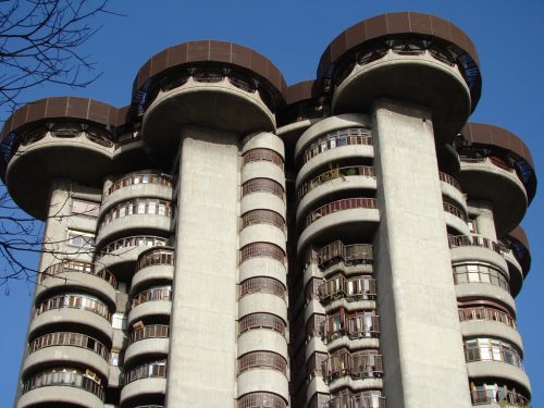
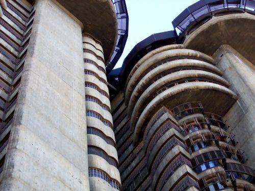
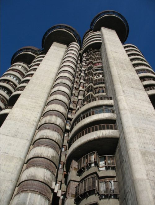
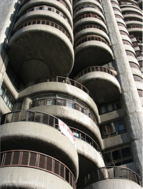
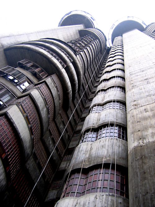
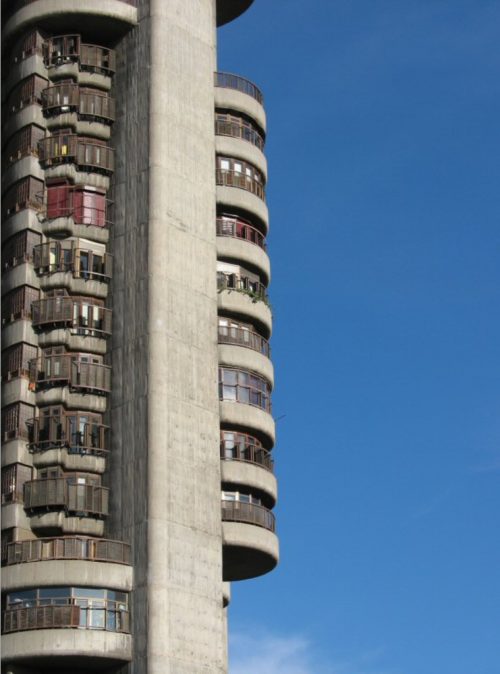
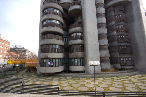
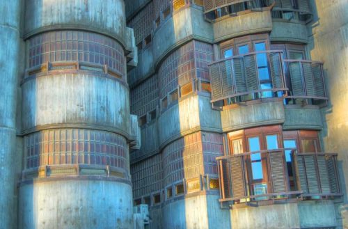
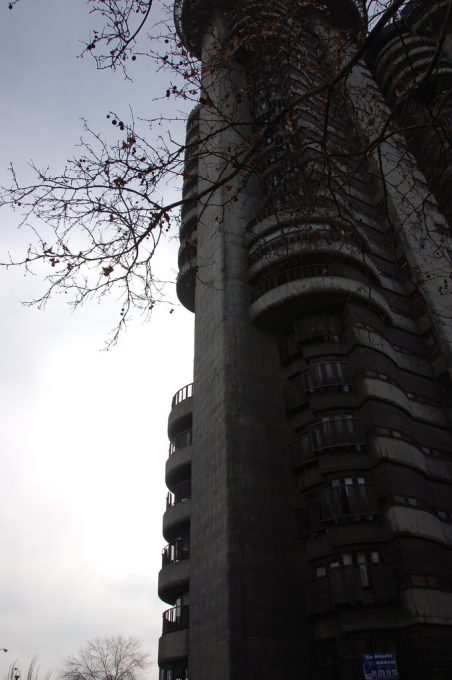
It was only a tower and concrete, but the idea is clear expression, the facades convey the idea of tree growth, with the curved terraces grouped as the leaves on the branch, in this case the walls.
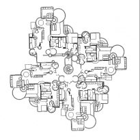
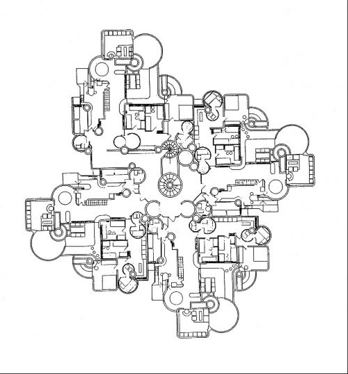
Its plant is even more revealing. Cylinder is full of muscles that seem sections traveled through the veins. It is in these plants in which it appears Oiza skillful develops a baroque syntax.
Its mission is clear town, regardless of their wealth and architectural object and its importance as a technological and typological meditation.
Spaces
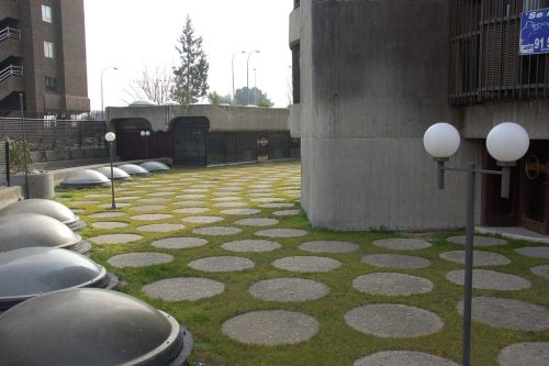
Access to the building is coming down some stairs and accessing a kind of cave, either to enter the basement where they are parking or portal
• basements
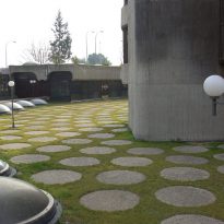
In the basement parking, a stay in space is enhanced by semienterrado cross visions of the coronation of the tower and the plane of the garden through the skylights, a transparency that makes it possible to simultaneously watch different topological situations.
• Lobby
In the lobby of pedestrian access is intertwined with the space of the staircase, which runs a natural way, which opens a space overlapping locations.
The staircase is a particularly attractive place, full of cracks and holes through which escapes the gaze towards the interior of the large building, lost the clear perception of it, so we are just fuzzy or dark holes in which to imagine these elsewhere in the heights and who belong to another reality space.
• Plants
The tower has 23 floors for homes and offices.
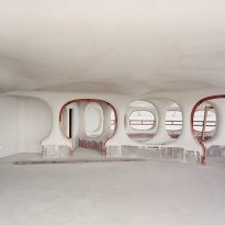
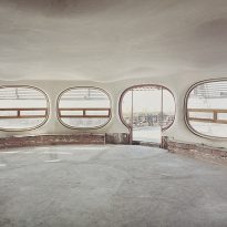
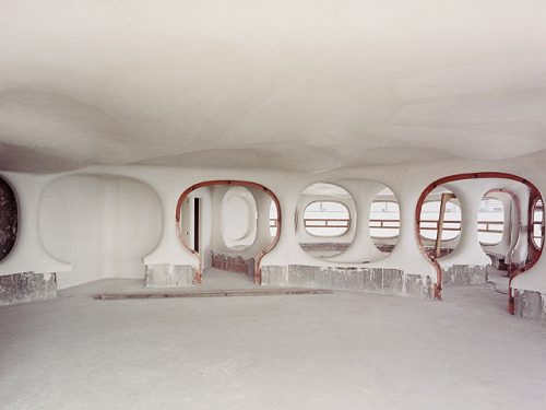
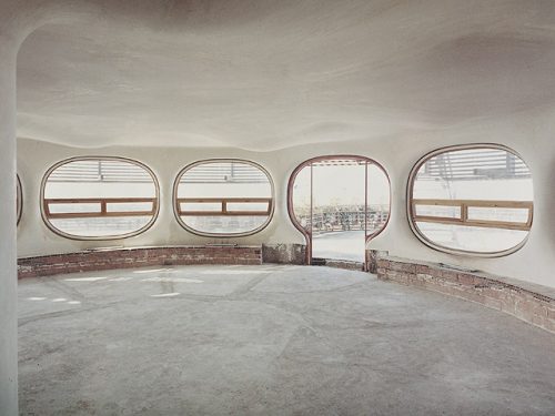
On each floor four houses are grouped together and rectangular and circular shapes in the rooms, so that owners can count thousands of anecdotes about the difficulties of conventional furniture with curved walls.
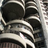
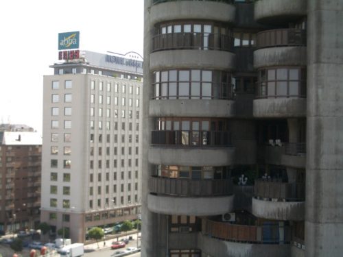
The tower, designed with every comfort, with plants, duplexes and apartments. The distribution shows clusters of houses in clusters of rooms and bathrooms and kitchen and living rooms with terraces shaped curves that fail to touch, allowing light to filter through them, tempered by vegetation.
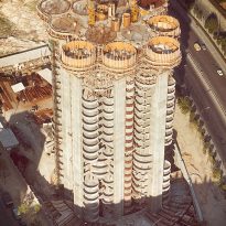
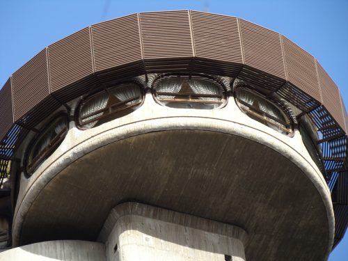
The last two floors at the top of the building houses a restaurant and a swimming pool surrounded by a rooftop garden
Among the attacks are not only the water, gas or cable usual, but also, for example, pipe-mounted independent meals or falling debris.
Structure
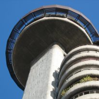
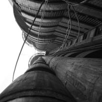
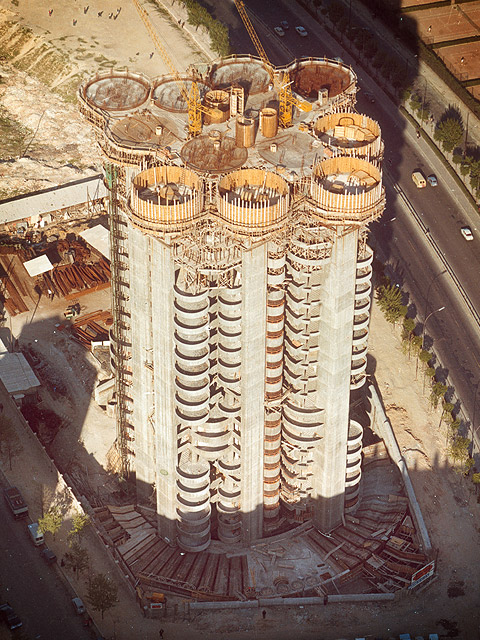
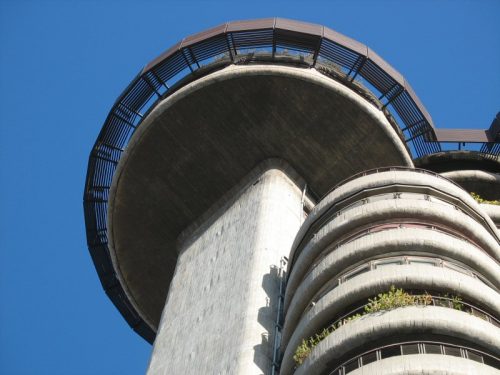
A structure made of reinforced concrete base of a large circular slabs cantilever without pillars, balconies with creating wooden latticework that shape a tree structure that houses along its various development opportunities to live
Are the external walls and the vertical structure that guarantee the internal functions of lift.
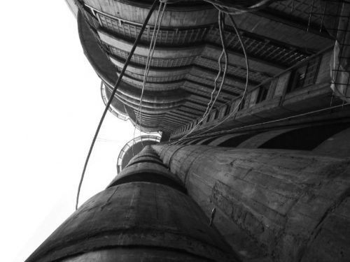
The circular geometry or rounded benefits both the movement as the stiffness of concrete screens that make up its structural integrity and ultimately to shape the blanks to the floor and the free service
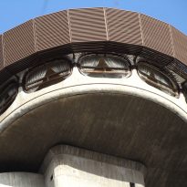
His image feature slender cylinders are formed by semicircular balconies, sometimes retranqueadas, paintings by alternating vertical planes. The tower is finished in the top twelve discs of 10 meters in diameter, which are home to the so-called core social
The building is in large part a result of the desire to join in possible functional, durable and aesthetic of its structure, making escape from traditional solutions, both in front and inside. Thus, the blind facade paintings as being perfectly satisfied without sustaining disguise pilasters, terraces are also resistant to the structure and the boxes inside, all round, play the dual role of host staircases and elevators and provide a backbone resistant building.
Materials
Of the two towers designed by architect built only one whose facade was covered with concrete and not mixed with white marble dust as was thought at first.
Oiza ingeniously used concrete to insinuate organic forms, opting for the curved front of the line and the angles, not just non-existent or softened in its facade, but also in the interior.
The main staircase was the only party that, in the end, was of white marble.
