Walker Art Center

Introduction
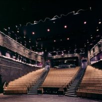
The Walker Art Center is a museum devoted to contemporary art, which works as a catalyst for the creative expression of artists and the active public reception. Focusing on visual arts, multimedia and the performance-art, this space seeks a comprehensive and multidisciplinary approach to the creation, presentation, interpretation, collection and preservation of art.
The original building was designed in 1971 by Edward Larabee Barnes. In 1999 the museum authorities decided to extend it, to make cultural and urban epicenter of Minneapolis. Thus summoned architects Herzog and de Meuron, in collaboration with Hammel, Green and Abrahamson.
The project, which opened in April 2005, at a cost of U $ S 92 million, aroused great expectations among local and national intervention by the Swiss architects Herzog and de Meuron, who in 2001 won the prestigious Pritzker Prize.
This design follows a path in the most recent work of architects to explore new possibilities that are beyond the purity of modernist and minimalist forms related to his early work. Herzog & de Meuron created a design for the Walker Art Center, which is perhaps best remembered for his spatial experience and creative juxtaposition and ingenious reconciliation seemingly opposite qualities: new but familiar, intimate and grand, fragile but strong, simple but complex, dynamic and composed.
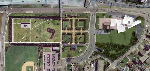
The extension doubles the exhibition space: 40,000 square meters of total area of which one third is new exhibition space, an auditorium for 350 people, media and underground parking with 670 spaces. Moreover, the campus was expanded with 4 acres of parkland, in addition to existing and are linked through the new gardens, totaling 17 acres, owned by the institution.
Status
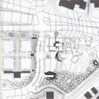
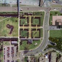
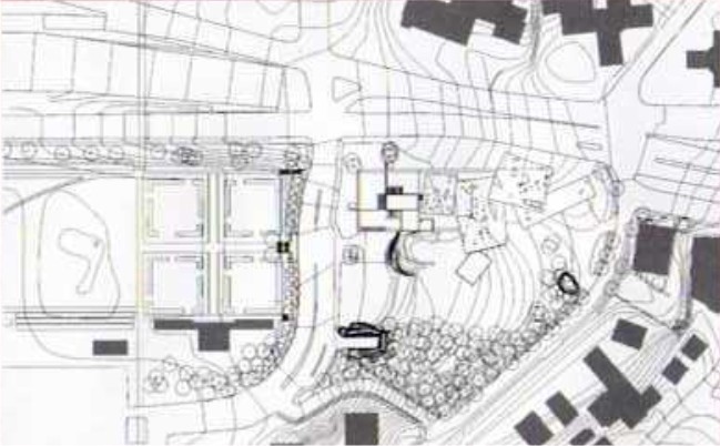
It is located in the city of Minneapolis. The expansion is located along Hennipin Avenue, one of the main arteries of the city.
Concept
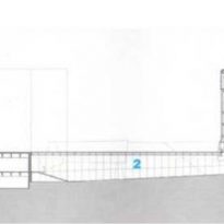
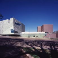
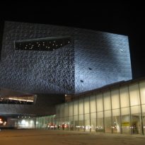
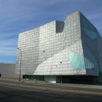
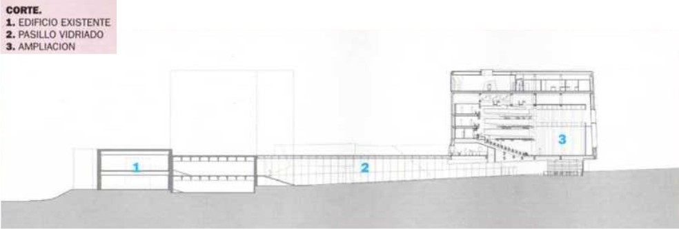
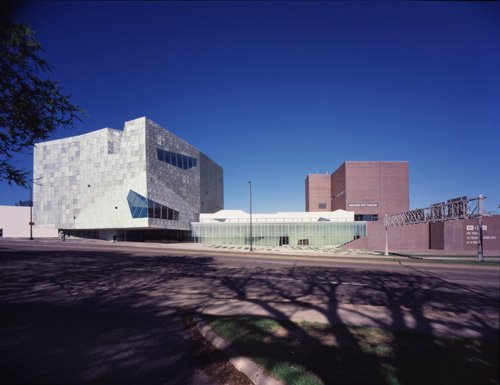
The new museum building, designed at the forefront of artistic expression, is a five-story building connected to the existing structure by a long glass transition that is actually a museum opening on Avenue Hennipin.
The study was commissioned to design a master plan and expansion of the museum.
Additional galleries were projected to show his collections in growth and new spaces. The concept also includes a number of venues where visitors could converge, opening the possibility of chance encounters with new people, ideas and art forms. On the site plan, the expansions were raised along the avenue, in a gesture that reorients the Walker to the city center. Besides creating a new park facing the residential neighborhood. The expanded campus serves as an important urban landmark that connects downtown Minneapolis to the nearby neighborhood of Uptown. The new building is also linked directly to the building designed by architect Barnes.
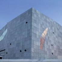
Based on the original project, the modernistic brick cube was transformed into a building that explores in his front, sensory experiences through the use of skins.
A stiffness contrasted existing building a new lighter and more ethereal. The original was a prism almost windowless. The opacity and dark brick cubes contradict the white masses angular design by Herzog & de Meuron, while greater transparency is achieved through large expanses of glass to reveal the interior spaces. This contributes to the aim of transforming the museum of the city’s shape.
Adding the complex a five-storey tower, was forged strong dialectical relationship not only between the original building and expansion, but also with the environment.
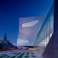
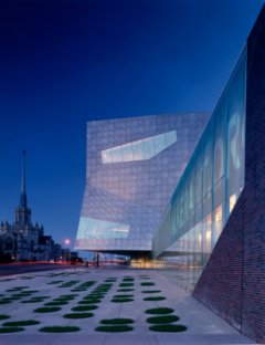
The contrast between the old building and the new prism of the museum, in addition to functioning as a visual counterpoint, communicates with the stone towers of two ancient churches that are located across the street. As part of the set, the Walker alongside churches and a group of office towers that are far away, evoking the link between culture, commerce and religion.
Spaces
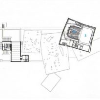
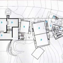
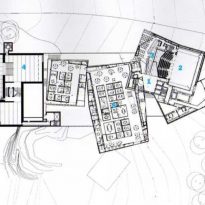
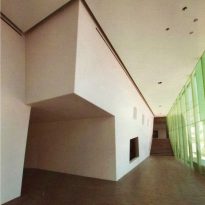
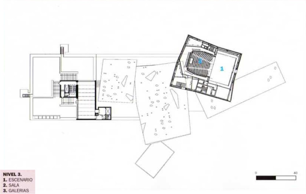
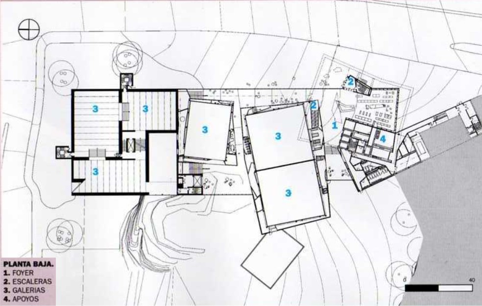
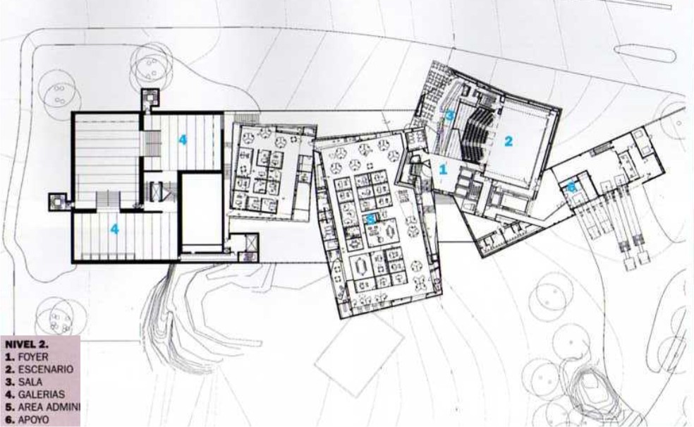
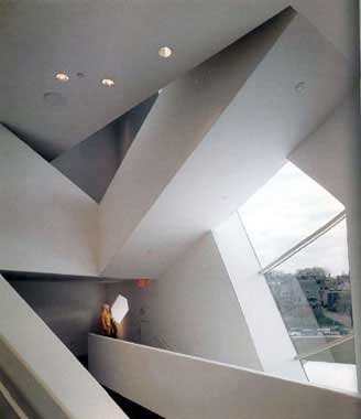
The museum is a sort of cluster of cubes and rectangles where spaces have fuzzy boundaries. Expansion consists of two parts: a tower and a binding cubic long horizontal. The cube contains a theater, a special events space, and a restaurant. The connection to the original structure is a two-story volume that includes galleries and social spaces, and a new roof terrace. The general scheme interweaves the spaces with the expansion, opens the closed circulation spiral of the original building and creates multiple new ways to explore downtown.
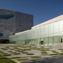
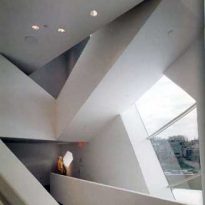
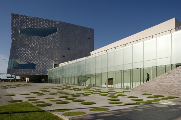
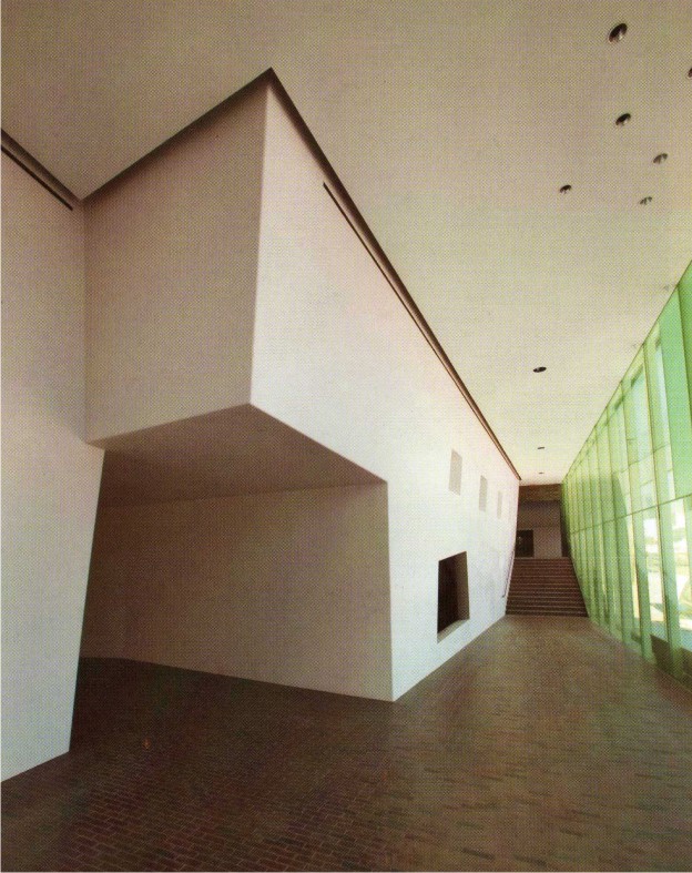
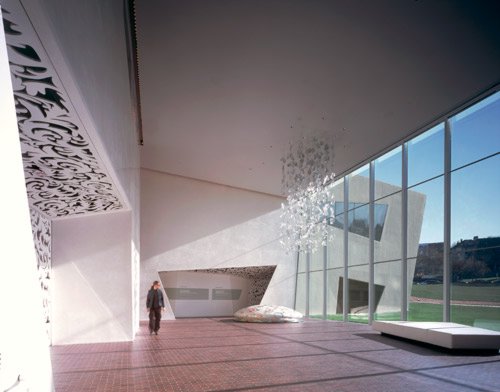
Glazed circulation, accentuates the feeling of transparency and openness that arise from an institutional issue: the message refers to the Walker has nothing to hide and that is a site open to all artistic expressions. The large glass panels circulation respond to this building urban integration and the connection of indoor and outdoor spaces that visually communicates the street.
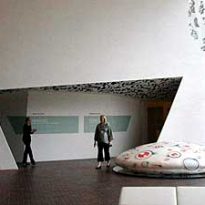
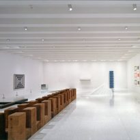
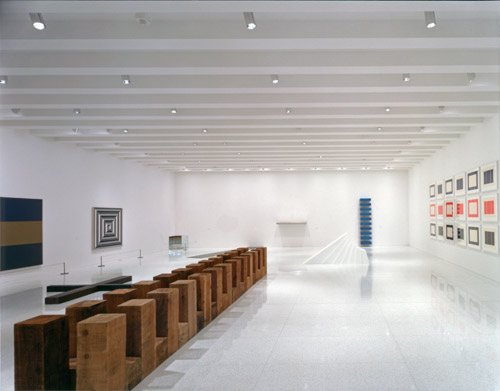
The galleries preserve the flexible design and aesthetics of white cube Barnes building, extending its use on the terrace. The expansion involves a creative dialogue space to its predecessor, offering flashes of light and dark, new and old, city and garden.
Besides the four-hectare park, the main elements include an outdoor square at Hennepin Avenue and rooftop terraces with spectacular views of the city and the park.
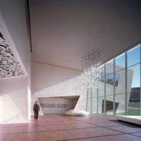
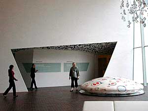
The new social spaces, in areas that fall outside conventional programming of the galleries, create an archipelago of rooms of different sizes and scattered across the ground floor level connecting the two buildings. The rooms articulate a human-scale architecture. A great space for a new garden, opening the room and the wall from floor to ceiling glazing to 26 meters high, offering a relaxed atmosphere for the contemplation of art and nature. The curtain wall glazing follows the slope of Hennepin Avenue, putting the visitors in motion parallel to the urban stream. Other rooms containing visitor interactive installations are located in the interstitial spaces formed between the inclined walls and the outer lead in the walls of the new galleries.
Materials
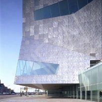
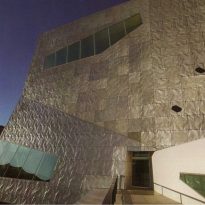
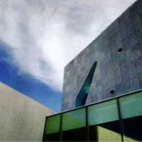
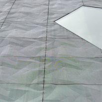
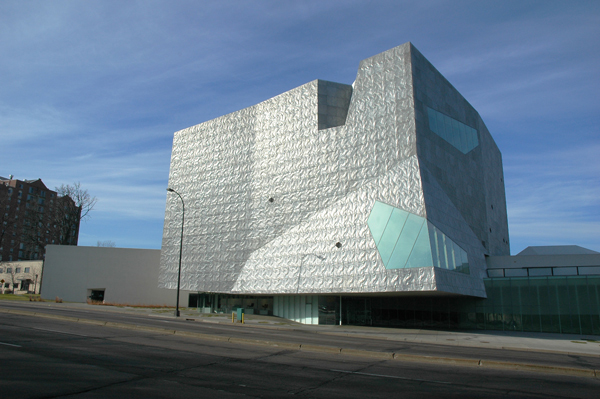
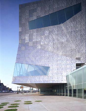
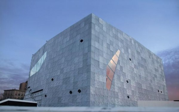
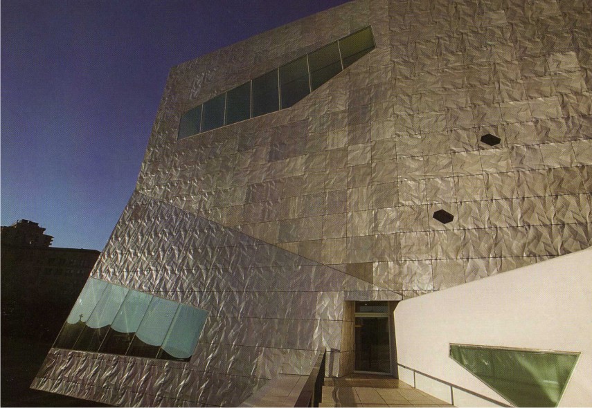
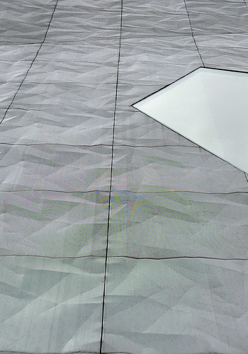
The façade of the new wing of the museum is clad in gray aluminum panels, capturing the attention of pedestrians by its irregular shape and visual lightness. This exacerbates the counterpoint between old and new.
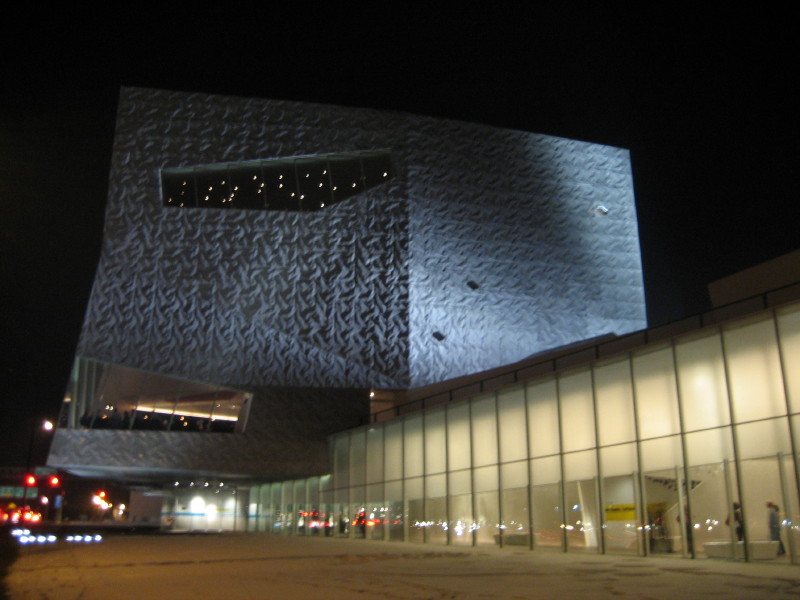
While the new tower mimics the structure of the previous building, holding a much more expressive and placed in tension with their immediate environment. The heaviness is juxtaposed with the lightness of the new tower coating of silver metal, which changes its appearance throughout the day, depending on the light. The brick veneer building designed by Barnes, is repeated on the floor of the expansion, a shift from outside to inside, the wall to the floor.
The aluminum mesh panels are folded and sealed with a pattern of folds. The effect is like a crumpled piece of paper or cloth wrinkled, suggesting the fragility despite its great mass. Lightness is enhanced by the holes in the facade, including several windows of irregular shape and size in different ways. The visual weight of the cube is undermined by its quality apparently floating cantilevered over the square below and projecting into the street.
