Villa Snellman

Introduction
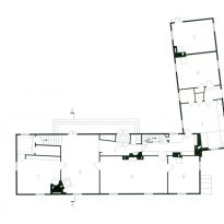
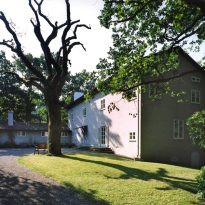
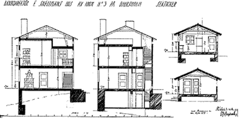
Between 1917-1918 Asplund designed a villa in Djursholm for a bank director, Mr. Snellman. It was a simple yet subtly complicated structure, consisting of two wings, a main with two levels and otr, at an angle to the first, for the kitchen and service rooms.
Villa Snellman has been described as “the seminal building” in the Neo-classical revival of Nordic style. However, the house is full of features that commentators have described as clumsy or Mannerist, and deny rational promised simplicity at first sight for the facades. These “blunders” were completely controlled by Asplund and were not forced at all, since the project never ceased to be financed, the plot was large and had quite freely. The architect spent much time developing the project, between June and December 1917, and if you ever showed any disappointment was mainly decorative schemes are not executed.
Situation
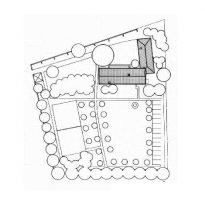
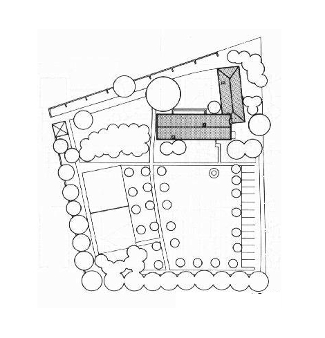
Villa Snellman was built in a northern suburb of Stockholm, Sweden called Djursholm. This district is included in the multi-city urban area of the Swedish capital, is one of four suburban districts and seat of the municipality of Danderyd, Stockholm County.
Concept
Gunnar Asplund relates to this project in the following téminos: “….The building will accommodate a modern house in a structure of a bay and a half. The structure of a bay, typical of rural homes, not adapted to the modern needs of service spaces, heating and communications. Moreover, the structures of two bays or half past two, occasionally used, also have their drawbacks, such as the absence of sunlight or good views in some rooms, dark hallways on the upper floors, and in any case lack of light…. ”
Description
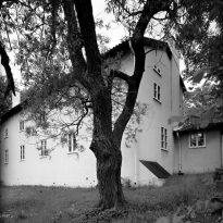
Originally the house was to be built of stone, was later replaced by wood, causing some design changes and giving appearance to the asymmetry so characteristic of the windows in the front garden, a line under windows on the facade of the courtyard or no need for agreement between the walls of the first floor and ground floor.
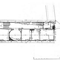
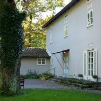
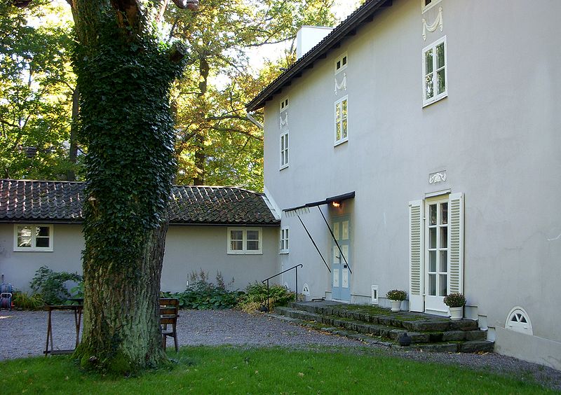
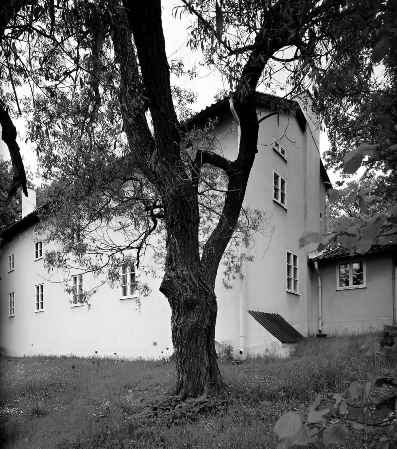
The building is as if it had been cut into the box and accompanied by an unusually small house in the background. This circumstance made all the rooms give to the garden. To create a connection between the garden and this side of the house, a long corridor extends across the width of it.
- Front yard
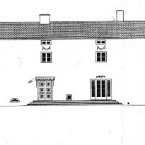
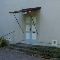
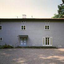
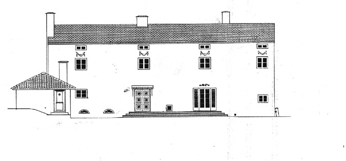
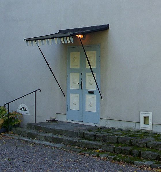
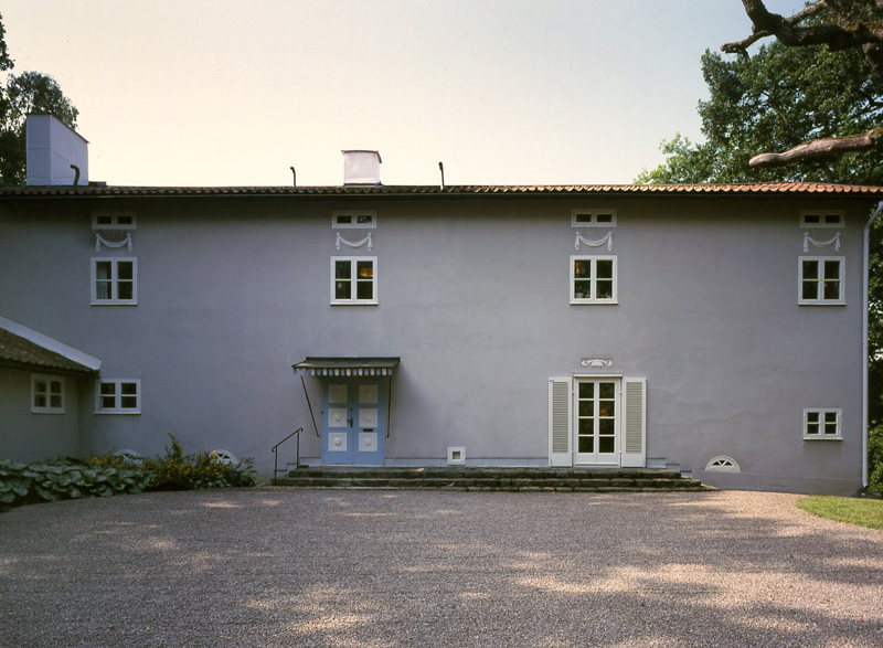
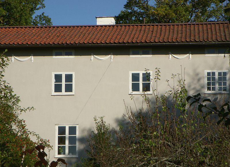
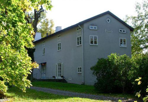
On the side facing the courtyard is a glazed door with two bodies, “Gateway Summer” which provides light to the room, and his side the front door. The two doors are very different and are held together by a small section of ladder-terrace in common. On the walls there are no moldings and columns, it is a classical building, but in this wall overlooking the courtyard, under each of the small attic windows estuco.A wreaths were placed socket level three windows of repeat crescent as indicating the location of the oval room on the facade facing the garden.
- Front garden
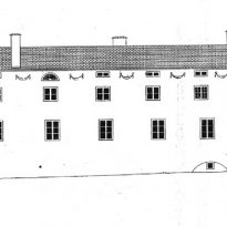
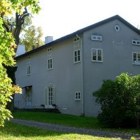
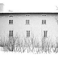
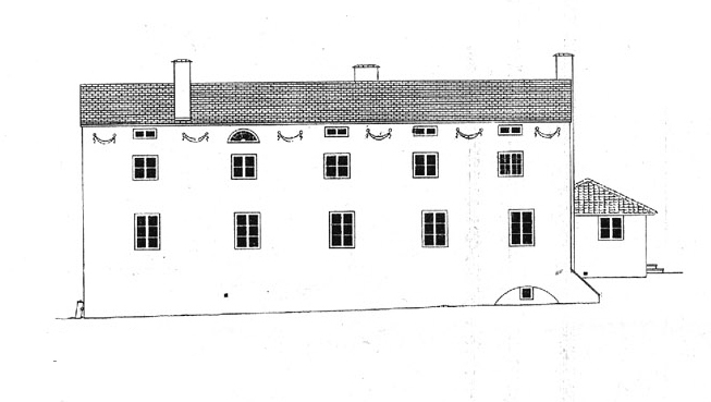
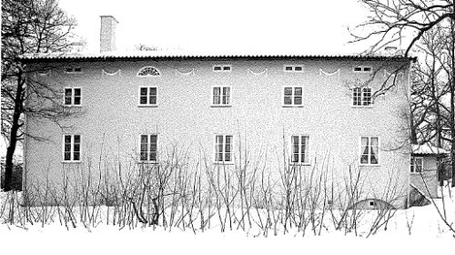
On this side of the building is striking shift to the right of the windows on the ground floor with respect to the upper. The displacement between the leftmost window is 5 cm, the next pair is shifted 10 cm, the remaining 20 cm, the next 40 and the last repeats this distance. In this case the garlands were placed in the spaces between the attic windows.
Spaces
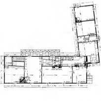
The house is L-shaped, with its open side sufficiently short, 6, to avoid the right angle. The main wing for family life and a lower and narrower for service. This form articulates the service element creating a courtyard entrance, thus differentiating front overlooking the garden, on the other side. The angle of 6º is a response to the site, Asplund put the house on a hill, in the northeast corner of the plot, allowing the main wing, parallel to the street, had views to the southwest through the garden.
Ala Service
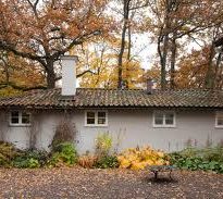
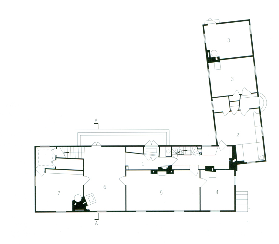
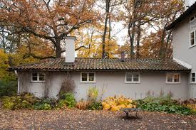
This module of the house, on one level, is located in the highest part of the land, north, making an angle to the main body. Its roof was made as low as possible, and inwardly finished flush with beams. In this part of the house is a kitchen and two utility rooms.
Main Wing

- Ground floor
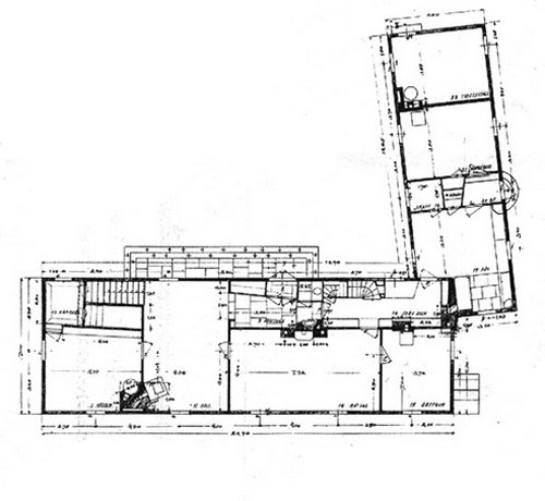
The ground floor is divided lengthwise rectangle in which the spaces have a height of 2.6 meters. In space overlooking the garden area of movement was available with a study, living room occupies the entire width of the rectangle having access to both the garden and courtyard access, a dining room and a living room.
In the partition facing the courtyard stairs and hall of one of the entrances are, as the “input Summer” leads directly to the classroom. In this lobby your closet and started absorbed basin between the thickness of the wall next to the entrance. The lobby communicates through a door to the kitchen, the service wing. The staircase leading to the upper floor on the other end.
- Upstairs
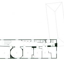
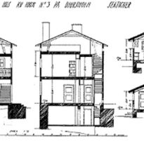
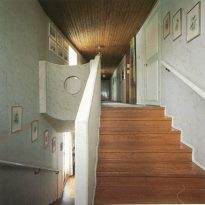
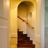
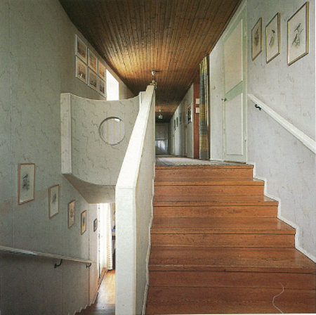
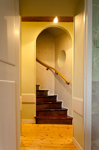
After the ladder, the appearance of a conical passageway is only one of several plant inflections and angle settings. At this level the main staircase is widened slightly, a line of cabinets and a spiral staircase that protrude from the wall giving access to the attic, the path of the upper passage ends in a bath appears.
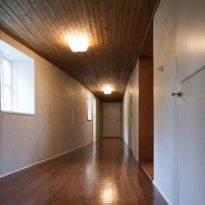
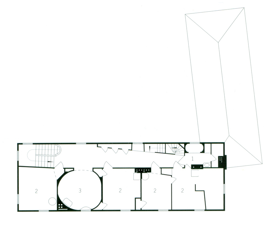
Upstairs there are four bedrooms, with a height of 2.5 meters, a bathroom and an oval lounge, all accessed from a straight corridor, 2.2 meters high, overlooking the garden. Its walls are not parallel, one of which is biased with respect to each other. The orientation is smooth and easy, with rows of windows with panels, the highest two and four below. If the facade is observed is that the row of windows on the ground floor is offset from the top.
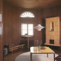
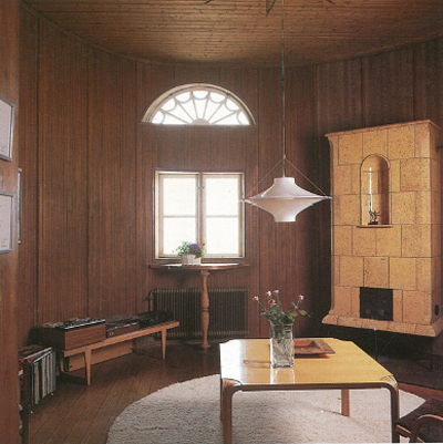
The upper lounge, which is not perfectly round or oval, but an irregular shape with many radios, has a height of 3.2 meters and the facade facing the garden can be distinguished by a window with a crescent shape. Examined more closely, its asymmetry is less puzzling, since it is formed from the relations between windows, stove and door, the three architectural sub-elements inside. Opening, between bedrooms occupies a symmetrical axis linking through the windows, the two facades of the house.
Materials
Originally the house was to be made of stone and the upper hall was completely round, a circle within a square, one of the preferred forms of the architect. With the change of material stone stucco over processed wood frame, perhaps for economic reasons, the architect left his inspiration emerge giving the room upstairs a more organic and free form. Its walls were covered with vertical wood moldings on walls and ceilings, like floors and ceiling of the corridor. The stairs are wooden varnished.
The walls of the rooms of the first floor is painted in tempera, light gray and then sprinkled with marbled inside. The gray was also applied on the facades, windows and door sections in white, except for one of the doors, combined with light blue.
Initially cover main module would cover noble slate and service wing shingles, but finally everything was covered with tiles used as Asplund preferred the old shingles on a single roll.
Exterior doors and windows are wood, glass paneled and painted white.
Video
