Villa Müller

Introduction
Completed in the same year Villa Savoye of Le Corbusier in Paris or Tugendhat Mansion of Mies van der Rohe in Brno, Villa Müller was ordered to Adolf Loos by entrepreneur Dr. František Müller and his wife Milada, who owns a construction company pioneered the use of reinforced concrete, so the house would be a showcase of special relevance.
On the recommendation of architect Karel Lhota, Mrs Müller handles the design of the villa to Adolf Loos
, Lhota who had worked on several of the projects in Pilsen. Lhota helped in the realization of the project and the development of spatial design, as evidenced by a contract signed by the architects specified in the collaboration between them in that work.
Loos designed the interiors including lighting system and some of the furniture is not built and was in this house where he could best express his ideas “Raumplan”. The severity of the external facade, composed with a refined balance of “asymmetric symmetry” in the window openings, in contrast to the noble elegance of the interiors, even in apparently secondary spaces.
The nationalization carried out in the country after 1948 had a decisive impact on the history of the family and the Villa Müller. Frantiźek Müller died in 1951, his widow was confined to a small apartment in the same town and the rest of the house converted into offices for different uses. Contrary to what usually happens in these cases with the changes that are made on the property, the change of use allowed this architectural monument survive in an exceptional condition.
After the fall of the communist government, Villa Müller was returned businessman’s daughter who went on sale. A campaign in the media, the intervention of the City Council, foreign activists and the local government of Prague avoided this private sale going to be bought by the city. In 1995 became the ward of the Museum of the City of Prague being proclaimed National Cultural Monument. Between 1998-2000 Villa Müller was fully restored officially opening to the public as an exhibition hall and a Study and Documentation Center of Adolf Loos
Location
The Villa is located in the area Střešovice, Prague 6, one of the most exclusive residential areas of the capital of the Czech Republic, northwest of downtown, on a sloping site overlooking the old city.
Concept
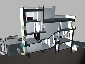
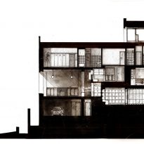
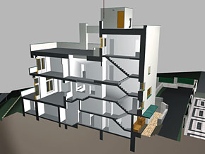
The composition of the interior spaces, mainly residential, the house is based on an entirely unique architectural thinking of Adolf Loos, on the principle of the spatial structure of the plane, called ” Raumplan “, which is reflected, among other things, by understanding the economy Loos and functionality in their designs applying for social housing.
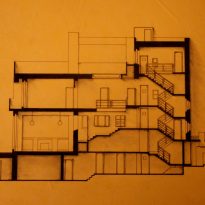
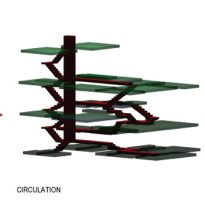
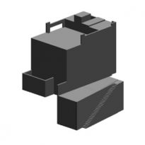
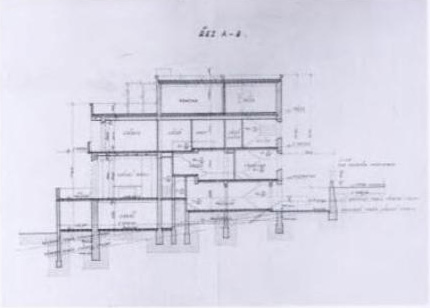
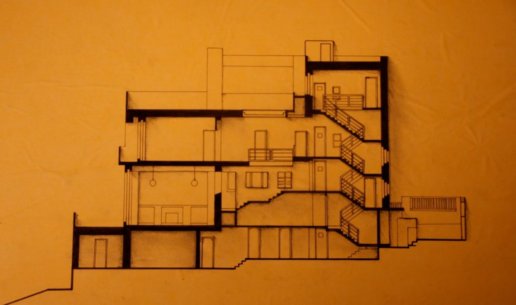
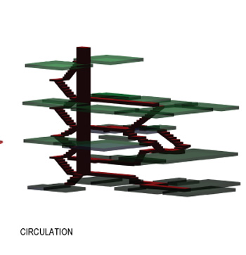
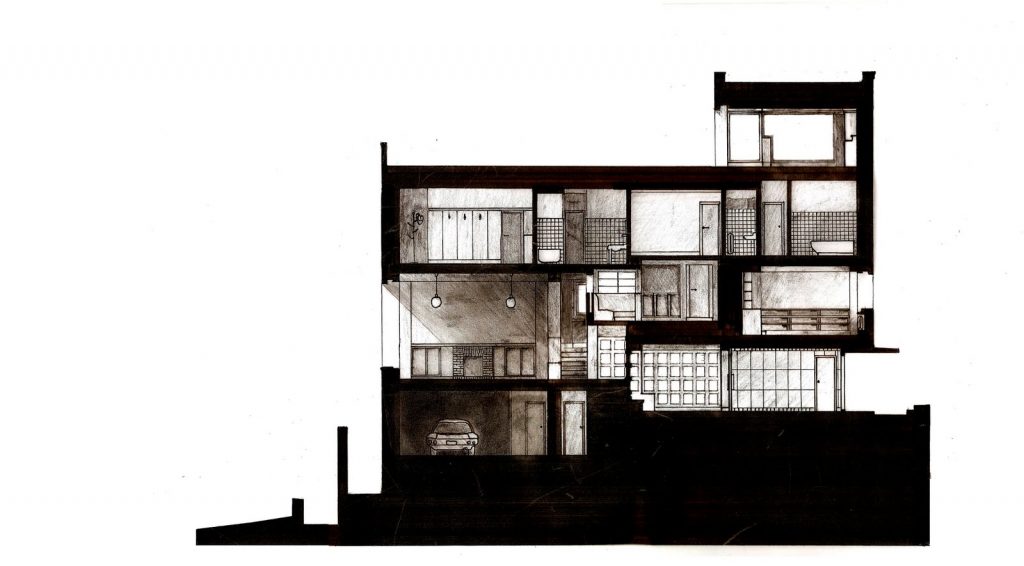
Villa Müller is the definition of modern house, according to Loos, at a time when the rich and progressive industrialists were the source of commissions modernists. Definitely a perfect example of the revolution that goes with the job. It shows how management breaks with the classic vertical floors and create rooms to various heights and unique spaces, linked by stairs or elevator and arranged around an imaginary axis.
While Frank Lloyd Wright was perfect the transition from inside to outside without scars, Loos tried to keep as separate as possible space “outside public” and “private house”: “The building should be dumb outside and only reveal wealth inside…” While the works of Mies or Le Corbusier were the center of attention of the international discourse on architecture, only Müller House was cubic praised for its facade. The creation of the interior spaces was not understood and not be called modern.
In designing the interior, Loos did not act only as an architect, so did as a psychologist. This perspective was beneficial as it made its creation environments for specific people with their individual needs. The priority when designing the house was that it was built for those who saw it from outside, but to those who lived within.
Spaces
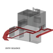
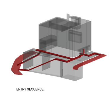
The moves indoors avoiding the center, you enter a room on one side and the other is usually out without interfering with the movement, their environments weave through this “asymmetric symmetry” constantly challenged by the movement of those inhabit the Villa.
To make life easier for the inhabitants of the house, plus the many stairs, the house has an elevator.
Exterior
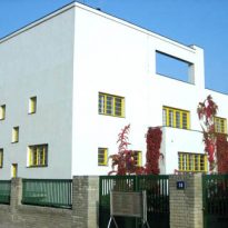
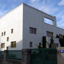
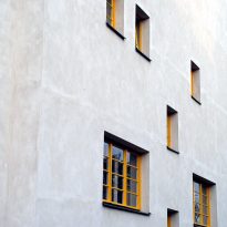
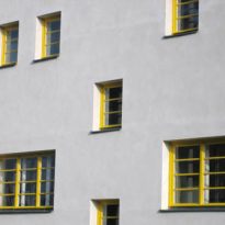
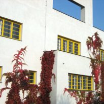
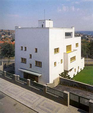
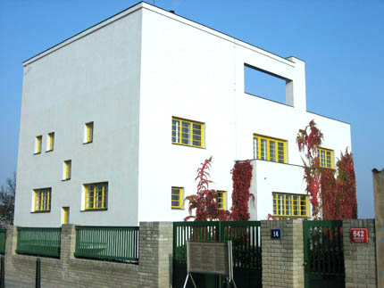
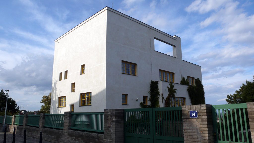
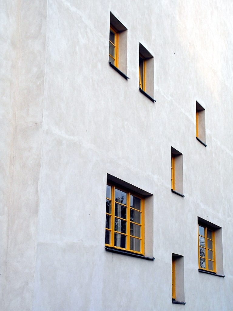
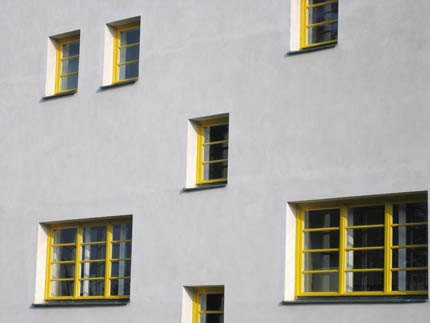
The house is surrounded by a solid brick wall topped with metal bars, with an entrance hidden from view until as we near the porch appears sunken in dark colors. Looking ahead, the driveway is located to the right of the house. From outside you can see the uneven distribution of the windows, which correspond to the rooms.
As is typical in the works of Loos in the entrance porch has symmetry as compositional element, the gateway to housing is displaced to the left, in the center is a large banking and on the right by a trap door which allows entry of firewood and coal, the latter somewhat hidden door and high.
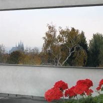
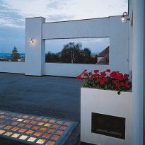
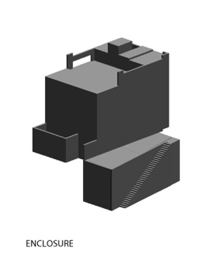
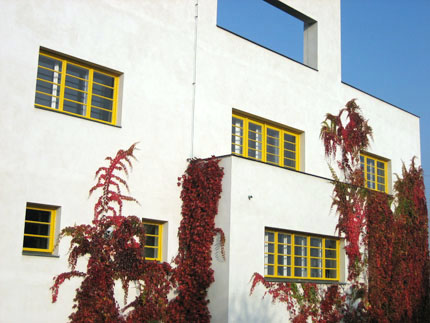
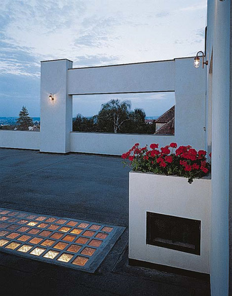
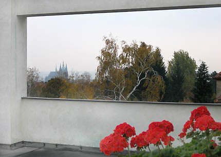
Villa Müller is distinguished by its cubic shape, with flat roof and terraces, irregular windows and clean white facade, a volume drilled austere bare necessities, where domestic requirements need to protect what’s inside. On the top floor, the terrace has a “single window” in the wall to frame the view of the cathedral of Prague. It has also placed a shower and can be seen from outside the elevator cage.
The garden design was a collaboration between Loos and German landscape architects Camilo Schneider, Karl Hermann Matern Furster.
Interior
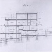
Spatial planning was inside where Loos was more innovative. Villa Müller is Loos’s view, the best application of spatial or “Raumplan”:
“My architecture is not conceivable for drawings, but by spaces. I do not draw plans, facades or sections… For me, the ground floor, first floor, there are… Only continuous and interconnected spaces, rooms, corridors, terraces… Each space requires a different height… These spaces are connected so that the rise and fall not only imperceptible, but at the same time functional. ”
Loos uses different levels of care Raumplan to create “architectural promenade” outside-in. Separated the area reserved for the family of the staff and by using their Raumplan stairs that connected the living room, the dining room, the cabinet of Mrs. and bedrooms
Inside, Villa Müller is both traditional and original on the outside. The materials are warm, rich and comforting, and the furniture a deliberately eclectic mix of traditional styles.
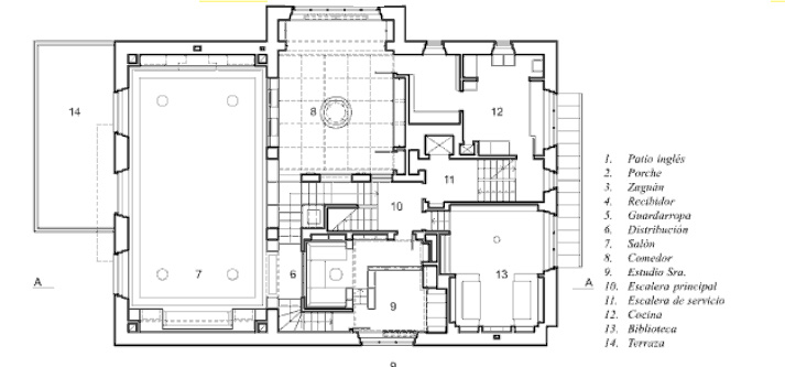
- Zaguan
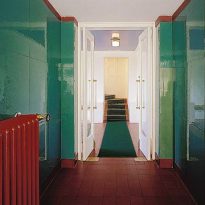
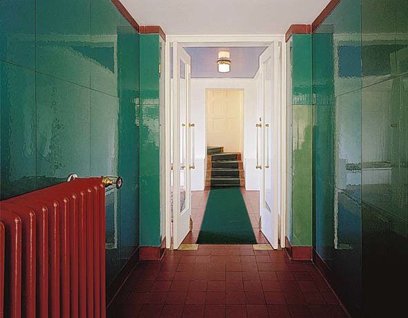
This is small and dark green. Service connections are arranged laterally in order not to interrupt the visual axis that leads into the hall.
- Receiver
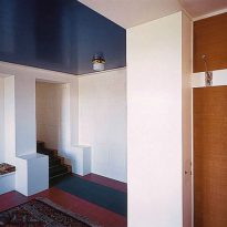
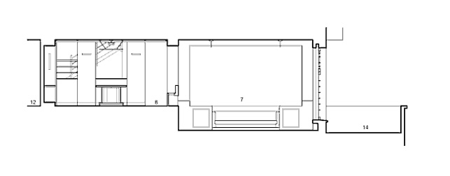
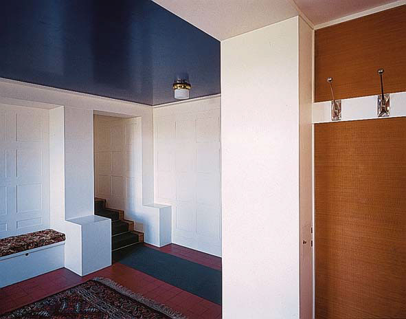
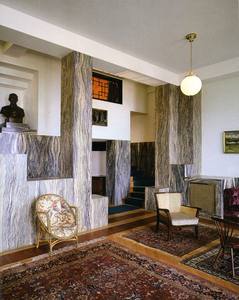
The entrance opens onto a spacious wardrobe, with white walls and a large window, always at the same level. In the background a modest turning staircase leads squarely to the living room on the second floor, ending between marble pillars in a spacious double height.
- Main Lounge
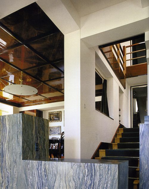
The tour continues past the stairs to the dining room upstairs. The unusual Raumplan overlooks all rooms.
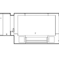
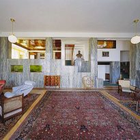
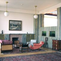
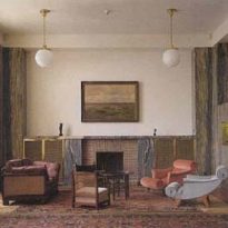
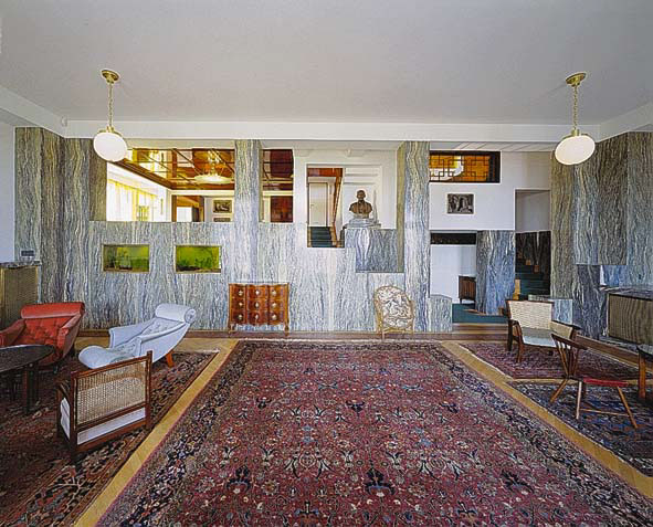
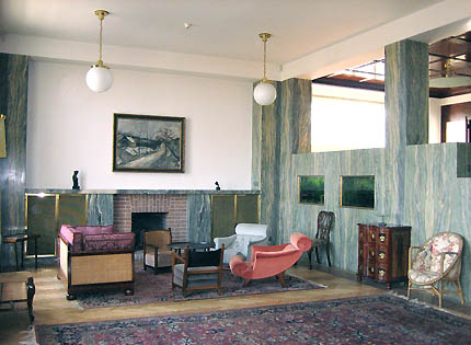
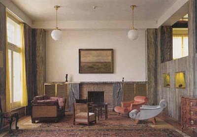
The living room is the center of the cultural life of the family and his circle of friends, with a height of 3.80 meters occupies nearly a third of the surface of the ground and is surrounded by three of the facades of the house in a which looks out onto a veranda. The composition of the Board is an example of the architect’s original concept in creating spaces. It is connected to the dining room, a lower level and with the cabinet of Mrs. accessed by a spiral staircase, has a fireplace
Spatial Conception
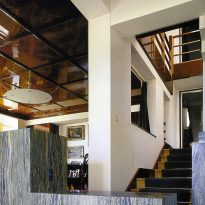
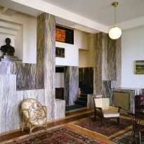
The salon open staircase continues to the upper floors. The realization of this conception of space allowed reduction to an entire wall pillars load, thereby creating a space unusual, visually rich and articulated. Perforation of the wall is also a resource that allows the green marble expose all their expressive power on the side where it was placed.
- Living room
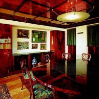
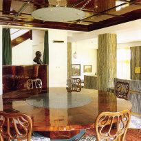
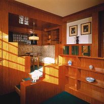
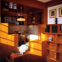
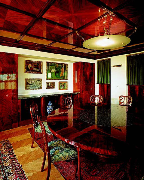
The dining room has two walls open to the living room and to the stairs leading up, interior is in contrast to the brightness of the room dominates the sobriety of mahogany wood. In one of the two solid walls cubes deep allow placement of decorative items.
There are three orthogonal axes that define the geometry of square, one of them is the opening to the living room, other links to the geometric center of the reading room of Mrs. Muller and a third axis is materialized in the center of fixed dining table on which a circular glass diffuses light four lamps creating a common vertical tension.
- Ladder
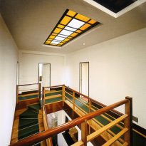
It is the first time combines Loos French guy living with an open staircase, which seems to pierce the back wall. The staircase leads to the upper levels via a stairwell that receives daylight through a rectangular glass placed on the terrace.
- Kitchen
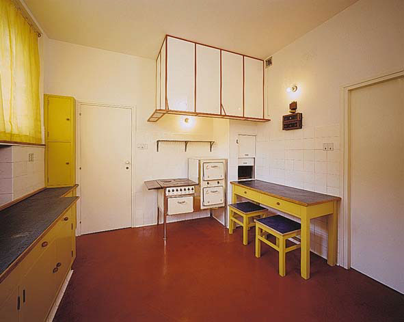
Kitchen was too modern for the time, represented the “kitchenette” in which the hardware has been designed to facilitate the preparation of food and family make the service as easy as possible.
- Cabinet
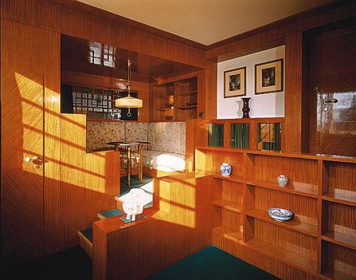
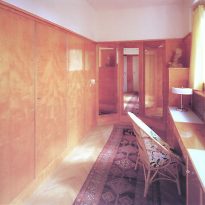
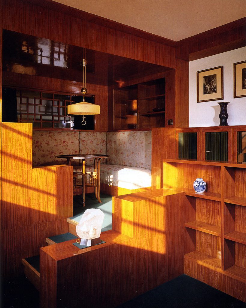
The cabinet is the most articulate room of the house. It consists Loos relatively small room under the principles of “Raumplan”. The horizontal divided into two levels: the upper has a narrow passage leading to a niche-corner, with seating, where the lady of the house could pass the time with friends and balconea the second lowest level, conceived as an expansion of the stairs coming from the living rooms and through which you access the cabinet.
From this corner of the house there are two visual fields that go beyond the enclosure itself: from the bench top level cornerback projected visual outdoor lightning, diagonally across space and from the point of entry is the living room otea and from the outside it again.
- Higher plants
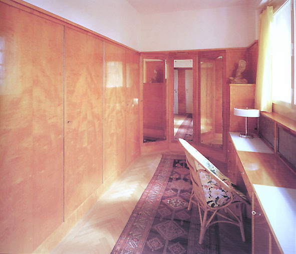
They distributed the bedrooms, the master with dressing as a man and woman, the children painted with bright colors, yellow, blue and red soils that matched the color of the radiators, the photographic darkroom, bathrooms and the library.
The house had plenty of outbuildings for domestic service that the family had Müller, a boiler room and a garage for two cars.
Structure
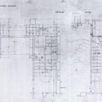
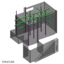
Due to the size of the work and the discontinuity of the structure caused by the central void of the stairwell, the first pillars designed in preliminary projects were replaced by a more complex structural design.
The common columns were replaced by four concrete columns distributed in a rectangular cage around a central axis. Two of these pillars square surface in the room, the other two are hidden from view, one integrated into the elevator shaft and the other on the wall thickness. This displacement of the structure and treatment in the work of Loos, in many ways undermine the classic status of the structure. The remarkable way to distribute the columns, beams and perimeter walls burden Raumplan platforms is not understood as a system, the structure has no internal consistency and external presence, each spatial element is articulated as an independent tectonic unit, although related thereto, as often happens, add nonstructural pillars or beams to maintain visual stability of the room.
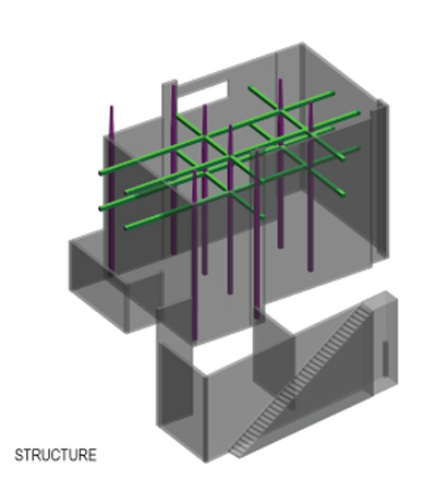
Geometric arrangement
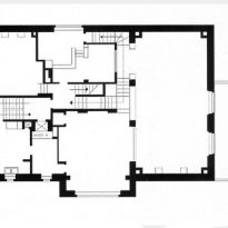
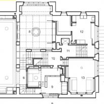
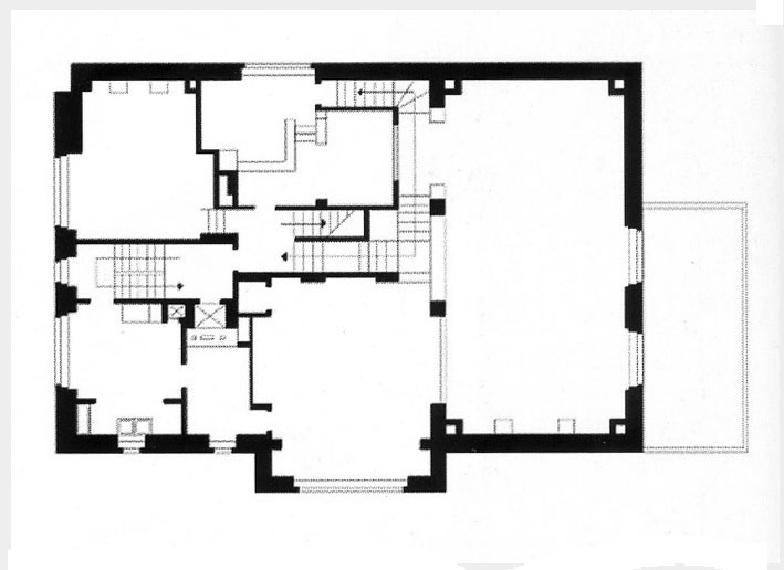
The plant is divided into six large rectangular modules, 2×3 meters, the dining room is for one of them, including the perforated wall and the living room two others. The square section pillars modular unit functions as a low, 46×46 inches and is present throughout the house. With respect to this measure, the proportion of the room is 22×12 and 24×36 overall plant meters.
On the regularity of this template there are small offsets which are almost always side with the dimensions of the pillars, as the axis of the room and the entire plant that does not coincide with the axis of the central staircase or the axis of the facade access, requiring a setback in the edge small volume external to maintain symmetry.
The axialidades, present throughout the house are permanently distorted by the entrances to the same back to regroup or transforming and creating a dynamic symmetry and in constant motion.
Materials
The design space was completed with luxurious marble and stone finishes, such as stone trevertina used outside the entrance, wood and silk, combining innovative architectural design with the cultural conception that the upper middle class of herself.
In the main hall used variegated green marble cipolino to cover walls and columns, mahogany wood in the dining room, Delft tiles in the library and lemon wood for the cabinet of Mrs..
- Entrance
Here there is also an interesting play of contrasting colors: the earth-colored tiles are dark, the walls painted white with light wood paneling. The space is complete with a deep blue ceiling
The room includes a wardrobe with pegs and mirror set in a spacious Japanese curtains
- Corridor
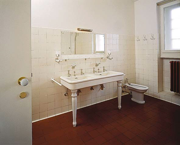
The corridor is notable for its unusual harmony polychrome tiles of opaque stained green, terracotta floors and dark colored friezes. Loos considered that the technical elements should not be only functional but also deserved contribute to the aesthetic appearance indoors so placed red radiators deliberately in a visible.
- Kitchen
The kitchen faucet was extremely modern for its time. The furniture, softwood, were painted yellow, had a dumbwaiter linking the kitchen upstairs. The limited storage space in the kitchen were reinforced by a large pantry and a large number of shelves in the basement.
Furniture
- Armchairs
Loos also designed some of the furniture, two armchairs and a similar and unusual aspect placed in the living room. With velvet sleeves and contrasting colors, olive green and a little more for the homeowner and rose for the lady.
- Mesa
The centerpiece of the living room was a round table set mahogany granite with a gray center rests on an octagonal leg, could be expanded by inserting one or two leaves with diameter of 170 or 230 cm, with sufficient capacity for 12 or 18 people. Several types of seats are concentrated around the table.
Video
