Villa dall’Ava

Introduction
Among the architects who try to rework some principles of the modern movement trying to give new answers and trying to set a new architectural language for the cities of the next millennium, Rem Koolhaas is among the most advanced. The Villa dall’Ava (1991) is a clear example.
Initially, the client wanted a house that was kind of an update of the Villa Savoye of Le Corbusier version, he wanted a glass house placed in the field of property, west of Paris. Rem Koolhaas convinced him not to pursue a glass house, but did provide a small sample of the ideas of Le Corbusier and Villa Savoye in the final design.
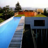
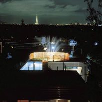
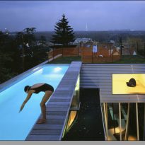
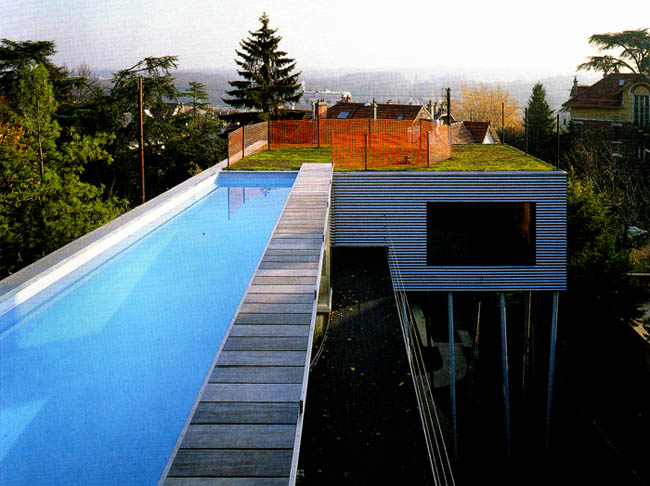
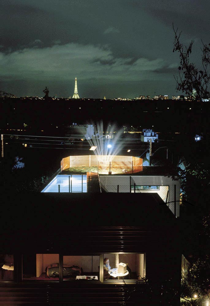
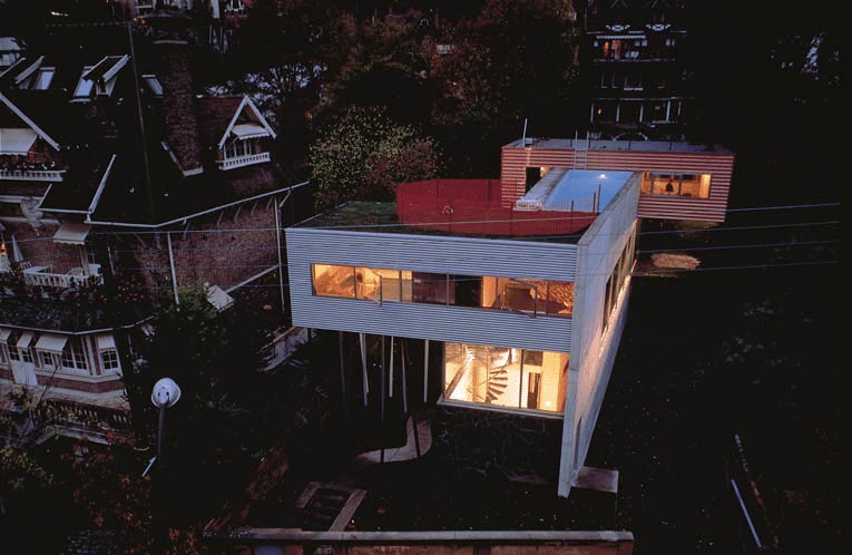
Another customer requests was a rooftop pool, probably seeing this as an upgrade from the roof garden of Le Corbusier. On this point, Koolhaas went a step further, and created a “bridge pool”, 30m2, between house segments.
Situation
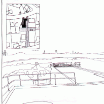
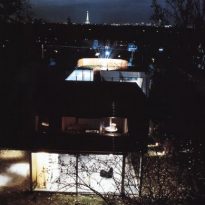
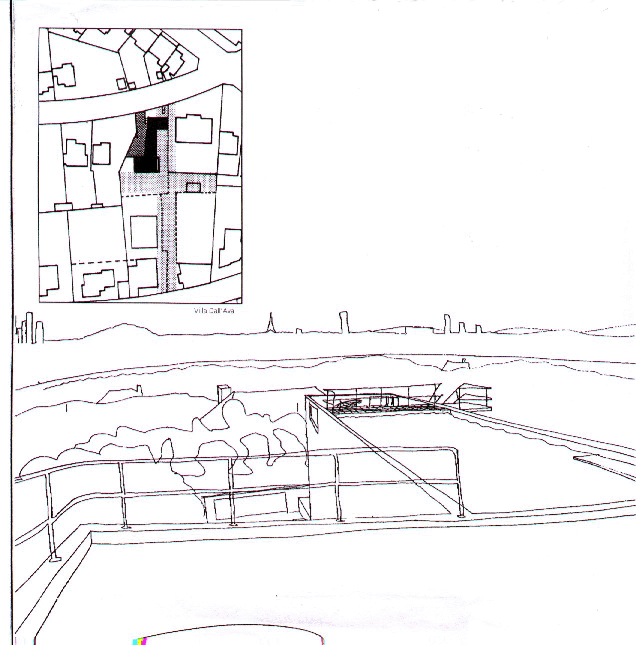
The house is located on Avenue Clodoald, 92210 Saint-Cloud, in the residential area of a hill that descends steeply towards the Seine, the Bois de Boulogne and the city of Paris in France, from where you can see the capital, far from their anger or threats. On a street lined slope plums and mansions with large single aspect of solid stone and warm colors.
This neighborhood, characterized by houses of the nineteenth century, provided a unique opportunity to Koolhaas, amid old houses with architectural styles of the past, the new home would be shocking.
Concept

The client wanted a glass house with a rooftop pool and two separate “apartments”, one for parents, one for the daughter. They also wanted a panoramic view from the pool, the surrounding countryside and the city of Paris.
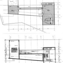
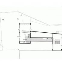
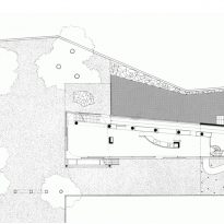
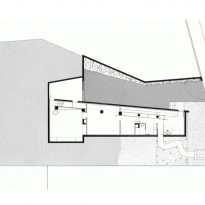
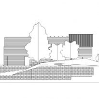
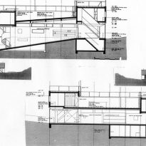
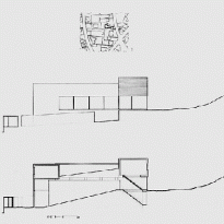
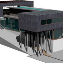
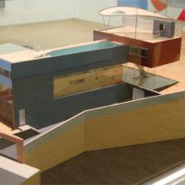
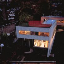
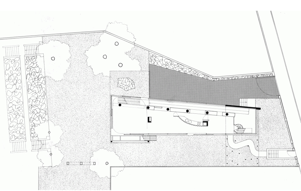
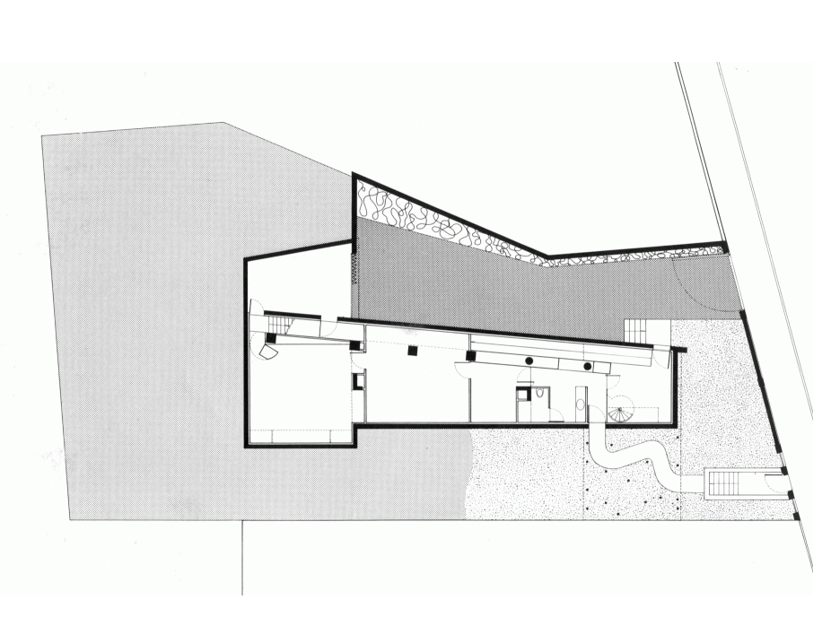
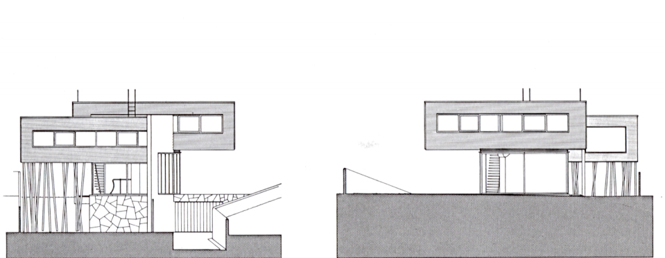
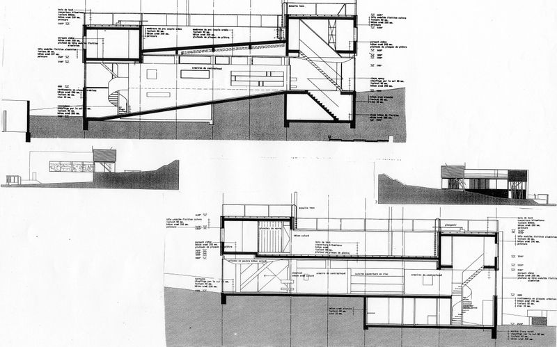
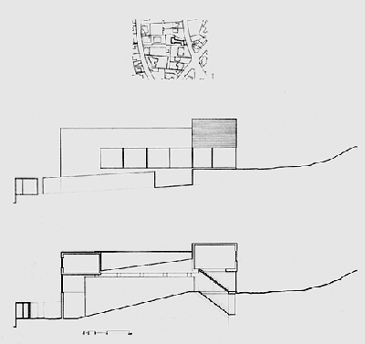
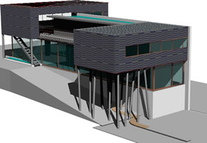
The site is like a big room with a border made of green spaces, garden walls and slopes. It consists of three parts: a sloping garden, the main volume of the villa and garage at street level with access to a cavity. The house is conceived as a glass pavilion containing living and dining areas, with two perpendicular apartments moving in opposite directions to take the view that seem to float. They pool, which is supported by the concrete structure covered by glass pavilion added.
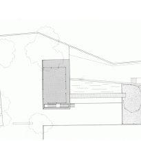
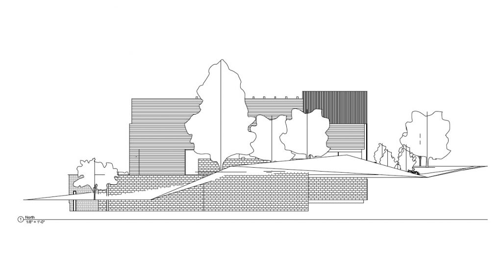
The architectural choice was determined by the significant influence of the built environment and landscape. Thus, in order to preserve the visual relationships and control the complex correspondences between the architectural present, it was decided to divide the land into three strips, oriented east to west. The first partition, defined as a garden, is part of the continuity of the range of the upper plot and lasts until the pedestrian entrance. The desire to preserve a strip not built at the bottom of the solar set the idea vacuum cross, and evaluate new neighborhood relations. The second is the longitudinal strip the building, and the third, asphalt, allows access to the garage. The main volume of the building is placed in the axis of the plot, grouping the bedrooms on the upper floor in two volumes perpendicular to the main body. The decks offer a panoramic view of Paris.
Collection of stereotypes
The look is repossessed by the movement of this dynamic and unstable architecture. All the stereotypes of modern architecture are there, all the topics of the vanguard. But a little displaced, abused in a mannerist collage that leaves chains without breath, dissonances tightly controlled by a large extremely free artist, who laughs in a stern tone of dogma or set of solutions too.
Spaces
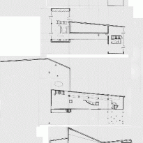
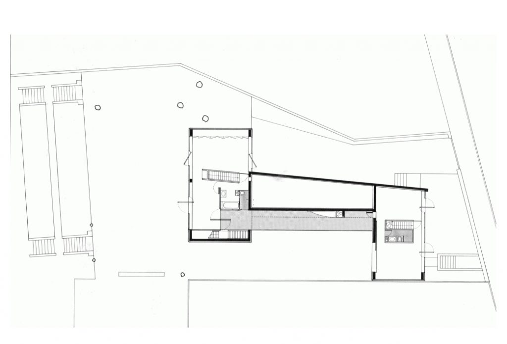
This house is inhabited by a couple and their daughter. First we can say that the house has a well marked division between what would be the social area and the intimate area. In fact we can notice in the distribution of these sectors located on main floor and upstairs respectively.
Access
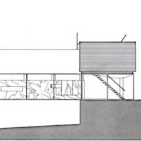
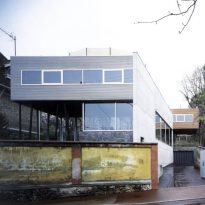
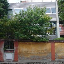
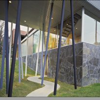
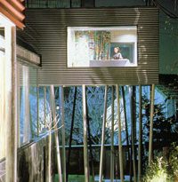
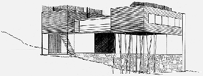
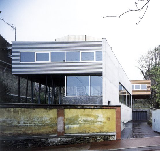
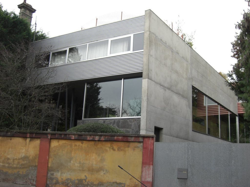
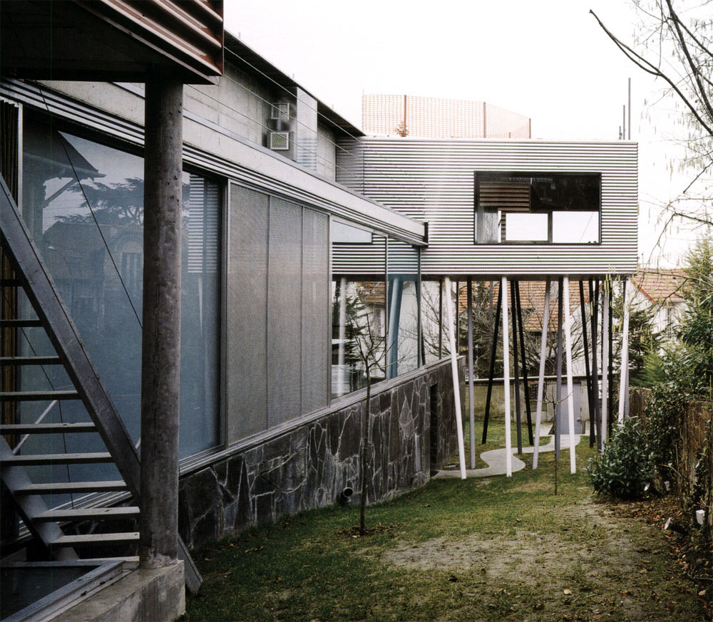
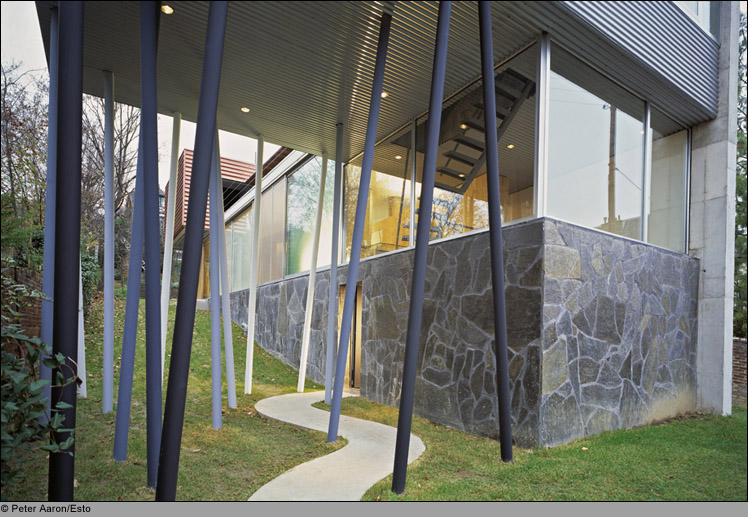
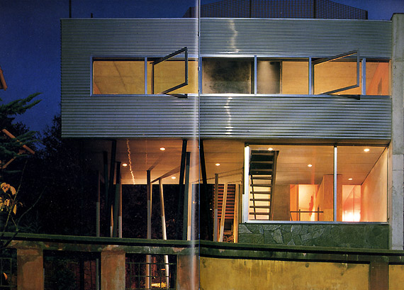
The architect has retained along the sidewalk of the old wall cloth on which now stands a strange case of a corrugated sheet metal gray. Smooth metal door once past, a curious object is discovered: the box is cantilevered, supported by a fortnight of thin steel pillars that seem to hesitate. A narrow concrete road sinuously glides through the grass.
A second steel door opens in front of the basement, flat and surrounded by dark slate. It is a relatively narrow entrance. By giving a quarter turn to the right leads to a black marble tiled space, uninhabitable, apparently without any other particular than being spacious function. In one corner is a metal spiral staircase, which turns around to the left and here you see a long and very narrow inclined ramp. Truly it is not a dealer, let alone a corridor. It is rather a processional space.
Main Floor
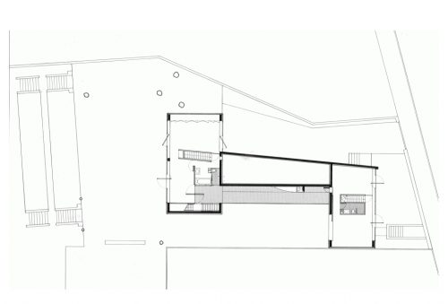
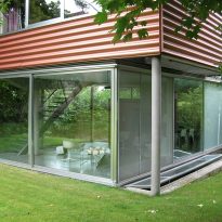
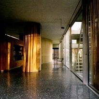
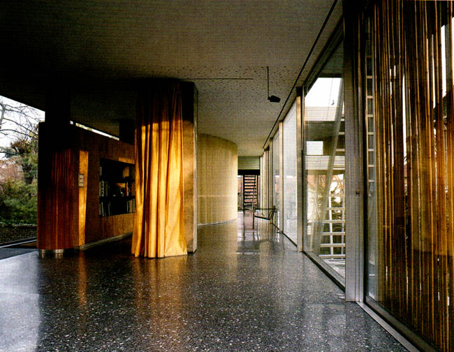
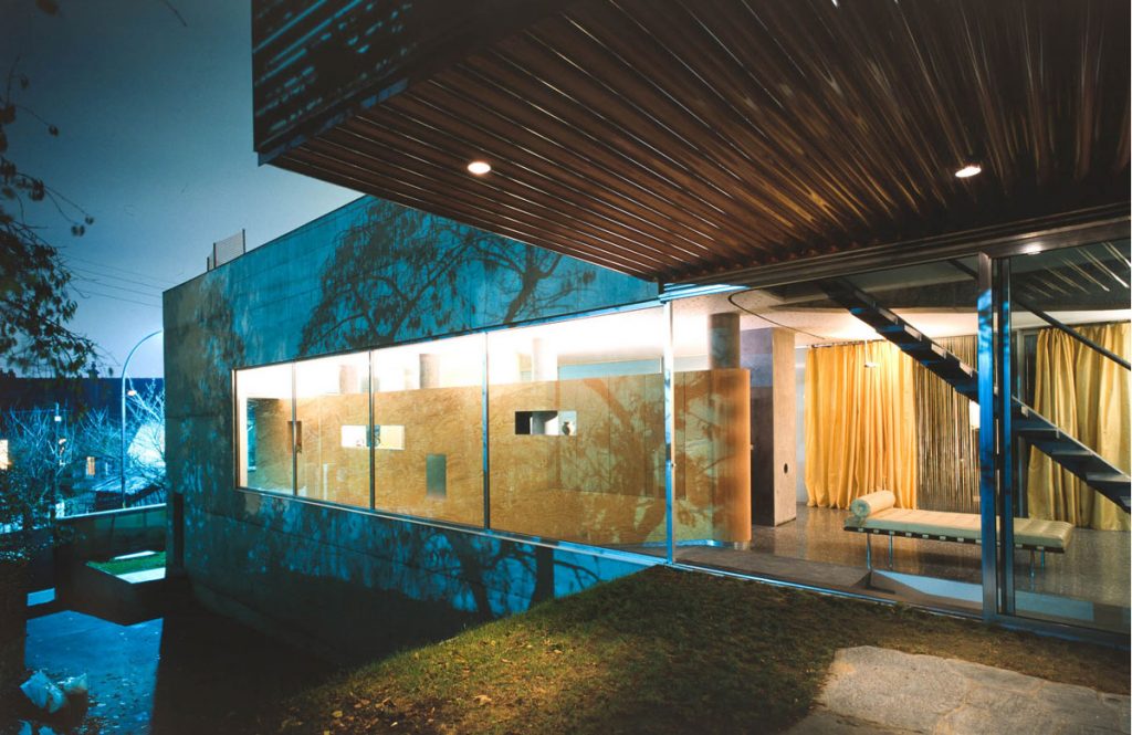
The idea was to create on main floor with a social area which were remarkable feature given the fluidity of space that allowed simulating thus, a “continuation of the park inside the house”. For this reason we note the almost total absence of furniture, in fact, the small amount of furniture is oriented longitudinally (along the lines of the side walls) so as not to set limits marked. In turn we can highlight the presence of large windows around its perimeter which makes the “internal – external environment” relationship.
- Dining room

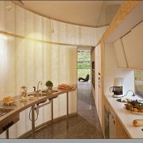
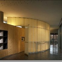
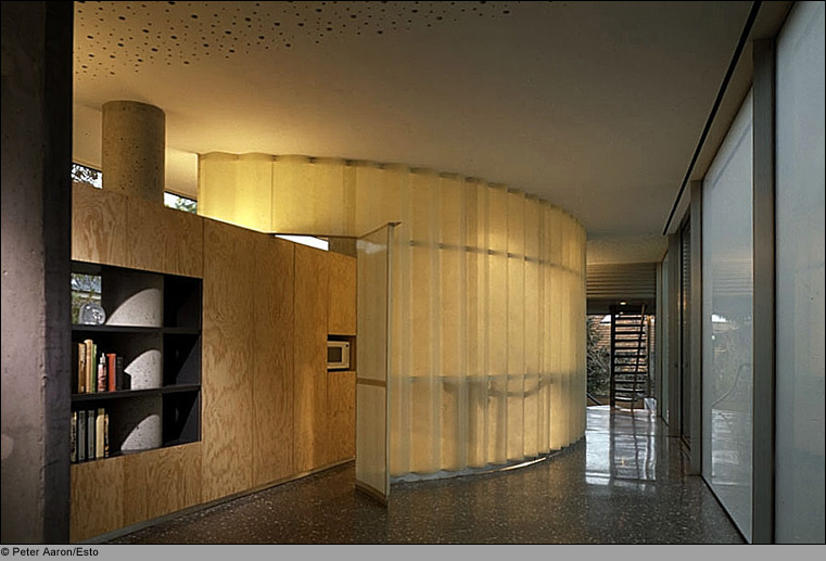
The sector is the lounge and dining room is able to perform a multitude of activities given its fluidity and lack of boundaries. In a middle section is the kitchen located in a place of “step” whose only limits are given for wood furniture arranged longitudinally and a semi-transparent “skin” that accompanies the curved line of the counter.
- Park
As previously noted, in the house there is an area for public use consisting of the ground floor and private sector use consisting of the bedrooms. In turn we can add the accession of the park to public use area because of its “introduction” in the internal environment through the large windows (living room and garden are one, due to the presence of sliding windows). In general, from our point of view, we believe that the house has been made almost exclusively for internal use by family members. In fact we found a very pleasant public sector, due to the lack of places for the meeting or service spaces, since the only place providing the space itself is the kitchen, which is at the dining room service.
Second floor
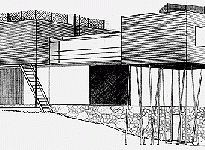
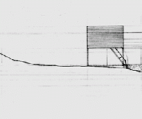
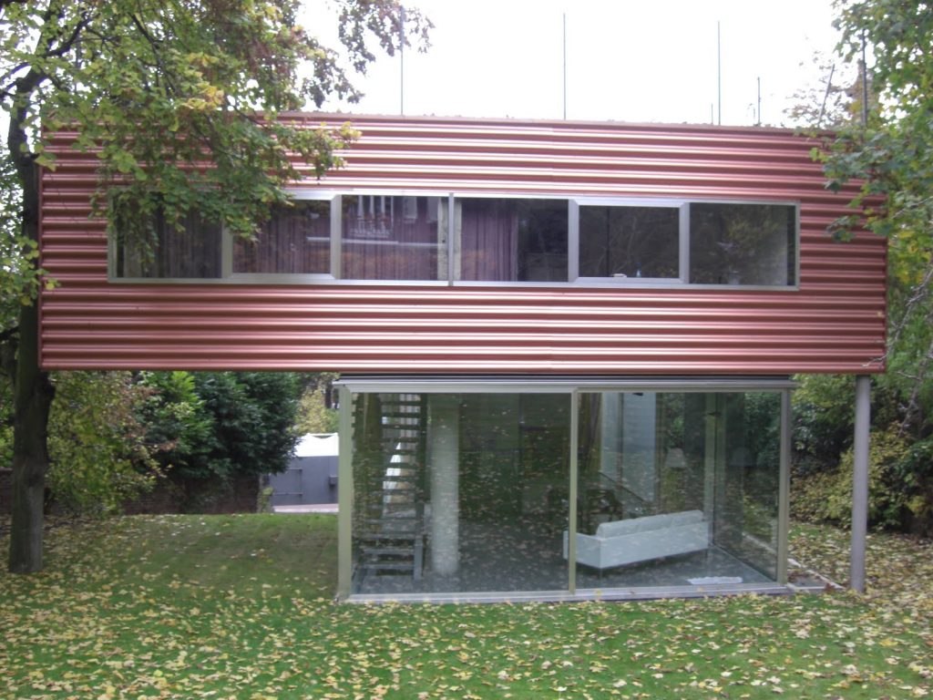
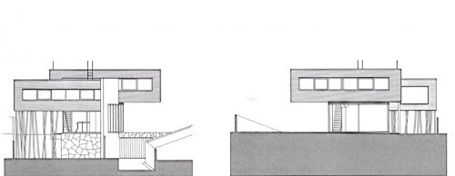
The apartments cantilevered beyond the central volume hovering over the garden. Referring to the intimate area, we can say that we also note a well marked between the two bedrooms, so division, the bedrooms act as individual departments, so as each of them has its own area of services and a staircase that allows access independently from the main plant. On this floor there is the presence of two bathrooms, one serving each room, located in rectangular volumes retracted behind the exterior walls.
- Bedrooms
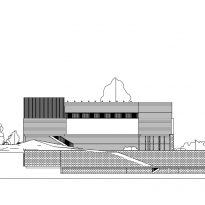
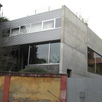
The first bedroom on the street is for the daughter. The second to parent and is located on the living room. Moves to the other side of the line of the wall, on a ledge amazing. Every detail of this construction is contrary to common sense and baffles. The severity of construction, the heaviest part is located on the top floor, defying the laws of physics.
Regarding the bedroom consider not meet other specific function given its distinct separation of the social area.
Structure
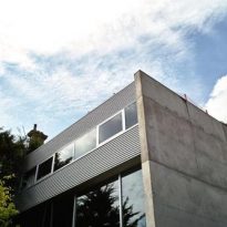
The house is well regulated by the thick concrete wall that is located longitudinally on the lot, one end of which is located one of the boxes, leaning against, the other stands astride where it disappears. The wall acts as a powerful lever, the rest is just movement, including garden indeterminate spaces that seem to be part of the living room. With this arrangement the system produces all kinds of vertical compressions struggling against the powerful interior columns, partly masked by the fitted line separating the ramp from adjoining rooms. These compressions are resolved by the horizontal expansion of the glass walls. Spaces spilling outward, or seize him, to such an extent that the boundaries between inside and outside disappear, like the uncertain balance between up and down.
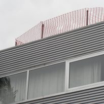
The game covers offers another illusion that merges with the sky, there is no parapet or on the roof garden, or the elongated pool, it is not to a space to vertigo sufferers. As throughout the villa classical concepts were eliminated, the manifesto of a new era shows exultant face of changing times.
Similarities with the Villa Savoye
The Villa Dall’Ava is not just a residence program that explores and proposes structural and contemporary reinterpretations, is itself a collection of the Villa Savoye of Le Corbusier, which are re-evaluated the five points of the Swiss franc architect:

- Free ground
The freedom with which the program is resolved, is the result of inventive structural Villa Dall’Ava system where few pillars and beams solve large loads, a clear tribute to Villa Savoye.
- Free facade
As a result of the previous option, there is a hierarchy in the facades allowing transparency and lightness. It is a contrast between different materials.
- Stilts
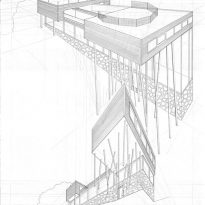
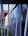
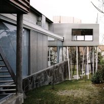
Instead of perpendicular piles of Le Corbusier, Rem Koolhaas uses compensatory “stilts”, reminiscent of the playful designs of British architect Will Alsop. Koolhaas makes stilts metrically arranged in music. A forest of pillars vertically angled in different ways, serving to support volumes upstairs.
- Terrace-garden
Like the Villa Savoye of Le Corbusier, the prismatic volumes have a beer garden, connected by a large pool of 30m2. The cover generally unusable, is treated as a facade, allowing beautiful views of the city.
- Windows in row
The bands of windows are both prismatic volumes and planes that cut the house, surrounding it. The nature of the environment falls interiors. The continuity of the coating in the apartments upstairs is only interrupted by bands of windows.
Materials
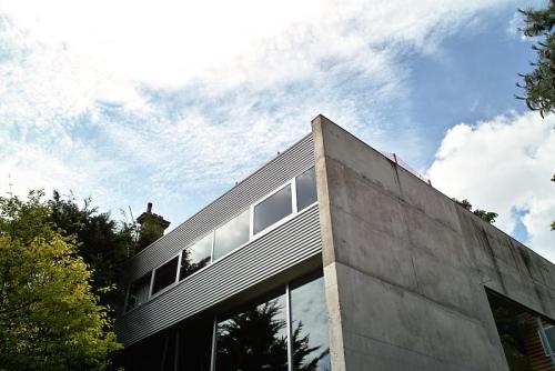
The main materials used for the structure were reinforced concrete and steel columns. The cladding slate, concrete, corrugated aluminum or copper lacquered, polished anodized aluminum uprights, clear glass and frosted greens.
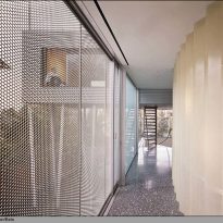
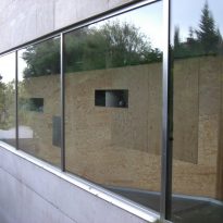
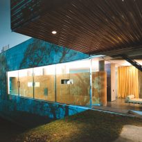
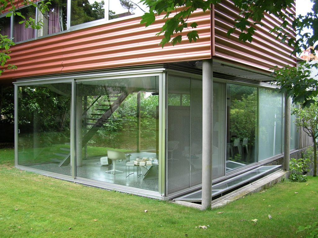
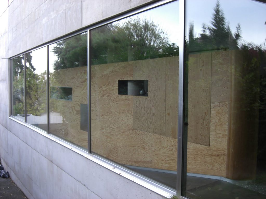
Large glass windows pierce the concrete walls at garden level making the living spaces seem totally enveloped by nature. The glass walls create a permeable barrier between the inside and outside that slides completely open to the garden. Although the perimeter of the villa is found almost closed glass at garden level full, is not completely transparent in all sectors. The south facade is closed with transparent glass and sandblasted, hiding a part of the living room, but allows the passage of light.
The minimalist kitchen is hidden from the outside, hidden behind a translucent wall curve within the public space.
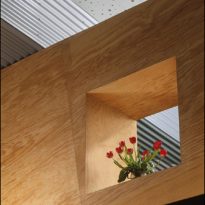
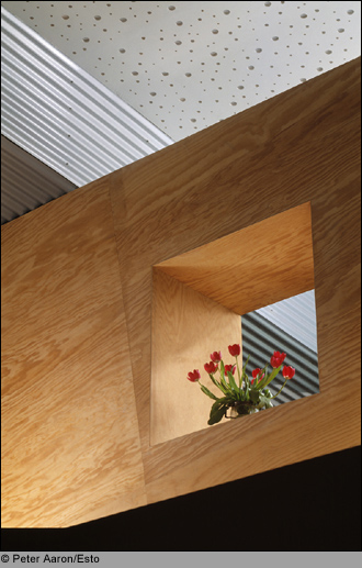
Along the north side, a thickened plywood partition spaces darkens family life. Only the elements of movement, occupying the space between the wall of wood and glass facade are visible from the outside.
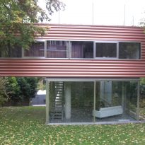
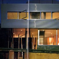
A narrow concrete ramp leading from the entrance to the garden level, and cantilevered steps provide access from the living room upstairs.
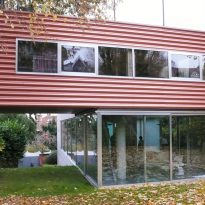
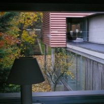
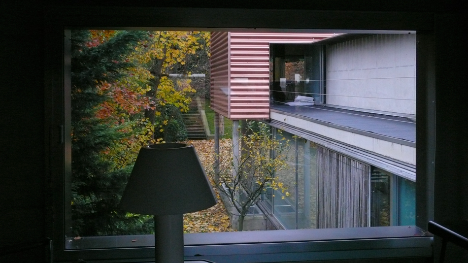
Independent apartments upstairs are clad with corrugated aluminum contrasting shades, one with an aluminum finish and one with a copper layer of lacquer that gives it a reddish hue. The corrugated plates are oriented horizontally, reinforcing the orientation of the apartments in contrast to the central volume. The material covers the bottom of each box apartment, even extending through the interior, emphasizing reading volume on the surface. The staircase, which ascends from the public space above the apartment seems to slip through an opening in the volume of continuous aluminum.
Thin steel columns painted in black and gray tones support the higher of the apartments upstairs, overlooking the street facade.
Related Books
Video
