Vanna Venturi House

Introduction
In 1962, Mrs. Vanna Venturi instructed her son, the young and promising architect, Robert Venturi, the project of a house in Chestnut Hill (Philadelphia). This house, although one of his earliest works, is complex and contradictory in both formal and functional aspects and soon became a platform from which Venturi achieved international recognition.
Location
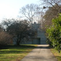
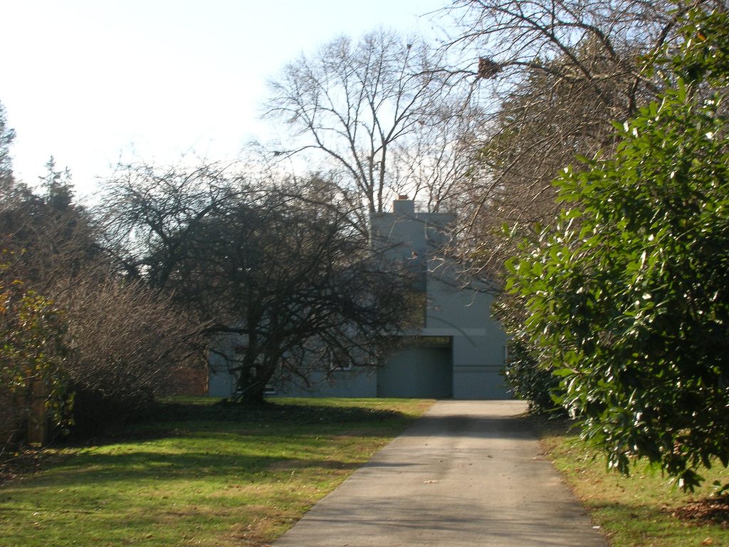
The House is in Chestnut Hill on the outskirts of the City of Philadelphia, about 15 miles north of downtown.
Concept
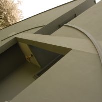
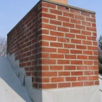
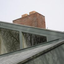
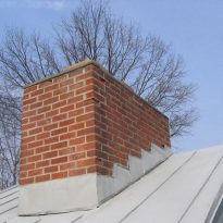
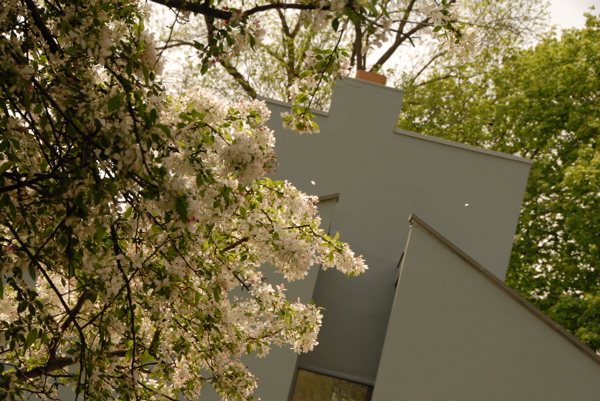
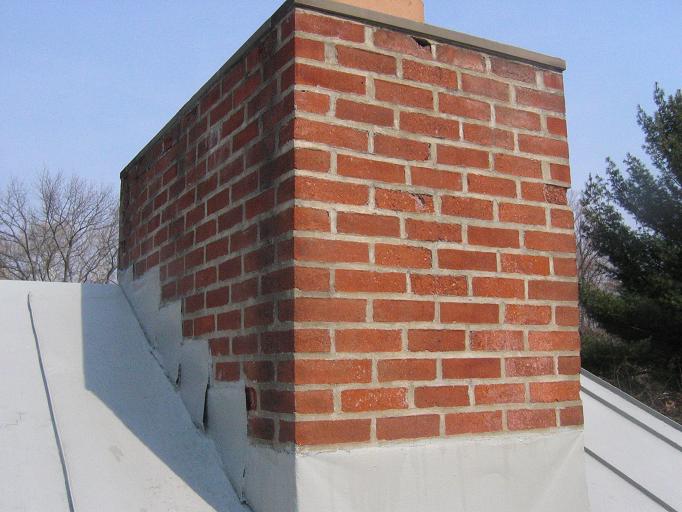
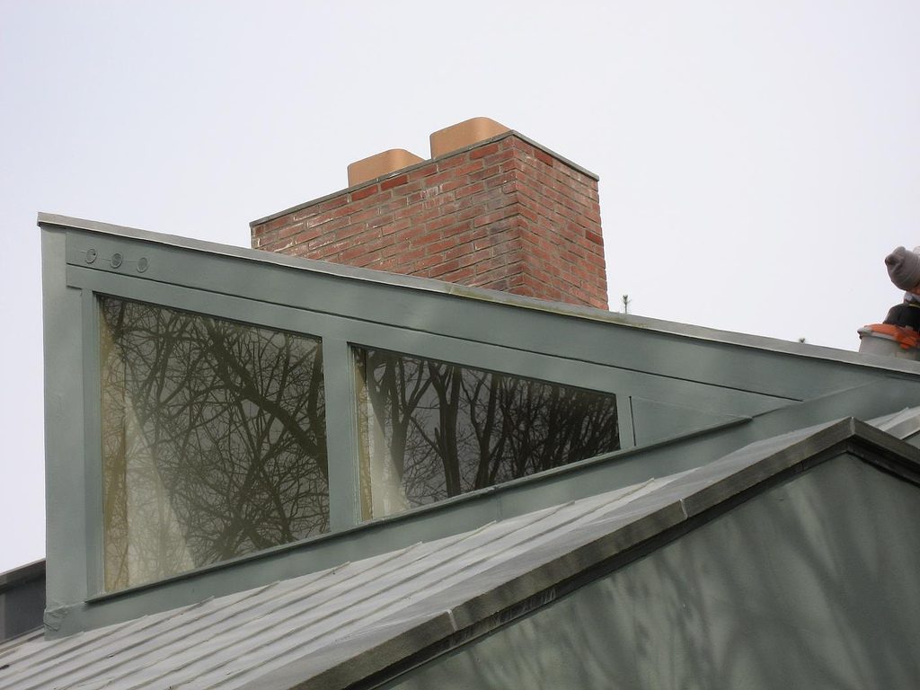
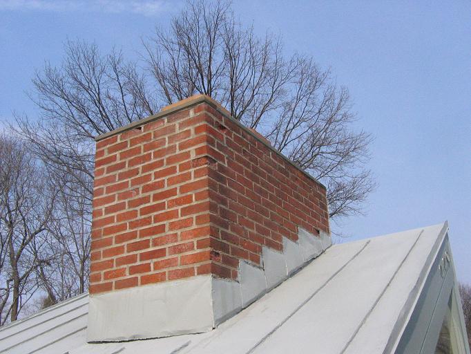
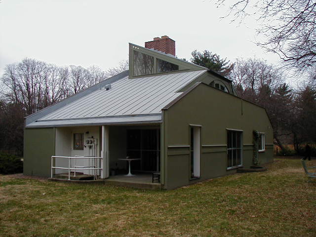
In this work embodies his theories Venturi Complexity and Contradiction, using modern resources toward purely as collage, quotation, and even irony, eg diverted from the chimney shaft, quotes a Greek pediment on the façade, and so on.
During the same time when this work was constructed Venturi worked on one of his best known “Complexity and Contradiction in Architecture”.
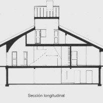
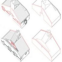
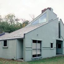
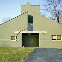
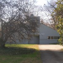
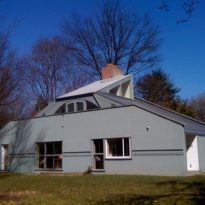
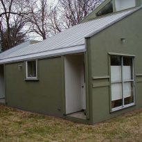
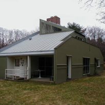
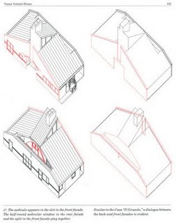
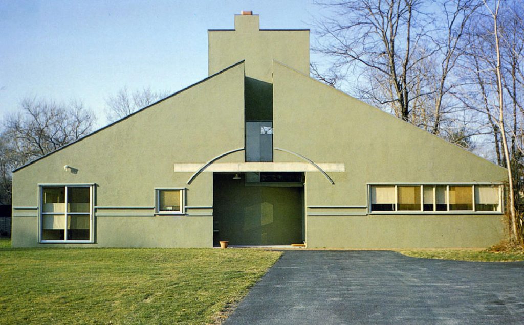
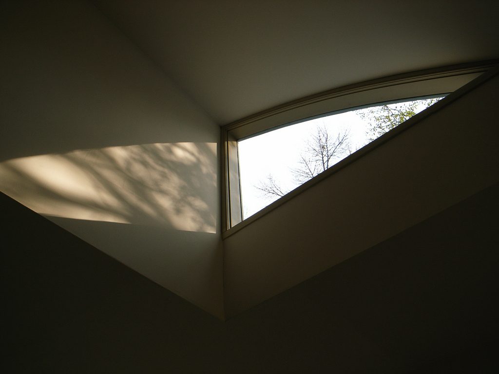
The house has a uniform appearance, even simple and symmetrical. However, between that appearance and compositional center sets a series of changes, geometric changes and unexpected routes. His unit concept is not, after all, an instrument of historicism, but, as he said, understanding of the silhouette as a whole.
It represents in simplified form the image of home that we have in memory. Robert Venturi used to say: “The House… is Home”.
The same urban rescues Popular Culture, because the volume of the house, playing a popularly accepted model home.
Spaces
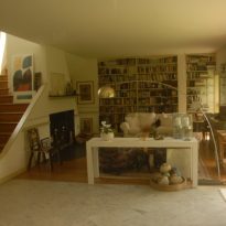
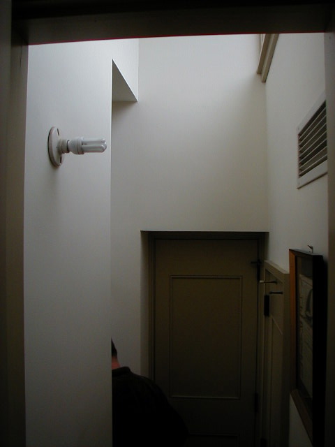
Small, yet large scale, its spaces are very complex, both in form and in their relations.
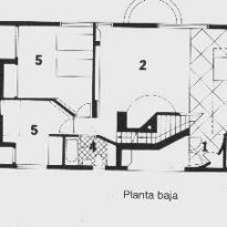
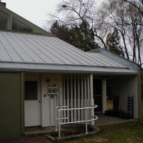
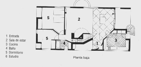
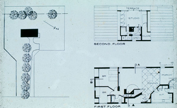
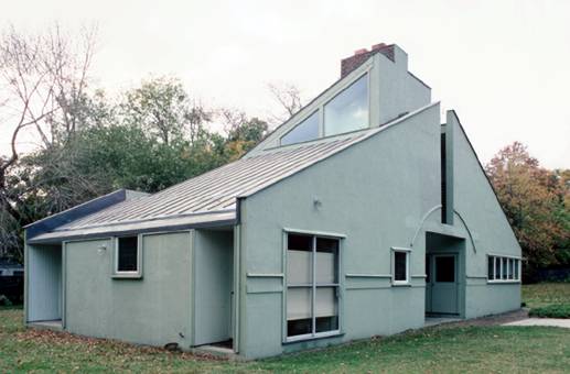
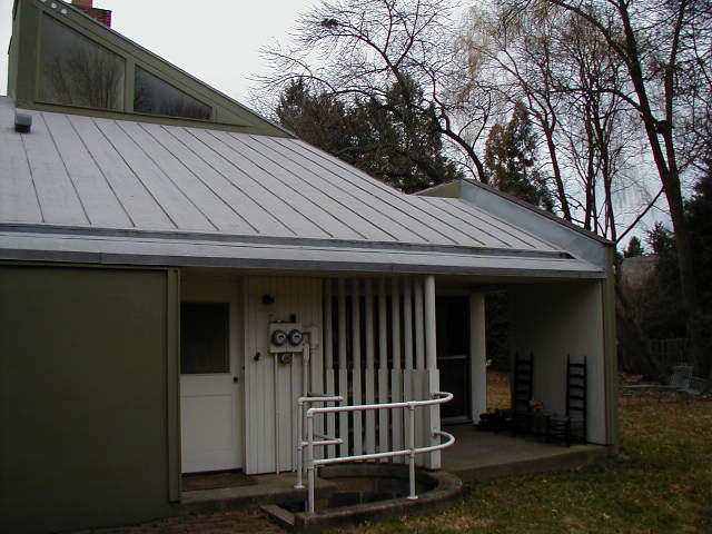
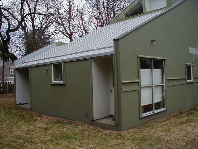
Access is difficult to identify, ie it shows a typical porch, but no access, which is located on the sides of it.
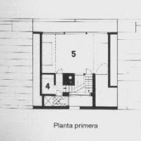
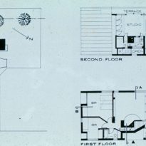
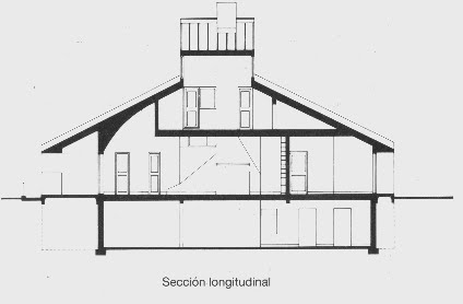
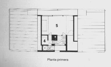
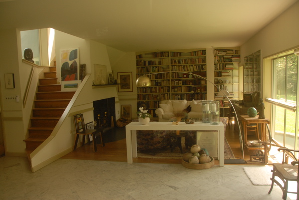
The ground floor contains entrance hall, dining room, kitchen, two bedrooms and bathroom. Top floor has a study, a small health center and two storage areas.
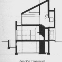
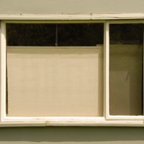
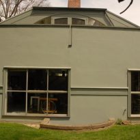
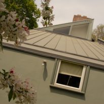
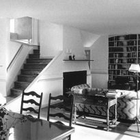
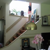
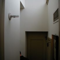
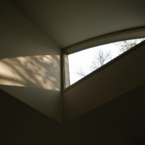
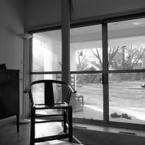
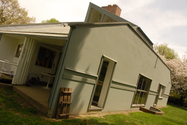
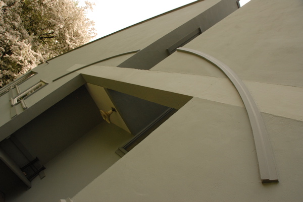
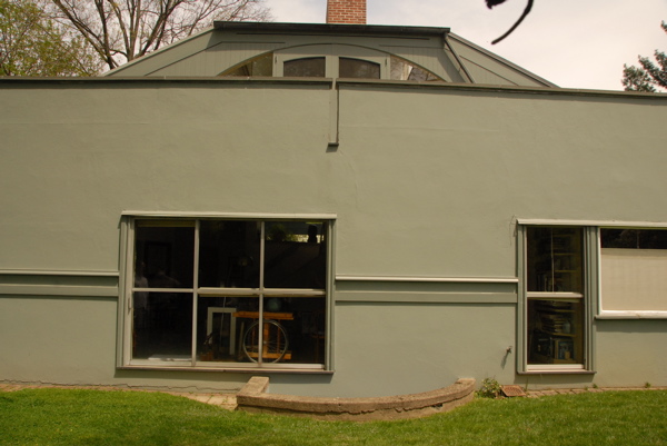
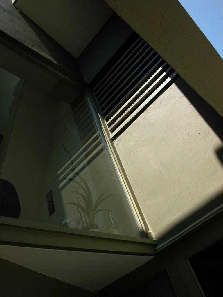
Outwardly the house shows its function. There are resources that challenge laid consistency of the modern movement, complex and contradictory as access, staircase and fireplace, the arrangement of the bedroom doors, etc.. Besides we can see the appeal of the citation and collage (the window is quoted verbatim from Rossi, the long window typical of Le Corbusier in the modern movement and the chimney of Frank Lloyd Wright) and how these elements from different backgrounds, live in the same work, one can speak of collage.
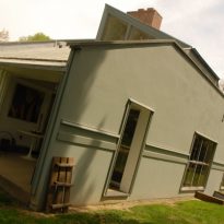
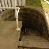
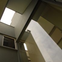
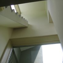
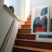
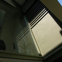
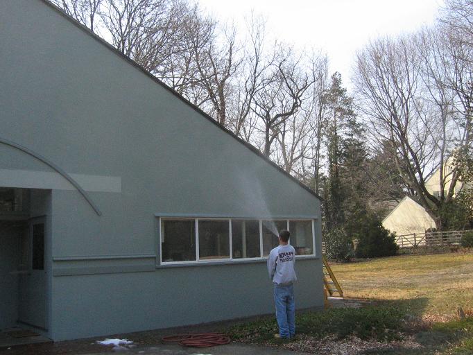
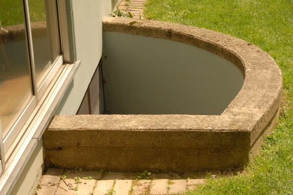
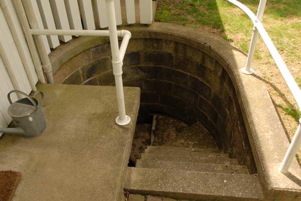
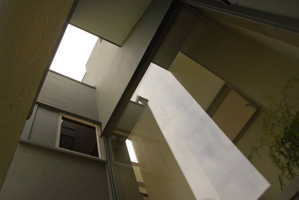
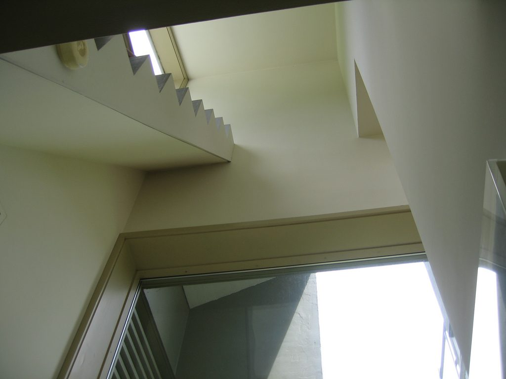
At the bottom the ladder is extended to facilitate the function of seat, but in his latest installment follows a wayward course to nowhere, as it does not reach any point of arrival, losing any functional relationship to become an element made extravagant and lacking more than practical help to clean some windows and store objects in the tank.
Structure
Brick Masonry plasters, both exterior and interior, covered with veneer and wood mezzanines of lathing.
