Van Gogh Museum Amsterdam -Enlargement

Introduction
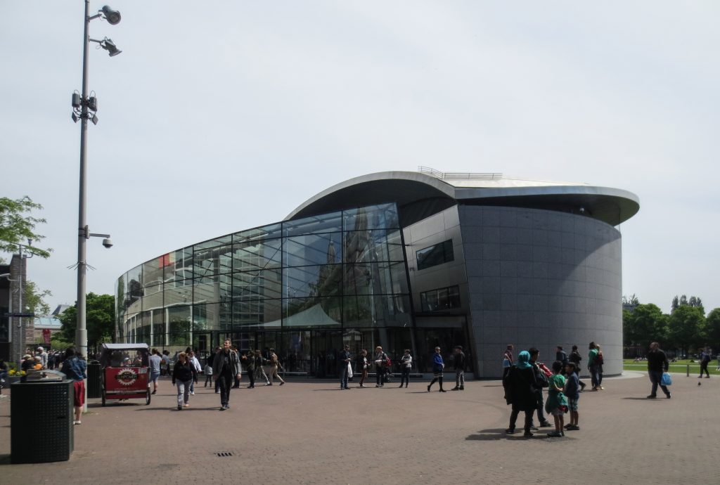
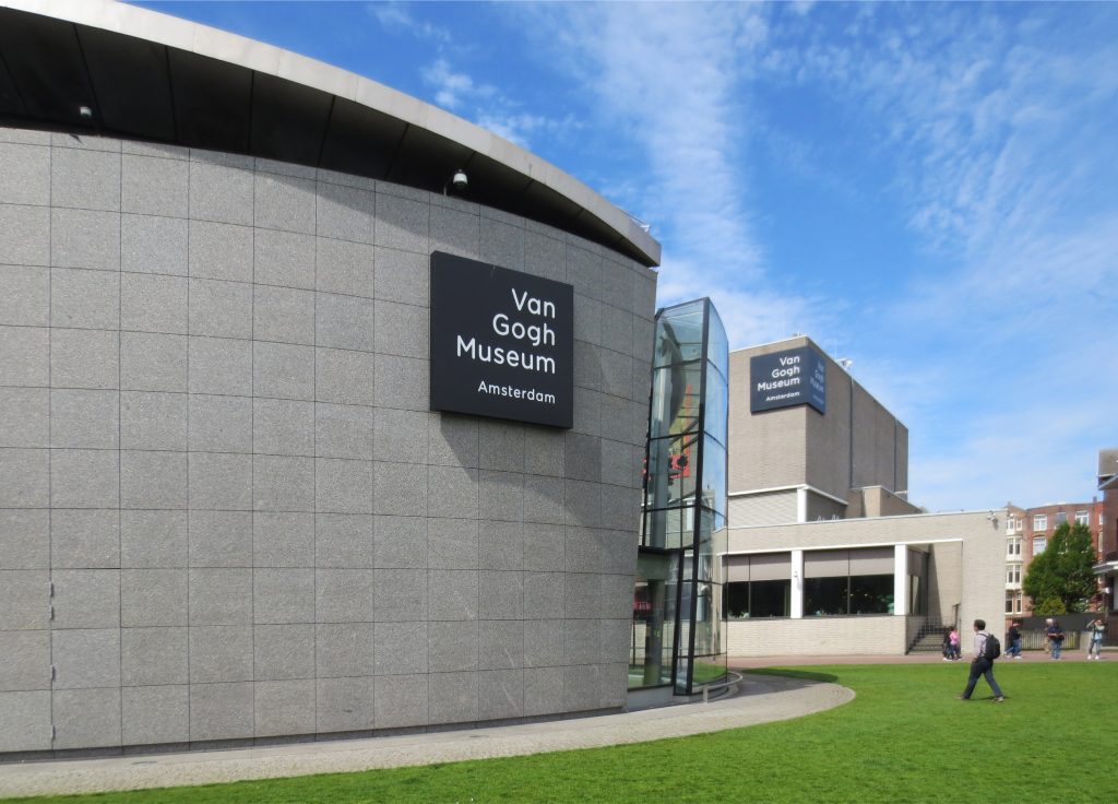
The current Van Gogh Museum in Amsterdam consists of two buildings, the Rietveld one and the Kurokawa wing, both connected by an entrance hall. Consistent with the development strategy of the two main nearby museums, the Stedelijk Museum and the Rijksmuseum, which in the last 10 years have been substantially updated and expanded, the Van Gogh Museum is also renewed and when the new entrance wing is completed, it passes to be part of one of the most interesting cultural centers in Europe.
The main building, designed by Gerrit Rietveld, opened in 1973. The exhibition wing of architect Kisho Kurokawa was completed in 1999. Other designers also contributed to the reconstruction and renovation of the building. In the spring of 2014, construction began on a new entrance hall in Museumplein.
The architecture of the museum has a complex history: apart from these two architects, several others have contributed to finishing, rebuilding or remodeling parts of both buildings. After Rietveld died in 1964, the museum building was completed by his partners J. van Dillen and J. van Tricht. The interior was altered many times over the years and in 1998-99 it was renovated by Martien van Goor of Greiner Van Goor Huijten Architects BV. At that time the building design was readjusted to be more similar to the original design, and the entrance area became more spacious and convenient.
Location
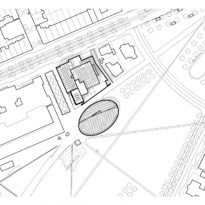
The new wing that has a basement and two floors above level was built in the open space adjacent to the main museum building, Museumplein 6, 1071 DJ, Amsterdam, Holland.
Concept
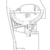
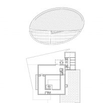
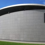
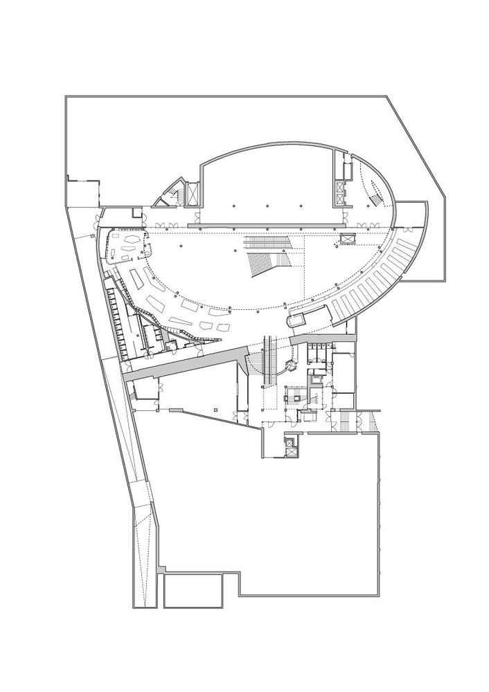
Kurokawa, who shared with Rietveld the love for geometric shapes, proposed a building based on curved lines, on the contour of an ellipse. Kurokawa defends the concept of symbiosis, a dialogue between two different entities, each with its own personality but seeking a common goal. His proposal is, therefore, a symbiosis between East and West, between straight and curved lines, between order and chaos.
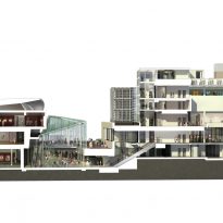
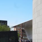
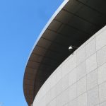
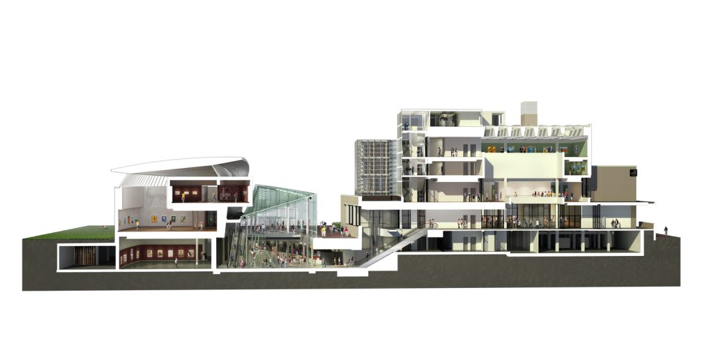
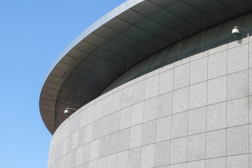
Showing humility and respect for his predecessor, Kurokawa buried 3/4 of the building, connecting it with the old museum through an underground passage, in order to minimize its visual impact on the environment. However, it is its peculiar curved roof that first attracts the visitor’s attention.
Spaces
Rietveld building
The permanent collection of the museum is displayed in the main building of Paulus Potterstraat, designed by the architect Gerrit Rietveld in 1963-64.
Rietveld was an important member of the Dutch movement De Stijl or Neoplasticism, a group of progressive artists and architects active in the 1920s. Rietveld’s modernist vision emphasized geometric shapes and light, open spaces. This is particularly evident on the stairs in the central hall, where daylight enters the museum’s galleries through a tall skylight.
Kurokawa wing
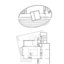
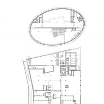
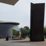
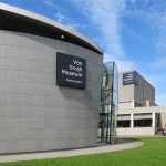
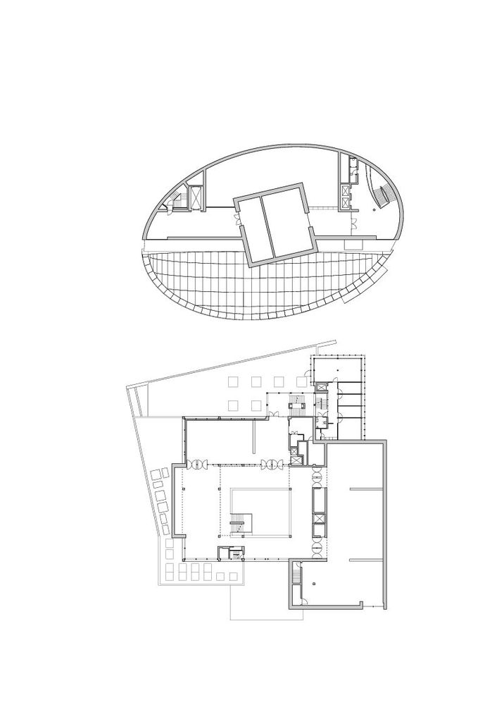
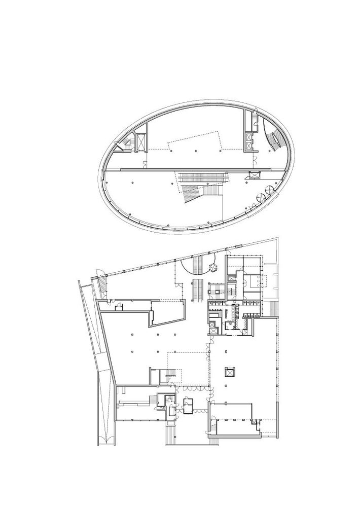
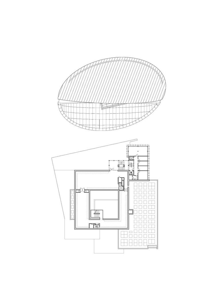
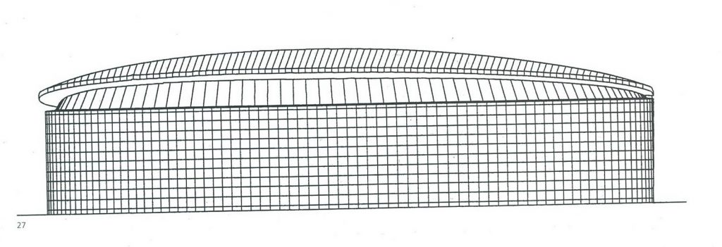
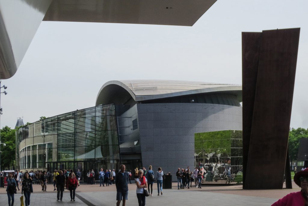
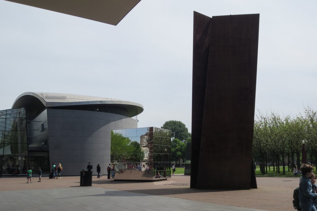
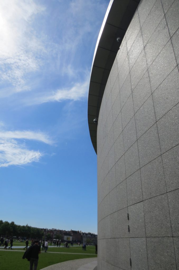
Kisho Kurokawa, one of the founders of the Metabolism Movement and consequently an architectural movement theorist called symbiosis, designed the museum’s new exhibition wing, which opened in 1999. Kurokawa was known primarily for his original designs for Japanese museums and for Kuala Lumpur Airport. Its design principles are reflected in the wing of the exhibition, the symbiosis between the environment and architecture, and between Japanese and European culture. In contrast to the Rietveld cube, Kurokawa opted for asymmetry, the building is elliptical with double height, highlighting the room where Japanese art is exhibited, a semi-suspended cube that is at an angle to the axis of the wing. The extension of the museum’s exhibition wing was made possible thanks to the support of The Japan Foundation and Yasuda Fire & Marine Insurance Company Ltd., based in Tokyo.
Taking into account the landscape as a whole, 75% of the area of the building, excluding the main exhibition hall, was built underground as an effort to minimize the space it would have occupied on the ground. The new wing is connected to the main building through an underground passage.
Although Rietveld and Kurokawa share the modernist idea of geometric abstraction, the new Kurokawa wing departs from Rietveld’s linear style with curvilinear shapes and lines, employing a traditional Japanese idea of abstraction. A characteristic that expressed this idea was the sunken pool, located between the new wing and the main building, later eliminated with the construction of the new entrance hall. The inclination of the elliptical roof and the curve of the walls dislodge the center, which underlines the Japanese aesthetics of asymmetry. Through simple, highly abstract geometric shapes made complex, and also, through careful manipulation, the abstract symbolism of the new wing achieves a balance between the international and the local.
New entrance hall
The new entrance hall opened to the public on September 5, 2015. Kisho Kurokawa Architect & Associates made a sketch consisting of broad contours for further elaboration of the elliptical wing of the building they had built in 1999. This idea is developed, materialized and made by the Dutch architects Hans van Heeswijk Architects, after the Japanese architect died in 2007. The new addition has been designed according to the pre-existing elliptical building conceived by Kurokawa in 1999 and represents its natural completion.
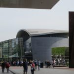
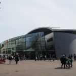
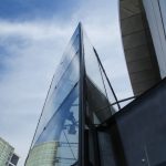
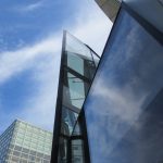
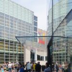
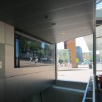
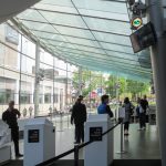
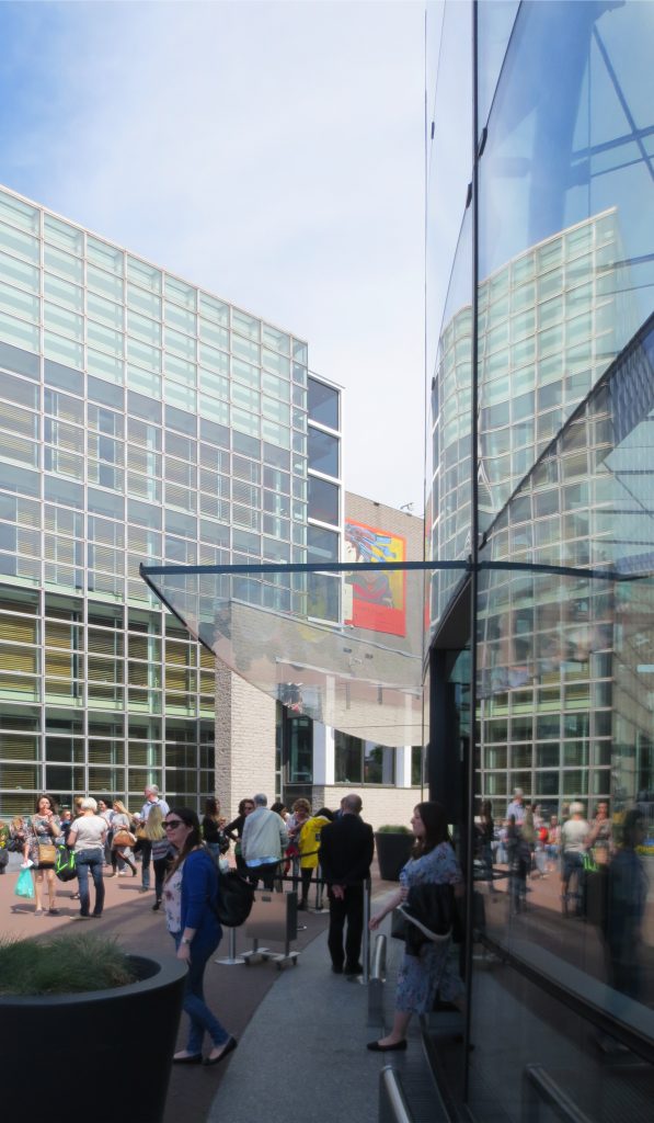
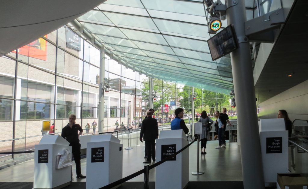
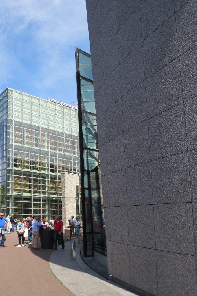
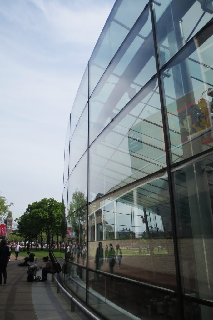
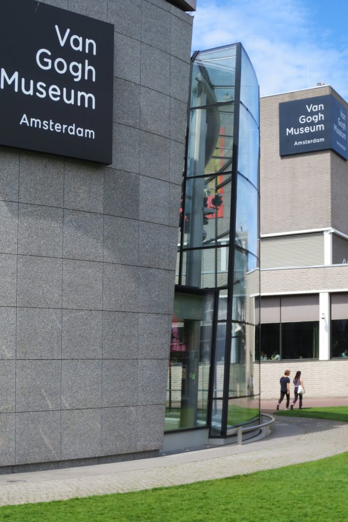
The new glass structure is located between the original museum building designed by Gerrit Rietveld and the most recent temporary exhibition wing, also by Kisho Kurokawa, which provides better access to them and between them and creates an additional area of 800m2 , totally transparent, surrounded by 650m2 of facade and 12m high.
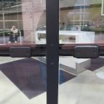
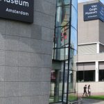
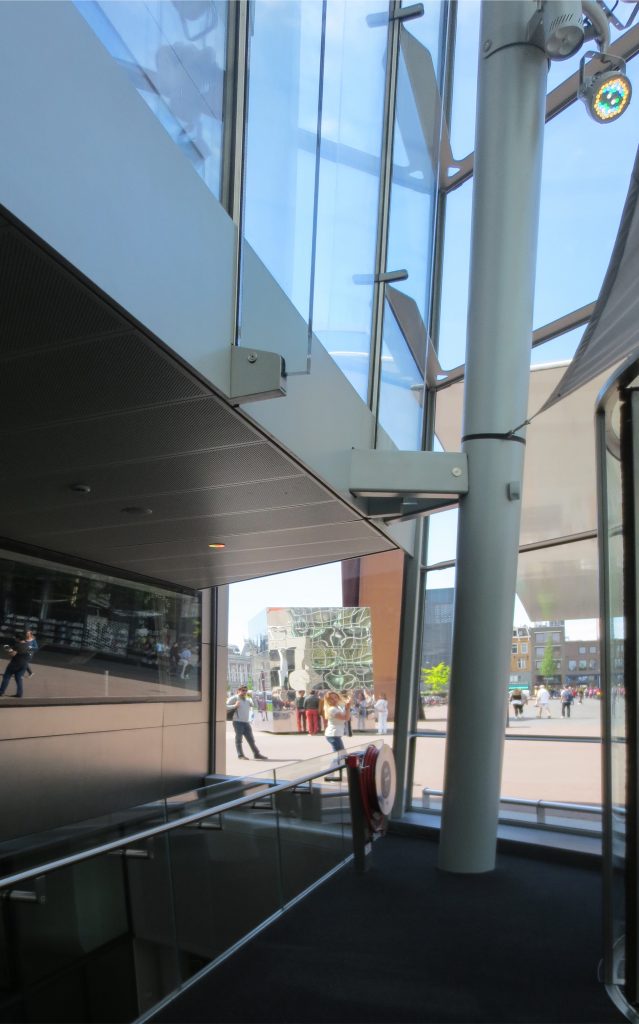
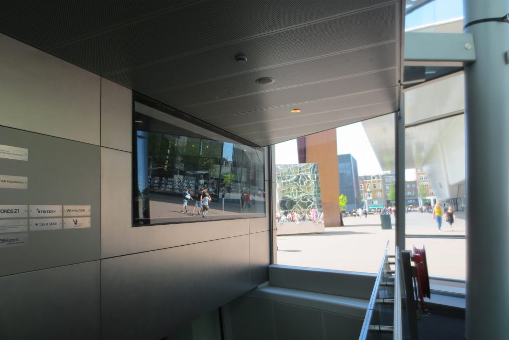
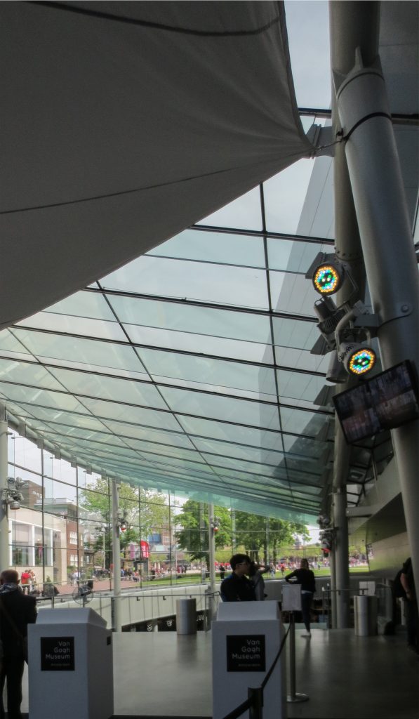
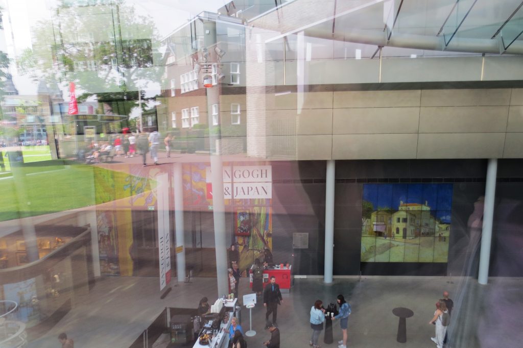
The all-glass entrance hall has high-quality structural engineering systems and can be reached directly from the Museum Square, leading visitors to a large hall located 4.88m below street level. This lobby can be accessed via a glass staircase or a panoramic lift. In this lobby there is a cloakroom, a museum shop, information counters and toilets. From the lobby, visitors can go directly to the Rietveld building for the permanent Van Gogh collection or to the Kurokawa wing for temporary exhibitions.
This renovation is better suited to the updated Museumplein, all its cultural institutions now have their tickets in front of the square. The transparent building with its state-of-the-art glass structure enriches both the Van Gogh Museum and the Museumplein.
Structure
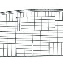
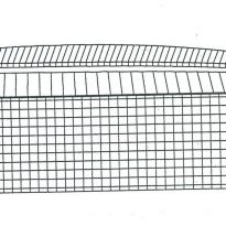
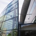
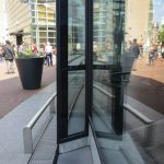
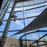
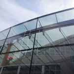
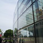
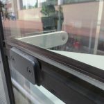
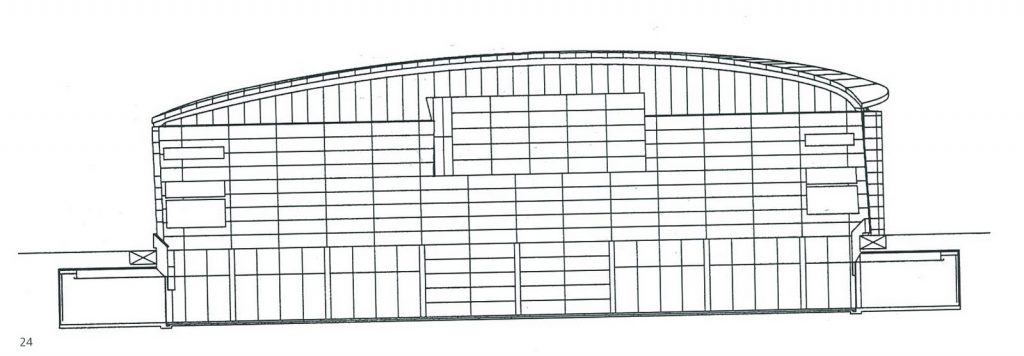
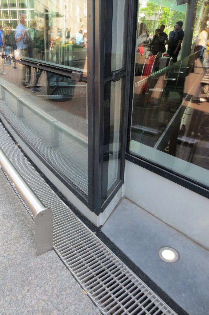
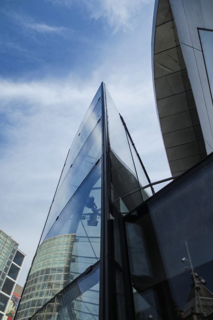
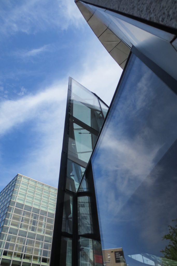
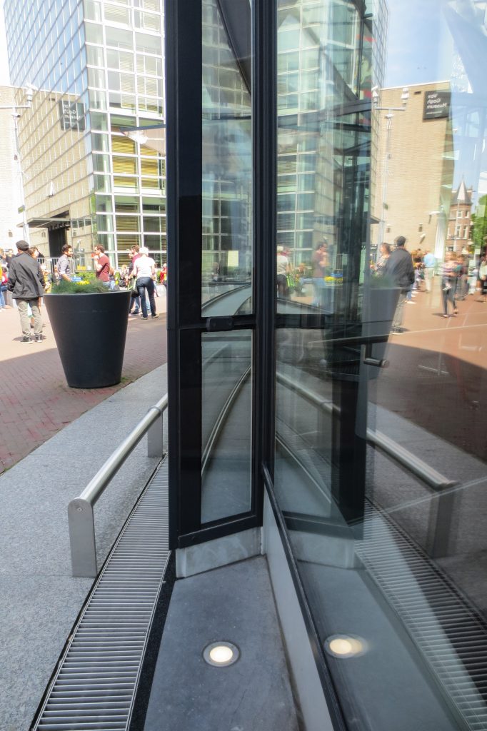
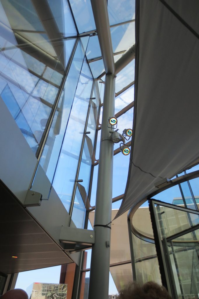
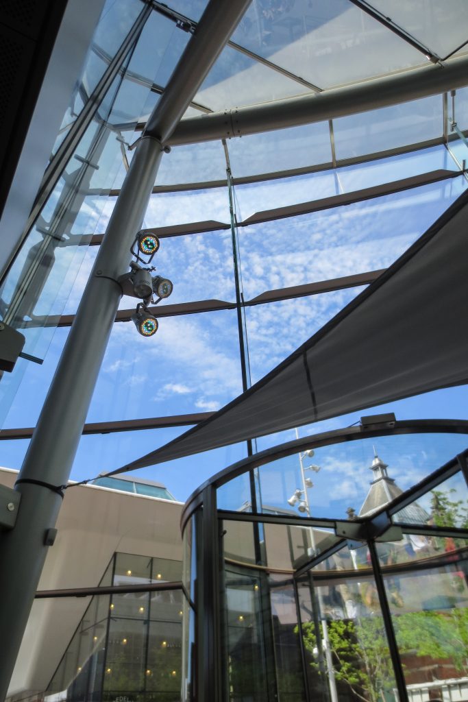
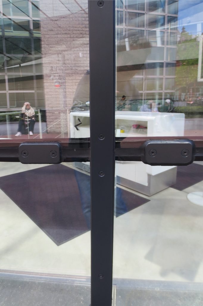
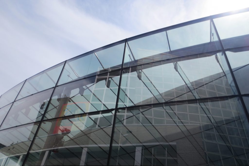
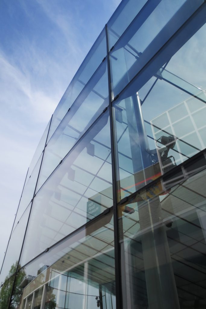
The extremely light appearance of the new building is due to its peculiar construction system. The open and transparent entrance hall has been built using the latest glass construction techniques. The facade consists of 650 square meters of cold-bent glass with integrated glass door, with 30 “roof fins”, the largest being 12 meters long and 700mm high, with 20 glass columns, some with 9 , 4 meters high supported by steel shoes, welded precisely to the main tubular steel structure consisting of 400 mm circular hollow sections, all mounted on a load structure containing 65 tons of steel. Due to the complex geometry, the numerous glass fin connections and the extremely tight tolerances, the entire 60x15x10 meter steel structure was pre-assembled at the factory. The smallest radius of curvature of the glass is 11.8 meters.
In fact, the roof-facade system not only constitutes the transparent envelope of the entrance wing but also functions as part of its load bearing structure. The curved glass panels collaborate with the vertical glass fins, are placed perpendicular to them and act as thin buttresses, which in turn work together with the steel structure of the building.
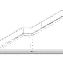
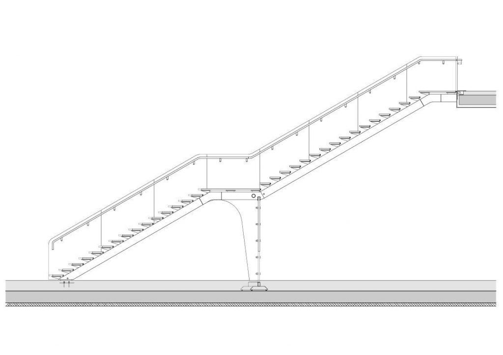
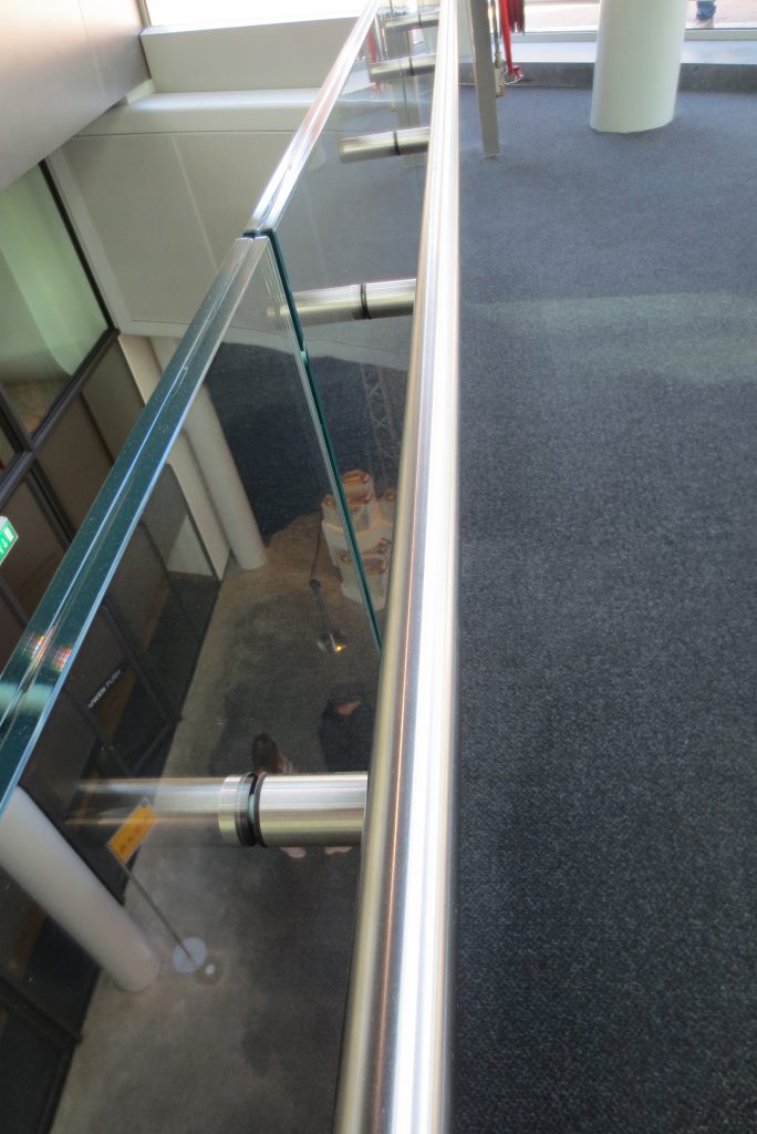
Inside, the glass staircase is supported by glass arches. Most loads are transferred by a triple arch of laminated glass that also stabilizes the ladder. The connection between the glass arch and the stringers is attached to the site for a perfect load transmission.
The use of glass as a building material is a last generation resource. The new entrance building is the largest glass structure in the Netherlands in which glass fins, beams and mullions, and double glass units are elements of the main structure of the building. For general roof stability, the glass fins have been connected to the steel structure, working together as a single structure.
Materials
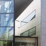
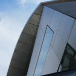
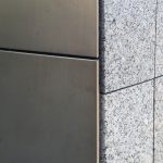
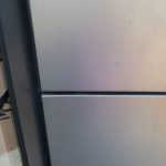
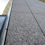
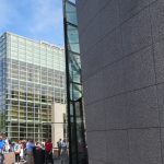
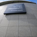
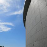
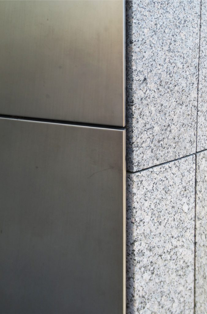
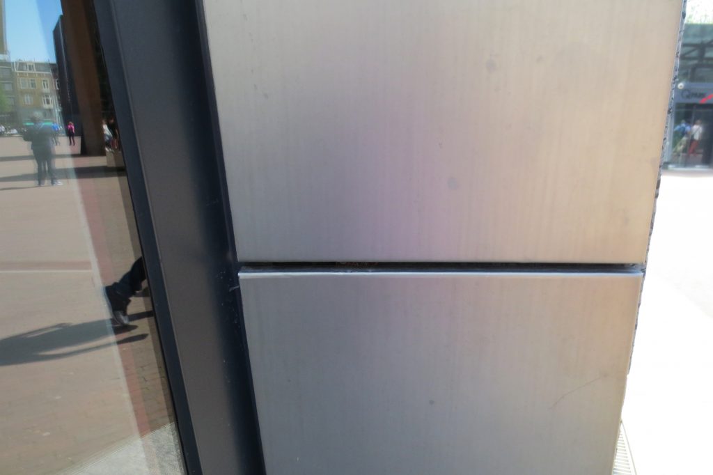
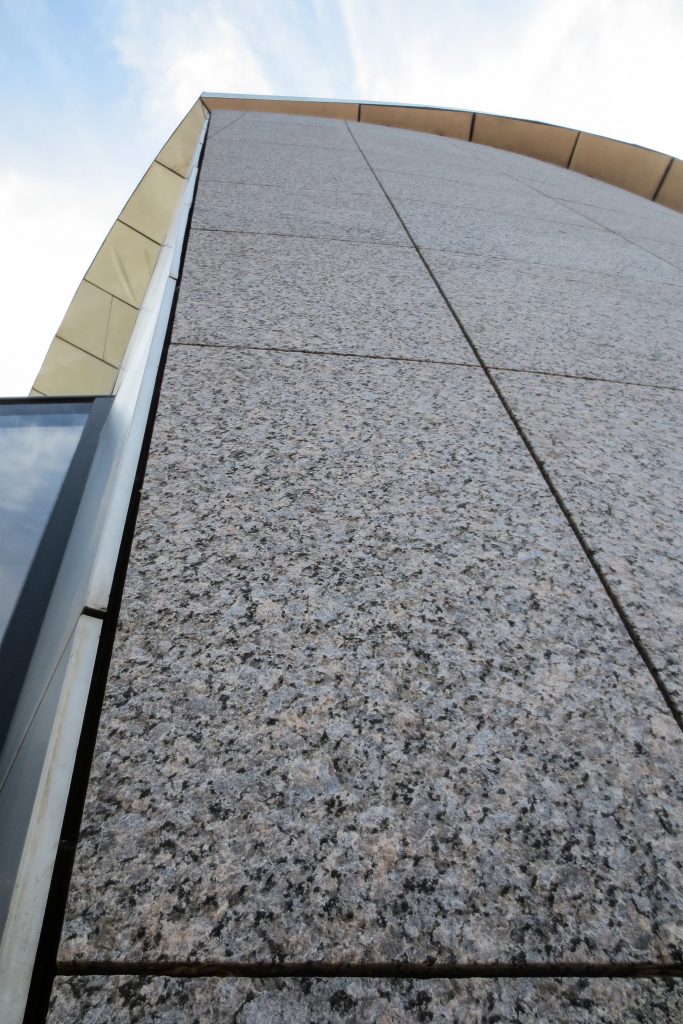
In the new wing of the museum, mainly reinforced concrete, structural steel and glass framework were used. The oval volume is coated externally with granite plates and its cover with titanium plates.
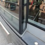
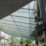
The entrance hall was made with steel frame and cold bent glass plates. All the glass used in the project is glass with low iron content. The roof is composed of units of insulated and laminated glass, all of different width and supported by 30 fins of triple laminated glass with SentryGlas interlayer, all optimized and unique in length and height. Solar control is provided by a high-end solar coating and a subtle frying pattern in double glass units, protecting the volume of north-facing glass. The double glass units on the outer perimeter of 1.3 meters wide are partially braided in cold to fit between the curved surface of the roof and the perimeter of the facade.
An 11 meter long glass canopy marks the entrance and has a 1.5 meter overhang.
Inside, the light filters through the curved roof and is distributed through fiberglass walls and wooden floors. LED lighting has been integrated into the glass staircase that accentuates the steps at night.
