Vacheron & Constantin Watch Factory

Introduction
The headquarters of the Swiss factory Vacheron & Constantin watches based in Geneva, was inaugurated on September 8, 2004, after two years of planning and 18 months of intensive construction work.
Vacheron & Constantin, brand in the select circle of Haute Horlogerie, sought in this work a facility that matches the philosophy of the company, which focuses on creativity and quality instead of pointing to ever-increasing volumes production.
Determined to regroup his forces, hitherto scattered among various sites around Geneva, the brand launched an international competition, won in the second round by the study of Swiss architect Bernard Tschumi.
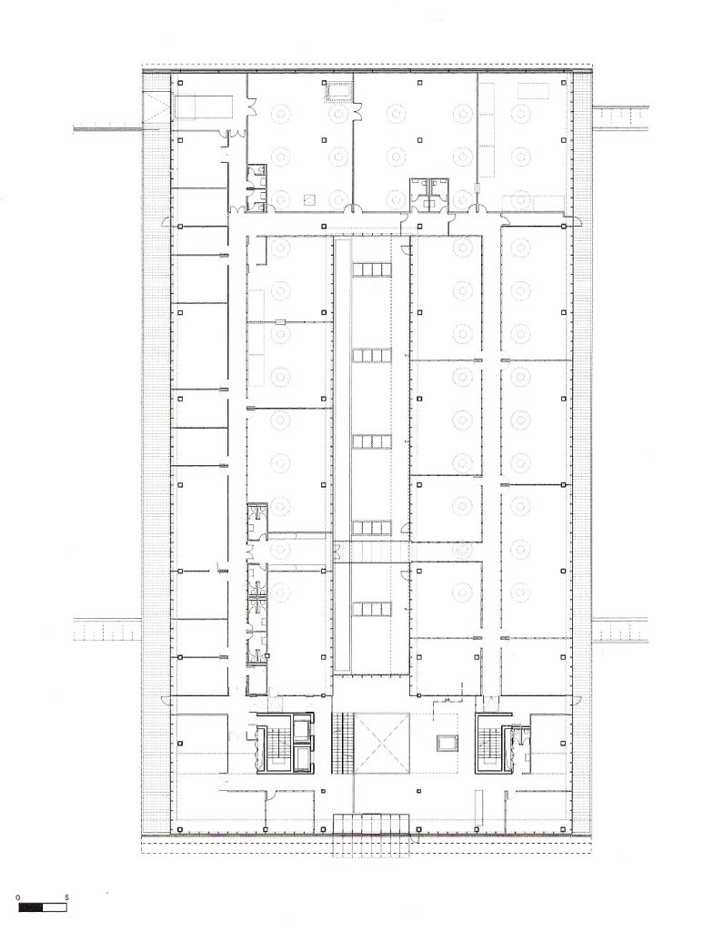
The program was to gather in one physical space, all productive and bureaucratic functions of the company: management, management, design and manufacturing. But the project was to interpret also the symbolic and testimony of the oldest watch brand in the world, in a country known worldwide for the industry, the time for a firm with two and a half centuries of existence, and a permanent art career making design and technology.
The building combines the dynamism and permanence, the preciousness of craft and technological precision of a clockwork.
Location
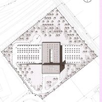
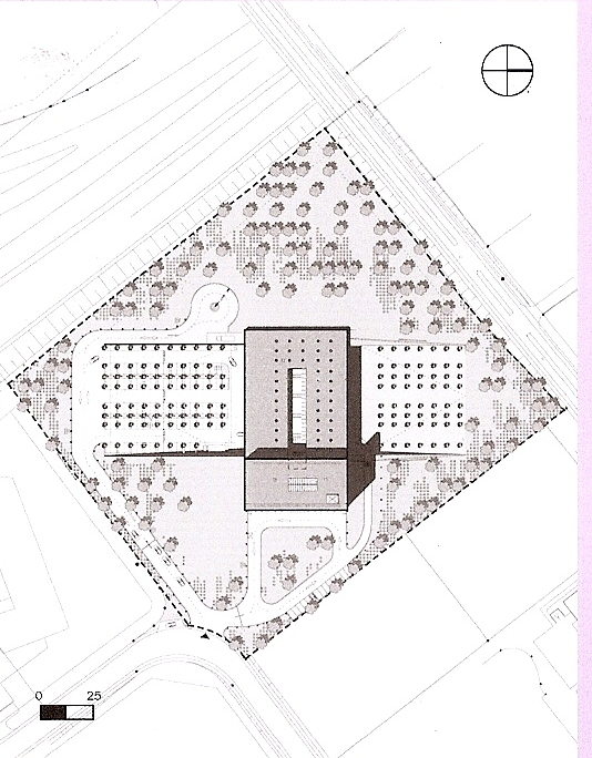
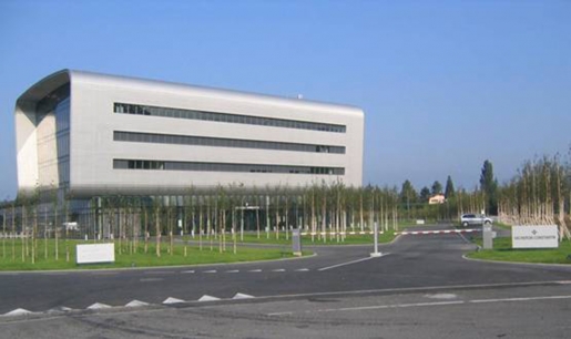
The headquarters is located in the area of Plan-les-Ouates, in the canton of Geneva, Switzerland. It is surrounded by 30,000 square meters of park and is fully in harmony with the surrounding landscape. It is an easily accessible location near the airport.
Concept
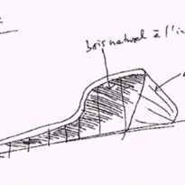
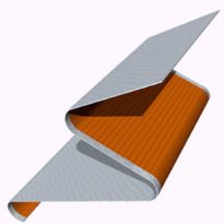
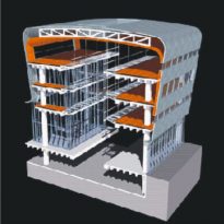
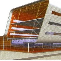
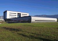
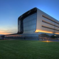
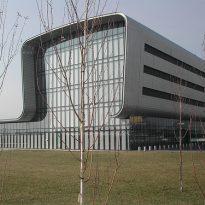
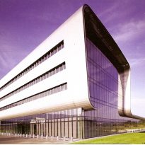
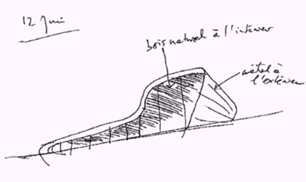
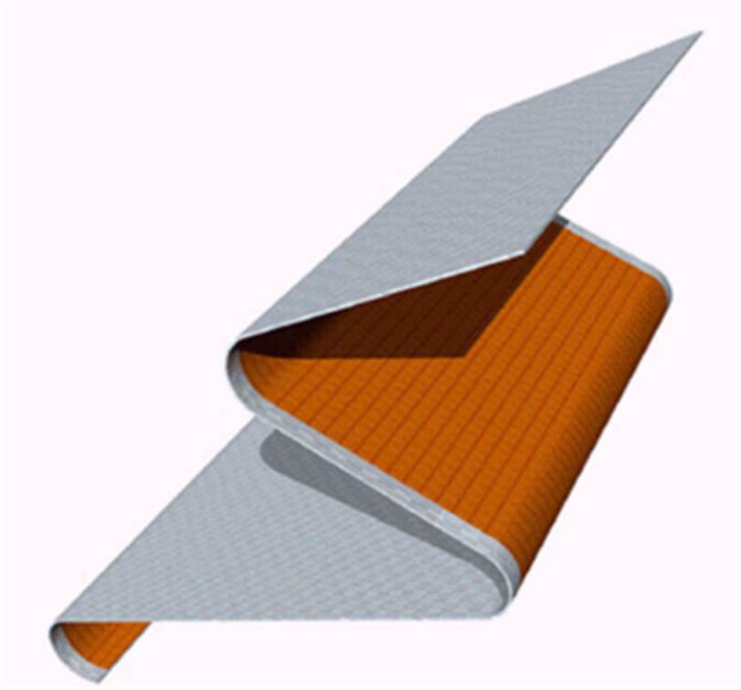
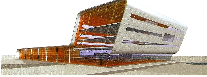
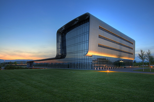
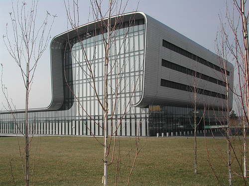
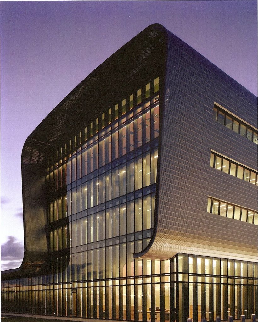
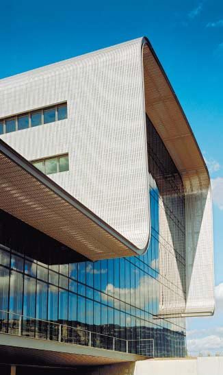
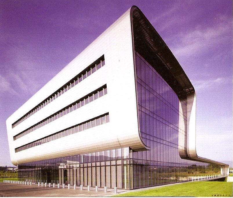
Tschumi architect’s proposal seeks to merge in a movie tradition and innovation, values that are summarized in a building with a morphological expression unit, clear and compelling, thanks to the presence of a surrounding light, flexible and continuously used to cover all functional requirements of the program, adapting to the different scales of the building. This idea of great coverage, and synthetic significant gesture at a time, is condensed in one continuous stroke ethereal structure is perceived as a great treadmill wrapped around the building.
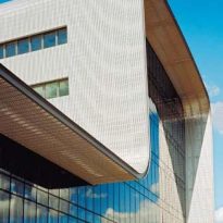
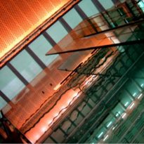
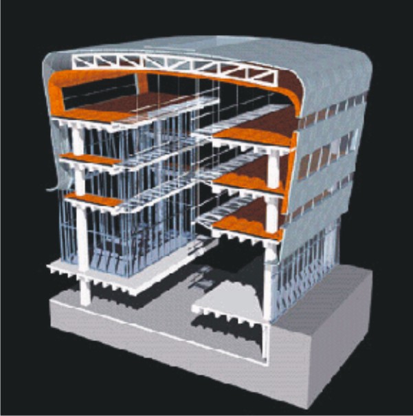
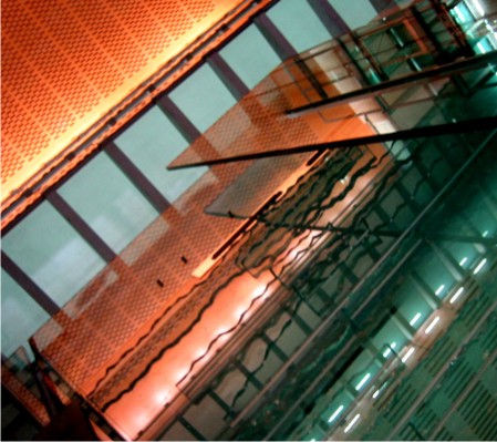
The metal casing functions as a wall, then turns into cover again returns to the wall and soon becomes flooring, reinterpreting the aesthetic industrial factory that started in the nineteenth century and was the epitome of modern architecture principles XX.
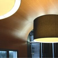
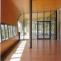
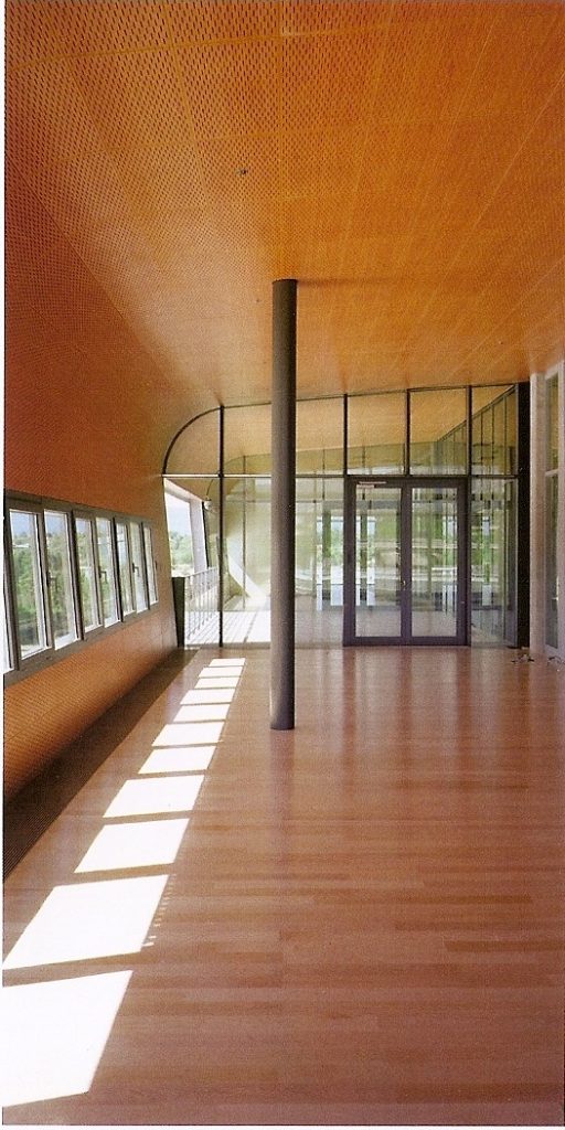
Tschumi explains the concept of his work as “a thin sheet of metal, stylish and easy to bend, her face bare exterior and interior clad in wood, mounted on a structure of great size, slightly asymmetrical, in which the metal can curved to fit your shape. The body is smooth and accurate result out, warm and welcoming inward. ”
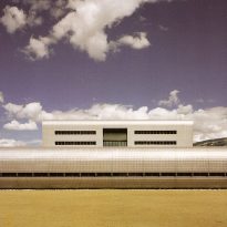
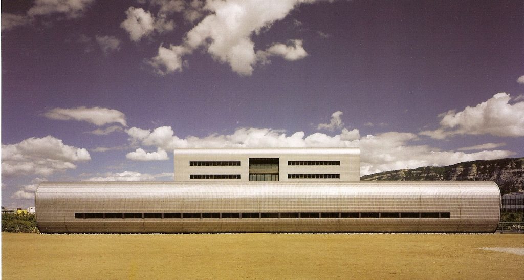
The envelope, in turn, mimics a clock mesh: lightweight, flexible and elegant. This is the unifying element that gives the building a futuristic profile, while its composition, according to some critics, reminds the Pirelli factory designed by Marcel Breuer in 1969, also in a volume structured landscape (the factory) and another in height (the offices).
Although the idea of the party to speak with the poetic force of the elemental, the architectural definition required a careful design of technological and constructive aspects to solve each part in relation to the whole, so as to achieve the same degree of detail purity and consistency that governs the strength of the project idea. This conceptualization of space, its executive process and extreme functionality of a system are the result of analogy to the client to understand their needs and industrial tradition.
The metal cover, which symbolizes the dynamics of time, covering a concrete structure, the very embodiment of durability.
Spaces
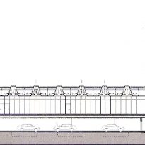
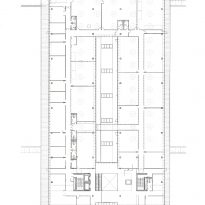
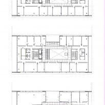
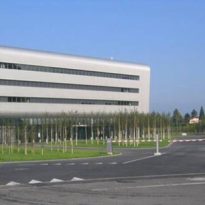
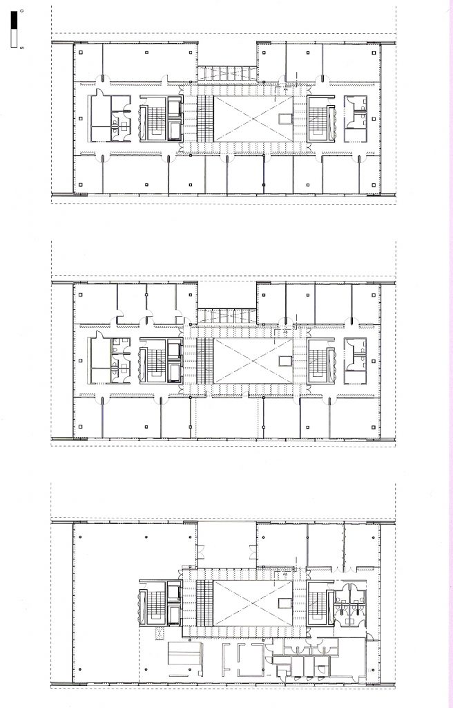
The volume is divided into two wings: a high, five levels, for offices, and a lower housing the industrial sector. Thus, the heights of the volumes are adapted to the functional requirements.
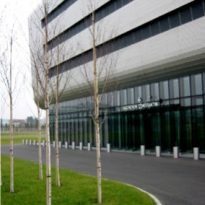
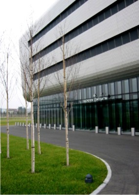
In turn, the whole building sits on a large expanse of green and undermines the underground parking, suggesting the structure of piles which provides visual permeability and fluidity of the landscape, which increases the monumentality of the work and morphology abstract.
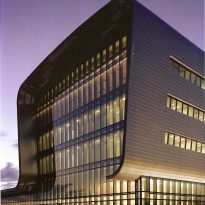
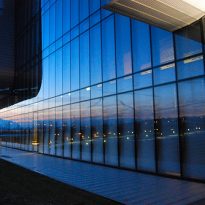
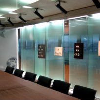
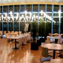
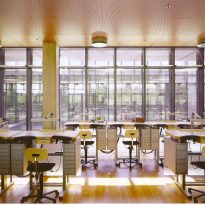
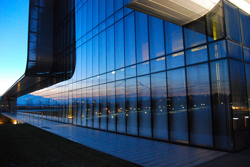
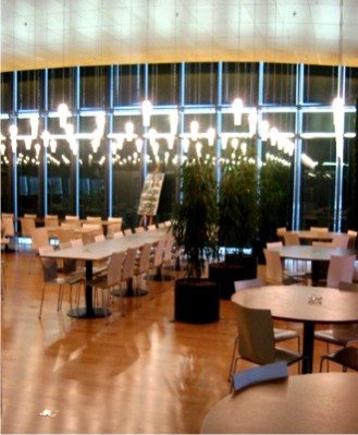
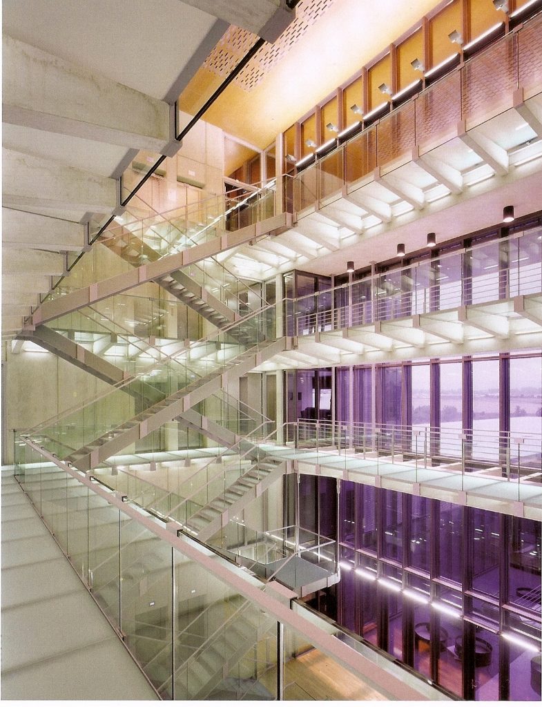
The interior is marked by the natural light in various intensities, according to the size of the windowed, filters used and their orientation. The sides, which are huge walls of glass, looking north and south allowing a greater influx of light to the workshops, they are divided by walls of glass making and spatial continuity of the screen light control panels.
In contrast, their faces covered by the metal skin, maintaining the dominance of the gap filled with smaller and oblong openings.
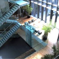
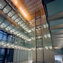
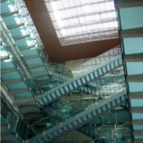
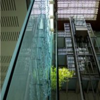
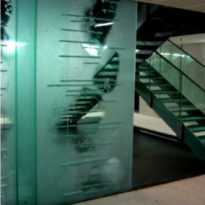
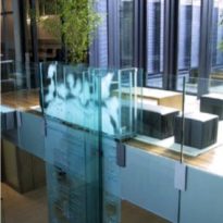
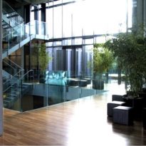
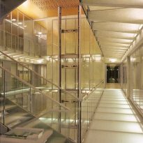
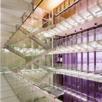
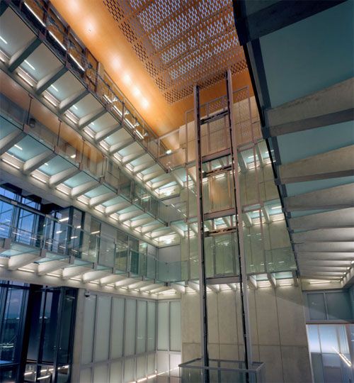
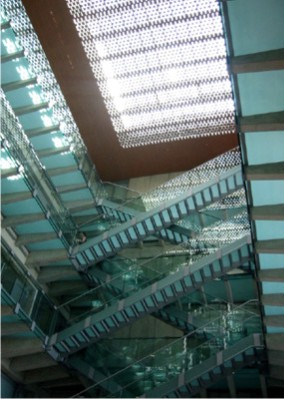
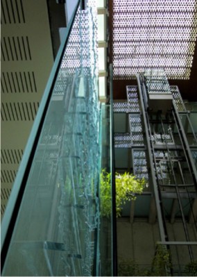
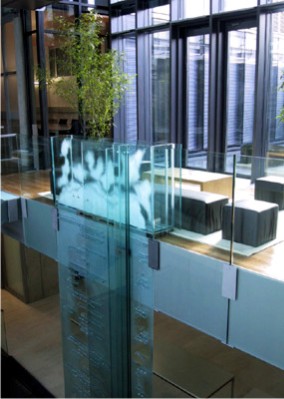
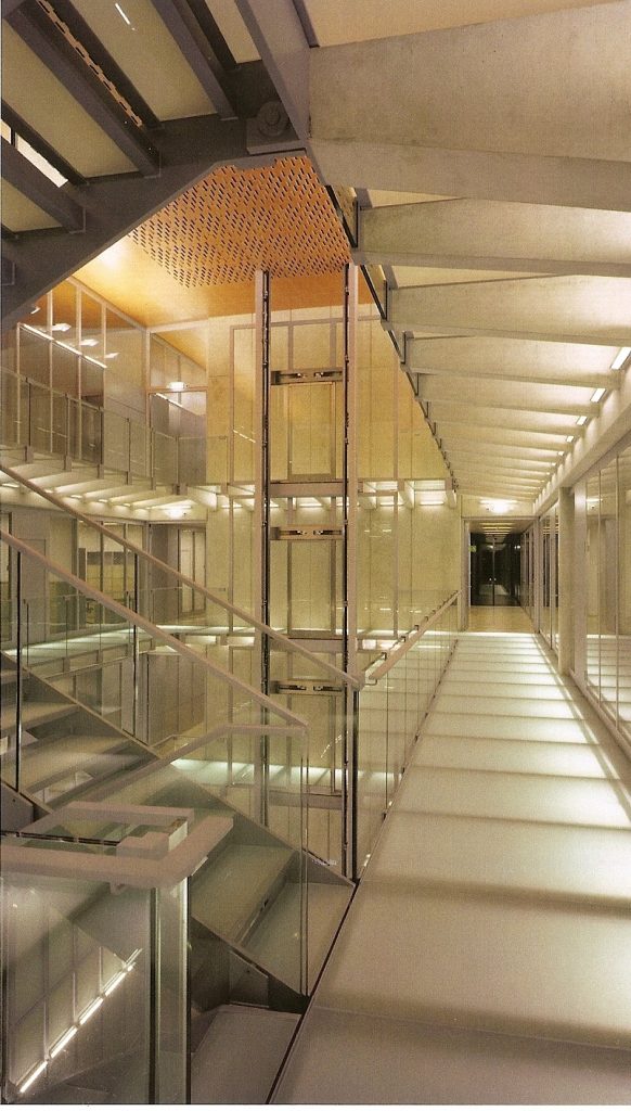
In indoor environments, defined by large planes of glass, metal and wood, everything seems to be suspended in space, since the equipment is incorporated into the overall design and gaps are cut by the stairs. A large glass atrium, three stories high, is surrounded by halls, galleries and staircases which also dominated the glass, evoking the subtlety of a clock and tiny, precise parts.
Materials
The structure is made of reinforced concrete.
The exterior is clad in a metallic facade and large glazed flat.
The interior wood was also used, bringing warmth to the whole.
