V. C. Morris Gift Store
Introduction
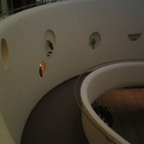
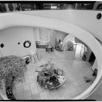
Since the V.C. Morris Gift Store in San Francisco was built in 1949, and the construction of the Guggenheim Museum in New York began in 1956, it has often been mistakenly believed that the store’s design was developed before the museum. However, it was in the museum, with its earliest designs dating back to 1943, where Wright first used the interior ramp as a signature architectural feature, with the V.C. Morris shop becoming its first prototype.
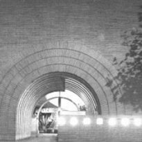
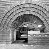
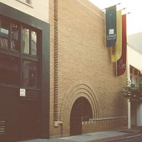
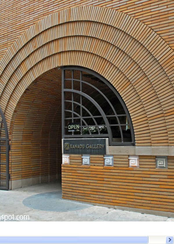
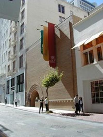
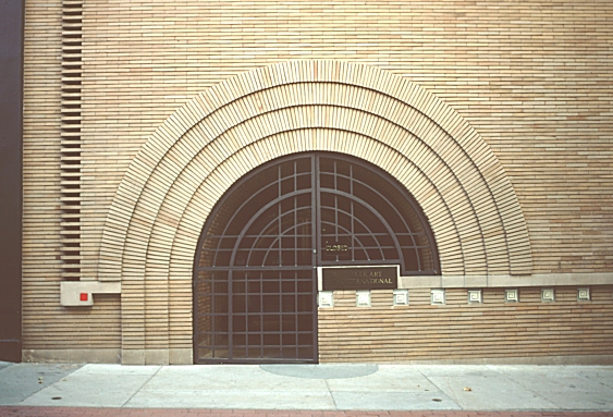
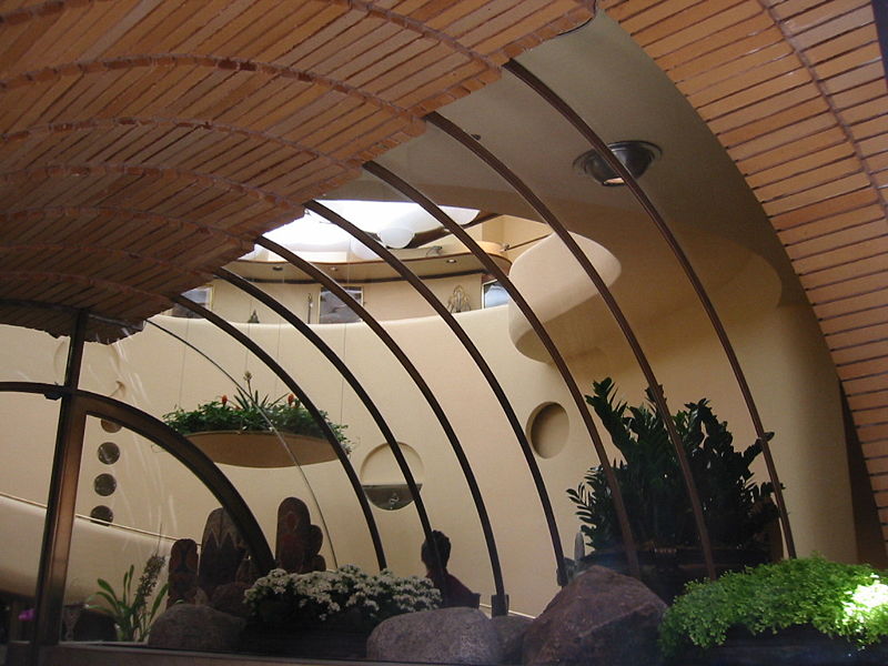
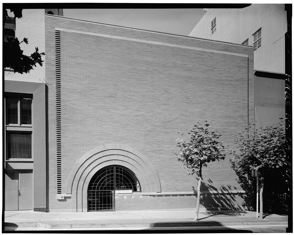
Wright‘s influence might be less apparent at the Morris Gift Store, as he only restored an already existing store, but his style still dominates the interior design, guiding movement from the ground floor to the second level. Wright also made the decision to deviate from the conventional storefront window, introducing a brick and glass arch in an otherwise plain wall.
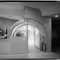
Customers were initially puzzled to find that the store lacked the traditional window display facing the street. Wright clarified that this design was not intended to showcase items to the street. Instead, the arched glass tunnel facing inward aimed to entice potential customers to peer inside, to view the items displayed on the stone ledge beneath the arch, and then be compelled to enter. Wright humorously dubbed this entrance as “the mousetrap.” Once inside, an attendant would greet the customer, saying, “Come on in. How can I assist you today?”
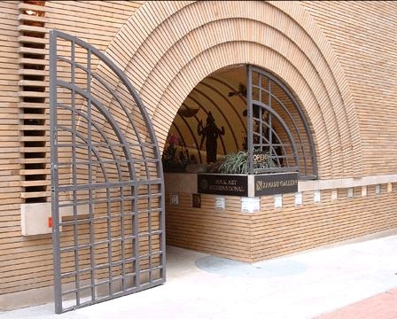
The structure has been acknowledged by the American Institute of Architects as one of the seventeen buildings by Wright that best represents his contribution to American culture, which underlines the importance of its preservation.
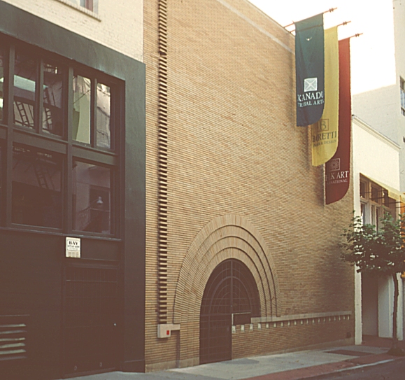
Currently, the building houses the Xanadu Art Gallery.
Location
The V.C. Morris gift shop stands at 140 Maiden Lane, San Francisco, close to Union Square.
Today, this area is recognized as one of the city’s most sophisticated shopping promenades. However, during its remodeling years, it was a street notorious for its unsavory reputation.
Description
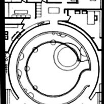
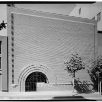
The V.C. Morris gift shop is a circular volume concealed behind a modest brick facade.
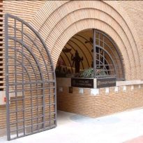
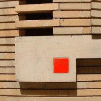
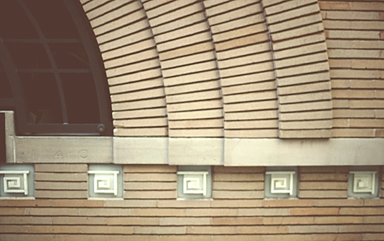
The main entrance, a modern take on the Romanesque arch, finds its curve echoed in the interior details. A vertical grill to the left of the tunnel-arch is crafted by removing alternate bricks from the masonry work. This grill covers a narrow glass-clad which is also retroiluminated at night.
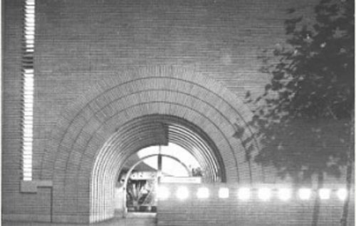
Overall the facade seems more like an abstract composition exercise than a real, functional facade.
According to Wright, this type of entrance draws in passersby more effectively than merchandise displayed in traditional street-facing windows.
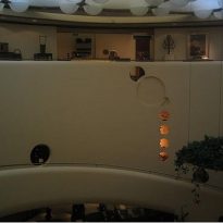
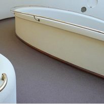
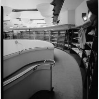
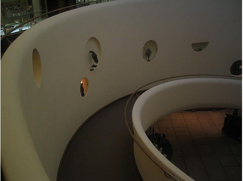
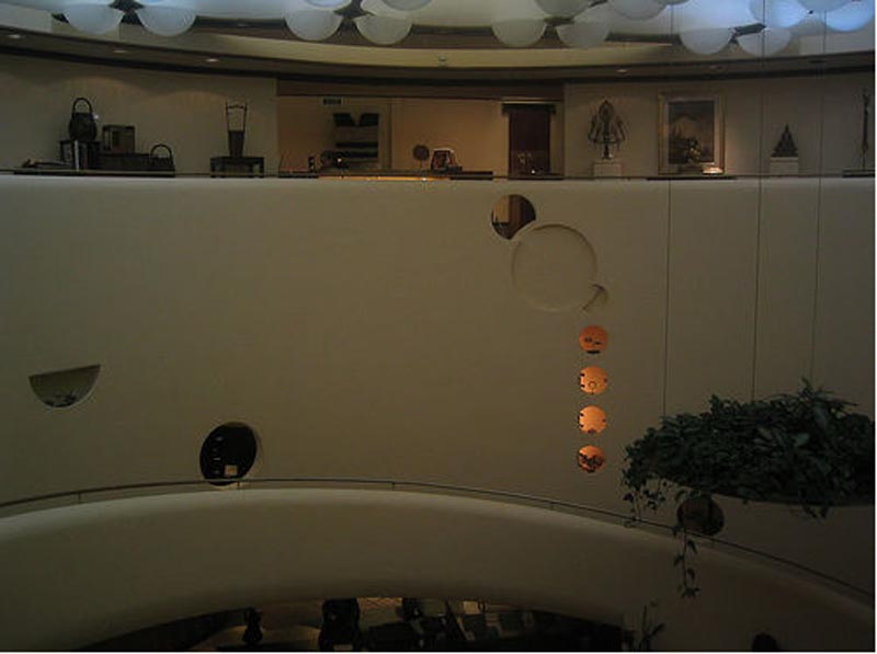
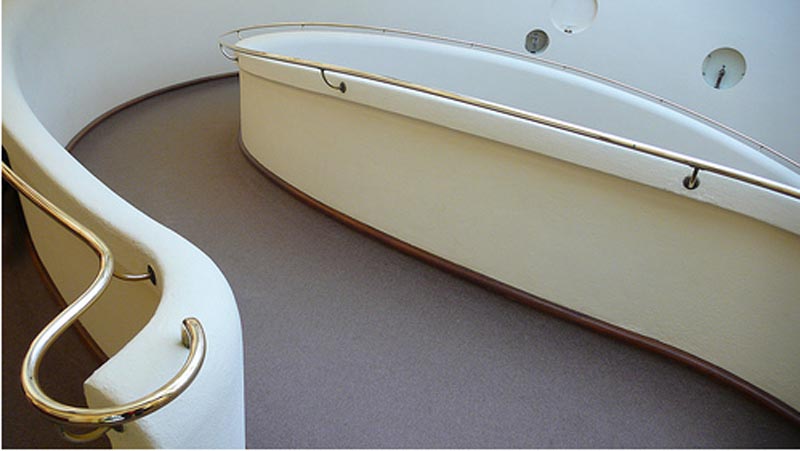
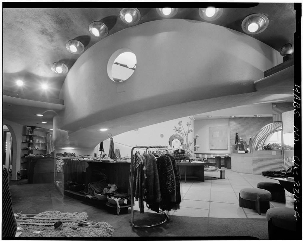
Inside the store, Wright created a circular mezzanine, accessible via an ascending spiral ramp that acts as the store’s focal point. Circular, illuminated openings punctuate the ramp’s curved wall, allowing for the display of items.
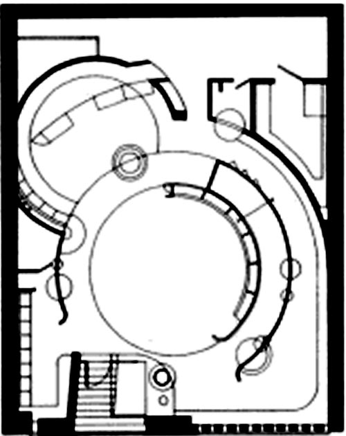
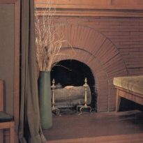
The store’s wooden furnishings and glass are also composed of circular segments.
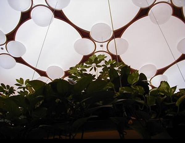
Illumination is provided by a network of interlocking translucent balloons hanging above the circular space.
Materials
A subtle line of translucent panels, featuring Wright‘s classic geometric pattern, conceals lights on the facade’s vertical grill.
Inside, the ambiance seems to revolve under the brightness coming from the ceiling’s white plexiglass bubbles. These create an opalescent effect, reminiscent of the organic geometry found in the interior of the Johnson Wax Building.
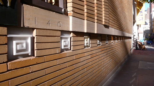
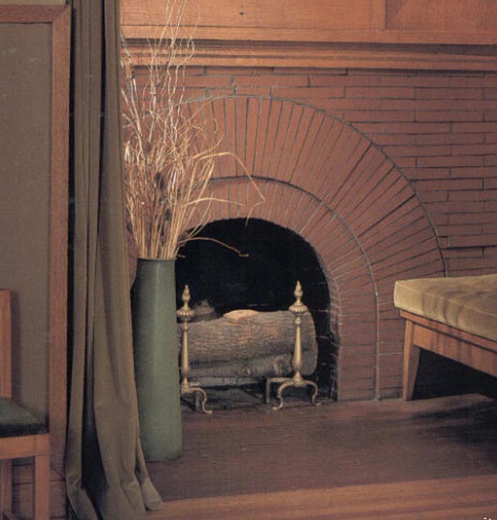
The brickwork, a common element in San Francisco‘s architecture, is employed exquisitely, drawing attention silently, rather than trying to overpower the neighboring buildings.
The interior ramp and the second level are made of white reinforced concrete.

