University Village Community Center in Albany

Introduction
The university town of the city of Albany is a residential complex owned by the University of California used to provide accommodation to students from the University of Berkeley (neighboring city) married, with family or by others. This is certainly a multicultural environment, as students living in this village of 67 different nationalities.
The initiative for the creation of this community was very well received since its inception in 1956, and since then has grown in size and number of dwellings.
Ever since the last decade of last century the university saw the need to restructure the planning of the people to enable better land use planning and greater ease of use. This department expanded eastward and brought down part of the old buildings, creating green areas and sites for building public service as a nurse, a supermarket or a community center.
Statement
From the same university was proposed architecture students during the summer of 2009 and through the course 100A, submit their proposals to the last piece of equipment, the community center.
The proposal should serve as an area of support to residents of the community with playgrounds indoor and outdoor cafe, an auditorium for meetings and vote on future decisions and also safe and educational space for children.
Was also seen as the presence of the stream.
The Quail Creek is born from the highest mountains in Albany and flows directly into San Francisco Bay, along its route has been severely mistreated by the city, condemning him to devise underground for most of its length.
In this area, and to emphasize the educational role should center the stream restored and integrated into the design, restoring the importance that had previously been denied.
Location
The land is situated on the border between the cities of Albany and Berkeley, officially belonging to the first.
It lies at a distance of three kilometers from the main campus of UC Berkeley, can achieve this through various lines of the AC Transit public bus.
The Site
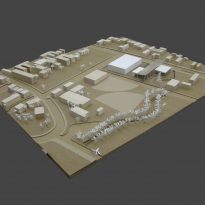
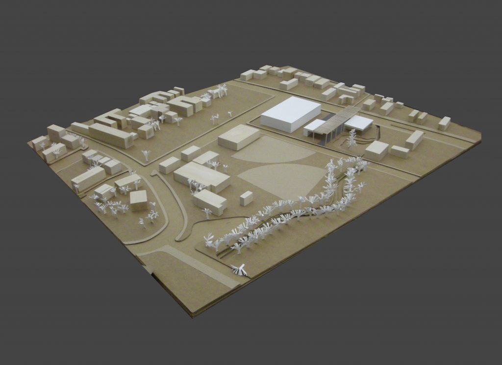
The sun will rise where the community center is practically flat, has dimensions of 67×80 meters and is bordered by San Pablo Avenue on the east, at 10th Street on the west, with another lot where there was a supermarket in the north and the Quail ment of the south.
There are four very different comparisons to be treated accordingly.
On the one hand the expectation that a supermarket is built on the lot next door. Buildings usually governed by economics, straight lines, walls, blinds, etc.
The presence of a considerable traffic streets and commercial use on San Pablo Avenue, behind which hides a rigid urban grid designed in the nineteenth century.
A much more open, natural, and recreation on 10th Street, followed by an urban girl, barely 20 years and full of open spaces and green areas.
And finally the presence of this stream is the stream of quail on the south side of the site, in turn generating a rich and luxuriant vegetation around him.
Concept
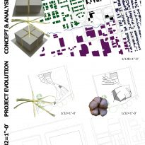
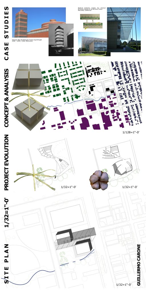
The concept governing this project could be summarized as an attempt to emphasize once opposed to a space generate smooth transition between these opposites.
As already mentioned there are two very different landscapes on either side of the lot and our building must meet the important but complicated task of serving as a link to these two very different realities.
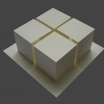
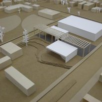
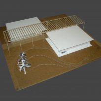
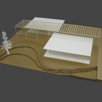
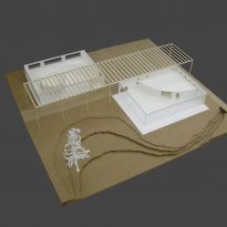
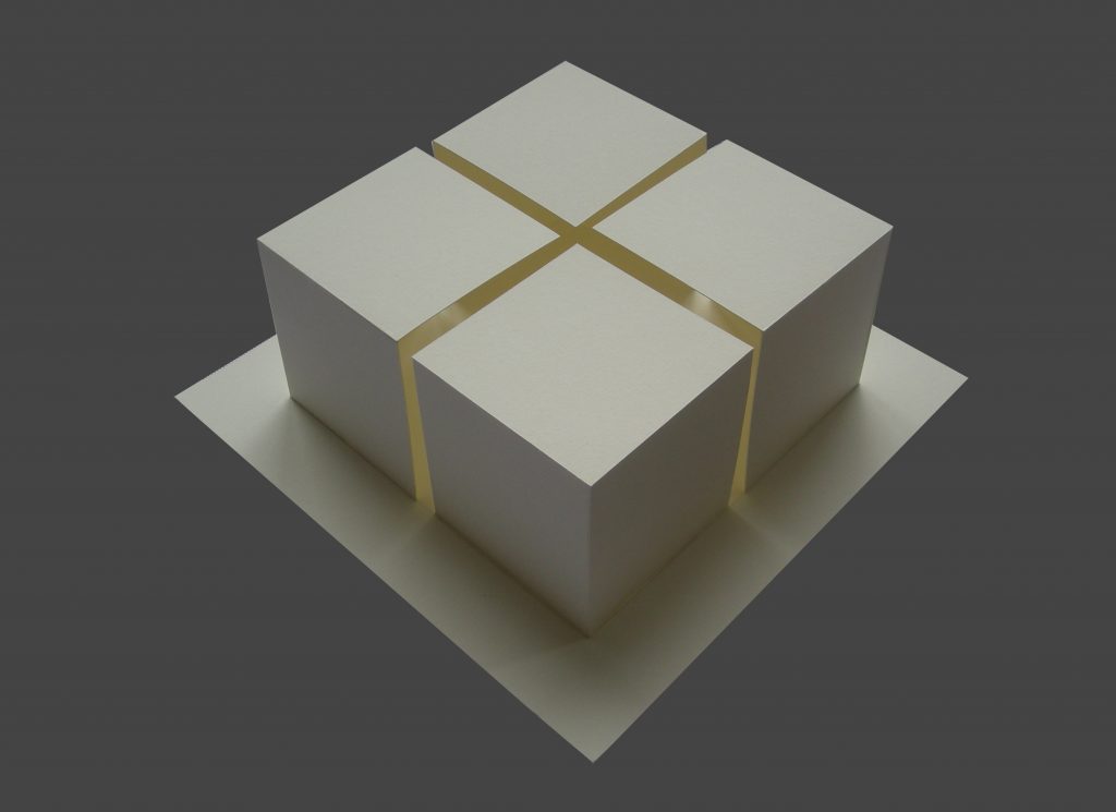
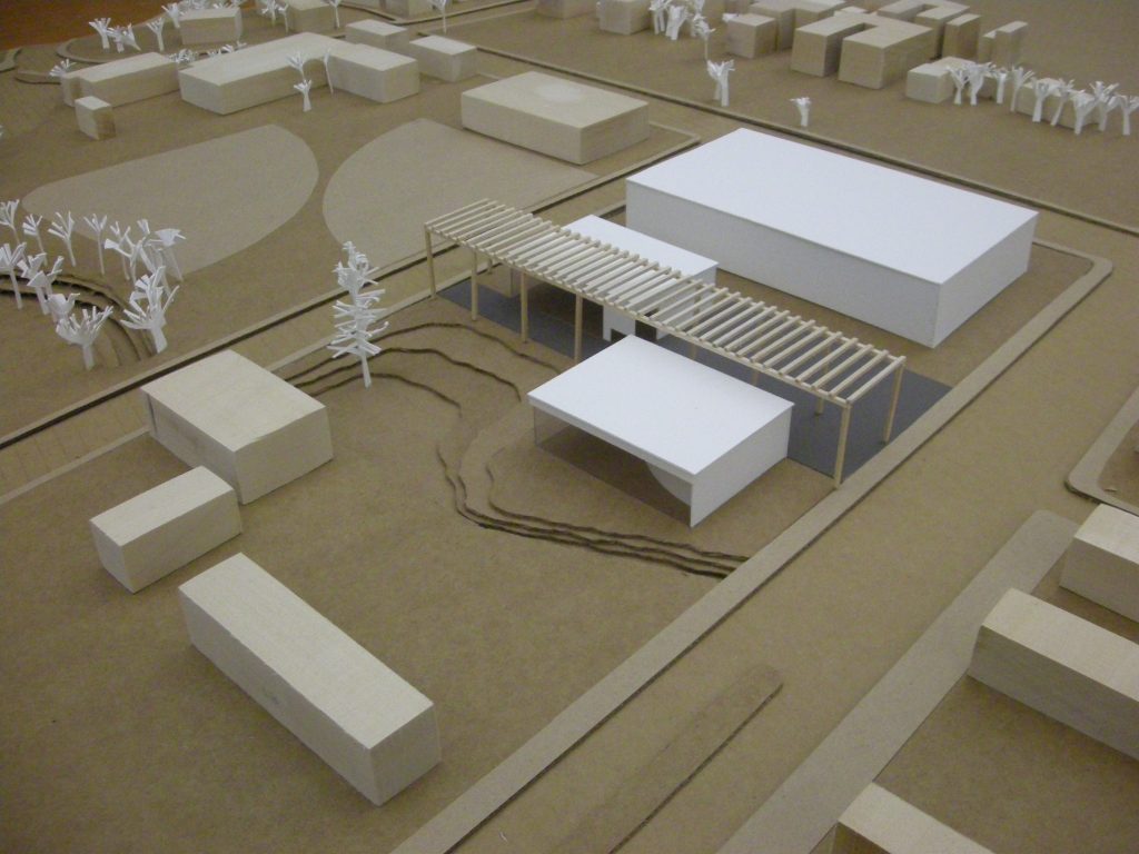
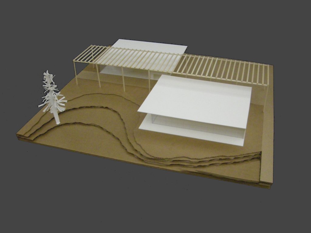
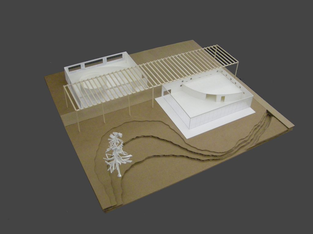
To achieve the program is divided into two, obtaining two parallelepiped volumes of identical dimensions. The placement of these two volumes on the ground leads to the creation of two public squares, one to each side of the site.
It is the treatment of these two spaces and the facades of the volumes that creates the confrontation of opposites that create tension and encourages curious and explore that part in all of us to wonder who will encourage us further and eventually found out.
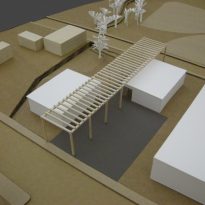
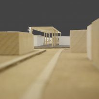
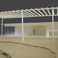
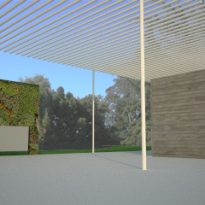
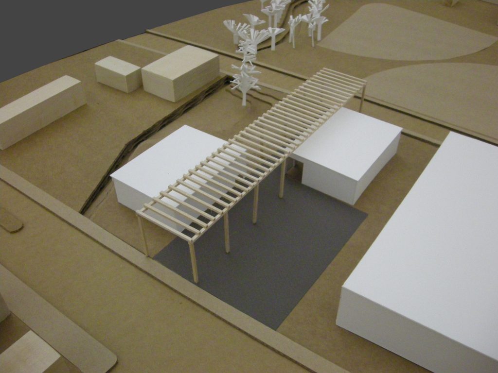
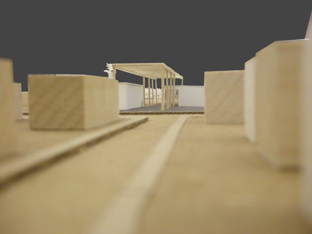
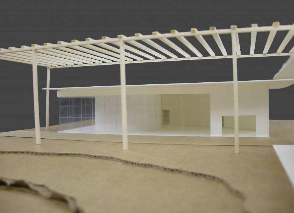
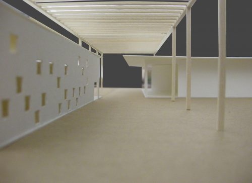
There is also a distinctive feature of this project is a large pergola that flies from the whole San Pablo Avenue to 10th Street. This element gives unity to the whole while you carry a heavy burden on the project concept, it is the only object that encompass all the elements, or not opposing each other and generate a permanent feature that accompanies the user along the entire route, harmonizing the transition between the two realities here.
Description

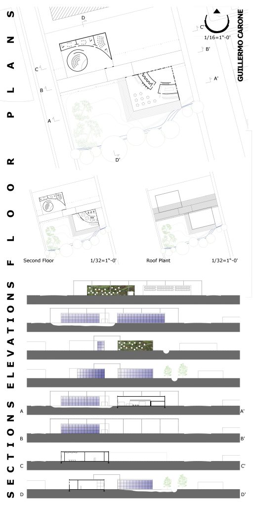
The field is divided virtually into four quadrants. In two diagonally opposite quadrants are placed the two volumes containing the program while the remaining two give rise to the two public squares.
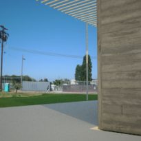
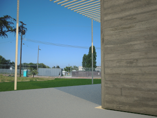
The square facing San Pablo Avenue is like a town square, with concrete pavements, lighting and street furniture. It can be understood as a simple widening of the sidewalk, where it generates an area of appointment, talk or play in an urban environment.
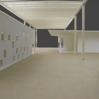
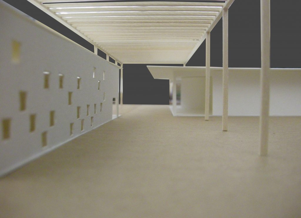
In contrast to the cold material of this urban plaza facades find the volume that lies beside her on the edge of San Pablo Avenue. These facades have been treated with plant elements that cover completely and openings have been conducted on them are small and in no apparent order. We see it as warm materials, natural and seemingly random order face the rigidity and coldness of the urban environment.
Across the sun are the same action but with the relations reversed.
The square is a microclimate here are natural, plant surfaces and trees. This place also takes on certain slope to the south that relate to the stream. It is a wild, but controlled the countryside.
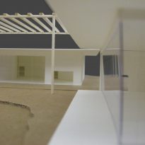
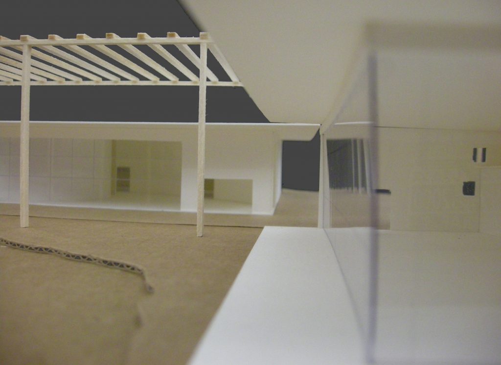
In contrast to this park facades of both volumes are on the look out large windows floor to ceiling, supported by steel uprights and anchoring views. A sample of high-tech architecture confronted with nature.
Finally, giving the whole unit are perhaps the most unique element of the project, a pergola that buildings taller than the solar crossing flies from San Pablo Avenue to 10th Street, a neighborhood setting the path to the other, generating a door transition, the transition from one reality to another always under the same roof.
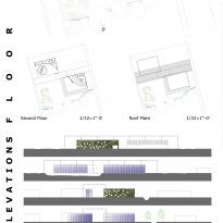
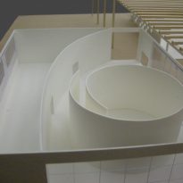
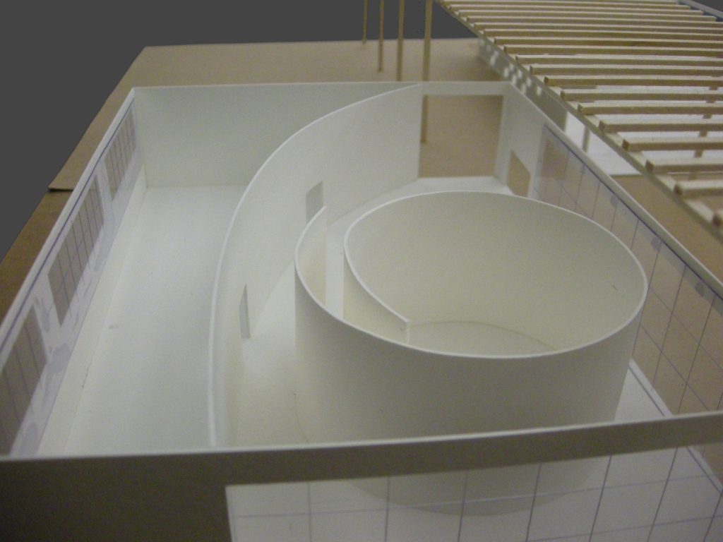
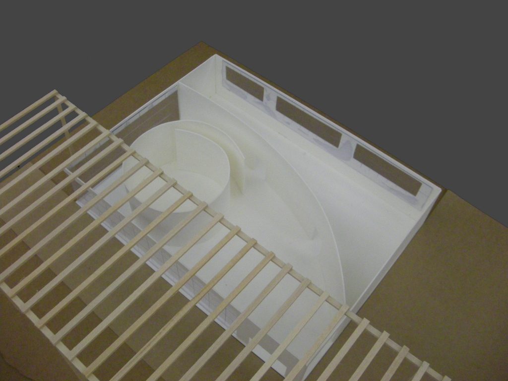
This contrast also find within themselves ways to move from inside to outside. From outside the lines are straight, the angles too rigid alignments, etc.. But everything changes go inside, a curved line runs through the whole jumping from one volume to another and creating a division between the open and enclosed spaces inside buildings. All the rooms are marked by the generating curve give a boost to indoor surprising the user from the outside can hardly begin to imagine what awaits behind the facades.
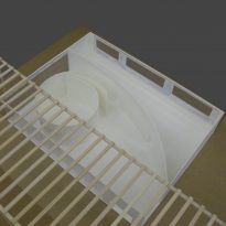
The audience emphasized the organic character of the forms materializing as an object inside a box. This is one wall that folds on itself creating a spiral in which is played the role and from the outside is perceived as a cylinder without tickets.
Spaces

The program is divided into two, placing in either volume of complex activities as belonging more to the field of study or recreation.
Recreation Area
In the volume with facade on San Pablo Avenue are placed on recreational activities and administration.
This building is divided into two floors, occupying only the upper half of the surface to achieve in the rest double-height space.
On the ground floor and is accessed by the naked eye are in reception, a waiting area, a bar and restaurant, all double-height.
Even under the second-floor wrought toilets are divided between men and women, the kitchen that serves both the bar and restaurant and a multipurpose room normally used as a playroom for children.
This plant is also open to the natural place and the stream through a step-shaped deck that creates a pleasant space to sit during the summer months and where you can keep casual meals, games and talks always in direct relation with the environment.
Upstairs is a private social club that are only accessible to community members and offices not only in charge of school work but of the entire university town, in response to complaints from neighbors, solving incidents and putting contact the city council if necessary.
Study Area
In the second volume that faces 10th Street are located studio spaces. Basically three classrooms with musical equipment and an auditorium with capacity for 60 people.
The audience is positioned as a cylindrical object in the middle of a fairly large space without contact with any front, so that is generated around a large hall that serves as a recreational area during breaks between presentations or between classes.
The classrooms have openings to the north above the eye level, so that natural lighting is as even as possible and the situation of the openings prevents direct views between the inside and outside, promoting an atmosphere of concentration in inside.
Both in the classroom and auditorium ceilings have been treated with suspension elements that enhance the acoustical quality of the chambers while generating an element of play when decorating. The lobby is the only space where the roof has remained intact with its full height.
Materials
The materials are a key aspect of this project, since many of the relationships between opposites in which the main concept is based are achieved through the purposeful use of materials.
We found both in the concrete pavement in the town square as the facade and structure of both buildings.
The vegetation element is also an important material here, as two sides of one of the volumes are coated with green giving the impression that it is these plants which are actually the fronts, not the concrete on which they are placed.
The glass becomes a predominant presence if we look at the park, as the four facades from here we can see (two in each building) are glazed large planes.
The interior compartments are finished with white plaster, making the curved shapes of these divisions take an almost more conceptual than real.
