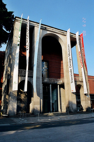
Triennale Design Museum

Introduction
Work began in 2005 and completed in 2006, at the Salone del Mobile. Opened in December 2007.
The new Museum of Design of the Milan Triennale exhibition covers an area of 2,000 square meters and was meant as a place of research and experimentation, a laboratory-museum changes its exhibitions from public property, private and national museums every 12 or 18 months.
Location
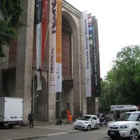
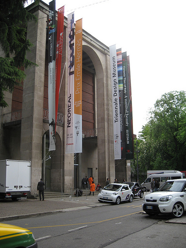
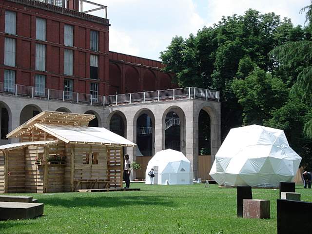
The museum is part of a larger project of restoration, the Palace of the Triennale, in the Sempione Park, viale Emilio Alemagna 6, I – 20100 Milano
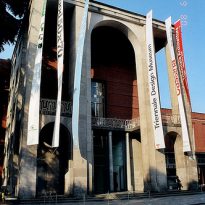
In 2002, the architect Michele De Lucchi was chosen to give glory back to the original building forms designed in 1931 by Giovanni Muzio. The first floor of the Palazzo dell’Arte was designed at the Design Museum.
Concept
Assuming the importance of the city of Milan in the history of Italian design from the last fifty years, either through its trade fairs, cultural debates, settling many of the biggest companies in the sector or any other event relating to the same, and the necessity of defining a fixed place to stimulate and revitalize the movement which brings it to life, it was thought that the Palazzo dell’Arte, point of exposure created exclusively for design in general, was the ideal place for the location of the Museum.
Respecting the space for other exhibits and displays, which must maintain a separate identity that is autonomous and proceeded to the preparation of space devoted to Design Museum.
Spaces
At the Design Museum is devoted to the curvilinear wing east was considered the most appropriate to be separated from other sectors of the exhibition Palazzo.
• Bridge access
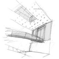
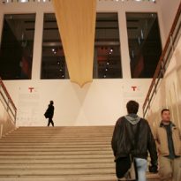
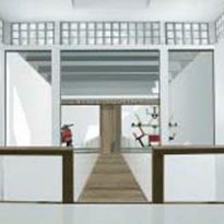
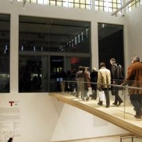
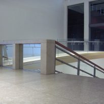
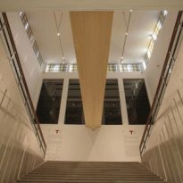
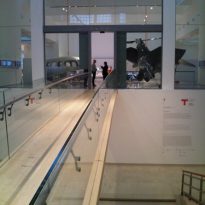
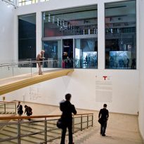
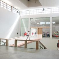
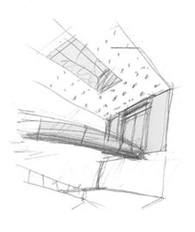
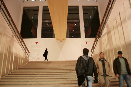
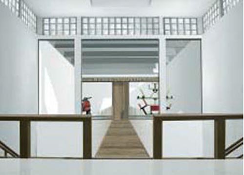
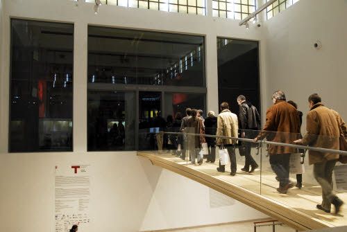
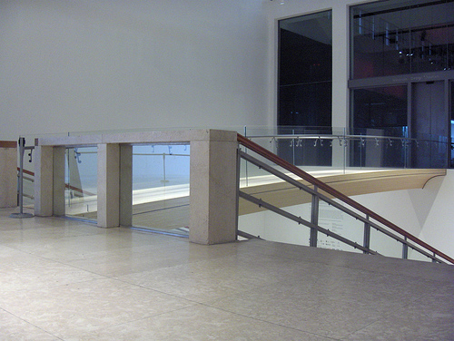
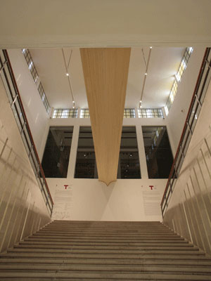
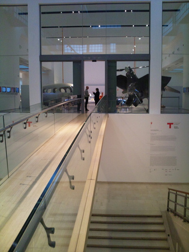
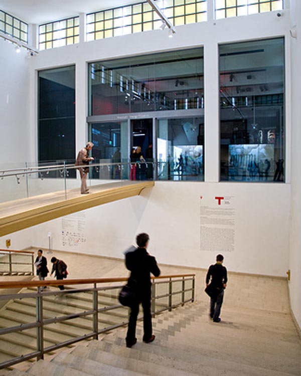
The project by Michele De Lucchi provides a bridge with a light-free approximately 14 meters on the wide staircase entrance, allowing access to the museum at the time it joins the Triennale. The end of the bridge is flanked by a large portal of steel and glass, it is integrated into the structure by Muzio.
The bridge is the element of surprise that the defined distance between the world of “consumption” and conservation, the bridge two eras, and to Muzio De Lucchi. The glass is the attraction to present products and objects.
“I think the bridge links, also metaphorically, especially now that there is a need for tolerance, there is a need for bridges,” said De Lucchi own.
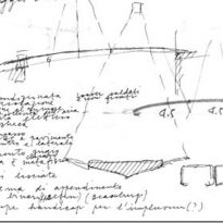
With a length of 13.85 m, a width of 1.66 m and a height of 0.66 m and 1.76 m including Pretil The bridge weighs about 5,000 kg, has a capacity of 400 kg/m2 and has been mounted factory and taken to work with all its parts and assembled. It’s like one of the works of art and design that have been brought to the museum.
• Chambers
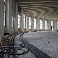
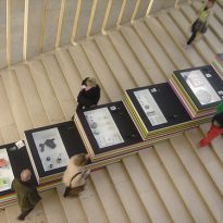
Once crossed the gate to access a vast hall where there is nightly receptions, meetings, presentations and all types of events concerning the world of design. From this hall one can see the entrance to the first room to house temporary exhibitions of common rhythm.
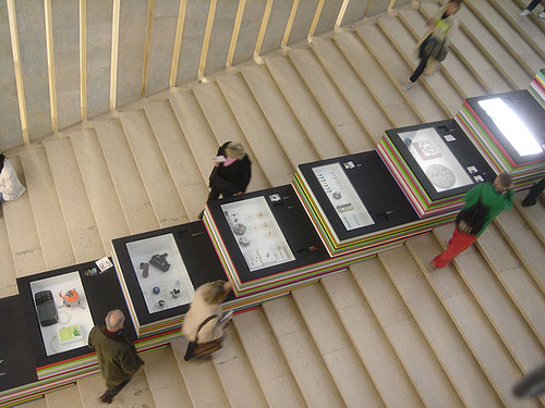
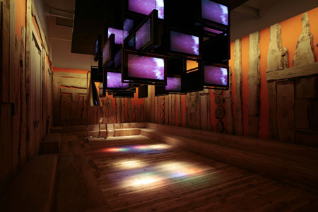
The second room, large living curve is for the annual exhibition. In this core lies the permanent collection of Italian design that has more than 1,000 pieces belonging to various sectors of the design, made from postwar to the present.
• Other Areas
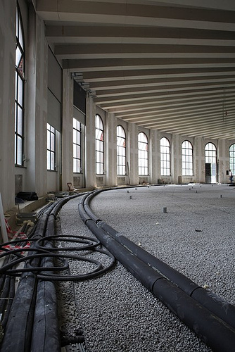
Within the project to the Design Museum was also made a library, an archive, a documentation center and a warehouse for the works of the collection.
Inside the museum’s own characteristics and personality, but its facade is related to the whole context.
Structure
In total the project, the innovative architectural element is formed by the entrance to the Triennale Design Museum.
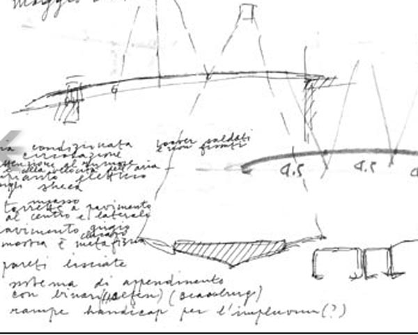
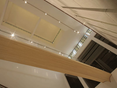
The bridge, with a light-free about 14 meters and a width of 1.66 m, is a strong element of visual attraction and consists of a single block of wood laminate cutting bamboo Pretil side with strong laminated glass, extra course, “embedded” in the lower section and linked together by two thin steel railings painted gray.
The bridge is actually a simple support beam isostatic monolithic shafts constructed with bamboo listellos wood glued to each other, the technology of laminated wood.
Materials
Bamboo has been chosen for their best aesthetic qualities, its parameters and mechanical strength, because as a construction material, is a renewable natural resource for high performance and high environmental compatibility.
The color of the bridge is natural with some parts painted gray Triennial, the color given by Muzio to the windows of the building.
One of the architect’s work was the recovery and rehabilitation of the original windows.
