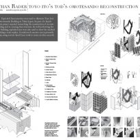
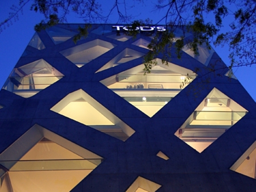
Tod’s Omotesando Buiding

Introduction
In the 90s almost every luxury stores were in search of new ways to promote their products. Billboards, television commercials and magazine ads did not attract the number of target audience and how to display their products was a common theme to all of them.
Over time they realized something had known all along, “the product packaging is sometimes as important as the product itself.” And when the product is trying to promote its own brand, then the brand packing should be as attractive as their products. Thus appeared the notion of “luxutecture” exterior architectural design in order to promote a brand. Gucci, Prada, Burberry, and others embarked on a mission to make sure that the outside of their shops look as well as the inside and the products they sell.
When Tod maca Omotesando store opened its had already been built several prominent buildings responding to the concept of “luxury building”, but the new building, the architect Toyo Ito, created great expectations for its innovative design.
Location
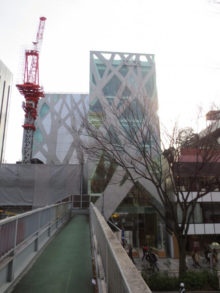
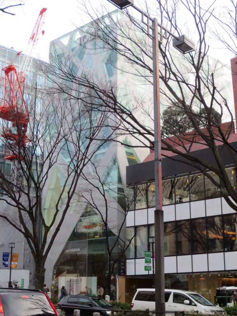
Tod’s building, is located in Yoyogi 01/05/15, Omotesando, the famous tree-lined avenue and the most prestigious shopping street Tokyo in the Aoyama district, Japan.
Concept
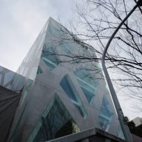
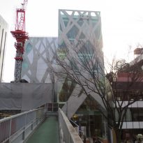
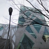
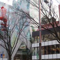
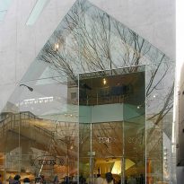
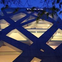
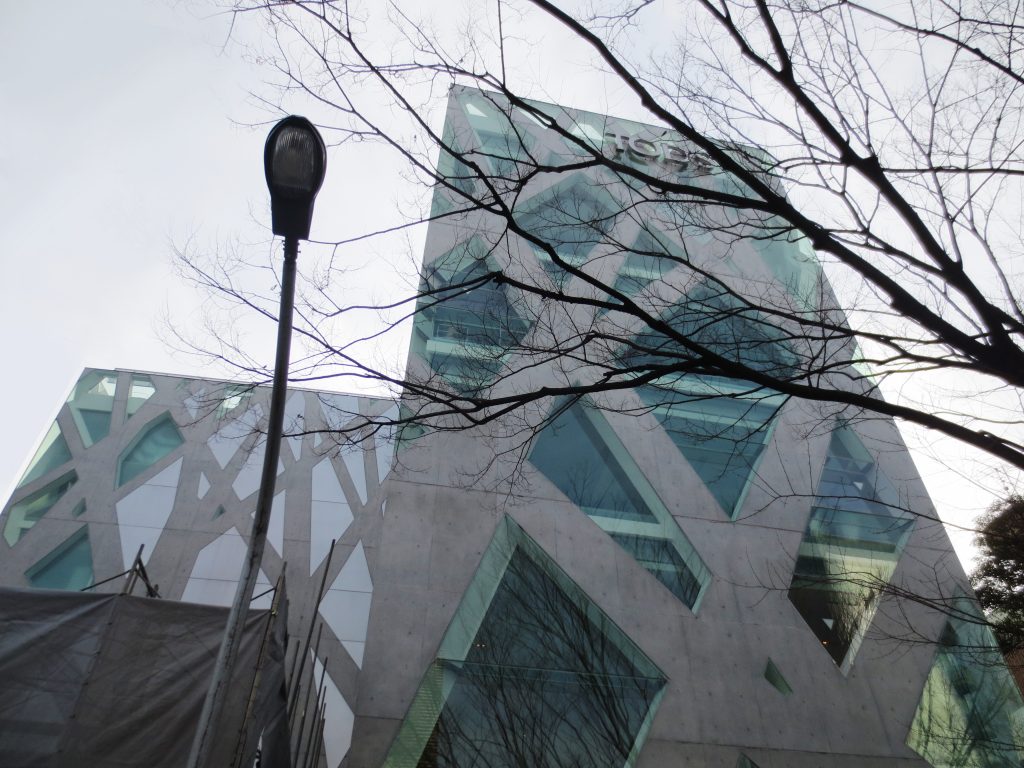
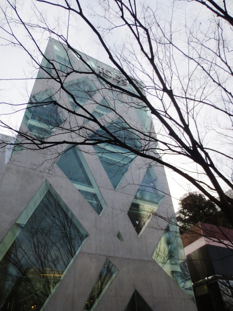
The building is surrounded by a skin of interlocking concrete supports and glass, mimicking the trees lining the street.
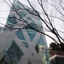
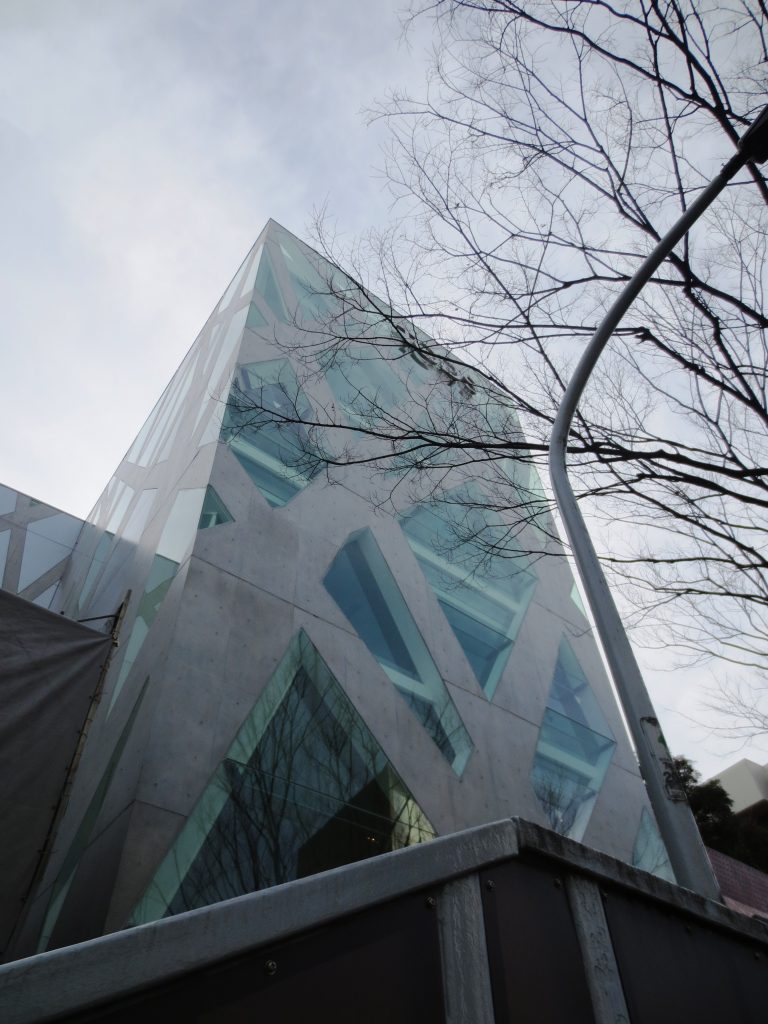
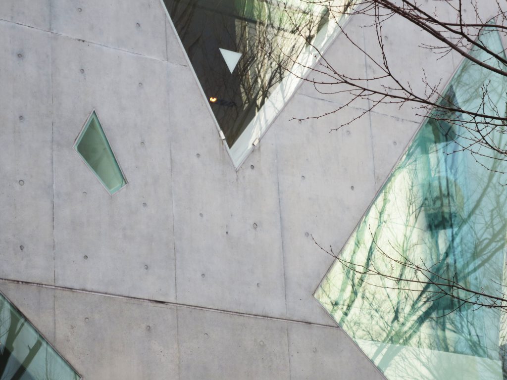
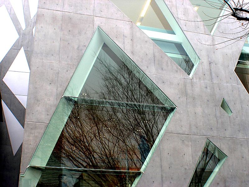
The organic effect outside of the building is particularly impressive in the cooler months, when the bare branches of the elms near reflected in the building. The facade design mimics the natural growth patterns of the trees nearby, and as luck would have on the sidewalk near the door has several trees whose branches run counter to most of the super-structure of the building, creating a mirror image of the nature of the architecture created by man. The branching design is based on the Serpentine Gallery in London.
New concept of surface

Throughout the Omotesando area were built many stores for luxury brands. By choosing concrete as building material Toyo Ito makes a bold proposal, the use of a substantial material and strong, absent in the “glass architecture” of the adjacent buildings.
“… This concrete structure, however, is not used just as in conventional architecture to express the volume or the massiveness of the walls. Rather than being simply a pattern or structure in this building acquires a new dimension in relation to the notion of surface.
The various studies began with the question: “How can we escape the conventional notion of the structure of a wall?”. The architectural team was looking for a way to avoid openings in a volume transparent opaque. Instead of differentiating transparency opacity, is looking for a new method that defined yet, simultaneously, the join, trying to relate all lines (columns), surfaces (walls), and openings in an innovative. Studies suddenly moved in a different direction after the formulation of the question: “Should not it be possible to create a surface like structure that directly expresses the flow of force, if formed as a structural diagram drawn as a pattern thick lines on a flat surface? ”
After going through this process, conceived the idea of using an integrated structure by overlapping silhouettes of trees, in a sense, suddenly.
Our address is created with a certain emotion when, after several investigations, we find that through tree form could achieve several conditions in an innovative way that is very different from the conventional geometry. Trees are known for organisms themselves, and therefore, its shape has an inherent structural rationality. The pattern of overlapping tree silhouettes also generates rational force flows. Adapted branched tree diagram, as it moves up the building, becoming thinner and numerous branches, with a higher proportion of openings. Therefore, the building interior spaces unfolds showing slightly different atmospheres in relation to the various intended uses.
Rejecting the obvious differences between walls and openings, lines and planes, two and three dimensions, transparency and opacity, this building is characterized by a distinctive type of abstraction. Tree silhouette creates a new image with a constant voltage generated by the symbolic realization of the building and its abstract nature. For this project, intended to create a new building for its architectural express both the living presence of a fashion brand and its strength in the urban landscape endure the test of time… “(Toyo Ito
Spaces and materials
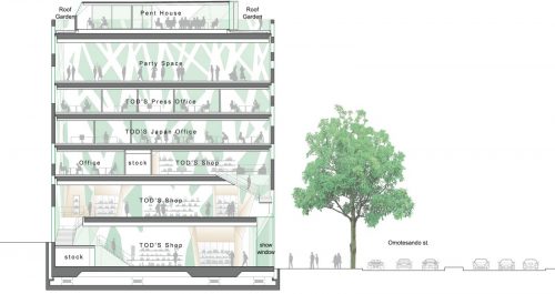
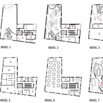
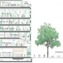
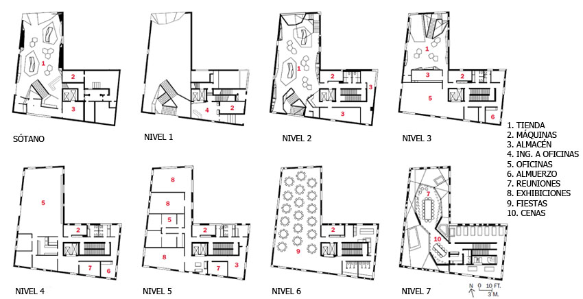
The slender building as the design architect for the firm Tod could showcase their products on the famous Tokyo Omotesando is L-shaped and is used for offices and retail store of the Italian firm. On the top floor, with a garden terrace, reserved a space for meetings and other events.
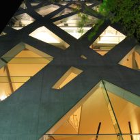
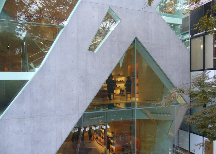
The seven-storey building at the Toyo Ito continues with the exploration of their ideas surface. Inside, hidden opaque glass rear view so buyers are attracted to the front of the store in which play an important role in the animation of the construction. At night and internal lighting are best organic forms of its design.
Interior
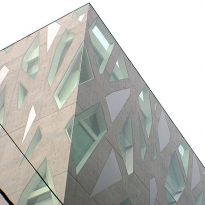
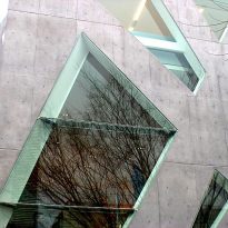
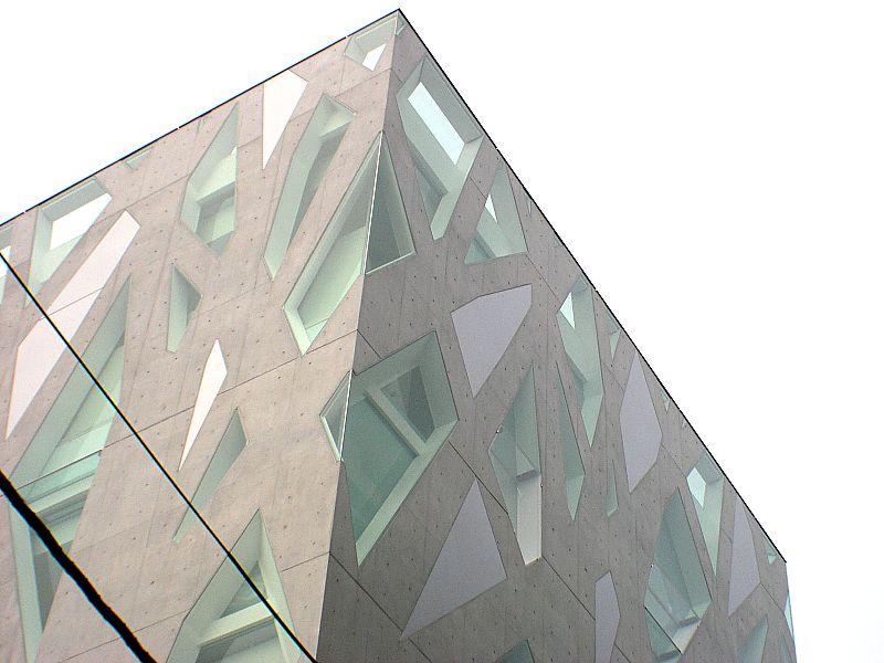
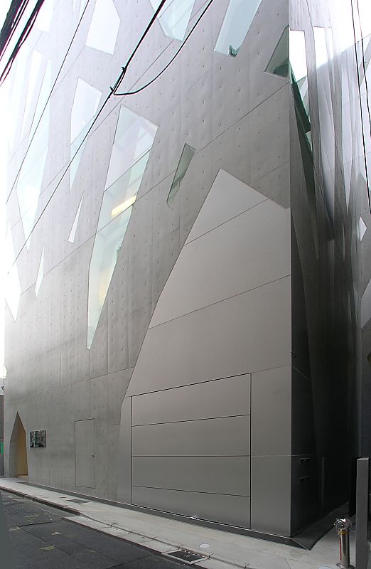
Light enters the building through the transparent glass that fills the spaces between the concrete supports on the front facade on the north side. The glass is opaque to the south, facing rows of low private homes that provide extra daylight in the building. The building has 270 openings, 200 of which are only 70 combined with glass and aluminum.
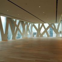
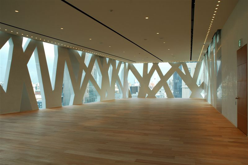
The concrete supports also serve as space dividers inside the building in which natural materials, stone, wood and leather, reflect the quality of the products displayed.
Exterior
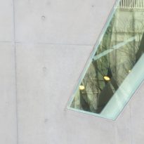
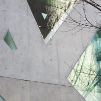
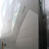
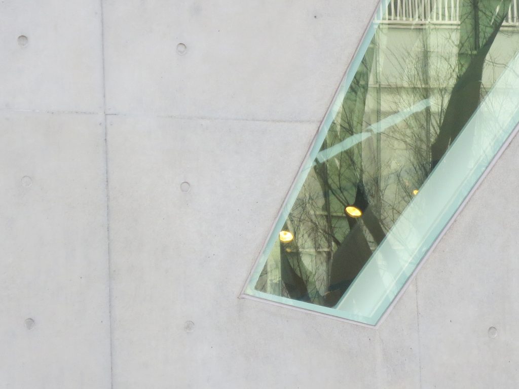
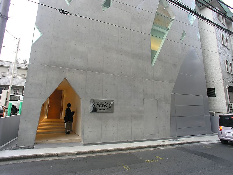
The depth of the concrete structure offers a neutral green tone, the color effect is the result of reflection of colored glass. Moreover, since the glass has no frame, creates a sense of bewilderment, as a whole, the visual appearance resembles a pattern drawn on a plane.
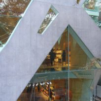
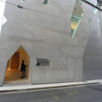
The rear entrance to the building is shaped like a “house of tales”, contrasting with a door located on the right side, rectangular frameless steel sheet and firmly fixed in the same plane as the concrete wall.
Structure

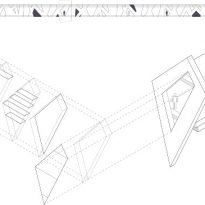
The innovative structure created by architect with concrete walls and glass shaped tree branches causes are structural and surround the building six sides, creating a spectacular visual effect and allowing a wide glass entrance.
The power architectural nonstructural curtain walls in modern architecture led to the creation of the “free facade”. With new construction technologies for concrete and glass, Ito has created a new freedom in a structural wall. In this respect the architect says:
“Omotesando Tod… The building is an ambitious project that incorporates cutting-edge concepts and techniques in contemporary architecture. With this project I strive to transcend architectural modernism that characterized the twentieth century… ”
Due to its narrow L-shaped façade was designed branched structure that unifies the volume. This outer surface serves as both a graphic pattern and structural system. It is built with reinforced concrete 30cm thick and embedded therein frameless glasses. The resulting surface supports the floor slabs that extend between 10 to 15 meters without any internal column.
Facade Description
The facade with interlocking concrete supports reinterprets the silhouettes of the elm trees lining the street. The division of plants is reflected in the transparent structure and not by the route of the facade has been designed following the pattern generated by the superposition of nine trees. Following the structural logic of botany, the columns are wider at the base of the building and become more slender as they gain altitude, and also branch out into more structural elements.
Is a block with a glass curtain wall, supported by the concrete and steel members. What is striking in its exterior design is that the members are arranged so as to cause the building to challenge your own way. Instead of the rigid mathematical angles and curves to classical architecture by man, the outer tent structure Tod is surrounded by large, smooth curves and bifurcations that emulate organic forms.
To avoid glass breakage, for a possible earthquake, the structure is supported on a cushion placed on the foundation, which is common in Japanese buildings.
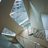
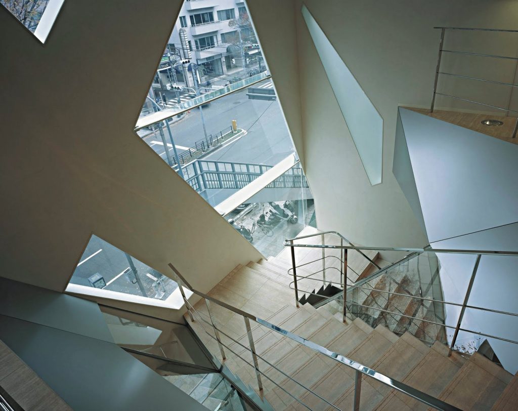
Branched structures are not simply a two-dimensional network abroad, also run by the interior, serving as decoration, a division of sections, and even unusual marking stairs. In some areas the soil is glass sections can not be enabled because the glass used is not strong enough to withstand pedestrian traffic must be closed with metal fences.
The unification between the outer and inner form was possible because the architect created both. Usually there is an architect for construction and one for the inside. In this case, one person is responsible for creating the building, and the result justified the risk.
