The Rookery
Introduction
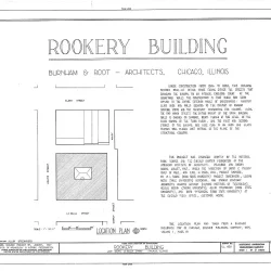
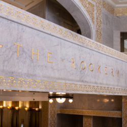
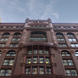
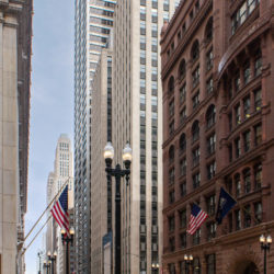
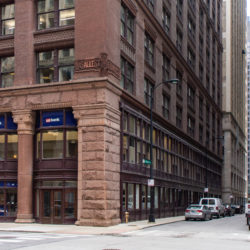
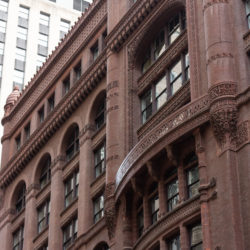
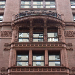
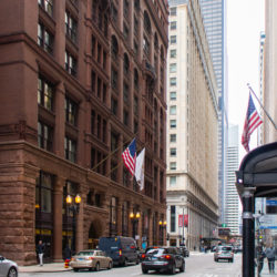
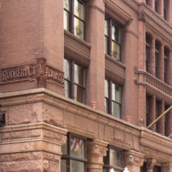
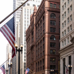
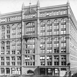
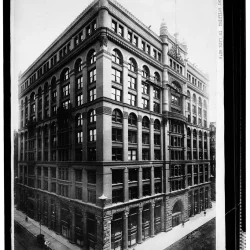
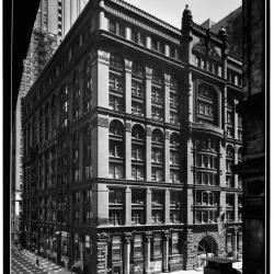
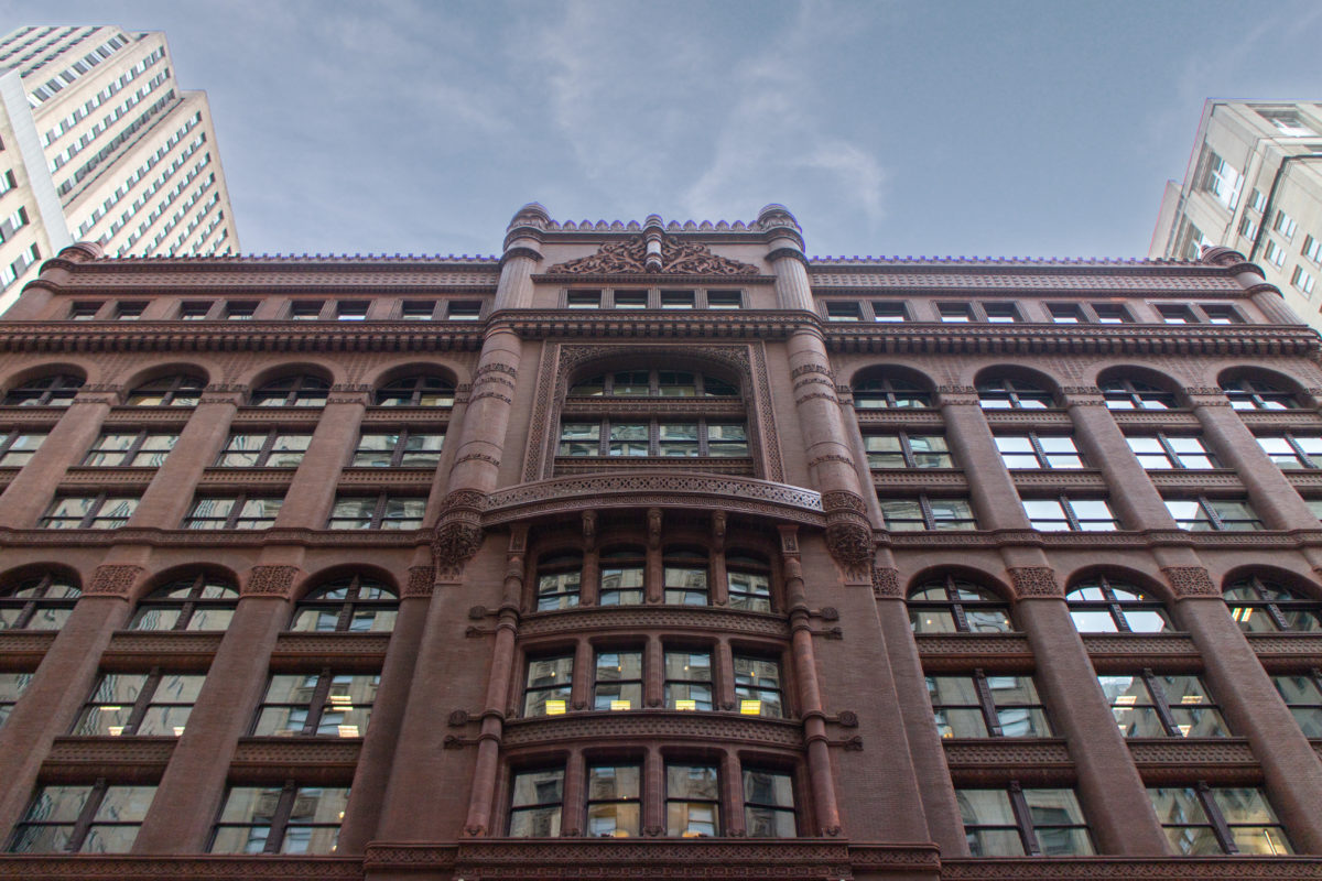
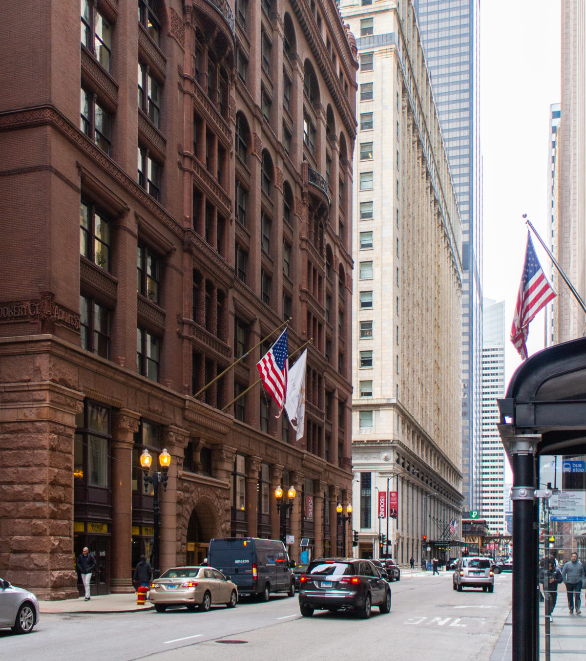
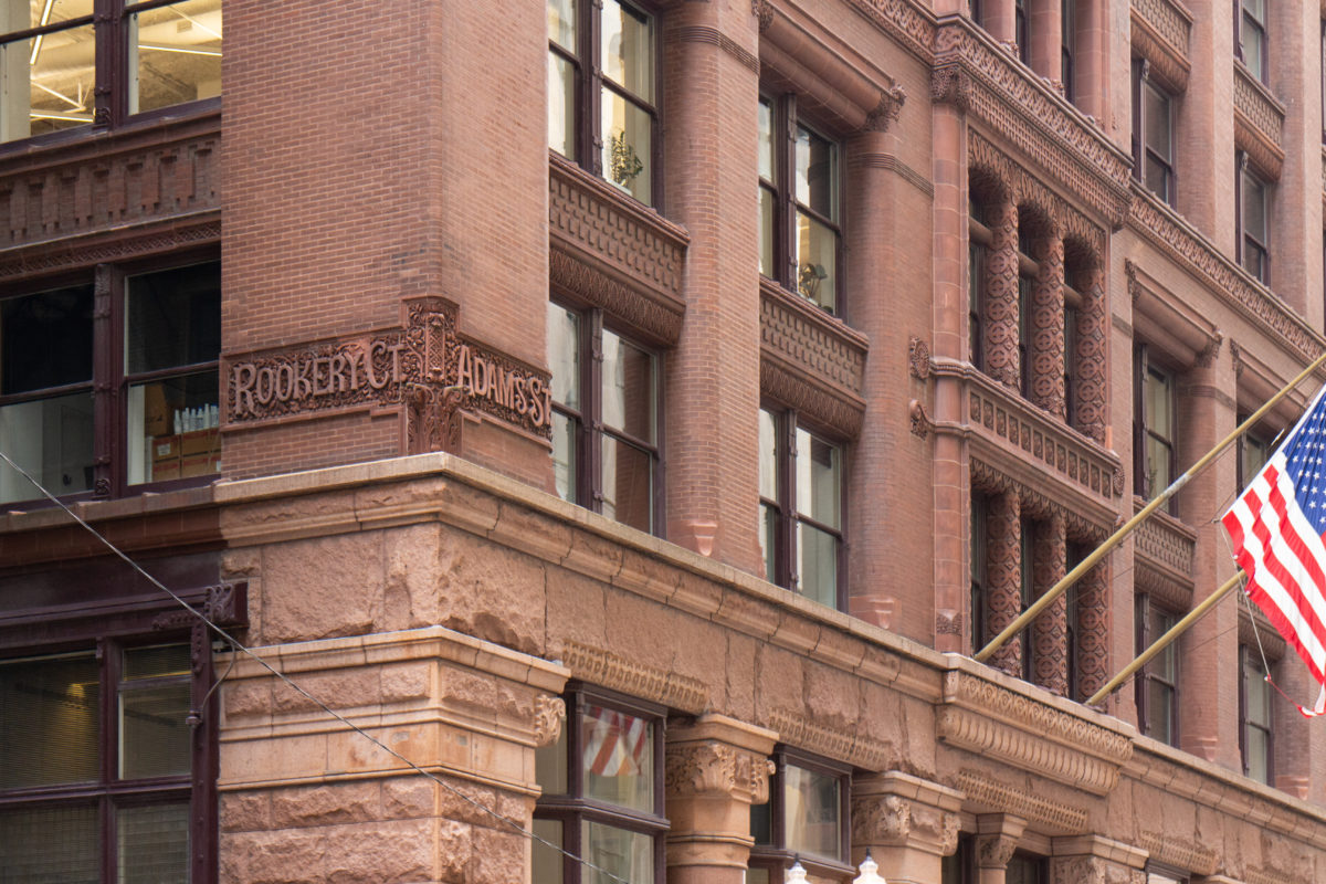
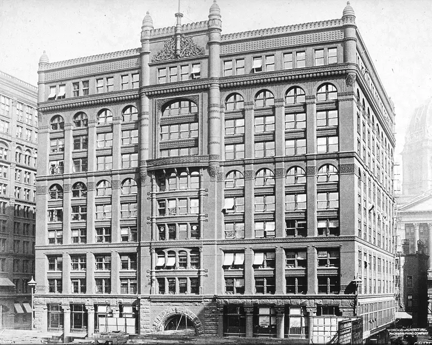
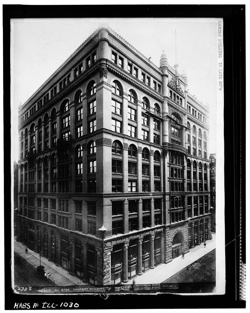
The Rookery is an eleven-story speculative skyscraper in Chicago designed in 1885 by Burnham & Root.
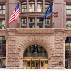
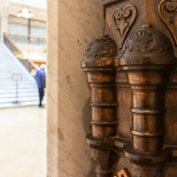
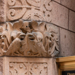
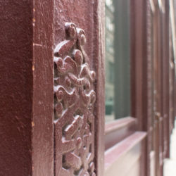
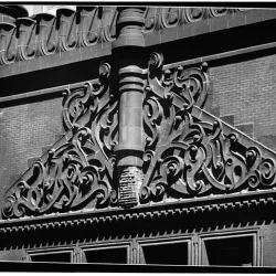
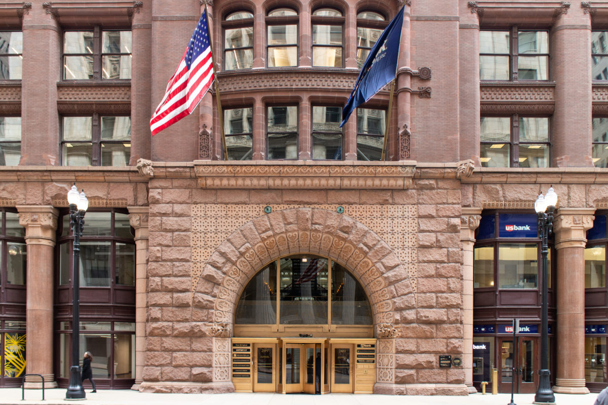
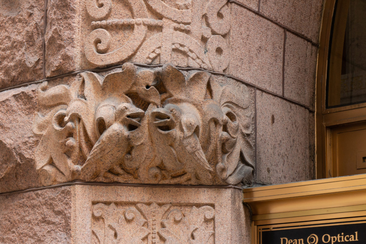
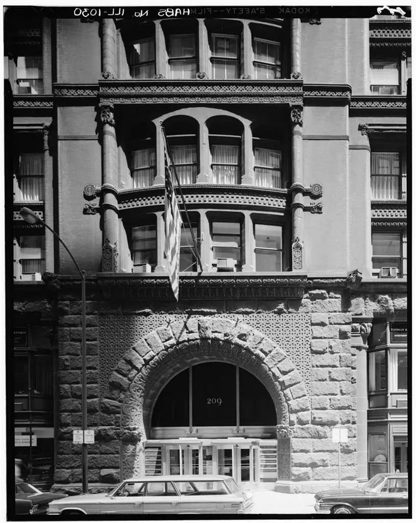
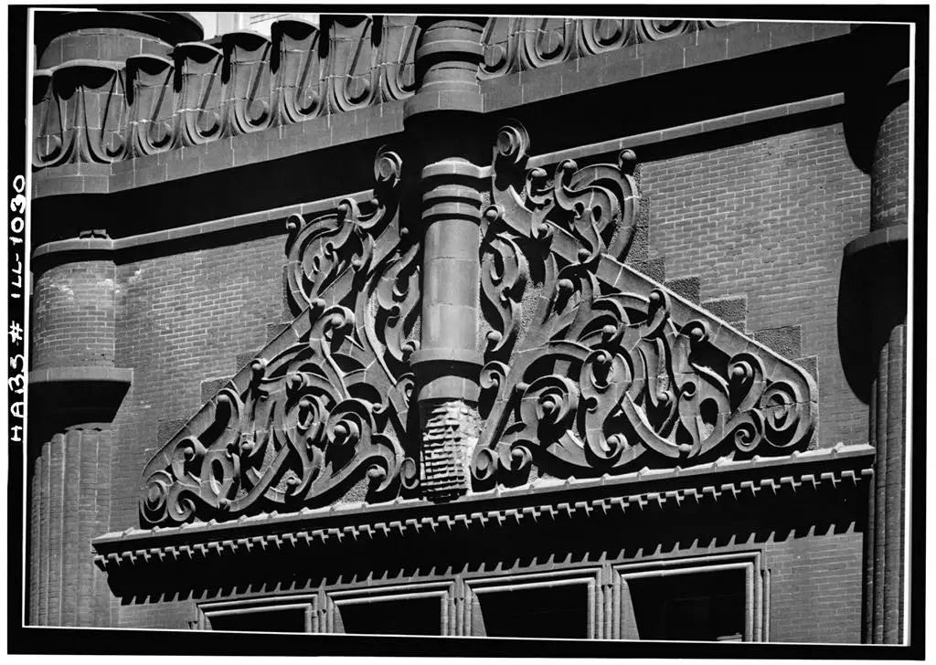
Its site had been the location of the temporary, post-1871 Fire City Hall that was erected around a municipally-owned water tower in which pigeons roosted that was nicknamed “The Rookery”. Chicagoans derisively continued to refer to the City Hall after it was erected as “The Rookery” in comparing the politically corrupt actions of the city leaders to that of the birds’ droppings. Against the wishes of the building’s primary owners (Peter and Shepherd Brooks of Boston), the building still bears this “romantic” name. Root quietly made sure that the site’s infamous past would not be forgotten by having a Rook carved in each impost block at the building’s two entries.
The building was designated a Chicago Landmark on July 5, 1972, and was added to the National Register of Historic Places on April 17, 1970 and listed as a National Historic Landmark on May 15, 1975.
Location
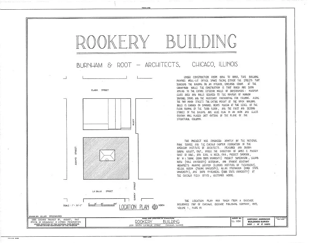
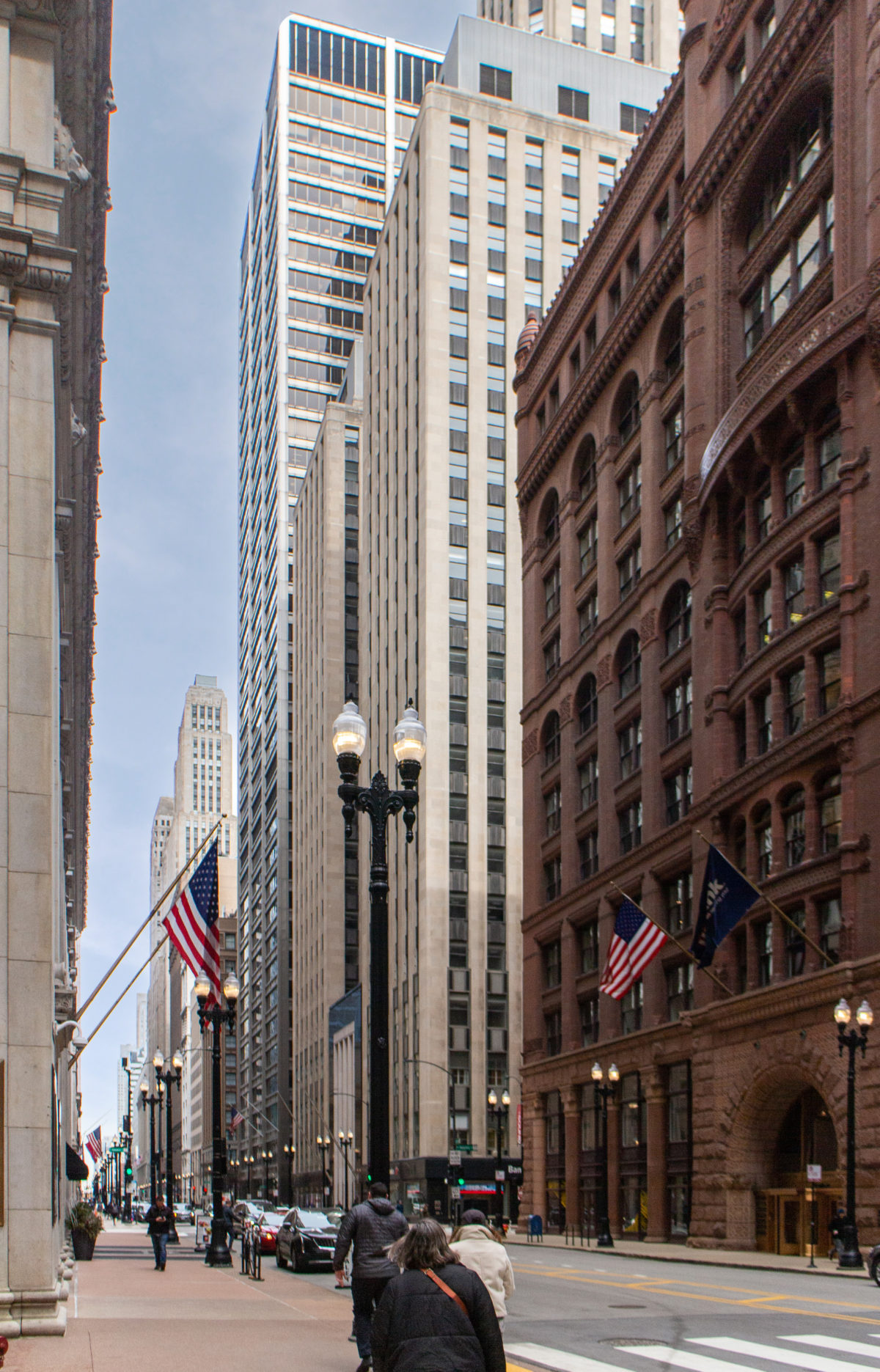
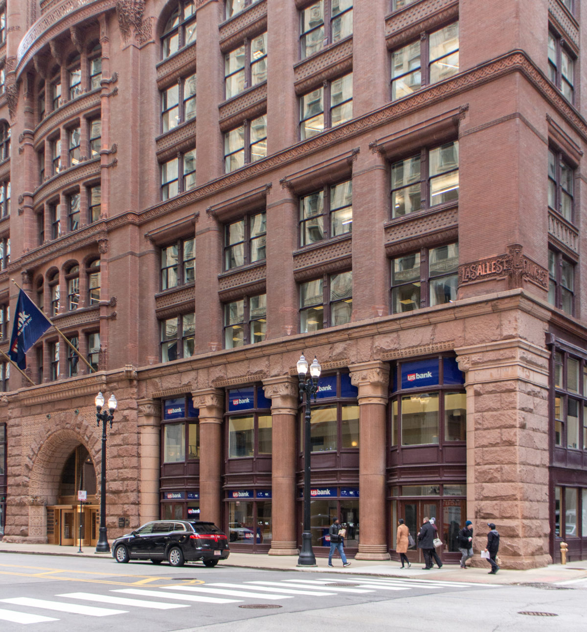
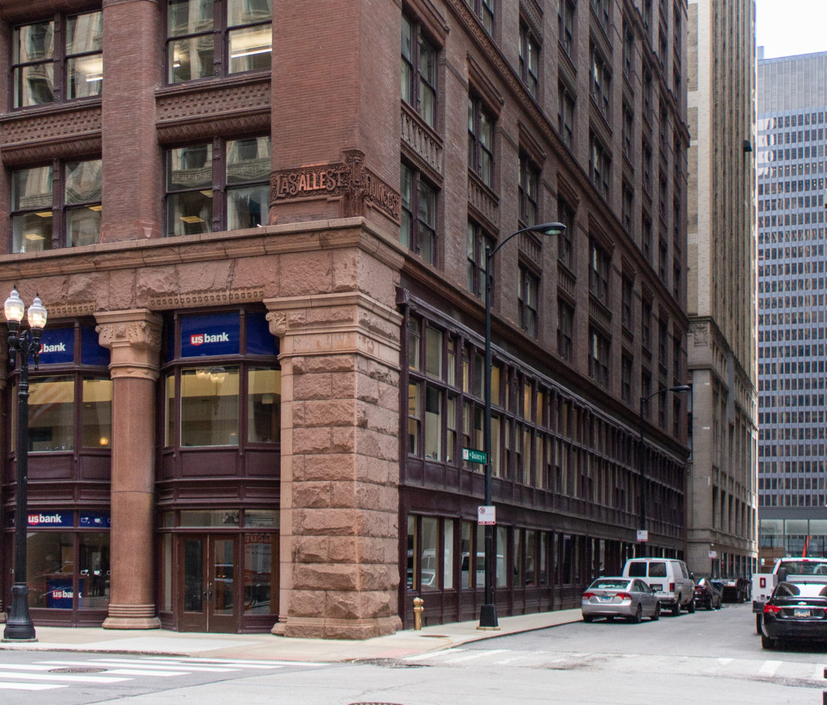
The site is the southeast corner of Adams and La Salle Streets, considered to be Chicago’s financial district. It is located only two blocks north of the city’s Board of Trade, which at the time of the Rookery’s design was the city’s tallest building, having a 303’ tall tower, designed by W.W. Boyington.
Concept
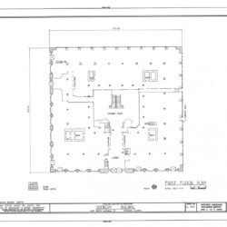
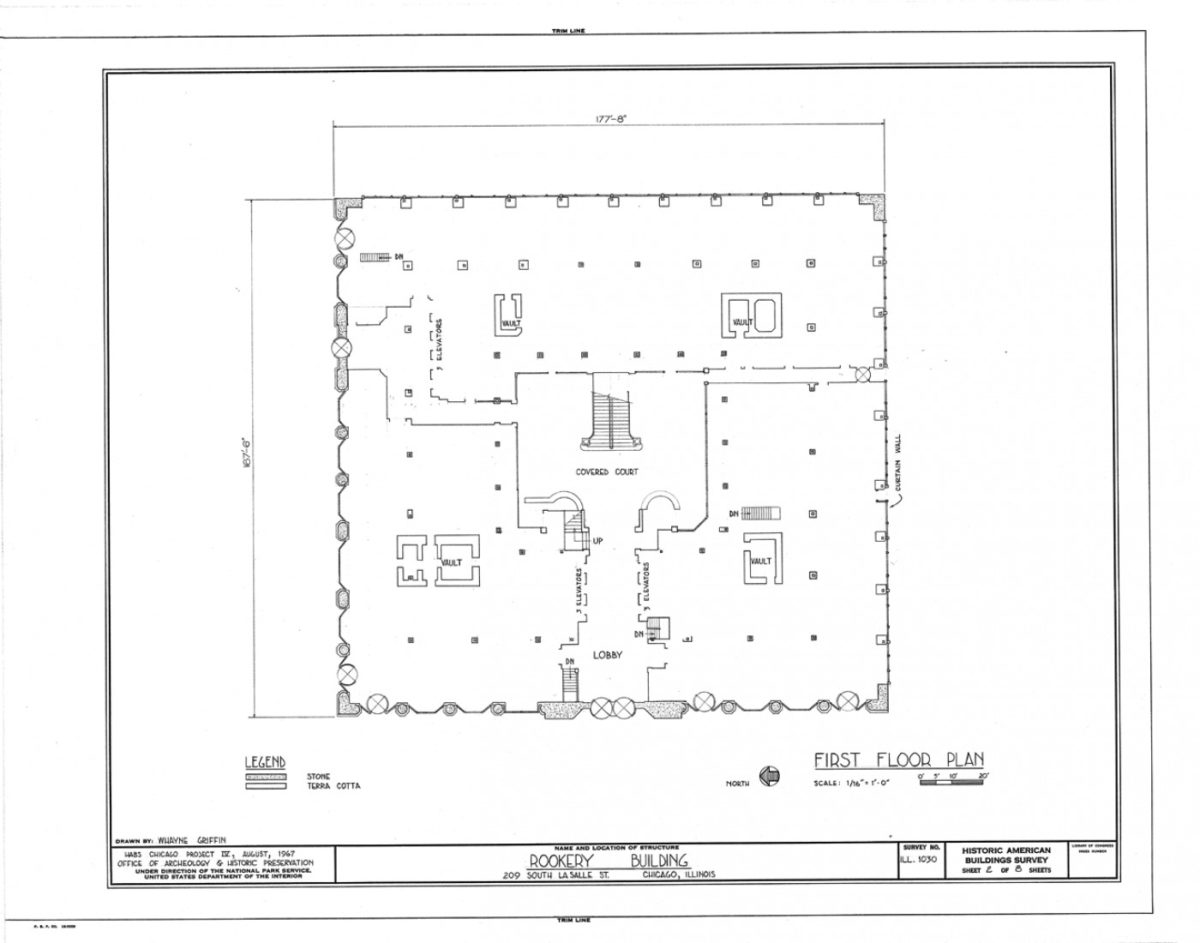
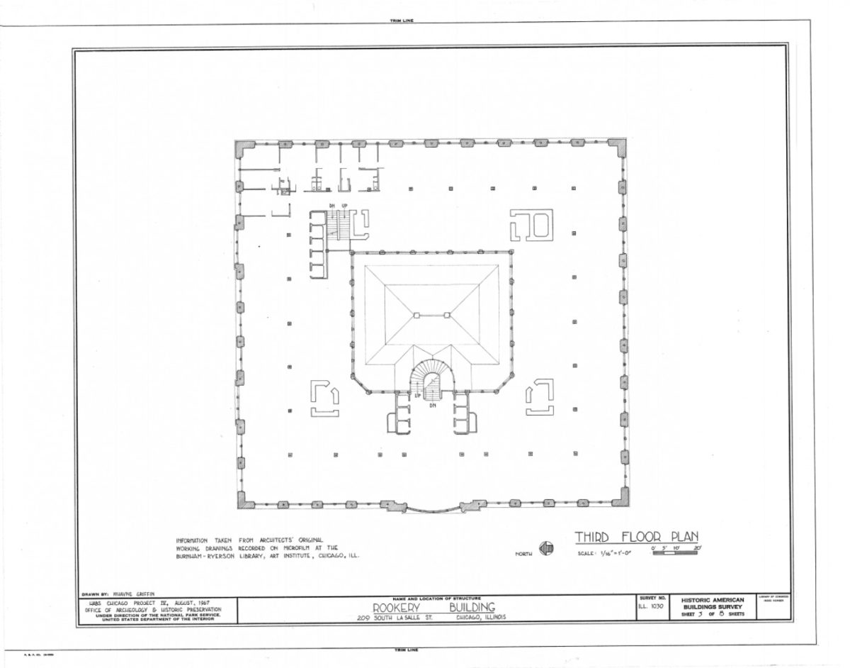
The site is surrounded by streets or alleys on all four sides, offering generous daylight for offices located around its perimeter. It is so large that instead of wrapping it with the traditional single-loaded corridor plan, Burnham had calculated that an interior ring of offices could also be included, almost doubling the rentable floor area which would also increase the building’s profitability.
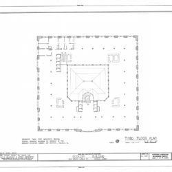
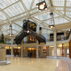
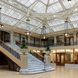
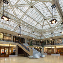
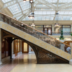
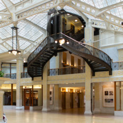
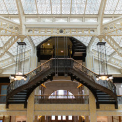
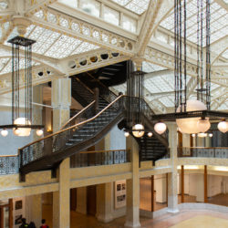
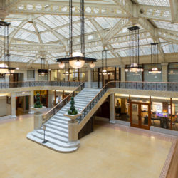
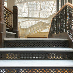
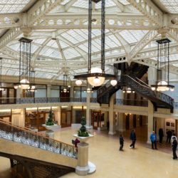
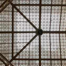
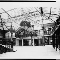
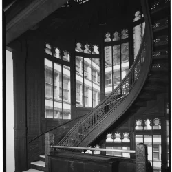
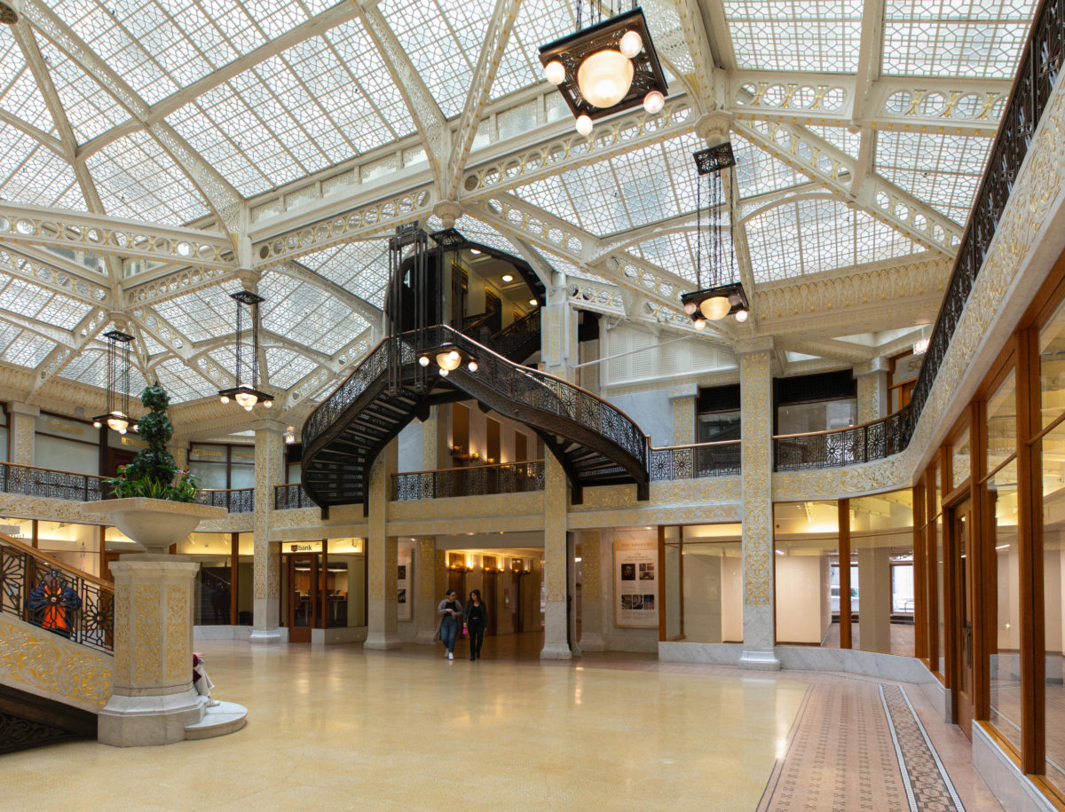
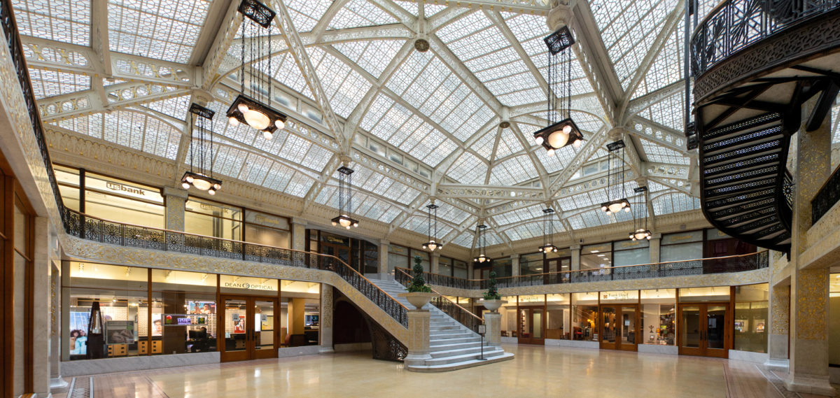
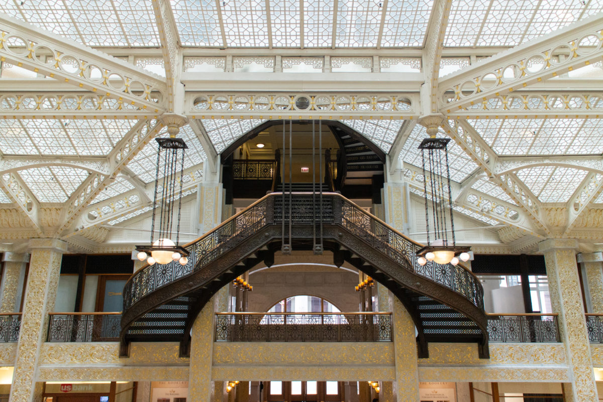
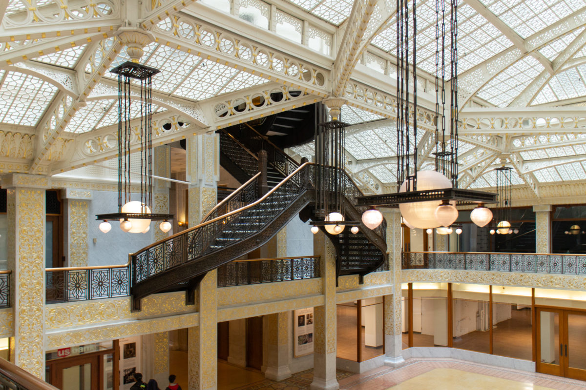
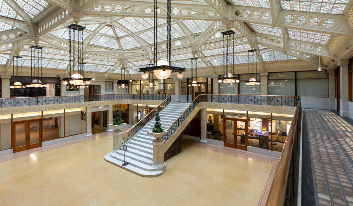
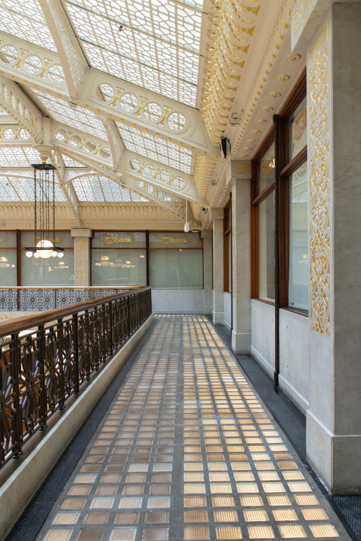
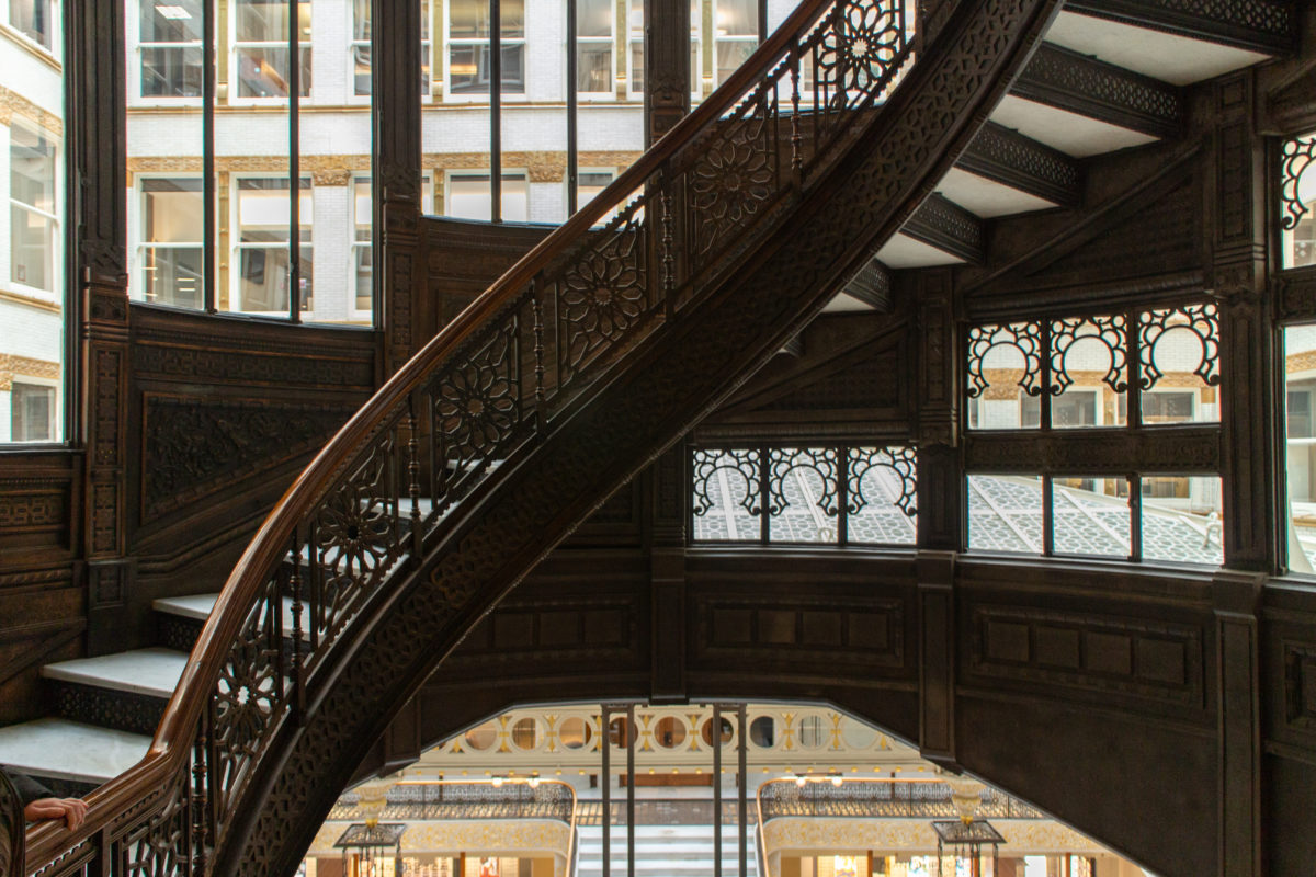
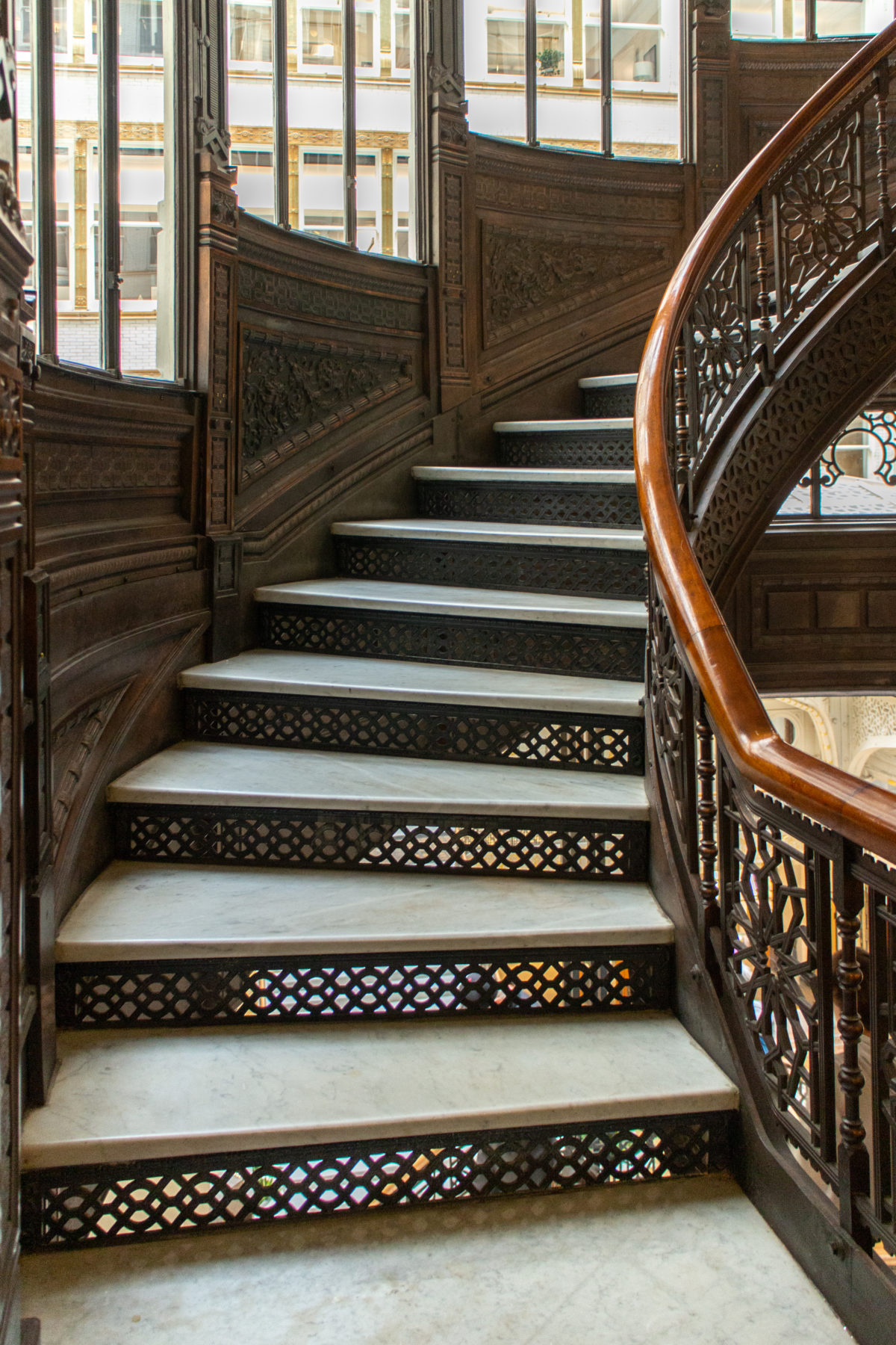
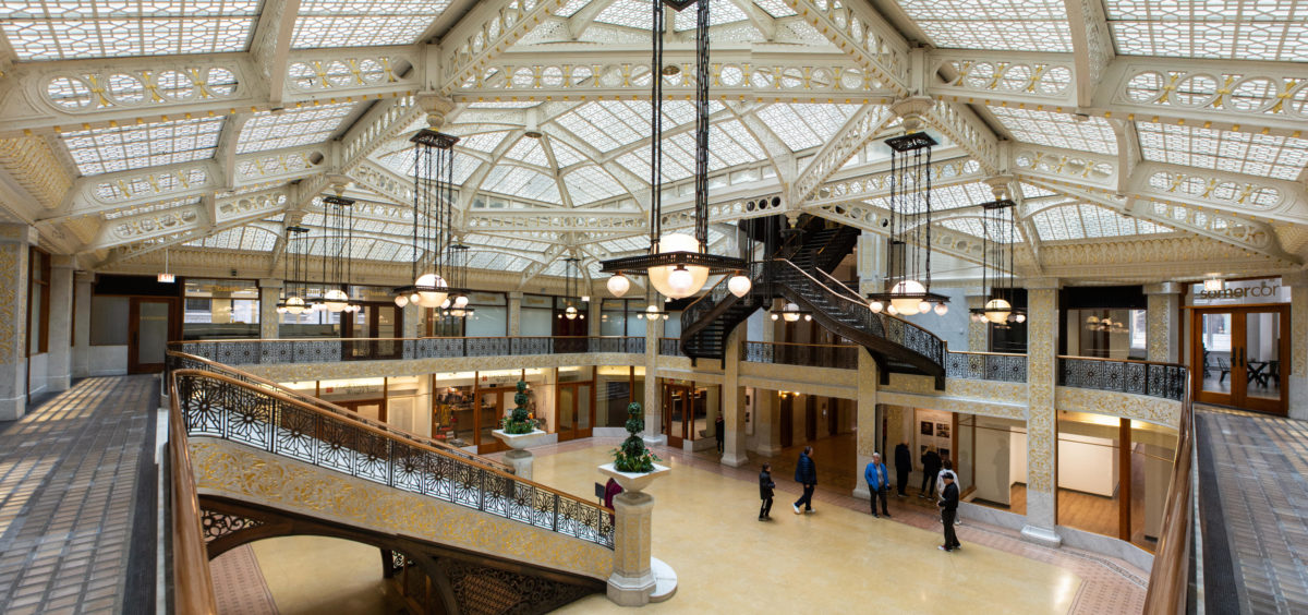
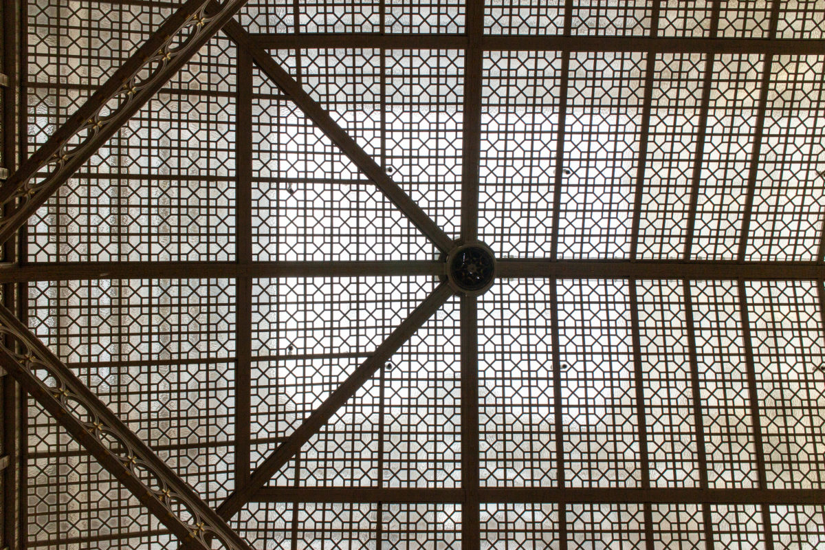
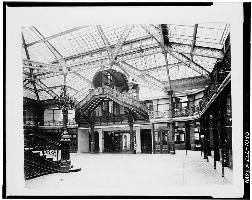
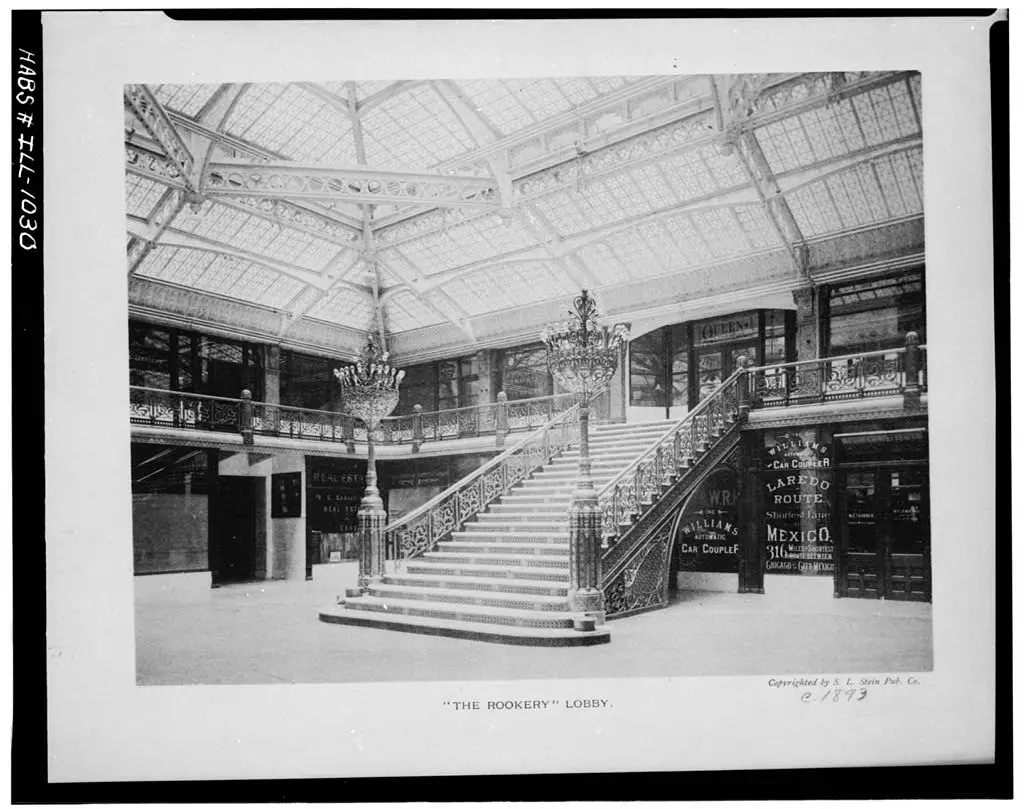
In order to gain access to natural ventilation and daylight for these offices, the glass skylight typically located at the top of a single-loaded corridor building, had to be relocated to the lowest office floor. In the case of the Rookery, this resulted in reducing the height of the atrium space in the center of the building’s footprint (where the unusable floor area was eliminated due to being too far from an exterior window) from eleven stories to only two stories. Root took advantage of this lower position of the glass skylight to offer visitors the opportunity to actually walk up a staircase that actually penetrated the glass and opened into the exterior light court above the skylight.
Spaces
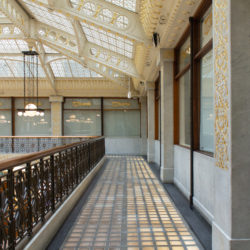
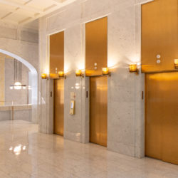
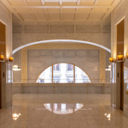
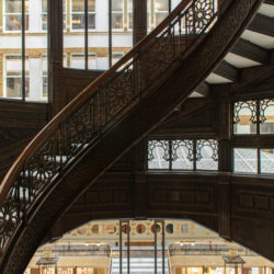
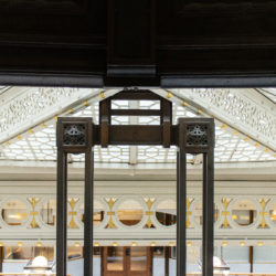
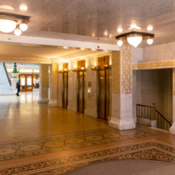
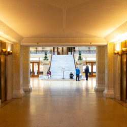
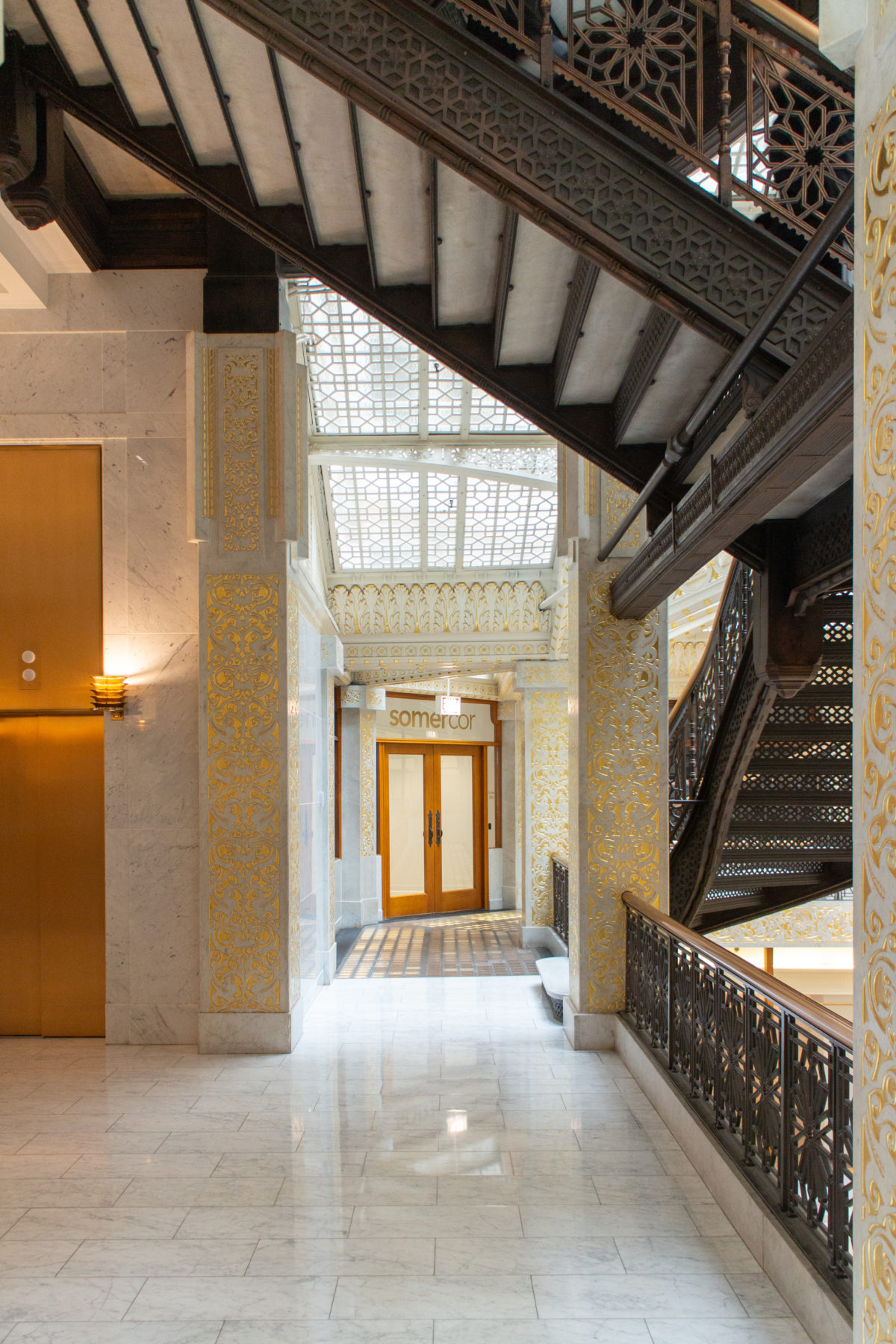
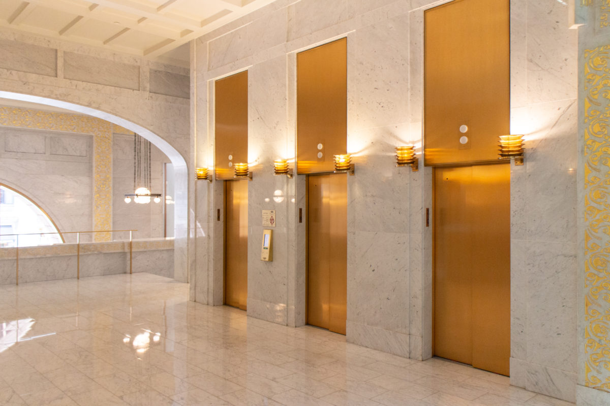
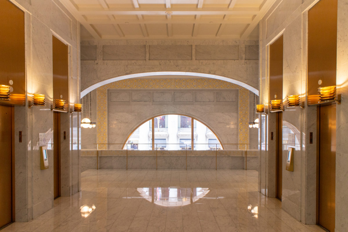
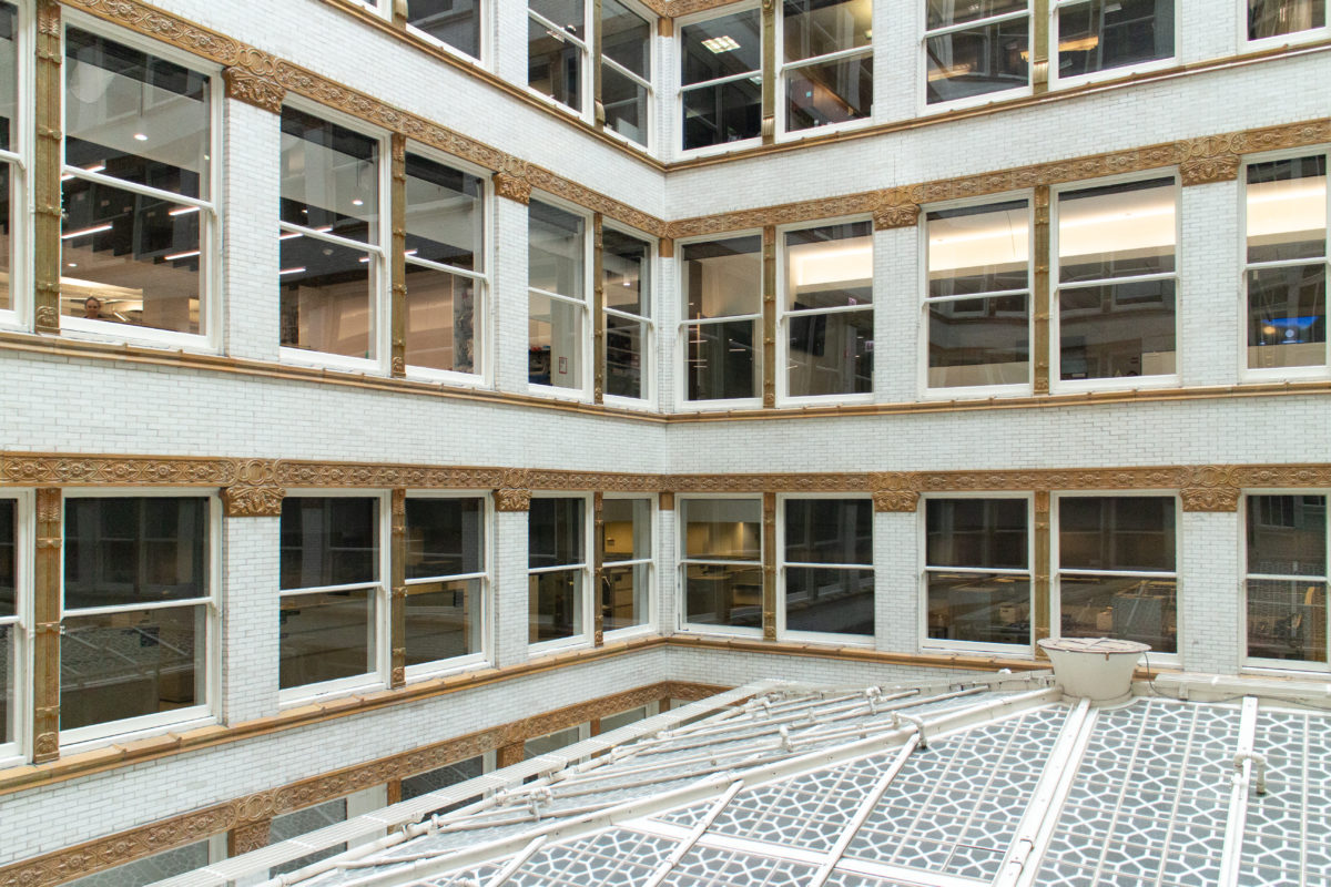
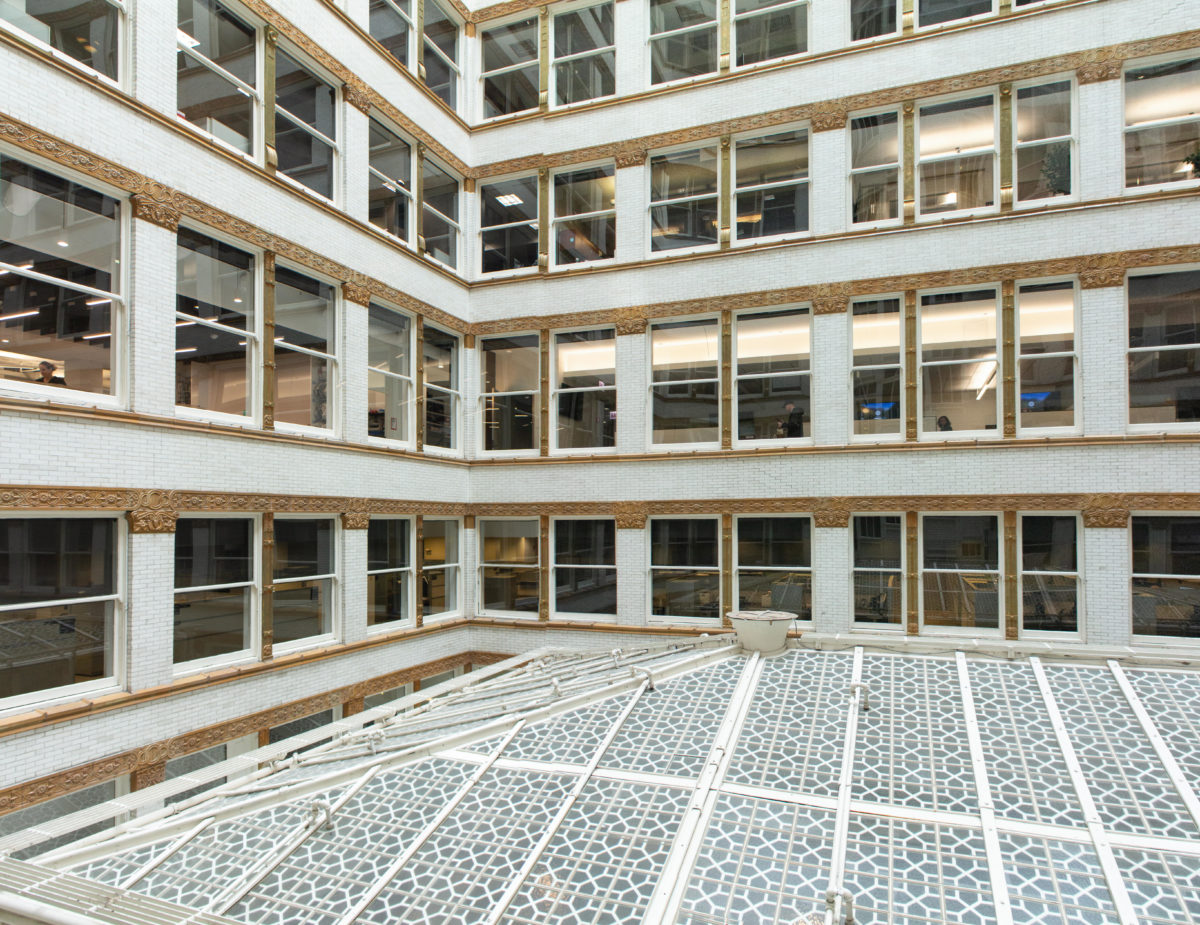
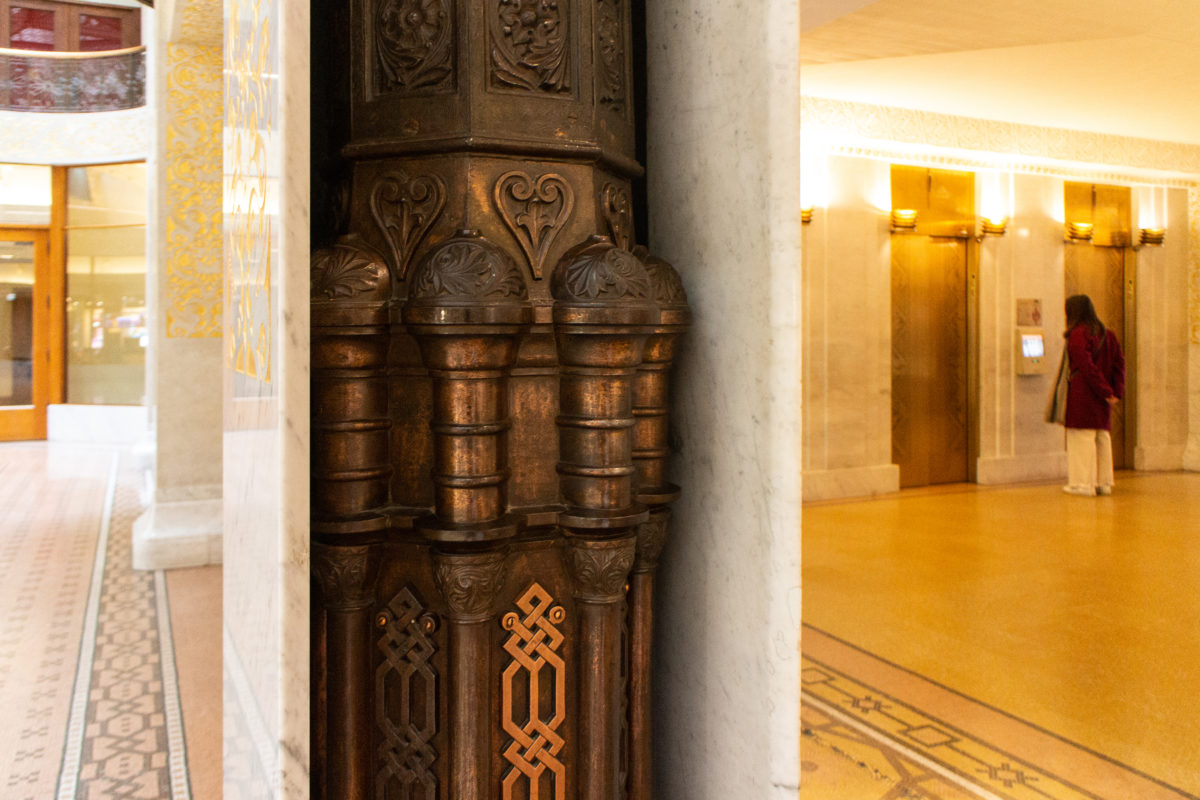
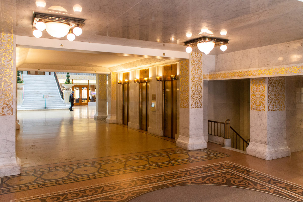
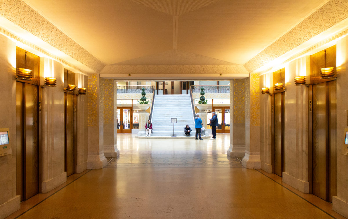
Coming through the aperture of the Rookery’s elevator lobby, Root enticed you to walk across the atrium and come up, through the skylight and into the light court. Here once was presented by Root’s unconscious prophecy of a new architectural language, what a skyscraper’s exterior in the immediate future would look like: thin, lightweight, rectilinear, light-colored and clean, and somewhat released from the tyranny of gravity: free from having to be vertically connected to the ground.
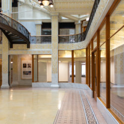
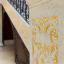
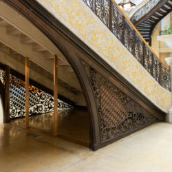
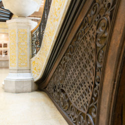
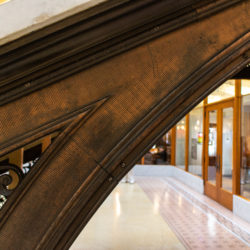
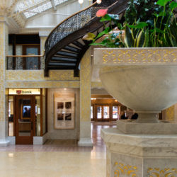
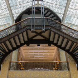
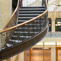
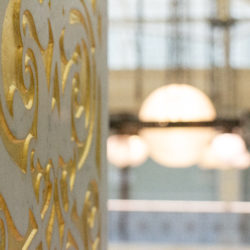
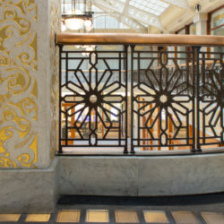
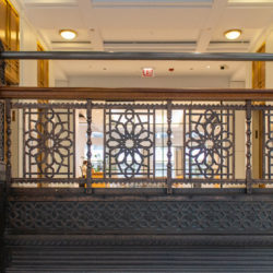
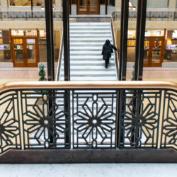
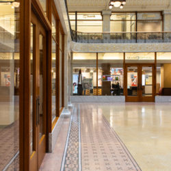
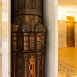
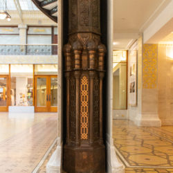
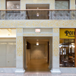
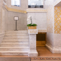
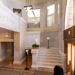
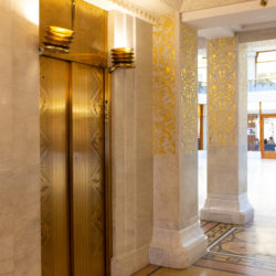
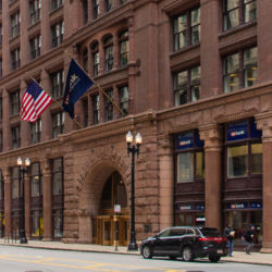
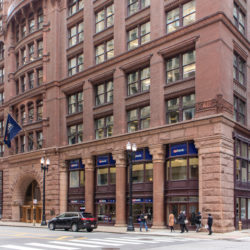
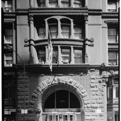
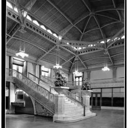
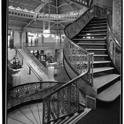
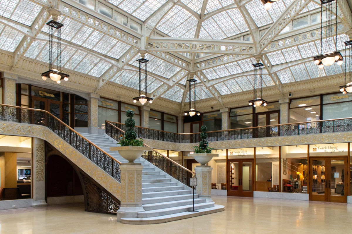
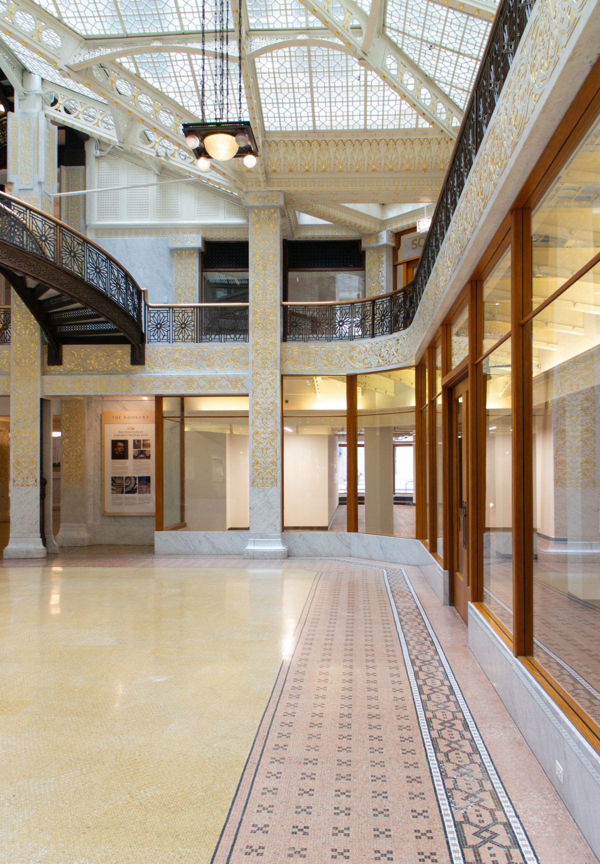
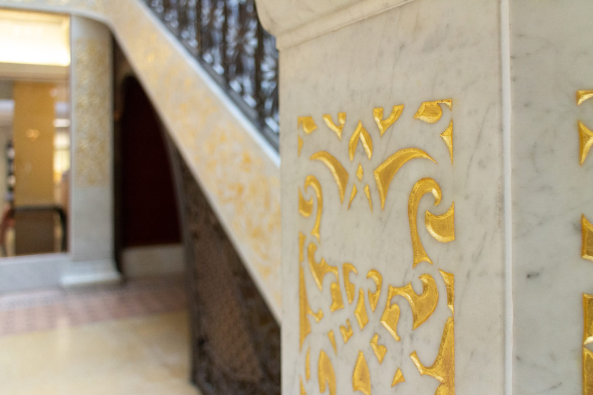
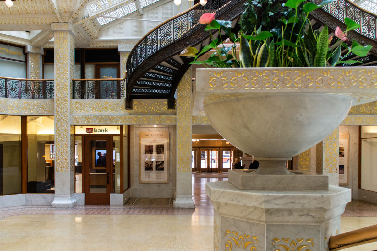
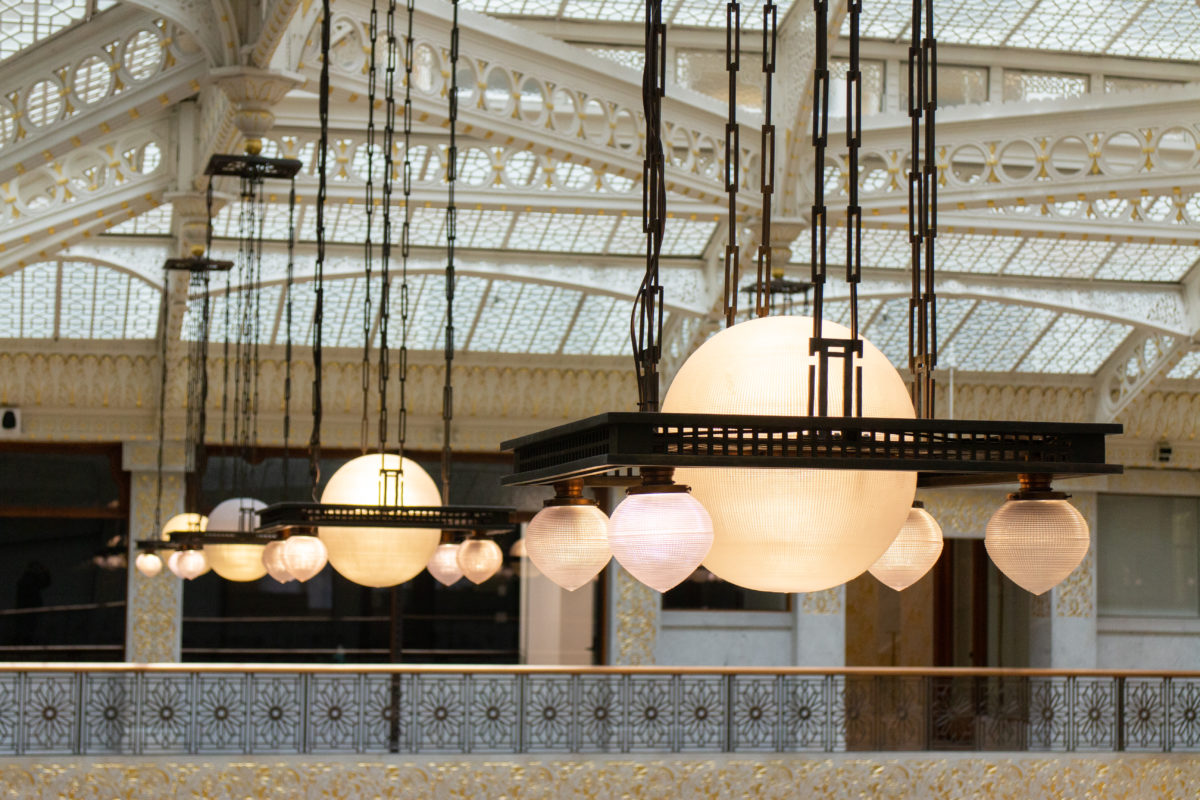
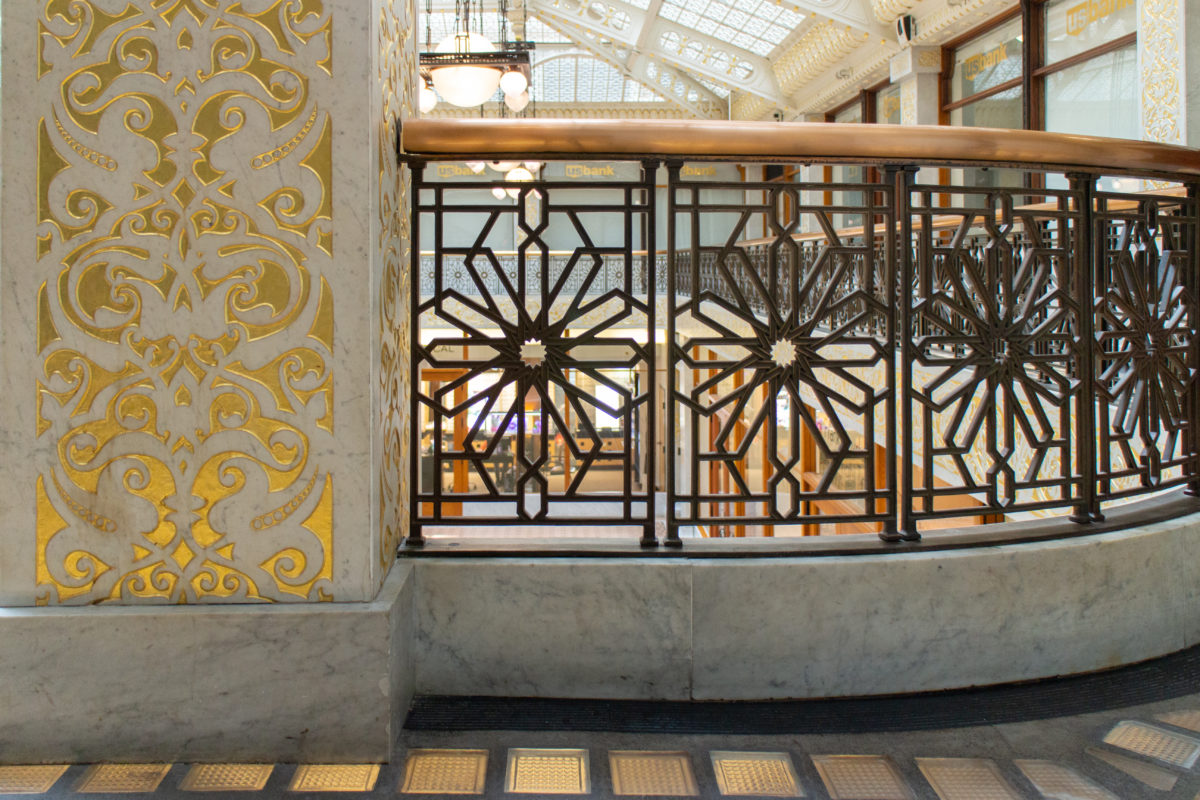
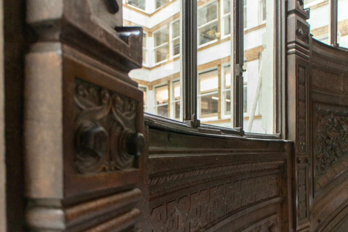
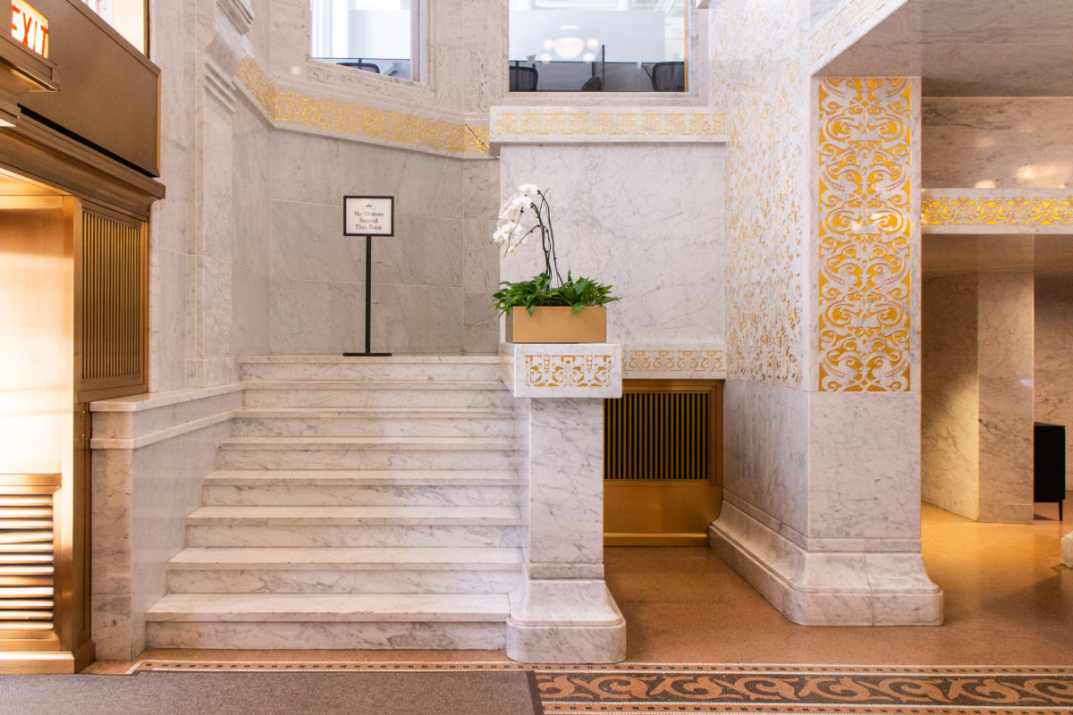
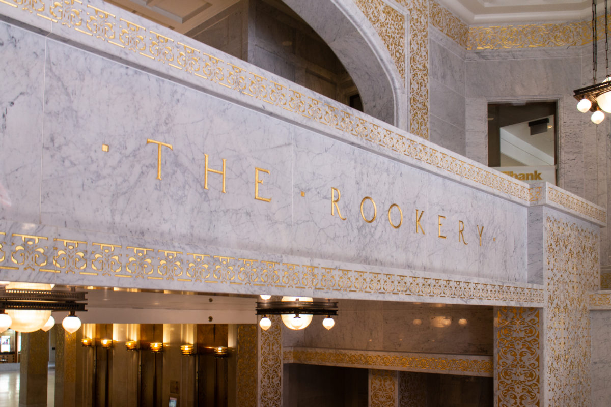
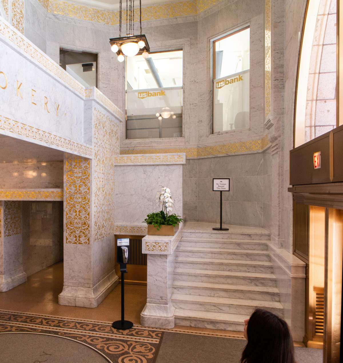
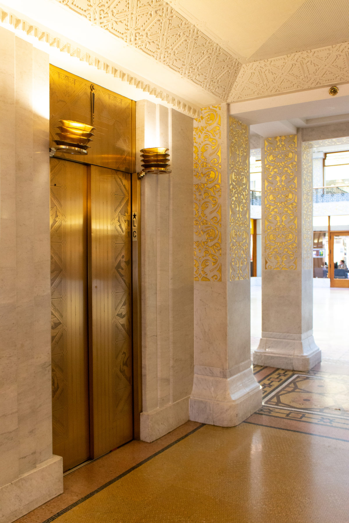
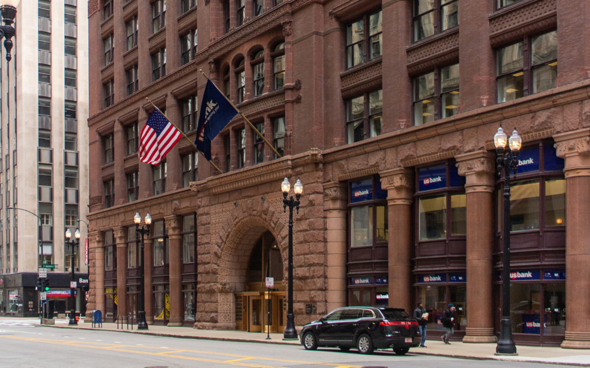
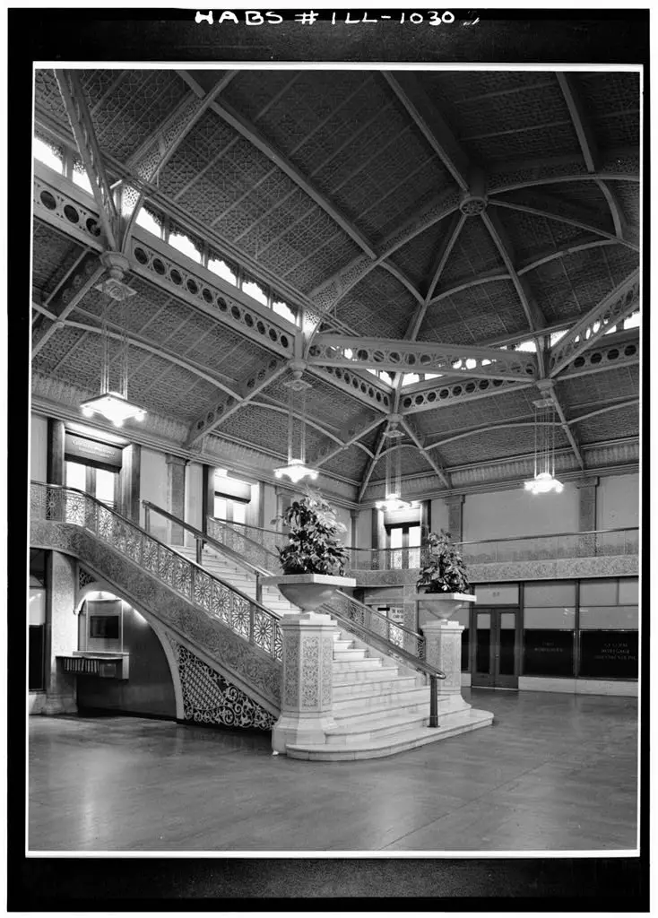
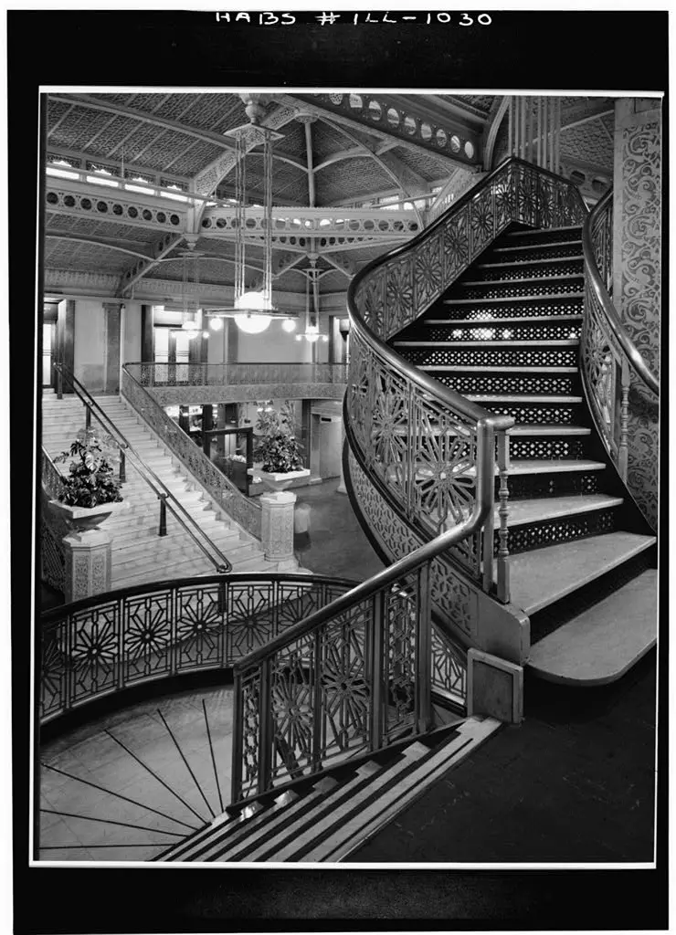
Penetrating the dark brown brick exterior through the stone triumphal arch, one entered a two-story vestibule of white stone and onyx with gold-leafed trim (this was remodeled by Frank Lloyd Wright in 1905). Stairs at both sides joined overhead in a balcony that beckoned a visitor up to the entresol or mezzanine. Flanking the stairs going up were vomitoria that led to the basement where the vaults of the building’s owner, the Central Safety Deposit Company, were located.
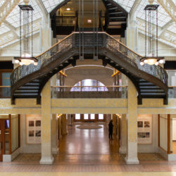
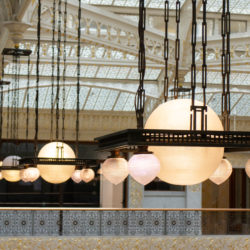
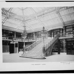
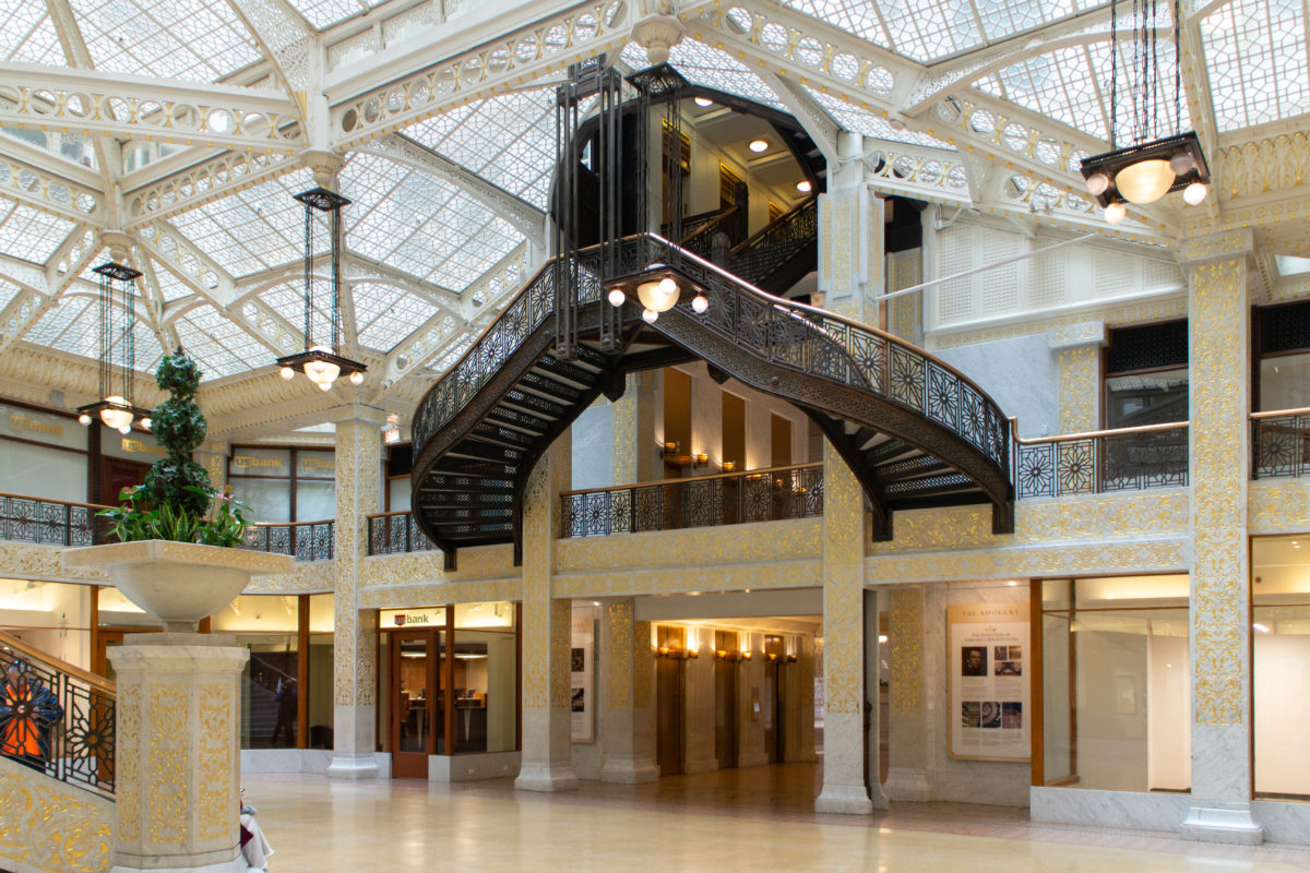
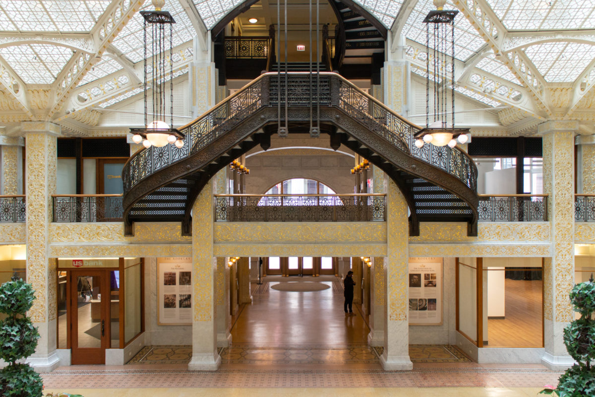
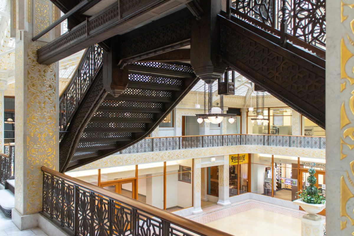
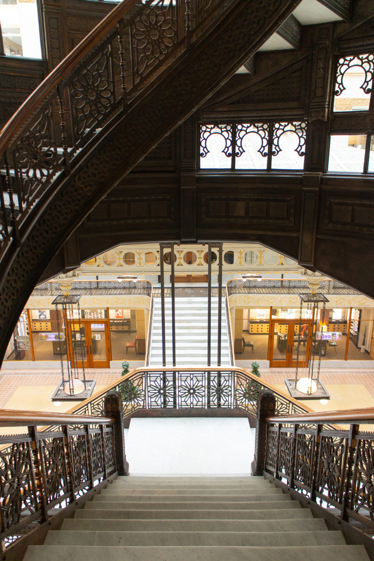
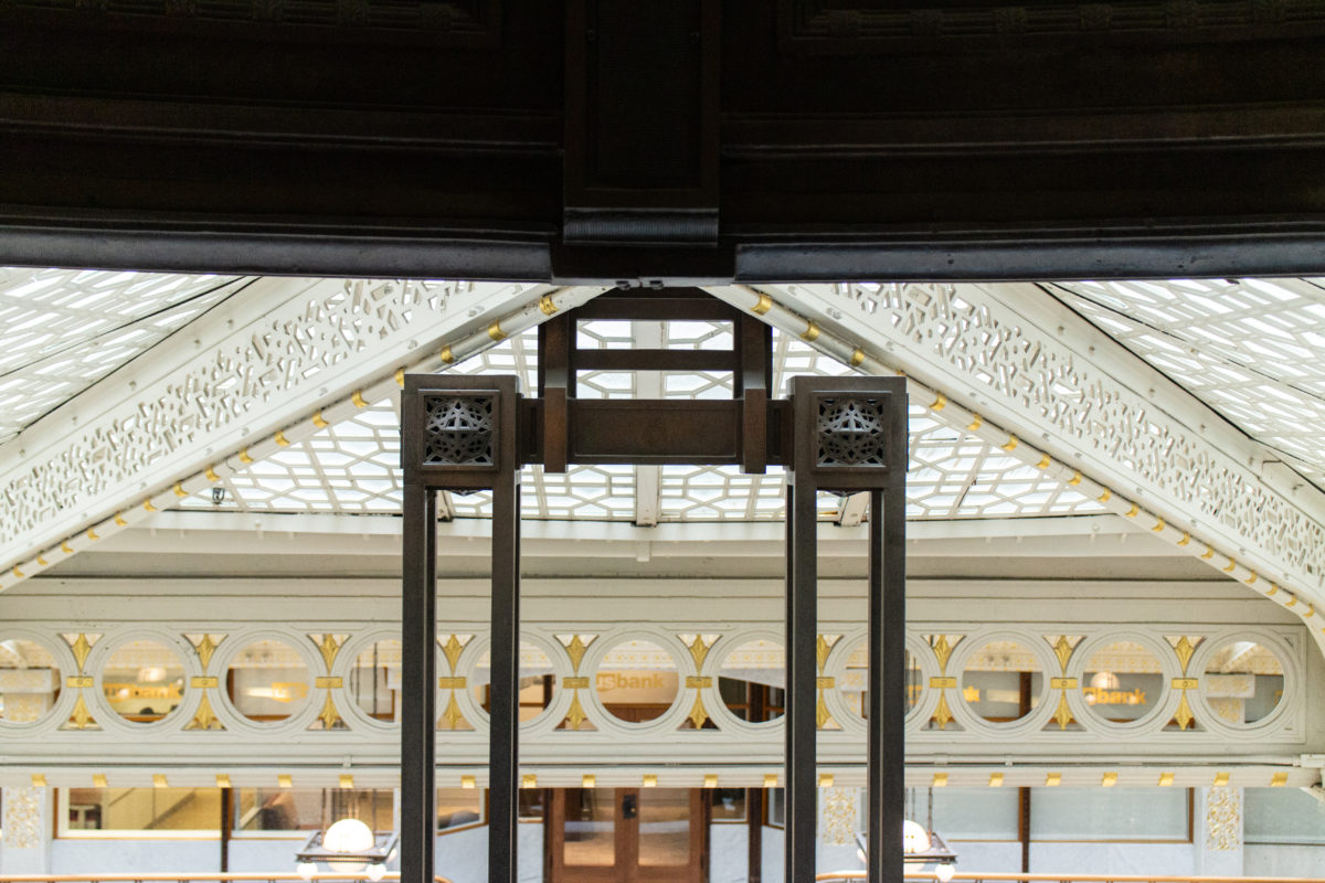
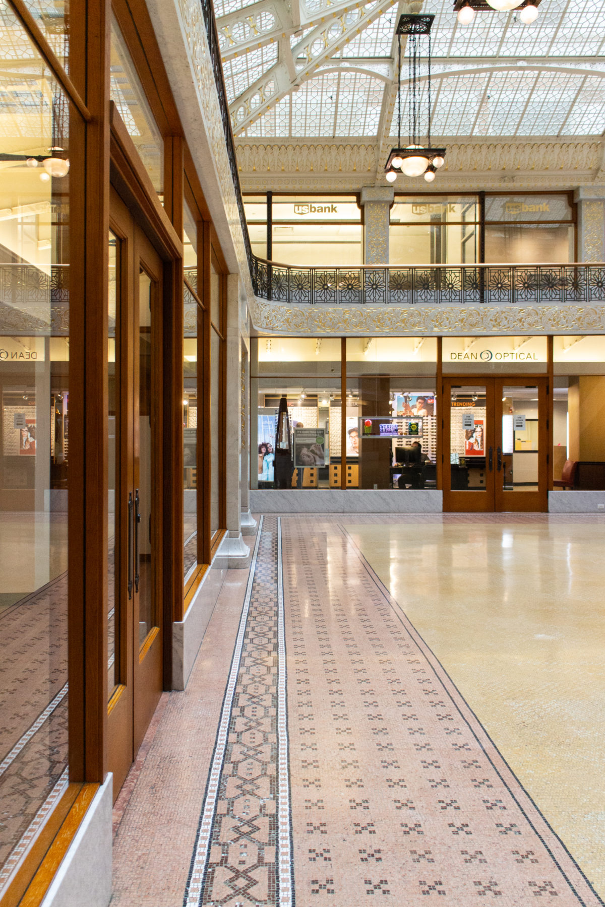
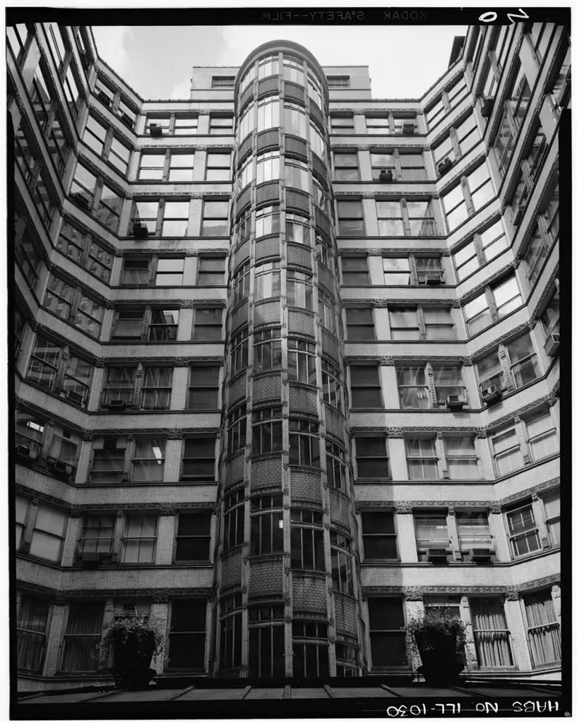
Drawn forward by the light of the courtyard ahead, one was compressed as he or she passed underneath the mezzanine and past the open grille doors of the elevator cabs that heightened the spatial explosion of the courtyard. The transparency of the skylight not only allowed daylight to bathe the white marble in the two-story atrium with brightness (which would have contrasted dramatically with the eleven-story shadow cast on La Salle by the Rookery, that one had to pass through to enter the building in the morning), but also permitted one to view not only the sky above, and, more importantly from the standpoint of architectural history, a prophetic vision of the future: the exterior elevation Root had designed for the inner tier of offices that faced onto the light court.
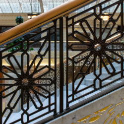
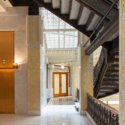
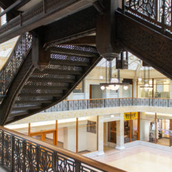
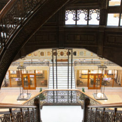
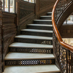
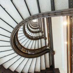
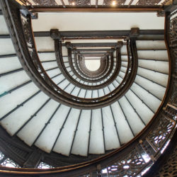
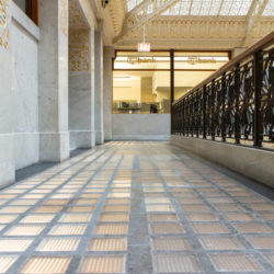
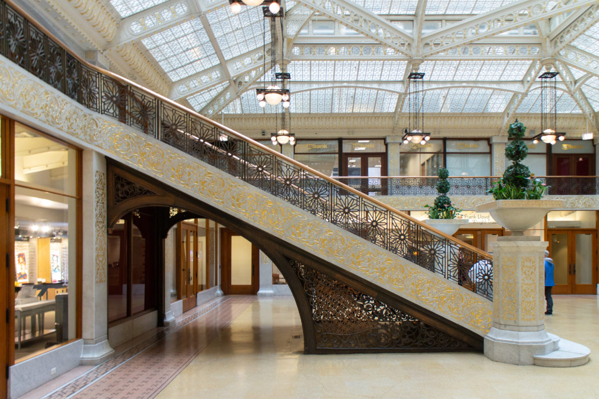
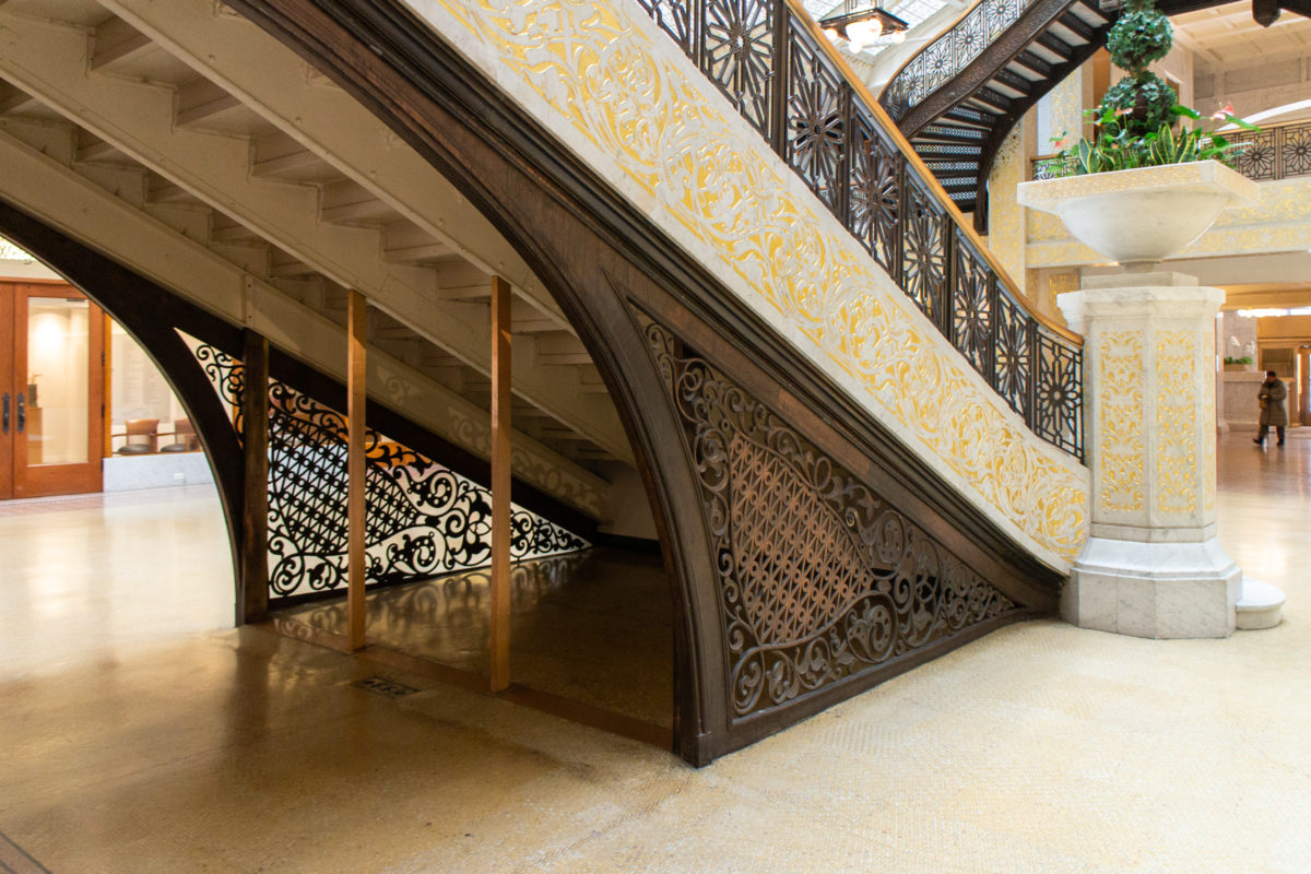
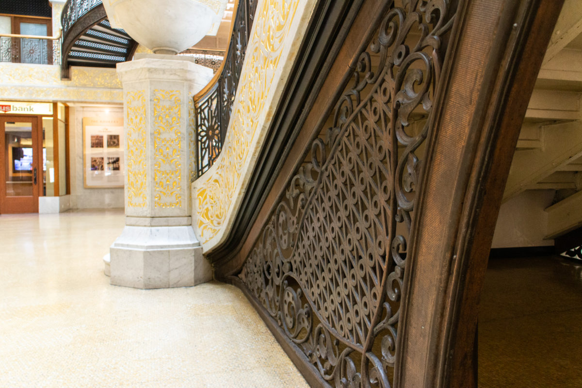
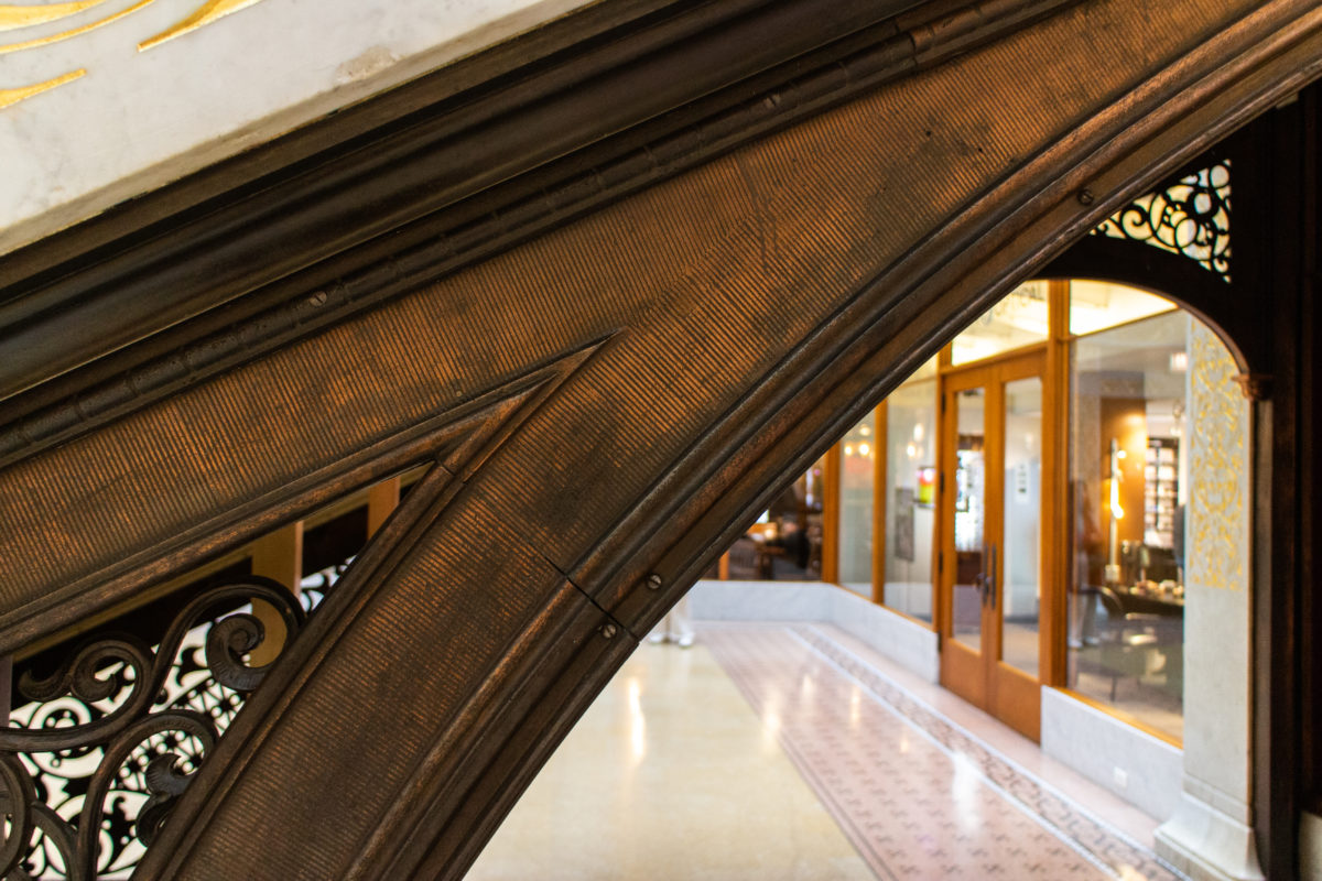
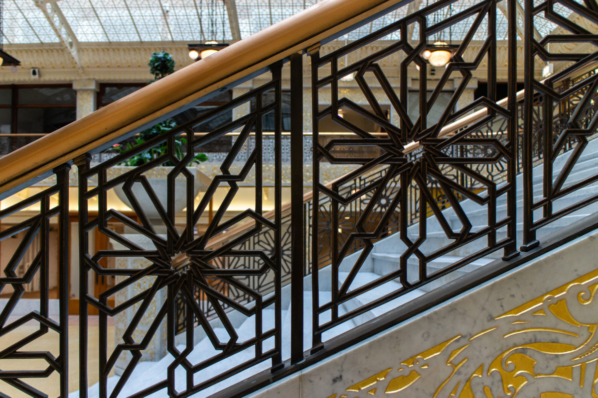
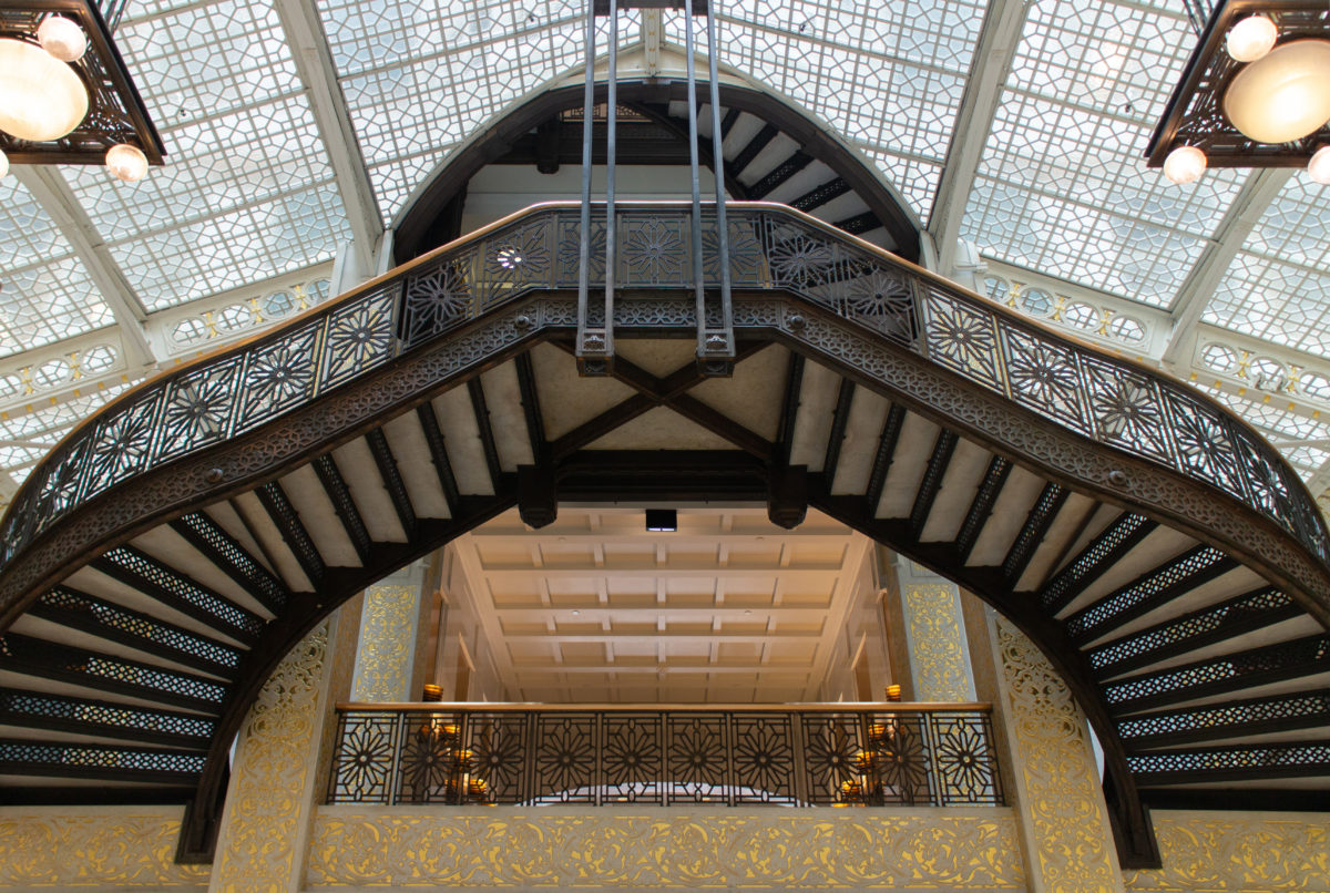
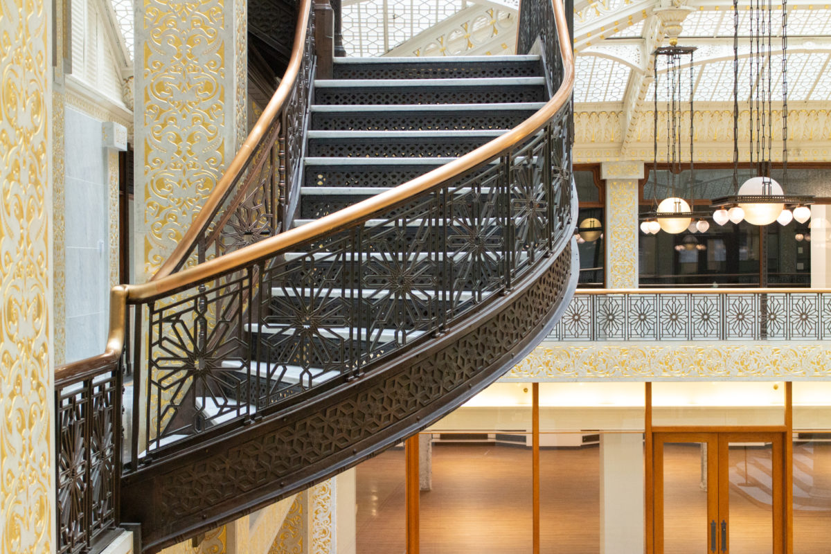
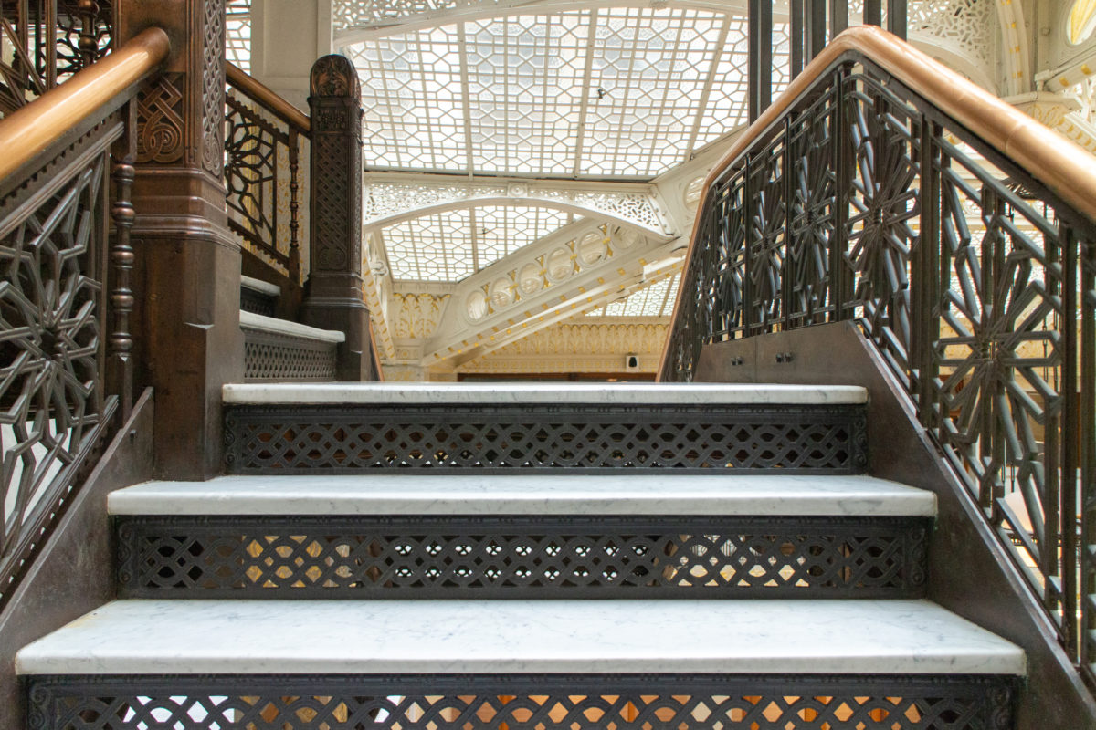
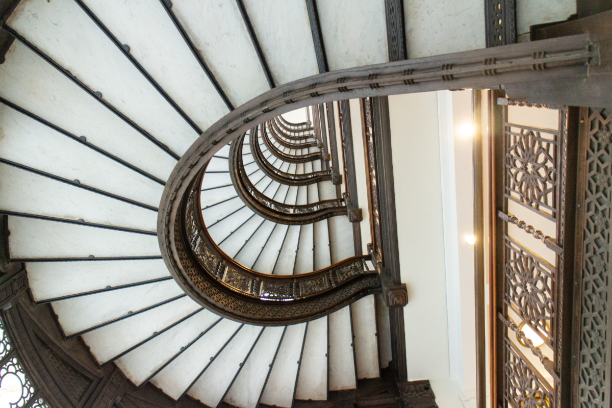
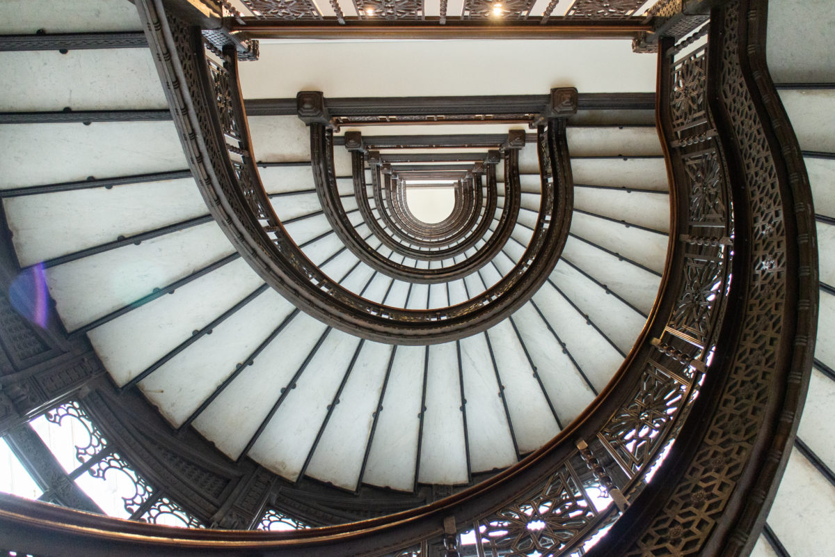
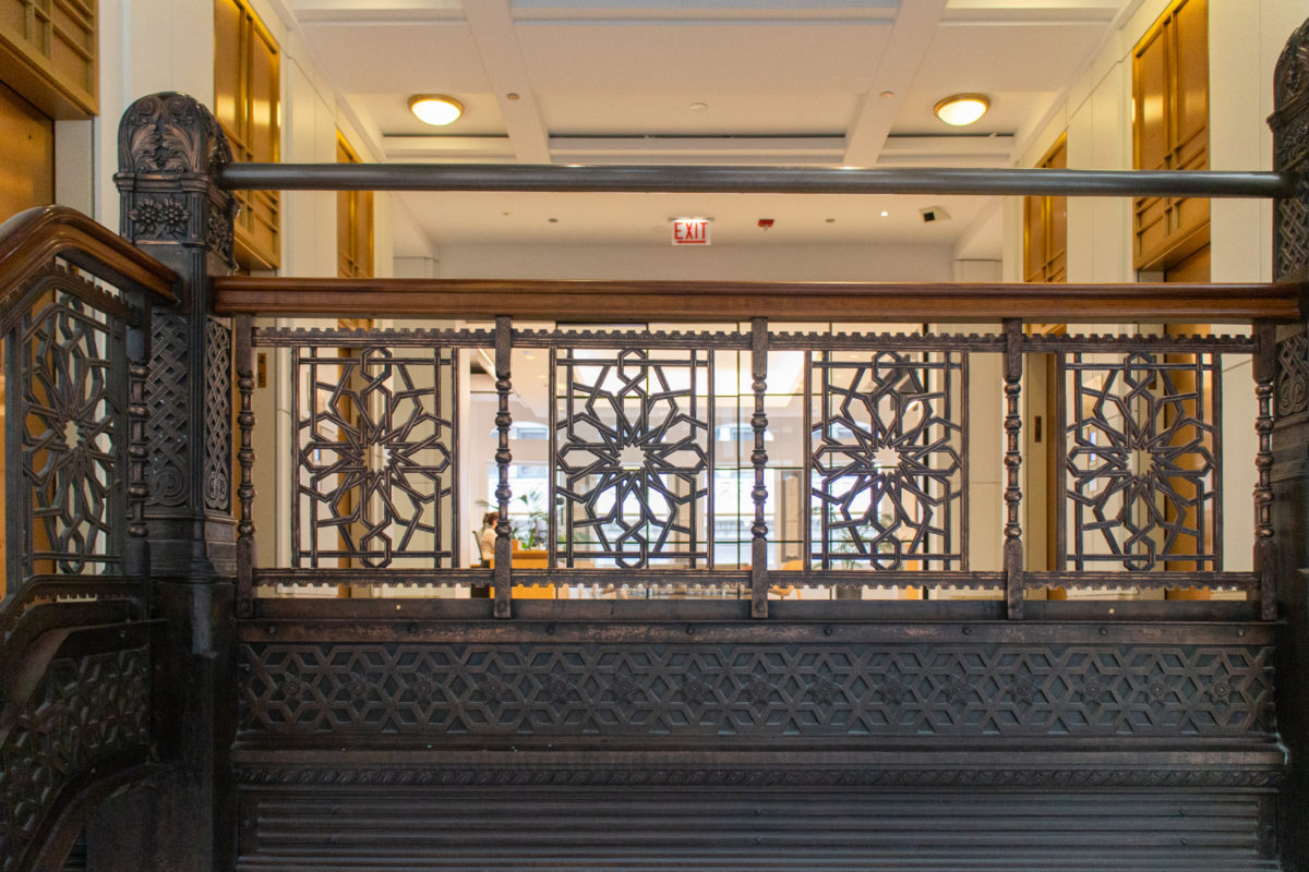
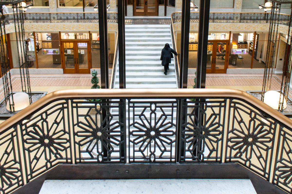
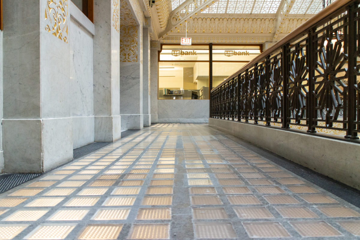
He then presented the visitor with a grand staircase at the opposite end of the atrium that took one up to the mezzanine, forcing one to walk the entire length of the atrium to gain access to the stairway through the skylight. Of course, he placed this, once again, at the opposite end of the mezzanine, making one walk past the storefronts that lined the mezzanine (justifying their higher rent). He then added a touch of the daredevil by cantilevering the stairs and their landing that looks out, over the entire space, before one then moved farther up and into the lightcourt.
Materials and Structure
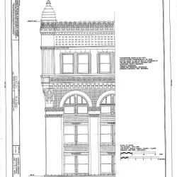
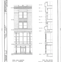
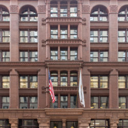
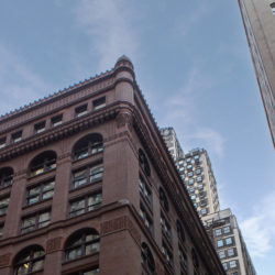
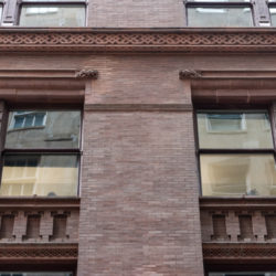
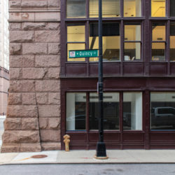
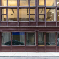
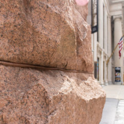
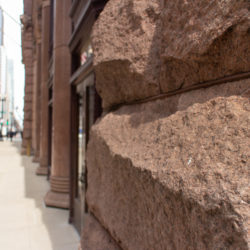
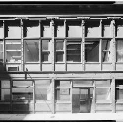
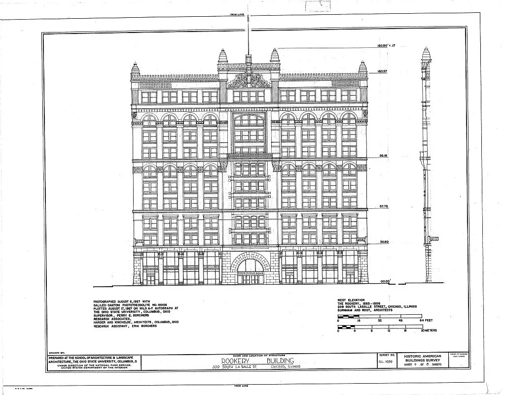
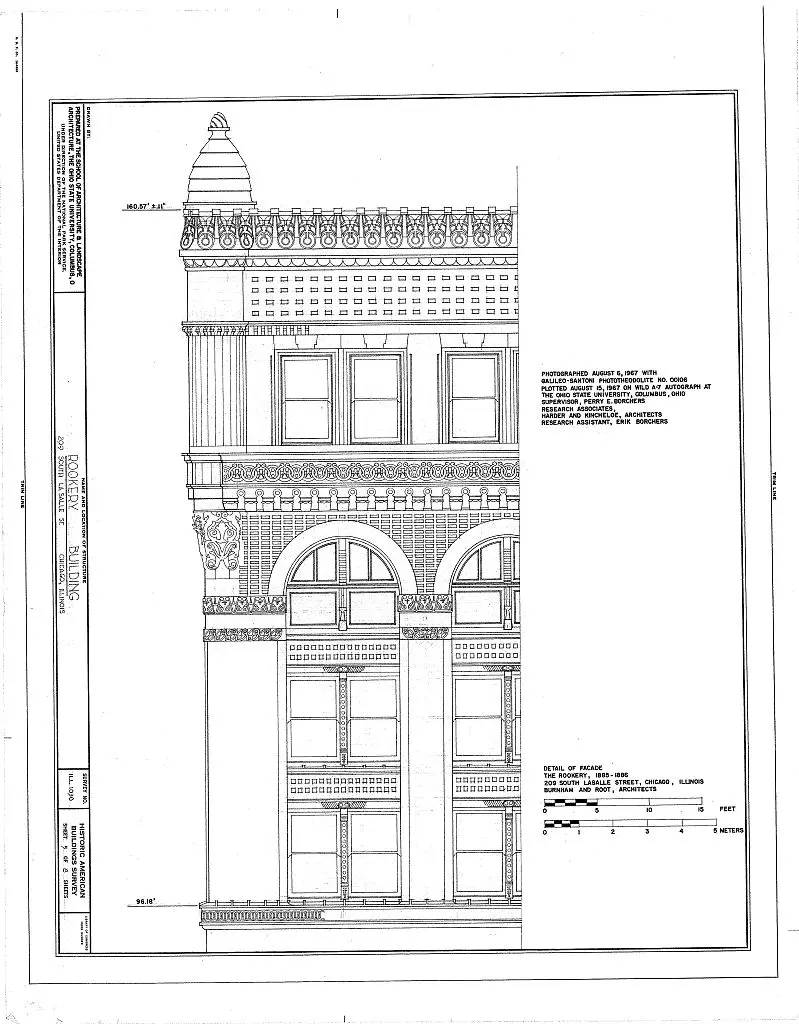
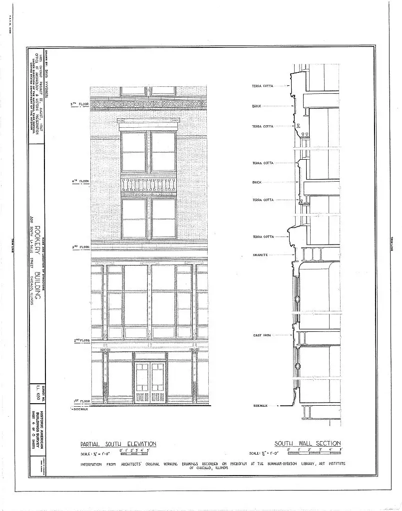
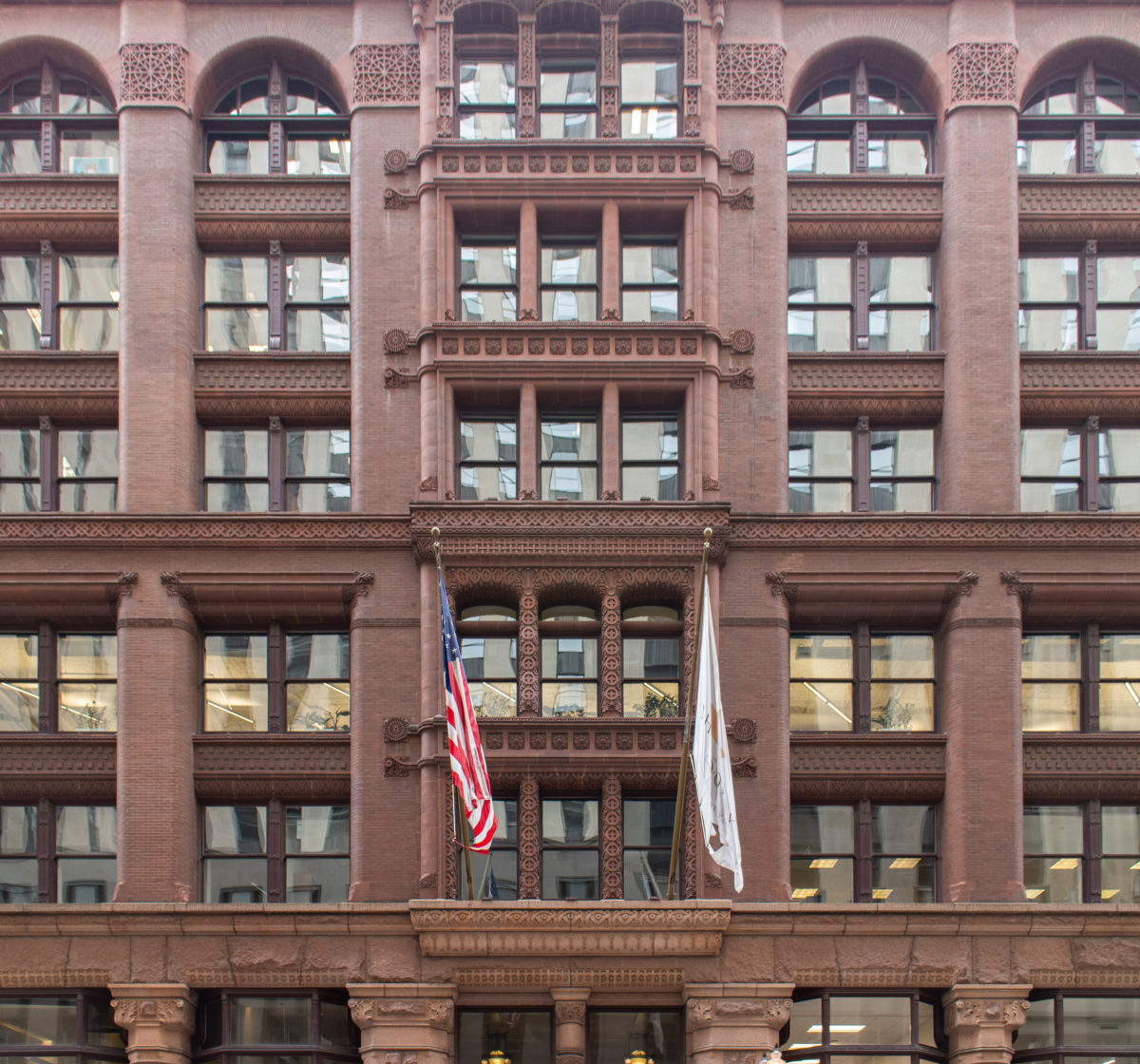
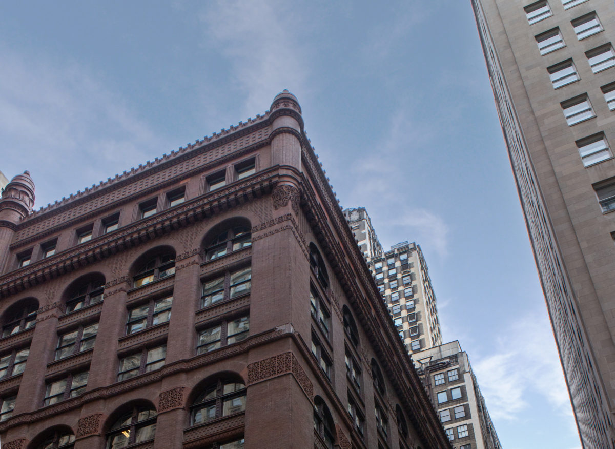
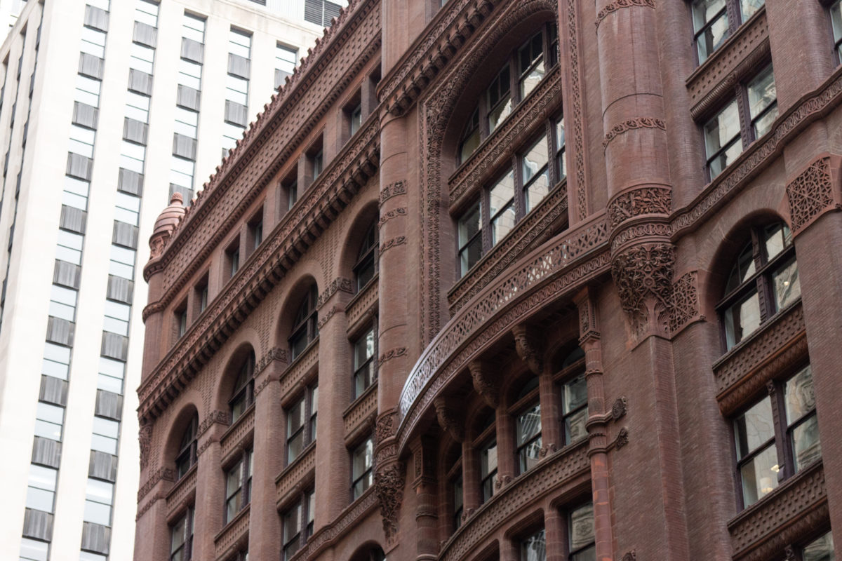
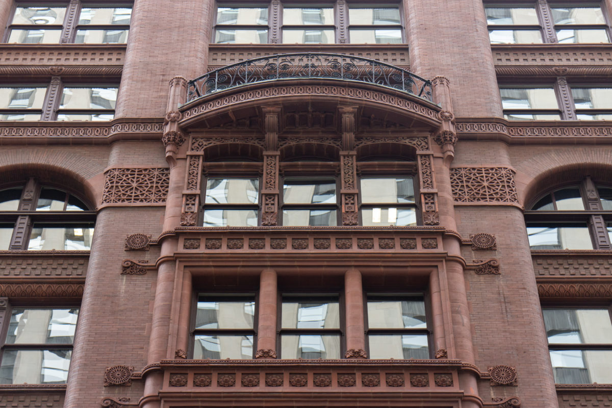
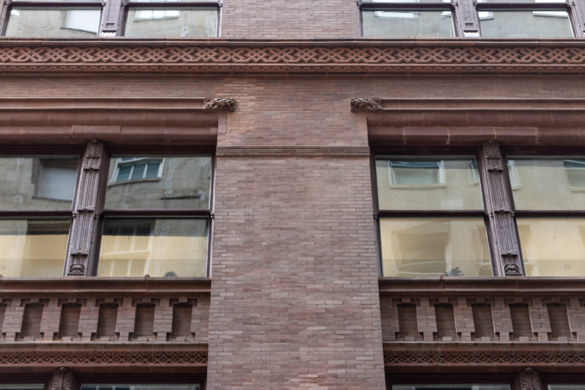
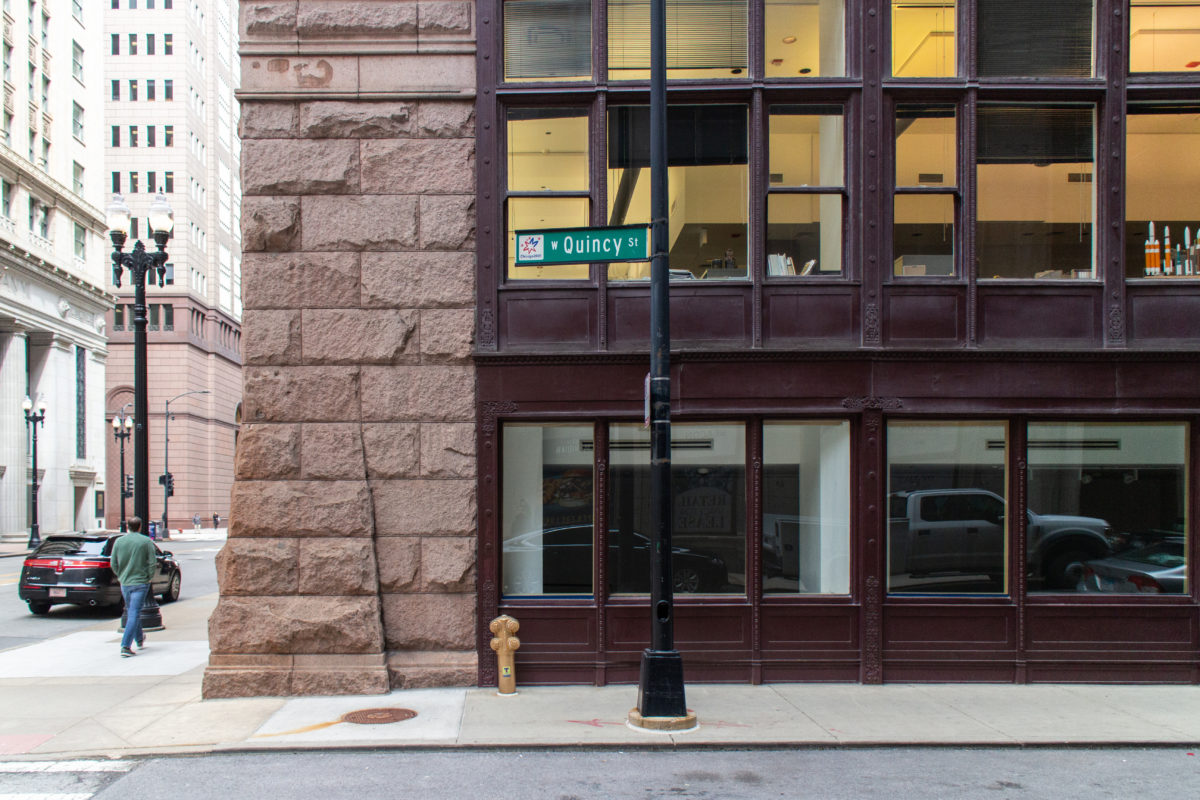
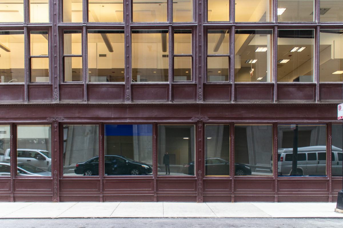
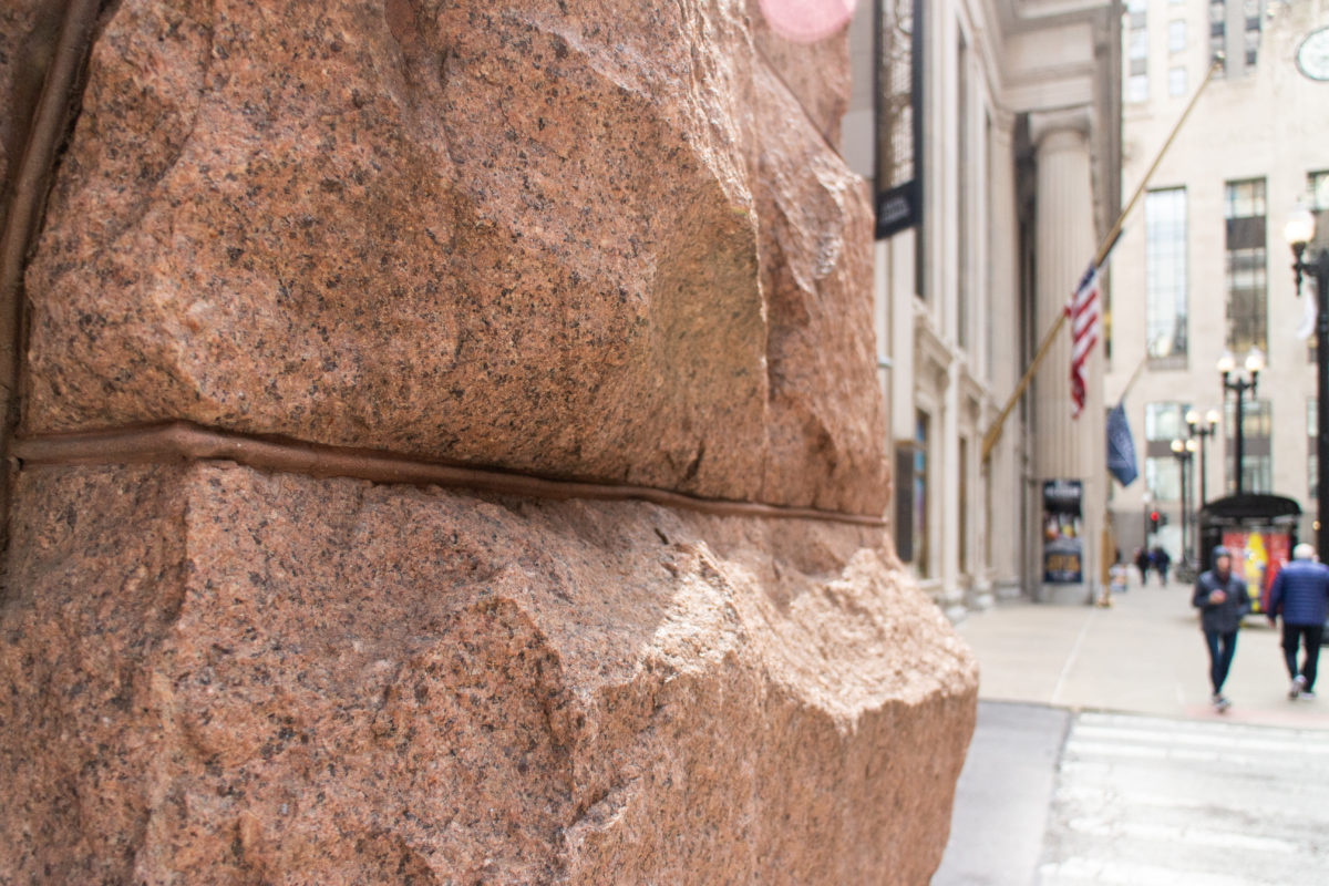
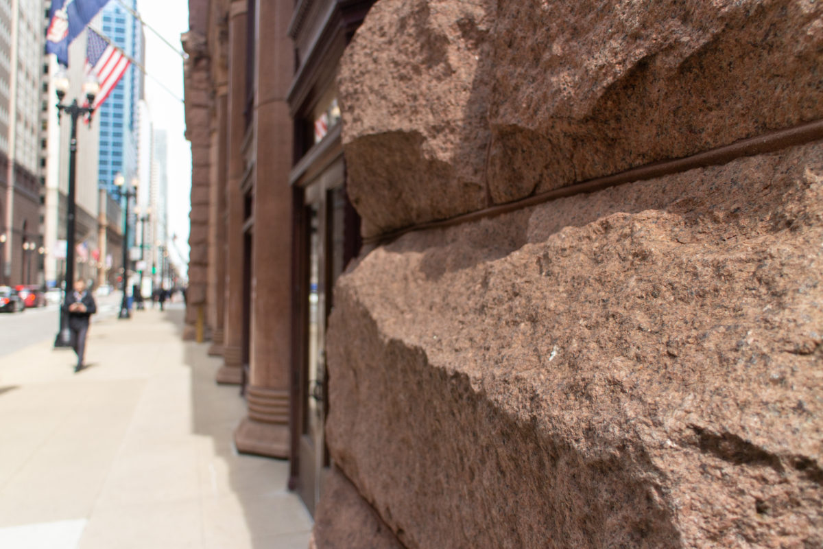
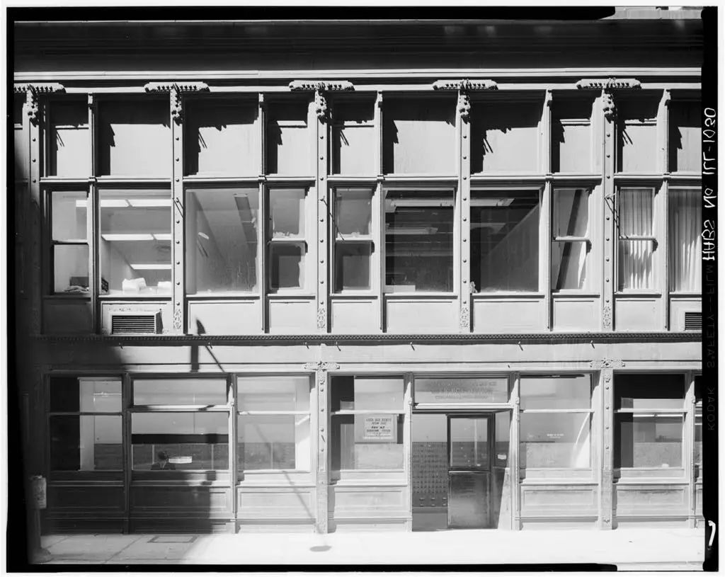
The building is a hollow, eleven-story brown brick box. As the building was designed prior to the general acceptance of exterior iron framing, Root employed brick-bearing piers and iron lintels (supporting brick and terra cotta panels) as the exterior structure on the upper nine floors. In order to increase the size of the ground floor display windows, however, he replaced the brick piers on floors one and two with two-story high granite columns on the two street fronts, and with iron columns along the two alley fronts. In the design of the elevations, Root took into account the general lines of the Insurance Exchange (that he designed a year earlier) that stood directly opposite La Salle Street, as well as the Home Insurance Building (designed by William Le Baron Jenney) that stood across Adams Street. He attempted to synthesize the elevations of these two buildings as the basis for the elevations for the Rookery, and had successfully done so, until the owners added the eleventh floor at the last moment, disrupting the proportions he had initially fixed. Therefore, the elevations comprise of a horizontal layering with a rhythm of 2(base)-2-3-3(originally 2-1). He capped the two three-storied layers with an arcade to reflect the existence of an arcade in these locations in one or the other two existing buildings.
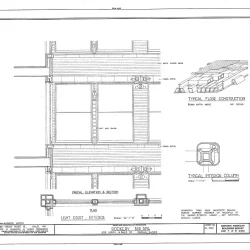
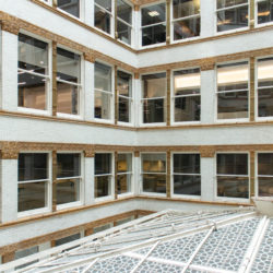
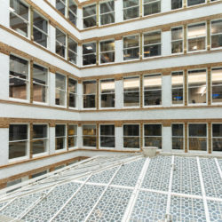
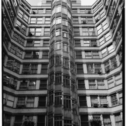
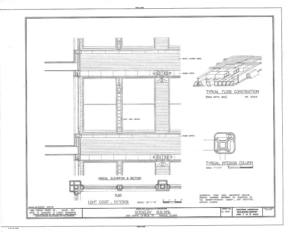
While Root still used masonry-bearing piers around the exterior, he experimented with the first use of iron skeleton framing in an exterior wall in Chicago since the 1871 fire had proved the vulnerability of unprotected iron framing, to frame the exterior walls around the light court. Because these walls were well within the site’s lotlines, they were not considered to be party walls, hence, they were not subject to the building code’s requirement to be a solid masonry party wall. This allowed Root to construct the four court walls as an independent iron skeleton frame that supported a uniformly-dimensioned masonry curtain wall at every floor, a great improvement over Jenney’s anachronistic system of iron-reinforced masonry piers used across the street in the Home Insurance Building.
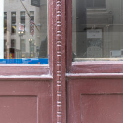
Root cantilevered a line of 7-inch channel sections and 12-inch I-sections off the face of the columns to support the interior wall of hollow tile and the exterior brick veneer. In order to reflect as much light as possible down into the lightcourt and into the individual offices, Root used an English cream-colored glazed enameled brick. He completed this essay on modern, iron skeleton construction by subtly detailing the brick spandrel at each floor level as a continuous, unbroken horizontal layer around the court, interrupting the vertical line of the columns. As the masonry was no longer supporting its own weight continuously to the ground, Root had expressed this new reality by making the vertical masonry covering of the iron columns subordinate to the horizontal bands. The lines of the floors were accented with bands of gold-leafed, brown glazed terra cotta at the top and bottom of each spandrel that flowed continuously through, breaking the vertical continuity of the column’s masonry surface. The columns, although also faced with the brick, were, thereby, appropriately subordinated to the spandrels by being inserted within the spandrels’ trim, with each column panel being capped with a matching terra cotta capital. The resulting horizontal composition of alternating layers of white brick and ribbon windows, was a straightforward expression of the wall’s construction, gone were the romantic arches of an earlier era. A modern architectural expression had finally appeared in public. (Le Corbusier would name this detail some forty years later as the “free façade” in his “Five Points of a New Architecture.”).
