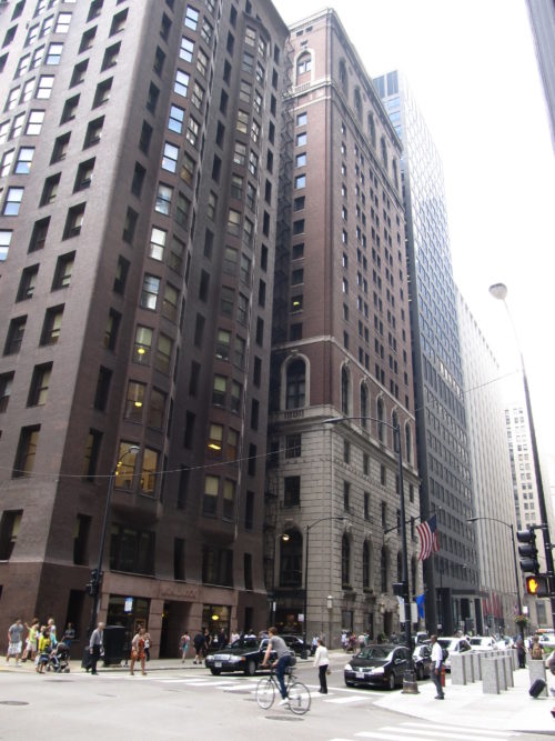
The Monadnock Block – Phase 1
Introduction
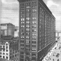
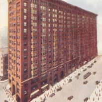
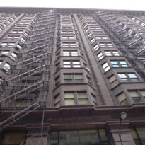
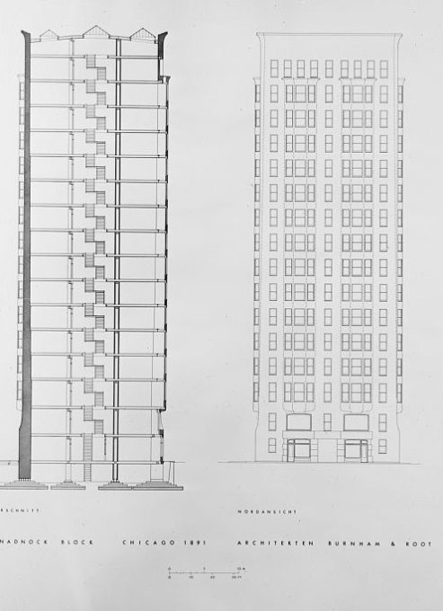
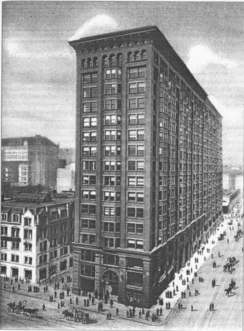
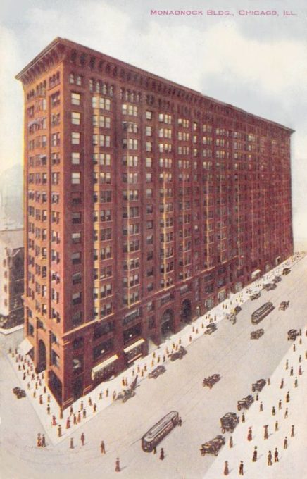
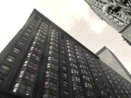
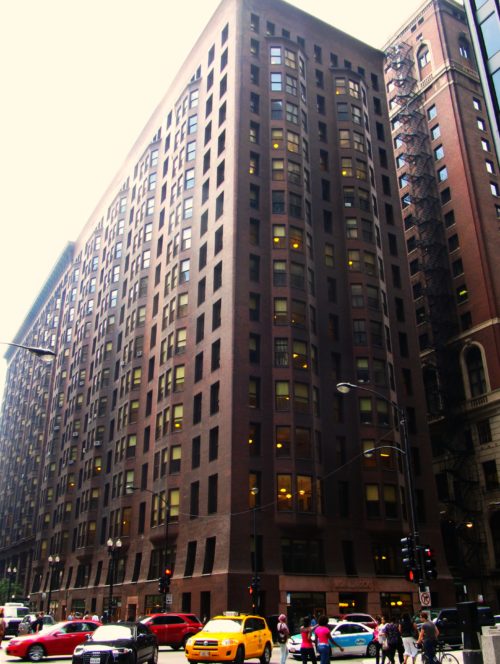
The Monadnock Block is a 16-story office building famous for being one of the tallest and one of the last skyscrapers built with masonry bearing walls. Its walls at the ground floor are 6’-4” thick. The building’s owners, Peter and Shepherd Brooks of Boston had required that their new office building be designed so that it could be constructed in phases for financial reasons. They also demanded that the architects avoid the use of all carved ornament.
Location
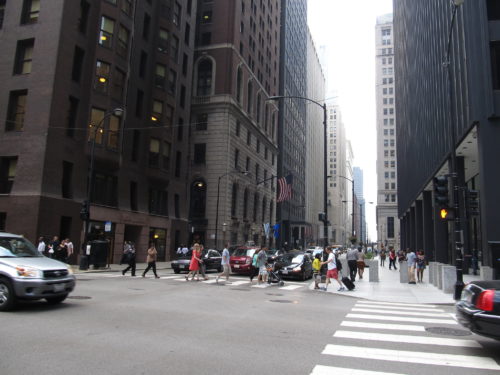
Chicago: the southwest corner of S. Dearborn and Jackson Streets.
Concept
When one imagines a “200’ high pile of bricks” over the course of architectural history, the only culture that built with this technique that immediately comes to mind is Egypt, of course. Root’s earlier designs in 1885 had incorporated Egyptian motifs, and so it wasn’t really much of a stretch for him to restudy what the style might offer in this latest effort. As he had been working over the past four years with the idea of the continuous plane or surface as a mode of expression for the exterior of a skyscraper that implied the enclosure or boundary surface of the interior’s volume, it would have been logical for him to apply this concept to the new design for Monadnock. One significant change Root made from the 1885 Egyptian designs was to shift building precedent types from the columnular Egyptian temples to the continuous, massive planes of masonry in the Egyptian pylon, the gateway walls that flanked the entrances to the temple precincts. The pylon was typically capped with a coved cornice, not unlike the profile he had been experimenting with in the 1885 design. Taking the pylon as his precedent, he would also try to impart a battered, or slopping profile to the Monadnock’s walls. The pylon also had two parts that were so arranged as to create a central opening, online with the axis of the precinct. As the Brookses were talking about the possibility of building some, if not the entire southern half, of the Monadnock at a later date, Root might just have the opportunity to echo the split nature of the pylon quite functionally.
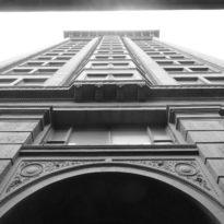
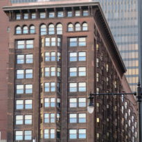
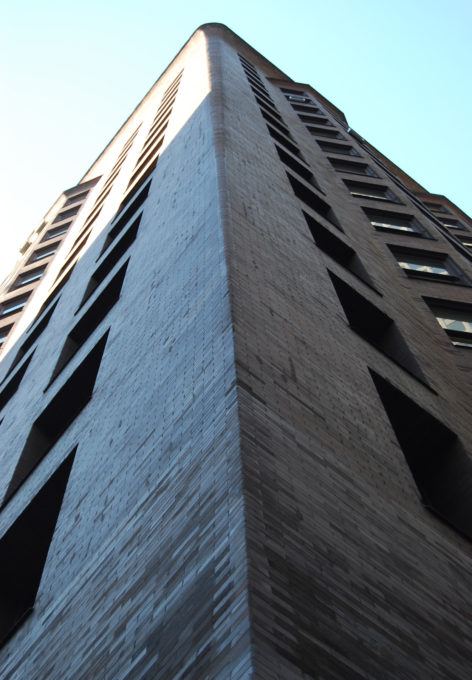
Still needing to transcend mere building into the making of architecture, however, Root had risen to this artistic challenge by changing the conceptual method he had typically employed in his past projects. Instead of conventionally applying/integrating carved sculptural elements onto the body of his building in an additive method, he would carve out of the original 200’ x 66’ x 202’ high brick pile a sculptural form, subtracting material from the original block not unlike what a sculptor does to a block of stone. Root had created a new type of architectural form; instead of a building with sculpture on it, the building now became a piece of sculpture. Root had literally carved a 16-story piece of sculpture:
- He first carved the coved cornice and its inverse at the second floor out of the block;
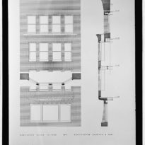
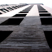
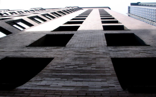
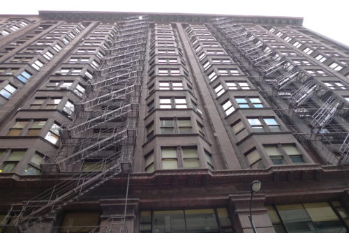
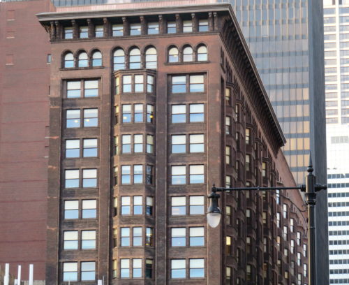
- He then carved out each of the openings in the wall when the bay windows would be located, running from the third floor to the fifteenth.
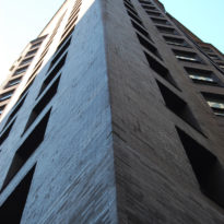
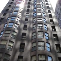
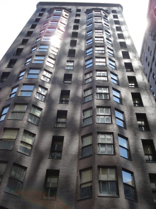
- These openings in the wall were then filled with a lightweight steel framework that held the bay windows. The steel was covered with a thin layer of exterior brick that Root simply continued from the surface of adjacent brick wall with a fluidity that contained no sharp corners. The brick simply seems to organically grow over the body of the wall.
- He then communicated to the onlooker the inherent contrast between the two structural systems with the location of the glass. In the skeleton framed bay windows, the glass is pulled as close to the surface of the exterior brick as possible, creating a sense of a taut, thin surface that is being blown out, away from the building by the air pressure inside. The windows that are located in the bearing walls, on the other hand, have been crisply carved out of the wall and the glass pushed as far back as possible, revealing the immense thickness of the brick wall for all to see.
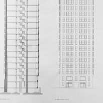
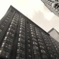
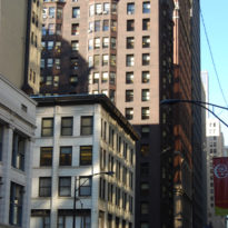
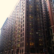
- Still wanting to evoke the precedent of the pylons with their battered, sloping walls, while he could not literally afford to make the walls slope inward, he struck upon a truly ingenious visual illusion that is effective, and yet so subtle that many viewers aren’t even aware of its presence until someone points it out. He detailed the corners of the buildings with a progressively increasing chamfer starting rather imperceptibly at the third floor, until it reached a three-foot radius at the cornice. Physically, it actually reduces the dimension from the last window jamb to the building’s corner as one moves up to the top of the building. When one is standing obliquely to the long elevations, this resulting angle does create the illusion that the wall is sloping inward. This illusion is reinforced on a sunny day when the shade around the chamfer reinforces the visual angle at the wall’s edge.
Materials
Most intriguing to Root from a theoretical viewpoint, Egyptian architectural was known to have been polychromatic. Root had always been deeply interested in the role of color in architecture, and as he was prevented from using any carved ornament, decided to employ the aesthetic of color in an attempt to impart an artistic sense to the building. By November 1889, the design had been finalized. Imagine how the building would have appeared with the following color scheme: black base, “then brown grading up to bright yellow.” What is unbelievable is that this color scheme seems to have actually survived for over ten months while the project was being bid. It was not until construction actually began in May 1890, that Peter Brooks rejected the multicolor exterior in favor of obsidian brown, the same color of brick that had been used on the Rookery. (This type of color gradation finally was used by architects during the period of the Art Deco skyscraper to make their building look taller.)
Spaces
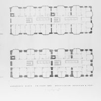
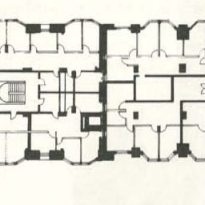
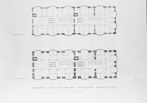
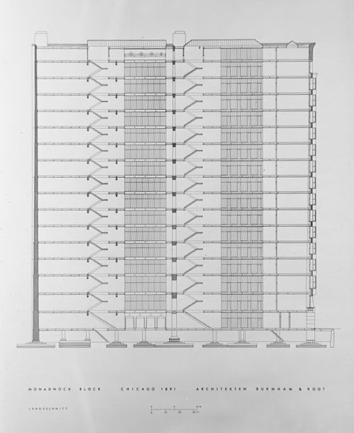
With a site width of 66,’ lining both long street fronts with 23’ deep office space, the resulting corridor would have a 20’ width. Instead of placing a narrow atrium through the center area for daylighting, Burnham & Root placed the building’s stairs and elevator shafts in this area. Therefore, no rentable area was lost along the building’s perimeter to these functions. The only daylight, therefore, available for the corridors would be provided by a meager 8’ wide skylight over the open stairways. The bay windows were a given in order to provide extra floor space.
Structure
Structurally, Monadnock broke little new ground. Within the loadbearing masonry exterior walls, Burnham & Root placed an iron frame of wrought iron Z-bar columns and steel beams. In addition to the lateral walls, they added two other systems for wind bracing. Eighteen-inch steel beams spanned from the interior columns to the exterior walls, where they were embedded into the walls for an extra four inches, in an attempt to create a rigid portal between the wall, the column, and the girder for extra stiffness. Diagonal bracing was added in an alternating pattern on odd and even floors in this first interior bay on both of the long sides in the form of 4 inch by 5/16 inch tension straps which ran from the first line of columns to be embedded 4 inches into the masonry wall at which point they were angled vertically into the brick in order to further anchor the steel into the wall.
