Tama Art University Library

Introduction
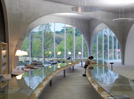
The new Library of the University of Art Tama is a place where everyone can find their style of “interact” with either books or multimedia technology, as if they were walking through a forest or in a cave, new place with spaces under the arcades where smooth and mutual relationship is created just going through them, one focal point where a new sense of creativity begins to spread across the University campus.
Situation

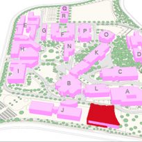
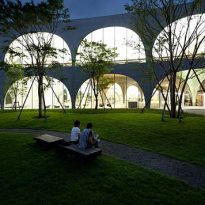
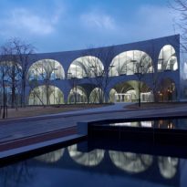
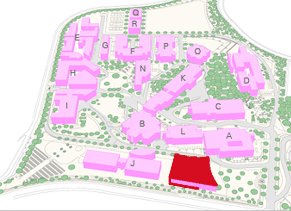
The Library is located in Hachioji Campus, University Tama Art in the suburbs of Tokyo, Japan. Passing through the main gate, the site is located behind a front garden with large and small trees, and extends to a gentle slope.
Hachioji campus is located in the western part of Tokyo and provides an environment in which students can learn and practice all aspects of art and design. Tama Art University is involved in the sustainable development of the Tama Hills area and is also supporting the development of natural surroundings Hachioji campus.
Concept
The cafe that existed at the University, was the only shared by students and by faculty from all disciplines space. The first issue taken into account when making design by Toyo Ito & Associates, Architects was the approach of how an institution as specialized as a library could provide a common open space for everyone.
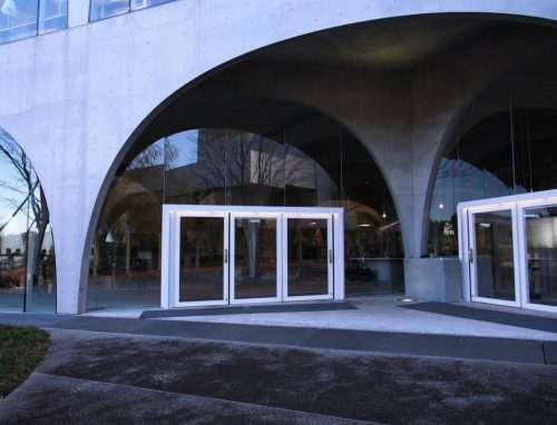
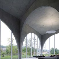
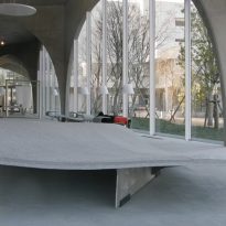
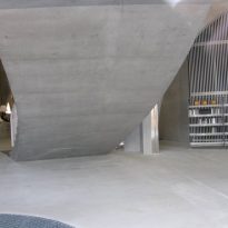
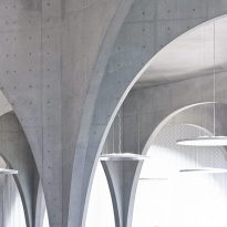
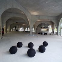
The first idea that emerged was to create a wide open gallery, covered by arches on the ground floor, which serve as a passageway for people crossing the campus, although his intention was not to go to the Library. This gallery space symbolize a cave where stalactites make an order not associated with any apparent plot or geometry. And in the cellar, library, buried underground
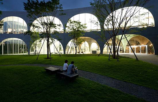
To allow flows and opinions of these people freely penetrate into the building, the team began to think of a randomly placed arches structure that would create the impression that the sloped floor and landscape the front yard was still inside the building.
Budget problems prevented University conducting a costly underground excavation causing Toyo Ito reverse its proposal, took his library, originally in the basement and placed on the first floor. To emphasize this idea, the architect chose a simple structure, concrete, glass windows and metal frames.
Spaces
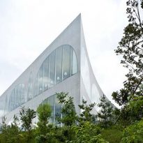
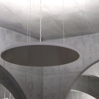
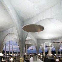
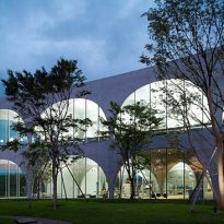
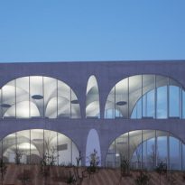
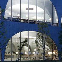
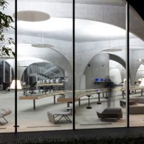
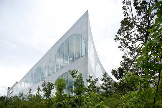
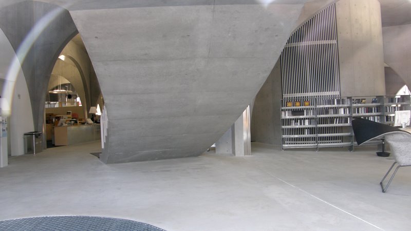
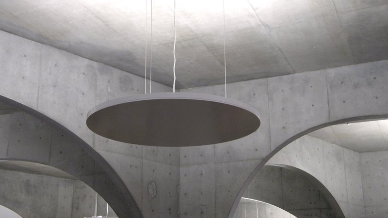
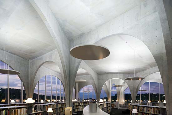
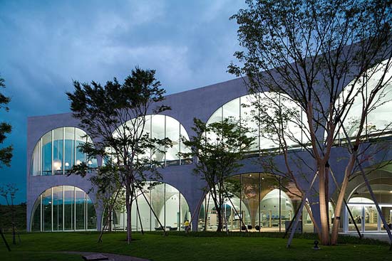
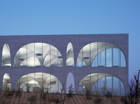
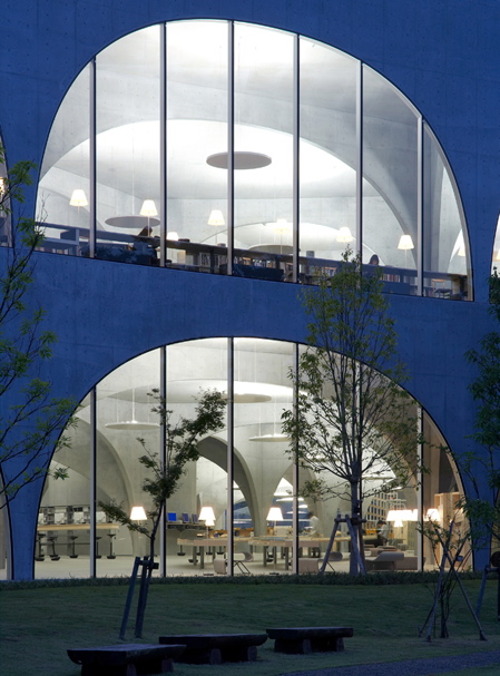
The facade is curved in two sides, keeping a right angle at the corner with less traffic. The glass panels are mounted on aluminum frames previously cut and folded 4mm to maintain the curvature of the facade. Although the facade of the building is impressive, the greatest achievement of the construction is the interior spatial treatment, where the arches in apparent chaos, simulated stalactites and create multiple and varied effects of perspective.
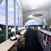
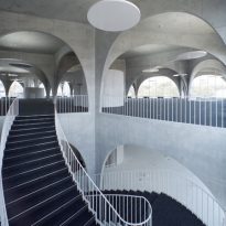
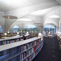
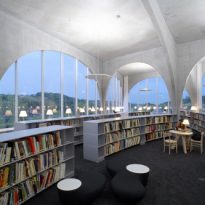
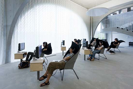
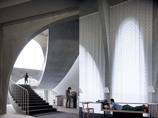
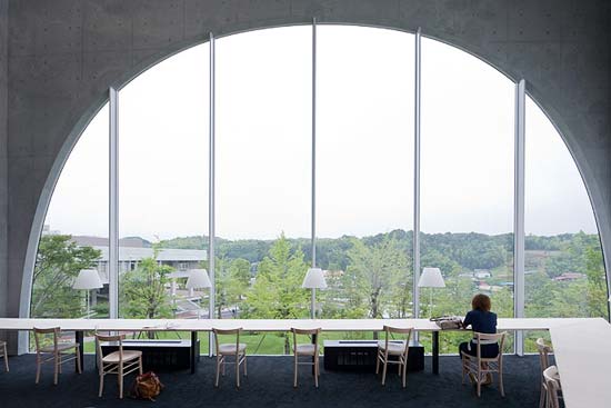
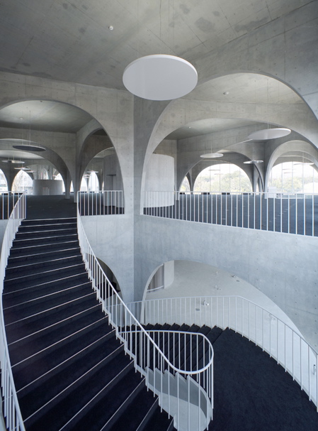
Spatial diversity is experienced when walking through the different bows and elevation changes provide different sensations of being in a cloister filled with natural light or printing a tunnel that can not be penetrated visually. These arcs whose width varies between 16 and 1.8 meters in some places openly exposes the building, whichever use curtains.
Description
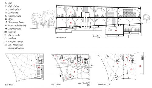
- Subsoil
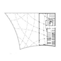
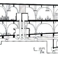
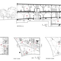
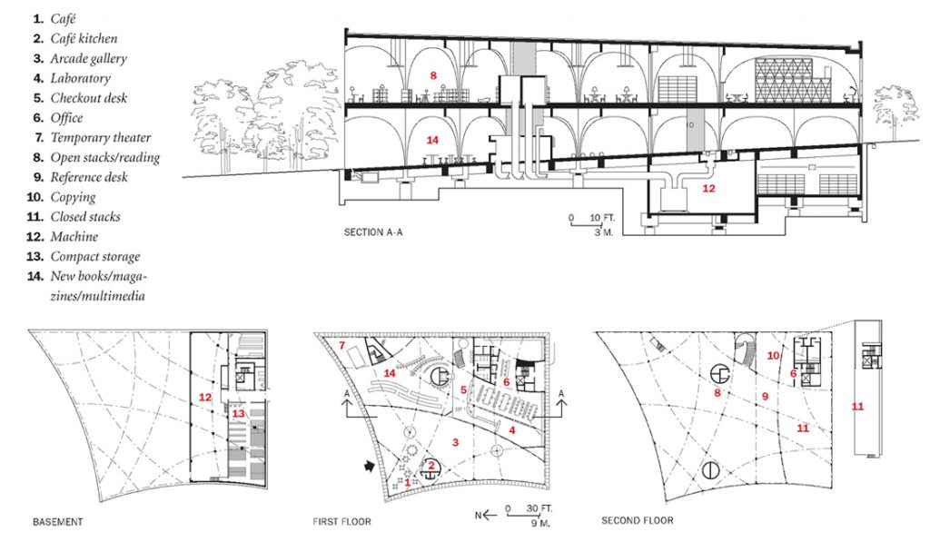
In the basement area and storage machines is located.
- Ground floor
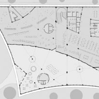
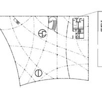
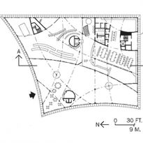
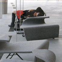
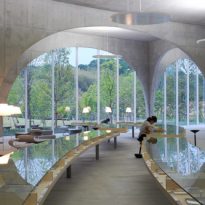
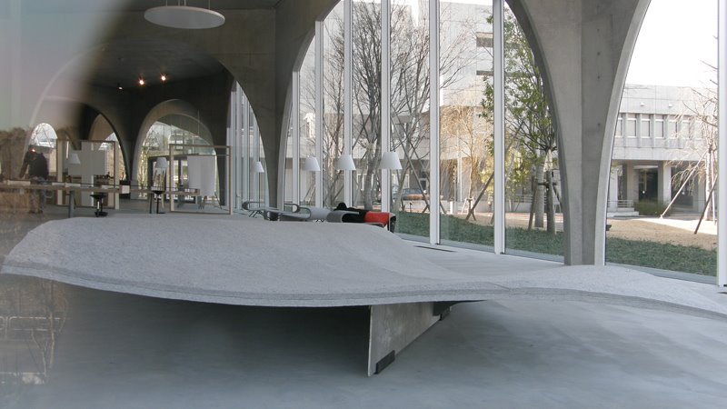
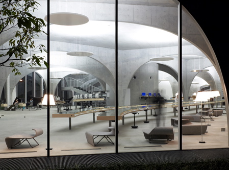
On the ground floor sloping screens to navigate, and the bar of a bar, and a large glass table with recent issues of journals, invite students to spend their time in the library while waiting for the bus, is the public exhibition area with art galleries, a cafe, a kitchen where students can heat your food, some tables, a laboratory, a space for temporary theater and offices.
- Second level
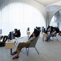
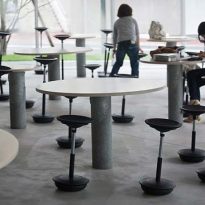
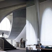
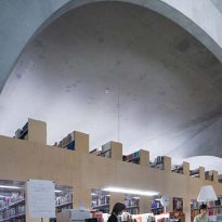
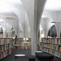
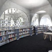
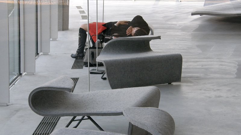
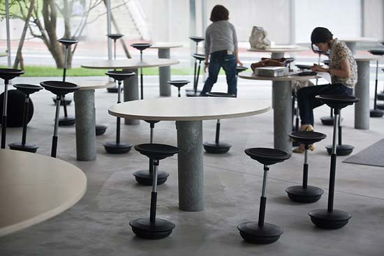
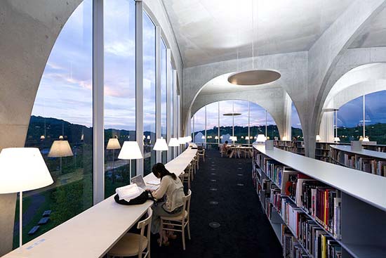
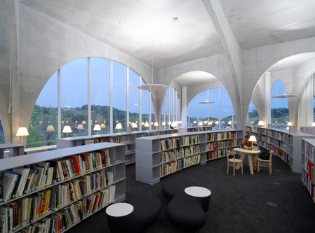
Climbing the stairs to the second level, to the private reading area, there are large low shelves that cross under the arches with a large collection of art books. These shelves desks study of various sizes are located. A large table with a special photocopier art prints allows users to perform professional work. This second level is the reading area and rest for students, which highlights the furniture designer Kazuko Fujie.
The open relationship between the exterior and the interior evokes a similar gesture of Ito in your Sendai Mediatheque, although in that case the spatial relationship between different levels is much more integrated than in the case of the library of the University of Tama. Despite the formal differences, Tama Library shares with the Sendai Mediatheque innovative structural concepts like approach and transparency of their activities.
Structure and materials
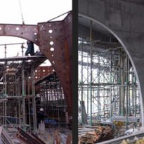
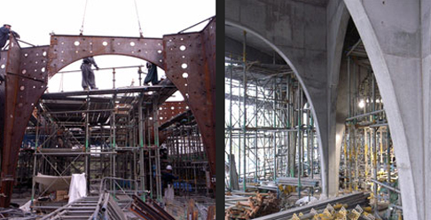
The main materials used to construct the building have been the reinforced concrete structure, glass windows and aluminum frames. The final volume design corresponds to a structural frame formed by the intersection of arches curves.
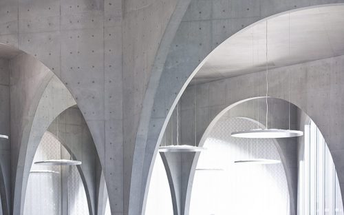
The characteristic of this space arches are made of steel plate 20 cm coated with concrete. Arbitrariness in the apparent location of the arcs corresponding to the result of a structural frame formed by the joining of curved arcs. On the ground these arcs are arranged along curved lines that intersect at various points. With these intersections have been able to realize a very thin bottom arches supporting heavy loads upstairs. The openings of the arches vary from 1.8 to 16 meters, although the width remains uniform way to 200mm.
The intersections of the rows of arches, joint gently help separate areas within this single space. This intersection forms a cross that besides emphasizing the directionality of geometry, has a seismic effect on the structure.
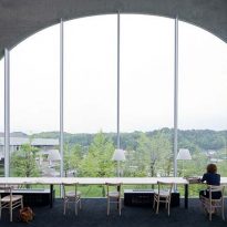
Shelves and study tables of various shapes, glass separation function as bulletin boards and other decorative details give these areas a sense both individually and visual character and spatial continuity. The use of glass in the reading tables allows external reflection, reinforcing the idea that the building is immersed in the surrounding greenery.
The frames of the large windows with arched shape also are aluminum. They have been bent 4mm so they could accompany the facade in its curvature.
