Tacoma Building
Introduction
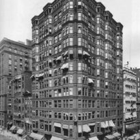
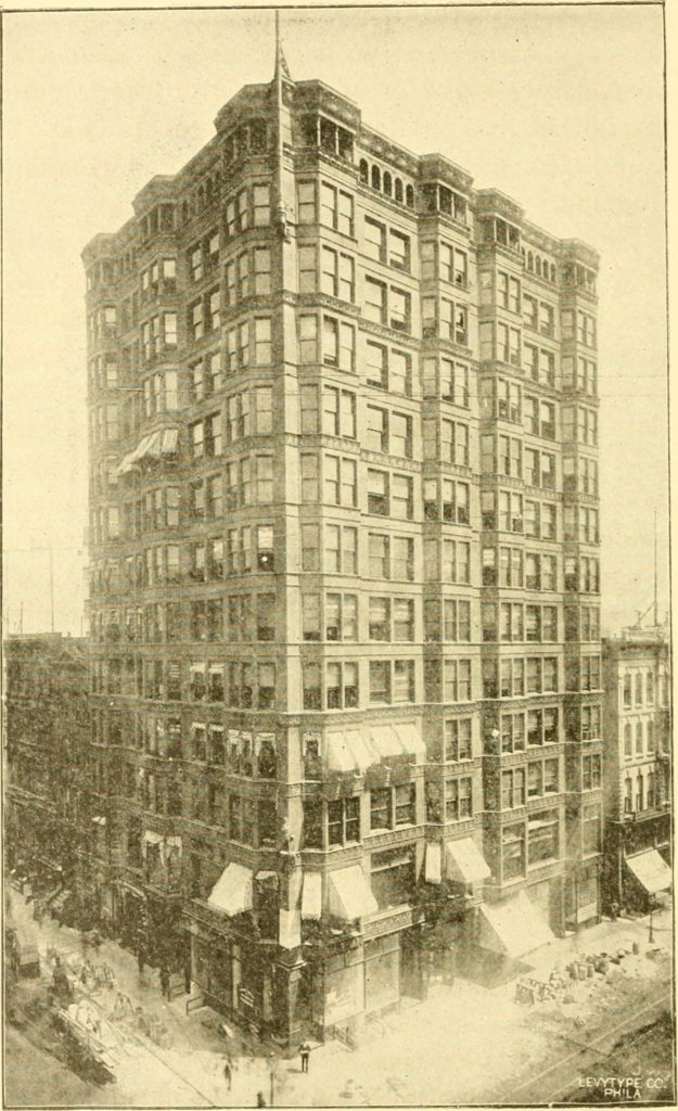
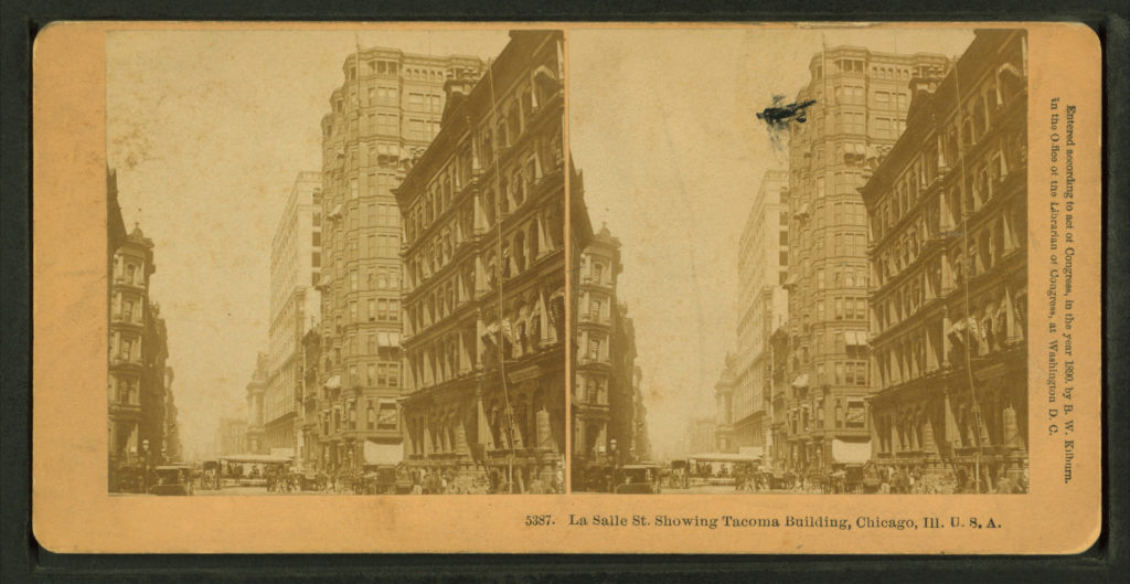
Sooner or later, some architect would be the first to put the skeleton iron framing used by John Wellborn Root in the Rookery lightcourt’s on the exterior of a building. The first to have done so in Chicago was the newly-formed firm of William Holabird and Martin Roche in early 1888, in their design of the 13-story Tacoma Building.
However, the idea to use the Rookery’s detailing may well have come from George A. Fuller, the building’s contractor who had just finished constructing the Rookery While these young architects had worked in William Le Baron Jenney’s office before the design and construction of the Home Insurance Building, what they designed for the Tacoma Building bore little resemblance to Jenney’s detailing. The Home’s two exterior street walls did not employ the independent iron frame, but a curious hybrid technique that combined the strength of the masonry piers and the iron sections embedded within them. In the Tacoma Building, for the first time, the iron frame was to be seen on the streets of Chicago (for the construction of the Rookery’s lightcourt had been hidden from the public by its massive masonry exterior), and the Chicago Inter-Ocean immediately had appreciated the revolutionary nature of the Tacoma’s exterior cladding: “its skeleton as it were – fireproofing tile will be used with such completeness that not a vestige of iron will be seen anywhere. A new order of architecture is evidently here, and coming to stay – iron and fireproofing.” the Tacoma’s exterior iron skeletal structure and construction would generate great controversy among the townspeople and the professional press, something that did not occur during the construction of the Home Insurance Building.
Location
Chicago : Northeast corner of La Salle and Madison Streets.
Concept
The Tacoma Building was not just “a new order of architecture,” but it was also revolutionary in its construction process. So much so that a company of policemen had to be assigned to the construction site for crowd control, as people were flocking to the site to see for themselves what rumor had called “floating brick”.
Floating brick was a result of contractor Fuller’s realization that as the masonry curtain wall was no longer a continuous brick wall from the ground up, but a series of brick partitions that were constructed on the building’s exterior iron frame, it would be faster, and therefore, less expensive, if instead of having his bricklaying crew start the brick exterior at the ground and proceed upwards, he had three separate teams that would start laying brick at three different floors at the same time. The result of this decision was that crews two and three were laying brick on two of the upper floors that had no contact with the ground, hence, to eyes that had become accustomed to seeing brick walls from the ground up, the brick in the upper floors did, indeed, appear to “float.”
Spaces
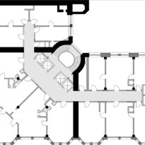
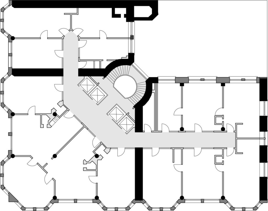
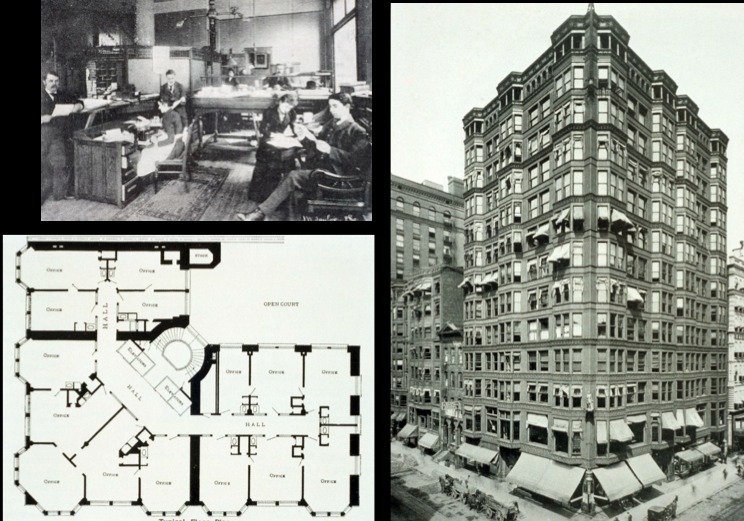
In plan the architects had wrapped the corner site with a double-loaded corridor scheme that left a small lightcourt in the building’s northeast corner. The final design consisted of a ground floor of stores with unusually large plate glass windows, made possible by the exterior iron frame.
In essence, it was an anti-base: gone was the traditional solidity wrought by a massive masonry wall or a stone colonnade, replaced by the transparent veil of the enclosing glass planes, above which the upper floors appeared to magically float.
Holabird & Roche went to great extremes to pull most of the building’s columns inside of the glass to reinforce the openness of the base. The only masonry purposely exposed on the ground floor were the three corner piers and those at either side of both entrances. Never before in a Chicago building had the base of a building been made so open, that had to have been quite apparent in the evening, especially during the dark winter months when the interior lights were on.
Materials
The iron framing also permitted the second floor to be as open and airy as the first. Note that large plate glass windows were also placed here, as opposed to the double hung windows used above, revealing that the height of the second floor was greater than that of the floors above.
Then followed floors three through twelve in a very repetitive layering, the monotony of which was broken by what appears as a rather random attempt to group these floors into larger horizontal layers by the application of a heavy frieze (a less pronounced frieze fronted floors two through four) at floors five, nine, eleven, and thirteen. The overall effect can be described as random because the rhythm that resulted from these cornices was Ground:3:4:2:2; no discernable pattern is evident.
The thirteenth floor (or back then the fourteenth, as the number thirteen was typically superstitiously avoided) was detailed as an open logia, that rather successfully capped the building. While the geometry of the bay windows was carried into this floor, the bays were left open, creating what appeared to be balconies on top of each line of bay windows. The reading of this floor as a cap was then reinforced first with a change in the fenestration from a pair of double-hung windows to an arcade of much smaller openings, upon which was placed an appropriately dimensioned sculpted terra cotta cornice. The result was a very satisfactory overlapping of the vertical force of the bays and the horizontal capping of the top floor.
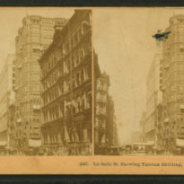
The only other two exterior ornamental features were a flagpole that graced the building’s corner in the top two floors, and the famous full-sized statue of Chief Tacoma that sat on its pedestal on the corner of the building at the third floor.
Structure
The architects employed bay windows in every other bay to increase the rental floor area in each floor. These were cantilevered from wrought-iron beams that were supported by circular cast iron columns and the ends of the masonry interior walls.
The vast majority of the exterior was plate glass, with a minimal terra cotta spandrel at each floor. Matching colored brickwork finished the exterior at the ends of the lateral bearing walls.
The building’s owner, lawyer Wirt D. Walker, had commissioned a 13-story office tower, a height that demanded extra caution with regards to the building’s ability to resist the increased wind loads, especially considering the reduction in the weight of the exterior walls. While the architects employed a revolutionary exterior structure, they were very conservative about the overall structure of the building, resorting to four interior bearing walls to gain the necessary rigidity in response to the anticipated wind loads. The building’s engineers also employed a great amount of riveted wrought iron in the floors to create rigid diaphragms to tie the structure of the whole building together. So while the Chicago Inter-Ocean could describe the exterior of the Tacoma Building as an “iron framework,” this technique was limited to only the exterior curtain wall, for the architects had simply turned the Rookery’s structure inside out.
