Steiner House

Introduction
Steiner’s house was designed for the painter Lilly Steiner and her husband Hugo. It is located in a suburb of Vienna, where planning adjustments were strong enough to have a direct impact on the final design.
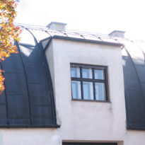
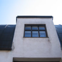
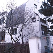
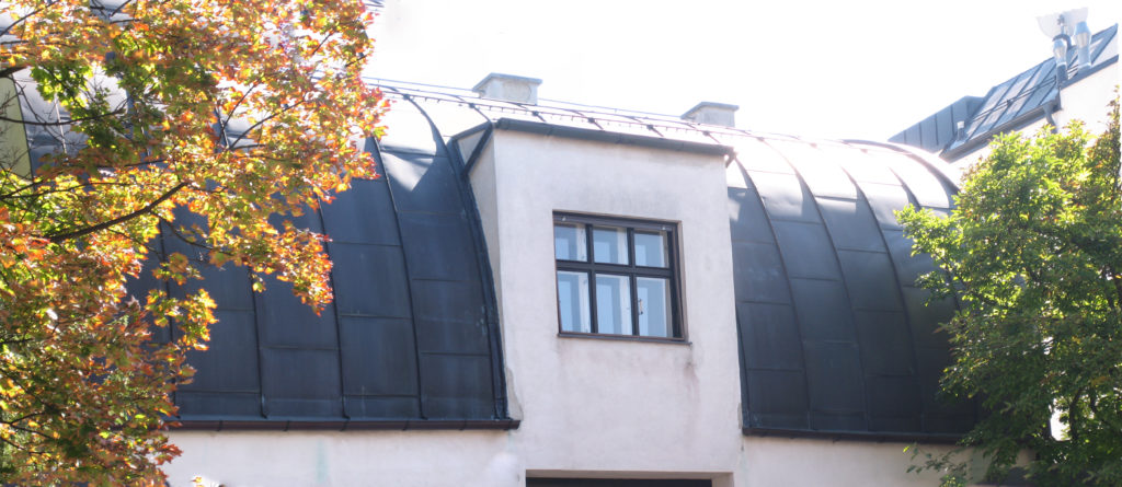
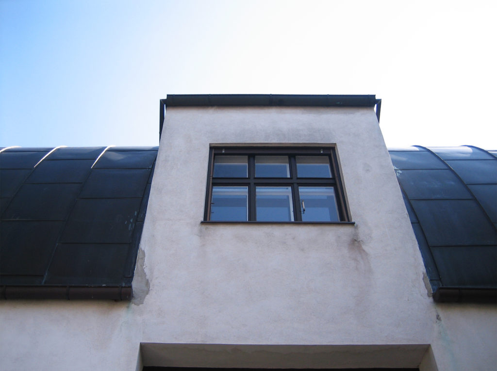
Loos was the architect who carried forward, within the limits imposed by the configuration, and external forces, such as rigid building codes at the time. They allowed only one facing the street and a “sleep” (a window built into sloping roof)
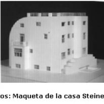
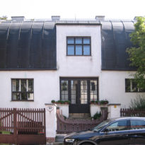
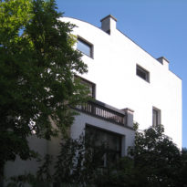
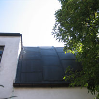
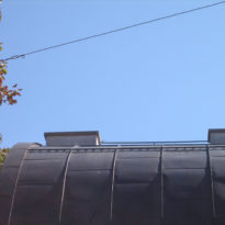
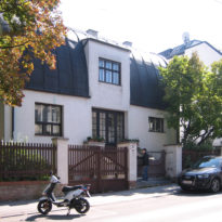
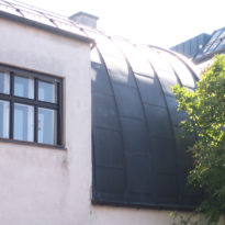
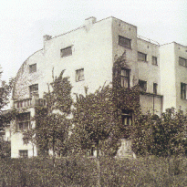
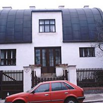
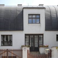
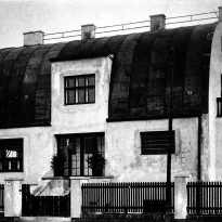
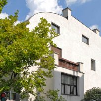
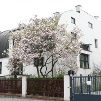
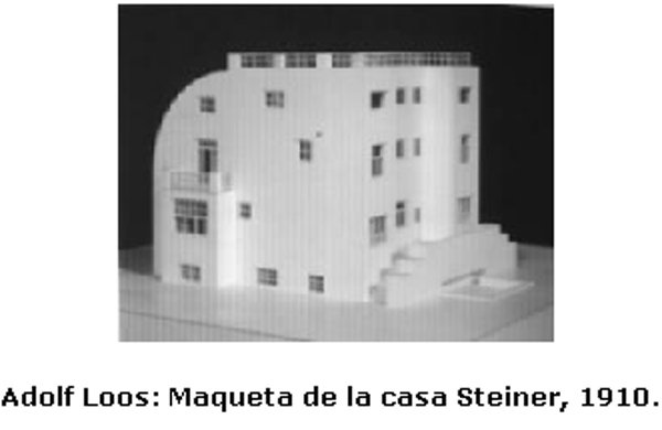
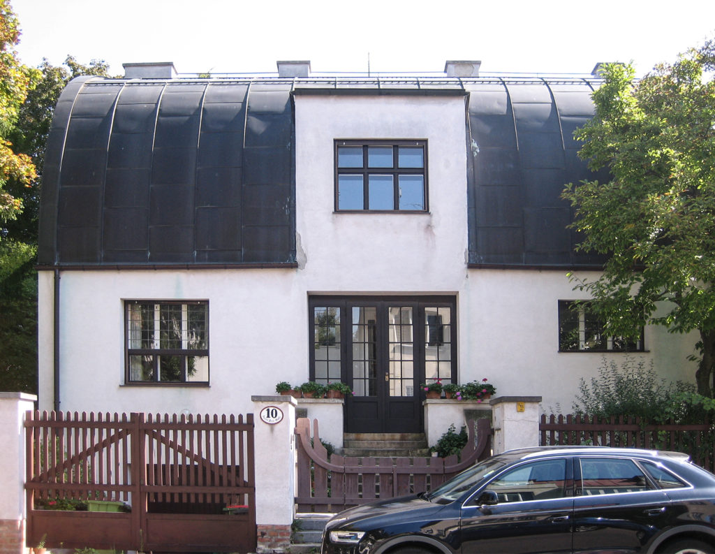
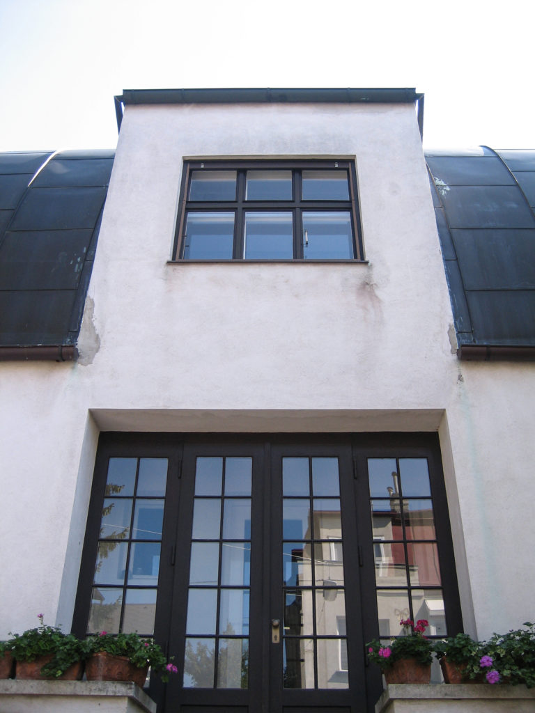
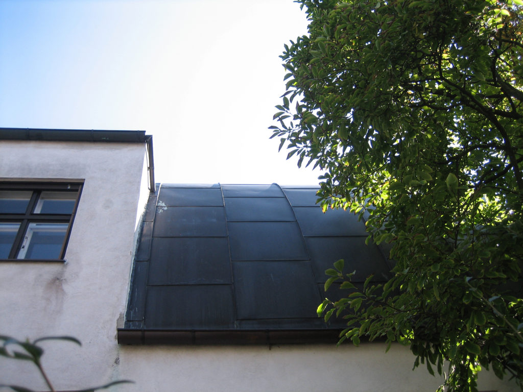
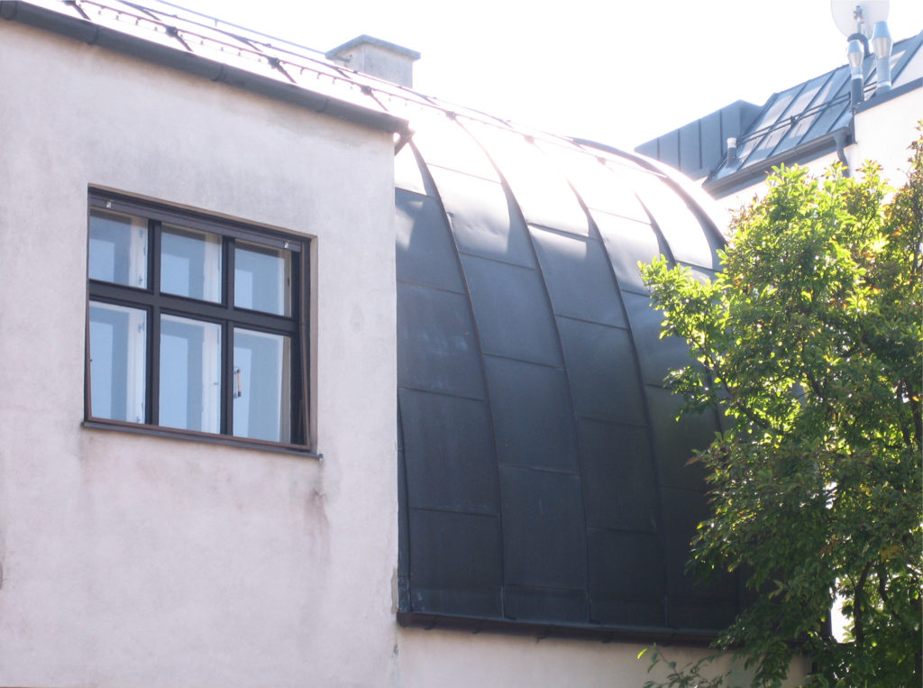
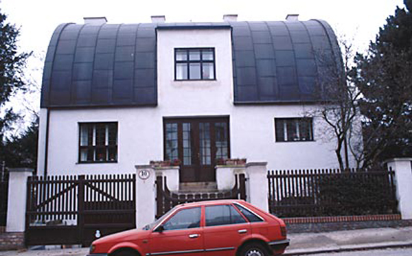
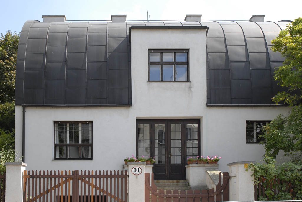
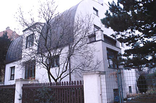
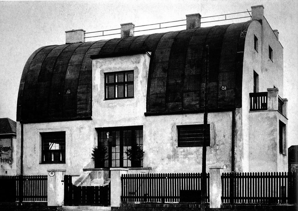
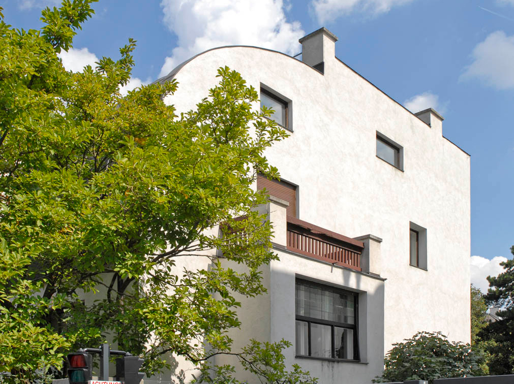
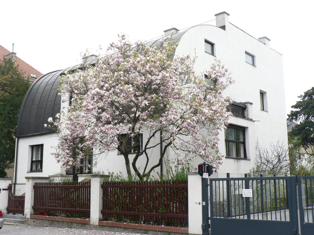
This house is on a manifesto of the poetics of the architect. Shows the architectural principles protorracionalista the main facade, with its ugly curved roof, designed by an architect to exclude the entire architecture of the arts to solve a function.
Steiner not only the house became a highly influential example of modern architecture is a must for the architects of the 20s -30s, but he played an important role in establishing the reputation of Loos as a bold modern architect inside and outside the community in Vienna.
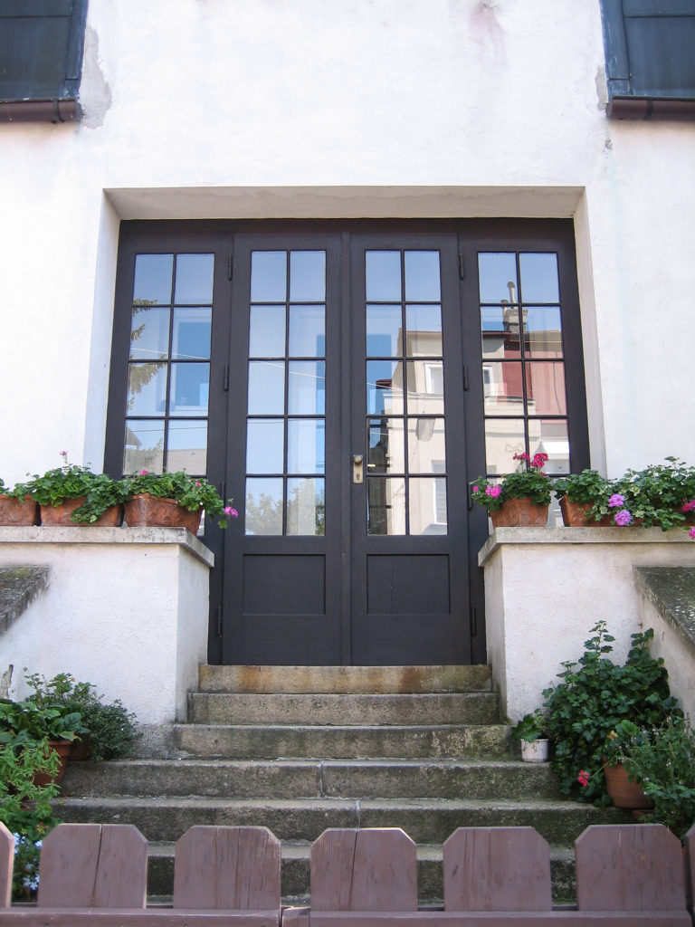
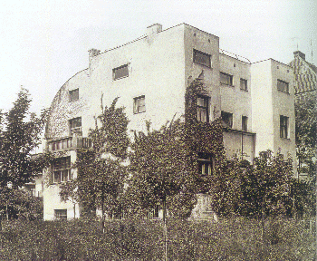
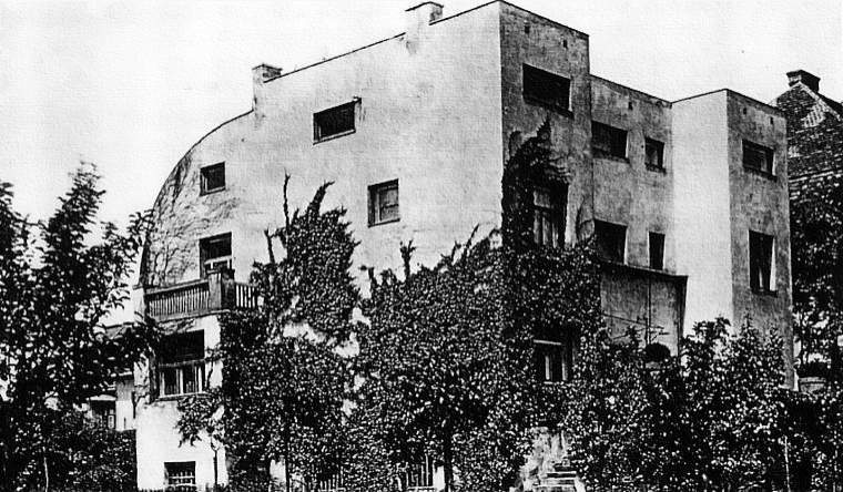
The front garden has been an indisputable example of radical rationalism in the modern architecture. Its facade was quickly assimilated into the formal purity of the 1920s and one of the reasons for the success of the construction.
Situation
It is located in St. Veit-Gasse 10 St, Vienna, Austria.
A short distance from the Strasser House and the House Scheu, the same architect.
Concept
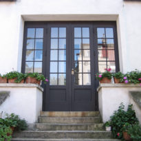
Loos to the outside is the public part of the house and is the reason for the surfaces of the walls bare, smooth, unadorned.
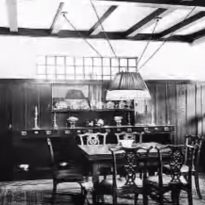
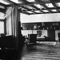
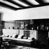
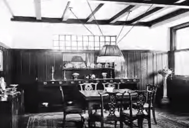
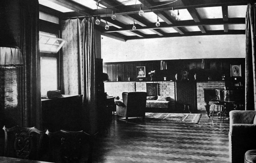
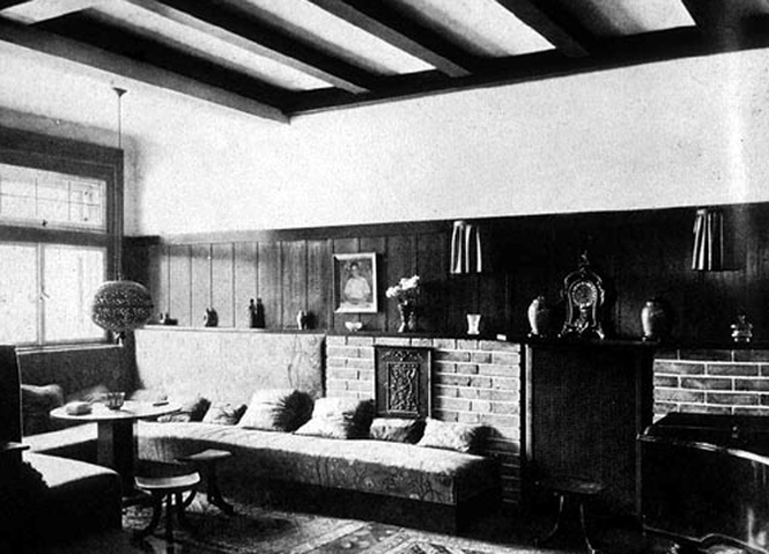
The interior is the private side and reflects the personal taste of the owner.
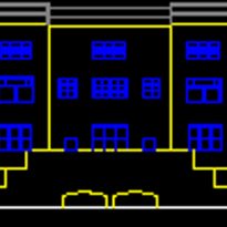
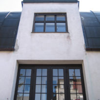
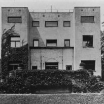
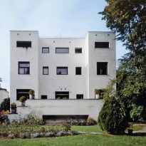
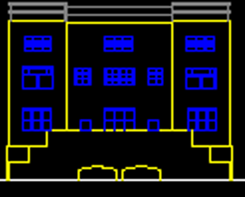
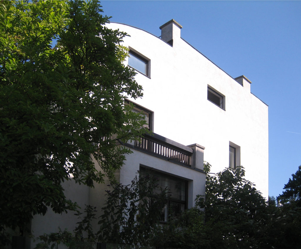
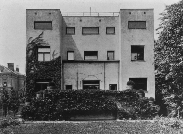
It is building a radically messy, with a symmetrical composition of the holes in the front garden, whose volumes are linked by two bodies that define an outgoing central wall.
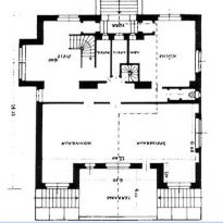
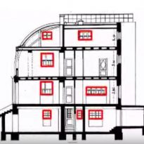
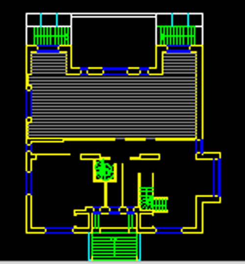
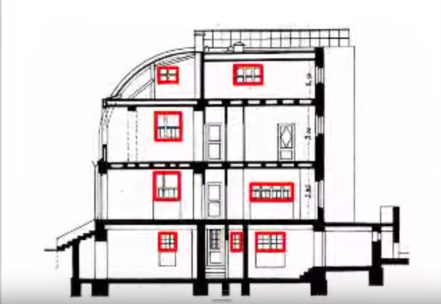
As for the interior, the project Loos founded on a principle of economy and share that part of the consideration that large plant sites require a height greater than the premises with small dimensions. Unable to cope with one roof spaces of different heights. Thus Loos environments fits on one another with different vertical levels, each volume has the size to fit its own role, until all the internal spaces are its conclusion under a single roof plane. Carried out in this way a remarkable spatial economy.
Symmetry, the total lack of ornamentation and net volumes defined the proposal. An architecture based on the economy and the rigor of the proposed functional.
The contribution is in the interior, where the local nature of the highlights through various altitudes. It requires a precise assembly of volumes and the proposal of a rational
The sleep (large window) on the front is responsible for bringing to light the painter’s workshop, located on the first level.
As some critics have pointed out, the house reflects the “married to the classic British domesticity in the pursuit of territorial continuity”
The experience described by key American Loos andalusia to look at a chest-table smooth, without embellishment, in connection with the theory of lack of ornament of the objects of use (the house is also an object of use) also had its impact in building houses.
Loos fight against all forms of decoration to implement defined as an economy and an aesthetic nature of social aversion to waste.
Spaces
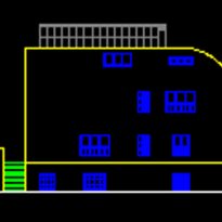
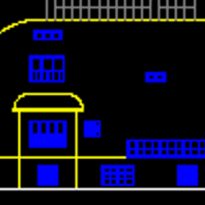
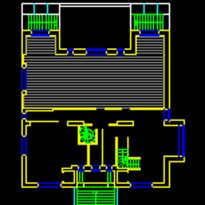
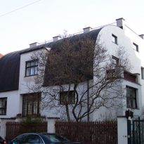
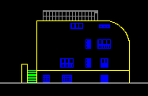
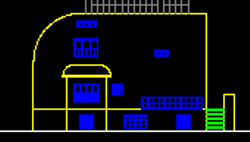
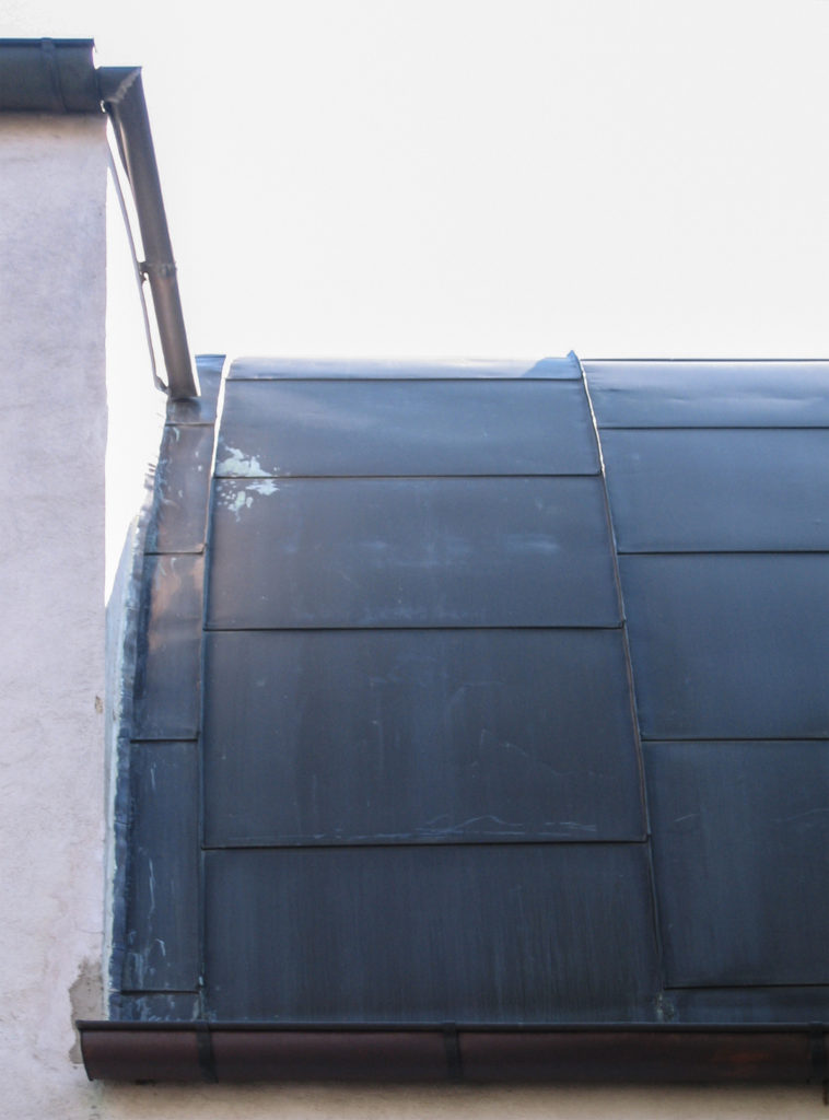
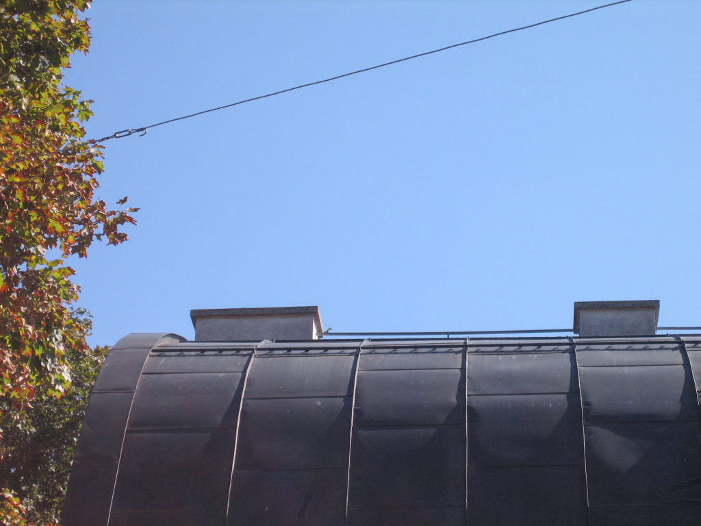
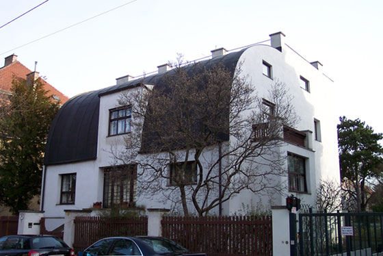
The architect added the building in the gap between the street and the garden, with his hand in the four-story and relating to the roof of the only permitted in the side of the street by a curved roof. Any combination of interior spaces should be based on the juxtaposition of large and small environments, while retaining a single roof.
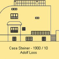
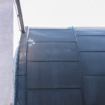
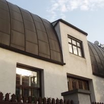
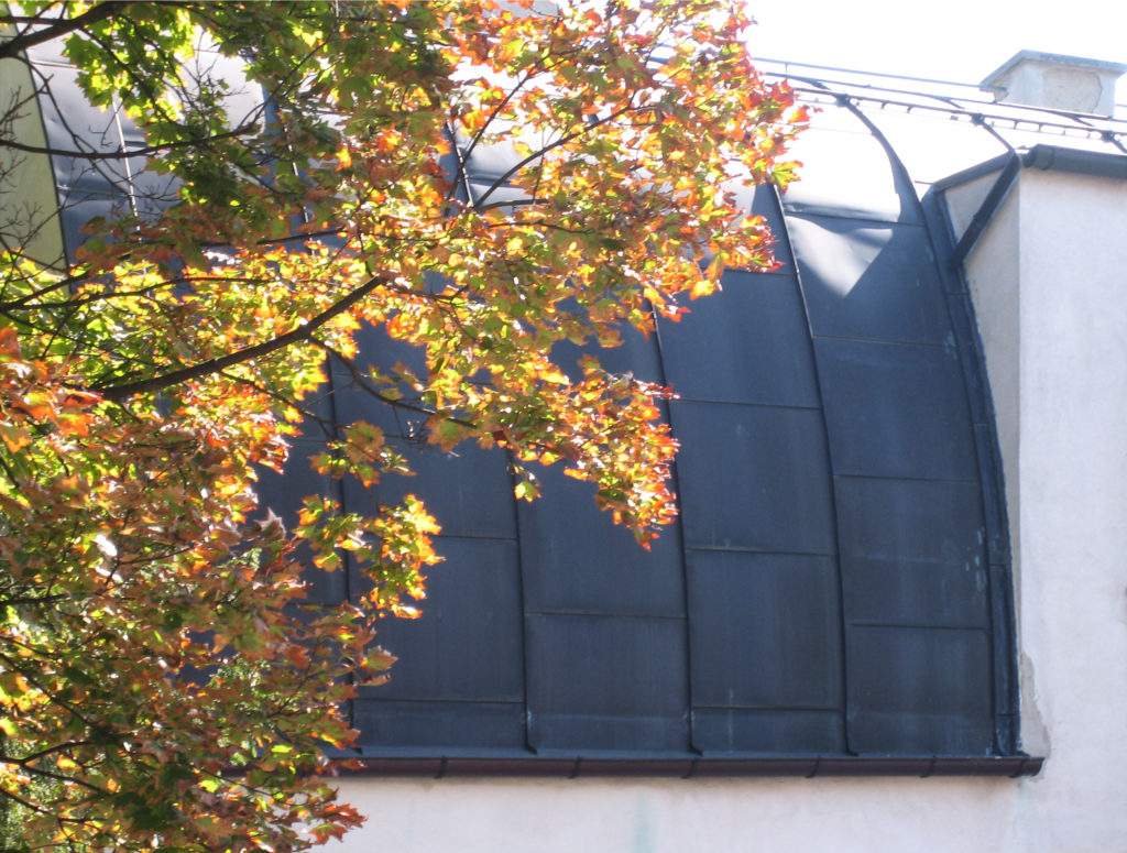
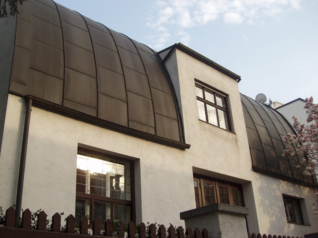
The side walls are different environments with different heights. The front garden, however, is orderly and composed with a classical and symmetrical order, topped with a semi-circular roof sheathed in metal and so articulate Loos manages the transition between the front garden and elevations.
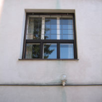
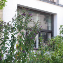
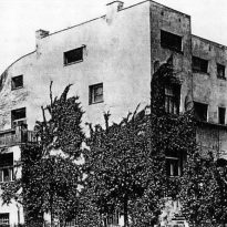
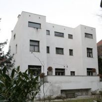
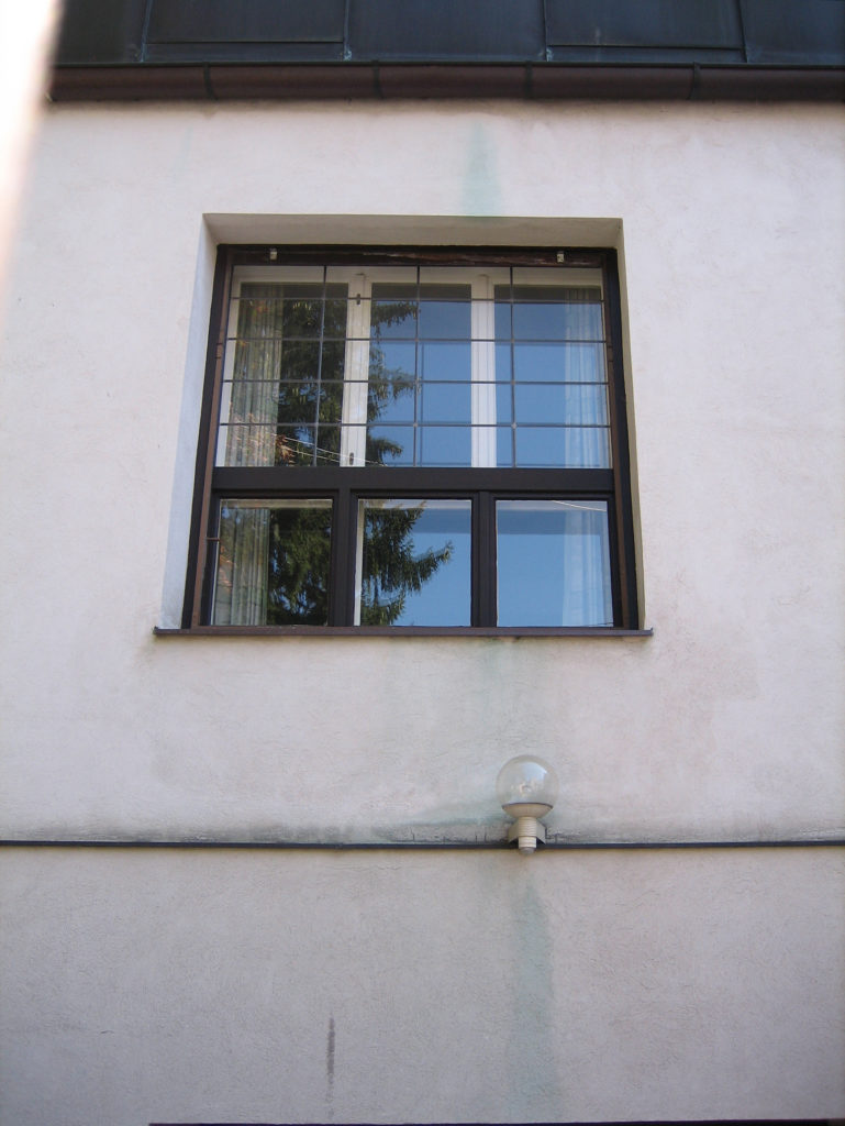
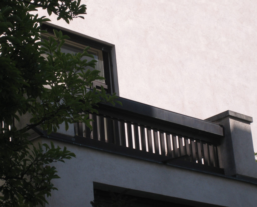
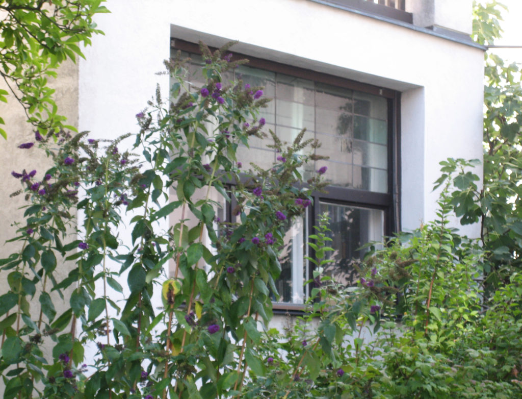
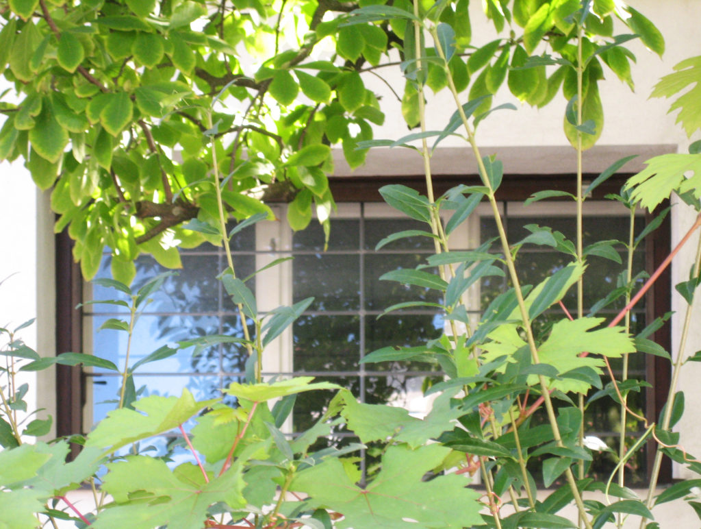
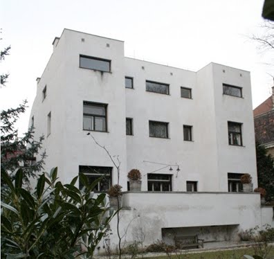
The facade of the rear window displays and irregular provision of various sizes, reflecting their different domestic environments in sizes and heights, which are a reflection of the principle of “raumplan,” Loos concept applied in many of his works and that is thinking of space, space intuitively understood as a consequence of a free composition of volumes and planes
Bohardilla played the role of his painting studio owner.
Complex in space. The coupling of different heights environments is evident in the front through the holes, so arranged asymmetrically.
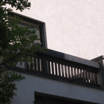
Outdoor terraces.
Materials
Covered with cement and timber, to accommodate the weather in central Europe.
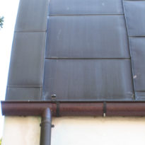
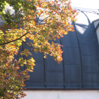
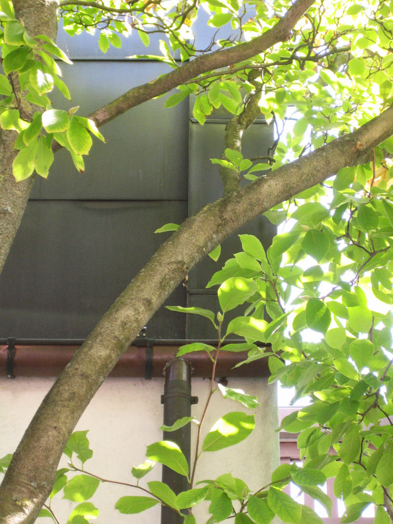
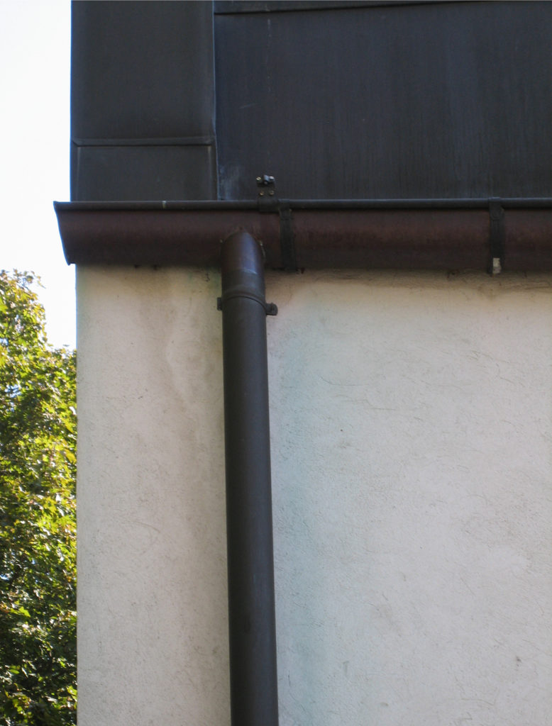
Sheet metal roofs, walls of cement and bricks. Rejects the walls of glass sample exhibitionism, indoor parking.
House cubic plane cement roof, windows and cut into the front garden.
The main facade is adapted to the standards, a municipal-solving attic floor and cover with a sheet semibóveda.
