Sendai Mediatheque

Introduction
Sendai Mediatheque, a project which in 2006 received the Royal Gold Medal by the Royal Institute of British Architects (RIBA), can be hailed from various aspects: its structural innovation, versatility and functional significance for the residents of Sendai. But perhaps what has made this building is a milestone that has tried to translate the architecture eteriedad, fluidity, and multi-virtual computer world that characterizes our time.
The general concept for the competition since the call was free access to the public. Located in an area of 50 x 50 m, the media library should contain several features: a library, internet booths, areas of DVD, galleries, cafes, etc..
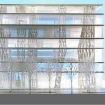
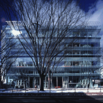
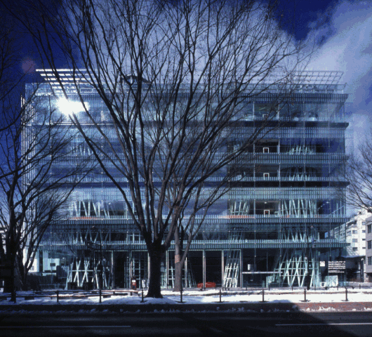
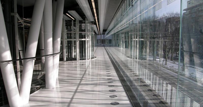
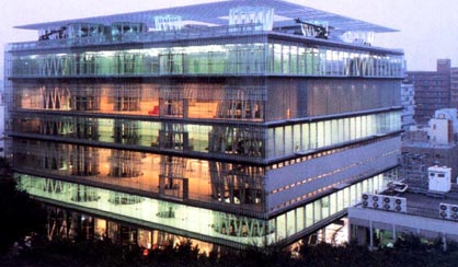
The proposed Ito opted for transparency. Since the lot is in front of a large grove, building extensive views towards the rescues as well as the use of trees in the design of the structure.
It is above all a space where the flow of light and frankly between the different levels of the building.
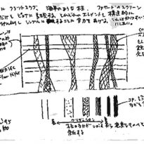
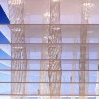
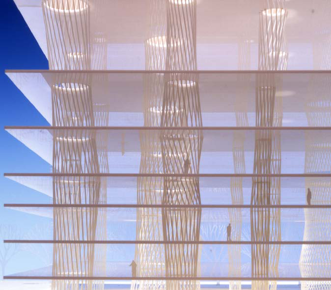
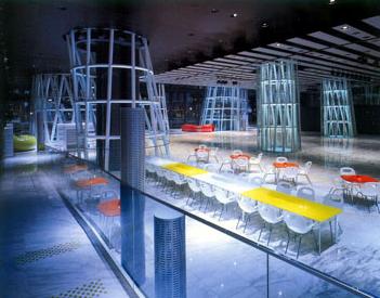
The Media is based on the metaphor of Aquarium, its transparency and hence the similarity of the pillar with algae.
Location
The Media was built in the 2-1, Kasuga-cho, Aoba-ku, Sandai of the capital of Miyagi Prefecture, Japan.
Located 300 km north of Tokyo is a city of one million known as the “City of Trees.” In its vicinity is Matsushima Bay, one of the three most famous natural scenery of Japan, near the island of Miyajima and Amanohashidate isthmus. Some small churches and a castle realize its historical heritage, but the reason we Sendai has achieved international renown for its Media, one of the most representative works of the architect Toyo Ito.
Concept
The main idea which is built on the Sendai Mediatheque is an open and fluid space, where the space is not predetermined. So that the architect made five wishes for your work:
- I want not to create together
- I want not to create beams
- I want not to create walls
- I want not to create room
- I want not to create architecture
This last wish is perhaps the most conditional work, despite being the most problematic. Toyo Ito comes this far in this sense that this idea is reflected not only the work but also how it is installed in the city. The building is dematerialises not think of interior-exterior, architecture in tune with nature for their perfect harmony, it is necessary to create a softer contours that merge inside with outside.
Description
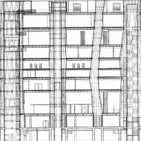
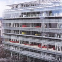
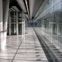
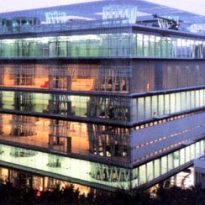
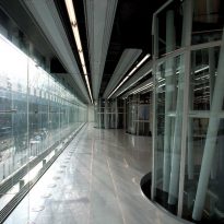
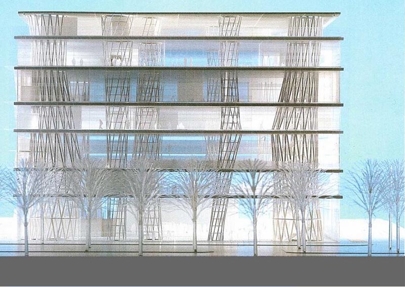
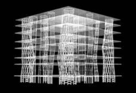
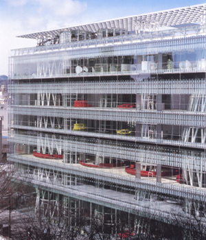
The Media is a glass 50 × 50 meters, 36 meters, with several plants and a series of pillars patio flowing through it from first to last.
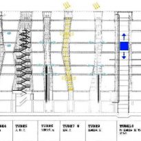
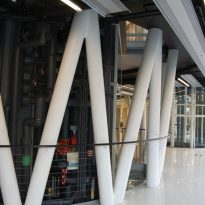
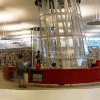
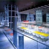
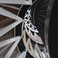
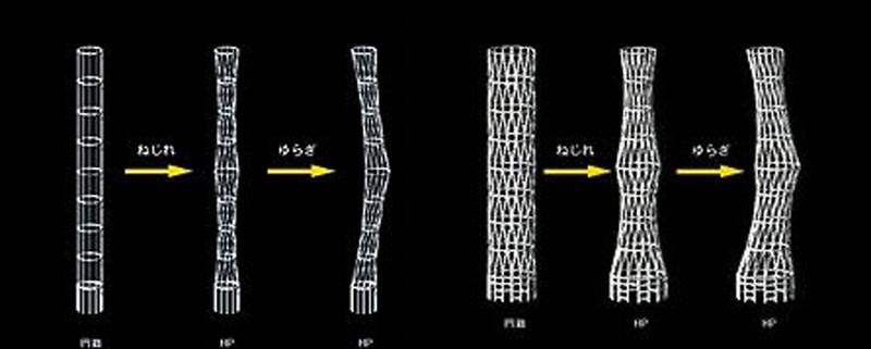
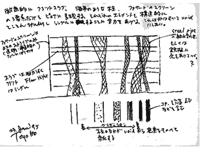
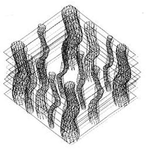
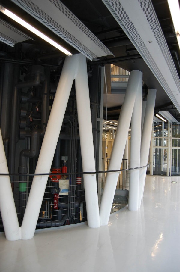
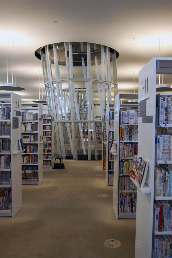
The technology is very present in this building, both internally and in the construction of the entire box. Plants are divided by use of forged steel base plates and beams in the middle as a “sandwich”, and the pillars are tubular metal soldiers. The latter are perhaps the most important aspects of the work since the run from the first to the floor and far from being orthogonal, they have a circular section that is changing as increasing in height, varying in each well one of the plants.
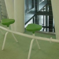
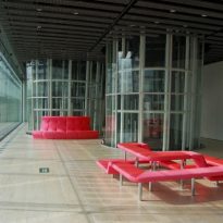
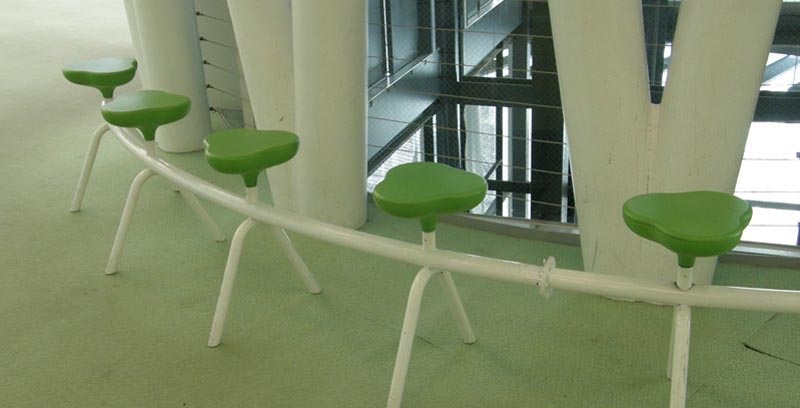
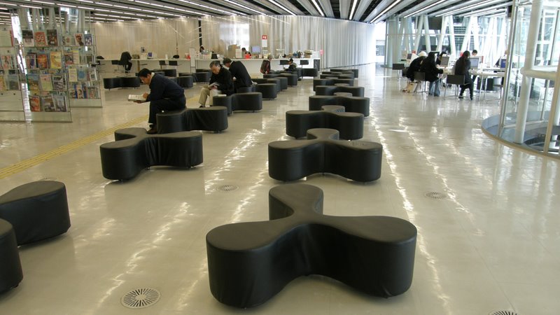
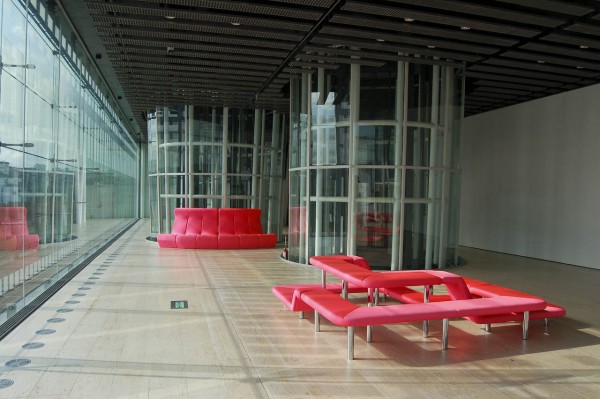
It is a multifunctional building, open and dynamic, with many micro environments whose activities are coordinated by the furniture. Their deployment on the streets is such that its presence does not interrupt the flow of the user, the building can go through the ground floor and is not a solid box.
Given the shape of the building might raise the question whether the media really has a concrete, apparently could pass through a cube, but its limits are so widespread and transparent and it so dynamic and ambiguous, ever-changing, it is difficult to assign one way.
Toyo Ito of this desire not to create forms as expressed in the phrase “… what attracts me is not see the wind, but think how wonderful it would be if there could be an architecture that did not take shape, as the light wind.”
Spaces
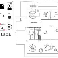
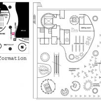
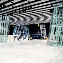
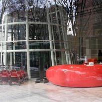
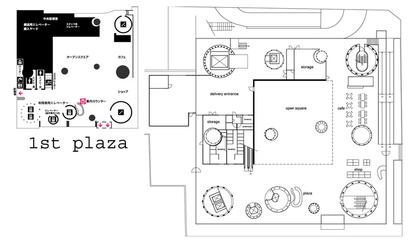
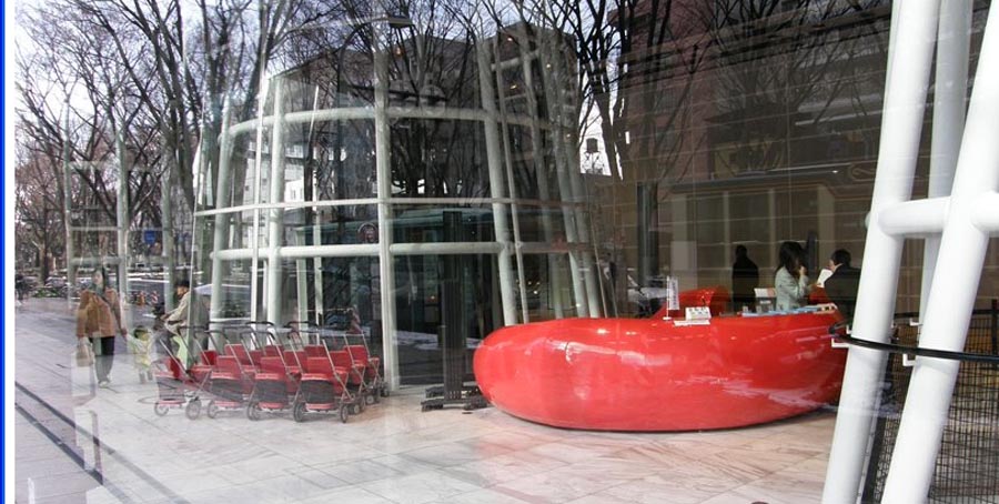
The street level, open square called, contains the reception, a café and a store of books and magazines. It is completely extroverted to the street.
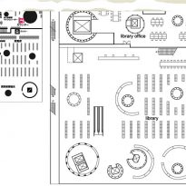
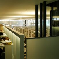
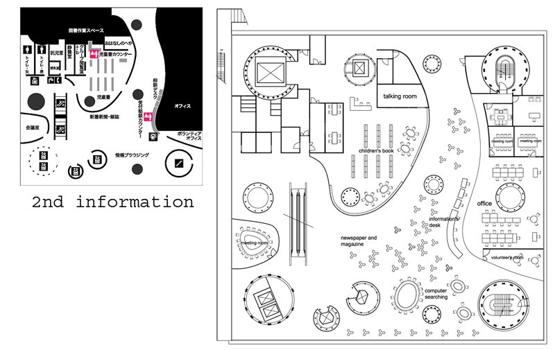
The second level is the children’s library, internet room and administration. This is a very free, where is the furniture that defines the space. A very interesting aspect is that the separation between the public area of Reading and the Private area of administration is simply a translucent curtain, resembling a floating wall.
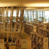
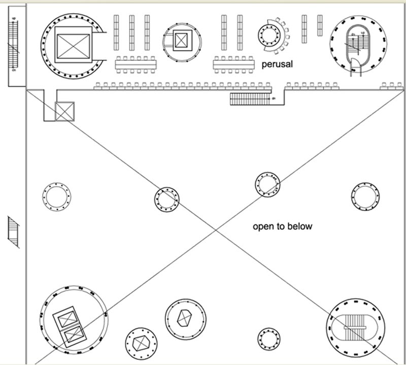
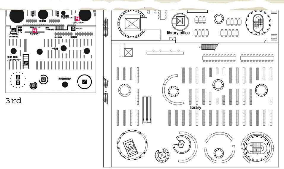
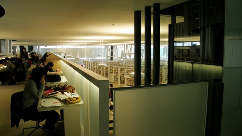
At the third level and fourth level, the room is actually a mezaninne are the area of lending books and reading rooms.
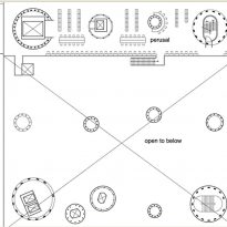
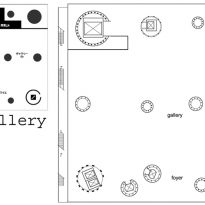
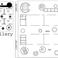
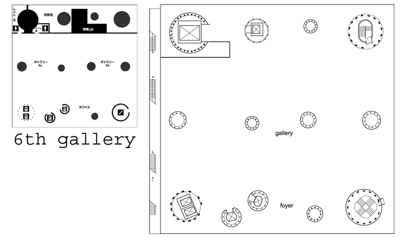
In the fifth and sixth floor exhibition galleries are located, used by the citizens of Sendai. Here, mobile rectilinear panels can be accommodated according to the needs of the exhibition, a clear reference to the sliding doors of Japanese architecture.
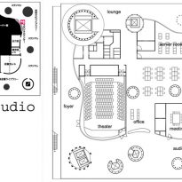
The seventh floor is located a film and conference rooms, which are wrapped in a wall, or as Ito called a “membrane”, matte glazed curvilinear shapes that are placed with their surroundings.
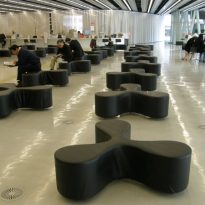
Here are also an area of loan and audition tapes and DVD’s and meeting areas, whose furniture is curved and organic.
Structure
Formal Concept
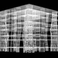
The design is based on three basic elements:
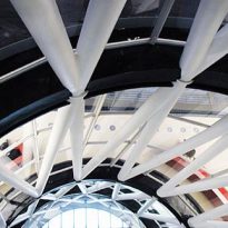
- The platforms in number 7, are the support functions where they settle. With a thickness of 80 cm, is actually a grid of metal beams welded to two metal plates too, similar to those used in shipbuilding.
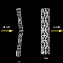
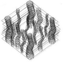
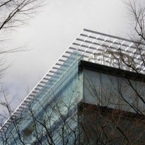
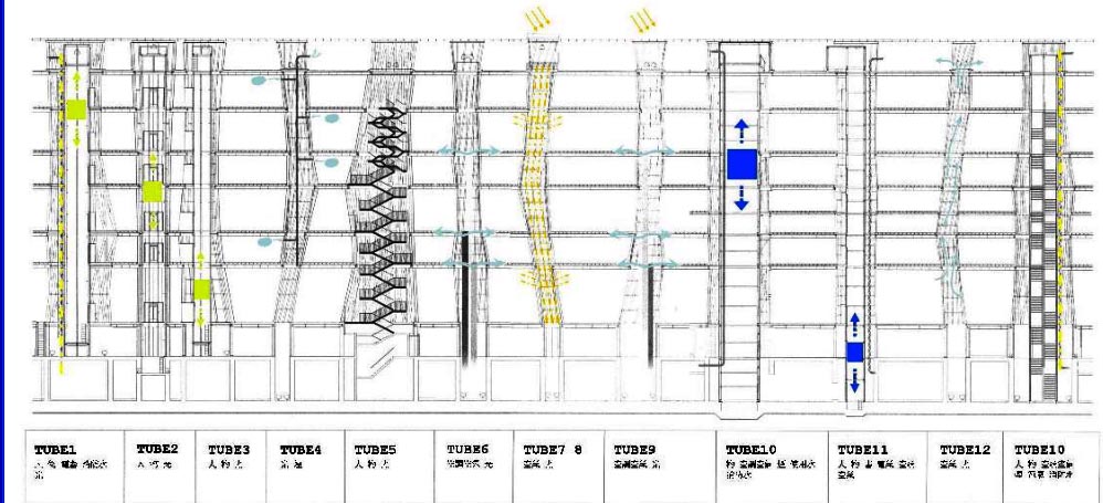
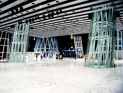
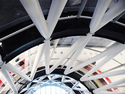
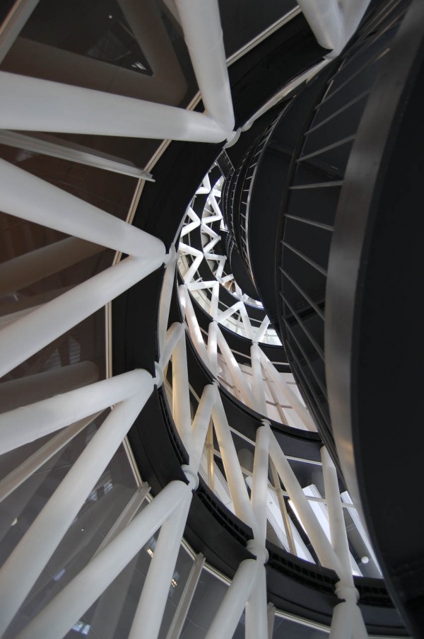
This grid can also be seen on the roof crowning the composition of the building. - The tubes are 13 bundles of steel tubular structures coated on glass, resembling a twisted structure like a seaweed, and maintain cross platforms to stand on the roof.Scattered freely in the building, varying in shape, diameter, inclination and size, while equipped with light inside. The tube houses the largest vertical circulation that connects the different levels of the media.
Despite his frail appearance and transparent, these structures confer flexibility, strength and horizontal and vertical stability to the building in an area of high seismic activity and typhoons constant.
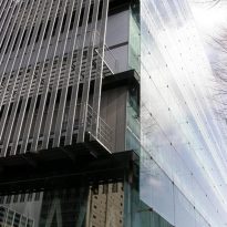
- The skin is a transparent membrane that allows fluid communication with the interior’s visual exterior, and at times the boundary between the two seems to be fading.
The building’s structural system is made up with two of the three basic elements for the design of the building, the floor are sheets of metal, and pipes, which are columns in the form of tubes combined.
The structure of the cell is built with reinforcements embedded between two steel plates. At each point of the plates the force is exerted on it is different in the tubes were placed in a radial reinforcements. The columns are made of steel tubes are hollow and have 2 to 9 meters in diameter.
At the time of the building to achieve the three above items are added others, such as walls, doors, elevators, escalators, etc..
Materials
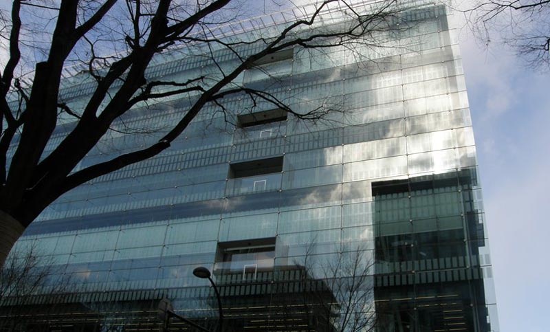
Based on the materials, steel and glass are predominant. Are forged steel and pipes, while the skin, both external and covering the pillars-yard, is made of glass.
Facades
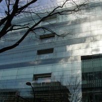
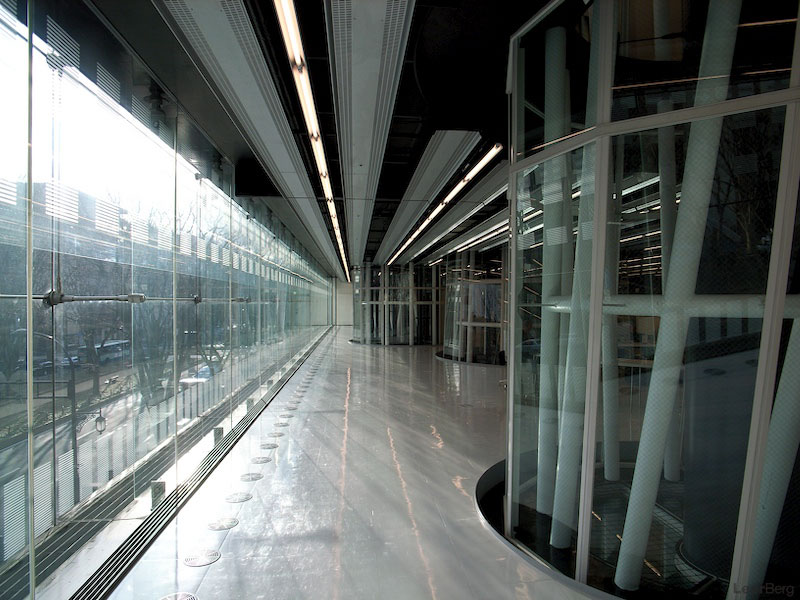
Ito suggested different facades according to the vocation of the environment they face. For example, the main facade, located on the south side facing the boulevard is a double layer of glass, very useful in the winter months, strong winds, is the most external and extends the effect of slightly increasing lightness of the building.
The west side façade, which faces a lot, is opaque, coated with a metal frame which leaves the emergency staircases in the north and east facades, creating paths to neighborhood streets, they have different finishes on each floor: glass polycarbonate and aluminum.
Videos
