Sainsbury Wing, National Gallery
Introduction
The building of the National Gallery in London, designed by architect Williams Wilkins in 1832-1838, has seen many upgrades over the years to accommodate its rich collection of artworks. Originally exposed Italian ando Dutch art works, but gradually increased its collection with works of modern art.
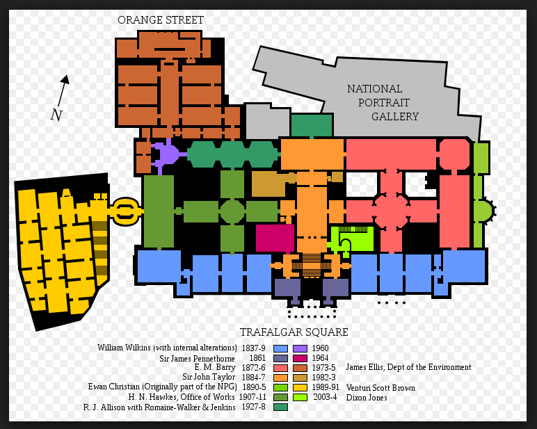
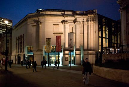
One of the most recognized expansions, the Sainsbury Wing by Robert Venturi, Denise Scott Brown and Edward Middleton Barry from 1989-1991, has been adding 11.148m2 on the west side to the existing surface, going to be 46,396 m2 gallery built. This expansion complements the work of Wilkins communicates with nineteenth century gallery on the first floor.
The extension by R.Venturi and his team has been awarded numbers of awards, including:
- 1991 – The Queen’s Award for Export Achievement
- 1991 – The Design Award for Natural Stone
- 1992 – Honor Award, The American Institute of Architects
- 1992 – First Prize in the Arts Access Award
- 1992 – The National Drywall Award for New Build
- 1993 – The Benjamin Franklin Medal Award
Location
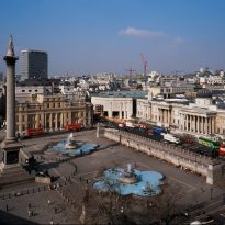
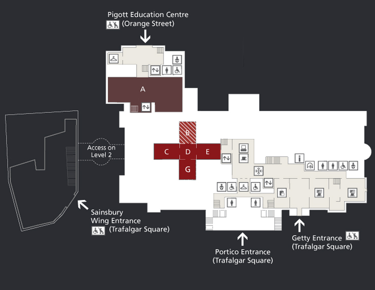
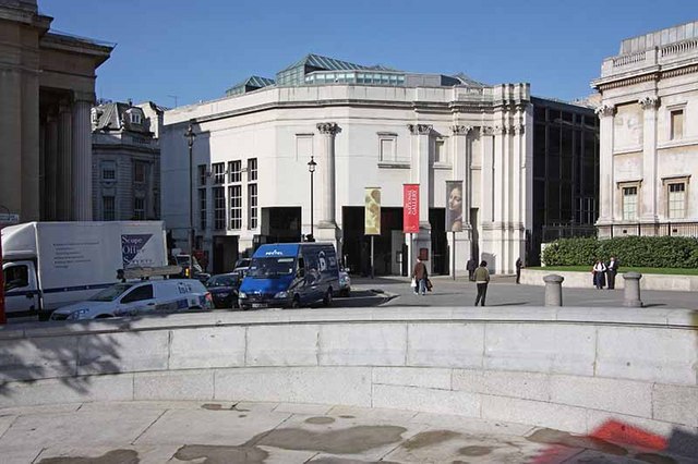
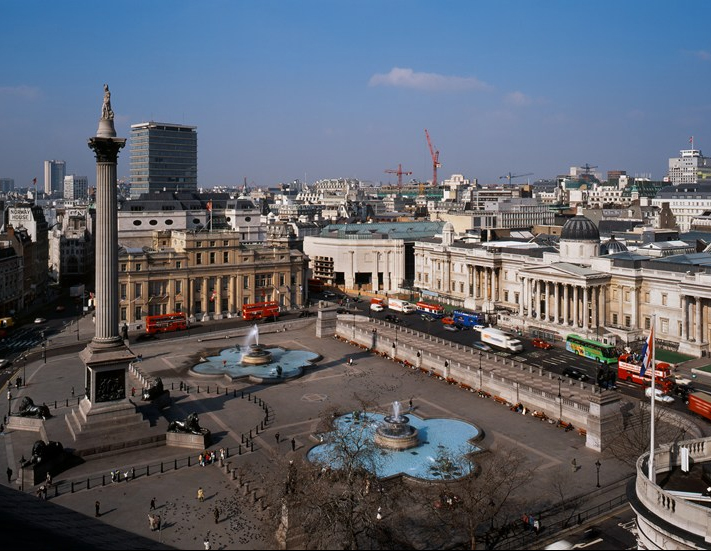
The main entrance of the Sainsbury Wing is located in the northern part of the famous Trafalgar Square, near WhitCom Street, London, England.
History
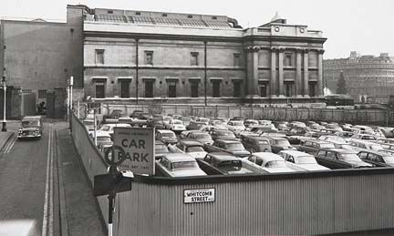
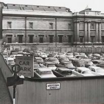
Since the end of World War II, to the west side of the gallery was left a free space formerly occupied by a furniture store that was destroyed during the bombing, leaving the coveted northwest corner of Trafalgar Square as the center of public controversy. In 1950 the government bought the corner with the idea of expanding the building by William Wilkins, but the austerity imposed as a result of the war forced one of the most central corners of London remained empty for years, being used occasionally as parking. In early 1980 the government announced a public competition to design a building of mixed use shops on the ground floor and extension of the National Gallery on the top floor. The parties, including representatives from the gallery, not agreed as to the architect, being suspended all projects until 1983 when plans were reviewed and reluctantly accepted by the parties, except the Prince of Wales in 1984 in a speech to the Royal British Architects Institute design branded as “monstrous carbuncle… in the face of a much loved and elegant friend…” In 1985 the three brothers Sainsbury, business tycoons, proposed to take over the cost of enlargement putting a condition that the building was not mixed use, eliminating the commercial project. Began the search for new architects from names such as Henry Cobb of Pei & Partners, James Stirling and Robert Venturi, being chosen the latter for his “soft postmodernist style”.
Concept
The Sainsbury Wing was projected to add more square meters to the original building of the National Gallery work 1838, adding more exhibition space, in this case to Renaissance art works.
Spaces
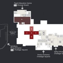
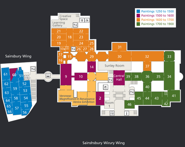
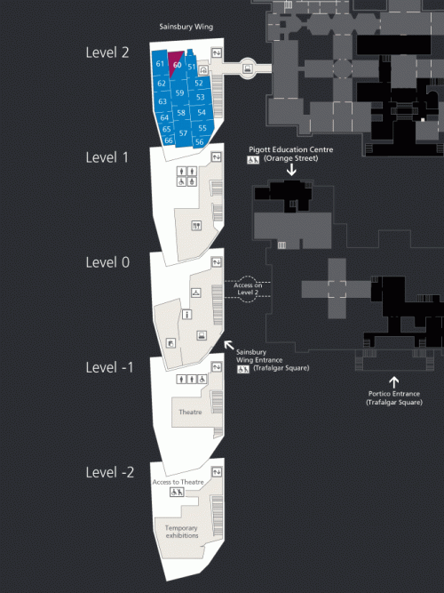
The addition of the Sainsbury Wing, one of the most important carried to the gallery, endowed it with 16 new rooms, approximately 15.000m2, on the main floor and one in the basement levels.
The building has 3 levels above ground and two underground featuring conference rooms, a theater with 300 seats, restaurant, expanded museum shop and interactive information center.
Building
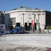
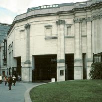
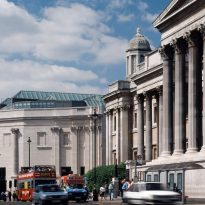
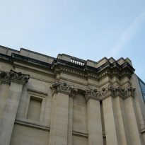
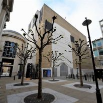
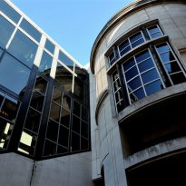
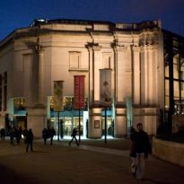
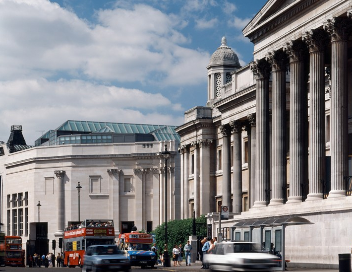
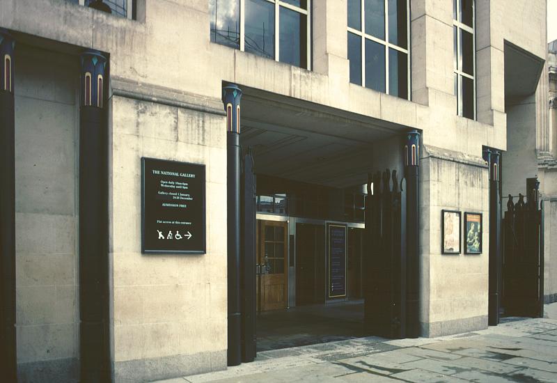
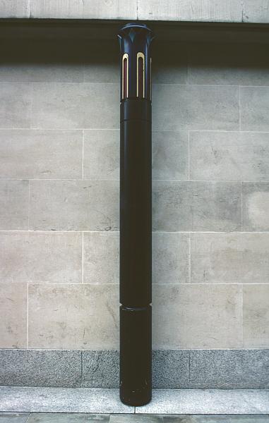
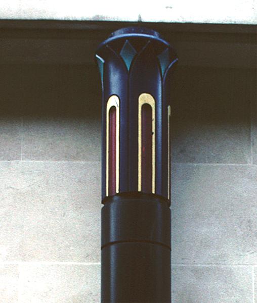
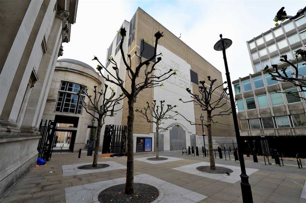
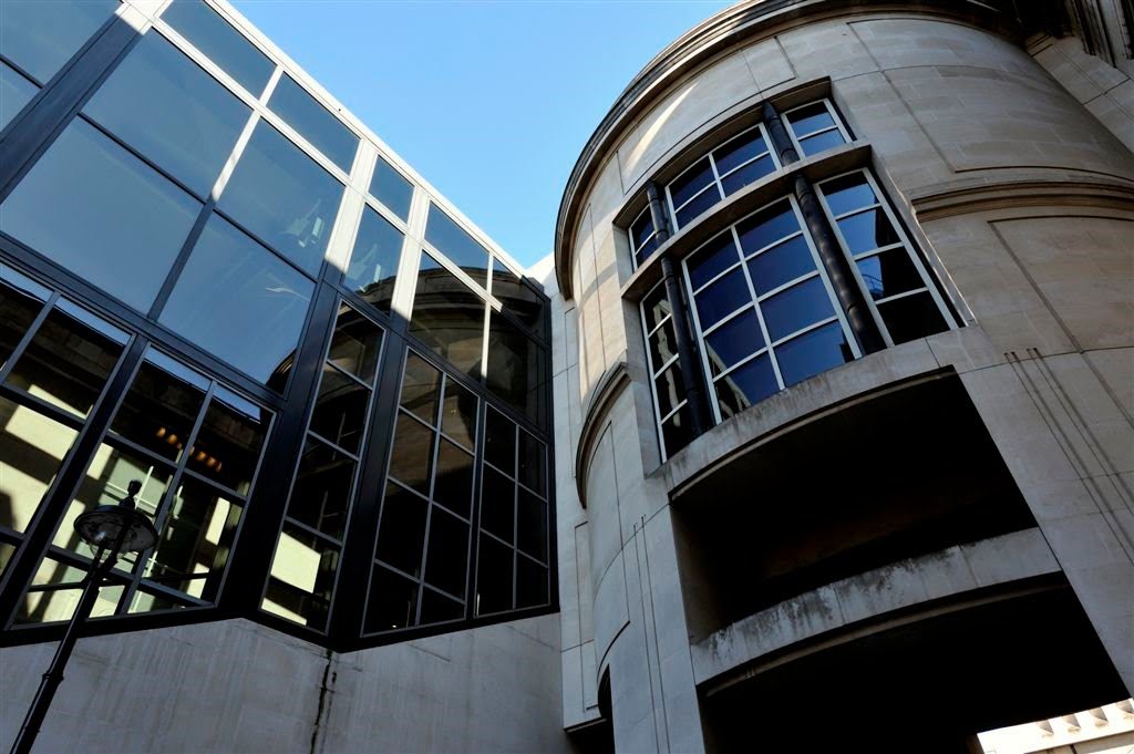
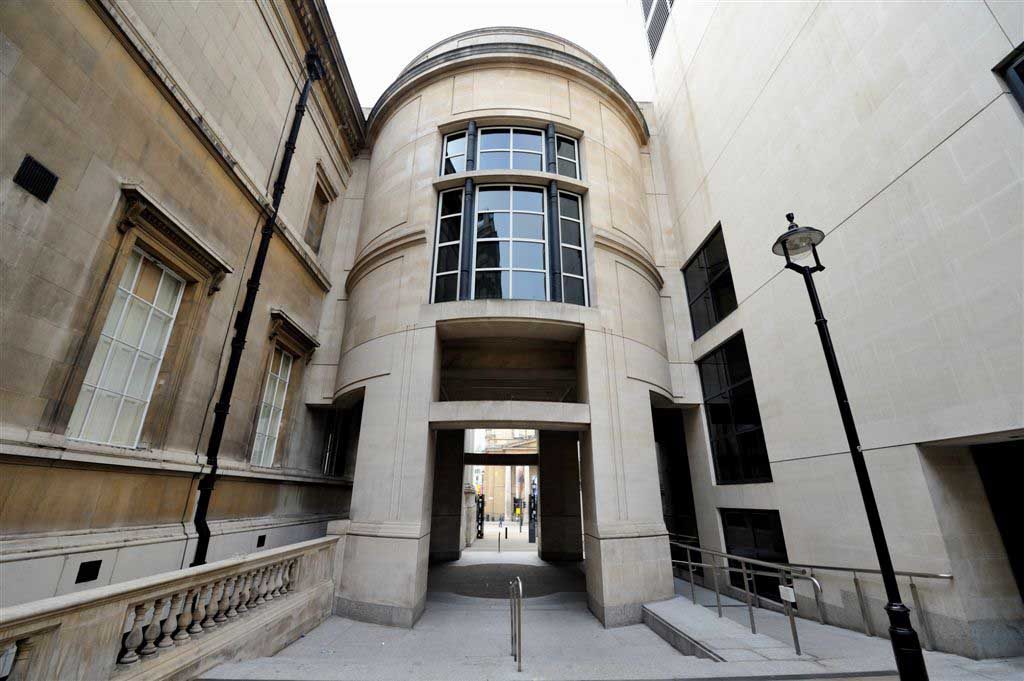
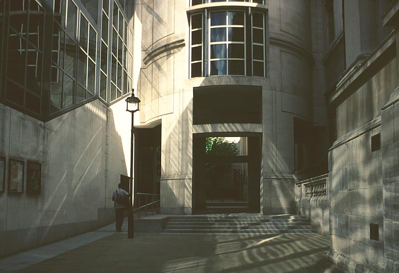
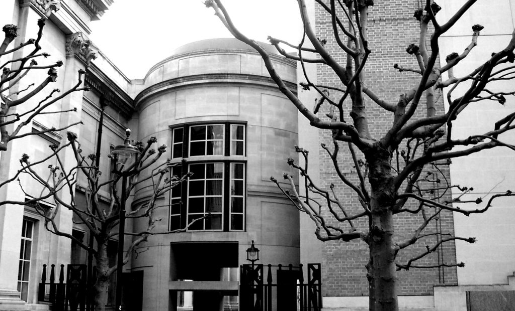
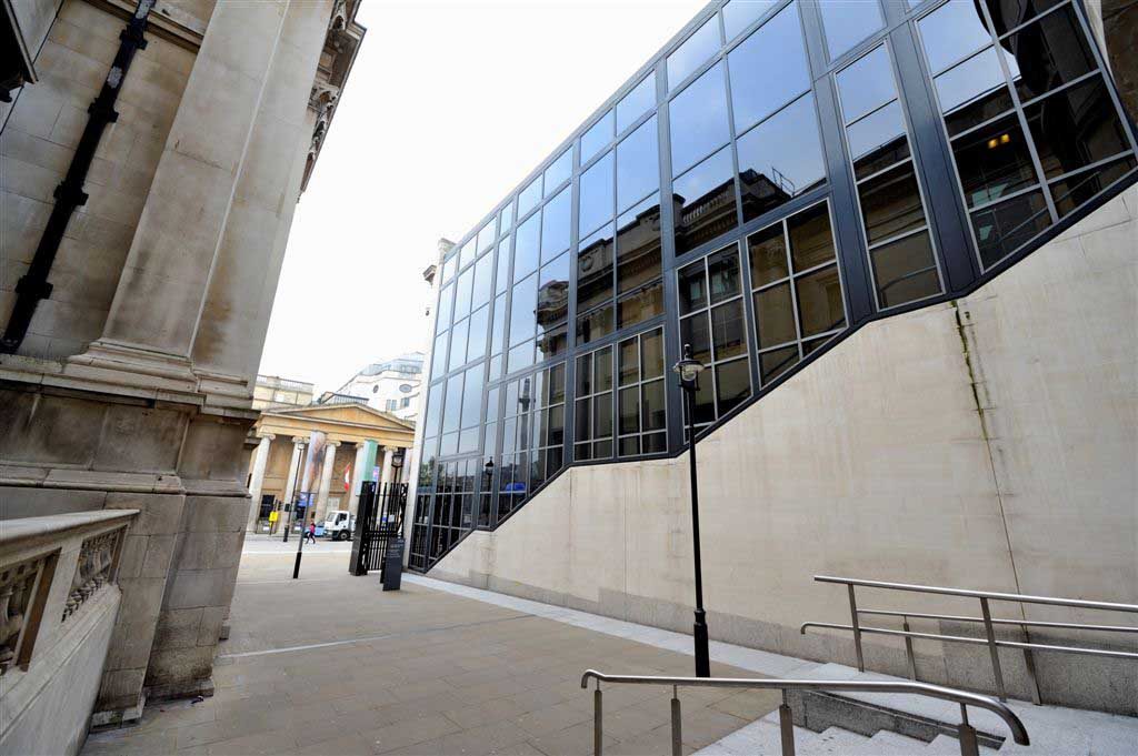
The Sainsbury Wing rises almost to the same height as the central building of the gallery, a relatively low construction and in which Venturi innovatively uses the classic elements of the facade of the National Gallery, cornices, Corinthian nonstructural pilasters, coating stone, creating a continuation fot the gallery across the street, but also combined with large openings, windows, blind windows and metal columns that give a new and harmonious rhythm, while echo building Wilkins.
Level -2
At this level the Sainsbury Wing has a space for temporary exhibitions, access to which, as in all levels of the project, is perfectly suited for all audiences by ramps, elevators and stairs.
Level -1
At level 1, as a component of Sainsbury Wing, a theater was built for 300 people which is used to host many functions, reading room, projection, such as study room or conference room. In this room is accessed via elevators that travel all levels or stairs.
Level 0
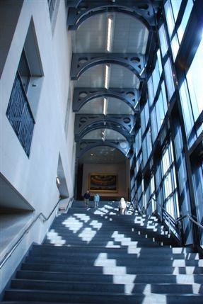
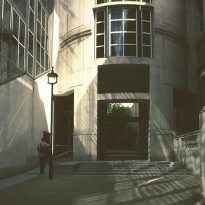
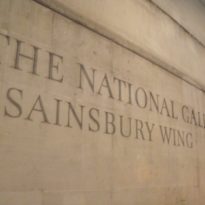
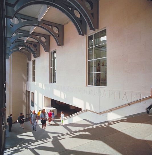
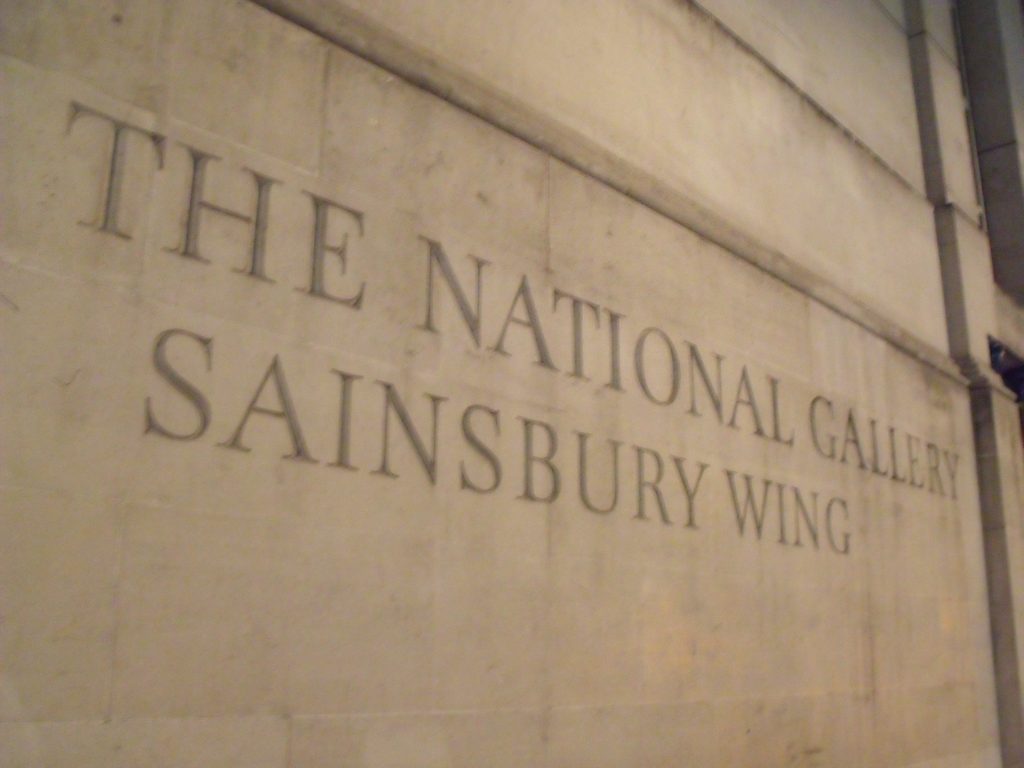
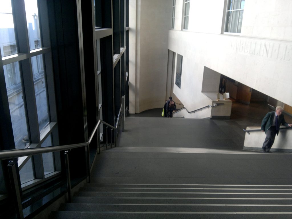
It is striking, on the left side of the entrance to the building the carved letters on the wall that are repeated in the wall behind the reception desk and the stairs leading up to the exhibition halls. These letters were for many years large print carved in the country, showing the names of some of the Renaissance masters as Duccio and Raphael among others. They were carved by Michael Harvey in 1990. The main entrance to the gallery is spacious, on street level, which does not happen in the original structure, allowing access to the public, a concept that the architect did incapié, “…’s not only accessible to the public, it also highlights… “, an important consideration for some time that museums and galleries are increasingly reaching a wider range of audience. Internally communicates with the main building by an overpass encased in a circular design with a large window and a walkway below, which has become one of the most iconic images of the new wing designed by Venturi facade.
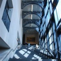
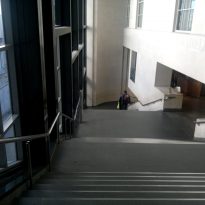
Once inside, the visitor encounters an information desk, a cloakroom, the Gallery Store and parallel to a side wall of glass overlooking the National Gallery and Trafalgar Square stately staircase, topped with iron beams subject to roof and decorated with bows double wall, that leads to the upper level and the exhibition halls.
Level 1
At this level a spacious and bright restaurant welcomes visitors. Overlooking Trafalgar Square and the National Gallery this space leverages the large glass wall of the facade to provide views and natural light. In this plant toilets, adapted toilets and a room for baby change are located.
Level 2
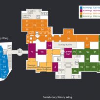
- Showrooms
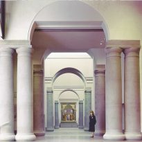
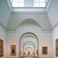
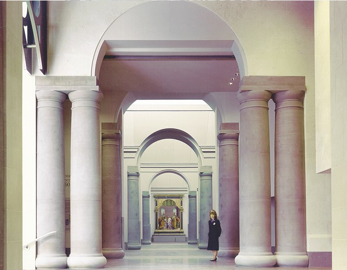
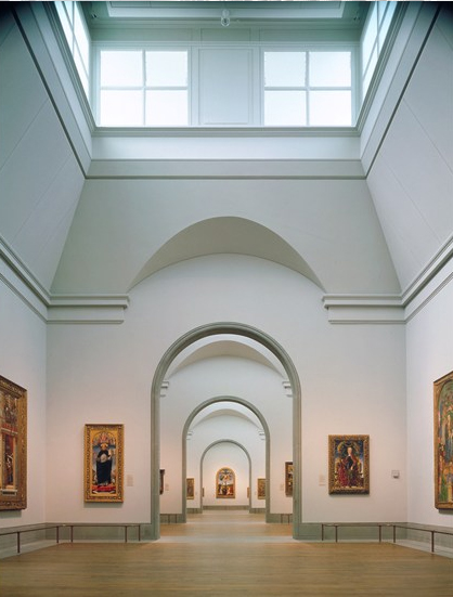
The 16 exhibition rooms have adequate lighting, predominantly natural light entering through the lattice clerestory. The rooms, with varying surfaces are grouped and linked. They have audio guides and access for everyone.
Structure
Materials
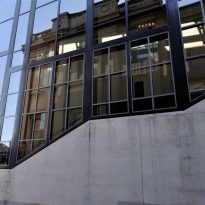
Venturi has used the same Portland stone in the main facade that facades lining the Wilkins building, in others uses brick or glass.
Inside the rooms are decorated in keeping the permanent collection that store, wooden floors combined with the light colors of the walls. The temperature and humidity are automatically controlled by computers for better protection of fragile wood panels of Renaissance paintings. There are “micro galleries” in which are placed numerous computers that can be used by specialized assistants for information on the exhibits.
Video

