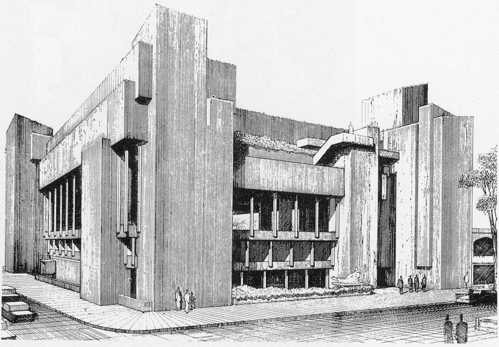
Rudolph Hall
Introduction
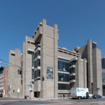
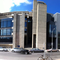
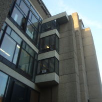
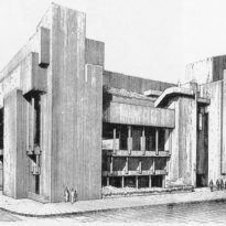
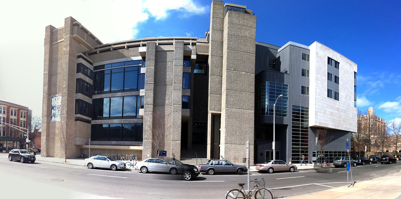
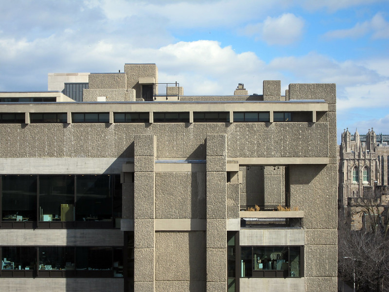
The Rudolph Hall is a building that belongs to the Yale campus and was formerly known as the Art and Architecture Building. It is known as one of America’s earliest and best examples of Brutalist architecture. Designed by the modern master and then chair of the Yale School of Architecture, Paul Rudolph in 1963.
The building is considered one of the architect’s most important works and it has been praised widely by critics and academics and received several prestigious awards, including the Award of Honor by the American Institute of Architects. However, as time went by the critical reaction towards the building has become more negative. Rudolph has been criticized for placing the areas that he cared less about in the basement, reserving the best spots for architectural activity. The building has also been referred to as oppressive and unwelcoming.
In 1969 a large fire took place inside the building causing extensive damage. Charles Moore, who openly disliked Rudolph’s design and had succeeded him as Yale’s architecture chair, headed the renovation process and reconfigured the interior, obscuring and hacking up keyspaces. In the year 2000, the School of Art moved into their own building and, since appreciation to the building structure had increased in recent years, the building underwent another renovation with the intent of restoring it to the original design. Charles Gwathmey was the lead in these recent renovations.
Despite all the controversy and mixed opinions involving the building, in 2008 it was rededicated and officially renamed “Rudolph Hall”, at the request of Sid R. Bass, the renovation’s primary donor.
Location
This building can be found in Downtown New Haven, Connecticut, at the corner of Chapel and York Streets. A couple of short blocks from the New Haven Green, the School is located in Yale University’s Art District, across the street from the Yale Center of British Art and, one of Louis Kahn’s earliest buildings, the 1953 glass, and steel Yale University Art Gallery.
Concept
Rudolph , as some of his contemporary architects like Wright and Le Corbusier, was concerned with the method and drama of natural lightning; which is an important factor for the activities the building was set to house. The building relies on this since it contributes to changing character and psychological implication of space. What also helps to create various spaces in the same area of the building is the difference of heigh; incorporating a few steps between two spaces creating a virtual separation of them.
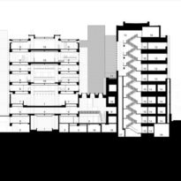
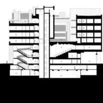
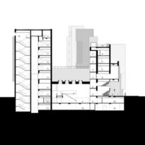
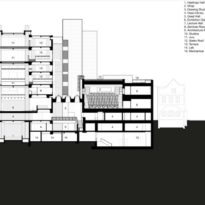
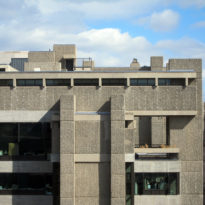
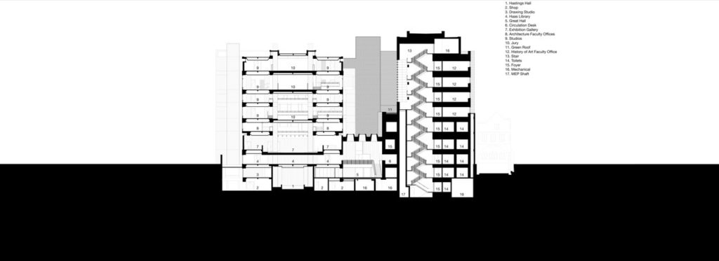
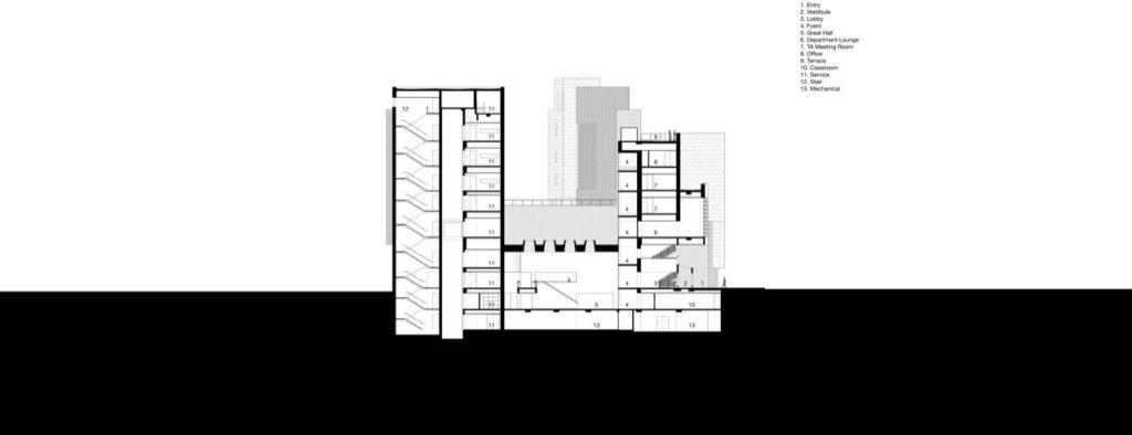
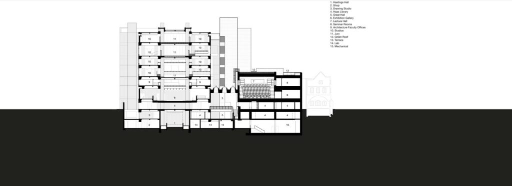
If we appreciate the building in section, we will notice that the lower floors are manifested as open floor plates whereas the upper floors take the form of discrete boxes. By doing this, Rudolph manages to invert the relationship between was is normally known as heavy and what is commonly known as light, it can be seen as a denial of gravity and an establishment of a new order.
Spaces
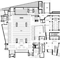
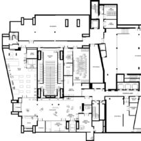
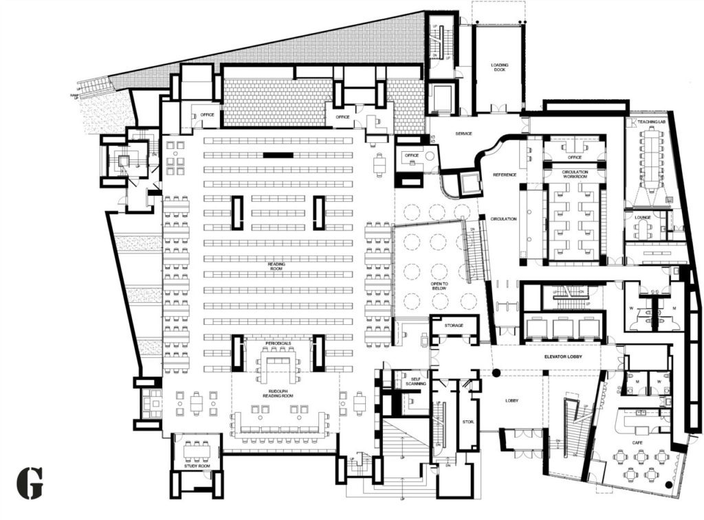
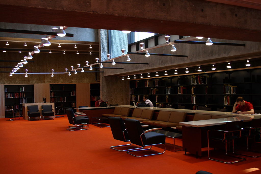
The entrance to the building happens by going up a narrow flight of steps that penetrate deeply into the mass of the main building. The ground floor presents a grand reading room, offices, a café and more.
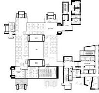
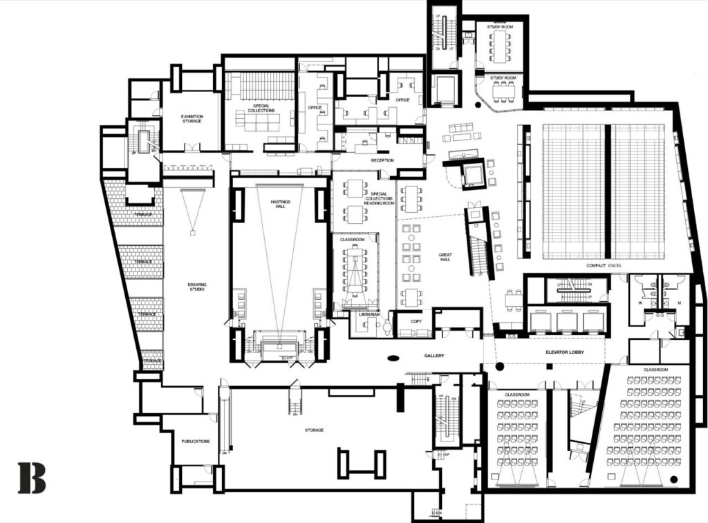
Even though it has nine floors, two of them are underground. Also, even though 9 floors can be distinguished the structure contains thirty-seven level changes in the form of a few steps within a space. Since the walls are de-emphasized, these levels are defined by floor and ceiling planes.
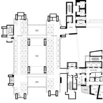
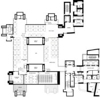
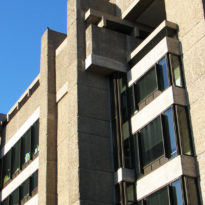
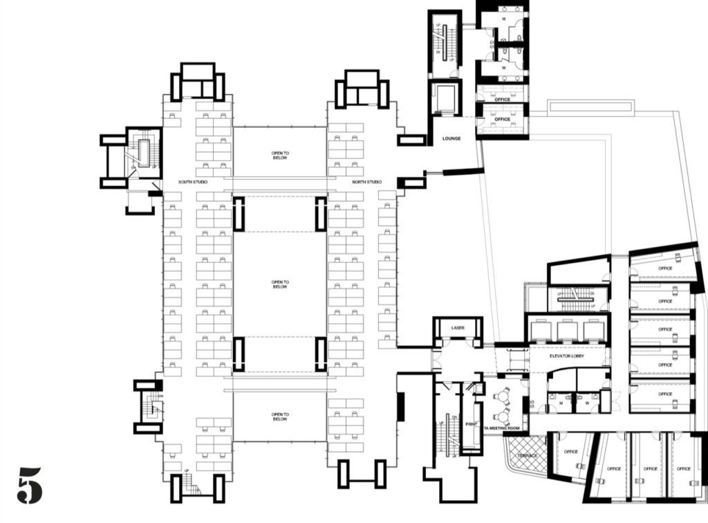
The building consists of four large concrete columns that define the central 9-square grid. There are two additional squares that provide space for the vertical circulation of the building. This way, vertical circulation flows are kept outside the original 9-square grid. The four columns priorly mentioned are hallowed and help accommodate the mechanical services.
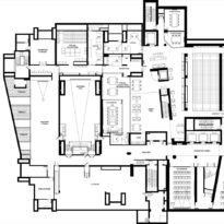
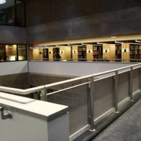
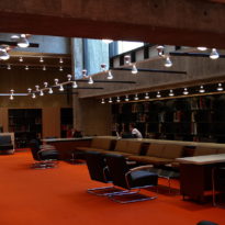
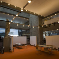
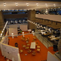
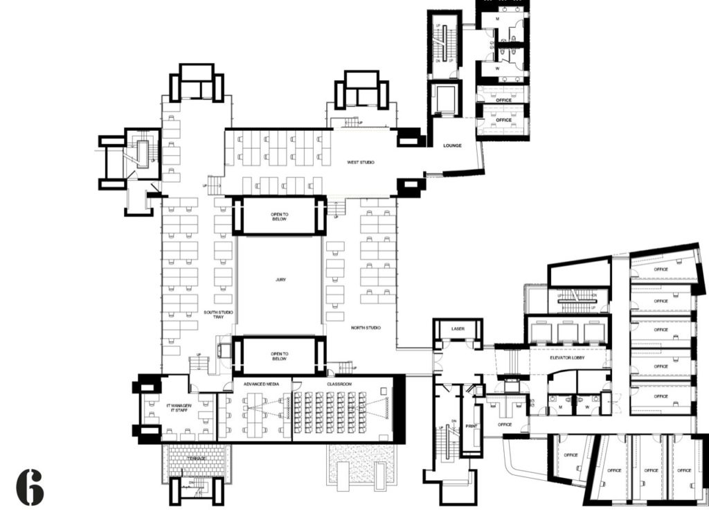
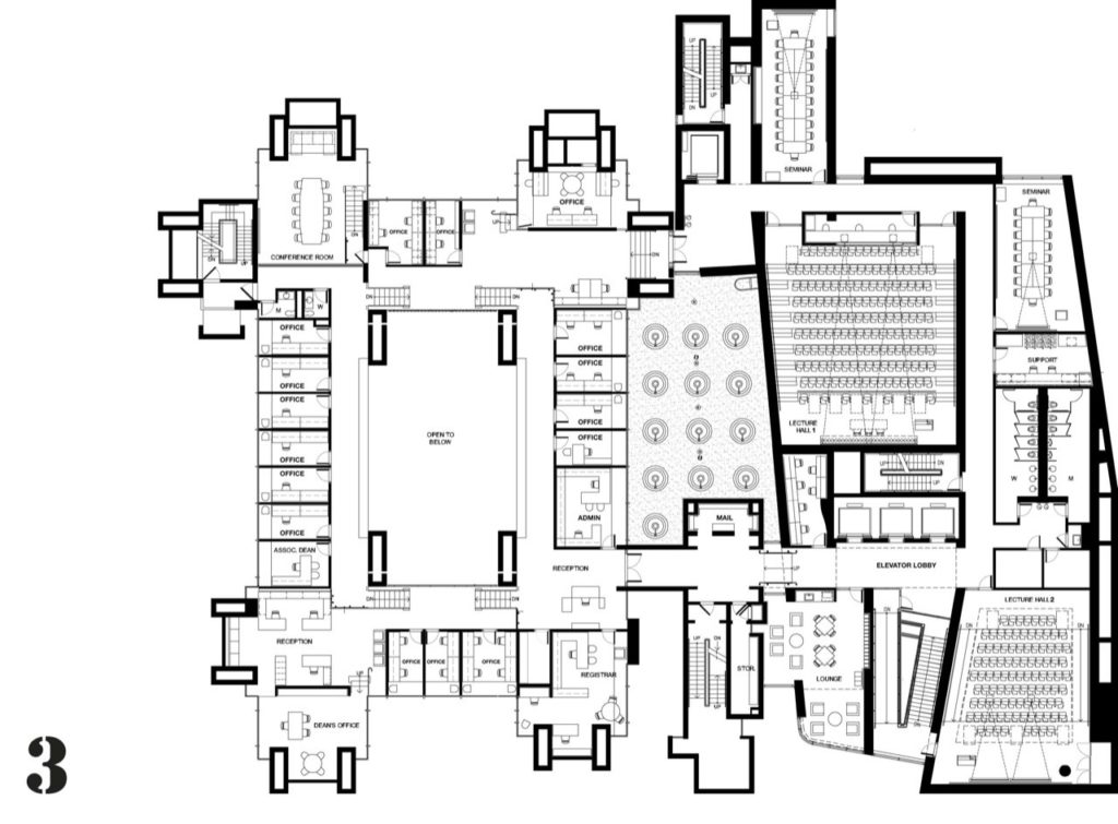
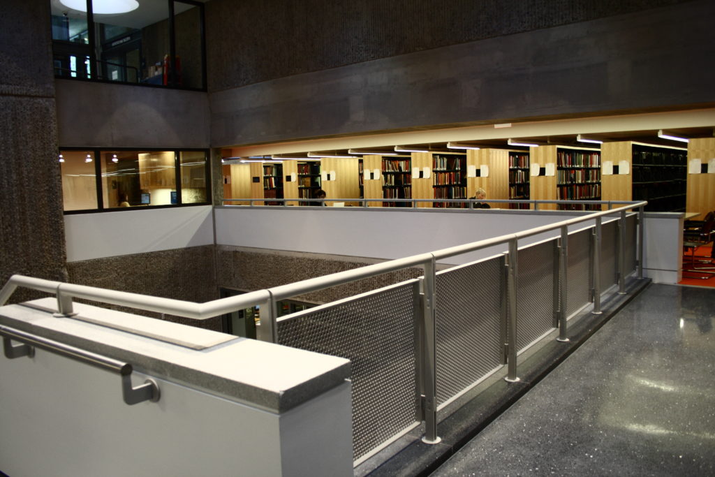
On the sunken levels activities related to sculpture and design take place while they encircle a central auditorium. At ground level, we can find the library and its reading rooms. Above this, with the possibility of looking down into the reading area, there is a two-story exhibition hall, with administrative offices and a central, sunken jury pit.
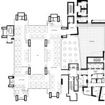
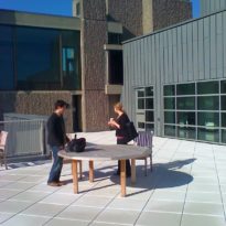
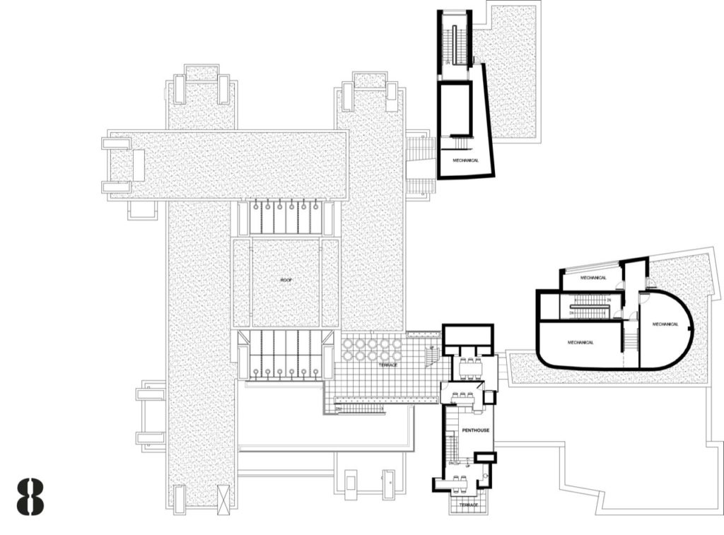
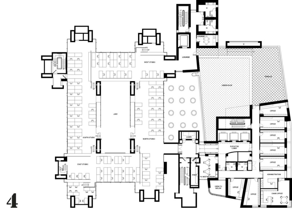
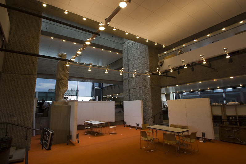
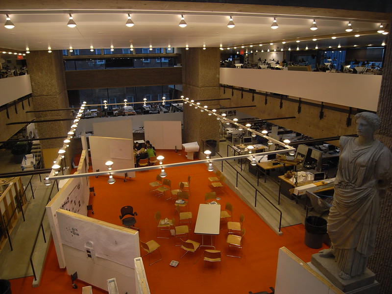
On the fourth level, we can find the most dramatic space, an architectural zone in five levels connected to each other by a few steps. Above this run two parallel mezzanines spanned by a channel-shaped bridge. Two skylights rise as giant clerestories bringing in intense natural light at the center of the space. On the top two levels, we can find the painting and graphic studios with an open terrace for sketching. The building also contains a penthouse for guess critics to stay in.
Structure
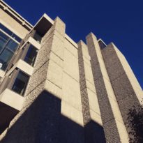
As mentioned earlier, the 114,000 square-foot building was constructed of cast-in-place concrete and consists of four large columns. In the longitudinal section, we can discover a “rhythm” between the parts, there are two narrower zones facing the outside (two supporting concrete piers) and in the middle, there is a wider zone defined by the two mentioned previously.
The floor plates and box volumes in the narrower zones are held by concrete piers on only one side. In the case of the wider zone, this one is held in all four corners by the concrete piers suggesting a much stronger connection to these structural supports.
Materials
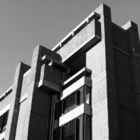
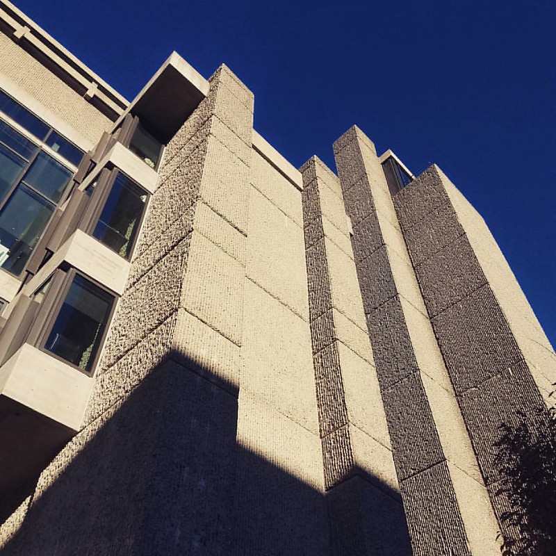
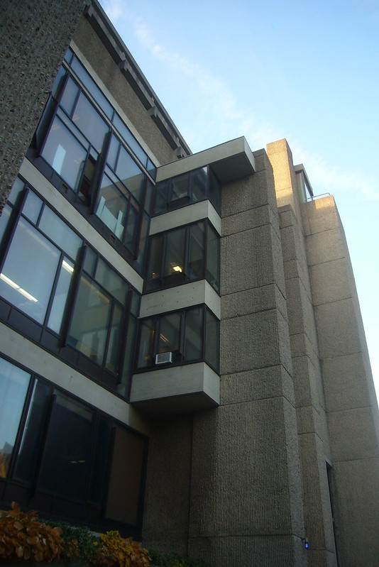
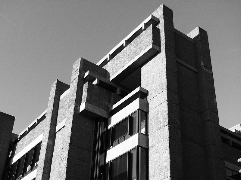
As in other brutalist buildings, the Rudolph Hall mostly consists mostly of ribbed, brush-hammered, “corduroy” concrete. The architect obtained strong vertical striations on the surfaces by pouring concrete into vertically-ribbed wood forms, that were then stripped away. This became Rudolph’s favorite treatment for exposed concrete since it does not stain easily and creates an interesting interior visual.
