Rudin House
Introduction
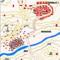
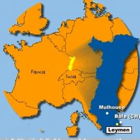
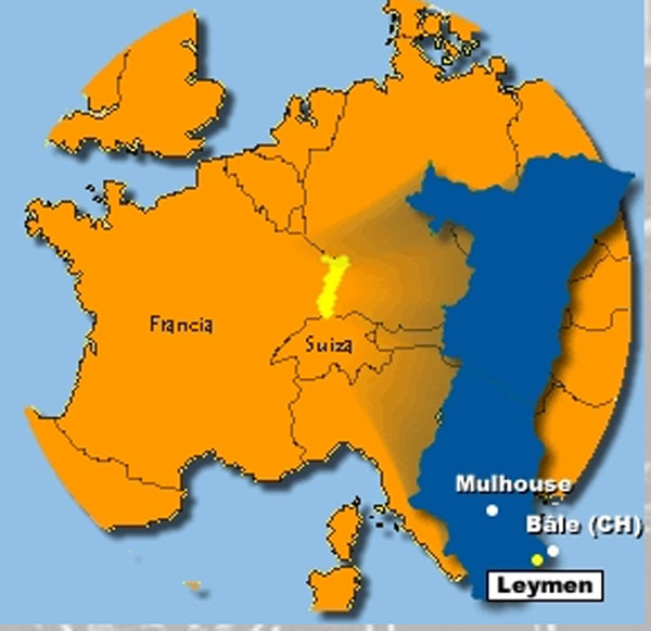
Located in a small village on the border of France and Switzerland (Leymen), the house was one of Herzog & de Meuron‘s first works, carried out for the art gallery owner, Hanspeter Rudin.
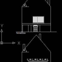
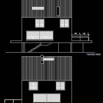
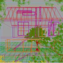
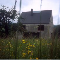
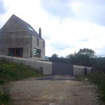
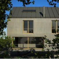
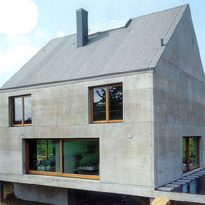
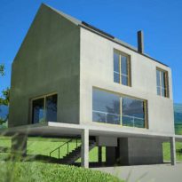
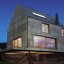
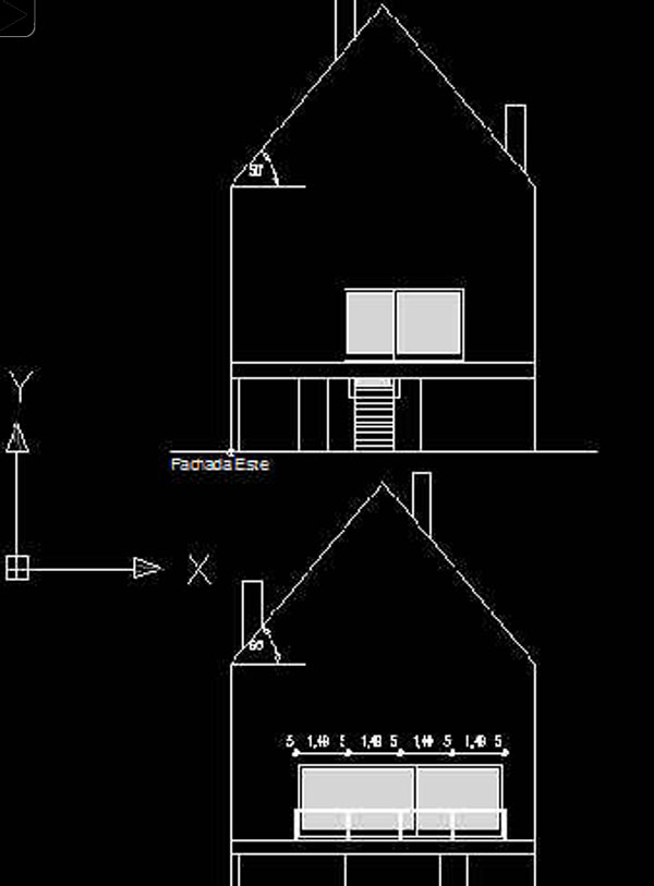
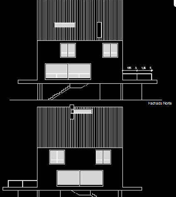
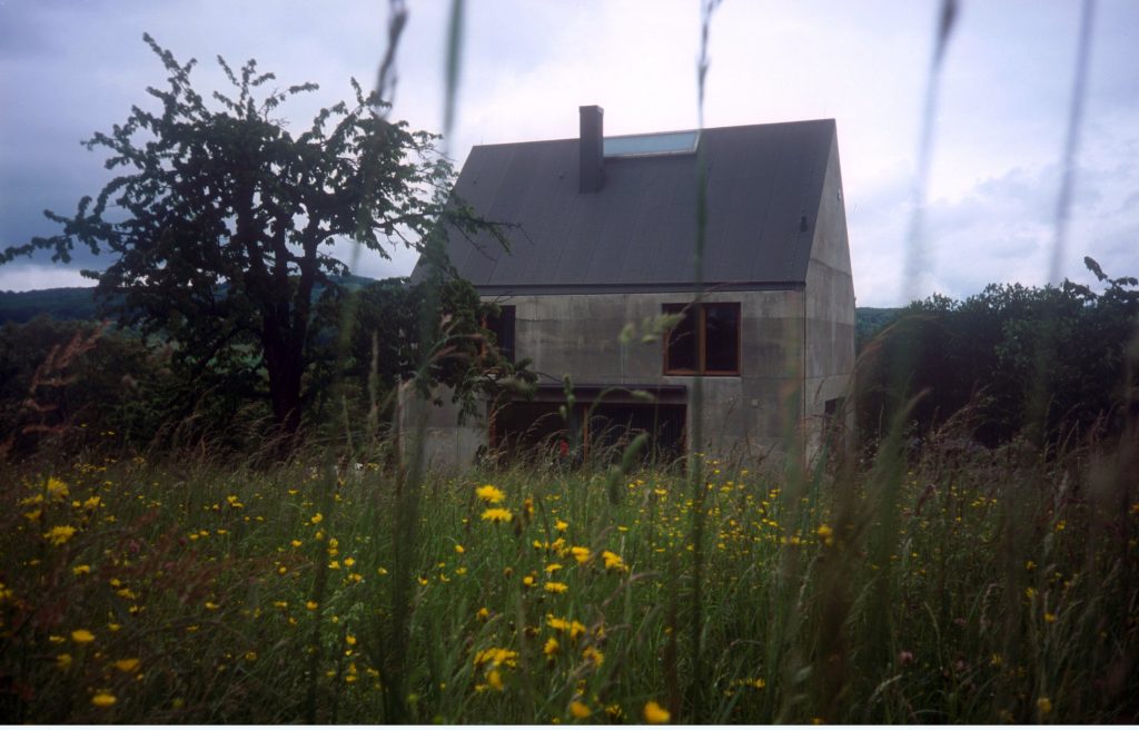
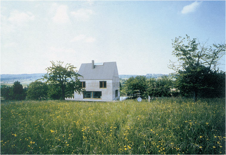
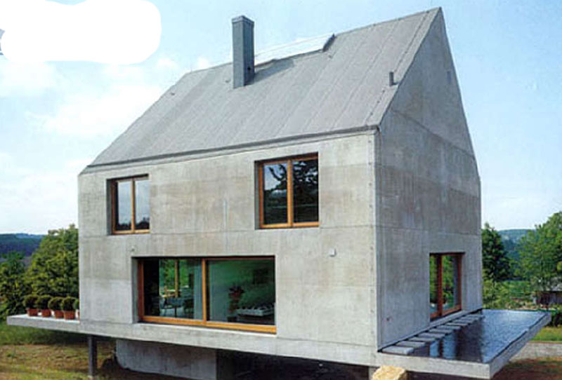
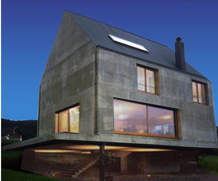
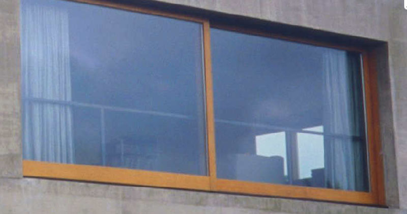
At first sight, it could be said that in its form and exterior aspect it is a very stereotypical house, like how we imagined a house in our childhoods: the gabled roof, the very big windows and door and a vast chimney. The roof is no more than a roof, the walls are simply walls and the two create a unique surface on which doors and windows are perversely arranged.
As Moneo once commented on the work: “a reflection on the history present here seems to be imposed and inevitable, which leads the architects to this painful transformation of memory they would be tempted to describe as schizophrenia, triggering a link with the typological melancholy.”
The house establishes a rare dialogue between tradition and modernity, subverting one another while utilising their values. If we were to have to argue whether it represented a serious project or one made in jest, I believe we would have to define it as a very serious joke made with great subtlety.
Location
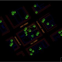
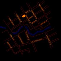
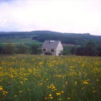
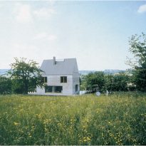
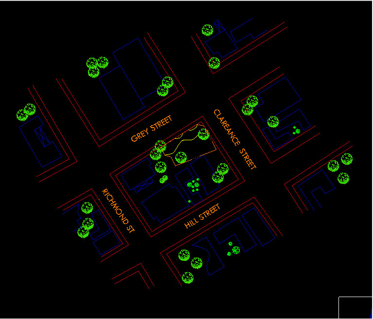
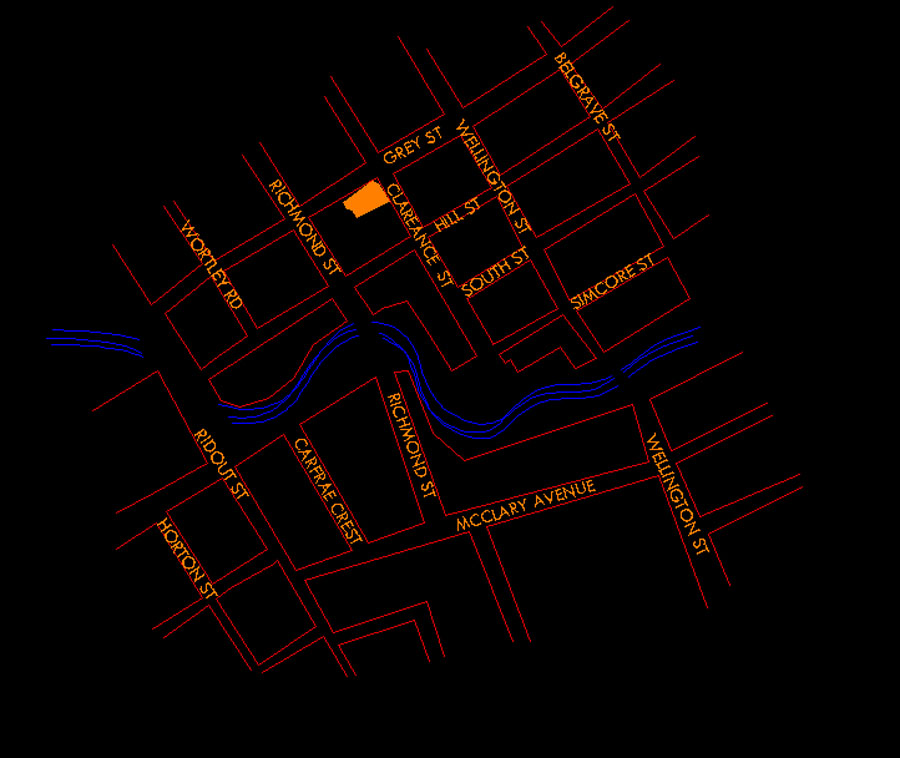
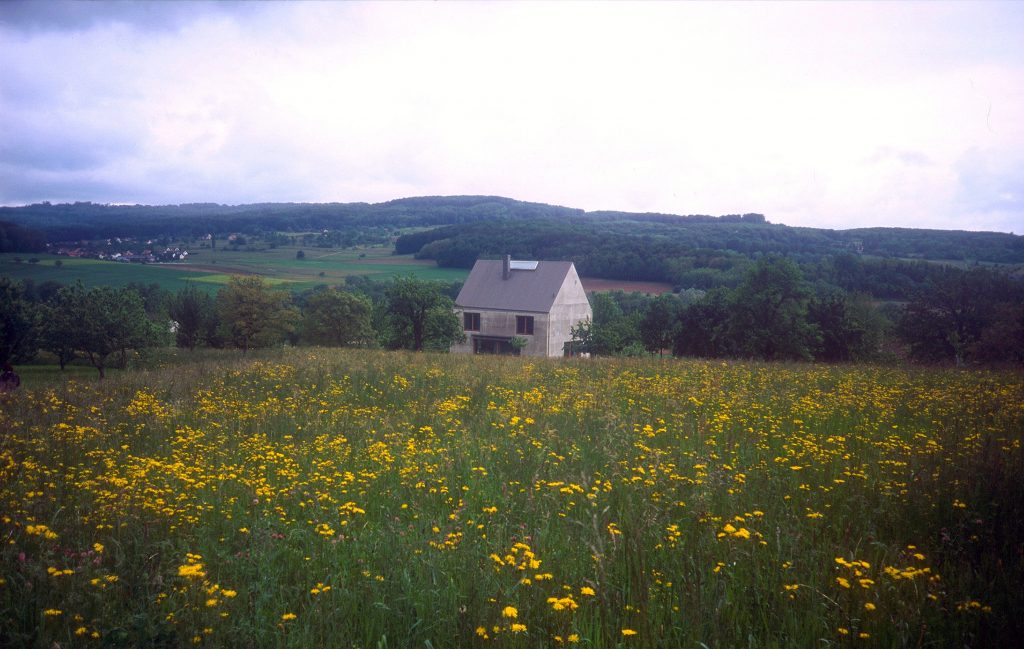
The house is situated on the base slope of a hill between conventional Central-European chalets, within a private development, in the city of Leymen, Upper Rhine, France. Bordered by Grey Street to the North, Hill Street to the South, Clareance Street to the East and Richmond Street to the West.
Concept
In the Rudin House, Herzog & de Meuron evoke childhood memories of the appearance of a house, retaining the most characteristic features, such as the large chimney, sloped roof, single volume and so on. Associating them with an elemental simplicity and cleanliness in its finishes, it reaches beyond the imaginative literality of how a house is envisaged, expelling the initial idea of a gabled-roofed house to reduce it to zero iconographic representation.
From a distance, it does not appear to differ in terms of volume from its neighbours, but its references are completely different. The house breaks with the parameters of the sweetened hypocritical historicity of the new, falsely traditional buildings, and takes from them only an abstract vision which includes their geometry and leads it toward this childish vision of a house that we all recognise.
Counterpoints
The house acts in a dialogue of conflicting positions, which can often be viewed in terms of entertainment.
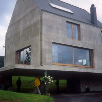
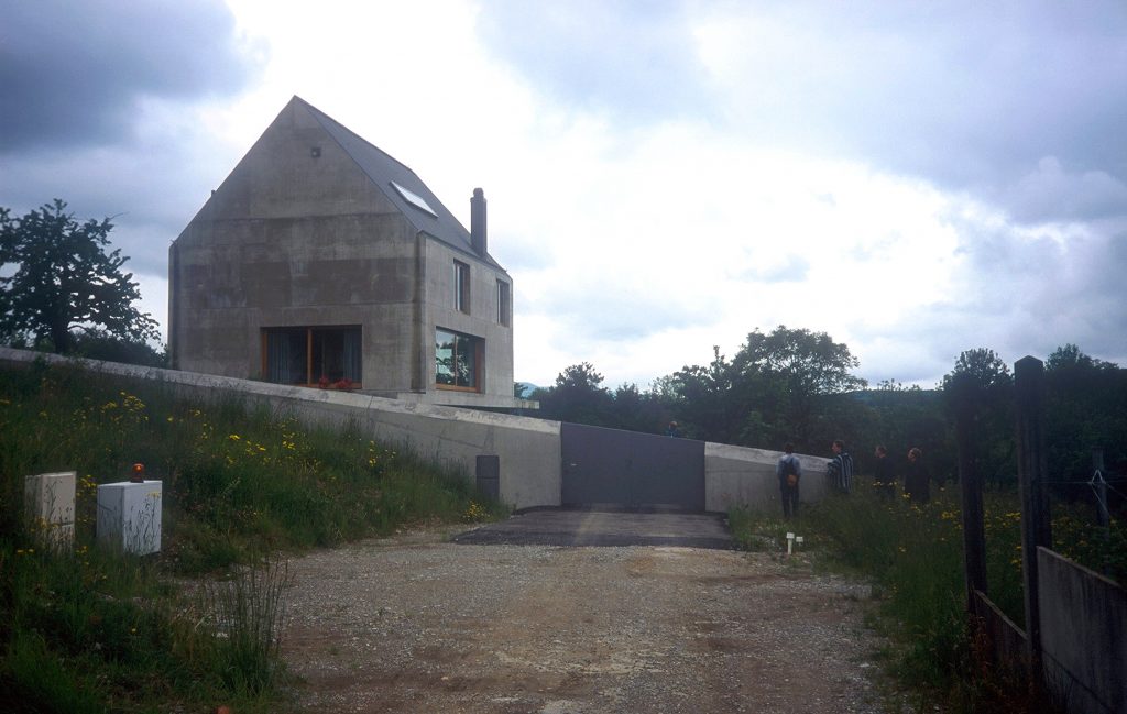
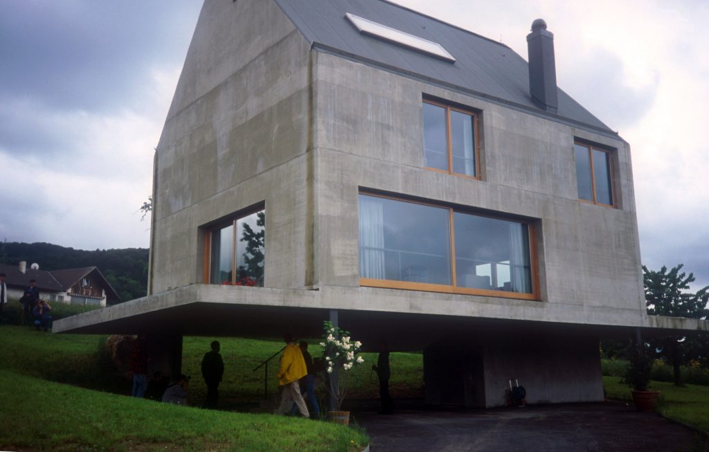
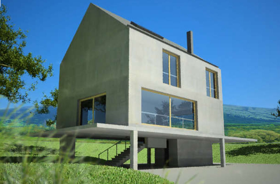
- It is an intentionally heavy, parallel-piped construction made of exposed concrete, which is also kept elevated from the ground, floating on a plate supported by slim pillars.
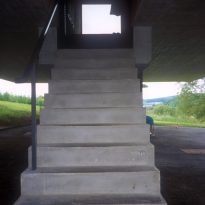
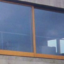
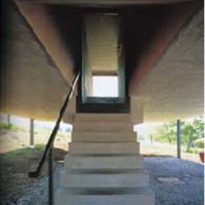
- It has large windows which open without shame to the exterior, while the entrance is almost secret and makeshift under the house.
- It has a large inclined roof, however the eaves and gutters which correspond to this roof disappear, and the rainwater slides down the concrete arriving at the pond on the supporting platform located on one side of the house.
- The inclined planes of the roof are presented to the outside world, while the finishing material is a vulgar asphalt cloth more typically used for flat roofs.
- On the one hand it approaches the cosy dreams of childhood, and on the other the aestheticism and durability of its materiality opposes all romanticism.
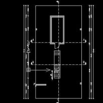
- The house is longitudinally symmetrical, but the staircase breaks the symmetry in its interior with a light revolution and avoids any bulky dimensions in its trajectory
- The house is erected on a thin plate of concrete, linearly and almost childishly simplistic, but it incorporates a terrace on one side with the classic and vulgar plant pots standing in for any railing that could provide volume, and on the side opposite the terrace there is sheet of rainwater of minimum depth, perhaps to mimic or mock the vast ponds and pools of the large summer houses.
Spaces
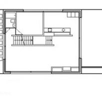
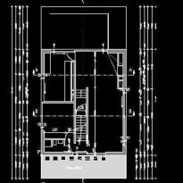
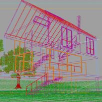
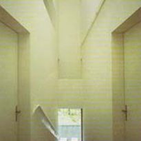
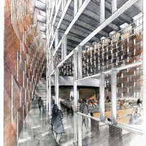
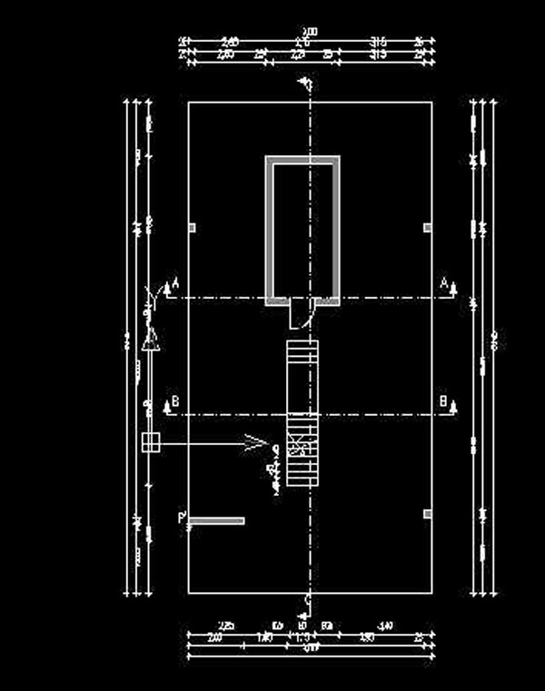
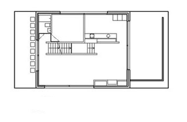
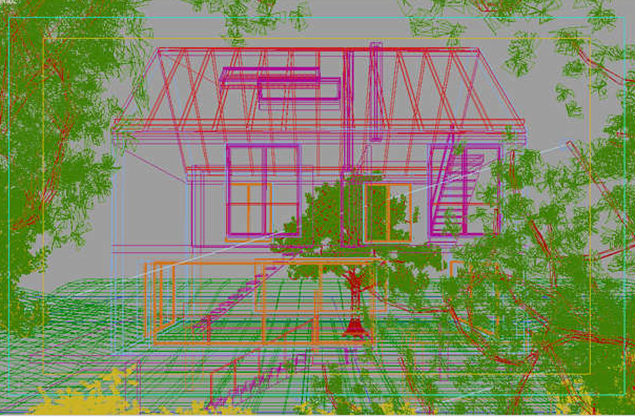
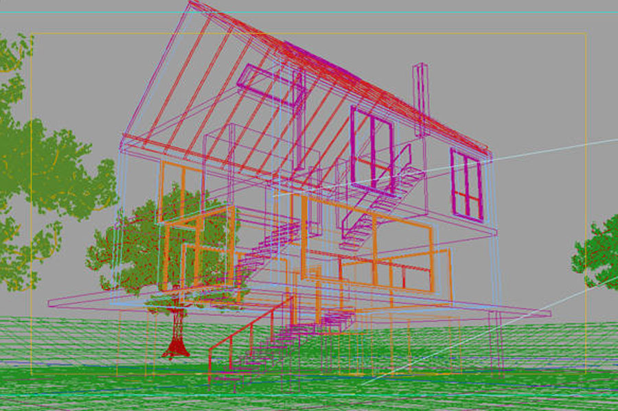
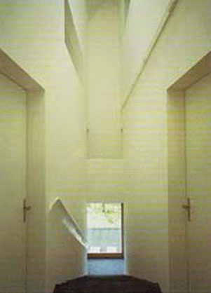
In the house’s interior, the large staircase which goes from the floor to the ceiling stands out as the central feature, and as the interior-exterior and vice-versa transitional element. It is the vertical axis of the house and the element that organises the space.
It ascends along the longitudinal axis of the building, with the rooms arranged at either side of its trajectory, and ends under the beam of the all-important skylight. The skylight takes advantage of the asymmetry that causes the mismatch of the gable’s axis with the staircase’s, in terms of light and economy.
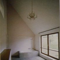
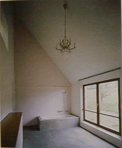
The rooms with the greatest spatial resource are found precisely at the end of this circuit: the master bedroom with its mezzanine floor and dreamlike bathroom in an extreme vertical cross-section.
Structure
It could be considered a very heavy work, being a concrete cube, with endless concrete walls. However, this leads us to understand the importance of the work, being contrasted by the supporting elements which support it like stilts and lighten its presence within its environ. It is also a platform so that the house is not lost in it, and illuminates its appearance.
This platform also creates a cantilever that collects the rainwater, becoming a pleasant mirror both from the outside and in.
Materials
The concrete roof and walls seemingly appear to be the same element as they project an appearance of continuity by the absence of any eaves.
It is defined as a simple and monolithic construction which allows for a connection to nature, as the water can be observed sliding down its walls and does not wear or damage their material.
The use of modern materials such as concrete and traditional ones such as adobe stands out, representing the fusion of past and present often seen in the works of these architects.
